#you unless you either see visual proof or if it's strong enough to feel effects from it (since magic is kind of like radiation in that the
Text
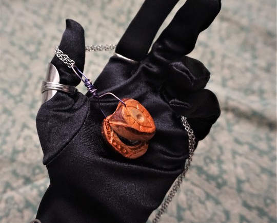

-- Poorly Constructed Enchanted Tool --
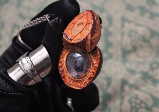
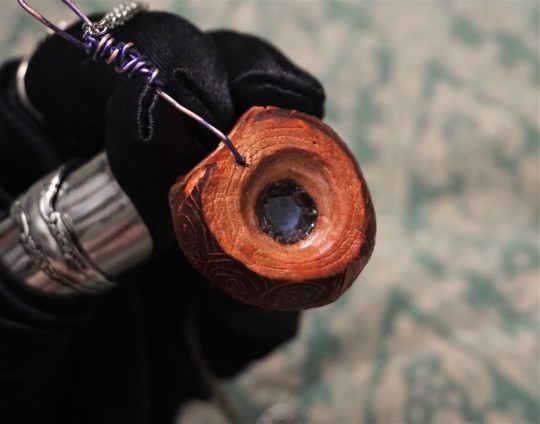
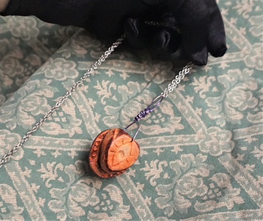
A small tool carved from a fruit tree seed. Energy to power the enchantment has seemingly run-out long ago, and the method of recharging is unknown - but, based on the appearance, it's very likely that this was once used for detecting magic. Usually, looking through the glass center would highlight areas of higher magical energy concentration present in the viewer's environment, even if they were otherwise obscured to the naked eye. While this form of enchantment itself is highly advanced, the craftsmanship of the item is far less neat or complex than what might be typically seen in similar devices. It may have been made as part of training/practice, or as a hasty replacement for a previous tool that had broken.
#written from the perspective of some fantasy traveler who checks all of the local thrift-stores and lost & found places for every#town they visit - looking for interesting items and documenting them or something#In reality - just another one of my goofy little avocado pit carvings lol. Still working on inlaying little stones in them and stuff#I don't really have the tools to make super intricate stuff but doing little plain swirly patterns is still fine enough lol.#WORKING ON NEW POLL ADVENTURE also I know I know it's been months.. I have been Busy and struck by the evils of summer#But like I mentioned in the previous one I do want to at LEAST finish the quest with the egg lol#ANYWAY.#Things like this would plausibly exist in Nanyevimi (my fantasy world) but wouldn't be very common as - like mentioned- this would be an#extremely advanced enchantment. REALLY advanced mages could sense magic around them (to varying degrees of pinpoint accuracy of location#) without even having to use any external device. But for a majority of people there's really no way to know someone is using magic near#you unless you either see visual proof or if it's strong enough to feel effects from it (since magic is kind of like radiation in that the#higher energy/more of it youre exposed to the more it damages you/can make you sick/etc.) and even then most people would just be like#'hmm why do I feel so nauseous and bad out of nowhere?' likely wouldn't directly think to link it to magic. Thus the only really reliable w#way isto just hone your senses over like 500 years as you become an expert mage - OR use enchantments like these. But a 'sense magic' encha#ntment is not as common as a just 'magic is not allowed here' enchantment. If you wanted to prevent magic from being usedin a space#it's easier to just put up a broad barrier enchantment around that space than to have some sort of Magic Sensor to pick out if it's being#done and then handle each individual case of it . etc. etc. These sort of things can have their uses (especially for people investigating#things or trying to be secretive about detecting something etc.) but are less common - especially in this form (where visuals are used. itd#be more likely to jsut have like 'piece of metal that gets warm or cool depending on magic nearby'.) ANWAY so this is why it's a notable#object. Though a majority of the realm is not very magic literate - if you were a researcher or a mage and found this at a pawn shop you'd#definitely be like 'oohhh!! :0 inch resting... ' if not you might just be like 'oh cool necklace!' lol#also love the quick 2min ''costume'' for the image of it being used. literally just 'wrap yourself in scarves from the waist up' and slap o#a wig and ears lol#on this blog I guess since it's worldbuilding related and technically art.. maybe more like crafting? I should have a crafts tag lol.. hmm
54 notes
·
View notes
Text
5 tips to speed up your image heavy website
Growing any business is, well, powerful business. you've your hand in each pot whereas at the same time sporting each hat. you are worrying regarding promoting ways, product creation and growth plans, bushed constant day.
With such a large amount of in progress tasks, it may be way too straightforward to let a touch issue like digital presence fall by the edge. However, that will be a grave mistake.
The Harvard Business Review recently conducted a study on what specifically makes individuals wish to complete a sale from a specific web site, and also the results were a convincing "trustworthiness." By creating customers feel safe, comfy and relaxed once they visit your on-line destination, you stand a way higher probability of not simply encouraging them to complete a sale, however convincing them to become old users.
A strong web site style is overriding in making this trait. By presenting a web destination that's easy and straightforward to navigate, users can have a a lot of positive expertise throughout your web site, creating them a lot of doubtless to complete a sale.
So, whereas things like company transparency, nice testimonials, and a solid product area unit obvious ways in which to ingrain familiarity to potential customers, web site style clearly ranks notably high once determinant if a whole looks trustworthy or not.
In order to face out from the gang, there area unit a number of tried-and-true style parts which will rework your web site guests into loyal customers. don't be concerned, i am not attending to say one thing obvious like "responsive designs" -- parts like that area unit a given.
Here area unit 5 prime net style and wife trends which will grow your business quick.
1. Video landing page
Incorporating video into your web site style could be a labor. I mean, seventy eight % of web users watch videos on-line each week.
But, do not simply imbed unspecified YouTube video. Instead, take your web site style to subsequent level by making a video landing page.
You could target this video to an immediate decision to action on a specific web content, a la Salesforce. otherwise you may take a page out of Baesman's book and make AN immersive video that auto-plays on your homepage. Either of those approaches will give data or drive home the brand's identity -- however each can improve wife and users' impression of your company as a full.
Not sold? The proof is within the pudding. consistent with Vidyard and Demand Metric's The State of Video promoting 2017 study -- that surveyed 159 B2B and B2C professionals and entrepreneurs -- it's expected that sixty nine % of web site traffic are going to be video, whereas seventy % of skilled participants according that video converts higher than alternative kinds of data and content.
2. optical phenomenon scrolling
While digital experiences don't have any doubt improved several aspects of our daily lives, it's had one negative impact: individuals area unit lazy. So lazy, in fact, that clicking a button is commonly too way out of the realm of chance.
Enter optical phenomenon scrolling.
This uneven-like scrolling impact has combated consumers' general laziness whereas remaining participating and visually appealing. With a straightforward swipe (a la Tinder), users have simply consumed your data as they create their method down the page.
The popularity of optical phenomenon scrolling has conjointly introduced a lot of deep-scrolling and single-page web site styles, and renders what data is "above the fold" a touch less necessary, since it's easier to check what is below, too. Ultimately, that creates prioritizing content easier for you to manage and will increase your user's probability of seeing everything anyways.
Make Your cash Matter took its optical phenomenon scrolling to subsequent level, with effects spanning AN illustrated timeline that goes each horizontally and vertically, guaranteeing it captivates users.
3. Animated calls to action
Calls to action area unit a necessary evil in web site style. the actual fact remains that your customers will not understand what to try to to unless you expressly tell them. Many. Many. Times.
However, merely telling your customers what to try to to simply is not enough any longer, either. they are seeing stimuli and directions from all corners of the online, therefore you wish a touch one thing further to assist your goal stand out.
Adding a touch animation to your necessary action things may well be simply the price ticket. whether or not it is a micro-mini interaction (such as "liking" a Facebook post and seeing the various reaction animations) or a straightforward impact to catch users' eyes, customers area unit a lot of doubtless to execute the action you are pushing once the decision to action grabs their attention and provides confirmation of completion.
Need some inspiration? Airbnb uses its animation app, Lottie, to include delicate graphics animations atop its calls to action throughout its web site and app styles.
4. Custom typography
Every web site desires text, however the times of boring Times New Roman, Arial or the other basic stock font have long-since passed. Instead, take your message to subsequent level with distinctive typography that encompasses your whole identity whereas at the same time human activity to users.
This distinctive typography will take several shapes (literally) or be found in numerous areas of your style. Some brands could prefer to utilize this in their brand style, whereas alternative businesses (like mine) can sprinkle custom font throughout the whole style to draw attention to big content, like this article signup decision to action (below). Ultimately, the selection in however and wherever you utilize this trend is up to you.
5. AI
Despite the surge in ecommerce sales over brick and mortar storefronts, individuals still crave connections, that is probably going one {in all|one amongst|one in every of} the explanations that AI in all its forms is therefore common.
AI in web site style will take several shapes, however some common examples embody machine learning, personalization and chatbots. Machine learning and personalization area unit cut from constant fabric to a degree and control a sense of "being special" with users that, in turn, fosters whole loyalty.
Chatbots influence user expertise far more directly, though. whereas they supply an enticing component, the largest draw to incorporating chatbots into your web site style relates to client service. Users will raise queries and receive answers in real time -- that is simple to ascertain -- and acquire data quickly.
Quartz could be a stellar example of chatbots inside immersive app style. Through a informal interface and humorous memes, users area unit a lot of doubtless to come back to consume the amusing content than they're to browse a run of the mill news story on another app.
1 note
·
View note
Text
Full Metal Jacket (1987)
“You’re so ugly you could be a modern art masterpiece!”

‘Full Metal Jacket’ is along with 'The Shining' the only Stanley Kubrick film I've seen (definitely planning to watch more), and I liked it as much as 'The Shining', although "like" is a weird term in this case I suppose.
I don't really like or love either, both films aren't exactly a pleasant experience, but I admire the unease and discomfort that they cause in me. A film that causes strong emotions, unless it's disgust at the film's politics and underlying message, is almost always proof of good cinema.
Even never having seen it, ‘Full Metal Jacket’ has been inescapable for years, it’s one of those iconic films that a lot of people know at least one quote from, for me it was "you're so ugly you could be a modern art masterpiece" (my new favorite film insult I think).
Completely randomly coming across it on Netflix I decided to scrap this one of my "films I have to see one day list", and I was definitely in for a surprise. Netflix described it to me as grim drama, which really is 100% fitting.
However from the internet, one would almost wrongly categorize it as a comedy, because people are always posting the funniest parts, the insults from the drill instructor at the beginning, are so colorful and obscene that they become hilarious. But there's not much to laugh about later on...
Lee Emery was a real drill instructor for the American army, and essentially plays an exaggerated version of himself. His role has become iconic and his lines famous.
These initial scenes have a very dark humor, reflecting and foreshadowing almost just how dark, and visceral and horrific the rest of the film is about to become.
War films and military films are definitely not my favorite genre, I wouldn't really trust anyone that does. I loathe war and all that it represents and says us about as human beings.
However, as someone that loves learning about history, I'm really interested in them from a historical and psychological point of view.
I have a problem with one particular kind of war film, those that glorify war and celebrate the violence and blood spilling if they feel like a political manifesto and celebration of war, I'm out.
But I do have an endless respect for films in the genre that dare to not focus on the fireworks of the special effects, and how bombastic it all is, but instead, dare to turn the camera towards its human subjects and sketch a portrait of what happens to people in a war, all people regardless of the side they're fighting on.
Films that dare to explore the psychological effects of it, trauma and or dehumanization.
And in that regard 'Full Metal Jacket' is a dream. There are people that say that its first part, the one at the training camp is the most powerful (filmed where I'm from, in Belgium) and maybe it is the most powerful in terms of drama and development of the characters. But in my opinion part two definitely can't be considered weak.
That part of the film is extremely powerful in sketching, the sheer horror of war, some shots are so visceral that they definitely stay burned in your retina for a while after.
In terms of visuals and sound effects, for me, it was the strongest part. I found some scenes so horrific, that I actually felt an almost physical disgust. It's the part that accomplishes a pure assault on the sense.
And it's really not a far stretch of the imagination, to compare the buildup of a scene in this part of the film, to that of one in a horror film. The use of unsettling and foreboding music, paired in some scenes, with an unclear field of vision, worked wonders for me.
It was pure almost unbearable suspense for me, and I remember thinking something like "oh no, something is going to happen, I don't know what but I won't like it". Very few films have that effect on me, of wanting to look at and at the same time wanting to look more than anything in the world.
Nowadays that kind of suspense isn’t really considered innovative anymore, every horror film has done it. But here I found it to be utter perfection. It’s a cinematic definition of what war is: a complete and utter nightmare, and one of the most debasing human activities.
There’s a tendency to separate part one and two and look at them as two different parts. And while that approach makes sense because they take place in different locations and in one part they are preparing for combat whilst in the other, they are in combat. But part one very much feeds into part two.
Kubrick made the film after reading the novel ‘The Short Timers’ by Gustav Hasford, about the training and the service, of a group of anonymous marines, of which the most important one goes by the nickname Joker. The film, like I, imagine the book does, gives a shart picture of the training of the soldiers as a process of dehumanization.
A constant returning point in Kubrick's work seems to be the relation between humans and machines, or humans as machines, here perfect killing machines.
Even 'The Shining' has that, Jack Nicholson's character has certain roles: husband, father and one by one he begins to reject them until only madness and killing instinct is left.
And we see that same thing in 'Full Metal Jacket', the men come in as different men, each with their own personality, and most importantly each with an own name.
But the first thing that has to go in the army is individuality: you shouldn't be too smart, too funny and certainly not too questioning of authority. It's the first thing their general literally shouts and stomps out of them, any defining character traits. To him, they're all the same, "all equally worthless".
In the first few minutes of the film, their hair is shaven off, and the general gives each of them a nickname, often based on characteristics of the person that he has a strong dislike for.
And it works too, we never really know any full names of any of the soldiers. There's a scene in the film in which the soldiers march with their guns and chant: "This is my rifle! This is my gun!
"This is for fighting!|This is for fun!
"This is my rifle! This is my gun!
"This is for fighting!|This is for fun!", the link between sex and violence and humans and machines is one so evident that I don't think I have to point out.
And it returns later, the men are reduced to the most basic of human conditions, killing to survive, and sex, even fighting over who gets to sleep with a Vietnamese prostitute first, all the while with complete disregard of the woman as a human being.
The first half of the film is so emotionally powerful, because we witness how people are brought down completely to the ground, and then build up again, to become what someone else wants them to be. You take everything away from someone and replace it with bloodlust. It really is fantastic as well as harrowing cinema.
One of the soldiers brilliantly played by Vincent D'onofrio is actually overweight and can't handle the heavy physical demands. And slowly starts losing his mind under the constant humiliations, of drill instructor Hartman.
At one moment we see him assembling his gun (that he named Charlene) and with an almost erotic pleasure, he lets the gun parts slide into each other, whilst talking to it.
It shows that different people react differently to authority, some people are scared of it and obey out of fear, while others have no problem obeying it and embrace the role they're being thrown into (with questionable pleasure in the case of some).
Some hate it and rebel against in instinctively, and some people simply can't handle being in a situation with lack of individuality and personal freedom and lose their minds.
Nowadays if someone wants to join their country's army that’s mostly their choice, in a lot of countries military service isn’t mandatory. But this was at a time when you had to go and were subsequently forced to kill, whether you liked it or not.
The film's most important strength is that it's all filmed with a contained simplicity, no bombastic, instead, it focuses on the actors, who all deliver fantastic work.
Matthew Modine is the stand-in for the audience. An Intelligent young man that despite everything, will end up losing his humanity. What else could happen under the circumstances? He's the most complex character in the film. He wears "born to kill" on his helmet and wears a peace button at the same time, something to do with the duality of man.
At the end when a female sniper of the Vietcong is found and initially not fatally shot, he looks down at the dying, suffering woman, who is literally begging the soldiers to end her life, and he can't find one bit of compassion. It took longer, but he too became a machine.
The scene disgusted me. But when you really think about it, you can't blame him. If a person is told time after time, that the only thing that matters is to kill or be killed, no matter how against your nature and spirit is, and fight it, in the end, a person starts believing what's repeated to them time and time again.
Interesting enough, this scene shows how horrible the situation is for both the female sniper as well as the soldier. When she sees the American soldier,t the first expression on her face is surprise and fear.
Then when she fires it's with what seems almost determined hate, but really it's survival instinct, a will to be the one to kill the other first. Both want to live equally badly.
When the soldier sees her determination, the look on his face is fear, just like she experienced when she first saw him. Ultimately while one is "the enemy" the film really doesn't put emphasis on this. We see them both as human beings, essentially experiencing the same primal emotions, only difference, their nationality.
You could almost say that the splits of Modine's character, peace activist as well as the killer, predominates the film.
A not so thin metaphor, for the human desire for tranquility, peace, and quiet, most people I know hate war and find it a terrible thing, this is common on an individual level. But as a group, not waging war is something that seems hardwired, and something impossible to erase from our nature.
Kubrick avoids the traditional connotations of the Vietnam war with the jungle and chooses an urban environment, a city in ruins.
The effect of this is that we see the violence represented against a background, that's easier to grasp for a western public, an almost indistinguishable enemy in a jungle, that most of us will never see, is easier to take emotional distance from. But the city is a place, most of us have a connection with.
Individual scenes also work excellently. A TV crew comes to interview the soldiers and we hear meaningful quotes such as: "I have always wanted to meet interesting and stimulating people of an ancient culture - and then kill them."
And then, of course, there is the final scene, After the massacre, after the violence, the soldiers withdraw when the night falls on the destroyed city and they sing the theme song of the 'Mickey Mouse Club'. It’ sad, and so absurd it’s almost obscene. Something to do with the duality of man, undoubtedly.
'Full Metal Jacket' is an incredibly strong film, Vincent D'Onofrio's look at himsef at the end of part one is in itself sufficient reason to give it a watch.
“I wanted to see exotic Vietnam……the jewel of Southeast Asia. I wanted to meet… interesting people of an ancient culture and kill them. I wanted to be the first kid on my block to get a confirmed kill.”
#I literally used to think this was a military comedy 😂#because people are always posting the funniest bits of dialogue#well what a surprise...#netflix described this as “a grim drama”#but that feels like an undertatement#full metal jacket#full metal jacket 1987#full metal jacket movie#full metal jacket film#stanley kubrick#war movies#vietnam war#movies#films#reviews#movie review#film review#movie analysis#cinema#filmista
29 notes
·
View notes
Text
How to Become a Logo Designer in 10 steps
Get started with logo design: 10-step guide
Before you embark on logo design, you must understand what a logo is and what it is supposed to do. A logo identifies a company or product via the use of a mark, flag, symbol or signature. A logo does not sell the company directly nor rarely does it describe a business. Logos derive their meaning from the quality of the thing they symbolize, not the other way around - logos are there to identity, not to explain. In a nutshell, what a logo means is more important than what it looks like.
To illustrate this concept, think of logos like people. We prefer to be called by our names - Jacob, Emily, Tyler - rather than by the confusing and forgettable description of ourselves such as 'the guy who always wears pink and has blonde hair'. In this same way, a logo should not literally describe what the business does but rather identify the business in a way that is recognisable and memorable.
It is also important to note that only after a logo becomes familiar does it function the way it is intended to do, much like how we must learn people's names to identify them. The logo identifies a business or product in its simplest form. Here are 10 vital tips you need to consider on your way to the perfect logo.
some hot logo and trends with templates you can check this link
https://www.fiverr.com/share/p303Bo
01. Learn logo 101
An effective logo is distinctive, appropriate, practical, graphic, simple in form and conveys an intended message. In its simplest form, a logo is there to identify but to do this effectively it must follow the basic principles of logo design:
A logo must be simple. A simple logo design allows for easy recognition and allows the logo to be versatile and memorable. Effective logos feature something unexpected or unique without being overdrawn.
A logo must be memorable. Following closely behind the principle of simplicity is that of memorability. An effective logo design should be memorable and this is achieved by having a simple yet appropriate logo.
A logo must be enduring. An effective logo should endure the test of time. The logo should be 'future proof', meaning that it should still be effective in 10, 20, 50+ years time.
A logo must be versatile. An effective logo should be able to work across a variety of mediums and applications.
A logo must be appropriate. How you position the logo should be appropriate for its intended purpose. For a more detailed explanation see: What makes a good logo?
02. Establish your own design process
Every designer has his or her own process, and it is rarely linear, but in general this is how the branding process is completed, which can be used as a guide to establish your own.
Design brief. Conduct a questionnaire or interview with the client to get the design brief.
Research. Conduct research focused on the industry itself, its history, and its competitors.
Reference. Conduct research into logo designs that have been successful and current styles and trends that are related to the design brief.
Sketching and conceptualising. Develop the logo design concepts around the brief and research.
Reflection. Take breaks throughout the design process. This allows your ideas to mature and lets you get renewed enthusiasm. Receive feedback.
Presentation. Choose to present only a select few logos to the client or a whole collection. Get feedback and repeat until completed.
03. Ask the right questions
A common pitfall before starting a new branding project is to fail to ask the right questions, which includes research on your behalf too. Before you begin your development, get as much information as you can from the client about their business, goals, target market, etc. If possible, try their service or product, visit their store – really get to know them and their requirements.
Some important questions you should ask your client before beginning:
How much do you plan to dedicate to this project?
Do you have a fixed deadline or timeline in mind for the project?
What are your goals and why?
What product or service does your business offer?
Who is your target audience and who is your most ideal customer?
Who are your competitors and how do you differ from them?
What was the idea behind the business name?
For further questions see: How to write a design brief.
04. Price your work accordingly
"How much?" is the single most frequently asked question and it cannot be easily answered because every company has different needs and expectations. You have to take a number of factors into consideration when designing a logo/brand identity, such as how many concepts need to be presented, how many revisions will be needed, how much research is required, how big the business is and so on.
The best approach is to draw up a customised quote for each client and to do this you should learn how to price your designs, which is another topic in itself.
Jeff Fisher, a notable designer and author, had this great point in his article How Much Should I Charge: "The major point I wish to convey here is that all designers need to work smarter in independently determining what their talent, skill and expertise are worth and charge the client accordingly without question or apology. Being smart in determining what you should charge for your work will hopefully allow you to 'work less, charge more' in the future."
05. Learn from others
By knowing what other brands have succeeded in and why they have succeeded gives you great insight and you can apply that attained knowledge to your own work.
For example, let's look at the classic Nike Swoosh (above). This logo was created by Caroline Davidson in 1971 and it's a great example of a strong, memorable logo, being effective without colour and easily scalable.
Not only is it simple, fluid and fast but it also has related symbolism; it represents the wing in the famous statue of the Greek Goddess of Victory, Nike, which is a perfect figure for a sporting apparel business. Nike is just one of many great logos, but think about other famous brands that you know and check out their logos - what makes them successful?
For more quality logos, check out Logo Of The Day or go to your local library/book store and check out some branding books. Also be sure to check out some of these logo design process case studies.
06. Make use of the resources
There are hundreds of resources available, both offline and online, that are dedicated purely to logo and brand design. Here are some of the best:
The Ultimate List of Logo Design Resources by Just Creative DesignIf you're looking for logo resources, this is the place to go.
Best Logo Design Books by Just Creative DesignLists some great logo design books.
Top 10 Logo Design Inspiration Galleries by Logo Designer BlogA list of the top 10 recommended logo design inspiration galleries.
Logo Design Tips by Steve at The Logo FactoryA great post outlining some very helpful logo design tips.
How NOT to design a logo from Web Designer DepotAn article outlining ways not to go about getting your logo designed.
Iconic Logo Designers by David AireyA mini-website of some of the world's most iconic logo designers.
45 Rules of Creating A Great Logo Design from Tanner Christensen.A fairly accurate list of 'logo design rules.' Take it as a guide only.
80 Beautiful Typefaces for Professional Design from Smashing Magazine.A thorough list of classic typefaces.
07. Choose the right font
When it comes to logos, choosing the right font can make or break the design. Font choice can often take as long as the creation of the logo mark itself, and both the font and mark should work towards the same goal(s).
Spend time researching all the various fonts that could be used for the project, narrow them down further, and then see how each gels with the logo mark, keeping in mind how the logo will used across the rest of the brand identity, in combination with other fonts and imagery.
Don't be afraid to purchase a font, modify one, or create your own. Also stay aware of font licensing issues, especially in free fonts, as they often cannot be used commercially.
For more information read How to choose the right font.
08. Avoid the clichés
Light bulbs for 'ideas', speech bubbles for 'discussion', globes for 'international', etc. These ideas are often the first things to pop into one's head when brainstorming, and for the same reason should be the first ideas discarded. How is your design going to be unique when so many other logos feature the same idea? Stay clear of these visual clichés and come up with an original idea and design.
With this said, please do not steal, copy or 'borrow' other designs. Although, this shouldn't have to be said, it happens too often. A designer sees an idea that he likes, does a quick mirror, colour swap or word change, and then calls the idea his own. Not only is this unethical, illegal and downright stupid but you're also going to get caught sooner or later. Do not use stock or clip art either — the point of a logo is to be unique and original.
09. Limit the concepts sent
Go wild exploring ideas, but don't provide your client with too many options. This means the client will have too much control over the design direction of the project, whereas the designer should be the director - unless you are hired by an agency and have already been given design direction.
If you provide 10 to 20 concepts to a client, more often than not they will choose what you consider the less superior design. A good rule of thumb is to only send one to three concepts that you personally could see working for their business. Of course, the number of concepts you send can change from project to project, but once you feel confident enough as a designer, these one to three concepts should nail the project on the head every time.
10. Deliver the correct files
Delivering the correct files to your client is one way to ensure that your client never comes back asking for revisions or different versions of a logo. It also ensures that the logo gets displayed correctly in all circumstances, which should be supported by a style guide.
You should give your client five high-quality files per logo variation - this means providing a spot-colour file, a pure CMYK file, a pure black file, a pure white knockout file and a RGB file. As a guide, these should generally be in EPS, TIFF (1500x1500 at 300DPI), and JPEG/PNG (800x800 at 72DPI) formats. You could also provide a favicon too.
A closing word
These logo design tips should help you become a better logo designer in theory. However, it's important to state that although lists such as this are a good starting point, they should not hold you back - rules are made to be broken and there is no 'right' way when it comes to logo design. Sketch, explore and create! Then repeat.
Also, it's important to remember that your logo is not your brand, nor is it your identity. Logo design, identity design and branding all have different roles that together form a perceived image for a business or product. Now that you have learned about logo design, you should learn how logos fit into the whole brand identity.
Some Creative Work and Templates Check Here
0 notes
Text
Rising Tide - Part 1/2
No one touches Pidge. No one.
Also sorry for the quality but my brain is fried but unable to shut down
*~*~*~*~*~*~*~*~*~*~*~*~*~*~*~*~*~*~*~*~*~*~*~*~*~*~*~*~*~*~*~*~*~*
Rising Tide
[Fandom]:Voltron: Legendary Defender
[Rating]: Teen Audience/ Gen
[Genre]: Friendship, Sickfic, Team as Family
[Word count]: 2.000
[Warning]: canon-typical violence, graphic depiction of violence
[Status]: wip
Big thanks to @taylor-tut for letting me play around with another prompt 1 & 2
*~*~*~*~*~*~*~*~*~*~*~*~*~*~*~*~*~*~*~*~*~*~*~*~*~*~*~*~*~*~*~*~*~*
The situation was hopeless.
And he wasn’t even exaggerating on this one. Lance meant it. Unless there was some sort of miracle happening, there was no way that they would escape their impending imprisonment or worse… deaths.
He felt the press of the still hot muzzle of a gun against the very base of his skull. The metal had even burned him, him letting out a scream because of it: a scream that got stuck in his throat when a Galra kicked him in his stomach to silence him.
Pidge had struggled, cursed even as Lance did everything in his power not to keel over, to regain his bearings and his breath.
They looked terrified, moisture clinging to the Green Paladin’s lashes but not enough to spill and fall and the sight made something clench painfully in his aching gut.
Lance tried to remember when exactly this mission had turned south and found he couldn’t tell what it was that had led to him and Pidge kneeling on the sand of a beach that looked like it was made of diamond dust, cyan waters and waves lapping at the shore and the tip of Lance’s shoes.
It was reckon mission. Take Green, hop out, do some scans, do some foraging, hop back on and be back to the Castle by dinner.
Well, that sure had turned out the way they had planned. Because none of the scans had spoken of a base, hidden under the planet’s crust but the simple fact that they were now at the mercy of their enemy was proof enough that either someone had been sloppy about the scans or that their equipment really was far too outdated.
Either way, it didn’t matter. What mattered was to find a solution to this before it was too late.
He mustered a glare at the Galra, this one looking like he actually belonged into water with his webbed fingers and skin that had a slimy sheen to it. His bulging, yellow eyes were studying them with contempt as he paced in front of them.
Finally, he came to stand still, cocking his head to the side before a nasty smile revealed two rows of sharp, pointy teeth. They reminded Lance far too much of a shark’s.
“Never would I have believed that the Paladins of Voltron would so willingly offer themselves to the empire. Lord Zarkon shall be most pleased.”
He circled them like a predator, gauging their reactions. As Lance chanced a glance at Pidge from the corner of his eyes, he realized just how incredibly brave they were – there was no submission, no fear, just sheer teenage stubbornness jammed into a small frame filled to the brim with pure defiance and anger.
The sight itself gave Lance some of his own confidence back.
But they needed a plan. They needed help. Too bad the Galra had not dumb enough to let them keep their helmets and thus their only link back to the Castle of Lions. So, contacting the others was no option.
Green was on the other side of the island they had landed on. An island that was nothing but cold, dead rock; miles of it actually that they had yet to properly explore when one of them had stepped onto a device hidden in the sand, slamming them into the ground as though the planet’s gravity had increased tenfold in this particular spot.
Lance wondered if Pidge had any idea what exactly it was that had held them down until a sort of hatch had opened not too far from them from where a handful of drones and what seemed to be a high ranking officer had poured out no sooner had they been incapacitated.
The Galra came to stand before Pidge, frowning down at them, displeased at the lack of fear in his presence.
It made ice shoot through Lance’s veins, his nerves alight with apprehension.
He wished Blue were here, his Lion, suited for the waters, stronger than ever when around her element. He wished they had visuals on a white spaceship in the planet’s atmosphere.
He wished he could make his own mind slow down, make himself forget about the sharp metal still digging into the skin of his wrists and into his neck. Wished he calm his frantic heartbeat when the Galra’s expression took on something icy as he continued glaring at Pidge who remained firm and unwavering.
Before Lance had a chance to blink, the Galra’s fist came down and Pidge’s head whipped to the side as they gasped both from shock and the force of the impact.
Lance screamed, feet under him getting into position to bolt and tackle that bastard even with his hands bound, but the drone at his back had him pinned down in a tick, pushing Lance into the ground.
He caught sight of Pidge’s face, the skin on their cheekbone bloody with a bruise already forming, their whole face scrunched up in pain. Despite sitting crookedly, those glasses still were there, the side of it digging into his friend’s temple.
Lance struggled against his captors, snarling at the Garla staring down at the Green Paladin from the tip of his pretty much none-existent nose, only giving Lance any kind of attention when he yelled.
“Why you! You scumbag!”
His outburst left their captor unimpressed.
“I dislike people not showing me the proper amount of respect.”
He said it casually as he flicked away some dirt he had picked at under his nail. He turned back to Pidge.
“And I will not tolerate it while I keep you here until Lord Zarkon arrives.”
His hand reached for the smaller Paladin and Lance could tell from its path that he was going for the hair, that he was going to grab them by it and drag the cuffed Paladin by it. And judging by Pidge’s expression, they were aware of that as well.
He wished Green would come for them like Red did for Keith, even though the smaller Lion was out of its element on this stupid planet.
If it were Blue, they could use it to their advantage.
But Blue was in her hangar, almost on the other side of this stupid planet, probably unaware of the danger they were in, unaware of the danger that was to come if this Galra did call upon Zarkon. And when he came, warping to their location, there would be no Voltron to hold him off and the universe would be doomed.
His chest felt too small for the sudden flood of emotions choking him, the sudden realization how fast everything could go terribly, horribly wrong and he found himself instinctively reaching out to that corner of his mind that had never been vacant ever since that barrier dissolved in an underground cave.
“Blue!”
It was a slim chance, nothing more but a desperate wish, a faint hope that maybe their bond was strong enough for them to overcome thousands of miles. There was a faint stir in their shared mindspace, a slight disturbance but Lance latched onto it like a drowning man onto a lifeline.
There was a sharp cry and Lance’s concentration was shortly broken as he saw Pidge hanging from the Galra’s grasp, clawed hand fisted into their hair and holding their weight up so that they could not brace some of it on their knees or feet.
Tears of pain were running down their face in earnest, breath hitching and eyes screwed shut.
Lance could feel his own breath speeding up, could feel his heart beat into overdrive at the sight. This wasn’t happening.
“Let them go!”
It had not the desired effect, his voice breaking mid-shout, too high pitched and afraid to ever be taken seriously. There was something in his brain shifting and stirring, Blue perhaps, but his undivided attention rested on the individual in front of him, that malicious grin foreboding.
The Galra’s other hand went up to go around Pidge’s throat, not yet squeezing, not even brushing but the promise, the threat of it, hung in the air. Pidge’s whimper was like a bullet to the chest.
And Lance could feel panic rise inside of him, a panic he registered could not be entirely his own in its overwhelming intensity, swelling and twisting and clashing and -
It became more.
It was rising still.
Ever stronger, surging like the waters of a river after torrents of rain, cascading and flowing, sweeping away all and everything in its path.
It was the crushing force of ice, growing to be mountains, pulverizing that which stood in its way as it pushed ever onward.
It was like the untamable force of the depths, overwhelming and dark and ominous and old, swallowing all and any foolish enough to venture this far.
It was at the tips of their fingers, lapped at their feet, filled their lungs, heart and minds.
It lashed out and cut.
It whipped and broke.
It pierced and burned.
It cleared the path.
It calmed and soothed, washing over the hurt, cool and fluid, coiling and protecting.
It-
“Lance!”
Lance felt himself falling forward, limp and shivering, as though he’d been hit by a blizzard with no shelter.
He hit the sand with a wet splash, cyan water filling up his mouth and nose and Lance was entirely too powerless to stop it, realizing in a distant sort of way that he couldn’t move, couldn’t even twitch, could not get his mouth to close.
Hands grabbed his shoulders, heaved him up just far enough for him to topple onto his back to stare at a sky that was growing a dark indigo. A sky he could no longer see as Pidge’s face bent over him.
Their eyes were huge behind the spectacles, filled with a feverish panic and hesitancy Lance had never seen there before. Why did they look scared? He did not want them to be scared.
He wanted to joke, to smile, to raise his hand so he could give a hug or pat them on the back reassuringly, wanted to move his lips so he could form the words for a teasing question. But nothing worked.
He was paralyzed and the realization did not scare him as much as it should in the same manner it seemed to scare his friend.
He was aware of the rise and fall of his chest as he struggled to get air into his lungs, oversensitive skin irritated by the way the wet suit clung to him uncomfortably.
Was that why he was so cold, why he was shivering so hard?
There was the sound of a slap and it took him a moment to register that one of his cheeks was stinging with tiny needle pinpricks, for his brain to make a connection between the sensation and Pidge’s hand hovering close to his face.
Their mouth was moving and there was sound, sound that Lance could not comprehend, far too quick and garbled like with a badly tuned radio.
Fingers tangled in his hair, lifting his head while others found their way beneath his chin, pressing into soft and giving flesh. Looking for his pulse point.
Lance’s eyes rolled to stare at Pidge directly, willing them to look him in the eye as their own chest seemed to move frantically, too fast, too ragged.
They caught the movement of his unfocused eyes and stared long and hard, their hands remaining on him, Lance only being able to tell because of their warmth seeping into his numb skin.
His eyes lost focus once, twice, each feeling like it was actually being pulled from its socket as he fought against a pull he could not name and the sudden realization that he was going to faint struck him like lightning just as he felt his eyes roll into the back of his head, felt his shaking limbs go loose.
And at the back of his mind, he felt the soothing pull towards his Lion’s presence, curling around him as if he were her cub, smothering him in warmth he did not know where it had disappeared to in the first place.
40 notes
·
View notes
Text
Julie Teckman reveals how dressing for summer is a fashion language all of its own…
Summer creates something of a dilemma for women of a certain age (that is, past their twenties). Dressing through winter and spring no longer presents any particular problems for the mature body given the dawning realisation of designers and stores that there is a largely untapped pool of profit to be made from the simple act of designing, making and selling clothes to women with a desire for fashion and the wherewithal to buy them. Both high street stores and high end boutiques are luring women inside their doors with well-produced designs that recognise the bits older women want to hide and flaunt the bits they still want to show off, and blogs like Advanced Style and That’s not My Age encourage older women to experiment and take confidence in the benefits of making clothes look sophisticated, eccentric or exclusive that only life experience and a fuller figure can bring.
So far so good. But then summer rears its wonderful but worrying head and suddenly the older woman is filled with a conundrum: just how much flesh should one be exposing before she looks, at best, invisible, at worst, silly, pathetic or just plain wrong. If we get it right we blend into the background whether it be beach, hotel, festival or party but if we miscalculate and buy the outfit intended for the younger woman, we might never know how other people are reacting to us but, trust me, it won’t be nice. I may sound like I’m being harsh but let me explain further.
Magazines which claim to proudly support and promote the beauty of the middle aged woman, choose to feature young girls barely out of nappies to model swimwear while beauty blogs and articles resort to telling us how to age-proof our skin while sunbathing – not a lot of good to women over 50 who buggered up their skin back in the 1970s and for whom following every skin care routine in the book is not going to give them the skin of their twenty-something sisters. Trying to find swimwear for the fuller figure is as difficult as finding a sunbed by a Greek pool without a towel reserving it unless you are a recent lottery winner or don’t mind seeing every other woman in the same high street or supermarket costume as you.
And while festivals are no longer the preserve of the young, photographs and footage from festivals that includes women old enough to remember when Michael Eavis had a full head of hair shows them cowering behind their daughters in ugly shorts and tee-shirts, playing it safe in jeans or channelling Stevie Nicks in concealing long skirts and dresses. Come summer and we really seem to have lost our way.
So far so pessimistic, but there is hope and it’s plastered all over the high street and the independent boutique. Basically the best advice I can give for stylish summer dressing as a grown-up is to ditch the wishy-washy and opt for either full on colour or Joan Collins-style monochrome glamour. Whether you choose floral, colour block or abstract pattern, strong colours tell the world that you are a confident, creative woman who doesn’t need to flaunt her body parts in order to attract attention. And whether you maintain a pale complexion or still plant yourself in front of the sun when you get the chance (old habits die hard), bold colour complements and brightens the skin and tells the world that you are someone to be reckoned with.
In her fascinating book The Language of Clothes, the writer Alison Lurie has described clothing as a way in which we express ourselves and our personality, finding examples of punctuation, grammar and colloquialisms in the way we dress. If this is the case then wearing bold colour is a shout out to the world to look beyond the obvious visual codes of age and physical condition and notice instead the subtleties of experience and confidence. To come closer and find out more.
This slideshow requires JavaScript.
In contrast, sticking to monochrome is an invitation to admire from a distance but to investigate no further. Worn well, black and white is almost always mysterious, smart and, if it fits properly, sophisticated. If worn effectively it hides a multitude of sins and can take the wearer from day to evening, informal to formal or casual to smart with little need for adaptation. Worn by a pool the two tone choice transports the wearer to Cannes or Nice even when she is in Cleethorpes or Norfolk.
Choosing outerwear for the British summer requires us to put as much, if not more, thought into footwear as anything else we choose to put on. Given the typical British summer my best advice is to always keep a pair of wellington boots in the car. Once considered to be an ugly necessity only to be used when there was really no alternative, the humble wellington boot has enjoyed a renaissance in recent years which has seen it reproduced in a million different patterns and leg lengths.
Garments from Voni Blu 01604 636847
Again it’s entirely up to the wearer what colour or pattern she chooses into which to slide her foot (funny how getting a wellington boot on is easy, while getting it back off requires a team of about four people and a shire horse) but I am going to suggest that for stylish summer outdoors dressing, the classic plain green, knee length boot with the best known brand logo on the front will work at festival, beach or sporting event throughout summer (although I don’t suggest wearing for evening events or when meeting Hollywood stars – meeting British Royals on the other hand, is fine).
When the weather is fine and the rubber boots are stowed away back in the car, or for foreign travel, the choice of summer shoe is immense but I would suggest that heels are dodgy for outdoor wear once one is over the age of 21. The stiletto wearing, long-legged lovely by the pool looks wonderful in fashion spreads or men’s magazines but invariably ends with a twisted ankle or unexpected soaking. There is simply no need to go higher than an inch or two to look good in summer footwear and with the choice of this year’s on-trend white mules and bright wedges going head-to-head with the ever cool Havaiana flipflops (I just wish somebody would tell me how to pronounce Havaiana!) and linen espadrilles which suggest you own a summer place in the South of France, it is perfectly possible to look stylish and stay comfortable (and on both feet) for the entirely of your holiday.
Garments from Voni Blu 01604 636847
And finally, back to the thorny problem of how much of the mature body should be on display in the great outdoors this summer. If you’re going to wear swimwear, it really doesn’t matter whether you wear a one-piece or bikini when you’re by the pool or on a lounger in the garden. What matters is how you wear it, and if you feel good in your swimwear, nobody will see anything other than a beautiful, confident, mature woman at ease with herself. And if you don’t feel confident in your skin after the age of forty, simply enfold yourself in a kaftan. The Demis Roussos style of cover-up never goes out of fashion and has the added benefit that you can hide an awful lot of beach towels in there with which to save the best sun-loungers. Enjoy the summer months!
Shine on through the summer months
Julie Teckman reveals how dressing for summer is a fashion language all of its own… Summer creates something of a dilemma for women of a certain age (that is, past their twenties).
Shine on through the summer months Julie Teckman reveals how dressing for summer is a fashion language all of its own... Summer creates something of a dilemma for women of a certain age (that is, past their twenties).
0 notes
Text
Julie Teckman reveals how dressing for summer is a fashion language all of its own…
Summer creates something of a dilemma for women of a certain age (that is, past their twenties). Dressing through winter and spring no longer presents any particular problems for the mature body given the dawning realisation of designers and stores that there is a largely untapped pool of profit to be made from the simple act of designing, making and selling clothes to women with a desire for fashion and the wherewithal to buy them. Both high street stores and high end boutiques are luring women inside their doors with well-produced designs that recognise the bits older women want to hide and flaunt the bits they still want to show off, and blogs like Advanced Style and That’s not My Age encourage older women to experiment and take confidence in the benefits of making clothes look sophisticated, eccentric or exclusive that only life experience and a fuller figure can bring.
So far so good. But then summer rears its wonderful but worrying head and suddenly the older woman is filled with a conundrum: just how much flesh should one be exposing before she looks, at best, invisible, at worst, silly, pathetic or just plain wrong. If we get it right we blend into the background whether it be beach, hotel, festival or party but if we miscalculate and buy the outfit intended for the younger woman, we might never know how other people are reacting to us but, trust me, it won’t be nice. I may sound like I’m being harsh but let me explain further.
Magazines which claim to proudly support and promote the beauty of the middle aged woman, choose to feature young girls barely out of nappies to model swimwear while beauty blogs and articles resort to telling us how to age-proof our skin while sunbathing – not a lot of good to women over 50 who buggered up their skin back in the 1970s and for whom following every skin care routine in the book is not going to give them the skin of their twenty-something sisters. Trying to find swimwear for the fuller figure is as difficult as finding a sunbed by a Greek pool without a towel reserving it unless you are a recent lottery winner or don’t mind seeing every other woman in the same high street or supermarket costume as you.
And while festivals are no longer the preserve of the young, photographs and footage from festivals that includes women old enough to remember when Michael Eavis had a full head of hair shows them cowering behind their daughters in ugly shorts and tee-shirts, playing it safe in jeans or channelling Stevie Nicks in concealing long skirts and dresses. Come summer and we really seem to have lost our way.
So far so pessimistic, but there is hope and it’s plastered all over the high street and the independent boutique. Basically the best advice I can give for stylish summer dressing as a grown-up is to ditch the wishy-washy and opt for either full on colour or Joan Collins-style monochrome glamour. Whether you choose floral, colour block or abstract pattern, strong colours tell the world that you are a confident, creative woman who doesn’t need to flaunt her body parts in order to attract attention. And whether you maintain a pale complexion or still plant yourself in front of the sun when you get the chance (old habits die hard), bold colour complements and brightens the skin and tells the world that you are someone to be reckoned with.
In her fascinating book The Language of Clothes, the writer Alison Lurie has described clothing as a way in which we express ourselves and our personality, finding examples of punctuation, grammar and colloquialisms in the way we dress. If this is the case then wearing bold colour is a shout out to the world to look beyond the obvious visual codes of age and physical condition and notice instead the subtleties of experience and confidence. To come closer and find out more.
This slideshow requires JavaScript.
In contrast, sticking to monochrome is an invitation to admire from a distance but to investigate no further. Worn well, black and white is almost always mysterious, smart and, if it fits properly, sophisticated. If worn effectively it hides a multitude of sins and can take the wearer from day to evening, informal to formal or casual to smart with little need for adaptation. Worn by a pool the two tone choice transports the wearer to Cannes or Nice even when she is in Cleethorpes or Norfolk.
Choosing outerwear for the British summer requires us to put as much, if not more, thought into footwear as anything else we choose to put on. Given the typical British summer my best advice is to always keep a pair of wellington boots in the car. Once considered to be an ugly necessity only to be used when there was really no alternative, the humble wellington boot has enjoyed a renaissance in recent years which has seen it reproduced in a million different patterns and leg lengths.
Garments from Voni Blu 01604 636847
Again it’s entirely up to the wearer what colour or pattern she chooses into which to slide her foot (funny how getting a wellington boot on is easy, while getting it back off requires a team of about four people and a shire horse) but I am going to suggest that for stylish summer outdoors dressing, the classic plain green, knee length boot with the best known brand logo on the front will work at festival, beach or sporting event throughout summer (although I don’t suggest wearing for evening events or when meeting Hollywood stars – meeting British Royals on the other hand, is fine).
When the weather is fine and the rubber boots are stowed away back in the car, or for foreign travel, the choice of summer shoe is immense but I would suggest that heels are dodgy for outdoor wear once one is over the age of 21. The stiletto wearing, long-legged lovely by the pool looks wonderful in fashion spreads or men’s magazines but invariably ends with a twisted ankle or unexpected soaking. There is simply no need to go higher than an inch or two to look good in summer footwear and with the choice of this year’s on-trend white mules and bright wedges going head-to-head with the ever cool Havaiana flipflops (I just wish somebody would tell me how to pronounce Havaiana!) and linen espadrilles which suggest you own a summer place in the South of France, it is perfectly possible to look stylish and stay comfortable (and on both feet) for the entirely of your holiday.
Garments from Voni Blu 01604 636847
And finally, back to the thorny problem of how much of the mature body should be on display in the great outdoors this summer. If you’re going to wear swimwear, it really doesn’t matter whether you wear a one-piece or bikini when you’re by the pool or on a lounger in the garden. What matters is how you wear it, and if you feel good in your swimwear, nobody will see anything other than a beautiful, confident, mature woman at ease with herself. And if you don’t feel confident in your skin after the age of forty, simply enfold yourself in a kaftan. The Demis Roussos style of cover-up never goes out of fashion and has the added benefit that you can hide an awful lot of beach towels in there with which to save the best sun-loungers. Enjoy the summer months!
Shine on through the summer months Julie Teckman reveals how dressing for summer is a fashion language all of its own... Summer creates something of a dilemma for women of a certain age (that is, past their twenties).
0 notes
Last Seen Blogs

youtait
min

myzzjolanda
SomethingJolanda

purpledeus
Purpledeus

art-of-wackylurker
Wacky's Artsy Corner