
thesleevenotes-blog
The Sleeve Notes
A new blog dedicated to the art of music, and the designers, photographers, and artists that make it possible.
78 posts
Don't wanna be here? Send us removal request.
Last Seen Blogs

takemerobertson
Take Me Robertson

younesshm
Untitled

anony-man
Anon Man

asdfghjkleyya
noelle ♐

almita5-blog1
💵Fernández💵
Text
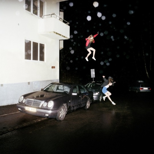
Placebo, “A Place for Us to Dream”

Placebo, “A Place for Us to Dream”
Elevator Lady
Photographer: Richard Lam
On June 15, 2011, the Vancouver Canucks were facing off against the Boston Bruins in the final game of the Stanley Cup on their home turf. A two block, six lane fan zone was set up where close to 100,000 fans were hanging out, tailgating, and watching the game. At approximately 7:45pm, as the game started winding down to the Canucks imminent defeat, a riot began to ensue. Porta-potties were knocked over, cars were flipped and set on fire, windows were broken. Although there were 140 non-fatal injuries, no one was killed during the riots.
During this madness, photographer Richard Lam was out with his camera to capture moments of the aftermath of the Stanley Cup. He took what would become one of “the most compelling sports images” in years, according to Sports Ilustrated. It was a couple kissing on the ground, surrounded by police, as the riot ensued behind them. It would be the image that would grace the cover of Placebo’s twenty year retrospective, A Place for Us to Dream, five years later.

The couple in the photograph was Canadian woman Alexandra Thomas, and her Australian boyfriend, Scott Jones. Thomas was knocked down by police during the riots. She was shaken up, while Jones was comforting her as she lay on the ground.
The image is, in a sense, the essence of Placebo’s music over the past twenty years: finding love and intimacy in the crazy, violent world we all live in.
As of 2015, the kissing couple is still together. And they sleep with a framed print of the iconic image above their bed.
youtube
#placebo#alternative#2010s alternative#britpop#photography#richard lam#vancouver riot#stanley cup#art#graphic art#album cover
7 notes
·
View notes
Text
Garbage, “beautifulgarbage”

Garbage, beautifulgarbage (2001)
Almo Sounds/Interscope Records
Designer: Me Company
Garbage’s 2001 record, beautifulgarbage, took the band in a more pop direction compared to their electronic and grunge influenced Garbage and Version 2.0 albums. At the time, the band were at the peak of their career: they were coming up a massive world tour supporting their Version 2.0 album and expectations were at an all time high for their new album. They had major label backing and they pulled all the stops when it came to marketing for beautifulgarbage.
For the album artwork, the band wanted the art to feel more organic. For their prior two releases, they hand assembled much of the artwork, but this time, the label spent a massive $75,000 on the look for the album. They teamed up with Paul White’s Me Company, took the band’s idea of a fractured rose and created the album cover.

Garbage released a special deluxe edition of the album, which features a hexagonal card stock sleeve that opens through a spiral in the center. It houses a special shaped booklet with lyrics and notes from the band, and showcases more of the fractured/pixelated flower from the standard album cover.

Keeping in tune with the style of the cover, the accompanying single releases featured more “fractured” artwork, including lead single “Androgyny” and “Cherry Lips” which featured distorted cherries and stilettos, respectively.
youtube
#garbage#beautifulgarbage#cherry lips#2000s rock#2000s alternative#2001#pop#shirley manson#me company#paul white#graphic design
2 notes
·
View notes
Text
Björk, “Post”

Björk, Post (1995)
One Little Indian Records
Photography: Stéphane Sednaoui
Design: Paul White
Much of the imagery reflected in the artwork for Icelandic singer-songwriter, Björk’s Post artwork, symbolizes the isolation and homesickness she felt while writing and recording the record. After the success of her breakthrough record, Debut in 1993, she moved to England. During this time, she was longing for her friends, relatives, and possessions from home. The colorful, blurred background symbolizes postcards, and a tumbling house of cards that represented her emotional state at the time.

In that sense, the art for Post takes on a literal meaning. Björk is standing still in the center wearing white, with a braid around her neck that represents the color of Royal Mail. The record is a literal postcard to her homeland of Iceland, something she always kept in the back of her head while writing.
The photograph on the cover was taken by her then-boyfriend Stéphane Sednaoui, with the design handled by Paul White and the Me Company. White had frequently collaborated with Björk during her time with the Sugarcubes. The lotus flower in the booklet’s packaging was modeled by Martin Gardiner.

The original cover was photographed by Jean Baptiste-Mondino. The image was scrapped and later appeared in The Face. The £24,000 shoot showed the singer surrounded by silver balls. The cover was rejected because she wanted something “more poppy.” Of the change, she said in The Face interview, “Now I know what I want. OK, I admit it…I’m a pop star.”
youtube
#Bjork#Björk#Post#1995#90s#90s pop#90s music#Army of Me#Photography#Graphic Design#Paul White#jean baptiste mondino#Me Company
3 notes
·
View notes
Text
David Bowie, “Aladdin Sane”

David Bowie, Aladdin Sane (1973)
Photographer: Brian Duffy
RCA Records
One of the most iconic images of David Bowie is the artwork for his sixth studio album, Aladdin Sane. Brian Duffy took the photograph in the second of five sessions with the legendary artist, and it quickly would go on to become one of the most famous photographs ever taken.

Bowie’s manager, Tony Defries, had a specific reason in mind for hiring Duffy to photograph the image. He says, “I was looking for an iconic cover image and artwork that would help me to persuade RCA that Bowie was sufficiently important to warrant megastar treatment and funding, in order to propel him to exactly that status.”

Tony Defries recalls the conception of the iconic thunderbolt that covered Bowie’s face on the cover in the book, Duffy/Bowie. Surprisingly, it was inspired by the logo on a rice cooker that they had in the studio kitchen. Duffy took the initial shape of the design on his face, and his assistant Pierre Laroche, filled it in with lipstick. An hour later, the iconic lighting bolt was formed.
Brian Duffy’s son, Chris, took over archiving his father’s work after his passing:
“Eventually we have all got to pass on, but I would guess that David’s legacy will be the Aladdin Sane picture. It has become a cultural icon. Several years ago I started calling it the Mona Lisa of Pop. I think it is quite befitting – there isn’t really an image that is as ubiquitous. It’s been on used fridge magnets, caps, calendars, t-shirts, lighters, beer mats and it is quite extraordinary, you know? You can go somewhere like a market in Goa and you will find people selling rip off Aladdin Sane T-shirts.”
youtube
#david bowie#aladdin sane#artwork#photography#brian duffy#makeup#makeup art#iconic#1970s#70s#rock#bowie
3 notes
·
View notes
Text
Radiohead, “OK Computer”

Radiohead, OK Computer (1997)
Parlophone/Capitol
Art Direction: Stanley Donwood and Thom Yorke
Radiohead frontman Thom Yorke (under the pseudonym, “The White Chocolate Farm”) collaborated with Stanley Donwood for the artwork for OK Computer, the band’s third studio album. Donwood had done the band’s previous artwork for The Bends and would go on to work with the band on all of their studio albums after.

To provide an adequate sense of the themes on the album and the band’s mindset, Yorke commissioned Donwood to create a visual diary so he could get a visual representation. Donwood used a “bleached bone” color scheme on the album art, dominated by shades of blue and white. Cityscapes, motorways, and corporate logos are visual motifs that appear prominently on the cover. Though not confirmed, it’s speculated that the image of the motorway was taken in Hartford, Connecticut.

The artwork of OK Computer gave birth to a widely recognized Radiohead logo: the motif of two stick figures sharing hands. It was featured in the booklet and on the CD image. According to Yorke, it represents exploitation: “Someone’s being sold something they don’t really want, and someone’s being friendly because they’re trying to sell something.”

#radiohead#ok computer#art#graphic design#photography#stanley donwood#thom yorke#1990s rock#1997#indie rock#indie#alternative
5 notes
·
View notes
Text
NEW ART: Miley Cyrus, “Younger Now”

Miley Cyrus has unveiled the retro-styled artwork to her upcoming album, Younger Now. The art is definitely a signal of the reinvention Miley has teased in recent singles, “Malibu” and “Inspired.”
The record drops September 29th.
1 note
·
View note
Text
NEW ART: Brand New, “Science Fiction”
After years of delay and teases, Brand New have announced their fifth album, Science Fiction. The cover was shot by Swedish photographer Thobias Fäldt. Brooklyn based studio, Morning Breath, Inc., handled packaging design for the release.
The album is set for release in October in physical editions, but can be purchased digitally on the band’s webstore now.
2 notes
·
View notes
Text
NEW ART: Fifth Harmony, “Fifth Harmony”

Fifth Harmony have gone full pop-art in the artwork for their upcoming self-titled album. Fifth Harmony drops August 25th.
3 notes
·
View notes
Text
NEW ART: P!NK, “Beautiful Trauma”

On the eve of the premiere of her new single, “What About Us?”, P!nk has unveiled the title, cover art and release date of her highly anticipated seventh album. Beautiful Trauma drops on October 13th.
3 notes
·
View notes
Text
NEW ART: Nine Inch Nails, “Add Violence EP”

Nine Inch Nails are releasing the second of their EP trilogy digitally on July 21st, with vinyl and CD releases to follow. Add Violence follows December’s Not The Actual Events EP. The art is above, and is now available for preorder.
7 notes
·
View notes
Text
NEW ART: Circa Survive, “The Amulet”

Circa Survive have just announced their new album, The Amulet. Like all of their previous releases, the art has been done by Esao Andrews. The art above appears to be standard, while the image below appears on the band’s webstore on some vinyl packages, with a black letterpress included.
The album drops September 22nd.

57 notes
·
View notes
Text
Sia, “This is Acting”

Sia, This is Acting (2016)
Monkey Puzzle Records
Art Direction: Sia Furler
Believe it or not, Sia Furler has a face. It’s a strange concept for people, but the veteran singer/songwriter has issued not one, but three albums already with her face on it. Googling is hard. Something that’s even harder to believe: yes, that IS Sia’s face on the cover of her seventh album, This is Acting.
Furler’s face was digitally distorted. Her neck was elongated, eyes widened, and tape placed across her nose. It’s an unsettling image, but the photomanipulation plays into Sia’s “acting” theme of the record.

Sia also developed the handwritten font used in the album, from the album title to the liner notes.
Towards the end of 2016, This is Acting was reissued with Sia’s muse, Maddie Ziegler, on the cover. Ziegler was used in many of Sia’s videos including the reissue’s single “The Greatest” as well as “Cheap Thrills.” Ziegler is seen with rainbow paint smeared across her face in a video still from “The Greatest,” which Sia wrote in response to the Pulse nightclub shooting. The album’s text is also given a rainbow gradient on the front, with this gradient used throughout the booklet and disc art.

youtube
3 notes
·
View notes
Text
NEW ART: Tyler, the Creator “Scum Fuck Flower Boy”

Today, Tyler, the Creator announced his new album, Scum Flower Fuck Boy, or the G-rated, Flower Boy. He released two album covers to go along with it, one by Eric White (above) and one by Tyler himself (below).

Which cover do you like best? Will you be checking out Tyler’s new album?
0 notes
Text
NEW ART: Kesha, “Rainbow”

After a tumultuous couple of years, Kesha is gearing up to release her third album, Rainbow on August 11th. She bares it all in the cover art above.
Are you excited for Kesha’s comeback?
0 notes
Text
NEW ART: St. Vincent, “New York - Single”

St. Vincent surprised us by releasing a new track last Friday, titled “New York.” What do you think of the song?
1 note
·
View note
Text
NEW ART: Garbage, “No Horses - Single”

Garbage are releasing a new track before their summer trek with Blondie. “No Horses” drops July 14th. The art is above.
0 notes
Text
NEW ART: The Horrors, “V”

The Horrors have announced their latest record, V, set for release on September 22, 2017. Above is the art, designed by Big Active with the art by Erik Ferguson.
2 notes
·
View notes