
Branding and packaging design specialist. Designing success for businesses and their products
Don't wanna be here? Send us removal request.
Statistics
We looked inside some of the posts by toddandersondesign and here's what we found interesting.
Average Info
Notes Per Post
14
Likes Per Post
14
Reblog Per Post
0
Reply Per Post
0
Time Between Posts
2 days
Number of Posts By Type
Photo
16
Text
1
Last Seen Tumblr Blogs


Fun Fact
Tumblr posted its first advertisements in May 2012 and subsequently earned $13M in revenue.
Photo

LithaFlora by Todd Anderson Design. The ‘Litha’ brand, (pronounced lee-tah) which means ‘star’ in Zulu, required packaging for tea blends, bath salts and cleansing bars. Created to look both high-end and to imply the health benefits of the products, the packaging needed to also be easily transferable across the range of different packaging vessels #design #packaging #branding #bestofpackaging #packagingdesign #logodesign #lovedesign #logo_showcase #packaginglove (at Cape Town, Western Cape) https://www.instagram.com/p/CGt6V8EBeXa/?igshid=17d0472ydpha1
#design#packaging#branding#bestofpackaging#packagingdesign#logodesign#lovedesign#logo_showcase#packaginglove
6 notes
·
View notes
Photo

A fantastic read for entrepreneurs. Pavlo Phitidis @pavlop book 'Sweat, Scale, Sale' is a super guide into running a successful business. (at Cape Town, Western Cape) https://www.instagram.com/p/CGfyZI4BwPC/?igshid=1c10uf8wkbw45
0 notes
Photo

Sketchbook packaging design by Todd Anderson. #design #branding #packaging #logo #logodesign #designstudio #graphicdesign #bestofpackaging #bestofpack #beauty #beautypack #packagingdesign (at Cape Town, Western Cape) https://www.instagram.com/p/CGeQWQuB3hm/?igshid=1jghnd0br1wba
#design#branding#packaging#logo#logodesign#designstudio#graphicdesign#bestofpackaging#bestofpack#beauty#beautypack#packagingdesign
0 notes
Photo
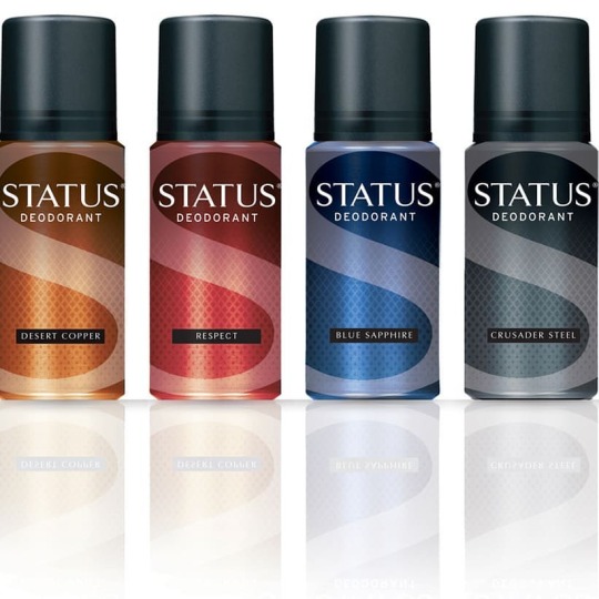
Concept design work for Status, by Todd Anderson. #design #branding #packaging #logo #logodesign #graphicdesign #brand #bestofpackaging #bestofpack #formen #logotastic #logo_showcase #packaginglove #packaginglover (at Cape Town, Western Cape) https://www.instagram.com/p/CGNT8ZjBwQA/?igshid=133ggzgzax8u3
#design#branding#packaging#logo#logodesign#graphicdesign#brand#bestofpackaging#bestofpack#formen#logotastic#logo_showcase#packaginglove#packaginglover
2 notes
·
View notes
Photo
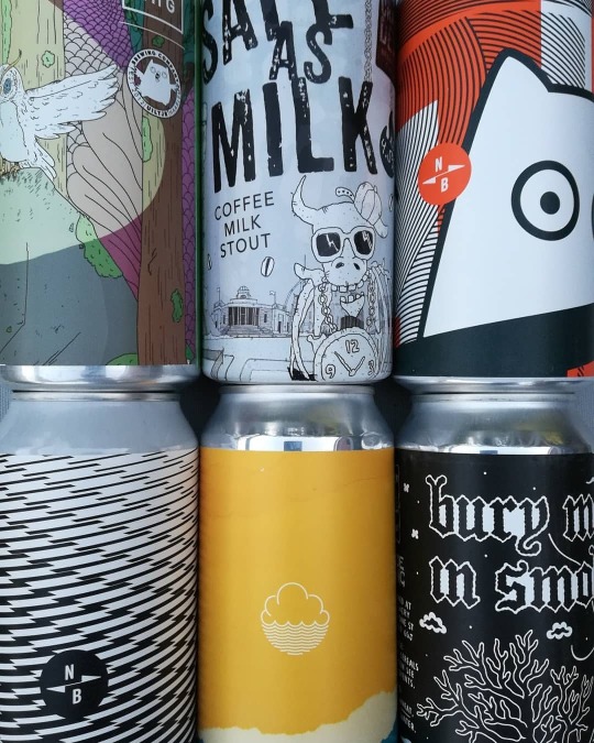
It's always great to imerse yourself in research for a project... This one within the craft beer industry was one of my favourites... For me, some of the most incredible packaging design is currently being produced within the craft beer market. The use of pattern and illustration is second to none. There are risks being taken with design that are just not being seen in other markets. The sheer surprise and delight that these designs are awarding is just breathtaking, on both an aesthetic and technical level. Take the examples featured here from Kraft Werk in Nottingham. There are tin/cans that are labelled to look like they are printed. Furthermore they are digitally printed so are produced in lower volumes. If you read any of the packaging press right now, all the innovation and risk is coming from smaller businesses, doing lower volumes digitally. These designs feel uninhibited by the might of the large retail brands. There’s a freshness of design that just can’t be matched. Not only are these labels printed digitally but some have a matt finish that give you a wonderful tactile experience. In my upcoming posts I want to examine this phenomenon in craft beer packaging further. There’s some stunning, risky design here that can only but inspire. Hope you enjoy the visual… I’m sure what’s inside will also be equally amazing!!! #packagingdesign #packaging #branding #logotastic #logo #design #brand #beer #craftbeer #bestofpackaging #bestofpack #logodesign (at Cape Town, Western Cape) https://www.instagram.com/p/CGNB5X2Bdv3/?igshid=17036dstlgptj
#packagingdesign#packaging#branding#logotastic#logo#design#brand#beer#craftbeer#bestofpackaging#bestofpack#logodesign
1 note
·
View note
Photo

With its high end African look and feel, Todd Anderson's work for Ledi Gin has become a stand out on shelf. (at Cape Town, Western Cape) https://www.instagram.com/p/CGJ4nBRh7ZC/?igshid=174r8d2sl8s1q
0 notes
Photo

It's always great to imerse yourself in research for a project... This one within the craft beer industry was one of my favourites... For me, some of the most incredible packaging design is currently being produced within the craft beer market. The use of pattern and illustration is second to none. There are risks being taken with design that are just not being seen in other markets. The sheer surprise and delight that these designs are awarding is just breathtaking, on both an aesthetic and technical level. Take the examples featured here from Kraft Werk in Nottingham. There are tin/cans that are labelled to look like they are printed. Furthermore they are digitally printed so are produced in lower volumes. If you read any of the packaging press right now, all the innovation and risk is coming from smaller businesses, doing lower volumes digitally. These designs feel uninhibited by the might of the large retail brands. There’s a freshness of design that just can’t be matched. Not only are these labels printed digitally but some have a matt finish that give you a wonderful tactile experience. In my upcoming posts I want to examine this phenomenon in craft beer packaging further. There’s some stunning, risky design here that can only but inspire. Hope you enjoy the visual… I’m sure what’s inside will also be equally amazing!!! #packagingdesign #packaging #branding #logotastic #logo #design #brand #beer #craftbeer #bestofpackaging #bestofpack #logodesign (at Cape Town, Western Cape) https://www.instagram.com/p/CF-RBcfhSvi/?igshid=9go9v4jgpus1
#packagingdesign#packaging#branding#logotastic#logo#design#brand#beer#craftbeer#bestofpackaging#bestofpack#logodesign
0 notes
Photo

It's been super to receive such positive feedback for the recent work on Evelyn's. We've seen interest from a number of large retailers and food manufacturers. Watch this space to see what's next for Evelyn's! #bestofpackaging #fooddesign #foodpackaging #design #toddanderson #branding #brand #logotastic #logo #food #packaging (at Cape Town, Western Cape) https://www.instagram.com/p/CF-P-Sbh8eL/?igshid=kngb1smzyq3a
#bestofpackaging#fooddesign#foodpackaging#design#toddanderson#branding#brand#logotastic#logo#food#packaging
0 notes
Photo

It's always great to imerse yourself in research for a project... This one within the craft beer industry was one of my favourites... For me, some of the most incredible packaging design is currently being produced within the craft beer market. The use of pattern and illustration is second to none. There are risks being taken with design that are just not being seen in other markets. The sheer surprise and delight that these designs are awarding is just breathtaking, on both an aesthetic and technical level. Take the examples featured here from Kraft Werk in Nottingham. There are tin/cans that are labelled to look like they are printed. Furthermore they are digitally printed so are produced in lower volumes. If you read any of the packaging press right now, all the innovation and risk is coming from smaller businesses, doing lower volumes digitally. These designs feel uninhibited by the might of the large retail brands. There’s a freshness of design that just can’t be matched. Not only are these labels printed digitally but some have a matt finish that give you a wonderful tactile experience. In my upcoming posts I want to examine this phenomenon in craft beer packaging further. There’s some stunning, risky design here that can only but inspire. Hope you enjoy the visual… I’m sure what’s inside will also be equally amazing!!! #packagingdesign #packaging #branding #logotastic #logo #design #brand #beer #craftbeer #bestofpackaging #bestofpack #logodesign (at London, United Kingdom) https://www.instagram.com/p/CF9rtSxB8Iz/?igshid=1jd1qjmm4b8zy
#packagingdesign#packaging#branding#logotastic#logo#design#brand#beer#craftbeer#bestofpackaging#bestofpack#logodesign
1 note
·
View note
Photo

It's always great to imerse yourself in research for a project... This one within the craft beer industry was one of my favourites... For me, some of the most incredible packaging design is currently being produced within the craft beer market. The use of pattern and illustration is second to none. There are risks being taken with design that are just not being seen in other markets. The sheer surprise and delight that these designs are awarding is just breathtaking, on both an aesthetic and technical level. Take the examples featured here from Kraft Werk in Nottingham. There are tin/cans that are labelled to look like they are printed. Furthermore they are digitally printed so are produced in lower volumes. If you read any of the packaging press right now, all the innovation and risk is coming from smaller businesses, doing lower volumes digitally. These designs feel uninhibited by the might of the large retail brands. There’s a freshness of design that just can’t be matched. Not only are these labels printed digitally but some have a matt finish that give you a wonderful tactile experience. In my upcoming posts I want to examine this phenomenon in craft beer packaging further. There’s some stunning, risky design here that can only but inspire. Hope you enjoy the visual… I’m sure what’s inside will also be equally amazing!!! #packagingdesign #packaging #branding #logotastic #logo #design #brand #beer #craftbeer #bestofpackaging #bestofpack #logodesign (at Cape Town, Western Cape) https://www.instagram.com/p/CF60dcnBdog/?igshid=eycm0l4ym0yu
#packagingdesign#packaging#branding#logotastic#logo#design#brand#beer#craftbeer#bestofpackaging#bestofpack#logodesign
0 notes
Photo

Status, designed by Todd Anderson. #design #branding #packaging #logo #logodesign #graphicdesign #brand #bestofpackaging #bestofpack #formen #logotastic #logo_showcase #packaginglove #packaginglover (at Cape Town, Western Cape) https://www.instagram.com/p/CF2eX_xBfID/?igshid=xbwix0gcwocg
#design#branding#packaging#logo#logodesign#graphicdesign#brand#bestofpackaging#bestofpack#formen#logotastic#logo_showcase#packaginglove#packaginglover
0 notes
Photo

Before and after the redesign. Status, designed by Todd Anderson. #design #branding #packaging #logo #logodesign #graphicdesign #brand #bestofpackaging #bestofpack #formen #logotastic #logo_showcase #packaginglove #packaginglover (at Cape Town, Western Cape) https://www.instagram.com/p/CF2IptRhCT_/?igshid=e0f9o3mlm5ux
#design#branding#packaging#logo#logodesign#graphicdesign#brand#bestofpackaging#bestofpack#formen#logotastic#logo_showcase#packaginglove#packaginglover
1 note
·
View note
Text

Evelyn's, designed by: toddandersondesign.com
1 note
·
View note
Photo

Status, designed by Todd Anderson. #design #branding #packaging #logo #logodesign #graphicdesign #brand #bestofpackaging #bestofpack #formen #logotastic #logo_showcase #packaginglove #packaginglover (at Cape Town, Western Cape) https://www.instagram.com/p/CFz3zVzhZTu/?igshid=gwrefgupb1mt
#design#branding#packaging#logo#logodesign#graphicdesign#brand#bestofpackaging#bestofpack#formen#logotastic#logo_showcase#packaginglove#packaginglover
1 note
·
View note
Photo

I thought this was clever branding. New work from JKR design. I also like the simple back of pack! #packagingdesign #packaging #branding #logotastic #logo #design #graphicdesign https://www.instagram.com/p/CFX0HXnBFIB/?igshid=p3ye9v86x831
0 notes
Photo

Point of sale designed by Todd Anderson. #design #beauty #pointofsale #retaildesign #bestofpackaging #bestofpack #toddanderson #typography #toddandersondesign #soap #packaging #packagingdesign (at Cape Town, Western Cape) https://www.instagram.com/p/CFXVCgJhkxL/?igshid=7vmw1vhldac1
#design#beauty#pointofsale#retaildesign#bestofpackaging#bestofpack#toddanderson#typography#toddandersondesign#soap#packaging#packagingdesign
0 notes
Photo

This was a super project to be involved with, working with Woolworths in South Africa. African Spa. #design #branding #packaging #logo #logodesign #graphicdesign #packagingdesign #bestofpackaging #bestofpack #beauty #beautypack (at Cape Town, Western Cape) https://www.instagram.com/p/CFXPqAkByO5/?igshid=m6kggc4whs4v
#design#branding#packaging#logo#logodesign#graphicdesign#packagingdesign#bestofpackaging#bestofpack#beauty#beautypack
1 note
·
View note