
typingquirk
Typingquirk
25/f
My name is Miranda, and I paint my nails a lot. That's pretty much it.
Mostly just swatches, but sometimes I get a little frisky with stamping!
27 posts
Don't wanna be here? Send us removal request.
Last Seen Blogs

tomiji
suzie

glompe
hi

idk-justmelol
just me i guess

heartissilly
Heart!!

lifeisablackhole9
God is testing me, and I’m about to fail
Text
Femme Fatale Poison Garden Trio
-Valentine’s Day 2019
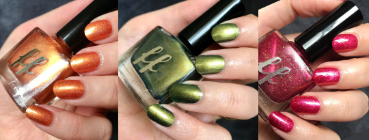
Today I’ve got a lovely trio to share- the 2019 installment of Femme’s Fatale’s annual Valentine’s Day trio! This year the theme was poison garden, and I’m in love with the aesthetics of this trio- not to mention that it’s super refreshing to see some Valentine’s polishes that aren’t strictly pink!

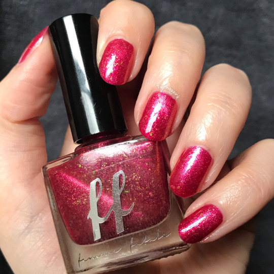
Bloodflower- A golden orange holographic with red iridescent flakes and fine silver holographic flakes.
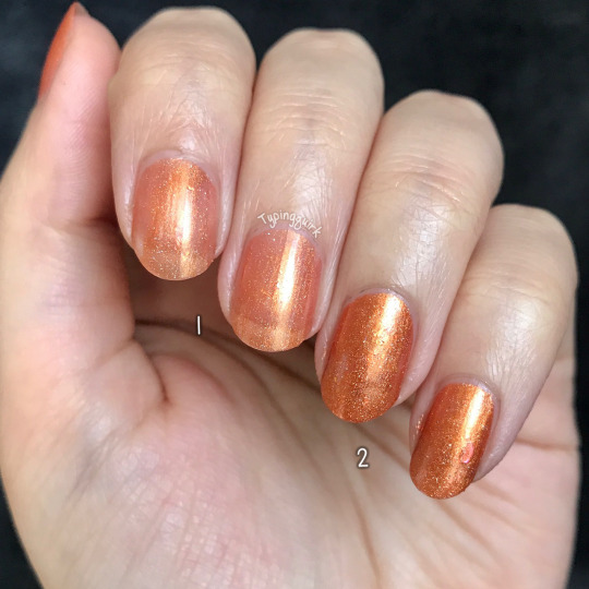
I LOVE a good orange; I feel like it’s a color that isn’t often tackled, and this one is perfect! This polish was opaque in two coats! It’s also one of those neat polishes that looks totally different in sunlight and low lights; in the sun it’s basically a crazy linear holo, and in lower lights (which I wasn’t able to capture on camera because of lighting that day) the flakies really come out to play while the holo gives it a shimmery base.
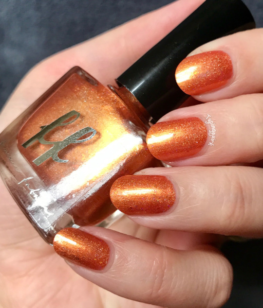
It’s also gorgeous with a matte topcoat, shown above! Some colors I can only see myself wearing in certain seasons, but this is an orange I could wear all year round.

Lobelia- An earthy, foresty green foil with a slightly tealish base; and aqua shimmers.
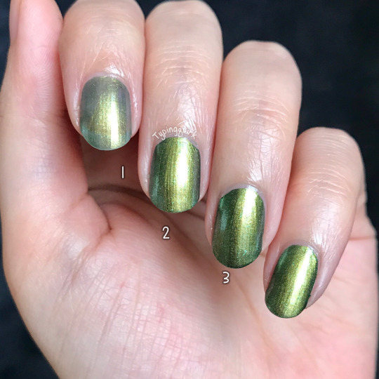
I had trouble capturing the little blue shimmers in this one (you can kind of see them on the bottle in some pics) but it’s a gorgeous, shimmery green. It was mostly opaque in 2 coats, though I did need a 3rd to really cover my nail line and deepen the color.
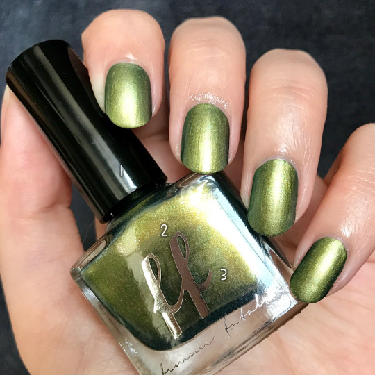
I did notice that this polish had some brush streaks, but I personally didn’t find them distracting and I don’t think it takes away from the overall appearance! Shown above with a matte top coat.
Laceleaf- Juicy raspberry pink jelly with pink-gold shifting magnetic shimmer and green iridescent flakies.
So... I had a lot of trouble with Laceleaf. It’s a gorgeous polish, but I had one hell of a time getting the magnetic effect to show up on my nails, even applying all of the usual tricks and going above and beyond (shaking between every coat, extra thick coats, holding the magnet over until it was bone dry... you get the idea.) No dice. It magnetized wonderfully on the bottle, but I couldn’t get the effect to show up on the nail AT ALL. I was initially using my Tonic magnets which have worked beautifully, but they just weren’t cutting it.
I didn’t want to buy a bunch of new magnets when the ones I already had worked on everything else, but I caved and bought that crazy super magnet that people have been raving about, and had MUCH better results. Sometimes special products need special tools, and this one needed the big guns!
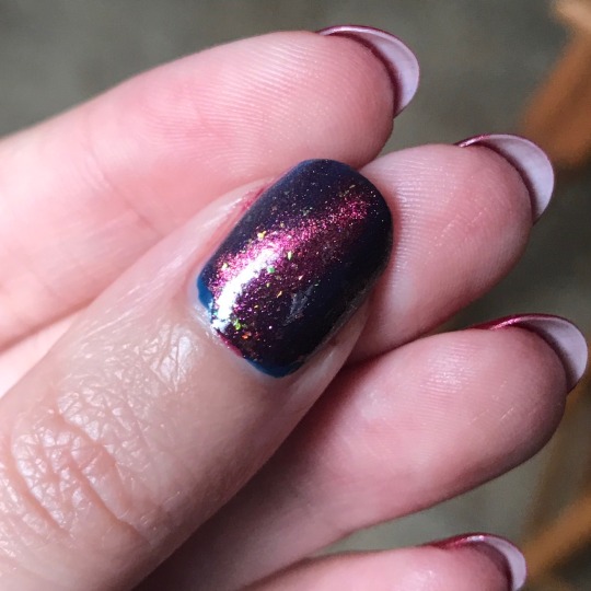
Unfortunately, I don’t have pictures of the manicure using the jumbo magnet- I only have natural lighting and an iPhone available to me, and even tho I could see it on the nail, I couldn’t capture the magnetic effect in pictures. The magnetic color is just too close to the base color for my camera to pick up when it’s also being blown out by my lighting :( However, I did have the thought to do a quick swatch of one coat of Laceleaf over a dark base, and it shows off the magnetic effect SO MUCH BETTER! Please forgive me for only having a quick & dirty thumb swatch; I’d already done 3 manis while messing with different magnets and I wasn’t interested in doing a fourth all in one week lol. I would definitely suggest people try this one out as a topper too! I think it has a lot of potential.
There’s been many times where I’ve said that I feel like my pictures don’t do the polish justice, and this is definitely the worst of them all lol. This is the first time I’ve really felt disappointed by what I was able to capture, but that’s 100% on me, and not on the polish.
All of that aside, this is a delightful trio and I’m pleased with my purchase! Like what you see? This trio is no longer available on Femme Fatale’s website (it was a one time presale) but should be coming to their various stockists in the near future :) I’d recommend reaching out to your favorite stockist to see if they’ve ordered it!
Femme Fatale Cosmetics
International Stockists List
#femme fatale#femme fatale cosmetics#nail polish#nails#indie polish#indie makeup#aussie indies#aussie indie polish#pink#red#green#orange#holo#holographic#Holographic nails#flakies#magnetic#magnetic nails#magnetic polish#valentine's day#natural nails#nails of the day#manicure#mani#manicure of the day#mani monday#beauty#beauty post#beauty blogger
0 notes
Text
Femme Fatale Psychokinetic

I’m finally back home after the holidays and have two months of polish to play with! So today I’m taking a look at Femme Fatale Psychokinetic from November’s HHC- better late than never, right?
This bold, kooky polish was the second to last installment in the brand’s Stranger Things theme!

Psychokinetic- a clear (warm) to teal (cold) thermal with soft pink sparkles, scattered holographic silver microglitters, and a variety of matte/neon glitters in orange, yellow, purple, teal and pink.

These days I’m honestly not super into chunky glitter bombs. I’m also not super into anything that boasts a clear base because of that prominent nail line I like to complain about. But there was something about this thermal that really drew me in, and I had to give it a chance anyways- it was just so weird lol. And you know what? I’m super freaking impressed and totally in love.

The base is definitely clear, but a cloudy kind of clear that hides my VNL super well- I honestly wasn’t expecting to like the warm state so much, but I actually love it just as much as the cold and transition colors! Pictures show 4 coats + topcoat, I forgot to take a picture of layer build-up this time, sorry! Most people could probably stop at 3 coats, but I really needed that last one to put my VNL in it’s place lol. I did need an extra layer of topcoat to smooth out the glitters, but that’s just how it goes when you’ve chunky ones like this.

And did I mention that it’s absolutely STUNNING matte? This polish is so bold and funky and I loved it as a shinny jelly; usually I only really like flakie or shimmer polishes matte, but I LOVE the frosted effect this has on the warm state. I might just have to start mattifying everything!
Like What you see? Unfortunately this shade is no longer available for purchase, but you might be able to find it in some destash groups! If you’d like to check out other offerings from Femme Fatale of HHC’s upcoming selection for February, you can check out their websites below!
Femme Fatale Cosmetics
Hella Handmade Creations
#nail polish#manicure#manicure of the day#femme fatale#femme fatale cosmetics#hhc#helle handmade creations#indie polish#indie makeup#indie cosmetics#aussie indies#beauty#beauty blogger#nails#nail blogger#neon nails#teal#pink#yellow#green#red#glitter#white#thermal#thermal nails#thermal polish#natural nails#nails of the day
0 notes
Text
Lucky 13 Lacquer Fear of the Unknown

Today I’ve got something really cool to share! I was asked to swatch Lucky 13 Lacquer’s contribution for the upcoming mythology themed Polish Pickup for January, and had so much fun figuring out how to capture this gorgeous tri-thermal (a first for me!)

Anya drew inspiration from Cthulu, and the shifts of this thermal perfectly emulate this creepy inspiration picture! I love just about everything inspired by the various elder god mythos, and this is no exception.

Fear of the Unknown- Tri-thermal that changes from neon green (warm) to grass green (cool) to dark forest green (cold) with pink/gold/green color-shifting flakes, peridot-rose color-shifting shimmer, and little blue-purple iridescent hexes.

I swatched this one while visiting family for the holidays, so I wasn’t able to do a layer-by-layer build-up shot, sorry! It was perfectly opaque in 2 coats. I had a bit of trouble capturing the middle state of this thermal (it was a learning experience!) because it’s constantly shifting and changing! This polish is so sensitive, and was different every time I glanced at my hands.

It’s hard to say which half of the color shift I prefer the most; I’m a sucker for neon greens and there’s something special about the delicate warm-cool shift, but the cool-cold side of things is so rich and a perfect set of jewel tones for winter. My family usually is not very keyed into my nail hobby, but this polish drew a TON of attention over the holidays!

Like what you see? This Polish Pickup exclusive shade is available from January 4th to 7th for $13 and has a cap of 90 bottles, so have your ninja fingers ready!
Polish Pickup
You can check out the rest of Lucky 13 Lacquer’s offerings on their home site, too!
Lucky 13 Lacquer
#prsample#pr sample#nail polish#indie polish#lucky 13 lacquer#thermal nails#thermal polish#nail swatch#green#neon#neon nails#green nails#beauty#beauty blogger#beauty post#nail blogger#natural nails#nails of the day#mani#manicure#manicure of the day#manimonday#mani monday#flakies#iridescent#iridescent nails#polish pickup#ppu#trithermal#tri-thermal
0 notes
Text
Femme Fatale The Black Empire

Today I’m showing off The Black Empire, the Femme Fatale “Fiend of the Month” from October! The FoTM polishes are a secondary CoTM (availuible only to members of their FB group) based on user-submitted inspiration photos.
In October they actually did two FoTM/CoTM sets, and this beauty was part of the “Pagan Gods” duo, based on this crazy image of the Black Empire from World of Warcraft:

The Black Empire- a deep purple base with scattered holo, and red-green iridescent flakies.

This polish was mostly opaque in 2 coats, tho I did need a third to even out some smudges and really deepen the base color. I’m all about using extra layers for flakies polish tho, because I really love how the depth they get layered!

The flakies in this polish typically pull a bright red, but I got lucky (or unlucky, depending on your preference) and wasn’t able to get any pictures of just the red, even tho that’s how it normally presents! So hopefully you’ll enjoy the effect of the full color spectrum this polish has to offer :)

This polish is not longer availible, but if you want a chance to grab any future FoTM colors (and participate in suggestions and voting!) you should head on over to the Femme Fatale Fiends FB group. In general you can purchase at their website
Femme Fatale Cosmetics
Or at one of their several lovely stockists (linked on their website) all over the world.
#femme fatale#femme fatale cosmetics#aussieindies#aussie indies#aussieindiepolish#aussie indie polish#nail polish#indie polish#purple#purple nails#holo#holographic#holographic nails#iridescent#iridescent nails#nails#manicure#mani#nails of the day#manicure of the day#manimonday#flakies#flakie polish#natural nails#indie swatch#nail swatch
0 notes
Text
Emily de Molly Group Exclusives

I haven’t used this blog in a billion years (life got nuts and it turns out makeup is more of an occasional thing for me,) but now that I’ve got a ton of free time on my hands while I wait for our big overseas move, I thought it’d be fun to play around with the blogging again! I’ve been posting my polish swatches and little write-ups on Instagram for almost 2 years anyways, so it should be a pretty easy transition into doing both!
I recently got my hands on 2/3 of the new Emily de Molly FB group exclusives, and thought that would be a fun place to start since I got to name one of them ;)
Swatches & review under the cut!

First up is Beyond The Horizon- a deep purple/burgundy base with blue-purple multichrome foil shimmer, and a stunning orange magnetic effect!

I typically think a lot of magnetic polishes are kind of gross looking in their un-magnetized state, but this one is actually quite pretty; the shimmer effect isn’t quite as strong, but it has a nice speckled appearance and isn’t muddy looking. And of course it’s even more stunning once you apply a magnet!

This polish was very opaque, tho I did need a second coat to even things out when wearing it un-magnetized. For the final effect I only used the magnet on the top layer.

Symbiosis- this thermal polish shifts from a peachy nude (warm) to teal (cold), with a smattering of holo microglitters and topped off a warm copper shimmer!

This polish was opaque in 3 coats; above you’ll see the buildup per coat in the warm state.

This was also the color I got to name! The exclusives themselves were based on images submitted by members of the FB group, so Hayley thought it would be fun to let members suggest names, too! The inspo pic behind this beauty with an ocean sunset, and the contrasting colors reminded me of sea anemones and clownfish- hence the name Symbiosis ;)

These gorgeous exclusives (and one other not shown here!) are only available to members of the Emily de Molly Fan Group on Facebook, and can be purchased on either of the store fronts:
Emily de Molly Australia
Emily de Molly US/International
#emilydemolly#emilydemollypolish#aussieindies#aussieindiepolish#indiepolish#nailpolish#magneticpolish#magneticnails#thermalpolish#thermalnails#purple#orange#blue#teal#peach#nude#shimmer#foil#holo#holographic#naturalnails#nailswatch#polishswatch#nailsoftheday#manicure#mani#manioftheday#manicureoftheday
0 notes
Photo

Shiro: The End is Nye - February 2016 CoTM
I love color of the month items, and I was really excited for this one! An awesome taupe-y eye shadow and Bill Nye? The only way it could be better is if it was all over my face.
Swatches & review under the cut!
Swatches were taken in overcast daylight over WnW Fergie Primer and PE.

The End is Nye: a fairly unassuming taupe in the jar, but rubs down to a smokey purpley-brown-bronze gleaming with metallic copper.
I was surprised by how grey this one pulled over just primer, but I definitely wasn’t complaining! I’ve been on the hunt for a good grey-taupe and I think this one will fit the bill. It’s also totally stunning over a sticky base- I wouldn’t necessarily call it metalic, but the copper shimmer is just gorgeous <3
One thing I noticed was the this color wasn’t as rich as the site swatch (which I’m honestly okay with) but I imagine that a similar effect could be achieved by either using extra sticky base, or applying the shadow before the base has properly dried down, but that does tend to sacrifice the quality of any shimmer.
#shiro cosmetics#shiro#cotm#shiro cotm#indie makeup#indie cosmetics#eyeshadow#swatches#brown#taupe#copper#grey#shimmer
2 notes
·
View notes
Photo

Shiro/Sunday Swap: You guessed it, Femme Fatale!
So this post is a little bit of a combination; two of these were purchased directly from Shiro, and two of these were purchased in the sunday swap. I felt kind of weird breaking them up since I bought three of these to use together, so, y’know ¯\_(ツ)_/¯
So here we go, Femme Fatale! Today I’ve got the coveted Alpine Skies, and then a lot of pretty green things to help satisfy the never-ending quest to own all of the WoW shadows.
Swatches & Review under the cut!
No shipping stuff this time; partially because some of these were second hand, partially because I’ve had them for a while so I don’t really remember, and partially because I just don’t want to. Shipping was reasonable and safe, the end lol.
Alpine Skies & Eternal Trance are from Shiro, and the Emerald Dream & Spark of Life minis are my swap treasures.
Swatches are done in daylight over Fyrinnae Pixie Epoxie and WnW Fergie Primer. Product pictures kind of look like butt because I was like “I’m just gonna do these in a little bit” and forgot that the sun starts setting at like 1:30, so, yeah. There’s that.

Alpine Skies: A super pale taupe with cool tones and prominent turquoise shimmer.
I have been lusting after this shade for so long; I was finally able to grab a sample in a destash a few weeks ago, and it just solidified that I needed this shadow in my life. I think it’s unique in that unlike other duochromes I own, when I buff it out over primer I just get a weird frosting of blue instead of the base color..
I love that the base is just a darker shade of my skin tone; in the right lighting it almost looks invisible and then BAM, GORGEOUS CYAN SHIMMER. Mostly I just see the cyan shift, but that’s probably because I usually look at my makeup in direct lighting. It’s a great “single shadow + crease color” shade.

Spark of Life: Soft leaf green with golden shimmer.
So as far as I can tell, this is an older/discontinued shade. I haven’t been able to find it on the site, but I’ve been it in some blog posts and various swatches. I grabbed it in a destash, but I haven’t really gotten around to investigating it’s origins because I’m lazy.
It’s super pretty though! It’s a little more vibrant in real life, and is just a gorgeous, warm green- like light shining through a little baby leaf. It looks great paired with Emerald Dream, which is good because that’s what I bought it for.

Emerald Dream: a bright paris green bordering on teal with a very subtle golden green shine.
Another shadow I’ve been trying to find for a long time! It’s another gorgeous gem to file under the “I love makeup and World of Warcraft” file. I love the subtle sheen to this one- it’s noticeable without being overpowering. It’s the cherry on top that really makes this color pop.
It reminds me of some of those “literally a mermaid” shades, but like, in a forest. A tree mermaid. A dryad, if you will. But like, a wet one. Maybe it rained.

Eternal Trance: a dark pine green with strong teal green shimmer.
Similar to Emerald Dream, Eternal Trance is the deeper layer in the canopy. It makes me think of the depths of a rain forest after a storm. These three greens together make such a lush gradient.
#swatches#femme fatale#femme fatale cosmetics#indie makeup#indie cosmetics#eyeshadow#green#teal#mint#cyan#blue#duochrome#shimmer#sunday swap
1 note
·
View note
Photo


Hello Waffle: The Forgottens
Today I’ve got the second and final part of my Hello Waffle purchase from Black Friday! I’m a huge sucker for grab bags (thought this is the first I’ve gotten my hands on) so when Christine announced that she would be offering mystery packs of colors that hadn’t made it to final production for one reason or another, I knew I had to get one.
The Forgotten colors were split into three different packs to avoid overlaps, and the only hints Christine gave were that two of the packs were warmer/rosier colors, while the third had cooler tones- otherwise it was a total mystery! I opted for pack #1, one of the warmer sets.
Swatches & Review under the cut!
Photos were taken in partly cloudy sunlight that wouldn’t make up it’s mind. Swatches are shown over Pixie Epoxie and WnW Fergie Primer. Colors descriptions for this set are my own, as there weren’t any official ones because, y’know, surprises!

#1: Deep blue with turquoise shimmer and magenta sparks.
I’m a huge sucker for dark blues, so I was really happy to see this color in my pack! It’s a little patchy even over a sticky base, and is reminiscent of Savior of Sailors. I LOVE the magenta sparkles, they’re such a unique touch! My favorite use for this kinds of blues is to buff them into my outer V, and since this one is a kind of weird blackened/ashey blurple over just primer, I don’t think I’ll be able to use it that way, but I’m looking forward to getting creative with it!

#2: Dusty plum taupe with a warm shimmer.
At first glance this one reminded me of Etherial Voice, but when you put them side by side I don’t think they’re very much a like. I’m not entirely sure how to describe this collor- it’s purple, it’s plummy, it’s taupe, but it’s also brown. I don’t know man. I think it’s very subtle and pretty, and might pair well with Shiro’s Yzma’s Essence of Llama.

#3: Soft rose-gold with a noticeable gold shimmer.
It wouldn’t be a Hello Waffle collection without a gorgeous rose gold! The lighting in the pictures make the base look a smidge more purple-leaning than it actually is. #3 is a classic, soft rose-gold; it’s almost ethereal and makes me think of warm fuzzy feelings.

#4: Metallic steel-blue.
This is a color that is almost completely unique to my collection- I think the only thing I have that’s similar is in a cheap LA Colors Pallet. I’m actually really excited to have #4 on my hands, because I loved the steel-blues from that pallet but didn’t care for the color pay-off or formula. I'll have to find a darker version of this color to pair it with for a nice smokey eye! Literally a combination that I’ve dreamed of but never actually gotten around to.

#5: Rich shimmery lavender.
This color reminds me so much of Of The Wildland! It’s not quite as bright and a little more blue-leaning, but the resemblance is definitely there. The payoff over just primer was especially bad over for this color, but it’s stunning over PE (and that’s honestly they only way I’d plan to use it, so SHRUG.) This color is gorgeous and fun, and even thought it’s not a flashing IN YOUR FACE purple I’m kind of intimidated by it because I’m a total baby about colors.

#6: Softest petal pink with pale gold sparks.
So, I’m not really a pink person. Like at all. But I really, really like this color. I wore it to work on Christmas Eve because I wanted a little bit of sparkle and was feeling a little playful (pale pink instead of peach? I’m such a risk taker) and was actually totally bummed because doesn’t look at pink on my eyelids as it did in my swatches! I think it’s just the combination of the soft gold sparkles and my eyelid being a much smaller space than my wrists, but it pulled pretty peachy. But now I’m apparently in love with pale pink and need to find the perfect mid-pink to pair #6 with to try and bring out that pink! Pink pink pink.
This color is so soft and delicate and UGH I just love it.
- - -
I love this set, and I couldn’t ask for a better first experience with a mystery grab-bag! These are all pretty sheer & patchy over just primer, which is fine because they’re all colors I would use over a sticky base anyways. I’m just so overjoyed that I was lucky enough to get a pack where just about everything will work for me in some way- I was expecting to get some duds that I wouldn’t really like, and honestly I don’t think I really did!
10/10 and now I’m hooked on grab-bags, save me from myself.
#hello waffle#hello waffle cosmetics#the forgottens#swatches#indie makeup#indie cosmetics#eyeshadow#shimmer#sparkle#pink#blue#navy#gold#purple#pastel#mettalic
0 notes
Photo

Hello Waffle: Kitty Kingdom 2015!
I’m super excited to share one of my Black Friday purchases with you guys today! November marks a year since I made my first indie purchase and started experimenting with makeup; I was enamored with the original Kitty Kingdom collection from last year, but was unable to purchase or participate at the time, but I’ve been looking forward to this year’s collection ALL. YEAR.
For those unaware, Christine from Hello Waffle has started a tradition of crafting a special Black Friday collection every year based on people’s furry (or not-so-furry) friends, and donating a portion of sales to the her local Humane Society- this year she raised over $1,300!
So basically this collection is everything I’ve ever wanted: pretty makeup and adorable animals, while helping some critters in need.
Swatches & Review under the cut!
There were a metric ton of products offered this year, but I managed to narrow down my purchase to 7 eyeshadows & 4 lip colors, plus the GWP (and a “forgottens” mystery pack, but that’s another post.) I love everything I got and honestly wish that I could have ordered more!
Swatches are taken in overcast daylight (I should really get a light box) over Pixie Epoxie and WnW Fergie primer.
As a side note, I couldn’t get good pictures of the labels on the lip colors, so I went ahead and snagged some pictures posted in the FB group so that they could also be enjoyed in their adorable glory :)

Baha: a golden brown with an orange duochrome.
I almost didn’t grab this color- I love browns, I have a ton of browns, I don’t need any more browns. But this brown.... this brown is rich and glowy and has an adorable lizard on the jar- just look at his little eye ridges! How could I say no to a face like that?
This is probably a good time to mention that the color descriptions are the original suggestions given to Christine and that the final products don’t always match 100%. Baha didn’t end up with an orange duochrome, but it does have some warm sparkle to it.

Freckled Nose: Shimmery brown with silvery pink shift and sparks
This color comes across SUPER purple for me over a sticky base; I loved the cool, frosty taupe-pink-purple thing that was going on with the site swatch, but in person it looks completely different to me- like a warm colored sister.

Jessica: a demure, reserved light purply-pink with a brilliantly unexpected flash of turquoise
This is such a delicate, ethereal color and was at the top of my list. It reminds me of a pink/purple version of FF Alpine Skies, but with a softer shift. I think this one would pair really well with some other colors from the collection, such as Dipper (which I sadly passed over and really really regret.)

Maddie: Shimmery black with pink shift and pink/silvery sparks.
I wouldn’t call this one black, but more of a blackened blurple color with some blue and pink shimmer. It toes the patchy line depending on the light, but overall preformed really well over a sticky base- on first application I thought it was going to end up as patchy as Savior of Sailors, but was pleasantly surprised! I think that it could be used to make a really nice smokey eye.

Mango: a deep peachy or rosy colour with a green shift and lime green or bright blue sparks!
Hands down, Mango probably has the cutest label art in the collection- he looks like such a ham! I don’t think any of the green made it into the final version of this color. It has some great sparkle to it, but I can’t tell if it’s actually green instead of “generally sparkly” or if I just really really want it to be. I thought this one would toe the rose-gold line, but it’s actually a really nice peachy color, kind of like a softer version of Mango’s head feathers.

Marci: a silvery grey metallic eyeshadow with a blurple shift/shimmer and maybe some red and gold shimmer thrown in as well.
I don’t see any of the red/gold shimmer in the final product, but I think it’s perfect without it! I was thinking recently that I needed to get my hands on a nice silver color, and this one fits the bill- it’s got the perfect touch of lavender to it. I thought Marci would lean more purple/blue than silver, but it ended up being the opposite.

SP: A very happy sunny yellowy-taupe with flecks of gold shimmer.
I think SP ended up being a really unique color- I don’t get as much of the purple-taupe undertones that showed up in the site swatch, but I get a lot of delightfully eggy/antique gold sparkle! I think buffing this shade could bring out more of the base color that I’m looking for, and I’m looking forward to playing around with it. Plus it’s based on a pug- who doesn’t love pugs? (The answer is “my mom”, and she’s wrong.)

WERFERRRRE: A glowing emerald with silver shift and green gold sparkle.
This was the GWP for all orders over $30 CAD, and it matches the description and site swatches perfectly! It’s a little more saturated/deeper in color in real life.

Estella: a warm greyed-pink slimline lip color.
I can’t get over how supremely excited this dog looks in all of the pictures I’ve seen! Her enthusiasm is infectious. I love this color, and while it was based off of some pink spots on her skin, I think it also matches the colors of Estella’s tongue perfectly.

Puppy Kisses: a peachy-pink with blue sparkles.
This was the first item I put in my cart on Black Friday- in fact, I bought two. I bought two, and proudly informed my husband that someone had made a lipstick based on our dog’s giant, floppy tongue. He wasn’t quite as excited as I was lol. Mina seems to like it, but she’s also known for eating chapstick, and the fact that this one smells like butterscotch probably doesn’t help either!
I actually submitted a couple of ideas for my dog and was tickled pink to have one of them chosen! The color itself is gorgeous, but a little to light for me to pull off on a regular basis I think (but that’s not gonna stop me from wearing it!) It’s a little sheerer than the other lip colors; they all became relatively opaque after a couple of passes, but this one a few more.

Slinky: The most bold shade of coral, almost-red but not quite.
Slinky definitely pulls more coral-red than pink in real life; more like the product picture than my lip swatch. It’s super gorgeous and on the more wearable side of bold, and I think it’s quickly becoming a favorite of mine!

Technic: a deep rosewood with copper shimmer.
This color is a a slightly cooler tone in real life; my lighting went from overcast to “slightly less cloudy” when I went to take it’s picture, and apparently that made it looks really warm. And of course my lighting disappeared again before I could take a less blurry product picture, but that’s Washington for you.
I love this color, and I love this sassy little lady- her owner named her after a set of stolen turn tables, which is super awesome and I’m sure there’s a great story to go with it!
- - - -
And that’s it! This purchase was super exciting and special to me in a lot of ways, and I’m so happy to have all of these colors. I’ll definitely be looking into picking up some of the others in the future if I can <3
#hello waffle#hello waffle cosmetics#kitty kingdom#kitty kingom v2#kitty kingdom 2015#indie makeup#indie cosmetics#eyeshadow#Lip products#brown#pink#purple#silver#blue#green#peach#shimmer#sparkle#duochrome#metallic#swatches
4 notes
·
View notes
Photo


Sunday Swap: More Femme Fatale!
Trying to stick to a low-buy right now, so I’ve dug up another little collection of shadows I’ve gotten through the Sunday Swap on r/IMAM to show off today! It’s my favorite way to get my hands on some items I wouldn’t otherwise have easy access too for various reasons.
In addition to my usual bunch of samples, I was also lucky enough to get my hands on a few full/mini-sized jars this time, which I’m super duper excited about!
Swatches & Review under the cut!
There’s no shipping info this time! Since I’ve gotten these second hand from various users and not directly from the original source, I can’t really comment on what that experience is like. However, everything arrived quickly and in great condition!
Swatches were taken in daylight over Pixie Epoxie and WnW Fergie primer- but there’s no primer swatches for the sample sizes, sorry! Since I’m not in the position to easily reorder those colors right now, I feel the need to hoard what I have.

Princess Princess Princess: A vibrant apricot with orange tones and golden shimmer. Can be buffed out to a light peachy gold as well.
This is one of those colors I bought on a whim that ended up to be exactly what I didn’t know I was looking for. So far I’ve mostly used it swiped over primer, which turns it into something like a perfect velvety nude, but peachier. It has the potential to be both delicate and bold, and I feel like that’s not something you find very often!

Flare: Flare is an intense scarlet with a hint of coral, highlight by a heavy green gold duochrome.
This color is so deliciously vibrant, AND it doesn’t stain- what’s not to love? The duochrome is stronger in real life than it is in the pictures, and it’s the most amazing rich warm gold. I sometimes find myself trying to wear really bland clothes to work so that I can pair this and PPP together for a simple, vibrant look that’s quickly working its way into my regular rotation.

Forgotten Love: A vibrant pink-coral jewel tone with soft violet/pink sheen. Very subtle but feminine.
This shade (and the duochrome) are more saturated in real life for me. The sheen is very, very strong, much stronger than I was anticipating! It can almost overpower the base color, so I end up with a lot of blue-pink-magenta. I was surprised at how sheer this shadow is over just primer- the jar leaks a little bit (even with a sifter sticker) and has a tendency to cover everything in neon smudges, so I thought for sure it would be just as vibrant over primer!

Underlord: Underlord is a loose mineral based eye shadow, a crushed berry with green shimmer.
I picked this shadow up for a couple of reasons; for starters I know that Femme Fatale has a lot of shadows based on WoW (hands-down my favorite game) and the name on this one caught my attention right away! Secondly, since the announcement of the new expansion, I’ve been on the hunt for some shadows that are reminiscent of creepy dark fel magics, and it fit the bill perfectly.
The green overlay is really nice, and the base color buffs out really nicely; I think this could make for a nice single-shadow look (maybe with something a little darker thrown into the crease or outer v.)

Dr. Eek: A pretty mid-range pink with cool undertones, and turquoise shimmer & sparks.
This isn’t a color that I would usually go for- I’m not super huge on pinks so I kind of picked it up on a whim, but it’s really grown on me (even if I’m not quite sure what to do with it yet.) The shimmer is strong, but not your typical bold turquoise; it’s much lighter and a little on the frosty side.

Dispersion: Dispersion is a rich mulberry base with strong aqua shimmer and sparkles. The aqua shifts to a pink/purple at an angle to the light.
Dispersion feels kind of like Dr. Eek’s darker older sister, and Underlord’s blue cousin. I really love the base color on this one (I’m a sucker for berries) and I think it might look really nice paired with Dr. Eek- which is something that hadn’t crossed my mind until seeing them next to each other right now, actually!

Desecration: striking bright green shimmer over a base mixed of cool grey, subtle brown and pearly purple tones.
Picked this one up for similar reasons to Underlord, and I’ll probably use it for a similar occasion! The base is a cooler, dustier purple than it’s cousin, and the shift is a gorgeous burnished green-gold.

Girl Who Cried Monster: A rich teal-blue base with strong, bright green shimmer.
Admittedly, even though most every swatch I’ve seen of this color has shown otherwise, I was still kind of surprised at how overpowering the green shift is! It’s a gorgeous color, but I was expecting it have more of a blue undertone than it actually does; I imagine buffing it could yield some results on that front, but I haven’t given that a shot yet. This color reminds me of a deep forest.
---
Once again I’m really happy with my little haul; I ended up with some surprising favorites, and some shades that were exactly what I had set out to find. It’s funny how these things work out sometimes!
#femme fatale#femme fatale cosmetics#swatches#indie cosmetics#indie makeup#eyeshadow#green#purple#pink#orange#red#gold#blue#duochrome#shimmer#imam sunday swap
7 notes
·
View notes
Photo

KaeQ: October Octopus!
Early last month KaeQ announced that they were offering an “oopsie” shade for sale in limited quantities- originally meant to be a batch of Sea Grape, they ended up adding too much of a pigment and ended up with something entirely different!
I snatched it up in a heartbeat because 1. I love oopsie colors, and 2. it reminded me of my HG Burt’s Bees lip crayon in Niagara Overlook, which my dog had coincidentally eaten earlier that day (because she’s a filthy enabler and I can’t remember to close my purse.)
Swatches, review, & comparison under the cut!
Unfortunately I don’t have shipping dates anymore, but everything arrived promptly and safely!
I did had to contact customer service about my order- after the first use I noticed that the tube wouldn’t roll back down. Nicole replied to my email very quickly, let me know that this is a common gripe with the slimline tubes, and gave me some pointers on what I could do to try and fix it. In the end I opted to just roll it up a little at the time, because I didn’t want to risk damaging anything since I wouldn’t be able to order a replacement.
Photos taken in overcast daylight, because it won’t stop freaking raining!

October Octopus: A bright pinky-coral.
This definitely pulls a little warmer in real life (thanks, clouds) and is a little on the pinker side for me. It’s super creamy, maybe almost too creamy- when I apply this shade warm, it feels like I’m almost getting too much pigment on my lips and it bunches up a little bit. Upside, it’s easy to smooth everything out by just rubbing my lips together, so that’s a plus! It’s definitely a shade I’d prefer to apply cold, and would probably benefit from being applied with a lip brush.
I love this color and it wears really well over time- I chug water like no body’s business at work, and it holds up really well (but does transfer onto cups.) I can’t really speak for how it weathers against eating, because I’m constantly rubbing napkins all over my face between bites.
I did want to see how it compared to Niagara Overlook though, just to see how close it was- so I went and bought a new one, because there’s no such thing as too many lip products, right?

October Octopus on top, Niagara Overlook on the bottom. I wanted to compare it to Sea Grape as well, but my sample is sadly MIA :(
I’d say they’re cousins- definitely in the same color family, but not really twins! Niagara falls always applies a little sheer for me the first few uses, but typically applies just as opaque for me. I’d say they’re both creamy, but Niagara Overlook is definitely lighter on the lips and I don’t feel like I end up using a ton of extra product on average.
At the end of the day I’m pleased with my purchase and happy to have both of these colors in my collection!
5 notes
·
View notes
Photo

Aromaleigh Swatches: Halloween 2015 Fatalis Collection
Last month I pre-ordered Aromaleigh’s new collection! Since they’re supposed to preform best in artificial light (and today ended up your typical dreary, rainy Washington day) I decided to finally bust them out and see if I could recreate those crazy color-traveling swatches from the product listings!
Swatches & review under the cut!
I placed my pre-order on Septermber 25th, received a shipping notification on September 28th, and received the actual package on October 2nd. I ordered the 1/16th size sample set; according to the website all product sizes for the collection were cut in half so that they could compensate for the cost of the color traveling pigments, without having to charge more than usual. I received a few free samples with my order, to be swatched at a later date.
The Fatalis collection is inspired by poisonous plants and animals, and during the pre-order period consisted of 10 eyeshadows. When the entire collection went live on October 1st, it was relieved that there were also two lip colors and a range of blush/contour colors in the collection that had not been available for pre-order.
All photos are taken in various artificial lighting (and some in a mix of artificial and dreary daylight) indoors, and are 100% unedited; all shadows are swatched over Pixie Epoxie.
I took a lot of pictures, but in the end narrowed it down to three per color that I felt best showed off the shifts I was able to capture.

Amanita Muscaria: This shade is inspired by the warm reddish to golden tones of the Fly Agaric mushroom. It has a warm red base and strong gold to chartreuse color travel. You may also see aqua - depending on lighting conditions and angles in which you view.

Atropa Belladonna: One of history's most infamous poisons. This shade has a medium-deep purply mauve base which flashes to reddish pink and violet - depending on lighting conditions and angles in which you view.

Chironex fleckeri: Commonly known as the sea wasp. This shade has a base in a deeper blue-grey and it shifts to a brighter blue to teal and also violet - depending on lighting conditions and angles in which you view.

Dendroaspis polylepis: This shade is inspired by the black mamba snake. This one has a more delicate shift, as it's a neutral greyed/cocoa base with the copper to rose to violet shift.- depending on lighting conditions and angles in which you view.

Hapalochlaena lunulata: inspired by the adorably colorful and poisonous blue ringed octopus. This shade is intensely color traveling and will look different in just about every type of lighting condition, ranging from cocoa/copper to shifts of teal, chartreuse and even violet - depending on lighting conditions and angles in which you view.

Helleborus niger: the poisonous but lovely "winter rose". This color has a has a purplish taupe base and shifts to gold and chartreuse and aqua - depending on lighting conditions and angles in which you view.

Leirus quinquestriatus: commonly known as the Deathstalker scorpion. This shade has a base that is a smokey warm green with a golden glow, and interference shift that goes gold-chartreuse-green-teal - depending on lighting conditions and angles in which you view.

Nerium oleander: our most poisonous common garden/landscaping plant. This shade has a vivid pink base that shifts to green and teal and occasionally a tinge of violet - depending on lighting conditions and angles in which you view.

Phoneutria nigriventer: inspired by the Brazilian Wandering Spider. It has a black base with strong color travel from gold to bronze and even possibility of aqua to blue.- depending on lighting conditions and angles in which you view.

Phyllobates terribilis: This shade is inspired by shade range of the golden poison dart frogs. It has a warm green base and shifts of vivid gold to orange to reddish. You might even see a pop of violet - depending on lighting conditions and angles in which you view.
---
All in all, I’m not really sure how I feel about this collection. A lot of the colors are pretty in their own right (and I think some would look really nice in sunlight) but I feel like they don’t really live up to the hype.
I don’t want to say that I’m disappointed, but I kind of am. I don’t feel like I was intentionally misled or deceived, but I’m kind of bummed in how things played out- I thought it was cool that in the time period between announcement and release that Aromaleigh went into more detail in how the pigments worked, but I feel like it was a gradual transition from “this is how these look in artificial light- crazy, right?” to “this is how these look in extremely specific lighting conditions from three different light sources if I stand in a specific spot in my kitchen.” And as much as I don’t want it to, that makes me kind of sad.
I didn’t expect these shadows to look exactly like the website swatches in every situation, but it’s a bummer that the conditions have to be so specific that it feels almost impossible to recreate. The owner has talked about doing a video that showcases the environment that she took the swatches in, and I really hope she does- maybe it will shed some light on the situation! For the time being though, I think I’m going to stash these away for a while and see what happens.
Also this is so petty, but I really don’t like that the shadows use the scientific names of the plants/animals- they sound really cool and I guess it fits in better with the theme, but it makes them so hard to talk about since I have to triple check everything.
Luckily thought, this isn’t an entirely negative experience! The consistency of the shadows was wonderful, and none of the colors stained, which surprised me a little bit! Some of the shades are pretty vibrant and almost all work as pretty duochromes/metallics, even if they don’t showcase 3+ colors at once. My two favorites would have to be Animata musicaria and Nerium oleander- which is surprising to me because I usually don’t go for hot pinks!
I don’t think I’ll be ordering fullsizes any time soon though, or picking up the rest of the collection (if only because I don’t use blush!) but I miiiight have to get my hands on those lip colors!
#aromaleigh#aromaleigh cosmetics#swatches#indie makeup#indie cosmetics#eyeshadow#green#pink#blue#brown#red#orange#yellow#purple#metallic#duochrome#sheen
6 notes
·
View notes
Photo

Shiro/Femme Fatale Swatches: Pluto CoTM Duo & Candied Apple!
I’ve finally been able to get my hands on Shiro’s cute planetary CoTM set, and also managed to grab a jar of Femme Fatale’s Candied Apple (which basically sounds like a cult favorite tbh) so that I could see what all the fuss was about ;)
Swatches & review under the cut!
I placed my order on September 11th, received my shipping notification on September 23rd, and received the package on the 28th from Oregon to Washington! I didn’t need to contact customer service about my order.
I also received two free samples with my order- You Know Nothing & My Mind is Telling Me No, and of course the free candies (sour punch straws- my favorite!) were gobbled up right away!
Photos were taken in daylight over WnW Fergie Primer and Pixie Epoxie.

Still Not a Planet: Peachy rose shimmer with strong copper-gold shift and turquoise sparkle.
August’s CoTM, based on everyone’s favorite dwarf-planet Pluto! Rosey is definitely an accurate description of this color- I was expecting something a little tanner (like the label art) because I apparently can’t read product descriptions. It’s pretty true to the description though- I don’t know if I would call it a strong shift, but there’s definitely a nice metallic-sparkly-sheen thing going on, though I don’t really seem very much in the way of turquoise sparkles. I catch a hint here and there, but they’re pretty subtle.

The Largest Moon of Still Not a Planet: Rose-tinged taupe with intense turquoise shift and copper-gold sparkle.
And the Charon portion of the duo! It was actually really cool to see these colors come about- Caitlyn had originally posted swatches of both colors to poll what people thought was the best fit for Pluto, and after a couple suggestions took the duo idea and rand with it!
The shift on this one is super freaking intense- I don’t get to see nearly as much base in real life as I do in the photo. Over PE this shadow morphs into this crazy turquoise & blue-grey beast with a tiny hint of taupe, and it’s just stunning. It’s not quite as dark for me as it shows up in the photo, though.

Candied Apple: It’s a pale redwood pink with a green duochrome, and blends out to have an almost brown undertone to it.
Oh geez, okay, I picked this up on a whim during Shiro’s FF restock (while on the never-ending hunt for Alpine Skies) and I’m really glad I did! I’d always thought it was pretty, but I hadn’t been lusting after it, y’know? It’s very true to description (though my photo is a little dark) and reminds me of an apple in the most delightfully soft way. I think this is a great candidate for a one-shadow look.

You Know Nothing: Cold wintery grey-white with bright icy shimmer.
The first of my free samples! Originally I wasn’t very excited about this color, but I’m coming around- the white isn’t as stark as I thought it would be, and the blue shimmer is actually really stunning even if my camera refuses to pick it up. Application was kind of patchy for me, and I felt like I was having a hard time getting product to stay on my brush- like I just couldn’t pick up enough no matter how hard I tried. Even in the baggie it didn’t stick together like my other Shiro colors have, but I have a felling that might just be the nature of white shadows.

My Mind's Telling Me No: A gorgeous almost-matte, almost-neutral rose-tinted tan with the most subtle metallic red shift.
I’ve been meaning to pick up the Flash Ignite collection (a combination I’ve never been able to master in the game because I’m a dirty scrub) for a while, so this was a really nice surprise- especially since I thought it would be one of my favorites! Spoiler alert, I was right, it’s 100% amazing and I need a fullsize like tomorrow. I’m not a huge fan of how it looks over PE (probably because it’s a mostly matte shade) but I wanted to try and see that red shift- it’s like the definition of subtle. I wouldn’t call it metallic, but I catch a shimmer of red here and there.
Mostly I’m 100% in love this how this looks over just primer and I am going to blend it into my crease all day every day. Like it’s seriously going to be a new permanent feature on my face because it’s the most beautiful soft nutty brown I have ever seen.
---
I’m super satisfied with this order! Lucky for me that I mostly bought fullsizes for once because that means I only have to go back for a jar of one color this time- I could seeing myself using You Know Nothing as a neat accent here and there, but not enough to warrant much more than the sample I already have.
#Shiro#Shiro Cosmetics#Femme Fatale#femme fatale cosmetics#swatches#color of the month#eyeshadow#brown#blue#turquoise#white#taupe#pink#green#shimmer#sheen#duochrome#matte
0 notes
Photo

Sunday Swap Swatches: Femme Fatale!
So I’m quickly learning that the Sunday Swap on Reddit is a great way to try and get my paws on some products that I either hadn’t thought to try, or that are currently outside of my reach for one reason or another.
One of the big reasons for me is location- take Femme Fatale, for example! I love their shadows, but I just can’t justify paying shipping from Australia right now :( So I get what I can from Shiro and Sunday Swaps- it’s actually kind of fun to dig through posts to find what I want! It’s almost like a super sparkly flea market (but minus the fleas.)
Swatches and review under the cut!
There’s no shipping info this time! Since I’ve gotten these second hand from various users and not directly from the original source, I can’t really comment on what that experience is like. Everything got to me quickly and safely, and the sellers were fantastic to work with- 10/10, would swap again!
Swatches are in daylight over pixie epoxie- no primer swatches this time, sorry! And my apologies for the slightly grungy baggies- I had a little sample spill in my collection.

Bone Dust: a pale taupe with coppery pink shimmer and sparks.
This one pulls a little more muted lavender than taupe on me, and it was hard to get a good photo of the pink shift- but it’s there, I promise! It’s a beautifully delicate shade, originally featured in the Halloween 2013 collection. Who knew spooky could be so pretty? The shadow applied evenly and didn’t give me any issues.

Secret Shiny: a soft and sheer violet purple with golden shimmer.
One of my favorites of the bunch! It swatches true to the description and site photos, and the gold shimmer is delicate but very strong- I had a hard time making it give the purple part of the spotlight, but I think that’s due to the size of my swatch. This shadow also applied evenly, and I think it would look awesome with Fyrinnae’s Debonair.

Phantasm: a pale purple with violet tones and copper orange shimmer.
This one almost feels like a mix between Bone Dust and Secret Shiny in the very best ways- it’s a gorgeous pale violet with a delicate, warm pink shimmer that gives it a nice kick! The shift was also hard to capture on camera, but it made for a great gradient.

Haunt: a vibrant royal purple eye shadow with a soft red duochrome finish.
I don’t get much of a duochrome out of this one- it has a bit of a warmer sheen depending on the light, but mostly it’s a sparkly, rich purple.

Echo of the Archmage: a blackened purple with a pink/violet sheen.
Unfortunately this color is no longer available- which is a shame because it’s really beautiful. I was on the fence about picking it up, but I’m really glad I did! Definitely going to be hunting for a backup. It’s a nice smokey purple, but (you guessed it) while the sheen looked amazing in person, it was hard to photograph. My camera really seems to disagree with all this pink :( I think this color would look lovely as a single-shadow look.

Witchwood: a vibrant green-gold metallic shade with a slight green/gold shimmer.
Another shade from the 2013 Halloween collection! The base leanes more golden-brown for me, and is richer in person. The sheen is super strong, and also shows up better & more vibrantly in real life- I really need to invest in a better camera! This was another color I wasn’t sure about getting, but I’m really glad I did. It would make for a fun pop in a more neutral look, and I’m excited to play around with it!
---
All in all, I’m super happy with this purchase! I the sample sizes were a little bigger so that I had more product to play around with (a lot of it seems to have gotten stuck to the sides of the baggies in transit) but that’s not a big deal- it’s just more motivation to save up for some fullsizes!
#femme fatale#femme fatale cosmetics#swatches#indie cosmetics#indie makeup#eyeshadow#brown#green#purple#pastel#shimmer#duochrome#imam sunday swap
1 note
·
View note
Photo

KaeQ Swatches: Part One!
I’m super excited to finally try out this brand! I’ve been eying KaeQ’s lip products for a while so I’m happy to be able to scratch them off the “bucket list” so to speak.
Swatches & Review under the cut!
KaeQ is based in Florida and run by Nicole, who makes all of her products with local ingredients! This is my first order from her, so I decided to pick up six samples to start with! All samples come in these cute little clam shells, and Nicole includes some doe-foot applicators in sample purchases to make application easier.
I placed my order on September 11, received a shipping notification on September 23, and my package arrived on September 26 from Florida to Washington.
I didn’t have to contact customer service with any problems- but they did contact me! I had originally included a sample of Camito in my order, but when Nicole was packing my order she realized that the inventory count was off and that she was out. She offered to issue me a refund or replace it with a different color, so I opted to pick up Rose Apple instead. She was very prompt and friendly, and had my order finished within a few hours!
(KaeQ is currently closed for a restock- post will be edited to include links and product descriptions when they reopen!)
And now the swatches! All photos were taken in indirect sunlight- but today being your typical slightly cloud Washington day, the lighting varies a little bit. Some very slight editing has been done to lip swatches so that they can look true to color instead of being washed out by funky cloud-lighting.

Rose Apple: sheer light pink.
This was the sheerest of the colors I ordered, and I actually really like that! I love sheer lip products because they can give me a nice, subtle pop of color when I’m at work without being overwhelming. I can see myself getting a lot of use out of this one! It applied easily, didn’t stain, and had a very glossy texture and appearance.

Sea Grape:
More opaque than Rose Apple, this is another color I’ll get a lot of use from! I got great coverage from it, but I feel like it’s not quite as opaque as some of the other colors. It was very soft on my lips, and reminded me a lot of my Nyx Soft Matte Lip Creams.

Dragonfruit: freaking neon fuchsia
Holy crap, this is probably the most neon product in my collection. It’s super bright and super fun, and I think it’s the perfect color to pull out for a pick-me-up on a rainy day! This color was super opaque and also super creamy. It was the only color to leave a noticeable (and very pretty) stain.

Mamey:
I love this color! It’s a wonderfully soft coral-orange kind of color- a nice kick of color that isn’t too loud. Also super opaque and creamy. I love how this one swatches, but I’m still on the fence about whether or not it suits me.

Herbology:
The August CoTM! I’ve always looked at it as a fun take on those brown-y greige colors that are so popular right now. I had high hopes for this one because it looked like a nice warm, rosie, dusty brown, but it ended up being my least favorite of the bunch. The color looked promising when I did arm swatches, but pulled super grey on my lips :( I still think the color is beautiful, even if it doesn’t suit me.
I’ve seen some people mix it with other KaeQ colors, so I think I might give it a whirl in the future.

Mulberry:
This was my risky pick! It’s a gorgeous rusty red-brown, but I’m on the fence on whether or not it suits me because it’s so much darker than any of my other lip products! That, and I’m generally kind of shy about reds to begin with. This one also had a creamy texture, but was also the only one I would describe as patchy. Maybe it would be easier applying from a tube, but I had some trouble getting an even color with the doe-foot.
---
That’s it! This was a wonderful first experience with a new company, and I’ll definitely be going back for more (and probably picking up a fullsize of Rose Apple & Sea Grape in the future!)
1 note
·
View note
Photo

Hellow Waffle Swatches: Part One!
I got my very first order from Hello Waffle in recently, so it’s time for swatches! Doing things a little different this time- I’m trying a different way of displaying swatches, and I've decide to go the other five miles (for the full ten!) and start doing reviews/order details.
I originally just wanted to have swatches for my own reference (and I didn’t really want to be a “beauty blogger”,) but I figure if I’m going to put this much time & effort into it I might as well go all the way :)
I’ve also realized that I need to invest in a better camera lol.
Swatches & review under the cut!
This is my first order from Hello Waffle! I’ve been eyeing their products for a looong time, and decided to dip my toes in with one of the 10 sample letter-mail packs.
I placed my order on July 21st and received a shipping notification on August 7th. I received the letter-mailer on August 8th, a surprising 1 day trip from Quebec to Washinton State! I didn’t have any issues with my order, everything arrived safe & sound, and Christine’s business card came with a coupon code for 10% off my next purchase!
All swatches were taken in daylight, over WnW Fergie primer on the left, and over Pixie Epoxie on the right.

Light of the Sun: Intense metallic gold with a subtle red to blue shift and an explosion of blue and golden green sparkle.
I didn’t see much of the shift or sparks in my swatches, but it’s still a stunning gold! I may try re-swatching it to see if I I can get that sheen to come out! It came across a little darker applied over just primer- it was shimmery on it’s own but really needs to PE to get that bright metallic sheen.

The Renowned Artificer: A shimmering golden tan with green to red shift.
I wasn’t able to see much of the shift in this shade either, but otherwise I feel like it really lived up to the description!

23: Rose gold shimmer, more on the rosy side.
This one really lives up to the description and I can see exactly why everyone love it so much! This is my first rose-gold shadow, and I think it was a perfect pick.

Of the Wildland: Light lilac with pink to blue shift and a twinkling of pink and purple shimmer.
This colored really glowed for me! The subtle blue shift really brings it to life. This color was very sheer and kind of patchy over just primer.

Debussy: Soft pastel green with subtle golden highlights.
This color is a little more vibrant in person; pastel might not have been the first word I’d have used to describe it, but it fits. It manages to be nice and bright, while remaining soft and wearable.
This was a pick I was on the fence about- I love greens, but I have some trouble making them look wearable on myself and was a little concerned how this one would come across, but I think it will be a gorgeous accent color! Really glad I decided to pick it up.

Enchantress: Shimmery copper-leaning purple.
This came across as more of a deep purple-red berry color for me than just purple- I imagine because of the copper! It’s a super gorgeous color, and like “12th” it’s one of those berry colors that I’ve been after for a while!
It’s a deeper/richer color than is showing in the picture.

Ethereal Voice: Warm purple with noticeable golden shimmer.
This is color I’d like to take new pictures of- I feel like the ones I took don’t really do it justice. Very sheer over just primer, and stunning over PE. It really lives up to the description, and for some reason reminds me of 23 even though they’re nothing alike. I think they could look really nice paired together, though!

12th: Dark mauve shimmer.
Another color that was very sheer over just primer. Over PE it’s a gorgeous shimmery berry, something I’ve been looking for for a while!

Savior of Sailors: Glowing sapphire with turquoise to blue to violet shift.
This one gave me some trouble- it applied very patchy over both primer & PE for me. After some thought I’ve put it down to a personal application issue; I think I may have let the PE sit a little to long, so it as more dry and tacky. Definitely a color I’ll have to re-swatch in the future.
Otherwise I felt like it really lived up to the description! It’s a gorgeous navy blue with a lot of depth and sparkle to it- I’m looking forward to seeing how it fits into that “neutral eye with navy outer corner” look I love so much!

June Bug: Warm orange-coral with the subtlest amount of blue/green glow.
My very first indie blush! I can see why this one is so popular, and I’m really glad I picked it up even though I use blush basically never (I might have to start!) Swatched over primer & PE since it’s eye-safe.
It came across really pink over PE, but was a gorgeous coral when I blended it out over bear skin.
-----
And that’s it! Overall I was super satisfied with this order, and I can see myself picking up full sizes or halflings of some of these colors. Really looking forward to trying some other products (I’m eyes that lip balm) in a future order!
#hello waffle#hello waffle cosmetics#swatches#indie makeup#indie cosmetics#eyeshadow#blush#shimmer#sparkle#glitter#red#berry#purple#green#blue#gold#pink
1 note
·
View note
Photo


Aromaleigh Swatches: Anthousai Collection
I made my first Aromaleigh order recently, and I’m really glad I did! I grabbed a sample pack of the Anthousai collection, as well as some other samples (to be posted at a later date.) I really like samples.
I really love the colors in this colors in this collection (so delicate!) and I’m looking forward to finding fun ways to wear them.
Swatches are over WnW Fergie Primer on the bottom/left, and over Pixie Epoxie on the top/right.
Close-ups under the cut!


#swatches#Aromaleigh#Aromaleigh Cosmetics#indie makeup#indie cosmetics#eyeshadow#anthousai#gold#yellow#pink#purple#green#red#pastel#shimmer#sparkle#glitter
1 note
·
View note