
Statistics
We looked inside some of the posts by typographie and here's what we found interesting.
Average Info
Notes Per Post
3K
Likes Per Post
2K
Reblog Per Post
852
Reply Per Post
2
Time Between Posts
3 months
Number of Posts By Type
Photo
17
Last Seen Tumblr Blogs


Fun Fact
The “We are the 99%” Tumblr blog became the slogan for the Occupy Wall Street movement.

Photo
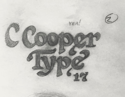
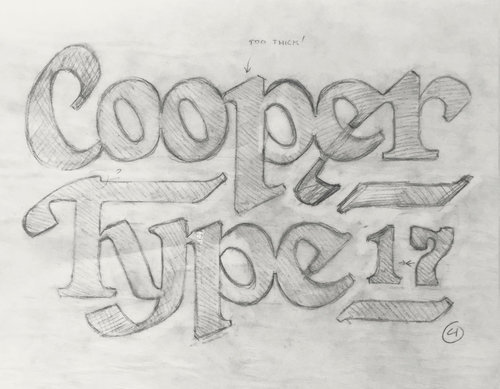
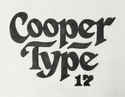


During a Ken Barber workshop at the Cooper Union, Spencer drew this logotype for his classmates that will be graduating from this years Type@Cooper program. The sketches below illustrate the refinements made by hand to achieve the final letterforms.
101 notes
·
View notes
Photo


Mail’s here! The latest entry in my annual tradition of Purim package design once again involves creating elaborate boxes to fulfill the ritual of mishloach manot, giving gifts of food to friends. (Find the last few years’ here, here, here, here, here, and here.) This year involves literally sending food in envelope-boxes. The Happy Purim message and stamp are cut out of the paper and backed with Fruit by the Foot — the best tasting stamp you’ll ever lick. The cancellation is marked 14 Adar (today’s Hebrew date) and ringed with the words describing this tradition from the Megillah: מִשְׁלֹחַ מָנוֹת, אִישׁ לְרֵעֵהוּ (”sending items their fellows,” Esther 9:19). It’s marked in the corner “Peace + Truth” from me, echoing the letters of peace and truth Mordechai wrote to Jews across the kingdom (Esther 9:30). And who couldn’t use a little peace and truth these days? Enjoy, and Happy Purim!
284 notes
·
View notes

Photo


Hand-drawn logotype and pattern design for Butcher's Plate by Sibylla.
571 notes
·
View notes

Photo


Télémaque is a Didot-style typeface I've designed with the help of the great FontYou team.
This modern face is my attempt to design a contemporaneous Didone that doesn't look back on the past while retraining the neo-classical elegance of the genre. Some unusual shapes like the cut terminal balls or the y à la Pierre Didot give to the family a a more graphic line. The same spirit led the removing of the serif of the middle stem on the E and F, and the unusual squared dot of the i and j.
Despite these radical design choices and a strong verticality, the serifs are not perfectly horizontal to avoid the caricature of a Didot, and gives warmth to the letters. The Didot's faces are not purely geometric or pre-bauhaus constructed types, they are grounded in the history of calligraphy: a good Didone must retains un je ne sais quoi from it in order to avoid the parody.
It was the ideal of Télémaque: classic in its skeleton while graphic in its shapes.
93 notes
·
View notes
Photo


Research book to support a new identity proposal for the ship building and repair company. The book took form as a fictive narrative with the element of rust and revival of ships coming back to shore from the lost sea. Reviving human spirit as a result.
143 notes
·
View notes

Photo

Wonderful Fan Made Selma Film Poster by Eve Lloyd Knight
229 notes
·
View notes
Photo


Pantry House produces delicious small-batch gourmet mustards, fruit butters, jams, and pickles. We've recently refreshed and redesigned this packaging for the full lineup of labels and jars.
Design Womb worked with Pantry House on the brand debut, which you can see here. The inital launch included the design of a full brand identity, logo design, package design jar labels, and an e-commerce website with development.
61 notes
·
View notes

Photo


Οι οδηγίες ήταν απλές, “θέλουμε κάτι κομψό που να αναδεικνύει το προϊόν”. Ο σχεδιασμός έγινε με βάση γεωμετρικά σχήματα, εμπνευσμένος από το πολύγωνο της κυψέλης και η εκτύπωση της ετικέτας έγινε σε διάφανο αυτοκόλλητο για να εμφανίσει το αγνό μέλι. Το προϊόν πολύ υψηλής ποιότητας και παράγετε σε περιορισμένο αριθμό κάθε χρόνο.
126 notes
·
View notes
Photo

Roget’s International Thesaurus, 1960s
61 notes
·
View notes
Photo


156 notes
·
View notes
Photo


The Open Road: Photography and the American Road Trip traces the rise of road culture in America and considers photographers on the move across the country and across the century, from the early 1900s to present day.
“Joyrides, voyages of discovery, surveys, wanderings, migrations, polemics, travel diaries, and assessments of the nation. Is America even imaginable without the road trip?”
128 notes
·
View notes
