
My take on new multifamily development in cities in which I visit and/or live
Don't wanna be here? Send us removal request.
Statistics
We looked inside some of the posts by urbanresidense and here's what we found interesting.
Average Info
Notes Per Post
1
Likes Per Post
1
Reblog Per Post
0
Reply Per Post
0
Time Between Posts
2 months
Number of Posts By Type
Text
13
Last Seen Tumblr Blogs


Fun Fact
After the announcement of the deal with Yahoo!, there were 170K signatures of unhappy Tumblr users petitioning to prevent the sale in 2013.
Text


Prior to the changeover from Kaufman to Crawford-Hoying, I was able to get an inside look at the pre-completion Green | House Short North. Not that anything has changed since that transfer (the story behind it is still intriguing to me), it was cool to have a private walkthrough with the development lead on the project.
Green | House excites me because the push of the envelope reminds me of efforts made in New York to be distinct in a market flush with “luxury” apartments. Completed with details like a signature scent pumped across the building and brand-embroidered sweat towels, the Green | House value prop (btw there’s another one going up in Franklinton and I hope to be able to tour that too once it’s open to!) markets a wellness and sustainability approach to urban living. The development includes spa rooms, a top-of-the-line gym (which truly does have the best equipment on the market), outdoor hot and cold tubs and pool (wisely facing south), and several additional communal spaces spread throughout the building.
Plants are everywhere - I can’t remember if they’re fake, but I’m quite positive that lush look is contrived.
Care was taken in designing the hallways to look less like long drab walkways. The building’s unique layout is in part due to the developer breaking up the sight lines of the residence hallways. The longer hallways pivot about halfway through so the viewer doesn’t see an actual end point. I appreciated this visual (de)allusion.
The apartments themselves were tight. Many developers these days seem to think by raising ceiling heights they can cut down on unit size. While this may be true to an extent, I think developers have overshot that equilibrium.
Islands are smaller (and some have plumbing hooked up, which I appreciate, but also assume cuts into costs compared to lining everything up on a wall). And like most apartments these days, storage is extremely limited. Don’t be looking to decorate your apartment for any holiday unless you want to pay and extra fee for a storage unit in the building.
Overall, I appreciate the effort and attention to detail made here. In the end, I think it was just a year or two too early to the market to really deliver like the developer was hoping.
#multifamily#multifamilyrealestate#multifamilyrealestatedevelopment#urbanresidential#multifamilyhousing#columbusdevelopment#columbusmultifamilydevelopment#kaufmandevelopment#greenhouseshortnorth#nbbj
0 notes
Text


I finally had an excuse to tour some units at One at the Peninsula. Honestly, they’re nothing special. The grandeur of the lobby made everything else on the building a let down. There was a massive inefficient use of space near the elevator banks of the rear building. I understood the reasoning behind it, but am curious to know just how much use those spaces actually get.
The doorframes in the hallways confused me. It was a door within a frame within an off-centered frame inset from the walls of the hallway… they just made for a visually sloppy apartment entrance.
The units themselves were fine. Nothing stood out as unique outside of certain layouts - which I did appreciate even though they might not be the most efficient use of space. I love an apartment when you walk in to an entrance hallway as opposed to right into the open concept kitchen/dining/living area.
There was no rhyme or reason to the placement of overhead lighting in the open concept area. Bedrooms did have ceiling fans - which was a nice bonus. Certain details were sloppy though - like the obviously crooked vent cover in the primary bathroom.
For being so pretty from the outside, I expected more from these units.
#multifamily#multifamilyrealestate#multifamilyrealestatedevelopment#urbanresidential#multifamilyhousing#oneatthepeninsula#flahertyandcollins
0 notes
Text


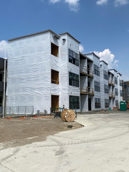
Strolling down Grandview Yard a few weeks ago, I saw this development. It seems as if it would be some sort of multi-family or even senior housing project, however given the supposed address of this structure on 1st Ave, there are absolutely no details I can find online about it.
Designed in an angular "S" shape, the recesses will likely be home to some sort of amenity spaces. Shallow recessed balcony structures are visible on most elevations. Whether there will be floorplates that protrude outside the recess has yet to be determined.
I haven't visited since that day in early November, but I am intrigued if any further signage has arisen around the structure to provide clarity on what it actually is.
#multifamily#multifamilyrealestate#multifamilyrealestatedevelopment#urbanresidential#columbusdevelopment#multifamilyhousing#columbusmultifamilydevelopment
0 notes
Text


Designed and developed by Elford (and admittedly walked through via a private hard-hat tour), I'm a fan of the concealment of the parking structure and the general architecture surrounding this project. After touring a few other Elford projects, if the interiors are designed with as much care as other recent multi-family developments, The Blakely will be on par with its sibling apartments.
The location is extremely sexy - and I wish it was only completed a few months earlier as I would have loved being a resident of this space. Close to Title Boxing, Orange Theory, and District West's Eatery (not objectively appealing, but I'd be so happy to have these at my doorstep), the development will feature a western facing pool and several common spaces spread throughout the three structures.
I'm curious once leasing begins to discover whether there will be any discrepancy between the parcels connected to the parking structure (i.e., the sandwich of apartments-parking-apartments) and the main structure. The sandwich is connected via a second floor bridge, which will also connect the main building to the covered garage. However, the western most set of apartments will almost be out on an island of its own. Lacking easy access to the common amenity spaces, I would hope there would be a slight discount in rent for these units (or perhaps they'll be affordable!).
The variance of siding materials creates more dimension for the project than other Elford developments. Though still a massive undertaking for the area of the neighborhood, I far prefer this to the bland exterior of The View on Fifth.
If you've followed any of my other posts, you also may be quick to point out the balcony insets. It's almost 90/10 with the interior/exterior and I absolutely love it! Creates even more dimension without being obnoxious as those balconies that fully protrude from the side of many new builds.
#multifamily#multifamilyrealestate#multifamilyrealestatedevelopment#urbanresidential#multifamilyhousing#columbusdevelopment#columbusmultifamilydevelopment#elforddevelopment#grandviewohio
0 notes
Text


Was on a walk through German Village today and meandered down Whittier to see what Jaeger Square, the full city block Pizzuti development was looking like. The majority of the south side was indecipherable as to what it will be (though I guess the renderings would help here…). I didn’t pay much attention to them once I noticed how un-diverse they were.
It seems the multi-use project will consist of retail and residential with a much-needed parking structure tucked away in the middle. The seamless architectural inclusion of the parking garage was really nice to see.
While any exteriors remain to be complete enough to form an opinion, the current northern portion of timber construction is making its way vertical with the northwestern portion topped-out. I appreciate the efforts to maintain some sort of facade consistency with the surrounding neighborhood, but the sheer mass of the structure can’t take away from its obvious contrast to its immediate neighbors.
I’m always a proponent of structures like these and my verdict is still out on whether it will prove to be as beautiful as the renderings and smoothly fit in with the rest of the historic district. Hoping some good will come from it!and maybe it will take the shape of a much-needed neighborhood grocer.
#multifamily#multifamilyrealestate#multifamilyrealestatedevelopment#urbanresidential#multifamilyhousing#columbusdevelopment#columbusmultifamilydevelopment#german village
0 notes
Text


Built on a 1.5-acre former International Brotherhood of Electrical Workers' Columbus headquarters in the Short North, Kaufman's Green | House (or however they choose to officially name it... "Greenhouse," "GreenHouse?") epitomizes the company's desire to create unique residential rental offerings for the Columbus market. The self-aware developer recognizes that "we might not be for everybody, but we don't want to be like anybody else."
Accented by sharply angular rooflines reminiscent of the developer's Gravity I project in Franklinton, Green | House intends to create a verdant resort-style respite with curated programs and experiences for its residents. Intrigued by what this actually means, I'm eager to see the progression of the leasing office's website as it currently only has the ability to sign up for mailing list updates.
Green | House is scheduled to be completed by Spring 2024 and with how quickly vertical construction has progressed, this may be a realistic timeline. The original brickwork structure will be converted into a combo leasing office and commercial space while the main structure will contain 158 apartments spread over 5 floors over 2 levels of parking holding 171 spaces. The renderings show a facade tribute to the initial site's brickwork adorning the first 2 to 3 floors of the structure, while the remaining portion with be a bright white material. Perhaps they'll be using the newly designed paint that reflects 99% of the sun's heat! Given the efforts made by the developer, I hope this would be the case.
The angular roofline permeates the structure with private balconies inlaid at a less-than-perpendicular angle from the exterior walls. As work continues and floorplans become public, I'm eager to research what design standards went into the units. Less than efficient, I'm curious to understand the functionality of these unique layouts. However, maybe they aren't as unique as I may think... some more research is definitely needed.
Smart move to situate the pool on the south side as well, maximizing sun exposure for the amenity space and likely abundant greenery on the third-floor deck. Units facing east will have a great setback view of High Street (though the commercial space separating the two is known for being on the louder side at night - thanks, Local!). The side facing High is also one story taller than that on the west side closer to the residential area of the Short North. While that may have been a design choice, I have a feeling it was more so zoning restrictions on the orientation of the building.
#multifamily#multifamilyrealestate#multifamilyrealestatedevelopment#urbanresidential#multifamilyhousing#columbusdevelopment#columbusmultifamilydevelopment#kaufmandevelopment
0 notes
Text


Thrive Companies sure knows how to create a fully contrived community out of brownfield/infill. For my own sake, I'll dub this development the "sister" to GVX. Jeffrey Park, located on 41 acres just north of I-670 and east of Fourth St, is a massive development zoned for 1500 residential units including 185 for sale homes, 17000 sf of retail space, and a five-story commercial structure.
While most of the development is complete - the higher-density interior structures are still in various stages of the construction/lease-up phases. There are currently four rental "living experiences" online and actively leasing. The images at the top of the building under construction are of a yet-to-be-named 5-story apartment structure that wraps 3/4 of the way around what will likely be an interior amenity space.
The construction photo is part of the townhome structures that primarily consist of an odd number of units of alternating exterior design three stories tall with rear-loading 2-car garages. These have been dubbed the "Perry Townhomes" and are listed to begin around $865,000 for the 3-bed, 5-bath structures. They look cute, I'm just curious how thick the abutting walls are in hopes one can't hear the neighbors on an especially noisy evening or WFH day.
The landscaping across the completed grounds is impeccably tasteful and I can't wait to see what these paths look like in a few years hoping they may appear more "lived-in." Like any new development, there is typically a growing period during which the young sterility grows into its character.
When I visited the behemoth Sage, it had yet to open for leasing. However, by the time of this post units are ready for move-in and management was offering several specials (which I can imagine are an added bonus given the time it will take to complete the grand amenity spaces which include two pools!). According to CoStar the building will hold 310 units of which 10 will be 3-bedrooms. However, no 3-bedrooms could be found on the actual leasing website.
In visiting friends' units in the development, I'm quite satisfied with both the construction quality and design layouts of the higher-density buildings. One day I'd love to film a full video tour expressing my opinions on everything. One day!
#thrivecompanies#columbusmultifamilydevelopment#multifamilyrealestate#multifamily#multifamilyrealestatedevelopment#urbanresidential#multifamilyhousing#thesageatjeffreypark#jeffreypark
0 notes
Text


One at the Peninsula is Indianapolis-based developer Flaherty & Collins's first entrant into the Columbus market and is making big strides in trying to stand out. Not only is it the sole residential property currently within the 26-acre Peninsula development, but it also boasts the city's most expensive rentals. Initially listed at $7999, the two 3-bed/3-bath 1,746 sf. penthouse units with direct city views have dropped to $7400 as of the date of this post.
While I have yet to visit them, I am curious to understand the justification for the primary bathroom design. Containing a single shared walk-through closet with connection to the side-by-side laundry room (I do appreciate a top-loading washer), the primary bathroom has a combined tub/shower. For being the most expensive unit in Columbus, I'd expect bathroom luxuries to reflect that with a separate tub and stall shower.
A sucker for clean lines, I do appreciate the attention made to the main facade on Belle St where the balconies available to every unit are inlaid into the apartment homes. I've covered this previously, but I much prefer that look to the protrusion of balconies that seem merely attached to the side of the building. The northern facade is particularly sexy in my opinion as well with slight outcropped balconies. The developers did not skimp on outdoor space for these units, they actually increased the interior floor space for units that do not have as striking of a view. Notice how on the rear of the main building and all the exteriors of the auxiliary building (in white), the balconies maximize interior space and simply stick out from the side of the structure. I really appreciate the thought that went into that - or at least, I assume it did.
According to the complex's website, the two buildings are distinguished simply by a number (#1 being the smaller 6-story building and #2 the 11-story tower). If given the opportunity, I'd love to discuss the zoning and/or entitlement process undergone and whether this final product maximized the number of units given the respective parameters, and whether aesthetics needed to be taken into consideration. For example, if building #1 could have been 11 stories as well, why wasn't it? Could they not get the same return on units given the construction costs and obstruction to views gained by building #2's rear units?
I'm intrigued to take a tour of this building and check to see what the interiors and amenity spaces look like. For the former, are the drawers soft-close? Are the kitchens and bathrooms externally vented? How do the windows open? Why carpet in the bedroom instead of a vinyl wood alternative?
A rooftop pool is a beautiful addition, but is the size compromised? What equipment is available in the gym? How convenient is it to get to the fitness center if one lives in building #1 since the facility is located in building #2? Why is bike storage in #1? I'm only questioning these choices because I'm curious, not that I really have any expertise in what is the "right" decision.
Personally, I hope this building leases up quickly to elicit even more development across the downtown skyline. The developer's Ascent at the Top of the Hill in Cleveland just off my MBA alma mater's campus is a promising behemoth of a community also ideally positioned on an outcropping of sorts with promising views from some of the more sought-after units. Let's see if they continue to invest more in Ohio!
#multifamily#multifamilyrealestate#multifamilyrealestatedevelopment#urbanresidential#multifamilyhousing#oneatthepeninsula#flahertyandcollins#thepeninsulacolumbus#rentaldevelopment#columbusdevelopment#ohiorealestatedevelopment
0 notes
Text


Kaufman Development's Gravity project is nearing completion in Franklinton. Phase II of the project can be seen through the commercial structures as the 12-story (which, by Columbus standards is high... though I'm jaded by my larger city desires) rental residence with light brown and alternating black exteriors with shallow balconies on those units that have them.
For Phase II, I do appreciate the thoughtfulness that went into the exterior architecture - specifically the balconies. They're not too obtrusive and "barnacle-like" as I have referenced them before. They're tastefully and strategically positioned within the building to maximize light for all units - including those neighboring those without balconies. The outcroppings also add slight outdoor space while maximizing interior floorplans, the latter of which are utilized substantially more throughout the year than the former.
The "co-living" space is found in the boxy structure in the last few photos and is actively leasing units. On the complex's website, these units are located in Building D.
The focus of this post though is the 5-story structure strategically positioned on the west end of the 889-space parking structure. These units are in Building E. There are no details on when the structure is to begin leasing. It is being marketed as townhouse living. However, the building is merely acting as an extension of Building B (the Tower) with a different design aesthetic. I'm excited to see the floorplates - which likely won't be made public, but I nonetheless hope I can see them - to determine the structural set up of each "Townhome."
In speaking with one of the developers of this project, his excitement over the growth of not only the neighborhood, but density in Columbus in general is infectious. Looking forward to see what other vendors/commercial investors this project brings into the Columbus urban space.
#multifamily#multifamilyrealestate#multifamilyrealestatedevelopment#urbanresidential#multifamilyhousing#gravityproject#kaufmandevelopment#columbusmultifamilyhousing#urbanresidense
0 notes
Text


Thrive Companies's Grandview Crossing or "GVX" is one of the largest mixed-use development projects in the greater Columbus area. As a Columbus native having left for the higher-density life of NYC, I have borne witness to unanticipated and welcomed urban growth.
GVX is a 55-acre swatch of land that has been redeveloped over a former landfill. The complex's website does not seem to have been updated in some time as Phase One is complete with office and residential tenants already in place. The Thomas at GVX is the anchor multifamily residence of the site with a (debatably over-used) industrial-chic aesthetic. Don't get me wrong, I love it. From a design standpoint, it seems to lack the character it once was trying to convey. However, for the Columbus market, this design may still be en-vogue for the foreseeable future.
In comparison to the new residential phases, The Thomas is structurally the tallest of residential projects. Whether this has to do with zoning, financial penciling, or some structural requirements, the new phases are all breezeway buildings neatly and creatively stacked together. These three-story structures alternate orientation and exterior design while maintaining a cohesive appearance. However, they will also cater to a slightly different renter that is willing to have external unit entrances and access to shared amenity spaces outside of their building.
In speaking with a representative of the developer, the current financial conditions all but force developers to construct with wood (which immediately limits a structure's height) and design common spaces with an open breezeway (which saves on utilities). While this inherently continues to increase the density of the area, I believe an alternative could increase density and sustainability given the proper inputs.
I'm eager to continue to watch this site develop - especially since I still remember the site as practically a forest that has been razed and offers pristine views of the Columbus skyline.
#multifamily#multifamilyhousing#urbanresidential#multifamilyrealestate#multifamilyrealestatedevelopment#grandviewcrossing#columbusmultifamilyrealestate#columbusrealestate#thethomasatgrandviewcrossing
0 notes
Text

Advantageously positioned across from Kaufman's massive Gravity project, Homeport's McDowell Place is well-underway in the ever-modernizing Franklinton. On the smaller end, the 50-unit affordable housing complex creates opportunity for those in need of benefiting from the neighborhood's gentrification while maintaining economic affordability.
The complex is the last of three affordable communities benefiting from FHAct50. Comprised of 16 one-bedroom, 30 two-bedroom, and 4 three-bedroom units, it comes in the middle of the pack of the neighborhood's recent affordable additions.
The lack of architectural flourishes is a start contrast from it's market rate neighbors, but nonetheless offers affordable residential offerings for households bringing in less than $50K/year. With only 150 designated new development affordable units in the neighborhood, Columbus continues to fall short of providing the need for affordable housing in the area.
McKinsey recently published a report highlighting some specific ways the city can continue to grow and lift every resident, not just those with deep pockets.
#affordable housing#columbusmultifamily#multifamilyrealestatedevelopment#realestatedevelopment#multifamily#housing#columbushousing#multifamilyrealestate
0 notes
Text


195 E Broad St., which has yet to (and may not) be renamed other than its address, is well underway. The Edwards Communities development brought aboard Denver's Kephart as the Architect of Record for this 13-story 133-unit podium complex. Situated above a 235-car 5-story garage, the building's lower facade pays homage to the historic structures over which it was built while launching (albeit by Columbus standards) into the sky.
Clad in dark limestone, the final structure is meant to provide focus on the front two floors that will be retrofitted with the original lighter limestone facades. While I understand the homage, I do not agree with such a dark exterior, especially given the environmental focus on reducing excessive urban heat. A new white paint was recently determined to reflect up to 97% of the sun's light, reducing the heat trapped in the surrounding area. Given the forward-thinking nature of this type of structure in downtown Columbus, I would have hoped more thought was put into its environmental impact.
I appreciate the smooth edges the building offers from the street, specifically in relation to the inclusion of private outdoor spaces for the residents. While recessed balconies take away from interior space, they also provide built-in precipitation protection and prevent the unsightly chaos that exists in buildings with an excessive amount of overhanding balconies that look more like barnacles than welcoming outdoor spaces.
It's great to see the vertical residential movement in my hometown, especially in the urban core. Hopefully, a successful lease-up will draw more developers to consider the redevelopment of underutilized commercial spaces downtown, ultimately leading to a more vibrantly dense city.
#multifamilyrealestate#multifamily#architecture#urban architecture#urbanresidential#edwardscommunities#columbusdevelopment#columbusmultifamilydevelopment
0 notes
Text
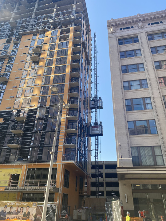
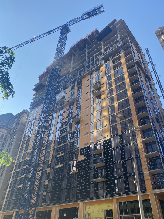
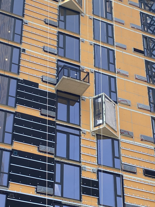
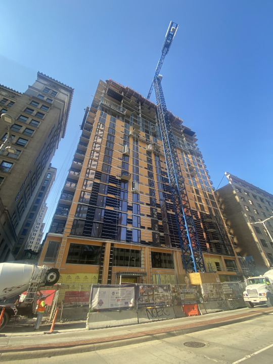
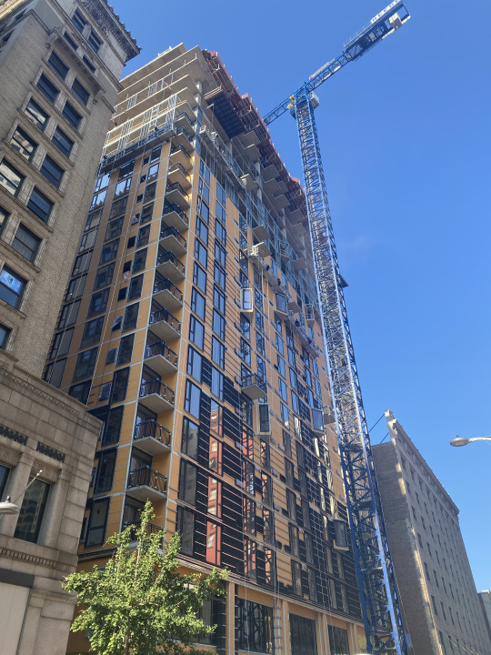
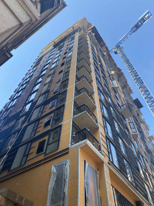
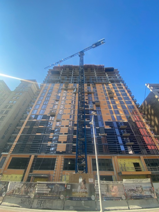

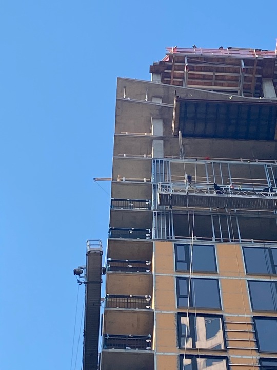
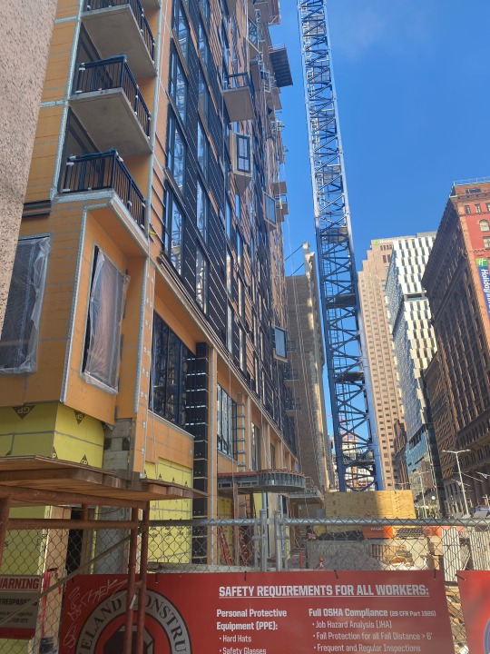
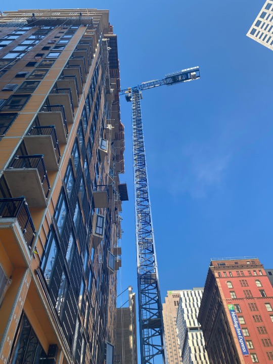
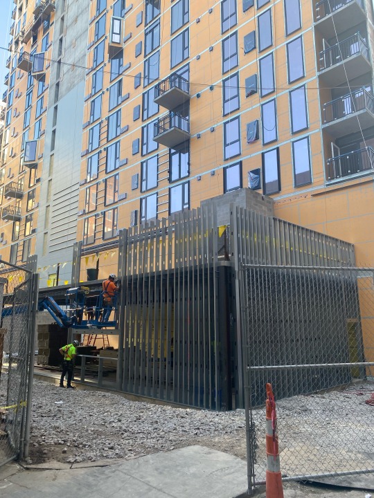
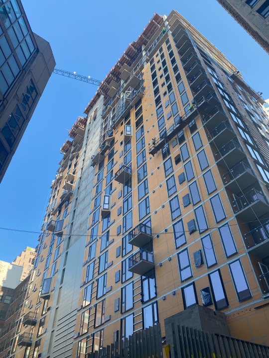
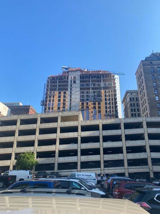
The newest ground-up multifamily residential addition to the Cleveland skyline is City Club Apartments Cleveland. With 22 floorplans to choose from spread across 23 floors, this building is promising to do the most. Just take a look at the brochure on the building's website (for some reason I can't link the PDF). The developers are definitely pushing the market when it comes to both pricing and amenities. Of the 304 units, the cheapest that are currently being pre-leased are garage-facing studios hovering just under $1500. One bedroom units land a little under $2000 with most going around $2300.
Living downtown and seeing this building going up has been both exciting and somewhat intriguing. The unique exterior structure and design as well as the seemingly jam-packed amenity offerings lead me to question the developers' hope of truly shoving (as opposed to pushing) the market. The renderings of the exterior rooftop seem a bit noisy, but renderings are always a bit more vibrant than the finished product.
The seemingly random outcropping design (of "bay" windows and random edifice balconies) makes me curious about design efficiencies, but does add a unique aesthetic to an otherwise plain face.
Construction is well underway and a topping-out ceremony was held in June '23 with an anticipated lease-up initiating Q4 of this year.
While not quite as tall as its nearest competitors (The Lumen and The Beacon), City Club Apartments is banking on its abundant resident offerings to lure tenants back into the Cleveland urban core.
#multifamilyrealestate#downtowncleveland#multifamilyhousing#multifamily#cityclubapartmentscleveland#urbanresidential#multifamilyrealestatedevelopment
1 note
·
View note