
Don't wanna be here? Send us removal request.
Statistics
We looked inside some of the posts by webauthoring and here's what we found interesting.
Average Info
Notes Per Post
11
Likes Per Post
11
Reblog Per Post
0
Reply Per Post
0
Time Between Posts
7 days
Number of Posts By Type
Text
13
Photo
4
Last Seen Tumblr Blogs


Fun Fact
If you dial 1-866-584-6757, you can leave an audio post for your followers.
Text
My First p5.js Sketch

Just completed my first ever p5.js sketch and it was so satisfying getting it right! I can’t wait to learn more about this software.
1 note
·
View note
Text
Sustainable Web Design
Recently, one of my classmates posted an article about sustainable web design to our class forum. It’s something I’ve read about before, but it’s been awhile since I last thought about it. I love that everyone can play a part in helping the environment and mitigating damage and I didn’t think web design would every come under that.

I currently think it’s beyond my capabilities, but I hope that if I become a web designer or developer in the future, that I will implement certain sustainable strategies into the websites that I build.

One thing that can be done to make a website more sustainable is called Dematerialisation. In layman terms, this is when you replace an energy hungry physical product with a web service. For example, you could move a paper form that is filled out on paper and processed by hand, to a digital form on your website.
The second thing you can do is called Transmaterialisation. This is when you digitally update a physical object, extending it’s use.
If you are interested in reading more about this area, check out the below links...
https://www.creativebloq.com/inspiration/save-planet-through-sustainable-web-design-8126147
https://sustainablewebdesign.org/
0 notes
Text
The Life of a Web-designer
As I’m coming to end of this particular module, I’m starting to wonder what would a job as a web designer be like and would I like it? I love both technical and creative challenges, I enjoy working from home and I’ve thought about being my own boss before. Could web-design be the perfect job for me?

A highly appealing element is the money. According to the Bureau of Labor Statistics, Web designers make (on average) $74,000 annually. However, in order for a web designer to keep a high level of client satisfaction they also have to work for it, always expanding their knowledge and learning the latest developments. They also have to continually upgrade their skills.

Whether your self-employed or not, you can expect a lot of back and forth with your clients. Working with them to achieve their dream websites, which they understandably are going to be very hands-on about and have a lot of questions.
You also have to be patient. Not only when explaining more technical elements to your client, but also when you solve code. I’ve heard experienced developers talk about running into issues with their code and having to work hard to find fixes that are not always readily apparent. Coding is for the problem solvers in our world.
Personally, I think I could really enjoy the world of coding, but I expect it can be a very solitary job. I’m hoping my next semester of college will help me further understand the area. I’m definitely still interested.
Read about a day in the life of a web designer:
https://www.charlotteohara.ca/blog/typical-day
0 notes
Text
Flexbox
What is a flexbox?
A flexbox allows you to alter the width and height of an item on your website, so that it fills the available space regardless of the device it’s being viewed on e.g, mobile, tablet, desktop, etc.
The below is a sample of CSS code you could use to create a flexbox.
.container { display: flex; /* or inline-flex */ }
Flexbox is often confused with grids.

When do you use flexbox specifically?
You might use it when you want to line something up in one direction. Grid has the possibility to line things in two directions; grids and columns. Grids don’t stagger, it thinks in columns and rows at the same time.

However, things on flexbox don’t need to line horizontally and vertically like girds. For example, on grid you cannot overlap items, but in flexbox you can.

0 notes
Text
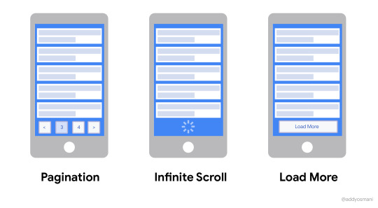
The Infinite Scroll
Infinite Scroll is a web design technique that continuously loads content as the user scrolls down the page. It’s technique that you will often see on social media sites, such as Facebook, Twitter or Instagram. It a technique you won’t see on every site, but it can be very effective when utilised.
For one, it’s somewhat addictive, which works well for the private company’s that own and run these social media sites. They want to keep people scrolling for as long as possible. You can blame the countless hours spent on your phone, often because of the infinite scroll function; a bottomless pit of content.
It also eliminates the need for the user to change pages, but unlike pages on a website. The content is rarely related. This makes continuous scroll unsuitable for regular websites, unless maybe they wanted to include an RSS feed of their social media account.
What do you think of the infinite scroll? Do you like it? Hate it? Or just plan don’t care?

0 notes
Text
Do all websites look the same?
Recently one of my classmates rose the question that all websites look the same. I was actually excited to hear her say that, because it has been something I’ve been thinking for some time.
Boris Muller wrote the article; “Why Do All Websites Look the Same?”. He explains that websites have incredible possibilities and web designers can make their websites evocative and exciting, but they aren’t. He cites how websites for creatives like Behance and Dribbble are completely boring.

Boris suggests that one of the reasons this is happening is because of Content Management Systems like Wordpress where everything is based on a template.
Eric Sharp in his article, 5 Lazy Design Decisions That Will Make Your Website Generic maintains that there are a few things that are bound to make your website look generic.
1. Making a massive logo:
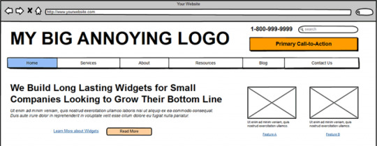
2. Using Arial for all your text.
3. Stock Photo Imagery

4. Poor colour choices.
5. Limiting your Menu to 5 sections.
Lastly, Viktor Thomas gives some suggestions in his article How to Avoid Generic Looking Web Design. He suggests to be bold with your design choices (within reason), look out your own industries for ideas on web design and hire custom web designer.
Thomas doesn’t offer anything groundbreaking, but he’s talking about the fundamentals, which are always the cornerstone of getting design right. You can’t break the rules, if you don’t know the rules.
Take a look at this unusual website design. Do you think it’s too much or would you like to see more wild and adventurous websites?

1 note
·
View note
Text
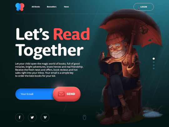
What’s a Hero Banner?
A hero banner is a banner that appears at the top of your website. It usually has an eye-catching image or perhaps it features a call to action. Corey Smith from Tribute Media maintains part of making a phenomenal web page is including; “A strong, clear message that indicates what next step you want your site visitor to do.”
Source

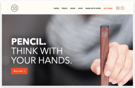
Photographs can prove particularly eye catching for a hero banner. Look at this one...

The hiker is standing right beside the call to action, creating interaction with your imagery and the website’s functionality.
This website makes clever use of it’s hero banner to include a countdown to when it’s going to launch. Even if your website isn’t complete you can use your hero banner to notify people of when it will be launched.

This banner immediately asks for your email details, catching their users early and converting visits into actions.
This hero banner is just inviting it’s visitors to read more, this quick call the action could potentially help to reduce bounce rates.

You could also use your hero banner to help showcase and sell your products.
Your hero banner may interact with columns of information below it. See the arrow jutting out of the hero banner and pointing at “Credit? Checked”.

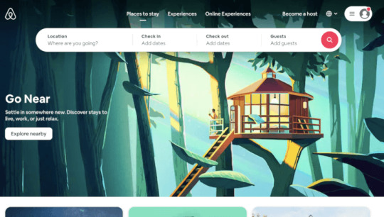
Look at how airbnb uses their hero banner to encourage their customers to use searching and filter options the minute the get to the landing page.
Utilizing an effective as well as beautifully designed hero banner is a fine art, but one worth giving careful consideration to as it is the first thing visitors to your site will see and as the above proves can be utilized in a myriad of useful ways.
0 notes
Text
The Coding Gap
Recently an advert appeared while I was watching a YouTube video to promote a website builder that didn’t require coding experience and it ends on a line about how it bridges the coding gap. I had never heard of the coding gap term before, so I decided to do some research.

The term coding gap is used in two ways; (i) the gap between the number of male and female coders with male being the majority and (ii) the gap between coders/developers and people who can’t code. For this post, we are going to focus on the latter, but I might touch on the first topic in the a later post. Being a woman, it might be an interesting one to look at it in more depth.
Now, back to our topic. If you think about it, computers are such a huge part of our lives and though many amazing developers allow us to use computers without having to write or understand complex code, how useful would it be for us to learn more about how computers understand the commands we give them or understand the websites we read, learn from and use everyday? Or, will coding for website developers become less and less important because of website builders like; WIX, WordPress, Weebly, Squarespace, Webflow, etc. I’d like to suggest otherwise.
In one study 9 in 10 marketers believe their work would improve if there was better integration with them and their company’s development team. This rises by 10% amongst marketers who work frequently alongside developers. The same study revealed that more than half of respondents felt that marketing and developing teams were less agile because of the coding gap. A proposed way to deal with this issue is for marketers to improve their technology skills.
Source

Imagine a marketer on your team who could speak to the developers in “their own language”. The miscommunications that could be avoided and the benefit to their communication. However, it’s not just marketers that could benefit from understanding code. Steve Weston, Chief Information Officer with Hays, believes that coding should be thought in schools with the same importance as a foreign language;
“According to data from Gartner, connected ‘things’ (such as mobiles, tablets and smart watches) will far outstrip the world’s population by 2020, with the expectation that we’ll see over 20 billion devices in use. It makes sense, then, to try and understand the languages of the most widely used things on the planet – our devices. Then, we can better connect, teach and improve what they achieve.”
Source
What do you think? Should we all be learning code or is the future software that builds the coding gap even more efficiently than it does today?
0 notes
Text
Javascript for Beginners
Javascript is the code that powers the dynamic element of a website. Here is some beginner JS code to wet your appetite and get you started.
1. console - Writes messages in your code using console.log;

In JS the semi-colon (;) denotes the end of your sentence or code. CSS uses the same property for the same reason.
2. Like HTML and CSS where you can leave comments in your code, you can also leave comments in JS using
// comment
on a single line and multiple line comments using
/*
Comment
*/
like in CSS.
3. Data Types - There are 7 fundamental data types in JS.
Numbers
String - These are letters, numbers, symbols surrounded by single quotes.
Booleans - These are answers to questions in JS. They have either values of true or false.
Null - This data type essential means the absence of value.
Undefined - Similar to null, but it has different uses.
Symbols - Used as unique identifiers. This is more complex for beginners.
Objects - Collections of related data.
Below, I’ve printed numbers and strings.

This is some very basic Javascript. If you want to learn more, why not visit https://www.codecademy.com/? It’s a great sounding board to learn all kinds of new code and learn which one you enjoy coding most.
0 notes
Text
Website Colour Schemes
It’s important you take care when choosing your website’s colour scheme. It should align with your brand and it’s values. The primary colour you choose is the primary colour your brand will be associated with. Take the below website. What do you think when you see this website? It’s for a festival in a forest.

Source
After you have chosen your primary colours, you need to consider your secondary colours. Look at the below websites and the beautiful colour schemes they employ. Most notably the colours compliment each other. The last website utilises darker colours that one might associate with landscapes and the outdoors to highlight the bright florescent font. Consider how you can use colours to both compliment your design, as well as create contrast.


Source
The 60-30-10 colour rule is a very smart why to divvy out your colour distribution without having to worrying too much that you’ve overdone it with one colour or another. It basically means that your use 60:30:10 ratios when sectioning your colour. Just be sure to assign the right colours with the right ratios. 60% hot pink might not be enjoyable for your users to navigate.
Look at the below image. One side follows the 60-30-10 rule and the other doesn’t. Which one do you think follows the 60-30-10 rule?

Source
Got it? If you said the one on the right, you’re correct. It employs the 60-30-10 rule, using only three colours and distributing in the above ratios.
If you’re still not sure what colours to use, talk to people who know your brand well and see what colours they suggest. Research similar brands to your own and see what they’ve chosen.
0 notes
Text
Website Mapping
I run a website in work using a CMS system called T4. I design webpages occasionally, but I didn’t design the overall mapping of the website. I think it’s quite well structured, but I want to learn more about good website mapping, so here we go...
What is website mapping?
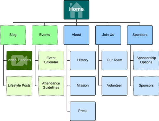
Website mapping is how webpages within a website are literally mapped together. Pages will be subject to hierarchies, which hopefully make them easier for the user to navigate. For example, when we see the word “Shop” in the website menu, we know that it will navigate us to products or merchandise. Similarly, when we see “About Us”, we may be led to a page or pages where we can find information about the company, it’s ethos, employees that work, etc. There are three main types of mapping we will discuss here; XML, HTML and UX.
Below is a good example of a simple website map with only a few pages.
Why is website mapping important?
Have you ever visited a site and just couldn’t find what you were looking for? Website mapping helps your users navigate your site easily and efficiently. This can help reduce your bounce rate and keep users on your site for longer.
What are xml and html sitemaps?
When creating a website one of the first things you need to do is map content into hierarchical pages and this is part of optimising the user experience. However, there is also the process of creating a sitemap.
XML sitemaps help search engines discover the pages on your website, this allows the search engine to prioritise the pages it crawls when it receive a request. It can also be helpful for your SEO. This is different to a HTML sitemap, which is a list of pages on your site for your users to view. This is particularly useful for large websites. You can read more about them here.
Here is a XML Sitemap for Tiffany & Co. and it contains 4,829 product urls.

Source
You might think you haven’t seen a HTML sitemap on a website, but you have. Take a look at this apple website.
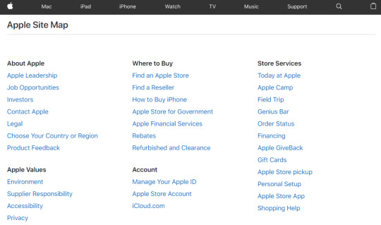
Source
Does it look familiar?
What is UX Website Mapping?
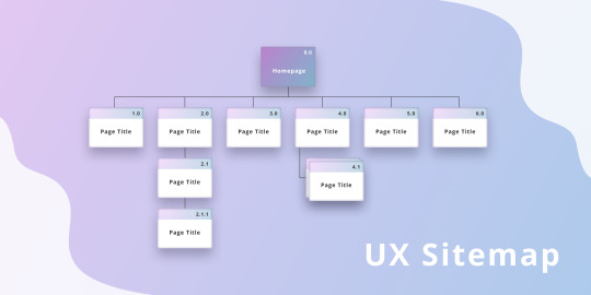
UX standings for User Experience and it’s the first type of website mapping we mentioned above. It basically is the precursor to building you website and if done effectively, you website will provide a smooth and inviting journey for your users.
Can you think of websites that provide a smooth journey or even ones that didn’t? Use these as examples of what to do and not do when you design your website.
1 note
·
View note
Text
Wordpress Org vs Com
So you want to start a blog and you’ve finally chosen WordPress as your CMS (Content Management System)? You think, this is great, let’s get started and you realise you need to decide one more thing...com or org?
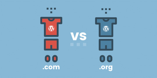
One of the biggest differences between wordpress.com and wordpress.org is that with wordpress.com you do not need to download and install wordpress onto your computer or to a server. In otherwords whether your site will be self-hosted or not.
If you go for WordPress.org, you will set your site up with a host and you will have the full access to all your site files and code. A self-hosted site will have it’s own domain name and will will be hosted on a server. A popular server is Blue Host and I’m not even getting paid to say that.
WordPress.com runs on the WordPress site software. If you do not know how to code, WordPress.com might suit you better, as you do not require any coding experience to get your site up and running. Pretty cool, huh? The only thing with WordPress.com is you may have to purchase a plan, depending on what you would like to do with your website. Also, you are going to have to live with the extension “WordPress.com” in your domain name and this can often mean people will not see your site as professional. So right about now WordPress.org is looking like the better option, right? Especially if you are on a budget.
Well...like I already mentioned it’s best to have the coding experience. Furthermore, you will be responsible for maintaining your site and all the files that come with it. However, on the plus side, WordPress.org enjoys many free plugins that are designed by developers and distributed for free.
I hope this helps you decide which version of WordPress to use. May the force be with you.
0 notes
Text
Em......
Today we need our websites to be flexible. There’s no point trying to design one layout for mobile, tablet and screen. Good web designers strive to make their websites responsive. In other words, depending on what screen dimensions you are looking at a website, the website will respond so that your viewing experience is an accessible and positive one.

One way that we do this is by using Em. Em is a flexible unit which converts into pixel values. Most browsers have a default value of 16px, so 1em=16px in size.
Even though many people find it easy to think in pixels, 1px will always be 1px. It’s what’s called an absolute unit. No matter the size of the screen and this means your website isn’t responsive...sorry.
Your website might end up looking like something on the left, if it’s designed for a desktop/laptop, but not for a mobile. We want our designs to respond to our users’ screens like the image on the right.

You can also use percentages. If the default font size is 16px and you set the font size to 62.5% the font size will equal 10px.
As the em unit derives it’s size from the parent or grandparent’s values, it can a little complicated to use. It has been advised that it’s best to use em within the context of an element.
Software Engineer Chiamaka explains;
“ With em unit, the computed pixel value is derived from the font size of the styled element while putting the inherited (parent and grandparent) values into consideration. Using emunit can turn out to be complex. emunits should be used to allow for scalability within the context of a specific design element e.g. setting the padding, margin and line-height of menu items to use emvalues works well to properly scale navigation menu items.
Given a section element with a font size of 14px, when you create a rule, with the padding property set to 3em, it would evaluate to 42px(14 x 3 = 42). This is irrespective of the font size assigned to the html element. Simply put, the font size of the element on which em unit is declared determines the pixel unit value.”
To help you further there are some great em calculators online. Here’s one; https://offroadcode.com/rem-calculator/
0 notes
Photo

The Parallax Effect might sound like something from the Matrix, and well...maybe it is, but it’s also a super cool scrolling effect you can add to your website.
You can make the effect using HTML, CSS and Javascript.

Sadly, I have yet to start javascript, but there’s sample code here.
3 notes
·
View notes
Photo
What is box-sizing?
“The CSS box-sizing property allows us to include the padding and border in an element's total width and height.” - w3schools.com
Why do we use it?
When we are calculating the width and the length of an element, we add the width, padding and border to get the total width of the element. Likewise, we add height, padding and border to get the total height of an element.
However, with box-sizing, we can include an elements padding and border in an element’s total width and height. We do this by adding; box-sizing: border-box; into our CSS.
If you want this to apply to all your code you can write
* { box-sizing: border-box; }
into you CSS.
However, Aurélien Aries, argues against using it on every element of your page, as not every element of the page requires it. You can read their argument here; https://aastudio.fr/box-sizing.html
1 note
·
View note
Photo

Padding and Margins
Have you ever wondered about margins and paddings in CSS? No?! That’s odd. It keeps me up at night. Let’s discuss...
The short version. Margins refer to the space around an element, outside of it’s defined borders.
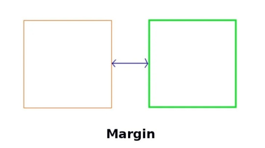
Padding refers to inside the element’s borders.
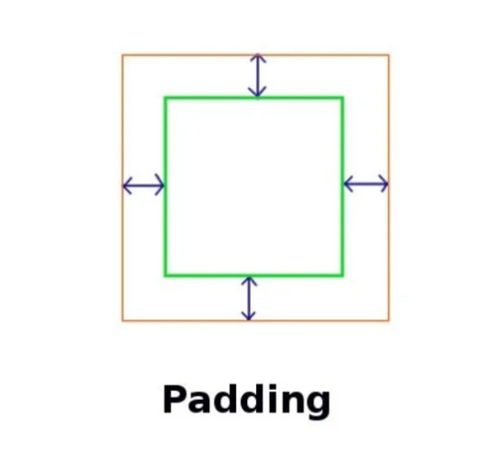
With the power of CSS, a web designer can have full control of the margins and padding on their website. Neat, right?
When you edit an element’s margins you push other elements away or closer to it. Whereas when you edit an elements padding, you move, shrink or grow the elements inside.
There’s some cool things you can do with margins and paddings. For example, if the width of your page is fixed and you want to centre your element on the page, set the margin to “auto”.
Negative margin settings will allow elements on your page to overlap.
Padding is also used to change the size of an element. If you increase the padding, the text inside will stay the same size, but there will be more space around it.
Writing your CSS.
You can write it like;
margin-top
margin-right
margin-bottom
margin-left
However, best practice is to keep your CSS short where possible. If there’s a shorter way to write the same thing, it’s best to do it. So, you can also write it like;
margin: 25px 50px 75px 100px;
25 is for the top, 50 for the right, 75 for the bottom and 100 for the left.
If the margin property has three values:
margin: 25px 50px 75px;
It means...
top margin is 25px
right and left margins are 50px
bottom margin is 75px
If the margin has only two values...
margin: 25px 50px;
top and bottom margins are 25px
right and left margins are 50px
The above goes the same for padding.
To drive the point home, here’s a cool little color key.
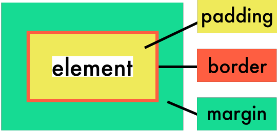
Margins and Padding are really important, because they play such an integral part in your website’s layout. Margins and padding are your friends and allies in web design.
3 notes
·
View notes
Photo
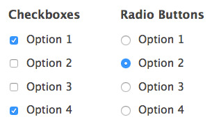
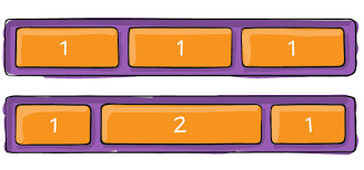
Checkboxes vs. Radio Buttons
So, what’s the difference between the two options above?
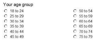
Radio buttons are normally grouped together and a user can only select one option at a time. You might use this for selecting your age group, because you can’t be 18-24 and also 25-29. If you can, you shouldn’t be reading this, as there’s no help for you.
Let’s write some html code for radio options...
<input type="radio" id="ages" name="18 _to_24" value="18_to_24"> <label for="18 _to_24">18 to 24</label><br> <input type="radio" id="ages" name="25_to_29" value="25_to_29"> <label for="25_to_29">25 to 29</label><br>
I wrote above code myself, to match the above image. So just incase, here’s some code from W3schools...
<input type="radio" id="male" name="gender" value="male"> <label for="male">Male</label><br> <input type="radio" id="female" name="gender" value="female"> <label for="female">Female</label><br> <input type="radio" id="other" name="gender" value="other"> <label for="other">Other</label>
So, what about checklists?

As you can see from the grainy picture above (sorry), the user can select multiple options.
<input type="checkbox" name="vehicle1" value="Bike"> I have a bike<br> <input type="checkbox" name="vehicle2" value="Car"> I have a car<br> <input type="checkbox" name="vehicle3" value="Boat" checked> I have a boat<br>
The <br> tag has been used here to place the options on a new lines. Otherwise they would run in sequence on the same line.
1 note
·
View note