#css-tricks
Explore tagged Tumblr posts
Visit Tumblr Blog
Explore Tumblr blogs with no restrictions, modern design and the best experience.
Last Seen Tumblr Blogs


Fun Fact
Tumblr Inc. has $15.1M in annual revenue.
Text
Revisiting CSS Multi-Column Layout
New Post has been published on https://thedigitalinsider.com/revisiting-css-multi-column-layout/
Revisiting CSS Multi-Column Layout
Honestly, it’s difficult for me to come to terms with, but almost 20 years have passed since I wrote my first book, Transcending CSS. In it, I explained how and why to use what was the then-emerging Multi-Column Layout module.
Hint: I published an updated version, Transcending CSS Revisited, which is free to read online.
Perhaps because, before the web, I’d worked in print, I was over-excited at the prospect of dividing content into columns without needing extra markup purely there for presentation. I’ve used Multi-Column Layout regularly ever since. Yet, CSS Columns remains one of the most underused CSS layout tools. I wonder why that is?
Holes in the specification
For a long time, there were, and still are, plenty of holes in Multi-Column Layout. As Rachel Andrew — now a specification editor — noted in her article five years ago:
“The column boxes created when you use one of the column properties can’t be targeted. You can’t address them with JavaScript, nor can you style an individual box to give it a background colour or adjust the padding and margins. All of the column boxes will be the same size. The only thing you can do is add a rule between columns.”
She’s right. And that’s still true. You can’t style columns, for example, by alternating background colours using some sort of :nth-column() pseudo-class selector. You can add a column-rule between columns using border-style values like dashed, dotted, and solid, and who can forget those evergreen groove and ridge styles? But you can’t apply border-image values to a column-rule, which seems odd as they were introduced at roughly the same time. The Multi-Column Layout is imperfect, and there’s plenty I wish it could do in the future, but that doesn’t explain why most people ignore what it can do today.
Patchy browser implementation for a long time
Legacy browsers simply ignored the column properties they couldn’t process. But, when Multi-Column Layout was first launched, most designers and developers had yet to accept that websites needn’t look the same in every browser.
Early on, support for Multi-Column Layout was patchy. However, browsers caught up over time, and although there are still discrepancies — especially in controlling content breaks — Multi-Column Layout has now been implemented widely. Yet, for some reason, many designers and developers I speak to feel that CSS Columns remain broken. Yes, there’s plenty that browser makers should do to improve their implementations, but that shouldn’t prevent people from using the solid parts today.
Readability and usability with scrolling
Maybe the main reason designers and developers haven’t embraced Multi-Column Layout as they have CSS Grid and Flexbox isn’t in the specification or its implementation but in its usability. Rachel pointed this out in her article:
“One reason we don’t see multicol used much on the web is that it would be very easy to end up with a reading experience which made the reader scroll in the block dimension. That would mean scrolling up and down vertically for those of us using English or another vertical writing mode. This is not a good reading experience!”
That’s true. No one would enjoy repeatedly scrolling up and down to read a long passage of content set in columns. She went on:
“Neither of these things is ideal, and using multicol on the web is something we need to think about very carefully in terms of the amount of content we might be aiming to flow into our columns.”
But, let’s face it, thinking very carefully is what designers and developers should always be doing.
Sure, if you’re dumb enough to dump a large amount of content into columns without thinking about its design, you’ll end up serving readers a poor experience. But why would you do that when headlines, images, and quotes can span columns and reset the column flow, instantly improving readability? Add to that container queries and newer unit values for text sizing, and there really isn’t a reason to avoid using Multi-Column Layout any longer.
A brief refresher on properties and values
Let’s run through a refresher. There are two ways to flow content into multiple columns; first, by defining the number of columns you need using the column-count property:
Second, and often best, is specifying the column width, leaving a browser to decide how many columns will fit along the inline axis. For example, I’m using column-width to specify that my columns are over 18rem. A browser creates as many 18rem columns as possible to fit and then shares any remaining space between them.
Then, there is the gutter (or column-gap) between columns, which you can specify using any length unit. I prefer using rem units to maintain the gutters’ relationship to the text size, but if your gutters need to be 1em, you can leave this out, as that’s a browser’s default gap.
The final column property is that divider (or column-rule) to the gutters, which adds visual separation between columns. Again, you can set a thickness and use border-style values like dashed, dotted, and solid.
These examples will be seen whenever you encounter a Multi-Column Layout tutorial, including CSS-Tricks’ own Almanac. The Multi-Column Layout syntax is one of the simplest in the suite of CSS layout tools, which is another reason why there are few reasons not to use it.
Multi-Column Layout is even more relevant today
When I wrote Transcending CSS and first explained the emerging Multi-Column Layout, there were no rem or viewport units, no :has() or other advanced selectors, no container queries, and no routine use of media queries because responsive design hadn’t been invented.
We didn’t have calc() or clamp() for adjusting text sizes, and there was no CSS Grid or Flexible Box Layout for precise control over a layout. Now we do, and all these properties help to make Multi-Column Layout even more relevant today.
Now, you can use rem or viewport units combined with calc() and clamp() to adapt the text size inside CSS Columns. You can use :has() to specify when columns are created, depending on the type of content they contain. Or you might use container queries to implement several columns only when a container is large enough to display them. Of course, you can also combine a Multi-Column Layout with CSS Grid or Flexible Box Layout for even more imaginative layout designs.
Using Multi-Column Layout today
Patty Meltt is an up-and-coming country music sensation. She’s not real, but the challenges of designing and developing websites like hers are.
My challenge was to implement a flexible article layout without media queries which adapts not only to screen size but also whether or not a <figure> is present. To improve the readability of running text in what would potentially be too-long lines, it should be set in columns to narrow the measure. And, as a final touch, the text size should adapt to the width of the container, not the viewport.
Article with no <figure> element. What would potentially be too-long lines of text are set in columns to improve readability by narrowing the measure.
Article containing a <figure> element. No column text is needed for this narrower measure.
The HTML for this layout is rudimentary. One <section>, one <main>, and one <figure> (or not:)
<section> <main> <h1>About Patty</h1> <p>…</p> </main> <figure> <img> </figure> </section>
I started by adding Multi-Column Layout styles to the <main> element using the column-width property to set the width of each column to 40ch (characters). The max-width and automatic inline margins reduce the content width and center it in the viewport:
main margin-inline: auto; max-width: 100ch; column-width: 40ch; column-gap: 3rem; column-rule: .5px solid #98838F;
Next, I applied a flexible box layout to the <section> only if it :has() a direct descendant which is a <figure>:
section:has(> figure) display: flex; flex-wrap: wrap; gap: 0 3rem;
This next min-width: min(100%, 30rem) — applied to both the <main> and <figure> — is a combination of the min-width property and the min() CSS function. The min() function allows you to specify two or more values, and a browser will choose the smallest value from them. This is incredibly useful for responsive layouts where you want to control the size of an element based on different conditions:
section:has(> figure) main flex: 1; margin-inline: 0; min-width: min(100%, 30rem); section:has(> figure) figure flex: 4; min-width: min(100%, 30rem);
What’s efficient about this implementation is that Multi-Column Layout styles are applied throughout, with no need for media queries to switch them on or off.
Adjusting text size in relation to column width helps improve readability. This has only recently become easy to implement with the introduction of container queries, their associated values including cqi, cqw, cqmin, and cqmax. And the clamp() function. Fortunately, you don’t have to work out these text sizes manually as ClearLeft’s Utopia will do the job for you.
My headlines and paragraph sizes are clamped to their minimum and maximum rem sizes and between them text is fluid depending on their container’s inline size:
h1 font-size: clamp(5.6526rem, 5.4068rem + 1.2288cqi, 6.3592rem); h2 font-size: clamp(1.9994rem, 1.9125rem + 0.4347cqi, 2.2493rem); p font-size: clamp(1rem, 0.9565rem + 0.2174cqi, 1.125rem);
So, to specify the <main> as the container on which those text sizes are based, I applied a container query for its inline size:
main container-type: inline-size;
Open the final result in a desktop browser, when you’re in front of one. It’s a flexible article layout without media queries which adapts to screen size and the presence of a <figure>. Multi-Column Layout sets text in columns to narrow the measure and the text size adapts to the width of its container, not the viewport.
Modern CSS is solving many prior problems
Structure content with spanning elements which will restart the flow of columns and prevent people from scrolling long distances.
Prevent figures from dividing their images and captions between columns.
Almost every article I’ve ever read about Multi-Column Layout focuses on its flaws, especially usability. CSS-Tricks’ own Geoff Graham even mentioned the scrolling up and down issue when he asked, “When Do You Use CSS Columns?”
“But an entire long-form article split into columns? I love it in newspapers but am hesitant to scroll down a webpage to read one column, only to scroll back up to do it again.”
Fortunately, the column-span property — which enables headlines, images, and quotes to span columns, resets the column flow, and instantly improves readability — now has solid support in browsers:
h1, h2, blockquote column-span: all;
But the solution to the scrolling up and down issue isn’t purely technical. It also requires content design. This means that content creators and designers must think carefully about the frequency and type of spanning elements, dividing a Multi-Column Layout into shallower sections, reducing the need to scroll and improving someone’s reading experience.
Another prior problem was preventing headlines from becoming detached from their content and figures, dividing their images and captions between columns. Thankfully, the break-after property now also has widespread support, so orphaned images and captions are now a thing of the past:
figure break-after: column;
Open this final example in a desktop browser:
You should take a fresh look at Multi-Column Layout
Multi-Column Layout isn’t a shiny new tool. In fact, it remains one of the most underused layout tools in CSS. It’s had, and still has, plenty of problems, but they haven’t reduced its usefulness or its ability to add an extra level of refinement to a product or website’s design. Whether you haven’t used Multi-Column Layout in a while or maybe have never tried it, now’s the time to take a fresh look at Multi-Column Layout.
#:has#ADD#almanac#Article#Articles#back up#background#book#box#browser#challenge#clamp#colours#columns#container#content#course#creators#CSS#CSS Grid#css-tricks#Design#designers#desktop#developers#digitalocean#display#easy#English#Explained
2 notes
·
View notes
Text
How To Get Multiple Colors in a Text
warning this is might be long due to my over-explanation!!!
Some time ago I got a comment on my post asking how I got the color fading effect in my text and used non-default text colors, like the title above. I also got a few messages about this.
I swear wanted to respond sooner, but I completely forgot. When I finally got the time to reply, I noticed my response turned into an essay! So, I decided it would be easier to make a post instead, and if you're like me and are a visual learner don't worry I included images!
Also, I have ADHD and over-explain things. I realized that while drafting my reply, it came across as patronizing. So if I sound that way in this post, I assure you it's not my intention; I just tend to explain things in detail because I prefer having things explained to me like that with the smallest details addressed. I tried to make it super simple for those who are new to Tumblr.
Here is the website I used: https://patorjk.com/text-color-fader/
If you got how it works congrats, If not, and you're confused, feel free to read the steps I take when using it!

HOW TO GET THE CODE!
1.) The first step is to enter your text which is done here!

2.) Choose the number of colors you want your text to have. At least 2 colors are needed for your text to have a fade effect. For using just one color without fading, refer to 3.c.

3.a) Choose your colors from the presets which btw automatically change the number of colors used but you could simply change it.

3.b) If you would like to choose your own colors, ignore the presets and simply click on the color to edit the Hex code. Keep in mind that the order of the colors, as shown above, is the same order in which they will appear in the text when the code is generated.

3.c) To use a single color without any fade effect, set the color amount to 2, which is the minimum allowed. Then edit the two colors to have an identical hex code.

4.a) You can choose your Fade type using the below options. For this post, I will be using the horizontal fade type, as it's the one I prefer. I haven't explored the other options much, so feel free to experiment and choose whatever you like!

4.b) For the output code ALWAYS KEEP IT AS HTML when using it on Tumblr. Unless something changes with the website, HTML is the default, so you don't need to worry about making any changes.

5.a) Click the generate button at the bottom of the page to create the code.

5.b) This is how the results will appear with multiple colors and just one color. By default, the background color is set to black, but you can change it to white or another color to test how your text will look. This option can be found at the lower right side of the results, titled "View Against Background." (NOTE: The background color does not affect the code and is not included in the code itself.)


5.c) If you want to edit something, simply press the "create new fade" button at the bottom. Don’t worry; it won't reset anything; it will just take you back to the previous page!

6.) When you are okay with the results copy the code. To do this press the select all at the bottom right of the code. This will just highlight the code so you will need to either press ctrl c, ⌘ c, or whatever you do to copy text on your device!

NOW, HOW TO PUT THE CODE INTO TUMBLR!
7.a) Head over to Tumblr and create a post! Make sure you're editing using HTML by pressing the little setting button on the upper right side of your post.

7.b) Scroll down to the text editor. The default should be rich text. Press the dropdown and choose HTML.


7.c) Paste the code in the HTML editor. Then save it as a draft to make sure it looks good before posting.

8.) Here's how it should look. Be aware that the HTML editor does mess up your image placements a bit when editing, but that's an easy fix. You just edit the draft and drag the images back to where you wanted them, and it won't mess with the code.

POTENTIAL PROBLEM YOU MIGHT FACE

You might get a warning like this when using bulky paragraphs with color-fading text on Tumblr, as it wrongfully considers them to exceed the character limit. This warning doesn't appear for single-colored text. When I switched to a single color, the warning disappeared, allowing me to save my draft. When this warning appears, you will not be able to save your draft at all, which puts you at risk of losing all your work. What I usually do when I get this warning and am unable to save the draft is change the text editor, use HTML, and save the draft from there.
Please be aware of two minor issues with this hack: First, HTML can interfere with your images. If your images are stacked, that's fine; however, if they are side by side, HTML will change them to a stacked format. Second, the "read more" link will be deleted by HTML. While both issues can often be resolved using the rich text editor, you won't be able to fix them in this scenario because the rich text editor won't let you save the draft or post due to incorrectly seeing the character limit.
To work around this issue, I sometimes save the draft as HTML on my computer to bypass character limits. Then, I use the Tumblr app on my phone to adjust the image placement and re-add the “read more” link. This may not always work so just be aware of these potential issues!
That's it! If you have any questions, feel free to comment or message me, I'm kind of new at this too so bear with me!
PS, @angel-dustspo I’m so sorry for the late reply!!
#html css#html#code#chaotic academia#tips and tricks#for reference#text post#moodboard#studyblr#academia aesthetic#useful#study blog#writing#instructions#productivity#tumblr stuff#colorful#aesthetic#girlblogger#pinterest girl#student#studying#studyspo#student life
16 notes
·
View notes
Text
How To Block Tags (no browser add ons)
How to exclude tags so that you don't have to set filters every time you search. This is where it gets more complicated. But the results can be well worth it if there are specific tags you don't want to see. Now this isn't full-proof by any means due to the fact that not everyone is going to tag their work appropriately, and some tags that have such varied meanings it can be hard to pin them down. But it should really reduce your accidental exposure to things you don't like.
Excluding Ships
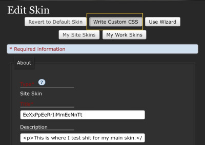
Firstly you go into your site skin (if you don't have one see this post) and click on Custom CSS, it will show the box where the code for the skin will go:
Then for excluding tags there is a piece of code you must use:
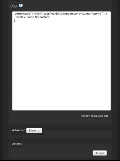
.blurb:has(a[href$="/tags/tagstringhere/works"]) { display: none !important; }
Excluding a ship tag (maybe one that's popular in a fandom you're in, and always clogs the search, that you simply hate) I find works best since it's such a specific tag. To do this you will need the URL pulled directly from the tag. I will use a ship I don't like to demonstrate. I want to excluding the ship of Hank Anderson/Connor from my searches because I have no interest in reading for this ship:
https://archiveofourown.org/tags/Hank%20Anderson*s*Connor/works
For the tag block to work we don't need the whole URL:
https://archiveofourown.org/tags/Hank%20Anderson*s*Connor/works
Take the remaining part and paste it into the "quotation marks". It should look something like this:
.blurb:has(a[href$="/tags/Hank%20Anderson*s*Connor/works"]) { display: none !important; }
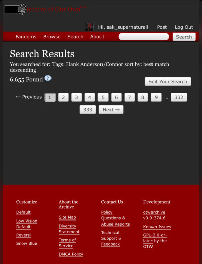
Update the skin and your display should look like this for the excluded ship:
You can repeat this process as many times as needed for different ships and you will have no more works tagged with the specific ship or ships appearing in your search. Pretty cool!!!
Excluding Other Tags
Excluding other tags is done in the same way, using the same piece of code. But it may not be as effective, especially if it's from the 'additional tags' section. There are many tags that link to other tags so excluding all of them that link up may not be possible, but excluding the main offenders should help reduce your exposure to works you don't like.
Here's an example list of some tags that I want to exclude:
Puppy Play
Pet Play (which links to the tag 'Animal Play' allong with many others)
Here's what the code I have used to exclude them looks like:
.blurb:has(a[href$="/tags/Puppy%20Play/works"]) { display: none !important; } .blurb:has(a[href$="/tags/Animal%20Play/works"]) { display: none !important; } .blurb:has(a[href$="/tags/Petplay/works"]) { display: none !important; } .blurb:has(a[href$="/tags/Pet%20Play/works"]) { display: none !important; }
This does not catch all works of this type because there are so many variations upon these tags. But it means I won't have to filter it manually every time I search. And I can add to these should I encounter anything else I don't want to read.
#how to block tags on ao3#ao3#ao3 site skin#ao3 skins#ao3 tags#blocking tags#blocking#tags#archive of our own#how to ao3#ao3 tips#ao3 things#ao3 tutorial#ao3 guide#coding#html css#html#css#excluding tags#personalize your ao3#ao3 tricks
7 notes
·
View notes
Text

Glowing Text Animation
#glowing text animation#css text animation#css animation tutorial#html css animation#css tricks#css effects#html css#divinector#css#html
5 notes
·
View notes
Text

Transparent Login Form
#transparent login form#login form css#css form#css tricks#html5 css3#css#html#css3#frontend#learn to code#codingflicks#webdesign#html css
3 notes
·
View notes
Text

CSS Button Animation
#css button border animation#css buttons#codenewbies#html css#html5 css3#frontenddevelopment#css#css animation examples#pure css animation#css animation tutorial#code#css tricks#css snippets#html5#frontend
3 notes
·
View notes
Text
i've implemented formatted text for my little tumblr mirroring page!
i also made an optimal mode to turn off all the formatting, because i thought it looked cleaner without them. partially inspired by the [pt: formatted text. end pt] things @dead-immortal does
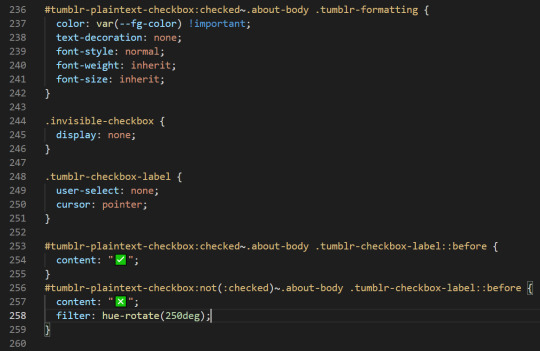
that checkbox is all css, and doesn't use a single line of javascript. my whole site is js free!... so far...
65 notes
·
View notes
Text
am currently working on a neocities site (which i cannot give you the url for yet because im working on the css still and there's no content also it looks ugly still) and oh man does it take me back to ye olde days of custom theme editing on here. i still use a custom theme obvs but back in like 2014/2015ish when i was really into indie rp custom themes were all the rage and you would spend hours editing some character specific image for your bg and then another several hours trying to make the css line up with your image (never at any point did i attempt to actually like. learn html or css. i just read other people's theme codes and edited the parts i could understand and solved problems as they arose. i distinctly remember one time i was using a base that had two sidebars and i only wanted one and deleting the section broke the theme in disastrous ways [bc i had no idea what i was doing] so i literally just made all the elements in the sidebar transparent and moved them off the screen LMAO. the best i ever got was moving from fully built custom themes that i edited to base themes that i built off of)
anyway while im slightly better now (im even reading tutorials! am i following them? sorry i have to go i think someones calling me) i am using a layout builder to build the homepage so it is even more reminding me of mid-2010s tumblr. much like building off a base theme, and definitely easier to understand than tumblr theme building (this time i at least know what all the different pieces of code are doing, even when im not sure how or why, or how to duplicate the effect under slightly different circumstances. but progress is progress!).
a good but annoying thing about the layout that im using is that i havent actually edited the site wide stylesheet, just used internal css on that one page, so when i go to make literally any other page i'll have to start from scratch. this is good because i am learning a lot and i think without doing it this way i would end up with a bunch of useless stuff in the stylesheet that really should be page-specific that i would have to correct with internal or inline css later. annoying because what do you mean i have to make decisions about the sizing and positions of the content? i literally just did that
also im kind of nervous to touch the general stylesheet because im pretty sure what i'll actually want to do is have a couple of stylesheets for different 'sections' of the website, to maintain cohesion between pages of the 'same' type but still allow a lot of fun customization on a per-page basis, but that requires deciding what 'sections' i want on the website and that is a whole other can of worms. but also you can't start without starting so i should probably just try to build a really simple layout and go from there (after all, if it sucks, it's not like i can't just create a new stylesheet, or do the css for each page independently until i hit a groove that's actually worth moving to the stylesheet). but also first i have to finish this goddamn homepage. which means i gotta find a header image that doesn't look ugly as shit
#good idea generator#i dont need a header but im scared of deleting the image in case i break the code and if i go back to the layout maker#i'll have to redo all the code i already did. and im not doing that it was so annoyinggggggg#im having so much fun though. enrichment in my enclosure or whatever#also i found a bunch of my old theme editing stuff while looking for resources and i was like woww i even look like i know what im doing#but ultimately the trick was 90% of my background image should have been css elements instead#like i had a nice box around my content. i should have used a container with a border in the css#but what i did was make a bg img with a box in it already. then try to fit the content to that box#and if youre wondering no i never tested shit all on different screens and i def did not understand positioning#so definitely the boxes did not line up on anyone elses screen. well you live and you learn!
7 notes
·
View notes
Text
youtube
Fancy css button animations
2 notes
·
View notes
Text
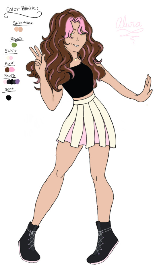
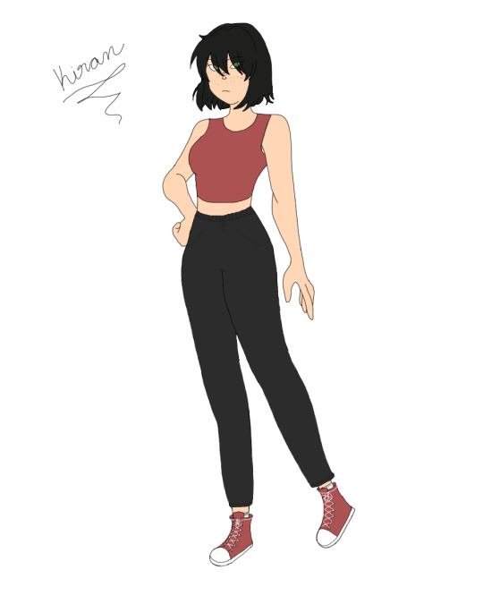
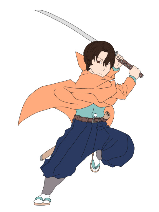
I’m gonna be trying out taking commissions, questions, and such on here! I’ve been working towards doing more digital art, but my motivation has been lacking, and I’d like to see if paid commissions could work for me in the future. Therefore, if you’d like to support me and help me find out what I can provide, please make a request or message me!💕✨
Two of the above are some characters from the novel I am currently writing, and the other was a commission I made as a Christmas present for a family member.
1 note
·
View note
Text
A Few Ways That Cloudways Makes Running This Site a Little Easier
New Post has been published on https://thedigitalinsider.com/a-few-ways-that-cloudways-makes-running-this-site-a-little-easier/
A Few Ways That Cloudways Makes Running This Site a Little Easier
It’s probably no surprise to you that CSS-Tricks is (proudly) hosted on Cloudways, DigitalOcean’s managed hosting arm. Given both CSS-Tricks and Cloudways are part of DigitalOcean, it was just a matter of time before we’d come together this way. And here we are!
We were previously hosted on Flywheel which was a fairly boutique WordPress hosting provider until WP Engine purchased it years back. And, to be very honest and up-front, Flywheel served us extremely well. There reached a point when it became pretty clear that CSS-Tricks was simply too big for Flywheel to scale along. That might’ve led us to try out WP Engine in the absence of Cloudways… but it’s probably good that never came to fruition considering recent events.
Anyway, moving hosts always means at least a smidge of contest-switching. Different server names with different configurations with different user accounts with different controls.
We’re a pretty low-maintenance operation around here, so being on a fully managed host is a benefit because I see very little of the day-to-day nuance that happens on our server. The Cloudways team took care of all the heavy lifting of migrating us and making sure we were set up with everything we needed, from SFTP accounts and database access to a staging environment and deployment points.
Our development flow used to go something like this:
Fire up Local (Flywheel’s local development app)
Futz around with local development
Push to main
Let a CI/CD pipeline publish the changes
I know, ridiculously simple. But it was also riddled with errors because we didn’t always want to publish changes on push. There was a real human margin of error in there, especially when handling WordPress updates. We could have (and should have) had some sort of staging environment rather than blindly trusting what was working locally. But again, we’re kinduva a ragtag team despite the big corporate backing.
The flow now looks like this:
Fire up Local (we still use it!)
Futz around with local development
Push to main
Publish to staging
Publish to production
This is something we could have set up in Flywheel but was trivial with Cloudways. I gave up some automation for quality assurance’s sake. Switching environments in Cloudways is a single click and I like a little manual friction to feel like I have some control in the process. That might not scale well for large teams on an enterprise project, but that’s not really what Cloudways is all about — that’s why we have DigitalOcean!
See that baseline-status-widget branch in the dropdown? That’s a little feature I’m playing with (and will post about later). I like that GitHub is integrated directly into the Cloudways UI so I can experiment with it in whatever environment I want, even before merging it with either the staging or master branches. It makes testing a whole lot easier and way less error-prone than triggering auto-deployments in every which way.
Here’s another nicety: I get a good snapshot of the differences between my environments through Cloudways monitoring. For example, I was attempting to update our copy of the Gravity Forms plugin just this morning. It worked locally but triggered a fatal in staging. I went in and tried to sniff out what was up with the staging environment, so I headed to the Vulnerability Scanner and saw that staging was running an older version of WordPress compared to what was running locally and in production. (We don’t version control WordPress core, so that was an easy miss.)
I hypothesized that the newer version of Gravity Forms had a conflict with the older version of WordPress, and this made it ridiculously easy to test my assertion. Turns out that was correct and I was confident that pushing to production was safe and sound — which it was.
That little incident inspired me to share a little about what I’ve liked about Cloudways so far. You’ll notice that we don’t push our products too hard around here. Anytime you experience something delightful — whatever it is — is a good time to blog about it and this was clearly one of those times.
I’d be remiss if I didn’t mention that Cloudways is ideal for any size or type of WordPress site. It’s one of the few hosts that will let you BOYO cloud, so to speak, where you can hold your work on a cloud server (like a DigitalOcean droplet, for instance) and let Cloudways manage the hosting, giving you all the freedom to scale when needed on top of the benefits of having a managed host. So, if you need a fully managed, autoscaling hosting solution for WordPress like we do here at CSS-Tricks, Cloudways has you covered.
#Accounts#app#arm#automation#Blog#CI/CD#Cloud#cloudways#Conflict#CSS#css-tricks#Database#deployment#development#digitalocean#dropdown#easy#engine#enterprise#Environment#Events#Forms#friction#github#Giving#gravity#Hosting#hosting provider#human#incident
2 notes
·
View notes
Text
Gradient Button in ClickFunnels Made EASY With This One CSS Trick 🔥

We can change the Background Color of ClickFunnels Sales Page buttons by using this Simple CSS Trick to set the Gradient Color.
📽 Watch Video - https://youtu.be/Je3zvZgXOmc
#css #tricks #clickfunnels 🔥
0 notes
Text

Product Card Responsive
#responsive web design#responsive product card#html css#divinectorweb#css3#html5#frontenddevelopment#responsive card design#css#html#webdesign#css tricks
6 notes
·
View notes
Text

CSS Curved Header
#css curved header#css header#css tricks#css basics#html css#css#html#css3#learn to code#frontend#code#webdesign#header design#header html css#neduzone
4 notes
·
View notes
Text

Background Blur CSS
#css background blur#css tricks#css snippets#codenewbies#html css#html5 css3#css#coding#background blur css
4 notes
·
View notes