
Web Authoring blog as part of Postgraduate Interactive Digital Media. Author: Dominika Campbell
Don't wanna be here? Send us removal request.
Statistics
We looked inside some of the posts by webdevelopmentanddesignstuff and here's what we found interesting.
Average Info
Notes Per Post
4
Likes Per Post
4
Reblog Per Post
0
Reply Per Post
0
Time Between Posts
7 days
Number of Posts By Type
Text
12
Last Seen Tumblr Blogs


Fun Fact
Mobile US users spent an average of 115.8 minutes on Tumblr app monthly.
Text
Graphic design trends 2021

In yesterday’s Visual Communications lecture we were talking about upcoming graphic design trends for 2021.
Here are 9 top trends. From 3D, emojis, nature element to hypnotizing optical effects, cartoon inspired designs and minimal colours - make sure to get yourself familiar before planning and developing your new designs.
1. 3D design

Image source: https://www.behance.net/gallery/106902311/Graphic-Design-Trends-2021
2021 will be the year of 3D. I really like these effects - it gives a depth to the graphic. This touch of reality, the movement of light and shadows gives really innovative effect.
2. Emoji design

Image source: https://www.behance.net/gallery/106902311/Graphic-Design-Trends-2021
I don’t know about you, but I always use emojis when sending messages online - it gives more personal touch and a bit of emotions to the message. In 2021, brands will be expected to show their emotional side and implement it in their graphics I really like it - it is playful and fun and I think brands who have younger target audience should definitely implement it.
3. Nature-Inspired Design

Image source: https://www.behance.net/gallery/106902311/Graphic-Design-Trends-2021 I’m a nature lover and really adore this kind of design! In 2021, leaves, trees, flowers, natural color palette will be a big thing. Above you can see cover cooking book from Cornucopia - vegetarian restaurant in Dublin (one of my favorite one!).
4. Optical Illusion Design

Image source: https://www.behance.net/gallery/106902311/Graphic-Design-Trends-2021
Very modern, cool and hypnotizing style! Another one to add your to-design list. Optical illusion design gives more depth, shading and lighting to a graphic.
5. 3D Typography Design

Image source: https://www.behance.net/gallery/106902311/Graphic-Design-Trends-2021
Typography is important in any design - it builds brand identity, it can grab the viewer's attention, help with brand recognition, and establish tone of a brand.
In 2021, typography is going to another level - 3D level! Fonts will be jumping out of the page - really cool effect!
6. Cartoon Illustrations

Image source: https://www.behance.net/gallery/106902311/Graphic-Design-Trends-2021
Another fun and playful design trend. Custom cartoon illustrations work for everyday in every possible way. Why should we treat design too serious? Add some cartoon illustrations, grab your viewers attention and simply have fun!
7. Typography Chaos

Image source: https://www.behance.net/gallery/106902311/Graphic-Design-Trends-2021
There is a lot of chaos in the world at the moment. We will experience even more chaos in design in 2021 as it will take 2021 by storm.
8. Color...less Design

Image source: https://www.behance.net/gallery/106902311/Graphic-Design-Trends-2021
Less is better! Simplicity will be a thing in 2021. Very stylish effect. .
9. Geometric Shapes

Image source: https://www.behance.net/gallery/106902311/Graphic-Design-Trends-2021
Geometric shapes were already ruling design in 2020 - now they are going to another level and we will see more often 3D geometric block shapes.
Source: https://www.behance.net/gallery/106902311/Graphic-Design-Trends-2021
1 note
·
View note
Text
Logo development process

Starting my logo development journey
In the Desktop Publishing module for Postgraduate Diploma in Interactive Digital Media, we were asked to design a logo for a business of our choice. When looking for a client, I wanted to find some local, Irish business. I’m a part of the Facebook group - for artists in Ireland. I used to do crafts myself and sell felt jewellery and I’m a part of a Facebook group for artists in Ireland called “Bite the Biscuit” (https://www.facebook.com/groups/bitethebiscuit/). That where I found my lovely client Pauline, the Wicklow Candles owner.
Getting to know my client
Wicklow Candles are beautiful beeswax candles and wax melts, handmade with love in Co. Wicklow. Made from pure beeswax with no additives, using organic hemp wicks. All of their packagings are 100% reusable and recyclable. They use 100% pure & all-natural raw beeswax.


Source: https://www.facebook.com/wicklowfragrances
To aid with designing a logo and better understanding the market, I conducted competitor research. After that, I discussed all the requirements with my client and what is she looking for. Pauline, my client from Wicklow Candles, sent me some logos inspiration that she found, and she really likes. She would like to focus on Celtic heritage but also implement a bee theme in the logo.


Pauline also answered for the main questions which would help me with my logo development. Her main goal when it comes to branding is to showcase sustainable, eco-friendly, natural products while focusing on Irish, Celtic heritage. In terms of how people find out about her products, it is mostly word of mouth, recommendations, as well as her Facebook page and some local "buy and sell pages". In terms of improving lives and positive impact, the Wicklow Candles are made from beeswax, which has many health benefits such as purifying the air, releasing good ions - there are no chemicals, just the good stuff! Fun fact - beeswax has health benefits when burned. The light from beeswax candles is said to mimic natural sunlight! Pauline uses completely recyclable and reusable packaging.
Finding some inspiration
I found a number of designs as a source of inspiration. The main idea was to combine Celtic heritage, beeswax products and an organic, sustainable vibe.


Sketching - an important part of the design process
I started from sketching to get some ideas. Sketching is very important process of UI design but often overlooked by a lot of designers during their design process. It is very important to start our design process with a pen/pencil and paper. The beauty of sketching is that you are not required to be an artist to produce them. Sketching is only to help explore and explain design concepts.

Next steps - colour palette and fonts
Then, I started searching for appropriate fonts and colour palettes. As I mentioned before, my client wanted to go with a sustainable vibe. I found 5 fonts, which I downloaded from Google Fonts. After showing my client all the options of selected fonts, we both agreed on the Forum font, as it gives a natural, organic feel.
For the colour palette, after careful research, showcasing colour options to my client, we both agreed to used two colours.
1. Hex: #b9870c

Source: https://htmlcolorcodes.com/
2. Hex: #fbc464

Source: “Branding sustainable ecologic brand identity hex colours.” https://colorswall.com/palette/10966/
Adobe Illustrator design implementation
I created 5 artboards with different designs, based on my sketches.
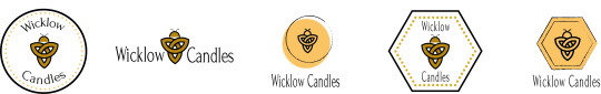
I combined Celtic bee, honeycomb symbol, as well as simple rounded shapes. My client picked logo number 4 as it contained all the criteria that she was looking for.
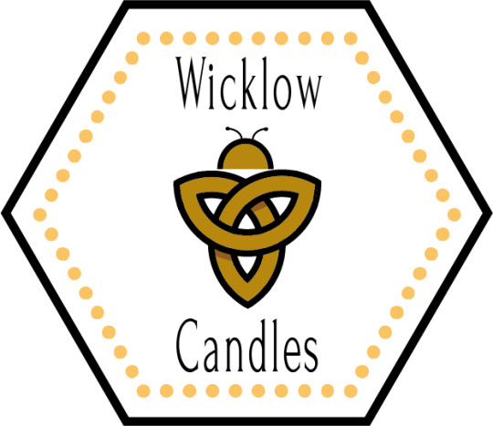
Final logo implementation
To create the Celtic bee, firstly I created a Celtic knot. I started by designing three circles and merged them together. After that, I switched to the shape builder tool and got rid of unnecessary details and joined some details also – so in this way I created a Celtic knot. I added the colours that we selected with my client. I also added shade – by creating a circle first, using stroke (multiply), which gave a bit of transparency. Then I placed it in selected spots, used the shape builder and scissors tool to get rid of details that I do not need. I added half-circle as a representation of a bee head, as well as two antennas, created with the Arc tool. I used the polygon tool to create “honeycomb” looking border. I also created another border with dots. I created a polygon shape, then in the stroke, I selected the dashed line, changed 0 for dash and then 30pt gap.
Yay - my first logo!
The overall research, collaboration with my lovely client as well as designing process was really a pleasant journey. I really enjoyed my first experience dealing with the client and designing a logo for her. The main thing that I have learned, apart from the magic of Illustrator (as I am a beginner) is that research is a key. While designing you need to think about the target audience, your client needs, not what you think looks the best in terms of design.
0 notes
Text
Website Homepage Design Examples

When looking for website design inspirations, I came across an article from HubSpot: "23 of the Best Website Homepage Design Examples."
The homepage is one of the most important web pages on the website - it's the first impression of the site, it's a virtual front door. If it is not appealing and user friendly, people will leave quickly.
HubSpot listed great examples of homepages: from Airbnb and Dropbox to Evernote, Chipotle and more. All of the homepage designs shown in this article use a combination of the following elements.
1. The design clearly answers "Who I am," "What I do," and/or "What can you (the visitor) do here."
2. The design resonates with the target audience.
3. The design communicates a compelling value proposition.
4. The design is optimized for multiple devices.
5. The design includes calls-to-action (CTAs).
6. The design is always changing.
7. The design is effective.
Pixelgrade
Very simple design and great colour combination.Also, CTA really stands out.

Dropbox
Another example of simple yet powerful design - it includes only essential elements. A large, relevant image with supporting copy, and a "Try free for 30 days" call-to-action button. I also like the use of whitespace.

Chipotle
This homepage is all about constant change - they adopt a message to the upcoming holiday. The food photography is beautiful, I’m actually getting hungry looking at it!

You can view the rest of great homepage designs here:
https://blog.hubspot.com/blog/tabid/6307/bid/34006/15-examples-of-brilliant-homepage-design.aspx
0 notes
Text
Building website with WordPress

Having a beautiful, user-friendly, responsive website matters. Building websites can be overwhelming, especially when you consider yourself not that much technical person. But if you think it’s the only job for developers – there is good news - WordPress is there for you to create a site if you don’t have coding knowledge. WordPress is easy to use, you can create a unique and professional-looking website for your business, appealing blog, or portfolio that will stand out.
Step-by-step guide how to start with your first WordPress site
1. Select a plan
Wordpress.org is ideal if you want full power over customizing and controlling your website. A domain is needed in that case. You will also need to upload and install all of your custom plugins and themes, edit the website’s code, and manage security. WordPress.org is free to use, but you have to pay for everything else that goes into having a website.
WordPress.com is great if you’re looking for an easy option where you don't have to do all that extra work and get a domain. You can also customize your site to make it look the way you want to.
WordPress.com has a free and paid version. If you select it, you can’t upload any custom themes or plugins, and you will have a WordPress subdomain. There is also the option to pay for premium upgrades and plans that will give you more features and control, as well as the option to buy a custom domain through a third-party site.
Five plans to choose from:

Image source: https://blog.hubspot.com/marketing/wordpress-website
2 Install WordPress
Here is a step-by-step guide on how to install your first WordPress site: https://wordpress.org/support/article/how-to-install-wordpress/
3. Choose your theme

You can use WordPress’s themes and templates to customize your website. It is important to make it appealing to your target audience, but also make sure it looks professional. To find a theme in WordPress.org, go to your admin dashboard. Click “Appearance” and then “Themes”. Once you found theme that is the most suitable, “Install” it to begin customizing it and adding your own content. Remember - each theme has different steps required of you during the customization process, so be sure to follow them closely.
Read more about themes in HubSpot a guide to 20 of our favorite themes and templates.
4. Add posts and pages to your website

When you add content to your WordPress website, you can choose between posts and pages.
Posts (or “dynamic pages”) are usually used for blogs and portfolios because they automatically place your newest website content at the top. Pages are static which is why they often appeal to business owners - the added content always remains in the same place.
To add a post to your website, go to the admin dashboard, click “Posts” and then “Add New”. You can add a title for your post, insert photos, or change the format.
5. Customize your website

There are a number of ways to further customize your website.
Create static or dynamic pages under the “Settings” tab in your WordPress admin page.
Customize site title in your admin dashboard.
Customize the navigation bar - it's important as your visitors can easily find info on the website.
6. Install your plugins

That's another great thing about WordPress - it has over 5,000 available plugins! Plugins are pieces of software that add functionality to your website. They also enhance the user experience.
Here is a short video from HubSpot about 5 tips for building WordPress website.
Bonus: WordPress Tips and Tricks from HubSpot

Focus on the basics and create a great user experience
Use dashes and not underscores when naming your files in WordPress. Google looks as underscores as joiners, meaning your file will look like one big word. That won’t help you with your SEO.
Use Image Alt Text to your advantage. Image Alt Text can be used to improve your SEO and Google rankings.
Keep your sidebar as organized as possible.
Back up your website regularly, so if you ever lose access or have technological difficulties, you have everything you need to completely restore your content. (believe me, I have been there...)
Learn and understand SEO basics to ensure your website is completely optimized.
Keep an eye on your website’s performance and know what is and isn’t working for your visitors.
Make sure your site is secure to ensure there are no hackers gaining entry.
Structure your website in a way that makes sense for your business, visitors, and buyer personas. For example, use posts if you’re a blogger and use pages if you’re a business owner.
Make sure your website is mobile friendly. People are searching the Internet while on their phones, tablets, and other mobile devices these days.
Use visuals when possible to break up the text on your website pages.
Update your WordPress site and plugins regularly.
0 notes
Text
Responsive Website Design

Back in 2010, Ethan Marcotte wrote an article about the importance of “responsive web design” (RWD):
“Rather than tailoring disconnected designs to each of an ever-increasing number of web devices, we can treat them as facets of the same experience. We can [make our] designs […] more adaptive to the media that renders them.”
10 years later, responsive web design is a standard practice to create a consistent, yet tailored, experience across every device. Unfortunately, there are still many websites that are not adoptable. Recently, I was browsing the Decathlon website, and I have to say - they really have to improve their design in terms of responsiveness and adaptability.
Mobile web traffic has overtaken desktop and now makes up the majority of website traffic. According to Statista, in the third quarter of 2020, mobile devices (excluding tablets) generated 50.81 percent of global website traffic. Responsive media design is fundamental - it can be really frustrating when browsing sites on mobile, and they are not adaptable. I would be one of those people who would lose patience and very quickly leave this site.
Elements of Responsive Website Design
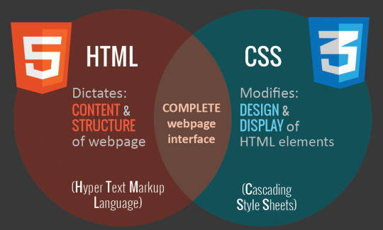
The foundation of responsive design is the combination of HTML and CSS, two languages that control the content and layout of a page in any given web browser.
Media Queries
A media query is a fundamental part of CSS3 that helps to adapt content to different factors like screen size or resolution.

Fluid Grid’s Layout
A fluid layout is an essential part of modern responsive design. A fluid layout relies on dynamic values like a percentage of the viewport width.
Flexbox Layout
Flexbox is a CSS module designed as a more efficient way to layout multiple elements, even when the size of the contents inside the container is unknown. A flex container expands items to fill available free space or shrinks them to prevent overflow.
Responsive visuals
It follows the same concept as a fluid layout, using a dynamic unit to control the width or height. This code prevents media files from exceeding the dimensions of their containers, as well as viewports. This allow to create timeless designs capable of adapting to any device, regardless of its size or shape.
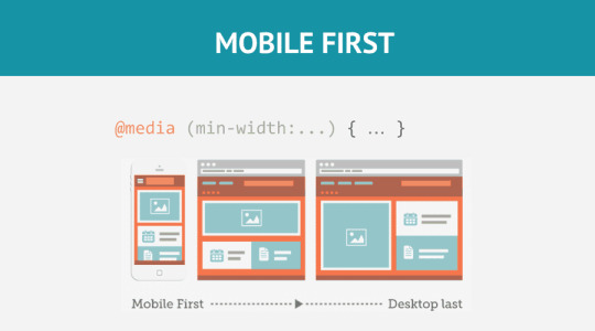
Responsive Breakpoints
When working with media queries, it is important to decide on the “responsive breakpoints” or screen size breakpoints. What is a breakpoint? It is the width of the screen where we use a media query to implement new CSS styles.
“If you choose a mobile-first approach to design, with a single column and smaller font sizes as the basis, you don’t need to include mobile breakpoints — unless you want to optimize the design for specific models.” - Matteo Duò wrote in his fantastic blog. You can access it here: “The Beginner’s Guide to Responsive Web Design (Code Samples & Layout Examples)”.
Responsive web design examples
Dropbox

Dropbox offers a tailored experience across each device. They are using a fluid grid and flexible visuals to design a standout responsive website. Font colour change to accommodate the background colour when shifting from desktop to smaller devices.
Shopify
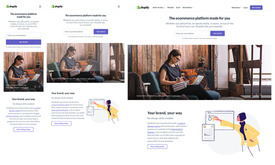
Shopify’s user experience is consistent across all devices. The only elements that would change between desktop and mobile devices are the call-to-action button and illustrations. Shopify’s menu is also replaced by a hamburger icon on smaller devices, which is very common practice.
Slack
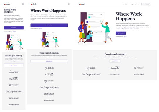
Whoever is familiar with Slack product, know that their brand is very simple and human. Their website follows the same guidelines and it's easy to navigate. Their flexible grid easily adapts to viewports of all sizes and shapes. While customer logos are presented in a three-column layout on desktop, they’re shown in a single-column layout on handheld devices.
Source:
https://www.invisionapp.com/inside-design/examples-responsive-web-design/
https://kinsta.com/blog/responsive-web-design/
0 notes
Text
The Importance of Branding

Consistency is everything
In the last Visual Communication lecture, we were talking about branding. When it comes to building a memorable brand, it's all about consistency. When you are in the shop looking for your favourite brand, you want to be able to spot it straight away. All of the most identifiable brands are recognizable because of their messaging consistency - colours they use, fonts, logos, language. Branding defines who your brand is, what you’re brand does, and how you communicate that externally.
"The best brands stick in our brains because their presence is defined by the repetition of the same logo, fonts, colours, and images."
Do you have your brand style guide?
When developing a consistent brand, it's vital to start with creating a brand style guide. A brand style guide is the collection of specifications that help to showcase a consistent visual brand. It's important to share it both externally and internally. A brand style guide is essential to building an effective marketing strategy, but it also gives employees access important guidance and visual assets to create more effective content. It helps to maintain consistency, especially when it comes to updating/refreshing your branding It also helps establish trust with your audience.

Photo source: www.unsplash.com
Important items when developing a brand guide: 1. Define your brand identity, story and know your buyer personas 2. Company name - make sure it's relevant 2. Logo - after your company name, your logo is the most important part of your brand. 3. Official brand colour palette 4. Typography - make sure fonts fit your brand 5. Define your brand voice 6. Include supporting visuals - icons, images, animations, videos etc.
Examples of companies that rock their branding.
"Branding is what people say about you when you’re not in the room." Jeff Bezos


Barre & Soul's brand style guide includes variations of its logo, logo spacing, secondary logos, supporting imagery, and a colour palette. See the full brand guide HERE.


Photography, colour, and even tone of voice appear in Urban Outfitters' California-inspired brand guidelines. They are not even shy to include information about their ideal consumer and what the brand believes in. See the full brand guide HERE.


Love to Ride, a cycling company, is all about colour variety in its visually pleasing style guide. The company's brand guidelines include nine colour codes and tons of detail about its secondary logos and imagery. See the full brand guide HERE.
Source: HubSpot, 21 Brand Style Guide Examples for Visual Inspiration: https://blog.hubspot.com/marketing/examples-brand-style-guides
0 notes
Text
Website Design Inspiration


I love HubSpot. Since I started working in Digital Marketing, it’s my Bible - such an amazing source of useful articles, eBooks and free training courses!
When searching for website design inspirations, HubSpot was up to the task as always. I downloaded this e-Book - 77 Brilliant Examples of Homepages, Blogs & Landing Pages.
These are 3 websites that particularly caught my attention.
The Hum Creative


The first impression when you enter The Hum homepage - what an amazing way of storytelling! They use bright, vibrant graphics to tell their studio’s story. It’s very easy to navigate. Instead of relying on a grid format, they sway the sizes and positions of their photos for engaging visual look. It's very interactive - when you hover on the images, they change their sizes and they are animated. The navigation links in all four corners stay fixed as you scroll, and the brand logo has an animation to it.
Bubble


This Czech Republic-based agency website design is very clean - they definitely follow “less is more” rule and they do it well! They use a combination of fun, blue colour illustrations, video, white space, and high-quality images - it definitely captures attention.
Names for Change - It's just stuff. Until you don't have it.


When you enter their website, you see duo tone animations and the text: "It's just stuff - only until you don't have it." How creative is that! After that, you scroll to the main page. They layout a grid of essential items that people need to live comfortably. “It’s not sexy stuff. But it’s important stuff. It’s the stuff you might not even think about needing. Until you don’t have it.” By showing baby diapers, bed, clothes, keys, a hot meal and more, they remind those who are fortunate that not everyone is so lucky. When hovering over each item, you can see description of its purpose as well as the associated value to donate.
0 notes
Text
“An image can be more effective than a thousand words.”


During yesterday's Visual Communication class we were discussing visual rhetoric's and what kind of emotions do we associate with each photo. The one that captured my biggest attention was two kids and the contrast - one girl with a doll, and the other girl from a war country. I remember that I came across that kind of photography before in one of the travel magazines, but I couldn't remember which artist was it. I did a bit of research and found this amazing artist. Uğur Gallenkuş is a Turkish graphic designer who combines photos from different parts of the world. He creates dramatic collages to show the extreme contrast between them. The artist says that an image can be more effective than a thousand words. “The solution to a crisis can be described by many complicated words, but you don’t need to know a language to read and understand a work of art. Art is the master of all languages,” says Uğur. “I wish that the whole world would live by Mustafa Kemal Atatürk’s phrase “Peace at Home, Peace in the World”, which was implemented as the foreign policy of Turkey.”


Truly eye-opening art!
You can follow him on Instagram: https://www.instagram.com/ugurgallen/
or visit his website here: https://www.saatchiart.com/ugurgallen
Today, there is a release of his book "In honor of World Children's Day": https://ugurgallenkus.com/
1 note
·
View note
Text
Photoshop and text effects
I was practising my Photoshop skills yesterday, in preparation for designing a poster for the Visual Communication module. I am only a beginner, I didn’t get a chance to use Photoshop a lot before, apart from editing photos from time to time, so it can be challenging at times and a lot of research is required. It is all about the practice after all. I made an attempt of RGB split and reflection effect - still a long way to perfection, but it’s all about baby steps. Before starting Interactive Digital Media, I didn’t even realise how much cool stuff you can do with text and shapes in Photoshop!
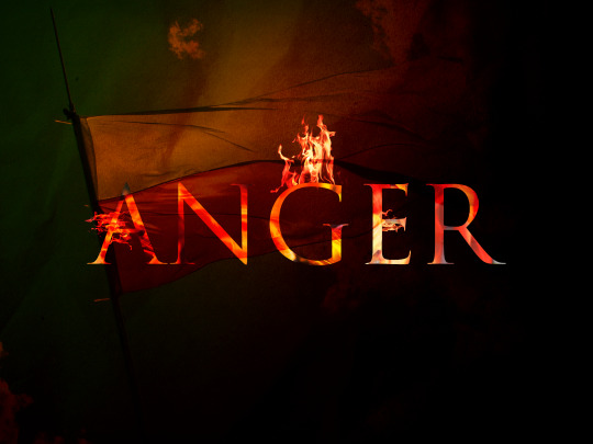
“Anger” - my first graphic. It represents my feeling toward what is going on in Poland (my home country) at the moment. I used this tutorial, with some adjustments (and losing patience few times along the way!😃)

“Calm Down” - my second graphic. I really like text reflection effects so I decided to try to design it myself. It’s actually easier then I thought, I followed great tutorial shared by Dara, our lecturer, available here. I used a clipping mask to add a photo of water inside the text. I also used gradience tool to make this reflected text blurred.
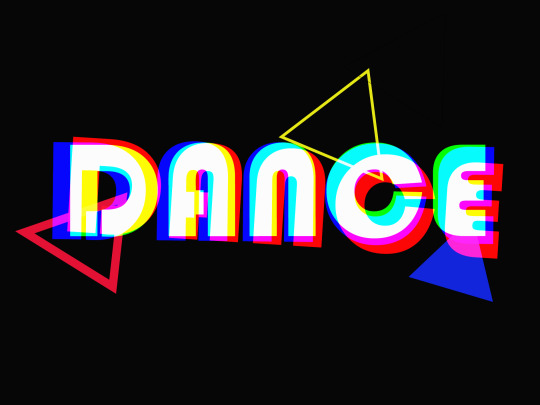
“Dance” - it’s time to blow off some steam!😊 RGB split is a glitch effect and it’s a fantastic way to add interest and action to motion graphics.
I used this great tutorial, available here: https://www.youtube.com/watch?v=75J6LtuCJJQ&ab_channel=BexarPhoto
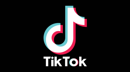
Image: TikTok logo - RGB Split effect
I found a great great article about typography tips and very useful tools: https://uxdesign.cc/awesome-typography-tips-on-how-to-elevate-your-designs-a89dd7dfa6d0
“Typography can make or break your design.”
Here are few main points from this article:
Before choosing a font, establish the purpose of your design. Consider also the medium that your design will be consumed - is it print or a screen. Identify the primary audience of your design.
Legibility and readability are the 2 important principals to consider when settling on the font of your choice.
Legibility is dependent on the font design, readability is dependent on a designers manipulation or handling of the font.
Please don’t arbitrarily choose font sizes. Use the Modular scale method to guide your font size scale.
Pair fonts like a match made in heaven by finding inspiration on Typewolf, FontPair and other online sources.
1 note
·
View note
Text
Semantic HTML

During our last Web Authoring lab we were going through semantic HTML. I never looked at the websites as blocks so it is something new for me.
When doing my research for Visual Communication class and looking for some photography, I came across this website: https://www.digitalphotomentor.com/travel-photography-golden-land-myanmar/
I love travel photography and Myanmar is one of the most memorable places that I visited.
Here is what I have learned during the last class:
<nav> - navigation panel on the top of the page. It can be nested in the header, like you see below. A header can be anything from your company’s logo to the website’s navigational items or author information.

<aside class=’advert’> - Aside’s are perfect for adding to parts of a page where you may want to display an advert or highlight stats, quotes or definitions. It helps machine readers to understand that it’s only slightly related to an article or the page itself if it is not within the article tags. It’s also great for marking up a sidebar navigation elements for extended articles or links out to other sites.

Below we have different sections. The <section> element is sort of like an <article>, except it doesn’t need to make sense outside the context of the document. It is better to use a <section> element over a <div> when implicitly definitely sections of the page. I’m quite excited to start CSS tomorrow and to be able to change section colours!

<footer> - Footers are basically the same as headers, except they generally come at end of an article/website opposed to the beginning. Common use cases include things like copyright notices, footer navigation, and author bios at the end of blog posts.

Important - don’t overuse <div>, use it for layout purposes only. Use semantic HTML whenever you can, since it helps machines infer the structure of your content and it gives you a standardized vocabulary to organize your web pages.

Example: A Semantic Outline from Web Authoring lab above.
Tips For Semantically Structured Content
Source https://www.hongkiat.com/blog/html-5-semantics/)
1. The outermost sectioning element is always the <body></body> tag.
2. Sections in HTML5 can be nested.
3. Each section has its own heading hierarchy. Each of them (even the innermost nested section) can have an h1 tag.
4. While the document outline is primarily defined by the 5 sectioning elements, it also needs proper headings for each section.
5. It’s always the first heading element. The following heading tags inside the same section need to be relative to this. (If the first heading is an h4 inside a sectioning element, don’t put an h4 after that.)
6. The sections defined by the <nav></nav>, and the <aside></aside> tags don’t belong to the main outline of the HTML document, they are usually not rendered initially by assistive technologies.
7. Each section (body, section, article, aside, nav) can have their own <header></header> and <footer></footer> tags, that defines the header (such as logo, author’s name, dates, meta info, etc.) and the footer (copyright, notes, links, etc.) of that section.
Here is a quick screenshot of the exercise from the lab:


1 note
·
View note
Text
<h1>HTML – How To Master Links</h1>

“Challenges are good, challenges are good, challenges are good” – that’s what I’m telling myself when going through the lab exercise from our Web Authoring class. I’m a newbie to HTML, my background would be in humanities, so not surprisingly – I found HTML quite overwhelming at first. But hey – you learn something new every day! Here I am, trying to crack HTML coding! Last week, during the Web Authoring class we were practising HTML links and images.
Here are a few takeaways.
1. There are root, absolute and relative links. “Absolute” links refer to other web resources. “Relative” links point to another file in our website. “Root-relative” links are relative to the “root” of the entire website. For instance, if your website is hosted on our-site.com, all root-relative URLs will be relative to our-site.com.
2. Opening link in a new tab – very important! We can use the target attribute to ask the browser to open a link in a new window/tab.

3. Spaces are bad. Make sure not to have spaces when naming your file - otherwise spaces will be replaced with 20%. Here is an example below, note the URL name:

4. It is all about dots. When providing links to other pages within your website, there are often times when the page does not exist within the same folder. This is where dots are super important as they help navigate the user between folders to the correct pages or files.

5. There are four main image formats in use on the web (JPG, GIF, PNG, SVG), and they were all designed to do different things. Understanding their intended purpose goes a long way towards improving the quality of your web pages.

The SVG image format is smaller. JPG, GIF, and PNG images are 150×150 pixels, while SVG is only 75×75 pixels. To get pixel-based images down to the intended size (75×75), we can use the width attribute. The width attribute sets an explicit dimension for the image.
6. HTML can be fun – even if you don’t believe in it at first. That feeling when you actually get it right and seeing the results.
7. Practice at least 20 minutes a day! Don’t leave it for the last moment – unless you want to end up like me in my second week of Web Authoring – practising HTML at 10 pm on Friday evening is not great for your mental health. Note to myself: visit https://www.freecodecamp.org/learn/responsive-web-design/basic-html-and-html5/say-hello-to-html-elements every day and crack that code!
8. Labs are fun. Working from home, not interacting with humans much, studying online can be hard. It’s nice to be in a small group in the lab and get to know people.
9. Practice HTML and gratitude every day. Today, I’m grateful that I’m not a 19 year old student who wants to socialise and go for a pint after college. Certainly, COVID times make it difficult and I’m sure a lot of young people can find it quite challenging.
Here is what I made earlier. 😊


0 notes
Text
Fonts, glorious fonts
Last week we were exploring the fascinating world of typography and fonts in our Visual Communication class. I have to say I got hooked on it and I spent all Sunday trying to practice typography in Photoshop. It seemed easy when looking at Dara’s tutorial, but when it came to practice…it turned out it is not as easy as I thought – at least for someone like me, who only used Photoshop to edit photos and to make people a little bit more pretty. This post is supposed to be about me showing off my amazing work but it’s not going to happen – I need to master Photoshop a little bit more!
New week, new challenges. But first – morning coffee and a quick browse through LinkedIn. As a Digital Marketing professional, I always pay attention to sponsored ads that appear on my feed. Before, I was looking more at the relevance rather than the design itself, but after only 2 weeks in the Visual Communication class, I started paying more attention to design. Here is a sponsored advert from my LinkedIn feed today.

Image: Sponsored advert from Cheq on LinkedIn
It caught my attention because of gradience, which we learned two weeks ago. Gradients are eye-catching and memorable because they’re colourful and playful. Last week, we also found out more about typography. I don’t like the way they used fonts in this graphic, it seems “messy” for me and the message is not clear. I decided to use a tool for checking fonts, recommended by our lecturer, Dara: https://www.myfonts.com/WhatTheFont
It turned out that they used four fonts.
Guildford Pro Titling
Avenir Arabic Book
Diverda Sans Pro Regular
Gogh Black
It’s important to keep the number of fonts used at a minimum (3 different fonts in one graphic would be maximum). Just a quick reminder to myself when working on an assignment and designing a poster! 😊
Before, I thought a font is just a simple design choice. But it is more than that. It’s like the body language of the graphic. It’s all about creating emotions with fonts. Do you want to motivate readers? Make people share your post? Or maybe drive decision making? You can read more about fonts and emotions below. There’s also great advice on typography and colours, and how to use it in social media ads: https://buffer.com/resources/how-to-create-shareable-social-media-images/
Below is an advert from Coke which I love – it’s simple, but powerful. A perfect example of more is less. The use of this typography is to motivate you – go explore, express yourself.

Image: Coke advert from https://www.adbranch.com/coca-cola-you-dont-have-to-campaign/
0 notes