#(ctrl + shift + tab moves you one tab to the left)
Explore tagged Tumblr posts
Visit Tumblr Blog
Explore Tumblr blogs with no restrictions, modern design and the best experience.
Last Seen Tumblr Blogs


Fun Fact
Tumblr was named as a finalist in Lead411’s New York City Hot 125 in Aug 2010.
Text
ever since i found out the keyboard shortcut for opening file explorer (windows key + E) ive been obsessed. open that thing upwards of 10 times a day. a necessity. my wife
#edit i accidentally said task manager.. thats a different thing#theres a keyboard shortcut for that as well tho i can never remember what it is. give me a couple tries#ok its ctrl + tab + esc#but ideally do it outside of an internet browser bcos ctrl + tab moves you one tab to the right#(ctrl + shift + tab moves you one tab to the left)
2 notes
·
View notes
Note
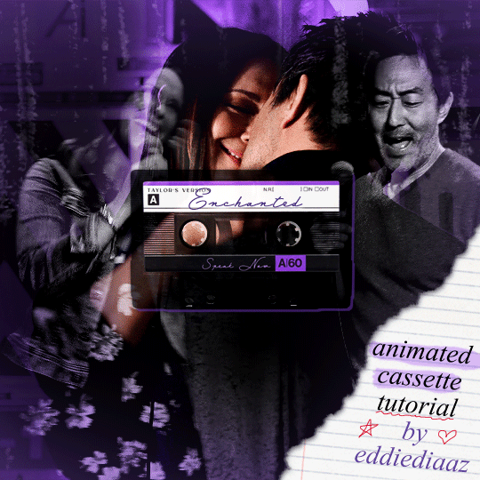
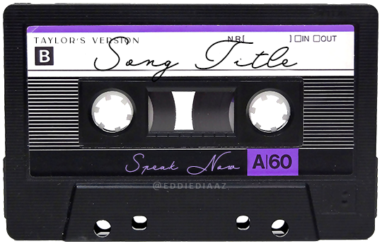
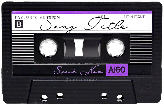
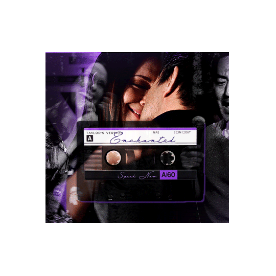
Hey!! I just wanted to say that your recent speak now gif set is sooo stunning. I was wondering how you managed to create that cassette tape effect if it isn’t any trouble? It’s really so pretty.
Have a great day! ✨
ahhh thank you so so much! first of all, i cannot take any credit for this effect, as it was greatly inspired by this amazing yellowjacket gifset by @thewintersoldier!!
but here's how i recreated the effect, from a cassette png (found on pngwing here), to this animated cassette effect (as seen in my speak now set):
psst: i usually always create in photoshop cs5, but for this effect you need a recent version of photoshop because it's using transform keyframes (i think cs5 doesn't let you do that, or i just don't know how to lol). i used cc 2019 for this.
sorry if this is lengthy or has too much or too little details haha, but i hope it's comprehensible! english is not my first language so i also apologize in advance for any mistakes!
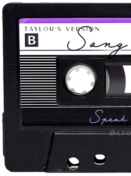
I. PREPARING THE CASSETTE
so, starting with the png here:
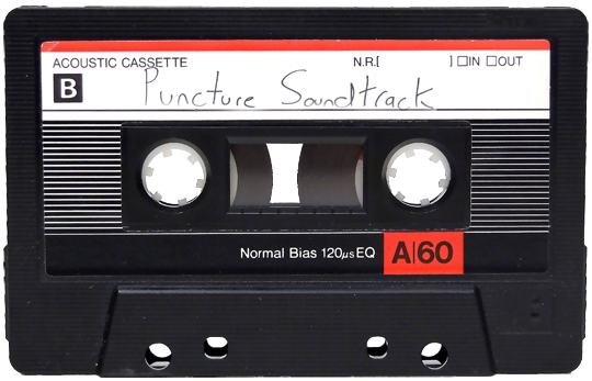
i removing everything i didn't want on the cassette png with the brush tool by just drawing the right color over the unwanted text. for the color, i then went to image > adjustments > hue/saturation and in the red tab, i played with the hue slider to get that purple color. finally, i added some text to my liking, and this is what i ended up with:
(not necessary but: i also selected the white lines on each side with the magic wand tool because i wanted these lines to be transparent. once your selection is done, go right click > layer via cut. it will create a new layer of the cutout you just made. you just need to disable or delete the layer to make the selection (lines) transparent.)
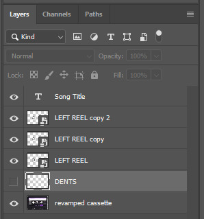
at this point you want to have only 2 layers: the revamped cassette and the text layer. you can remove the text layer actually, and just add the title back at the end, as it is not necessary for this effect. i just like to have the visual.
if you have multiple layers, you need to select all of them (except the song title layer), right click on the png layer and click on merge layers. this will create one layer with all the editing you made on the cassette. if you think you will need to edit this later though, i would save the file as a psd before merging the layers.
II. THE EFFECT
okay, so now that you have your cassette, make sure your video timeline is activated, not frame animation, and you are ready to go.
first, you want to create a perfect circle shape around one of the reel with the elliptical marquee tool (hold shift while dragging the circle). make sure it covers the entire area that will later be rotated. make sure this circle is perfectly centered around the reel or otherwise the animation will be a bit lopsided.
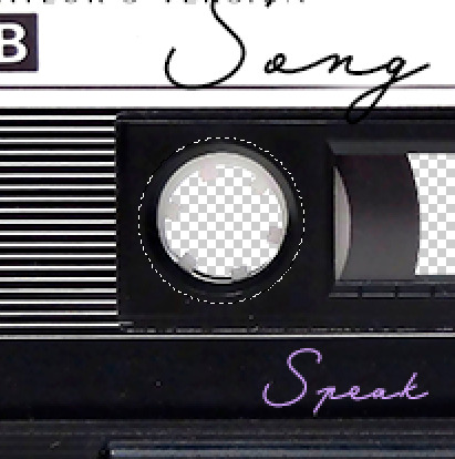
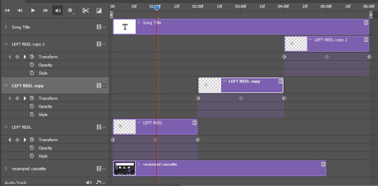
then right click on this selection and go "layer via copy". this will create a layer of only that circle selection. important step: right click on that new layer and go "convert to smart object". the layer should look like that, i've renamed mine:
now if you go to your timeline and open that new smart object layer, you will see that you have 3 keyframe options. we only need the transform one.
go to the start of the timeline and activate the transform animation by clicking on the stopwatch button. a keyframe will be created automatically.
to create the actual animation, move the position of the cursor on the timeline further, i put mine at the 01:00f mark so it's easier to create the right timing.
then what you want to do is select the reel smart object layer and hit ctrl + T. a box will appear and this is how you will make the reel rotate.
to rotate the reel shape, move your cursor near the blue box on your canvas and drag it until you have rotated the shape halfway through and hit enter. another keyframe will be created and if you play your animation, the reel should rotate on itself for half a turn

move your position on the timeline to 02:00f and do the same thing: select the left reel smart object, hit ctrl + T, rotate for another half turn, and hit enter. this third keyframe should be the last one needed for the animation and you should have a full animated rotation of the reel.
play your animation, and adjust the speed to your liking by dragging the keyframes on the timeline (but make sure they stay within the same distance from each other). the closer the keyframes are, the faster the animation are, and the further they are, the slower it'll be.
then you can just trim the smart object to your animation's length, and duplicate (right click the smart object > duplicate layer) this layer the amount of times needed (i find this less finicky than duplicating keyframes), and placing them one after the other. three full turns should be enough. this is what my timeline looks like right now:
and my animation for the left side looks like this:
as you can see, we can see the little "dents" peeking through behind the animation. we don't want that! to remove it, select the revamped cassette layer (that should be under the reel smart object), and create another perfect circle around it with the marquee tool. this time make sure it's smaller than the previous one, it just needs to cover these dents.
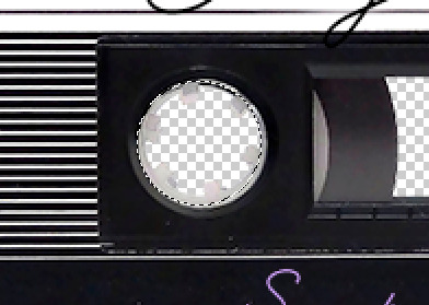
then right click on this selection on your canvas and go "layer via cut". this will create a new layer with that selection, and all you need to do is to disable it. this is removing the information in that circle.
once you are happy and the animation works, you can just delete that cut layer. now the animation is done and looks like this:

III. SECOND ANIMATION
one you have done it on the left side, you just gotta do the same thing on the right side. you can also try duplicating it, but i found it finicky for some reason (or maybe i'm just not used to the controls of this 2019 photoshop version?).
this is what i have once i've done the same thing on the right reel:
once i am happy with the speed and everything, i want to have only one layer so it's easier to use on gifs. first, i will save this animation as a psd file, in case i want to reuse it. then i am removing the song title layer and will be flattening everything and creating frames from this animation. to do so i am using the "save" action from here.
i'm not sure why it does that, but it's creating a couple of frames where the reels are a bit offset from their position everytime there's a full circle done, so i just delete these 5-6 frames. you can also change the speed here, but by default it should be 0.05.
once you are happy with it, just turn these frames into a smart object with the video timeline again (convert frame animation to video timeline and select all the frame layers > right click > convert to smart object)
now you have a smart object that is ready to be used anywhere!
IV. FINAL TOUCHES
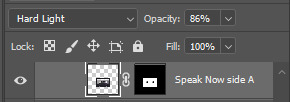
for my particular speak now gifset, i have multiple layers of the animated cassette on each gif:
1, bottom one - cassette layer set to the blending mode "hard light" and set to opacity 86%:
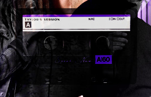
2, middle - this same cassette layer set to hard light, but with the opacity at 100%, AND with a layer mask so it's only applied to the animated reels (i wanted them to show up more):
3, top one - and finally a third layer with another layer mask because i wanted the white label and speak now area to be less see through. it's set to the normal blending mode and the opacity is at 75%

and then i just added the song title on top at 100% opacity and normal blending mode, and added some drop shadows, and tada!
there we have it, i hope this was helpful <3
#alie replies#Anonymous#photoshop#tutorial#*ps help#completeresources#allresources#resourcemarket#userrobin#userraffa#userpjo#usertreena#tuservaleria#tuserheidi#userdean#userrainbow#usersalty#userzaynab#usernik#swearphil
423 notes
·
View notes
Text
A Very Basic How to Edit a Screenshot Tutorial
I had a request by PeachPlumbobs on Bluesky about how I edit my moodlets and use them on my Sims 4 screenshots. I used this as an opportunity to brush up a little on my Photopea skills to offer a free solution to anyone editing their sims screenshots. This is a quick and dirty tutorial. There are SO MANY MORE THINGS you can do with Photopea. Its basically a free to use, browser based, Photoshop. If you've ever worked with Photoshop, you will be comfortable here.
To follow along with this tutorial you need:
A screenshot of a moodlet and a screenshot you want to put it on top of.
Open Photopea in your browser
** I play and edit on a PC. Any keyboard shortcuts I mention are for PC.

First, we're going to open Photopea. It really is browser based. You don't need to download a thing to your computer. For this basic edit tutorial, I dragged and dropped a screenshot with a moodlet and a screenshot I wanted it overlayed on.

Notice how Photopea will open each image as its own tab. That's good. The question I was asked was how I edit and add moodlets. Personally, I use exactly what the game gives me. I'm going to show you how to cut them out with rounded corners here.
*To make your life easier, feel free to use the magnifier glass tool on the left to make the area you are working on bigger. If you need to move the whole image around, use the hand selection tool on the left side.
On the left side with the tools, you will find a button for shapes, click the rectangle one. On the top bar, just below the "Edit" button, you will see a drop down box that lets you change this from a shape to a path. Make it a path. On that same bar you will see an option to edit the corner radius. I changed it to 5px.
Use this path drawing tool to draw a rectangle over the part of the moodlet you want to see. I cut out the time remaining on the moodlet when I do this. I also cut out the icon - that's optional of course!

Once you have your path drawn, look to the right side of the screen. Over there, you want to switch it from layer view to Paths. After that, on the bottom of the right side is a button that lets you make that path into a selection. Switch the view on the right side back form Paths to Layers. Use the Arrow tool on the left side and click the center of your selection to make sure it is active.

On PC, you can use the keyboard short cut "Ctrl C" to copy the selection. Or, you can go to the top and click "Edit - Copy"
Switch tabs to the image you want to place the moodlet on. The PC keyboard shortcut is "Ctrl V" to place your copied selection on a new layer of this file. Or, you can click, "Edit - Paste"
Again, this is how I edit my moodlets and you don't have to do the same thing if you don't want to! Once my moodlet is placed as a new layer, I use the square selection tool on the left side to create a box around the moodlet icon. I then use the arrow tool to move the icon on top of the moodlet box with the text. Once completed, go to the top and press "Select - Deselect"

How to add that nifty translucent outline around the moodlet. Make sure you are on the layer your moodlet is on! Go to the bottom right and click the button labeled, "eff." Go up the pop-up list until you get to "Stroke." Click on that and a layer style box will pop up. For this example, I set the width to 10px, the opacity to 40%, and the color to white. There you go, you've given that moodlet a little pop!

This is a quick tutorial, but I'd be remiss if I didn't follow through with the rest of the image editing process here. I know I plan to make this image a square when I save it, so I moved my moodlet over where the square would be. Using the rectangle select tool, you can press "Shift" while dragging the rectangle out and you will get a perfect square. Once you are happy with your selection, go to the top bar, and click "Image - Crop"

Now that I know the size of my image that I plan to post, I can adjust the size of the moodlet. Again, make sure you are on the layer with the moodlet when you try to do this! Go to the top bar and click, "Edit - Free Transform"
Free Transform is a lot of fun. You can make the moodlet larger, smaller, or rotate it! If you hold down the "Alt" button while resizing, the moodlet will keep it original aspect ratio as well. Once you are happy with the size and rotation of the moodlet, click the arrow tool on the left to exit Free Transform mode.

This screenshot was taken at night and is very dark. There is a very easy and quick way to make it a little brighter. Click the layer with your screenshot. By doing this first, the following edits to brightness will not affect the Moodlet layer. From the screenshot layer, go to the bottom right and click the half and half circle button. From the drop down list, click "Levels"
Levels brings up a bar graph looking screen. On the left is darks, on the right is lights, in the middle is midtones. Pull the slider button just below the bar graph around until you find a happy level of darks and lights. In this case, I played more with the midtones. This is a quick and dirty adjustment method! there are so many other ways to do this! But, if I'm in a hurry, I go straight to levels to adjust my screenshots.

Finally, save your final product! In my case, I'm going to file and exporting it as a .jpg or a .png. If you save it as a .PSD, you can open it and work on it again in the future if that's something you want to do. When I export the save as a PNG or JPG - it automatically saved it to my downloads folder.

There you go! One quick Photopea to edit your sims screenshots tutorial!
Have fun.
#ts4#sims 4#ts4 screenshot editing#photopea#photopea screenshot editing#photpea screenshot editing tutorial
35 notes
·
View notes
Text
Flag Making Tutorial
This will be a more technical step-by-step tutorial on how I make my flags (also a long post because I wanted to be thorough, plus I love flags lol).
The program I use is Inkscape, a free vector (.svg) editor program for pc.
I have templates set up, so the actual flag making process is pretty easy/quick.

Hotkeys/Locations/Other Reference
I'll be mentioning these options, so I thought to put them here all in one list. (They list the keyboard shortcuts first)
Snapping: magnet symbol (top right of screen), or under the adjacent arrow ◀️ symbol.
Document properties: shift+ctrl+D, or under the file menu (top left corner of screen). Display (1st tab) Guides (2nd tab) Grids (3rd tab)
Fill and Stroke: shift+ctrl+F, or under object (top of screen).
Layers and Objects: ctrl+shift+L, or under object (top of screen).
Align and Distribute: ctrl+shift+A, or under object (top of screen).
Import (Images): ctrl+i, under the file menu, or by dragging into the Inkscape window.
Save As: ctrl+shift+S, or under the file menu.
Export: shift+ctrl+E, or under the file menu.
Selector Tool: S, or cursor symbol (left side of screen). Click, or click and drag around the objects, to select them.
Locking a selection: lock symbol between the width and height boxes at the top of the screen.
Transform Selections: the width/height and x y position can be changed by typing in the X,Y,W,H boxes (near top middle of screen), or by dragging the corners/edges (resize) and inside the object (move).
Duplicate: ctrl+D.
Delete: delete key, or right click on the object.
Node Tool: N, or below the selector tool (left side of screen).
Rectangle Tool: R, or square symbol (left side of screen).
Pen Tool: B, or pen symbol (left side of screen).
Gradient Tool: G, gradient square symbol (left side of screen).
Mesh Tool: swirly square symbol (left side of screen).
Dropper Tool: D, or dropper symbol (left side of screen).
Undo: ctrl+Z.
Redo: ctrl+Y.
Creating the Template
Download Inkscape and open it, under the Time to Draw tab, click New Document.
First, snapping needs to be enabled, and under advanced mode enable grids and guide lines snapping. (This is crucial for making the stripes equally sized, spaced, and the overall flag in the right ratio.)
I'll be making a template with a 2:3 flag ratio.
Open document properties. (I like to move these types of windows to the right side.)
Under display, set the width to 42px and height to 28px.
Under guides, just click create guides around the current page.
Under grids, make sure rectangular grid is selected, and click new. (Grid units should be in px.) For the major grid line every option, change it to 2. (I also prefer to change the minor grid line color to be transparent.)
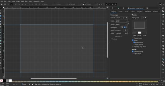
That's pretty much it, your template is done :D ! Just save it wherever you want. I like putting it in an easy-to-access flag folder, as it is needed to open it every time to make new flags.

You can use a different width / height / grid size / flag ratio if you want, these are just the numbers I'm comfortable with / used to.
Also, since this is a vector, the image can be infinitely big or small without any quality loss, so the small dimensions above don't actually translate to a low res image.
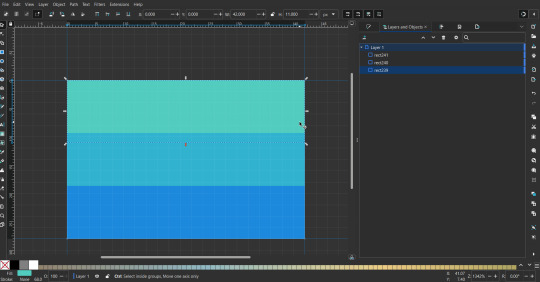
Creating the Flag
(I'll be using the rainbow flag to demonstrate.)
Start by having the template open.
You can import images (like .png/.jpg files) to color pick / reference if you want. Said images can be transformed (resized/moved) by selecting and transforming them using the options mentioned in reference. (This is optional, they should just be off to the side so they don't get in the way.)
To create the stripes, use the rectangle tool. Click and drag from one grid corner, to a lower grid corner.
While the rectangle is selected, use the dropper tool to pick a color from a imported image. You can also use the fill and stroke (shown on right) tab to create your own colors / edit colors / etc.
You can make these stripes however you want, they just need to all be equally sized. (They don't have to all have the same height, if you intentionally want that (like the demisexual flag for example).)
Then select all the stripes and transform them so that they fit the page.
All that's left is to save/export it.
To export it, use the export tab, under single file, page, adjust the width and height (in px) to however high res you want your image to be. (I usually do 3000 by 2000.)
Type in the desired file name in the box next to the folder symbol, use the folder symbol to choose its export location (which can also be used to determine the file name and save/export it), the adjacent drop-down-menu to select what to save it as (,png, .jpg, .svg, etc.), and the gear symbol to adjust other settings (I leave it as default, with antialias turned off (set to 0)).
And done, you've made a flag :D 🏳️🌈
Extra Notes
Layers and Objects: a menu that can be used to manage objects. Like their layering position (whether they are above or below another object), and other options can also be done here instead of with keyboard shortcuts.
Vertically striped flags: it's very similar to above. You would just make the rectangles taller rather than wider.
Wavy stripes: first use the pen tool to create zigzags. (The pen tool works like a outline, so just click along the grid corners, and join the line at the end. The fill and stroke menu can be used to make it a solid colored shape, and remove/add outlines). The steepness/frequency of the zigzags is up to personal preference, they just need to extend off the page a bit. To create equally sized wavy stripes, have the all side lengths (highlighted in red) be equal except (depending on how you draw your zigzags) the first or last wave, which should have half the side length of the others.

Select everything, and with the node tool, select all the zigzag nodes (the corners don't need to be selected), and click make selected nodes smooth (half circle with point in middle symbol, at top of screen). (It'll likely look like it has weird lines in-between the waves, see glitch section at the end for how to fix that.)
Then resize it all to the height of the canvas. And done :)
This can of course be vertical too.
Gradients: You can use the fill and stroke dialogue, gradient tool, or mesh tool to do this.
To create the gradient, select the object, click the linear gradient symbol (gradient box) under fill and stroke. Or dragging / double clicking with the gradient/mesh tools. (The mesh tool is what I used to create the square gradient.)
To change the colors, click on the arrows or circles under fill and stroke, or by clicking the points on the shape, to select the nodes. Then use fill and stroke to change the colors.
To create new colors/stops, click on the plus+ symbol under stops (under fill and stroke), or double click on the gradient. Edit the new colors in fill and stroke again.
To change the location of stops, use stop offset under fill and stroke, or drag the nodes on the gradient. You can also move the end points on the object to make the gradient slanted or vertical.

Symbols: I make my own when I can (like the demi- triangle can be drawn with the pen tool, and resized to the correct proportions). When the symbol is too complicated, I import a .svg of it. Wikimedia commons is a great resource, and the popular twemoji comes in .svg format too. You could also edit it on over the .png in a rastor program if need be.
The align and distribute tab can be used to center symbols (or any other selected object). Select page for the relative to option, and use the symbols underneath to center/align it however you want. (You can also use different relative to options, like last selected, if you want to align it to an object instead.)
Deleting imported reference images: you can do this before saving it as a .svg, if you don't want to keep them / want to clean up the .svg file.
Antialiasing: an option that blurs things basically. A image with antialiasing off will be sharp pixels, while a image with antialiasing on will have transition colors between the main colors.
Below is an example. The left side is without antialiasing, and the right side is with antialiasing.

I can see why it might be preferable to have it on (like for diagonal shapes), but antialiasing can make recoloring .png (not .svg) files hard. The extra different colors messes with fill tools. I also think it looks cleaner without, so I prefer it off.
Exporting glitch: sometimes an exported image will have a thin line between the stripes, despite the fact the stripes are perfectly next to each other. (This seems to not just be a problem with Inkscape, but with vectors in general.)
Below is a zoomed in example of what it'd look like. The left side shows the stripes are all next to each other, but the right image has a transparent line in-between the stripes.
This can be fixed a number of ways.
You could select all the objects, and duplicate them twice.
Or overlap them. The stripes will still be the same size when overlapped, but they will technically be behind each other, so there will be no gap.
With all the different stuff mentioned, you can basically think of them as building blocks with the grid as reference. They can all be mixed and matched together.
I didn't mention all the options, just because there's that many different things you can do in Inkscape. I'd encourage you to play around with all the different options/tools yourself.
There's also some great Inkscape guides on YouTube, it's where I learned how to do a lot of this from (even if they're not for flags specifically, the concepts in those videos can be applied to flags).
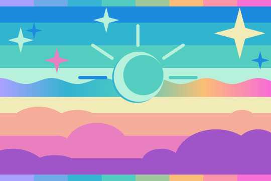
Here's an overly elaborate flag I made, just to demonstrate some (but not all) of the things that can be done.
Anyways what a long post haha. But maybe this will be helpful for anyone interested in making (pride) flags.
218 notes
·
View notes
Text
Tidbit: Persnickety About Posters
If you want to avoid overly dark or blurry posters in your fan adventures, then follow my lead:
1) Download JPEG off of Google Images.
2) Import, scale down, and skew/shear it. Use an interpolation method such as Bilinear or Bicubic Sharper. Doing both transformations at once is better than repeatedly transforming the image (i.e. resizing it, applying the transform, and then skewing it), as it helps prevent the image and edges from becoming too blurry. This will be important later.
You can hold down Ctrl + Shift to constrain the Move tool along a single axis so it won't go out of alignment as you're skewing it. If you don't see the Transform Controls by default, enable it in the tool options bar at the top, or go to Edit>Free Transform.
3) Desaturate it. Desaturate means to turn color grayer, until it becomes black and white.

4) Adjust the brightness and contrast using the Levels adjustment tool. It's much too dark as it is! In Photoshop, it is located under Image>Adjustments>Levels..., but I recommend creating an adjustment layer from the bottom of the layers tab instead. Doing so will allow you to make edits non-destructively, meaning you can go back and change any parameters until it looks right.

You could use a Brightness/Contrast adjustment with "Use Legacy" enabled instead to achieve a similar effect, but it won't clip the shadows and highlights as easily. You would have to create an additional duplicate adjustment and turn the brightness and contrast way down on the first one to do so. It's somewhat easier to use but less efficient than Levels in this case.
5) Apply a simple sharpen to the image as it is still too blurry for our purposes. In Photoshop, it is located under Filter>Sharpen>Sharpen... Do not use any other filter, such as Unsharp Mask, unless you absolutely have to in lieu of a basic one. If you must, turn down the radius a bit and the threshold all the way to 0.
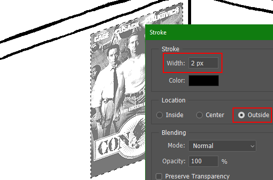
6) Make a selection around the image. Ctrl + left click on the layer's thumbnail to make a selection around it. Doing it this way makes it inherit the level of transparency any pixels have. If you can't, use the Magic Wand tool with "Anti-alias" enabled to select the transparent area outside, then invert it using Shift + Ctrl + I, or go to Select>Inverse.
Create a new layer above the image, then go to Edit>Stroke... and add a black stroke with a width of 2px located Outside. Leave everything else at the default. Doing it this way will create a stroke with anti-aliasing based on the selection you made. This should generally turn out pretty sharp if you follow my advice from Step 2. If you had used the Stroke Effect available from the Blending Options' layer styles, it will always result in a very smooth outline instead. You do not want this.
Voila, and Bob's your uncle, you're done!

The instructions above are Photoshop specific, but it should still be pretty software-agnostic. Here is the recreation PSD, and below the read-more link are additional notes, such as transferring the steps to something like GIMP.
ADDENDUM
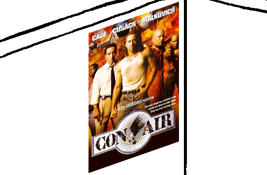
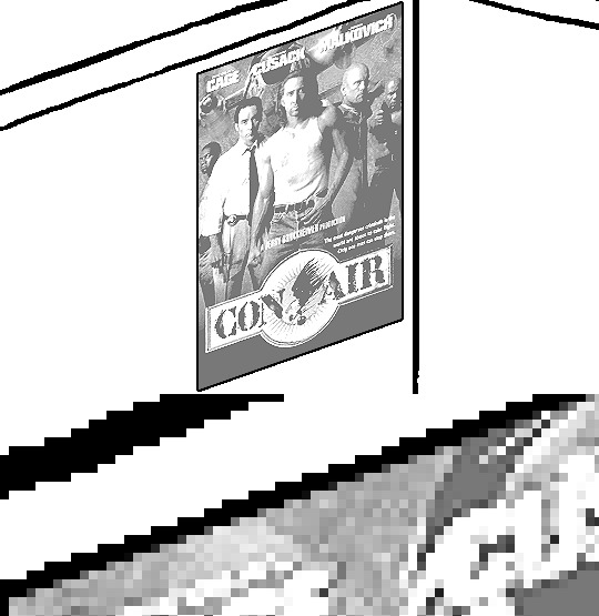
You may be questioning why I deliberately made the stroke anti-aliased. "Isn't that an MSPArt cardinal sin??", I hear you clamoring. Well, my dear readers, let me briefly elucidate you on why your ass is wrong. Exhibit A:
The clearly semi-opaque pixels that can be found in every poster outline, which is especially pronounced here in the Little Monsters poster. I can also see that Hussie actually created a stroke on the same layer as the poster and merged it down into the white background like a dumbass. I omitted this in step 6 for the sake of convenience (and also the fact that you can't add a stroke to a smart object in Photoshop without rasterizing it first).
He had to use the magic wand tool in order to extract it from the layer for this panel, and then fill it in with the paint bucket tool. I can even tell he had the color tolerance set up very high on the magic wand to grab all those near-black and very light gray pixels, AND he had anti-alias enabled and the tolerance on the bucket tool set to be at least higher than 0 to tint similar colors. Exhibit B:

I also didn't address exactly how to desaturate something in Photoshop. Honestly it was because I was feeling pretty lazy. I would have had to rewrite step 4 to not include redundant information about adjustment layers. You can add either a Black & White adjustment layer or a Hue/Saturation one and turn the saturation all the way down to 0. The resulting tones will be slightly different from each other but I'll explain why that is in another tutorial.
Speaking of another tutorial, read this one if you believe this post is missing the step of using a posterize filter.
Now onto applying some steps to GIMP.
RE: step 2) In GIMP, there is a dedicated Unified Transform tool separate from the Move tool, unlike in Photoshop where both features are combined into one. This is how you scale and skew (AKA shear in GIMP) both at the same time, among other things such as rotating.
You'll also find that instead of any interpolation methods labeled "Bilinear" or "Bicubic", there are only ones named "Linear", "Cubic", "NoHalo", and "LoHalo". Basically, Linear and Bilinear are the same, so are Cubic and Bicubic, naturally. I guess NoHalo would be similar to Bicubic Smoother and LoHalo would be kind of similar to Bicubic Sharper as well. It's not an exact 1:1, though.
Honestly it doesn't really matter what you use to reduce the size as long as it isn't None/Nearest-Neighbor. You're going to have to sharpen it no matter what. This applies to Photoshop as well.
RE: step 3) Go to Colors>Hue-Saturation... and repeat turning the saturation down to 0, or go to Colors>Desaturate>Desaturate... and select the Lightness (HSL) method.
RE: step 4) Go to Colors>Levels... or Colors>Brightness-Contrast... The Brightness-Contrast adjustment tool already functions almost exactly like in Photoshop with "Use Legacy" enabled.
RE: step 5) In GIMP 2.10, the developers squirreled away the basic Sharpen filter, making it inaccessible from the Filters menu. To use it, hit the forward-slash (/) key or go to Help>Search and Run a Command... to bring up the Search Actions window and type in "sharpen". Select the option that just reads "Sharpen..." and has a description of "Make image sharper (less powerful than Unsharp Mask)". I find that using a sharpness value of around 40 to be similar to Photoshop's sharpen filter.
RE: step 6) Instead of holding down Ctrl, you hold down Alt and click on the layer thumbnail to make a selection around it. Make a layer underneath the image this time since there isn't an option to place the stroke outside the selection rather than the middle. Go to Edit>Stroke Selection... and create a stroke using these settings:

I recommend keeping anti-aliasing disabled however, as GIMP produces lines that are a little too smooth for my taste.

With "Antialiasing" enabled
Without
If you're using a program that doesn't have a stroke feature available, you could draw a straight 1px thick line across the top of your poster, duplicate it, and move it down 1px. Merge them together, duplicate it again, and move it all the way down to the bottom of the poster. Then repeat the exact same process for the sides. I used to do this before I even knew of the stroke feature, haha.
Another reason I had to do it this way was because my dumb ass did the thing I said not to in step 2, scaling down the image with the scale tool, and then shearing it separately with the shear tool. This caused the edges to become too blurry to be used for a stroke automatically. Oh well, live and learn.
148 notes
·
View notes
Text
stim gifs in photopea
[PT: Stim gifs in photopea /End PT]
Hello! This is my (lengthy) tutorial for how I make GIFs for stimblr using Photopea. It's not going to be as extensive as how I make for shows, celebrities, etc, because I have different processes for both, however I'm still aiming to cover everything I think necessary!
It'll be split into multiple sections with headers, so feel free to skip whatever you want if you don't find it necessary :•] Reblogs appreciated if you found it useful, but no pressure obviously!
Sections:
Getting your video
Importing into Photopea
Making the GIF
Sharpening the GIF
Coloring
Exporting & Optimization (in EZGIF)
End results, and misc tips and comments
1. Getting your video
[PT: 1. Getting your video /End PT]
Short section! These are the ways I download and source videos for use
Youtube - yt-dlp (installation instructions)
Instagram
Tiktok (Allows without watermark)
Pexels
For yt-dlp, check out this basic list of commands I made solely for downloading material to GIF! If you have further questions, either send me an ask or refer to the github page.
2. Importing into Photopea
[PT: 2. Importing into Photopea /End PT]
There are two ways to import into Photopea, the first is importing footage directly, and the second is screencapping (which I won't cover in detail, but this tutorial is for installing the program I use on mac & how to use it, and this is for installing on windows)
Option 1: Importing footage directly (see end for comments)
On the home page of Photopea, you'll want to click "Open from computer", and select your clip, upon selecting you'll be presented with a popup like below

All that really matters here is where you see "30 FPS", that's the videos native frame rate. I always put whatever that number is as my frame rate because I find it to be the best, but you can use different presets (Like ezgif, which gives you 12, 20, etc). The less frames you have, the chopper it will be. If you plan to slow it down later, I'd also recommend having more frames so it looks smoother after slowing.
Now you just have to wait for it to load all the frames, then you're set!
Option 2: Importing screencaps
This is my personal way of doing things, so this is assuming you've installed a screencapping program and already have your frames ready.
For this, when you click "open from computer", select the first frame and open it by itself. Once that's loaded, look in the top left at the "File" tab, select "Open & Place", then ctrl + shift to select the rest of your frames. Once they've all loaded in, you can either rasterize them now, or wait until after cropping and resizing (goes faster then).
What's important though, is use the shift key to select all your layers, in the top left open the "Layer" tab, hover over "Animation" at the bottom to expand it, and select "Make frames". With your frames still selected, hit the folder button in the bottom left.

Without this, Photopea won't recognize this as an animation, therefore you'll be unable to export it as a GIF.
3. Making the GIF
[PT: 3. Making the GIF /End PT]
3A. Cropping
To begin with cropping, select the crop tool, which is the fifth one down on the left bar (if you hover over, it will say the name), or the "C" key on the keyboard.
Along the top now, you should have some new options. The dropdown menu that says "Free" is going to be how you select an aspect ratio or fixed size, and I always set to 1:1 since most people on stimblr use square GIFs, but you can do whatever works for you! Make sure to leave "Delete uncropped pixels" unchecked, because that lets you move stuff around later without having to recrop.
Crop your animation down as you see fit, then either hit the enter key, or the check button along the top bar. If you're unhappy with the placement, you can undo it OR, select all your layers, then use the move tool (First icon on the left, or the "V" key) and drag it around as you see fit.
3B. Resizing
With all your layers selected still, open the "Image" tab in the top left, towards the bottom select "Image Size", then select what you want to resize to.
Tumblr's exact GIF sizing
1 per row: 540px
2 per row: 268px
3 per row: 177px
HOWEVER. For stim GIFs, I find the quality difference so negligible, you can resize to what you want. It's also better for it to be bigger and scale down, then smaller and scale up. For this reason, I typically do 268px no matter what, or 300px.
As far as resampling goes, leave it turned on, and I personally leave it on bilinear, but the different options vary slightly, so experiment and see what works for you!
If you're happy at this step, go ahead and skip down to exporting! But when doing this way, I do recommend sharpening for better quality at smaller size.
4. Sharpening the GIF
[PT: 4. Sharpening the GIF /End PT]
The fun thing about this section is you get to experiment and find what works for you! I'll give you my personal method, but you can play around, add and remove bits, etc until you get something you're happy with!
4A. High pass
High pass is my personal favorite way to sharpen GIFs, and for stim GIFs I'll often use only this.
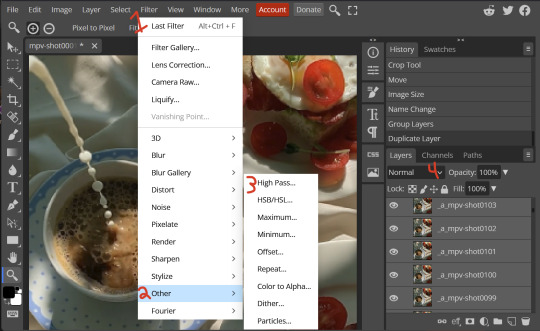
(Steps 1-3 in image) To do, start by right clicking the *Folder* all your frames are in, and select "Duplicate Layer". Select all the frames in Only the folder on top, then go to the "Filter" tab along the top left, hover over "Other", and select "High Pass". The grey look is entirely normal! I normally set my high pass at 2-4, but play around with this step and find something you like!
Select the *Folder* all your high pass frames are in, and change the blending mode (fourth step in image) to "Soft Light", it should be on "Pass Through" initially. With that done, you've used high pass on your GIFs! If you're content here, skip the next section about smart sharpening, and see about merging animation folders under it.
4B. Smart Sharpen
Note: I recommend testing your sharpening settings on one layer BEFORE applying them to all layers, as it will be easier on your computer.
I utilize this in addition to high pass usually, but you can do it all by itself as well! To begin, select all the frames in your folder (if you used high pass, select the frames in the *Bottom* folder). Open the "Filter" tab on the top left, hover over "Sharpen", and select "Smart Sharpen". Now find what you like!
For stim GIFs, if I used high pass, I'll go for 75-110% amount, and a .1 radius. I personally don't like the look of an over sharpened GIF, so I only use smart sharpen if I want to enhance some small details high pass didn't touch enough, which is why I use so little. If you don't like high pass, you might use more here!
4C. Combining animation folders
If you used high pass, you'll notice you have two animation folders. To fix this, select both folders using ctrl + shift, open the "Layer" tab, hover over "Animation", and select "Merge". It will give you a popup to confirm, and you can go ahead and accept!
If you don't merge these, Photopea will think they're two GIFs in one document, rather than only one, which is why this step is so important.
As a note, once you merge these folders, you can no longer shift the frames around to change where they are in the crop like you could earlier.
5. Coloring (Image Heavy)
[PT: 5. Coloring (Image Heavy) /End PT]
This section is going to be less of a tutorial and more a basic rundown of the adjustment layers and what they do. Coloring will change from GIF to GIF, and you can do light or intense coloring, so this is just a guide to begin with, but really just play around and find what you like!
To access the adjustment layer menu, in the bottom right where "New Folder" was, the one directly next to it that looks like a circle made of two half-circles, will bring up your adjustment layers.
As a note, I always group my adjustment layers in a folder above my animation, for ease of hiding to compare with and without.
5A. Levels
Levels is one I almost *Always* use on a GIF because it makes it look cleaner to me. In the first box, sliding the black square on the left *increases* the blacks, sliding the white square on the right *increases* the whites, and the one in the center changes the general brightness up or down.
Sliding the black box on the bottom bar *decreases* the blacks, sliding the white box *decreases* the whites.
If you change the channel from RGB to another option, you can change the balance of reds/cyans, greens/magentas, or blue/yellows, I personally don't touch this for stim GIFs. In the RGB channel, I set the top black box at ~10, and the top white box at ~245 usually.

5B. Curves
This is another way of adjusting brightness, blacks and whites, or color balance. By adjusting the dot in the bottom corner you adjust blacks, the top corner adjusts whites, and if you make a dot in the center, it adjusts general brightness! You can also make multiple dots to separately adjust some values. By changing the channels, you adjust color channels rather than white/black.

5C. Exposure
This is another way of adjusting the lights and darks of the GIF. Sliding the exposure up and down will add/take away light from the lighter parts of your images. Adjusting the gamma correction up and down will add/take away shadow from the darker parts of your image. Offset increases/decreases the brightness of the whole thing but I almost never use it.

5D. Vibrance
Vibrance is what I like to think of as a "softer" way to increase intensity of colors, instead of using a Hue/Saturation layer. It affects warmer colours more intensely than cooler colours, whether you use the vibrance or saturation slider. The saturation slider here is more intense than the vibrance one, but less intense than saturation in a Hue/Saturation layer.

5E. Hue/Saturation
This one is simple! Sliding the hue slider changes the colour, sliding the saturation slider increases/decreases saturation, and sliding the lightness is basically like directly adding black/white to a color. I use lightness only sparingly.
What's cool here, is you can adjust the range to target a specific batch of colours! If you find your reds are too bright compared to everything else, you can target the saturation of them specifically.
5F. Color balance
This is a simple way to adjust the base colors of an image, by changing it to be more cyan or red, magenta or green, or yellow and blue. This can be useful for making a GIF appear warmer or cooler!
I almost only touch the shadows & midtones, and highlights sparingly. "Preserve Luminosity" preserves the highlights and shadows of the image, so by unchecking it, you can achieve some more intense results.
5G. Black & White
The black and white layer is useful because you can change exactly how light or dark a color appears after making it black and white. For that reason, I prefer it over a gradient map if I need to make something black and white.
5H. Photo filter
Photo filter is a simple way to add a color filter over the entire image, and adjust how strong or weak it is. "Preserve luminosity" once again just keeps the darks and whites of the original GIF.

5I. Channel mixer
I couldn’t even begin to cover channel mixer here, but this is for very intense color edits (I typically use it when I'm trying to make a GIF fit a board). However, here's another tutorial solely about channel mixer if you're interested in taking a crack at it!
5J. Selective color
Finally, selective color allows you to adjust the amounts of color or lightness/darkness of a specific batch of color.
By changing the color channel, you can affect different batches of color. The cyan slider controls cyan/red, the magenta slider controls magenta/green, the yellow slider controls yellow/blue, and the black slider controls black/white.
Checking the "absolute" is essentially like "Preserve Luminosity" in the other layers. With absolute, it's like shifting the color one way or the other, and without absolute, it's like adding to the pre-existing color.

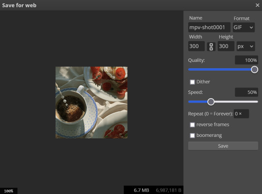
6. Exporting and Optimization
[PT: Exporting and Optimization /End PT]
6A. Exporting
With all that done, we're ready to finish it up! To finish your GIF, open the "File" tab in the top left, go to "Export As", and select GIF!
Here you can rename, adjust the size (WILL ruin the sharpening you did), the quality (I leave at 100%), and the speed.
Another important thing to note is the "Dither". If you leave dither off, you can potentially encounter color banding, which is where (typically gradients) with look like strips of color, rather than smooth. This is because GIFs only have 256 colors they can render, so if something has too many, it bands.
By checking dither, it can get rid of color banding, at the cost of dots on the image (around where the worst color banding is usually). Sometimes the dots aren't noticeable and this is the better option, however it will Also increase your file size. It's up to you if you want to use it!
6B. Optimization
This is technically an optional step, as tumblr's GIF size limit is 10mb, so as long as you're under that, you can post, however, smaller GIFs load faster and I personally find are better for use in stimboards where you're loading a lot of GIFs! So to help this, let's head on over to the optimize section of ezgif. My personal goal is UNDER 4.5MB, ideally under 4MB.
The two main things I recommend are Lossy GIF, or removing frames, and I always start with Lossy GIF. I do anywhere from 5-15, and usually this will bring down GIFs a lot if you made them in Photopea! My example GIF was 6.7 MB to begin with, and afterwards it was 4.2MB.
However if you find that to be not enough, you can remove frames. When you remove frames, it speeds the GIF up, so I also recommend slowing it down (this is why I set my frames high in the beginning as well). I typically do "Remove every 4th frame" and slow it down to 75%-85%.
7. End results, and misc tips and comments
[PT: 7. End results, and misc tips and comments /End PT]
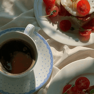


(source) The first GIF is without sharpening/colouring, the second is with sharpening but no colouring, and the third is with sharpening and colouring. I didn't color it much besides making it slightly warmer, but I hardly ever do much anyways!
As for misc comments:
In firefox, when you import footage directly, sometimes it glitches and tries to load 4000 blank frames, which is extremely resource intensive on a computer. The solution is import the footage in chrome, save as PSD, then open the PSD in firefox. (Or work in chrome but why do that /half silly). The other solution is screencap which I do since I do this often, but both work fine.
In firefox, sometimes you're unable to slow the GIF down upon export and it will export faster than it actually is. Slowing the video down to 50% restores it to native speed I've found, and you can do this in ezgif before other optimization.
When colouring, my number one tip is slide something all the way up first, then adjust down! By seeing it at max, you have a better idea of what's getting adjusted.
If you have any questions, drop me an ask :•]
And that concludes our tutorial! My apologies for the length, but I wanted to cover every possible thing here. It definitely seems like a lot, much more than working in ezgif, but when you get used to what you're doing, it goes extremely fast (even if you spend extra time screencapping). I personally find it worth it for the ability to sharpen GIFs alone, but as well as more detailed coloring opportunities.
Thank you for reading, I hope this has been useful!
#i did it :•]#not stim#stimblr#gif tutorial#photopea#big thanks to talos for proofreading this :3 🖤💚🖤💚🖤💚🖤
78 notes
·
View notes
Text
The donut tutorial, new post
Don't want to keep reblogging the first post so this is a new thread.

Here are links to the first reblog: Part 1, Part 2, Part 3, Part 4
I recommend following the links in case there are edits in each part.

In Part 4 I was busy duplicating springle to make .001, .002, .003, and now .004. .004 is also bent, but less so.

back in object mode (tab -> object mode) we're selecting all the sprinkles with left click and press m to add to a new collection

ta da, the sprinkles are now in their own thing. woops, idk why the camera is off on one of them, although it doesnt matter for now ill turn it back on.

okay so i hit / to see the rest of the objects, clicked the frosting so i can look at its geometry nodes again, and then left click and drag the Collection into the geometry nodes section.

connected the collection info box to instance and checked some boxes as shown

this is the full geometry node setup. note the arrow pointing to Density Max which will adjust how dense our sprinkles are.

cool, now we have different size and shape of springle.

however i decided ALL of the sprinkles are too big. so i clicked "springle" and shift+clicked "springle.004" to select them all. Then I hit / and tab -> edit mode. hit a to select all.

turned back on the donut so i could see the size of the sprinkles while i shrank them. i just shrank them a tiny bit.

nice, now i can turn up the density of the sprinkles without worrying about them looking too chunky.

time to make sprinkles a color. clicked the first springle for no particular reason and hit new

trans rights donut

select springle, then shift select springle.004 to select all the sprinkles. "springle" is in orange and the rest are in red. ctrl + L to open link menu and hit link materials.

now, while the springle is selected, go to shader editor

shift + add object info node, Shift + add color ramp. Plug random -> Fac and Color -> color. In the color ramp window, switched the box next to RGB to "Constant" (default is Linear); used the + in the color ramp window to add more colors. now the sprinkles say trans rights.

I went back and duplicated one of the sprinkles and made springle.006, which is an EVEN SMALLER sprinkle. shift + d, tab -> edit mode, left click and drag to select and g to grab and move the sprinkle so its smaller.

shift + a to make a new cylinder

in the add cylinder menu make the cylinder have very small amounts of vertices and extremely small. you can see the little polygons on the donut.

hit / to only edit the polygons. Numpad 7 to straight down. Press the 3 key to go to face select. Select each face individually and press e to extrude straight out.

selected the end rectangle and shrank it down really small

Went to the modifier section and hit add modifier and added subdivision. changed the Levels Viewport to 2 to make it smoother later on.

Pressed 1 key to select vertices again and shrank the middle of the star a bit

also pressed a to select all vertices, press 1 to look at the front, and move the sprinkle up. Also made the whole thing a bit smaller.

y to see the rest of the donut. added a new material just for the star. I could have made the stars be multiple colors but i wanted them to stand out and be the same color.

ok select donut then select frosting. ctrl + p to parent. now we can move the whole donut together.

i dressed up the scene a bit. the plane is now an L-shaped platform. There are three lights, the one in the back is a little farther away.

hovering donut
im tired, ill have to come back to this later
8 notes
·
View notes
Text
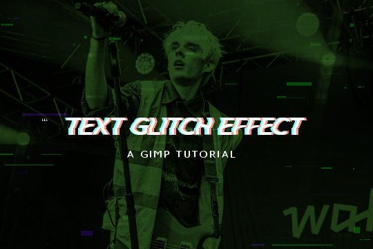
Read more to learn how to make this text + image glitch effect on GIMP!
Things you need:
GIMP
Import your image and resize it to your liking. I'll be using this.

2. Then I'll pick a gradient color. The FG will be black (or the darker color) and the BG color will be the lighter color. Go to Colors > Map > Gradient Map and it will apply the gradient map on the image.

3. Create a text layer. RIght click on the layer in the layers tab and pick "Layer to Image Size". Use the rectangle select tool to select the top half of the text.

4. Go to Filters > Distorts > Ripple and use these values. Feel free to play around with the sliders to your liking. Hit OK and the Ctrl + Shift + A to deselect.

5. Copy and paste the text layer 2 times.

6. On the second layer from the top, go to Colors > Colorify and pick a cyan color.

On the first layer, do the same but pick a pastel red/peach color.

7. Use the move tool to move one of them a few pixels to the left and the other a few pixels to the right.

8. Move the initial text layer to the top.


9. You can also add some TV glitch overlays if you want to.

And you're done!
5 notes
·
View notes
Text
Minecraft in Desmos

Links:
Empty world except for corner blocks to orient yourself. You can place blocks on the invisible floors/walls/ceiling.
Full world with stuff I made while debugging. Very laggy.
Instructions:
Hit 'ctrl+alt+p' then tab to access the controls. Inputs are:
Turning: plain arrow keys,
Forwards movement: 'shift+up'
Jump: 'shift+down'
Change held block: 'shift+right'
Place: 'shift+left' with block in hand
Break: 'shift+left' with nothing in hand
I've been working on this on and off for a few years, and things turned out pretty good I think. I'm pretty sure there's no desmos community on here, but why not, right? Rambling below the cut.
memory
The memory is waaay over engineered. I thought the world was going to be bigger than it ended up being. The bottleneck turned out to be how fast desmos could run rather than the memory.
I still managed to get a 520,000 bit object in desmos, so that's cool. (It could be bigger, I think you can get 540,000 but eh.)
rendering:
The rendering is fairly standard, I generate sides for all the blocks (stored as a point (block, direction)), then kill the ones that face another block. After placing/breaking, I update the sides for the block and all surrounding blocks.
I thought of doing backspace culling, but it didn't seem worth it.
The actual rendering is just a bunch of functions (rotation, translation, projection) then displaying them based on distance from player.
movement/collision detection:
Movement and collision detection were an absolute pain. I'm sooo glad that all the vectors are orthogonal to each other. I can just treat each vector separately and eliminate them when they result in a collision. There's some edge cases that won't work, but that's fine.
Gravity was fine, a bunch of if statements for when you should fall, move and stop.
place/break:
My favorite part is the place/break detection! I'm pretty sure if I was doing this on not-Desmos, we could get the data for which sides are colliding with the centre while rendering, but I can't do that.
2d version here:
You start with a parametric line going from the player to a point one block in front of them. You have t=0 at the player, and as t increases to 1, you linearly interpolate to the point. (If you put a negative number you go backwards, and t>1 goes beyond the point)
You can do basic algebra to find the t value when the line intersects with the gridlines surrounding the player, then sort the intersection-type (horizontal or vertical in 2d) by t value. (ie, how close they are to the player.) (I also remove the points behind the player and too far from them.)
The list can be used to see how the block the line is 'in' changes over t. (If the line crosses a horizontal gridline, the next block would either be above or below the previous one.)
And since a) it's in order, and b) the line always starts from the player, you can find the nth block that the player is looking at by adding the first n translations together.
With that, I can easily find the first block on the list that isn't an air block.
#desmos#minecraft#mathblr#my post#hmm this is hard#im trying not to be too verbose#but im not sure if im under/over explaining anything#im sure like#each sentence here could be its own sepperate post#if I made posts as I was making it#that might have worked better#well#I hope its intelligible
24 notes
·
View notes
Text
Porting Models from Dragon Age: Inquisition to Dragon Age: Origins or Dragon Age 2
Part 2b - Into Origins
Tools needed: Blender 2.49b Blender ImportExport Script GDApp The DAO Toolset OR pyGFF and TlkEdit
Make sure you have the ImportExport script installed correctly (all the files dumped into the same folder as Blender.exe), and open DragonAge_tools.blend. (Blender uses a lot of shortcut keys, so if you're unfamiliar, you might find it useful to go through a Blender tutorial)
By default, Blender will open with 4 windows: a 3D viewer in the top left, a buttons window in the bottom left, and two text windows on the right. In the upper left, use the File menu to import your DAI obj(s), setting 'Clamp_Scale' to 0. (if you haven't yet extracted your model from DAI, see Part 1 of this series)
Then right-click in the upper text window, and hit 'execute script'. Select 'MSH Tool' and browse to wherever you've extracted Origins mesh files.
Select a mesh that's similar to the one you're porting, and click 'Load MSH'.
Click 'Import as mesh'.
You'll need to adjust the Inquisition mesh to roughly the same proportions and pose as the Origins mesh. This is something that takes practice, and a lot of trial and error.
A couple little tips for armor/clothing: -Do all your adjustments in Edit Mode. -First scale (S) the entire mesh on the Z-axis so the neckline roughly lines up. -Then scale and skew (Ctrl+S) so that the fingers match up. You might need to adjust the arms separately from the rest of the body for this. -Skewing works from your viewing position, so to skew on the Y-axis, for instance, you must be viewing your model from the side. -In general, you want to make the major joint areas (shoulders, elbows, knees, hips) line up as best as you can. -Rotating a group of vertices around a single vertex can be very effective: Select that vertex, then do Shift+S, Cursor to Selection. Change the pivot point by clicking on the pivot box (two to the right of the 3D mode selection) and choose '3D cursor'. Box-select the vertices you want to rotate with B. (if you miss some, hitting B again won't remove the ones you've already selected; it will allow you to add more. Also, hitting B and drawing the box with the right mouse button removes enclosed vertices.) -I usually alternate the pivot point between '3D Cursor' and 'Median Point' a lot. -You can rotate around a specific axis and to an exact degree with keyboard inputs. For instance "R, X, 10" will rotate your selection on the X-axis by 10 degrees. This is especially useful when you're trying to keep limbs symmetrical. -'Shrink along normals' (Alt+s) is another very useful function for widening/slimming cylindrical areas, like arms & legs. -Check the model from all sides before moving to the next phase! It's always annoying to find out later that a few random vertices are sticking out weird, and got badly weighted as a result.
Once your mesh is adequately adjusted, it's time to add some weights.
Switch back to Object Mode, and select the DAO mesh, then your DAI mesh.
Find and click the 'Scripts' button in the upper right window. Click on 'Object', then 'Bone Weight Copy'.
Change the quality to 3 or 4, and hit OK. (if you're making LODs, using a quality of 1 is fine)
Wait. And wait. And wait. Seriously, this can take several minutes. You can tell it's working by the red to green progress bar at the top. If nothing happens, you likely didn't select both meshes, or both meshes already have weights.
Eventually, the weight copy will finish, and you can check how it did. Move the DAO mesh off to one side, select the DAI mesh, and then change the 3D viewer to Weight Paint mode.
Hit F9 to change the Buttons window to the Editing tab. Use the Vertex Groups box to go through the bones one-by-one, and make sure they all look reasonable. (unfortunately, they're numbered, not named, so that makes things trickier)

Mostly, you want to check that certain areas aren't trying to move when they shouldn't. Common culprits are the elbows getting a bit of weight from the chest bone(s) and vice-versa, or adjacent fingertips getting weight from each other. This is another one of those 'trial and error' things. You might find it helpful to switch back and forth between the DAO mesh and DAI mesh, going through the bones at the same time for comparison.
The weight paint brush can be used to subtract unwanted weights, or add weights where needed. You'll have to play around with the brush settings to your liking (I suggest starting with both weight and opacity at 1/2).
You can also switch the 3D window back to Edit mode, select vertices that shouldn't belong to the selected bone, and then click the 'Remove' button under the Vertex Groups box. MAKE SURE NOT TO HIT 'DELETE'. That can seriously mess things up.
Once you're done playing with the weights, it's time to get ready for export.
Minimize Blender, and put a copy of the vanilla mesh you used for weighting in a new folder. (the export script works by overwriting the info in a vanilla file. Don't want to mess with the original!) Also copy over the corresponding mmh & phy while you're at it.
Go back to Blender, execute the DragonAge_Tools script again, and hit the MSH Tool button. 'Browse' to your copied vanilla msh, and load it.
Instead of importing this time, you're going to make sure your ported mesh is selected in the 3D window, and then click the yellow-outlined 'Replace' button in the script window.
Then make sure the submesh (also called a "chunk") you want to replace is selected (for armor and clothing, there'll probably only be one, but with hairstyles you'll want to replace 'HairM2'), and click 'Replace chunk'.

Click 'Save filename' to confirm.
If the replacement failed, the most likely cause is that you have unweighted vertices. Finding them is frustrating, and I'm sorry. There's no easy way in Blender 2.49; the quickest way is to save your file, and reopen it in a newer version of Blender that has a "Select Unweighted Verts" function. Moving it to a new version of Blender, however, has a chance of scrambling your UV map.
Now you'll want to minimize Blender, and navigate to your overwritten vanilla msh. Unless you're making a replacer, rename the files to something unique.
It needs to start with a race/gender code (hm = "human male", hf = "human_female", and so on), and end with "_0". See Bioware's naming conventions for reference.
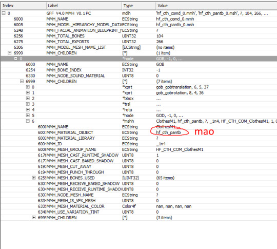
Open up all three files with either the DAO Toolset or pyGFF. Rename each instance of the vanilla file name with the new file name. (no need for the filepath like in DA2, thank goodness) If you're using pyGFF, you'll need to make sure to hit 'Save' in the bottom left after every change.
In the MMH, also expand MMH_CHILDREN, GOB, MMH_CHILDREN, and then the bottom list, *mshh. MMH_MATERIAL_OBJECT refers to the mao, you'll need to replace the vanilla with a custom mao (more on that in a bit).
If you want, you can also change the chunk name under MMH_MESH_GROUP_NAME to match the new file name. If you do, make sure to change it in the msh as well. (there's a rare glitch where if you change between two pieces of equipment with the same mmh_mesh_group_name, the mesh will not change, leading to vanilla items appearing with custom models or vice-versa. It doesn't happen consistently, but it can happen) Also in the mmh, you may want to activate some lighting options: CAST_RUNTIME_SHADOW should be active by default; if it's not, change the 0 to 1. You can also activate CAST_BAKED_SHADOW, RECEIVE_BAKED_SHADOW, and RECEIVE_RUNTIME_SHADOW in the same way, but these are less noticeable if they're inactive.
Save your files.
Making a .mao file:
My tutorial for converting DAI textures to DAO using Paint.NET can be found here. If you prefer to use GIMP or Photoshop, I recommend these tutorials: magpie's for GIMP sapphim's for Photoshop
If all you want for now is quick placeholder textures, simply extract the DAI textures as .dds files. Use a text editor to open up a vanilla .mao of the same basic appearance (color & material matters most) and replace the vanilla texture names with those from DAI. Save the new mao with a name matching your model.
Put your msh, msh, phy, mao, and textures in the DAO override folder. If you're making a replacer, testing is as simple as opening up your game and equipping the right item.
If putting in a new unique model, you'll have to tell the game how to find it. Extract the variations GDA matching the item type (armor_heavy_variation for heavy chestpieces, clothing_variation for clothing & robes, etc).
Open up the GDA with GDApp, and delete all lines except one, which you'll use as a template (so don't use line 0).
Change the 'ID' entry to something (hopefully) unique.
Thanks to a weird quirk of UTIs, the highest number you can use is 256. If you already have a lot of equipment mods, you may want to look through the Item Variation ID spreadsheet (NexusMods, Google Sheets) to avoid GDA conflicts. The item variation GDA tells the game what mmh to look for. The modeltype, modelsubtype, and modelvariation columns are combined together, along with the race/gender code, to form the model's mmh (the final "_0" is ignored for this): hf_cth_comd_0 = (human female)_(clothing)_(commoner)(d) = (race/gender code)_(modeltype)_(modelsubtype)(modelvariation)
If you've named your mmh a bit different than the Bioware convention, that's fine, as long as you can break it up into those GDA columns. I don't think there is a character limit.

Now save your GDA, keeping the original file name but adding a unique suffix (for example "armor_variation_medium_edit.gda"). The file name cannot be longer than 32 characters, including ".gda".
Put your new GDA in the override as well, and open up the toolset.
Open up a local copy of the same type of item, click on Item Variation, and look for your new model. If it doesn't show up, the most likely cause is that your GDA is missing or its name is too long.
Change the item to your new model for viewing. If your model is not for human males, you'll need to change the race & gender at the bottom. For testing, I recommend now exporting the item (Tools, Export, Export without dependent resources), and consoling yourself the item in-game if you don't already have it. (model swaps like this are not baked into the save, so you don't have to worry about permanently messing up things)
If you're NOT using the Toolset, you'll have to change the item variation in an extracted UTI with TlkEdit, and then console yourself the item for testing.
If something doesn't quite look right, go back to Blender and experiment. You'll need follow the process for overwriting a vanilla mesh every time you edit, but you shouldn't need to redo the mmh & phy.
Common problems: -- Distorted/noodly body parts: used a mmh that didn't match the msh -- Model is mint green and t-posing: can't find the mao -- Textures are gray and/or shiny: can't find texture(s) -- Game crashes: bad msh export. Try exporting again, or compare it to a vanilla msh for errors -- Invisible model: wrong msh name in the mmh, or mismatched chunk names between the msh & mmh -- Won't tint: the chunk names in the mmh MUST be BootsM1, GlovesM1, ArmorM1, HelmetM1, ClothesM1, or RobeM1. Chunk names must also be consistent for all different race/gender variations of the same model, and any LODs.
The next tutorial will cover porting static meshes for either game, since it's the same process/tools for both.
4 notes
·
View notes
Text
Programmer here, and I want to add INFINITE AMOUNT OF NUANCE. Your average user probably wouldn't be able to operate a computer without a mouse, but it is completely possible.
Both Linux and Windows work in a way that it's possible to operate without a mouse with shortcuts like the windows key, and the alt+tab thing.
Using the command prompt, you can move in your file system, delete and copy and whatnot files, run programs, do a whole host of things. This is when you see white letters on a black background and type commands. You can run programs, delete and move and create files like this, and probably do a lot more.
There is also an accessibility function that lets you use the arrow keys to control the mouse.
But most websites and programs aren't built with that in mind, and they can vary WILDLY in whether or not doing things without mousing is possible. Tumblr is one that has its own hotkeys, but you need to learn specifically which does what to move effectively.
Also, the way you usually navigate a website without a mouse is by pressing tab and shift-tab to move to the next or previous item you would like to click on. Sometimes this is fine, and sometimes, there are five million repetitive social media links you want to skip, so doing that will often lose you a lot of time. "Move the mouse and click a link" is often an easy tab, then enter. And it's often tab-tab-tab-tab-tab-tab-tab-fucktoomuch-shift+tab-enter.
But I also use hotkeys to move the cursor and select text while typing, and it's a lot more efficient than you'd think!! Shift+arrrow keys let you select, ctrl+left and right let you jump one word at a time, ctrl+arrow+shift lets you select while moving one word at a time, home and end move your cursor to the start and end of a line, page up and page down make big jumps, and holding shift while doing any of this selects the entire thing you jumped over. Good stuff. Visual Studio and Visual Studio Code gives you even more fun features like that, and those make things go so much faster.
So, yeah. Nuance. it's based on the task, the character's skill and showoffyness, the computer, and whether a mouse is available.
Things that work in fiction but not real life
torture getting reliable information out of people
knocking someone out to harmlessly incapacitate them for like an hour
jumping into water from staggering heights and surviving the fall completely intact
calling the police to deescalate a situation
rafting your way off a desert island
correctly profiling total strangers based on vibes
effectively operating every computer by typing and nothing else
ripping an IV out of your arm without consequences
heterosexual cowboy
159K notes
·
View notes
Text
Excel Shortcut Keys Every Job Seeker Should Know | Your Interview Prep Guide
Spending too much time clicking around Excel menus? You’re not alone. If you're serious about job interview preparation, career growth, or just speeding up your daily workflow, learning Excel shortcut keys can be a total game-changer.
In today’s fast-paced, data-driven world, Microsoft Excel is more than just a spreadsheet app—it’s your personal data assistant. Let’s explore how to supercharge your Excel skills, slash your task time, and even earn certifications like a Diploma in Microsoft Excel without spending a dime.

Why Excel Skills Matter More Than Ever
Excel has come a long way from being a simple table tool. Today, it’s at the core of data management, financial modeling, inventory tracking, project planning, and so much more.
Professionals from fields like finance, logistics, marketing, and healthcare rely on Excel’s capabilities to manage vast datasets, automate tasks, and generate meaningful insights. Thanks to integrations with Microsoft 365 and OneDrive, teams now collaborate on spreadsheets in real time from anywhere in the world.
Learning to master Excel is no longer optional—it’s a must-have skill for modern professionals. And the good news? You can start mastering it through Online Short Courses tailored for beginners and pros alike.
Must-Know Excel Shortcut Keys for Workbook Navigation
Speed up how you move through workbooks with these essential Excel keys:
Action
Shortcut
Create a new workbook - Ctrl + N
Open an existing workbook - Ctrl + O
Save the current workbook - Ctrl + S
Switch between workbooks - Ctrl + Tab
Close a workbook - Ctrl + W
Want to go deeper? Enroll in the Mastering Excel Spreadsheet & Workbook - Formulas And Functions course to explore every shortcut and hidden trick to turbocharge your efficiency.
Excel Shortcut Keys for Fast Formatting
Tired of clicking multiple tabs just to format cells? Use these keys instead:
Action
Shortcut
Bold selected text - Ctrl + B
Italicize - Ctrl + I
Underline - Ctrl + U
Format cells - Ctrl + 1
Center align - Alt + H + A + C
These formatting shortcuts make cleaning up reports and dashboards a breeze.
Advanced Excel Commands to Level Up
Ready to go beyond the basics? Advanced shortcut keys and formulas can help you handle complex tasks effortlessly.
Explore nested formulas, array functions, and custom formatting shortcuts through the Essentials Of MS Excel - Formulas And Functions free course available online. It’s a goldmine for anyone looking to boost their analytical skills.
Pivot Table Shortcuts That Save Time
Pivot Tables are Excel’s power feature—and shortcuts make them even better:
Action
Shortcut
Create a Pivot Table - Alt + N + V
Refresh a Pivot Table - Alt + F5
Group data - Alt + Shift + Right Arrow
Ungroup data - Alt + Shift + Left Arrow
Whether you're analyzing sales data or tracking expenses, these Microsoft Excel shortcut keys for Pivot Tables will cut your time in half.
5 New Excel Functions You Should Be Using
These new functions are transforming how professionals handle data:
GROUPBY Automatically group rows and summarize data—no Pivot Table needed. It’s dynamic and updates as your data changes.
PIVOTBY Think Pivot Table, but with formula power. Summarize data by rows and columns in one clean formula.
PERCENTOF Quickly find what percentage one number is of another. Perfect for reporting KPIs.
BYCOL Apply a formula across entire columns. Ideal for comparing monthly totals or applying statistical functions.
BYROW Like BYCOL, but row-focused. Simplifies row-by-row calculations without repetitive formulas.
Here’s the revised paragraph with the country name removed, while keeping the message intact and flowing naturally:
Excel Learning Opportunities
Excel literacy is becoming increasingly essential, especially as digital transformation reaches more sectors—from banking to agriculture and government.
Whether you’re a university student, a data analyst, or someone preparing for a new job role, online platforms now offer accessible, high-quality online short courses that fit any schedule or budget.
Free resources like the Diploma in Microsoft Excel and Essentials Of MS Excel - Formulas And Functions free course offer learners a flexible way to build critical tech skills. Many institutions and employers are now prioritizing Excel skills in recruitment, making this the perfect time to upskill.
Conclusion: Work Smart with Excel
Mastering Excel isn’t just about shortcuts—it’s about working smarter. From Excel Shortcut Keys and formatting tricks to powerful new functions and free online certifications, there’s never been a better time to improve your skills.
Ready to get serious? Enroll in free courses like Mastering Excel Spreadsheet & Workbook - Formulas And Functions or earn a Diploma in Microsoft Excel to make your resume shine.
Bonus Tips for Excel Beginners
Memorize the basics: Copy (Ctrl + C), Paste (Ctrl + V), and Select All (Ctrl + A) will always come in handy.
Learn once, use everywhere: Many Excel shortcut keys also work in Word and PowerPoint.
Use Excel daily—even for simple things—to build muscle memory.
Bookmark a list of A-Z Excel shortcuts and revisit it regularly.
#ExcelShortcutKeys#JobSeekerTips#InterviewPrep#ExcelSkills#CareerDevelopment#JobInterviews#ProductivityHacks#EmployabilitySkills#ExcelTricks#CareerSuccess#InterviewTips#QuickReferences#OfficeSkills#ResumeBuilding#JobApplications#FutureReady#ExcelMastery
0 notes
Text
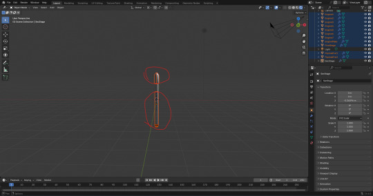
Separating the second stage fuel tank into it's own file Pt1:
I opened up the full rocket model file and saved it as a new file while I remember to. Just like I did with the previous models. I named the new file "Fuel tank 3".

Here, I selected the rest of the meshes I didn't need and pressed 'Delete' to delete them.
From there, I applied the 'Smooth by Angle' modifier like I did with the other models.
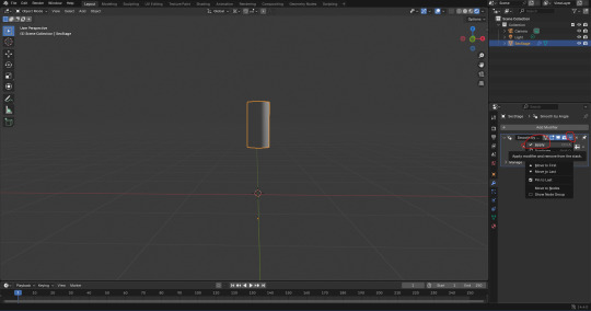
Next, I clicked onto the 'Shading' window and changed the 'Shader Type' from 'Object' to 'World'.

Like the I did with shading settings of the files of the previous models that I used from the full rocket file, I added a 'Light Path', 'Mix Shader', and a second 'Background' box to connect together. I did this so I could change the background colour without effecting the model visually.

I copied and pasted the same hexadecimal colour code that I keep using for the background in the files of my other models. The code is '#0086FFFF'.

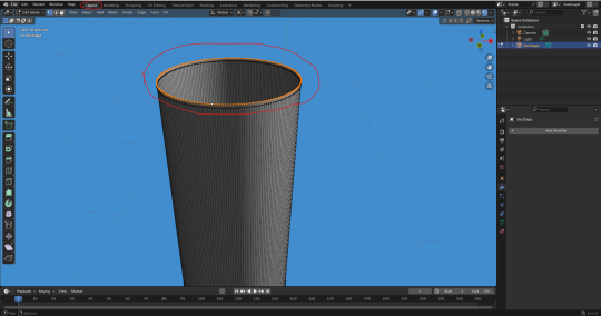
When I switched back to the 'Layout' window. I jumped straight into 'Edit Mode' to give the top and bottom of the mesh a face. I pressed 'Alt' + 'LMB' to select all the vertices on the top of the mesh. I then pressed 'F' to fill the gap with a face.
I did the same at the bottom of the mesh.

However, there was an issue. The face at the bottom was black, which suggests a lighting problem. I looked it up on Google to see what was specifically the problem.
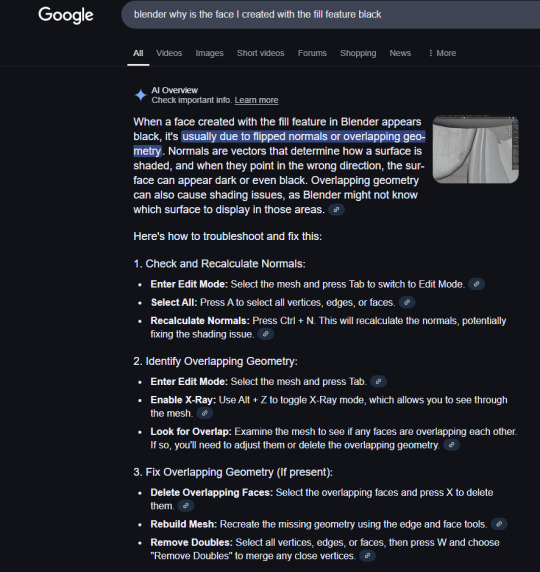
I tried to recalculate the normals of the mesh. I entered 'Edit Mode', and pressed 'A' to select the whole mesh. I then pressed 'Ctrl' + 'N'. The problem was that when I pressed 'Ctrl' + 'N', It came up with the option to create a new file. That obviously wasn't what I wanted.
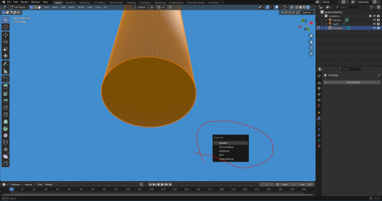
I looked up how to recalculate the normals more specifically on Google. According to this result, I need to press 'Shift' + 'N', not 'Ctrl' + 'N'.
I tried again by pressing 'Shift' + 'N'. It didn't do anything. One thing it did do, is show a box at the bottom left of the screen with a tick box. The tick box allows you to recalculate the inside.
I did that and it still didn't do anything. I then tried doing it manually. I clicked on 'Mesh', 'Normals', 'Recalculate Outside'.

It still didn't work. so I tried clicking on 'Recalculate Inside'.
That still didn't fix a thing. However, I just realised that I have embarrassingly mistaken a faulty face with the colour of the texture. The texture is black where it separates from the first stage.
Now that that is sorted. I was ready to move onto adding an image into blender and combining it with the mesh. However, my computer black screened. Thankfully it came back on but blender's tab was pitch white. I lost progress. Now that I'm back in college, I tried to retry those steps as this is where I last saved.
Here, I added the faces back. It looks like the lighting on the mesh is a bit off.

I decided to press 'RMB' and then 'LMB' on 'Shade Auto Smooth'.
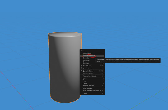
This actually worked well. I then realized that my previous models would look better if I kept making sure that I used 'Shade Auto Smooth' whenever make a big change to the model. For example, adding faces or joining meshes. I then applied the 'Smooth by Angle' modifier.

Next, I wanted to add the 'PNG' for the connector faces on the model. I made in photoshop yesterday. I did this by clicking on 'Add', 'Image', and 'Reference'.

Here, I selected the 'PNG' file that I wanted to use as a reference image object.
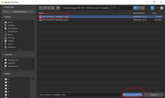
At this point, I had transformed the image to these transformations seen in the screenshot below. This is so that it looks apart of the model.
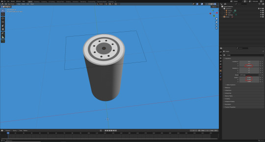
Next, I duplicated this object and placed it underneath the face model. I did that by pressing 'Ctrl' + 'C' and then 'Ctrl' + 'V'. From there, I transformed it's position on the 'Z' axis (circled below).

Here, I selected the two images and the mesh and tried to join them together by pressing 'Ctrl' + 'J'.
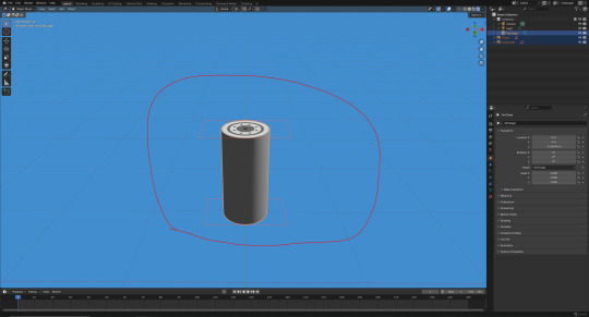
At this point, I remembered that I couldn't join them together unless the images were converted to a 'Mesh Plane'.
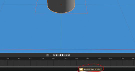
I then pressed 'RMB' and then 'LMB' on 'Convert to Mesh Plane'.

Last time I did this, I didn't change the settings. This still worked fine so I did the same here.
Here, I attempted to join them together again by pressing 'Ctrl' + 'J'.

Although it worked, I realized that the images were too far apart from the mesh. As a result, I undid this.

Next, I set the position of the image on the top to '1.354m' on the 'Z' axis.

0 notes
Text
First Class Task .............................................................................
For the first ever class, we started in the engine right off of the bat. I do adore this approach to learning, since my brain often shuts down when all I'm doing is sitting and absorbing word of mouth.
We started with a pre-made asset pack world labelled as 'Temple Ruins'... I'm getting the strongest certificate nostalgia right now.
Mostly this seemed to be a day targeted to newcomers of the engine. Lot's of learning how the movement in Unreal Engine works, which I'll be honest I mostly zoned out for. I actually started up this documentation and these initial posts while the teaching was going on, apologies Morgan.
..............................................................................................................................
Temple Ruins
Starting off, we made a new map in a freshly opened UE project. Instead of starting with a blank map, this time we started with an empty one- so we could learn how to important our basic environmental lighting assets. You can choose what kind of level map you want to create using CTRL+N, or going into file and selecting 'New Level'. All you'll have to do is make sure it's root directory is into the right folder.
Loading up an empty map level:

Once the map is loaded, we can navigate to the windows top panel drop down, and find Env. Light Mixer. When selecting it, we'll be met with a pop up. All we have to do is press all the buttons that come up in the pop up, to load everything into our level. Here we can also bring things back if we accidentally delete them down the line.
Setting up Environmental Lighting:


Note how I have shifted everything into a folder labelled 'Lighting'. As an organized person already, I folder everything in my directory without thinking, but it is a nice habit to have, and I'm glad it's being more heavily drilled into us.
Next, we want to create the terrain. In the top left, we move up to our selection and pick the Landscape option. By clicking it, it will bring up this menu, which will allow us to generate the land we can work and sculpt. Opening up the Landscape dropdown option:

The most important menu in this area, is these options found in the left hand side directory. Here, we can adjust resolutions, with easily editable with dropdowns, that allow for many combinations. Once, we're satisfied, we hit create to make the landscape and bring up editing and sculpting options. The panel will look like this, as the landscape renders into a grid mesh (right panel). Setting up the landscape:


Using the tools provided along the top, we can create realistic looking terrain. Main tools used are Sculpt, Smooth, Flatten, Erosion, and Noise. - Sculpt will rise the terrain. - Smooth will smooth over any ragged edges - Flatten with make a flat plain wherever the cursors is directed - Erosion will give the landscape texture and more realistic slopes - And noise does a similar thing, but raises the land rather than erases it. Creating the landscaping:

Once satisfied with our unique terrains, we moved back into selection, and added in a plain. Upscaling it to a massive extent. This will act as our water that will surround our island.
Creating the water:


We then spent time fiddling and messing around, upping the tiling of the water so it didn't look so massive (easily accessed in the Material Instance menu), and adding smaller island outcrops. My final product looked like this, with a nice slope up to a flatter topped mountain that would soon hold my shrine. My uniquely sculpted island:

Now it's sculpted, we can add the material. Luckily the asset pack we're using comes with one, so it is a simple drag and drop. But uh oh, looks like we haven't added the material information in yet, so our island ends up looking rather... ominous. Takes after my own colour palette! Ah... not quite right:

Easy fix, however. Going back into landscape, we can switch over to the paint tab right next to the sculpt one. Here, down at the bottom, we can find the textures that make up the material. All we have to do is add them into the project, without altering anything in the pop-ups. Adding the material information:


Coming out of this and looking back to our island. It now appears far les ominous and far more normal. An actually coloured island:

Next is the fun part. Adding the static mesh assets that came with the pack we're using. With the topic being 'shrine' my main goal was one dilapidated building, with a lot of foliage. I did end up using the foliage tool after I hand placed half a dozen bushes, which is another drop down menu where you can add in the grasses you want and change their variation, before painting it over the island.
The foliage menu:

In the next post, I will be posting some of the shots I took of my island, after I had fiddled around with it for an hour or so.
..............................................................................................................................
0 notes
Text
Retopologizing
Done to reduce the file size and poly count.
The loops/grids should be perfect when making it to the animation stage to avoid the mesh deforming in unnatural ways. Start
Other softwares we can use are Topogun and 3D Court
Make the model live and symmetry on to object x (Usually x is used. Other axis are used when modelling mechanical items)


2. Open modelling toolkit

Can use this or the last icon (the last one opened something else for me but the one highlighted in this one works)
3. Quad Draw - Make vertices in the model

Add 4 points, shift + left click. You can continue adding points -> shift + left click
We can move the faces, edges and vertices any way we want


EDGE LOOPS Hold ctrl + drag left click and let go to add an edge loop
If you want to bridge seperated pieces just drag and it'll automatically snap


EXTRUDE To extrude, click Tab, hover your mouse above an edge and drag
SMOOTH Shift + drag to smoothen out curves/edges

DELETE Ctrl + shift + left click to delete faces/edges/vertices

RETOPOLOGIZING
Starting with the eyes


Add an edge loop and the eyelid shape should form perfectly

Add BIG shapes first, then add edge loops to even it out.
Mouth Highlighted the mouth corner since it's a tad bit tricky to make without creating a triangle. Avoid triangles!

Connecting the eyes and mouth.
Honestly it's like a puzzle game trying to avoid creating triangles. Fun stuff.


Nose be tricky :(
Circle around the ears

To save, go to object mode and save. Mb is fine. If the topology disappears get quad draw, make sure the surface is live and turn on symmetry.
Lighting -> two sided lighting so we can see the inside of the head when adding space for the teeth
Sculpting -> 3rd brush Scale to smooth out edges Extrude mouth bag (Mouth bag holds the teeth)
Eye bags -> extrude the eyes inwards just like the mouth bag
0 notes
Text
Maya 2025 Introduction - Chair
The first thing that I had to make in this project was a chair in Maya, which is an industry standard 3D modelling program. We had a brief on google classroom to guide us and show us how each thing works, so it was easy to understand, as I've never used Maya before. The first thing I learnt before I started making the chair, was the controls/ shortcuts.
ALT < this is the key button to use in conjunction with the mouse clicks.
Alt + Right Mouse (Hold) = Zoom (Moves the camera in and out)
Alt + Left Mouse (Hold) = Rotate
Alt + Scroll Wheel Down (Hold) = Translate (move the camera Left / Right / Up / Down)
Right Click Held Down in the Viewport = Radial Menu for selecting what part of the object you want to interact with
Scroll Wheel Down (Hold) = Drag and drop items in menus such as the Hierarchy
Space Bar = show and select what camera to use in the viewport.
These controls are a bit different to the ones used in Unreal Engine, but were still simple enough to understand and were easy to use. Now after I had learnt the controls and tested them out on a blank grid, I added a cube to start off with my chair.

The next thing I had to do was adjust the height of the cube to get the actual seat part. So for this I had to use the tab at the top right hand side of the screen and select either the attribute editor or the modelling toolkit. These both work, but in my opinion the modelling toolkit is easier as it uses sliders to adjust what you've selected.

I didn't use this tab in the end, but is is very helpful and useful for some modelling as you can get very precise measurement quickly. But I used the modelling toolkit so I could get use to it in Maya and try manually change the size of objects.

The modelling toolkit has every basic tool needed to make any game asset. I decided to look at what some of the controls do, just so I know how to use them when we have to get round to using them.
Extrude = This will take a face and add material to form a new set of faces connected to the Original.
Multi-cut = This will take a knife and slice polygons.
Boolean = This will cut objects out of other objects.
Once I had learnt these controls, I clicked on the cube and it gave me scale tools, with these tools I made the seat part of the chair the size I wanted.

Now after I had done this, I needed to add cuts into the chair, as this would help me add the legs and backrest. So to do this, I selected the multi cut tool in the modelling toolkit tab, and then held down ctrl and shift, this would make it so the line would go up in intervals of 10%, instead of a free moving line that would go through any percentage. The first thing I tried with this tool was to cut 20% away from each edge, but this didn't work and some of the corners I had made were different sizes, so to fix this I did 2 cuts at 50% going both ways. From here I did the cutes going at 20% from the edges and it was the same length this time.

Now to get the legs of the chair, I went round to the bottom of the base, and clicked on the object. Once this had an outline I held down right click, and selected faces.

This option then let me click on the the cut areas and it would highlight the one I would select. To make it so you could select more than one, I held down shifts and clicked on each of the faces in the corners. After I had clicked on all the corners, I selected the extrude tool and it gave me scale arrows, and I then dragged down and it gave me four chair legs.

I then just repeated this process, but on the top of the base so I could get a backrest.

With both the legs and the backrest, I had to change the thickness in the popup tab that comes up when I click Boolean. The guide recommended that it should be about 5.5. Now the last thing to do with this chair is just add
0 notes