#000000;>Square
Explore tagged Tumblr posts
Visit Tumblr Blog
Explore Tumblr blogs with no restrictions, modern design and the best experience.
Last Seen Tumblr Blogs


Fun Fact
In 2020, 44% of users from Denmark used Tumblr daily.
Text

…color correct an image in photopea?
so, you’ve finally finished a psd. it’s everything you imagined and more. you go to apply it to your image and get…

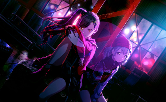
…well, that. what the fuck, you may be thinking, this looked fine on my tester images! and it probably did! the problem with this image is that it’s just. overbearingly purple.

which may be fine for the image itself, but it doesn’t work for editing purposes. you end up with weird bits (why’s her hair blue? why’s the contrast so low?? what the fuck is happening) and an image that frankly hurts to look at. so, the question remains. how do you turn that into—

—something more like this? well, don’t worry, because i’m canarysage and i make things more confusing instead of less, and i’m here to save your eyes and psds
i. white balancing
if you keep up with photopea for dummies, you probably recognize this term from my post curves for dummies. i’ll go ahead and re-explain it, though.
white balancing is done using either a curves or levels layer—it doesn’t matter which, they both do the same function. i use levels because i don’t have to scroll to reach the eyedroppers on mobile LMFAO but they both do the exact same thing ¯\_(ツ)_/¯
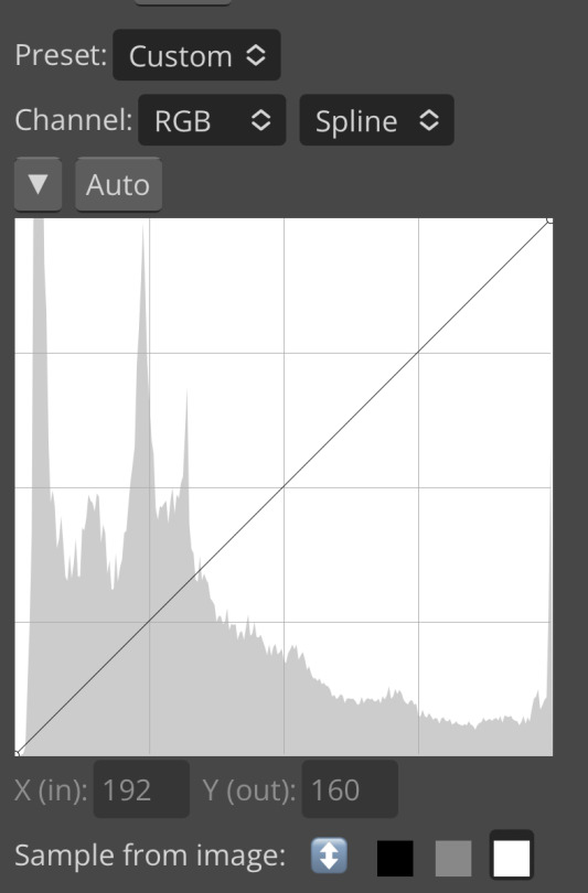
add a levels/curves layer below your psd folder and turn the psd off. look at your image and determine what you think are the darkest and lightest parts—or, if it’s easier, what parts you want to convert to #000000 black and #ffffff white. once you’ve figured that out, go into your levels layer.
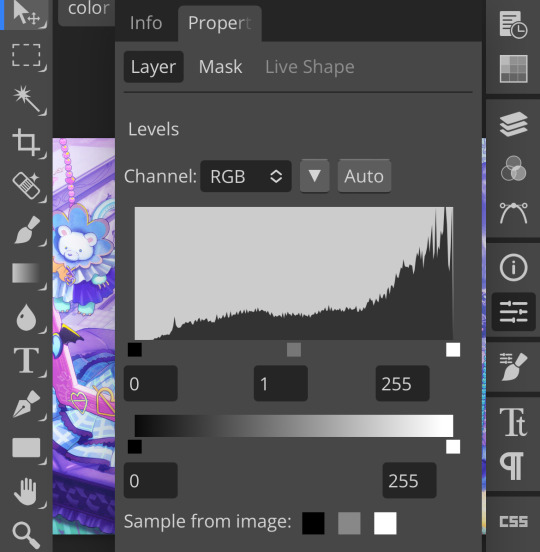
see those three squares at the bottom? that’s the important part. first thing i’m going to do is tap that black square. the black square turns whatever color you pick into #00000 black, so i’m going to use the eyedropper it pulls up and select a darker part of my image
for this picture, i selected ena’s pupil, because it’s rather grayish in the original. this will help add some contrast. (also i zoomed in really far because i have shaky hands and wanted to make sure i was “aiming” correctly. you don’t have to do that i’m just insane)
repeat this process with the white square. the white square turns whatever color you pick into #ffffff white, so pick a lighter part of your image. also, for the sake of my sanity, do not choose a skintone when doing that. for the love of god
mega zoom to the rescue again. i picked the whites of her eyes because those look really weird if they’re not white, frankly. other good choices are highlighted areas on objects or things that are already white (like the paper in her sketchpad)
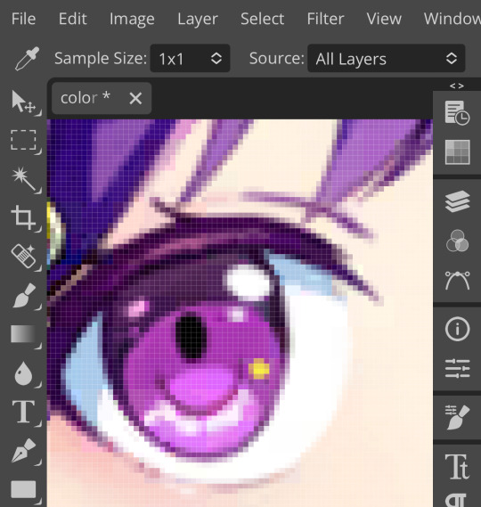
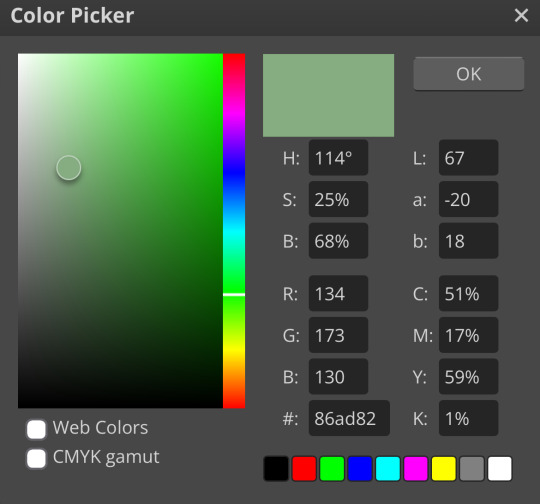
now we’re going to do the gray square. this is the part which is trickiest, so don’t be annoyed if it takes a few tries. choose the color in your image that you want converted to gray—in other colors, figure out which color is most overpowering and select that. i recommend not picking a saturated color for this, because it’ll look—

—really bad. ow, green. i recommend picking a color that’s reasonably close to gray already, but it depends on how much correcting your image actually needs. you just have to eyeball it.
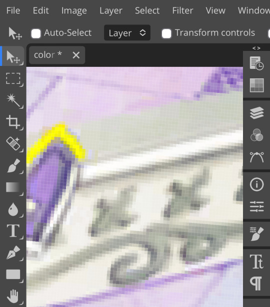
pixels. for this image, i chose the decals on this picture frame in the background; they’re reasonably close to gray but still purple enough to do the correcting i want.
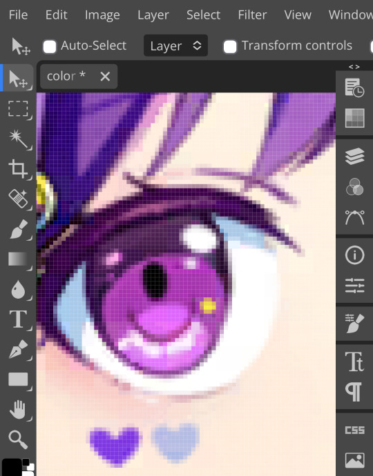
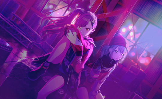
after white balancing, your image should look significantly better already. here’s mine at this stage:

it’s a little strange, but that’s going to be covered by our psd anyway, so don’t worry about it. if your picture still looks really off, you can add a second levels/curves layer and white balance again, and you can just repeat that until it looks how you like it. i’m pretty happy with this, though, so we’re moving on.
ii. photo filter
(photopea refreshed on me so i had to recreate my white balancing, forgive me if it looks inconsistent. let this be a lesson on saving your wips as psds)
okay, step two! this one is way easier, don’t worry. add a photo filter layer above your white balancing layer and below your psd. fair warning, this step requires bare minimum knowledge of color theory—as in, what colors are opposite each other on the color wheel. godspeed
look at your image and figure out what looks off about it. feel free to toggle your psd on and off as you do this, it’ll help. in my case, mine ended up too warm and too saturated. so, to fix this, i’m adding a very low saturation green photo filter
which, obviously, made it… green:

to fix that, we’re just lowering the percentage of the photo filter here. how much you lower it depends on your image and your personal preference, but, for reference, i set mine to about 30%. if you want to, you can mess with blending modes and opacity in this step, but i just left it as is
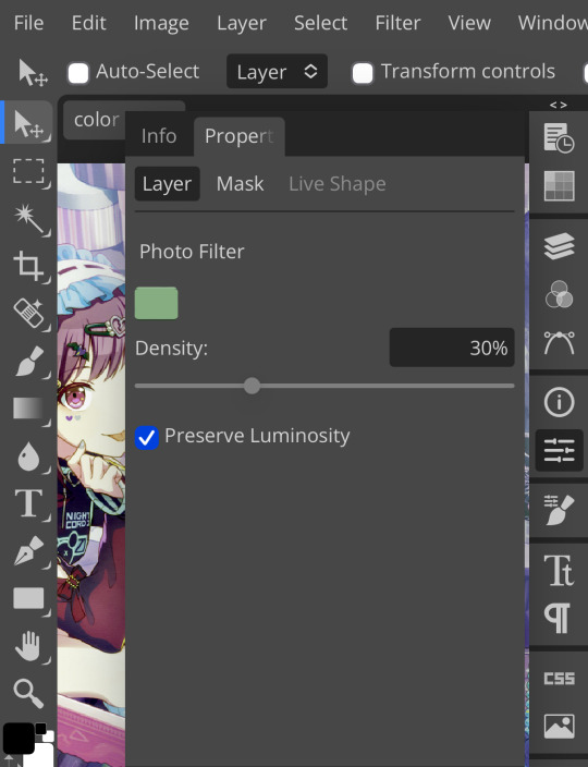
yay, less green ^_^ like with the white balancing, you can add as many photo filters as you want. i’m real lazy so i’m just doing one, but you can just keep stacking them until your image looks right—sky’s the limit. for me, i’m going to step three:
iii. brightness/contrast
pretty self explanatory. brightness/contrast isn’t a color corrector; it’s a lighting corrector. it adds brightness and contrast, obviously. look at your image again with and without the psd, and figure out what it needs. the psd i’m using for this is pretty dark, so i’m adding brightness and lowering the contrast:
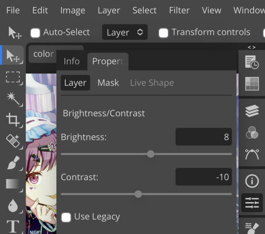
like so. this step can also be accomplished with curves, levels, or exposure, but brightness/contrast is the simplest and least finicky of those options, so i personally prefer it ¯\_(ツ)_/¯

pretty minimal change, but i wanted to demonstrate this step anyway, as it can be pretty important on some images. with that done, time for the last step:
iv. selective color
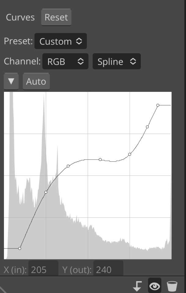
like all the previous steps, this goes under your psd and above the other layers we’ve added. what exactly you do with selective color once again depends on your image and psd, but what i did was darken my blacks and whites,
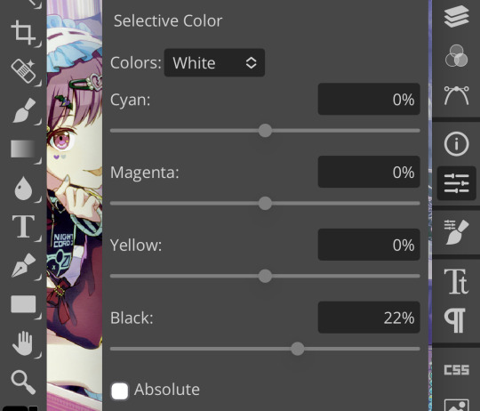
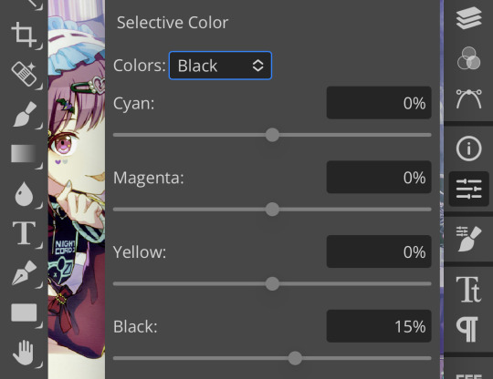
very minimally adjust the neutrals,
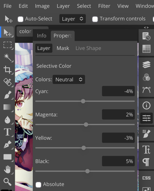
remove magenta from magenta and add magenta to green,
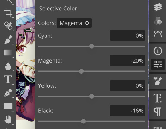
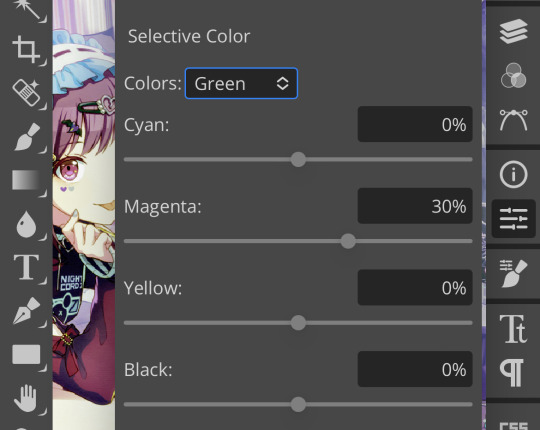
and remove cyan from my reds and yellows.
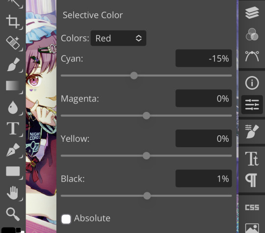
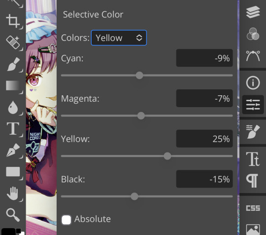
which, all in all, gives me this:

which, if you’ll recall, is a far cry from our original image. now, if you turn the psd back on, you’ll get this:

which i consider a marked improvement from what we originally had. these steps can be mimicked on pretty much any image as long you tweak it enough. obviously you’ll have to finagle and adjust depending on your image, but it’s actually pretty easy! observe:


…so that’s how you do it.
64 notes
·
View notes
Text
not to be a hater but at this point they really should just let go of the skin lineart/shadow/#000000 black rules. because like you cannot look at a dark enough dragon with the numerical noise effect on it and tell me that it maintains "the unique silhouette and identity of the breed" or the "integrity of the underlying illustration's shadows and lineart." or that the effects "remain as cohesive to Flight Rising's style as possible"
like staff can do whatever. but also why are these specific protections in place then? what purpose do they serve at this point? your dragon can look like unintelligible colored squares
6 notes
·
View notes
Note
How do you come up with colours for your pieces? (Ex. Keluarga cemara 2.0, 2x3x4 touch, philautia and storge, it's hip to be square, character designs, etc.)
The way you color adds so much atmosphere and character to a drawing and I just wanted to know if there was a specific technique you used or. 😵💫
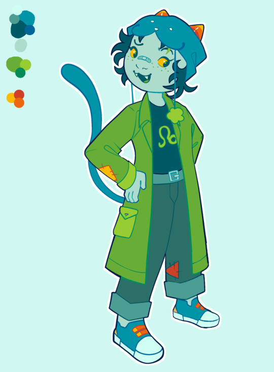
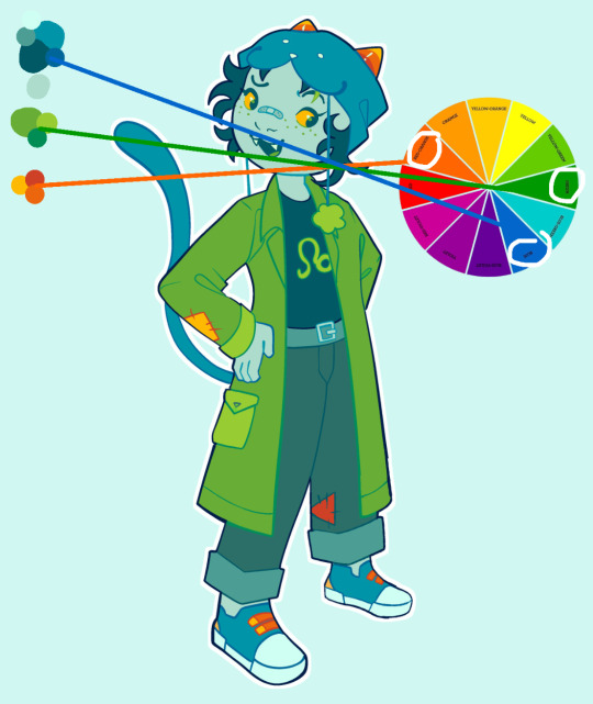
hi, eddie! thank you for asking! I usually eyeball the color palettes I use in my artworks while paying close attention to their original character references. when I want to change their color palettes to portray the mood or setting of the artwork, I think about what "gradient" I'm going to put them in. I apologize if I cannot put my thoughts into words well, haha! I'll try my best to explain.
for "keluarga cemara 2.0", I think about the "gradient" mute yellow and purple. the greys and light blues get affected by the mute yellow, turning them greenish. the dark blues and red get affected by the purple, inching them towards indigo/purple.
of course, there are other things to consider, like skintone. it would be a mute orange because of mute yellow's influence, but I want to make it just a bit more vibrant. just tweak the colors as you wish, as long as it stays true and correlates to the "gradient" you're aiming for.


you can find applications of my techniques in various artworks, as pictures below. backgrounds also play a large part in building color palettes, as you have to match your subject's color palette to its surroundings. it's all about feeling, the feels!!!

as for character design, well, it's their base colors. the colors you use as references for artworks that they're featured in. however, I have my own personal rules when it comes to character designs.
for example, I rarely use #ffffff white for scleras. it clashes terribly with the rest of the colors that are not as vibrant. I also tend to avoid using #000000 black. here's a handy chart to explain my thoughts further.

I believe that's all I can explain for now XD I'm not the best in putting my thoughts into words properly, but I hope this can help you, eddie!
17 notes
·
View notes
Photo
Went to the reblogs to see if someone was already talking about this and yeah, this is at least the gist of things.
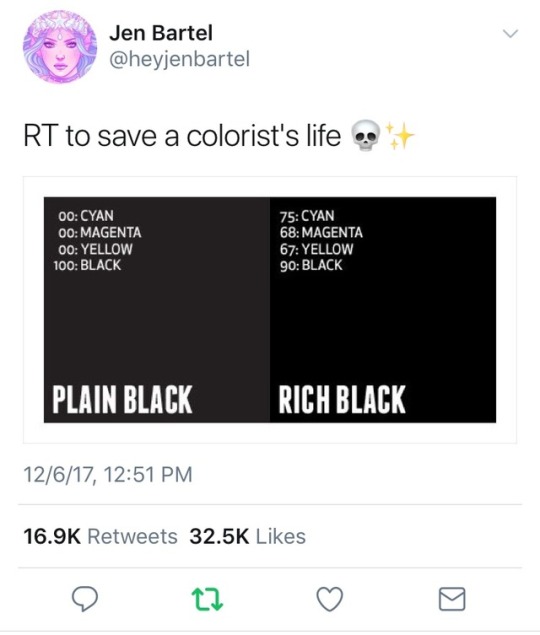
The other thing I'd add to the above is that if you've almost entirely worked with digital stuff in your life, you've stumbled onto the idea of Additive vs. Subtractive color. This might be boring to some folks, so full spiel after the cut, but TLDR; in digital, you're going from no light to all light, and in print, you're going from all light to no light (and you have to take some physical factors into account).
Now, excuse me as I dust off the degree I got but don't generally use:
When looking at RGB (like #000000 or #FFFFFF), it's explaining roughly how concentrated each color is in the same block of empty/black space, on a scale of 0-100%, but stretched into hex to be 0-256 (00 being 0% and FF being 100%). It's also representing mixing literal beams of light of those colors, so when you have them at 100%, you've made white light, like a reverse prism. This is additive color, the common thing for digital because it's pretty literal, as you're adding together light on top of an otherwise lightless square of a screen.
In CMYK, you're not starting from nothing, you have a (usually) white background, and then you're adding colors on top of that, and removing the light from the space*, thus subtractive color. That's accomplished with the dots referenced above in terms of how large the dots of a given color are in that block of space, ranging from no dot, to filling the given space with as much dot as possible. Additionally, in the same way you can make white in RGB by maxing out the colors, you can theoretically create black with just Cyan, Magenta, and Yellow at maximum concentration, but that's both a giant waste of ink, and way more likely to bleed through paper, so instead, you have Black on its own as a way to jump directly to black, and to make it more efficient to get dark colors when mixing the other three (plus black ink is cheaper).
Okay, so let's go back to the dots referenced above and what zwoelf was saying. If you think about printing some black text for something like a newspaper, that's easy, you just use purely black ink, and bam, you've got black text that reads just fine as black for general use. It's small, so there's not that much paper color to show up between the dots, and adding colors wouldn't change it enough for it to really matter in most cases (especially for the added price of printing with other colors).
But when you start looking at printing something larger that you want to look really good, and you fill a big space with just black ink, all of that white in-between the dots suddenly adds up, and now instead of black, visually you've got gray, which means everything starts looking washed out. You don't want your prints to look bad, and you know there's overlapping dots, so to fix that, you want to add a bit of the colors to fill up the white space (since all of the colors together can make black after all). Only, you don't want to layer things together too much because not only do you want to prevent the ink all just bleeding into the paper, those colors are more expensive. So you do some math and some tests, and you find the middle ground where you're using just enough of each ink that it covers up basically all of the white space on the paper without overloading it (if used appropriately).
Now when you look at it, not only do you have the black ink overlapping those colors a little bit in different spots, making the black dots a little more concentrated, but all of that space between the black dots is now a deeper, darker, mix of colors, and voila, the black looks more black, and technically, it is, because there's less white being added from the paper itself.
*You're also more literally removing light from the space in exactly the opposite way as RGB because Cyan, Magenta and Yellow are created by removing Red, Green, and Blue from White light. Cyan is White minus Red, Magenta is White minus Green, and Yellow is White minus Blue.
Additional "fun" facts:
If you've done digital art or messed with anything print related and seen DPI and not known what that is, that's Dots Per Inch. It refers to the scale of the dots that make up whatever is being printed, with a higher number meaning more dots can fit in one square inch of paper.
If you've read this and thought to yourself "I've used a color printer before and it's refused to print a simple document of black text because one of the color cartridges was empty, is it actually printing in Rich Black?" Good guess, but no, that's actually because when you print something from most modern printers, there's a micro-dot pattern encoded onto the page at least once, usually in yellow, but not all tracking codes are publicly known. (Also because capitalism, so how dare you not refill the color cartridges as soon as they're empty!)
Reblog to save a life
217K notes
·
View notes
Note
do you have any art of your characters? That either you or others have drawn?
Unfortunately, I do not. The most I have are small moodboards that don’t tell you much about the character’s appearances.
I do, however, have character sheets for all of the major characters with specific hexadecimal codes and information on their appearances! (Info below the cut.)
ATLAS
Height: 5’7
Weight: 56 kg
Body Shape: Rectangle Exomorph
Complexion: Light Skin With Neutral Undertones (FFE3D6)
Eyes: Green (769B76), Upturned Shape, Average Size
Hair: Brown (7C4F38), Mid-Short Hair, Type 3A
Unique Features: Freckles
KING DUMAN
Height: 6’3
Weight: 104.3kg
Body Shape: Athletic Mesomorph
Complexion: Light Medium Skin With Olive Undertones (E3AC7F)
Eyes: Blue (0492C2), Almond Shape, Average Size
Hair: Blond (FAF0BE), Short Hair, Type 3A
Unique Features: Cleft chin, square jaw, patchy beard, several scars across his body
ANIR
Height: 6’
Weight: 80kg
Body Shape: Athletic Mesomorph
Complexion: Light Medium Skin With Peach Undertones (EDAF8B)
Eyes: Blue (0492C2), Almond Shape, Average Size
Hair: Blond (FAF0BE), Short Hair, Type 3A
Unique Features: Cleft chin, square jaw
ERONA
Height: 9’11
Weight: 73kg
Body Shape: Rectangle Exomorph
Complexion: Dark Purple Skin (25132B)
Eyes: Bright Lavender (F3BAFF), Deep Set Shape, Average Size
Hair: Black (0F0F0F), Long Hair, Type 3C
Unique Features: Glowing eyes during teleportation
RAMONTH
Height: 9’8
Weight: 73kg
Body Shape: Rectangle Exomorph
Complexion: Dark Purple Skin (B65FCF)
Eyes: Bright Lavender (E39FF6), Deep Set Shape, Average Size
Hair: Black (000000), Short-Mid Hair, Type 3C
Unique Features: Glowing eyes during teleportation
KOA
Height: 5’11
Weight: 72kg
Body Shape: Hourglass Mesomorph
Complexion: Pink Skin (FFC3CB)
Eyes: Red (922030), Deep Set Shape, Average Size
Hair: Pink (F596BA), Long Hair, Type 3A
Unique Features: Three scars on his face, one over his right eye, over his nose bridge, and one on his left cheek. Large scar on his chest.
COZEN
Height: 5’3
Weight: 113.6kg
Body Shape: Athletic Endomorph
Complexion: Pink Skin (E5A0A9)
Eyes: Red (B20017), Protruding Shape, Large Size
Hair: Pink (CC8E98), Short Hair, Type 1C
Unique Features: Protrusive underbite
1 note
·
View note
Text
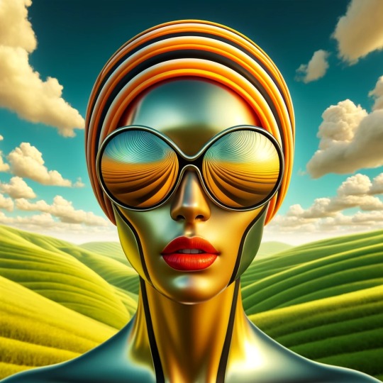
Large surrealistic sunglasses
Square-format digital artwork in a photorealistic style with surrealist elements. The central figure is a stylized, hyper-realistic portrayal of a female with yellow-orange skin (#FFD700) and prominent red lips (#FF0000). She is wearing large, futuristic sunglasses that cover her eyes, with a reflective surface showing a swirl pattern. Her head is adorned with an orange, black, and white striped headwrap (#FFA500, #000000, #FFFFFF). The backdrop consists of surreal, rolling green hills (#008000) under a blue sky with white clouds (#FFFFFF), creating a serene and dreamlike landscape. There are no visible text or logos, with a focus on a seamless blend of realism and surrealism.
#AI#AI art#AI art generation#AI artist#AI artwork#AI generated#AI image#computer art#computer generated
1 note
·
View note
Note
BAM! HERE HE IS!
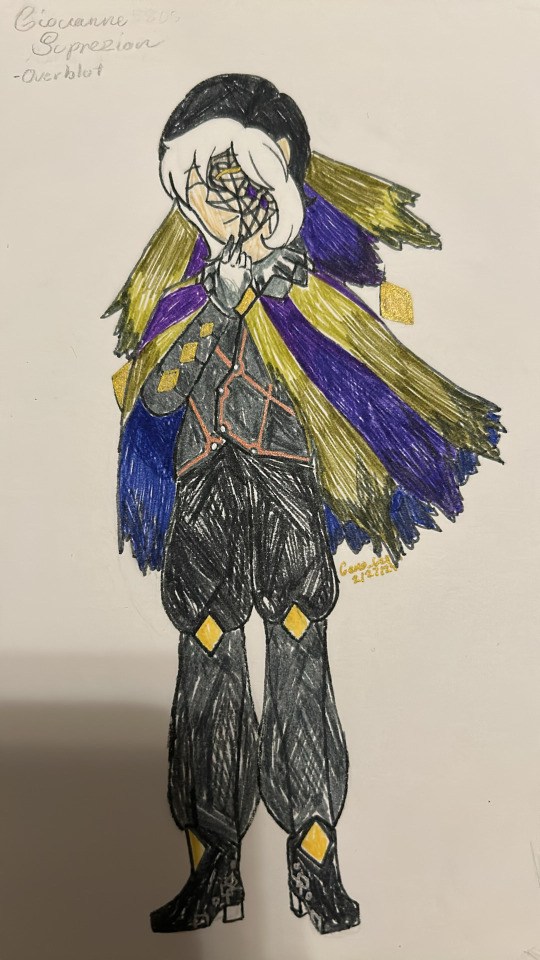
I figured because of how muted the colors of an Overblotter are, it would work with a darker Dimemtio color scheme, and it does! yes the fabric past his knees is rather see through, it works. Also the idea of soot stains on the cloak and head piece worked extremely well. I also couldn’t do the shoes and not do the thing I did for his regular shoes with the silver squares.
:000000
he looks amazing!!!!!! I really like the cloak
I absolutely love your art ^w^
#twisted wonderland#twst#twst wonderland#giovanno#mario#super mario#twst x super mario#twst giovanno
1 note
·
View note
Text


DO NOT ADJUST YOUR TELEVISION SETS
How to make an RGB classic CRT monitor glitch effect
This looks awesome in pixel/block art of any kind, cross-stitching etc. and it’s way easier to pull off than you’d think. …Unless you’re colourblind, in which case best of luck to you and godspeed.
You’ll need an art program that can handle a few layers, has transparency options, and that’s it. (But a squared drawing guide can also help keep things neat.)
First you need your line work. I’ve used text, but any line-work will do. For this it’s best to be a single colour, because we’re going to recolour it a few times.
If you’ve got a palette, set up your colours. In hexidecimal it’s going to be every combination of FF and 00:
Red - FF0000, Green - 00FF00, Blue - 0000FF, Magenta - FF00FF, Yellow - FFFF00, Aqua - 00FFFF, White - FFFFFF, Black - 000000.
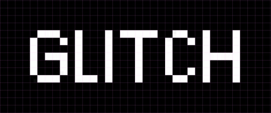
I suggest a plain black background while you work, and a pink guide.
Now you’re going to want to:
Duplicate this for three total (four if you want to keep your original)
Recolour each layer in this order from topmost: Blue, Green, Red.
Reduce both the Green and Blue layer’s transparency to 50%.
You should now have something like this.
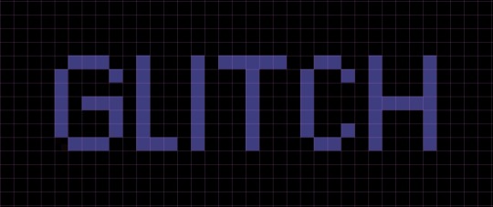
Now we’re going to move the layers.
Red stays where the base line art was. Green moves down one pixel/block. Blue moves down two pixels/blocks. Which will give you something like this:
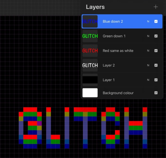
Now CREATE A NEW LAYER *cough* which I’ve never forgotten to do or have trauma about.
You can see how it’s starting to take shape.
This is where the work comes in as you go to work and go over what you see. Now Red, Green, and the darker Blue are obvious. But if you look closer you’ll see a gold that will be your Yellow, a purple that will be your Magenta, and a slightly off-blue that is going to be your Aqua. The lightest blue is in fact going to be your White. I suggest doing Blue, then Aqua, then White so as not to get too confused by their similarities.
(You might temporarily reduce the transparency of the red layer as you do that colour specifically, but you will need it at 100% for the future colours.)
Yes it’s going to look like garbage and like it’s absolutely never going to work and you must be doing something wrong or it’s too small or something. No. Persevere. Let the magic happen.
Your zoomed in work should now look something like this or even more illegible:
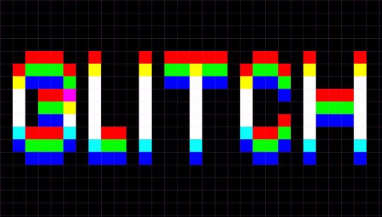
But when you turn off the line guide and zoom out…
Your eyes pull a very clever trick on you, and now the image is discernible again!
You can also do the trick horizontally as well, as best fits the piece:

And if you want to do a bodge version of the glitchy sideways bits, you want to cut out a small section and move it over say by three pixels/blocks. And you can put some pixels randomly about. If you are going to do it in a more complicated area/piece, because colours are going to overlap, you may want to go back and move the base layers to ensure you are getting the ‘correct’ colours when they mix.
(It’s tricky to pull off on one as busy as this but you get the idea).
Happy glitching!
#art#art tutorial#art guide#art reference#glitch effect#pixel art#cross stitch#rgb#trial and error#go a long way#i just think it looks neat#one of you put a cross stitch#that used this effect on my dash#and my autistic brain#wasn’t going to let go#until i figured out the pattern
277 notes
·
View notes
Note
your colors are alwasy SO GOOD.... do u have any advice for how u pick them
thank you! for advice, i have a few tips:
the first is to always keep in mind what color palette you are using. as you become more experienced this will likely become something you do subconsciously, but when i was starting out with drawing i would usually deliberately choose a color palette and reference that while coloring in my drawing.
i'll go into some basic color theory (ha ha) but feel free to skip this if you're already familiar with it.
there are many different types of palettes to choose from, but the most common ones are:
monochromatic
analogous
complementary
split complementary
triadic
square
tetradic
for example, the drawing i just posted follows a split complementary palette (which is favorite scheme btw)
i can explain this more in-depth if anyone want me to but for the sake of brevity i'll leave it at that. the only other thing that i think is important to note if you're following a color palette is that it's important to balance out the values of the colors that you are using (how light and dark they are) as well as use it as a guide but you don't have to strictly adhere to your pallete 100% if the time within your piece. for example, the my drawing uses MAINLY blue, green, and red-orange, but there is also some orange, yellow-orange, yellow-green, blue-green etc. in there as well
my second tip is to experiment! i hear the phrase "learn the rules before you break them" a lot when people are giving advice to beginner artists, which i don't always agree with because i think experimenting and finding out what you like and what you think works is very valuable (especially when you are drawing for fun and not professionally!) have fun with it, do the opposite of what people tell you to do just to see how it looks, etc. i remember getting the advice to always shade warm tones with a warmer tone and cool tones with a cooler tone (this is only a rule of thumb btw) and one day i started doing the opposite and found that it can look cool in certain circumstances
my third tip is to use references! i joke a lot about colorpicking from the most random images but i think that looking at other images and asking yourself "how is the artist/photographer using the colors to make it look this way? how do i recreate that?" and using that as a way to study their use of colors can be really helpful. i you find a drawing that has cool colors, try using those colors in your own drawings and see how they look!
the fourth tip is to play around with contrast. some drawings will look better with LOTS of contrast (where the darkest points are black and the brightest points are white), while others will look better with low contrast. stylistically, i prefer using low contrast. going back to the drawing above, there is no true #000000 or #ffffff used anywhere (except the white outline). i find that in certain situations this can help colors stand out. but like i said, it's more of a personal preference
the fifth tip is more for digital art, but it's to play around with blending layers, adjustment layers, and gradient maps if you don't like your colors but have no idea how to fix it. some programs don't have this feature but using blending layers/adjustment layers/gradient maps is sort of like using a filter to change the hue/value/saturation of your art in different ways
hope that helps! if there's anything i need to explain further please lmk!
48 notes
·
View notes
Text


Blog Layout & Reply Icons: Vampire aesthetic, featuring Lanque Bombyx
☁️ I thought it would be a cool idea to make a whole blog theme concept with a little visual! The settings are under the cut if you would like to replicate them!
Credit me in your blog description, bio, or pinned post if you use this!
🦇 / blog layout (header & icon) 🌹 / reply icons (29 total)
Background Color: #000000
Accent Color: #a80c09
Header Setting: Not Stretched
Icon Setting: Square
Title Text Color: #a00f0c
Title Text Font: Garamond, Not Bolded

✧ Requested by nobody!
#there’s magic in the air ☁️ not a request#blog layout#header#icon#vampire#vampire aesthetic#red#black#hiveswap#hiveswap friendsim#lanque bombyx#reply icons#replycons#blog theme#tumblr layout
20 notes
·
View notes
Text

Curves For Dummies <3
— as written by a dummy.
hello and welcome back to photopea for dummies! today, we’re talking about curves, an adjustment layer found in photopea. please be warned that i don’t understand curves even remotely, so i have no idea what i’m doing

curves is, put simply, extremely deranged, and i have no idea how to use it other than the most basic things, which is what i will be demonstrating. if you really want an in-depth explanation of curves, i recommend looking it up on your own time, because that is not what i will be doing here, for my own sanity.
white balance is actually fairly simple to do! referred to by professionals (see: photographers and gifmakers) as “white balance,” i like to call this particular setting “un-fucking an image,” for fairly obvious reasons.
put simply, white balance turns selected colors into their extremes—#ffffff white and #000000 black. doing this helps to add contrast to an image, and also helps in removing obnoxious tints or weird looking colors.
to un-fuck one’s image, make a curves layer (layers > adjustment layers > curves) and scroll down slightly until you see these three squares
(i’m on my phone, pardon my weird cropping) these squares are color samplers, companion to the eyedropper tool. the black square turns whatever color you select and anything darker than it to #000000 black. if you click on gray or white, you fuck your image even more. if you click on black, you do nothing. the white square turns whatever color you select and anything brighter than it to #ffffff white.
what colors you pick exactly are up to you, and also depend on your image. in this one, i could’ve used white for the white lights in the window or the lights in an’s eyes—instead, i picked some of the harsher lighting on her face, because this wasn’t already #ffffff white like the other things i mentioned. similarly, i picked a darker shadow from her hair instead of a pixel from her outline, because it wasn’t already #000000 black.
the difference between white balance and a plain old contrast layer is that white balance actively changes your colors as it works—if you pick a more saturated dark color with your black white balance tool, your image gets tinted with the opposite of that color. for example, picking a dark purple turns your image green. this is very useful for when images are tinted or have exceptionally weird contrast.
low contrast is also fairly easy to apply. if you’re completely unfamiliar with curves, you create and manipulate dots by clicking or tapping on the graph provided. these dots determine your curve, and therefore the outcome on your image.
these are my settings for this image:
as you can see, the two dots at the bottom and top have been lifted or lowered and moved inwards. this lightens the blacks of my image and darkens the whites. the other dots are applied similarly: dragging the line downward if they’re near the top and dragging it upward if they’re near the bottom. the center dots are for extra stabilization.

high contrast is the same concept as low contrast, except inverted. instead of dragging your top and bottom dots downward or upward, you leave them as they are, but drag them inward.

the other dots are also adjusted downwards or upwards towards their respective directions, instead of further away. this creates a higher contrast, lightening your lights and darkening your darks. like laundry!
and now we arrive at what the fuck. i don’t really recommend using curves this way (unless you want your image to look like a unicorn barfed on it, in which case, have at it) but i wanted to show how fucking stupid curves is. because it is. it’s fucking stupid
rule of thumb with curves: the more dots you add, the more control you have. is this good? well, this has the most dots of the examples i’ve shown so far, so… you tell me.
as you can see, curves can also affect the colors and saturation of your image, especially on the rgb setting (curves also has red, green, and blue settings, but this post is long enough already, so i’ll cover those another time.) you can see this in the less extreme examples, too—my midtones are greener
if you don’t want to change your colors but don’t know shit about avoiding that in the graph itself, fear not! i don’t understand either. so, we use one of our trusty blending modes: luminosity (found at the very bottom of the blending mode list.) as covered in my extremely long post on blending modes, luminosity ignores the color values of your layer and only applies the brightness/luminosity values.

this is quite a bit better! still extremely weird (everything is now grayed out instead of green) but it’s much less murder on my eyes!
in conclusion: curves is batshit fucking insane, and when in doubt, use luminosity. also stick to levels it’s way easier.
sincerely apologizing, eos
43 notes
·
View notes
Text
Blurring Gif Backgrounds
As requested by Anonymous, I will explain how to blur out backgrounds, unnecessary characters or distracting things in your gifs, with this as our example:

(Natasha isn't an unnecessary character ok I just can't find a better example at the moment, but I hope this demonstrates it well enough 😂)
NOTE: This tutorial works best for scenes with minimal movement.
↓ LEARN HOW TO BLUR YOUR GIFS UNDER THE CUT ↓
[1] Create your gif
Make the gif like you normally would, including coloring, sharpening etc. If you don’t know how to make gifs, click here for some great tutorials.
Assuming you’ve already converted into a Video Timeline and your layers into a Smart Object in your gif making process, let’s proceed.
[2] Make sure the playhead is at the start of the timeline
If your playhead isn’t at the start of the timeline, do this before step [3], so the duplicated layer will be aligned with your gif layer, as demonstrated below:

[3] Duplicate the gif layer
Shortcut keys:
Mac: command + J
Windows: Ctrl + J
[4] Add Gaussian Blur to duplicated gif layer
With your duplicated layer (gif copy layer in the demo below) selected, go to Filter > Blur > Gaussian Blur... The radius is up to you. I used 1.5 pixels in my example.

Feel free to use the other blur options (Blur, Blur More, Box Blur, etc).
[5] Add Layer Mask to duplicated gif layer
To do this, click the square button (highlighted in pink below) beside fx at the bottom of the Layers window.

[6] Brush the parts you don't want blurred
Make sure of these before brushing:
Click the layer mask once to select it since we’ll be brushing over the layer mask, not the layer.
Have black (#000000) as your foreground color (the color in the front).
If white became the foreground color after selecting the layer mask, change it to black OR press the shortcut key X on your keyboard to switch the foreground and background colors.
The brush hardness and size are up to you.
So, with the layer mask selected, brush to remove the blur on your subject(s) like this:

TIP: If you want to blur back the parts you’ve brushed over, press the shortcut key X on your keyboard again to switch the foreground and background colors. Always make sure you have the layer mask selected.
Black foreground color: erases
White foreground color: brings back what’s been erased
〰️
Please like/reblog if this has helped you, thank you! :)
#club post#club tutorial#blur gif background#gif blur#photoshop tutorial#gif tutorial#itsphotoshop#allresources#completeresources#chaoticresources#tusergolden
562 notes
·
View notes
Text
Aroace, agender, and it/its pronouns flag :)
Which should really have its own unique name, but I can't think of one at the moment. Feel free to suggest some.


[ID: Two versions of pride flag with nine horizontal, symetrical stripes of: black, navy blue, blue, pale green, yellow, pale green, blue, navy blue, and black. The second version is much wider than it is tall. End ID.]
This can be used for icons, moodboards, edits, designs you sell, art... pretty much anything you'd use a pride flag for! The second version is for using as a blog header!
If you do use it, please try to include an image description in the post, so that it is accessible.
Hex codes and misc info for the colors below the cut, to maybe hopefully make it easier for people to replicate in digital and traditional designs.
hex codes:
Black: 000000 Or 292929 if you want it to be light enough to show up against black backgrounds:

[ID: a black square that is slightly lighter than pure black. End ID.]
Navy blue: 27446B
Light blue: 159DD9
Green: A6D877
Yellow: F2E970
To create these colors with Appel Barrel brand paint (which is the cheapest paint I can find in little bottles) to make homemade pride pins/art, the colors are
Black
Admiral Blue
Cool Blue
Spring Green
Sunny Day
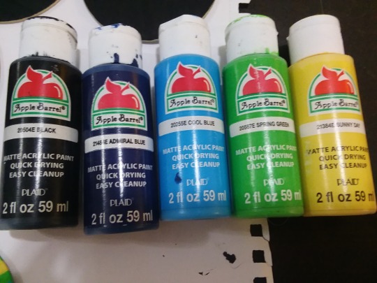
[ID: A photo of small Apple Barrel paint bottles lined up next to eachother on their sides. The colors are Black, Admiral Blue, Cool Blue, Spring Green, and Sunny Day. End ID.]
Here's a work in progress picture of the pin I made for myself, some of the paint was still wet when I took the picture, hence the shininess.
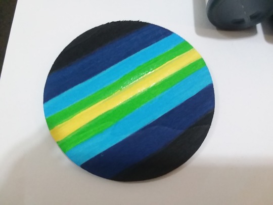
[ID: A round wooden disk painted with the pride flag above: symmetrical stripes of black, navy blue, light blue, light green, yellow, light green, light blue, navy blue, and black. End ID.]
#pride flags#aroace agender it/its#aroaceagenderit/its#aroace#agender#it/its#ititspronouns#described images
17 notes
·
View notes
Text
Mars Study [Week 2]
Dear Reader,
This week I have been working on the following three variables:
1. DIAM_CIRCLE_IMAGE – diameter from a non-linear least squares circle fit to the vertices selected to manually identify the crater rim (units are km)
2. DEPTH_RIMFLOOR_TOPOG – average elevation of each of the manually determined N points along (or inside) the crater rim(units are km)
Depth Rim - Points are selected as relative topographic highs under the assumption they are the least eroded so most original points along the rim Depth Floor – Points were chosen as the lowest elevation that did not include visible embedded craters
3. NUMBER_LAYERS – the maximum number of cohesive layers in any azimuthal direction that could be reliably identified
Here is my code [in Python] :
#importing the required library import pandas import numpy #reading the mars dataset data=pandas.read_csv('marscrater_pds.csv', low_memory=False) print('number of observations(row)') print(len(data)) print('number of observations(column)') print(len(data.columns)) print('displaying the top 5 rows of the dataset') print(data.head())
#dropping the unused columns from the dataset data = data.drop('CRATER_ID',1) data = data.drop('CRATER_NAME',1) data = data.drop('MORPHOLOGY_EJECTA_1',1) data = data.drop('MORPHOLOGY_EJECTA_2',1) data = data.drop('MORPHOLOGY_EJECTA_3',1)
print('Selected rows with diameter greater than 3km') data1=data[(data['DIAM_CIRCLE_IMAGE']>3)] print(data1.head())
# Frequency distributions # Crater diameter print('Count for crater diameters (for diameter greater than 3km)') c1=data1['DIAM_CIRCLE_IMAGE'].value_counts(sort=True) print(c1) p1=data1['DIAM_CIRCLE_IMAGE'].value_counts(sort=True, normalize=True)*100 print(p1)
# Crater depth print('Count for crater depth') c2=data1['DEPTH_RIMFLOOR_TOPOG'].value_counts(sort=True) print(c2) p2=data1['DEPTH_RIMFLOOR_TOPOG'].value_counts(sort=True, normalize=True)*100 print(p2)
#Number of layers print('Count for number of layers') c3=data1['NUMBER_LAYERS'].value_counts(sort=True) print(c3) p3=data1['NUMBER_LAYERS'].value_counts(sort=True, normalize=True)*100 print(p3)
First, I have decided to remove the unnecessary columns from my dataset, i.e. the variables that I will not use in my research project in the future: the crater ID (CRATER_ID), the crater name (CRATER_NAME), the description of ejecta morphology (MORPHOLOGY_EJECTA_1, MORPHOLOGY_EJECTA_2, MORPHOLOGY_EJECTA_3) . This was done by using the command data.drop.
Second, I have decided to work with a sample of craters for my research. So, I selected the craters whose diameter was greater than 3km in order to limit the number of records, and also in order to avoid measurement uncertainties the diameter of smaller craters due to data resolution.
The ‘p’ values were multiplied by 100 in order to get the values directly in percentage (easier to read).
The output of the program is given below:
number of observations(row) 384343 number of observations(column) 10 displaying the top 5 rows of the dataset CRATER_ID CRATER_NAME ... MORPHOLOGY_EJECTA_3 NUMBER_LAYERS 0 01-000000 ... 0 1 01-000001 Korolev ... 3 2 01-000002 ... 0 3 01-000003 ... 0 4 01-000004 ... 0
[5 rows x 10 columns] Selected rows with diameter greater than 3km LATITUDE_CIRCLE_IMAGE ... NUMBER_LAYERS 0 84.367 ... 0 1 72.760 ... 3 2 69.244 ... 0 3 70.107 ... 0 4 77.996 ... 0
[5 rows x 5 columns] Count for crater diameters (for diameter greater than 3km) 3.02 317 3.03 309 3.06 308 3.05 305 3.01 305
60.07 1 69.95 1 100.78 1 118.24 1 67.50 1 Name: DIAM_CIRCLE_IMAGE, Length: 6039, dtype: int64 3.02 0.398356 3.03 0.388303 3.06 0.387047 3.05 0.383277 3.01 0.383277
60.07 0.001257 69.95 0.001257 100.78 0.001257 118.24 0.001257 67.50 0.001257 Name: DIAM_CIRCLE_IMAGE, Length: 6039, dtype: float64 Count for crater depth 0.00 12821 0.07 1564 0.08 1534 0.10 1475 0.11 1448
3.80 1 2.82 1 2.95 1 2.94 1 3.03 1 Name: DEPTH_RIMFLOOR_TOPOG, Length: 296, dtype: int64 0.00 16.111439 0.07 1.965392 0.08 1.927693 0.10 1.853551 0.11 1.819621
3.80 0.001257 2.82 0.001257 2.95 0.001257 2.94 0.001257 3.03 0.001257 Name: DEPTH_RIMFLOOR_TOPOG, Length: 296, dtype: float64 Count for number of layers 0 60806 1 14633 2 3309 3 739 4 85 5 5 Name: NUMBER_LAYERS, dtype: int64 0 76.411526 1 18.388479 2 4.158237 3 0.928660 4 0.106815 5 0.006283 Name: NUMBER_LAYERS, dtype: float64
We can draw a few conclusions from these results:
- The smaller the craters, the more frequent they are. Larger craters occur less often than smaller craters;
- Same applies for crater depth. The shallower the craters, the more frequently they occur. This already seems to show some relationship between crater depth and crater diameter : smaller and shallower craters seem more frequent than bigger and deeper ones.
Thank You for investing your time in reading this article.
#science#technology#astronomy#mars#marcian craters#datavisualization#data science#education#college#course#student#research#nasa#datamanagement#planets
76 notes
·
View notes
Text
A nice collection of determinant identities
1 note
·
View note
Photo

We have been dying to share this classy and elegant wedding with you guys; it has come in all the way from San Diego. Couture wedding dresses, gorgeous colour palette, stunning decor, beautiful flowers and chic baraatis make this stylish and sophisticated ceremony a winner in all aspects! The couple had two photographers to document the events and both have done a fantastic job!
Bride & Groom
Venue
Fairmont Grand Del Mar
Wedding Planner
Exquisite Events
Lin and Jirsa and Salt Spell Beauty
Royal Turban Tying
Mayyur Girotra
Simrun’s Sangeet Outfit- Rohit Bal lehenga and Mayyur Girotra blouse
Simrun’s Sangeet Shoes- YSL
Kevin’s Sangeet Shoes- Christian Louboutin
Simrun’s Wedding Outfit- Sabyasachi
Simrun’s Wedding Jewlery- Kashi Jewellers
Simrun’s Wedding Shoes- Jimmy Choo
Kevin’s Wedding Outfit- Sabyasachi
Simrun’s Reception Outfit- Manish Malhotra
Simrun’s Reception Shoes- Christian Louboutin
Kevin’s Reception Outfit- Tom Ford
Kevin’s Reception Shoes- Tom Ford
Here’s wishing the couple a very happy married life ahead…Submit your wedding photos to us for publication on our blog and social media -email us at [email protected]
The post – Fine Art Wedding At the Fairmont Grand Del Mar appeared first on India& Wedding Blog.
Related posts:
Real Weddings: Suchana and Rajendra’s Bollywood Style Bangalore Wedding Odia girl Suchana Mishra married Punjabi-Rajput Rajendra Kumar in a...
Real Weddings:Retro Charm at Rahul-Snigdha’s Lucknow Wedding by Yuna Wedding Planners Mogra and white lily curtains, Victorian candelabras, crystal chandeliers, mushroom...
Starry Reception of Newlyweds Shahid Kapoor and Mira Rajput After a low key wedding in Delhi Shahid Kapoor and...
#> Simrun#000000;#><a#>Bridal#>Groom#>Decor</span></h2>#>Hire#>Raj#000000;>Photographers</span></h2>#000000;>Vinuth#000000;>Neeta#000000;><a#000000;>Square#000000;>Amber#000000;>Videographer</span></h2>#000000;">Impressive#SimAndKevINLove#039;s
0 notes