#Figma website UI UX Design
Explore tagged Tumblr posts
Visit Tumblr Blog
Explore Tumblr blogs with no restrictions, modern design and the best experience.
Last Seen Tumblr Blogs


Fun Fact
Tumblr has been providing a Korean-language service since 2013.
Text

💼 Need a stunning website or web application? Explore my services at https://raajia-shah-portfolio.great-site.net From sleek designs to powerful functionality, I specialize in crafting captivating web experiences tailored to your needs. Let's bring your ideas to life!
#website#web design#web development#ui ux design#software#software company#software house#figma#figmadesign
2 notes
·
View notes
Text
Diseño web
¡Hola! Les dejo mi servicio de diseñadora web, si me ayudan a compartirlo les agradecería. <3
#web designer#design#designer ux/ui#ux/ui#figma#figmadesign#uxdesign#ui ux development services#web development#mobile app development#mobile games#desktop#website#graphic design#creative
8 notes
·
View notes
Text
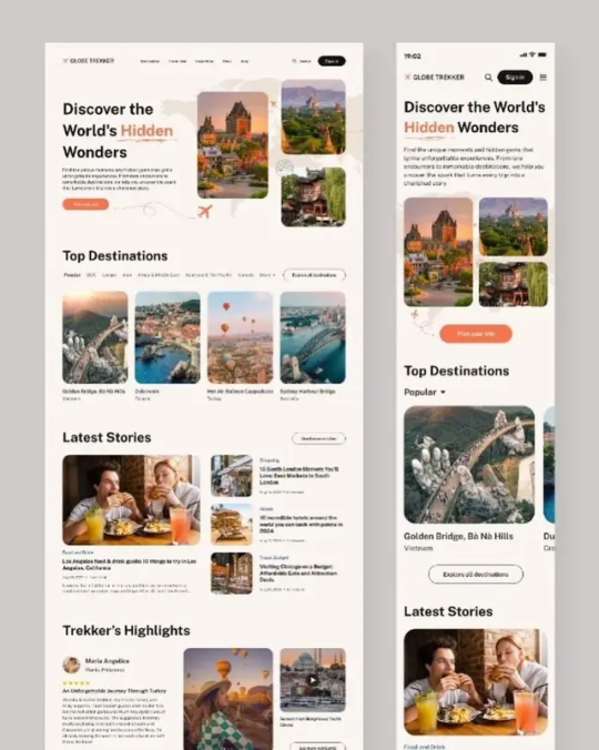
processos zzzz / process zzzz
[ br / eng ]
[um pequeno processo criativo/meu primeiro projeto oficial] lição mágica aprendida hoje: contraste.
˚✧ antiseptic ݁ ੭
BR :
⎯⎯ o processo criativo é a parte mais divertida de um design, as cores, fontes, formas, texturas, tudo é tão bom que me derreto por essa área ♥︎ fico extasiada em como os embasamentos realmente funcionam na prática.
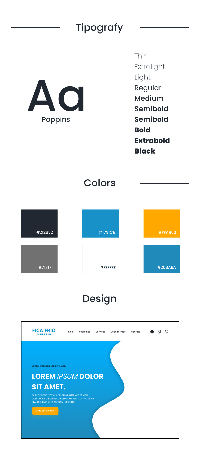
meu PRIMEIRO projeto consistia em fazer um site de refrigeração nas cores azuladas, confesso que odeio não poder encher de símbolos e formas (tirem o figma de mim), mas trabalhar com estilos diferentes me fez refletir como os clientes veem o mundo, então decidi tentar! 𓆩♱𓆪
e o meu primeiro cliente foi meu pai! 🖤

pequenas explicações é apenas a teoria do que pensei, não é necessário ler~
/⠀ ⠀TIPOGRAFIA ⠀⠀ 〜 ♱
𓏲 pesquisei diversas fontes, precisava de algo que não fosse retangular, mas não fosse tão redondo, apesar do aspecto profissional que eu quis passar. a psicologia por trás da forma redonda é bem simples: círculos são associados a suavidade, absoluto, movimento e facilidade, mas não exagere. nenhuma forma deve ser exagerada, isso causa a impressão de mal feito e afastamento, é necessário equilibrar para uma fórmula bem feita. ⛧
/⠀ ⠀CORES ⠀⠀ 〜 ♱
de fato, essa foi a parte mais fácil. a paleta de cores predominante é o azul, o que traz uma sensação de frieza, frio, gelo, tudo o que queremos, certo? (sim.) por se tratar de uma marca de refrigeração, não escolhi o preto como a cor das fontes, mas sim uma cor acinzentada, fugindo do padrão. o laranja foi escolhida por conta do círculo cromático das cores, ou, a velha teoria das cores.

fonte: sla peguei no google / https://blog.adobe.com/br/publish/2022/03/30/como-usar-o-circulo-cromatico-com-o-adobe-color-super-facil
─ é nítido que o azul e o laranja são cores contrárias, então, por que elas parecem tão harmonicas juntas? porque são cores complementares. um pequeno resumo: as cores complementares são aquelas que dão contraste uma a outra, um exemplo interessante é a rapunzel de enrolados, você percebe que a paleta de cor predominante nela é o roxo e o amarelo, pois são cores que se contrastam, ficando assim de forma harmonica.
,⠀cinza e branco: são cores análogas, estão presentes lado a lado no círculo cromático, o resultado é uma cor básica. (imagine aquele seu amigo que fala, aff isso não é roxo, é violeta! entao, é isso...) (eu sou essa chata, ok?) (voce nao pode falar que rosa choque é igual rosa ou eu irei atrás da sua familia) ☆
/⠀ ⠀CONCLUSÃO, uau ⠀⠀ 〜 ♱
é necessário durante a criação pensar no contraste das cores e dos elementos, as formas arrendondadas precisam ser equilibradas com formas retangulares de forma positiva, elementos que normalmente se dão bem juntos são aqueles que se contrastam, é muito interessante pensar em como é necessário dar atenção aos mínimos detalhes. o contraste é uma das ferramentas mais poderosas do design, se utilizada corretamente.
errr, sobre o site? ele continua na fase de programação, mas caso o post tenha uma repercussão boa, eu trarei ele com seu resultado. obrigada a todos que leram até aqui, um comentário e corações me deixariam muito feliz ♡
dúvidas, sugestões ou críticas? me mande um ask, ele está aberto para qualquer tipo de coisa que tenha surgido durante o post. ♥︎
ENG :
[a small creative process/my first official project] magical lesson learned today: contrast.
⎯⎯ creative process is the most enjoyable part of design, the colors, fonts, shapes, textures, everything is so good that I melt for this area ♥︎ i am ecstatic about how the foundations really work in practice.
my FIRST project consisted of creating a cooling website in shades of blue, i confess that i hate not being able to fill it with symbols and shapes (take figma away from me), but working with different styles made me reflect on how clients see the world, so I decided to try! 𓆩♱𓆪
and my first client was my dad! 🖤
small explanations it's just the theory of what I thought, no need to read~
/⠀ ⠀COLORS ⠀⠀ 〜 ♱
indeed, this was the easiest part. the predominant color palette is blue, which brings a sensation of coolness, cold, ice, everything we want, right? (yes.) as it's a cooling brand, I didn't choose black as the font color, but rather a grayish color, deviating from the norm. orange was chosen due to the color wheel theory, or, the old theory of colors.
font: idk, got it from google / https://blog.adobe.com/br/publish/2022/03/30/como-usar-o-circulo-cromatico-com-o-adobe-color-super-facil
─ it's clear that blue and orange are opposite colors, so why do they look so harmonious together? because they are complementary colors. a brief summary: complementary colors are those that contrast with each other, an interesting example is rapunzel from tangled, you notice that the predominant color palette on her is purple and yellow, because they are contrasting colors, thus appearing harmonious.
,⠀gray and white: they are analogous colors, present side by side on the color wheel, resulting in a basic color. (imagine that friend of yours who says, ugh, this isn't purple, it's violet! so, that's it...) (i'm that annoying person, okay?) (you can't say that hot pink is the same as pink or I'll go after your family) ☆
/⠀ ⠀CONCLUSION, wow ⠀⠀ 〜 ♱
it's necessary during creation to think about the contrast of colors and elements, rounded shapes need to be balanced with rectangular shapes positively, elements that usually work well together are those that contrast, it's very interesting to think about how attention to the smallest details is necessary. contrast is one of the most powerful tools in design, if used correctly.
uhh, about the website? it's still in the programming phase, but if the post has a good reception, i'll bring it with its result. thank you to everyone who read this far, a comment and hearts would make me very happy ♡
questions, suggestions, or criticisms? send me an ask, it's open to anything that came up during the post. ♥︎
#designgraphic#design#design ux#design ui#designinspiration#website#web design#art process#colors#theory#disscussion#brasil#english#creative#art#digital art#my art#aesthetic#figma#figmadesign#figma figure
10 notes
·
View notes
Text
How can I control render blocking in an HTML and React.js application? Render blocking can significantly impact the performance of your HTML and React.js application, slowing down the initial load time and user experience. It occurs when the browser is prevented from rendering the page until certain resources, like scripts or stylesheets, are loaded and executed. To control render blocking, you can employ various techniques and optimizations. Let's explore some of them with code examples.
#libraries#web design#website#reactjs#web development#web developers#html css#ui ux design#tumblr ui#figma#blue archive#responsivedesign#responsive website#javascript#coding#developer#code#software#php script#php programming#phpdevelopment#software development#developers#php#php framework#jquery
17 notes
·
View notes
Text
I will do mobile app, website, dashboard, software, design, UX UI design with Figma, photoshp or xd
Fiverr Gig link : https://www.fiverr.com/s/Ajjml4
UI Design
UI design involves creating the user interface of a digital product, focusing on its visual elements and layout.
UI/UX Design
UI/UX design combines user interface and user experience design to create a seamless and user-friendly digital product.
Mobile App Design
Mobile app design is the process of creating the visual elements and layout for a mobile application.
App Design
App design refers to the overall design of an application, encompassing both its user interface and user experience.
Figma
Figma is a popular design and prototyping tool used by designers and teams for creating digital designs and collaborating on projects.
Mobile App UI
Mobile app UI design focuses specifically on the user interface elements of a mobile application.
UX Design
UX design, or user experience design, involves creating a positive and efficient experience for users when interacting with a digital product.
Mobile App
A mobile app is a software application designed to run on mobile devices like smartphones and tablets.
App UI Design
App UI design focuses on the visual elements and layout of the user interface within an application.
UI/UX
UI/UX combines user interface and user experience design to ensure a product is both visually appealing and user-friendly.
Website Design
Website design involves creating the visual elements and layout for a website.
UX UI Design
UX UI design combines user experience and user interface design to create an optimal user interaction with a digital product.
Figma Design
Figma design refers to the design work done using the Figma design and prototyping tool.
UX
UX, or user experience, focuses on enhancing user satisfaction by improving the usability and accessibility of a digital product.
UI
UI, or user interface, pertains to the visual elements and layout that users interact with in a digital product.
Prototype
A prototype is a preliminary model of a digital product used for testing and evaluation before full development.
User Interface
The user interface (UI) is the point of interaction between the user and a digital product.
UX UI
UX UI combines user experience and user interface design to create a cohesive and user-friendly product.
Mobile UI Design
Mobile UI design focuses on creating the visual elements and layout specifically for mobile devices.
App UI UX
App UI UX design combines user interface and user experience design for an application.
Web UI Design
Web UI design involves creating the visual elements and layout for web applications and websites.
User Experience
User experience (UX) refers to the overall experience a user has while interacting with a digital product.
Web Design
Web design is the process of creating the visual elements and layout for websites.
Mobile UI
Mobile UI encompasses the visual elements and layout specifically designed for mobile devices.
Website UI Design
Website UI design focuses on creating the user interface for websites.
Mobile Design
Mobile design involves designing for mobile devices, including both UI and UX considerations.
Landing Page Design
Landing page design focuses on creating a compelling and conversion-friendly webpage for marketing purposes.
Wireframe
A wireframe is a visual representation of the layout and structure of a digital product, used as a blueprint for design and development.
Figma App Design
Figma app design refers to using the Figma tool for designing mobile and web applications.
Wireframe Design
Wireframe design involves creating visual blueprints of digital products to plan their layout and structure.
UI UX Designer
A UI/UX designer specializes in both user interface and user experience design.
Website
A website is a collection of webpages accessible on the internet, designed for various purposes.
Web UI UX
Web UI/UX design combines user interface and user experience principles for web-based products.
Adobe XD
Adobe XD is a design and prototyping tool used for creating user interfaces and experiences.
Website UI
Website UI refers to the user interface elements of a website.
Dashboard UI UX
Dashboard UI/UX design involves creating user-friendly and informative dashboards for data visualization.
Application
An application (app) is a software program designed to perform specific tasks or functions on a digital device.
Responsive Design
Responsive design ensures that a digital product adapts and functions well on various screen sizes and devices.
Dashboard Design
Dashboard design focuses on creating visually appealing and functional dashboards for data presentation.
iOS
iOS is the operating system developed by Apple for their mobile devices such as iPhones and iPads.
Mobile
Mobile refers to devices like smartphones and tablets that are portable and typically run on mobile operating systems.
Android
Android is the operating system developed by Google for a wide range of mobile devices.
Web App Design
Web app design involves designing the user interface and user experience for web-based applications.
Website UX
Website UX focuses on optimizing the user experience of a website to meet user needs and expectations.
App
An app, short for application, is a software program designed for specific functions or tasks.
Design
Design encompasses the process of creating visual and functional elements for a product or project.
Web UI
Web UI refers to the user interface elements of a web-based product or application.
App Screenshots
App screenshots are images captured from a mobile app to showcase its features and design.
App Prototype
An app prototype is a preliminary model of a mobile application used for testing and demonstration.
App UI
App UI refers to the user interface elements within a mobile application.
App Development
App development involves the process of creating and building software applications.
Web Application
A web application is a software program accessed and used through a web browser.
NFT Website Design
NFT website design focuses on creating websites for buying, selling, and trading non-fungible tokens (NFTs).
App Mockup
An app mockup is a static representation of an application's user interface, used for design and presentation purposes.
UI Website Design
UI website design involves creating the user interface elements for a website.
UI UX Website
UI/UX website design combines user interface and user experience principles for web-based products.
Landing Page UI
Landing page UI design focuses on creating the user interface elements of a landing page.
Android App UI
Android app UI design involves designing the user interface for applications on the Android platform.
PSD Design
PSD design refers to creating design layouts and elements using Adobe Photoshop (PSD) files.
#Certainly#here are the points with the “hax” tag added:#UI Design#UI/UX Design#Mobile App Design#App Design#Figma#Mobile App UI#UX Design#Mobile App#App UI Design#UI/UX#Website Design#UX UI Design#Figma Design#UX#UI#Prototype#User Interface#UX UI#Mobile UI Design#App UI UX#Web UI Design#User Experience#Web Design#Mobile UI#Website UI Design#Mobile Design#Landing Page Design#Wireframe
10 notes
·
View notes
Text
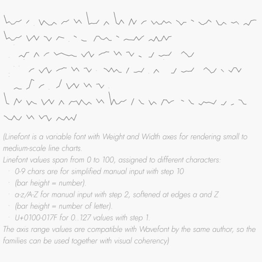

totally awesome sneak peak at my next web typography assignment, everyone go give Dmitry Ivanov a big consensual kiss.
#dmitry ivanov#linefont#typography#web typography#web design#ux/ui#website#coding#digital art#graphic design#lettering#letterforms#figma#html#css
5 notes
·
View notes
Text
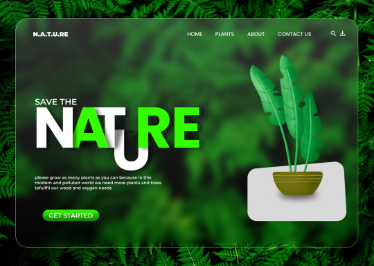
Plant website landing page design
#nature#website#landing page#web design#adobe#figma#adobe illustrator#adobe photoshop#ui/ux design#plants
2 notes
·
View notes
Text
#design#ui ux company#web#uxui#uxdesign#ux desgin#ux#figma#website#карточка#интернет магазин#tilda swinton#ui ux course#webchina
2 notes
·
View notes
Text
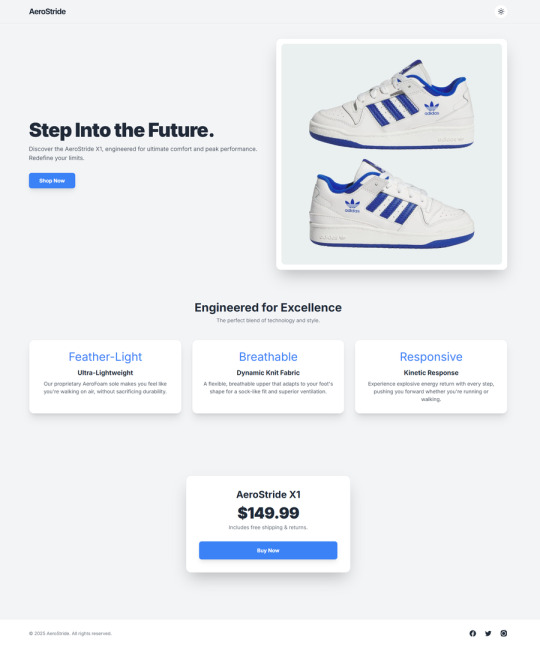
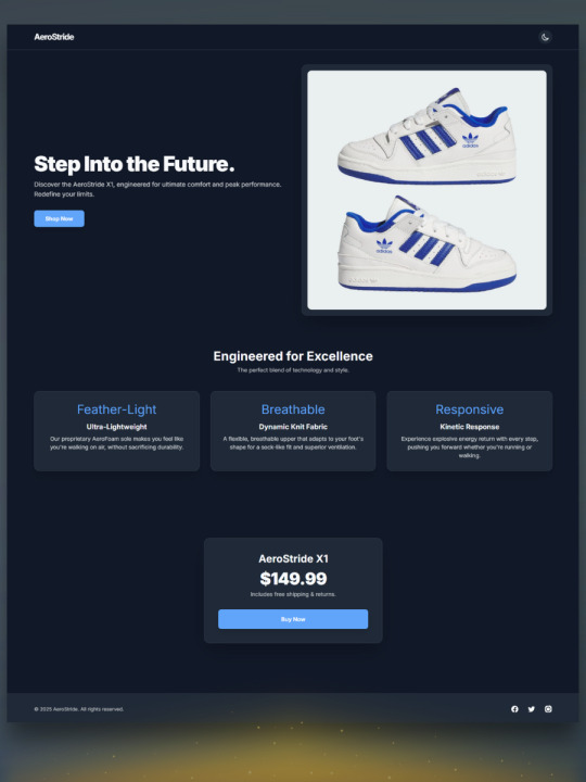
Aero-Stride - The Future of Footwear (HTML Sales Template)
LIVE DEMO | BUY NOW
Elevate your product presentation with Aero-Stride, a sleek, modern, and fully responsive HTML Sales template designed specifically for showcasing footwear, fashion, or innovative products.
Crafted with the latest web technologies, Aero-Stride provides everything you need to create a captivating online presence for your product, ensuring an exceptional user experience on any device.
_____________________
_____________________
Key Features & Benefits:
Stunning Modern Design:
Clean & Contemporary Aesthetic: A visually appealing and professional design that puts your product in the spotlight.
Premium Typography: Utilizes the highly readable "Inter" Google Font for a crisp and professional look across all text elements.
Smooth Hover Effects: Subtle yet engaging transform: translate and box-shadow transitions on cards and buttons add a dynamic and interactive feel, enhancing user engagement.
_____________________
Seamless Responsiveness (Mobile-First Approach):
Built with Tailwind CSS: Ensures your landing page looks flawless and performs beautifully on all screen sizes, from large desktop monitors to tablets and smartphones, providing a truly adaptive user experience.
Optimized for All Devices: Every element is designed to scale and adjust gracefully, guaranteeing your product is presented perfectly, no matter how your visitors browse.
. . . . .
User-Centric Dark & Light Mode Toggle:
One-Click Theme Switching: Empower your users with the choice to switch between a vibrant light mode and a comfortable dark mode with a single click.
Persistent Preference: The template remembers the user's last chosen theme using local-Storage, ensuring a consistent experience upon return visits.
Enhanced Accessibility & Comfort: Caters to diverse user preferences and reduces eye strain in varying lighting conditions.
. . . . .
Optimized Code & Structure:
Clean & Semantic HTML5: Well-structured and easy-to-understand HTML, making content updates straightforward.
Efficient Tailwind CSS Integration: Leverages the utility-first framework for rapid development and highly maintainable styling, minimizing the need for custom CSS.
Custom CSS Variables for Theming: Smartly implemented CSS variables (--bg-color, --text-color, etc.) allow for effortless global theme adjustments.
Simple & Effective JavaScript: Minimalist JavaScript code dedicated purely to the theme toggle functionality, ensuring high performance and easy extensibility.
. . . . .
Comprehensive Template Package:
index-full-code.html: The main, ready-to-use landing page file.
source-files/ directory: Includes separate index.html, style.css, and script.js for easier modification and modular development.
readme.txt / readme.md: Clear documentation to guide you through setup and customization.
license.txt: Details the licensing terms for your peace of mind.
. . . . .
Ideal For:
Launching a new product (e.g., sneakers, apparel, gadgets).
Creating a stunning promotional page.
Showcasing key features and benefits of an item.
Building a clean and effective call-to-action page.
. . . . .
Get AeroStride today and give your product the cutting-edge presentation it deserves!
#html#css#javascript#coding#web development#front-end#back-end#programming tutorial#code snippets#responsive design#bootstrap#web coding#website development#developer tools#website template#ui design#ux design#landing page design#template design#figma to html#creative templates#professional templates#modern web design#template showcase#neifex templates#website layout#sales page#landing page#conversion template#product showcase
0 notes
Text

🌟 Webflow Tip of the Day – Use Custom Code Embed for Ultimate Design Flexibility
Sometimes, Webflow’s built-in tools might not cover everything — and that’s where the power of Custom Code Embed comes in. Whether it's adding a widget, integrating a third-party tool, or creating complex interactions, the Embed element is your gateway to limitless functionality.
🔧 How to Use:
Drag the “Embed” element into your Webflow canvas.
Paste HTML, CSS, or JavaScript code inside.
Save and preview to see the live effect.
💡 Popular Use Cases:
Add custom animations using GSAP or Lottie.
Insert third-party forms like Typeform, HubSpot, or Calendly.
Embed widgets like reviews, live chat, or countdown timers.
Add schema markup or custom tracking scripts in the <head> or <body>.
⚠️ Pro Tip: Use Webflow’s Page Settings to insert custom code in the head or body tags for site-wide functionality — especially useful for SEO, analytics, or cookie consent.
🎯 Boost your site’s power beyond Webflow's native limits!
🔗 Explore My Work & Hire Me: 🌐 Webflow Portfolio: www.webflowwork.com 🎯 Upwork: https://bit.ly/4iu6AKd 🎯 Fiverr: https://bit.ly/3EzQxNd
#webflow#freelancewebdeveloper#web development#web design#webflowdesign#webflowexperts#webflowlandingpage#website#nocode#ui ux design#figmatowordpress#figma#figmadesign#figma figure#motion design#graphic design#figmacommunity#webflowcms#web desgin company#fiverr top rated seller#fiverr#freelance#onlinebusiness#workfromhome#startup
0 notes
Text
Traveling website design concept
Dm for website
Follow @websitedorkar, tag someone you love ❤️
By instagram/tishasaha
#uxdesign#uidesign#ux#ui#webdesign#uiux#design#userexperience#uxdesigner#appdesign#userinterface#graphicdesign#webdesigner#uxui#uidesigner#website#websitedesign#uiuxdesign#uitrends#productdesign#designinspiration#webdevelopment#designer#uxinspiration#dribbble#uxresearch#interface#figma#uiinspiration#dailyui
#uxdesign#uidesign#ux#ui#webdesign#uiux#design#userexperience#uxdesigner#appdesign#userinterface#graphicdesign#webdesigner#uxui#uidesigner#website#websitedesign#uiuxdesign#uitrends#productdesign#designinspiration#webdevelopment#designer#uxinspiration#dribbble#uxresearch#interface#figma#uiinspiration#dailyui
1 note
·
View note
Text
meu primeiro redesign!
[ br / eng ]
[meu primeiro redesign e como isso é mto confuso/my first redesign and how this is so confusing] lição mágica aprendida hoje: paciência.
˚✧ antiseptic ݁ ੭
BR :
’ㅤㅤㅤok é estranho postar depois de algum tempo MAS EU JURO QUE TENHO FEITO COISAS!
primeiramente, percebi que eu não ia conseguir aplicar meus estudos se eu não colocasse em prática (obviamente?), então do q adiantaria estudar se eu não faria nada com isso?
eu estava navegando na minha maravilhosa shein com esse pensamento, quando eu parei pra analisar: POR QUE EU NÃO FAÇO UM REDESIGN DA SHEIN?
sim. eu fiz.
Este site é propriedade da Shein e é destinado exclusivamente para fins de estudo. Todos os direitos sobre os materiais, informações e elementos gráficos apresentados neste site pertencem à Shein e estão protegidos pelas leis de direitos autorais.
ok pra começar: eu não fazia ideia do que fazer. não pensei em nenhuma teoria ou nada, eu só simplesmente fiz???
acredito que esse post vai ser o mais curto do perfil, mas irei tentar explicar meus processos pra não ficar tão sem conteudo. ao final do post, terá o link do resultado caso queira pular!
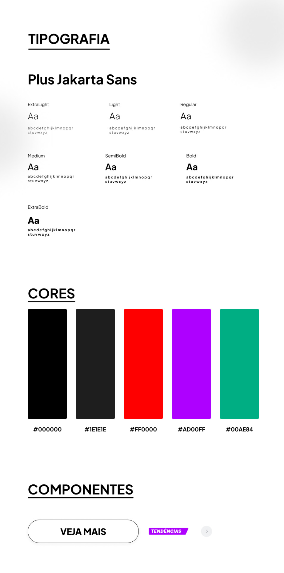
TIPOGRAFIA:
a escolha da fonte foi uma abordagem que precisava ser elegante e moderna, sabia que essa fonte foi criada sob encomenda do 6616 studio para um projeto do governo provincial de jacarta chamado ‘+Jakarta City of Collaboration’, lançado em 2020. ela se inspira em fontes como Neuzeit Grotesk, Futura e outras sans-serifs grotescas dos anos 1930, apresentando um contraste quase monolinear e curvas agudas.
a plus jakarta sans é caracterizada por suas formas modernas e limpas. ela tem uma altura-x ligeiramente maior, o que proporciona um espaço claro entre as letras maiúsculas e a altura-x. além disso, a fonte é equipada com contadores abertos e espaços equilibrados, garantindo uma boa legibilidade em uma ampla gama de tamanhos.
agora que te dei um contexto histórico dessa fonte, vou te explicar algumas razões que me fez escolher ela (não, não foi aleatorio ok). a fonte reflete uma estetica moderna e contemporânea, proporcionando espaços claros e legibilidade em vários tamanhos, tornando uma escolha versátil para diferentes elementos, desde títulos até textos menores.
CORES:
confesso que nessa parte não tenho muito a dizer, o preto é uma cor elegante e básica, tornando a comum. em termos técnicos, o preto é a ausência de luz ou cor. no espectro de luz visível, a cor preta absorve todas as cores e não reflete nenhuma delas para os olhos. legal, ne?
sobre o vermelho, é obvio que eu precisava de algo chamativo; o verde normalmente simboliza elementos da natureza, mas em alguns contextos ele também representa renovação, então, imaginei que essa era a melhor cor pra representar sobre avisos de roupas ou quaisquer coisas novas.
agora o roxo, não sei dizer o que me levou a escolher essa cor, confesso que entrei no site da SHEIN e dei uma boa olhada no motivo de ela estar ali e tudo o que me faz pensar, sinceramente, é porque ela é chamativa, o que faz o usuario ficar ansioso e pensar nossa meu deus TENDENCIA eu preciso comprar!!
CONCLUSÃO
esse foi meu primeiro trabalho concluído, de fato. tanto como webdesign como redesign, eu realmente gostei muito de ter feito e me diverti ao longo do processo, mas eu ficava ansiosa pra terminar e percebi que eu tentava atropelar algumas etapas, isso deve ser mais comum do que eu imagino e eu preciso treinar isso, mas tirando isso.... consegui trabalhar bem olhando as referencias do proprio site da SHEIN e acredito que fiz um retrabalho bom!
POR FAVOR SHEIN ME CONTRATA
dúvidas, sugestões ou críticas? me mande um ask, ele está aberto para qualquer tipo de coisa que tenha surgido durante o post. ♥︎
ah, e sobre o resultado final, claro....... eu postei no dribbble! provavelmente vai ser a plataforma que utilizarei em todos os meus posts para mostrar o design final, ent caso vc n queira ver meu monologo, basta pular direto pro final!
https://dribbble.com/shots/24251593-SHEIN-Redesign?added_first_shot=true
[meu primeiro redesign e como isso é mto confuso/my first redesign and how this is so confusing] magic lesson learned today: patience.
˚✧ antiseptic ݁ ੭
ENG :
’ㅤㅤㅤok it’s weird to post after some time BUT I SWEAR I HAVE BEEN DOING THINGS!
firstly, I realized that I wouldn’t be able to apply my studies if I didn’t put them into practice (obviously?), so what would be the point of studying if I wasn’t going to do anything with it?
I was browsing my wonderful shein with this thought, when I stopped to analyze: WHY DON’T I DO A REDESIGN OF SHEIN?
yes. I did.
This site is owned by Shein and is intended exclusively for study purposes. All rights to the materials, information and graphic elements presented on this site belong to Shein and are protected by copyright laws.
ok to start: I had no idea what to do. I didn’t think of any theory or anything, I just simply did???
I believe this post will be the shortest on the profile, but I will try to explain my processes so as not to be so without content. at the end of the post, there will be the link to the result in case you want to skip!

TYPOGRAPHY:
the choice of font was an approach that needed to be elegant and modern, I knew that this font was custom made by 6616 studio for a project of the provincial government of Jakarta called ‘+Jakarta City of Collaboration’, launched in 2020. it is inspired by fonts like Neuzeit Grotesk, Futura and other grotesque sans-serifs from the 1930s, featuring an almost monolinear contrast and sharp curves.
the plus jakarta sans is characterized by its modern and clean shapes. it has a slightly larger x-height, which provides a clear space between the uppercase letters and the x-height. in addition, the font is equipped with open counters and balanced spaces, ensuring good readability in a wide range of sizes.
now that I’ve given you a historical context of this font, I’ll explain some reasons that made me choose it (no, it wasn’t random ok). the font reflects a modern and contemporary aesthetic, providing clear spaces and readability in various sizes, making it a versatile choice for different elements, from titles to smaller texts.
COLORS:
I confess that in this part I don’t have much to say, black is an elegant and basic color, making it common. in technical terms, black is the absence of light or color. in the visible light spectrum, the color black absorbs all colors and does not reflect any of them to the eyes. cool, right?
about red, it’s obvious that I needed something eye-catching; green usually symbolizes elements of nature, but in some contexts it also represents renewal, so, I imagined that this was the best color to represent about clothes warnings or any new things.
now the purple, I can’t say what led me to choose this color, I confess that I entered the SHEIN website and took a good look at why it was there and all it makes me think, honestly, is because it is eye-catching, which makes the user get anxious and think oh my god TREND I need to buy!!
CONCLUSION
this was my first completed work, in fact. both as webdesign and redesign, I really enjoyed doing it and had fun throughout the process, but I was anxious to finish and I realized that I tried to rush some stages, this must be more common than I imagine and I need to train this, but apart from that… I managed to work well looking at the references from the SHEIN website itself and I believe I did a good rework!
PLEASE SHEIN HIRE ME
questions, suggestions or criticisms? send me an ask, it is open for any kind of thing that may have arisen during the post. ♥︎
ah, and about the final result, of course… I posted it on dribbble! it will probably be the platform that I will use in all my posts to show the final design, so if you don’t want to see my monologue, just skip straight to the end!
https://dribbble.com/shots/24251593-SHEIN-Redesign?added_first_shot=true
#design#aesthetic#art#english#designinspiration#brasil#design ux#ui ux design#uidesign#ui ux company#ui#ux#redesign#shein#sheinstyle#design ui#web design#website#user interface#prototype#digital art#figmadesign#figma#creative#dribbble#dribble
8 notes
·
View notes
Text
#website development#ai solutions#custom software development#mobile application development#ui ux design#reactjs#javascript#figma#html css#generative ai#gen ai#ai writing#llm#ai technology#artificial intelligence#seo services#web development#flutter app development#hiring#ruby on rails development company#internship#freshers#career#job
0 notes
Text
Blog Website Design
Hello Everyone✋🏻
Welcome to our Blog Website Design exploration!
Ready to take your website design to the next level?
We create stunning & impactful website designs that go beyond expectations.
Check out our portfolio for a dose of inspiration: https://bit.ly/3MGFcLI.

0 notes
Text

Shhhhh 🤫! There is a surprise!
This is a perfect 👌 web UI kit to build an e-commerce store for women’s undergarments.
Get this web UI kit to start your e-commerce 🛒 journey.
✅ Designed in Figma
✅ Essential product pages
✅ Attractive UI design
✅ Customizable
Visit Now- https://allclonescript.com/product-detail/laceline-web-ui-kit
#web template#website template#web design#ui ux design#web ui kit#website ui kit#uikit#ecommercestore#ecommerce#online store#online#figma#figmadesign#landingpage
1 note
·
View note
Text
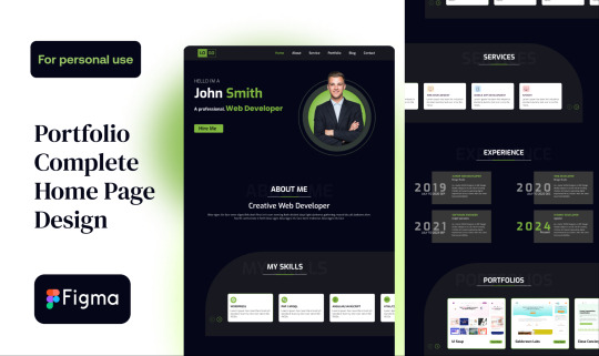
FREE FIGMA TEMPLATE
Get this landing page template for free. You will get the thumbnail as well with the landing page.
https://www.figma.com/community/file/1381725221697457016/portfolio-complete-home-page-design
Have an exciting project?
Let’s collaborate
#uidesign #uiuxdesign #uiux #design #websitedesign #designrockdh #figma
#ui#ui ux design#uiux design#user interface#portfolio#designrockdh#figma#free template#product design#website#website design#design inspiration#graphic design
0 notes