#List post
Explore tagged Tumblr posts
Visit Tumblr Blog
Explore Tumblr blogs with no restrictions, modern design and the best experience.
Last Seen Tumblr Blogs


Fun Fact
If you dial 1-866-584-6757, you can leave an audio post for your followers.
Text

SCREENCAPS WEBSITES LIST
Here's a small list of websites containing movie and animation screencaps for your graphics—such as icons, headers, picspams, and more. Enjoy!
Cap-That
FanCaps
@neverscreens
@hq-screencaps
Screencapped
BluScreens
Movie-Screencaps
KissThemGoodbye
AnimationScreencaps
ScreenMusings
FilmGrab
Caps-A-Holic
QuiteUnlikely
#*mine#screencaps#list#resources list#dearindies#supportcontentcreators#dailyresources#chaoticresources#allresources#completeresources#resources#rp resources#rph resources#indie rph#rp help#roleplay resources#useful links#list post#free resources#helpful#useful#useful stuff
136 notes
·
View notes
Text
Mighty Nein ND & Disability Headcanons
Beauregard Lionette: ADHD, Autism, C-PTSD & Depression
Caduceus Clay: Autism & PTSD
Caleb Widogast: Autism & C-PTSD
Essek Thelyss: AVPD
Fjord: ADHD, C-PTSD, & Depression
Jester Lavorre: ADHD, Autism & PTSD
Marion Lavorre: ADHD & Agoraphobia
Mollymauk Tealeaf: BPD & PTSD
Veth Branatto: ADHD & PTSD
Yasha Nydoorin: Autism & C-PTSD
#fandom:#cr#critical role#mighty nein#character:#beauregard lionett#cadeuces clay#caleb widogast#essek thelyss#fjord stone#jester lavorre#mollymauk tealeaf#veth brenatto#yasha nydoorin#topic:#nd headcanons#headcanons#type:#txt#list post#my post#other:#critical role headcanons#mighty nein headcanon#critical role headcanon#critical role meta
28 notes
·
View notes
Text
After six (very slow!) years of writing, Hallo, Aro comprises eighteen short fiction and creative-non-fiction pieces about allosexual aro protagonists--all collected on my website, Patreon or Tumblr.
Stories include:
Unspoken
Leaving
Friendship
Lucky
Attraction
Existence
Neuronormative
Loveless
Monstrous
Pressure, Side One
Pressure, Side Two
Abrasive
Question
Antagonist
Witch
Hunter
Pillar
Tomorrow
Please expect fantasy and fairy tale motifs, trans and multisexual characters, a dash of autism, a great deal of amatonormativity, and a pervasive struggle for recognition by family, society and community.
#fiction#aro writing#alloaro writing#aromantic#alloaro#hallo aro#links#aro words wordpress#amatonormativity#fantasy#short fiction#original fiction and prose#contemporary#amatonormativity feels#alloaro feels#aromantic and trans#aromantic and autistic#list post#k a attempts self promotion#tagged so that folks can block these sorts of posts#as I'd like to get better about making them#aro worlds patreon
75 notes
·
View notes
Text
so I went to see beauty and the beast (the musical) last week and I just want to share with you all some highlights because this was possibly the most UNHINGED production I've ever witnessed
Act I
The beast started out with a russian fur hat on as the 'prince'. They're in france. Why was it russian
This was for the special effects transformation but given that they accomplished the rest of it with lights and a very sneaky stagehand idk why they had to make him wear a russian hat
Belle was not white but all of the villagers were
This in no way took away from the show actually it made it better but i felt like i should mention it
Gaston and Lefou were clearly casted for their looks
And by that I mean: both of them were singing/speaking out of their normal ranges because they both looked like the opposite character but had different voices
Like Lefou was kind of lanky and had curly hair, well styled as Lefou, but it was clear he had a deeper voice than he was playing
And gaston?
That man had the voice of a twink and he was really bad at hiding it
actually none of them could keep up their character voices. Lumiere's french accent kept dropping in and out
Mrs. Potts ended up sounding like a new zealander
Belle's dad, the entire time, looked like he would be more at home at the lakeside with a cap that says 'fish fear me women want me' than anywhere near this production
Madame de garderobe had working drawers in her costume
I've seen a few versions of this musical. First one with proper working drawers
I'm pretty sure everyone has heard 'be our guest' at least once in their life. It's a very famous song.
Be our guest went for TWELVE MINUTES
Three of those minutes went to a dedicated TAP BREAK in the middle where all of the dancers AND Lumiere AND Belle tap danced
Cogsworth also tapped and absolutely slayed that tap dance
They somehow managed to recreate the cabaret-esque synchronised swimming scene with the cutlery chorus from the live-action movie
To top it all off, that bit when Lumiere has his depressing little monologue? During that bit Cogsworth pulled out a comically huge electronic plug which cued the light changes, and Belle helped Lumiere get it all working again because idk. Electricity somehow existed in 1790s France
(Yes Beauty and the Beast - the movies and musicals, at least- is set in 1790s/1800s France. I have evidence to support this)
So remember when I said that Gaston was somewhat of a twink?
The beast himself was dressed in red, and given that he was VERY built and VERY largely costumed (and also looked uncannily like a guy from my high school who harassed people) he ended up looking more like Gaston than Gaston did
Act II
So act ii begins with Belle nursing the beast after he saved her from the wolves, yada yada yada, etc., and instead of using his voice to make weird screams and growls and yelping sounds like a NORMAL PERSON, they used sound effects
smh. just let actors make weird sounds what are you afraid of
Those of you who may not have seen the musical might not know this, but Belle has a costume change. And not the classic costume change we all know into the magical yellow princess dress, but just into another gown after she and the beast are 'drenched' from the wolf attack and being outside
And, like I've said. I've seen a few versions of this musical. This dress is the dress that the costume designers can have a bit of fun with because they don't have to stick to what is known and marketed. There's been a few versions of this dress. But this dress?
This dress was somehow PINK and 1950S despite it being in 1790S FRANCE
Also forgot to mention. They had eiffel tower motifs everywhere, despite the eiffel tower not being built until the 1880s
Anyway the rest of the musical proceeded somewhat normally. Belle and the beast had their dance. He let her go. blah blah blah
Then we get to the mob song (the song where Gaston leads a mob)
See a thing that they did with this production is for the attacks and rain and special effects they had this sheer screen that they would project things onto that would come down at the front of the stage. A lot of people don't like it, I think it worked very well, I think there's a lot of untapped potential for further special effects with it
The thing about this screen is because of the hazy effect they were going for with the rain and the villager choreography being a bit lost because of the colour of their costumes, it was very obvious when Gaston spent most of this song just doing an NPC dance holding a pitchfork
Also speaking of special effects
They way they built the set meant that Gaston could actually fall off a cliff a la Beauty and the Beast 1990 (using wires)
Those wires were also used to flip the beast around in the air as he resurrected into a normal person again
The end!
#i also went to a gay club right after i saw this so like. it was a crazy night#anyway i love beauty and the beast but this was insane#beauty and the beast#musicals#disney#theatre kid#musical theatre#broadway musicals#theatre kid posts#i sincerely hope y'all read my url#there's a reason im talking about this#i am a musical theatre student i know what i'm talking about#this is my job#list post
11 notes
·
View notes
Text
INTRO: ❤️
If you come upon this blog, WELCOME! Here you will find fresh content on the daily! (Actually, depends on my mood and what I'm doing from time to time! lol)
Here's my about me post if you want to get to know who I AM! (maybe be mutuals? Lemme know if you wanna!) 😊
Need a break from other things??? (Politics, doom scrolling etc.) Then you have come to the right place!
Follow my other side blogs for more craziness (lol): @calkestiswhasits @dagangeraaa @silcosilcooo & @misterrrlangdon
And down below are my fanfics (if you're interested in reading them) 📖📖📖
HAVE FUN AND WELCOME ABOARD! 🚂👩🔧

Legend: ⭐ = Has the most likes 💥= Has the least likes
--
Fics of...
Dagan Gera (Star Wars) 💥
Michael Langdon parts One and Two (Coming soon) (American Horror Story) 💥
John Wick fics HERE (John Wick Fandom) 💥
Loki (Marvel) ⭐
Din Dijarin (Star Wars) 💥
Feresk Tassat parts one and two (Star Wars: Squadrons) 💥
Shadow the Hedgehog (Sonic Fandom) (Drabble) ⭐
My Headcannons of...
Silco (Arcane: League of Legends) ⭐
Dagan Gera 💥
Random Characters ⭐
Smut Fics of... 18 plus and UP! ⚠️
Dagan Gera 💥
Dagan Gera (Drabble) 💥
Feyd-Rautha (Dune: Part 2) ⭐
Loki (A Drabble) ⭐
Reality Imagines (What if they were real!) of...
Cal Kestis parts one & two 💥
Crossovers of...
Cal Kestis & Aloy (Jedi Survivor and Horizon Forbidden West) 💥
Fluffy Content of...
Dagan Gera (A Proposal) 💥
Drabbles of...
Feyd-Rautha (Dune Part II) ⭐
Silco (Arcane: League of Legends) (Mini) 💥
Michael Langdon (Mini) 💥
Jinx (Arcane: League of Legends) ⭐
Rey Skywalker (Star Wars)
Dagan Gera (Star Wars) 💥
Andy Dolan (Eden) 💥
Sonic the Hedgehog (Sonic Movie verse) 💥
Casper (A Date With Death) Another one here
Drabbles that include ME and my Favorite Characters...
Dagan Gera 💥
Cal Kestis
(MY INBOX CLOSED FOR NOW!!!) (Keeping out them trolls!)
This will be edited more to add if needed...

#my masterlist#list making#my fanfiction#fanfic#my fanfic stuff#fic list#fic library#my stuff#list post#about myself#know about me#my blog#follow my blog#for more#if you wish
17 notes
·
View notes
Text
15 Best Children's Books I Read with My Kid in 2024
#Best Children&039;s Books I Read with My Kid in 2024#Book Blog#book blog feature#Book blogger#Books for kids age 5-8#Books Teacup and Reviews#Children&039;s book recommendations#Children&039;s book#Indian Book Blogger#List post#Listopia#recommendation list#recommendation post
2 notes
·
View notes
Text
What Are You Grateful For: A Staff Article
Here are some things we are grateful for at Real Women of Gaming

View On WordPress
#gratitude#gratitude post#list post#positive post#Real Women of Gaming#staff post#Thankful#thankful post
2 notes
·
View notes
Text
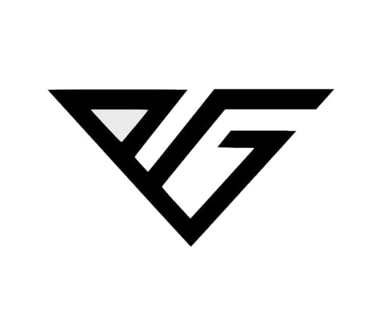
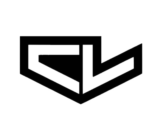
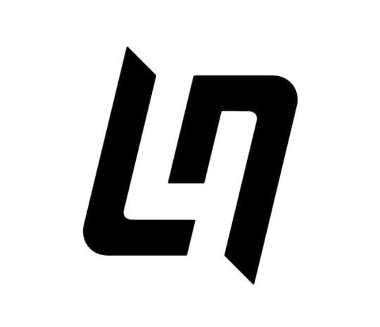
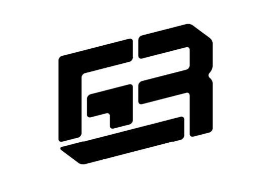
Ranking all the Driver logos of the 2023 F1 grid
My ranking of the logo designs of the grid, doing main drivers only. Ranked based on the graphic design quality. A good logo is simple and recognizable.
Not bringing any driver biases into this, if your logo sucks you're on the bottom.
Starting at number 20 and counting up to 1! Let's go!
20. Kevin Magnussen It's hard to find his official logo, but this seems to come up the most. While initials with driver number is a good idea, the font kills it. Having a brush-like font makes it too complex and messy. It doesn't look bad but it's not logo material

19. Esteban Ocon
I'll be honest I don't even know what's going on in the middle there. But this is more of a simplified signature, that isn't what you want in a logo. If the E and O were bolder with that swoop we might be on to something, but instead we have this mess.

18. Zhou Guanyu
This logo is at least clear, however it is still burdened by being a little too complex. Plus it reminds me of Monster Energy font which isn't helping. The split in the Z is lost when viewed at a distance. This could be good with a little more polishing but for now it's trying to do too much.
This is an example of having elements that don't add anything, this would be the same or even improved without the border lines.

17. Lewis Hamilton
Getting controversial here. While this is a nice logo, and there is thought put behind it. This could be anything. There is nothing specific to the driver here. It's too abstract. Now as a 7-time world champion he can make this logo synonymous with himself. But this logo feels impersonal. This could be a car or computer logo for all I can tell.
Additionally the excess of lines in the detailing makes it unnecessarily complex.

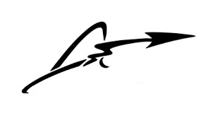
16. Fernando Alonso
This logo suffers from a lot of the same problems as Esteban's. It's better because that bold arrow is distinctive and makes it stand out. But it's over doing it with the excess of squiggles. I think if it were just the A with the arrow making the line through this would be a top 10 design, but it tries to do too much.
15. Nico Hulkenberg
For some reason it's really hard to find what this man's logo even is. Some sources have it as just his name in block letters. Regardless just the driver number is lazy. It's fine, however it really has no thought put into it.
14. Carlos Sainz
Another number logo. This one beat out Hulkenberg just a bit because there is more stylization put into the numbers. The sleek design looks like a track. So for a number logo this one is the best, but it is still just a number logo.

13. Logan Sargeant
It was really hard to find a high quality image of this one. I don't dislike it. The logo is clean. I like the way the letters run into each other, but it feels a little lazy for an initials logo. The font is also something that I could probably find on any PC so it lacks that customization Furthermore it is without an element of personalization. This is basically doing the bare minimum for an initials logo.

12. Yuki Tsunoda
This one is similar to Dani's. It has bold blocking which makes for a good clean logo. It's inspired by a Japanese symbol for luck. Simple, clean lines, recognizable at a distance, this is a pretty good one.
11. Daniel Riccardo
Don't get me wrong I do like this one. It's unique and definitely stands out from the rest. However it suffers from a little too much abstraction. Yes if you look closely you can make out a D and an R, but it isn't clear. So good logo, but went a bit too far in some areas.
I feel like some people might disagree with me here, but just because it looks cool doesn't mean it's necessarily a good logo.

TOP 10!
Beyond here I think all of these are great logos, it's just a matter of nitpicking.
10. Valtteri Bottas
This one is just sleek. The single line ending in that nice curve is so good. The V blending into the lowercase B is so smooth. A lot going on in such a simple design. It's on the more abstract end for initials but it's not pushing it too far. The looping effect it has for directing the eye is really effective.

9. Lance Stroll
This is really good for a clean initial logo. Simple, bold with a little bit of stylization. It's doing a lot more than Logan's(same initials) The only thing that bothers me about it is the gap, I like it, but it seems a little off in my opinion. But over all this is a good example of a nice initial logo.
8. Oscar Piastri
Another one I had a really hard time getting a quality image for. This is another good example of an initials logo with a personal touch. Love the simple lettering and the dashes connecting the two letters. This has way more custom touches which is why it stands out compared to Logan's.

7. Alex Albon
Now this is just satisfying to look at. Double initials really work here. It's about what I'd expect from a double A situation, nothing super innovative, but they made something really nice with it. The use of blank space between the letters also creates a nice through line for the eye.

6. Sergio Perez
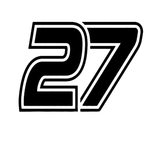
This one is a little complex but it makes up for that fact because it does something that a lot of logos struggle with. It incorporates the driver's number(there are better examples higher on the list).
I am happy that someone saw the potential to sneak the driver number into the initials, that's easy to do with number 11 and it's pretty effective here.
If the 1's weren't hollow this would be even higher, remove the serifs and fill in the 1s and this is top 2 easy, but for now it's number 6.
5. Max Verstappen
This is a really clever combo of Max's initials. M and V sharing similar design elements really lends itself nicely to this concept. The logo takes advantage of that perfectly creating something simple and recognizable.
The symmetry is also very satisfying in this one. It's a really good example of how lettering can be combined with geometric shapes to great results.
4. Pierre Gasly
This is just a great design. The simple letters that are connected fitting within an invisible geometric shape, beautiful. This is just satisfying to look at. It's simple, has the letters that are obvious, has a high level of custom appearance and is a really sleek design.
This one is essentially tied with the number 3 spot. I had a hard time choosing because they are both such good designs. The reason this is in number 4 is only because it's a little less pleasing to the eye but that is subjective. So it's effectively a tie.
3. Charles Leclerc
This is fantastic logo design. It's helped by the fact that the letters get to mirror each other in a really nice way. It does a similar thing to Pierre's having a simple geometric shape outline the whole thing.
The negative space mirroring the positive space is what set it a part just a little, that's a really sophisticated design choice and is visually satisfying. It helps create a nice flow that compliments the lettering.
It's sleek, bold, the letters are clear, this is what a logo should look like. The bold outline helps it stand out even more while not overly complicating the design.
2. Lando Norris
At first glance Lando's is very similar to Lance's, however it is so much better. It almost mirrors itself and has nice motion to it almost creating a swirl.
However the real genius of this design comes into play with the negative space between the initials. It creates the number 4! A super clever way to incorporate the driver's number into the initials as well. Making use of all the space in a logo while only using 2 lines, now that is just good design work right there.
1. George Russell
There were a lot of close ones on this list, but George's is the clear winner. This is a logo where I see it and I'm just impressed. It's so simple but they somehow managed to combine his initials with his driver number. Brilliant! This is the kind of design that not anyone could come up with.
Sometimes you see just the number, sometimes it's the initials. Either way it works, they almost created an optical illusion in the best possible way. This is beyond clever and is such a good example of what good graphic design can do.
That's my list! Hopefully you had fun reading.
8 notes
·
View notes
Text
holy shxt, we have so many requests. yall are awesome. gonna make a list for our own sake. -❤️

DRAFTS (oldest to newest):
- level 2 high cleancore • halfway (re-doing)
- 2x level 3 mizurio & mori kei alters • halfway (stuck)
- 2x level 4 bowser archivist & bb protector • started
- level 4 queer Christian • barebones
- 2x level 4 prince and his knight • barebones
- level 2/3 “other” layla & awake layla sisasystem • barebones
- 3x level 3 tawog characters • barebones
- level unspecified sou hiori yttd • close to done
- level 3 orange soda • barebones
- scifi themed headspace • halfway
- dsmp headspace • started (stuck)

INBOX (oldest to newest):
- headspace for prince & knight pack, 2-3 locations w pastel theme • not started
- level 1.5 (include moodboard) hivemind • not started
- galaxy/ocean headspace • not started
- level 1 opal themed headmate • not started
- homestuck themed headspace • not started
- forest themed headspace • not started
6 notes
·
View notes
Text
List of things I learned writing chapter 20:
All my friends think I'm crazy
I have gained the ability to find any sentence in this chapter in under a second(new super power unlocked woooo)
The timeline can live in my head and everything is still fine(see Syl)
This was a reasonable thing to attempt
I might be getting a handle on this whole smut/omegaverse thing
Should be a fun update tomorrow XD
#Robert Jordan (may he rest in peace) and his 300 page last battle chapter would be so proud of me#I'd Lie posts#Luci rambles#list post
4 notes
·
View notes
Text
Usernames that could be untaken (because I've used them before)
Subject to edits because I won't stop until I've found the perfect username
disconcherto (Disconcerting and concerto, except disconcerto was taken so I added an H)
0 notes
Text
Hi, new Mr. Terrific fans! Do you want to get to know him after watching the movie? Here’s a short and easy reading list for you!
Important details to note:
His name is Michael Holt
He’s a legacy character. There was a Mr. Terrific before Michael named Terry Sloane who has been dead for decades. He’s the reason why “Fair play” is written on Michael’s jacket sleeves.
His origin includes attempted suicide.
His mask has a purpose! It makes him a walking blind spot to cameras.
The New 52 Mr. Terrific is a completely different character.
Reading list:
The Spectre (1992) #54 (Michael’s origin)
JSA (1999) (He Joins the team in #11 and becomes chairman in #27)
Justice Society of America (2006)
Checkmate (2006)
The Terrifics (2018)
Mr. Terrific: Year One (2025) (A modern retelling of his origin. Currently two out of four issues are out. The third releases on Wednesday while the fourth comes out a week after that.)
If you have any questions, ask me at @fall-of-fall ! Happy reading!
#posting this here because my main blog is shadowbanned#reading list#michael holt#mr terrific#mr. terrific#mister terrific#superman 2025#dc#dc comics
8K notes
·
View notes
Text
I thought Trans Day of Visibility a good time to mention that I have a post collecting my stories with trans aro protagonists. I often feel disconnected from the aro community in that the (albeit very limited!) representation we celebrate and bond over largely depicts cis aros. Characters who seldom encompass, because they are cis, much of how I experience being aromantic.
In order to be seen as aro, I must push my transness into the shadows. The reverse is true in trans-centred fiction, where acceptance--by ourselves and/or others--is often demonstrated via a character's experiences of romantic relationships and love. Time and time again, I must choose which part of me to celebrate and which part to ignore: I can only be transgender or aromantic in the stories about which my communities express delight.
So this is a list of aro stories about gender and trans stories about aromanticism, because we deserve recognition as trans and aro.
#trans day of visibility#tdov#aromantic#transgender#representation#aromantic and transgender#link#aro worlds wordpress#fiction#short fiction#aro writing#aro and trans feels#aromantic and trans#undescribed#text in image#list post#representation feels#aro community#most stories are about trans alloaros#alloaro writing#aspec#fantasy#fairy tales#alloaro and transgender#aro community feels#aro feels#aromantic feels#ciscentrism
70 notes
·
View notes
Text
youtube
0 notes
Text
PJO List
Crossovers PJO/Epic PJO/The Witcher ---- Sea people's culture
0 notes