#Material Design Template
Explore tagged Tumblr posts
Visit Tumblr Blog
Explore Tumblr blogs with no restrictions, modern design and the best experience.
Last Seen Tumblr Blogs


Fun Fact
Tumblr is used by 21% of adults online aged 18-29 years.
Text
Unleashing Productivity: A Deep Dive into Material Kit React – The Ultimate Free Admin Dashboard Template
Why Material Kit React is a Game-Changer for Developers In the fast-paced world of web development, efficiency and design are paramount. Developers often grapple with creating admin dashboards that are both functional and aesthetically pleasing. Enter Material Kit React – a free, open-source admin dashboard template that seamlessly blends Material Design principles with React’s component-based…
#Admin Dashboard Template#Bootstrap 4 HTML5 UI Kit Template#Clean#Dropdown#Free Material UI Template#Free React Dashboard#free template#Left Sidebar#Login Form#material design#Material Design Template#Material Kit React#material ui dashboard#Multipurpose#On hover effect#Open Source React Template#React Admin Template#React Template#React UI Kit#ReactJS Admin Panel#Responsive Admin Dashboard#responsive design#Sticky Navigation Bar
0 notes
Text


# multiple theme ✮
very geometric and playful and messy so they end up together. free to use, credit if reposting and using for edits requests.
#★ :: personal hymn#cat#drip#design#overlay#shape#square#text#circle#cross#squiggly line#decorated#avatar mask#carrd resources#rentry graphics#rentry mask#rentry resources#rentry#image mask#web graphics#carrd#carrd inspo#carrd stuff#carrd material#template#resources
720 notes
·
View notes
Text
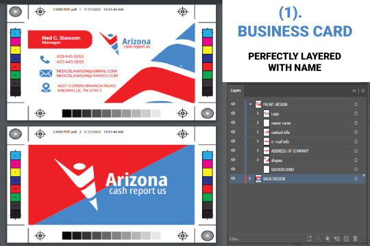
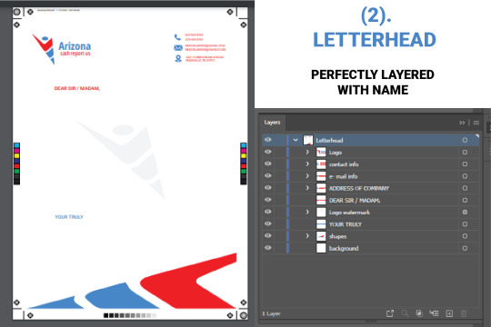
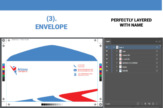
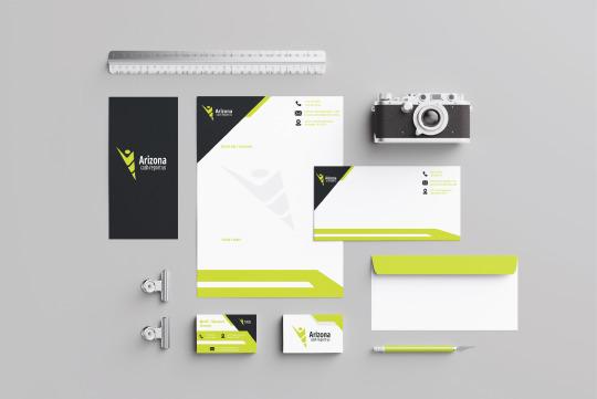
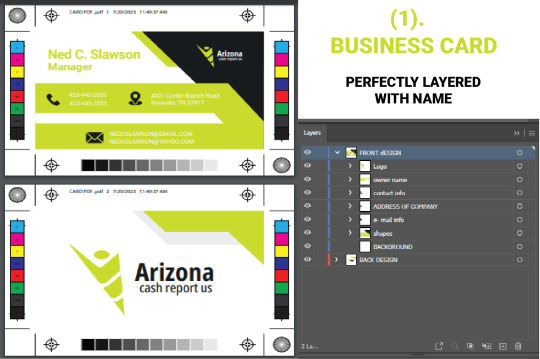
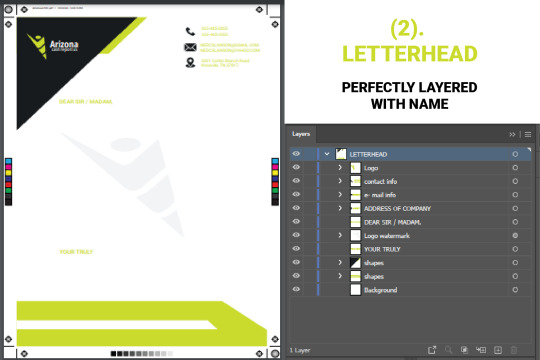
Elevate Your Brand with Perfect Stationery Design Templates
Elevate your brand with perfect stationery design templates. Captivating graphics leave a lasting impression. Stand out and create a cohesive brand identity with ease. Invest in professional results today!
Get it Now: stationery design templates
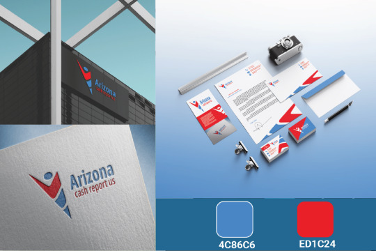
Section 1: Captivating Designs for Every Business
Our perfect stationery design templates are thoughtfully created with captivating graphics and attention to detail. Whether you run a small startup or a well-established corporation, these templates offer versatility and professionalism, making them suitable for businesses of all sizes and industries.
Section 2: Create a Cohesive Brand Identity
Consistency in branding is crucial for building brand recognition and trust. Our templates enable you to create a cohesive brand identity across all marketing materials, from business cards to letterheads and envelopes. By presenting a unified and professional image, you establish credibility and make a lasting impact on your audience.
Section 3: Stand Out from the Competition
In a crowded marketplace, standing out is key to success. Our perfect stationery design templates help you do just that. With unique and eye-catching designs, you differentiate your brand from competitors and attract the attention of potential clients. The striking visuals and thoughtful layouts ensure that your brand will be remembered long after the initial interaction.
Section 4: Versatility for All Occasions
Whether you need designs for a corporate event or a client presentation, our templates have got you covered. Their versatility allows you to adapt them to various occasions and purposes, saving you time and effort in creating professional materials.
Section 5: Easy Customization and Professional Results
Our perfect stationery design templates are user-friendly, enabling easy customization to match your brand's colors, fonts, and logo. You don't need to be a design expert to achieve professional-looking results with these templates.
Conclusion:
Elevate your brand with our perfect stationery design templates and make a strong and lasting impression on your audience. Their captivating designs, versatility, and ease of customization will help you stand out in a competitive market and create a cohesive brand identity. Invest in these templates today and unlock the potential to elevate your business to new heights of success. Create a brand image that leaves a positive and unforgettable impact, and watch your business flourish.
Get it Now: stationery design templates
#stationery design#brand templates#professional stationery#versatile designs#captivating graphics#business marketing#stand out#branding materials#creative templates
4 notes
·
View notes
Text
Introduction to ClickDesigns™: A Game-Changer in Digital Design
In today's fast-paced digital world, standing out is essential for businesses and content creators. The challenge? Finding a design tool that is both versatile and easy to use, but also affordable. That’s where ClickDesigns™ comes into play. This innovative software is a game-changer in the world of digital design, offering users the chance to create stunning graphics, websites, and marketing materials quickly and effortlessly. ⚡ $515/Sale ⚡ 50% Coms ⚡ $257.5/Yours!
Easy-to-Use Interface
One of the standout features of ClickDesigns™ is its user-friendly interface. Whether you're a design novice or a seasoned professional, this platform is intuitive and straightforward to navigate. Gone are the days of hiring expensive graphic designers or wasting time learning complex software. With ClickDesigns™, anyone can create professional-looking designs with just a few clicks. The interface is clean, simple, and incredibly powerful, making it easy for users to get the most out of their creativity.
CLICK HRAR
#ClickDesigns#Digital design tool#Customisable templates#Marketing materials design#Logo creation software#Social media graphics design#All-in-one design tool#Design software for businesses#High-conversion design tool#No technical skills required design software#software
1 note
·
View note
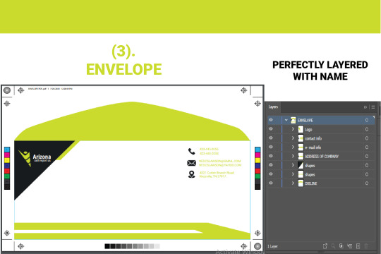
Photo
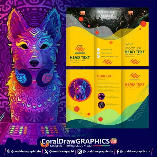
Three Fold Corporate Brochure templates
0 notes
Text
also how tf do i rewrite my resume to include....
i was the only one geeky enough to make automation templates for the brand i work on materials for at work...and the previous three graphic artists in my position couldn't figure it out, im smarter than them, im smaaaart i can do maaath... im an artist who knows MATH
i am adobe scripting and batch process queen... gimme yob
like i've basically automated every portion of my job that would be outsourced to india (cause i was tired of having to fix the work coming in from india tbh)
#personal#like man i created data merge templates that link our catalogs and two layouts of sales materials#AND i made tee and pant templates where if u resize one kids tee... it automatically does the other three sizes#im lazy and it's cuz i was having to do so much fucking overtime when i started#and like it was paid.... but i didn't wanna be there LMAO#i mean most of the things i've worked on adapting adult to childrens have like 20-50k units printed#and things i've chosen colors for and stuff on the like... non fancy brand stuff...has like 10-30k units#i just did a design adaptation today that as long as it's approved by the main brand... it'll have 3k of it printed cause it's a one off...#like i usually see a kid wearing something i worked on like..... 2x weekly#and i work in a lot of event based stuff with REALLY fast turn around... like 2-3 day turnaround time for 3 events yearly
0 notes
Photo

New Post has been published on https://themesnulled.us/materialize-v12-1-0-html-laravel-material-design-admin-template/
Materialize v12.1.0 - HTML & Laravel Material Design Admin Template
0 notes
Text

Its the kids turn!! ⸜(˃ ᵕ ˂ )⸝
i put way too much effort in this
Don't worry they're still FAR from the conventional nuclear family lmao
PJ is by @/7goodangel
Gradient is by @/askcomboclub
Template by @/unu-nunu-art
Error and Fresh by @/loverofpiggies
Ink by @/comyet
Design notes under!
Design Notes for PJ:
-Error patches up the tears on his scarf! Very nice of him to do.
-All the art materials he has stashed on his belt are for food. He likes to snack on em often.
-Because of Error's..."tolerance" of him, he has more strings that he can use. He's got enough to form legs.
-Fresh gifts him magical ink durable Heely shoes! Instead of shedding footprints all over the place, he can instead heely/skate around and leave behind lines. He's creative on using it during battles. He would never admit it, but he appreciates the gift.
Design Notes for Gradient:
-I based his outfit off ye old web aesthetics like Cyber Grunge,,, I really liked the big pants look on him.
-I placed his scarf on his neck to match with his family, but also to match Template's scarf hehe, a little sign of his influence.
-You can't see it but his laptop bag has a ton of pins and merch of random dated internet references.
-His shoes looking old design Ink's shoes were complete accident but I liked it enough to keep anyway. Maybe Ink gave it to him and he spiced it up!
#and ive figured out the name for this!#ScumAnomalyverse#SAverse#thats a shortened version. the full name is#very crack. completely unoriginal. and unserious.#this is basically a broader offshoot of my sansnomaly fic (that i havent... started yet...)#once ive cracked out the details for the first arc maybe ill post it on ao3??? IDK college has me in a chokehold rn#im just having fun ig#junie art post#errorink#paperjam#gradient#error sans#ink sans#template error#template!sans#paperjam sans#gradient sans#utmv#fresh sans
3K notes
·
View notes
Text
✧・゜: how i organize my google drive for maximum efficiency :・゜✧:・゜✧


hey lovelies! ✨
i use google drive to organize mostly everything, and the truth is, my google drive used to be an absolute disaster zone, we're talking hundreds of "untitled document" files and random screenshots saved who knows when. but after one particularly stressful finals week where i lost a paper for three hours, i completely overhauled my system. here's exactly how i organize everything now!
⋆.ೃ࿔:・ the folder structure that changed everything ・:࿔ೃ.⋆
first things first, i use a simple top-level organization system:
📁 𝘢𝘤𝘢𝘥𝘦𝘮𝘪𝘤𝘴: all school-related files
📁 𝘱𝘦𝘳𝘴𝘰𝘯𝘢𝘭: journals, goal tracking, finances, etc.
📁 𝘤𝘳𝘦𝘢𝘵𝘪𝘷𝘦: blog drafts, design projects, photos
📁 𝘢𝘳𝘤𝘩𝘪𝘷𝘦: completed classes and old projects
📁 𝘳𝘦𝘴𝘰𝘶𝘳𝘤𝘦𝘴: templates, reference materials, guides
the key is keeping your top level super simple, i used to have 20+ folders here and it was overwhelming! now i can find anything within seconds because i know exactly which category it falls under.
⋆.ೃ࿔:・ my academic folder system ・:࿔ೃ.⋆
this is the most detailed section of my drive! inside my academics folder:
📁 𝘤𝘶𝘳𝘳𝘦𝘯𝘵 𝘴𝘦𝘮𝘦𝘴𝘵𝘦𝘳
📁 class 1
📁 class 2
📁 class 3
📁 class 4
📄 semester schedule
📄 assignment tracker
inside each class folder:
📁 notes
📁 assignments
📁 readings
📁 projects
📄 syllabus
i color-code each class folder to match my physical notebooks and planner tabs, this visual consistency helps my brain switch between subjects more easily!
⋆.ೃ࿔:・ file naming conventions that save me ・:࿔ೃ.⋆
the absolute game-changer was developing a consistent naming system:
for class notes: DATE_CLASS_TOPIC example: 06.10_psych101_memory_systems
for assignments: CLASS_ASSIGNMENT_STATUS example: econ202_midterm_essay_final
for group projects: CLASS_PROJECT_MYPART_VERSION example: marketing300_campaign_research_v2
this might seem excessive, but it means i never have to open files to figure out what they are! plus, sorting by name automatically puts everything in chronological order.
⋆.ೃ࿔:・ my favorite google drive hacks ・:࿔ೃ.⋆
these little tricks make everything run even smoother:
𝘱𝘳𝘪𝘰𝘳𝘪𝘵𝘺 𝘴𝘵𝘢𝘳𝘳𝘪𝘯𝘨: i star current project files so they always appear at the top of my drive
𝘤𝘰𝘭𝘰𝘳 𝘤𝘰𝘥𝘪𝘯𝘨: right-click folders to give them colors that match your physical organization system
𝘵𝘦𝘮𝘱𝘭𝘢𝘵𝘦 𝘨𝘢𝘭𝘭𝘦𝘳𝘺: i keep a "templates" folder with pre-formatted docs for essays, lab reports, notes, etc.
𝘰𝘧𝘧𝘭𝘪𝘯𝘦 𝘢𝘤𝘤𝘦𝘴𝘴: i set important folders to be available offline (has saved me during wifi emergencies!)
𝘴𝘦𝘢𝘳𝘤𝘩 𝘰𝘱𝘦𝘳𝘢𝘵𝘰𝘳𝘴: using "type:pdf" or "after:2023-09-01" in the search bar to filter results
⋆.ೃ࿔:・ maintenance routines ・:࿔ೃ.⋆
even the best system falls apart without regular maintenance! here's my schedule:
𝘸𝘦𝘦𝘬𝘭𝘺 𝘤𝘭𝘦𝘢𝘯𝘶𝘱 (15 min): every friday afternoon, i sort any stray files into their proper folders and rename anything with default names
𝘮𝘪𝘥-𝘴𝘦𝘮𝘦𝘴𝘵𝘦𝘳 𝘢𝘶𝘥𝘪𝘵 (30 min): halfway through each semester, i check that everything is where it should be and create any new folders needed
𝘦𝘯𝘥-𝘰𝘧-𝘴𝘦𝘮𝘦𝘴𝘵𝘦𝘳 𝘢𝘳𝘤𝘩𝘪𝘷𝘪𝘯𝘨 (1 hour): i move completed classes to my archive folder and set up the next semester's structure
⋆.ೃ࿔:・ sharing & collaboration settings ・:࿔ೃ.⋆
as someone who works on lots of group projects, getting these settings right is crucial:
𝘤𝘰𝘭𝘭𝘢𝘣𝘰𝘳𝘢𝘵𝘪𝘰𝘯 𝘧𝘰𝘭𝘥𝘦𝘳𝘴: i create specific shared folders for each group project rather than sharing individual files
𝘱𝘦𝘳𝘮𝘪𝘴𝘴𝘪𝘰𝘯 𝘭𝘦𝘷𝘦𝘭𝘴: i'm careful about giving "edit" vs "comment" access depending on the project
𝘭𝘪𝘯𝘬 𝘴𝘩𝘢𝘳𝘪𝘯𝘨: i always disable "anyone with the link can edit" to avoid accidental changes
⋆.ೃ࿔:・ my best google drive tips ・:࿔ೃ.⋆
create a "quick access" document with links to your most-used files
use google drive's "workspaces" feature to group project files temporarily
download the desktop app to easily drag and drop files
set up automatic google photos backup for screenshots and images
use keyboard shortcuts (shift + n for new folder is my favorite!)
⋆.ೃ࿔:・ final thoughts ・:࿔ೃ.⋆
remember that the perfect organization system is one that works for your brain! mine has evolved over years of trial and error, and i still tweak it each semester. the key is consistency, whatever system you choose, stick with it long enough to make it habit.
xoxo, mindy 🤍

#summer study tips#study motivation#summer productivity#college student summer#study habits#academic motivation#summer classes#summer semester#study inspiration#productivity tips#student life#college tips#study methods#academic success#study schedule#beating procrastination#summer learning#study environment#college student advice#study space#academic tips#student motivation#productive summer#study organization#academic planning#summer routine#study techniques#student productivity#college life#study strategies
216 notes
·
View notes
Text
Unlock Efficiency with Pluto – The Ultimate Free Bootstrap Admin Dashboard Template
Why You Need This Admin Dashboard Template In the fast-paced world of web development, time is everything. Whether you’re building a CRM, analytics panel, or a management interface, starting from scratch can be a costly decision. That’s where Pluto – Free Bootstrap 4 HTML5 Admin Dashboard Template comes in. It’s a lifesaver for developers and agencies looking to deploy professional-looking…
#Admin Dashboard Template#Admin UI Kit#Bootstrap 4 Admin Template#Bootstrap 4 Dashboard Template#Bootstrap 4 HTML5 UI Kit Template#Carousel#Clean#Datatables#Dropdown#free admin templates#Free Bootstrap 4 HTML5 Template#free bootstrap template#Free Responsive Agency Template#free template#Login Form#material design#Multipage#On hover effect#Open Source Admin Panel#Pluto Admin Template#Pricing table#Progress bar#responsive dashboard template#Responsive HTML5 Dashboard#Smooth scroll
0 notes
Text
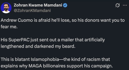
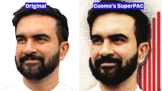
Soooooo...
Don't attribute to malice what can be explained by Photoshop incompetence.
This is a story of two staffers who knew just enough about Photoshop to be dangerous.
First, Zohran had someone do a basic cutout for his campaign materials. He uses this for his avatar and his website.
They did a bad job.

Maybe they had an old version of Photoshop or used the wrong selection tool, but the cutout is... rough.

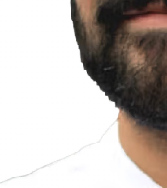
I mean, it's fine.
It's a small grassroots campaign. They probably had to delegate to someone who took a single graphic design course in college.
You do what you gotta do.
I'm not hating.
I'm just saying they didn't have the experience to do this task properly.
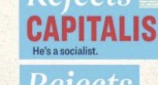
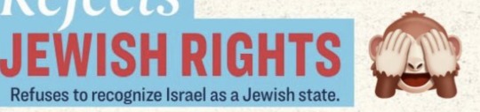
Okay, now some dipshit at the Cuomo SuperPAC is like, "We need to make an attack ad! Make sure to mention he's a socialist! And add a monkey!"
So they task someone even worse at Photoshop to slap this together.
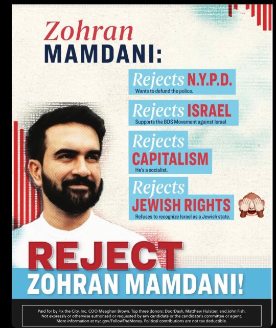
This is mostly a template. The template was designed by an actual artist, but the person who used the template is very much not.
You can tell by the addition of a monkey that does not fit the aesthetic.
With these templates, you just add in your assets and type words that seem negative and scary, but are actually all good things.
It's graphic design on a budget.
But there was a problem...
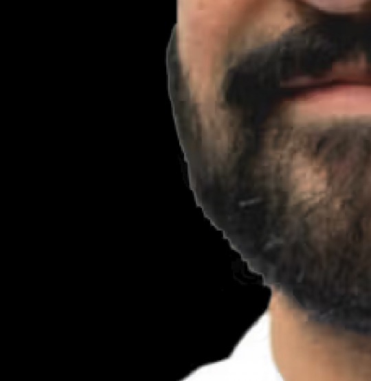
Oh no!
They used the magic wand tool and the previous bad selection caused things to get worse.
There are many ways to deal with this. Contract the selection. Feathering. A soft eraser. Remove the white matte. Basic masking. Refine hair. A stronger tolerance on the magic wand. Remove background. Select subject using the cloud.
You could even download a brush that emulates beard hair and carefully paint over the white edge.
SO MANY OPTIONS!
But for some reason, they chose the clone stamp tool with a large soft brush. They chose to paint over his beard using another part of his beard.
This is like a 1997 solution to this problem.
I tried it myself just to make sure my suspicions were correct.
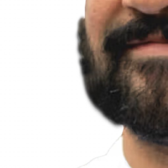
Yep, that's what they did.
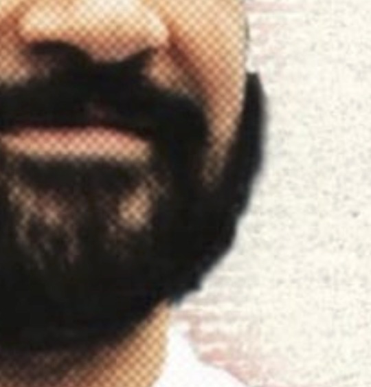
The darkening of the beard is a side effect of the template they used. It's a halftone effect meant to emulate old printers.
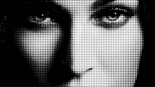
The effect increased the contrast which makes the whites brighter and the blacks darker. I doubt the person even realized.
I'm pretty sure people supporting Cuomo are a bunch of racists. But I don't know if this horrible beard cloning was an intentional act.
I think they used a template, did a bad selection of a bad cutout, and then use Mr. Bean-esque methods to fix their mistake.
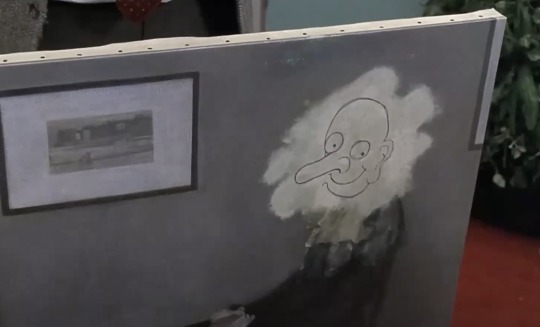
In any case, if Zohran needs any help from a selection specialist, I'm happy to help.

73 notes
·
View notes
Text
Stand Out with Versatile Branding Designs | Elevate Your Business
Stand out with versatile branding designs and elevate your business to new heights. Craft a cohesive brand identity that leaves a lasting impression on your audience. Invest in captivating templates for your brand's success.
Get it Now: Versatile branding designs
Section 1: The Power of a Strong Brand Identity
A strong brand identity is the foundation of any successful business. It communicates your values, personality, and unique selling proposition to customers. Our versatile branding designs provide a canvas to craft a cohesive and impactful brand image that resonates with your audience, setting you apart from the competition.
Section 2: Elevate Your Business Presence
Our branding designs are carefully curated to cater to various business needs. From captivating logos to eye-catching marketing materials, these templates empower you to elevate your business presence effortlessly. Craft a professional image that instills trust and confidence in your potential customers.
Section 3: Versatility for Every Business
Whether you're a startup, small business, or established enterprise, our branding designs cater to your diverse requirements. Easily customize the templates to match your brand's colors, fonts, and style. The flexibility of these designs ensures that your brand remains consistent across all touchpoints.
Section 4: Leave a Lasting Impression
First impressions matter, and our branding designs are designed to make a lasting impact on your audience. The captivating graphics and thoughtful layouts create a memorable experience for customers, helping you stay top-of-mind and fostering brand loyalty.
Section 5: Unlock Your Business's Potential
Investing in our versatile branding designs is an investment in the success and growth of your business. By presenting a strong and cohesive brand identity, you enhance brand recognition and customer trust, opening doors to new opportunities and potential partnerships.
Conclusion:
Stand out in the competitive market and elevate your business with our versatile branding designs. Craft a powerful brand identity that leaves a lasting impression on your audience. Whether you're just starting or seeking to revamp your business image, our templates provide the tools to unlock your business's true potential. Embrace these captivating designs and take your business to new heights of success. Invest in your brand's future today and watch as it flourishes with a powerful and impactful identity.
Get it Now: Versatile branding designs
#branding designs#brand identity#business templates#versatile graphics#professional branding#creative marketing#customizable templates#stand out#business image#branding materials
0 notes
Text
this calendar is a bit of a disaster, ngl. i wanna highlight a few issues (EU shop edition) that could have been prevented by just revising original files before sending them to the company that printed everything:
September has an uncoloured part in letter "r":

calendar boxes are not coloured properly in several months (February, July, August, November). basically, the net and the colouring aren't adjusted correctly, and there's a space between the net and the coloured box:


(some photos are with arrows, and some are not - it's done intentionally)
pictures and calendar templates are not aligned with the edges of the pages almost on every page. which is a manufacturer's problem, probably. also the names of the months are not in the middle of the empty spaces under the templates, which creates a lot of unused empty space under the month's name, and it looks strange (i saw people pointing out that the templates have small boxes overall, i'll come back to it separately when i have the 2024 calendar with me. but as a side note, yeah, they could make the templates bigger since they had a lot of spare space anyway):


there's a dot missing in the credits. each credit other than Linda Blacker's has a dot. in addition, IRL Merch Ltd isn't a thing. there's no such company, and a brand name can't be "limited". so it's either IRL Merch or IRL Digital Ltd. it's quite alarming that they don't know the difference and put a non-existent company on a printed material. idk where Neil and others were looking, tbh:

this thing isn't aligned either (orange line, 2025 and the phrase):

not to mention the problems that the US shop has with the printing of this calendar.
all things considered, the quality of this calendar is bad. the majority of these issues are easily preventable by just revising each page by zooming in and using rulers. it's a designer's job first, manager's job second, sorry. raises a question about professionalism and care for what IRL Merch puts out. it's just not a well-made product, and it's upsetting, because it could easily be an amazing calendar. and it's not the first time IRL Merch doesn't check what they do, they've been asked to be more careful, but i guess, they don't care.
in the same breath i wanna say that they fixed the colouring of empty boxes, and now they are different shade from the boxes with numbers. the 2024 calendar had the boxes coloured chaotically, which was definitely a mistake.
#overall the design is so inconsistent i don't get how someone with so much experience can make this and be happy with the outcome#it look messy and unfinished#photos where dnp are just with the empty background look horrendous. why is there so much SPACE? zoom in a little bit pls#don't you have eyes?#dan and phil#dnp merch#calendar 2025#irl merch
105 notes
·
View notes
Photo
Company Flyer Colorful Template
0 notes
Text
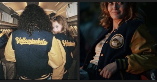
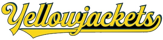
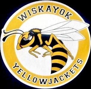
While there are lots of options as to where you can buy a replica of the Yellowjackets Letterman Jacket, they’re not always easily attainable. Last year for halloween I made my own letterman and I figured others could find my process helpful. (The supplies I used were things I already had or were accessible to me but there are other ways to create the same thing. If you have different materials that also work feel free to make suggestions or use them in your process).
HOW TO MAKE A YELLOWJACKETS LETTERMAN JACKET:
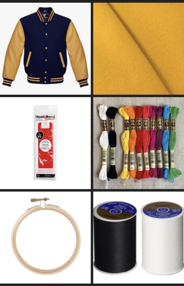
Supplies:
• Gold/Navy Letterman jacket
• Printer
• White Printer paper
• Gold Felt
•Chalk
• Heat ‘n Bond
• Embroidery floss in the colors White, Black, Gold and Gray (I ended up needing two packs of white).
• Embroidery needle
• White (or light colored) tissue paper
• White fabric (I used cotton)
• Embroidery hoop
• (Optional) White and Black thread
• Glue stick
Step 1: Aquire your jacket.
You can do a lot of different things for the plain base jacket. I bought mine off Amazon but if wanted too you could probably sew one or buy one second hand etc. The only specification is that it’s Gold and Navy. It is important to do this first because everything else builds off of this step.
Step 2: Print out designs.
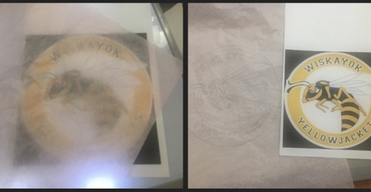
Use the photos I provided below and paste them into a word document. From there you can size them up or down to reach the size that you like for printing. The “Yellowjackets” logo is for the back of the jacket so when I did it I kind of split the photo in half and put it on two different pages. In the end it turned out to be just shy of 13 inches length wise. The round patch goes on the front and mine was 4.25 inches in diameter.
Depending on the size of your jacket your patches can be bigger or smaller, but once your happy with the sizing you can then move onto the next step.
Step 3: Gather supplies.
The gold felt is to be used to create the back patch. Because of the size of mine I was able to get a little 50 cent sheet of it (I was able to place the logo at an angle to fit it) but because the patch sizes will be different it’s important to bring your print out of the logo when shopping to make sure you have enough. Most craft / fabric stores should have this in stock. It’s also a good idea to bring your letterman jacket with you to try to color match the shades of gold/yellow as best as possible.
The embroidery hoop, floss, white fabric, and thread are for the front patch as I hand embroidered mine but in theory you could use an embroidery machine or printable fabric sheets to create your patch. If you use these other methods you’ll need different supplies and different instructions that I can’t give.
The Heat ‘n Bond is to iron the patches onto your jacket so they stick (though I’ve had to re iron my back patch because the fibers of the wool make it hard to stick to). It will essentially act as double sided tape.
Step 4: Creating & attaching the back patch
• Cut out a piece of Heat n’ Bond that covers the area where your logo will go.
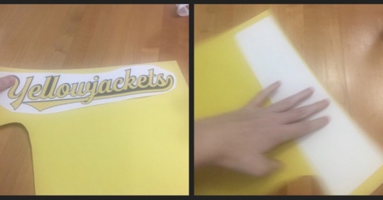
(i am using colored paper in the example pictures. Yellow represents the felt. White represents the heat and Bond).
• Once you have the right sized piece of Heat n’ Bond, iron it onto the back of your piece of Gold felt (make sure to follow the instructions on the Heat n’ bond packaging).
•Use your printed template of the logo and cut out the words on the felt. You can cut out the logo on paper first and trace it or attach the paper to the felt and just cut them both at the same time. (I moved the dot on the J down so that it’s still attached just to make it easier but you can do whatever you want).
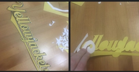
• Put on your Letterman and use the chalk to mark where on the back you want the patch to go. For this step it can be helpful to have someone else assist you (though it’s possible to do it yourself).
• Take off the jacket and lay it flat to align the patch up with your chalk markings. Once it is where you want it you can Iron it onto the back of the jacket (according to the instructions on the Heat n’ Bond).
You now have a finished back patch!
Step 5: Creating the front patch.
• Trace the design of the front patch onto tissue paper (I would suggest a dark pen or sharpie so you can see it really well). If you have trouble seeing the design underneath it can be helpful to hold it to a window pane when it’s sunny or another light source. The photo of the logo I included has a white border around the black words but the patch in the show doesn’t have it so I just ignored it. From there you glue the traced tissue paper onto the fabric.
• Cut out a piece of white fabric big enough for your embroidery hoop and glue the tissue paper sketch onto the fabric.
• Put the fabric/tissue paper into the Embroidery hoop.
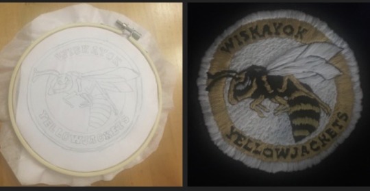
• Thread the needle and start embroidering the design. I found it good to use different techniques on different areas of the patch (long white stitches on the wings versus short ones on the background etc. I also thought it was helpful to embroider in color groupings (so like white all at once or yellow all at once etc. so you don’t have to switch out the floss that much). Save the white outer circle and black outline for last though to help clean everything up. The white and black sewing thread can be used to outline smaller details or neaten up some of the floss.
• Once the patch is done cut out a piece of Heat n’ Bond that covers the back of the patch.
• Put on your jacket and mark with chalk where you want to put the patch. In the show it’s placed by the second from the top button. (See Jackie reference photo at the top of the post).
• Iron on the Heat n’ Bond to the back of the patch (following packet instructions).
• Iron the Patch to the jacket based on your chalk markings.
• You have completed the front patch!
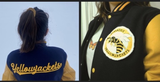
Above are some photo examples of my jacket (please ignore my messy hair in the left picture, being in the snow got it ruffled up).
Sorry for the long post but I think I got everything covered. I hope you guys found this helpful but if you have any questions about the jacket, my process, or anything else feel free to ask!
#yellowjackets#fashion#costume#diy#jackie taylor#taissa turner#akilah yellowjackets#gen yellowjackets#shauna shipman#natalie scatorccio#van palmer
140 notes
·
View notes
Text
Miffy All-in-one Notion template (Ver. 1): Your gateway to peak productivity with an aesthetic Miffy life planner! 🐰🌷

Dive into the delightful universe of Miffy, where organization meets adorable charm in perfect harmony. This template isn't just a tool—it's a playful journey that turns your Notion workspace into a haven of cuteness and productivity.
Miffy-themed elements aren't just for show—they're designed to enhance your productivity with a touch of playfulness. From vision board to workspace, experience the perfect blend of functionality and cuteness, making your work and organization an absolute delight.
✿ What's Inside? ✿
🌷 Vision Board: Yearly Goals, Wishlist, Daily Affirmations, Habits Builder, Gratitude Journal, Countdown
🌷 Academics: Class Timetable, Course Notes, Deadline List, Quick Notes, Important Links, Journals & Essays, Assignments, Upcoming Exam List
🌷 Workspace: Work Progress, Work Files, To-do List, Quick Notes, Important Links, Clients, Meeting, Ideas
🌷 Journal: Monthly Journal, Yearly Journal, Affirmations, Photo Archive
🌷 Financial Planner: Monthly Bills, Monthly Expenses, Monthly Goals, Savings Tracker, Subscriptions, Wishlist, Accounts Balance
🌷 Book Library: Currently Reading, Reading Tracker, Monthly Reading Goals, Book Wishlist, Book Reviews, Notes & Quotes
🌷 Movies Log: Currently Watching, Watch List, Links, Movie Reviews, Movie Recommendations
🌷 Language Learning: Weekly Schedule, Study Notes, Study Goals, Study Materials, Quick Notes, Pomodoro Timer
🌷 Self Care: Morning Routine, Night Routine, Self-care Check, Skincare Routine, Period Tracker, Meditation & Affirmations
Additional Gifts
Free aesthetic Miffy PNG images, banners, and Notion covers that I used on this template (ZIP File)


✿ Get Miffy All-in-one Life Planner Notion Template (Ver. 1) only on Gumroad and Ko-fi! ✿
#notion#notion template#notion inspo#notion aesthetic#notion dashboard#notion setup#notion tutorial#notion.so#productivity#planner#digital planner#miffy#studyblr#studyspo#study blog#study aesthetic#study space#studying#bullet journal#journaling#digital journal#university#it girl#bookblr#girlblogging#pink core#girlblogger#light academia#aesthetic
269 notes
·
View notes