#Tableau dashboard
Explore tagged Tumblr posts
Visit Tumblr Blog
Explore Tumblr blogs with no restrictions, modern design and the best experience.
Last Seen Tumblr Blogs


Fun Fact
Tumblr was created by web developers David Karp and Marco Arment.
Text
The Ultimate Tableau Dashboard Testing Checklist

Ensuring the quality of a Tableau dashboard goes beyond building. It requires thorough testing to validate its reliability and usability. This tableau dashboard testing checklist focuses on essential aspects like verifying data accuracy, evaluating functionality, security testing to protect sensitive data, stress testing for performance under load, and visual testing to maintain clarity and design standards.
Aspects Involved in Testing the Tableau Dashboard

Testing Data Sources:
Ensure the dashboard is connected to the correct data sources and that credentials are set up properly.
Checking Data Accuracy:
1. Check whether the source data is reflected in the dashboard. This involves cross-checking the data on the dashboard with the data from the sources.
2. Verify that the calculated fields, aggregates, and measures are as expected.
Functionality Testing:
1. Report or dashboard design check.
2. Filters and parameters testing to see if they work as expected and do not display incorrect data. Also, if the dynamic changes to data visuals are applied and reflected.
3. Drilldown reports checking.
4. Ease of navigation, interactivity, and responsiveness in terms of usability.
Security Testing:
1. To check the security for report access and Row Level Security Permissions.
2. Integration of Single Sign On (SSO) security.
3. Multi-factor authentication.
Regression Testing:
Any change to the BI Dashboard/Model can impact the existing reports. It is important to perform regression testing so that after updates or modifications, the data/visuals shown in the dashboard remain the same before and after the changes.
youtube
Stress Testing:
To test the load time, run time, filter application time, and to simulate the access of reports and user behavior.
Visual Testing:
To check alignments, layouts, consistencies in terms of texts, visuals, or images to ensure all the elements are properly aligned.
How Does DataOps Suite BI Validator Enable Testing of Tableau Dashboards?

BI Validator is a no-code testing tool to automate the regression, stress, and functional testing of Tableau reports and dashboards.
Checking Data Accuracy:
DataOps Suite allows users to validate the data from the visuals of the report to be compared to the source databases. On connecting to Tableau and selecting a report, the datasets underlying the visuals of the reports are accessible through the suite as well. Each Visual has its own dataset, which can be compared to a source database used to build the tableau report.
This is possible with the help of the Data Compare component in the suite, which can compare the aggregated data from the databases and the datasets of the visuals. The differences are captured, thus allowing users to check the data accuracy between the reports and databases.
Functionality Testing and Visual Testing:
Once the connection is established, the users can access the reports and the exact workspace to work with. The specific workbook/report is accessible. The report will be loaded without any changes, and the visuals and filters of the report can be accessed from the BI Validator itself, thus verifying the responsiveness of the visuals and filters and verifying whether the dynamic changes are reflected.
The BI Validator comes with the Tableau Upgrade component to compare two reports, which can be the same or different from one or different data sources.
A common use case is the comparison of views and worksheets across multiple environments. Comparison can be done in terms of both text and appearance, where the differences are captured and pointed out wherever mismatch occurs in both reports. Also, BI Validator allows the differences in the filters of both reports to be pointed out on enabling “Capture filters after applying.”.
youtube
Security Testing:
BI Validator connects with Tableau Testing through direct trust authentication, default authentication, or personal access token, where the users must provide their respective Tableau credentials, secret key, and secret ID (in direct trust connection) and the necessary web login commands (for default or personal access token connection). Thus, ensuring the authentication is secure so that only the users with valid credentials are accessing their reports to be validated.
BI Validator restricts the users from downloading the testing results when it comes to BI Reports to prevent the sensitive information from being downloaded.
The DataOps suite also has user-based access through roles and containers to prevent access to reports for everyone. The BI Validator can only allow users with defined roles and permissions to access reports.
Regression Testing:
BI Validator supports regression testing of the reports through the Tableau Regression component, which automates the testing of Tableau reports during any in-place upgrades and workbook deployments. This testing happens by comparing a benchmarked/baseline version of the dashboard/report with the live version. The filters can be changed accordingly if needed before/after the benchmarking. These filter changes can be bookmarked as the latest checkpoint before running the test.
Similar to upgrades, regression test runs can validate the differences in terms of appearance or text. Also, differences in the filters can be pointed out on enabling “capture filters after applying.”
Stress Testing:
BI Validator comes with a stress test plan to simulate concurrent users accessing reports to evaluate how reports and dashboards perform under heavy load. The plan typically involves running multiple users through different types of interactions, such as viewing reports, applying filters, refreshing data, and interacting with custom visuals.
The stress test plan allows the users to select the pages/dashboards from required workspaces to perform stress testing. These pages can be either from the same or different report.
Users can run the stress test plan on specific run options like number of parallel users, time spent on each page, total simulation run time, number of seconds to reach parallel users, refresh time, and other options to run the stress test plan.
The runs will result in showing metrics like Average Open Time and Max Open Time, Average Filter Apply Time, SLA Failures.
#datagaps#Tableau#Tableau Testing#Tableau dashboard#Tableau Testing Checklist#BI Validator#BI#Youtube
0 notes
Text
Industry-Leading Visualization with Tableau Data Visualization

1. User-Friendly Interface: The intuitive design allows anyone to easily start visualizing data.
2. Seamless Integration: Connects easily with various data sources for efficient analysis.
3. Quick Insights: Generate actionable insights within minutes.
4. Integrated Collaboration Tools: Share dashboards and insights with your team effortlessly.
5. Regular Updates: Tableau continuously evolves with new features and improvements.
Want to take your skills to the next level? Join our 1-day Tableau Bootcamp on 2nd November (Online)!
#tableau#tableau software#data visualization#data visualisation#dataviz#software#technology#cavillion#cavillion learning#data analytics#data#tableau online training#tableaudesktop#tableau dashboard#big data#business analytics#data analysis#data science#tableau course#salesforce#Tableau Tutorial#Tableau Visualization#Tableau Training#learn tableau#tableau certification#Tableau Visualisation
1 note
·
View note
Text
What are the advised steps for Tableau dashboard development?
Developing Tableau dashboards involves a series of steps to ensure that your visualizations effectively communicate insights. Here's a general guide to Tableau dashboard development:
Define Objectives and Audience:
Clearly understand the purpose of your dashboard.
Identify the target audience and their needs.
Gather Data:
Collect and prepare the necessary data for your analysis.
Ensure data quality and address any data cleaning requirements.
Install Tableau:
Download and install Tableau Desktop on your machine.
Connect to Data:
Open Tableau and connect to your data source (Excel, CSV, databases, etc.).
Perform any necessary data transformations within Tableau.
Understand Data Structure:
Explore the data to understand its structure and relationships.
Identify key dimensions and measures.
Create Worksheets:
Build individual worksheets with appropriate charts and visualizations.
Utilize the drag-and-drop interface to add fields to Rows and Columns shelves.
Design Layout:
Plan the layout of your dashboard.
Arrange sheets in a logical order and use containers to organize content.
Create Calculations:
Use calculated fields to derive new measures or customize existing ones.
Leverage Tableau's calculation language for advanced computations.
Filter Data:
Apply filters to focus on relevant data points.
Consider global and context filters for interactive dashboards.
Add Interactivity:
Include parameters and actions for user interactivity.
Allow users to filter data dynamically and explore different scenarios.
Create Dashboards:
Combine individual worksheets into a cohesive dashboard.
Arrange elements, add titles, and ensure a clean and intuitive layout.
Enhance Visual Appeal:
Choose appropriate colors and fonts to enhance readability.
Utilize formatting options to make the dashboard visually appealing.
Test and Iterate:
Test your dashboard with potential users to gather feedback.
Iterate and make improvements based on user input.
Publish to Tableau Server or Tableau Online:
Publish your dashboard to Tableau Server or Tableau Online for sharing and collaboration.
Set permissions and access controls as needed.
Document and Maintain:
Document data sources, calculations, and design choices for future reference.
Regularly update and maintain the dashboard as data changes or new requirements arise.
Train Users:
Provide training and documentation to help users understand how to interact with the dashboard effectively.
Monitor and Optimize:
Monitor the performance of your dashboard and optimize as needed.
Keep an eye on data refresh schedules and ensure timely updates.
Following these steps will help you create effective and engaging Tableau dashboards that deliver valuable insights to your audience.
Find Tableau Consulting Services
#tableau#tableau services#tableau consulting#tableau consulting services#tableau dashboard#tableau development
1 note
·
View note
Text

#Finance#Business#Work Meme#Work Humor#Excel#Hilarious#funny meme#funny#accounting#office humor#consulting#big data#data analysis#data visualization#data analytics#data#dashboard commentary#tableau#power bi
13 notes
·
View notes
Text
Mastering Power BI A Comprehensive Online Course for Data professionals
In the period of big data, the capability to visualize and interpret data effectively has come a vital skill for businesses and professionals likewise. Power BI, a robust business analytics tool from Microsoft, empowers stoners to transform raw data into practicable perceptivity. This composition explores the benefits of learning Power BI through an online course, outlining the essential chops covered, and pressing how this training can elevate your data analysis capabilities.

Why Choose Power BI?
Power BI is celebrated for its capability to seamlessly integrate with various data sources, offering intuitive and interactive visualizations. Its user-friendly interface and important features make it a favorite among data professionals.Thera are some pivotal reasons to choose Power BI.
Interactive Dashboards Power BI allows stoners to produce visually fascinating and interactive dashboards that give a comprehensive view of business criteria.
Data Connectivity With the capability to connect to a wide range of data sources, including databases, pall services, and Excel spreadsheets, Power BI ensures data integration is royal.
Advanced Analytics Power BI supports advanced analytics with features like DAX( Data Analysis Expressions) for custom calculations and predictive modeling.
Collaboration and sharing Power BI enables easy sharing of reports and dashboards, fostering collaboration across armies and departments.
Benefits of an Online Power BI Course :
Flexible knowledge Environment
Online courses offer the strictness to learn at your own pace, making it ideal for professionals balancing work commitments.
Access to Expert Instruction
Learn from sedulity experts who give perceptivity and practical knowledge, icing you gain a comprehensive understanding of Power BI.
Practical operation
Hands- on exercises and real- world systems help you apply what you learn, solidifying your chops and enhancing your confidence in using Power BI.
Cost-Effective knowledge
Online courses generally offer a cost-effective volition to traditional classroom training, with savings on trip and accommodation charges.
Core topics Covered in the Course:
A well- rounded Power BI online course generally includes the following pivotal areas.
Prolusion to Power BI
Understanding the Power BI ecosystem.
Setting up Power BI Desktop and navigating the interface.
Connecting to different data sources.
Data Preparation and Transformation .
Using Power Query for data drawing and transformation.
Creating connections between data tables.
Understanding and applying DAX for data analysis.
Data Visualization and Reporting .
Designing compelling visualizations and interactive reports.
Customizing dashboards and using themes.
Administering drill- through and drill- down functionalities.
Advanced Features and Stylish Practices.
Exercising AI illustrations and integrating R and Python scripts.
Performance optimization ways for large datasets.
swish practices for report design and data fabricator.
Collaboration and sharing :
Publishing reports to Power BI Service.
sharing and uniting with team members.
Setting up data refresh schedules and cautions.
Career Advancement with Power BI Chops.
Acquiring Power BI chops can significantly enhance your career prospects in various places, including .
Data Critic transfigure data into perceptivity to support business decision- timber.
Business Intelligence innovator Develop and maintain BI results that drive strategic enterprise.
Data Scientist influence Power BI for data visualization and communication of complex findings.
IT Professional Enhance data operation and reporting capabilities within associations.
Conclusion:
Mastering Power BI through an online course offers a precious occasion to develop in- demand data analytics chops. With the capability to produce poignant visualizations, perform advanced data analysis, and unite effectively, Power BI proficiency positions you as a vital asset in moment’s data- centric world. Start your trip with a comprehensive Power BI online course and unleash the full eventuality of your data analysis capabilities.
#powerbi#darascience#dataanalytics#BusinessIntelligence#data#DataInsights#python#DataDrivenDecisions#tableau#DataTools#sql#dashboard#DataReporting#onlinelearning#analytics#courses#dynamics#bi#software#nareshit
1 note
·
View note
Text

You still been using outdated design tools to create dashboard mockups? 🥴 OOF. Issokay We've all been there.
Now create hi-fi dashboard wireframes with Mokkup.ai in under 30 mins. Share, comment, export and present your designs to the world! 🌎
#data analytics#dashboard#data#powerbi#tableau#visualization#dashboards#dashboard simulator#datascience#free#freetools
2 notes
·
View notes
Text
¿Cómo tomar decisiones comerciales más inteligentes? Aprende cómo el uso de herramientas de Business Intelligence mejora la toma de decisiones comerciales con datos claros, actualizados y accesibles.
#acceso a información#agilidad operativa#anomalías#business intelligence#capacidad de respuesta#coordinación entre áreas#crisis empresarial#cuellos de botella#dashboards#decisiones comerciales#decisiones estratégicas#empresas distribuidoras#gestión operativa#herramientas de gestión#información clara#integración de datos#KPIs en tiempo real#Looker#patrones#Power BI#situaciones cotidianas#Tableau#tableros visuales#toma de decisiones#variables comerciales#ventaja competitiva#visualización de datos
0 notes
Text
📊 Want to Learn Tableau in 2025? Here’s the No-Fluff Beginner’s Guide
Let’s be real — data is everywhere now. But knowing how to show it? That’s a whole different skill. 💡
Whether you’re new to data or just trying to upgrade your resume, Tableau is one of the most in-demand tools right now for building dashboards, charts, and real-time insights that actually make sense.
This guide takes you from clueless to confident, even if you’ve never used a data tool before: 🔗 2025’s Ultimate Tableau Guide: How to Become a Data Visualization Expert from Scratch
Perfect for students, analysts, marketers, freelancers — or anyone who wants to turn data into stories.

#Tableau tutorial#Learn data visualization#Data analytics tools#Tableau beginners guide#Visual storytelling with data#EdTech 2025#Career skills 2025#Tech for learners#Data dashboards#Analytics made easy
0 notes
Text

📊 Benefits of Data Visualization
Struggling with too much data?
Data visualization helps you:
✅ Simplify complex data – Easy to read
✅ Enhance understanding – Clear insights
✅ Make faster decisions – Take quick action
✅ Improve communication – Work better with your team
Start mastering tools like Power BI, Excel Dashboards, Tableau, and more!
✅ Why Choose Us?
✔️ 100% practical training
✔️ Real-time projects & case studies
✔️ Expert mentors with industry experience
✔️ Certification & job assistance
✔️ Easy-to-understand Telugu + English mix classes
📍 Institute Address:
3rd Floor, Dr. Atmaram Estates, Metro Pillar No. A690, Beside Siri Pearls & Jewellery, near JNTU Metro Station, Hyder Nagar, Vasantha Nagar, Hyderabad, Telangana – 500072📞 Contact: +91 9948801222 📧 Email: [email protected] 🌐 Website: https://dataanalyticsmasters.in
#DataVisualization#VisualizeData#DataAnalytics#PowerBI#Tableau#ExcelDashboard#DataStorytelling#DataScience#BusinessIntelligence#LearnAnalytics#AnalyticsTraining#DataSimplified#ChartsAndGraphs#Dashboards#DataAnalyticsMasters#TechLearning#UpskillNow#HyderabadTraining#OnlineDataCourses#SimplifyWithData
0 notes
Text
Data Analytics Course: Machine Learning Dashboards With Tableau Using Python (Winter 2021)
This course will explore methods and techniques for analyzing databases using VBA, Python, and Java. We will develop a … source
0 notes
Text
Designing Eye-Catching Dashboards in Power BI: Best Practices
In today’s data-driven world, turning raw numbers into meaningful visual insights is more important than ever. Power BI has become one of the leading tools for business intelligence and data visualization, enabling users to create powerful, interactive dashboards. But what makes a Power BI dashboard not just functional—but truly eye-catching?
In this article, we'll explore best practices for designing visually appealing and user-friendly dashboards using Power BI. Whether you're just starting with Power BI training or you're a seasoned pro, these tips will help elevate your data presentation skills.

Why Dashboard Design Matters
A well-designed dashboard improves decision-making by highlighting the right data at the right time. It enhances user experience, reduces cognitive load, and ensures that insights are quickly and clearly understood. Bad design, on the other hand, leads to confusion, missed insights, and ultimately poor decisions.
Best Practices for Designing Eye-Catching Dashboards in Power BI
1. Know Your Audience
Before diving into Power BI, identify who will be using the dashboard. Are they executives, analysts, or operations teams? Different users have different data needs. Tailoring the dashboard content and complexity to your audience is key.
2. Keep It Simple and Clean
Less is more. Avoid clutter by only including essential visuals. Use whitespace effectively to create breathing room between elements. A clean design ensures better readability and quicker insights.
3. Use Consistent Colors and Fonts
Maintain a consistent theme throughout your dashboard. Use your brand colors or predefined color palettes. Stick to 1–2 font styles and sizes for uniformity. This enhances professionalism and visual harmony.
4. Choose the Right Visuals
Bar charts, pie charts, line graphs, cards, maps—Power BI offers a range of visuals. Choose the one that best represents your data. Avoid fancy visuals just for aesthetics; ensure they serve a purpose.
5. Leverage Filters and Slicers
Interactive slicers allow users to slice and dice the data based on specific criteria. Filters improve usability and make the dashboard dynamic and personalized.
6. Highlight Key Metrics
Use KPIs and cards to draw attention to critical values. Place these visuals prominently so decision-makers can quickly scan the dashboard and identify performance indicators.
7. Use Tooltips and Drill-Throughs
Tooltips provide additional context without cluttering your visuals. Drill-throughs allow users to click on visuals and view detailed reports—offering both high-level overviews and deep dives.
8. Test on Multiple Devices
Power BI dashboards can be accessed on desktops, tablets, and mobile devices. Always test your design on various screen sizes to ensure responsiveness and usability.
Bonus Tip: Stay Updated with Power BI Training
Power BI is continuously evolving. Staying updated through Power BI training courses will help you explore new features, advanced visuals, and performance tips. Continuous learning is essential to remain competitive in the field of data analytics and business intelligence.
FAQs
Q1: What is Power BI? Power BI is a Microsoft business analytics tool that provides interactive visualizations and business intelligence capabilities with an interface simple enough for end users to create their own reports and dashboards.
Q2: Who can benefit from Power BI training? Anyone from business analysts to data scientists, marketing professionals to finance managers can benefit. Whether you're a beginner or looking to advance your skills, Power BI has something for everyone.
Q3: Is Power BI suitable for small businesses? Absolutely. Power BI offers scalable solutions for small to large businesses with flexible pricing and robust features.
Q4: How long does it take to learn Power BI? With dedicated Power BI training, most users can become proficient within a few weeks, depending on prior experience and commitment.
Q5: Where can I get expert Power BI training? You can visit our website for structured Power BI training programs designed by industry experts. Our curriculum covers everything from the basics to advanced dashboarding techniques.
Conclusion
Designing eye-catching dashboards in Power BI isn't just about aesthetics—it's about delivering the right insights in the most efficient way. By following these best practices, you’ll create dashboards that not only look great but also empower better business decisions.
Ready to master the art of Power BI? 👉 Visit our website for hands-on Power BI training, tips, and expert support!
#powerbi#dataanalytics#BusinessIntelligence#data#DataInsights#python#DataDrivenDecisions#tableau#DataTools#sql#dashboard#DataReporting#onlinelearning#analytics#courses#dynamics#bi#software#nareshit
0 notes
Text
Why Learn Tableau? Here are 5 powerful reasons to get started with this industry-leading tool

1. Industry-Leading Visualization: Transform raw data into stunning visuals!
2. High Demand in Data Analytics: Tableau skills are highly valued in today’s job market.
3. Actionable Insights in Minutes: Make data-driven decisions faster.
4. User-Friendly Interface: Easy to learn, even for beginners.
5. Boost Your Career: Stand out in data roles and advance your career! Want to take your skills to the next level?
Join our 1-day Tableau Bootcamp on 2nd November (Online)!
#tableau#Learn tableau#Tableau Bootcamp#data analytics#data visualization#software#big data#dataviz#technology#cavillion#cavillion learning#data visualisation#tableau dashboard#tableau software#salesforce#data#tableau community#Tableau Developer#business analytics#businessintelligence
0 notes
Text
Explore how to create and optimize a KPI Tableau Sales Dashboard. This comprehensive guide covers key metrics, best practices, and tips to boost sales performance.
0 notes
Text
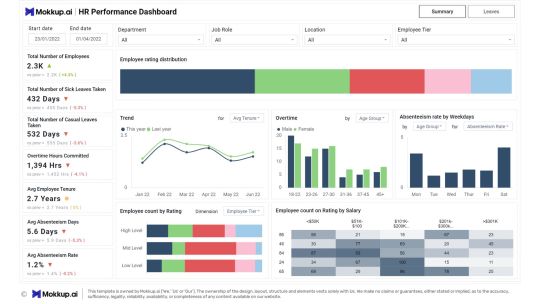
HR Performance dashboard done in under 30 mins on Mokkup.ai.
#dashboard simulator#dashboard#dashboards#data#visualization#datascience#data analytics#powerbi#tableau#hr#recruitment
1 note
·
View note
Text

🔴 Classroom & Online Training at KPHB Branch 🔴 👉 Join Our POWER BI Training ✍️ Registration Link: https://shorturl.at/P74yo 👉New Batch Details: Date: 10th April 2025 Time: 7:00 PM to 08:30 PM Mode of Training: Classroom & Online 📲 Meeting ID: 2510 795 9186 🔐 Password: 112233
#powerbi#darascience#dataanalytics#BusinessIntelligence#data#DataInsights#python#DataDrivenDecisions#tableau#DataTools#sql#dashboard#DataReporting
0 notes
Text
Comprehensive Tableau Consulting for Scalable Analytics Solutions
Elevate your data analytics with our comprehensive Tableau consulting services. Our experts help you integrate data, build custom dashboards, and develop insightful visualizations tailored to your business. With a focus on scalability and efficiency, our Tableau solutions enable real-time reporting and actionable insights. Partner with us to streamline analytics, improve decision-making, and unlock the value of your data.
0 notes