#adding text sometimes color and tweaking it again
Explore tagged Tumblr posts
Visit Tumblr Blog
Explore Tumblr blogs with no restrictions, modern design and the best experience.
Last Seen Tumblr Blogs


Fun Fact
Tumblr was acquired by Yahoo for $1.1B in 2013.
Text
Hello,
Little reminder that I DON’T allow reposts of my comics and artworks.
It also applies to reposting my comic with translations, other edits, voiceovers etc.
ESPECIALLY if you didn’t ask for permission AND are not even able to properly credit me.
#proper credits are THE BARE MINIMUM#imagine you are sitting hours or weeks on a comic#coming up with an idea#and sketching and trying to get the expressions and anatomy somewhat right#lining it amd tweaking it sometimes redoing panels or whole pages#adding text sometimes color and tweaking it again#just sb else can copy paste it and put it on their blog#if you want to make some sort of project with my comics like voiceover then ask me first#and when I don’t answer ITS NOT AN AUTOMATIC YES
174 notes
·
View notes
Text
Okay so my biggest problems with how the Steve Saga base color steves were designed are that they don’t match and they aren’t as vibrant as I’d like, sometimes even looking kinda muddy. Green and Yellow especially.
So I’ve redesigned all 5 to ease my brain, and will be adding descriptions of how I’d change them lore-wise (excuse me if the ideas seem jumbled, I’m not very good at compiling my thoughts coherently)
First there’s Red Steves
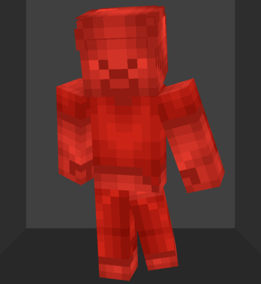
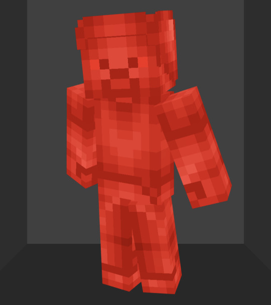
In terms of design I basically just brightened it up and made it shinier
The original lore had them be incredibly dumb. While it’s a fun gag, I would prefer if they were closer to average
So in my idea of a streamlined Red Steve, they’d still be pyrokinetic with anger issues, but they wouldn’t be boneheads. The original had them using redstone as a power source, but it was never really explained, so to expand on that, their ability to create fire demands they consume mass amounts of fuel to function. So lots of food and burnable items can help them. Alternatively, redstone blocks contain a similar level of energy that they will feed on to fuel themselves more efficiently.
Next Blue Steves

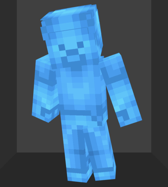
Honestly the best of the original designs. Once again, basically just brightened it up and made it shinier to match the more overhauled ones.
So, these guys are hydrokinetic as well as the smartest, strongest, and wisest of the 5. Not much I want to change there. I do want to add on to them that they have a level of hubris comparable to the SCU Red Steves, which does lead some to less than desirable fates
Now the first majorly changed design, Green Steves
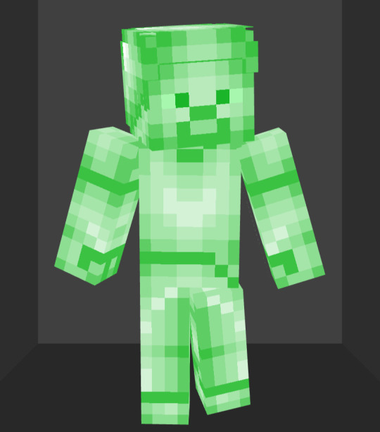
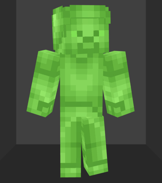
The original green steve design always bothered me because it was the most different from the other base colors. In short, it’s just way too bright. The green just doesn’t really pop. So I actually darkened it a bit so that it matches the other colors better.
We never really learned much about the green steves in the steve saga. From what I know, they were all fairly timid and pretty weak.
Obviously I’d like to at least tweak that. So my ideal version would have them be Chlorokinetic, meaning they can create and control plants. I feel this could give them a bit more character by having them be more connected to nature.
Now for my personal favorite of the redesigns, Yellow Steves why doesn’t tumblr have a yellow text option 😭

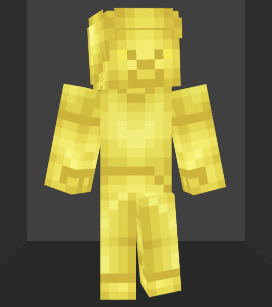
My gripes with the Steve Saga design are that it has a lot more contrast than the others, has weirdly colored highlights, and is just a sickly shade of yellow. So I fixed the contrast and highlights up and made it a more golden yellow
These guys were known for being electrokinetic speedsters in the original. Honestly I like that about them, don’t really wanna change anything there. I do think it’d be interesting to make them drawn to metals because conducting electricity, and weak to resisters like wood since electricity can’t flow through stuff like that. They’re the only ones who actually fight using lighting. The other 4 will at most have lightning while using their own abilities, but won’t be able to use that lightning for actual combat
Lastly, we have Purple Steves

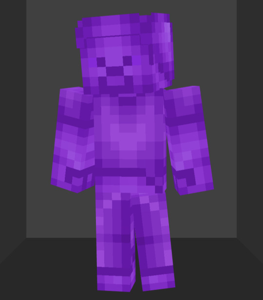
So the original was missing some highlights, and I didn’t really like the shade of purple. Pretty easy fixes
The power these guys were known for was being able to teleport basically anywhere at will. Pretty cool power, not gonna change it.
Personality-wise we only saw one in the series and he was brain damaged for most of it. I think a good general trait for them is that they don’t like staying in on place for long, both because they lack any real attacking abilities and they just instinctively want to teleport to new places as a means of avoiding people who’d want to harm them.
Lmk your thoughts and what you think I could do differently with the ideas or if you have your own that you think could be cool to add. I will be keeping an eye out and will add anything that I like (with credit obviously). I have some more complex thoughts for the upcoming prominent steves so keep an eye out for that.
Have a good day/night!
25 notes
·
View notes
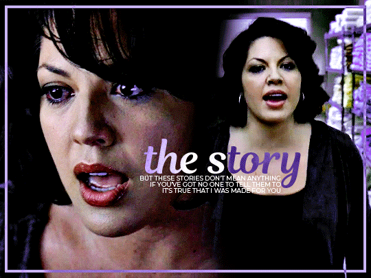
Note
do you think you could please do a tutorial for your greys anatomy edit (kinda similar to your brittana edits) i'm shocked if no one has ever asked you before for tutorials (and if you do i'd love to see them) your edits are so gorg and you're incredibly talented !
Totally! Bare with me, this is my first tutorial in like 8 years. Haha. I'll show you how I made this one:
For reference, I use Photoshop CS5. (My computer hates the newer versions. It'll run three different video editing softwares but hates photoshop. Idk lol.)
Okay, first you want to make 2 gifs with the same amount of frames. That's important. And then you want to convert them to a smart object.
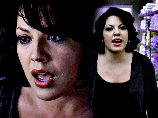
So we have these two gifs.

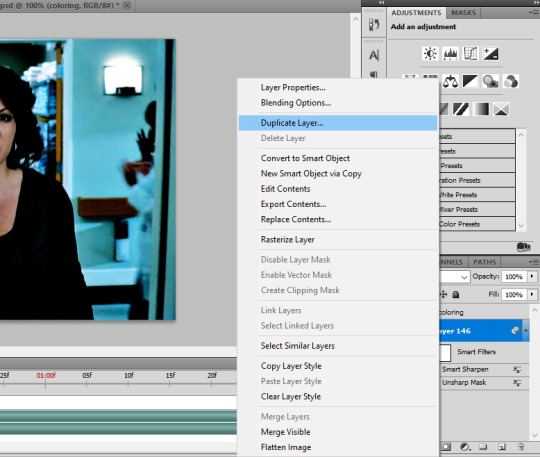
Now, depending on what you're doing, you can do this next step now or you can color your gifs how you like, save them separately and then reopen them with all the coloring on them. Sometimes I do this if I'm working with a lot of effects but since these two gifs have the same coloring, we're going right click on one of them (it doesn't matter which one tbh) and you're going to select "duplicate layer"
A little box will pop up and this is where you're going to select the project name that you want to essentially paste this gif on top of.
Set the top gif to Screen.
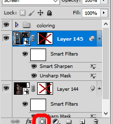
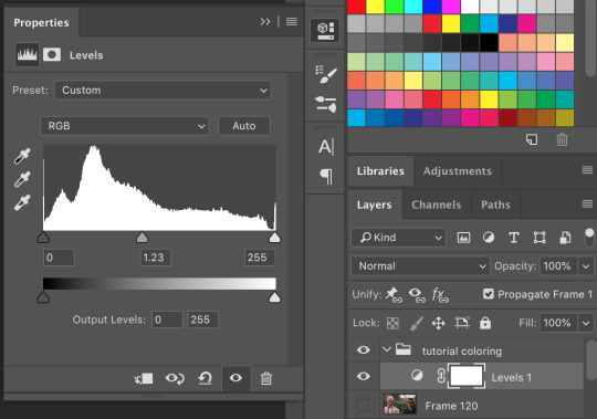
The first thing I usually do is sharpen them. So I use Smart Sharpen and Unsharp Mask with these settings:
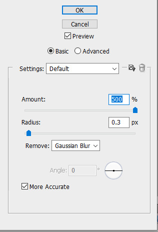
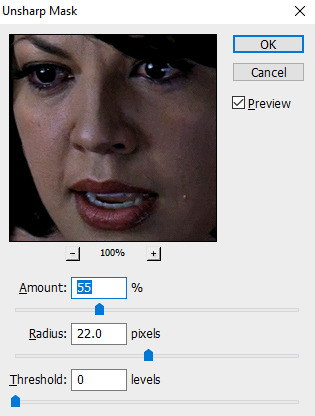
With Unsharp Mask, you have to tweak them depending on the gif, quality, what effect you're going for, etc.
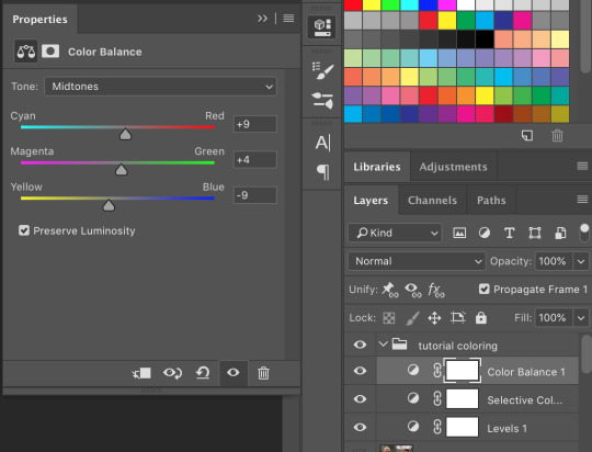
Then we add some basic coloring:
Now, I have a base for specific shows because all shows are colored different. Grey's is more blue toned whereas Glee is more yellow toned. However, since coloring is a bitch sometimes, I'll add a PSD that I use ALOT. You can download it here.
So now that we've sharpened and added some coloring, this is what we have (separately):
This is what it looks like after I set it to Screen (and I moved the top gif a little to the right.)
Obviously, we need to get rid of those lines and make it so that each gif is more visible.
So now we blend.
On the top gif, you're going to add a layer mask to that gif. So with that top gif selected, you're going to select the mask button that looks like this:
Select your brush tool and use a soft brush to erase what you want from the background of each gif. (Make sure to repeat the previous steps to get a layer mask on the bottom gif.)
I have this now, after using the brush tool.

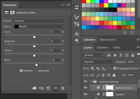
As you can see, it's very blue and I wasn't feeling blue for this gif so we want to change blue color. That's where the Selective Color comes in.
We're going to get rid of that cyan tone. So you're going to add adjustment layer and select Selective Color.
All I did for this one was adjust the cyan tones in the drop down box.
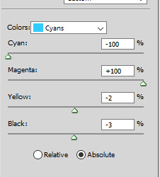
Now we have a pretty purple tone!
Now, we're going to add a light grey squareish box this to outline.
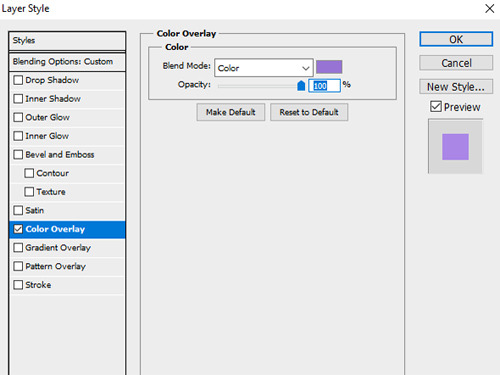
Set the blending mode to exclusion. To get the bar (and we'll do this again with the text) you're going to select the FX icon.
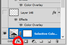
Select Color Overlay. A box will popup. You're going to set the blending mode to Color and then select whatever color you want the bar to be. (If it comes out with too much white, adjust the color of the bar itself to a darker shade.)
Lastly, we're going to add our text. For this gif I used Magnolia Script and Montserrat.
To get the purple effect on the "The Story" text, you're going to do the same thing you just did for the bar.
Voila! I hope this helped. If you need any further assistance, I'm always happy to help!
#tutorial#gif tutorial#blending tutorial#usergif#completeresources#mine#also anon you’re so fucking sweet
141 notes
·
View notes
Note
how do you make your graphics? your style is so unique and beautiful!
Hi, thanks so much, that’s very kind of you! And I use Photoshop. If I’m being honest it’s not a super elaborate nor elegant process, I’m still learning and I mostly figured out what I like to do by just going in there blind and clicking around a bunch. I’ll put the more detailed steps under the cut if you’re interested, though!
Okay so generally speaking, these are usually the steps:
1. I take screenshots through either Premiere or the built-in Windows screenshot tool (but preferably Premiere). I try to use 4K remasters of the movies where I can these days, because it allows me to—
2. zoom in and crop the hell out of them and reframe them how I see fit without losing out too much on the quality. (these movies needed more close-ups, goddamn it) If there’s blank space left at the edges, I might duplicate the nearest edge area of the layer and try to blur it out + darken it with a gradient to fill that gap and still get the framing I want.
3. Then I adjust basics like exposure and contrast using the Curves function + boost saturation and vibrance—I try not to overdo it with the latter two because that step gets repeated later on, but I do need to do it at the start to even properly see what colors are in there since the MCU is so fucking bleak when it comes to color grading, and the 4k remasters tend to be even flatter. I also add Sharpen and Sharpen Edges filters here.
4. This is the fun part: go in and mess around with color. I usually use the Selective Color tool to figure out which parts I want to bring into focus by boosting like 2-3 colors and tweaking/evening out the rest of the tones to get some contrast. Hue/Saturation and Color Balance come in handy here, too. I’ll also sometimes use the Match & Replace Color tools to either neutralize, lighten/darken or entirely remove certain colors, and add Photo Filters to warm up/cool down the whole thing or certain areas.
5. When I have a decent idea of what I’m doing with color, I move to masking out what I don’t need—usually over-saturation in the skin tones, teeth, whites of the eyes, weirdly saturated pixel clusters, etc, and blurring out areas that might be too textured.
6. I’d say this is an optional step depending on the edit, where I might add any “special elements”—this is not the best quality example, but it has multiple:

I take the rectangle select tool—or Lasso or whatever select tool, depending on the shape—and then use Invert on that area (which I do a lot, lol. Big fan of my buddy the Invert tool). Here I also used a B&W adjustment layer, but if the inverted area’s in color I go in again with Selective Color or any of the other previous adjustment tools to futz around with the colors some more, such as here:
I kind of suck at remembering to use different layers for different adjustments, but if I’m adding any shapes or patterns with the Brush tool—such as the dots or the blood spatter on those BW posters—I make sure to always do that on a new layer. I do the same if I’m adding a duplicated area at a lower opacity to create that “ghost” effect at the edges of an object, like in this Sam edit here:
or if I’m adding a directional blur like in these:

7. On a new layer, I add in color gradients at a very low opacity and then layer them up until I like what I’m seeing, usually radiating out towards the edges of the image or in spots that I feel might need a color change or boost. The red and cyan here are some of the more noticeable examples:
or the sepia-esque bleed through in these:


And I might do the same thing with a dark grey to darken the corners and edges a bit.
8. I add a text layer, write whatever it is I want on there and set font and size, pick a base color for it that is complimentary with the colors of the image, and then I go into Layer Style to adjust the opacity and blending mode. I usually use Difference or Exclusion for the latter if I’m trying to get that colorful text, and I might also throw in a lower opacity Gradient Overlay if I’m not a 100% satisfied with the colors that produces.
I might also mask the text so that I can make it appear to be behind an object, like in this:

9. Texture! I used to just add a noise filter directly to the base image but have since learned that’s not really the best way, so instead I:
i. create a new layer;
ii. set the mode to Overlay, and check “Fill with Overlay-neutral color (50% gray)”—you can also do this by just using the Bucket tool to fill this new layer with a neutral-looking gray color and then tweak the opacity;
iii. convert the layer to a Smart Object so I can go back in and re-edit;
iv. finally add a Noise Filter (set to gaussian and monochromatic) at around 3%-15%, depending on the image size and quality. I might also add a Gaussian Blur on top to make the noise a bit softer.
10. Final checks—this is where I might up the exposure, contrast, and saturation/vibrance again, or add another layer with gradients (always under the texture layer). I usually also export a test version to see how it translates online after it’s been compressed on upload, and then use that as a reference for whatever needs fixing or tweaking.
And that’s more or less it! Thanks for the ask—I never really thought too systematically about what it is I exactly do with these, so this was an interesting exercise. <3
4 notes
·
View notes
Text
* Tutorial levels revamp: There’s only 2 books in the first one where they have info related to the Companion’s controls and then you have a lot of illustrations across levels. Most other books were removed. This is my attempt at mixing both presenting enough info and making the tutorials less of a waste of time.
* The world titles that show up at chapters’ first levels have been changed to have stuff behind the latters. Feel free to check l3300n, b00k3r and h0lm3s to see the new versions.
* Because of this, the title disappears a bit sooner.
* It takes 15 coins to get a new life under the limit of now 10 max lives.
* Because of the above, I added extra coins to various levels.
* Some really tiny adjustments to z4r1n4
* b4rn3y/Massag level 4: Added a new basic NPC, a Dalmatian police officer.
* In the same level above, there’s a rope you can pull to hear the train’s horn.
* And an illustration of 3 NPC characters from this world.
* k4rl44/Massag level 5: Art for the cheerleaders.
* An option in the pause and main menu is a text with instructions about the game. It may be reworked better sometime in the future.
* p33tt3/Nort part 1 level 8: Fixed the van so it won’t reactivate again and its sound is in the proper sound channel.
* The "please read" button now says "current issues" so people wouldn't feel the need to read that thing for too long.
* Tutor1 and Krimb level 2/r1c0t0: There’s now moving platforms next to areas where ladders and water are close.
* Tutor3 has a new path that allows you to go back to the start.
The plans post also changed (Specially the Google Doc version, while Rentry version is way behind now).
* HirdrihLevel3/b0rhrr has 4 illustrations of Borhr, NPC’s and enemies.
* And the spider chips in the level above can be killed, classifying them as enemies.
* Some tiles were changed to have less unpleasant colors and a new set of tiles is just black outlines to make it clear some tiles are solid.
* Guest appearance: Ganyah (By FairyGodBomber), a sorceress you can meet if you destroy all targets in Nort part 3 level 3/sh1hr0.
* Guest appearance: Anna Fresser from Dreadhunter (By HemoGlobinWorld); You’ll find her in a new area added to MassagLevel2/mcshry where you press a valve to lower the water to reach a room with health.
I also did a lot of behind-the-scenes stuff for later updates, like art for future characters.
#gamedev#indiedev#indie dev#godot#godot engine#indie games#blog#game development#game dev#gaming#godot game engine#progress#update#video games
3 notes
·
View notes
Note
I like several things about your art & lore so a simple note doesn't do it justice i feel, i just hope tumblr formates it somewhat okay via ask lol. 1. How absolute soft and round you draw, you hardly see any edges or hard corners and i am at this point fully convinced you do this on purpose, even when it comes to Vyrm's sidespikes or any claws.
2. Being able to make all characters easy to recognize yet give each your spin, even if one were to fully color any character in your art black, you can still say whats going on and who is who. 3. Expand on "blank slates", while we got all these Lore tablets by PK, we hardly know him as official, public text written as the King do not tell how he was in Person, and I for myself have adopted a few things as my HC on how your Vyrm acts in that regard, even more with his relationship with WL. Same goes for Grimm, the aspect of an eternal, ageless god seeking a quiet life after tasting all the world had to offer is very, very nice.
4. Not restricting yourself to what the game shows us, that might be just Take 2. but i feel like this should be mentioned as well, you dont just say "everyone is a bug" you go with reptiles, mammals, bugs, birds, literally everything imagineable to fit your vision of characters, especially your design of Lurien shows that being both bug & bird inspired. 5. Also Dinosaurs. Your Baryonix picture is still one of my faves, not just because Baryonix have become one of my fave dinos thanks to ARK: Survival Evolved but in general, still close to one of the more accurate renders we have while also adding your own charm, love the light blue "crest" (not sure how to call it) you added on the head especially, not just stylish but a possible feature to attract mates. You make dinosaurs look soft but not forget they were dangerous beasts.
Oh gosh this is a long one, I really appreciate this! I'll try responding to each one.
1. It is on purpose, yes! Funnily enough, it's a complete contrast to my old artstyle from over a year ago. Using Vyrm's side spikes as an example, they used to be almost perfect sharp triangles. These days I try to make the shapes in my art very round and soft, so I'm really glad this is something you like!
2. Thank you, I'm glad you think so! It's something I've been a little conflicted about sometimes. On one hand, I worry that I changed them so much they might not register as the characters they're based on. On the other, I want to draw them like this, that personal touch helps me connect to them on a much closer level, and considering Grimm and Vyrm in particular are my comfort characters, I'm trying to get rid of that doubt so I can fully embrace it. Hearing that they're still recognizable really does help!
3. Ahh I'm so happy to hear you adapted some of my interpretations into your own headcanons! It's really flattering to know that my silly rambles might have impacted how others view the original counterparts/their own interpretations.
4. Thank you! I'd just be repeating what I said in the second one, but again, it's very reassuring that people are open to my interpretations!
5. Ooooh I didn't expect this one hahaha. I'm glad you liked it! Redesigning the Jurassic World Baryonyx used to be one of my favorite things, I'm not the biggest fan of the movie design and I always found it fun to tweak it in subtle (and less subtle) ways to make it work better as the animal it's supposed to represent. And yes, I believe crest is the correct term here, it's something the movie design didn't include but I think it gives Baryonyx a lot of personality.
Again, thank you so much for your kind words!
4 notes
·
View notes
Text
Why Your Website Isn’t Converting — and How to Fix It
Let’s be real.
You’ve spent weeks (or months) getting your website live. Everything looks polished. Fonts align. Colors match. It even loads pretty fast. But… crickets. No calls. No emails. No sales.
Frustrating, right?
You’re not alone. At our web design company in Qatar, we’ve seen this story — again and again. Great brands. Poor results. Because traffic doesn’t always mean conversions.
Here’s the thing. People don’t convert because the site didn’t earn it. Below, we’ll walk you through the reasons why — and how to turn things around.
1. Your Website Talks About You (Too Much)
Harsh truth?
Nobody cares about your journey. Or your logo. Or that your grandfather started the business in 1972.
Visitors come for them. Their problems. Their goals. Their wins.
Take Reem, a boutique owner in Doha. Her homepage was beautiful. But all about her: “We’re passionate. We’re experienced. We love design.” But the bounce rate? 87%. Ouch.
We flipped the narrative. First line? “Struggling to find the perfect outfit that fits right and feels good?”
Boom. Relevance. She saw a 40% increase in inquiries that month.
Moral? Start with their problem. Not your passion.
2. Navigation is a Hot Mess
Ever landed on a site where you just… didn’t know what to do?
Too many links. Dropdowns inside dropdowns. Tiny text. It’s overwhelming.
Visitors? They’re lazy. (Aren’t we all?)
They won’t dig around. They click once, maybe twice. Then they leave.
At our web design company in Qatar, we helped a logistics firm simplify their site. We killed 6 menu items. Made the CTA loud and obvious. Their leads? Doubled in 3 weeks. No kidding.
Keep it simple. Like, painfully simple. Guide the user like they’re five.
3. Mobile? What Mobile?
Here’s a stat. Over 70% of users in Qatar browse on phones. But your site? Still stuck in desktop-first land.
Buttons that are hard to tap. Text too tiny. Images overlapping. It’s 2025. This shouldn’t still happen. But it does. A lot.
We ran a test last month. A real estate firm had a sleek desktop site. Mobile version? Clunky. Unreadable.
We redesigned with mobile in mind first. Results? +63% time spent on page. +32% form submissions.
Lesson? Don’t design for your screen. Design for their thumb.
4. It Feels Cold. No Trust.
People buy from people. Not pixels.
If your site looks generic or feels robotic, they bounce. Fast.
Add warmth. Show real faces. Testimonials. Client logos. Case studies.
One of our favorite clients, a legal consultant in Al Wakrah, added a simple testimonial slider. Three happy clients. That’s it.
Conversion rate went up 29% — without changing anything else.
Don’t be afraid to show you’re human. Trust builds slowly. But it starts with familiarity.
5. Weak Call-To-Actions (CTAs)
“Click here.” “Submit.” “Contact us.”
Boring. Passive. Forgettable.
Your CTA should punch. It should guide. It should scream value.
Instead of “Submit,” try: 👉 “Get My Free Brand Audit” 👉 “Book Your 15-Minute Strategy Call” 👉 “See Pricing Instantly”
We did this for a Qatari event planner. One CTA change. That’s it. Bookings tripled.
Make it bold. Make it clear. And yes — repeat it like a broken record.
Real Talk: Conversion is a Science and a Gut Feeling
You can track numbers. Analyze heatmaps. Study behavior. But sometimes? You just gotta feel the page.
Does it make sense? Does it feel human? Does it guide someone like a friendly hand?
If it doesn’t, time to fix it.
FAQs
Q: I already invested in my site last year. Do I need to change it again? A: Probably not everything. But if it’s not converting, something’s off. Sometimes a few tweaks work wonders.
Q: How do I know if my design is the problem? A: If users leave within 10 seconds or don’t scroll — yep, it’s the design.
Q: Can a web design company in Qatar actually help with conversion? A: Absolutely. We don’t just build sites. We build journeys that convert.
Q: How long to see improvements after a redesign? A: Depends. But usually, in 30–45 days, you’ll start seeing signs. Leads. Calls. Movement.
Closing Words: You Don’t Need a Prettier Site. You Need a Smarter One.
A website that looks good — but doesn’t convert — is like a fancy store with no entrance.
It’s useless.
Fixing that doesn’t always mean rebuilding. Sometimes, it’s just rewriting your headlines. Or moving a button. Or telling a better story.
At Artisans, a trusted web design company in Qatar, we help businesses turn websites into growth engines. Real advice. Real results.
Need help? Let’s do a free audit. No pressure. No pitch. Just honest feedback from folks who’ve done this before.
👉 [Schedule Your Free Audit Now]
Let’s fix what’s broken — and turn your website into your best salesperson.
0 notes
Text
Fukuya Rank 3 (Temperance Confidant)
You receive a text message from Fukuya.
Are you ready for the next time management class? I call this one "Summoning Your Strongest Skills for Self Sustainment". Basically, using your talents to do things efficiently and minimize your reliance on others. You'll be real interested in this one.
Call Fukuya over for tutoring. You meet him inside the cafe.
We'll start tonight's session here. It's critical to the lesson plan that I obtain a cup of coffee brewed by the proprietor of this establishment. It's not because I'm tired-- though I am. We're going to do a taste test. Excuse me? Can I get a cup of the house blend, please? And a cup of hot water on the side?
Fukuya carries both cups to a table, and you sit down together.
Mm… That man knows what he's doing when it comes to coffee. I'll have to stop by here for pleasure one of these days. I'm assuming you're a fan of it, too. Help yourself to mine if you want. After you drink your fill, try some of this.
He takes a small jar of dark brown granules from his pocket and shakes some into the hot water.
I created this instant coffee myself. One cup contains four times the amount of caffeine of a typical cup of coffee, without sacrificing the taste. It's nearly on par with what I just ordered.
>That's poison, isn't it?
What? Why would I poison you where there are witnesses? You've done nothing that deserves poisoning, either. Here, if it puts your mind at ease, let me drink some first. …Ah, the taste of my ability to sleep tonight evaporating. Delicious.
I'm not going to have you sit here and be skeptical any longer. Bottoms up, Emi.
He hands you the instant coffee, and you take a sip. This is… pretty good, actually! You feel your spirits lifting.
Well? Some color just came back to your face. It's good, isn't it?
You nod.
You see, both the owner of this cafe and I use our talents to make great coffee. He does it the proper way, carefully considering the beans, the roast, even the type of water used. Unlike mine, you can taste the love put into it. But doing all that is time consuming, though I'm sure he's gotten quick at it over the years. And the tangible benefit, the caffeine, isn't as potent as it could be. Me, I've always been an instant coffee guy. I don't have the patience for anything else. On the weekends, I whip up a cup while I mess around with my chemistry set. One day, about a year ago, I added one of the chemicals I was experimenting with to my drink. The coffee's effect immediately doubled! I've been tweaking the formula ever since. And that's how I put energy into something I like doing, and wind up with more energy for the things I hate doing.
>That's really cool!
The end result sure is. Some of the intermediate steps were… less than spectacular. The process went back and forth from being trivial to making me pull out my hair in frustration. But now I have another time-saving trick up my sleeve. God knows I need it.
I've concocted a few other time savers. Sometime, I'll have to show you my special laundry detergent. It seeks and destroys dirt and sweat so quickly, you have clean clothes in less than five minutes. But Fukuya, you're wondering. I'm not a chemistry buff. How can my talents save me time? Let me give you some examples. If you're good with your hands, you can craft lockpicks, and not have to waste time with things like finding keys or asking for permission to enter. Or if you read a lot of books, you collect lots of info that could help you later on, and your reading speed increases. Even something like writing or drawing does something similar to what my coffee does. It refocuses you so the mundane chores you have to do don't seem as daunting, and gives you motivation to finish them faster.
Writing… Wait. Shit! That essay on the Meiji era is due tomorrow morning, isn't it? Damn it, damn it, damn it! I'll have to cut our session short again. Give me the rest of the instant coffee. I'm going to have to chug it. Avert your eyes if you must. [glug glug] Ahh. If you see me pass out in history class right before the homework's collected, you'll know my mission failed. Later.
Late at night, your phone rings when you're alone in your room.
Emi, I'll be staying firmly in my seat tomorrow. Phew! I finished my essay. It's six pages of the same sentence reworded hundreds of different ways, but I doubt the teacher really reads our homework anyway. I realized I neglected to tell you something important. I'll gladly let you use some of my coffee or detergent, any night you feel like it. However, I can only bring you one at a time, and I have to watch you use it.
>Why?
Why the limitations, you mean? First off, I need to ensure I have enough stock for myself. I don't have the means to make very large batches. As for me needing to be there… These compounds are volatile. If you don't follow procedure exactly, the entire cafe could go bang. I'm sure your guardian wouldn't appreciate that.
I'm not sticking to my own teachings very well, am I? I get nothing out of coming over to your place and bringing you this stuff. In fact, it's a pain in the ass. But I guess I've taken some sort of liking to you. I see a lot of my former self in you, and I'd hate for it to be too late for you, too…
You don't need to know what I mean. Just manage your time well. I'll come up with something new to teach you once my brain's numbness from that horrible assignment wears off. Try not to let the anticipation kill you.
0 notes
Text
How to gif without photoshop
Hello! By popular demand (of like 4 people) I am going to write out a tutorial of how I make gifs when I’m on my personal laptop and don’t have access to photoshop. There is another method I use with a different software that is a bit more complicated and if people are interested, I will make a tutorial of that method as well. I’ll do my best to keep this concise, so let’s get started.
Warning that this is VERY text and image heavy because I know how frustrating it can be when a tutorial feels like it’s skipping steps and I want this to be as clear as possible. Also please read this on desktop, tumblr mobile kills the quality of gifs inside text posts.
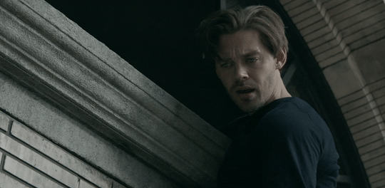
This is the video I will be giffing and here is the gif I will be making!

What you need:
A video to gif
For the best results, I recommend a video that is either 720p or 1080p (basically the higher the quality, the better). Videos with good lighting and bright colors also turn out the best. Unfortunately for me, I gif the TV show Prodigal Son a lot and that show has neither of those things, which is why my gif example is from that show; if you can make a scene with zero lighting or vibrancy look even somewhat decent, you can make anything else look good.
A video downloader or screen recorder
This is the video downloader I use and this is the screen recorder but basically any youtube video download website or screen recorder program works. Keep in mind that ezgif has a pretty low upload limit for videos, so if you want to gif something longer than like ~4 minutes, cut the video down to the specific parts you want first on a website like this one.
ezgif
A very straight forward website that anyone can access. You don’t need to download anything, it’s all online.
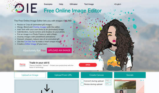
Bonus: Online Image Editor (not required, but I use this website to add text to gifs)
1. Making the gif:
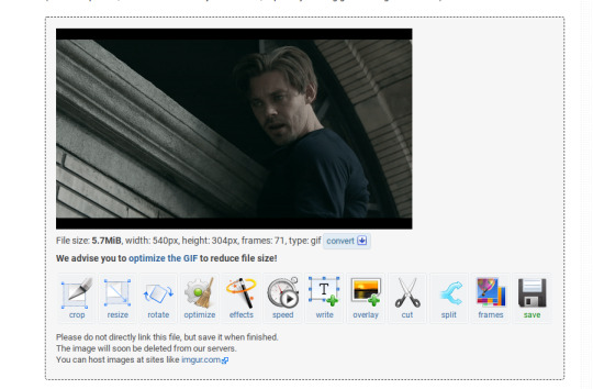
Once you have a video downloaded, you go to ezgif.com and go to the section video to gif. Click choose a file, scroll to your downloaded video, and hit upload video. Your screen should look like this now.
There are two ways to pull out the sections of the video you want to gif. You can either write in the start and end time in the little sections (you have to convert them to seconds: for example, if my gif started at 1:16 and ended at 1:20, it would be 76 seconds and 80 seconds respectively). Or you can do the method that I feel is easier, where you go to the section you want it to start on, hit pause, and hit the blue button that says “use current position” then let the video play until it hits your stopping point, hit pause again, and click on the second “use current position” button.
Once you have the start and end time recorded, scroll down to the next part of the screen with the size options. For size, select “540xAUTO (for Tumblr)” since tumblr gif sizes start at 540p and go down the more gifs are in a row. For frame rate, try to do either 20 or 25; the higher the frame rate, the smoother the gif will look. If you are trying to gif something in 540p that is longer, you might need to chose 10 to keep it under 5mb, which is the tumblr gif size limit. For method, leave it on FFMPEG. Then hit, convert to gif.

your gif will now look something like this!
Now, this gif is currently 5.7mb, which is above the size limit for tumblr (5mb or above gifs will still play if I recall, but the quality will be really bad when you post them). If I was planning on keeping the gif this size, I would go back and change the frame rate to either 20 or 10 to get the size down. However, I am going to resize the gif to 268p, so I don’t need to worry about it being to big.
Using the correct gif size for tumblr is one of the easiest ways to make sure the gif looks good! For gifs that take up a whole row, the size should be 540p wide. For two gifs in one row, the size is 268p each. For three gifs in one row, the sizes are 177p, 178p, and 177p in that order. Here is a visual of it.
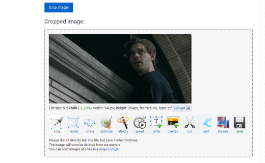
The next step would normally be resizing the gif, but Prodigal Son youtube videos come with a black banner on the top and bottom that I need to crop out. You will see a menu full of options under your gif, and you want to click on “crop.”
Cropping is pretty straight forward; you just move the little box over the part you want cropped, then hit the “crop image” button. Make sure width stays 540p!

Your gif now looks like this
Next, you look at the options under your gif again, and go to “resize.”
Again, resizing is pretty straight forward. I just put in 268 into the “width” section and leave the “height” section blank since the site will automatically resize the height. You can ignore the other menu options.
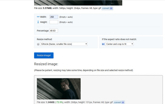
Your gif now looks like this

Next step is optional, but I usually do it. Once again, you go to the menu of options under your gif and select “speed.”

Speed is also super straight forward. I almost always reduce the speed of my gifs somewhere from 90% to 80% no matter what, just because I think it makes it look smoother. For gifs that are of short scenes that go really fast, I will reduce it to anywhere from 70% to 50%. You can try different speeds to test out what you think looks best. For this gif, I’m going to put it at 80%.
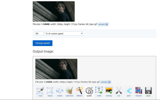
Here’s what we have so far. Congrats, you have made a gif!

Now for the fun part!
2. Coloring the gif
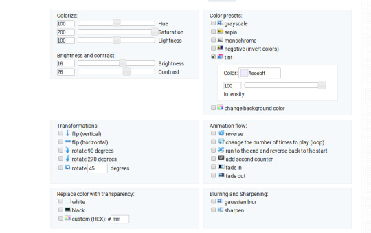
Go to the “effects” option, in the menu under your gif. You will see a LOT of options, but the panels I’m going to focus on are “colorize”, “brightness and contrast” and “color presets”. This section is going to vary a lot depending on what specific video you are giffing so remember to be flexible and try lots of different options out! It took me a while to get to a place where I can just eye a scene and know what settings to use. It’s super easy to go back and tweak a setting if the gif doesn’t look like how you want it the first time, but it’s a lot of trial and error.
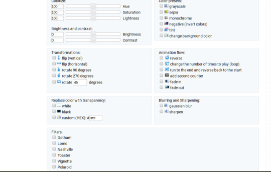
The main option I focus on in the “colorize” section, is “saturation.” This is what will make all the color in your gif pop out. The saturation I use varies a ton; for scenes that already are colorful/bright, I usually keep it around 120 to 150, since you don’t want it to be over saturated. If I’m making an edit that is supposed to look toned down or more grey/neutral tones, I’ll decreases the saturation in the range of like 90-40. For a show like Prodigal Son, where there is basically zero color vibrancy, I tend to go full out with saturation, usually in the 150-200 range. For this gif, I have it all the way up to 200.
Next is brightness and contrast. This also varies wildly, but a good rule of thumb is I always try to keep my contrast at least 5 points higher than whatever my brightness is, it just makes the lighting more even. You need to find a good balance; obviously, the darker the scene, the higher you want the brightness and contrast, but if you go too high, the gif with be staticy/grainy. For Prodigal Son, which has horrible lighting, my brightness is anywhere from 10-30 and my contrast is anywhere from 15-35. For this gif, my brightness is on the lower side since the scene is outside in natural light; brightness is 16, contrast is 26.

After you get those settings, I go over to “color presets” section and click on the “tint” option. It will pull up a color chart that looks like this
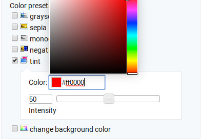
You ALWAYS want the intensity up to 100. This part is where the most trial and error occurs; there isn’t any one color option that works for every gif. The shade I use most often is light red/pink or light blue/light purple. For scenes that are lacking warm tones (which is almost all of Prodigal Son) I tend to go to the light reds, and for scenes that are lacking cool tones, I go to the light blues. The light reds are best for making characters skin tones look more...like actual skin tones and not totally washed out. To select a color, you just move your mouse around the chart. This is the range of color codes I tend to use.
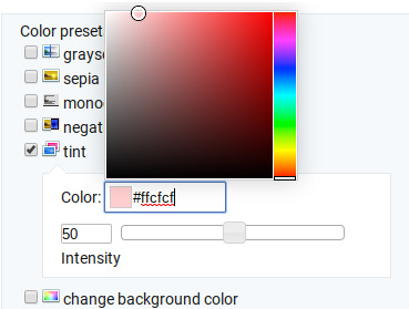
Again, intensity should be up to 100 (it automatically starts at 50 and I was too lazy to move it while getting screen shots :P).
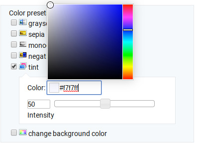
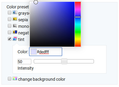
For this gif, I actually used a new technique I’ve been trying out where I start with a light blue tint to even out the color tones, then once that gif is done, I go back to effects and add a layer of pink to make the colors brighter. Usually, one color works fine, but sometimes it’s hard to find a good balance (the red colors can get too red and the blue sometimes brings out too much of a yellow shade). For now, I have my color tint set at #eeebff.
Ultimately, this is what my effect settings look like and this is what the gif looks like now.

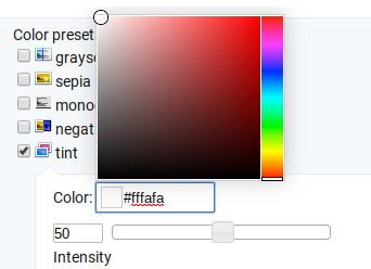
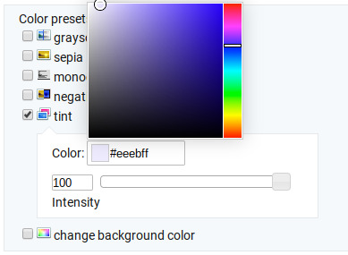
Now, like I said before, I added another layer of tint to this gif. All you have to do is go to the menu under your gif, and click on effects again.
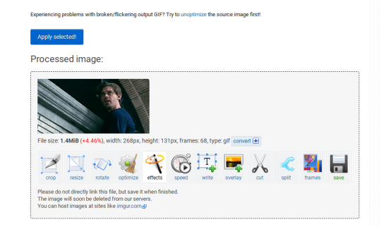
It will take you back to the panel you were just on, expect now your colored gif is on the top and all the settings are blank again. The only setting you need to use now is the tint option; go there, and select a light red shade. I used #fff0f0.

And here is the final gif! To save it, just right click and hit “save image as.”
I know it seems like a long process, but once you get a hang of it, it goes by super fast, especially if all your gifs are coming from the same video.
BONUS: Adding text
If you are trying to gif something with dialogue or you want a quote to put over your gif, you will want to put text over it. ezgif has a “text” option that you can use if you want, but I personally don’t really like their font options, so I use the website Online Image Editor.
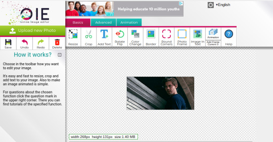
This is what it looks like. You can either hit “upload an image” and upload your saved gif, or you can go back to ezgif, right click the gif, hit “copy image url” and paste that url into the “upload from url” option. The web page should now look like this.
It’s pretty straight forward from here; click on the “add text” button and a menu will appear on the left hand with options for the text.
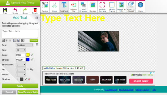
Type whatever you want the caption to be in the “type text here” box. This website has a ton of font options you can play around with, but when I just want to caption a gif, I stick with “Arial Bold Italic.” For a 268p gif, the font size should be 10-12, depending on how much writing you plan to put on each gif (if some gifs are going to have more writing than others, pick a smaller font size so it stays consistent!) When I make a 540p, the font goes up to 14-16. I use white for the color and black for the stroke. I make the strokewith 3 because it makes the caption stand out more. Once all these settings are selected, hit the “preview” button under the text box.
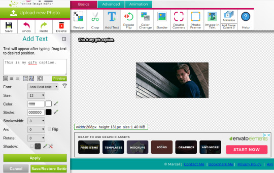
You can now drag your text anywhere you want on the image! The only bad thing about this website is that it doesn’t automatically center text, so you either have to eyeball it, or if you’re picky, like me, open up one of those online ruler applications and use it to measure out the center. For captions, I move the text just slightly above the bottom of the gif.
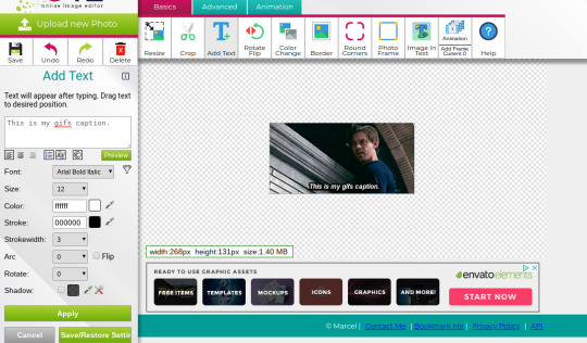
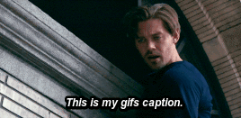
Finally, you hit apply. Once your gif has the text on it, all you have to do to save it is right click it and hit “save image as.” And here is the finished project!
That got a lot longer than I thought it would, but I hope it was informative! If anything was unclear or if you have further questions, feel free to send me an ask. Thank you for reading.
#gif tutorial#giffing tutorial#giffing#gifmaking#mine#my gifs#long post#I hope this makes sense lol#pls rb if it helped!!!#also if mobile doesn't keep the read more...idek
424 notes
·
View notes
Text
New Year’s Resolutions: Group commentary
Welcome to the group commentary! As I said in the winner’s post, there were a lot of white cards in the inbox, and that’s an obvious sign that white needs a small rework to keep up with its buffed up brothers.
@misterstingyjack White does lover its planeswalkers and tying card draw with a powerful card type could be reasonable since card draw is white’s main weakness. However I would like it more if this loyalty extension was offered by a creature, so at least you can keep the game rolling.
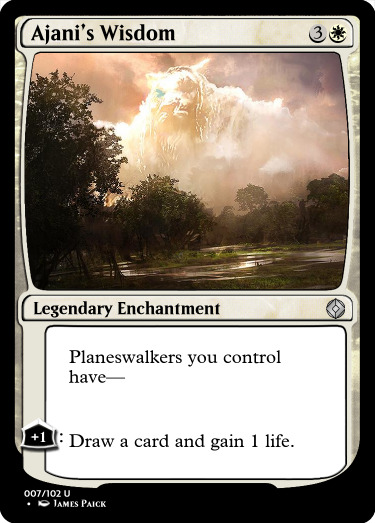
@askkrenko MaRo has mentioned the “elemental” supertype quite a few times in podcasts etc, but its really too late to add this element to the game. But we’re here to dream and create, and Strike Twice would be a sick card, if not a staple, in that parallel universe. Also this is the most badass a Pichu has ever been XD
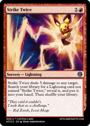
@ignorantturtlegaming There were no additional notes other than this crazy card in the inbox, so I can only guess that the creator wants more group-hug effects in red. I want to say Fires of Renewal is on the expensive side, but the effects it offers unconditionally are all very impactful. The Melvin in me appreciates all the instances of “2″ in the card!
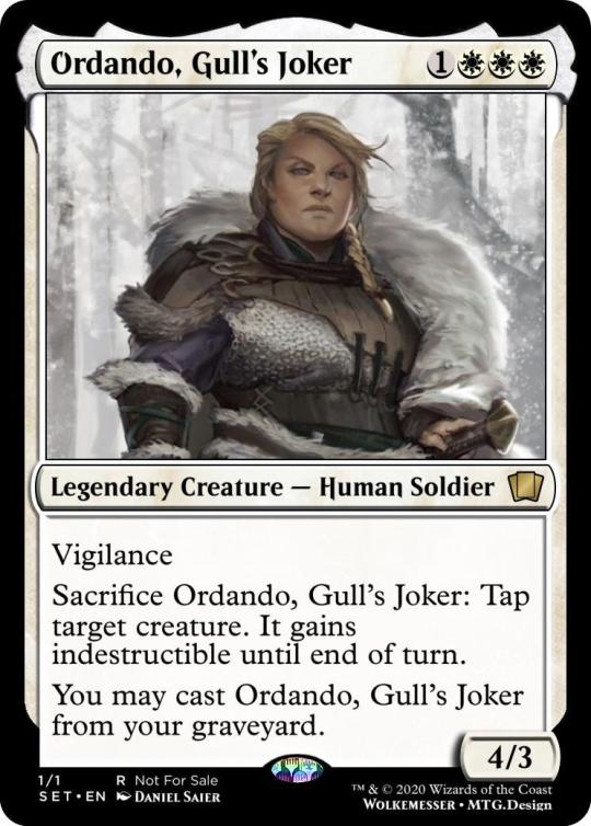
@wolkemesser gave life to an ancient mtg character from the Shattered Chains book and boy, she’s a truly solid card. Ordando has decent stats and gives some additional staying power to monowhite decks. I like the whole flavor that is so tough that she can protect others and come back again, but the execution feels a little off to me, as discard and mill decks can abuse her in non white ways. Since we’re going for the flavor win, I would like it more if in order to protect something she exiled herself with a promise counter (which in turn allows her to be cast from exile.)
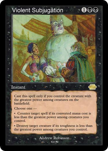
@i-am-the-one-who-wololoes A disgustingly evil win more card? Sign me up! The philosophy of the card plays very nicely in black, especially with low cost high stated creatures that ask for their tribute every upkeep! Counterspells in black are a big stretch in my opinion, but no one can’t deny this card is a big flavor win!
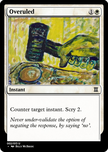
@col-seaker-of-the-memiest-legion Speaking of counterspells, here’s another suggestion for them being in white. Many protective cards can be treated as counterspells, so we could find a loophole and treat this as a very wide protective spell. I think we could have cards like this in the future, but it’s still treacherous terrain because they must be so efficient that might replace blue’s role in the game.
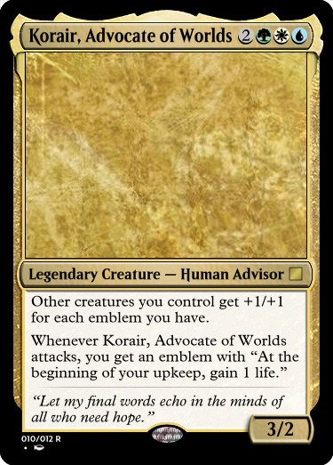
@naban-dean-of-irritation I have mixed feelings about Korair. Flavor text matches with the card’s name quite nicely but it doesn’t connect with the actual gameplay. Also venturing into the unexplored “emblems matter territory” is surely exciting, but I don’t like the fact that is creates emblems by itself, and with that ease to boot!
@mardu-lesbian Hindsight is pitched as the blue/red shared keyword ability. I view it in a positive light, meaning I think it’s both flavorful and makes sense for those two colors, but it’s a bit unexciting that it matters only once in the creature’s life on the battlefield, while other shared keywords are combat related and have a greater impact in the game.
@deafeningsandwichpeach Hexproof for player is a rare sight, usually preserved for white and green, but there’s also Leyline of Sanctity and Witchbane Orb and this changes things to the point I would even tell this card is overcosted. Cost aside, I really like Seal into Darkness!
@snugz I would really love blue getting a combat ability that’s not straight evasion, but going full throttle to lure all creatures is a bit much, given that existing cards are usually uncommon. It could be like old fashioned provoke ( forcing a one on one fight) or even a numbered mechanic, like lure 1 or 3 etc, forcing 1 or 3 creatures to block.
@hypexion Lapse of Certainty is definitely a card, but there’s a reason why it was not repeated. Here, Mean’s to Delay, like Unexpectedly Absent, is an X spell where usually the correct way to ply it is for X=0, turning it into a slightly better counterspell. Not against counterspells in white, but be cautious.
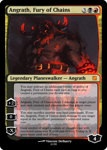
@deg99 With this Angrath design, deg wanted to build more on the Rakdos color combination, through caring about stolen creatures and you know accidentally sacrificing them before returning them to their rightful owners. The power level is quite high, but it’s so enticing that I would gladly playtest this card to enjoy the crazy ride!
@hiygamer Sooner or later, we will see this card printed, I’m sure! When that time comes, I hope it costs a little less, and also that it has an equally inspiring flavor text! Really nice design!
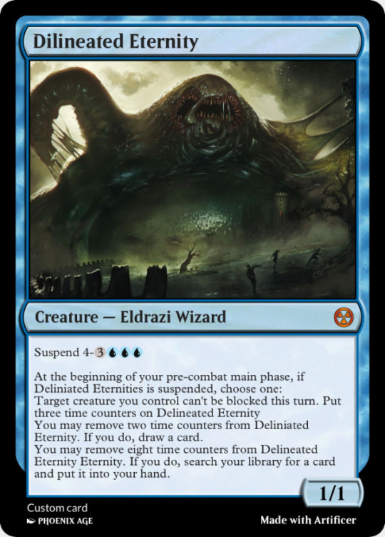
@thedirtside Our friendly snailbear wanted magic to be a little more weird, and what’s weirder than a procrastinating Eldrazi, looming over the battlefield, doing it’s own things. Given, its practically impossible to interact with it and this takes away a lot of points per say, but I love suspend and bizarre triggers that feel like a disturbance in the Force. But we must cling to simpler things to make it happen.
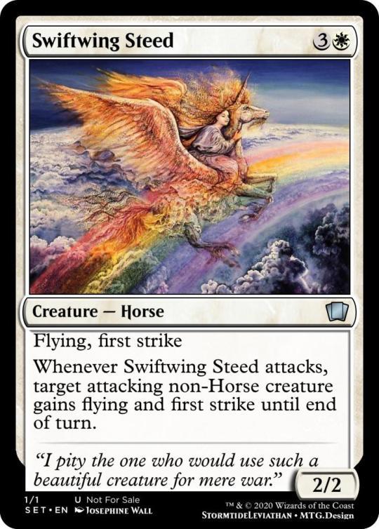
@stormtide-leviathan The proposal of this design is sponsored by “Horse United” inc and pushes WOTC to pass an errata to merge all Pegasi, Unicorn and Horses into one race XD On the actual design, Swifting Steed is a real treat for limited!
@teaxch here tacling on the big issues of mtg, the shared keyword for blue and black! Feint is surely flavorful and it would make combats really interesting, but the main requirement for a shared keyword is to be able to mix with the other established keywords of the color pair. Blue and black have a lot of evasive abilities so an ability that matters when you’re blocked might not get the green light. That said, I definitely want to see this ability here and there in sets. A little guile spices things up! Also, neat flavor text XD!
@dimestoretajic With a quick read I was quite thrilled, but then I realized that you had collective care about itself. That leads into being a bit clunky, and also it goes from 0 to 100 in 1 sec because it’s either you have not 3 collective so no draw for you, or you got 3 , which means 3 triggers and thus 3 cards!! With a small tweak, this brave insect could be holding the fair’s coveted trophy!
@corporalotherbear
It’s true that there are some dryads that care about multicolored shenanigans, and I really like Manatwist Dryad playing into this space and establishing this trend. Because if green can’t care about multicolors, who can?
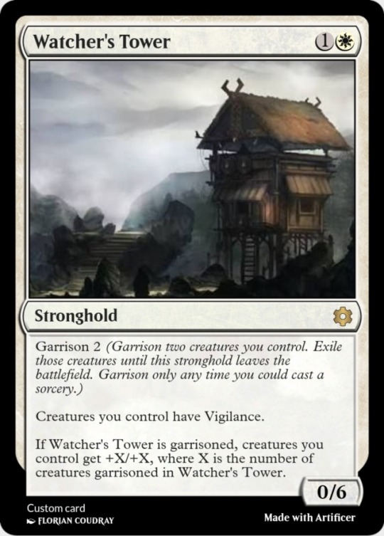
@fractured-infinity Edit: I forgot the commentary for this entry last night. My sincere apologies! A new card type is always an exciting gift for our inbox! Strongholds can die from damage like planeswalker do. They make sense in white and I could see them secondary in blue as large structures are products of community and science.
Watcher’s tower has two passive abilities, the vigilance granting requires 0 effort, while the buff requires you to “man” the stronghold with the garrison activated ability. I wish phasing was still relevant so the creatures would phase out instead of exiling themselves, because things can quickly get out of hand with blink shenanigans.
The +2/+2 buff might be a bit much because it isn’t that hard to get it online on turn 3. But all in all, Watcher’s Tower is very interesting and I hope Wizards will explore this space in the future.
@partlycloudy-partlyfuckoff Sometimes you see a mechanic and it’s not in the color it deserves to be. Mentor in Green seems like a perfect fit, and the non human clause gives this Leonin a greater sense of camaraderie. All in all a good design and future proposal.
@gollumni I saw this card in a very positive light with the first read. I like investigate after all, and I had good memories of it pulling its weight in Shadows over Innistrad, giving White a taste of the forbidden fruit that is card draw. But with the second read, I feel the card is too efficient, taping two creatures and two lands for an instant speed draw is quite good, and adding the overrun option felt a bit too much. But other than power level concerns, I really dig this design.
@corillion This might seem like an everyday card without context, but the change suggested involves first strike and double strike being relevant in fights. I’m all for it, but I got a feeling that the closer we will get to this is like a first strike lord that allows only first strikers deal damage in fights.
@kytheon4-4 said let there be hatebears, but we got hatebirbs instead XD but instead of harassing your opponent, this feathered boi plainly protects your side of the board so you get to play uninterrupted, but only on your turn. Fair and square.

@reaperfromtheabyss Ending the same way we started, with planeswalker support, this time in Red, as it is proposed to be the secondary planeswalker matters color. I can get behind this idea, as red has a sense of wanderlust thematically, and in terms of game, it cares about noncreature spells so planeswalkers are game too. On the card itself, the etb trigger is quite nice, even dealing two damage is fine. About the alternative loyalty ability, a mere ping is something that you would encounter on a weaker planeswalker, so it could at least be a + 2 loyalty ability, to ensure the survival of your planeswalker, as red isn’t really good at defending.
#new years resolutions#group commentary#mtg#magic the gathering#Inventor's Fair#custom magic card#that's a lot of white cards
10 notes
·
View notes
Text
2020 March Update
Happy New Year! Well, I guess it's a bit late for that...
Much of what transpired in the past few months will fall under polish and bug-fixing. Will and I have a mutual friend who got married, so I had the occasion to visit Will to attend the wedding as well as have Will playtest the game in its most complete form yet. He logged 24 hours of playtime and just reached the entrance of the final dungeon. Then we had to call in for the night since it was 5 AM, and I had a flight to catch in the morning.
His completion rate where we stopped was 42% of Heart Pieces, 33% of Energy Gems, and 44% of Moonstones. So... I think we have a pretty lengthy game!
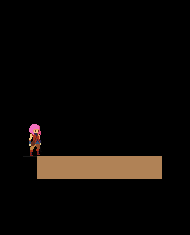
This will take a while to playtest & polish... Will's daytime profession is QA Engineer so he's pretty great at catching bugs. From his playtest, we jotted down 200+ items to fix/adjust. Some as small as a simple misspelling, and some more significant (like Gail being unable to jump when standing at the edge of a steep slope). I'm about half-way through fixing that list...
(Will’s living room where much playtesting was done)
Here are some other things we've accomplished in the past few months. A lot of it falls under polish and bug-fixing, which won't sound outwardly impressive, so I'll dive in a bit under the hood.
-------------------------- Item Balancing --------------------------
There are over 200 items in the game. Of which, 90+ are healing items. While much of their flavor text was already written, their stats weren't yet finally decided. So a large effort was spent to balance them as well as possible. Initially, I balanced items by observation (ex: "The player is relying on this item a lot, so I will nerf it...") Now, I've moved to a more systematic way of doing things. I made an equation that takes in all of an item's parameters, and spits out a score. The higher an item heals, the higher the score. The longer an item takes to consume, the lower the score. And so forth.
As usual, I used google spreadsheets, since they support equations. I could tweak the values of a healing item, and immediately see how its final score was affected. I also made use of automatic color formatting, so a field becomes highlighted red, if it's particularly bad, or green, if it's particularly good. Of course, the sheet is just a guideline. The aim wasn't to make all items have the same final score, but that they made sense for what they were and when you could get them. Late-game items tend to have higher overall scores versus early-game items. Some items, like doggy biscuits, have notoriously low scores across the board - as a joke!
-------------------------- Cooking Systems --------------------------
Another thing that had to be done with the healing items was finally determine their cooking sequences. 38 healing items could be cooked and will transform into something else. The way I specified that an item could be cooked was to add a a little snippet to an item's "meta data". An example would look something like, "COOK,57,62,ABXY,10,1.5,1".
In order, this specified the item_ID that would result on success (57), the item_ID that would result on failure (62), the button sequence (ABXY), the time you had to complete the sequence (10 seconds), how quickly the cursor should move (1.5x speed), and if the item multiplied on success (1). The system appears simple enough - but it was actually extremely inefficient!
For one, this system didn't allow random button sequences - all "berry fruits", when cooked would have the same button prompts and in the same order every time (ABXY). Initially, I thought having set button sequences would be a feature, but in practice, it was less fun.
Two, this system wasn't human-readable at all. I'd see a sequence of numbers, forget what they were, and have to look them up over and over.
But the biggest problem was that you couldn't evaluate an item's cooking difficulty from these numbers without manual testing. At 1.5 cursor speed, how many times does the cursor pass the center panel in 10 seconds? Maybe that's 15 times... for a 4 button sequence, the player has 11 opportunities to miss - that's too wide a berth for failure. The system also had variable penalties - if you misspressed a button prompt you loss time on the cooking meter. If you didn't press anything, you missed the opportunity, but not the time - but the clock was still ticking, so you did lose time, just not as much. In the end, the difficulty of cooking each item was all over the place. It was also possible to create "unwinnable" scenarios if I made the button sequence too long, the time too short, or the cursor speed too slow. Testing each item manually to ensure doability was too tedious and unreliable - it was a mess!
Which is why, the underlying cooking system was revamped. The new meta data looks like : "COOK,57,62,seq_length,5,spd,1.5,ease_add,2". This is a lot more readable. Beyond the first 3 entries, the arguments could be specified in any order. And their meanings were easy to understand.
"seq_length,5" means a random button sequence of 5 will be generated (no need for me to personally generate it)
"spd,1.5" means the cursor moves at 1.5x speed. I could also leave this field out to get a default value of 1x cursor speed.
"ease_add,2" - the biggest improvement to the system is how we now approach difficulty. We streamlined a miss-press and a missed opportunity as the same level of "mistake", and difficulty is framed as, "how many mistakes is the player allowed to make and still have a successful result?" By default, the player is afforded the ability to make 2 mistakes, and "ease_add,2" bumps the number of allowable mistakes to 4. We then automatically calculate how much "time" the player should have to cook something based on its cursor speed, how long the button sequence is, and how many mistakes the player is allowed to make. This was a more sensible and efficient system that let me knock out all 38 healing item cook sequences in one sitting!
-------------------------- Badges Nearly Done --------------------------
As you may recall from the last update, I was working on implementing the badges.
Thinking up the badge and having its graphic drawn is just the first half. Underneath, the code also needs to be made to track all the relevant player stats - how many times the player fished, ate, got money, used a certain move, etc. Some badges require extra guards, because they can be spoofed. For instance, the "Treasure Hunter" badge is obtained when the player has collected XXXX RIN through the course of your journey. However, there is something like a "gold exchange" in the game, where you could circularly trade gold and RIN to boost this number artificially. It's important to guard against cases like those.
So far, 30 of 33 badges are implemented. The last three have to do with late-game things that have inter-dependencies that we're still figuring out. The Speed running badge for instance is still dependent on two things. One, I need to speed run the game a few times to see how fast it's possible to beat the game and decide finally what's a reasonable time-limit. Two, there's actually a time-keeping bug which can inflate the game time if the system is left in sleep mode. I don't expect either things will be too hard to figure out - just gotta find the time for it.
-------------------------- Script Extra Polished --------------------------
We continued to polish the script, which I thought was basically done before. We added some extra NPCs here and there, and fleshed out the world with lore text where it seemed appropriate. In the end, the game's script ballooned to over 100,000 words! Hah... It's definitely DONE now however!
Some interesting things I noted as I was polishing old text - there were quite a few instances where Gail talks. I began the game's development with the idea that Gail should definitely talk since I wanted her to be a more active participant in what she chose to do. But I discovered later that if Gail talks, but only talked a little, she comes off as a very reticent person. There's no middle lane here - you're either all in or all out.
If Gail was a silent protagonist, she still talked symbolically. She is understood to be talking based on how people react to her - kinda like Link. So that's the direction I went with in the end (again). When Gail has occasion to talk, it comes in the form of a player dialogue choice. She also has an inner voice when she needs to remind the player to do something.

Another reason I went with this direction, is for brevity. Take this exchange for instance: QUEST GIVER : Can you help me find this super rare ingredient? GAIL : Maybe. I can't make any promises...
If Gail is silent, I can reduce those 2 lines to 1. QUEST GIVER : Can you help me find this super rare ingredient? GAIL : ...
-------------------------- Business Taxes --------------------------
Not too exciting, but new year means I gotta do taxes for the business. They're a lot more complicated than personal taxes, and more expensive! Since the game hasn't sold anything, you would think there'd be nothing to file. Hah! If only... The business is there so we can act as a legal entity and record expenses for when we do start selling. I really want to focus on making games, but there’s a small percentage of it that is sometimes boring and dreadful (-_-) ... still it needs to be done.
------------- Why no Public Beta Testing? -------------
As you may have noticed, I haven't put out any public calls for testing help despite being at that stage. Some have offered to help, which I appreciate! But sadly, I cannot accept. Here's the story for that.
Two and a half years ago, I got my hands on a console dev kit - that's very exciting, so I hurriedly took the steps to convert my dev station to be console-capable. After about two weeks, I had the console version working and integrated into my workflow, so all appeared good...
4 Months later, an artist needed an updated PC build to test some new art assets, so I went to build a new PC version. We use Unity, so generally you just need to click your desired build target, and hit "build". However, I now discovered that by attaching the console "hooks" into my work environment, I could no longer build to PC... It was possible, from my end, to test the game from the dev station in dev mode, which was why it went undiscovered for so long.
I did try to excise the hooks, but proved unsuccessful after a day of work. I decided to take this as an opportunity to focus exclusively on the console version first, which afforded me some niceties. Knowing that there's a standardized control scheme meant I could make full use of the control stick for the fishing mini-game. I also didn't need to create a rebindable keys menu - which is a MUST for PC versions... Most importantly, it lets me focus on making the one version as good as possible before moving onto the next. I have NO idea how those other guys release on all platforms at once...
Chalk it up to inexperience. In my defense, this will be my first commercial release, so bear with me. Don't worry, I still plan to make the PC version! It's a bit unconventional, but we're just going to go in the reverse direction of the usual. Console first, then PC, then other consoles. Wherever it makes financial sense, there we will be. (Sorry Ouya!)
Back to the original question - that's why I haven't sent out any public calls for playtesting. Current playable builds of the game are locked to my console dev kit. So actual playtesting unfolds in a very closed setting. Like what I did with Will, I literally sit behind the playtester, breathe down their neck, and watch them play, taking notes all the while.
But since I'm observing the player directly, even just one playthrough nets me a TON of bugs and adjustment tasks. So it evens out I think.
-------------------------- Trailers, Release Dates, etc. --------------------------
Alright, get your frowns ready...
We finished two trailers, and they're raring to go. BUT! We can't show them yet... We're sort of at an awkward spot where we're waiting on some conversational threads to conclude. Say we win a slot in a show - that'd be a HUGE plus for us - but that may also be contingent on us having NOT shown anything substantial yet. The game in its unrevealed state is a negotiating chip. So we're trying to leverage that... and you can only do the reveal once...
We also want to have some "actionable" items in the trailer - a launch date you could mark on your calendar, a wishlist, a website you can visit, etc. So since those things aren't entirely lined up yet, we can't let the trailers rip just yet...
Right now, I can only say we're *aiming* for a late Q2/early Q3 launch. But I can't commit to anything concrete yet. As soon as we know, we'll happily sing it from the rooftops. I hope I can update this blog sooner with good news, but if things move slowly again, I'll send out the next "we're alive" update 2 months from now (end of April).
I know it's frustrating to have nothing major after so long still, so I captured some gameplay footage... May it sate your hungers!
-------------------------- Footage 1 : Fishing --------------------------
You've seen pictures of the fishing, but never video of it in action. Well, here it is!
youtube
(And right after I uploaded the video, I noticed there actually was a video of fishing before. D’oh)
The idea is simple. First, get the lure in front of a fish, and assuming the fish isn't scared, it will soon bite. Then begins a fight sequence, where your energy meter is pitted against the fish's energy meter. Whoever's energy outlasts the other's wins.
The fish's resistance is represented by a red moving circular subsection. You fight the fish by pushing the control stick and keeping it on the subsection, which will dart around and try to escape you. Bigger and tougher variants of fish will do a "shake" which will reverse the wheel. When the wheel is reversed, so too are the controls, so it gets extra tricky!
While fishing, your energy meter doesn't recover, so one of the ways you level up your fishing ability is by finding energy gems to increase your max energy. There's another way - but we'll keep that a secret.
-------------- Footage 2 : Kobold Boss Fight --------------
You can actually skip the next section if you'd prefer to be surprised and you find your hunger for info sated. That's how I prefer to consume the games that I know I'm going to get. If you're still hungering for info, and you don't mind the slight spoilers, then feel free to proceed!
The next video shows the new Kobold Boss fight. Let's take a moment to reflect on the old game's visuals and how far it's come...
(we've come a long way since the time of the flash game)
youtube
You'll notice the Kobold boss has a name now - Katash! He's a significant enough character that he's earned it. The second thing you'll notice is that he looks better!
Some people have humorously pointed out that the old boss looks like Wolf O'Donnel from Star Fox. There's a funny story behind that. Basically I asked an artist to draw me a space wolf. And the artist, whom I'm assuming wasn't familiar with Wolf O'Donnel, drew that - all of it - all the animations and everything. The first time I laid eyes on it, it was already done, so it was too late to ask for edits. So I just ran with it.
That was seven years ago. Nowadays, I know to involve myself more in the process. I ask for just the design first, and we don't move forward with animations until we're happy with the design. Life lessons!
By the way, if you like Katash’s personal boss theme, give it a lesson on Will's Sound cloud (LINK)
-------------------------- Fan Arts -------------------------- Lots of fan art came in over the past 3 months!

This one is a pixel animation made by Pimez, and shows Gail singing a Christmas carol in various parts of the game. So cute! Years ago, I too was making little animated gifs for my favorite games, so it really brings me back!
This one was made by cARTographer (twitter link) after a request by Deli_mage, so thank you both. Gail rocking stylish boots with a pose that shows confidence in her batting skills. Very anime - Love it!
Another submission of laptekosz of the Last Song of Earth area. Whereas the last picture depicted the night sky, now the orange trees are lit by a rising sun. Artfully done! Kinda makes me want to eat eggs. I hope you'll like the new Last Song of Earth area just as much :D
A new artist to the scene, Not_Quin, submitted two pictures, one of Gail and one of the Sand Drake re-imagined as a centipede. I'm always a fan of these re-imaginings! I like how it's spiky all over and appears to be wearing a skull mask. The Sand Drake is often pointed out to be too similar to Zelda's Dodongos, so maybe a long slithery body would have indeed served better. Fun fact, long ago, when we were working on Phoenotopia 2 in earnest, we actually had a giant man-eating worm planned - WIP animation depicted below. One day... one day...
Negativus Core made two cool new arts! I'm really impressed by their use of unique perspective! Having characters run towards the screen or reaching close to the screen from afar is tricky since the proportions get all distorted - but not an issue for Negativus Core! Love the blur on Gail to show speed, with 66 in focus - really skillfully done! And the cube. Amazing!
--------------------------
I'm really honored by the huge fan art community. Thank you all!
50 notes
·
View notes
Text
ashlee’s gif making tutorial
@amysperalta has requested a gif making tutorial from me and i’m happy to oblige! everyone has a different way to gif and some ways don’t work for some people, so this is just how i personally make them. i’ve also never made a tutorial before, so let’s hope this doesn’t end badly.
this is the gif i’ll be making for the purposes of this tutorial:
things you’ll need:
a version of photoshop
some way to get frames from a video file (i’ll give some options)
patience
step 1: getting your frames
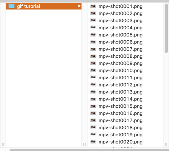
there are many, many ways to do this. there are multiple different programs to do this with (kmplayer, uplayer, gom player) but i personally use mpv (via @kylos lovely tutorial here; which i also highly recommend as a gif tutorial since it gives a different way to create a gif file) because my mac doesn’t accept any other type of program.
note: BE SURE THAT WITH ANY PROGRAM YOU USE, IT IS SET TO SAVE EVERY FRAME. some people may lie to you and say a program grabbing every other or every third frame is fine, but it’s 2019 and we don’t do that any more. the tumblr gif limit is 3mb, which means we can have smooth, non-choppy gifs by gathering every frame from a scene.
okay, so i gather my frames, and typically keep them in a folder, separating scenes cut-by-cut so it’s easier to handle. for example:
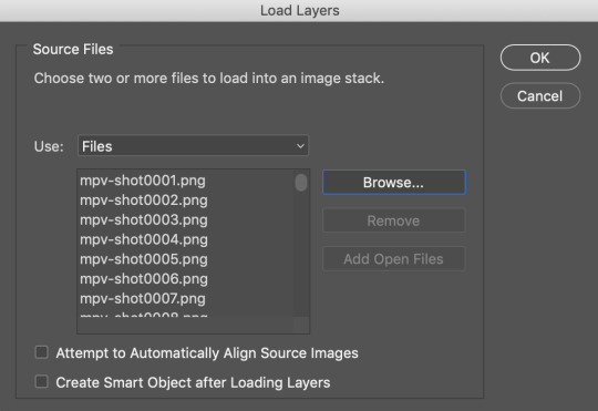
from there, i import them into photoshop using: File --> Scripts --> Load Files into Stack; this screen pops up, in which you browse for your frames hit OK. this will automatically upload all the frames into the same file for you. be patient! depending on how many frames you choose, it can take a few minutes to upload all of the frames.
i always save my work after every step. so once frames are uploaded i save the file. be sure to have “timeline” (or “animation” on some versions of photoshop) opened in your view. my photoshop looks like this when i open the file:

now, i’m going to click “Create Frame Animation” at the bottom. This will give me a timeline to work with at the bottom. Next step, go to the three little lines on the right side of the thingy that says “Timeline” and go through these steps:

and then

now, you have a working gif! you can hit the little play button at the bottom left of the screen and it should play for you.
step two: cropping and sharpening
there is plenty you can do for sizes on tumblr. the general widths are 540px (big), 268px (normal) and 177/178px (small). it’s all a matter of the type of set you’re making. also be aware that the gif limit is 3mb. the bigger the gif, the fewer frames you can have. most of my 540px gifs have between 20-35 frames, while some of my 268px frames can have 75-90 depending on the coloring of the scene.
but for the purpose of this tutorial, i’m making one 268x160. i go to the crop key at the left side, and set my ration up top to 268 and 160.

then i crop the gif! (note: sometimes, files will have a black line on one side of a video file; typically the bottom or on one side. the black line will be no more than 2px big and sometimes hard to see until you’ve cropped it. be sure to drag the cropped area away from the edge of the files that have this dark line, as it when appears on the final gif and looks bad. one of my more recent sanditon gifsets fell to this and i didn’t realize until i had posted it. 😖)
now we have to size it. you do do this by going to Image --> Image Size or using the keyboard shortcut. it should automatically keep the aspect ratio, thus when you change width to 268, the height should change to 160 automatically.

hit OK and now you have your base gif!

next, we’ll be sharpening and setting the frame rate, two very important things. to sharpen a gif, there is no way you want to go do it frame by frame, so you can use an action! these are really helpful. i have one i use for most gifs, and one i use for lesser quality. the one i use for this gif is this one here. to use this, you’ll have your photoshop open, you can go to your actions in your barthingy on the right by color swatches which should look like this:
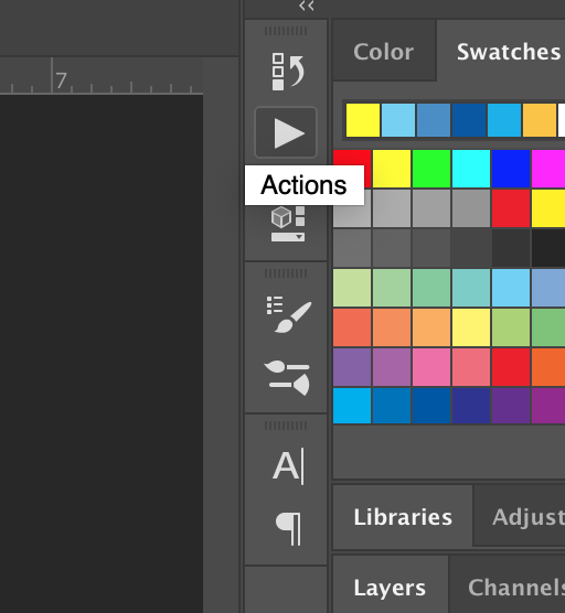
click that and find the three grey lines at the top right. click them and this will pop up. you’ll go to “load actions” and then browse for the action you downloaded.

once loaded, it will show up like this and have a nifty play button!

make sure you click on/highlight the “play me!” line and then hit the play button on the bottom of the box. it will go through the motions for you and sharpen your gif. once that’s done, you can hit the big action button to close this box to get it out of the way. now, to set a frame rate, you’ll go down to the timeline and highlight all of the frames and then click while holding shift and this will pop up.
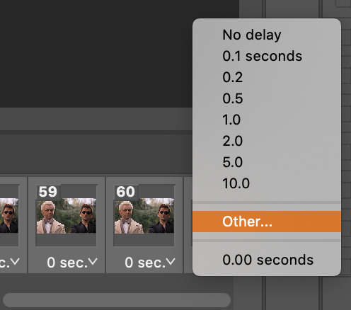
you’ll select “other” and type in “.05″. this is the most commonly used frame rate. most movies and tv shows will look fine using this for scenes, especially ones with subtitles, etc. for more artistic scenes, sometimes i’ll use “.06″ to slow it down just a hair. also make sure that your gifs are set the loop “forever”.
and there you go! a gif fully sharpened and moving at the proper speed:

this is also the time you can choose your frames. meaning if you uploaded like 200 frames and only wanted to use 50 of them, you can go through and delete them in the timeline. there’s a little trashcan button there.
note: once you’ve sharpened and set your frame ratio, be sure to go into your levels box and click the top frame. it is also useful to have the first frame in the timeline always highlighted as you’re editing the rest of the gif.
step three: coloring
there are endless ways to color. there’s loads of people offering psd colorings. (psd means an editable photoshop file btw) you can also make your own. i have a whole slew of psds i’ve made for certain scenes that i’ve kept and reuse, tweaking each time. this isn’t a coloring tutorial, but i’ll show you a quick way to make a simple coloring. (i purposely chose a well lit scene for this gif tutorial for this reason. making dark scenes look good, or scenes with bad color balance is a whole other tutorial lol)
first off, make a folder above your frames. you can name it whatever you want; it will automatically call itself “group 1″. this is where you’ll be putting all of your coloring layers so they stay together and you can also save it to use again.
from here on out, we’ll be adding layers, using the half black/half white circle down at the bottom; just click on it and it’ll pull up a list of things you can use. note that when you add coloring layers, you start at the bottom and add other layers on top of it.
always start with “levels”. i lighten up almost every scene i gif, since it gives me the chance to play with contrast on my own terms.
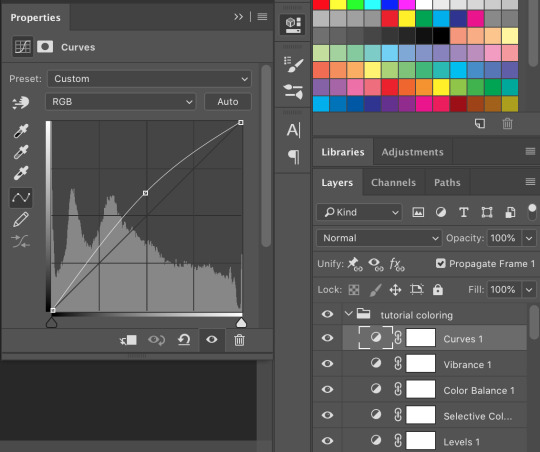
then we’ll do a “selective color”; this one is just to set some blacks while giving contrast. be sure to select “blacks” at the top and change just what’s below:
most gifs also need some “color correction” at this point. (this is a layer you’ll keep coming back to to tweak as you add more above it fyi.) for this one, i’ll make it a bit more green and red.
the gif right now looks like this....which isn’t perfect, but i can see where it will get to from here:

now we’ll add a layer of 100% “vibrance”

not every gif needs 100% vibrance, but i tend to like how colors look when i use it and we can fix any weird colored skin in later steps. and now some curves for contrast:
the gif now looks like this:
which is much too yellow certainly, but gifs always look worse before they look better when it comes to coloring! next, we’ll make another layer of “selective colors”. this is when you’ll play with each color within the same selective color layer. i’m guessing i’ll utilize more blues and less yellows under “yellow” and “red” but let’s see what happens:


now it looks like this!

which is a lot better. i’ll probably up the blacks +10 (using the same selective color layer) just a bit so crowley can be his angsty self entirely. i also want to up the greens because i love bright gifs.
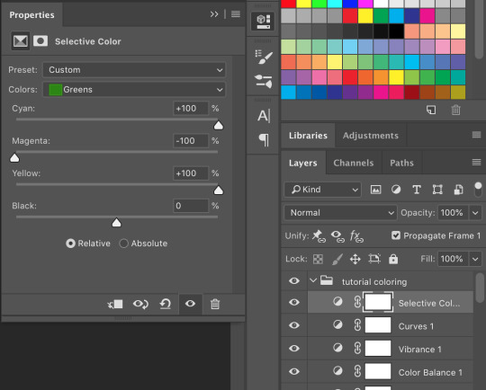
the great thing about selective colors is that they’re easy to manipulate. and you can even have multiple of them over one another to really zero in on one color. and if you find that you can’t get the gif to look right at all, you can also return to your color balance layer and tweak it until it looks better and is easier to manage.
so now, my finished gif looks like this:
(this is not the most exciting gif ever, but it works to show how to play with colors in a well lit scene).
there is a number of other things i do/can be done in making gifs, but these are the basics.
be sure to go to File --> Export --> Save for Web and follow my settings to save your gif. (there are many ways to save a gif, and each gif tutorial will give you different settings. i recommend trying them out and see which works best for you.) pay attention to the “bicubic” quality at the bottom. and when your gif is small enough (under 3mb), be sure to click on the “original” tab at the top and save it while on that screen.


and, because i’m feeling nice, let’s have a quick subtitles moment:
bonus step 4: subtitles
i know there are easier ways to make subtitles but this is how i do mine. using the ruler around your photoshop space, drag one vertical line over your gif. the program should automatically “snap” them to the middle of the gif to create your perfect center.

then take the text tool and write something in it, no matter where or what size, just so you have something to manipulate. you’ll find that it too will snap to the center to match the ruler line, giving you a centered text box! you can have it whatever distance you want from the bottom (don’t go too close or tumblr will cut it off) and then you can edit the text color/font/etc. these are my settings.

and i also have an added stroke and drop shadow to it which you can get to from Layer --> Layer Style:

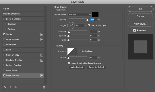
and so it looks like this:

it is important to add your text layer ABOVE your coloring folder, otherwise the coloring will affect the text. and it’s good to have different colors for different people talking.
i hope that all made sense! feel free to send me any questions (i’m sure i must have made you confused or missed a step or something), or if you have any other tutorials you’d like to request.
#gif tutorial#photoshop tutorial#photoshop#itsphotoshop#tutorial#my tutorial#thanks for requesting this!#it's very long but i hope it helps
68 notes
·
View notes
Text
Editing tips, I guess?
Hey uhhhhh, so I've gotten lots of new followers over the past few weeks and wanted to do some kind of thank you?? Also, I have seen a fair share of "omg HOW" in the tags on my edits (which??? always make my day?? my week??? my life????)
Anyway, I thought I'd share some of my ~techniques with y'all? So here goes:
(lmao this got really fuckin long so cuuuuuut)
1. Make EVERYTHING a Smart Object
Okay, maybe not EVERYTHING, but seriously. Do it. It will save ur editing life. You ever shrink something down and then an hour later change your mind and decide you want it bigger? If you're not using a smart object, it’ll get blurry when you scale it back up and you’ll be fuCKED!
To make a layer/group a smart object, just right click on it in the layers panel and select "convert to smart object". This makes Photoshop store the layer's original data in a separate space for safe keeping (an embedded .psb file, to be exact) -- so you can shrink it and enlarge it as many times as you want without any lossiness.
As soon as I paste/place a screencap, texture, or whatever into my document, the first thing I always, ALWAYS do is convert it to a smart object!!
Why, you might ask?? Continue to item No.2 :)))
2. Harness the POWER of Smart Objects!!
The reason I am obsessed with Smart Objects is because I am obsessed with making any edits as non-destructive as possible. If you use “Image > Adjustments > Levels/Selective Color/etc” on a regular layer, that’s a destructive edit. Same goes for any Filters (such as blur/sharpen) and transforms (Warp, distort, perspective). You lose the original data that was there and the only way it can be undone is with ctrl+z. Might not seem like a huge deal at first, but if you keep chugging along for an hour and decide, “hmm, maybe i went too hard on that levels adjustment after all...” your only options are deleting the layer and starting over, or uh... hoping it’s still in your history panel.
However, it's really easy to avoid destructive edits when you use smart objects!! Because all those adjustments, filters, and transforms become “Smart Filters”. Smart Filters have all the non-destructive advantages of performing these adjustments via adjustment layers, but have the added bonus of ONLY effecting the layer they’ve been applied to, instead of cascading down and effecting all the layers beneath. (Which can be a good thing sometimes, but that’s a whole other topic)
Smart filters are attached to their ‘parent layers’, and can be hidden, deleted, or modified (by double-clicking their names) at any time:

Can I hear a wahoo???
Other cool things about Smart Objects:
You can copy a Smart Filter with all its settings to another layer by alt+click+dragging it over
You can change the order in which Smart Filters are applied by clicking and dragging them around
You can edit a smart object independently/in a sort of 'isolated' mode by double-clicking on its thumbnail!! I like to use this for edits that are specific to a given screencap-- like cutting out the background and any initial adjustments, like levels and selective coloring. Once you’re done editing the contents of the smart object, hit ctrl+s and it will automatically update in the main document!
But really, the biggest thing for me here is psychological. I know I’m much more willing to try things and experiment when I know that I can easily go back and tweaks things at any time. Otherwise, I’d stick with adjustments I don’t really like all that much simply because it would take too much time/effort to redo them.
3. Don't even THINK ABOUT using the eraser tool or I will STOMP YOU to death with my hooves!!
Use a layer mask instead. Please I am begging you. It all comes back to making your edits as non-destructive as possible. If you erase something, it's gone forever. When you mask something, you can make changes to which parts are visible/not visible as often as you want.
For the newbies or the otherwise unacquainted, a mask is a greyscale ‘map’ attached to a layer (or layer group) that controls its opacity. Black areas give the layer 0% opacity, white areas will give it 100% opacity, and you can use shades of grey to achieve partial transparency. You ‘draw’ on these layers with the your trusty brush and paint bucket tools.
You can create a mask by selecting a layer and then clicking the little mask icon at the bottom of the layers panel (it’s the one with the little circle inside the box). Draw black on the parts you want to hide, and if you erase too much on accident? Just paint back over it with white!
I love masks, and sometimes i will throw an already masked layer inside a layer group and apply a second mask to said group. This way I have two masks that can be edited independently from each other. Like layer mask-ception.
So anyway, yes. Eraser tool? Don’t know her.
4. Try using channels to create masks!
This is a technique that works REALLY well for cutting out complex shapes, such as wispy hair (or feathers!) -- provided there's strong contrast between the subject and the background, and the background isn't too busy.
This is also a fantastic method for capturing alpha transparency. For example: If you have a neato paint stroke/splatter/watercolor texture you want to use as a mask, but has a solid background that’s getting in the way of things. This method will capture all the semi-opaque areas flawlessly!!
While editing your image (which you had better have made into a Smart Object!!!) do the following:
Switch from the "layers" panel to the "Channels" panel.
Toggle through the R, G, and B channels, and decide which one has the most contrast for the areas you are trying to mask.
Ctrl+Click that channel's thumbnail. This will create a selection marquee.
Switch back to the layers panel
Click on the target layer/group (the one you are trying to mask)
Click the mask icon at the bottom of the panel (the one with the circle inside a box)
Release the selection and invert the mask if necessary
If you're using this method to cut out a subject from its background, you probably won't want alpha transparency. In this case, select the mask thumbnail and use a levels adjustment on the mask itself to bump the contrast until you have more of a cutout effect!
It sounds like a lot of steps, but it’s really simple! So I made this handy GIF: (click to view from beginning)
Sometimes you won’t want to use this method for the entire image, but just a specific part. For example, if you’ve cut out a character with some other method (magic wand, manual brushwork), but are having a hard time with their hair in particular. Use this method to create the selection, but instead of converting the whole selection into a mask, use the brush tool to apply the mask only where you need it! You can invert the selection itself with shift+ctrl+i.
5. Outlining text
The font I used here is Salomé, which is actually a solid typeface with no outlined version. But you can make virtually any font into an outlined version if you so desire!
There's two possible methods here, actually:
The Easy Way:
Add a stroke layer effect to the text layer (by selecting the layer, clicking the little “fx” button at the bottom of the layers panel, and choosing “Stroke...”)
As far as settings go, aligning the stroke to the inside usually yields the best result/maintains the integrity of the letterforms.
Make the color of the text itself match the background.
If necessary, use the lighten/darken blend modes to create the illusion of transparency.
If you need true transparency (which I didn't until I decided I wanted to apply a gradient over the text), you'll have to try something else-- The Also Easy But Less Than Ideal Way:
Right click the text layer in the layers panel and select "convert to shape".
Now you can edit the fill/stroke the same way you would any other vector shape.
Again, you’ll want to set the stroke alignment to ‘inside’. For vector shapes, those settings are a little hidden. You’ll wanna open up that little dropdown in the toolbar with the line in it, and click “More Options”.
This is semi-destructive, so if you're working with a lot of text you might have to edit later, consider duplicating and hiding those text layers first so you'll have a 'backup' of it.
And while I’m on the topic of text...
6. Try breaking up your text layers!
I know a lot of people like to draw a neat little text box to put their text in, and then they center it all nice and neat and probably use a small font size to make it subtle and stuff... and that’s cool. Everyone’s got their different styles and things they like to emphasize in their edits and there’s absolutely merit to that sort of thing (case and point: the bulk of my dear @herzdieb’s work), but. Listen.
I love typography. I love a good typeface. The stroke widths, the letterforms, the ligatures, the serifs... I get like, horny on main for a good typeface. I like to make the text on my edits BIG, so that those details can shine. I also like doing interesting things with the text. Jumbling words/letters around, distorting them, deconstructing them and just... letting the text really ~interact with the rest of the composition instead of just kinda politely floating on top of it.
I’m not saying you have to do that kinda stuff. Or that I think neat little floaty text boxes are boring, or lazy, or whatever. It’s just... personally, I get really inspired by type. Fun type treatments are one of those things I LIVE FOR, something of a ~signature of mine, and I encourage everyone to just... try it? To use text as more of an integral Design Element and less of a... idk. A caption?
So if you have a quote, or even just a word... put each word (or letter) on its own text layer. And then: make ‘em different sizes. Make the words so big they don’t fit on the canvas. Rotate each one at a fun angle. Scatter them around. Go nuts. Use masks to chop parts of the letterforms off. Make ‘em overlap. Just have at it. Or, as the kids these days are saying: go absolutely fuckin feral.
If that really just isn’t your style, or doesn’t work/make sense for the edit you’re doing, fine. Delete all the layers and just do a text box or whatever. But. I’m tellin u.
Give it a try.
At least once.
Just... a lil taste.
7. Understand the difference between lighten/darken vs screen/multiply
For a while in my photoshoppin' youth, my understanding of these blend modes basically amounted to "darken makes things darker, and multiply makes things really darker", and vice versa for lighten/screen. But there's an important difference between how these blend modes work, and if you understand them, you can use them more... strategically? I guess?
Darken and Lighten are kinda misnomers tbh, because they technically don't really darken or lighten anything. What they actually do is make it so that only the areas of the layer that are darker or lighter than the content of the layers beneath them are visible. This produces some pretty nifty layering effects that you can't achieve with screen and multiply.
Here’s an example: (if you’re reading this on a phone with the brightness dimmed down you probably won’t be able to see the differences)
Without any the texture applied, you can really see the noise/graininess of Crowley’s jacket in the screencap. You can also see the ‘seam’ where Crowley fades into the background-- the jacket is a green-ish black, while the background it’s fading into is more of a purple-black.
With the texture set to ‘Screen’, the whole image becomes lighter across the board. Crowley’s jacket gets lighter, and so does Aziraphale’s jacket and the pink cloud thing. This does little to nothing to obscure the poor image quality and disguise that ‘seam’.
But with the ‘Lighten’ blend mode, ONLY the dark parts of the image appear lightened, and not only do they appear lightened, but they get kinda equalized. Notice how the patchy jpeg artifacts on Crowley’s jacket disappear, how that color seam smooths out, and how the brightness of Aziraphale’s jacket and the pink cloud doesn’t change at all.
This isn’t to say that lighten/darken are better and that you shouldn’t use screen/multiply. They each have their uses. But most often, I find myself using lighten/darken because the way they work is honestly really helpful? And just cool af?
8. Masking individual frames on gifs
If you ever feel like torturing yourself by making a gif that has frame-by-frame masking, my advice is don't try to mask each frame from scratch. You'll get patchy/wobbly results from the masks being slightly different on each frame.
Instead, mask the first frame, then alt+click and drag that mask onto the next frame. Make any minor adjustments to the new mask as needed, and repeat for each frame. This saves time and more importantly, keeps the masking consistent on areas with little to no movement, which makes a HUGE difference in how smooth the final product will be.

If you look at the edges of the animation, they’re nice and steady and consistent. It’s only the parts that have a lot of movement (like the back of his neck) where you can see any ‘ghosting’/wobbly-ness happening.
Sometimes the mask will move when I copy it to the next frame. Like, for the whole document. It gets nudged 20 pixels down or to the left or s/t every time. I have yet to figure out why, but I’m betting it has something to do with shooting myself in the foot with the frame 1 propagation settings at some point during editing?? ANYWAY, when this happens, just unlock the mask from its layer (click the little chain icon between their thumbnails) and move it back into place.
In these cases, I also like to pick a spot with a hard edge (such as the shoulder in the above gif) as a reference point of where it needs to be moved to. It kinda sucks having to do this for every frame, but you already signed up for some suckage when u decided to mask every frame of a gif, so I mean... 👀
9. Don't be afraid/too intimidated to do manips as needed!
Manips can be tricky if you're really striving for realism. There's light sources and color grading and perspectives to reconcile!! But when you're doing an artsy Edit with a capital E, odds are those kinds of discrepancies will be thoroughly camouflaged by all the levels, black and white, etc adjustments you're doing!
Something I run into often is, "I like this screencap, but the top of their head/hair is chopped off :(" But if I go back through all the screencaps from the scene, there's usually another frame where the camera is planned/zoomed out enough that I can steal the rest of their head/limb from it! And since it's from the same scene/shot, the lighting and color grading should already be a perfect match!
A super simple example:
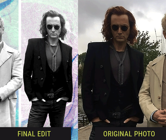
So I wanted to use this picture of David and Michael for this edit, but 1) They’re standing on the wrong sides for their characters, and 2) part of David’s arm is covered up by Michael’s.
Of course, the easiest course of action would be to just mirror the photo so they’re on the correct sides, but 1) mirroring faces tends to yield wonky results, and 2) that still wouldn’t give me a perfect, free-standing cutout of Crowley to place wherever I want in my composition (as opposed to being forced to awkwardly position him off the edge of the canvas to hide the fact that the other arm is missing)
Fortunately, it only took all of like, two (2) minutes to draw a crude selection around his good arm, copy and paste it into a new layer, flip it around, and add any necessary masking to get the shape right.
My point here isn’t to teach y’all how to do manips, or to pass this off as an impressive example of one. Because it’s really, REALLY not. My point here is to demonstrate that even something as tiny and simple as this can really open up your options for what you can actually do with an edit/composition.
So next time you’re feeling limited/inconvenienced by the crop of a screencap, just... you know. Consider whether or not it’s worth attempting a quick and dirty manip to fix it.
Another Example:

Sometimes you’re torn between two screencaps. You like one element from Screencap A but also want some other element from Screencap B. What to do? Just frankenstein ‘em together. Layer one on top of the other, get them lined up, and mask out the necessary parts.
It’s easy to get hung up on stuff like “Uh... should Crowley’s shoulder be doing that?” but let me assure you that like... the people looking at the final product are none the wiser to your butcherwork and will not notice. Especially if you’re going to add a bunch of contrast and color adjustments later on. (in fact, sometimes I’ll apply those adjustments first so I’m not distracted by any discrepancies that are going to come out in the wash anyway)
“I dunno... 🤔🤔 doesn’t seem anatomically correct... 🤔🤔🤔🤔” thought no one.
Point is... point is... dolphins you can get away with a LOT more than you think you can. Don’t let the desire to make these kinds of manips perfect get in the way of just... making them good enough. The bar isn’t that high, I promise.
10. Know what inspires you
What types of edits get you EXCITED? What kind of work do you see on your dash and go, "oh, I'm reblobbin' THAT!!1!"
I know for herzdieb, she's all about emotional pieces. She likes matching words/lyrics/poetry to on-screen moments and punching you in the feels with both. She hears a song, or reads a poem, and the lightbulbs go off for her, and she does her thing.
As for myself, I just live for the aesthetics of an edit. The colors, the fonts, the composition. I almost never know what text/screencaps I'm going to use when I start an edit. I just see a font I like, or a color palette, or a texture, and think, "I wanna use that!"
And once you know what inspires you, collect that inspo! I hoard textures and fonts. I have them organized into neat lil folders. When I wanna make an edit, that’s where I start. I just browse through them all until one or two start calling my name. Herzdieb collects songs and quotes and poems. Maybe your thing is color palettes, or aesthetic-y photos. Or whatever.
The point here is make the kinda stuff you like/want to see. Not the kinda stuff everyone else is making or the kinda stuff you notice gets the most notes.
11. Be able to let go of things that aren't working
I often begin an edit with a rough idea of the style, colors, or layout I'm going for. And I almost always end up doing... something totally different.
So don't get too fixated on what your initial ideas are. Be open to experimenting and just let the edit be what it wants to be. If something looks nice, do it. If it doesn't, don't try to force it just because, "well, I was inspired by this piece that did xyz and I wanna try it too".
When you see a certain effect that inspires you, just keep it in mind as a possible solution for the next time you make something-- don't make it into a benchmark, or some imaginary 'goal' you have to meet for This Edit You Are Working On Right This Moment. In fact, sometimes the elements I end up ditching are the very ones I started with, that initially sparked my inspiration. And that's okay. Inspiration can be a moving target, and if your vision for something changes, let it.
You wanna know what inspo reference I was looking at when I started that “Temptation Accomplished” edit?
Fucking this: https://search.muz.li/YTdiNjkwN2Rh
You might be thinking, “how the fUCK was that the inspiration??!! Your edit looks nothing like that at all!” ...and you would be 100% correct, and that is 100% my point. I spent a good hour or two trying to incorporate that cutout text layering effect before finally accepting the fact that it just wasn’t working for the edit I was making. And it wasn’t until then that it actually started to come together.
12. Be patient, and take the time to explore all your options!
I’m not gonna lie, y’all. I spend hours on my edits. I usually complete them over the course of 2-3 days/sittings. I rarely have a plan. 99% of the time I'm just throwing things at the wall and seeing what sticks. When I get stuck (when, not if), it helps to step away from it and come back later with a fresh perspective/set of eyes.
Every single edit I've posted, I have at some point felt like giving up on because I thought it looked like garbage (and not just because I was being self-deprecating/doubting myself, but because at those points, they simply weren't finished/something about the composition just wasn't working for me)
Work through those moments, and if necessary, take a break/sleep on it. It's always after I've exhausted my early ideas that the really good ones start to come to mind!
Here’s how the character poster edits I did progressed:

In Classic Me™ Fashion, I literally started off with just... textures I liked, and a font that I liked. Now, there were obviously a lot more ‘steps’ involved in both designs, but hopefully at the very least this gives a sense of how things get from point A to point B.
So uh... thanks 4 comin 2 my TED talk. I hope u learned at least one (1) cool new thing or maybe just feel vaguely inspired by this rambling mess?
157 notes
·
View notes
Photo
I was writing a funny caption for a photo, but I suddenly lost consciousness and wrote a long backstory to it. So I'm sorry, but the backstory goes below, and the caption (which is also a bit long, to be honest) begins after the words "Two months later."
And I really need a beta to check the text.
Cam stared at the monitor with interest, her head tilted slightly to her left shoulder. Donna was surprised that she wasn't tapping the keyboard or clicking the mouse, so she went and looked at the screen:
- What are you doing?
- Oh, this... - Cam turned her head and glanced quickly at Donna, returning her gaze to the screen. - I thought that my development of bots for games can be used to test the "what if". Look, it's me and it's you...
The characters on the screen were more drawn than the pilgrim, and although they did not have a portrait resemblance, they did resemble Donna and Cam in height, hair color, hairstyle, and so on. It was both like and unlike their avatars from Mutiny chats. Cam continued to talk:
- I made a set of functions that makes them react to their surroundings, something like a character. Then I create a situation around it and see what happens. For example, it's a mainframe launch party where Cam was hiding in the crowd, but Donna found her and just made her give a speech. I didn't code a speech, so their supposed words and emotions are schematically represented by emojis that appear above their heads. You see, she wasn't happy at first, but then she started smiling. And I haven't done the rest of the characters yet, this crowd is the simplest type of bots. That's why the Bos doesn't sing here.
Cam smiled, and Donna smiled back.
- Have you sent them out to buy stolen XTs yet? - Donna asked. This episode was one of the highlights of their time together.
- Um, yes, - Cam said, a little embarrassed, - but I did a bad job with the salesman bot, and it stuck off while they were waiting for it at the bar, so they just got drunk there and gave out a set of unintelligible emoticons.
She didn't mention that the hearts were in the lead in these emoticons.
- How did you make alcohol? - Donna asked, interested.
- This is a special feature that strengthens the most powerful parts of the character and adds a certain number of random smiles, - Cam explained. - I know it's an odd description of the effects of alcohol, but I thought it would be appropriate for a computer character.
Donna nodded in agreement.
- How do they make decisions?
- Depends on different indicators. For example, if you make a hole in the path, whether the character will jump over it is determined by the level of caution. Look...
Cam quickly tapped on the keyboard, recompiled the code, started the program, and the image began to shake.
- This earthquake. They are standing on a platform that may collapse, so the characters have to make a decision - to jump down or stay on the shaky structure.
Donna held her breath. The figures were moving around the platform, and emojis with a scared expression appeared above their heads. Suddenly one of the figures jumped down, the second remained, but after a couple of seconds jumped down too. Cam stopped the program.
- Wow! - Donna gasped. - I thought your character would jump first.
- I'm afraid of earthquakes, - Cam said.
- I know, but wasn't that supposed to encourage you to jump?
- It's too logical for such an emotional moment.
- So you think I'm more logical? - Donna raised an eyebrow.
- Don't you? - Cam looked at her.
Donna thought about it, trying to imagine what she would do if the situation were real. She nodded slowly:
- Yes, I think you're right. But Cam, it's great if your software can predict decisions like that!
- I don't know how great they are yet, so I'm testing them on the situations that actually happened. I know myself best, so I made my own character first. But when she's alone, there's no interaction, so I created you. It became much more interesting. I'm not sure I know you that well, but I know you better than anyone else. Want to see the settings? - Cam suggested.
- Of course I do! - Donna said enthusiastically.
Cam opened the list of parameters, sat Donna down in her chair, stood next to her, and began to show:
- There are different properties and qualities and for each there is a scale from -100 to +100. You need to set the appropriate values. This is permanent. And here variables - situational emotions. You know, you can be nice to a person, but sometimes you want to strangle them.
- I know, - Donna giggled.
- Emotions can change from the interaction of characters. If at first one is angry and the other is cheerful, then after their communication they may become both angry, both cheerful, or both indifferent. This is quite interesting to watch. Well, you think about it while I bring a soda. Can I bring for you too?
- Yes, please, - Donna said, lost in thought, looking at the sliders of various personality traits. It was interesting to know what Cam thought of her.
Cam was a little nervous as she went to the kitchen for soda. What if she upset Donna with the parameters she chose? She had wanted to show Donna her toy for several days, but that was what stopped her, that Donna might not like her character.
Cam opened a can of orange soda and quickly drank half of it. Well, there's no going back, but you can always try to apologize. She took her can in one hand and a whole can for Donna in the other and went upstairs.
- How much did I mistaken? - Cam asked carefully, setting the can down on the table in front of Donna and searching her face for signs of anger. But Donna looked at her with a smile:
- Actually, you're pretty close. I wish that if I were creating your character, I would be just as close.
Cam let out a sigh of relief and took a sip of her soda. Donna opened her can and took a sip. She chewed her lip hesitantly, then took a chance and said:
- You know, I've been wanting to know for a long time... If the two of us had gone to Diana's house in Sonoma, would we be able to make it up?
Cam glanced at her quickly and put her hands on the keyboard.
- Let's see. I've never been there, can you tell me?
Donna described a beautiful house, a pool ("Pool? Is there an accident barrier?" Cam raised a skeptical eyebrow, drawing a laugh from Donna) and the green grass around them. The image of the house where Cam and Donna were standing appeared on the screen. They went inside.
- Wow, the house isn't empty? - Donna asked.
- This is the Mutiny house from the previous simulation, I just fixed the dimensions, - Cam explained. - But there's already furniture and stuff inside. You can also interact with items. With most of them.
- Great! - Donna commented.
- We need to tweak the characters' functions a little, add some emotions, - Cam said, clicking on the list that opened. - We were...
- Angry and depressed, - Donna added.
- I was going to say "angry and offended", but it's better if you fix your character yourself, sit down.
Donna hesitated for a moment, remembering her emotional state at the time, then adjusted her parameters and clicked Save. Cam leaned over, pressed a few keys, and started the simulation. The two of them stared at the screen.
The characters went their separate ways again. Then Donna went into the kitchen, stood there,and the screen flashed a change in some indicator.
- What was that? - Donna asked.
- Beer, - Cam said. - This is a refrigerator from the Mutiny house, it is programmed for endless beer.
- It's a good thing our real refrigerator didn't have that capability, or the guys would have gotten drunk very quickly, - Donna said.
- Was there beer in Diana's house? - Cam asked.
- Mmm, I don't remember. There was wine. And I met Diana's youngest daughter there with her friends, and they had pot. How would you program the pot?
- I don't know. Like stronger alcohol? Something that removes all inhibitions? To be honest, I haven't tried pot, - Cam shrugged.
- Really? - Donna stared at her with wide eyes.
- Well, I'm mostly a fan of orange soda and alcohol. And you?
- I tried it at Berkeley. Everyone tried it. And then in Sonoma... The guys shared it with me.
- Oh! Does it look like it needs to be programmed after all? - Cam's eyes narrowed slyly.
- Do you think the character looks so much like me that she'll have the same hallucination? - Donna glanced at the screen and froze, trying to figure out what she was seeing. Cam followed her gaze:
- Oh, hell! How did this happen?
On the screen, Donna and Cam were standing in the doorway of the house, very close to each other, and so many heart emojis appeared over their heads that they didn't have time to dissolve.
Cam reached for the keyboard, leaning over Donna, and started tapping the keys.
- I see, - she said. - Too much beer. It is necessary to put a restriction on consumption, it is simply physically impossible to drink so much at once...
- How much did they drink? - Donna asked.
- 3 liters each, - Cam looked back at Donna and realized that she was almost lying on top of her. She hurriedly straightened: - I'm sorry...
- It's all right, - Donna said. - Come on, you sit in the chair, and I'll get another one. Clean these drunks of alcohol for now.
Donna smiled, got up, and went to get a chair, trying to get rid of the thought of what it would be like if they got drunk together from time to time.
Soon they were sitting together again in front of the screen. Cam restored the previous parameters of the characters and now they were trying to encode the action of the pot.
- Does it always cause hallucinations? - Cam asked, scribbling lines of code.
- No, of course not. It only happened to me once. Maybe the weed was strong. Or mixed with alcohol. Or... - Donna resisted the urge to say, "I wanted to talk to you so much."
- So, let's see what happens - Cam compiled the code and ran the program.
The characters again avoided each other, and when they met they threw angry emojis. They went into the kitchen a couple of times, but the alcohol was blocked. There was pot in the living room. Cam found her first, and then she left the house. Then Donna took the dose. She also went outside and ran into Cam. The real Cam and Donna held their breath. But the characters were fighting again.
- I should probably check the alcohol program to see why it works like... - "love potion," Cam wanted to say, but she didn't. Because at that moment, her character fell into the pool. Donna was almost crying with laughter.
- Cam, your code is genius, and events happen just like in real life!
Suddenly, Donna's character also jumped into the pool. Donna stopped laughing. Her character got to the character Cam, they hung together in the middle of the pool and dozens of hearts bloomed above them.
Cam and Donna looked at each other. They had been sitting side by side to look at the monitor, and now, turning their heads, their faces were very close.
- You say my code is genius? - Cam stammered, leaning slightly closer.
Donna reached out and gently touched Cam's cheek, her eyes never leaving Cam's face:
- It's like a piece of music
- Then you are the melody.
- Do we really need alcohol? Or weed? - Donna was already so close to Cam that their noses were almost touching.
Cam shook her head:
- It all ends the same, doesn't it?
Donna nodded and closed the last few inches between them. They both imagined hearts appearing above their heads.
****
Two months later.
The production meeting was getting worse and worse by the minute. Donna and Cam couldn't come to an agreement. They were angry with each other, and on the table were papers covered with arguments, but no one would give in. Full of emotion, Donna abruptly got up from the table, went to the window and stared out of the glass, actually seeing nothing. There was a heavy, oppressive silence in the room. Then she heard the soft sound of paper being slowly torn. Apparently, Cam was trying to deal with her emotions in her own way, and she was literally tearing Donna's arguments to shreds. Great.
Focusing on her steady breathing, Donna managed to calm down a little and think. How important is this? Pretty important, yes. Development strategy for the near future. But it doesn't have to be decided today. And it's certainly not worth their relationship with Cam. The thought of not being able to hug Cam at night because of this conflict made Donna's heart ache. She mentally composed conciliatory phrases, then resolutely turned around, took a step to the table and... all the words died on her lips.
Cam held a piece of blank paper in her hands, which she was tearing, and looked at Donna with a slightly apologetic smile. And between her and Donna's chair was a chain of four crooked paper hearts with uneven edges, since Cam didn't have scissors and didn't cut them out, but tore the paper. With a few movements, Cam finished making the fifth heart and pushed it across the smooth table in Donna's direction.
Donna caught it, pressing it against the tabletop. "Oh, Cam," she breathed, and clutching the paper heart in her hand, she walked over to Cam and gave her a big hug. "Do you have any more paper? I want to make a couple of them, too."
6 notes
·
View notes
Text
Patch Notes
PC:1.69.54.1020 / Mac: 1.69.54.1220 Console: Version 1.35 Happy Holidays Simmers! It’s time to go back in to Create a Sim! Where in this update you will find 100+ new skin tones, customization sliders for skin tones and makeup, and three improved base game hairstyles! Every skin tone now has a value slider that allows you to change the light to dark value of that skin tone, unlocking a much wider variety of skin tone options for you to play with! You will also find that our skin tones are now filterable to warm, cool, and neutral tones (as well as miscellaneous that covers our occult skin tones).
The new makeup sliders add more choices and opportunities for you to customize your Sims, and express your Sim’s style! Hue, saturation, value or brightness, and opacity are now available to modify on the makeup. We have locked some of the sliders where it did not provide an optimal experience or make sense for the makeup. Expect us to continue our work on these issues into the future to provide you with more. In addition to the customization opportunities provided, you can also save custom swatches as you tweak your sliders to get the perfect look. When you click on the swatch (for skin tones and makeup) as you modify the sliders, you will have an opportunity to save your custom settings, so you can re-use it later without having to remember your perfect looks! Did we mention that we made some hair updates? We did - we updated a base game child hair (cfHair_BraidedPonyTail), and we added a second version of that hair that removes the baby hairs (cfHair_BraidedPonyTailPlain). And we updated a base game male hair that you may find difficult to recognize from the original hair (ymHair_flatTopTextured)!

We have updated the Main Menu!... Again! The idea behind this change is to create a more cohesive experience and give Packs a more proper space as we continue to grow our content lineup. As a nice bonus, we highlighted the Gallery in a more meaningful way to inspire you.
-SimGuruGnome & SimGuruRusskii
Now onto the fixes:
Sims 4
Sketching so much that the Digital Sketch Pad just quit on you? Never fear! Freelancer Sims that use the Digital Sketchpad will now be able to complete designs without being reset abruptly.
Happy Birthday to all! Sims will now properly Age Up. Adulting is hard but they will make it, don’t worry.
Fixed an issue in which Doors, Windows, and Arches had cutouts when being reflected in Mirrors. Rorrim Rorrim no eht llaw, ohw si eht tseriaf erutaef fo meht lla?
Sims that do not have the Fishing Skill, or have not been Fishing at all, will not get notifications about identifying Fish. THEY WERE FISHING WITH THEIR MINDS.
The following careers have added the “Take Vacation Day” option, yay!Editor Russkii note: I didn’t want to add each line in each pack for this fix, it would have looked weird and robotic so that is why I chose to do one bullet point for all in this section.
Child Sims will no longer forget they are in their Sleepwear when they go to school. Though in these times of Work and School from Home, I don’t blame them one bit.
The Sweet Escapes Country Toilet will no longer be Comfortable AND Uncomfortable at the same time… There can only be one!
Sims with the Best Selling Author Aspiration can now complete their task of writing 3 Best Sellers.
Fixed an issue in which resized objects would disappear when they were part of downloaded Gallery items.
We revised our Careers (Pack specific and not) and we made sure there were no Chance Cards that were repeated constantly.
We noticed we had added the option to Clean Up Toddler on kitchen and bathroom sinks for both Toddlers and Children by mistake, so we removed it for both age groups from the sink… but how would have they fit? Like… how? These are the questions that keep me up at night.
Build Snowpal interaction is no longer available on non-natural ground (For Simmers that own Seasons and/or Snowy Escape). That's why it's called a Snowpal, not a Floorpal!
Gardener (Seasons)
Military (Strangerville)
Lifeguard for Teens and Conservationist (Island Living)
Law, Education, and Engineer (Discover University)
Civil Designer (Eco Lifestyle).
Get to Work
We made a clarification on the Xenophilia moodlet when interacting with Alien Sims. It should no longer say “From Discovering Aliens” but now it correctly reads “From Interacting with Aliens.”
Fixed an issue in which childbirth was not possible if Simmers changed the color swatches of the Surgery Tables. Now listen, I have heard about renting whole hospital wings for a birth in real life and other eccentricities, but this… was really something.
Get Together
Male Sims will no longer get Pregnant after receiving calls from NPC Sims.
City Living
NPC Sims will now text and call with invitations to Festivals. I personally welcomed the calm and quiet of my phone not beeping about constantly. But I can’t miss a Festival!
Sims rejoice! Yard sale customers will no longer invade their Home Lots and use Household objects. It is a Yard Sale… OUT in the yard, not an Open House.
Did you ever regret trusting some Sims enough to give them your apartment keys to constantly get visits from them for Milk and Juice? You can rest assured that they will no longer visit you for this purpose. I think some neighborly love is appreciated, but this went beyond the proverbial “May I have a cup of sugar?” type of situation.
Fixed an issue in which interactions to participate on GeekCon contests would not appear when interacting with objects.
We decided to give a bit more clarity when displaying the location of Festivals, so now it will display as “Near <insert location>” and not a distinct location that is not entirely correct. This is true for Festivals in Snowy Escape as well.
Cats and Dogs
Pets will no longer sleep in random places when told to sleep on their Pet beds. In my world they can sleep where they are most comfortable, my conspiracy… allegedly.
Seasons
Sims can now Shower in the Rain… Jury is still out on Singing and Dancing.
Sims will no longer “lose” their shovels when performing other autonomous activities while performing the interaction “Shovel Snow.”
Our friendly neighborhood Snowpal has been properly renamed to Chill from Chil. Everything I knew before was a lie… a LIE!
Ever felt like the Holiday spirit has just been too much to handle, and Father Winter starting to show up everywhere and not letting you do much of anything getting a bit… out of hand? Fear not! Father Winter will stop replicating himself* to spread holiday cheer. *Note this fix is not entirely retroactive, new saves should see this without issue. Existing saves will correct themselves over time.
Get Famous
Duck Security SCROO9E Super XL Smart Vault will no longer disappear after Sims Woohoo in it… you can say Woohoo can be romantic and magical, but maybe not to this extent?
NPCs from the Actor Career sometimes would never show on Set, making gigs impossible to complete. We've spoken with their union reps and everyone has agreed to stop this ridiculous strike. What were they striking about? Was there even a Strike? We may never know.
Island Living
Mermaids and other Occults should no longer be able to make hybrid occults. How were they making them? Oh boy, I'm not sure if it's appropriate for me to give you the mermaid-birds and spellcaster-bees talk.
Randomly generated Mermaid Sims will no longer be seen without some features in affected Simmer Saves. However this fix is not retroactive, so it should be seen fixed in new saves.
Pizza delivery to Lagoon Look Lot has been fixed to arrive promptly. This is Sulani Deep Lagoon Pizza, home of the 2x1 Mermadic Kelp Pizza and the Salty Llama Combo, may I take your order? <Descriptive Simlish on the line> Uh huh… uh huh… <Indescribable Simlish on the line> Yes, we now can ACTUALLY deliver to Lagoon Look… <Interrogative Simlish on the line> Yes, we told our delivery Sims that they need to deliver it there and not keep the pizza for themselves… like give it to the actual client. <Surprised Simlish on the line>
Discover University
Has this ever happened to you? Your Sim is ready to make an offering to the Sprites only to find a crystal stuck without being able to move it? No longer a problem, Sims now can remove offerings so all their rituals can resume. Sprites rejoice.
We fixed an issue for our Console Simmers that wouldn’t allow them to close the Humanoid Robot’s Behavior Module Menus correctly.
Fixed an issue that would cause items to be repossessed when loans were fully paid. That is NOT how it worked Repo Person… NOT how it worked.
Sims with Research & Debate Skill 3 or higher will no longer be able to “Convince to” with Toddler Sims.
Masquerade Secret Society Masks are now properly unlocked in Create a Sim when joining the Secret Society.
Fixed an issue in which Heckle animation was sometimes not being performed autonomously by Sims while playing Ping Pong.
Eco Lifestyle
Fixed an issue that triggered the Off-the-Grid notifications after traveling to different Lots in Evergreen Harbor, even when they are not labeled as Off-the-Grid.
We spoke to all Eco Inspectors, and they have agreed that they should NOT be charging the Energy efficient appliances fine if your appliances are fully upgraded to be super efficient and amazing. I mean all that work and still get fined? Not in this house!
Fixed an issue in which some placeholder text was showing in notifications after Dumpster Diving.
The Americana Station Speakers will now play Music… as the prophecy foretold.
When the We Wear Bags N.A.P is active, Grim Reaper will not be partially invisible when appearing on a Lot. Grim Reaper contributes!
Living the No Appliance lifestyle? We’ve got news for you! Sims will no longer be penalized for not having “Eco-Friendly Appliances.” No appliances, no fines!
Snowy Escape
Vending Machine Canned Soups and Drinks won’t spoil anymore. Time to stock up!
Sims can no longer go on Hikes while holding their Toddlers.
Space Heaters will now be able to be placed on Lots from Inventory. Sharing the warmth everywhere!
Fixed an issue in which the Shoe Removal Sign in 5-1-2 Kiyomatsu was not working properly. We also added Shoe Removal Signs in 5-1-1 Kiyomatsu and 2-4-2 Wakabamori.
Sims will now be more visibly furious when having the appropriate furious sentiment toward other Sims. “Yes, I’m mad!... No! This IS my furious face!”
Fixed an issue with some animations that would stutter while Snowboarding or Skiing. We also made sure that Sims with a high level of those skills would not always choose the Bunny Slopes.
Izzy Fabulous’ Star Simmi Rank was just too fabulous so we had to correct it to be one star less than displayed. Don’t worry Izzy, you are a full 4 stars in my book, you are that fabulous to me.
After much debate of whether it is the Cave Shrine or the Mountain Shrine for Hiking destinations we finally decided to just call it Mountain Shrine.
We revised the Snoop-Proof Bamboo Blinds and it is now possible to drop’em like they’re hot with the Thousand Words Window.
NPC Sims will no longer “take over” the Slopes for themselves for an indefinite period of time, now they will be sharing with all Sims the joys of the Slopes.
Fixed an issue in which Sims would get highlighted in the Sentiment Panel as if receiving new Sentiments every time traveling is involved.
Sims with Rock Climbing Skill 7, or higher, are able to autonomously climb the Tall Wall (Such tall! So much wall!). There is no need to not face what makes you uncomfortable… autonomously.
Had a chat with Yamachan and asked if he was ok, he seemed to start random conversations and then randomly say goodbye without reason. We are happy to report that he is OK now and will try not to do that. Give us a hug Yamachan.
Food Stalls at Mt. Komorebi Festivals won’t be closing shop randomly during Festival hours anymore. <guitar and piano intro> Closing time, open all the Stalls and eat all the food in the world...Closing time, turn all the lights on and let Yamachan greet you heeeere…
Create a Sim asset ymHat_EP10HelmetGoggles has been fixed to no longer display clipping around the neck area as well as we made sure no facial hair is removed when wearing this asset.
Dine Out
Experimenting with photo frames will no longer use the same picture of an Experimental Meal when displayed.
Hot Pot meals are now part of Restaurant Menus! I miss the times I would go to eat Hot Pot at a restaurant. One of my favorites has a conveyor belt that carries your fixings never leaving your table for a thing. *happy sigh*
Vampires
Vampire Sims will no longer be affected by temperature, so they won't be constantly obsessed with lighting fireplaces trying to get warm.
Post edited by EA_Leeloo at 6:30PM
Source: https://forums.thesims.com/en_US/discussion/984647/december-7th-2020-patch-notes
182 notes
·
View notes
Text
The Sims 4: New Game Patch (December 7th, 2020)
There’s a new Sims 4 update available for PC/Mac and Consoles. IPC:1.69.54.1020 / Mac: 1.69.54.1220 / Console: Version: Console: Version 1.35
Happy Holidays Simmers!
It’s time to go back in to Create a Sim! Where in this update you will find 100+ new skin tones, customization sliders for skin tones and makeup, and three improved base game hairstyles! Every skin tone now has a value slider that allows you to change the light to dark value of that skin tone, unlocking a much wider variety of skin tone options for you to play with! You will also find that our skin tones are now filterable to warm, cool, and neutral tones (as well as miscellaneous that covers our occult skin tones).
The new makeup sliders add more choices and opportunities for you to customize your Sims, and express your Sim’s style! Hue, saturation, value or brightness, and opacity are now available to modify on the makeup. We have locked some of the sliders where it did not provide an optimal experience or make sense for the makeup. Expect us to continue our work on these issues into the future to provide you with more. In addition to the customization opportunities provided, you can also save custom swatches as you tweak your sliders to get the perfect look. When you click on the swatch (for skin tones and makeup) as you modify the sliders, you will have an opportunity to save your custom settings, so you can re-use it later without having to remember your perfect looks! Did we mention that we made some hair updates? We did – we updated a base game child hair (cfHair_BraidedPonyTail), and we added a second version of that hair that removes the baby hairs (cfHair_BraidedPonyTailPlain). And we updated a base game male hair that you may find difficult to recognize from the original hair (ymHair_flatTopTextured)!


We have updated the Main Menu!… Again! The idea behind this change is to create a more cohesive experience and give Packs a more proper space as we continue to grow our content lineup. As a nice bonus, we highlighted the Gallery in a more meaningful way to inspire you.
-SimGuruGnome & SimGuruRusskii
Now onto the fixes:
Sims 4
Sketching so much that the Digital Sketch Pad just quit on you? Never fear! Freelancer Sims that use the Digital Sketchpad will now be able to complete designs without being reset abruptly.
Happy Birthday to all! Sims will now properly Age Up. Adulting is hard but they will make it, don’t worry.
Fixed an issue in which Doors, Windows, and Arches had cutouts when being reflected in Mirrors. Rorrim Rorrim no eht llaw, ohw si eht tseriaf erutaef fo meht lla?
Sims that do not have the Fishing Skill, or have not been Fishing at all, will not get notifications about identifying Fish. THEY WERE FISHING WITH THEIR MINDS.
The following careers have added the “Take Vacation Day” option, yay!
Child Sims will no longer forget they are in their Sleepwear when they go to school. Though in these times of Work and School from Home, I don’t blame them one bit.
The Sweet Escapes Country Toilet will no longer be Comfortable AND Uncomfortable at the same time… There can only be one!
Sims with the Best Selling Author Aspiration can now complete their task of writing 3 Best Sellers.
Fixed an issue in which resized objects would disappear when they were part of downloaded Gallery items.
We revised our Careers (Pack specific and not) and we made sure there were no Chance Cards that were repeated constantly.
We noticed we had added the option to Clean Up Toddler on kitchen and bathroom sinks for both Toddlers and Children by mistake, so we removed it for both age groups from the sink… but how would have they fit? Like… how? These are the questions that keep me up at night.
Build Snowpal interaction is no longer available on non-natural ground (For Simmers that own Seasons and/or Snowy Escape). That’s why it’s called a Snowpal, not a Floorpal!
Gardener (Seasons)
Military (Strangerville)
Lifeguard for Teens and Conservationist (Island Living)
Law, Education, and Engineer (Discover University)
Civil Designer (Eco Lifestyle).
Editor Russkii note: I didn’t want to add each line in each pack for this fix, it would have looked weird and robotic so that is why I chose to do one bullet point for all in this section.
Get to Work
We made a clarification on the Xenophilia moodlet when interacting with Alien Sims. It should no longer say “From Discovering Aliens” but now it correctly reads “From Interacting with Aliens.”
Fixed an issue in which childbirth was not possible if Simmers changed the color swatches of the Surgery Tables. Now listen, I have heard about renting whole hospital wings for a birth in real life and other eccentricities, but this… was really something.
Get Together
Male Sims will no longer get Pregnant after receiving calls from NPC Sims.
City Living
NPC Sims will now text and call with invitations to Festivals. I personally welcomed the calm and quiet of my phone not beeping about constantly. But I can’t miss a Festival!
Sims rejoice! Yard sale customers will no longer invade their Home Lots and use Household objects. It is a Yard Sale… OUT in the yard, not an Open House.
Did you ever regret trusting some Sims enough to give them your apartment keys to constantly get visits from them for Milk and Juice? You can rest assured that they will no longer visit you for this purpose. I think some neighborly love is appreciated, but this went beyond the proverbial “May I have a cup of sugar?” type of situation.
Fixed an issue in which interactions to participate on GeekCon contests would not appear when interacting with objects.
We decided to give a bit more clarity when displaying the location of Festivals, so now it will display as “Near <insert location>” and not a distinct location that is not entirely correct. This is true for Festivals in Snowy Escape as well.
Cats and Dogs
Pets will no longer sleep in random places when told to sleep on their Pet beds. In my world they can sleep where they are most comfortable, my conspiracy… allegedly.
Seasons
Sims can now Shower in the Rain… Jury is still out on Singing and Dancing.
Sims will no longer “lose” their shovels when performing other autonomous activities while performing the interaction “Shovel Snow.”
Our friendly neighborhood Snowpal has been properly renamed to Chill from Chil. Everything I knew before was a lie… a LIE!
Ever felt like the Holiday spirit has just been too much to handle, and Father Winter starting to show up everywhere and not letting you do much of anything getting a bit… out of hand? Fear not! Father Winter will stop replicating himself* to spread holiday cheer. *Note this fix is not entirely retroactive, new saves should see this without issue. Existing saves will correct themselves over time.
Get Famous
Duck Security SCROO9E Super XL Smart Vault will no longer disappear after Sims Woohoo in it… you can say Woohoo can be romantic and magical, but maybe not to this extent?
NPCs from the Actor Career sometimes would never show on Set, making gigs impossible to complete. We’ve spoken with their union reps and everyone has agreed to stop this ridiculous strike. What were they striking about? Was there even a Strike? We may never know.
Island Living
Mermaids and other Occults should no longer be able to make hybrid occults. How were they making them? Oh boy, I’m not sure if it’s appropriate for me to give you the mermaid-birds and spellcaster-bees talk.
Randomly generated Mermaid Sims will no longer be seen without some features in affected Simmer Saves. However this fix is not retroactive, so it should be seen fixed in new saves.
Pizza delivery to Lagoon Look Lot has been fixed to arrive promptly.
This is Sulani Deep Lagoon Pizza, home of the 2×1 Mermadic Kelp Pizza and the Salty Llama Combo, may I take your order?
<Descriptive Simlish on the line>
Uh huh… uh huh…
<Indescribable Simlish on the line>
Yes, we now can ACTUALLY deliver to Lagoon Look…
<Interrogative Simlish on the line>
Yes, we told our delivery Sims that they need to deliver it there and not keep the pizza for themselves… like give it to the actual client.
<Surprised Simlish on the line>
Discover University
Has this ever happened to you? Your Sim is ready to make an offering to the Sprites only to find a crystal stuck without being able to move it? No longer a problem, Sims now can remove offerings so all their rituals can resume. Sprites rejoice.
We fixed an issue for our Console Simmers that wouldn’t allow them to close the Humanoid Robot’s Behavior Module Menus correctly.
Fixed an issue that would cause items to be repossessed when loans were fully paid. That is NOT how it worked Repo Person… NOT how it worked.
Sims with Research & Debate Skill 3 or higher will no longer be able to “Convince to” with Toddler Sims.
Masquerade Secret Society Masks are now properly unlocked in Create a Sim when joining the Secret Society.
Fixed an issue in which Heckle animation was sometimes not being performed autonomously by Sims while playing Ping Pong.
Eco Lifestyle
Fixed an issue that triggered the Off-the-Grid notifications after traveling to different Lots in Evergreen Harbor, even when they are not labeled as Off-the-Grid.
We spoke to all Eco Inspectors, and they have agreed that they should NOT be charging the Energy efficient appliances fine if your appliances are fully upgraded to be super efficient and amazing. I mean all that work and still get fined? Not in this house!
Fixed an issue in which some placeholder text was showing in notifications after Dumpster Diving.
The Americana Station Speakers will now play Music… as the prophecy foretold.
When the We Wear Bags N.A.P is active, Grim Reaper will not be partially invisible when appearing on a Lot. Grim Reaper contributes!
Living the No Appliance lifestyle? We’ve got news for you! Sims will no longer be penalized for not having “Eco-Friendly Appliances.” No appliances, no fines!
Snowy Escape
Vending Machine Canned Soups and Drinks won’t spoil anymore. Time to stock up!
Sims can no longer go on Hikes while holding their Toddlers.
Space Heaters will now be able to be placed on Lots from Inventory. Sharing the warmth everywhere!
Fixed an issue in which the Shoe Removal Sign in 5-1-2 Kiyomatsu was not working properly. We also added Shoe Removal Signs in 5-1-1 Kiyomatsu and 2-4-2 Wakabamori.
Sims will now be more visibly furious when having the appropriate furious sentiment toward other Sims. “Yes, I’m mad!… No! This IS my furious face!”
Fixed an issue with some animations that would stutter while Snowboarding or Skiing. We also made sure that Sims with a high level of those skills would not always choose the Bunny Slopes.
Izzy Fabulous’ Star Simmi Rank was just too fabulous so we had to correct it to be one star less than displayed. Don’t worry Izzy, you are a full 4 stars in my book, you are that fabulous to me.
After much debate of whether it is the Cave Shrine or the Mountain Shrine for Hiking destinations we finally decided to just call it Mountain Shrine.
We revised the Snoop-Proof Bamboo Blinds and it is now possible to drop’em like they’re hot with the Thousand Words Window.
NPC Sims will no longer “take over” the Slopes for themselves for an indefinite period of time, now they will be sharing with all Sims the joys of the Slopes.
Fixed an issue in which Sims would get highlighted in the Sentiment Panel as if receiving new Sentiments every time traveling is involved.
Sims with Rock Climbing Skill 7, or higher, are able to autonomously climb the Tall Wall (Such tall! So much wall!). There is no need to not face what makes you uncomfortable… autonomously.
Had a chat with Yamachan and asked if he was ok, he seemed to start random conversations and then randomly say goodbye without reason. We are happy to report that he is OK now and will try not to do that. Give us a hug Yamachan.
Food Stalls at Mt. Komorebi Festivals won’t be closing shop randomly during Festival hours anymore. <guitar and piano intro> Closing time, open all the Stalls and eat all the food in the world…Closing time, turn all the lights on and let Yamachan greet you heeeere…
Create a Sim asset ymHat_EP10HelmetGoggles has been fixed to no longer display clipping around the neck area as well as we made sure no facial hair is removed when wearing this asset.
Dine Out
Experimenting with photo frames will no longer use the same picture of an Experimental Meal when displayed.
Hot Pot meals are now part of Restaurant Menus! I miss the times I would go to eat Hot Pot at a restaurant. One of my favorites has a conveyor belt that carries your fixings never leaving your table for a thing. *happy sigh*
Vampires
Vampire Sims will no longer be affected by temperature, so they won’t be constantly obsessed with lighting fireplaces trying to get warm.
It's here – and a day early! Today, a free game update brings you 100+ skin tones, customization tools for skin tones and makeup, three improved base game hairstyles, and a main menu makeover. Available now to all The Sims 4 players! pic.twitter.com/p7QIIkI74d
— The Sims (@TheSims) December 7, 2020
A huge thanks to @Xmiramira @EbonixSims @MiaZaff1 @RaonyPhillips & @catherinegYT for the candid conversations & constructive feedback! Their input, representing their viewpoints alongside their player communities, was instrumental to current & future improvements. #GameChangers !
— The Sims (@TheSims) December 7, 2020
Every skin tone now has a value slider, unlocking thousands of customizable options. In addition, we made improvements to both new and existing skin tones, including strengthening the quality of suntans and sunburns.
— The Sims (@TheSims) December 7, 2020
44 notes
·
View notes