#animated sticky header
Explore tagged Tumblr posts
Visit Tumblr Blog
Explore Tumblr blogs with no restrictions, modern design and the best experience.
Last Seen Tumblr Blogs


Fun Fact
In February 2021, Tumblr had 518.6 million blog accounts.
Text

Animated Sticky Header
#animated sticky header#sticky navbar on scroll#sticky header#html css#codingflicks#css#html#css3#frontend#animated sticky navbar#sticky navbar
3 notes
·
View notes
Text

Animated Sticky Navbar
#Animated Sticky Navbar#Sticky Header On Scroll#Resizing Header on Scroll#navbar#header#html css#divinector#animated#animation#css#html
1 note
·
View note
Text
Beyond Plus Ultra! – The anatomy of falling in love
Chapter 20: Wait, Did I Just Trigger a Flag? (Oh No.)
wc: 3141 words

It felt like the whole week had passed in less than two days.
Time had slipped through their fingers like seawater, soft and golden and gone before anyone was ready. Soobin couldn’t remember the last time he’d laughed this much. Or maybe—he realized—he never had. Everything about the beach trip felt like a vivid dream: the salt on his skin, the sticky-sweet taste of canned cocktails, the late mornings and later nights, and the way Y/N smiled at him when they thought no one else was looking.
She’d had just as much fun as he did. They all had.
Somehow, over these days spent barefoot and sun-drenched—cooking together, napping in mismatched hammocks, getting drunk on fruit juice and cheap vodka, sprinting into the ocean at dusk or doing absolutely nothing on the porch—their chaotic group had become something real. The kind of real that felt unshakable. The kind of real that sneaks up on you and makes a home.
Jake had unexpectedly bonded with Heeseung and Beomgyu in what could only be described as a high-energy disaster trio. Even though the two were the absolute opposite of “athletic,” they had something that matched Jake’s tempo: wild imagination and relentless chaos. Instead of laps, they offered obscure anime references and dramatic replays of RPG campaign drama. And Jake—being Jake—met all of that with unfiltered enthusiasm. They were now apparently planning a cross-campus LARP night–Jake had no idea what LARP was; he never questioned it.
Ni-ki, deep into his druid-core identity, had formed a spiritual alliance with Leehan—a pairing that had taken everyone by surprise. Leehan, who had previously existed in everyone’s minds as “the guy with fish facts,” turned out to be weirdly magnetic. Quiet but confident, like he knew exactly who he was. People started gravitating toward him. Giselle in particular had taken to bombarding him with a daily stream of oceanic inquiries—roughly fifteen per day—ranging from “Can a jellyfish fall in love?” to “If mermaids existed, would they be cold-blooded?” Leehan answered them all with the patience of a monk, even when Giselle clearly retained none of the information.
Sunoo, Yunjin, and Hueningkai had become their own unit. At first glance, they seemed like an unlikely trio—but the longer they spent together, the more they operated like they shared one collective brain cell. They spent hours huddled around the kitchen island baking “experimental cookies” (rumor had it Jake had supplied the secret ingredient—don’t ask what), laying on the floor listening to throwback K-pop, and dissecting campus drama like it was an Olympic sport. By the end of the trip, they’d already scheduled a weekly dinner once they got back to the city in a group chat named “Neurodivergent and Still Hot.”
Jungwon had become quietly obsessed with Taehyun—not in a weird way, but with a fascination that bordered on anthropological. He’d known Taehyun from the soccer team, sure, but that version of him had been quiet, hardworking, and terrifyingly good at headers. This version? The one pulling cards from his sleeve and doing sleight-of-hand at the breakfast table? Jungwon had not seen him coming.
“I thought he was lying,” Jungwon whispered to Karina at one point.
“He’s not,” Karina replied, crossing her arms. “And I’m going to figure out how he does it.”
She followed Taehyun around like a shadow, demanding repeat performances of every trick and staring at his hands like a hawk. She had yet to catch the illusion. Her frustration only grew.
Meanwhile, Jay, Y/N, and Sunghoon had found their rhythm too. The three of them often stayed up long after everyone else had gone to bed, bundled in hoodies and lying under throw blankets on the porch, whispering about horror films and rating haunted houses. Soobin joined them often—especially when Y/N patted the space beside her with that quiet smile that said she’d been waiting.
And even Yeonjun, who had previously declared himself Jay’s rival in what could only be described as a one-man drama arc, had let it go. He still rolled his eyes every time Jay spoke—but now he did it while sitting next to him, passing him the bag of chips. Progress.
Now, the beach house was too quiet.
Not actually quiet—there were still footsteps creaking across the floorboards upstairs, the sound of zippers and someone shouting about missing flip-flops, and Jake’s voice echoing from the porch as he sang something vaguely ABBA—but in Soobin’s chest? Silence.
That cold, echoing kind of silence that only comes when something good is ending.
He stood alone in the hallway, suitcase half-packed behind him, staring out through the narrow window at the stretch of sand beyond the porch. It was golden outside—sun-drenched and perfect. Like nothing could go wrong in a place like this.
Which, of course, made it worse.
Soobin felt it. That weight in his stomach. The coil of unease tightening in his ribs.
This week had been the best week of his life. Objectively. It was full of the kind of laughter you didn’t plan, the kind of chaos you told stories about years later. It was full of soft mornings with Y/N in the same bed. Her fingers tracing the inside of his wrist. Her voice whispering his name in the dark. Her telling him things that made his body shiver.
He should’ve been happy. Floating. He should’ve been basking in whatever this was turning into.
But instead?
He was spiraling.
Because he didn’t know how to keep something like this. He didn’t even know how to trust that it was real. And the more perfect it felt, the more convinced he was that he’d imagined all of it.
That she would go home and return to her real life.
That she’d wake up and remember she was Y/N—the girl who lit up every room she walked into—and he was still Soobin.
Just Soobin.
He pressed his palms into the windowsill, heart in his throat.
“She kissed you,” he whispered to himself. “She chose you.”
But his brain was already firing back. Yeah, for now. But what happens when she remembers she could have anyone?
He squeezed his eyes shut.
Footsteps behind him.
“Soobin?”
Yeonjun.
He turned. “Hey.”
Yeonjun leaned against the wall. “You look like you’re five seconds from passing out.”
“I’m fine,” Soobin said too fast.
Yeonjun raised an eyebrow.
And then—like a dam breaking—Soobin exhaled.
“No, actually, I’m not fine,” he muttered, dragging a hand through his hair. “I feel like I’m about to mess everything up.”
Yeonjun straightened. “Talk to me.”
Soobin crossed his arms, eyes flicking back toward the window. “It’s Y/N. I—I don’t know what we are. Or what she wants. Or what I’m doing.”
“I thought things were good.”
“They are good,” Soobin said anxiously. “They’re too good. That’s the problem.”
Yeonjun tilted his head. “Walk me through that.”
Soobin laughed, short and humorless. “It’s like—I keep thinking it’s a dream. Like any second now I’m going to wake up and she’s gonna be gone. And the worst part? I wouldn’t even blame her.”
“Why would she leave?”
Soobin swallowed. “Because I’m not enough for her.”
Behind them, a hallway creaked.
Neither noticed.
“Come on,” Yeonjun said.
“No, think about it,” Soobin continued, his voice rising a little. “She’s this incredible, terrifyingly cool person who knows who she is. And I’m—what? Some awkward nerd who doesn’t even know how to deal with this level of affection without spiraling.”
Yeonjun opened his mouth, but Soobin was already on a roll.
“She’s gonna wake up one day and realize she could be with someone better. Someone who actually knows what they’re doing. Jake, probably. Or Jay. Or literally any other guy.”
His voice cracked, and he didn’t care.
“Those nights? That was probably just something in the air. The beach. The moon. Whatever. It didn’t mean anything. Not really. She was just being kind.”
From behind the corner of the hallway, Y/N went still.
She hadn’t meant to hear anything. She was just looking for her book—the one she left on the upstairs shelf. But now she stood there, completely frozen, her blood gone cold.
And her heart?
It cracked just a little, just enough to hollow her chest.
Inside the room, Soobin let out a shaky breath.
“I mean, yeah. She kissed me. She slept next to me. We, you know, did things. But she probably does that with guys all the time. That doesn’t mean she wants me. She’s way too good at this.”
Yeonjun flinched. “You don’t mean that.”
“I do,” Soobin snapped. “She’s so good at this. At everything. What if I’m just the next placeholder in her life until someone better comes along? Because let's be honest, I don't bring much to the table”
A silence fell.
Y/N backed away, quietly, like her shadow might give her away.
She didn’t hear what Yeonjun said next.
She didn’t care.
She was already walking down the stairs, heart thudding loud in her ears. Her fingers curled tight around the railing, holding herself steady like the floor might give out beneath her–or worse, like she would cry.
⠂⠄⠄⠂⠁⠁⠂⠄⠄⠂⠁⠁⠂⠄⠄⠂ ⠂⠄⠄⠂
Later that morning, the bags lined the front hall like abandoned memories. Flip-flops slapped quietly against the tile as people made their final rounds—grabbing chargers, checking under beds for earrings and earbuds, stuffing beach towels into overstuffed totes.
Sunoo hummed absently to himself while folding his hoodie with surgical precision. Karina had her sunglasses on indoors, as if to shield her from the weight of goodbye. Jake was muttering instructions about how to Tetris the luggage into the trunk, while Beomgyu insisted on carrying a pool noodle in the back seat–he said it was for self defense.
Leehan taped a note to the fridge that read WE LOVED YOU. NEVER CHANGE. PLEASE WATER THE SEAWEED SHRINE.
Even that earned only a few tired laughs.
Outside, the sun was blindingly bright—but no one rushed to step into it. They lingered. Drifted between rooms. Pretended to double-check bags they’d already zipped.
And beneath it all, a quiet tension hummed like static.
Soobin stood near the doorway of his room, half in the light, backpack slung over one shoulder and his phone clenched too tightly in his hand. He hadn’t seen her all morning. Not really. She hadn’t come down for breakfast, hadn’t said good morning, hadn’t even looked at him when she passed in the hallway earlier.
It was a hollow kind of quiet. The kind that builds in your chest and stretches, aching, while the world moves on like nothing happened.
He tried to tell himself it was fine. That she just needed space. That everything would be okay.
Then she walked into the room.
Her face was unreadable.
Soobin’s chest clenched.
She didn’t say anything at first. Just stood there, arms crossed, gaze sharp in that way that didn’t need volume to cut him open. She looked like a kicked puppy, but fierce at the same time.
And when she finally spoke—
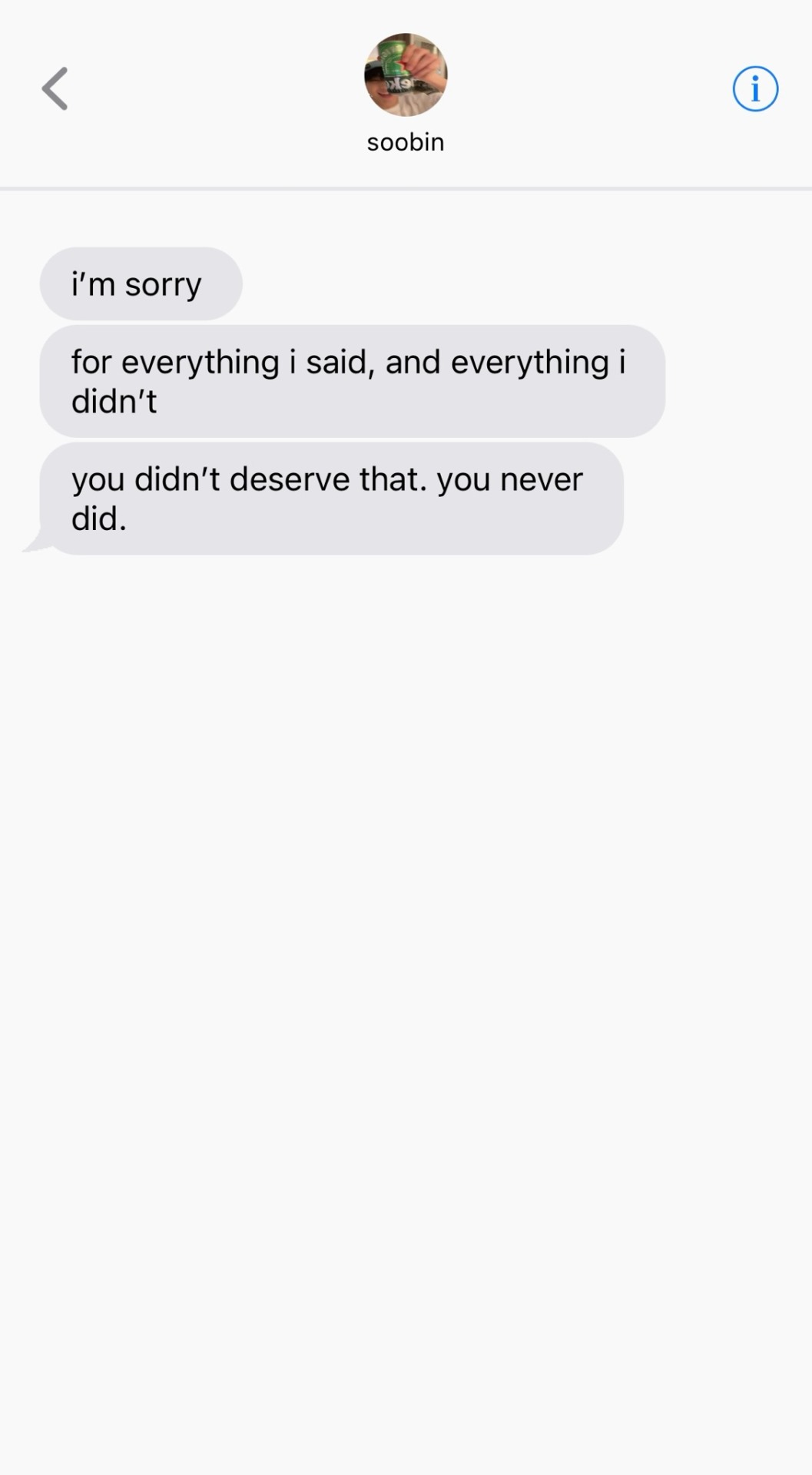
“I heard everything.”
Soobin’s heart sank so fast it made him nauseous.
She took a careful step closer. “You really think that little of me?”
He blinked. “What? No, I—Y/N, that’s not—”
“You think I kissed you because it was the vibe?” Her voice cracked on the word. “Because I was caught up in the moonlight? Do you hear how that sounds?”
“I didn’t mean it like that,” he said quickly. “I was spiraling—”
“I know you were spiraling, Soobin. That’s the whole point.” Her voice dropped, hurt blooming underneath every syllable. “You spiral and you don’t tell me. You doubt everything good that happens and you don’t think I notice?”
Soobin flinched.
“I opened myself up to you,” she said, quieter now. “I let you in, I trusted you with parts of myself I never thought I could share with someone. I trusted that you saw me. That you wanted me the way I wanted you.”
“I do,” he whispered, throat tight. “God, I do.”
“Then why would you say those things?” she asked, voice shaking now, a pool of tears forming in her eyes. “Why would you throw my feelings away like that behind a closed door?”
“I didn’t mean to,” he said. “I was scared. I’ve never had anything like this. I didn’t think I deserved it.”
She blinked hard, once. Twice. “It hurts that you don’t see what I see in you.”
“I don’t know how,” Soobin admitted, voice breaking. “I look at you and I see everything. And then I look at myself and I feel like a joke.”
“You’re not a joke,” she said, fierce now. “You’re funny and kind and thoughtful and stupidly handsome and smarter than you think and—God—so careful with people it makes me want to scream. But you talk so low about yourself, that I don't know how I can help you.”
He opened his mouth. Nothing came out.
“I thought we were building something,” she whispered. “And maybe that was stupid of me.”
“No—Y/N, please.” Soobin stepped forward, desperation blooming behind his eyes. “It wasn’t stupid, God, Y/N, it was never stupid. I was the stupid one.”
“I believed you when you said I mattered to you.”
“You do.”
“Then act like it,” she snapped.
Silence.
They stood there, surrounded by half-packed bags and fading sunlight and the weight of things said too late.
Soobin reached for her hand, but she pulled away—gently, like it hurt to do it. Like it hurt seeing him.
“I need some time,” she said. “I need to figure out what parts of this were real.”
Soobin stood there, heart splintering like glass underfoot.
“Y/N…”
She shook her head. “Don’t.”
And then she walked away.
No slammed doors. No dramatics.
Just the soft click of the front door and the quiet that followed.
Soobin didn’t move.
Didn’t breathe, he had no idea how to.
He stood there, surrounded by the pieces of something beautiful he didn’t know how to hold.
And for the first time all week, the house felt cold.
⠂⠄⠄⠂⠁⠁⠂⠄⠄⠂⠁⠁⠂⠄⠄⠂ ⠂⠄⠄⠂
He hadn’t said goodbye.
The thought kept repeating like a pulse in Soobin’s head, dull and aching, as the road unfurled in front of them. Grey sky, green blur. Rain threatening the edges of the clouds but never quite falling—just like the words he should have said.
He sat in the backseat of Yeonjun’s car, crushed between a duffel bag and his own self-loathing, while Heeseung and Hueningkai argued halfheartedly over what playlist fit the mood. Yeonjun drove like they were headed toward something brighter, something easier, but Soobin knew better.
There was no playlist that fit this feeling.
No song for you broke the best thing you ever had because you were too scared to believe it was yours.
His hoodie still smelled like her shampoo. His skin still burned with the ghost of her fingertips. His lips—his whole mouth—still remembered how she kissed when she trusted him.
And he’d ruined it.
He didn’t even know what he’d been trying to say to Yeonjun. It had started out as fear. A whimper. A confession. But somewhere in his panic, he’d let it twist into something cruel. He’d let his voice carry doubt when it should have carried faith. And of course, of course the universe would let her hear the worst of it.
It wasn’t her he didn’t trust. It was himself. But how could she know that now?
Soobin stared out the window like it could save him. The glass was cool against his temple. His reflection looked unfamiliar. Pale. Tired. Small.
How could he have looked at her—at someone who had chosen him again and again with such gentle certainty—and still believed it was temporary?
She had kissed him like it meant something.
She had held him like she wasn’t afraid.
And he had turned that into a reason to doubt her.
“I’m sorry,” he thought, again and again. “I’m sorry. I’m so sorry.”
But it was too late.
The car bumped along the highway, and he sank further into his seat, feeling like the smallest version of himself. The Soobin who had panicked and said too much. The Soobin who was still trying to figure out how to believe he was worthy of the love that had already been given.
He should’ve told her the truth.
That he hadn’t been afraid because she made him feel small.
He was afraid because she made him feel seen.
And he didn’t know what to do with that kind of light.
⠂⠄⠄⠂⠁⠁⠂⠄⠄⠂⠁⠁⠂⠄⠄⠂ ⠂⠄⠄⠂
The road blurred past her window like watercolors bleeding together—soft greens, greys, sky-blue sadness.
Y/N sat in the back seat of Jungwon’s car, knees pulled to her chest, arms wrapped around them like a barrier she didn’t know how to lower anymore. The music was too low to fill the silence, and no one dared turn it up. Giselle scrolled absently on her phone beside her. Jungwon drove with one hand on the wheel and the other tapping the beat of nothing.
But Y/N didn’t hear any of it.
She heard Soobin.
“She probably does that with guys all the time.”
The words looped, cruel and sharp, like a record scratching against her ribs.
It wasn’t even what he said—it was what it meant. That he saw her heart and assumed it was borrowed. That he received her affection and thought it was disposable. That somewhere, deep down, he didn’t believe she was real. That they were real.
She’d never opened up like this before. Not with anyone. She’d let herself be soft with him, let him see the parts she kept buried under quick jokes and confident smiles. She’d let him in.
And he’d treated her feelings like they were a dream he would soon wake up from.
A summer fling.
A passing moment.
Not something true.
She squeezed her arms tighter around herself.
The part that hurt the most wasn’t the doubt—it was that she’d seen this exact fear in him. She knew he struggled. Knew he overthought. And she had chosen him anyway. Carefully. Deliberately.
And he hadn’t trusted her enough to believe in it.
She turned her face toward the window, letting the cold glass press into her cheek. Her chest felt too full, like she’d swallowed a goodbye that hadn’t been said out loud. She hadn’t even looked at him when she left. Couldn’t. Because if she had, she would’ve broken.
And he hadn’t stopped her.
No calling her name. No chase. Not even a whisper of apology.
So she sat there, small and quiet, in the backseat of a car heading back to a world where she didn’t know what they were anymore.
Where maybe they had never been anything at all.
prev | masterlist | next
profiles: d&d saturday mass group | bling bling losers
author's note: hey..... hey.... how y'all doin?
i love you all and i'm sorry but it had to be done. soobin needs to learn how to trust himself. i felt so sad writing this bc tbh i had my doubts about this chapter, however, it needed to be done.
let me know what you all think!! thank you so much as always <3
taglist: @heejamas @mingyustar @wintereals @mimimiloomeelomi @wonderstrucktae @delirioastral @gomdoleemyson @i03jae @irishspringing @bunniwords @kirbrary @sirenla @saladgirl @beomieeeeeeeeeeees @uvyuri @imlonelydontsendhelp @haechology @sanriwoozzz @stormy1408 @soobinieswife @ijustwannareadstuff20 @soobskz @jkeydiary @imnotsureokay @nyanzzn @lostgirlysstuff @lilbrorufr @beomgyusluver@lveegsoi@pagesoobinie @catpjimin @t-102@sh0dor1@i-am-not-dal @bbeomgyucafe @damn-u-min-yoongi@https-yeonjun@booksxandxlace @kookssecret@jellyyjn@soobinz-wife@dazeymazey11 @jellyyjn @urfavsgf @snoopyispunk
#txt au#txt#txt fluff#txt x reader#soobin#choi soobin#txt x female reader#txt smau#soobin smau#soobin x reader#soobin x you#txt fake texts#txt imagines#soobin imagines
162 notes
·
View notes
Text
Things Found On The SOLDIER Bulletin Board Before It Got Banned
Also known among the operatives as "Exhibit A in HR's Case Against Us" and "Why Lazard drinks"
• An old timey style wanted poster of Sephiroth.
• A Shinra Crypto Pyramid Scheme Recruitment Poster: "Get rich! Ask me how!" flyer definitely not put up by Genesis.
• A candid, casual shot of Angeal in a towel, with a sticky note on it that reads "This man's physique is impeccable and we should all strive to look like him - Kunsel"
• An unofficial and deeply Inappropriate SOLDIER length ranking. A full infographic-style chart titled "Who's Really First Class?" — featuring stylized silhouettes, pixelated measurements, very unscientific bar graphs, with one bar labeled "??? (Sephiroth)" that pierced through the top of the page and kept going onto the wall behind.
• A heavily redacted mission report re-titled "How To Get Bitches In Wall Market" By Roche. Accompanied by a pinned photo of Roche, Zack, Kunsel and Cloud in front of the Honeybee Inn doing a thumbs up. Entire paragraphs blacked out with Sharpie by Lazard.
• A sign reading: "STOP SCREAMING IN THE AIR DUCTS." Below it: a list of times screams were heard, organized by pitch. "3:12 AM – Zack: "YOU'LL NEVER CATCH ME ALIVE," 4:47 AM – Genesis: operatic shriek followed by "What an ADORABLE rat!",, "2:16 PM – Kunsel: 🎶 Vent mann, he's in the vents 🎶 Who's gonna tell 'im he can't be in the vents? 🎶
• A complaint letter written entirely in Wingdings. No one could decipher what it said, but Sephiroth pinned it dead center with his sword and left it there for a week. Genesis claimed it translated to "STOP LEAVING RAW EGGS IN THE SHOWERS. THE HOT WATER IS COOKING THEM."
• "Kunsel Knows" Weekly Gossip Column. Typed, laminated, and mysteriously accurate. This week's headline: "Rufus and Tseng: Covert Lovers?" Kunsel denies authorship every time while distributing fresh copies.
• A photo labeled "Sephiroth, age 6." Except it was clearly taken recently. Featured a photo of Sephiroth happily filling a coloring page while eating animal crackers.
• A prayer candle with Lazard's face on it nailed to the bulletin board. Taped under the header: "Our Administrative Savior, Deliver Us From Overtime." Lit regularly by Angeal. Burned through the wall once. No one confessed.
• "Sign Up for the Shirtless Sparring Tournament!" flyer sponsored unofficially by Zack. Angeal's name was written 42 times all in different handwriting by different people. Among them was noticeably Sephiroth's handwriting 12 times.
• An updated Lost and Found photo collage of strange things retrieved from the training room. Notable entries included: A weaponized tree branch with "property of Sephiroth" carved into it, an Angeal body pillow, a molotov cocktail, a Genesis-themed rubber duck, Cloud Strife looking confused, and a suspicious flashlight.
• A flyer titled: "Genesis Says He Can Fly Now, Come Watch at Noon"
• A very official-looking memo from HR titled "You Are Not Allowed To Challenge Sephiroth To Arm Wrestling, Ever Again."
• A letter addressed to Lazard written entirely in glitter pen that read only: "You can't fire us all. ❤️"
• A laminated page titled "Forbidden Moves Banned From Sparring" Included: A photo of Sephiroth and Genesis beating each other with makeshift marker swords.
• Two photos pinned side by side: one of Sephiroth and the other of ex-turk Vincent Valentine. People would gather around while Kunsel divulged his theories using a presentation pointer stick.
#ff7#ffvii#final fantasy 7#sephiroth#final fantasy vii#ff7r#cloud strife#zack fair#angeal hewley#genesis rhapsodos#kunsel#crisis core
189 notes
·
View notes
Text
How a Creative Web Design Approach Increases Customer Retention

In a world that puts a strong emphasis on digital, a website is not just a website anymore; it is now your brand. But the harsh reality everyone is facing is that a functional website is not enough; you need a website that connects to your audience, converts, and retains them. This is where a creative web design approach can be an absolute game-changer for you.
There is no denying that the way your website looks, feels, and operates will either persuade users to stay longer or drive them away within seconds. So, if you’ve done any research only to find that the bounce rates on your website are high and conversions are low, you may want to rethink your web design.
Let’s take a look at how creativity around web design can build deeper user loyalty and increase retention.
1. First Impressions Count Now More Than Ever
Users will formulate a first impression of your website in the first few seconds. If your design seems outdated, and/or too busy or even confusing, you’re likely to lose potential customers before they have even engaged.
A creative design is more than colours and layout; it’s about making an impact and adding value from the start! Your first impression needs to evoke an emotion. By using clean interfaces, bold headings, and functional imagery, users can instantly understand who you are and why they should stay.
A current web design company in Coimbatore, like Xplore Intellects Pvt Ltd, understands the psychological thinking behind these first impressions and creates designs that inspire trust.
2. Interactive Elements Foster Engagement
Web design is no longer static. Subtle animations, hover effects, scroll-triggered transitions, and micro-interactions give life to a page. These design cues help direct a user smoothly from one section of a webpage to the next, enhancing the flow of information.
Interactive elements establish a more memorable user experience—one that encourages users to click around, explore deeper, and stick around longer.
3. Storytelling Through Design
We connect with stories better than we do with mere information. Good web design helps you visually communicate your brand story—from how your homepage is designed to the presentation of your case studies.
Thoughtful typography, imagery, and structure can help create a business message that is a visual journey and one that users want to participate in. A storytelling tactic in web design keeps users emotionally invested and increases their chances of returning.
4. User-Focused Navigation
Wayfinder menus or multiple layers of navigation that confound the user experience are a deal-breaker for conversions. Creative web design emphasizes the intuitive journey of the user experience.
An odd twist on the phrase, "easy to use," from sticky headers to breadcrumbs and bare bones menus—a web design company in Coimbatore will ensure the user finds what they're looking for. At Xplore Intellects Pvt Ltd, UX design is like a roadmap—one that moves the user from awareness to action with as little friction as possible.
5. Design that Grows with User Behavior
Your website worked five years ago, but it doesn't mean it still does today. Intelligent web design is data-led and adaptable to every user insight regarding behavior. Heatmaps, analytics, and scroll recordings demonstrate how users use your content, and the best design teams make adaptations based on those insights. Design is creativity and not a one-and-done task. Design is a process—one where visual appeal meets progression. A web design company in Coimbatore, skilled at behavior-led design, will continually refine your website to match changing expectations of users.
Conclusion
A creative web design approach isn’t just about aesthetics—it’s about user experience, retention, and long-term growth. If your site feels more like an electronic brochure and less like a living brand asset, it is time to embark on a more serious investment.
Let Xplore Intellects Pvt Ltd demonstrate how the right blend of strategy and design results in higher customer retention and better performance in the digital realm.
FAQs
1. Why is web design important for customer retention?
Because users will immediately judge your brand based on the design of your website. A clean, interactive, and user-friendly layout will keep users engaged.
2. What makes a web design "creative"?
Creative web design means thinking about the layout, visual storytelling, animations, and appropriate amounts of design <-- eg, strong brand alignment.
3. How can I tell if my existing website design is outdated?
Check the bounce rate and session duration, and review user feedback. If users are not actively engaged, you likely need a new design.
4. What to expect from a great web design company?
Design strategy; responsive development; analysis of user behaviour; continuous optimization.
5. Can creative web design also improve conversions?
For sure! A user-friendly and appropriately structured site will make it easier for users to take action, driving an uptick in conversion rates.
0 notes
Text
AI Tools Hub
Responsive Glass-morphism Landing Page
Live Demo
Buy Now on Site
Buy Now on Gumroad

Overview
AI Tools Hub is a modern, fully responsive landing page built to showcase AI-powered tools and services. Designed with a focus on visual clarity, user engagement, and high performance, this layout uses the elegant Glass-morphism aesthetic, combined with smooth animations and a mobile-first approach to create an immersive browsing experience.
This landing page is ideal for startups, SaaS products, AI platforms, or any digital tool seeking a clean and modern presentation.
youtube
Key Features
1. Modern Glass-morphism Design
Semi-transparent panels with a blurred glass effect
Soft borders and elegant shadows for depth and elevation
Gradient backgrounds that enhance visual appeal
Delivers a sleek, premium user interface with a futuristic vibe
2. Sticky Navigation with Smooth Mobile Experience
Fixed, glass-style header that remains accessible during scroll
Adaptive navigation bar with desktop and mobile toggle support
Hamburger menu with animated lines and a blur-overlay background
Clean, non-intrusive UI that ensures ease of use on all devices

3. Compelling Hero Section
Bold headline and supporting paragraph for quick value communication
Large product image with rounded corners and a drop shadow
Visually engaging call-to-action (CTA) button to encourage user flow
Scroll anchoring using scroll-margin-top for precise in-page linking
Content Sections
4. Features Section
Four responsive cards highlighting key AI features:
AI Content Generation
Data Analytics
Image Generation
Smart Automation
Each card includes an icon, heading, and concise explanation
Hover animations to provide subtle interactivity
5. Pricing Section
Three tiered pricing plans: Starter, Professional, and Enterprise
Each pricing card includes:
Plan name and price
Feature list
Clear CTA button
Highlighted middle card (featured) draws attention to the recommended plan
Transparent and scalable pricing structure for different audience needs
6. Testimonials Section
User reviews displayed in animated cards
Includes avatar initials, name, role, and quote
Subtle entrance animations powered by the Intersection Observer API
Builds trust and reinforces social proof
Footer Section
Four-column layout organized into:
Branding and Mission
Product Links
Company Info
Support Resources
Clean hover effects for all links
Copyright footer

Technical Implementation
Front-End Stack
HTML5: Semantic and accessible markup
CSS3: Custom design using Flexbox and CSS Grid, fully responsive
JavaScript: Lightweight vanilla JS for:
Mobile menu toggling
Smooth scrolling
Intersection animations for scroll reveal
Responsive Design
Mobile-first media queries
Touch-optimized spacing and button sizes
Works across all modern browsers and devices
Performance Considerations
Uses modern CSS properties like clamp() and backdrop-filter
Avoids heavy libraries or frameworks
Scroll performance optimized using Intersection-Observer
How to Use
Save the files:
index.html (structure)
style.css (styling)
script.js (interactions)
Place them in the same directory.
Open Full Code.html in your browser.
Customize text, icons, and content as needed.
No build tools or frameworks required — just open and go.

Ideal Use Cases
AI or Machine Learning startups
SaaS product launches
App or dashboard landing pages
Developer or designer portfolios
Tech marketing campaigns
Conclusion
AI Tools Hub landing page demonstrates a perfect balance between aesthetics and functionality. From its sleek Glassmorphism look to its seamless responsiveness and subtle animations, it offers a professional, high-converting solution for presenting modern digital tools.
. . . .
Support at | "[email protected]" |
#webdesign#webdevelopment#frontend#frontenddevelopment#htmlcss#htmlcssjs#javascript#responsivewebdesign#uxdesign#uidesign#glassmorphism#modernui#webdesigner#webdev#uianimation#webinspiration#landingpage#landingpagedesign#productpage#saaslandingpage#aiproduct#startupdesign#marketingpage#conversiondesign#cleanui#businesswebsite#productshowcase#artificialintelligence#aitools#aitemplate
1 note
·
View note
Text
🔥 Top UI and Navigation Trends for 2025 Websites
What’s shaping the way we browse, scroll, and click in the modern web.
🌍 Why UI and Navigation Matter More Than Ever
In 2025, users expect websites to be fast, intuitive, and effortless. With attention spans shrinking and competition growing, your UI (User Interface) and navigation design can directly impact how long visitors stay—and whether they ever come back.
Let’s explore the top UI and navigation trends you should know for creating modern, user-focused websites.
🎯 1. Minimalist & Content-First Design
Less clutter, more clarity.
Modern websites are embracing clean layouts, bold typography, and ample white space to help users focus on what matters: the content.
Key features:
Large headlines and readable fonts
Fewer colors, stronger contrast
Simple UI elements with high accessibility
🔄 2. Sticky & Smart Navigation Bars
In 2025, navbars are becoming dynamic and context-aware.
Trends to watch:
Sticky headers that stay visible while scrolling
Auto-hide navbars that appear only when needed
Contextual navigation that changes based on scroll section
🌈 3. Microinteractions & Scroll Animations
Small touches = big impact.
Subtle animations are used to:
Indicate button clicks
Highlight active links
Reveal content as you scroll
Create visual feedback (without slowing things down)
These animations enhance the user experience without overwhelming the design.

📱 4. Thumb-Friendly Mobile Navigation
With mobile-first design being the norm, navigation must be:
Easy to reach with one hand
Intuitive even on small screens
Optimized for touch (larger buttons, minimal taps)
Popular features:
Bottom nav bars
Swipe menus
Progress indicators (great for long-form content)
🧠 5. AI-Powered Personalization
Smart navigation adapts to user behavior.
Some modern websites now offer:
Dynamic menus based on past visits
Content suggestions based on scroll patterns
Voice and chatbot-assisted navigation
This trend is especially relevant for eCommerce, SaaS, and content-heavy sites.
🔍 6. Search-First Navigation
Users don’t always want to click through menus. That’s why websites in 2025 are prioritizing powerful, instant search features.
Search bars now include:
Auto-suggestions
Keyboard shortcuts
Voice input
AI-generated results based on context
🧭 7. Mega Menus with Smart Categorization
For websites with lots of content (e.g., eCommerce or universities), mega menus are being redesigned for clarity:
Visual icons for categories
Hover + click behavior (for better accessibility)
Highlighting popular or trending items
🎨 8. Glassmorphism and Soft UI Styles
Designers are mixing minimalism with soft effects:
Blurred backgrounds
Subtle shadows
Light gradients
Rounded corners
This makes interfaces feel more inviting and modern, especially in tech and creative industries.
🔮 Bonus: Voice & AR Navigation (Emerging)
While not yet mainstream, voice-driven navigation and AR-enhanced websites are on the rise — especially in mobile apps and wearable web experiences.
As devices like Vision Pro and AR glasses gain traction, expect UI and navigation to evolve further into gesture-based and immersive formats.
📈 Why These Trends Matter for Your Business
🧩 Better navigation = lower bounce rate
⏱️ Faster access = higher conversions
🧠 Intuitive design = better customer satisfaction
📱 Mobile-ready = broader reach
In short, investing in modern UI and navigation isn't a trend — it’s a strategy.
🔗 Ready to Redesign Your Website for 2025?
At We3Vision Pvt Ltd, we craft future-ready websites with smart UI, clean navigation, and performance-first development.
1 note
·
View note
Text
Web Development Training Program

Master the Core Front-End Technologies: HTML, CSS, JavaScript, and BootstrapThis course provides a complete introduction to front-end web development, enabling you to build responsive, interactive, and professional websites from scratch. By mastering these technologies, you'll be equipped with the foundational skills needed for a career in web development.Tools & Technologies Covered:HTML5 CSS3 JavaScript (ES6+) Bootstrap 5 Text Editors: Visual Studio Code, Sublime Text Web Browsers: Chrome, Firefox, Edge Understand how websites are structured and styled using HTML and CSS. Create interactive, dynamic web pages using JavaScript. Build responsive, mobile-first web designs using Bootstrap. Overview of the Web Development Process Understanding Client-Side and Server-Side Development Setting Up the Development Environment (Text Editors, Browsers) Structure of an HTML Document Basic HTML ElementsHeadings, Paragraphs, Lists, Links Images and Media ElementsAdding Images, Audio, and Video Forms and Input ElementsText Fields, Buttons, Dropdowns, and Checkboxes Semantic HTML5 Tags (header, nav, section, article, footer) CSS Syntax: Selectors, Properties, and Values Styling Text and ElementsFonts, Colors, Backgrounds, Borders The Box Model (Margins, Padding, Borders, Content) Layout and PositioningStatic, Relative, Absolute, Fixed, and Sticky Responsive Design with Media Queries Advanced Features: Animations, Transitions, Gradients Introduction to JavaScript Variables and Data Types (var, let, const) Operators and Control Flow (if-else, loops) Functions and EventsWriting and Calling Functions Handling Click, Mouse, and Keyboard Events Arrays and Objects Manipulating the DOMSelecting and Updating HTML Elements Adding Dynamic Behavior to Web Pages Setting Up Bootstrap (CDN or Local) Understanding the Grid SystemRows, Columns, Breakpoints for Responsive Layouts Using Bootstrap ComponentsNavigation Bars, Modals, Buttons, Cards, Forms Styling with UtilitiesColors, Spacing, Typography Advanced FeaturesCreating Hero Sections and Interactive Forms Customizing Bootstrap with Custom CSS and Sass Combining All Technologies to Create Web Pages Styling and Adding Interactivity to Content Building Responsive and Dynamic Multi-Page Websites Developing a Full-Stack Web ApplicationResponsive Landing Page with Navigation Interactive Elements (Forms, Buttons, Modals) Using JavaScript for Dynamic Content and Validations Styling the Project with Bootstrap Components Hands-On Practice: Build multiple projects throughout the course. Real-World Application: Work on a capstone project to create a complete website. Certification: Earn a Web Development certificate upon successful completion. Aspiring web developers and designers. Students looking to start a career in front-end development. Professionals seeking to build personal or business websites. Read the full article
0 notes
Text

Animated sticky header
#animated sticky header#header design#javascript snippets#html5#html css#frontend#css#html#frontenddevelopment#webdesign#sticky header#css3
4 notes
·
View notes
Text
Web Designer in Bangalore: Build a Powerful Digital Identity with Hello Errors

The Digital Identity Revolution: Why Bangalore Businesses Need More Than Just a Website
Bangalore is a city of innovation—a place where startups rise, tech giants expand, and creative ventures flourish. Yet, in this fast-paced digital economy, having a generic website isn’t enough. You need a digital identity that reflects your brand’s purpose, personality, and promise.
That’s where the expertise of a web designer in Bangalore like Hello Errors becomes indispensable. We don’t just build websites—we build experiences. Whether you're a solopreneur, creative agency, SaaS brand, or enterprise, your website is your digital handshake, and it should be bold, confident, and memorable.
Branding Through Web Design: More Than Just Colors and Fonts
What separates a good website from a great one? Branding.
At Hello Errors, we specialize in integrating brand narratives into website design. We ensure that every font, every image, and every section of your website tells your story.
As a leading web designer in Bangalore, we ask deep questions like:
What does your brand stand for?
Who is your ideal customer?
What emotions should your site evoke?
From mood boards to brand-aligned typography and personalized icons, we build platforms that don’t just look good—they feel like your brand.
Specialized Web Design Solutions for Diverse Industries
Not all websites should look the same. A real estate website shouldn’t feel like a wellness blog. A SaaS dashboard shouldn’t resemble an eCommerce store.
Hello Errors provides niche-specific web design in Bangalore for:
Startups – Minimal, fast, pitch-friendly design
Healthcare – Trust-driven, accessible, and informative interfaces
Education – Dynamic dashboards for students and educators
Hospitality – Visual-heavy layouts with booking features
eCommerce – Conversion-focused product pages and seamless checkout UX
Each industry requires its own design logic, and we bring that nuance into every project.
Interactive Design That Drives Engagement
Modern websites are interactive. Hover effects, animated text, scroll-triggered visuals—these are no longer luxuries but expectations. At Hello Errors, we build interactive websites that enhance user engagement and drive deeper browsing sessions.
We incorporate:
Animated menus
Scroll-based transitions
Hover-activated CTAs
Sticky headers and dynamic content loading
As a future-focused web designer in Bangalore, our goal is to transform static pages into storytelling tools.
Local Optimization: Designing for Bangalore Audiences
When targeting a Bangalore-based audience, local optimization is key.
Our design process includes:
Localization of content and visuals
Integration with regional payment gateways
Maps, directions, and Google Business linking
Bangalore-specific SEO structuring
This hyperlocal approach gives you a competitive edge and improves search visibility among customers searching for services in Bangalore.
So when users Google “web designer in Bangalore,” your website won’t just show up—it’ll stand out.
Performance-Driven Design: Beyond Looks
Speed, accessibility, and technical compliance are non-negotiable for top-ranking websites.
Hello Errors uses:
Google PageSpeed Insights and Lighthouse tools
Image compression without compromising quality
Clean code with semantic HTML
Lazy loading for fast rendering
Accessibility features (ARIA labels, color contrast, alt tags)
We ensure your site meets the highest performance and compliance standards, making us a top-performing web designer in Bangalore for both user experience and SEO.
Hosting, Maintenance & Ongoing Support
Web design doesn’t stop at launch. We offer:
Hosting setup with SSL and CDN
Monthly backups
Uptime monitoring
Security updates
Content changes on demand
This end-to-end support helps clients stay worry-free, knowing their digital platform is monitored and maintained by professionals.
Collaborative Process: Design with You, Not Just for You
At Hello Errors, we follow a collaborative design process that ensures you're involved at every stage:
Discovery Call – Understand your vision, target audience, and goals.
Wireframes – Share rough layouts for feedback.
Design Prototypes – Interactive previews before development.
Testing – Device and browser testing to ensure perfection.
Launch & Support – Ongoing updates and growth.
That’s why many of our clients call us the most approachable web designer in Bangalore—we treat every project as a partnership.
Our Clients Speak: Testimonials That Matter
“Hello Errors transformed our basic business idea into a beautiful, functional website. Our customers love the interface, and we’ve seen a massive jump in inquiries!” — Anjali Mehta, Founder, GreenRoot Interiors, Bangalore
“The SEO-backed design Hello Errors created for us now ranks on page one for multiple Bangalore-based keywords. Amazing results!” — Siddharth Rao, Marketing Lead, StartLoop Technologies
These stories are just a glimpse into the client satisfaction we’re proud of.
Ready to Partner with the Best Web Designer in Bangalore?
If you’re looking for a design team that blends creativity, technical skill, and brand strategy, Hello Errors is your answer.
Let’s turn your digital vision into a compelling, high-performing website that drives leads, tells your story, and sets you apart in the Bangalore business ecosystem.
Contact Hello Errors Today
📍 Office: Bangalore, India 🌐 Website: https://helloerrors.in 📧 Email: [email protected]
#WebDesignerInBangalore#HelloErrors#WebsiteDesignExperts#BangaloreBusiness#ResponsiveDesign#DigitalBranding#CustomWebDesign#CreativeWebDesign#StartupWebsiteDesign#WebDevelopmentIndia
0 notes
Text

Webflow Tip of the Day
“Use Webflow’s Nested Collection Lists + Tabs to Build Dynamic Multi-Category CMS Views”
If you’ve ever wanted to build a layout like:
A blog categorized by topics
An FAQ section grouped by subject
A list of products filtered by type
A documentation system (like Help Center)
...all dynamic, powered by CMS, and without external scripts — this method is for you!
What You Need:
Two CMS Collections
Example:
-Blog Posts
-Categories
A Reference Field
In the Blog CMS, add a Reference Field to link each post to its Category.
Step-by-Step:
1. Drop a Collection List for Categories
This will act as your outer loop.
Show the category title or tab name (e.g. “Marketing”, “Design”, “Tech”).
2. Nest a Collection List Inside
Inside each category item, drop another Collection List.
Filter it to show only Blog Posts where the Category = Current Category.
3. Style as Tabs or Accordions
Use Webflow Tabs for a native tabbed layout.
Or use Interactions to create accordion-style collapsible sections.
4. Add Pagination or Scroll Overflow (Optional)
If you expect a lot of posts per category, enable pagination or set a max-height with scroll overflow.
Example Layout:
Imagine a CMS-powered "Resources" Page
Categories:
Design
Marketing
Development
Each tab or section dynamically shows related blog posts under that category — no manual updates needed!
Pro Tricks:
Use the currentCategory class to highlight active tabs
Add scroll-based animations (e.g., fade-in posts when visible)
Use position: sticky on tab headers for a floating category nav
Combine this with Finsweet Attributes or Wized to make it filterable on the fly
Perfect For:
Blog Archives (tagged articles)
Product Browsing by type or brand
FAQs by topic
Knowledge Base like Help Centers
Directory-style layouts (e.g. services, team members, listings)
Want a CMS system that auto-scales, filters, and looks clean?
Check out my work here:
🌐 Portfolio: www.webflowwork.com
🎯 Upwork: https://bit.ly/4iu6AKd
🎯 Fiverr: https://bit.ly/3EzQxNd
#WebflowTips #WebflowCMS #NestedCollections #WebflowDesign #NoCodeLogic #WebflowExperts #DynamicTabs #MadeInWebflow #WebflowIndia #CategoryFilter #CMSLayout #ClientPortals #AdvancedWebflow
#webflow#freelancewebdeveloper#web design#web development#webflowdesign#webflowexperts#webflowlandingpage#website#nocode#ui ux design#fiverr gigs#fiverr#freelance#uiux#freelancing#webflowcms#web developers
0 notes
Text
Website Designing Best Practices: How to Create an Engaging User Experience
In today’s digital landscape, your website often serves as the first point of contact between your business and potential customers. A well-designed website doesn’t just showcase your brand—it delivers an engaging user experience that converts visitors into loyal customers. For businesses seeking professional web solutions, choosing a reliable Website Designing Company in Muscat can make all the difference in creating an online presence that stands out.
This blog explores the best practices in website design that foster engaging, intuitive, and user-friendly experiences. Whether you're launching a new business site or revamping an existing one, these insights will guide your approach to effective design.
1. Understand Your Users
The cornerstone of good website design is understanding the audience. Begin with research—analyse the demographics, preferences, and behaviours of your target users. What are they looking for? How tech-savvy are they? What devices do they use?
A professional Website Designing Company in Muscat will start every project by defining the user personas. This data-driven approach helps tailor the layout, features, and content to ensure relevance and accessibility for the intended users.
2. Mobile-First Design
With mobile traffic surpassing desktop usage globally, mobile-first design is no longer optional. A responsive website adapts seamlessly across smartphones, tablets, and desktops, ensuring a consistent user experience regardless of device.
Responsive design also plays a role in SEO, as search engines prioritise mobile-friendly sites in their rankings. Collaborating with a seasoned Website Designing Company in Muscat ensures your site performs optimally across all screen sizes.
3. Clear Navigation Structure
Navigation is the backbone of user experience. When users can’t find what they’re looking for quickly, they’re likely to leave. A well-structured navigation bar with logical categories, search functions, and minimal clutter can drastically improve user satisfaction.
Drop-down menus, breadcrumbs, and sticky headers are techniques that aid in easy browsing. Simplicity is key—avoid overloading the interface with too many options.
4. Fast Load Times
The speed of a website plays a vital role in both user experience and its ranking on search engines. According to industry research, even a one-second delay in load time can reduce customer satisfaction by 16%.
Optimising images, leveraging browser caching, and minimising code are a few strategies to ensure faster performance. A proficient Website Designing Company in Muscat will employ the latest technologies and techniques to keep your site lightning fast.
5. Compelling Visual Design
The visual appeal of your website sets the first impression. A good colour scheme, clean typography, high-quality images, and consistent branding contribute to a professional look. White space, or negative space, should be used strategically to avoid a cluttered layout.
Animations and transitions can enhance engagement, but should be used sparingly to avoid distraction. Design choices should always align with your brand's identity and the emotional response you wish to evoke from users.
6. SEO-Friendly Architecture
A beautiful website is ineffective if no one can find it. Implementing SEO best practices during the design phase ensures your site is discoverable by search engines. This includes proper heading structures (H1, H2, etc.), keyword integration, image alt tags, and fast load times.
A reputable Website Designing Company in Muscat will build your website with SEO in mind, creating clean, crawlable code and ensuring metadata is properly configured.
7. Content That Connects
Design and content go hand in hand. Visitors stay longer on websites that offer valuable, relevant, and easy-to-digest information. Use clear headlines, bullet points, and concise paragraphs to improve readability.
Calls to action (CTAs) should be prominent, compelling, and placed strategically throughout the site. Whether it’s “Get a Quote” or “Contact Us,” CTAs should guide users toward desired actions.
8. Security and Compliance
Security is paramount in website design, especially for e-commerce and data-driven sites. SSL certificates, secure payment gateways, and GDPR compliance are essential components.
A professional Website Designing Company in Muscat will implement the necessary security protocols and ensure your website adheres to local and international data protection laws.
9. Regular Testing and Updates
Even after launch, websites require continuous improvement. A/B testing, user feedback, and performance analytics help identify areas for enhancement. Regular updates to plugins, themes, and backend systems are necessary to maintain performance and security.
Partnering with a Website Designing Company in Muscat ensures you have ongoing support and maintenance to keep your site functioning at its best.
10. Accessibility for All
An inclusive website is accessible to all users, including those with disabilities. This means using readable fonts, providing text alternatives for images, enabling keyboard navigation, and ensuring compatibility with screen readers.
Accessibility isn’t just a legal requirement in some regions—it’s a best practice that reflects your brand’s commitment to all users.
Final Thoughts
In the digital age, your website is a powerful marketing tool and a direct representation of your business. Focusing on user experience is no longer optional—it's essential. By applying the best practices in design, from mobile responsiveness to intuitive navigation and SEO integration, you ensure your website is not only visually appealing but also functional and user-centric.
Businesses aiming to create or revamp their websites would benefit significantly from partnering with an experienced Website Designing Company in Muscat. These professionals bring local market insights, technical expertise, and creative vision to build websites that captivate and convert.
For long-term success, remember that website design is not a one-time task but an evolving process. Stay current with design trends, listen to user feedback, and keep refining your digital presence.
#Website Designing Company in Muscat#Web Design in Oman#Website Development Oman#Digital Marketing Oman#Ecommerce Website Development Oman#Mobile App Development Oman#Web Designing in Oman#Web Design Company Oman#Web Design Agency in Oman#Web Development in Oman#Web Development Company in Oman#Website Designing Company in muscat#Ecommerce Website Development Company Muscat#Ecommerce Website Development Services Muscat#Website Development Company Oman#Digital Marketing Company in Oman#Digital Marketing Agency Oman#Social Media Management Oman#Social Media Management Service in Oman#Social Media Management Agency in Oman#Social Media Marketing in Oman#Social Media Marketing Agency Oman#Social Media Marketing Services Oman#Social Media Marketing Company Oman#Social Media Agency Oman#Ecommerce Web Solutions Oman#Ecommerce Solutions Oman#Ecommerce Development Muscat#Ecommerce Development Company Muscat#Ecommerce Development Services Oman
0 notes
Text
Make Your Website Irresistibly Sticky

Introduction: Why Your Website Needs to Be Sticky
In today’s fast-paced digital world, grabbing user attention is hard, but keeping it is even harder. A sticky website isn’t just nice to look at. It’s designed to keep users engaged, reduce bounce rates, and increase the chances of conversion. In this blog, we’ll explore how to turn your website into a place users love to stay.
1. First Impressions Matter: Design the Top Fold of Your Website
The top fold of your site is the first thing visitors see. It sets the tone for the rest of their journey.
Key elements to optimize:
Clean layout with minimal clutter
A headline that tells users exactly what you offer
A compelling call-to-action (CTA)
A user-friendly and focused design makes your site feel trustworthy and easy to navigate from the first second.
2. Simplify Navigation to Guide Visitors on Your Website
Your site should never confuse visitors. Sticky sites provide clear paths and logical flow.
Best practices for simple navigation:
Limit your top menu to essential items
Use dropdowns sparingly and with structure
Keep menus visible on all screen sizes
When users can easily explore your site, they’re more likely to stay longer and take action.
3. Fill It with Content That Adds Value
Content is what makes people stick around. A sticky website offers value through well-crafted, readable, and helpful content.
Make your content work:
Use short paragraphs and clear headers
Add bullet points and visuals
Keep the tone friendly and informative
The right content turns your website from a static page into a conversation with your audience.
4. Add Micro-Interactions to Keep It Dynamic
Subtle interactions help your site feel alive. These elements make users curious and invite them to explore.
Interactive elements to try:
Hover effects on buttons or images
Scroll-triggered animations
Interactive forms or quizzes
When your website reacts to the user, it builds a connection that feels more personal.
5. Build Trust with Proof and Transparency
A sticky site builds trust quickly. Show users that others trust your brand, and they will too.
Ways to build credibility:
Showcase customer reviews and ratings
Use testimonials with names and photos
Add trust badges or certifications
Trust signals make your website feel safe and credible, especially for new users.
6. Make Mobile a Priority, Not an Afterthought
More than half of your visitors likely arrive via mobile. If your website isn’t optimized for phones, you’re losing them.
Mobile must-haves:
Fast loading time
Clear, readable fonts
Buttons large enough for tapping
A mobile-friendly website ensures users enjoy a smooth experience on any device.
7. Use Sticky CTAs That Stay Visible
Sticky elements keep important actions in view, making it easier for users to convert.
Effective sticky CTA ideas:
Floating “Book Now” or “Contact Us” buttons
Persistent newsletter signup bars
Scroll-triggered lead capture forms
A sticky CTA keeps your site’s purpose front and center.
8. Improve with Analytics and A/B Testing
No site gets it perfect the first time. Use data to test, learn, and grow.
What to track and improve:
Bounce rates and session durations
Click maps and heatmaps
Conversion rates by page
Smart analysis ensures your site evolves based on user behavior, not guesswork.

Conclusion: Your Website Is Your Best Salesperson
A sticky website creates memorable experiences. It captures attention, builds trust, and encourages action. By focusing on smart design, useful content, mobile responsiveness, and clear CTAs, you ensure users not only arrive but also stay and convert.
If you’re ready to make your website work harder for your brand, reach out to Focal Media and discover how great design drives better business.
0 notes
Text
8 CSS & JavaScript Snippets for Creating Sticky Elements — Speckyboy
New Post has been published on https://thedigitalinsider.com/8-css-javascript-snippets-for-creating-sticky-elements-speckyboy/
8 CSS & JavaScript Snippets for Creating Sticky Elements — Speckyboy
Modern websites often feature extensive scrolling. Long pages are common on desktop devices, but are even more frequent on mobile screens. The practice creates usability challenges for tasks like navigation and referencing important information.
That’s where “sticky” design elements come in handy. They allow users to scroll without losing access to your site’s menu. You can also use them to keep ads in view, attach social media sharing buttons to the viewport, or create fun special effects.
Implementing a sticky element can be simple, as CSS has a dedicated position property for this function. JavaScript can be used for building more robust features. As usual, there are several methods to achieve your goals.
We searched the CodePen archives to find interesting examples of sticky elements in use. Below, you’ll find various options that enhance the user experience. So, get stuck in your easy chair and be inspired by these code snippets!
Pure CSS Header Animation to Sticky Navigation
Created by Amit
Sticky headers are among the most popular use cases. On Chromium browsers, this snippet uses CSS to transform a tall and narrow header into a full-screen bar upon scrolling. Unsupported browsers receive a narrower, taller, sticky header. Keyframe animation is used to create smooth transitions. The feature is useful, lightweight, and attractive.
See the Pen Pure CSS header animation to sticky nav by Amit
Sticky Responsive Sidebar Navigation
Created by Areal Alien
Sidebar navigation can also take advantage of staying put during scrolling. Hovering over the sidebar expands the navigation to include text labels – it works on mobile too. However, you might also reserve this concept for large screens and use the traditional “hamburger” menu for mobile.
See the Pen Sticky responsive sidenav by Areal Alien
CSS Sticky Table Header & Column
Created by Mike Golus
Long HTML tables can be a pain to read. You have to memorize the column headers to understand the context. Sticky headers make even the busiest tables easier to read. Using position:sticky (and a few other tricks) on the first row and column enables scrolling without losing sight of key information. The examples in this Pen demonstrate how it’s done.
See the Pen CSS Sticky Table Header and Column by Mike Golus
Long Scroll Sticky Sections
Created by Burmese Potato
Here’s a unique way to denote the various sections of a long page. Scroll down the page, and the episode number (displayed in the left column) sticks until you reach the end of the section. The snippet combines sticky positioning with the calc() property on the container’s height to keep the number in view. This little bit of CSS adds a nice touch to the user experience.
See the Pen Pretty Sticky by Burmese Potato
Just Another Sticky Section Layout
Created by Misala
Sticky design elements can also be used to show off product features. Scroll down this page and watch as featured text and videos change. The layout occupies the entire screen viewport and is responsive for mobile devices. It’s a high-end feature sure to capture a user’s attention.
See the Pen just another sticky section layout by misala
Multi-Navigation Sticky Bars & Layout
Created by Den
This snippet asks the question: What if you have more than one navigation bar? The first bar is sticky by default. Scroll past a few sections, and a second sub-navigation bar lines up underneath. That second bar also features a neat frosted glass look as content scrolls underneath.
See the Pen Sticky layout + filters #2024 by Den
Sticky Video with CSS @container scroll-state()
Created by Jhey
We’re seeing more websites implement sticky videos, where the presentation sticks to the bottom corner upon scrolling. It allows users to view the rest of your content without losing sight of the video. Here, CSS container queries are used to reposition the video player. Use the included config panel to see how different settings impact the animation effects.
See the Pen CSS @container scroll-state() faux PiP video by Jhey
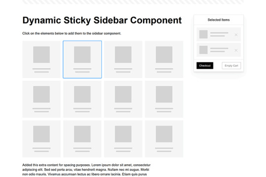
Dynamic Sticky Sidebar Component
Created by Ryan Mulligan
Features like shopping carts are a perfect fit for sticky sidebars. The UI makes it easier for shoppers to keep track of their cart and, most importantly, finish their purchase. This sidebar widget keeps track of cart contents and sticks to the screen while you scroll in the page content area.
See the Pen Dynamic Sticky Sidebar Component by Ryan Mulligan
Stick With What Works in Your Designs
We may think of sticky elements as being used for site headers and navigation. However, the examples above show that they can do much more. There are so many creative possibilities for informing and entertaining users.
What’s more, CSS can do a lot of the heavy lifting for you. Several snippets in this collection don’t require a single line of JavaScript. Still, it’s nice to know you can add some DOM manipulation when needed.
We hope this collection sparked your imagination! Check out our CodePen collection for even more sticky snippets.
Related Topics
Written by Eric Karkovack
Eric Karkovack is a web designer and WordPress expert with over two decades of experience. You can visit his business site here. He recently started a writing service for WordPress products: WP Product Writeup. He also has an opinion on just about every subject. You can follow his rants on Bluesky @karks.com.
Read more articles by Eric Karkovack
#2024#ADD#alien#amp#animation#Articles#attention#Building#Business#buttons#Capture#change#chromium#code#container#content#CSS#CSS Layout Snippets#CSS Snippets#Design#desktop#devices#easy#effects#Featured#Features#Filters#Full#glass#hamburger
0 notes
Text
How Can the Underwater Pro Blue WordPress Theme Elevate Your Website Experience?
Standing out in today’s crowded digital world requires more than just compelling content—it demands a visually stunning, user-friendly, and high-performance website. For businesses and creatives seeking a calming, trustworthy, and professional aesthetic, the Blue WordPress Theme is an exceptional choice.
Whether you’re a marine biologist, dive instructor, travel blogger, or a business looking to project a serene and polished identity, this theme delivers. Let’s take a closer look at how it transforms ordinary websites into visually immersive and conversion-focused platforms.
Embrace the Power of Color Psychology
Colors influence perception, and blue is known to evoke feelings of trust, calmness, and intelligence. It’s a favorite across industries for conveying professionalism and reliability.
The Underwater Pro theme capitalizes on this psychology with its ocean-inspired color scheme. Its dominant blues, soft whites, and complementary gradients make it ideal for brands related to nature, health, wellness, technology, education, and even corporate sectors.
This theme doesn’t just look good—it creates an emotional connection that encourages visitors to stay longer and explore deeper.
User Experience Comes First
One of the key strengths of Underwater Pro is its intuitive layout and seamless navigation. Whether a user is exploring your homepage, reading a blog post, or browsing your services, the structure is logical and user-focused.
Call-to-action buttons are placed thoughtfully, ensuring high visibility and improved interaction rates. Header menus, sticky navigation, and well-spaced sections help users move through the site naturally, reducing bounce rates and increasing engagement.
Plus, animations and transitions are subtle and tasteful—enhancing interaction without being distracting.
Lightning-Fast Performance on All Devices
Mobile users account for more than half of global web traffic. That’s why the Underwater Pro theme is fully responsive and optimized for speed.
Your site will look sharp on smartphones, tablets, and desktops. Load times are minimized thanks to clean code and built-in performance optimization. Users won’t have to wait to see your images, galleries, or read your content.
This responsiveness is not only great for user experience—it’s also a key factor in search engine rankings.
Designed with SEO in Mind
Search engine visibility is vital for attracting organic traffic. The Underwater Pro theme comes built with SEO-friendly coding practices, including semantic HTML, optimized heading structures, and clean permalinks.
You can also integrate popular SEO plugins like Yoast or Rank Math without a hitch, enabling you to fine-tune metadata, sitemaps, and more. From a technical standpoint, the theme helps ensure your website is indexable, crawlable, and fast-loading—three pillars of search performance.
Flexible Layouts for Multiple Use Cases
This theme isn’t limited to just marine or aquatic businesses. Thanks to its flexible design structure and compatibility with Elementor and other page builders, you can tailor it to any niche that benefits from a clean, modern, blue-themed aesthetic.
Some great use cases include:
Environmental organizations
Spa and wellness retreats
Travel and adventure blogs
Medical or dental clinics
Online portfolios or agencies
E-commerce stores with blue-toned branding
Its adaptability makes it an investment that can scale with your goals.
Feature-Rich Yet Easy to Use
Even users with no technical knowledge will find Underwater Pro accessible. The one-click demo import allows you to start with a pre-made layout and customize from there. Drag-and-drop functionality lets you move elements around effortlessly.
Pre-designed templates for About, Services, Contact, Gallery, Blog, and Shop pages mean you can go live in record time.
Moreover, the theme supports multilingual plugins like WPML and Polylang—great for global businesses or organizations with diverse audiences.
Advanced Blog Capabilities
Blogs play a crucial role in both customer education and SEO. With this theme, your blog won’t just be an afterthought—it’s integrated beautifully into the design.
You can showcase featured posts, organize by categories or tags, and offer clean reading experiences with well-formatted text, callouts, and embedded media. Each post page supports social sharing features and comment sections to boost interaction.
Whether you’re sharing underwater photography, travel tips, wellness advice, or business updates, the platform adapts to your voice and purpose.
Seamless WooCommerce Integration
If your business involves selling products or services online, you’ll appreciate the full WooCommerce compatibility. Set up an attractive shop section in minutes, complete with:
Product pages and galleries
Shopping cart and checkout
Secure payment gateways
Inventory management tools
The blue theme enhances visual clarity for products, making it ideal for stores that sell eco-friendly goods, ocean-related merchandise, or premium services.
Highlight Testimonials and Team
Social proof matters. This theme makes it easy to showcase customer testimonials, reviews, and trust indicators. Use pre-built testimonial sliders or grid sections to share positive feedback that reassures new visitors.
Additionally, you can introduce your team with dedicated profile sections, bios, and images. This transparency builds trust and connection—especially important for service-based businesses.
Built to Convert
All the design features, performance improvements, and content tools work together to achieve one goal: conversion. Whether that’s getting users to fill out a form, subscribe to a newsletter, schedule an appointment, or make a purchase, the theme is optimized to drive results.
Even small details like strategically placed buttons, interactive forms, and dynamic headers contribute to a user journey designed for action.
The Blue WordPress Theme gives you everything you need to craft an engaging website that not only looks beautiful but also performs as a powerful business tool.
Final Thoughts
First impressions are lasting—and your website is often the first touchpoint for your audience. By choosing a visually striking, responsive, and SEO-friendly template like Underwater Pro, you ensure your brand shines from the very first visit.
From its immersive design and robust features to its ability to elevate user experience and boost performance, this theme delivers true value. Whether you're launching a new project or redesigning an old site, this theme is your gateway to a cleaner, deeper digital presence.
#blue WordPress theme#blue color scheme WordPress theme#ocean blue website template#navy blue WordPress theme#corporate blue WordPress template#aqua blue WordPress theme#light blue WordPress theme#sky blue WordPress site#blue and white WordPress template#blue gradient WordPress theme#clean blue WordPress layout#minimal blue website design#professional blue theme#blue branding WordPress site#cool tone WordPress template#business blue WordPress theme#modern blue WordPress site#blue style website template#simple blue WordPress theme#blue UI WordPress theme
0 notes
Text
Why People Keep Scrolling (And What Makes Them Stop)
Scrolling is second nature to us now. Whether you’re browsing a blog, checking out an online store, or catching up on news, your thumb keeps moving. But have you ever wondered what actually keeps users scrolling through a webpage—and what stops them?
For businesses, creators, and marketers, understanding this behavior is key. If you want people to stay longer, read more, and eventually take action, your page needs to hold their interest from top to bottom.
Let’s look at what drives scroll behavior, how to improve it, and how smart design and content strategies can help you hold attention longer.
The First Few Seconds Decide Everything
Most users decide whether to scroll within the first 5–10 seconds of landing on a page. If the top of your page (also called “above the fold”) is boring, unclear, or irrelevant—they’re gone.
To grab attention early:
Use a clear, benefit-driven headline
Avoid clutter
Add a visual element (image or video) that supports the message
Make it obvious what the page is about and who it’s for
Think of the top section as your invitation to the rest of the page. Make it count.
Visual Flow Keeps the Thumb Moving
Once you’ve captured attention, the next challenge is to guide the reader downward. This is where visual flow matters.
Webpages with consistent spacing, strong headings, readable font sizes, and well-placed visuals create a rhythm that keeps people scrolling. If things feel hard to read or randomly placed, scrolling slows down—or stops.
Try to space your content in a way that gives the eyes room to breathe. A clean layout encourages users to keep going without getting tired.
Content That Feels “Snackable”
Long paragraphs can feel like a wall. And when people face a wall, they often stop.
Instead, aim for “snackable” content:
Short paragraphs
Bullet points or numbered lists
Subheadings every 2–3 scrolls
Quotes, stats, or bold lines to break up the flow
This makes the content feel manageable—even if the page is long.
A good digital marketing services in Bhubaneswar team will often structure content this way to boost retention and lower bounce rates.
The Curiosity Factor
Curiosity is one of the most powerful tools to keep people scrolling. Teasing what's coming next or asking thoughtful questions gives users a reason to keep reading.
Examples:
“But here’s the part most businesses miss…”
“Want to know what happens if you don’t optimize this?”
“Let’s look at a real example next…”
These small cues build momentum.
Interactive Elements Help
Small interactive features can increase scroll depth. Things like:
Animated counters
Progress bars
“Scroll to read more” buttons
Sticky headers that update as you scroll
They signal to users that more value lies ahead. But keep in mind: these should be helpful, not distracting.
Page Speed and Mobile Friendliness
You might have everything right—layout, content, flow—but if your page loads slowly, users might never get to it.
Mobile users especially are quick to bounce from pages that lag or break. Make sure your site is:
Optimized for fast loading
Fully responsive on all screen sizes
Easy to scroll with a finger (not just a mouse)
Many digital marketing services in Bhubaneswar now offer performance audits just to catch issues like these before they cost you traffic and conversions.
End Strong
Reaching the end of a page is an achievement. So reward your readers with something meaningful:
A strong CTA (call to action)
A related article suggestion
A short form or feedback prompt
A thank-you message or takeaway summary
When the end feels like a next step—not a dead-end—users are more likely to engage.
Final Thought: Make the Scroll Worth It
The goal isn’t to make people scroll just for the sake of it. It’s to keep them engaged enough that they want to.
From headline to footer, everything should feel intentional. If you can build trust and curiosity with every swipe, you’ll hold attention longer—and get better results.
Start small: test your page on mobile, tighten your first section, and use subheadings wisely. You’ll likely see more users scrolling—and sticking around.
#digital marketing agency bhubaneswar#website development companies in bhubaneswar#best digital marketing company in bhubaneswar#digital marketing services in bhubaneswar#web development services in bhubaneswar#digital marketing agency in bhubaneswar
0 notes