#change Color CSS3
Explore tagged Tumblr posts
Visit Tumblr Blog
Explore Tumblr blogs with no restrictions, modern design and the best experience.
Last Seen Tumblr Blogs


Fun Fact
Average visit duration of Tumblr.com is 10 mins and 25 secs.
Text
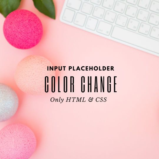
Placeholder Color Change using CSS
#codingflicks#html css#frontend#placeholder color change#css input color#css#html#webdesign#frontenddevelopment#css3#input#css form#form html css#css tricks#css effects
5 notes
·
View notes
Text
Background Color Change JavaScript
#Background Color Change JavaScript#codenewbies#frontenddevelopment#html css#html5 css3#javascript project#javascript snippets#webdesign
1 note
·
View note
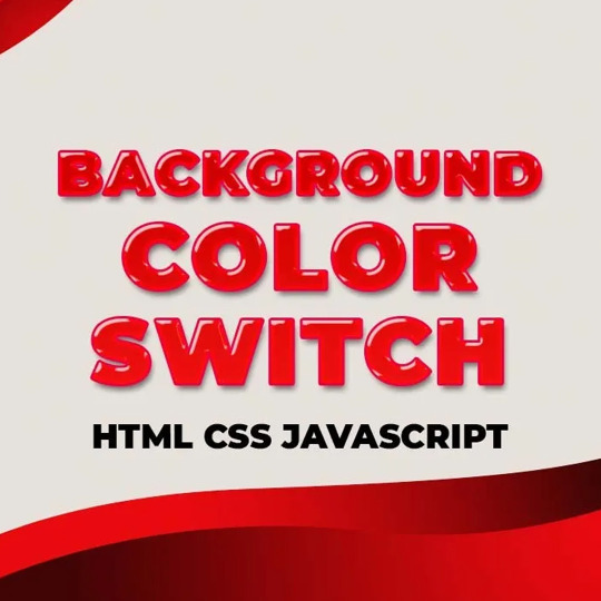
Text

Background Color Switch
#background color switch#background color change#dark light toggle effect#css effect#html css#css#frontenddevelopment#webdesign#html#css3#divinectorweb#learn to code
1 note
·
View note
Text
Searching for a New CSS Logo
New Post has been published on https://thedigitalinsider.com/searching-for-a-new-css-logo/
Searching for a New CSS Logo
There is an amazing community effort happening in search of a new logo for CSS. I was a bit skeptical at first, as I never really considered CSS a “brand.” Why does it need a logo? For starters, the current logo seems… a bit dated.
Displayed quite prominently is the number 3. As in CSS version 3, or simply CSS3. Depending on your IDE’s selected icon pack of choice, CSS file icons are often only the number 3.
To give an incredibly glossed-over history of CSS3:
Earliest draft specification was in 1999!
Adoption began in 2011, when it was published as the W3C Recommendation.
It’s been used ever since? That can’t be right…
CSS is certainly not stuck in 2011. Take a look at all the features added to CSS in the past five years (warning, scrolling animation ahead):
(Courtesy of Alex Riviere)
Seems like this stems mainly from the discontinuation of version numbering for CSS. These days, we mostly reference newer CSS features by their individual specification level, such as Selectors Level 4 being the current Selectors specification, for example.
A far more general observation on the “progress” of CSS could be taking a look at features being implemented — things like Caniuse and Baseline are great for seeing when certain browsers implemented certain features. Similarly, the Interop Project is a group consisting of browsers figuring out what to implement next.
There are ongoing discussions about the “eras” of CSS, though, and how those may be a way of framing the way we refer to CSS features.
Chris posted about CSS4 here on CSS-Tricks (five years ago!), discussing how successful CSS3 was from a marketing perspective. Jen Simmons also started a discussion back in 2020 on the CSS Working Group’s GitHub about defining CSS4. Knowing that, are you at least somewhat surprised that we have blown right by CSS4 and are technically using CSS5?
The CSS-Next Community Group is leading the charge here, something that member Brecht de Ruyte introduced earlier this year at Smashing Magazine. The purpose of this group is to, well, determine what’s next for CSS! The group defines the CSS versions as:
CSS3 (~2009-2012): Level 3 CSS specs as defined by the CSSWG
CSS4 (~2013-2018): Essential features that were not part of CSS3, but are already a fundamental part of CSS.
CSS5 (~2019-2024): Newer features whose adoption is steadily growing.
CSS6 (~2025+): Early-stage features that are planned for future CSS.
Check out this slide deck from November 2023 detailing the need for defining stronger versioning. Their goals are clear in my opinion:
Help developers learn CSS.
Help educators teach CSS.
Help employers define modern web skil…
Help the community understand the progression of CSS capabilities over time.
Circling back around to the logo, I have to agree: Yes, it’s time for a change.
Back in August, Adam Argyle opened an issue on the CSS-Next project on GitHub to drum up ideas. The thread is active and ongoing, though appears to be honing in on a release candidate. Let’s take a look at some proposals!
Nils Binder, from 9elements, proposed this lovely design, riffing on the “cascade.” Note the river-like “S” shape flowing through the design.
Chris Kirk-Nielson pitched a neat interactive logo concept he put together a while back. The suggestion plays into the “CSS is Awesome” meme, where the content overflows the wrapper. While playful and recognizable, Nils raised an excellent point:
Regarding the reference to the ‘CSS IS AWESOME’ meme, I initially chuckled, of course. However, at the same time, the meme also represents CSS as something quirky, unpredictable, and full of bugs. I’m not sure if that’s the exact message that needs to be repeated in the logo. It feels like it reinforces the recurring ‘CSS is broken’ mantra. To exaggerate: CSS is subordinate to JS and somehow broken.
Wow, is this the end of an era for the familiar meme?
It’s looking that way, as the current candidate builds off of Javi Aguilar’s proposal. Javi’s design is being iterated upon by the group, it’s shaping up and looks great hanging with friends:
Javi describes the design considerations in the thread. Personally, I’m a fan of the color choice, and the softer shape differentiates it from the more rigid JavaScript and Typescript logos.
As mentioned, the discussion is ongoing and the design is actively being worked on. You can check out the latest versions in Adam’s CodePen demo:
Or if checking out design files is more your speed, take a look in Figma.
I think the thing that impresses me most about community initiatives like this is the collaboration involved. If you have opinions on the design of the logo, feel free to chime in on the discussion thread!
Once the versions are defined and the logo finalized, the only thing left to decide on will be a mascot for CSS. A chameleon? A peacock? I’m sure the community will choose wisely.
#2023#2024#adoption#amazing#animation#Articles#bugs#cascade#chameleon#change#Collaboration#Color#Community#content#course#CSS#css-tricks#css3#css5#csswg#Design#developers#Features#figma#Full#Fundamental#Future#github#History#how
0 notes
Text
Premium Animated Background Bundle - Particle & Star Effects (Background + Transparent Versions)
LIVE DEMO - Premium Animated (Background)
LIVE DEMO - Premium Animated (Transparent)
BUY NOW
Elevate your website's visual appeal with our Premium Animated Background Bundle - a collection of professionally crafted particle and star effects designed to create immersive user experiences. This versatile package includes two distinct versions for maximum flexibility:
Gradient Background Version: Features a stunning cosmic-themed gradient background with:
150+ twinkling stars with randomized glow effects
100+ dynamic floating particles
Smooth parallax movement
Modern dark-blue/purple color scheme
Transparent Background Version: Perfect for seamless integration:
Fully transparent canvas
120+ semi-transparent glowing stars
80+ ethereal particles with opacity control
Works over ANY background color/image

Key Features:
✅ Double Value: Two complete versions in one package ✅ Zero Dependencies: Pure vanilla JavaScript + CSS ✅ Lightweight: Only 4KB minified (CSS+JS combined) ✅ Fully Responsive: Auto-adapts to all screen sizes ✅ Cross-Browser: Works on Chrome, Firefox, Safari, Edge ✅ Easy Customization: Change colors/size/speed in 2 lines of code
Perfect For:
Website hero sections
SaaS product backgrounds
Portfolio showcases
Landing page decorations
Presentation visuals
Digital product showcases
Technical Specifications:
Format: HTML5/CSS3/JavaScript
Total Files: 8 (4 HTML, 2 CSS, 2 JS)
Documentation: Detailed README included
License: Commercial Use (MIT)
Why Choose Our Bundle?
Performance Optimized: CPU-friendly animations with intelligent element recycling ensure buttery-smooth performance even on mobile devices.
Professional Aesthetics: Carefully calibrated timing functions and randomized parameters create organic, natural-looking motion that stands out from amateur effects.
Developer Friendly: Clean, commented code with modular architecture makes customization effortless. No jQuery or bloated libraries!
Instant Integration: Includes ready-to-use HTML files - just drag & drop into your project. Works with React/Vue/WordPress via simple wrapper.
Sample Customer Use Cases:
Web Designer: "Used the transparent version over client's photography portfolio - created magical hover effects!"
SaaS Developer: "Background version made our analytics dashboard feel premium and high-tech"
Marketer: "Increased conversion rate by 17% with animated hero section"
Agency Owner: "Our go-to solution for client projects needing wow-factor backgrounds"
Commercial License Includes:
Use in unlimited projects
Client work authorization
Resell in compiled products
Lifetime updates
#animated background#javascript background#css animation#parallax background#particles js#star background#vanilla js effect#cosmic animation#html5 animation#website hero effect#responsive animation#transparent canvas#gradient animation#animated stars#twinkling background#floating particles#pure css#no dependency#lightweight js#modern website effect#immersive ui#digital product design#animated hero section#landing page animation#portfolio background#saas ui background#interactive background#canvas animation#background bundle#particle effect
1 note
·
View note
Text
Ajax-Enabled Enhanced Layered Navigation nulled plugin 2.0.2

Boost Your WooCommerce Store with Ajax-Enabled Enhanced Layered Navigation Nulled Plugin If you're looking to revolutionize your WooCommerce store’s navigation experience, the Ajax-Enabled Enhanced Layered Navigation nulled plugin is the tool you’ve been searching for. This feature-rich plugin allows your users to filter products with lightning-fast precision—without reloading the page—offering a seamless and intuitive shopping experience that increases conversions and customer satisfaction. What is Ajax-Enabled Enhanced Layered Navigation Nulled Plugin? The Ajax-Enabled Enhanced Layered Navigation is a dynamic WooCommerce extension that upgrades your product filtering system. Unlike traditional layered navigation, this plugin uses Ajax technology to load filtered product results instantly—no page reloads, no waiting time. Best of all, you can download it for free directly from our site, giving you access to premium functionality at no cost. Technical Specifications Plugin Name: Ajax-Enabled Enhanced Layered Navigation Compatible with: WooCommerce 5.x and above Technology: Ajax, jQuery, CSS3 File Format: ZIP (Nulled Version) License: GPL (General Public License) Powerful Features and Key Benefits The Ajax-Enabled Enhanced Layered Navigation nulled plugin is designed to simplify the shopping experience and streamline product discovery. Here’s why it’s a must-have for your WooCommerce store: Instant Filtering: Say goodbye to page reloads—filter products by categories, attributes, price, and more with immediate Ajax-powered updates. Multi-Select Filters: Allow users to select multiple filter options in one go for a more flexible and tailored product search. SEO-Friendly URLs: The plugin generates clean URLs that are fully crawlable by search engines, enhancing your site’s SEO. Mobile Responsive: Designed to look and function flawlessly on all screen sizes and devices. Fully Customizable: Tweak the plugin to match your theme and branding with customizable color schemes and layout options. Why Use the Ajax-Enabled Enhanced Layered Navigation Nulled Plugin? Unlike other solutions, this nulled version grants you access to all premium functionalities without spending a dime. Improve customer experience, reduce bounce rates, and drive higher engagement with this powerful tool. For additional SEO enhancement tools, consider using All in One SEO Pack Pro, a perfect companion for optimizing your product pages. Common Use Cases Large Inventory Stores: Perfect for businesses with hundreds or thousands of SKUs looking to streamline navigation. Fashion & Apparel Stores: Let users filter by size, color, brand, and more—instantly. Electronics Shops: Offer real-time filtering for specs like storage, screen size, brand, etc. Multi-Vendor Marketplaces: Enhance the overall browsing experience across multiple product categories. Installation & Usage Guide Installing the Ajax-Enabled Enhanced Layered Navigation is simple and takes just minutes: Download the plugin ZIP file from our website. Go to your WordPress dashboard → Plugins → Add New → Upload Plugin. Select the downloaded file and click "Install Now." Once installed, activate the plugin and go to WooCommerce → Settings → Layered Navigation to customize your filters. That’s it! You’re now ready to offer an advanced, lightning-fast filtering system to your users. FAQs Is the Ajax-Enabled Enhanced Layered Navigation nulled plugin safe to use? Yes. The version available on our site has been thoroughly scanned for malware and is safe for testing and use in non-production environments. Can I customize the look of the filters? Absolutely. You can change colors, styles, and positions to match your theme perfectly. Will this plugin slow down my website? Not at all. In fact, it improves user experience by eliminating the need for full-page reloads, resulting in faster browsing and higher user engagement. Is it compatible with all themes? Yes. The plugin is compatible with most WooCommerce themes, including premium ones like flatsome NULLED.
Enhance your online store’s performance and provide your users with a modern, fluid shopping experience by using the Ajax-Enabled Enhanced Layered Navigation today. Download it now and give your WooCommerce site the upgrade it deserves—without spending a single cent!
0 notes
Text
Complete Guide to Web Development Course in Delhi for Aspiring Coders
Web development is one of the most sought-after fields in the tech industry today. Whether you’re looking to build your own website, start a career as a developer, or boost your skills, a web development course in Delhi can help you gain the expertise you need. With Delhi being a major tech and business hub in India, it offers plenty of opportunities for aspiring coders to learn web development from experts and gain practical, hands-on experience.
In this guide, we’ll take a deep dive into everything you need to know about web development courses in Delhi, including what you’ll learn, the skills you need, and how to choose the best course that fits your career goals.
Why Choose a Web Development Course in Delhi?
Delhi, with its thriving tech ecosystem, has become one of the top cities for digital education, especially in fields like web development. Here are some key reasons why a web development course in Delhi can be the perfect fit for aspiring coders:
Access to Industry Experts: Delhi is home to a large number of experienced developers and tech professionals who often lead web development courses. Learning from industry experts gives you practical knowledge that can’t be found in textbooks.
Wide Range of Course Options: Delhi’s institutes offer a variety of courses ranging from front-end to full-stack development, catering to different skill levels and career aspirations.
Networking Opportunities: By joining a course in Delhi, you gain access to a network of tech professionals, mentors, and fellow students, which can lead to potential job opportunities or collaborations.
Job Placement Assistance: Many web development institutes in Delhi offer job placement support, ensuring that students are well-prepared to enter the workforce.
What Will You Learn in a Web Development Course in Delhi?
A web development course in Delhi will typically cover the following essential topics:
1. Front-End Development
Front-end development is all about creating the user-facing part of websites—the part that users interact with. As a front-end developer, you’ll learn:
HTML5: The backbone of any webpage. HTML defines the structure and content of a website.
CSS3: Responsible for styling the layout, colors, fonts, and overall design of the website.
JavaScript: This programming language allows you to create interactive features like forms, buttons, and other dynamic elements on web pages.
Bootstrap: A front-end framework that helps developers quickly create responsive websites.
2. Back-End Development
Back-end development focuses on what happens behind the scenes of a website. It’s about managing databases, servers, and application logic. As part of back-end training, you’ll learn:
PHP, Python, or Node.js: These are popular back-end programming languages used to build the logic behind web applications.
Database Management: Learn to interact with databases using MySQL or MongoDB.
Web Servers: Learn how to deploy applications and manage web servers using tools like Apache or Nginx.
3. Full-Stack Development
Full-stack developers are experts in both front-end and back-end development. Many web development courses in Delhi offer full-stack development training that covers everything from designing websites to building the back-end systems that support them.
4. Version Control and Collaboration
Learning version control using Git and GitHub is crucial for any developer. It allows you to track changes to your code and collaborate with others in a team setting. Most web development courses in Delhi will include training on these tools.
5. Web Hosting and Deployment
Once your website or web application is built, you need to make it accessible to users. In web development courses, you'll learn how to deploy your projects to live servers and host them using AWS, Heroku, or other platforms.
What Are the Skills You’ll Develop?
Along with technical coding skills, a web development course in Delhi will help you build essential professional skills required for the job market.
1. Problem-Solving Skills
Web development requires strong problem-solving skills. As a developer, you will face many challenges that require creative solutions, whether it’s fixing bugs, optimizing site performance, or developing new features.
2. Time Management Skills (MGT Skills)
A key element of being a successful developer is effective time management. Completing projects on time, meeting deadlines, and working on multiple tasks at once requires you to plan your time wisely. Many web development institutes in Delhi incorporate mgt skills as part of their curriculum, teaching students how to manage time effectively while maintaining quality work.
3. Attention to Detail
In web development, even the smallest error in code can lead to significant problems. A good web developer is highly detail-oriented and able to write clean, bug-free code.
4. Teamwork and Collaboration
In today’s world of web development, most projects are completed in teams. Collaboration is essential to success. Students are often taught how to work well in teams, communicate their ideas clearly, and solve problems collectively.
5. Communication Skills
As a developer, you need to clearly explain your ideas to other developers, designers, and sometimes clients. This requires strong verbal and written communication skills.
How to Choose the Best Web Development Course in Delhi?
When choosing a web development course in Delhi, it’s important to consider the following factors:
1. Course Content and Duration
Ensure the course covers all essential topics, including front-end, back-end, and full-stack development. Also, check the duration and whether the course fits into your schedule.
2. Trainer Expertise
Look for institutes with experienced trainers who have worked on live projects and can provide real-world insights into the field of web development.
3. Practical Learning
Practical, hands-on learning is crucial. Ensure that the course includes live projects, coding exercises, and case studies that give you real-world experience.
4. Job Placement Support
Choose an institute that offers placement assistance and has ties with tech companies or agencies looking for fresh talent.
5. Reviews and Testimonials
Research the reputation of the institute. Read student reviews and testimonials to understand the quality of training and the success rate of past students.
Start Your Career with a Web Development Course in Delhi
A web development course in Delhi can open up a world of opportunities for aspiring coders. With expert trainers, real-time project experience, and comprehensive learning, Delhi is the perfect city to kick-start your career as a web developer. By mastering both technical skills and mgt skills, you’ll be well-prepared to tackle the challenges of the job market and succeed in your career.
0 notes
Text
Master the Web: Join the Best Frontend Web Development Course in Delhi

In today’s digital world, a strong online presence is essential for every business. This demand has created a surge in the need for skilled web developers, especially frontend developers who craft the visual and interactive aspects of websites. If you’re looking to enter the tech industry or enhance your current skills, enrolling in a Frontend Web Development Course in Delhi is the ideal first step.
Why Frontend Development is in Demand
Frontend development is all about creating visually engaging, responsive, and user-friendly websites. Everything a user sees and interacts with on a website—buttons, layouts, colors, fonts—is the result of frontend development. With more companies investing in better digital experiences, skilled frontend developers are highly sought after across various industries.
What to Expect from a Frontend Web Development Course in Delhi
Choosing the right Frontend Web Development Course in Delhi gives you access to structured, expert-led learning. A good course equips you with both theoretical knowledge and practical experience, preparing you for real-world challenges in web development.
Here’s what a comprehensive course typically covers:
HTML5 & CSS3: Learn the foundational languages used to structure and style web pages.
JavaScript: Understand the logic behind user interaction and make websites dynamic.
Responsive Web Design: Master mobile-first designs to ensure websites look great on all devices.
Frontend Frameworks: Get hands-on with tools like Bootstrap and JavaScript libraries such as React or Vue.
Project Work: Work on real-time projects that simulate actual work environments.
Version Control: Use Git and GitHub for code management and collaboration.
Benefits of Joining a Training Program in Delhi
Delhi is a growing hub for IT training and startups. Taking a Frontend Web Development Course in Delhi provides several advantages:
Experienced Trainers: Learn from professionals with industry insights and years of experience.
Career Support: Many institutes offer career guidance, resume building, and placement assistance.
Networking Opportunities: Meet fellow aspiring developers and build connections in the tech community.
Affordable Learning: Compared to many other metro cities, Delhi offers top-quality training at competitive prices.
Who Should Join This Course?
Students and Graduates looking to build a career in web development.
Professionals wanting to switch careers into the tech domain.
Freelancers aiming to expand their service offerings.
Entrepreneurs who want to build and manage their own websites.
Whether you’re a complete beginner or someone with basic coding knowledge, this course will help you bridge the gap between theory and hands-on skills.
Conclusion: Your Career Starts Here
Enrolling in a Frontend Web Development Course in Delhi can be a life-changing decision. It opens doors to high-paying job opportunities, freelance projects, and even the chance to create your own web-based business.
Start learning from industry experts, work on real-time projects, and master the skills that are in high demand. Don’t just browse the web—start building it.
Take the first step today and become a professional frontend developer with the right training!
Original Source:- https://digilinkersacademy.blogspot.com/2025/04/master-web-join-best-frontend-web.html
#digital marketing course#web development course in delhi#digilinkers academy#advanced digital marketing course#Frontend Web Development Course
0 notes
Text
Haven’t Heard About Starbis - Multipurpose HTML5 Template Well, there is no reason to doubt that this all-in-one solution will definitely help you to create a professional and top-notch business presence online. Most probably you have checked hundreds of website designs, with no real success. Today we want to help you with your choice and suggest you to use Starbis to become a member of the web world. More | Demo To begin with, Starbis from TemplateMonster is considered to be a cutting-edge multipurpose template, which can be handled equally great by both experienced users and newbies. In general, Starbis implies a wide number of features, pages, and extensions that are suitable for creating any type of business or personal websites for a quick start. In addition, it sticks out with a user-friendly interface, a set of custom page templates, W3C validation pages, and an SEO optimization option. As to SEO-friendly option, it provides your visitors with an excellent performance on all handheld digital devices and popular browsers. Functionality In all honesty, Starbis HTML5 template features a fully responsive design enhanced with a Bootstrap framework, W3C standard-compliant pages for better usability, a well-commented code, load speed and SEO optimization for more traffic, etc. All these and many more smart features differ this template from the others solutions and provide great visual and user experience. Custom Pre-Designed Pages Speaking about pre-design pages, Starbis offers 50+ different out-of-box pages, which will save your time and efforts. Depending on your business marketing strategy you are free to choose between pre-designed HTML5 pages, make any changes in the color scheme, add your content, set up fonts, etc. Some of these layouts are Cooming Soon Page, 404 Page, FAQ Pages, Registration Page, Pricing Page, and maintenance pages. A great and unique design is the very feature, which differ them and make their look perfect. These ready-made solutions allow you to interact with your audience and keep them informed. Customization Mode As we have already mentioned, the best part about website templates is the possibility to play with their skins, switch between all of them, try how they look like, whether they fit your business strategies and goals. A well-organized structure of your website will enhance its visual performance, provide a user-friendly interface, easy-to-use navigation, etc. Starbis boasts multiple header and footer variations, a fully-fledged MegaMenu, a set of UI elements, CTA buttons, icon lists and boxes, smooth CSS3 animation, a cutting-edge Parallax technique, live search, etc. Actually, this is not the whole list so far. Smart use of these options will make your website to stand out from competitors, for sure. Let your audience know that you are interested in it. Provide them with all possible contact details, newsletters subscription form, a feedback form, multiple web forms. Thus, you will create a strong communicative chain, enhance your website’s navigation and increase traffic. eCommerce Ready In addition, Starbis features eCommerce pages in order to run an online store right on your web page. They can be also customize depending on your liking. As a result, you may showcase your products and services using grid or list layout, single page or cart page layout, and a checkout page for shipping and paying details. Each type is intended to provide your visitors with the detailed information, color, size, photo gallery, video review, testimonials, etc. Starbis Multiple Gallery Types When it comes to the visual presentation of your works and projects, multiple gallery types enable to organize their structure properly. Thus, you can choose a grid, masonry and cobbles gallery type. This option allows you to combine images of different size into a captivating presentation. Child themes n fact, Starbis offers 5 child themes suitable for different business niches.
You can find here a ready-made solution for a financial and business project, investment and accounting companies, lawyers and insurance agencies, as well. Choose the one you need and stay one step ahead of your competitors. Customization Service Center You cannot neglect the fact, that choosing a great website template sounds like investing in a new house. Your website should be user-friendly, simple in navigation, creative and professionally designed, as well. Even now, many of you still hesitate with their choice. Right from this point stop worrying about the perfect design and empower TemplateMonster’s
0 notes
Text
Alanzo Personal Chef WordPress Theme v1.1.0
https://themesfores.com/product/alanzo-personal-chef-wordpress-theme/ Alanzo Personal Chef WordPress Theme v1.1.0 Alanzo Personal Chef & Wedding Catering Event WordPress Theme Alanzo is an elegant, modern & responsive restaurant WordPress theme for catering businesses. It s also a perfect fit for your personal page if you are a chef, and you want to offer your services during special events, like weddings, anniversaries, birthday parties, and corporate banquets. The template is also an ideal option for a restaurant, cafe, and actually almost any eating establishment and food service. Important Features for Catering WordPress Theme Alanzo combines contemporary and interactive design and some awesome functionality. The theme allows you to showcase the menu you offer in a beautiful way (this includes categorization, recipes, nutrition information etc) due to the integration of our custom post format Dishes . Online Appointments booking & management Contact Forms Incredible restaurant menu management Awesome ready-made shortcodes & pages The theme is entirely responsive and fully Retina-ready. No matter what device your users are using for browsing, your site will always look wonderful and work properly. Key Features Professional design One-Click demo install Modern, Flexible, Customizable WordPress 4.0+ Tested and Approved Built with HTML5 and CSS3 code Cross-Browser Compatibility: FireFox, Safari, Chrome, IE11+ Slider Revolution & Swiper Slider included Retina Images Support User menu and Main menu support Interactive Ajax Search Flexible Colors & Typography Layout Features: 100% Responsive & Mobile-friendly Boxed and Fullwidth page layouts WPBakery Page Builder support modify any page content easily Customize Header and Footer Layouts in Visual Composer Advanced Blog Settings: Multiple Blog Styles Flexible Layout Options 20+ Post Animations Customizable Blog Feed (choose from post types or categories) Post views, likes and sharing buttons Related Posts Section Powerful Theme Framework: Setting Inheritance and Override System 750+ Customizer Options Custom Post Types Custom Widget Sets Custom Shortcodes Custom Theme Options Panel Optimized for best performance …and many more! Plugins Compatibility: Slider Revolution WPBakery Page Builder Essential Grid MailChimp for WP ThemeREX Addons Fontello & Image Icons Google Fonts Professional Support Detailed Documentation Regular Updates And many more Change log 17.03.2023 Version 1.0.10 – Update – Import Essential Grid 3.0.17+ plugin; – All plugins have been updated to their latest versions 24.01.2023 Version 1.0.9 – Update – Compatibility with WordPress 6.1.1 has been improved; – Theme styles have been improved; – All plugins have been updated to their latest versions 17.10.2022 Version 1.0.8 – Update – Compatibility with WordPress 6.0.2 has been improved; – Theme styles have been improved; – All plugins have been updated to their latest versions Please note that any digital products presented on the themesfores website do not contain malicious code, viruses, or advertising. For License Key: themesfores.com products are functional without entering a product license code. We are unable to provide a license code for you, and it’s because we already obtain the Plugin/Theme to the original developer. The use of a license code usually is for automatic updates and premium support from the original developer. Besides, we guarantee you to deliver a free manual update and minor assistance for your convenience of using the product. Refund Policy: If the plugin or theme is not working properly and we also fail to help you then, in that case, you will get the money back. If the plugin and theme are working properly then you will not get the money back. https://themesfores.com/product/alanzo-personal-chef-wordpress-theme/ #ModernMagazine #WordpressTheme
0 notes
Text

CSS Text Color Change Animation
#text color change animation#css text animation#css animation tutorial#css text effects#css animation examples#html css#neduzone#css#html#frontend#css3#frontenddevelopment
1 note
·
View note
Text

Javascript Background Color Change
#background color change#javascript#javascript projects#javascript projects for beginner#html css#frontenddevelopment#codenewbies#code#css#html5 css3
0 notes
Text
Web Development Course in rajkot
1. What is the importance of responsive design in web development?
Answer: Responsive design is crucial because it ensures that websites are usable and visually appealing on a variety of devices, including desktops, tablets, and smartphones. By using flexible grids, layouts, images, and CSS media queries, responsive design enhances the user experience and improves SEO rankings since search engines prefer mobile-friendly websites. This is a fundamental topic in any Web Design Course in ahmedabad.
2. Can you explain the concept of a CSS preprocessor and name a few?
Answer: A CSS preprocessor extends the default capabilities of CSS by adding features such as variables, nested rules, and mixins, which help to write reusable and maintainable CSS code. Popular CSS preprocessors include Sass (Syntactically Awesome Stylesheets), Less, and Stylus. These preprocessors compile the extended syntax into standard CSS that browsers can understand. Learning about CSS preprocessors is a key part of any website development course
3. What is the difference between a fixed layout and a fluid layout in web design?
Answer: A fixed layout has a set width in pixels and does not change regardless of the screen size. This can cause issues on smaller screens, as content may be cut off. A fluid layout, on the other hand, uses percentage-based widths, making it more flexible and able to adapt to different screen sizes. Fluid layouts are more user-friendly on various devices.
4. Describe the box model in CSS
Answer: The CSS box model describes the rectangular boxes that are generated for elements in the document tree and consists of four parts: content, padding, border, and margin. The content is the innermost part where text and images appear. Padding is the space between the content and the border. The border encloses the padding and content. Margin is the outermost part, providing space between the element and other elements. Understanding the box model is essential in Web Designing in ahmedabad.
5. What are media queries, and how do they work?
Answer: Media queries are a feature of CSS3 that allow the application of different styles based on the characteristics of the user's device, such as screen width, height, orientation, and resolution. By using media queries, developers can create responsive designs that adjust the layout and styling of a website to provide an optimal viewing experience on various devices.
6. How do you ensure that your web design is accessible to users with disabilities?
Answer: Ensuring web accessibility involves several practices, including using semantic HTML tags, providing alternative text for images, ensuring sufficient color contrast, making content navigable via keyboard, and using ARIA (Accessible Rich Internet Applications) roles and properties to enhance the information provided to assistive technologies. It's also important to test the website with screen readers and other assistive tools. Accessibility is a key topic in any Website Development Course.
7. What is the purpose of a wireframe in web design?
Answer: A wireframe is a visual guide that represents the skeletal framework of a website. It outlines the structure, layout, and key elements of a web page without including detailed design or content. Wireframes are used to plan the layout, ensure a logical flow of information, and serve as a blueprint for the design and development process. They help stakeholders and developers understand the basic structure before adding visual design elements. Wireframing is an essential skill in Website Design Training.
8. Can explain the difference between UX (User Experience) and UI (User Interface) design?
Answer: UX design focuses on the overall experience a user has when interacting with a product or website, including usability, functionality, and satisfaction. It involves research, prototyping, and testing to create a user-centered design. UI design, on the other hand, is concerned with the visual and interactive elements of a product, such as buttons, icons, typography, and color schemes. UI design aims to create an aesthetically pleasing and intuitive interface that enhances the user experience. Both UX and UI design are covered in-depth.
9. What are some common web design trends you follow?
Answer: Some common web design trends include:-
Minimalism and simplicity
Responsive and mobile-first design
Use of bold typography
Micro-interactions and animations
Dark mode design
Asymmetrical layouts
Use of gradients and vibrant colors
Incorporating illustrations and custom graphics
Accessibility and inclusive design
Voice user interface (VUI) integration
Keeping up with these trends is important for anyone involved in web designing.
10. How do you approach a web design project from start to finish?
Answer: Approaching a web design project involves several key steps:-
Discovery and Research: Understand the client's goals, target audience, and competitors. Gather requirements and define the project scope.
Planning: Create a project plan, including timelines and milestones. Develop a site map and user flow diagrams.
Wireframing and Prototyping: Design wireframes to outline the structure and layout. Create interactive prototypes to visualize the user experience.
Visual Design: Develop the visual style, including color schemes, typography, and graphics. Design high-fidelity mockups.
Development: Convert the design into a functional website using HTML, CSS, JavaScript, and other technologies. Ensure the site is responsive and accessible.
Testing: Conduct thorough testing, including usability, compatibility, performance, and accessibility testing. Fix any issues that arise.
Launch: Deploy the website to a live server. Monitor for any post-launch issues and make necessary adjustments.
Maintenance: Provide ongoing support, updates, and improvements based on user feedback and analytics.
0 notes
Text
Building a Strong Online Presence with the Gym WordPress Theme

In today's competitive fitness industry, having an online presence is no longer optional—it's essential. For gym owners and personal trainers looking to distinguish themselves, the Gym WordPress Theme provides an exceptional solution. This user-friendly theme is designed to help you create a compelling website that showcases your services and attracts more clients without requiring advanced coding skills.
User-Friendly Design
The Gym WordPress Theme is perfect for users with any level of technical expertise. Even those with little to no coding knowledge can easily design their website by following the comprehensive documentation provided. Additionally, free installation support ensures that you can get your site up and running smoothly.
Customizable Elements
One of the standout features of the Gym WordPress Theme is its high level of customization. You can tweak various elements such as colors, layouts, and more to align with your brand identity and keep pace with changing market conditions. The theme's interface is built to adapt, ensuring your website remains fresh and relevant.
Extensive Plugin Compatibility
The Gym WordPress Theme is compatible with popular page builder plugins like Gutenberg, Elementor, Divi, Visual Composer, Beaver Builder, and Live Composer. This flexibility allows you to create stunning page layouts with ease. Furthermore, the theme adheres to WordPress codex theme review standards, ensuring high-quality coding practices.
Cross-Browser and Device Compatibility
Your gym website will be accessible on both old and new browsers, thanks to the theme's flat and material design approach. It has been tested across various browsers, including Chrome, Safari, and Opera, ensuring a seamless experience for all users. Additionally, the theme is responsive and compatible with all devices, providing an optimal viewing experience on smartphones, tablets, and desktops.
Enhanced Loading Speed
Website loading speed is crucial for maintaining visitor interest and boosting traffic. The Gym WordPress Theme supports cache plugins to enhance your site's loading speed, making it faster and more efficient.
Engaging Blog and Media Integration
The theme includes a blog section designed to keep visitors engaged with your content for longer durations. You can choose from four different layout variations to create an elegant blog section. Additionally, the theme supports a mix of images, videos, and banners to present your content in an alluring and aesthetic format.
Multilingual and High-Resolution Ready
The Gym WordPress Theme supports various RTL languages like Hebrew and Arabic, making it versatile for global use. It is also high-resolution ready, ensuring your website looks sharp and professional on all devices.
Security and SEO
Security is paramount, and this theme supports various security plugins to protect your website from malicious attacks and hackers. Moreover, it is SEO and social media-friendly, helping you to enhance your online visibility and reach a broader audience.
Additional Features
Full color-changing options with a color picker
Over 580 social icons and other icons available
A dedicated bio area to showcase your gym trainers
Theme options for various buttons, info boxes, and accordions
Multilingual support with qTranslate X compatibility
PO file for easy translation into other languages
Over 600 Google fonts to choose from
Shortcodes plugin compatibility for better content setup
WooCommerce compatibility for setting up an online shop
Contact form and Google Map integration
Gallery area for displaying images of your gym
Widgetized sidebar, footer, and header
HTML5 & CSS3 coding standards
Conclusion
The Gym WordPress Theme is an ideal choice for gym owners and personal trainers aiming to build a strong online presence. Its comprehensive features and user-friendly design make it easy to create an attractive and functional website that stands out in the competitive fitness industry. Start building your fitness website today with the Gym WordPress Theme and make a lasting impact in the fitness world.
By leveraging the Gym WordPress Theme, you can effectively showcase your training services, attract more clients, and maintain a competitive edge. Don't miss out on the opportunity to enhance your online presence—take the first step towards building your compelling fitness website now.
#BestWordPressThemes#BestPaidWordPressThemes#TopWordPressWebsitesinIndia#PurchaseWordPressTemplates#BestWordPressThemesToBuy#PremiumWordPresstemplates#BuyResponsiveWordPressTheme#WordPressThemes#BuyWordPressThemes#PurchaseWordPressThemes#DownloadWordPressThemes#WordPressThemesIndia#IndianWordPressThemes
0 notes
Text
Website Closure Announcement
Hello,
Next week starting on May 5th I'm closing the website for maintenance and some groovy updates. No new posts until the website is live again.
The expected time of opening will be on Saturday, May 11th.
The follow are website updates that's being worked on. - New website layout! - Easier navigation - Responsive layout - More graphic info details like format. - Introducing vector backgrounds. (SVG format). They're free. - add more CSS3 patterns - New color search with more options (magenta, beige, teal, tan ) - Animated background patterns (.gifa format)
I'm also changing the hosts too. Tumblr will remain updated too with each post. A custom Tumblr website layout will follow.
0 notes
Text
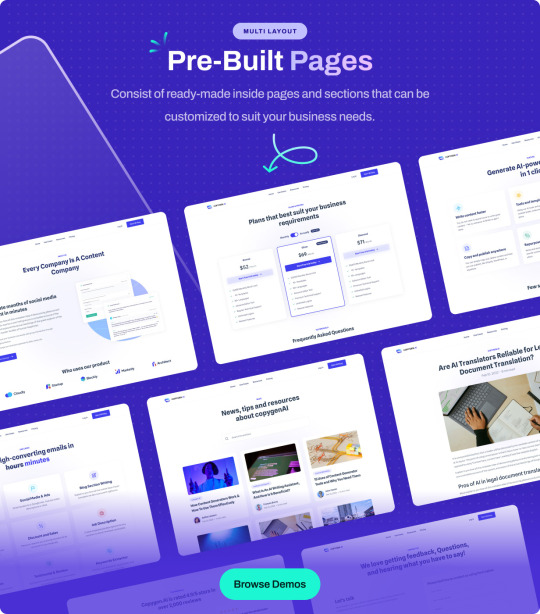
CopyGen – is a responsive website template for AI Content Writing/Generator website. We have designed this template for your new AI Content Writing website just how you like it. So, if you want to create a website for AI Writer, Copywriting, OpenAI Content Generator or AI Content Writing website then CopyGen template will best choice to build your own website.
CopyGen Template is fully flexible, user-friendly and responsive that looks great on every devices as desktops, tablets, and mobiles. This template built with Boostrap 5, HTML5, CSS3, Vanilla JS, SASS and Gulp. It includes 5 Homepage/Landing page, and 20+ pre-built inner pages. It built with well organized folder structure, clean & commented code. We have used gulp-based build tools and stylesheet based on scss variables so you can quickly change the colors, font sizes in variable file.
CopyGen HTML Template Features
4+ Homepages
20+ Prebuilt Pages
Pricing & Use cases Pages
Various Component Ready
Working Contact Form
Clean & Modern Design
Fully Responsive
Mobile first approach design
W3 validated Codes
Cross Browser Compatibility
Bootstrap 5, Vanilla JS, SASS
6 Months Free Support
And many more…
What do you get?
Landing Page HTML Template Files
Stand-alone User Dashboard Template Files
Source of Package (Gulp require to build)
Documentation
Caution: Some images are for preview purposes only and images cannot be supplied due to licensing reasons and have been blurred heavily.
0 notes