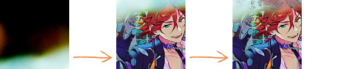
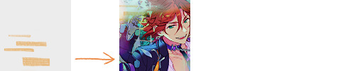
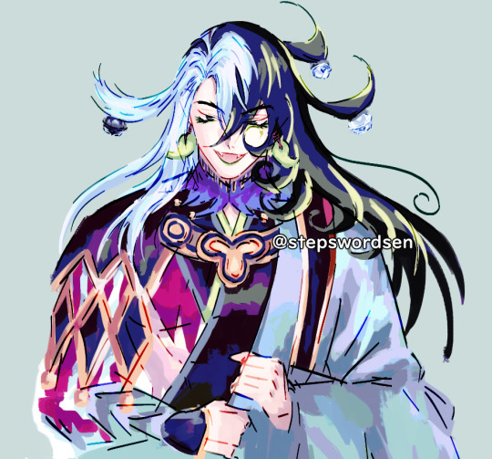
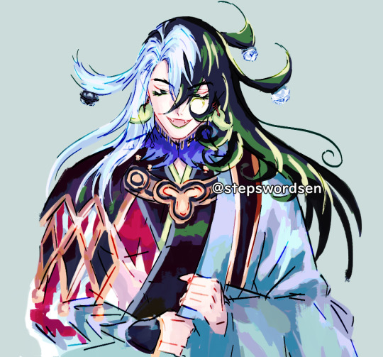
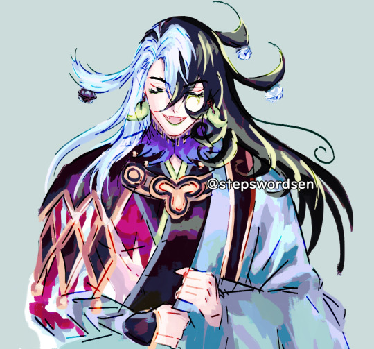
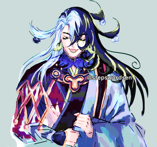
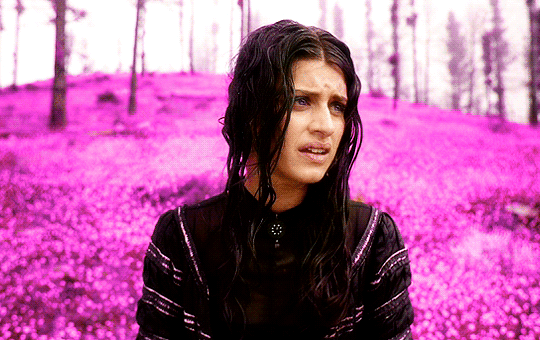
#first time playing with gradient maps :D
Explore tagged Tumblr posts
Visit Tumblr Blog
Explore Tumblr blogs with no restrictions, modern design and the best experience.
Last Seen Tumblr Blogs


Fun Fact
Tumblr.com rank in the US is 25.
Text

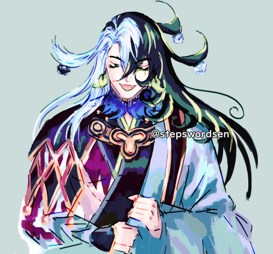
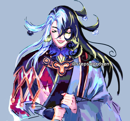
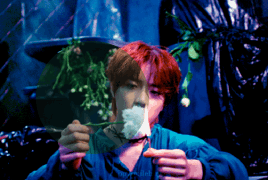
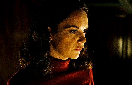
pfp for my friend jurt < 3
#this is fwicken tuff#my art#furry#digital art#first time playing with gradient maps :D#theyre so awesome
9 notes
·
View notes
Text
youtube
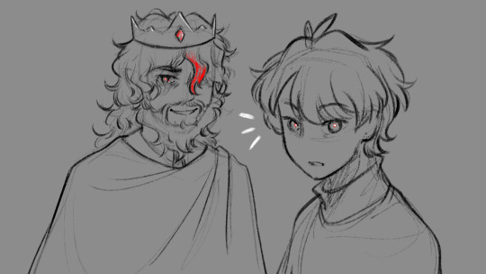
"Okay, yeah. If you kill a red name, killed a red name-" "I'll give you a life for that. That's the deal." "We'll be back together like buddies again, Bdubs."
In participation of Extreme Timed Challenge Gift Exchange hosted by @extremetimedchallengeexchange!
[gifs, full storyboard, behind-the-scene rambles under cut]
past 48h animatics: MCYTETC2023, ETC2023
[Red Lives-Suspicion; Prayer-Determination; Fireworks]
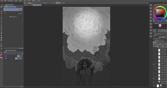
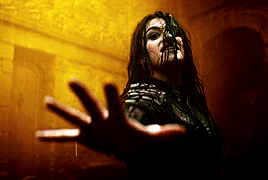
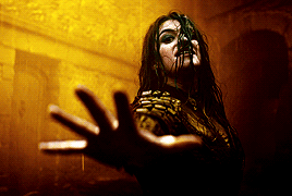
Fiddled with gradient maps this time for some additional colors :D I would have colored in the eyes as well, but I didn't have enough energy left when the event hit the 47th hour xD
Also played around with camera movements. Respect to people who do fan edits and other forms of video/ assets editing 'cause keyframes are so 😭
13 hours to draft storyboard this time! Last year I used 16 but with waaay more frames idk how I accomplished that. Probably bc this year I'm drawing more than three(3) characters lmao
Progress Timeline:
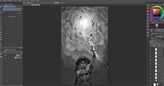
[13th hour] finished storyboard/ draft (plany off time...) [25th hour] lineart for the first 10 seconds (wuh oh) [36th hour] lineart for the first 25 seconds (oh shit oh fuck gotta shorten it) [45th hour] finished Bdubs' part (NOOO I DONT HAVE TIME FOR ETHO)
ngl kinda glad i cut it in half rn 'cause i'd have to spend time figuring out shadowDog's design /lh
Designs I used for Lizzie and Joel (old art from 2022 and 2021 respectively) (holy shit i've been here for 3 years???)
Joel *shakes fist* i hate u and ur stupid beard
[Lyrics vibe/scene planning; hours before disaster]
I think most of the drawn parts didn't deviate from the initial idea. Mostly timing adjustments and building upon the vibes. The parts that were changed the most was the "And you caused it (×3 combo)".
Went from "vague flashbacks" to "following Etho and co. out of the cave and back to Scott's base while implying who Etho blames with single character focus shots".
The first one is Scott because he suggested the idea. Like, obviously he's to blame. It's not like Etho went along and cemented the deal himself. Scott totally peer-pressured him into it.
The second one is Etho because... well the scene ends up kind of being like. The sight of the Snow Fortress triggering a flashback. (EthosLab the content creator deliberately turned his camera towards the Snow Fortress and holds it there for a second instead of looking at the huge lava pillar right in front of him. What is WRONG with him.)
But also like. Clocks are kind of special to Bdubs right. Whoever gave him a clock basically has his (temporary) loyalty or at the least earned a favor from him. So like. If he hadn't gifted Bdubs the clock, which signifies a closer(?) bond, maybe Bdubs wouldn't be so devoted to him (wrong). Also serves as a call-back/ reference to the "Prayer-Determination" shot ("pray with clock" in the scene planning screenshot). I like to think that Bdubs weighted his options and thought about "if he will kill/ who to kill" a lot while following the other Red Names. And in that scene he's like, convincing/ motivating himself. Remembering who/ what he's doing this for.
(It is also meant to be part of my giftee's other prompt: "an exploration of the doubt one or both of them felt during the heart transfer that didn’t happen after Bdubs killed Lizzie, and the following guilt Etho felt." The Etho section starting from "we're setting fire to our inside for fun" til the end of the animatic is based on that prompt.)
After a brief period of self-blame, it's time to shift it onto someone else! Because you're in denial! If Bdubs hadn't gone red, then Etho wouldn't have to offer the deal. If Bdubs hadn't want to stay as teammates, then he wouldn't agree to the deal. If Bdubs wasn't so devoted to Etho, then he wouldn't have attacked Lizzie and gotten himself killed.
Then the animatic ends with the end of the session :D
...That's longer than I expected but also not that long. If you read through all that, tysm :] Tell me your thoughts! Have a good day/ evening/ night :D
#bdoubleo100#ethoslab#ethubs#bdoubleo100 fanart#ethoslab fanart#last life smp#last life spoilers#traffic smp#trafficblr#Extreme Timed Challenge Exchange#48 Hour Exchange#events#my art#animatic#i sound like i didnt sleep but i DID DO NOT WORRY
94 notes
·
View notes
Note
Woowww, I LOVE the texture of your art 😍 can I ask how you achieve the many fine lines? Do you do them all by hand or do you have a specific brush? I’d love to hear more about your process in general!
Hello!! Firstly, thank you SO MUCH for your words, they seriously mean so much to me and every time I get a cute little reblog tag or an ask like this, I squeal in excitement !!
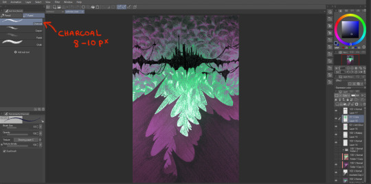
As for my brush/process, I would be happy to share! I work on Clip Studio Paint and I seriously love it. It's got so many cool features, and I barely know a third of them. As for brushes, I use one of the stock brushes they have, charcoal, under the pastels category.
In terms of process for this veiltober lineup, I am doing every line manually, one by one, but I have a couple of things that help me through the pieces.
First, I don't work with color right away. Once I have the sketch done, I will lay down some base values that give a good contrast to the piece. Doing this allows me to focus on the values and not so much on the palette I will use later.
Then, I manually go in and start doing every line. I try to have it follow some sort of flow (for the coulds/smoke/etc) or the planes of the body, face. And I work on the contrasts too, see what works or what doesn't work, what needs to be more hidden or brought out more.
Then I will group all my layers, duplicate that group (to keep the original, in case I wanna change anything), and merge all the layers in the group so as to have one single layer with everything. With that layer, I apply a gradient map and watch my B&W drawing colorize! In CSP, you have to go into Edit > Tonal Correction > Gradient map. I Also make some final adjustments on another layer, like white accents, extra lines or different colors (like Solas' arm here).

It's not that smooth though! Some pieces take a really long time because I'm constantly playing with colors, contrasts and details. Seeing what works, experimenting. There's always a lot of layers and groups in my files because of that xD
Hope that answers your questions :D Once again, ty for asking! It totally brightened my day!! I'll be going back to making the pieces now :3
44 notes
·
View notes
Text

From: Today!! <3
Time Spent: ~1 hour 20(?) minutes
THIS is the piece I got excited enough about sharing to finally post the others FBDHFJB
Inspired by the scene where Airi strangled Hina, and Hina just said "I... lo.. you.." I LOVE That scene and I LOVE Hina !!!!
Other inspiration includes an ask sent to wombrion about how they draw with shapes first rather than lines (which is how I drew this!!!) And a few songs from Will Wood and the Tapeworms' album, Everything is a Lot (the songs remind me of Hina sooo much, hehe)

This drawing was originally intended to be just layout for a short animation, since I haven't done that in a while, but I realllly wasn't feeling it, so I did the aforementioned drawing-with-shapes-first style, and had a lot of fun !!!!
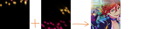
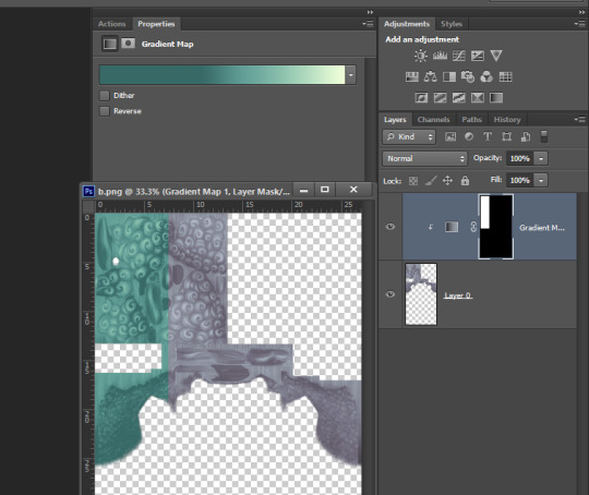
Since it's in greyscale, I ALSO played around with some gradient maps! Ended up looking like this


which is PRETTY AWESOME!!!
Another fun detail is that you can see Hina's head is turned a little bit, and the hair on the side she turned away from is more straight/stretched out than the other side. teehee. Her shoulders aren't straight either!! :D
#kitanai kimi ga ichiban kawaii#kitakawa#hinako hanamura#id in alt#not tagging airi here. her hands are NOT enough of a cameo#FBDHJSBF#my art
13 notes
·
View notes
Text
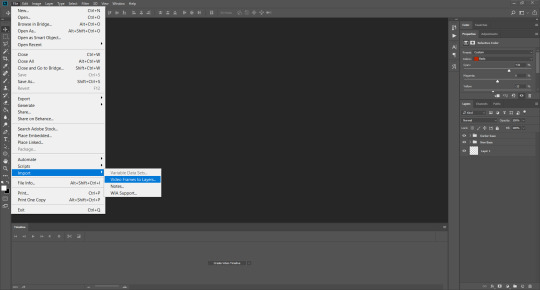
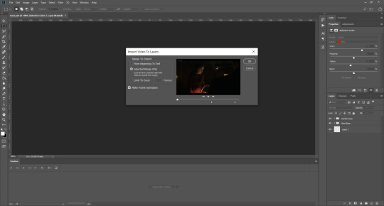
Welcome back to "Icon Making With Killian: An Intro to the 'Lost' Art of LiveJournal Icons"
aka, you didn't think I was one and done, right?
This tutorial was written in Photoshop 2020, but you can probably recreate it in as far back as CS2-ish (since I still use the same sort of techniques I've been using since then, lmao). It also assumes basic understanding of the software, though I've tried to be as clear as possible throughout.
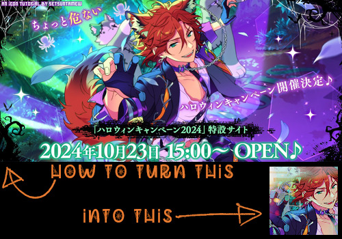
I was possessed with a need to both make an icon of Madara's new event card and then write a tutorial, so let's all be proud that I busted it out before Halloween 💪
I started with the bloomed art of Madara from The Howling Forest★Lupine Halloween event (image from the Halloween 2024 campaign announcement, because the event hasn't started yet).
Since there's a lot of extra text & etc on this, I knew I'd be cropping it pretty close. I started with a blank 100x100 canvas, pasted the original image in, and then resized + rotated it until I liked the composition/crop.

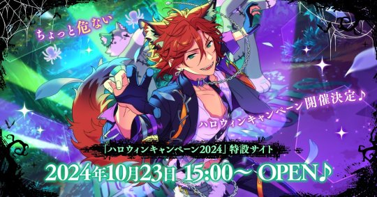
First up, I wanted to get some cobwebs in here (for Halloween!), but didn't want them to overwhelm the whole icon. I used a texture from lookslikerain, set to Lighten, and rotated it a bit before erasing anything covering his face.

Next, I used another texture from lookslikerain and set it to Darken. There's a lot of green in the images for this event and I wanna pull some of that back into the icon, since it most got cropped out.

Time for light textures!!! I used a bunch in this icon~ I started with one from lookslikerain (can you tell I love their resources?), rotated it, and set the layer to Lighten, before deciding that it was too harsh. I used a small, soft brush set to 30% Opacity to erase most of the texture from his face, as well as softening the edges of the light.
The next few light textures are kinda subtle, but overall add to the icon. I'd say sometimes less is more, but I'm a maximalist at heart XD For the next few steps, just assume that the light textures were rotated/resized/moved/etc as I saw fit. I used yet another texture from lookslikerain, set to Lighten, and tucked in the bottom right corner.
This light texture from Sanami276 is also set to Screen. I moved it around to get just a bit of orange in the top left corner- gotta keep those Halloween colors in there!! :D
I wanted some more depth/texture in the upper left corner, so I decided to use part of a texture from Sanami276.
However, it's way to harsh to just throw in there like that...at least not for my purposes. I decided to invert the colors and recolor the black parts orange. My go-to method is with a Gradient Map adjustment layer. The easiest place to find it is in the Adjustments window.
I then used these colors for the gradient itself: #e7b676 at 0% and #ececec at 100%.
And it left the texture looking appropriately orange! I then pasted it into the actual icon, moved it so the rectangles were in the upper left corner, and set the layer to Darken.
Now for more light textures!! I used a couple from ianthinae, set them to Lighten, and went to town. I cut them up, moved them around, rotated them...just about anything to make them fit where I wanted. I love playing with light textures in general, and I find that even when I use similar ones a lot, they can look very different depending on how they're place.
Finally, I used part of a large grunge-y texture that I've unfortunately lost the source to D: I inverted it and set the layer to Multiply, before moving it around a bunch until I found a spot that looked good.
And with that, it's done! You've now got some new skills to make icons with~
If you have any questions, please feel free to ask, and I'll answer as best I can- as long as it's not about making icons in other software D: I only know Photoshop (and Paint Shop Pro, but I don't think anyone uses that anymore). If there are any other icons of mine you're interested in seeing tutorials for - or even just specific techniques! - just lemme know. I love helping :D
Also, I'm happy to share where I get icon resources from. I have a whole post dedicated to that on my DW graphics journal, though tbh that's the best place to talk to me about making graphics in general. But I will absolutely answer asks/replies/etc about icons here on tumblr, don't worry!!!!
#livejournal#icons#tutorials#graphics#icon tutorial#graphic tutorial#photoshop#LJ icons#100x100#100x100 icons#tutorial#reference#halloween#madara mikejima#enstars#ensemble stars
13 notes
·
View notes
Text
TW: M4n1pul4t10n
Just a lil fanart for @plushii-gutz's new chapter cuz the last scene always gets me :3 Also, playing with the gradient map at Krita for the first time :D
#my singing monsters#celestials msm#Seaveera sketches#fallen stars au#Fallen stars msm#Msm Au#Krita#made with krita#small artist#artists on tumblr#saken answered#art for moots#Art for others
16 notes
·
View notes
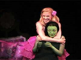
Note
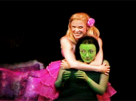
Hi, I'm a big fan of your blog and your gifs in general! I was wondering if you had any tutorial on how you color? Particularly your Wicked and Hadestown gifs look incredibly gorgeous and the colors really pop, and I'm so curious as to how you achieve those effects. Amazing work overall :D
hiii, oh my god thank you so much!! 🥺❤️
i'm happy to show you how i color my gifs but pls note that i basically have no idea what i'm doing, everything i know i taught myself via trial and error and this is just something i found works for me.
that being said, here's a quick (and very messy) bootleg coloring tutorial under the cut!
okay so, when it comes to making gifs and coloring in general, good source material is key. bright and clear videos make the coloring process SO much easier.
i picked an old 2010 wicked oberhausen boot for this tutorial. it doesn't have the highest resolution but the colors translate nicely and the lighting is pretty good as well.
now, this is our base gif cropped and sharpened. i usually want my gifs to look as natural and as close to their base version as possible with just colors and contrast enhanced slightly. baby steps are important here!
first thing i do is add a brightness/contrast layer. these are my settings for this gif:
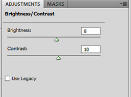
i rarely ever go above 20 with either brightness or contrast. adding too much early on will make your gif look grainy in the end. our gif now looks like this:

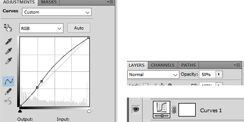
not much has changed but a little goes a long way, trust me. next up is a curves layer. i click the little arrow to open the drop down menu and select increase contrast (rgb). afterwards i reduce the opacity. for this gif i set it to 52%.
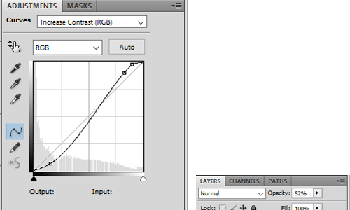
this will darken the gif again but it also gets rid of these white spots on elphaba's dress which is great.

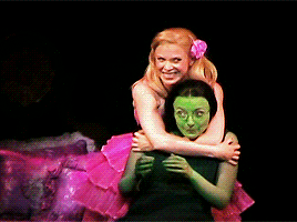
next, we start playing around with colors. i usually use 3 color fill and one or two selective color layers. this really is just playing around until you find the settings that you think look good. for this gif i wanted to enhance the green and neutralise some of the yellow, so i went with two color fill layers first.
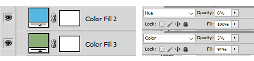
green to slightly enhance the green of elphie's skin and blue to neutralise the yellow in glinda's hair.
next we're going with a selective color layer. think of the colors you want to pop. for this gif the obvious choices are elphie's skin and glinda's dress.


i added a second layer to further adjust the greens
and ended up with this gif

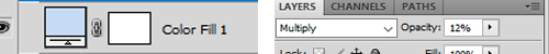
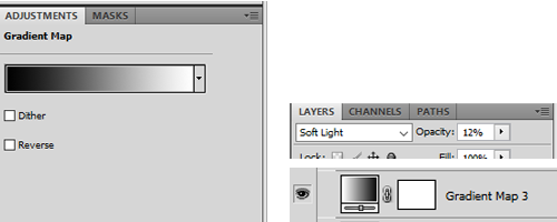
i then added another color fill layer, set it to multiply and reduced the opacity to 12
followed by a color balance layer

the purpose of these layers is to slightly "cool down" the gif, meaning they decrease orange/yellow undertones while enhancing the blue and purple ones.
next up is a levels layer to add a tiny bit more brightness

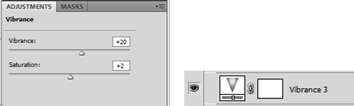
followed by a vibrance layer to make existing colors pop
and another curves layer for more brightness/contrast with the opacity set to 50%
our gif now looks like this:
almost done! we're finishing up with a black and white gradient map layer for some more depth
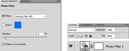
and a cooling filter to further reduce the yellow/orange tones of glinda's face and hair
and that's it!
so, here you go. this is my coloring process most of the time. sometimes i add more layers (on top or in between), other times i use less, it all depends on the specific scene and the mood i'm in lol.
now, could you leave out some of these steps? yeah, definitely. some layers probably don't even make that much of a difference but i like adding them anyway.
you can download the psd here. feel free to play around with my settings and add or delete layers as you see fit. hope this was at least somewhat helpful!
#ask#coloring tutorial#photoshop tutorial#*psd#*tutorial#*ps help#i don't know how to explain things i'm sorry
10 notes
·
View notes
Text
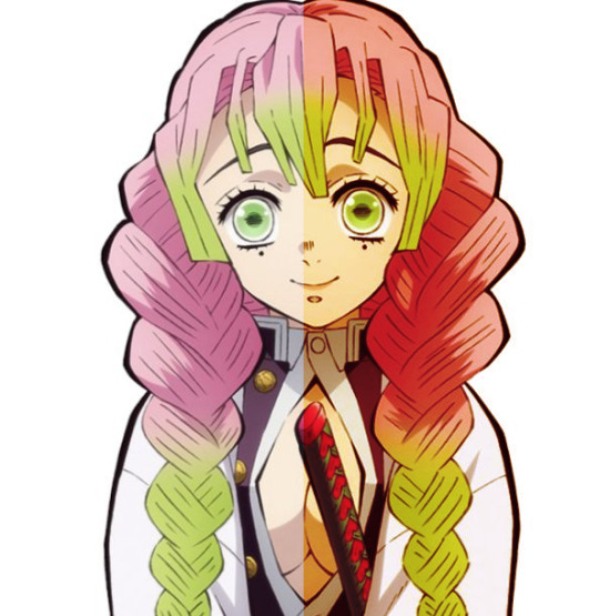
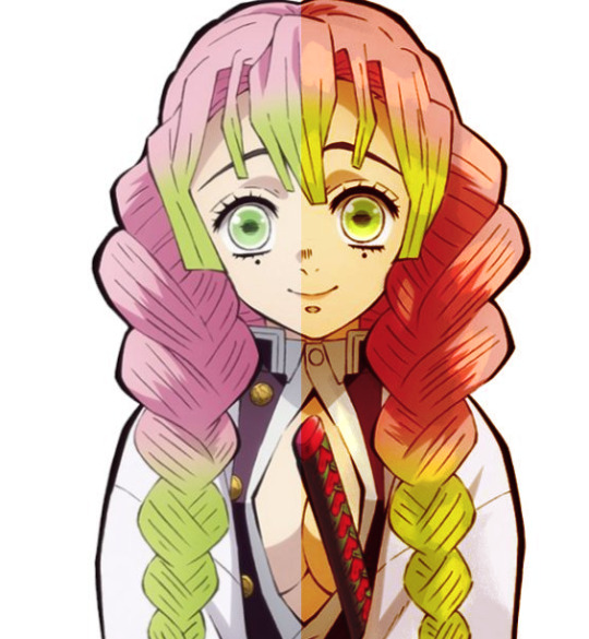
【FGO】 Beautiful Carnivore, The All-Ridiculing 💚🐈⬛

And here's the other batch of colour tests I did


Ashiya Douman doodle 💚 🐈⬛
OG + playing around with gradient maps (18 total)
The 1st one is the OG!
I'm just testing rough colours for now so it's super messy and not refined yet
I already loved the colours of the OG that I chose but the other are so cool to see. The way low opacity gradient maps shift the colours in subtle ways WHOAA
If you're curious, check out the Ashiya Douman vs. Dioscuri anthology comic here! Popular FGO fan-artist and official artist AU (@delete_au) has such gorgeous art~
Rambles
I've been obsessed with Ashiya Douman, the evil clown cat since December 2020. Didn't even take me a week to be obsessed. It took 5 days. Sen's Limbo December Descent 🙌
LimGuda is my comfort HC NBLNB ship 💚🧡 They've been one of my top fave ships since December 2020. The spice of a gay evil clown demon who hates humanity, with a karmic relationship of love/hate with the human they're in love with, is unparalleled.
I can’t get over how much I adore Douman. They’re simply the best. This chaos clown is a forever fave of mine~ I love how in-depth and nuanced this hot evil jester onmyouji is. The emotional nuance and complexity of this chara…
“WANTS TO WATCH THEM FALL TO HELL BUT UNWITTINGLY FALLS IN LOVE WITH THEM.” I’M DEVASTATED ABOUT THEM
The amount of detail that went into Douman's character and design is insane to me… Hasendow AKA Showichi Furumi (Douman's character artist/illustrator) has such a huge brain 🤯
My LimGuda collection is my pride and joy 🤭 When Douman first released on FGO NA in November 2022, this was my Douman pentagram setup. Douman merch summoning circle catalyst! We did summon an evil demon into my Chaldea~ Welcome home! You are now reunited with your WIFE 🫶
The clean up's gonna be hell with how detailed Douman's design is, but I love working with their colours! I wanna draw LimGuda in matching green and red Áo tấc so bad!!! Matching couple clothes~ 💘💞
Douman loves them with curses… LIKE A CAT TIPPING OVER VASES CUZ THEY WANT TO BE PAID ATTENTION TO. The whole “Limbo gets defeated/is overwhelmed by the power of feelies and their S/O’s Candid Sincerity" trope I love to see in their ship works that I wanna draw eventually btw… I wanna draw them lots!!!
Cinna said “Douman just reminds me of that ‘cat reacts to separation anxiety by trying to maul their owner’ thing I saw one time” LMAO
Ashiya Douman vs. Dioscuri Anthology Comic by AU
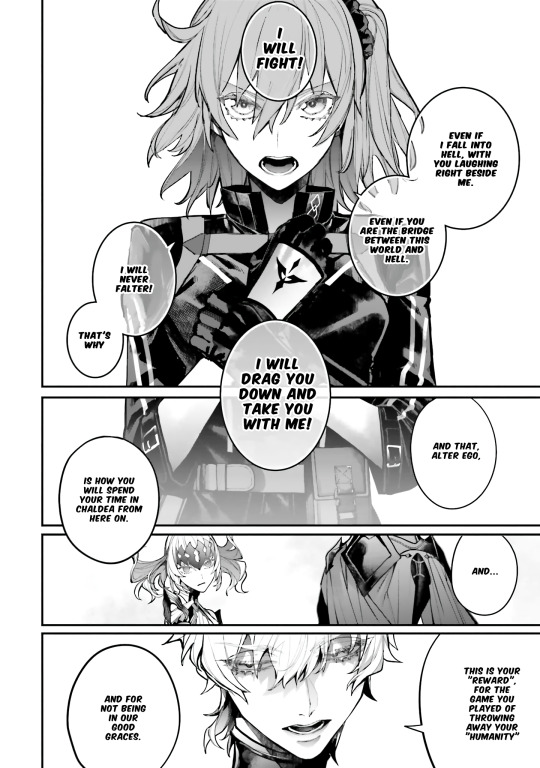
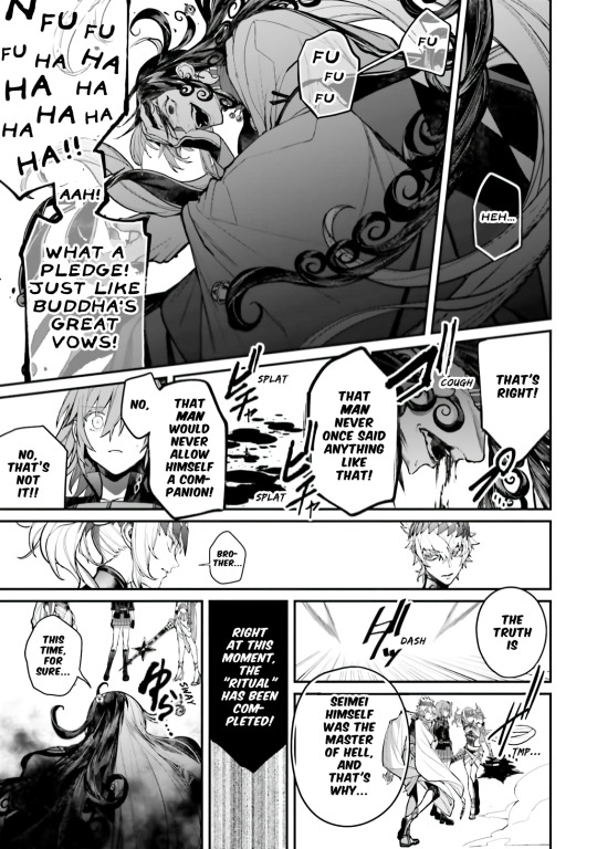
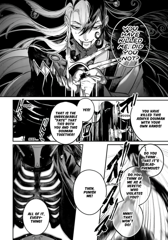

The Ashiya Douman vs. Dioscuri anthology comic has such beautiful art by AU (@/delete_au). Douman invited Ritsuka to fall into hell with them & now they're the one inviting him. Douman tells them that the two of them are "bound by unbreakable/inseparable fate." JAW DROP??? THIS IS GAY AS HELL 🏳️🌈 LIMGUDA IS REAL!!! 💚🧡
AU (@/delete_au) is a popular Fate/Grand Order (FGO or Fate/GO) fan artist that's been commissioned to draw official works for Fate (including official merch)
TYSM to Carli (@/carlikun) for translating it... I got stuck on some parts reading the JP version cuz of Douman's difficult, esoteric and archaic vocabulary... I got to clear things up reading the VN fan-TL, and it was interesting to see how it was translated in Viet, but yeah the EN fan-TL cleared up so many things for me.
They drew the Ashiya Douman vs. Dioscuri chapter in one of the FGO anthologies. LIMGUDA ALSO INTERACT IN IT, AND THERE'S TONS OF LIMGUDA FOOD HEHEHEHE... Their art is so gorgeous. They're one of my favourite FGO artists, their works are stunning.
THE WHOLE THING IS SO DELICIOUS SO I'LL JUST SHOW A COUPLE PAGES FROM THE END, BUT OH MY GOD???
I LOVE THEMMMMMMMMMMM LOVE IS REALLLLLLL
Douman is gigantic. Ritsuka's 200 cm tall (~6"7) bf that loves them!!!
AU'S DOUMAN COMIC FROM THE FGO ANTHOLOGY COMIC WITH DOUMAN AND RITSUKA IS MAKING ME SCREAM WTF /pos /endearing
2 notes
·
View notes
Text
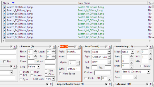
Recolor Resource
I know Simomo has a newer bigger palette, but I’m far too lazy for 178 colors. All credit for this palette goes to Simomo.
With that out of the way
I made some gradient maps for the original 90! Please do feel free to play around with these and change the colors or even make new ones. They’re a lot easier to customize and use than multi-step actions so don’t be afraid to mess around.
You can download them here. (This is not CC. This is a resource.)
How-to under the cut if you need. Very beginner friendly & applies to gradients in general.
You’ll need s4studio and photoshop. I use cs6. I primarily use these for hair type items, but they can be used over anything. I’m working my way through the clothes atm actually. I always use the #15 hair swatch. If that is not available (kids) I have included a gradient map you can run over Dirty Blonde #13 to get #15. It’s not perfect, but it’s close enough for a base.

You can do this over a .dds, .png. jpeg w/e you prefer. I use .pngs.
Load up your file of choice and add an adjustment layer -> gradient map
You should see a menu like this somewhere in your photshop.
which will drop down in to this :

If you do not see the momo colors click the wheel up by Momo 83 in my picture and hit load (you can use replace to get a clean only momo menu like my pic) and select the Momo 90.grd file you hopefully downloaded. You can also double click the .grd wherever you saved it.
Simply pick one and voila. Your texture is recolored.
Something I had trouble with with actions was them not respecting selections and recoloring everything, the map will respect your selection though so you can leave out streaks or hair accessories easily. I selected a small portion to demonstrate :D
I have not included an action because you don’t need one! However, I did make one for myself that loads the colors and saves out as 1.png - 90.png, but it won’t work on other’s pcs because the paths would be different. You definitely can and should do this yourself to save time.
that looks like this
make the layer once, change the color & save. then just change & save until done!
Pro-tip: Save your recolors as .png and name them 1,2,3,4,5 so on. Once you’re done use bulk rename utility and add “Swatch_” as the prefix and “_Diffuse_1″ as the suffix. (in my experience so far “_diffuse_1″ will not need to change, but swatch does so that’s why we don’t add a number to it and instead name the .png as the number.)
If you do this you can bulk import in to s4studio to save you some clicking. :) shift+control+c in s4studio and type “studio.importall” Studio will make a folder where your package is called “yourpackage resources” and you just drop your .pngs in there then type studio.importall again to actually import this time. Yay no more carpal tunnel clicking import 90 times!
You do need to apply the color palette to the package first but s4studio has that palette tool now so no tips/tricks needed. Hope this helps!
also for shits n giggles I put one of the blues over a random skyrim screenshot and set the layer to soft light for a knockoff reshade effect. Experiment!

417 notes
·
View notes
Photo
COLOURING BEFORE & AFTER TAG:
tagged by the lovely, kick butt and awesome sauce content maker @digitalgirls (thank you very much for the tag!) and another lovely mutual but for the life of me my peanut brain forgot who it was so thank you also to you too if you see this!
tagging (only if you want too!): @jinniebit @snug-gyu @soonhoonsol @woozification @seokmins @injunnies @chogiwapadada @jeonwonwoo
welp here you go guys! my poopy gif coloring lol. i haven’t giffed much as i just started 2ish years ago now(?) and i am now working a full time job so alas, i don’t have much to really show improvement but i do feel proud with some of my colorings and here are my top 5 (plus bonus two in the read more section hehe) i guess my coloring is more so with making things brighter if that makes sense? keeping things natural but bumping up the vibrance as you can see in certain gifs like the lights one for example. i do feel content with my giffing, granted the quality could be better but that is due to me using ezgif as a converter for making gifs on photopea (i know i can use vs but vs SCARES me like everyone that uses it? you guys are officially badass like gandalf in my books! i bow down to you all lol)
if anyone wants to hear more in depth thoughts of my coloring for each gif plus see the bonus ones that are too tiny to show in a normal gifset, readbelow but if not thank you for checking this out!
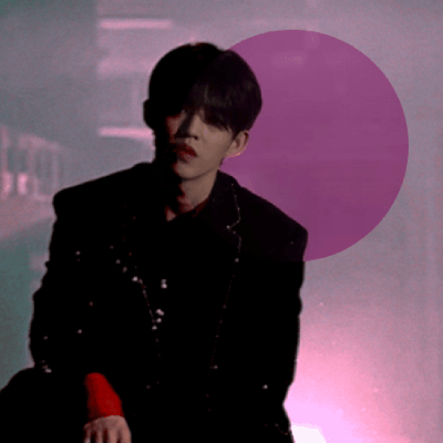
gif one: starting off with my proudest one of the bunch, this gif is from my baekhyun countdown series which you can view right here oh my when i say i am proud of this, i am SO proud of this. first of, this short video is pale, REALLY pale. more pale than casper the ghost lkdsalkjda so i struggled with making sure to not overdo the coloring where baekhyun is weirdly colored but making sure it’s no longer so bright ya know? with what i work with, i think i did a good job? it was during this series i started using a gradient map as well for my coloring and ya’ll....use gradient maps lol. i would have used them earlier but i had no clue how to well, use them as silly as that sounds! i found a tutorial on how someone used them and since then i use that. usually use brown to grey to make things neutral but also make sure skinetone is as natural as possible but of course that isn’t always the case, this is something i struggle with as you can probably tell so i am trying my best! overall, a very pretty gif coloring i think! simple but pretty!
gif two: ah yes....my og fav hehe. this was during the 17 days of 17 event that happened last year almost now and this was for of course, scoups day and i am proud of it still! granted, i would do things a tiny bit more differently even though this is just what, a 6ish months difference in giffing from the first gif? regardless, this one is my favorite and all because of one silly thing...the color changed background. as you can tell in the circle, the original was purple with the lightning background and i actually did save my coloring originally with this background still! however, i was playing around with coloring and by accident, just out of curiosity, i changed the color of the background and when i say i was super shocked...i was lol. in a good way of course! don’t ask me why but at the time, i just loved this small change. i thought it was so cool and it made me so excited so i kept it. could i have kept the purple? for sure, it bothered me to this day if i made the right call because a mutual of mine said the purple looked better against scoups skintone which i agree so it eats me to this day lol. (no ill feelings to my mutual! i liked having the feedback because sometimes that initial excitment sometimes isn’t the right call and i like being told the truth!)
gif three: another of my baekhyun gif series which again.....WHY DOES SM OR WHOEVER EDITS THESE VIDEOS, MAKE THINGS SO PALE!?!??! like bro....this one baekhyun IS truly casper the ghost dsaldasl. i managed to save him in this gif set but when i kept doing double takes myself when giffing, i always went “wait, is THIS how it originally looks!?” like i was so surprised with the coloring difference
gif four: featuring my queen, lights. the only non kpop gif lol. she is the reason i got into gif making actually! my first ever gifset is for her mv “prodigal daughter” (which yes you should all take a listen too just saying) so you can thank her for my gif making! this was from her i think 3rd mv, “in my head” which you can check out the gifset here! this is a perfect example of my coloring i think, the making things vibrant but keeping it somewhat natural and for me giffing this without gradient map i feel dang proud lol. it was either this gif or another one of lights but i went with this one instead to showcase i guess my usual coloring ya know?
gif five: and lastly a baekhyun gif once again. this one is originally meant to be with a pink coloring overlay and font as seen in the original gifset but i kept the original coloring because i liked how it turned out overall! i decided to switch things up with my editing by using unsharp mask and instead of using 30% i did 135% and kinda liked the result of it! i do admit, if you are someone like me and are stuck using ezgif, make SURE the file is super hq! while this does look nice, imo it looks better with good video quality when making the gifs as i did this setting for the last 4 gifsets of the baekhyun countdown and for ones like this one, it looks nice but some weren’t very high and you can tell it looks a bit meh. this is i think my current giffing editing and i feel proud of it! this one is very natural in coloring but everything is more “pop” if that makes sense, things are more defined than smooth, the neutral colors look lively, etc.
BONUS:
you guys thought i would leave out these ones? oh no lol. so these two gfs are from my txt “good boy gone bad” mv and seventeen “hot” mv gifsets i made! i remember seeing this gifset style being HUGE back in late 2017ish up until 2019 if memory is correct by an old school content maker. i saw they had a tutorial on how they did their sets back then so i followed it and made my own for these mv’s and man i loved doing them. not only was the setting up the scenes to use was fun but finding the right font that fit the mv vibe was fun and of course, the coloring. for txt’s, there was alot of greens as you can see here and while i like me green, i wasn’t happy with just how dark and swampy it looked lol. i get it was the aesthetic in general but i wantted it to pop alot and thus the blue/purple tones in the overall gifset which i think looks really beautiful! then for hot, i didn’t plan on the pink coloring lol. i originally wanted to do the usuals, brighten and and make the colors pop out but by moving around to color the orange colors, it turned more pink so i went with it (you can see the difference towards the end of gif of how different the pink and orange are!) still my proudest coloring on both and still am proud for the “hot” as that was originally my top set with notes until somehow baekhyun and his doggo took over xD
#fun tag thingy#digitalgirls#jeonwonwoo#seokmins#injunnies#chogiwapadada#snug-gyu#soonhoonsol#woozification#jinniebit#if anyone of ya'll read that entire essay under the readmore...i am kissing your forehead
9 notes
·
View notes
Photo
💜 HOW TO MAKE A GIF WITH PHOTOPEA 💜
Hey everyone! I recently got asked to do a tutorial on how I make my gifs. I know that many people (such as myself) don’t have access to Photoshop for various reasons but they’d like to get into gif making. When I started making gifs, I only had a free trial of Photoshop, but when that ran out, I had to find another way to make gifs. Enter Photopea! A free, web-based software that you can use anywhere and that works just like Photoshop!
In this tutorial, I’ll teach you how to make a basic gif like the one I did above. I use a macbook air, but it should be doable on a regular pc too!
If you found this helpful, feel free to share it with your friends! The tutorial can be found under the cut below 💜
THINGS YOU’LL NEED
A browser (I switch between Safari and Chrome, more about this later)
A screencapping software (like MPlayer OSX Extended) or, alternatively, a presentation program like Keynote or Powerpoint.
A program to screenrecord or a program that let’s you download from YouTube
Lots of patience bc gifs are annoying little shits <3
1. GETTING A VIDEO BY SCREENRECORDING
First things first, you need to have the clip you want make a gif out of. There are plenty of ways that you can get them. I’ve seen some gifmakers say that they torrent entire movies and gif from that. The way I do is I screenrecord the part I want to gif directly from where I’m watching the movie or show (like Disney+ or Netflix [or something like 123movies if you’re a pirate 🏴☠️)]). That way, I don’t have to download the entire movie and I have just the part that I want.
To screenrecord, I use my macbook’s built-in program called Screenshot.
Open the program by pressing ctrl + command + 5 on your keyboard and you get these funny little buttons.
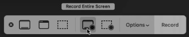
Click on the button that says record entire screen. The program is now recording your screen. Play the scene and make sure you expand the video into full screen so you get a full resolution. When you’re done, click the stop button that is at the top right of your screen (next to the wifi and battery symbols.)

If you don’t have Mac, I suggest you look into how to screenrecord on your computer, as I don’t know how other operating systems work. Sorry!
1B. GETTING A VIDEO FROM YOUTUBE WITH CLIPGRAB
Another way you can get videos is from Youtube. I use a program called ClipGrab for this. Download and open the program. You’ll get this window
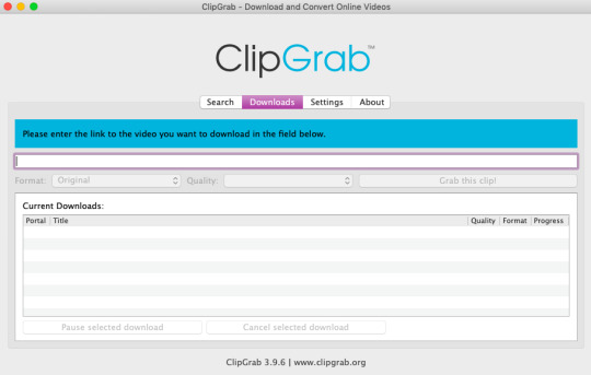
Simply paste the link and chose the highest quality, then click ‘grab this clip!’. Done!
2. SCREENCAPPING
After we’ve obtained the clip we wanted, we can do this two ways. The first way is to use the program MPlayer OSX Extended. Here’s a tutorial on how to set it up, make sure you do this if it’s your first time using the program. Make sure that you have a special screenshot folder!
Open MPlayer, then go to file > open and find the video of the scene you screenrecorded or downloaded. MPlayer will now play the video. Use the left and right keys (< and >) to go go backwards or forwards 1 minute, but try not to move around too much because the software crashes if you do. If that happens, just click the reopen button when the popup comes on, and reload the video again.
When you’ve gotten to the point you want in the video, press the command + shift + s buttons at the same time and the program will now take a screencap of every single frame until you stop.
If everything goes smoothly, you should find all your frames in your screenshot folder that you’ve made before when setting up the program!
2B. USING A PRESENTATION SOFTWARE TO MAKE A GIF
If you want to skip the screencapping part and you want to have a fully completed gif, you can do the second option. That’s what I used to do before I got MPlayer. In my experience, it’s a really fast way to make a gif, but the quality isn’t really good.
Here’s a tutorial on how to turn a slide into a gif in Keynote.
Here’s a similar tutorial on how to make a gif on PowerPoint.
Basically, you make sure that the size of your presentation is the same as your video, and that you make sure to export one slide into a gif. Also make sure that you export in the highest quality!
3. LOADING THE FRAMES IN PHOTOPEA
Finally, we can start giffing! As I said at the start, Photopea can be used anywhere, but I switch between Safari and Chrome. The reason why is that if I upload the frames in Chrome, the frames will be out of order. In Safari, that doesn’t happen, but the downside is that once I start editing, Safari will reload the page because it takes up too much memory.
So, first I go to photopea.com on Safari. I click New Project and put in the same dimensions as the screencaps (in my case, they are 1440x900 px). You’ll get an empty project.
Then click file > open & place and select your screenshots. Wait until Photopea has loaded all the frames, then, at the speed of light, quickly click file > save as psd before Safari reloads! You’ll find it in your folder where all your downloads are.
Next, I open Chrome (I use the incognito window because I have adblock on my usual Chrome, the program won’t work as usual if you have it enabled) and I click Open From Computer, locate your saved .psd file that you saved from Safari.
Now, you’ll see all the frames as individual layers. Select everything by clicking on the first layer, then golding the shift button and clicking on the last layer. Press command + G to group the frames into a folder. Here’s how everything should look after you’ve grouped the layers.
^^ See how Agnes approves! Agnes things you’re going a great job!
Now, it’s time to crop the gif and get rid of the black borders. Making sure that the folder is selected, click on the crop tool (or press C) and click on Fixed Size
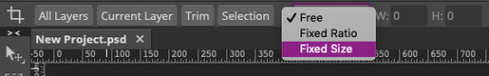
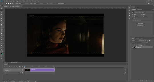
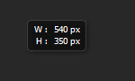
W is Width and H is Height, write in your sizing here. Tumblr’s max width is 540, so I put the width as such. For the height, I use 405. Then you just drag the corners until you’ve selected the part that you want, like this
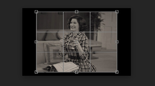
Press enter and the image will be sized down 540x405 px.
Now, our gif looks like this after cropping!
Open the folder so you can see all the layers. Select all your layers and right click on them, then click rasterize.
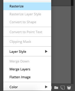
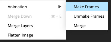
Then, go to layer > animation > make frames. You’ll now see that each layer begins with _a_ - this is crucial because this is how Photopea knows that the layers are part of a gif. If your layers don’t begin with _a_, then it will not play as a gif
If you instead already have a gif done, all you have to do instead is simply click open from computer when you first open Photopea and load your already finished gif and it’ll have the _a_ at the start of every layer. You won’t have to go through the steps of loading your frames into a new project to make your gif as it’s already done and in a folder :) Just start cropping once you load it
You can preview your work by going to file > export as > gif. Make sure to change the speed in the preview window until your gif plays the way you want it! I put my speed at 500%
4. SHARPENING
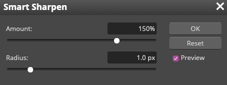
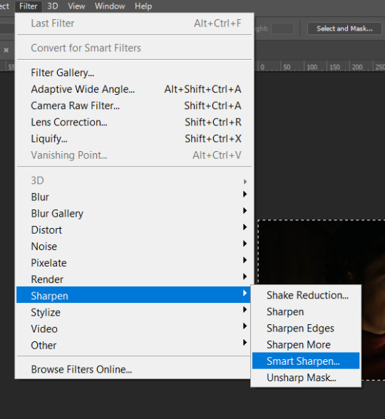
Hooray, we now have our gif! But to make it look a little nicer, it’s good to sharpen it. I always use Smart Sharpen when I sharpen my gifs, and many other gifmakers use that too. It’s really good :D
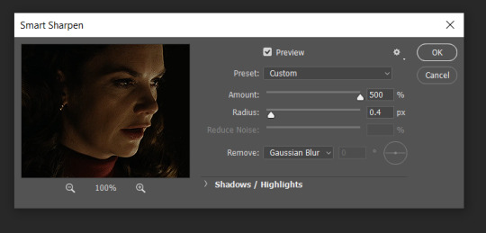
To sharpen your gif, again, make sure that all your layers are selected. Go to filter > sharpen > smart sharpen. I use two different settings for my gifs, it really depends on the gif.
Setting 1 (which is the default setting)
Setting 2
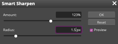
Again, it depends on the gif, play around until it looks good to you!
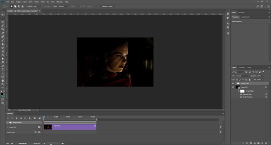
Here’s our gif after sharpening it
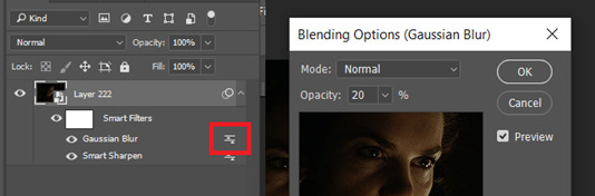
I ended up deleting the last few layers as the gif got bigger than 10mb (that’s Tumblr’s file limit, it your file is bigger than 10mb, it won’t upload). I also added a gradient map and it made the file size smaller, more about that in the next segment!
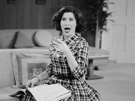
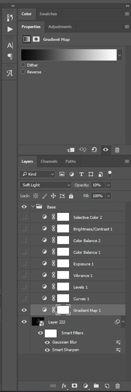
5. COLORING
Here’s the fun part! Now we get to play around with the gif, making it brighter and look Extra Nice™! Since this is a black and white scene, I make sure that the blacks and the whites really pop.
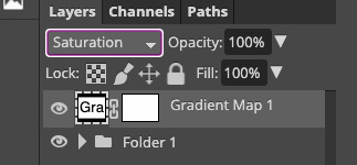
Notice how in the original scene it’s not actually b&w, it has a slight sepia tint to it. I want to remove this, so I add a gradient map by clicking on the white square with a black circle (I want to point out that we’ll be clicking on this button a lot in this step)
and I change the blending mode to Saturation
Then I add a curves layer using these settings
Then a second curves layer
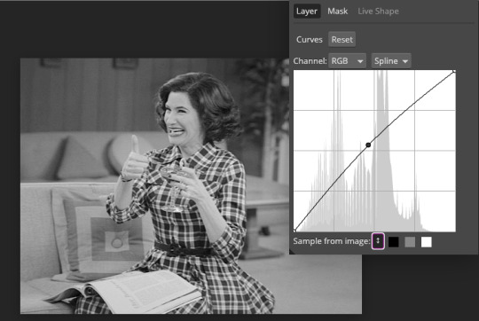
Brightness/contrast
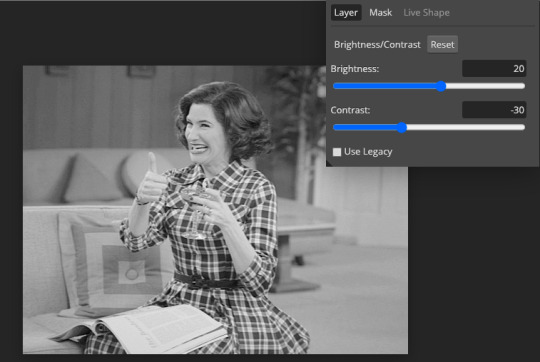
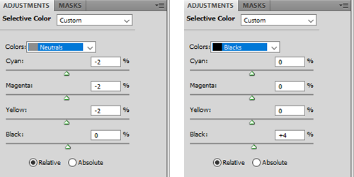
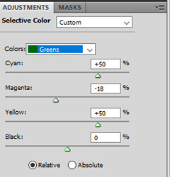
Then my favourite! Selective color! First layer, I deepen up the blacks
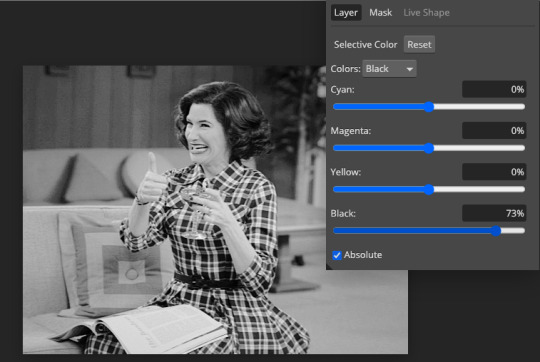
Then another selective color layer, this time the whites
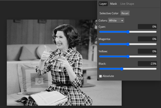
Lastly the neutrals
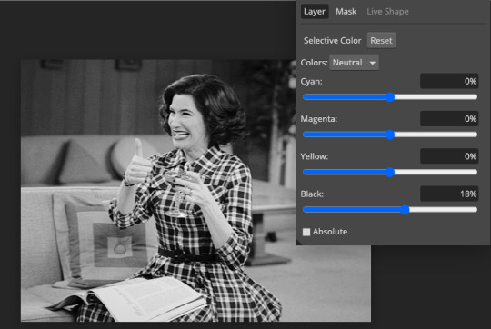
Here we have the final results!
Wasn’t this a gas! I hope this helped you out, let me know if you want to know anything else about gifmaking, I’m happy to help! Also, sorry if I wasn’t very clear, I’m bad at explaining 🙈
MORE RESOURCES:
Here are some other tutorials that are really helpful in making gifs. These users use Photoshop, but you can still use their tips most of the time in Photopea too, you just need to play around and see what works for you!
Gifmaking for beginners by @chloezhao (this one saved my life)
Pale coloring tutorial by @itsphotoshop
Two-Toned Gif Background by @clubgif
Text with white outline tutorial by @anya-chalotra
#resources#tutorial#gif tutorial#photopea#photoshop tutorial#photopea tutorial#tuserfran#userlaur#userlaura#usermirna#(tagging mutuals if you wanna share :P)#my tutorials
1K notes
·
View notes
Text
becca’s mega coloring tutorial
i’ve gotten a lot of requests recently asking me to make a tutorial for my 'colorporn’ gifsets, and i think i’ve finally gotten over the traumatic incident 3 years ago, when i spent all day writing out a coloring tutorial only to accidentally hit backspace causing the entire thing to be wiped. so, here it is, buckle up folks! it’s going to be a long ride but here’s hoping it’ll be helpful.
so we’ll be going from left side (no coloring) to right (coloring & color porn):

let’s get started! you will need some sort of photoshop in order to do this, i use photoshop cs5 so this tutorial will be based around that, but i imagine you can adapt it for whichever one you use.
this is more of a coloring tutorial than a gif tutorial, but if you’re not sure how to make gifs then this is a pretty good all-encompassing tutorial, although i use 0.05 as my frame delay speed.
we’ll start from your have your basic gif, re-sized cropped and sharpened like so:
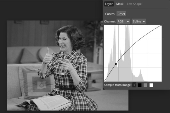
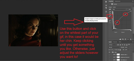
step one: curves
so i’m going to start off with basic colouring! the first thing i’m going to do is a curves layer to sort of ‘balance’ the gif out. to do that i go to layers > new adjustment layer > curves. on this window, right next to the graph, are three little droppers. i’m going to click the very bottom one right here:

this basically allows you to set your ‘whitest’ point in the gif, aka the point that should be the brightest. so i then go to my gif and click on the ‘lightest’ point. there’s a lot of light coming in from the top left hand corner of the scene i’ve chosen, so i’m just going to click it on that point (circled below) and that immediately brightens up the scene.

next i’m do something similar, but with the ‘blackest’ or darkest point on the gif. to do that i’m going to use the very top color picker:

and i’m then going to hit what the blackest point to balance out the light:
what this is basically doing is using your white and black points as color markers to not only brighten and darken the gif in places, but it also acts as a sort of color balancer. it’s very common that shows put a sort of colored ‘filter’ over their scenes, for example the scene i’ve picked has a sort of yellowish filter over the top. you might find that some scenes it doesn’t really affect, but others it makes a tremendous difference. personally i like doing this to get back to a ‘neutral’ ground on the scene, which is particularly useful when we are taking a scene with a warmer color tone (yellow) and trying to make it a cooler tone (purple).
if you are using a darker scene you may have to put a brightness/contrast layer on before you can complete this step, or even add an auto curves layer (hit the ‘auto' button on that same window) before you have a ‘white’ and ‘black’ spot to work on. i love this trick but this is precisely why i say i have no ‘general psd’ because it is entirely scene specific! but here we are at the end of step 1:

step 2: basic coloring
i’m just going to add a few adjustments to round off my basic coloring! i added just a little increase in curves to make the gif a little brighter (a), added a levels layer to enhance the contrast (b), and added some color balance. for this i worked with adding magenta and yellow tones to enhance the skin tones in the gif. i also made the midtones a bit more ‘purply’ (c) (as this is the end colour i want to achieve) and also did the same for the shadows (d).

for a darker gif i would probably add more curves and an additional brightness/contrast layer. color balance is also a really important tool to just play around with, ‘warmer’ scenes need more cyan/blue balance, while ‘colder’ scenes need more yellow/magenta balance. our final product is:
step 3: painting colors
if you wanted, you could probably leave your gif right there, but i like colors and i’m going to embrace them!
now there are three methods that i bounce between and they really depend on the type of gif you’re working with. an ideal scene would have a strong background color (see step 4) already for you to work with, but the truth is the majority of scenes don’t. as this scene is fairly neutral in background coloring, you’ll see we can’t just use selective colors to get the purple we want, so instead we’re going to do something a bit different. warning: this method won’t work for scenes with a lot of movement! for that you need step 4 or step 5.
first, something i always do with colored gifs, is i add a gradient map layer of black + a light shade of the final color i am trying to achieve, like so:
i then set this layer to ‘soft light’ and lower it to an opacity that i think suits. for this gif i lowered it to 20%.i think this makes the darker colors a little more ‘purply’ and overall gives a smoother affect what we’ll do next.
next is the fun part! we’re going to start adding in the purple. to do this, we want to create a new layer right at the bottom of all your coloring layers, so sandwiched between the actual gif and your first curves layer. then i grab my paint brush (you want one with the blurred edges, not a solid brush), use the same purple tone i selected for the gradient mask and paint around yen’s face and body.
i like to split my left and right side into separate layers. this is because i like to use a large paintbrush to solidly paint the left hand side of the gif, and then use a large eraser to get rid of the color from her face/body. the larger eraser you use, the smoother it looks (i’m not saying try and use a 600px eraser, just a 100px rather than a 10px creates a better effect). now it looks like this:
don’t worry that it looks very white, that’s just because it’s under all the curves layers! so now all i do is change it from normal, to multiply, and as you can see we have a nice purple background:
repeat this process for the right hand side:
you may find that if you’re working with a darker gif, setting these layers to ‘hue’ or ‘color’ is better. and again, the opacity may need a bit of playing around with. remember it’s ok to play around with effects and what might work for one gif will not work for another just because scenes and lighting vary!
then i just painted a line across the bottom, over her chest area, and lowered this to a 41% opacity. this just helped to enhance the purple feel of the gif. now we’re left with:

so a few finishing touches, i noticed that there was a spot by her right arm that as she moves, exposes a bit more of a ‘yellowish’ band. to fix this, at the top of all my coloring layers, but under the gradient map, i added a layer and just put a small purple dot on top with my paintbrush, and set the layer to ‘color’.

lastly, i wanted to make the right side a deeper purple, so i used selective colors to manipulate the magentas to the shade i wanted. then with the layer mask, painted black over the right hand side of the gif so it didn’t affect this coloring.
and there we have it! i have my finished gif!

tips: sometimes it’s nice to enhance lighter and darker parts of the gif further. i didn’t with this one as i already thought the natural lighting did it well enough, but of course this might not always be the case!
while i liked the coloring of this gif, i wanted a bit more variation in the purple tones. so, under all the coloring layers again, i painted some black on the right hand side, set this to softlight, and played with the opacity (it ended up on 65%). then added another purple layer on the right hand side, but set this to overlay instead and again lowered the opacity (to 58%) and got this:

you can play around with this to get different tones, and you can even change the color of what you’re painting on to create a gradient effect! for example, if i change the black softlight layer to a dark blue, and the overlay purple layer to a lighter pink, i get this:

and then you can use blue and magenta selective colors to play around with that even more. it’s all about experimenting and seeing what works!
step 4: selective colors
to do this method, you need to have a gif that has a strong background color. it doesn’t matter what that color is, or even if it has two, but it doesn’t work well with a netural background. for example this gif (which i’ve already done my base coloring on), is perfect to work with:

as we can see it’s very yellow in the background which is perfect! so the first thing i’m going to do is is create a new hue/saturation layer, set this to ‘color’ and then on the drop down menu change the color to ‘yellow’. from here i just dragged the hue bar till it was pink/purple.

because i’m working with yellow, which is a skin tone, we find that her skin has also gone pink. now i don’t really want this effect as i’d like her to look natural! so all i’m going to do is grab my black brush, paint on the layer mask, and erase this from her face. this won’t be so much of a problem if you’re adjusting cool tones, such as blues or greens.
i then used some selective colors to adjust the magentas and the same ‘tip’ i used for step 3 to add a little bit of gradient variation and all done!

step 5: all the time in the world
sometimes, you have scenes that won’t conform to either of the two methods listed. either they have too much movement for step 3 to work, or too neutral a background, or the selective colors won’t work for the overall color of the gifset. also, if you’re working with something of a yellow background with a lot of movement, the selective color method doesn’t work great because it ends up disturbing the skin tone of the person you’re giffing.
for example, for this gif i did all the steps in step 3, and got this:
now i love the coloring, but it’s messy. the movement of her hand means that her hand dips in and out of the yellow, but leaves background exposed.and the turn of her head means half her head ends up yellow. so instead of giving up, because i am a stubborn bitch, i take my yellow layers i’d painted on, merge them into one and start coloring them frame by frame.
to do this i adjust the timing of the yellow layer to fit each scene, and fill in/erase the yellow around yennefer as required. it ends up looking a bit like this:

i must say this can be pretty time consuming. it’s fine for shorter gifs, but it doesn’t work for a gif with a lot of frames. i don’t mind cos i just do this in the background while watching a movie, but it’s not for everyone. you might just prefer to play around with selective colors as in step 4, but you also might find if you’re adjusting warm skin colors, that you’ll need to use a layer mask frame by frame to still get the clean affect you want!
anyway, i added a slight yellow layer set to ‘hue’ over her dress to round it all off, and after coloring it frame by frame i got the affect i wanted:
obviously if you did all gifs like this it would take all week, but in mixing all three techniques i end up creating the sets i want!
the end
and that’s it, i hope this has actually semi-made sense and is of help. if you have any further questions or points you want elaborating on please feel free to ask! a lot of this takes time, practice and experimenting, so my biggest tip is just be patient and play around with what works for you :)
#fyeahps#completeresources#itsphotoshop#coloring tutorial#gif tutorial#i can't even remember who's asked for this except for everyone but i hope it actually helps?? and lives up to your expectations??#saved this every 5 seconds due to paranoia lol#tutorial#tutorials#ps help#1k
4K notes
·
View notes
Photo
Hello! As requested, here is a tutorial on how I make my gifs. I would like to preface this by saying there are many ways to make gifs, and there’s no right or wrong answer imo. This is just how I personally go about doing so!
I will be using PS CC 2017, but as long as you have the video timeline option, it shouldn’t matter too much; on any version of PS, you should be able to adapt anything I mention here! You will also need some kind of screen recording software. I’ll talk a little more about that under the cut.
To start, you need the source material you will be making the gifs from! I get mine from snahp(.)it (avoiding links so tumblr hopefully doesn’t banish this from the tags lmao) and I always opt for either 1080p or 2160p. Not all laptops will support 2160p as it’s 4K, but either works great! You just want your gifs to be the best quality possible.
Next is where the screen recording comes in. I don’t use the screencapping method to make my gifs (where you use a program to cap a clip and then load those caps into a stack in PS). This isn’t for any particular reason… it’s just how my friends, (who very kindly taught me to gif), had always done it, so it’s now how I do it too. Personally, I find the quality to be just as good as the screencapping method, and have never noticed a difference between the two.
As I have a PC, I use the software built into it for screen-recording. If you go here: theverge(.)com/2020/4/21/21222533/record-screen-pc-windows-laptop-xbox-game-bar-how-to – you can see how to use the XBOX screenrecorder to record from files you have d*wnloaded. This also works on some streaming sites, but I think it depends on what browser you use. Personally, I recommend Firefox, as that seems to bypass a lot of the blocking and ads that occur when trying to do this sort of thing.
For MAC users, I have been told handbrake works well, as it converts MKV files to MP4, which can then be used to make gifs. You only need to convert part of the file to MP4 depending on how much you want to gif, and this also bypasses the screenrecording stage, as you can edit MP4 clips on Quicktime. I am told you can split them into smaller clips by going to edit > trim and it saves the new clip!
I have also used anyvideoconverter for small clips, but I can’t say what it does to the quality of your video, or how big of a file it lets you put in! With the XBOX screenrecorder, it doesn’t matter what type of video files you get, as the recording will save to MP4 anyway.
LOADING YOUR FRAMES
Now, go ahead and record whatever clips you want to gif. Make sure you have the video timeline open, by going to window > timeline. Then, go to file > import > video frames to layers.
Next, select and open your clip from where it has saved (with the XBOX recorder, it saves in video > captures). You should see a little window pop up, where you can move the sliders back and forth to clip your recording to whichever part(s) you specifically want to gif. I recommend trying not to load a lot of frames into photoshop at once, but I would be a hypocrite to say that, since I do it a lot lmao. Just be patient if you do!
Once you have chosen the length, click okay. Never, EVER, I repeat NEVER click the button that says “limit to every __ frames”. This really ruins the flow and quality of your gif—it’s better to have shorter, but smoother gifs, I promise. And with tumblr’s new 10 MB limit, it shouldn’t be a problem anyway!
Then, your frames should open up. What we want to do is make them into a smart object, so we can edit all the layers at the same time. To do this, click the small button in the left-hand corner. ALWAYS click this first. If you don’t, it will only convert the first frame to a smart object and the gif won’t work.
Give it a second to sort itself out, then, on the right-hand side, select all your frames at once using the shift key.
Then, go to filter > convert for smart filters. This might take a minute. Don’t click anything else in case PS gets angry lmao, just leave it for a second and it’ll do its thing. The more frames you have, the longer it takes! Now we have our gif, but it needs to be cropped, sharpened and coloured!
CROPPING
You want to start by selecting the rectangular marquee tool on the left-hand side, then drag it across by clicking and highlighting the area you would like to crop your gif to, like so:
What I tend to do is select everything inside the black lines you sometimes get around your gif (this depends on what file you d*wnload), and also the tiniest bit inside the sides. This is because I’ve found if you crop it right up to the edge, you get a tiny bit of transparency on the sides of your gifs, which I’d rather avoid.
Once you have your desired selection, go to image > crop. Now, the dimensions for tumblr are 540px width, so all your gifs have to be that width. However, the length is up to you. I really like big gifs, so sometimes I even make a full square, or even longer. It’s entirely up to you, and what kind of set you want to make.
For the purposes of this gif, I will stick to what I usually go for, 540px by 350 px. This will mean you’ll have to crop some width off, but that’s okay, since Marisa isn’t central anyway. The cropping is always trial and error for me, as sometimes people move out of the frame within in the gif. The best thing to do is just try it, and then move the slider in the timeline window at the bottom to see if the person stays inside the gif, and if not, adjust accordingly.
Next, go to image > image size:
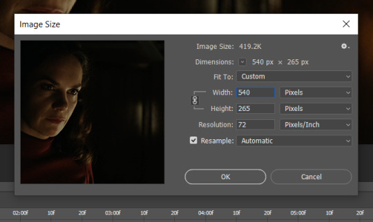
In this box, if I put the width as 540, the gif is a smaller height than I want, as it keeps to the dimensions of the gif when you load it into PS. That’s okay, just put the height you want instead, and we’ll crop off the excess.
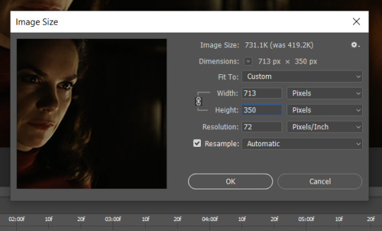
Then click OK. Using the rectangular marquee tool again, we need to remove the excess width. Part of the reason I like this version of PS is that it tells you the width of your selection as you do it, but you can always use the ruler as a guide, and check the size of your image by going to image > image size again.
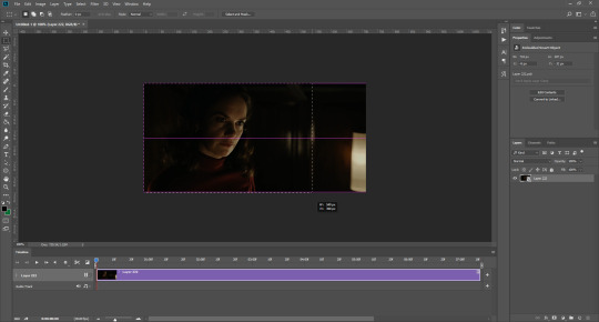
Again, use image > crop, and your gif should now be the correct size!
You can also use the crop tool in the timeline window to crop the length of your gif:
However, I tend to wait until later on to do this (which will be explained further down!)
SHARPENING
Next you want to go to filter > sharpen > smart sharpen.
These are my settings. However, 0.4px is very sharp, too much so, but that’s easily fixed.
Go to filter > blur > Gaussian blur and then set it to 1.0.
Now on the right-hand side, we need to reduce the blur, so double click the little adjustment button, and change the opacity of the blur. I usually go for 20-30%!
Then click OK, and that’s your sharpening done!
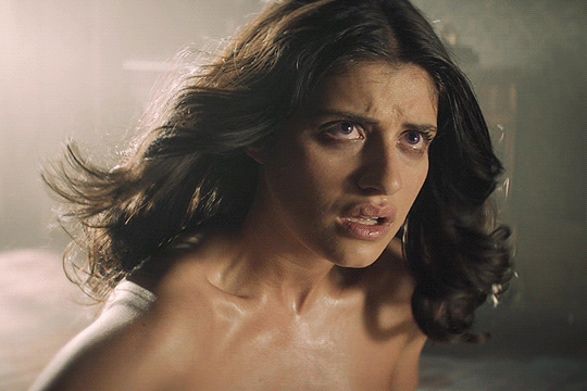
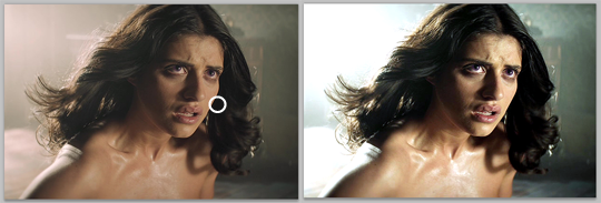
COLOURING
I picked this scene on purpose as it’s dark, so good for showing how to colour a gif. I have a base psd which consists of some very basic adjustments, but it mostly exists so I don’t forget what adjustment layers I like to use. I adjust them every time I make a gif, essentially colouring each gif from scratch.
In this case, the psd actually makes it darker. So, what I will do is turn each layer off, and adjust as I go. A lot of people say using lots of adjustment layers ruins the quality of your gif… I have never found this to be true, as long as you are gentle with them. If you whack the brightness right up to the top, it’s going to ruin your gif no matter if you use 1 adjustment layer or 100. I would just say use your common sense, and adjust a little at a time!
I start with a simple black to white gradient map set to soft light, because I think it helps you see depth once you add some brightness to it. I usually do this on about 10%, or more if needed. It’s probably unnecessary, I just like how it looks!
Then, I move onto using curves and levels. This is where things can diverge depending on who you’re colouring. If this person is white, it doesn’t matter too much. If they’re not white, you don’t want to white wash them. My best advice is to play around with it. By adding vibrance and other (usually the red) selective colour settings later, you can ensure you don’t change the person’s skin tone from what it originally was. You can also use layer masks at varying opacities (various shades of grey), on your curves and levels, to remove some brightening so that you’re not changing anyone’s skin colour. Just brighten slowly and check in with yourself honestly about how your gif looks.
Some people don’t like using levels, or curves. It’s completely up to you. I tend to use both because levels are good for bringing depth, even if not brightening (though I like to use them for that as well).
One thing you can do is use the white point of the gif to make PS adjust the curves itself, however I like to drag the sliders myself and see what it looks like. Just make sure it’s not too bright, as we will be using further layers to brighten more, after.
Next is levels. The slider on the left controls the black point, the one in the middle controls the midtones, and the one on the right controls the white points. The black brings depth, the midtones adjust the overall brightness, and the white points produce stronger highlights. Again, you’ll get a feel for how this works as you practice. Just don’t use the white point excessively, especially if your characters are not white.
Then I add vibrance (+20!), because we’ve removed a lot of it when lightening the gif. Next is exposure, which I find brings out the highlight and shadow areas more effectively:

Then colour balance! This helps with scenes that might be a certain colour, i.e. too blue, too green, too red, etc. Moving the sliders in the opposite direction of the colour your gif is will counteract it. The best thing to do when accounting for different colours, is to make a new layer every time you change colour, so that you don’t get confused. I always add a new layer for colour balance and selective colour if I want to change more than one thing. So one for red, one for yellow, one for pink, etc.
A layer of brightness just to make the gif pop, and because the scene is extra dark, I added a very gentle extra curves layer:
SAVING YOUR GIF
Time to save the gif. You can go ahead and file > export > save for web (legacy) now, but then you’ll have to reopen the gif to reset the frame rate from 0.07, to 0.05. Instead of doing that, I use a modified action. The original was made by the very talented @elenafisher! So I do not take credit for that at all. You can find the original here: elenafisher(.)tumblr(.)com/post/190817437374/gif-sharpening-action-2-preview-download and in my resources tag. Please reblog it if you’re going to use this!
To use an action, first make sure you have actions turned on in window > actions. To load in your action, go to the little lines circled, and then load the action from your downloads:
Obviously if you don’t want to sharpen your gifs yourself, you can use the action as it is, and it will give you a beautiful glowing effect. If you’d just like to use it to flatten your gif into frames like I do, make sure to take out all the items I have highlighted:
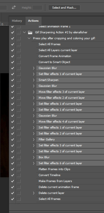
Until it looks like this!
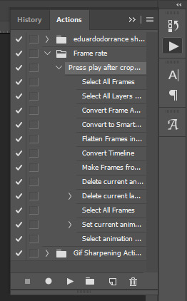
Make sure you have the layer under the file name highlighted, and then click the play button at the bottom! (If you get a screen saying select all frames cannot be found, don’t worry, just click continue!) You can delete the layer that does that if you want, I just keep it in case I realise I’ve forgotten to do something, because you can click cancel and edit your gif before you flatten it. Of course you can undo the steps to get back to the smart object version of your gif, it just takes longer!
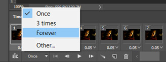
And now your gif is in frames and set to 0.05 already, so you don’t have to change the speed! All you need to do now before saving is change the gif cycle to “forever” in the bottom left-hand corner:
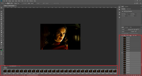
Then to save the gif go to file > export > save for web (legacy). Sometimes, the gif is bigger than the tumblr 10MB limit. You’ll be able to see this in the bottom left-hand corner of the gif save settings. If this is the case, I like to preview the gif, to see whether it would be best to cut frames off of the beginning or the end, or both. When you’ve decided, you can select the frames at the bottom, and in the right-hand side panel, and delete them both using the little bins/trash icons.
I keep checking and deleting frames until I get the gif under 10 MB! Just don’t delete frames from the middle, as then you’ll have the same issue as if you selected “every other frame” when making the gif: it won’t flow!
Lastly, these are my save settings:
So that’s it! That’s how I make all my gifs. Blending I do when the gifs are in the grouped, smart filter stage, whereas text I add on during the framing section above! Really hope this is helpful, please feel free to ask any questions you may have! 💖
#gif tutorial#tutorial*#completeresources#yeahps#chaoticresources#allresources#mikesmom#usergeo#userava#usertix#usersmile#usertom#if you'd like me to cover anything more advanced just shout#i wanted to show how i add text too but tumblr wouldn't let me add any more pics#but people can let me know if that's something you'd want!
520 notes
·
View notes
Note
Hey there! Hope you don't mind me asking but I've recently gotten into graphic making but have no idea how to do the things I want haha (right now I'm thinking about that neon line art look) do you have any advise on where to find tutorials and what not? Thanks!
hello hello! i don’t mind at all bud and i’m honoured that you thought to ask me for advice! i’ve only been doing graphics for like a year now so this ask surprised me in such a good way! sorry for the delay! i was dealing with things💛
as for tutorials, i’m afraid i don’t have any i can pass on to you. a lot of what i’ve learnt is through trial and error and taking certain techniques i’ve learnt like overlays and textures from gif making and applying it to graphics.
for advice, shapes and colours are your best friends! there’s a lot you can do with graphics when you limit yourself to certain palettes or even when you add shapes by different overlay methods.
for a lot of my graphics, i tend to stick with 5 or less colours for the palette because more than that can make it too messy. finding colours that work well with one another and offer good contrast while keeping things cohesive can be hard. if you ever get stuck with a palette, i find adding black as one of the 5 colours can work wonders! it adds a deepness to the lines that might be missing or even offer a nice contrast to bright colours so it isn’t as hard on the eyes.
in this dabi one i made, my palette was 3 colours only: black, yellow, and red. as you can see even if you have yellow and black as the main screencap colour, like i did with the 2nd, 3rd, and 6th panel, adding the red string on those panels tied those three panels back to the other three so it was cohesive. the orange that pops through on the lines is because I had added my colours using a gradient map so the change from red to yellow featured an orange. by playing around with the gradient map feature, you choose which colour is more prominent by how much of it you put in using the little scale/bar. i used this method of black + 2 other colours a lot (ishigami senkuu, sherlock holmes, bakugou katsuki, and soukoku + genshin au).
this victor nikiforov edit i made was another example of 3 main palette colours: blue, yellow, and black. however instead of using the colours through gradient maps, i focused on using the selective colour, colour balance, and hue/saturation features. i used them to make the colours i chose, stand out from the rest. the black was the colour that tied all six together, whether through the typography or through background colours (like viktor’s scarf).
one colour palette that i love using is a red, black, and white one! i’ve used it so many times and I never get tired of it (portgas d. ace, donquixote rosinante, bam, and nakahara chuuya). as you can see it’s very simple but you can do so much with it, whether applying it to a gif or a screenshot.
the other thing with graphics that i’ve learned through trial and error is typography! sometimes finding a good font can just make a graphic. for typography the two things i pay attention to is 1) not overloading a panel with too many fonts and 2) size. in one panel i never use more than two fonts together. two is my max because then it becomes too clunky and messy. i also never do two cursive fonts together. one cursive and one standard are my go to because it’s less straining on the eyes no matter which pairings you do. with size, you can use the same font in one panel but make different words or lines bigger or smaller to add affect/emphasis. the first panel of my nanami kento edit shows what i mean. this aizawa shouta one also shows the differences in font size but because they’re the same two fonts despite the size difference, the set still flows.
you can also play to the character’s aesthetic. take colours from their clothes and run with them for the colour palettes if you’re stuck. or if you want, do the opposite of the character’s aesthetic. that’s what i did for the dabi edit from before. dabi’s aesthetic in canon is blues and blacks, cold colours. i flipped it for that edit and took warm colours as his palette which made for an interesting and jarring change because that’s not normal for him.
last thing i will add is really just have fun and go wild! the fun thing about graphics is that you can literally experiment and try so many things!
hopefully this made sense, but if not feel free to send me another ask🌻💛
5 notes
·
View notes
Note
I really like your shigaraki redraw! I was wondering how you choose the colours of your drawings, you begin with black and white or you have already in mind a specific palette? I always struggle with coloring, especially in this period, I always feel disappointed with my art :(
omg thank u !! im glad you like it :”)
and yeah !! so when i color something, its usually just me playing around with the different program functions; seeing what i can do with different colors and layers on multiply / color burn / overlay, etc., tone curve, gradient map, so on and so forth. i think i have some form of aphantasia, so rather than having an image in my head of what i want something to look like, i’ll usually figure it out through trial and error according to some like. i guess Feeling of how it should look. such as, if you want to go for a gloomy theme, you might want to adopt a cooler color palette; more purples, blues, and greens. or if you’re going for a different approach, say smth like love, you might opt for a warmer palette in which you use reds and oranges. ofc they arent rules or anything, but they can be a nice guideline if you’re having trouble deciding where to start . i think curiosity for how certain colors interact will bring you large percent of the way. after that, it’s more a matter of personal preference for whichever colors you think fits the best.
im sorry you’re feeling disappointed with your art though !! thats such a tough feeling to work through but i hope you can find some methods that work for you ! i can go ahead and share my process if that gives you some idea for what to try :3
at the most basic level, i’ll usually have a base layer of a character’s normal palette and then i’ll have a few extra layers set to overlay, multiply, color burn, etc. on top. usually of reds or purples because those are my fav colors :3 i use layer settings like multiply to add shadows, glow dodge / screen to add highlights, and color burn / overlay / soft light to shift the hues or saturation of the colors in some particular direction. for instance, heres a mitsuri pic i edited. her colors are too cool for my preference, so i went ahead and added an orange color dodge layer to the right side at 74% opacity . i looked at how the layer looked in multiply, overlay, color burn, color dodge, etc. and the different opacity levels before deciding on this particular combination. depending on what program you use, you might not have these settings. i believe paint tool sai has less than clip studio paint, but they usually share a few in common.
as you can tell, its already a lot warmer and headed towards the direction i want :3 but in giving it this orange hue, i feel like i’ve made it darker, too. so to make it more exciting, im going to add some new colors to her eyes and hair. i think yellow will be a nice compliment to the greens, so im gonna go ahead and add a yellow highlight using glow dodge at 18% opacity.

and if i decide i want to add a few extra shadows just ‘cause, i’ll usually pick some pre-existing color off my drawing to keep the palette more cohesive. in this case, i went ahead and chose the reddish-purple color from her uniform and put it on a new multiply layer at 15% opacity
they’re small individual additions all things considered, but i enjoy watching them build on each other :3 . thats usually the process i’ll take when drawing w a base color. add or take how you like
in the case of the shigaraki one, i initially colored in black and white because i wanted to emulate the manga appearance, but once i colored his iris red i decided i wanted to add some more colors overall. something you can do with greyscale images that i like to do is add gradient maps !! these can transform your blacks & greys into actual color which you can then adjust with more layer editing (like above). your program may come with pre-set gradients, or you can download new color packs online / make your own.
left is the original, middle is a dark blue-to-red gradient map at 71% opacity, and the right is that same gradient with increased contrast, orange color burn layer at 60% , and 15 gradient posterization.

they all add color in their own way, its just up to you to choose which direction to go :-)
the different program settings can be confusing @ first but they’re a lot of fun to play around with if you ever have the time. and once you start to learn how these settings generally affect the drawing / its color, you’ll have a more innate feeling of how to use them without needing to think about it much before hand
but AAHH hopefully this gave u some insight for how i color my pieces 🥺️ msg me if theres anything u want clarification on :-D !!
#newdramaticvalues#asktag#lgtext#i genuinely just smash buttons until i make it work though AHAHHAAH
21 notes
·
View notes
Text
A Meal of Freshnism
A design jouney about meal and identity.
2020.8.5

1. Project brief:
Using food production and consumption as a container for a variety of concepts and issues.We’ll reflect on our own identity, the identity of our group and the stories behind the food we eat. We worked in groups of 6.
2. The Design aim
We want to deconstruct the five senses brought by fresh food through immersive experience, and arouse people's discussion and reflection on the excessive pursuit of food freshness.
3. The Research methodology
We used a variety of design methods to investigate and get information to promote the development of the project:
Observation: We went to a number of restaurants nearby to observe and record people's eating and to ask them about their opinions and experience of food.
We went to a barbecue shop to experience the whole process of food cooking, and recorded the sounds of food being cooked, the changes of food and so on. We recorded these details that we usually didn't pay attention to.
Participatory design: Two experiments have been designed to test the relationship between people's senses and food, and 14 people have been invited to participate in our experiment. And we invited people to join in us to design the menu.
Mapping: Based on the previous audience participation experiment, we used a map to visualize the relationship between different dining environment sounds and user comfort level to explore the relationship between them.
Brainstorm: We conducted a wide-ranging discussion on research methods and subjects based on food.
Desk Research: Based on first-hand research, we conducted the research about the artist reference and academic papers on culture and history to find inspiration for expression forms.
4. Research process
Stage1: Research base on food.

In the traditional level, the food is the core of a meal, we want to deeply understand it, so, first of all, with our physical properties (geometric shape, color, smell, sound) as a benchmark to deconstruct the different food, explore their characteristics. We observing the behavior of customers ,and conduct interview to explore the relationship between people and food.In addition, we also discussed the packaging of different food categories and found some interesting features.
In this stage we have an in-depth understanding of the geometric composition of food, color composition, sound characteristics and identity.
One interesting phenomenon is that fresh food has a smoother outline, smoother surface, and higher color saturation.
Stage2: Participatory experiment design and analysis.

We hope audience can participate in our design process and get more real feedback to promote our design. We designed two experiment in this section.
Experiment 1:

We wanted to see what people had in common with their impressions of food.
What we do is we ask participants to choose the color and the shape to match the dish, when they're thinking about a particular dish.We prepared 35 color cards covering all colors of different grayscales and different lightness, and 7 basic shapes for them to choose from. Participants were asked to choose two colors and a shape to describe the dish from the options provided.
Through this experiment, we found that people tend to choose bright colors, and after communication, we found that they prefer to imagine the food as complete and fresh. Moreover, the colors selected by each person vary greatly. In the imagination of ice cream, people are more likely to choose the colors represented by their favorite flavor, as well as other things.
Experiment 2:

Through this experiment, we want to explore the influence of different environmental sounds (the sound of kitchen, the sound of people talking, the noise of air conditioning, the sound of cutlery colliding) on people's dining comfort experience.We placed different sound sources in four places: A, B, C and D, and the other positions were incremented by distance relative to this position to achieve A gradual gradient of sound decline.We would blindfolded the participant, lead her/him to experience the sound in four positions, and provide him/her with the same food simulation meal. After each meal, we would ask him/her subjective feelings, and score the feelings from uncomfortable to comfortable with a score of 0-5. After collecting and processing these data, we made a map.
Site layout


Mapping outcome

In this experiment, we found that the influence of sound on individuals is quite different, but in general, it has little influence on food flavor and great influence on seat comfort.All people are sensitive to the effects of different sounds, and they feel more irritated by harsh sounds.
At the same time we also reflects on the experiment design of some deficiencies, such as audio quality can't completely simulate the real environment, there will be noise interference, on food choices, we use the original chips taste level and people too familiar with the flavor of potato chips, change the music it is difficult to shake people's perception of familiar with food.
Stage3: Cultural and artist reference research, define the audience.
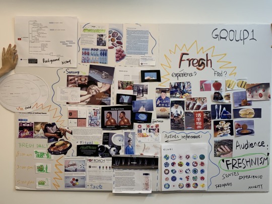
Based on first-hand investigation, we conducted a study on artist reference and academic papers on culture and history to find inspiration for expression forms.
In this part we find rerefences focused on the relationship between people and the senses . Here are three of the most inspiring project in our reseach.

The designer of this project is called Alexandra Genis. She proposed a technical concept, and then designed an artificial flavor containing taste molecules. For example, she uses 24 taste molecules to express the taste of strawberry. But they all have their own taste. So people can freely select and combine these flavors according to their needs.We think the visualization of the smell sense and the deconstruction is inpiring.

Another important reference is about exploring the different senses of human。The Chinese srtist Wu Juehui, made a futuristic devices, an electronic eyeball that could be placed everywhere. We can wear glasses to see through the camera of the electronic eyeball. we think This is a futuristic visual extension project can give us some inspirations.
Gu Guangyi put a tactile device on his mouth. Similar to brace. In order to help gay people .Through this device, they can have better oral sex pleasure. This is also an exploration of the touch sense.
At the same time we have done some research about the culture and history,we find Chinese restaurant often appears the concept of "kill instantly": many restaurants will keep animals (ingredients) alive on purpose as a selling point to attract customers, only after customers order, they kill the animals, and even kill them in front of the customer, in order to prove that is absolute fresh food. However, from the point of view of food safety and food taste, such behavior is unnecessary. Before be killed, the animals have been kept in cramped spaces with minimal life supports, or kept in unsanitary conditions. Aggressive animals have even been tied up and unable to move. Many animals die before they are put on the table, and they lose their value and are abandoned.

In China, some people excessively pursue the freshness of food materials, which leads to some unnecessary waste and cruel behaviors. This has become our later theme. We want to know what is the freshness that people always pursue.
5. Summary
People not only taste the taste of food, but also experience the color, shape, sound, smell and the sound and light of the dining environment. However, compared with the food itself, these influences are insignificant, and people always have a persistent pursuit of freshness.
We have found a feature that Chinese people pursue widely -- freshness of food, which is our identity design. We even invented a word "Freshnism" to represent this extreme pursuit of food freshness.
We wanted to deconstruct the five senses of fresh food through immersive experiences, and ask 'What is fresh?', let people to discuss and reflect on the excessive pursuit of food freshness. This will be an experimental, ironic attempt to explore from the physical level (the sense of smell, sight, hearing, touch) can be collected on the intake of fresh senses (taste). When fresh food is deprived of its edible value, the surplus value for people to judge the influence of 'freshness', it is also a kind of metaphor, people explore the non-material aspects of excessive pursuit freshness.
6.Design plan
We will design a western-style dinner without food entities, and make four dishes of smell, sight, hearing and touch. Our audience will experience these four dishes to explore the composition of freshness, and feel the irony and doubt in it.

We intend to interact with the audience through a variety of media, such as video, installation, drawing and conversation.

Based on this process, we arranged the work. I was mainly responsible for daily schedule, props design and making, 3D modeling, playing the role of chef in the video, site design and layout, and material procurement.
7. Prepartaion
Menu
Participatory Design (second round)

We invited 13 people to design the meal. They were asked to draw something that represented the word "fresh", and we asked them what smells and sounds came to mind when they thought about freshness.

Tablemare design
Me and Triple Spark made all the product for experiences.


Visual Dynamic Graphics Design for the main dish (VR)
I made it individually.


Story board
My partner, Eva and K drew the storyboad based on dining interaction.

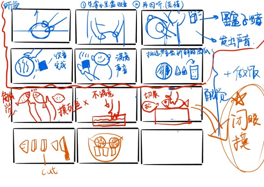
Video shoting
The shooting was divided into two parts: a chef's cooking video on the home screen (interactive) and a concept video, in which I played the chef.

Visual material preparation
Jin, my partner, took charge of the branding of this exhibition. The final logo, poster and menu design are as follows.
Site layout
Together, we laid out the site.
8. Presentation


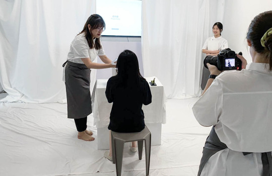
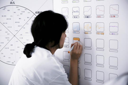

9.Feedback and reflection
2 notes
·
View notes