#forgetting curve graph
Explore tagged Tumblr posts
Visit Tumblr Blog
Explore Tumblr blogs with no restrictions, modern design and the best experience.
Last Seen Tumblr Blogs


Fun Fact
In 2020, 27% of US Tumblr users had an annual household income of over $100,000.
Text
The Science of Forgetting: Why Trainers Must Rethink Learning Strategies
The Forgetting Curve and Its Relevance for Trainers: How to Ensure Long-Term Knowledge Retention
Introduction
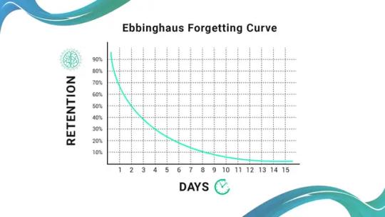
Have you ever attended a training session, felt confident about what you learned, and then struggled to recall most of it just days later? This phenomenon is explained by the Forgetting Curve, a concept introduced by German psychologist Hermann Ebbinghaus in the late 19th century. His research showed that without reinforcement, people forget nearly 50% of newly learned information within an hour and up to 90% within a week.
For trainers, this presents a major challenge. No matter how well-designed a training program is, its effectiveness is limited if learners quickly forget the material. The good news? With the right strategies, trainers can combat the Forgetting Curve and ensure long-term knowledge retention.
This article explores the science behind the Forgetting Curve, its implications for trainers, and proven strategies to make learning stick.
Understanding the Forgetting Curve
What is the Forgetting Curve?
The Forgetting Curve describes how memory retention declines over time without reinforcement. Ebbinghaus conducted experiments where he memorized nonsense syllables and tested his recall over varying time intervals. His results formed a steep, downward-sloping curve, demonstrating rapid forgetting unless information is reviewed periodically.
Key Insights from the Forgetting Curve
Forgetting Happens Fast – Learners forget up to 70% of information within 24 hours of learning if there’s no reinforcement.
Repetition Strengthens Memory – Regular review interrupts forgetting and moves knowledge into long-term memory.
Meaningful Learning Improves Retention – Information that is relevant, contextual, and engaging is remembered better.
Active Recall is More Effective – Actively retrieving information (e.g., quizzes, teaching others) improves memory more than passive review.
These findings highlight the urgent need for trainers to implement strategies that reinforce learning over time.
Why the Forgetting Curve Matters for Trainers
For corporate trainers, L&D professionals, and educators, understanding the Forgetting Curve is critical. If trainees forget most of what they learn, then training programs are failing to create lasting impact.
Common Training Pitfalls That Lead to Forgetting
One-and-Done Training – Single-session workshops without follow-up lead to rapid information loss.
Overloading Learners – Dumping too much content at once overwhelms learners, making retention difficult.
Lack of Reinforcement – Without periodic reviews, knowledge fades quickly from memory.
Passive Learning Methods – Traditional lectures and static e-learning do not engage learners enough for deep retention.
The Cost of Forgetting in Organizations
Reduced Employee Performance – Employees forget essential skills, leading to mistakes and inefficiency.
Compliance Risks – Forgetting critical compliance regulations can result in legal consequences.
Wasted Training Investments – Organizations spend millions on training programs, but without reinforcement, much of that investment is lost to forgetting.
To overcome these challenges, trainers must design learning experiences that actively combat the Forgetting Curve.
How Trainers Can Overcome the Forgetting Curve
1. Use Spaced Repetition
Spaced repetition involves reviewing information at increasing intervals to strengthen memory. Instead of cramming, learners revisit key concepts multiple times over days, weeks, or months.
How to Implement Spaced Repetition
Microlearning Modules – Deliver bite-sized lessons with follow-up reinforcement.
Automated Learning Reminders – Use AI-powered learning platforms to schedule personalized review sessions.
Reinforcement Emails & Notifications – Send learners periodic reminders or quizzes.
Example: Instead of a one-time compliance training session, provide weekly microlearning refreshers on key policies.
2. Leverage Microlearning
Microlearning platform delivers small, focused lessons that are easier to digest and remember. Studies show that microlearning can increase retention by up to 50% compared to traditional training.
How Microlearning Helps Combat Forgetting
✅ Short & Focused – Learners absorb one concept at a time, improving retention. ✅ Flexible & On-Demand – Employees can access learning when they need it, reinforcing knowledge in real time. ✅ Engaging Formats – Videos, infographics, quizzes, and interactive lessons enhance engagement.
Example: Instead of a 3-hour training session, break it into 10-minute modules with real-world applications.
3. Implement Active Learning Techniques
Passive learning (reading, watching videos) leads to high forgetting rates. Active learning, which requires learners to engage, recall, and apply knowledge, significantly boosts retention.
Active Learning Strategies for Trainers
Quizzes & Retrieval Practice – Asking learners to recall information improves memory retention.
Scenario-Based Learning – Present real-world problems that require critical thinking and decision-making.
Peer Teaching – Encourage employees to teach concepts to others, reinforcing their understanding.
Gamification – Use leaderboards, challenges, and rewards to make learning engaging.
Example: After a training module on data security, give learners a real-world phishing attack scenario to solve.
4. Use AI-Powered Adaptive Learning
Artificial intelligence (AI) can personalize learning paths, ensuring that employees receive reinforcement exactly when they need it. AI analyzes learner performance and automatically adjusts training schedules to prevent forgetting.
How AI Helps Combat Forgetting
🚀 Personalized Reminders – AI identifies knowledge gaps and pushes targeted microlearning content. 🚀 Smart Adaptive Quizzes – AI-driven assessments help learners actively recall weak areas. 🚀 Just-in-Time Learning – Employees can access training at the moment of need for maximum retention.
Example: If an employee struggles with safety protocols, AI sends personalized refresher lessons.
5. Reinforce Learning with Real-World Application
Retention improves when learners apply knowledge in real-world scenarios. Trainers should create opportunities for hands-on practice and real-life implementation.
Ways to Reinforce Learning
On-the-Job Training Assignments – Give employees tasks that require applying new skills.
Role-Playing Exercises – Simulate real situations to deepen understanding.
Follow-Up Discussions & Coaching – Encourage knowledge sharing among peers.
Example: After a leadership training session, assign managers real coaching tasks to apply new skills.
Final Thoughts
The Forgetting Curve poses a significant challenge for trainers, but strategic learning reinforcement can dramatically improve retention. By incorporating spaced repetition, microlearning, active learning, AI-powered tools, and real-world application, trainers can ensure knowledge sticks—leading to more effective training programs and improved workforce performance.
🔹 Key Takeaways for Trainers: ✅ Combat forgetting with spaced learning & microlearning. ✅ Use active learning techniques like quizzes and real-world practice. ✅ Leverage AI-powered learning for personalized reinforcement. ✅ Reinforce learning with on-the-job application.
By shifting from one-time training events to continuous, reinforced learning, trainers can defeat the Forgetting Curve and maximize learning impact.
🚀 Want to improve your training programs? Explore how AI-powered microlearning solutions like MaxLearn can help!
#how to beat the forgetting curve#overcoming the forgetting curve#what is the forgetting curve#forgetting curve theory#the forgetting curve#curve of forgetting definition#curve of forgetting study method#according to ebbinghaus forgetting curve forgetting#memory curve#using forgetting curve#the curve of forgetting#ebbinghaus forgetting curve percentage#memory retention and the forgetting curve#forgetting curve psychology#forgetting curve study schedule#ebbinghaus retention curve#how to overcome forgetting curve#the ebbinghaus forgetting curve shows that:#forget curve#ebbinghaus curve of forgetting#curve of forgetting#what is ebbinghaus forgetting curve#how to overcome the forgetting curve#rate of forgetting#forgetting curve#forgetting curve graph#typical forgetting curve#forgetting curve calculator#what is the curve of forgetting#the ebbinghaus forgetting curve shows that
0 notes
Text
So, a while back I was thinking that within the Fallout chronology, there's going to be a period immediately after the war where you have a shitload of mad scientists running around the wastes, people with pre-war scientific training and resources who were disproportionately likely to have survival contingencies in place via their association with the military-industrial complex, The Enclave, Vault-Tec, or whoever else would have a pet evil scientist. For a while they're just a kind of guy you can run into. Then there's going to be a big period in the middle where that initial glut of hanger-ons have died off, actual trained scientists become as rare as unicorns, and the high-science of the pre-war era becomes the stuff of legend and superstition- this is the period where you get groups like the Ciphers from the Van Buren design doc. Then like 200 years after the fact, you'd see sufficient reconstruction of civilization that you start to get new scientists, you've got the Followers setting up an actual college in the boneyard to train people, you've got the NCR setting up The Office of Science and Industry, you've got the NCR going door-to-door looking to draft someone with theoretical physics knowledge and expecting to succeed, scientists are once again just a type of guy you can reasonably expect to run into. If we were graphing this it'd be a big inverted bell curve.
Anyway. The sheer number of scientists running around in Fallout 3 with no obvious source of training (James, Madison Li and her staff, Pinkerton, The Surgeon, Dr. Lesko, that one guy in vault 106, Julius Banfield, there are others I'm forgetting) is not unrelated to my theory that they fucked around with the intended timeframe for the game late in development.
#fallout 3#fallout 3 timeline shift theory#fallout#thoughts#meta#fallout new vegas#fo3#fonv#fallout meta
97 notes
·
View notes
Text
Waveforms and Everything I've Learned About Them
@isthissarksouls
This probably wont be as long as the last one tbh
I think it's very easy to forget since it's not exactly a huge mention, but wuthering waves' world and designs and every thing inbetween is based off the concept of sound. We say frequencies and fortes and other fun words but the biggest thing to remember is these words are in reference to sounds.
well naturally in the world there is a way to measure these sounds, in that of sound waves.

Sound waves can be measured in a variety of ways and shapes.
Resonators are determined Natural, Mutant, Congenital, or Artifical, based on the shape and appearance of the curve and it's "convergence" or "non-convergence". it's a lot a blabbing and it's mainly boils down to this: physics in sound.
The shape of the soundwave is all about the harmonics, as realistically speaking, no sound is truly "clean" without some sort of contamination (background noise, other factors that can displace or affect the appearance of the shape).
In the most basic of terms, as simple as can possibly be, different shaped curves are going to have different frequencies, and different harmonics.

See how the different shapes exist? This is what the "Natural" and "Mutant" resonators might have (as an extreme example) of waveforms. In reality, it will probably look more along the lines of something like this:

However, if you converge the two lines, you get something more like this:

These are two different lines, converged into one, creating an odd 'square' shape. However, in physics, harmonics play a key role.
As you can see in the above graphs, the line is smooth, and steady: these resonators did not experience a lot of distress during this time.
A resonator who experiences a lot going on likely means they were exposed to more harmonics, creating a line more like this:
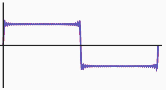
It is steep, jagged, and closer together. For non-convergent, something like this:

The more harmonics, the messier it will likely look.
In conclusion: A mutant resonator handles a lot all at once, and while the awakening of a forte is not fully clear or known, it's probably good to know that if your resonator is a mutant resonator, the blue line is going to be tighter, steeper, as the frequency is higher, and the pink lines will be very messy and frequent, but they do not cross.
A Natural resonator will probably not have as messy of a line like this, but take it with a grain of salt.
Fortes are widely not studied enough, and there are plenty of theories and understandings on a basic level, and my real life research can only take me so far as to what might be correct.
If you want to see these in action and mess with it yourself, use this site. This is where I got most of the visuals from, and sometimes messing with it actually helps to visualize the how and why it does what it does.
#wuwa#wuthering waves#wuwa oc#i do love this game i swear#but sometimes it's confusing with the way they talk about stuff#and then never explain#or show visuals about what they're talking about#like i had zero idea these things were called wave forms tbh#hope this helps
22 notes
·
View notes
Text
Stats 4
Have you heard the term "bell curve"?
You probably have; it was the title of a hellaciously racist piece of scientific dreck a few decades ago that racists still like to cite despite its obvious flaws. But that title came from something real--something called the normal curve.
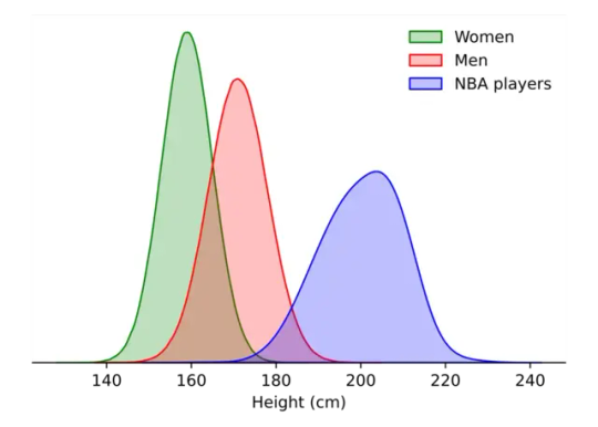
We're going to talk about distributions today. Distributions are what happen when you get a bunch of numbers and then look at the shape they make. If I look at the inhabitants of my house, and I plot their ages on a bar graph, it ends up looking like a pair of blocks: there are two groups, my old dogs (12-16? who knows) and me and my husband (approx 40).
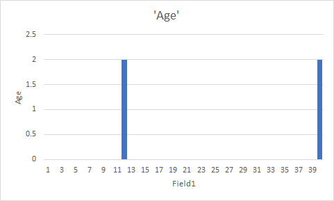
I will never tell you how long it took me to make my computer make a simple two-part bar graph for me.
Anyway, this is a distribution. It's a really, really simple one. It's also fucking useless--never forget that we can do all kinds of things to useless numbers, so garbage in, garbage out. You want a more complicated distribution? Here's ages of people in the US.

Holy shit that looks complicated! Okay, maybe a little easier. Graph of heights.
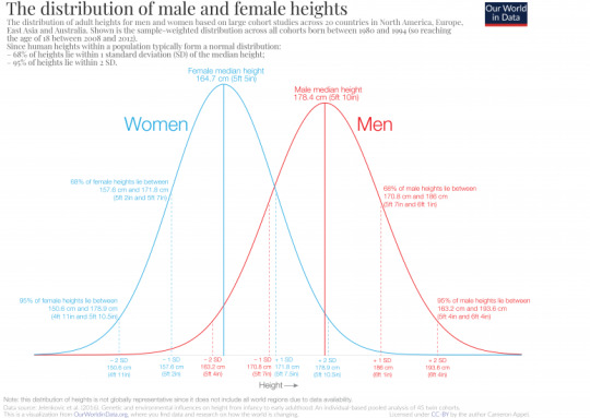
Now we're getting somewhere. Women, on average, are shorter than men. However, there's a pretty good amount of overlap there. And very short people and very taller people are more rare than average-height people.
This is the most common distribution you'll run into in nature, called the normal curve. It's bell-shaped. It's bigger in the middle and smaller towards the ends. It kind of trails away. Many, many, many things are distributed in a normal distribution.
Of course, you always want to consider what group you're looking at.
Not every distribution is a normal curve. You need to know stuff about the population you're looking at. However, like pi, you will see this kind of distribution everywhere--and it's so common we have developed systems of statistics that, to a greater and lesser extent, rely on or correct for it.
So! Now you know what a distribution is. And what a normal curve is. Next up, we can talk about skew and various things that make assumptions of normalcy fucking useless.
103 notes
·
View notes
Note
do you have any tips for working with a piece that has mostly dark colors that doesn't involve turning brightness up to the point of burning my retinas?
Sorry for the late reply, anon!
This blog has been running on auto-pilot for a while as I was gone.
Anyway, I am a sucker for curve adjustment layers:


Simply add an adjustment layer on top of everything else and yank that RGB curve up. Works wonders for me.


You can also strategically focus certain values if you add more than one point to the graph:


As it's a visual change on a separate layer, you can easily show and hide the effect whenever you need (don't forget the hide the layer when you colour pick hahahaha)
13 notes
·
View notes
Text
pilot!Max x backpacker!Daniel 👨✈️✈️💼
Part 3
Part One; Part Two here!
Hey. It's Max, from the bus. Sorry, I'm going to have to turn my phone off now, but when we land in Qatar I'll turn it back on and we can arrange somewhere to meet
He stares at the message, and then feels mortified. It's not a business meetings he's trying to "arrange" for fuck's sake, it's breakfast with the hottest man he's ever met who he's not completely convinced yet wasn't a figment of his own imagination.
He backspaces.
Hey. It's Max, from the bus. I'll be stuck in meetings until the plane takes off so won't be able to respond to your messages, but once we land in Qatar we can message and find somewhere to meet👍
There. That's good. That's friendly, right? It looks like one of the texts his sister would send to her friends, it looks fine and standard and not awkward or tense. It's fine. It's fine. It's-
He hits send before he can delete it all over again. The ticks turn blue almost instantly.
Hey Maxy! Perfect, sounds like a plan :)) have a good flight and sweet dreams!
He stares at the message, and then brings his left hand up to his mouth and bites down on his thumb knuckle. Teeth in skin, pressing hard. Not enough to draw blood, but just enough to distract from the sensations in his chest.
"Did you hear the goose, Max?"
Max clicks his phone off and slides it into his pocket, as if being caught doing something unlawful.
"What?" He frowns at Lando, dropping his hand from his mouth.
"A goose," Lando repeats. He's meant to be going over the flight data but the ipad has been discarded on his lap. Wordlessly, Sebastian leans over and takes the device, clicking on the screen to reveal rows of neat graphs.
"What goose?" Max asks, annoyance growing. Being around Lando is like becoming pavlov's dog. After a while, there stops being a reason to become annoyed with him - it's just a natural response to his presence, a preparation for the undoubtedly nuisance Lando is preparing to be.
"On the bus," Lando insists. Max looks over at Sebastian, but he's either too busy reading the graph to notice or a fabulously good actor at pretending to be too busy reading graphs.
"A loud goose. Honking away. I think," -
"Oh", Max says flatly, finally figuring it out.
"It was flirting," Lando continues regardless, acting mystified. "And I've never even heard a goose flirting before, but this one was honking laughing away, it was-"
"Right," Max says.
"And unluckily, " Lando continues, "I couldn't hear any of the details, but then -,"
"Can we finish this?"
"I realise the goose must've been successful, because," with reflexes that Max always forgets is hidden under Lando's relaxed and easy going persona, small, tanned figures suddenly shoot out, wrapping around Max's wrist with an iron grip.
"For the record, my laugh is not the same as a honking goose," Max complains, trying to tug free. Lando ignores him, twisting his fingers so Max's hand goes palm down.
"The goose was successful!" He crows, using his free hand to gesture at the now faded numbers scrawled on Max's skin. Max slaps his hand away.
"You're a child," he says with no heat. He looks at Sebastian for help, but he's still gazing down at the tablet, ostensibly too engrossed in the data to notice their bickering. His lips are curving into a private smile, though.
"You're both children," Max corrects himself.
"Apparently so! I didn't even consider getting the number of my seat mate!"
"That's because your seat mate is married," Max tells him flatly.
"Hey, that's never gotten in the way of a torrid love affair. Right, Sebastian?"
"Exactly," Sebastian agrees, flicking to the next page of graphs.
"He's also your boss. Goes against the rules of conduct at F1 Wings I'm afraid."
"That is a good point," Sebastian says. Lando just waves his hand dismissively.
"Enough about my lost chance with one ravegously attractive Captain Vettel, let's-"
"You flatter me Lando."
"Not a word of a lie."
Max rolls his eyes. "You know, obsequioussness won't get you that promotion."
"Obsequiou-what?" Lando repeats dubiously, as if Max has just spoken Dutch.
"It means servility," Sebastian explains.
"Servility? Like to be polite?"
"That's civility. Servility is to be overly attentive and ingratitating."
"Ingrat-"
"It means to be a bootlicker," Max informs him, deciding to put them all out of their misery.
"Right, first of all, by simply proclaiming the truth of our captain's fabulously good looks does not make me bootlicker, fuck you," Lando says lightly, ticking one finger down.
"Language," Sebastian says, flicking to the final sheet of graphs.
"And secondly, how come I'm the native speaker and you two are foreigners and know words like that?"
"Maybe your private school wasn't all it was cracked up to be," Max says, unable to resist the easy dig. Lando scoffs, rolling his eyes.
"Right, let's move away from civility and -"
"Servility."
"Servility and bootlicking and let's get back to the pressing matter at hand."
"That we're piloting an eight-hour journey and need to start doing some security checks?" Max asks, and Lando shoots him a look.
"No. The fact that you got the number of someone in the bus! I've never known you to even talk to someone outside of the work setting, let alone flirt and get numbers scribbled on the back of your hand."
"Gee. Thanks," Max deadpans before turning to Sebastian. "Isn't part of your job as captain to get us to stop talking and start doing checks?"
He glances up from the ipad, blue eyes sharp and bright. "Yes," he says after a beat. "But in my books Lando is right, this is a very important topic to discuss."
"My love life is not an important -"
"The discovery that you actually have one is -"
"Alright," Max says loudly. "As fun as this has been, I'm actually going to be a responsible professional pilot and -"
"We still have an hour and a half to complete checks which will at most take an hour," Lando says dismissively. "Come on, we need details!"
"Of what?" Max asks bluntly.
"Her name! How old is she, what's she doing, is she hot? How does she like her eggs in the morning," he adds with a smirk.
Max suddenly envisions it. None of your business, none of your business, yes, he's very attractive, and no, don't know.
That would be it. Just a simple change of pronouns, and it would all be done. Lando's eyes would widen, and Sebastian would continue to look at the graphs, poker face hiding his own shock, but it would be done. He? Lando would say, questioning, and Max would nod and change the subject, and that would be it. Finally. And it would only be his two coworkers, but it would be something. It would mean that his truth exists beyond this confines of his mind, that others knew it too. He. Not she, but he.
"Yes she's attractive", Max snaps, brusque and harsh and cold.
"Geeze, I thought you'd be pleased about it. You sound pissed off she isn't some ogre," Lando says. Max looks away. He brings his hand to his mouth, biting down on his thumb knuckle again. The pain of teeth into skin is a welcome destraction, taking away from the surge of self-loathing rising inside.
"What-"
"Alright," Sebastian says firmly. "That's enough chit chat, time to start earning our paychecks. Lando, read the graphs. There's nothing unusual there, but -"
"Why do I have to read them if you've already gone over them and know there's nothing unusual?" Lando complains, but after one sharp look from Sebastian, wordlessly accepts the iPad.
"Max-"
"I'll help you with the configuring the altimeter," he mutters, well used to Sebastian's routine. He drops his hand, looking down at the pale indentations carved around the joint. He presses it into his crisp pilot uniform, hiding it as he slides past Lando to sit beside Sebastian.
-
Hey, breakfast in Qatar can't come soon enough
He texts it while waiting for the airhosts and hostesses to finish welcoming the passengers abroad. He's technically not supposed to have it on at this stage, but Landos blatantly scrolling through a video game subreddit on his latest apple device while Sebastian is taking the opportunity to read another few pages of the Anna Karenina copy he's been working on since they last flew to Moscow.
Daniel opens the message immediate.
Why lol, hungry already?
No, not hungry.
Is all Max texts. It takes longer for Daniel to respond, and Max watches the three bubbles bounce as he types.
I'm looking forward to seeing you again too :)
Part 4 here!
#maxiel#pilot au#my fic#a touch more angsty than usual lol#not intentional#i just love writing lando/max/Sebastian dynamic :)
92 notes
·
View notes
Text
Real world nightmares
Press the pen into the paper,
Make sure the blue is infused into the page
Curved letters, a steady hand,
Cross your "t"s, dot your "i"s, repeat,
till your hand cramps, a never ending loop
of learning, forgetting, repeat,
learning, despairing, repeat,
learning, failing, repeat,
learning, repeat.
Repeat.
Repeat.
Repeat what? Learning just to move on the next day,
you can't remember what the text was about,
all you wanted was to learn about the beauty of the cosmos but
you had to burn this formula in your brain,
least you forget it, tape the diagram
under your eyelids, it's alright if you tear up,
it stings a little.
Learn, memorise, repeat,
Sit another exam, repeat,
Barely pass through, repeat.
Get drunk in your room at midnight, repeat.
Try to kill yourself, repeat.
The pen pierces the paper, the ink bleeds through,
it's Red.
Sometimes you dream about Red.
You dream of flying, and then Red.
Fall asleep, jump, fly, Red, repeat.
Wake up. Repeat.
Go to class. Repeat.
Don't give into the Red.
Or do.
Repeat.
Red's a damning and a salvation, Red against pavement,
Red against bathroom tiles,
Red against printer black and white on paper.
Let the deadline pass, repeat.
It's three am and you're still citing sources,
It's four am and you're calculating the graphs,
It's five am and it's due at six.
You sign your name,
repeat.
Red's at the end of your vision, begging, taunting, preying.
Praying. Repeat.
A missed alarm, a sorry email, repeat.
A half arsed attempt at an essay, repeat.
You use Red ink this time, repeat.
Repeat, repeat, repeat.
A new term. The same shit. Repeat.
Red against a Diploma, a nine to five future,
a promise to repeat.
You are flying again, then Red and repeat.
A new lecture, an old, half-smoked cigarette, repeat.
Red ink against the whiteboard and you stare,
will it to go away but it stains.
Sweat down your back, heart dancing, repeat.
You cry in secret, once they're all asleep, repeat.
Next morning,
you'll smile politely, to return
Red expressions of faith and support
to people who
Really,
Really, don't know you all that well.
Red expectations you'll never meet,
Repeat.
Take sleeping pills before bed,
if you take extra, you blame it on your forgetfullness, repeat.
You don't want to feel anymore, pop another, repeat.
The pills are Red. Repeat.
You dream of integrals and chemical components,
Your pens lie half empty, half unused on your dresser,
The Red ink bleeding out,
into the carpet,
down the drain, followed by your dreams
and your passion for living.
You pick them up. Repeat.
You fail to submit yet another project. Repeat.
Ignore your phone ringing, your team will manage,
Repeat.
Your life is on hold again, just another exam period
to get through. Repeat.
The system is made to burn you to the ground,
like fuel you light on fire, repeat.
The fire is Red.
The Blue sky would be comforting,
did you have the time to look up.
Hunch over a pack of weathered textbooks,
they'd seen better days before you got your hands on them,
throw them to the floor, rip them apart,
repeat.
Repeat your prayers too, maybe for a life
you once hoped you'd have,
turned into an apathetic state of
trying, giving up, disassociating,
repeat.
Do it all over and then,
repeat.
Red is the colour of hell,
waiting, patiently
to claim you as her own.
You never stood a chance.
Pick up the pen, carve your arms.
Give into the Red.
Repeat.
#poetic writing#poetry#depressing shit#poetic#original poem#poem#poet#poems and poetry#poems on tumblr#heavy topics#mental heath tw#tw s3lf harm#tw sui ideation#tw death#tw drugs#poets on tumblr#writers and poets#poems about feelings#poems about life#poemsbyme#poets corner#long poetry#original poetry#poem i wrote#poem i guess#poetumblr#poetblr#poem by me#poemblr#poem blog
3 notes
·
View notes
Text
My research on Autodesk Maya!
(Warning: This makes reasonable sense if you use Maya)

So, Maya- What on Earth is it?
Maya is a leading 3D computer graphics and animations software created by Autodesk. It provides the entire tool set for creating 3D models, rigging characters, stimulating effects, animating motion and helps rendering final images.
The Core capabilities of Maya surround modelling with both NURBS and polygon tools; animation and rigging with keyframing, MO-CAP (motion capture integration) skinning, skeletons, liquid simulations (using Bifrost), cloth, particles, rendering- the whole kit and kaboodle. Maya is also known to support modern day workflows with collaborative pipelines, allowing custom interfaces to be prioritized for each task.
Unlike the some of the other 3D software available in the market, Maya is platform-agnostic which basically means it's designed for any workspace PC. Be it Windows, Apple or Linux- Maya will continue to be adaptable and is heavily adopted in film and game production.
Despite the nightmare this software is (according to more local opinions), Maya is easily considered to be an industry standard for effects and animations. SO, consensus is that we have no choice but to learn it. Someone call the psych ward.

On the other hand, I learned that Autodesk also has this called "Autodesk 3ds Max" which is quite popular amongst architects and model constructions for games. Unfortunately, its a windows only software. Oh! and Blender, can't forget that now can we? Blender is an open source, free to use software that is a popular alternative to use and is often used by indie artists. Both more or less have the same features, apart from the ability to animate.
More below the cut!
Autodesk Maya does various things, such as:
Modeling: NURBS and Polygonal modeling tools are used for props, characters and vast environments.
Rigging & Animation: Advanced rigging (skeletons, IK/FK) and animation (keyframing, graph editor, motion capture, nonlinear clips) support.
Simulations & Effects: Bifrost engine for realistic dynamics (fluids, cloth, smoke, destruction) and particle effects.
Shading & Rendering: Integrated Arnold renderer and Lookdev tools for high-quality lighting/materials.
Pipeline & Extensibility: Scripting (MEL/Python), USD workflows, and plugins (Unreal Live Link, etc.) allow custom pipelines

Modeling: Breakdown
NURBS - How it works:

These models define shapes using surfaces and curves that are mathematically calculated. These curves are predefined by weight values and control points which allow for continuous and smooth surfaces.
Advantages:
Scalability: These kind of models can be scaled up or down without losing surface quality or accuracy.
Precision: This offers high precision and can represent curves and surfaces exactly, making them ideal for products requiring tight tolerances and smooth surfaces.
Flexibility: It also allows for complex shapes and smooth organic forms.
Disadvantages:
Rendering: NURBS models can be more challenging to render in real-time, especially for complex scenes.
Limited Support: modeling with this is less commonly supported in game engines and some other real-time applications.
Complexity: it can be more complex to learn and use than polygonal modeling, requiring a deeper understanding of mathematical concepts
Polygonal - How it works:

This type of modeling is built from a net or 'mesh' of interconnected polygons, usually triangles, hence the name. The more polygons are used in a project, the smoother the surface would appear to be.
Advantages:
Flexibility: these models can be easily edited and manipulated due to the multiple points.
Real Time Performance: It is generally easier to render in real time, which make it the ideal method of modeling for other applications and game production.
Wide support: It can be opened and viewed in various 3D software and platforms.
Disadvantages:
Resolution dependent: When scaled down, polygonal models lose its smoothness and may require additional polygons for complex shapes.
Approximation: This model method approximates curves and flat surfaces automatically, which usually leads to loss of quality and precision later on- especially when the polygon counts are quite low.
FK AND IK: Breakdown
Kinematics
Definition: "It is the study of how objects move, without considering the forces that cause that motion." Also known as the "Geometry of Motion".
Now, Forward Kinematics (FK) and Inverse Kinematics (IK), In simple terms, are two differing ways to control a characters limbs. FK is what moves the limbs in a sequence while IK moves the end of the limb and everything adjusts accordingly. FK provides direct control over each individual joint while IK simplifies the entire animation.
FK -
How it works: It moves a limb by manipulating each and every joint in a chain, one after the other. So to move an arm, for example, one must first rotate the shoulder, then the elbow and then finally the wrist.
FK gives complete control over each joints position and general orientation, making it ideal for precise manipulation.
This is often recommended for flowing and natural movements such as swinging an arm or making a character run.
IK -
How it works: it's by defining a target of movement, such as a hand, then calculating the joint angles needed to move the limb to that target.
It gives the chance to have a more intuitive sense of control over the end of a limbs position. For example, if the character was to grab an object- the arm will automatically readjust to accommodate the movement.
It's used in situations where one may need to precisely position a limb like when the character is reaching for something or walking in uneven terrain. It's also used for complex interactions between characters and their existing world.
---
How it compares to other tools in general:
It's technically a full animation suite for people to use honestly, given that it excels in most functions as well as animation and cinematic pipelines. In regards to industry comparisons, it is considered to be an all rounded software for Animation or VFX, while 3d Max is golden for architecture and Blendr is good on cost and functionality (i mean... it's free. Can't get any better than that). But when it comes to AAA games, TV/film productions, Maya is considered to be the holy grail for many producers despite it's advanced nature.
Now, Maya is a 'use-to-be-understood' kind of software in my personal opinion. But if this whole thing scared you and rightfully so, here are some noteworthy productions (games and others) that have been made with Maya just to give you some motivation:
Animated Films: Frozen (Disney, 2013) and Wreck-It Ralph (2012) – early Disney/Maya. More recently, Pixar’s Toy Story 4 (2019), Illumination’s The Secret Life of Pets, and Sony’s Spider-Man: Across the Spider-Verse all employed Maya in their pipelines.
Visual Effects: Marvel and Star Wars blockbusters (Endgame, Rise of Skywalker), Disney’s The Lion King (2019) – VFX studios used Maya/Arnold for characters and FX.
TV/Streaming Series: Arcane (Netflix) – Maya formed the core of Fortiche’s animation, The Mandalorian (Disney+) – many creature rigs and FX in Maya; anime-style CG shows like One Piece (CGI specials).
Games: The Last of Us series (Naughty Dog) – Maya for character. God of War Ragnarök (Sony Santa Monica) and Uncharted sequels – use Maya for character rigs and motion (see community videos). Borderlands franchise – as above, New Tales from the Borderlands (Gearbox) used Maya for 2D and 3D cinematics. Activision Blizzard Studios (their film/TV arm) used Maya for animating Call of Duty: WWII cutscenes and for their early Skylanders animations. Assassin’s Creed Origins, Ubisoft showed their entire animation pipeline from Maya → MotionBuilder → in-game engine, with real-time lighting previews thanks to custom Maya plugins.
All in all, Maya is one awesome tool.
Thanks for reading and more to come!
#Long Post#Nerd is nerding#English really did English today!! yayy#Game development?? HELLO SAILOR#Am I going to pass away this semester? Probably#But denial is a river in Egypt and I am delulu :D#educational post
0 notes
Text
Common Mistakes Parents Make While Using a Child Growth Chart
Using a child growth calculator can be a great way to keep track of your child’s development, but it's important to understand how to use it correctly. While these charts are incredibly helpful, many parents misinterpret the data or expect unrealistic results. This often leads to unnecessary stress or worry. In this article, we’ll discuss the most common mistakes parents make while using a child growth chart and how to avoid them.

Assuming All Children Should Be in the 90th Percentile
One of the biggest misconceptions is that a child needs to be in a high percentile to be healthy. Some parents believe that unless their child ranks in the 90th or higher percentile, something must be wrong. In reality, a child in the 25th or even 10th percentile can be completely healthy. A child growth calculator is not a competition; it's a tool to observe trends over time.
Each child has a unique growth pattern. Some are naturally smaller or taller based on genetics. The child growth chart is simply a way to measure whether your child is growing consistently along their own curve.
Ignoring Gender Differences in Growth Charts
Another mistake parents make is not using the appropriate chart for their child’s gender. Girls and boys grow differently, especially as they approach puberty. The child growth calculator girl is specifically designed to track female growth patterns. Using a general chart or one meant for boys can lead to inaccurate conclusions.
For example, girls often experience their growth spurts earlier than boys, which can affect their height and weight percentiles in early adolescence. Using the correct version of the child growth chart ensures more accurate tracking and better peace of mind.
Relying Solely on a Single Measurement
It’s easy to panic when you see a sudden drop in your child’s weight or height percentile. However, this could be due to various temporary factors, such as illness, a growth spurt, or a change in appetite. The child growth chart is designed to track trends over time, not single data points.
Doctors typically look for consistent patterns across several months. If a child dips in one measurement but catches up later, it's usually not a problem. Monitoring the chart regularly and using tools like a child growth chart calculator can help parents better understand long-term trends.
Not Using a Regional Growth Chart
Standard growth charts are based on global data and might not reflect the growth norms in every country. In places like India, genetic and environmental differences play a role in how children grow. Using the Indian child growth chart calculator helps provide a more region-specific comparison.
This tool uses localized data to give parents a more accurate picture of how their child’s height and weight compare to others in the same region. If you're tracking your child’s development in India, this calculator is an essential addition to your routine.
Comparing Siblings or Other Children
It’s natural to compare your child’s growth with their siblings, cousins, or friends. However, every child is different. Just because one child was in the 75th percentile doesn’t mean your younger child should be too. Growth patterns can vary even within the same family.
The child growth chart should only be used to compare a child to themselves over time. Comparing across children only adds stress and often leads to inaccurate concerns. What matters most is consistency and gradual progress, not a one-time number on a graph.
Forgetting About Developmental Milestones
While tracking height and weight is important, don’t forget about other areas of growth. The child growth and development chart includes critical milestones like crawling, walking, talking, and social interaction. These milestones are just as important as physical growth in understanding your child’s overall development.
Some children might be smaller in size but advance quickly in speech or motor skills. Using both the child growth chart and the child growth and development chart provides a complete view of your child’s well-being.
Measuring at Irregular Intervals
To get accurate results, it’s important to measure your child’s height and weight at consistent intervals. Skipping months or measuring too frequently can lead to confusion. For example, growth is not always linear—children can go through spurts or plateaus.

To avoid this mistake, track your child’s growth every two to three months. Using a digital child growth chart calculator can help keep all your data organized and accessible. This will allow you to easily spot trends or sudden changes that might need medical attention.
Ignoring Head Circumference in Infants
For babies under two years old, head circumference is an important measurement. It helps track brain development and can signal potential neurological issues if not growing as expected. Many parents overlook this aspect of the child growth chart because they focus only on height and weight.
Doctors usually include head circumference as part of the regular check-ups during infancy. If you're monitoring growth at home, don’t forget to include this measurement for a more complete understanding.
Using the Wrong Units of Measurement
A surprisingly common mistake is mixing up units—like tracking height in inches one month and centimeters the next. This can lead to misinterpretations and inaccurate plotting on the child growth calculator.
Always use the same units for each measurement and stick with either metric or imperial, depending on your location or doctor’s recommendation. Most online tools like the child growth chart calculator allow you to select your preferred unit system, which reduces confusion.
Not Consulting a Doctor When Concerned
While it’s great to track your child’s growth at home, don’t hesitate to reach out to a pediatrician if something looks off. Sometimes, parents try to figure things out themselves and end up misreading the chart. A sudden drop or unusual pattern should always be evaluated by a healthcare professional.
Doctors have years of experience interpreting child growth chart data. They can also factor in other elements like family history, nutrition, and medical conditions that may affect growth. It's always better to check than to guess.
Final Thoughts
A child growth calculator is a valuable tool for parents, but it should be used wisely. Avoiding these common mistakes can make your tracking more accurate and your parenting experience less stressful. Remember, the goal is not to hit a particular percentile but to ensure steady and healthy growth over time.
Whether you're using a basic paper chart or a digital child growth chart calculator, consistency and correct interpretation are key. Don't forget to use gender-specific tools like the child growth chart girl version and regional resources like the Indian child growth chart calculator when applicable.
When paired with developmental tracking using a child growth and development chart, you’ll have a well-rounded view of how your child is progressing. Use these tools to stay informed, not overwhelmed, and always consult your pediatrician when in doubt.
0 notes
Text
6 Powerful Ways Power BI Transforms Your Business Operations
Let’s get straight to the point—Power BI’s top selling points are its robust features, intuitive design, and cost-effectiveness.
In today’s hyper-connected world, data is the new bacon—hot, in-demand, and irresistible! And why not? It drives customer behavior, shapes internal strategies, and helps business leaders make smart decisions.
But here's the catch: raw data alone isn’t valuable unless it’s well-structured, visualized, and actionable. That’s where Microsoft Power BI steps in, transforming your data chaos into clarity.

What is Power BI and Why Should You Care?
According to Microsoft, Power BI is a unified, scalable business intelligence (BI) platform that enables you to connect, model, and visualize any kind of data. It supports self-service BI, as well as enterprise-level analytics.
Power BI helps you gather, visualize, and analyze large volumes of business-critical data in a way that’s simple, engaging, and easy to digest. You can finally ditch those dull spreadsheets and lengthy reports and get everything you need—right on a single dashboard, through eye-catching graphs and interactive charts.
Power BI also shares a familiar interface with Microsoft Excel, so even non-tech-savvy users can jump in and start using it with minimal training. Plus, it integrates effortlessly with Microsoft 365 tools, cloud platforms, and external databases.
6 Ways Power BI Enhances Your Business Processes
Let’s break down how Power BI can elevate your operations, streamline decision-making, and maximize return on investment.
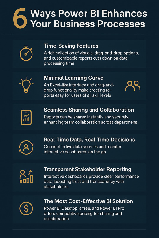
1. Time-Saving Features That Make a Big Difference
Power BI comes packed with a rich library of pre-built visuals, drag-and-drop elements, and highly customizable reports that significantly reduce the time spent on data processing.
Key time-saving features include:
Natural language queries: Ask questions like “What were sales last month?” and get instant charts.
Bookmarks, filters, and parameters: Personalize data stories based on your audience.
Zoom sliders: Easily navigate complex data.
DAX (Data Analysis Expressions): A powerful formula language for creating complex measures.
With Microsoft continuously adding updates, Power BI is always getting smarter.
2. Minimal Learning Curve
One of the biggest fears businesses have when adopting new software is the learning curve. But Power BI removes that barrier entirely.
Thanks to its Excel-like interface and drag-and-drop functionality, even first-time users can build impressive reports and dashboards. Your team doesn't need to be made up of data scientists—they just need a little curiosity and creativity.
For more advanced users, there’s support for:
M-Query for data transformation
DAX for advanced calculations
Python and SQL integration for deep-level analytics
Whether you’re a beginner or a pro, Power BI caters to all skill levels.
3. Seamless Sharing and Collaboration
Power BI takes team collaboration to the next level.
With Power BI Pro, users can:
Share reports instantly across departments
Embed dashboards into SharePoint, Teams, or your website
Schedule automatic report updates
Grant secure access to stakeholders and clients
Forget endless email chains and outdated attachments. With Power BI, everyone gets real-time access to the same data, keeping teams aligned and productive.
4. Real-Time Data, Real-Time Decisions
In a rapidly changing market, real-time insights can be a game-changer.
Power BI allows you to connect to live data sources—whether it's social media, SQL servers, CRM platforms, or cloud apps. By setting up an on-premises data gateway, your dashboards stay continuously updated.
You can even view interactive dashboards from your mobile device, so you’re never out of the loop—even on the go.
Example: Your support team can monitor live call logs to instantly spot and resolve customer wait-time issues.
That’s the power of timely decision-making.
5. Build Trust with Transparent Stakeholder Reporting
Let’s face it—no one likes long, text-heavy reports anymore.
Power BI enables you to present complex business performance data in an engaging, visual format that your stakeholders will love. From executives to investors, interactive dashboards help convey KPIs and results clearly and persuasively.
Reports can be accessed from any device at any time, building transparency and boosting stakeholder confidence.
And the best part? Updates are reflected automatically, ensuring they’re always seeing the most current data.
6. The Most Cost-Effective BI Solution on the Market
Cost plays a major role in decision-making, and Power BI truly stands out in this regard. Power BI Desktop is completely free—just download it and begin building interactive, data-rich reports right away.
For sharing and collaboration, Power BI Pro is available at just $9.99 per user per month. It allows you to publish dashboards on-premises and effortlessly share them with your team by simply sending a link.
Compared to other business intelligence tools, Power BI offers a highly competitive pricing model. When you factor in its powerful features and capabilities, it becomes clear that Power BI delivers exceptional value for your investment.
FAQs
1. Is Power BI suitable for beginners? Yes! With its Excel-like feel and drag-and-drop features, Power BI is designed for users at all levels.
2. How secure is Power BI for business data? Power BI uses Microsoft’s robust security protocols, including data encryption, role-based access, and compliance with GDPR.
3. Can I customize dashboards for different departments? Absolutely. Power BI lets you create department-specific views, filters, and dashboards based on the role or access level.
4. Does Power BI work offline? Power BI Desktop works offline for data modeling and report building. Online features like sharing and collaboration require internet access.
5. How often does Power BI get updates? Microsoft releases monthly feature updates, keeping the platform modern and user-friendly.
#power bi consulting services#generative ai#power bi solutions#data analytics#data analytics services#Power BI
0 notes
Text
Secondary Maths: Speed-Time and Distance-Time Graphs Explained
Understanding speed-time and distance-time graphs is a crucial part of secondary mathematics. These graphs help students analyze motion, interpret data, and solve real-world problems involving speed, acceleration, and displacement. However, many students find these graphs challenging due to their abstract nature and the need for careful interpretation. This is where secondary math tuition plays an essential role in simplifying concepts and boosting confidence. By mastering these graphs, students improve their problem-solving skills and perform better in exams.
What Are Distance-Time Graphs?
A distance-time graph represents how the distance traveled by an object changes over time. It provides a clear visual representation of motion and helps in understanding speed calculations.
The horizontal axis (x-axis) represents time.
The vertical axis (y-axis) represents distance.
A straight line with a constant slope indicates uniform motion at a constant speed.
A horizontal line means the object is stationary.
A curved line shows changing speed, indicating acceleration or deceleration.
These graphs help students determine whether an object is moving at a steady speed or if there is acceleration involved.
Interpreting Speed from Distance-Time Graphs
Speed is calculated as the gradient (slope) of a distance-time graph. In secondary math tuition, students learn to extract key information using the following steps:
Find the gradient: Speed = Distance ÷ Time.
Steeper slopes indicate higher speeds.
A flat line represents no movement.
A curved graph suggests acceleration or deceleration.
By practicing real-world scenarios, students develop the ability to read and analyze these graphs efficiently.
What Are Speed-Time Graphs?
A speed-time graph shows how an object’s speed changes over time. Unlike distance-time graphs, these graphs help in understanding acceleration and deceleration.
The x-axis represents time, and the y-axis represents speed.
A horizontal line shows constant speed.
An upward-sloping line represents acceleration.
A downward-sloping line indicates deceleration.
The area under the graph gives the total distance traveled.
These graphs provide deeper insights into motion, making them useful in physics and mathematics applications.
Understanding Acceleration from Speed-Time Graphs
Acceleration is the rate of change of speed. In secondary math tuition, students are guided through a structured approach to calculating acceleration:
Acceleration formula: Acceleration = Change in Speed ÷ Time Taken.
A positive gradient shows increasing speed (acceleration).
A negative gradient shows decreasing speed (deceleration).
A zero gradient (flat line) means constant speed.
By working with multiple graph types, students learn to interpret motion patterns effectively.
Comparing Distance-Time and Speed-Time Graphs
Although both graphs represent motion, they convey different types of information. FeatureDistance-Time GraphSpeed-Time GraphX-AxisTimeTimeY-AxisDistanceSpeedGradientSpeedAccelerationArea Under GraphNot applicableDistance traveledFlat LineObject is stationaryObject moves at a constant speed
By comparing these graphs side by side, students gain a clearer understanding of how motion is represented differently.
Common Mistakes and How to Avoid Them
Students often struggle with interpreting these graphs correctly. Some common errors include:
Confusing gradient with the actual value on the y-axis.
Misreading acceleration as speed.
Not identifying when an object is stationary.
Forgetting to calculate the area under a speed-time graph to find distance traveled.
Through guided lessons in secondary math tuition, students practice solving these problems systematically, improving their accuracy and confidence.
Real-Life Applications of These Graphs
Understanding motion graphs is useful beyond exams. These concepts are applied in various real-world scenarios, such as:
Traffic analysis: Engineers use speed-time graphs to design efficient roadways and traffic signals.
Physics and mechanics: Understanding motion is crucial in designing vehicles, roller coasters, and machinery.
Sports science: Athletes use motion graphs to analyze performance and improve speed and endurance.
Aviation and space travel: Scientists use these principles to calculate rocket launches and aircraft movement.
By linking these concepts to real-life applications, students develop a deeper appreciation for their importance.
Conclusion
Speed-time and distance-time graphs are essential for understanding motion in mathematics and science. Many students find them challenging, but with the right guidance from secondary math tuition, they can master these concepts effectively. By focusing on structured learning, practical applications, and problem-solving techniques, students build confidence in interpreting these graphs. With continuous practice, they improve their analytical skills and perform better in exams.
0 notes
Text
The Forgetting Curve in Action: Why Traditional Training Fails and How to Fix It

The Forgetting Curve and Its Relevance for Trainers: How to Maximize Knowledge Retention
Introduction
One of the biggest challenges trainers and learning professionals face is ensuring that employees retain and apply what they learn. The Forgetting Curve, a concept introduced by German psychologist Hermann Ebbinghaus, highlights a harsh reality: people forget nearly 50% of newly learned information within an hour and up to 90% within a week if the learning is not reinforced.
This article explores the impact of the Forgetting Curve on corporate training and presents science-backed strategies to help trainers design programs that enhance retention and performance.
Understanding the Forgetting Curve
The Forgetting Curve visually represents the decline of memory retention over time. The steep drop in recall occurs because the brain prioritizes information it deems useful and discards the rest.
Why Does the Forgetting Curve Happen?
🔹 Lack of reinforcement – Without reviewing or applying knowledge, learners forget it quickly. 🔹 Information overload – Employees often receive too much content in a short time, making it difficult to retain. 🔹 Passive learning methods – Traditional lecture-based training lacks engagement, leading to lower retention. 🔹 No real-world application – If employees don’t apply what they learn, the brain doesn’t encode it as important.
The Impact of the Forgetting Curve on Training Programs
For trainers and L&D teams, the Forgetting Curve has serious implications:
🚨 Wasted Training Investment – Organizations spend millions on training programs, but if learners forget most of the content, ROI plummets. 🚨 Decreased Employee Performance – When employees can’t retain critical information, errors increase, and productivity suffers. 🚨 Compliance & Safety Risks – Forgetting key policies and procedures can lead to regulatory violations and safety hazards.
So, How Can Trainers Combat the Forgetting Curve?
To ensure long-term knowledge retention, trainers need to rethink how they deliver learning. The key lies in reinforcement, engagement, and personalization.
5 Proven Strategies to Overcome the Forgetting Curve
1. Implement Microlearning for Continuous Reinforcement
Microlearning—delivering short, focused learning modules—perfectly aligns with how the brain retains information. Instead of overwhelming employees with long training sessions, microlearning delivers content in small, digestible chunks over time.
✅ Why it works: Spaced, bite-sized learning strengthens memory recall and helps employees retain knowledge better. ✅ How to implement:
Use AI-powered microlearning platforms like MaxLearn to break down training into 2-5 minute lessons.
Deliver content in multiple formats, such as short videos, interactive quizzes, and infographics.
Ensure learners revisit key concepts at spaced intervals to reinforce knowledge.
2. Use Spaced Repetition to Strengthen Retention
Spaced repetition is a scientifically proven technique that involves reviewing learning material at increasing intervals over time. This resets the Forgetting Curve, reinforcing memory before it declines.
✅ Why it works: Helps the brain move information from short-term to long-term memory. ✅ How to implement:
Schedule follow-up quizzes at 1 day, 7 days, and 30 days after the initial training.
Use AI-driven adaptive learning to personalize review schedules based on individual performance.
Send automated knowledge reinforcement nudges via mobile apps or email.
3. Make Learning Interactive & Engaging
Active learning significantly improves retention compared to passive learning. Gamification, interactive content, and real-world scenarios keep learners engaged and improve recall.
✅ Why it works: Active participation improves focus, motivation, and knowledge application. ✅ How to implement:
Use gamified learning platforms with quizzes, badges, and leaderboards.
Create scenario-based simulations where employees practice real-world situations.
Encourage peer learning and collaboration through discussion forums or group challenges.
4. Leverage AI-Powered Adaptive Learning
AI-driven learning platforms can analyze learner behavior and deliver personalized reinforcement based on knowledge gaps.
✅ Why it works: AI ensures learners receive targeted support exactly when they need it. ✅ How to implement:
Use an AI-powered LMS like MaxLearn to track learner progress and adjust content dynamically.
Deliver automated quizzes that adapt in difficulty based on the learner’s performance.
Provide AI-driven content recommendations to strengthen weak areas.
5. Integrate Learning into the Flow of Work
Employees learn best when training is embedded into their daily workflow rather than being a separate event.
✅ Why it works: Learning in context ensures immediate application, reinforcing memory. ✅ How to implement:
Provide on-demand microlearning resources accessible via mobile devices.
Integrate learning reminders into collaboration tools like Slack or Microsoft Teams.
Offer real-time performance support tools, such as chatbots and digital job aids.
Case Study: Beating the Forgetting Curve with MaxLearn
Companies using MaxLearn’s AI-powered microlearning platform have reported higher knowledge retention and training effectiveness. By leveraging spaced repetition, adaptive learning, and gamification, organizations have:
✔ Increased retention rates by up to 80% ✔ Reduced training time by 50% while improving results ✔ Boosted employee engagement and performance
Conclusion: Training That Sticks
The Forgetting Curve presents a significant challenge for trainers, but with the right strategies, it can be overcome. By implementing microlearning, spaced repetition, AI-driven personalization, and in-the-flow learning, trainers can ensure that knowledge sticks—leading to better performance, higher ROI, and long-term success.
Ready to Defeat the Forgetting Curve?
Explore MaxLearn’s AI-powered microlearning platform and transform your training today! 🚀
#how to beat the forgetting curve#overcoming the forgetting curve#what is the forgetting curve#forgetting curve theory#the forgetting curve#curve of forgetting definition#curve of forgetting study method#according to ebbinghaus forgetting curve forgetting#memory curve#using forgetting curve#the curve of forgetting#ebbinghaus forgetting curve percentage#memory retention and the forgetting curve#forgetting curve psychology#forgetting curve study schedule#ebbinghaus retention curve#how to overcome forgetting curve#the ebbinghaus forgetting curve shows that#forget curve#ebbinghaus curve of forgetting#curve of forgetting#what is ebbinghaus forgetting curve#how to overcome the forgetting curve#rate of forgetting#forgetting curve#forgetting curve graph#typical forgetting curve#forgetting curve calculator#what is the curve of forgetting#memory retention graph
0 notes
Text
Van Westendorp Pricing Index

Want to know the sweet spot for your pricing? Forget guesswork! The Van Westendorp pricing index is your secret weapon. This method doesn't rely on gut feeling; it's data-driven.
In this video, Alex Hormozi explains how to use the Van Westendorp method to pinpoint the optimal price point for your product or service.
Here's the breakdown:
Ask Four Crucial Questions: Survey your target audience with these questions:
Too Expensive: At what price is this product/service too expensive to consider?
Too Cheap: At what price would you question its effectiveness?
Good Value: At what price do you feel it's a good bargain?
Acceptable: At what price would you buy it, but it might sting a little?
Plot the Answers: Use the responses to create a graph showing the price ranges where most people are satisfied with the value.
Find the Sweet Spot: The area under the curve on your graph reveals the price point with the highest desirability, maximizing conversions.
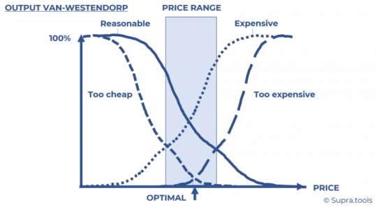
Stop relying on instinct! Use the Van Westendorp method to fine-tune your pricing strategy and boost your bottom line. #pricingstrategy #businesstips #vanwestendorp #pricing #sales #marketing #entrepreneurship
Ready to Build Your Business With Alex Hormozi ? Go Here :
Thank you.
0 notes
Text
Here’s a graph which I entitle Gradually Then Suddenly (ladies, try not to swoon over my astonishing artistic gifts):
If you’re a classicist you might prefer the title Motus In Fine Velocior, which means things accelerate at the end. Which was the old way to say Gradually Then Suddenly.
The collapse that interests us today is Western Christianity. We had the Gradually. A case can be made we’re now, or soon will be, in the Suddenly.
If you are inclined to dismiss this claim out of hand and stop reading, then please meet “Luce”, the Vatican’s mascot for the Holy Year of 2025. The daisy-chain emblem on its chest is usually presented in rainbow colors. Brony-boy Christianity has arrived. It gives me felt-banner flashbacks and when I look at it I swear I can hear treacly Intro-To-Piano communion music playing as I look at it.
In the briefest way possible, leaving aside all sublties, let’s trace the curve of Gradually.
Western Christianity suffered a hit as it neared its peak about a thousand years ago when the Orthodox and Romans had a dispute about a vowel (I do not jest). Yet, in the end, this was more a practical than a spiritual split. The real decline began with events leading up to some Christians Protesting certain excesses, but drawing from their success the unfortunate conclusion that every man could, should, and would be his own priest.
They weren’t wrong in this prediction. They nailed it. Protesting Christian sects at first swelled in numbers wonderful to behold. Yet since interpretation is free, nothing prevents belief in the proposition “We don’t need the transcendent”. This was embraced and the masses began falling off. Membership in once enormous Protesting groups is now reduced to a husk, peopled only by a dry remnant. Think Church of England. One fellow tracks a number of UK Protesting sects and figures most will be extinct in 10 years. Whether that’s true, there is no sense of any increase, especially in those without gray hair. It’s not helping that even as the ordained decrease, the majority are now women (55% new ordinations in 2020 were women in the CoE).
One man has a site entirely devoted to church attendance modeling. To pick what might be the best single picture from the site, here is the membership in Methodists in Great Britain (up to 2020). Don’t forget, while looking at this, that the Great Britain population was about 10 million at the start of the plot, and was about 69 million at the end. So it is much worse than it looks.
0 notes
Text
Finding branches using a reflectometer
As you know, a data cabling system consists of different segments. To connect them all and bring the data connection to the end user, it is necessary to make a certain number of crossings. Often, staff forgets to disconnect "old" lines. As a result, over time, parallel branches appear, and their presence can have a detrimental effect on the quality of services.
BRANCHES AS A SOURCE OF PROBLEMS
Parallel branches can make it difficult to serve clients and ensure system functionality. With the introduction of digital systems, the search for parallel branches becomes an increasingly important task since they negatively affect the operation of digital transmission systems and, even if in most cases they are relatively short in length, nevertheless lead to significant problems. The bramch creates a second path for digital signals transmitted on the main line, which travel along the branch and are reflected from its open end. Reflected signals (echoes) enter the main line, where they are mixed with "good" digital signals and negatively affect the quality of the transmitted data. Therefore, to ensure correct operation of the digital line, the branches must be disconnected completely.
When connecting to analog lines, branching also creates problems. For example, if there is a fault on such a branch, it may show itself in the form of a decrease in the quality of the transmitted signal.
Finally, unknown branches can affect the accuracy of diagnostic equipment, for example, when measuring cable capacitance and estimating the distance to a break using a capacitive bridge. An unknown branch increases the combined capacitance of the cable pair and causes a measurement error: for the tested pair, the calculated length will be greater than the actual length.
It is very important to have full information about all the parallel branches available on the line in order, if necessary, to select the correct algorithm for troubleshooting and eliminating the problem.
SEARCHING FOR THE LOCATION OF THE BRANCH CONNECTION
The capacitive bridge is the device most often used to measure the length of a cable that is open at the far end. Unfortunately, it only allows one to estimate the total length of a cable pair, including all parallel branches.
Using multi-function devices (combining a capacitive and resistive bridge), it is possible to calculate the length of the branch cable due to the ability to compare the length values obtained from measuring the cable capacitance and the resistance of the loop.
Pic main_img_p7621_thumb.png
In this case, an OTDR is the most optimal and, moreover, the only device that allows one to find the locations of branching, measure the lengths of the branches, and determine the distance to them.
However, in practice, cable analyzers that combine the functions of a reflectometer and a multi-function instrument are more convenient. The implementation of two measurement methods (reflectometric and bridge) in one device allows for comparison of the results obtained for more accurate fault localization.
The classic branch reflectogram is similar to the one for testing a damaged cable, the only difference being that the reflection of the signal from the branch is a straight line rather than a curve.

As an explanation, let's look closely at the reflectograms for an open-ended cable section without a branch and a cable section with one (it is located at a distance of 3385 ft). The corresponding measurement results using a capacitive bridge were transferred to the reflectometer for direct comparison and accounted for. Note how the presence of a branch affects the measurement results of a capacitive bridge—in particular, how the cable section with a branch distorts the pulse reflected from the open end of the cable at a distance of 6500 feet. This occurs because part of the energy of the reflectometer signal was lost passing through the branch. The ideal way to view these graphs simultaneously is to use a dual-channel OTDR to connect and compare the "good" and "bad" cable pairs back-to-back.


Just as echoes affect digital signal transmission, parallel branches affect cable reflectograms. Interpretation of the reflectogram becomes significantly more difficult if two or more branches are connected to the pair under test.
The following graph is similar to the one shown in the previous figure, but in this case there is an additional branch at a distance of approximately 5400 feet.

The open end of the cable at a distance of 6500 feet is almost invisible on this reflectogram since the energy of the reflectometer test pulse is spent on passing two branches. If there are multiple branches connected to the cable under test, the best strategy is to locate the first one, access its location, and only then locate the next branch. This procedure should be repeated until the locations of all branches have been found.
Let's get to conclusions. Branches obstruct the operation of digital systems. The search for branches and their subsequent removal is extremely important to ensure the high quality of the digital services provided.
In order to make sure that the distance to the nearest branch corresponds to the standard for digital lines (maximum and total length of branches), one can use the following algorithm:
Check the distance to the nearest branch.
Check the length of the cable branch.
Check the total length of all branches found.
0 notes
Text
Life in a sine graph- Community Edition

Sourced by A. Stewert, (2017)
I was on LinkedIn the other day and came across the graph above. It symbolized “life is a sine curve,” with the analogy linked to the weather all year round. I thought to myself, “What better way to describe this block, than using a mathematical correlation that we are all familiar with?” Hence the title of my blog is “Life is a sine curve- Community edition.”
We started this block on quite a high, feeling refreshed after the relaxing holiday we deserved. Feeling very nervous but excited, the first week was orientating myself to the community, the many projects that I had to continue, and just trying to blend in. As the days went by, I slowly started to feel the physical and mental exhaustion kick in. Just like the highs and lows in the sine graph that many of us drew in school, this block felt just the same. Some days were good, and I felt like I was conquering the world, while other days felt like I was failing at everything. When faced with failure, we are often given two choices, either stay down or get up, just like how the following video describes, https://www.youtube.com/shorts/NYXOo8y6MFg . I chose to get up!
Full disclosure, it was difficult to adjust to the informal conditions that we were working in, especially when you are so used to a structured system in a hospital setting, with specific patients in certain wards, and the variety of resources you have access to. Here we had to “rough it out,” and use what we had.
Physically, it was draining. Walking about 6 kilometres daily from the old clinic to the new clinic, being on your feet while screening patients, running after children in the primary school, and not forgetting to carry all the heavy tools, gazebos, and tables. Let me just say that community is not for the weak. Apart from what felt like physical torture, emotionally and mentally it was exhausting as well. I found it challenging to advocate for a profession, that not many individuals know of. More so, it was also very cognitively demanding, especially when we working long hours, and still had other submissions like essays and blogs to do. However, I am thankful that I got to experience this block the way I did because it was an eye-opening experience for me.
I watched the following TedTalk ,https://www.youtube.com/watch?v=uzDsT-25w14 , which talks about Personal Empowerment through reflection and learning something that Dr. Craig Mertler mentions that learning can come from asking experts for advice, and it is through their experiences that we hope we learn something. Within this block, even though I asked for advice from my supervisor and peers, a lot of the learning came from myself, and reflecting on what happened on a daily basis. I realised that learning does not rely on what others experience, but rather on how I approached the situation, what I took from it, and how I went back to look at the things I didn’t know.
Something that I learnt very quickly into this block, is how important it is to have cultural humility. It is vitally important to understand one's culture, how one sees oneself when ill, and how important it is to respect individuals for whatever culture they belong to (Yeager et al, 2013). Although I was already practicing this, it was amazing to see how much of an impact culture has on the types of occupations individuals engage in and why. For example, I saw many women in Kenville, who reported that they are not working, because they are mothers, but the baby's father, who does not necessarily stay with them is financially supporting them. This is not an ideal situation that I was brought up in, but I realized that in the cultures and traditions practiced around Kenville, this is acceptable. Just like the image below, if we practice humility, we build trust and we demonstrate respect around our clients and their needs, we create positive change, and are able to sustain that change throughout their lives. This makes our therapy as OTs more effective as well.

Sourced by First Nations Heath (2016)
I learned a lot about an ongoing pandemic we face- Gender-based Violence, as illustrated in the image below. Especially when working in a community like Kenville. I screened individuals daily and nearly every third woman I interviewed was a victim of GBV. Initially, I thought it was impossible to have such high numbers, but after researching, I realised that it is true that 1 in 3 women experience some sort of violence every day (WHO, 2023). I was astonished at how strong these women are, and how some of them just have to get up and carry one living every day, as if nothing happened. I connected the dots as to how it not only socially impacts a woman, but also the children of the home and how these children grow up either thinking that violent behaviour is okay, or completely wrong. What really made me feel all kinds of emotions was also how these children protected their mothers and sisters against violence.

Captured by J. Gerber, (2021)
Another important thing I learned was having good communication, not only with the people of the community but with the MDT team as well. I learned that every member of the MDT team plays an important role in the well-being of every individual. Just like the image below, when we put pieces of a puzzle together, we complete a picture. Similarly, when we join minds with other professionals within the MDT team, we ensure that each client is getting complete care for their well-being. Furthermore, working with the MDT team also promotes clarity and continuity of patient care (O’Daniel et al, 2008).

Sourced from Impact Learning, (2023)
Professionally speaking, this block has made me understand the reality of working in communities, and how even though these communities lack resources, it does not mean that health care services must be deprived. People in these low-income communities need just as much care as those in private hospitals. I saw how health promotion speeches every morning made a huge difference in getting individuals to speak up about what is bothering them, and for them to ask for help. I also learned to ask questions that I used to think seemed irrelevant, for example, “What is your HIV status?” I finally understand the role OT plays with HIV patients, and how HIV impacts a person's health and well-being. I have also changed the way I think, whereas now I am thinking more deeply, researching more about topics that I am unaware of, and reading good literature to support my thinking.
On a more personal level, this block has made me more confident, especially when talking to strangers, as every morning we did health promotion talks where we advocated for our profession to the community. It has made me physically strong, after carrying the gazebo and tables every day, and all the equipment from one clinic to the next, and emotionally strong, especially when someone shared their grievances with you, and you had to hold back the tears.
I am eternally grateful for the highs on this block, especially when the children in the community are always so excited to see you, when the old Gogo finally gets out of bed, or when the old Mkhulo says ‘Thank you, you helped me a lot.’ It is because of these highs that I kept pushing myself. As much as I am grateful for the highs, there were equally, if not more, lows. Some lows made me cry, for example when your projects are just not working out, or when you client choses not to come for therapy and you have to start from the bottom all over again, but it is these lows that made me stronger. I will definitely be taking what I have learned in this block with me into Community Service and look forward to learning more in the years to come.
When I think back to the graphs I drew in school, the sine curve- community edition has by far been the best one I drew yet!
______________________________________________________________
References
August 16, 2023, from World Health Organisation: https://www.who.int/news/item/09-03-2021-devastatingly-pervasive-1-in-3-women-globally-experience-violence
O'Daniel, M., & Rosentein, A. H. (2008). Chapter 33- Professional Communication and Team Collaboration. In Patient Safety and Quality: An Evidence-Based Handbook for Nurses. Retrieved August 17, 2023, from https://www.ncbi.nlm.nih.gov/books/NBK2637/
Yeager, K. A., & Bauer-Wu, S. (2013, August 12). Cultural humility: Essential foundation for clinical researchers. Retrieved August 15, 2023, from National Library of Medicine: https://www.ncbi.nlm.nih.gov/pmc/articles/PMC3834043/
Zyl, M. v. (2023, May 30). Quarterly crime stats: schools are crime scenes. Retrieved August 18, 2023, from DA: https://www.da.org.za/2023/05/quarterly-crime-stats-schools-are-crime-scenes#:~:text=30%20May%202023%20in%20News&text=Given%20the%20high%20rate%20of,and%20staff%2C%20not%20crime%20scenes.
0 notes