#full-width-template
Explore tagged Tumblr posts
Visit Tumblr Blog
Explore Tumblr blogs with no restrictions, modern design and the best experience.
Last Seen Tumblr Blogs


Fun Fact
Average visit duration of Tumblr.com is 10 mins and 25 secs.
Text
Transform Your Travel Business with Tournest – A Stunning Free Travel Template That Sells Dreams
Why Every Modern Travel Business Needs Tournest In a world where first impressions are made online, travel businesses must dazzle visitors at first glance. That’s exactly where Tournest steps in — a free Bootstrap-based HTML5 travel agency template that’s more than just a pretty interface. For many tourism startups or small operators, the challenge isn’t the tour but the tech — lacking a…
#animated travel website template#Architecture Business Template#Art Studio Bootstrap template#barbershop HTML5 template#bootstrap travel agency template#Carousel#Countdown Timer#Email Subscription#Free Bootstrap Travel Template#free template#free travel website template#Full Width#Gallery#HTML5 Travel Website Template#Pricing table#responsive design#responsive tour booking template#Social Media Icons#Sticky Navigation Bar#tour booking#tourism business
0 notes
Text

I couldn't fit the tutorial on a reply lmao, here's a full post explaining my process :]]
STAMP TUTORIAL (TF2 edition, but works for everything)
99% of the process is done on the website ezgif. Ezgif carries the stamp-making process lmao
1. Get your GIF
Tenor: Ok place to grab your GIFs. Average quality of the GIFs is good enough, and looks ok when resized to the size of the stamp. You'll find like 1 normal GIF every 4 buff characters GIF tho.
GIPHY: Average quality of the GIF is better (I don't think the web compresses the GIFs that are uploaded)… If you find what you're looking for. You'll have to SCROLL before finding what you're looking for because there are always non-related GIFs on the top of your searches or the same GIF multiple times, it's crazy.
makeagif: You will find cool GIFs, but the quality is pretty low (I think the web itself compresses the GIFs a lot). It looks bad even when resized down. And it has a watermark, which I recommend cropping because it's not even visible when resized, it just looks like a gray blob on the corner.
Google: Best option by far, quality is pretty good and the ratio of “things I was looking for/things I actually find” is SLIGHTLY in favor of “things I was looking for” (and most of “things I actually find” are just the characters rotating, not NSFW, so that's only a nice change from Tenor). You won't have to scroll much to see different and interesting GIFs. JUST REMEMBER TO FILTER BY GIFS.

You search whatever > Images > Tools > Type > GIF
Make it on your own: Aka, you download your video, go to ezgif's “Video to GIF” (then you can crop it, CUT IT. THIS IS IMPORTANT, YOU DON'T NEED TO GO ANYWHERE ELSE TO CUT YOUR CLIP, YOU CAN DO IT ON EZGIF ITSELF). Ok, I lied, it wasn't Google, this is the best oftion by far. You get exactly what you want, the best quality if you don't compress it much until after the GIF has been resized into the size of a stamp… It's just super time-consuming, and you'll have to spend like an entire hour just watching a video to find the clips.
OK, I HAVE MY GIF NOW
Hehe, his legs go pipupipu
2. Resize
Go to ezgif, this is where the fun begins (if you weren't on ezgif already). You download your GIF, or copy the link and insert it, or you'll have it there if you made it yourself.
A STAMP MAKES 99px × 56px
THE INNER PART OF THE STAMP MAKES 91px × 47px
I RECOMMEND MAKING YOUR GIF 92px × 48px
BTW, THESE MEASURES ARE FOR THE TEMPLATE I'LL GIVE YOU LATER. If you use another template, just go to an image editor and see what the inner size of the stamp is.
So, you set your GIF's width to 92px.

Then crop it, so your height is 48px.

Or you can resize it so it's directly 92px × 48px, but the crop will be in the center, and SOMETIMES YOU DON'T WANT THAT.
For example:

It's a vertical GIF whose area of interest is not in the center, so if we resize it directly-

oops-
ANYWAY
Once you have your GIF resized:
IMPORTANT: BEFORE THE NEXT STEP, REMEMBER TO CONVERT TO GIF IF THE FILE YOU'RE WORKING ON ISN'T A GIF ALREADY
Sometimes you'll be working with a webp without even noticing (EW, I hate webp) and transparencies don't work particularly well with that extension.
3. Overlay

Click on this icon.
Ok, now that that's fixed:

Extend the size of the canvas.

Select your template and Upload image!

This is the template, btw.

Then move the overlay around until it contains the GIF nicely, or just set Left to 43, Top to 20 and Generate image! (I have these numbers memorized, it saves you like 20 seconds lmao)
Also, again, these numbers work on MY template, if you use another one, you'll have to figure it out yourself.
4. Crop

THIS OPTION IS A TIME-SAVER FR
5. Optimize (optional, highly recommend)

I always set my optimization method to Lossy GIF and level 10 because I find that there is no quality loss, and the file size might drop by 30%-70% (actually crazy). These percentages don't change much in higher compressions, even though you'll start seeing a drop in quality around level 35 of compression (the default).
6. Save

YIPPE!!! Your stamp is done :D
You can save it and look at it and place it on your profile or website.


Here it is btw, in case someone wanted it :]] The Sniper GIF but correctly cropped and made into a stamp as well.
Now do that another… eleven times, and you'll have a stamp pack to make into a Tumblr post... Oof TT
There's no website that lets you make stamps faster lmao (I wish)
@sir-broken-bones (I'm @ them so they actually see it, I made this tutorial for them after all lol)
#team fortress 2#tf2#tf2 scout#tf2 sniper#stamps#da stamps#tutorial#graphics#old graphics#neocities#old web graphics#old web
200 notes
·
View notes
Text

genderjoyical / genderwhimsous ┄ a gender system related to [x] and being full of joy and whimsy ! it could be related to [x] being full of joy and whimsy, being a [x] full of joy and whimsy, experiencing joy and whimsy due to [x], and anything else the user deems fit !
example: catjoyical/catwhimsous would be a gender related to cats and being full of joy and whimsy ! it could be related to cats being full of joy and whimsy, being a cat full of joy and whimsy, experiencing joy and whimsy due to cats, and anything else the user deems fit !
if anyone coins genders under this umbrella PLEASE tag me i'd love to see 'em !!! :3c
[assets n image ID templates under the cut!!]
symbols used for the flag !!
img id templates
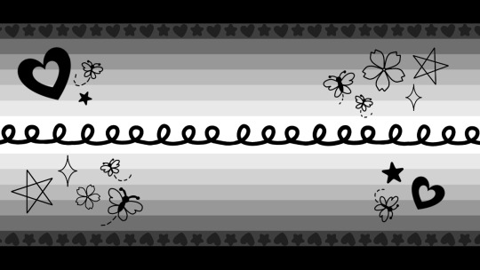
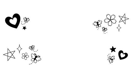
flag 1 :: A flag with 15 stripes. The top, bottom and middle stripes are slightly thicker than the rest of the stripes, and all three are of the same width. From top to bottom, the colors are [COLORS]. In the middle stripe, there is a [COLOR] swirly line with many loops coming up from it. Across the second and 14th stripes are a repeating pattern of [COLOR] hearts and stars. In all four corners of the flag are several symbols: the top left and bottom right contain a heart, a rounded star and a butterfly, while the top right and bottom left contain a pointed star, a sparkle, a flower, and two butterflies, respectively. The symbols themselves are [COLORS].
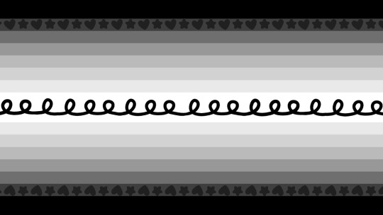
flag 2 :: A flag with 15 stripes. The top, bottom and middle stripes are slightly thicker than the rest of the stripes, and all three are of the same width. From top to bottom, the colors are [COLORS]. In the middle stripe, there is a [COLOR] swirly line with many loops coming up from it. Across the second and 14th stripes are a repeating pattern of [COLOR] hearts and stars.
flag 3 :: A flag with 17 stripes. The top and bottom stripes are slightly thicker than the rest of the stripes, and the center stripe is much thinner than the rest. From top to bottom, the colors are [COLORS].
tagging @identity-systems for archival !! ^^
other tags :: @buntress , @flutteringwings-coining , @smilepilled
#gender coining#xenogender#xeno coining#mogai#mogai coining#gender system#gender system coining#gender umbrella#genderjoyical#genderwhimsous#i already have catjoyical in my drafts .. teehee
116 notes
·
View notes
Text
IN DEPTH TUTORIAL FOR MY SCHOOL NOTION⋆.ೃ࿔*:・📄

i dont know how to make templates, so instead im going to make an in depth tutorial for how i made my school notion bcuz i didn't use a template.

STEP ONE ; go to ur sidebar and where it says "private" click on the + button (it should say add a page)
STEP TWO ; click the three dots on the upper right hand corner and set the text to serif and make the page full width. title it however u want, add an icon and a cute banner. i found mine off of pinterest.
STEP THREE ; press enter as though you were about to fill the page and click on the tiny six dots. go to turn into and make it to two columns
STEP FOUR ; decorate it however u want with cute photos from pinterest. i made 3 different toggle lists labeled "resources, knowledge outside of school, and digital notes"
TO CREATE A TASK BOARD ; click the + button and scroll down to where it says "board view" and go to "table" add a calendar and label it "school calendar" and thats all ✨ have fun with ur school notion. some things u can add into it to personalize it are ;
studying playlists
studying methods
links to important school resources
SOME PHOTOS THAT I USED ; all these photos can be found on pinterest + none of these are mine 💗

here's where i posted my current school notion for some inspo.
#it girl#becoming that girl#self care#honeytonedhottie⭐️#that girl#it girl energy#dream girl#dream girl tips#dream life#notion✍🏽🎀#pink academia#girly#girl blogging#girl blog#girly tumblr#studying#studying inspiration#study motivation#notion tutorial
369 notes
·
View notes
Text
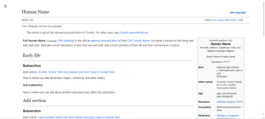
HETALIA WIKIPEDIA TEMPLATE
I finally did it! I'm ready to share the template I made!
Link to the template
Important notes:
To use it, make your own copy (File > Make a copy)
This template was made on a PC, and it may look odd on mobile.
This is modeled after Wikipedia on light mode.
Keep it in pageless view.
Use full text width (View > Text width > full).
If you have any other questions or noticed a mistake, please let me know by sending me an ask or by messaging me.
This template is a very modified version of one originally made by rukidut on Twitter.
rukidut twitter post
rukidut wikipedia template link
If you want, please show me what you create because I wanna see :D
#hetalia#hetalia wikipedia#in universe hetalia#nations revealed au#nations public au#aaaaaaaaaa#this took a while#i hope you like it
87 notes
·
View notes
Note
Query, how do we use the official templates to make a prompt post?
It's occured to me that I forgor to put the html codes for the templates, so here they are under the read more.
-Mod Peepaw
If you want to use them, you can get them by copying the HTML code below, setting up a new tumblr post on browser to HTML editing, paste, and then switch back to normal!
Foot Clan Template <div class="npf_row"><figure class="tmblr-full" data-orig-height="319" data-orig-width="1800"><img src="https://64.media.tumblr.com/ff9d69382e3962a8c0a7d982276665b0/03d2510fd6bf4054-fe/s2048x3072/85cff6037b2bb2d48a953b812e715369ec1e9ee9.pnj" data-orig-height="319" data-orig-width="1800" srcset="https://64.media.tumblr.com/ff9d69382e3962a8c0a7d982276665b0/03d2510fd6bf4054-fe/s2048x3072/85cff6037b2bb2d48a953b812e715369ec1e9ee9.pnj 1800w" sizes="(max-width: 1280px) 100vw, 1280px"></figure> </div> <h2><b>Name:</b></h2> <p>~●○°●○°●○~<br><br><b>Likes</b>: Favorite tropes and such<br><b>Squicks</b>: Anything that you don't like or want in your fics<br><b>Favorite Iteration(s)</b>:</p> <p>~●○°●○°●○~<br><br><span style="color: #ff4930"><b>Prompt</b></span><b> #1</b><br>-<br><br><span style="color: #ff4930"><b>Prompt</b></span><b> #2</b><br>-<br><br><span style="color: #ff4930"><b>Prompt</b></span><b> #3</b><br>-<br><br><span style="color: #ff4930"><b>Prompt</b></span><b> #4</b><br>-<br><br><span style="color: #ff4930"><b>Prompt</b></span><b> #5</b><br>-<br><br>~●○°●○°●○~</p>
Hamato Clan Template <div class="npf_row"><figure class="tmblr-full" data-orig-height="319" data-orig-width="1800"><img src="https://64.media.tumblr.com/5489f6f1e005ad6d1ee5c1f3d742b6b4/edde2a8285a26759-20/s2048x3072/ba6d68dc8ff9812789533dd37c32d8381ff31189.pnj" data-orig-height="319" data-orig-width="1800" srcset="https://64.media.tumblr.com/5489f6f1e005ad6d1ee5c1f3d742b6b4/edde2a8285a26759-20/s2048x3072/ba6d68dc8ff9812789533dd37c32d8381ff31189.pnj 1800w" sizes="(max-width: 1280px) 100vw, 1280px"></figure> </div> <h2><b>Name:</b></h2> <p>~●○°●○°●○~<br><br><b>Likes</b>: Favorite tropes and such<br><b>Squicks</b>: Anything that you don't like or want in your fics<br><b>Favorite Iteration(s)</b>:</p> <p>~●○°●○°●○~<br><br><b><span class="npf_color_rachel">Prompt</span></b><b> #1</b><br>-<br><br><b><span class="npf_color_rachel">Prompt</span></b><b> #2</b><br>-<br><br><b><span class="npf_color_rachel">Prompt</span></b><b> #3</b><br>-<br><br><b><span class="npf_color_rachel">Prompt</span></b><b> #4</b><br>-<br><br><b><span class="npf_color_rachel">Prompt</span></b><b> #5</b><br>-<br><br>~●○°●○°●○~</p>
17 notes
·
View notes
Text
thoughts on this guy?? i'm kinda like ... IN LOVE WITH IT?! wasn't sure if i would do a full width icon template but i am really enjoying how this one is coming. what are your thoughts??
6 notes
·
View notes
Text

Day 1 - 100 Days CSS Challenge
Welcome to day 1 of the 100 Days CSS Challenge! In this challenge, we'll bring a design to life using only CSS. Our goal is to recreate the image we're provided with on the challenge page using HTML and CSS.
On the challenge page, we see:

A small preview of the design we need to replicate.
A starter HTML template.
A submission form to showcase our work alongside others who have taken on the same challenge.
Let's dive into the process step by step.
Step 1: Screenshot the Image
The first thing I always do is take a screenshot of the target design. Even if the design includes animation, having a static reference helps me focus on the basic structure and colors. Here’s the screenshot of the design we’re aiming for:
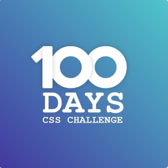
Step 2: Extract the Color Palette
Next, I identify the color palette that we'll need. This helps ensure that we maintain consistency with the original design. Here’s the color palette I’ve created:

Step 3: Identify and Create the Image Elements in HTML
Now that we know the colors, I break down the elements in the image:
Background: This is a linear gradient.
The 100 number: This is the main challenge, and it will require some work.
Text: “days css challenge,” which we’ll place to the left of the number.
Here’s the HTML structure for these elements:
<div class="frame"> <div class="center"> <div class="number"> <div class="one-one"></div> <div class="one-two"></div> <div class="zero-one"></div> <div class="zero-two"></div> </div> <p class="sentence1">days</p> <p class="sentence2">css challenge</p> </div> </div>
Now that the elements are in place, CSS will bring them to life.
Step 4: Bringing the Elements to Life with CSS
Linear Gradient
To create the background, we’ll use a linear gradient. Here’s a basic syntax:
background: linear-gradient(to <direction>, <color-stop1>, <color-stop2>, ...);
Parameter 1: Direction/Angle
This defines the starting point of the gradient. You can either specify a direction (e.g., to top, to bottom) or an angle (e.g., 90deg, 180deg).
Direction options:
to top
to bottom
to left
to right
If you want more precision, you can specify angles:
0deg: Gradient starts from the top.
90deg: From the right.
180deg: From the bottom.
270deg: From the left.
You can also combine two directions, specifying both horizontal and vertical movements, like to left top or to right bottom. This means:
The first keyword (left or right) controls the horizontal movement.
The second keyword (top or bottom) controls the vertical movement.
For example:
background: linear-gradient(to left top, red, blue);
This gradient starts at the bottom-right corner and transitions toward the top-left.
Parameter 2: Color Stops
Color stops define how the gradient transitions between colors. Each color stop specifies a point where a color starts or ends. Here's an example:
background: linear-gradient(to right, red 10%, blue 90%);
This means:
The element starts at 0% fully red.
By 10%, the transition from red begins.
Between 10% and 90%, there is a smooth blend from red to blue.
At 90%, the transition to blue is complete, and the remaining part is fully blue.

Once we understand the concept, we can apply the background we need. In our case, the gradient flows from the bottom left to the top right, so the code will look like this:
background: linear-gradient(to right top, #443DA1, #4EC3C9);
Bonus: Stacking Multiple Linear Gradients
You can also apply multiple gradients on top of each other:
background: linear-gradient(180deg, #f00, #0f0), linear-gradient(90deg, #ff0, #f0f);
Step 5: Making the "100" Number
Creating the Zeros
We start with the zeros. These are simply circles created using CSS. To make a full circle, we use border-radius set to 50%.
The white border gives it the appearance of the number zero.
.zero-one, .zero-two { position: absolute; height: 100px; width: 100px; border-radius: 50%; border: 24px solid #fff; box-shadow: 0 0 13px 0 rgba(0,0,0,0.2); }
This gives us a nice circular zero. We adjust their positions using properties like left and top, and manage the z-index to make sure the zeros stack correctly.
.zero-one { z-index: 8; left: 17px; } .zero-two { z-index: 6; left: 100px; }

Now both zeros are positioned, and they overlap in the way we want.
Creating the "1" Number
The number "1" is made of two div elements:
One-One: This part represents the slanted part of the "1".
One-Two: This is the straight vertical part of the "1".
What make the one-one element slightly slanted is
transform: rotate(50deg);)
the one-two is created simply with a little height and width nothing too particular then it is placed directly on top of the slanted part, giving us the full "1". Its z-index tho has to have a higher value than the slanted part of our 1 to ensure it stays above the slanted one.
Step 6: Adding the Text
For the two sentences “days” and “css challenge,” the styling is basic CSS. You can achieve the look with just a few font changes, some padding, and adjustments to font size. It’s as simple as:
.sentence1,.sentence2{ text-transform: uppercase; margin:0; padding:0; } .sentence1{ font-size:82px; font-weight:700; } .sentence2{ font-size:25px; font-weight:700; margin-top:-20px; }
And just like that, we’ve completed day 1 of the 100 Days CSS Challenge! Each part of the design is carefully crafted using CSS, giving us the final result.
Happy coding, and see you tomorrow for Day 2!
#100dayscssChallenge#codeblr#code#css#html#javascript#java development company#python#studyblr#progblr#programming#comp sci#web design#web developers#web development#website design#webdev#website#tech#html css#learn to code
16 notes
·
View notes
Text
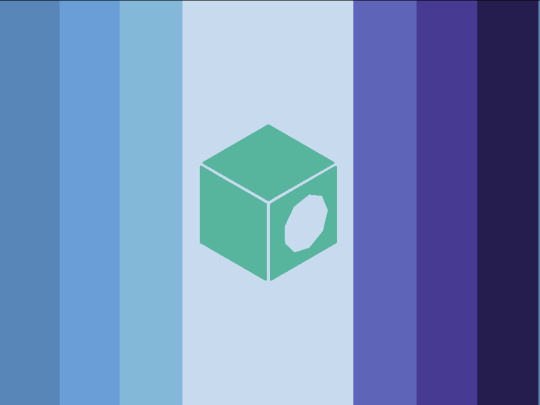
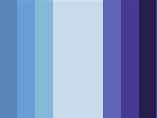
Oceanobjectix
[PT: Oceanobjectix]
An objectum/objectix attraction label specifying the attraction to the Ocean
Made using @Speaksleazy's objectix flag redesign[link] as a template (genuinely love their objectum flag redesigns)
[ID: Two flags, each with seven vertical stripes. The stripes are the same width except for the middle one, which is wider. The left three stripes are a gradient of gray blue to lighter blue, the middle stripe is very pale blue, and the right three stripes are a gradient of medium blue to very dark blue. The left flag has a green symbol in the centre of a cube with a very pale blue octagon on one side, and the right flag does not. End ID] Courtesy of @radiomogai
DNI: bigots, radinclus, radexclus, pro-endo, if you’re going to try and argue with me on any of these points, if you demonise mental illness, pro-transid (eg; transabled, transage, transrace, etc), proshippers/anti-anti, MAPS/NOMAPS/necro/zoo (full DNI in pinned)
#🦷 coining#💌 orientation#coining post#flag coining#identity coining#liom coining#objectix coining#objectix#objectum coining#objectum#objectophilia#attraction coining#coining#mogai coining#term coining#orientation coining#mogai orientation#mogai flags#aemogai#safequeer coining#mogai post#mogai term#mogai#mogai blog#mogai community#mogai flag#mogai identity#mogai label#new mogai term#with id
25 notes
·
View notes
Text
Burnout Template – A Stunning Free Bootstrap 4 Template for Health & Fitness Websites
Why You Need This Burnout Template Now If you’ve ever struggled to build a health, fitness, or wellness website from scratch, you’re not alone. Countless professionals and fitness instructors want to reach more clients online, but don’t have the time or budget to invest in a custom-coded website. Burnout solves this issue with a powerful, free HTML5 Bootstrap 4 template that’s ready to deploy.…
#Animation#Art Studio Bootstrap template#Bootstrap 4 Health Template#Burnout HTML Template#burnout template#Contact form#Fitness Template#fitness website template#Free Bootstrap Medical Template#Free Health Website Template#free web design#Full Width#Gallery#gym template#Gym Website Template#health template#Hero Header#On hover effect#Parallax Effect#Responsive HTML5 Business Theme#Slider#Smooth scroll#Sticky Navigation Bar#Wellness HTML Template#wellness site
0 notes
Text
Build a Seamless Online Store with the Ecommerce TNC Webflow Template
Ecommerce TNC empowers you to offer an exceptional digital shopping experience — without writing a single line of code.
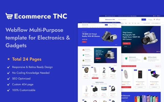
Standout Features
Modern, Clean Layout A minimalistic yet stylish design puts your products in the spotlight. The airy white space, crisp typography, and bold visual hierarchy create a professional and trustworthy first impression — critical for ecommerce success.
Customizable Homepage Hero Grab attention instantly with a full-width hero section designed to showcase promotions, bestsellers, or new drops. Add call-to-action buttons, dynamic images, or sliders with ease — no code needed.
Dedicated Product Pages Each product page includes customizable fields, image galleries, size guides, and reviews — so you can provide every detail a shopper needs before clicking “Add to Cart.”
Flexible Collection Grids Effortlessly categorize and display your products with responsive grids that adapt to mobile and desktop devices alike. Organize by category, popularity, or tags for a smooth shopping experience.
Conversion-Optimized Cart & Checkout Designed with usability in mind, the cart and checkout flow is sleek, straightforward, and mobile-ready — helping reduce cart abandonment and improve customer satisfaction.
Fully Responsive Design From mobile to tablet to widescreen desktop, this template ensures your store looks sharp and functions flawlessly on any device.
CMS Integration for Content Marketing Launch a blog or news section in minutes using the integrated CMS. Perfect for announcing sales, sharing customer stories, or improving SEO with fresh content.
Global Styling System Quickly change fonts, colors, or component styles from one centralized place. Ideal for maintaining brand consistency or testing new seasonal looks.
Smooth Interactions & Animations Add motion without overwhelming the user. Scroll-triggered animations, hover states, and button transitions make for an engaging and delightful experience.
Built-in Contact and Newsletter Forms Grow your list and stay in touch with ready-to-use contact and subscription forms — fully integrated and customizable.

Who Is Ecommerce TNC For?
DTC (Direct-to-Consumer) Brands Digital Product Sellers Fashion & Lifestyle Businesses Home Decor or Tech Gadget Stores Startups building MVPs quickly
Launch Your Store with Ecommerce TNC Now
Don’t wait to bring your store to life. Explore the Ecommerce TNC Webflow Template and start customizing today. Whether you’re launching a new product line or scaling your business, this template helps you look polished and professional from day one.
👉 Get the Ecommerce TNC Template Now
#webflow#webflowtemplates#websitetemplate#template#web design#ui ux design#webflowdesign#web development#businesswebsite#degital marketing#ecommerce
3 notes
·
View notes
Text
Easy No Sew Lace Up Shirt
you will need:
tshirt
measuring tape
chalk
scissors
start by measuring yourself. if you want the shirt to end up more tightly fitted use your waist measurement, for a looser fit use your hip or bust measurement. measure the full way round and make sure the measuring tape is going straight across your back. half this measurement (eg for 120cm waist you want 60cm).
lay your shirt out on a flat surface (I already chopped a couple of inches off the collar of this shirt its just a bog standard tshirt) and measure the width.
next subtract your halved body measurement from the width of the shirt, then half the remainder again. (if your shirt is 70cm and waist 60cm that would be 70-60=10, half of 10 is 5).
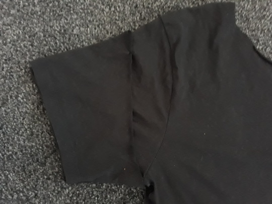
measure in this amount (eg 5cm) from both sides of your shirt and draw a line vertically from the bottom hem this amount from the edge. my shirt was not very big so I didn't have to chop much off but I have done this successfully with gigantic shirts in the past.
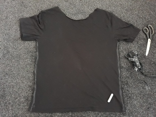
you'll probably want to chop off the ends of the sleeves too. I just cut a straight line basically following the line I drew then used the offcut of one sleeve as a template to make sure the other side was basically even. feel free to experiment with the angle especially if your shirt is huge, you could even cut off the sleeve entirely!
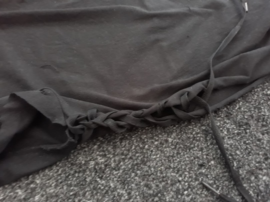
next use the point of your scissors to poke holes in both layers of fabric every few inches from the bottom hem to the base of the sleeve on both sides of the shirt. so you end up with something like this! put as many or as few holes as you like, the less holes, the bigger the gaps will be, just like laces in shoes.

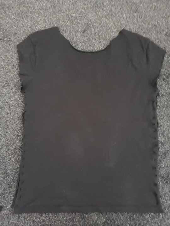
for the lacing, it works really well if you cut thin strips of the fabric cut off the sides of your shirt and stretch them out to make them longer but since I didn't have much to cut off mine I used an old pair of shoelaces I had lying round. make sure your lacing is much more than double the length of the shirt. if using the offcuts of your shirt tie two strips together so the knot will be positioned at the top under your arm when you lace it.
start at the top and lace it up just like a shoe! use your finger to enlarge the holes if need be. tie a knot when you get to the bottom. repeat for the other side.
because I didn't take my own advice, my laces weren't long enough to get all the way to the bottom of the shirt so I chopped off the bottom and made mine into a crop top instead.
the raw hems will naturally roll themselves up so don't worry about them.
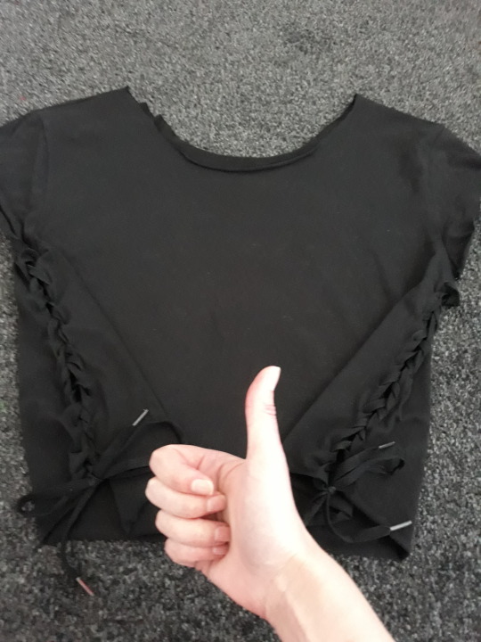
enjoy wearing your cool new shirt!!!!
12 notes
·
View notes
Text
NOTION TUTORIAL୭ 🧷 ✧ ˚. ᵎᵎ 🎀
this is to serve as some little notion tips that i use to make my notion the way that it is. cute and efficient. this is very surface level and i'll get more in depth the more the post goes on. im working on dropping a notion template soon <3
first off pick a color scheme, for me, my color scheme is pastel pinks and whites and soft shades of green as an accent.
u can import photos from pinterest by copying the photo (not the link address, the actual photo) and pasting it into ur notion
take advantage of the columns, when u make a new space click "turn into" and use columns, it'll neatly divide the page
experiment with fonts, i use serif. u can also do large or small text, AND full width pages
making toggle lists saves space and keeps ur page looking super neat and organized
calendars and tables will keep u organized
to add a page ur gonna wanna go to the top left corner and click "new page"
u can import custom icons by going on pinterest and looking up app icons with the color scheme that u want, download that and add it for cute icons, u can also do the same with GIFS
for links and things of the sort embedding the video and adding the link are two different things, embedding the video means that u can access it on ur page (i do this for youtube videos/spotify etc) and when its a link i'll do this for documents and things of the sort
to add titles to ur columns click the "+" button, i use heading 3 bcuz that's the size i prefer but there are other sizes to choose from
a cool feature that notion has is that u can change the background color OR the text color, when u change the background color its more pastel-like if that's what ur going for
to make section dividers click (-) three times to create a divider
#it girl#becoming that girl#self care#notion#dream girl#it girl energy#that girl#notion template#organization#self improvement#self management#productivity#femininity
759 notes
·
View notes
Text
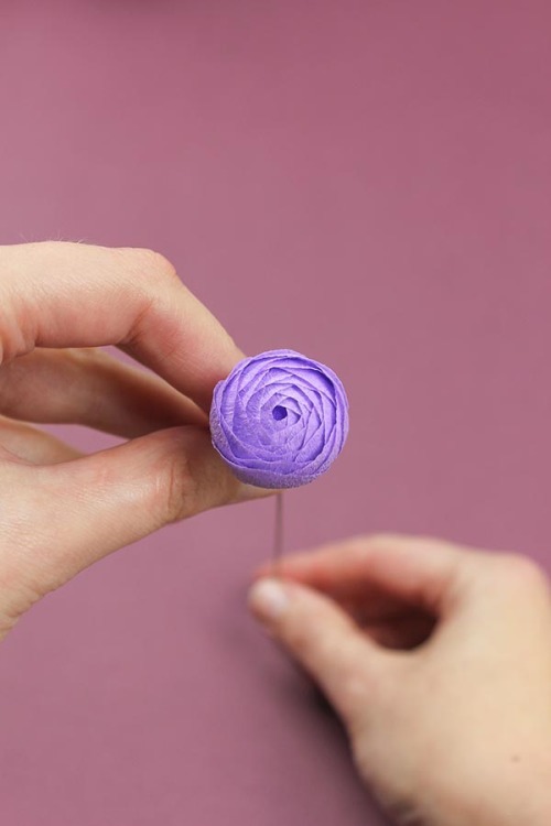
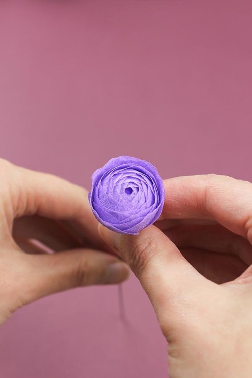
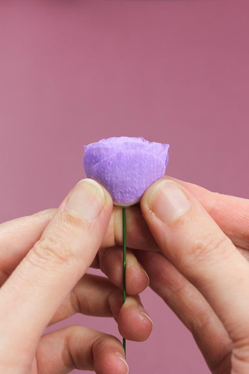
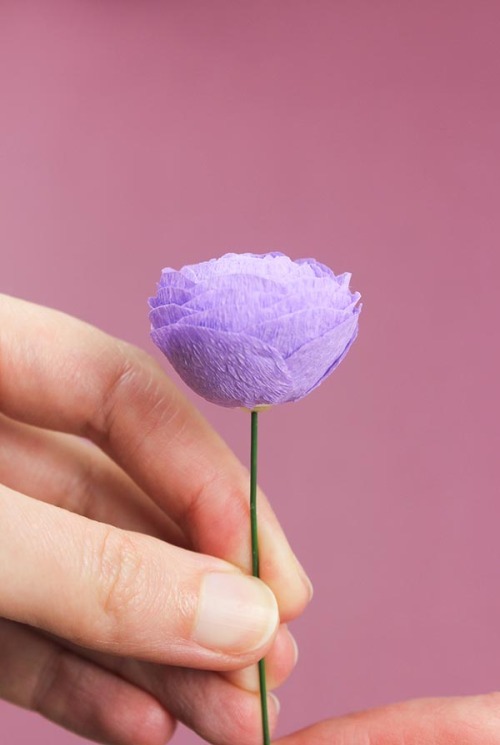
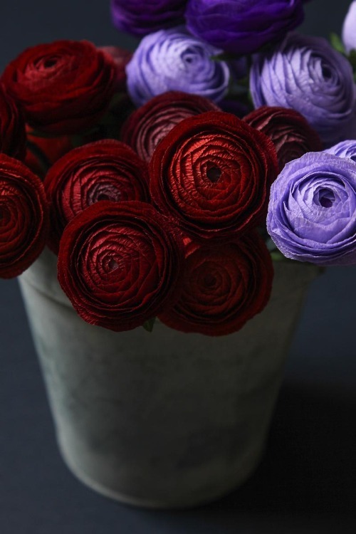
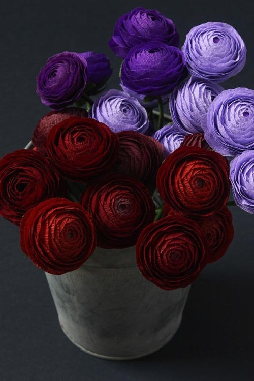
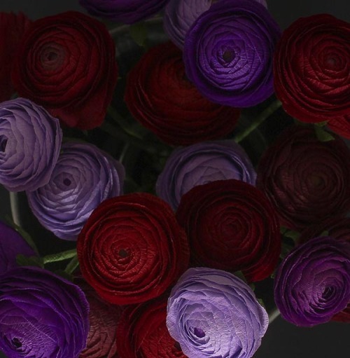
DIY Paper Ranunculus
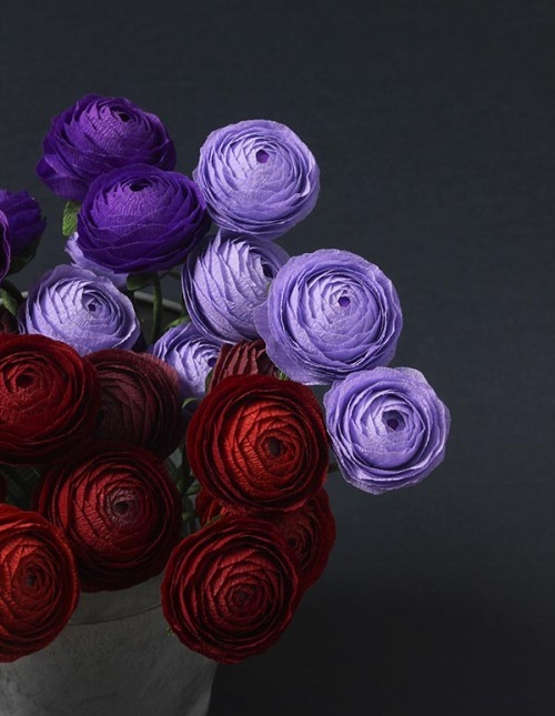
Project by Susan Beech:
Sometimes, I wish Instagram was a real person so I could shake its hand and give it a huge hug for the endless amounts of inspiration it provides. From discovering great new home tours, photographers and florists to talented DIYers, I am constantly screengrabbing things and sending them to myself to follow up on later. This week’s final DIY project before the holiday is one I’ve been excited to post for weeks. I follow a number of crafters online, but few inspire me as much as Susan Beech. Susan’s Instagram account, A Petal Unfolds, is full of beautiful paper flowers. Most of the time I can’t believe they’re not real, but especially in the case of her rich purple and red ranunculi. They looked so much like the real thing that I wrote to her to ask if we could do a how-to together. Thankfully she was game and today I’m thrilled to share her project, just in time for holiday centerpieces. xo, grace
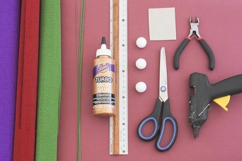
Materials:
-Single Ply crepe paper 40g (I use a piece about 23cm/9in x 50cm/20in for each flower) in reds, purples and a green for the stems -2 cm diameter Polystyrene balls -Florist wire, 20 gauge –Aleene’s Tacky Glue (the Turbo Tacky Glue is my favourite to use) -Hot glue gun and glue stick -Scissors -Thick card for templates -Pencil -Ruler -Wire cutters –Petal Template
Tips for working with crepe paper:
•When working on this flower, the grain of the paper must always run with the height of the petals, so your grain will run from the top of the petal to the bottom and not across. •Cupping a petal involves holding the petal between your thumb and forefingers of both hands and then gradually stretching the petal carefully and evenly in to a curved shape. •Stretching the paper means holding the paper at both ends with your thumb and forefinger and gently stretching until it can’t be stretched further.
Instructions:
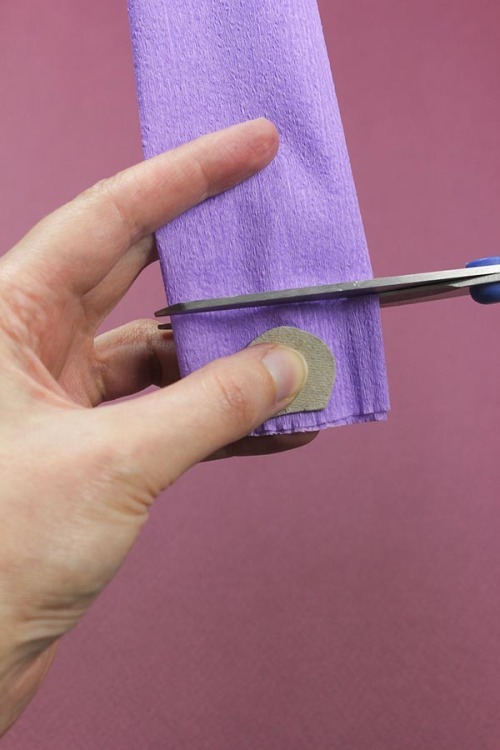
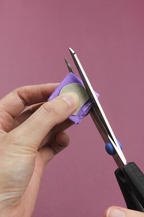
Refer to petal template, draw out template and cut this out of the card.
Cut strips of crepe paper about 3cm wide and cut out your petals. You will need approximately 75 for each flower. I tend to cut out my petals and keep them as they are in their little piles, as it’s easier to trim the petals down to the different sizes later.
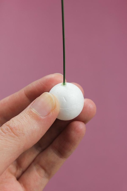
Cut floral wire into lengths about 16cm long.
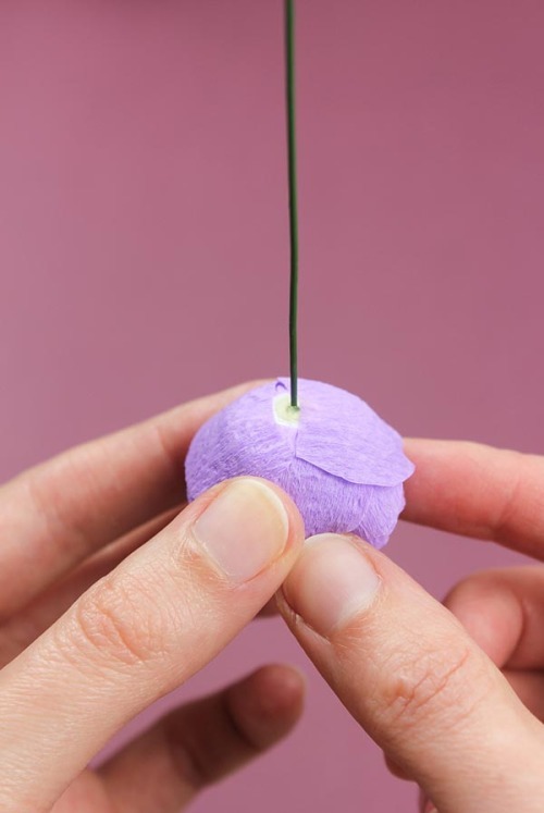
Find the center of the polystyrene ball and insert floral wire with a little hot glue on the end. I push the wire in about a centimeter. Once the glue has cooled slightly, I press any above the surface down onto the polystyrene so it doesn’t create too much of a bump around the base of the wire. This is the only time you need to use the hot glue.
Cut a little circle of crepe for the very dark center base of your ranunculus flower. I tend to use a darker shade of the colour I plan to do the whole flower in. A brown/green colour can be good, too. Stretch the paper a little and glue to the top of the polystyrene ball.
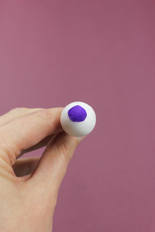
For the first batch of petals (center petal) you will need approximately 45 to be cut about 1cm from the top across the width. Lightly cup each petal in the center between your thumb and forefinger to give the petal a little shape. The petal template shows the petal when cut down and stretched. Apply a small amount of glue along the straight bottom edge.
These first petals will be forming the very center circle. Place the first petal so that the top edge almost meets the center of the polystyrene ball, holding the petal down so it is sure to stick. Glue the edge of your next petal and overlap it on the previous petal about 50%, positioning it so it is forming a little curve away from the previous. Continue doing this with your next petals until you have formed your center circle. Throughout making the flower, you will be overlapping your petals and you will be able to keep track of where you need to place your next petal because the last petal you glued down will be the one that hasn’t been overlapped yet.
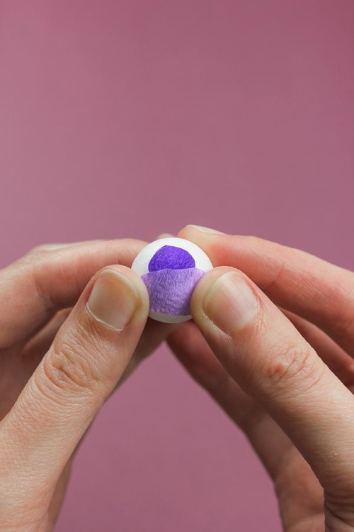

For the next row of petals, you will bring the layer slightly down from the edge of the center circle and then continue overlapping round and round, following the center circle, bringing the layers down until you have completely filled the center of your flower.

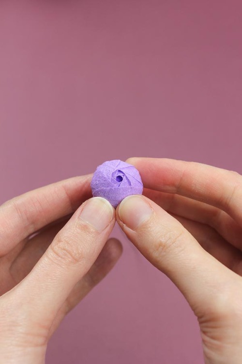
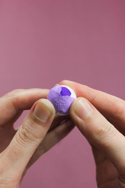
Your next set of petals are the outer petals on the petal template and you will need about 30. These petals are cut across about 2mm from the bottom of the petal and are cupped in the middle.
With this layer I tend to bring the petals up around the center of the flower a little. Continue overlapping the petals as before and applying a little glue along the bottom edge. Once you have completed one layer, bring the next layer down slightly and continue around and around as before.

Once you’ve reached a point where you are happy with the shape of your flower (I usually do about 5 layers of outer petals), cup 4 full-size petals deeply to give the bottom of the flower a full shape. I glue this down along the bottom edge as before, but this time I simply glue the petals down overlapping at 90 degrees with each other to cover any remaining polystyrene that is showing and any of the hot glue.
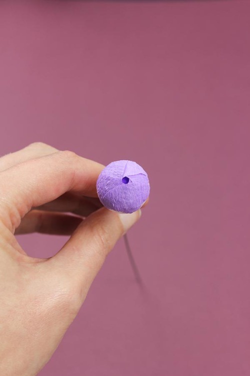
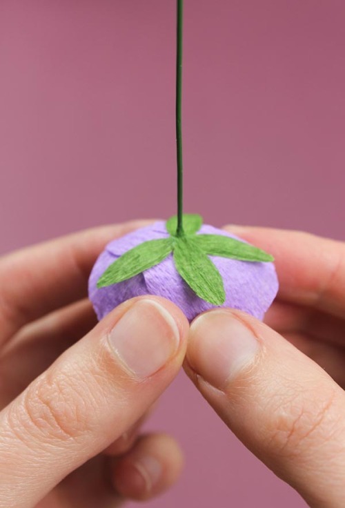
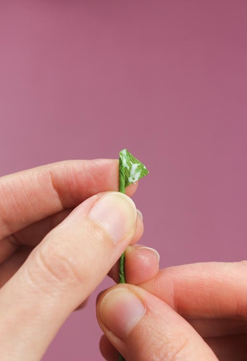
Stems & Calyx
To make the calyx, I cut a strip of green crepe about 2cm wide, across the grain, accordion fold and hand cut out a little leaf shape 2cm in height, cupping slightly in the middle to give a little shape. Glue the end of the calyx shape, then push the glued paper up against the base of the wire, pinching the paper to it once it is stuck down. I apply four of these to each flower.
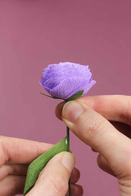
For the stems, cut a strip of crepe about 1cm wide and 13cm across and stretch it. The paper should be cut across the grain. Apply a little glue to one end and fold this over the top of the wire underneath the calyx. Hold the flower in your right hand and twist the paper down the stem with your left (or whichever is easiest for you), trying to keep the stem as smooth as possible by wrapping tightly and pinching the paper in as you go. I also apply small amounts of glue after every 6 turns or so to keep the paper secure. When you get to the end of the wire, cut the paper down to just above the wire, apply a little glue, fold the top over the wire and pinch the rest of the paper around to seal. I usually repeat wrapping the stem a few times to get the thickness I prefer.
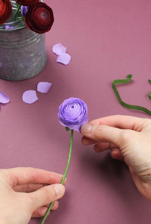
Now you have your finished flower and you can style it as you wish – by shaping the stem and also gently bringing down a few of the lower petals of the flower if you like.
20 notes
·
View notes
Note
i really love your templates! where do you get inspiration for formatting/do you have suggestions for anyone who is interested in learning to make their own?
OMGGGG THANK YOU SO MUCH this is so sweet, please! this means so much, AHHHH!
honestly, my biggest inspiration is music. i'm always listening to something and sometimes the vibe of a song will give me an idea for a certain aesthetic based on its theme, because some songs do have certain vibes like a siren vibe, edgy gothic vibe, etc. with that in mind, sometimes the songs also remind me of colors, whether it's the song itself or the single / album cover's vibes! then i'll start thinking about motifs and other visuals that match the aesthetic i'm going for, and i just start throwing things together on the canvas. i might not end up using all of them and delete things on the way, and it's truly a "trust the process" thing.
i often post wips on my private twitter, so friends of mine can tell you that sometimes what i start with does not at all look like what i finish with KSJBCS it's a lot of trial and error and just figuring out what looks good and makes you happy!
i always start with what kind of icon border i want (do i want it to be a square? rectangle?) and choose a color scheme, and sometimes i pick a color scheme first and THEN i go diving in my folder of assets to see what suits the vibe best. i always make the border first before anything else, so deciding on the shape and its dimensions often dictates the aesthetic of what i go for and how messy / clean the aesthetic of the end product will be!
my one big tip though is to use a canvas that has a width of 540px! having an odd dimension or even ONE pixel off will cause your icon design to be blurry unless you click to full-size it off the dash!
i hope this is helpful!!! kdsjbckjsdb i'm like the worst to ask these things i think because my process is kind of insane just for the fact that my working style is so chaotic bc of my adhd LOL SKJDBCS BUT PLEASE FEEL FREE TO ASK ANY QUESTIONS! and you're more than welcome to join my discord server! i have a community section where people post their designs for feedback or just to share their creations!
5 notes
·
View notes
Text
7+ Best Art Portfolio Website WordPress Premium Theme

Art Portfolio Website WordPress Premium Theme
Creating an art portfolio website is essential for artists, designers, and creatives to showcase their work and attract potential clients. Let’s explore some of the best WordPress premium themes specifically designed for art portfolio websites:
1. Dabble – Creative Agency & Portfolio WordPress Theme:

A sophisticated and stylish theme with multiple menu layouts, sliders, and preset blog post styles.
Features a portfolio system using a custom post type, allowing you to display your projects effectively.
Available in both free and premium versions, with advanced controls in the premium version.
2. Rubrash – Personal Portfolio WordPress Theme:

Known for its rock-solid coding and fantastic support.
Offers full-width portfolio layouts, including checkerboard style and carousel options.
Utilize the drag-and-drop Elementor Builder to create stunning pages for each portfolio entry.
3. Swipy – Creative Agency WordPress Theme:
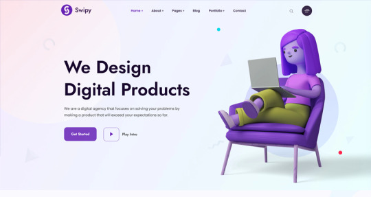
A flexible and feature-rich theme powered by the Elementor page builder plugin.
Suitable for various types of websites, including art portfolio website.
Explore its extensive library of over 300 templates for startups, freelancers, and personal sites.
4. Kulluu – Creative Agency WordPress Theme:
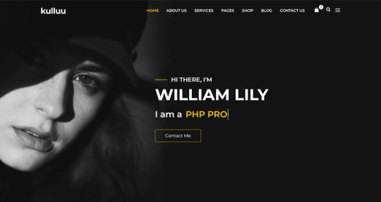
A minimalist freelancer and agency portfolio theme.
Ideal for showcasing your work with a clean and modern design.
5. Bionic- Personal Portfolio WordPress Theme:

Another portfolio WordPress theme that emphasizes simplicity.
Perfect for artists, photographers, and creative professionals.
6. Cretic – Creative Agency WordPress Theme:

A multi-concept artist and creative agency theme.
Offers versatility and a variety of options for different types of art portfolio website.
7. Mifo – Creative Minimal Portfolio WordPress Theme:
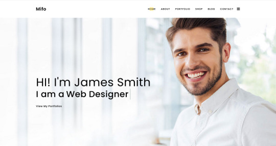
A clean and minimal multipurpose theme suitable for art portfolio website.
Focuses on elegant design and typography.
Remember to choose a theme that aligns with your artistic style, provides an excellent user experience, and effectively showcases your work. Happy creating! 🎨🖌️
For more options, you can explore other themes from ThemeForest. Each of these themes has unique features and customization options to suit your specific needs.
#premium wordpress themes#premium wordpress theme#app landing wordpress theme#wordpress premium themes#education wordpress theme#education & online course wordpress theme#paid wordpress themes#consulting business wordpress theme#online learning wordpress theme#wordpress plugins#art portfolio website#Art Portfolio Website WordPress Premium Theme#Creating an art portfolio website is essential for artists#designers#1. Dabble – Creative Agency & Portfolio WordPress Theme:#A sophisticated and stylish theme with multiple menu layouts#sliders#and preset blog post styles.#Features a portfolio system using a custom post type#allowing you to display your projects effectively.#Available in both free and premium versions#with advanced controls in the premium version.#2. Rubrash – Personal Portfolio WordPress Theme:#rubash#Known for its rock-solid coding and fantastic support.#Offers full-width portfolio layouts#including checkerboard style and carousel options.#Utilize the drag-and-drop Elementor Builder to create stunning pages for each portfolio entry.#3. Swipy – Creative Agency WordPress Theme:#swipy
4 notes
·
View notes