#how to start a blog - step by step tutorial for beginners
Explore tagged Tumblr posts
Visit Tumblr Blog
Explore Tumblr blogs with no restrictions, modern design and the best experience.
Last Seen Tumblr Blogs


Fun Fact
Users from the US are the majority of Tumblr visitors.
Note
hey!! would you mind doing a tutorial on how you blend your gifs? they're so perfect! if not, then that's fine but thanks anyway :)
hi there! first of all, thank you for the kind words, i appreciate it so much! and i'm always more than happy to make tutorials! below the cut i'll do my best to explain my process when it comes to creating blended gifs like these:
original gifset
original gifset
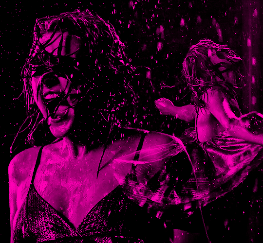
original gifset
original gifset
disclaimer that i in no way consider myself an expert when it comes to blending. i actually struggle with it quite a bit sometimes and there are tons of gifmakers far more talented than myself. here's a link to all the blending tutorials i've come across for my other blog @gifmakerresource just in case!
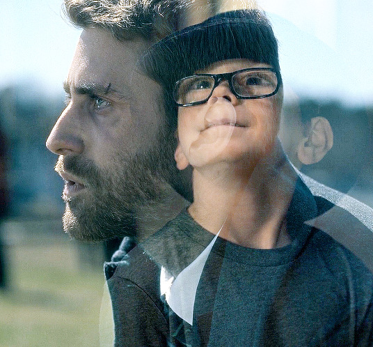
when it comes to blending two or more scenes/shots together, i cannot overstate how important the scenes you choose are. i'll go more in depth on this in a moment, but there have been so many times when i'm making gifs like the ones above where i spend ages testing out different scenes together to see if they'll actually work and give me the desired effect.
so, what should you be looking for when selecting your scenes? in my opinion, what's most important (and can therefore cause you the most trouble) is lighting and contrast. dark on dark is what blends best. now, you can obviously tweak these things using adjustment layers, but i think it's best to set yourself up for success right from the very start.
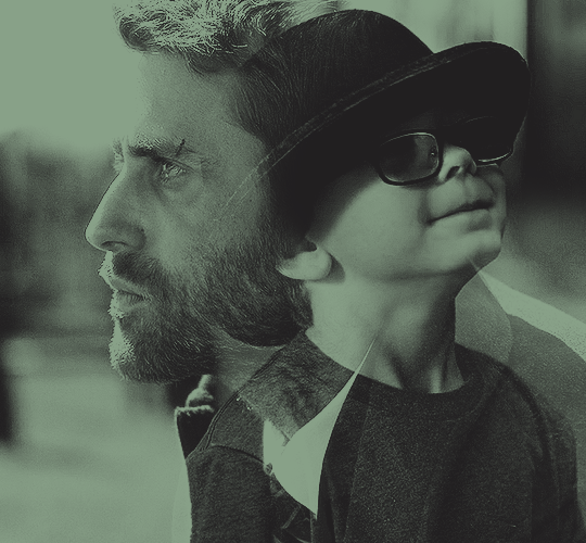
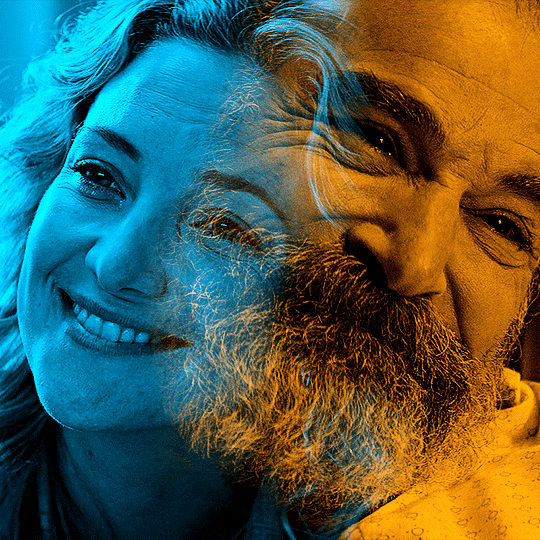
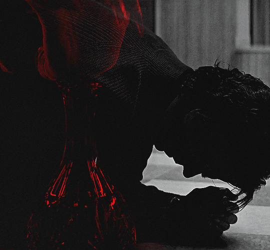
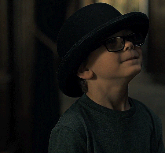
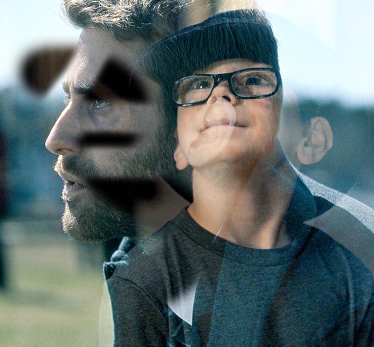
if we look at my first and last examples above the cut (luke in hill house and pruitt in midnight mass), these are the two that show this the best. the scene of adult luke is high in contrast to begin with; we've got areas of bright highlights and dark shadows and the latter are the areas where the blending shows through the most clearly. luke's hair and shirt are darker as is young luke's shirt and hat. the same can be seen in the midnight mass example. both scenes are on the darker side to begin with, but the shot of pruitt praying is silhouetted and makes for very stark contrast, allowing the shot of the angel's blood to be seen most easily in the darkest parts.
now, a lot of this does and can come down to trial and error and i want to make a point of saying that before i get into the actual process. there have been numerous times when i'm working on gifs like these where i have to try out multiple different shots and scenes until i find something that works. sometimes, i just save what i've done so far as a psd and go work on something else for a while, and then i can come back and look at everything with fresh eyes at a later time -- never underestimate the power of doing this, btw. some of my most popular and most favorite sets have happened as a direct result of taking a break!
now it's finally time for what you came here for! how do you do this? i'll walk you through this step by step and for now, i'm just going to be walking through 2 gifs blended into one. i've done 3 and even 4 blended into one, but they are outliers adn should not be counted. blenders georg, who created photoshop and blends over 10,000 gifs a day -- [gunshots]
step 1: make your base gifs. i'm assuming basic gifmaking knowledge, but if you need some help there, here's a tag on my resource blog with all beginner gifmaking tutorials (and i'm willing to make one of my own, personal process if anyone shows interest).
i'm mostly talking converting them to timeline and into a smart object. each person's process varies a little, but i personally use an action i made that converts from frames to timeline and applies the sharpening settings i use all in one. it's entirely up to you if you want to color your gifs before or after you have them on one canvas. in this case, i colored mine after, so this is what i have right now. two separate sharpened but un-colored gifs.
as an added note, when i'm blending gifs, i almost always keep them at their original dimensions until i bring them to the new canvas. i find it easier to position them where i want them and then crop to my desired dimensions. that way i don't have to worry that i accidentally cut something off. but for the purposes of this tutorial, i'm using my psd from this gif, which has been cropped to 540px x 500px.
step 2: bring both gifs onto a new canvas. as i just stated, the dimensions of this particular gif are 540px x 500px. if you're unfamiliar with tumblr's dimensions, i whipped this up. what matters is the width, whereas the height can be whatever you want. i saw something recently (though i can't find it now, of course) that said the middle gif in the row of 3 was no longer 178px and is now also 177px, but take that with a grain of salt! the gutters (the automatic spaces between gifs that tumblr puts in) are 4px.
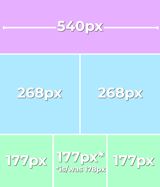
so, since this is a single gif in a row, the width must be 540. bear in mind that the larger your dimensions, the larger the gif file will be and tumblr's upload limit is 10mb per gif. with blended gifs typically being on the larger end, i try to keep mine somewhere between 35-50 frames. this particular one is 35, which along with 40 frames is what i most commonly use.
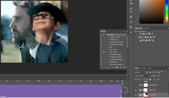
create a new canvas with your desired dimensions and either copy your gifs to it or drag them onto it. you should have something like this now:
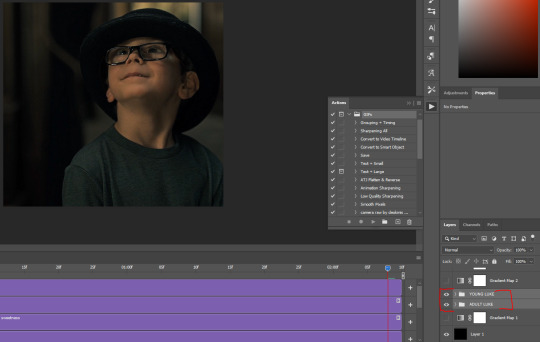
for now, ignore the other layers. as i said, using my psd of the completed gif.
step 3: add a black fill layer. this step is personal preference and therefore completely optional, but when blending, i always add an all black layer at the very bottom of all my layers. i find it helps when using layer masks (more on that soon) to make the blends appear more seamless. play around and see if you like it or not!
to create this layer, i use the keyboard shortcut (i'm on pc) ctrl+shift+N and then press G to call up the paint fill tool. once you have the color selected, just click anywhere on the canvas and it fills it. then drag this layer to the very bottom, beneath all other layers.
alternatively, you can go to layer -> new fill layer -> solid color -> choose your color but i heart keyboard shortcuts.
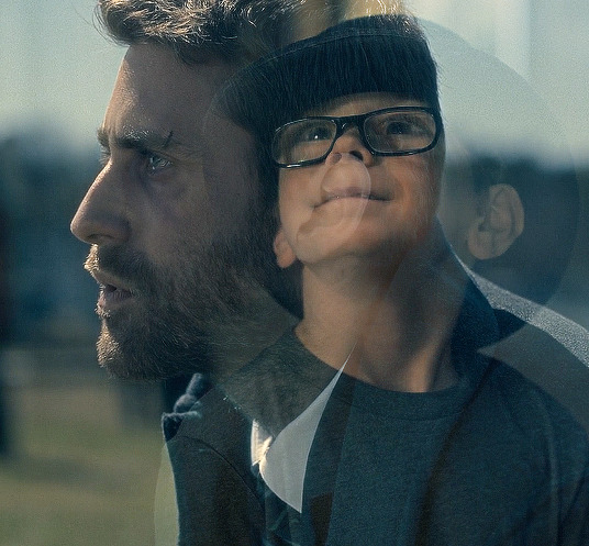
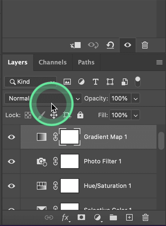
step 4: set the blending mode of each gif layer to SCREEN. right now, we can only see the layer that's on top. when you switch the blending modes from normal to screen, the blending begins! this is also where you can move your gifs around until you find the best placement for each one.
brb, crying about baby luke for the 800th time.
step 5: color! if i haven't already colored my gifs, i would likely do it now. that way, when i go to apply the layer masks, i'll know i'm working with a mostly-finished product coloring-wise. this is what i have now:
you can see just how important the contrast of lights and darks becomes. look at the difference between how visible the right side of young luke's face/hat is before coloring compared to after. when we lighten the highlights and darken the shadows, the blending becomes much more apparent.
step 6: layer masks! before i even tell you how to use them, we need to know how to apply them. you'll do this a layer/gif at a time. with one gif selected, press this button:

and you'll now have this:
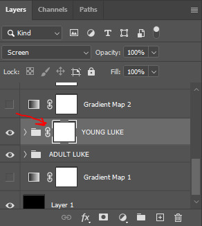
that selected white box is our layer mask. now do the same to the other gif layer. you should see this:
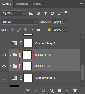
now that we've applied our layer masks, what are they for and how do we utilize them? layer masks allow you to, at their most basic, adjust specific parts of a single layer without permanently deleting them. the beauty of layer masks is that you can get rid of a certain area on a gif and if you realize later you want to bring some of it back, you can! all by using the colors black and white and, in this case, a soft round brush.
the most important part of working with layer masks is that you make sure the mask itself is what's selected. in the last image, the layer masks are NOT selected. in the one before, the layer mask IS selected. you can always tell because of the little borders around the corners of the mask. if you find something isn't working quite right, chances are that's your issue (speaking from personal experience).
as i said, we're only working with black and white here. using your brush tool (press B on your keyboard), select a soft, round brush. i personally set the hardness to 0 for the most gentle fade possible. i don't want hard edges in my blends. the size of the brush depends on how large of an area you're working with. sometimes i'll go all the way up to 150px+ and other times, i'll be well below 50px. the smaller the better for more detailed work. black (#000000) erases and white (#ffffff) brings your image back.
for a visual example, with a black brush, i'm going to mask an area of adult luke:
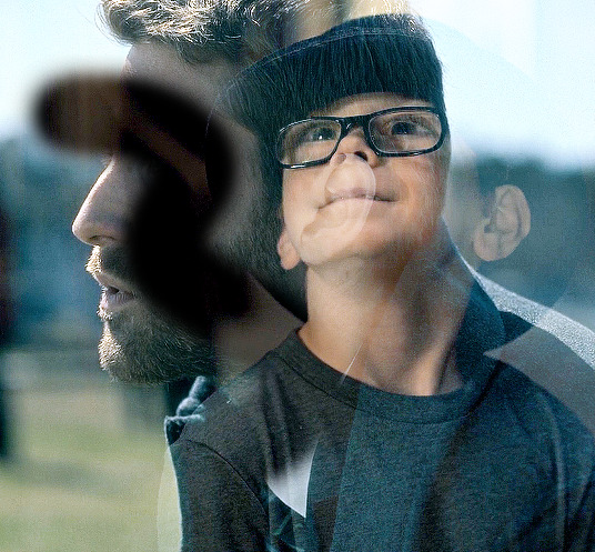
pretty obvious, right? because both layers are set to screen, masking an area of adult luke's gif reveals young luke's gif. because that area of the gif is no longer blending with anything, we see it purely with its coloring. now i'm going to take a smaller brush and switch the color to white (to do this quickly, pressing X on your keyboard will switch between the two colors [foreground and background] on your color picker).
you can see the lines/cuts where i ran the brush through the mask and it brought back the parts of adult luke we'd erased. if we did this same thing on young luke's gif, black would erase young luke and reveal adult luke and white would bring back young luke. i know this might sound a little confusing, and even though i knew a fair bit about layer masks before i started giffing again last year, there was still a learning curve for me.
now that we have our layer masks, we need to identify which parts of which gif we want to mask/erase. for this one in particular, i didn't like that adult luke's ear was smack dab in the middle of young luke's face. to remedy this, i selected the layer mask on adult luke's layer and, using a fairly sizeable black brush, i colored over young luke's face and up into the top-right corner. i wanted to see more of his hat and because that area was so light, i covered that whole part. this is what my gif and layer mask looked like after:
the black on the little layer mask corresponds to where i colored on the gif. now that corner only shows young luke's gif and his face is much clearer without an ear in the middle of it.
step 7: that's it! maybe.
in theory, this could be a completed gif. from here on out, nothing changes as far as blending or layer masks. you could save and export this and upload it and be done. but in this case, i just didn't like the coloring. because mike flanagan wants to see me suffer, his shit is almost impossible to color and i just didn't like the difference in coloring between present day adult luke and 90s young luke. this is also part of a larger gifset with a color scheme.
regardless of that though, i have to confess that i do this almost every. single. time. i make gifs like these. i slap a big fat gradient map on those puppies and somehow they look 10x better to me. i scrolled back through a shit load of my gifs and i only found 2 examples of blended gifs that weren't under a gradient map. oops. maybe this is the easy way out or maybe i just love colors, but idk i think it helps them look more cohesive! if you're interested, read on. if not, that's pretty much it!
if you still have questions or encounter any problems after following this tutorial, PLEASE let me know! i'm more than happy to clarify things or help out if i can! otherwise, check out some of the other blending tutorials i linked at the beginning! if you'd like me to make tutorials for anything else, feel free to send an ask, anon or not! i'm quite literally always happy to help as i don't believe in gatekeeping resources or knowledge!
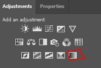
step 8: i ended up applying two gradient maps on this gif. it's important that these go on top of all your other layers (namely, the gif layers). if you're unfamiliar, you click this to apply a gradient map:
then you'll see this:
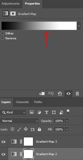
photoshop automatically applies a gradient map using your current foreground and background colors. to edit the colors, click on the map itself (my arrow). unless you're going for an inverted x-ray sort of look, your darker color needs to be on the left and the lighter one needs to be on the right. click on the bottom color points to change their colors:
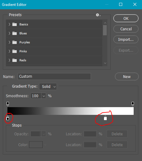
normally, the right one will be all the way to the end, but moving it in will let more white show through and brighten the image, which i wanted in this case.
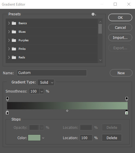
my second gradient is the green one, which looks like this and goes from #211f20 to #88a188.
i encourage you to play around with gradient maps. as you adjust the colors, you'll see the changes live as long as you pull the window to the side a little bit. i think they're super fun and can completely change the vibe and aesthetic of a gifset.
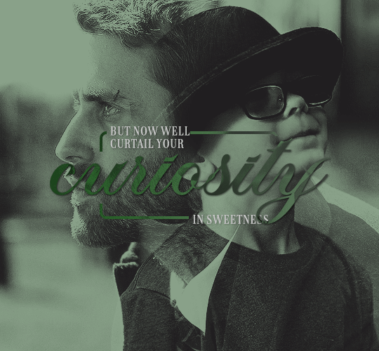
from here, i added my typography (lyrics, naturally) and then exported and saved the gif! and here we have this gif that literally made me cry while i made it because HE WAS SUCH A BABY
again, i hope this helps and if you have any further or other questions, don't hesitate to ask!
#answered#Anonymous#my tutorials#gif tutorial#gifmakerresource#completeresources#dailyresources#chaoticresources#thanks for being patient anon!#i know it's only been a few days but typing all this took me like 3 hours lmao
121 notes
·
View notes
Note
Hii- I...☝️🥹 um, I don't actually quite know what to say to my idol. But believe me when I say I am absolutely besotted by your art 🫶💐
I actually got introduced to your page via your COD Valentine's Day cards, and have been stalking your account consuming your art like a hungry fella since then.
Did you know: You actually inspired me and my IRL friends to do art? :3 If you don't mind, any tips for self-learning beginners? 📝
And, sorry if this is a whole lot to read—just wanted to let you know that you are such a great artist! And I hope you know that. Great is an understatement, though 🙂↕️
omg??? thank you so much qwq it seriously means a lot to me!! <3
a small heads up, i'm not a pro or an art teacher, so these tips are just based on my own experience as a self-taught artist:
just draw. sounds simple, but practice really does make perfect. i always struggle with motivation at the beginning of a drawing, but trust me, the flow state kicks in once you get started
references are your best friend! omg, they make such a difference, especially for bigger pieces or anything you're unsure about
learn from other artists, but don’t just copy. figure out how they do things and put your own spin on it. for me, studying comic artists helped a lot with simplifying anatomy in a way that makes sense (im still learning though xD)
don’t overwhelm yourself! focus on one thing at a time. if you’re doing a composition study, don’t get too caught up in tiny details or textures—focus on the big picture first
listen to your body and mental health. take breaks, stretch, and don’t be afraid to step away for a bit. sometimes a quick walk can clear your mind and recharge you
dont compare yourself to anyone but your past self and if you post stuff/have art blog - dont pay that much attention to likes/reblogs n etc, they dont define you or your art
more under the cut!
i also recommend to check out these: again, dont overwhelm yourself with new information, this section is more of an archive/compilation of where you can find some different stuff
YT channels
Sinix Design - I LOVE HIS TUTORIALS SO MUCH.
Ethan Becker - art tips and critisism
Adam Duff LUCIDPIXUL - honestly i dont really know how to describe his content. it feels like an art podcats but more..personal? just check his channel out and you'll see it for yourself
moderndayjames - more animation based but still a lot of helpful tutorials
Dan Beardshaw - found him through anatomy tutorials but he has A LOT MORE than just them, please check him out!!
Videos
this specific video helped me understand that light is not that complicated
in this video, the author shares how they learned art, and i think they nailed the 4th tip perfectly
another lighting video
part 1 of a "how to splash art" series which goes over almost everything you need to know. this series more of a guide cause you still need to go into a depth for each topic but i just have to share it anyways, other parts can be found in the description
Books / Libraries (google drive links)
anatomy for sculptors - helps a lot with anatomy simplification and understanding
a big library with art books and other resources
another library with some books
MORPHO BOOKS!!!
Constructive anatomy by George B.Bradgman
lmk if something doesnt work or you have something else to add!! :]

30 notes
·
View notes
Text
learning to code!
When I was 9 years old, I learned enough html to code neopets pages, my own geocities websites, and I even made forums on my own sites so my friends could all roleplay together or rant together lol. And then? I forgot so much. I no longer no how to make a forum, or even a 'next page' button - so even the dream of just making a simple blog or webnovel site feels like a huge hurdle now. (9 year old me could probably figure it out in 2 hours).
So I'm relearning! I figured this would be a fun post to place resources I find for coding, since there's coding languages, and I figure maybe if you like running you're blog then you also might be interested in tools for making blogs!
First, for those of you who miss the old geocities and angelfire type of sites to make your own free site on: neocities.org
You can make free sites you can code yourself, the way 9 year old me did. A lot of people have made SUCH amazing sites, it's baffling my mind trying to figure out how they did, I definitely wish I could make an art portfolio site even a fourth as cool as some of the sites people have made on here.
And for those pressed for time, who aren't about to learn coding right now: wix.com is the place I recommend for building a site, it requires no coding skill and is fairly straightforward about adding pages or features by clicking buttons. I used it to make my art portfolio site, I am testing out using it for my webnovel - the alternative is Wordpress, but wix.com is letting me basically make a wordpress blog Inside my own site. It's very beginner friendly in terms of "how the fuck do I set up a 'sign up for updates' message and have my site actually email these people my novel updates?" and "I need a 4x20 grid of my art down the page, that lets people click the art to see it's information and make it bigger."
I did neocities.org's little html tutorial today, it's the part of html I DID remember (links, paragraphs, headers).
My next step is to go through htmldog.com's tutorials. They go from beginner, to intermediate, to CSS. Unlike many a coding tutorial I've seen, they explain what program on your computer you need to WRITE the code in and then how to save it and how to open it. (You'd think this isn't a big deal but I've been looking into how to learn Python for months and I can't find a tutorial explaining what fucking program to write my python in... notepad? do I need something else? I don't fucking know!! My dad finally gave me a printed textbook which supposedly tells you what to download to start... I learned C++ in college and for that you needed Visual Basic to code C++, so I figured I needed Something to Write the fucking python IN.)
#coding#rant#wooh my new CODING TAG#learning to code#i feel very. odd if im honest?#i genuinely knew how to build full fucking forum websites as a child including user sign ups#and i studied Computer Science Engineering in college so i did everything with C++ we were asked to and got As#and then i promptly BLOCKED IT OUT because i#HATED studying c++ SO fucking much. i hated my whole major. i did not like Engineering. i hated it. i was so mentally destroyed#by my college major that when i graduated i got a DIFFERENT job#and do NOTHING related to my major#i want to get into a more tech focused career eventually...since that is what my fucking degree is in#but i've been looking into something with less coding OR trying to teach myself#to like coding as long as its not fucking c++ again... i cant do it. too many bad memories#i think cybersecurity sounds like a fun job.#but u know me. im a person who likes knowing the BASICS#so i feel like i need to Relearn to code and learn python decently#before i try to study cybersecurity specific shit
37 notes
·
View notes
Note
(not the same anon) Pat, previously you answered that you learn a while ago how to make gifs but what about coloring? did you have any tips? or base psd that could help a beginner?
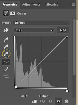
hello, another anon! 🥰 hm... i'm so terribly AWFUL with tips... but i'll give it a try. 1st, i believe you have to start with things you like the most. if you like more colored things don't be afraid of using hue/saturation tool... with color balance and levels.
one thing that helps me a lot is this little tool here on Levels:

how to use it; 1st you have to click on it and then go to your scene/gif and choses the darker spot and then the magic is going to happen.


see here? it helped me decreases the white ugly filter and the blues and red became more vivid. but this is not what i like so my next step is Selective Color. there i'll try to praise more his natural skin tone. for that to happen i recommend you always be careful with the red layer in the pink/yellow tones (use the arrows to help you to see the difference). another great tool/tip for that is the gradient map

*for more tips about that you can check this tutorial* this is what i usually do when their skin started to look more pale/yellow in the middle of my coloring settings or just by default (remember to always changes it to light and modify the opacity!). this is how it looks after all of this:

it's kinda more like my personal taste. but i'm not satisfied with the lights yet, see how a red/magenta kinda surround in that? so i'll go to color balance to fix it. usually i just fix it with shadows (change the arrows to cian/blue or vice-versa). but be careful cuz this also makes their skin change! you may have to go back to the selective color layer to fix it. this is how is looking now:

it's a slightly change but for me it's A LOT :') ok after all that you can let it all lighter with Exposure or more colored with Hue/Saturation... that is more personal and specific then a "general" settings imo you can really play along and see what you like the most. that's my final product after put a lil more life into it with the tools i've mentioned:

and that's all folks! lol sorry if it's confusing. i have a terrible english so do not be afraid of asking what part you got confused okay?
and oh, for base psds i have some in my psds tag in my main blog and had shared some other psds here too. if you wanna check it out it's in here. i also shared a "base" psd here. let me know if it helps! :)
lots of love 💜
13 notes
·
View notes
Note
Hello!! I have loved taxidermy for as long as I've known its existed (which was since I was like 4-) and I've always wanted to do taxidermy but not known where to start. Now that I've found an actual taxidermy blog, rather than someone who simply buys taxidermy I have to ask- how does one start to make their own taxidermies? Or just simply the basics of taxidermy.
(I own lots of taxidermy, bones, and have put animals in resin before but I know next to nothing about the ins and outs of taxidermy and I'm genuinely extremely curious!!)
Ty!!
Hello!
Ah, I see. The Curse has gotten you, too.
I would recommend looking into some taxidermy schools or courses near you! I personally graduated from the Lone Star School of Taxidermy, but there may be closer options depending on where you are.
If you’re not into the school option, buy some tutorial dvds from Breakthrough Magazine and McKenzie Taxidermy Supply.
I’ve gotten a similar ask in the past, so I’ll link it here.
It’s got some good beginner tips!
Good luck!
16 notes
·
View notes
Text

Full step by step photo tutorial on How to Start Crocheting for Absolute Beginners is up on my blog! Link in my profile! 👋🫶✨️
Check out this playlist featuring more crochet Beginner Guides here!
#yarn#art#crocheterofinstagram#crochet#crocheting#crocheted#youtubers#youtube#phototutorial#photography#crochettutorial#crochettutorials#diy#howtocrochet#beautiful#craft#crafting#crafty#tutorials#tutorial#patterns#love#crochetstitch#crochetstitches#yarnaddict#crochetaddicted#instamood#crochetcreations#photo#handmade
10 notes
·
View notes
Note
sorry i couldn't find out how to ask on your other blog.
that book binding you posted is gorgeous btw !!
I noticed that in one of the photos you included the disclaimer that you also edited it. I just had a question about how you formatted the text.
one of my biggest gripes with AO3 is text formatting (i often feel like i'm reading a legal document vs a novel/story) . Did you change how it is formatted on AO3 compared to printed?
I feel like i'm in the 0.5% that hate AO3 formatting but i thought i might as well ask in case you have any tips for that. >,>
(also how do you decide on the page size, do you just choose a standard size for all your projects? or do you vary it depending on what you are binding?)
thanks so much for taking the time to answer and for sharing your projects :) !!!!!!!!!!!
hey anon! I have asks turned off for the sideblog, but happy to answer here. Thanks very much!
I'm taking this opportunity to info-dump and link a lot of resources. I think they're useful for people new to either typesetting or bookbinding, but not all are directly related to your queries. That said, hope this is of use!
one of my biggest gripes with AO3 is text formatting (i often feel like i'm reading a legal document vs a novel/story) . Did you change how it is formatted on AO3 compared to printed?
I do a fair bit of editing when I'm binding a fic; typesetting is often the longest part of the process. Your mileage will vary depending on your experience with using word processor software, particularly the paragraph style and page style settings. Another factor is how simple/complicated you want your typeset to look. Replicating a published novel in format is difficult but learnable for a complete beginner.
I'm not equipped to give a full tutorial on how to typeset, but I'll point you towards some useful resources for ficbinding then talk about my own process.
ArmouredSuperHeavy has a tutorial on how to make Ao3's HTML downloads into a printable book in Microsoft Word. I use LibreOffice Writer myself, so this adaptation of the same tutorial is what I follow. Both are very helpful to reference as you're learning the typesetting ropes.
Personally, I don't mess around with HTML. I find it easiest to start by doing a Ctrl+A copy of the Entire Work fic view on Ao3 then pasting that into my word processor. This video tutorial by Beautifully Bound runs through how to do this in Microsoft Word using an AO3 fic as an example, including the associated steps needed to make the fic look novel-like. This is probably the best tutorial to address your gripe with AO3 formatting. Other than that, I'd recommend looking into videos or tutorials about typesetting novels for print. Same idea, and you may get more hits than searching for fanbind/ficbind typesetting tutorials.
More under the cut! Once I start yapping, it's hard to shut me up 🤷♀️
As a point of comparison, here's one of my fics on Ao3 and the corresponding typeset side by side:


Beautifully Bound explains this in far better detail than I will, but off the top of my head, the steps involved:
making a new document and setting the default page size to whatever size I want the book's pages to be (A5 or A6 usually). You can also set the margins at this point, taking account of your printer settings.
CTRL+A and copying the entire work's text on AO3 then pasting it into the document.
removing all hyperlinks and AO3 frontmatter, things like the author tags, summary, notes, etc as well as any website text that got copied over alongside the fic.
(optional) running a spell check and ensuring grammar usage is consistent. For me that's substituting em dashes for hyphens between clauses, enforcing curly double quotation marks for dialogue, etc. LibreOffice Writer automates a lot of this with customisable settings, via Tools -> Auto-Correct. Here's also where to make sure character names are all spelled right, convert the text to or from US to UK English, etc.
picking out fonts for the body text, headers, page numbers, etc. This is where you'll want to use paragraph style settings. Page style settings also comes in clutch if, for example, you'd like different headers on alternating pages. I like having the author on the right, the fic title on the left.
setting the body text first line indent to whatever makes sense visually). This in particular helps make the fic feel more like a novel. You can also play around with line spacing and space between paragraphs at this stage. For this A6 typeset, I had a 0.75cm first line indent, 1.15 line spacing, and 0.15 spacing between paragraphs.
(optional) formatting the first line of the work to use small capitals and to add a drop caps to the first letter of the first word. Again, this is a convention in publishing which add a novel-like feeling to a printed fanwork.
Inserting page numbers, adding images, coming up with how I wanted the "copyright" page to look—optional for the most part, but these are details that make a fic appear more like a novel.
For multi-chapter works, there's extra work in formatting chapter titles as headings so that they're referenced correctly in the automatic table of contents word processors can generate.
Once you have a typeset you're happy with, and if you're considering printing and binding it as a book, then you'll need to look into how to create and print signatures. Personally, this is something I had to actually try (and mess up a bunch of times) before I got to grips with it. Understanding how both your printer and your PDF reader work, particularly printer margins and booklet print settings, is key.
I won't go into as much detail on this, but if it's something you have an interest in, I'd recommend starting with DAS Bookbinding's tutorial. DAS has tutorials for everything bookbinding related so when in doubt, check his channel! Plenty of other YouTubers also have good videos on making signatures.
This resource is extremely useful once you've got your head around how to print signatures manually, so here's a link for anyone in that space: GitHub Bookbinding Imposer. Essentially, this does the signature creation for you, removing the need for booklet print settings in your PDF reader.
also how do you decide on the page size, do you just choose a standard size for all your projects? or do you vary it depending on what you are binding?
I have access to both A4 and A5 sized paper and my printer can handle printing on either size. In bookbinding, normally two pages are printed per side of the paper (which are then folded in half as part of a signature). That is, when I print on A4 paper, it's to make an A5 sized book. Printing on A5 paper will yield an A6 sized book.
Before I begin typesetting, I'll usually know what paper I plan to use, so the typeset will be one size down from the paper. So far, I've made softcover pamphlets at A6 size and casebound books in A5. No real method of choice for me, it's whatever I feel most suits the project.
---
If you made it this far anon, thanks for reading! Here's links to a few general resources if bookbinding is something you'd like to explore more:
DAS Bookbinding (YouTube, bookbinding in all forms)
Sea Lemon DIY (YouTube, bookbinding and other crafts)
bitter melon bindery (YouTube, bookbinding, particularly beginner friendly!)
Jess Less (YouTube, demonstrations of fanbinding and re-binding existing novels)
Papercraft Panda (blog, lots of detailed tutorial on bookbinding)
Renegade Bookbinding Guild (collective and website, loads of fanbinding-specific resources from their members and they have a helpful Discord).
24 notes
·
View notes
Text
The Plushū Diaries
This is a long post about the plushie I made as a beginner and just me venting about the process. Just skip this is you don't like long posts. Also I will probably mix up UK and US English a lot here. The usual Internet learning experience.
Canto 1- I can (not) make a plushie myself
So... As you may gather from the existence of this blog, I love Ryōshū a very normal amount. And like many other PM fans, I wanted a plushie of my best girl.
Two problems arise.
Independently made plushies made by commission are EXPENSIVE (For a very valid reason, this things take AGES to make and require a lot of work and skill.).
And
All the "Mass" produced ones by indie designers that I saw had animal ears or features, which I don't really like.
So, Sunday at around 10:00 pm, I, in all my wisdom, say to myself "I want it! So I'll make it!" I already had some material from a previous failed attempt, so might as well use them.
I dug up the doll skeleton and the body I had and stuffed that thing. By then it was already late and I had to work on Monday so, to bed I went.
Canto 2- The Real Start
By morning on the following day, I had already gotten over the Idea of making a plushie myself. Too much work. Too little skill. Like any other good little ADHD demon, I am allergic to completing my own projects and I jump from new idea to new idea too quickly to get anything done.
So, imagine my shock when at 11:00 pm I get that little itch to just make the thing. That little night owl brain magic that happens when everyone else is asleep and you are just now deciding to be productive.
So I grab the body, my embroidery thread and a bathtub of coffee and I just started.
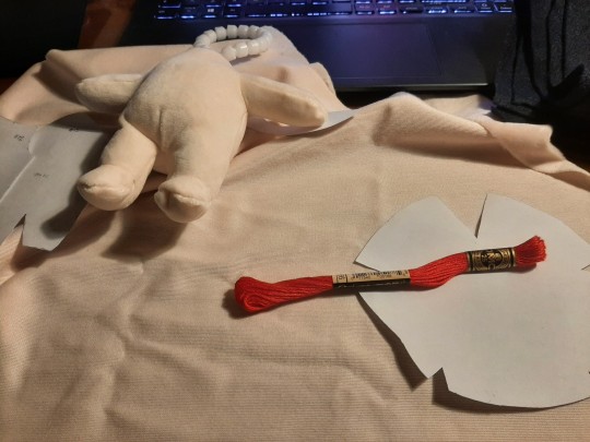
Luckily I already had a pattern that a friend printed out for me two years ago. But then, the mistakes also started.
Mistake 1- Improv
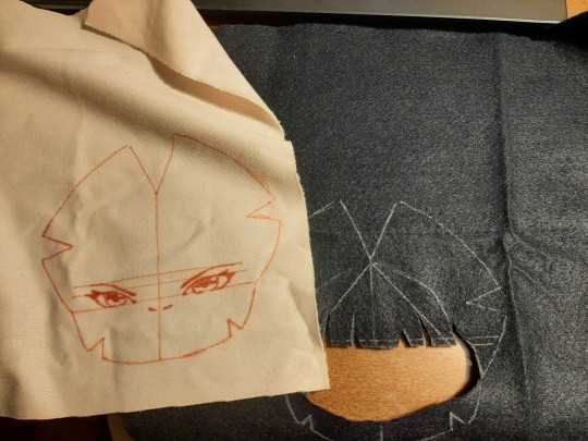
I had no idea what I wanted to make. I had a design that I had painted In photoshop before but I didn't have that materials nor skills for that. So I made a simpler one on the spot. I don't own a printer. I don't have transfer paper. So... like a person with a very aesthetically pleasing smooth brain, I just drew the design STRAIGHT ON THE FABRIC with BRIGHT red pen.
Mistake 2 - The bright red pen
At the start it wasn't much of an issue just something to mark the design because I don't have a tearaway stabilizer.
By the end of this saga, those smooth clear lines had bled SO MUCH I could no longer tell the difference between te guide and random stains. Oh! And you can also see the guidelines from the outside of the doll. Cool.
Mistake, the third - The felt hair
This doesn't seem like a mistake, but trust me, It will haunt the narrative.
Mistake forever after - Hubris
It took... around 1 hour to line up everything correctly on the embroidery ring? Why? Because I am stupid, that's why.
During this first day I decided that I didn't need to use pins. I could just put it on the ring by eyeballing it. How bad can it be?
I was a fool. There's a reason why professionals use them, and there's a reason why some people sew some pieces temporarily during certain steps of the process before finally attaching them together. Pins truly are unsung heroes.
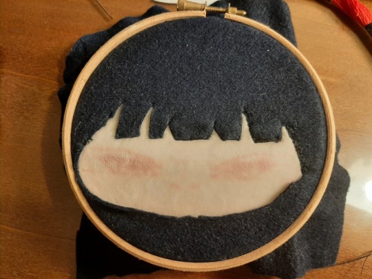
Canto 3- The unembroidered
So... embroidery. Embroidery is hard. Symmetrical embroidery is hard. Symmetrical embroidery with bleeding guidelines and no stabilizer is HARD. Symmetrical embroidery with bleeding guidelines, no stabilizer and you are a total beginner is maddening.
I watched someone do it by hand on YouTube before and I tried to mimic the process as much as I could. It didn't help much. Youtube tutorials can only do so much to compensate my lack of experience.
By the time I had done one eye I was already seeing problems. My stitches were all scattered to the four winds. They were all going in different directions. Some of them were too far apart or too close to others. The lines in the back of the doll were piling up and there were more knots in the thread than in your average omegaverse fic.
I went colour by colour. First black since I needed it to line the hair and it was the most used colour, then white just for the little highlights and finally red.
(Funny thing, the number of this red thread of this brand is 666 wich is kinda funny for miss hellscreen over here.)
After the red thread it finally started to look kinda decent (by beginner standards)


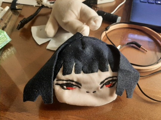
Canto 4 - Revenge of the felt hair
After all the embroidery was done it was finally time to get her off the ring and sew the parts together.
For those unaware, the regular soft plushie material, Minky, is really lightweight and very thin. Felt... isn't thin. And when you are sewing a plushie head with may parts and layers, all those millimeters of fabric pile up really quickly. One layer of felt is easy to pierce with a needle. Five layers? Not so much. Several needles were broken in the process of joining the front of the head with the back. I do not own a sewing machine. I did all of this shit by hand.
Thank god for the tetanus vaccine. When I say this little creature has my blood, sweat and tears, I MEAN IT.
The curse of the felt hair didn't end there.
Now that the head was done, it was time to stuff it.
Naturally, I had to rip parts of the stuffing to get it inside the head and around the skeleton. This sent bits and pieces of the thing flying everywhere. My room is FILTHY. And the felt hair got the worst of it. All those little dusts and microfibers stuck to it like a fly in a web. As I write this I am still trying to rip out bits of stuffing without damaging the felt. It is horrible. My girl is DIRTY.
(Also, plushie heads take WAY more stuffing than I thought. Holy shit.)


Finally, on the last day, it was time to attach the body to the head and sew the back of the hair. (I should have done that before but... more layers of felt. Broken needles. You know... nheeeeeee)
So, with a lot of fear in my heart I ladder stitched those bastards together and mocked up a decent enough pattern for the back of the hair. And just like that.... she is done.
Canto 5- The Plushie Defining
So... what did I learn?
Use pins. Stitch things temporarily with an obvious visible line that you can cut out after and test things before committing to a permanent stitch. If you are a beginner, like me, and are afraid to sew pieces together because you don't want to ruin your embroidered parts that you spent SO LONG working on, do this before.
Fuck felt.
Don't use a bright red pen.
Mess up. Make your plushie. Make it ugly. If you hate making bodies like me, buy one made and practice the head. Despite everything, I love my asymmetrical girl a lot. Like... I made this little bastard. She is MINE and I made her. This never stops being magical. It's a nice feeling.
And I did it without specific materials.
Some cheap threads, a body you can probably make too, some felt I found at the discount bin and random needles. That was all. No tearaway stabilizer, no sewing machine, no printer, no embroidery machine. The minky fabric is the only thing that was more of an investment. The rest is pretty accessible.
Do you know that post that says "Everything worth doing is worth doing poorly." Yeah, that applies to artistic projects. Go for it! Just... don't start with something hard like a human... Christ sake that was a nightmare.
I'm probably still gonna get a better plushie of her in the future, but for now, this is my baby.
Goodnight Tri-state area.

24 notes
·
View notes
Note
How did you learn how to make gifs?
A million different tutorials and lots of trial and error lol. I still consider myself a total beginner and i'm learning new things all the time, but if you're interested in learning gifmaking here are some tutorials that have been really helpful to me:
Beginner's guide to photoshop by @rresources
Gifmaking for beginners by @hayaosmiyazaki
Giffing 101 by @redbelles (super comprehensive and includes a few videos showing the process)
How to make hq gifs by @cal-kestis
Giffing tutorial by @cillianmurphy
Gif tutorial by @kylos
Channel mixer by @aubrey-plaza (life-changing for coloring difficult scenes)
@chaoticresources and @completeresources and @usergif are general photoshop/editing resource blogs
Everyone has their own process in making gifs and i've also been using a mix of different tutorials. I've tried a few different video player/screencapping programs and imo mpv player is the best. Most people use photoshop (source blogs should have links where to get it) for making gifs and edits but i've heard photopea is a good alternative though i haven't tried it.
My biggest advice to anyone wanting to learn giffing is having patience (it takes a LOT of time) and trying to learn one step at a time, because at least to me it felt completely overwhelming and confusing in the beginning when i was trying learn the whole thing at once while not having even downloaded anything before. It's best to start from the very basics and it gets easier and less confusing when you make progress!
24 notes
·
View notes
Note
Good afternoon! I just wanted to say that you're designs are beautiful. I wanted to know how you got started in crocheting/knitting. I feel like just watching a video, for me at least, is a bit difficult and I'd need a hands-on approach. Also, will you/do you have a shop available to purchase your creations? (apologies if it's stated somewhere on your blog and I missed it)
hi thank you so much ! i first got into crochet by making the stripped cat beanie back 2 years ago. after that i was making or trying something every now and then until i started filet crochet in summer 2023 and feel in love with the craft. i learnt from watching youtube videos.
i will sell pdf patterns on etsy pretty soon, I just want to film a in-depth beginner friendly filet crochet video first, with my advices and step by step tutorials (here's my channel if you are interested) but maybe i will release the pattern for the 'cunt' filet crochet before that as this one is almost ready on my computer, depending or on how long I take to edit the video!
then i will also start selling my finished crochet works, jewellery and other handmade things (once I get a label printer and business cards) on my etsy
thank you so much for your ask! have a lovely rest of your day ♡
7 notes
·
View notes
Note
Do you have any tips on how to make CC for beginners? Your stuff has inspired me a lot but idk where to start!! >~<
Hey nonny! I'm so happy you're inspired to make cc.
One of my greatest resources as someone that learns better with written tutorials than videos, is the full index of sims4studio tutorials. It looks a little overwhelming at first, but just take things one link at a time. Also, whenever I have a problem, I usually google whatever my problem is along with "sims4studio", and a helpful thread usually pops up.
The threads I return to very often are:
Weight transfer tutorial
UV_1 tutorial
It's slightly more advanced, but if something's fucky and you can't figure out what, chances are it's the weights or the UV_1. So I would learn about those pretty early on (after looking at the more basic tutorials of course). Also, always remember to remove those doubles! (You'll know what I mean when you follow the tutorials, ha)
Anywho, here's a few more resources that I and others in my discord server have found useful for just starting out:
@thefoxburyinstitute tutorial blog
cc making for beginners video tutorial by @powluna
cc tutorial by @myshunosun
written hair tutorial (part 1/part 2) by @simandy
For general advice, I'd recommend to take things very slowly, one step at a time, one project at a time, until you feel more comfortable. There's a teeny bit of a learning curve at first, if you've never touched blender or any image editing software before- but once you've got the hang of things, you're pretty much golden. Also, it may take a little bit to discover what you like making most. For example, I like making hair a lot, but clothing irks me. Some people love clothing and hate hair lol. So if you start off on one thing and find yourself hating it, don't be afraid to drop it completely and try something else. Every project you try is never a waste, even if you don't finish it, it's all teaching you something and building your familiarity with the process.
If you have any detailed questions, don't be afraid to come back and ask me! I'll help with whatever I can. Good luck, nonny 💜
44 notes
·
View notes
Text
Dev Diary #23
A reflection on Tyrano Builder so far and others...
Early this year I contemplated joining Short Circuit VN Jam but as the event period approached, and I juggled with which ideas to work on, nothing was working out. Flash forward to the end of May, Neo-Twiny Jam announcement pops-up. On a whim, I draft out a short story within its 500 words limit rule. Lo and behold, I managed to write something overnight, retrieving an old idea from sometime during lockdown.
When fellow devs informed me we can submit more than one projects -still within the 500 words limit - and I managed to write two more, I decide to drop out of Short Circuit VN Jam and join Neo-Twiny Jam instead. Something I have been meaning to do since I saw it years back, but was too insecure to do.
And since I've had Tyrano Builder around for so long without having used it at least once, I figured right now was the perfect chance to learn to master the tool. Something I already did early this year at The Worst Visual Novel Ever Challenge with "this is a trial game" where I finally played around with Tuesday JS Visual Novel Engine.
First impressions! Once you get past feeling overwhelmed by the interface, read through the basic tutorial and watched video tutorials, the steps become more intuitive. So far, I appreciate the convenience of dragging and dropping resources into Tyrano and manually placing custom images around the tool area. The downside with the latter however is the lack of alignment and distribution feature you'd commonly found in any editing software nowadays to automically align said images.
Another aspect I am not fond of is how reliant the engine could potentially be with Steam. In a hypothetical scenario Steam shuts down, does it mean the engine itself is lost?
TyranoBuilder can still be a decent tool for a beginner wanting to start making vns, and yet overall Ren'Py - despite its complexity - continues to be a reliable option in my opinion in terms of how well-documented it is with the amount of plug-ins and tutorials you can find online.
I've had to dig around online just to figure out how to even implement a hover effect in TyranoBuilder. Once I did, the result was satisfying! The in-tools at your disposal are still very limited, unless you know Japanese and have no problems reading through the JP tutorials (which I am not sadly *big sigh*), but again it's a good enough tool if you're just starting and want to handle the coding aspect to a minimum, same with Tuesday JS.
As of the time of this blog post, I have a working kinetic novel with as much customisation I could get away with. I like how it looks so far. Working on this is the most fun I've had since putting aside my inherent need for perfectionism.
This won't be the last dev diary for the month! Thank you for reading so far :D
– S. H.
2 notes
·
View notes
Text
yet another gif coloring tutorial
Okay, so, I posted a coloring tutorial for one of my moots a few years ago on my main, @zackmartin (I believe I've since deleted it) but that was the technique I was using when I started making gifs 7ish years ago, and I’ve since updated my routine so I decided to post a new tutorial with my new technique.
I'm going to show you how I achieved this:
I'm using Photoshop for this. I'll try to make this as detailed as possible so it's beginner-friendly, but you do at least need to know how to make and export a gif. If you have any questions, don't hesitate to reach out! just be aware, this tutorial really image-heavy
A few notes before I begin: 1) this is like, the bare minimum most basic way to color a gif. This is what I’d be doing if I was giffing a scene and that’s it. If you’re interested in different coloring styles (like my suite life episode series) then let me know! 2) When coloring gifs with POC, you need to make sure not to change their skin color by making them too light, too orange, too yellow etc. The JATP source blog posted a masterpost of different tutorials to teach you how to color gifs in different ways (like with the pastel coloring for instance) without whitewashing/orangewashing POC. But, honestly there’s a ton of tutorials out there that show you how to avoid this if you do a little digging. NO EXCUSES!
Anyway, let's get started! Before I do the coloring, I ofc make my gif, crop it, set the frame rate, resize, and sharpen. (you can find my sharpening tutorial HERE)
I. BRIGHTENING
(as a quick note, I don't focus much on London's skin tone during this stage, because I'm going to fix it during later steps)
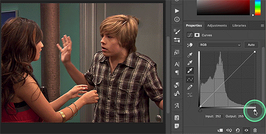
The first thing I do is white balance using a curves layer. To do this, I click the little circle thing in the toolbar below the layers, and then click curves like so (you'll do this every time you want to add a new layer):

And then I click the bottom eyedropper tool on the left-hand side:
Then I click the lightest white part of the gif. (I’m not sure how to explain this well, but it basically white balances that spot to make it pure white. Like, if I clicked on the gold part of London's bracelet, then the whole gif would turn out really blue because it would be trying to white balance the gold) (hopefully that makes at least a little bit of sense)
Anyway, there’s a trick I use to find the lightest part of the gif; hold down the option key (or alt if you’re on windows) and while you’re holding down the option key, drag the little white arrow on the right-hand side:
(i apologize for the quality of the screenshots, tumblr keeps destroying them :/ let me know if I need to clarify anything)
Then I use another curves layer to do the same thing with but with the blacks. So, I add another curves layer, and then click the eyedropper tool at the top this time:
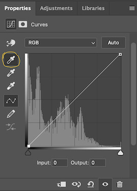
And then I click the darkest, black part of the gif. You can use the same trick by holding the option/alt key and dragging the triangle on the left-hand side:

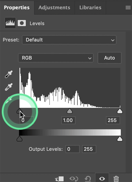
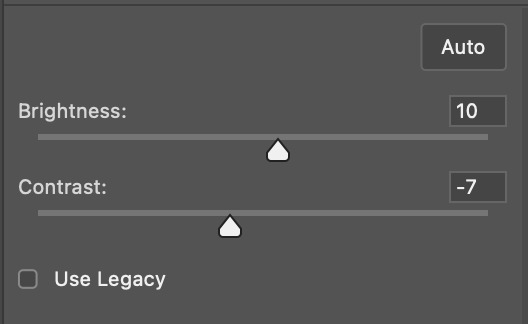
Next, I add a levels layer. I drag the middle lever thing to the left, and the left lever to the right. (I don’t usually touch the little lever thing on the far-right, but it’s really up to personal preference. I learned to color gifs by basically messing around with settings, so I’d recommend doing the same and just seeing what you like best):
Finally, if I want to go even brighter, I usually add a brightness/contrast layer. I typically turn up the brightness a bit, and turn down the contrast. But, since I brightened a lot with the curves and levels, I usually don’t go that far. These were the settings I used for this particular gif (even though I'm going to share most of the settings that I used, I wouldn't recommend using the exact same ones on your own gif as it'll really depend on the scene you're using):
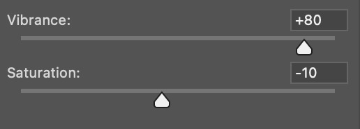
II. VIBRANCE
Now I add a vibrance layer. I like my gifs to be bright and vibrant, so I usually turn up the vibrance, and turn down the saturation a bit. These are the settings I used for this particular gif:
And this is what the gif looks like so far with just brightening it up a bit and adding vibrance (it might look a bit too bright right now, but I'm going to fix that in later steps):
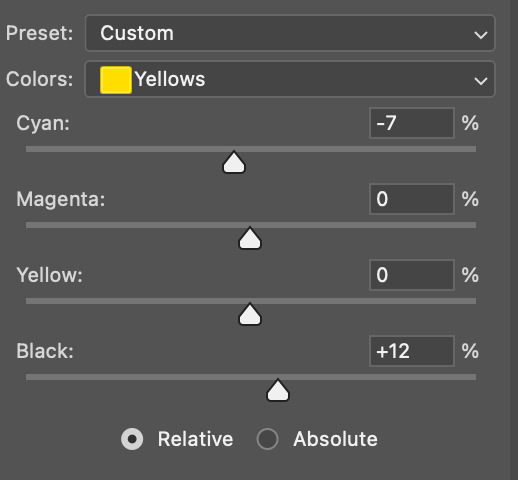
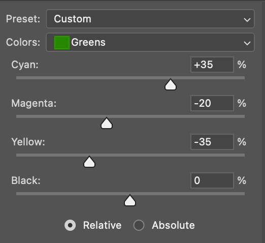
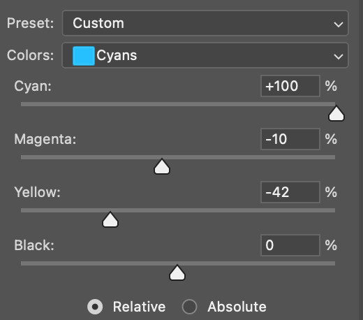
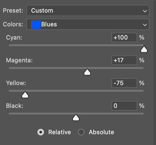
III. SELECTIVE COLOR
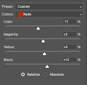
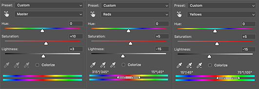
Now, I add a selective color layer. The reds and yellows typically affect skin tones, so this is where I'll start to fix London's. These are the settings I used for this gif (I usually wouldn't change all of the colors, but this is just one of those situations where they happened to be present in the scene I'm giffing):
IV. HUE/SATURATION
now I add a hue/saturation layer. I typically turn up the master saturation to +10 and the lightness between +3 - +5 regardless of the gif. Then if I still need to fix skin tones, I'll mess around with the reds and yellows. These are the settings I used:
V. PHOTO FILTER
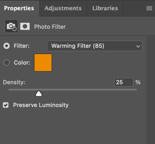
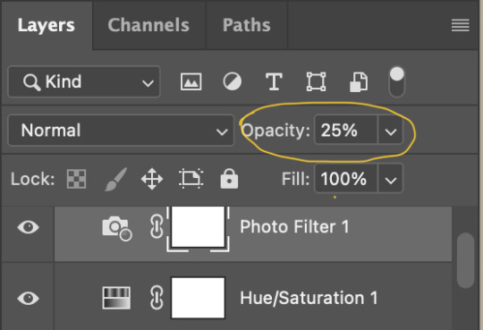
Next, I add a photo filter. I usually stick with the default one, I keep the layer set to normal, and I turn the opacity down to 25%:
VI. B&W GRADIENT MAP
finally, I add a black & white gradient map, and I click the little box to reverse it:
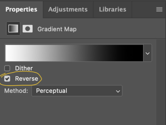
Then I set the layer to soft light and I turn the opacity down, between 10% - 20% depending on the gif:
A lot of times, I'll stop here. If I'm satisfied with the way the gif looks, and London's skin isn't too pale/orange/yellow etc, then I could just add my watermark, export and be done. But, there a few other optional steps I might take if I'm still not quite happy with it.
VII. OPTIONAL
Usually the next thing I'll add if I've decided to keep going is a color balance layer. It obviously does as it says, helps balance out the colors, but some gifmakers also like their gifs to have like, a reddish tint or a bluish tint or what have you, so this can help with that too. I wanted to balance out the reddish/yellowish tint, so these are the settings I used:
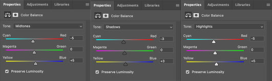
and this was the gif before the color balance:
and after:
And if I want to play around with the colors a bit more, or fix the skin tones further, I might add another selective color layer or a hue/saturation layer (or both, depending).
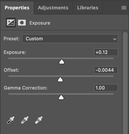
Rarely, I might add an exposure layer. (I added one to this gif for the purposes of this tutorial). These are the settings I used for that:
And if the gif came out a bit too bright, I might add another brightness/contrast layer, except this time I would turn down the brightness and turn up the contrast (again, I did that with this gif for the purposes of this tutorial).
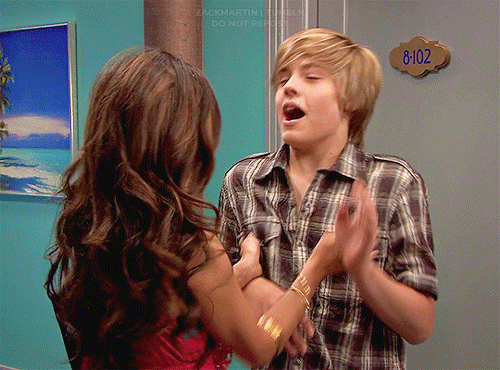
And, that's pretty much it! This is my finished gif!
Like I said earlier, I pretty much learned how to color by messing around in photoshop, so I would really recommend playing with the different layers and settings for yourself, as well as checking out other coloring tutorials and other gifmakers methods and see what you like and what you don't. And finally, the best thing you can do is just,,, practice. I've been gifmaking for about seven years, but I feel like I didn't really become decent at it until this year
Again, If you have any questions let me know! and feel free to tag me in your creations! #userzackmartin 💕
#*tutorials#tutorials#gif tutorials#coloring tutorial#gif coloring tutorial#flashing gif#flashing gif tw#i'm not really sure it counts but just in case#flashing tw#dailyresources#photoshop tutorials#*
64 notes
·
View notes
Text
HOW TO FRONT LEVER | ANYONE CAN DO IT!
youtube
Want to learn how to hold a front lever? Chris Heria shows you exactly how you can start training for it as an absolute beginner along with its many variations like front lever pull-ups! Timestamps: 0:00 GET THIS WORKOUT ON YOUR PHONE: Get the Music in the video made by Chris Heria: https://soundcloud.com/chrisheria FOLLOW CHRIS HERIA IG: @chrisheria https://www.instagram.com/chrisheria/ VLOG YT CHANNEL: https://youtube.com/CHRISHERIA Take your training to the next level with a Heria weight vest: https://chrisheria.com Follow THENX on Instagram: @thenx https://www.instagram.com/thenx/ Join our Events: http://thenx.com/blog/events/ (currently updating) Heria Apparel here: https://chrisheria.com/ BECOME A THENX MEMBER: https://thenx.com/ DOWNLOAD THENX Iphone App: https://goo.gl/Qk235s DOWNLOAD ANDROID App: https://goo.gl/kcRBpL SHOP THENX: https://thenx.com/shop VIEW OUR EVENT CALENDAR: http://thenx.com/blog/events/ THENX BLOG: http://thenx.com/blog/ The BEST Calisthenics App, secret techniques, programs, and step by step guided tutorials tested by thousands of people to reach their goals, with the most simplistic systematic approach to learning any calisthenics move such as the Handstand, Muscle Up, Planche, with ease. And it's all IN HERE https://WWW.THENX.COM
#health & fitness#youtube#excersice#workout#calisthenics exercises#fitness#exercise#thenx#thenxworkout#calisthenics#Youtube
2 notes
·
View notes
Text
Hostinger Discount Code 2025
Hostinger Discount Code 2025 – Save Up to 80% on Hosting Click Here 🚀 Ready to Launch Your Website? Watch This Hostinger Tutorial! 🚀
youtube
In this video, I’ll show you everything you need to know about Hostinger, one of the most affordable and user-friendly web hosting platforms out there. Whether you’re a beginner or a pro, Hostinger has the tools to help you create a fast, secure, and reliable website in minutes! 👉 What You’ll Learn in This Video:
✅ How to set up your website with Hostinger step-by-step ✅ Tips to optimize your site for speed and performance ✅ Why Hostinger is perfect for beginners and small businesses ✅ Exclusive discounts and deals to save on your hosting plan 💡 Why Choose Hostinger? ✔ Affordable hosting plans starting at less than $1/month ✔ Free domain, SSL certificate, and website builder
✔ 99.9% uptime guarantee and 24/7 customer support ✔ Perfect for blogs, portfolios, e-commerce stores, and more 🔗 Links & Resources Mentioned in the Video: 👉 [Get Hostinger Discount Here
#hostingercouponcode2025#hostingerpromocode#hostingerdiscountcode#Hostinger2025#cheapwebhosting#webhostingdeals#BestHosting2025#HostingerSale#websitehosting#WordPressHosting#HostingerCouponCode2025#HostingerDiscount#webhosting#cloudhosting#hostinger#hostingerpromocode2025#cybernews#cybernewshosting#hostingerreview#bestwebhosting#hpanelreview#IsHostingerWorthIt#websitebuilder#affordablehosting#hostingtutorial#hostingreview#websitetips#OnlineBusiness#TechTips#HostingDeals
2 notes
·
View notes
Note
I just saw your Barbie jacket and fell in love, such beautiful work!
I want to get into sewing but have no idea where to start, do you have any tips?
Yes! FYI, I had the privilege of learning to sew at a really young age, around 10-12, thanks to 1) learning the basics from my mum 2) having a second-hand sewing machine I could futz around on as I pleased. But I truly think anyone can learn to sew, it does not have to be a childhood skill.
If you want to try it out before committing to buying anything except fabric, there are almost always community or adult education classes or courses that can teach you basics on their machines. Depends where you live but you might find them through your local community college or high school night class, library, YMCA/community centre, or even by asking at a fabric/craft store.
I highly recommend taking a couple of classes if you're a complete beginner - they can teach things like laying out and cutting patterns, threading a machine, the basic stitch and finishing options, etc. Often they can also teach you how to use your own machine, if you've bought one but you're a beginner.
If you want to try at home, at minimum you will need:
A basic sewing machine - you can very often find good second-hand machines online (ebay, craigslist, local buy/sell Facebook pages). Mine is a Janome and I've had it for almost 20 years, but the old 70s steel Singer machines are fantastic in terms of longevity.
A pair of reasonably sharp fabric scissors. You do not need to pay a million dollars for the best scissors, but going up a level from basic craft scissors, and keeping them only for cutting fabric (no paper) will make your cutting-out experience a lot easier.
A packet of sewing pins. For pinning down patterns and seams. I like the glass-head pins since they don't melt if you iron over them.
A tape measure for measuring yourself and checking your seam width, hems, etc.
An iron and ironing board (or table with a thick towel laid down, if space is a real problem).
A flat surface to lay out and cut your fabric - dining table or floor both work fine.
A needle for hand-sewing - to sew on things like buttons.
A box of empty bobbins to wind your bobbin thread onto.
In terms of patterns - there are a huge range of indie pattern companies online now (meaning they're not the big commercial patternmakers like Butterick). Most often, you can buy their patterns as a PDF and print it out on your home computer. In all honesty I much prefer indie patterns to commercial - they're often a lot more up to date with style, and usually not as expensive - but they can also be limited in terms of sizing, the range of style options, and some people really like a printed paper pattern instead of having to print your own. I recommend Papercut Patterns as an indie option that's great for beginners.
Indie instructions can also sometimes be a bit confusing (I find Etsy patterns the worst for this) although often you can email them and ask - or Google "[name of pattern] sew along" for a video tutorial. You can also find step by step video or blog post tutorials for pretty much every sewing technique, including things like putting in a zip, sewing buttonholes, etc.
Once you've picked your pattern, you'll obviously need fabric. There are a million people online who espouse the virtue of sewing with old bedsheets from thrift stores; in all honesty I don't love doing this because 1) I get a huge amount of joy from beautiful fabrics 2) if you want to make things that look 'professional'/store-bought, bedsheet cotton is not always your best friend. BUT it is probably the cheapest option for fabric, and a very good way to start or to test that a pattern fits and you know how to make it before you cut it out in the nice linen that cost $30 a yard. Using thrifted fabric is also obviously really eco-conscious, although a lot of fabric stores (especially independent ones vs chain stores like Spotlight or Joann) make a point of selling 'deadstock' fabric - fabric leftover from a clothing designer's run.
That's probably enough to start, honestly just fuck around and have fun with it, screw up a few times, lean into the imperfection. I still regularly scrap projects that aren't working for me, no shame in doing so as long as you're enjoying yourself!
30 notes
·
View notes