#html set width to hr tag
Explore tagged Tumblr posts
Visit Tumblr Blog
Explore Tumblr blogs with no restrictions, modern design and the best experience.
Last Seen Tumblr Blogs


Fun Fact
Average visit duration of Tumblr.com is 10 mins and 25 secs.
Text
HTML hr Tag
The HTML <hr> tag is used to define a horizontal line or rule to separate content in an HTML page. The <hr> tag is an empty tag and this tag does not require an ending tag. Syntax <hr> Example <!doctype html> <html> <head> <title>HTML Hr Tag</title> </head> <body> <h1>What Is HTML?</h1> <p>HTML stands for Hyper Text Markup Language, which is the most popular language on web and the language is…

View On WordPress
#attributes of hr tag in html#horizontal line tag in html#horizontal rule in html#how to use hr tag in html#hr in html#hr tag#hr tag attributes in html#hr tag example#hr tag html#hr tag in hindi#hr tag in html#hr tag in html example#hr tag in html in hindi#html#html hr tag#html hr tag attributes#html hr tag properties#html set width to hr tag#html tag#html tags#html tutorial#html tutorial for beginners#html5#tag#what is hr tag in html
0 notes
Text
Brower Electric - Commit #5 - About Us
This commit, I built the About Us page. It uses a Bootstrap 5 accordion, modified to a single dropdown.
On Desktop:


On Mobile:


The HTML:


We have our head tag, same as the home page but with a different title.
Our navigation is the same as the Home page, quite literally copy/pasted.
At the top we have a heading. text-center centers the text just fine in this situation. display-2 controls the font-size. and mt-5 applies a top margin.
Next we have a div, flexed so that it's items will be in the center, in that div we have an <hr> tag. The hr tag makes a horizontal line. The width is 50% of the page and some other styles are applied via CSS.
Next we have the div that contains our paragraph. It's width is set to 75% of the page with custom styling to make sure it is the center 75%.
The paragraph itself has it's font controlled by the h3 class and some padding with p-3.
Our accordion is a Bootstrap accordion with 1 accordion-item containing several accordion-bodies. The entire accordion is contained in a flexed div that centers it and adds a margin on the bottom.
I removed the show class and added a collapsed class to the button. I also changed the button's data-bs-target to a class (.pastCollapse) applied to all the bodies so that it would open/close them all at once.
The button's text has some padding, no margin, and custom css applied through the pastProjHeading class.
All of our accordion body divs that contain the text are flexed, seperated on the x axis and then centered on the y axis.
The right text has the class pastProjText that applies some styles.
After the accordion, we have another hr, flexed to the center with a top margin and a width of 75% of the page. The border of the line is 2px.
The footer is a column flex container with 2 <p> tags. The bottom one is a rudimentary nav for the bottom of the page.
The CSS:

Our aboutBar hr tag (at the top) has a 1px white border and is opaque.
The center75 class centers our 75% width section by applying percent margins on either side.
pastProjHeading applies our font, font size, font color, and centers the text.
Our strong tag uses the sans-serif font, a 500 font weight (so just a little bold), and a 1.25rem font size.
The pastProjText has the same weight, 1 rem sans-serif font, and no margins. It is also aligned to the right so that if the text wraps on very small viewports, the state will go under and on the right of the city.
The accordion-body of the last pastCollapse item has no borders but all other accordion-body divs have a bottom border. This creates those separating lines you see on the expanded accordion.
The accordion-item has no border.
When the accordion-button is expanded (not(.collapsed)) it will retain it's initial styling. This is there because otherwise it turns an odd pale blue when opened. I used the Firefox inspect tools to locate the class with the border that does that and overwrote it in my css.
Conclusion:
This one was much more straightforward. Even though it was an entire separate page of the site, it took a fraction of the time of the other commits. The lesson today is that content component complexity and developer experience are much better indicators to predict completion times than number of pages or even length of content.
You can visit the site's github repository here: https://github.com/Xacheri/BrowerElectric
2 notes
·
View notes
Link
Folder Name (Folder) Assets (Folder) > Contain an image HTML1 HTML2 HTML3 ————- ————- —————- html> is first line saying its a html file is next line (which closes laster on with )
is next (all business, meta tag, style tag, linking, none of the content goes in there, no page content) (what does the page need to render? to the search engine that comes walking by) (Script tags, JavaScript, Does not go in the middle opening closing and body ) (title tag) is the content (Heading Tag, Paragraph tag, Anything that marks up content. Nothing more than tags,unicode) (paragraph tag gives indentation, bold, default black, large font size, change w/CSS) (Style tag, CSS, all formatting is done in CSS. No formatting w/ attributes. NO ATTRIBUTES) // within 2. HTML INTRODUCTION What is HTML? HTML is the standard markup language for creating Web pages. ~~~~~~~~~~~~~~~~~~~~~~~~~~~~~~~~~~~~~~~~~~~~~~~~ //Tables are not used for page layout. //They are used to setup tabular content. //CSS IS used for page layout almost entirely •The declaration defines this document to be HTML5 •The element is the root element of an HTML page •The element contains meta information about the document •The element specifies a title for the document •The element contains the visible page content •The
element defines a large heading •The
element defines a paragraph //Classes or IDS go within the opening tag seperated by the blank //There is no debugger. My eye balls are it, my brain cells are it. I need to be good problem solver. //Within opening tab are structural attributes. //Make sure the end tag is within any other tag //DO NOT OVERLAP. The head has to be on top. HTML BASIC //DO NOT LEAVE OUT THE HEAD TAG. IF EMPTY. ABOVE BODY. value goes up, font size goes smaller
Setting apart content Types of content on a page Later on: Anchor Tag What she calls her Bookmarks’ click on top, bring down https://www.w3schools.com/html/tryit.asp?filename=tryhtml_basic_paragraphs The paragraph tag //Indentation
This is a paragraph.
This is another paragraph.
CSS is for spacing, not blank paragraph Basically a chunk of content, whatever i’m going to be presenting. //No links or imgs today HTML Elements https://www.w3schools.com/html/html_elements.asp If I want single spacing then I want tag , because it’s single spacing. Its useful for a # of things. Especially tables, when we want condensed and not spread out. Can I put within paragraph? Yes I can. It breaks up. h1{font-size:60px;}
Heading 1
Blah blah blah
h1{font-size:60px;} = embedded css
Heading 1
// //she took out in line, 100% incorrect, she will mark it wrong //two places for css, 1 in file, 2nd place opening closing style in head tag. A OR B no C https://www.w3schools.com/html/html_headings.asp https://www.w3schools.com/html/tryit.asp?filename=tryhtml_headings_hr BEFORE
This is heading 1
This is some text.
This is heading 2
This is some other text.
This is heading 2
This is some other text.
AFTER hr{width:75%; height:5px; background-color:blue; margin: auto; }
This is heading 1
This is some text.
This is heading 2
This is some other text.
This is heading 2
This is some other text.
//hrFormatting.html save as all files HTML Paragraphs https://www.w3schools.com/html/html_paragraphs.asp HTML Display https://www.w3schools.com/html/tryit.asp?filename=tryhtml_paragraphs2 BEFORE
This paragraph contains a lot of lines in the source code, but the browser ignores it.
This paragraph contains a lot of spaces in the source code, but the browser ignores it.
The number of lines in a paragraph depends on the size of the browser window. If you resize the browser window, the number of lines in this paragraph will change.
AFTER
This paragraph contains a lot of lines in the source code, but the browser ignores it.
This paragraph contains a lot of spaces in the source code, but the browser ignores it.
The number of lines in a paragraph depends on the size of the browser window. If you resize the browser window, the number of lines in this paragraph will change.
HTML COMMENTS https://www.w3schools.com/html/html_comments.asp
This is a paragraph.
CSS INTRODUCTION https://www.w3schools.com/css/css_intro.asp //Covering all, The CSS Box Model is bedrock CSS SYNTAX https://www.w3schools.com/css/css_syntax.asp h1 = selector { Color:blue, color = property, blue = value, = declaration ; font-size:12px; } //First rule: Align, to see. For human eyes. //Indendation CSS How To
1 note
·
View note
Text
VIM学习笔记 网页开发-输入网页标签(Input HTML Tags)
在编写HTML代码时,重复录入标签显然是相当低效的。我制作了HTML-Editor插件,通过快捷键和菜单项来提高输入HTML标签的效率。
安装配置插件
请在vimrc中添加以下命令,以便在“Insert (paste)”状态下正常使用快捷键:
:set nopaste
如果侦测文件类型为XHTML,那么将自动使用小写的标签。也可以定义以下变量,以强制使用小写标签:
:let g:do_xhtml_mappings = 'yes'
在插入模式下,输入以“;”开头的关键词,比如“;pp”,将自动扩展为完整的段��标签;使用以下命令,可以修改默认的前缀键为逗号:
:let g:html_map_leader = ','
假设使用;ah快捷键,输入以下链接标签。光标将自动定位到href属性的引号之内;输入链接地址之后,点击Tab键将移动至title属性的引号之内;输入链接标题之后,点击Tab键将移动至</a>标签之前。也就是说,使用Tab键可以快速跳转至下一标签属性,进一步提高输入HTML代码的效率。
如果您需要输入真正的Tab制表符,那么可以使用;Tab快捷键。
如果您希望恢复通常的Tab键操作行为,那么请设置以下变量:
let g:no_html_tab_mapping = 'yes'
利用快捷键输入标签
以下表格列示了在插入模式和可视化模式下,用于输入HTML标签的快捷键:
快捷键输入代码;;插入字符“;”;&插入字符“&”[1];4<!DOCTYPE html PUBLIC "-//W3C//DTD HTML 4.01 Transitional//EN" "https://ift.tt/kTyqzh"><!DOCTYPE html PUBLIC "-//W3C//DTD XHTML 1.0 Transitional//EN" "https://ift.tt/kkyg93">;s4<!DOCTYPE HTML PUBLIC "-//W3C//DTD HTML 4.01//EN" "https://ift.tt/nYkKzf"><!DOCTYPE html PUBLIC "-//W3C//DTD XHTML 1.0 Strict//EN" "https://ift.tt/mOIMeg">;ab<abbr title=""></abbr>;ad<address></address>;ah<a href="" title=""></a>;an<a id=""></a>;bd <body><CR></body>;bh<base href="" />;bl<blockquote><CR></blockquote>;br<br />;bu<input type="button" name="" value="" />;ca<caption></caption>;ch<input type="checkbox" name="" value="" />;ci<cite></cite>;cm<!-- -->;co<code></code>;cs<style type="text/css"><!--<CR>--></style>;ct<meta http-equiv="Content-Type" content="text/html; charset=UTF-8" /> [2];dd<dd></dd>;de<del></del>;df<dfn></dfn>;dl<dl><CR></dl>;dt<dt></dt>;dv<div><CR></div>;eb<embed type="" src="" width="" height="" />;em<em></em>;fi<input type="file" name="" value="" size="20" />;fm<form action=""><CR></form>;h1<h1></h1>;h2<h2></h2>;h3<h3></h3>;h4<h4></h4>;h5<h5></h5>;h6<h6></h6>;he<head><CR></head>;hi<input type="hidden" name="" value="" />;hr<hr />;ht<html xmlns="https://ift.tt/3b8LcZy>;if<iframe src=""><CR></iframe>;im<img src="" alt="" />;in<ins></ins>;it<i></i>;js<script type="text/javascript"><!--<CR>//--></script>;la<label for=""></label>;li<li></li>;lk<link href="" />;ls<link rel="stylesheet" type="text/css" href="" />;me<meta name="" content="" />;mh<meta http-equiv="" content="" />;mi<img src="" width="" height="" alt="" /> [3];ms<select name="" multiple><CR></select>;ns<noscript><CR></noscript>;ob<object data="" width="" height=""><CR></object>;og<optgroup label=""><CR></optgroup>;ol<ol><CR></ol>;op<option></option>;pa<input type="password" name="" value="" size="20" />;pm<param name="" value="" />;pp<p></p>;pr<pre><CR></pre>;qu<q></q>;ra<input type="radio" name="" value="" />;re<input type="reset" value="Reset" />;sa<samp></samp>;sb<sub></sub>;se<select name=""><CR></select>;sj<script src="" type="text/javascript"></script>;sm<small></small>;sn<span></span>;sp<sup></sup>;st<strong></strong>;su<input type="submit" value="Submit" />;ta<table><CR></table>;tA在可视化模式下,提示输入行列数,并自动生成表格代码;tb<tbody><CR></tbody>;td<td></td>;te<input type="text" name="" value="" size="20" />;tf<tfoot><CR></tfoot>;th<th></th>;tH<thead><CR></thead>;ti<title></title>;tr<tr></tr>;tx<textarea name="" rows="10" cols="50"><CR></textarea>;ul<ul><CR></ul>
请注意:
由于“&”作为前缀键用于输入字符实体(Character Entity),所以定义快捷键用来输入此特殊字符;
charset属性根据文件的'fileencoding'或'encoding'属性自动判断;您也可以通过g:html_default_charset变量进行强制定义;
点击;mi将查找src指定的图片文件,然后将获得的图片尺寸信息更新到width和height属性中;
代码列中的“<CR>”,代表换行符;
在可视化模式下选则文本然后点击快捷键,将插入标签并将选中的文本放置在name、value或content属性中;
对于<acronym>,<big>,<center>,<font>,<isindex>,<strike>,<tt>,<frame>,<frameset>,<noframes>,<b>,<u>等等已废弃的标签,不建议继续使用;
关于完整的HTML标签索引,请参考HTML Elements Index。
利用菜单输入标签
您也可以使用“HTML”菜单来输入HTML标签;
Ver: 2.0 | YYQ<上一篇 | 目录 | 下一篇>
from Blogger https://ift.tt/2RS5rDl via IFTTT
0 notes
Text
Class 12, Homework 4: HTML Fundamentals
We started to write HTML code in Brackets. This is a video of some of the basics. Those basics were changing the font color, changing the emphasis (or bolding which is done with the <strong> tag), changing or ending paragraphs as well. It is important to remember the </> when finishing a command.
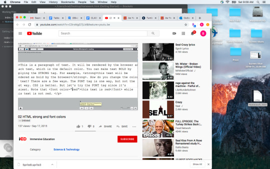
I started to write my code for getting the text complete. You can see this in the top of the screen, those first four lines are the first lines of the command. In the next Video we put in rule breaks <hr> and weblinks with the <a href> tag.

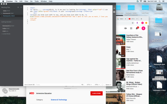
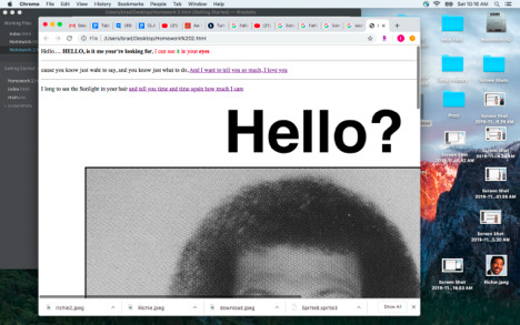
I had some incorrect coding, where the orange extended. What this means in this code is that it thought it was the same information. When I tested it, the text did not show up, I was missing a > to close.
This is the code for where the images are on line. Using the “_blank” command you can open the link in a new tab. I added 2 links, one does not open to a new tab and the other opens a video in a new tab.
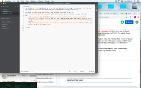
This is a video on how to add images. We worked on three ways to do this, the first was from a website, the second from a file the document was in, and the last a file in a folder where the document is. The code is all similar as it starts with <img src> but the pathing changes.
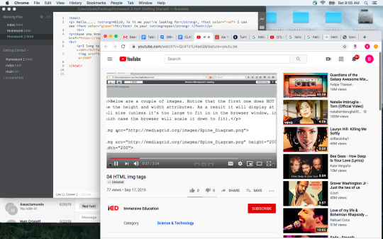
This is the code for the HTML file. It is not a very long code, but there is also not a ton of text in the document. When you look at this, blue are tags and orange are the modifiers. Not a lot of black text showing just text.
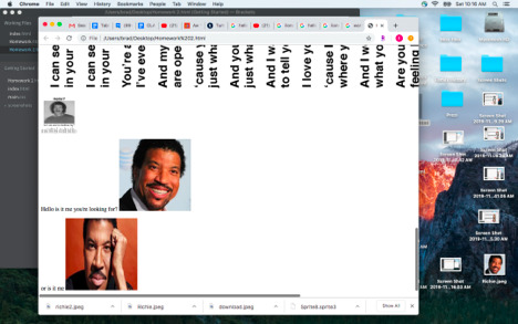
I had to check the file name for the second image, I had to make sure the capitalization matched the file name or it would not work. You can see me searching for it.

This is my HTML code after it is completed and saved as a .HTML file. You can see the <strong. text in bold, then the <font color=> tag after that. I used red and then green. <hr> was used to put in a break, and two hyperlinks were added. The first one does not open a new page, the second one does. I then put in an image, which was huge. The height and width were set on the next one at 100 and 100. This image comes from <img src> at a websiteThen I added some more text and 2 more files on my computer, the first was on the desktop and the second was in a folder on the desktop so that pathing was Screen Shot/richie2.jpeg.

This was the code.
<html> <p> Hello..... <strong>HELLO, is it me your're looking for</strong>, <font color="red"> I can see <font color="green">it</font> in your <strong>eyes</strong> </font></p> <hr> <p>cause you know just waht to say, and you know just what to do, <a href="https://imgflip.com/i/wa6py"> And I want to tell you so much, I love you </a></p> <hr> <p>I long to see the Sunlight in your hair <a href="https://www.youtube.com/watch?v=UBYnT8JY7sE" target="_blank"> and tell you time and time again how much I care</a> </p> <img src="https://gourmetint.files.wordpress.com/2017/10/lionel-poster-e1507231532726.jpg?w=1500"> <img src="https://gourmetint.files.wordpress.com/2017/10/lionel-poster-e1507231532726.jpg?w=1500" height="100" width="100">
<p>Hello is it me you're looking for? <img src="Richie.jpeg" height="200" width="200"> </p> <p> or is it me <img src="Screen Shots/richie2.jpeg" height="200" width="200"> </p> </html>

0 notes
Text
Back to Basics
HTML
Editors
Brackets
Dreamweaver
Tags for a basic webpage
Doctype
HTML
head
title
close head
body (what is seen)
h1
p
close body
close HTML
<!DOCTYPE html> <html> <body> </body> </html>
Errors: did you close all tags?
Web Browsers
Browsers read and display HTML documents
Firefox
Safari
Chrome
uses the HTML tags to determine how to display the content
HTML Headings
<h1> </h1> <h2> </h2>
HTML Paragraphs
<p> </p>
HTML Links
<a href=“https://www.blahblahblahetcetcetc.com “>This is a link</a>
HTML Images
<img src=“ “ alt=“ “ width=“ “ height=“ “>
alt tag for if the image does not show up
HTML Buttons
<button> </button>
Use CSS to make it a nice button
HTML Lists
<ul> <li> </li> <li> </li> </ul>
Ordered lists (has numbers)
<ol> <li> </li> <li> </li> </ol>
<hr>
Attributes
Allow to control size etc.
href attribute
src attribute
Blockquotes
<blockquote> </blockquote>
HTML Comments
For use of designer, good practice You can ‘comment out’ things to fix errors
<!-- This is a comment -->
<!-- Remember to add more information here -->
HTML File Paths
Absolute File Paths
Relative File Paths (use these if possible - best practice)
Links & Images
Attribute > element > content
Parent Folders
Folders should be structured
Link Targets
‘_blank’
opens link in a new tab or window
‘_self’
opens link in the same window as it was clicked (default)
Use these like
target=‘_blank’
File Names
Use hyphens or underscores instead of spaces
Lower Case
e.g. about-me or about_me
Image Formats
jpeg
png
svg
gif
no more than 1MB, like maybe 200KB
JPEGs
designed for handling large colour palettes
good for photos and images with lots of gradients
does not support transparency
can be used with compression tools to make image size small while maintaining quality
PNGs
good for diagrams and icons and logos
transparency supported
do not use for photos or images
GIFs
good for animations
SVGs
Vector-based so can be scaled without losing quality
good for the same stuff as PNGs but use SVGs when possible
Image Dimensions
When using JPEGs or formats that lose quality when scales
More HTML Attributes
<html lang=‘en’>
For English
Character sets
For different languages and symbols like euro
0 notes
Text
freeCodeCamp Tribute Page Project
In this post, I talked about going through the freeCodeCamp learning curriculum. I’ve done parts of it before, but I never got to finish it. Now that there’s a new curriculum, I resolved to go through it again from the beginning. Hopefully, this time I’ll be able to finish it.
Anyway, I’ve now gotten to the part where we have to make responsive web design projects. The first project is the Tribute Page. I was able to make this before for J.K. Rowling using Bootstrap 4.
Now, I’d like to try my hand at making the Tribute Page again. This time, I’ve decided not to use a framework like Bootstrap. I want to focus on using just plain HTML and CSS.
However, I do want to use this opportunity to practice and learn more about SASS (means Syntactically Awesome Style Sheets), a CSS preprocessor. So I’ve decided to use SCSS (means Sassy CSS). This is a newer version of SASS. The old one is .sass, and this doesn’t use brackets and semi-colons while .scss does.
Aside from that, I also want to be able to incorporate all the curriculum lessons that we’ve learned so far. Or, at the very least, include as much of the lessons as possible.
For this project, I’ve decided to make a Tribute Page for the Harry Potter series.
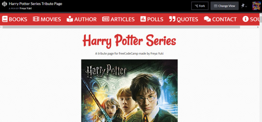
The instructions for the Tribute Page project is here: https://learn.freecodecamp.org/responsive-web-design/responsive-web-design-projects/build-a-tribute-page.
freeCodeCamp Curriculum Lessons Used in the Tribute Page Project
Say Hello to HTML Elements
Headline with the h2 Element
Inform with the Paragraph Element
Fill in the Blank with Placeholder Text
Uncomment HTML
Comment out HTML
Delete HTML Elements
Introduction to HTML5 Elements
Add Images to Your Website
Link to External Pages with Anchor Elements
Link to Internal Sections of a Page with Anchor Elements
Nest an Anchor Element within a Paragraph
Make Dead Links Using the Hash Symbol
Turn an Image into a Link
Create a Bulleted Unordered List
Nest Many Elements within a Single div Element
Create an Ordered List
Change the Color of Text
Use CSS Selectors to Style Elements
Use a CSS Class to Style an Element
Style Multiple Elements with a CSS Class
Change the Font Size of an Element
Set the Font Family of an Element
Import a Google Font
Specify How Fonts Should Degrade
Size Your Images
Set the id of an Element
Give a Background Color to a div Element
Use an id Attribute to Style an Element
Adjust the Padding of an Element
Adjust the Margin of an Element
Style the HTML Body Element
Inherit Styles from the Body Element
Use Hex Code for Specific Colors
Use Hex Code to Mix Colors
Use Abbreviated Hex Code
Create Visual Balance Using the text-align Property
Use the strong Tag to Make Text Bold
Use the em Tag to Italicize Text
Decrease the Opacity of an Element
Use the text-transform Property to Make Text Uppercase
Set the font-size for Multiple Heading Elements
Set the font-weight for Multiple Heading Elements
Set the font-size of Paragraph Text
Adjust the Hover State of an Anchor Tag
Use RGB values to Color Elements
Use RGB to Mix Colors
Use the u Tag to Underline Text
Add a box-shadow to a Card-like Element
Use the CSS Transform scale Property to Scale an Element on Hover
Add Borders Around Your Elements
Add Rounded Corners with border-radius
Create a Horizontal Line Using the hr Element
Add Different Padding to Each Side of an Element
Add Different Margins to Each Side of an Element
Use Clockwise Notation to Specify the Padding of an Element
Use Clockwise Notation to Specify the Margin of an Element
Adjust the Width of an Element Using the width Property
Adjust the Height of an Element Using the height Property
Adjust the Size of a Header Versus a Paragraph Tag
Center an Element Horizontally Using the margin Property
Add a Text Alternative to Images for Visually Impaired Accessibility
Create a Media Query
Make an Image Responsive
Understand Absolute versus Relative Units
Set the line-height of Paragraphs
Use the CSS Transform scale Property to Change the Size of an Element
Use Headings to Show Hierarchical Relationships of Content
Jump Straight to the Content Using the main Element
Wrap Content in the article Element
Make Screen Reader Navigation Easier with the header Landmark
Make Screen Reader Navigation Easier with the nav Landmark
Improve Chart Accessibility with the figure Element
Improve Readability with High Contrast Text
Avoid Colorblindness Issues by Using Sufficient Contrast
Avoid Colorblindness Issues by Carefully Choosing Colors that Convey Information
Give Links Meaning by Using Descriptive Link Text
Make Links Navigatable with HTML Access Keys
Use display: flex to Position Two Boxes
Add Flex Superpowers to the Tweet Embed
Use the flex-direction Property to Make a Row
Apply the flex-direction Property to Create Rows in the Tweet Embed
Use the flex-direction Property to Make a Column
Apply the flex-direction Property to Create a Column in the Tweet Embed
Align Elements Using the justify-content Property
Use the justify-content Property in the Tweet Embed
Align Elements Using the align-items Property
Use the align-items Property in the Tweet Embed
Use the flex-wrap Property to Wrap a Row or Column
Use the flex-shrink Property to Shrink Items
Use the flex-grow Property to Expand Items
Use the flex-basis Property to Set the Initial Size of an Item
Use the flex Shorthand Property
Use Attribute Selectors to Style Elements
Create a Text Field
Add Placeholder Text to a Text Field
Create a Form Element
Add a Submit Button to a Form
Use HTML5 to Require a Field
Create a Set of Radio Buttons
Improve Form Field Accessibility with the label Element
Wrap Radio Buttons in a fieldset Element for Better Accessibility
Use tabindex to Add Keyboard Focus to an Element
Use tabindex to Specify the Order of Keyboard Focus for Several Elements
Prioritize One Style Over Another
Override Styles in Subsequent CSS
Adjust the background-color Property of Text
Create a Gradual CSS Linear Gradient
Create a Set of Checkboxes
Check Radio Buttons and Checkboxes by Default
Add an Accessible Date Picker
Learn about Complementary Colors
Learn about Tertiary Colors
Adjust the Color of Various Elements to Complementary Colors
Adjust the Hue of a Color
Adjust the Tone of a Color
Make Circular Images with a border-radius
Learn How the CSS @keyframes and animation Properties Work
Use CSS Variables to change several elements at once
Create a custom CSS Variable
Use a custom CSS Variable
Attach a Fallback value to a CSS Variable
Use the CSS Transform Property skewX to Skew an Element Along the X-Axis
Use the CSS Transform Property skewY to Skew an Element Along the Y-Axis
Make Screen Reader Navigation Easier with the footer Landmark
Create Texture by Adding a Subtle Pattern as a Background Image
Define the Head and Body of an HTML Document
Use a CSS Linear Gradient to Create a Striped Element
Use CSS Animation to Change the Hover State of a Button
Modify Fill Mode of an Animation
Use the order Property to Rearrange Items
Use the align-self Property
Override Class Declarations with Inline Styles
Override Class Declarations by Styling ID Attributes
Change Animation Timing with Keywords
Use a Retina Image for Higher Resolution Displays
Know When Alt Text Should be Left Blank
freeCodeCamp Curriculum Lessons NOT Used in the Tribute Page Project
The following are the freeCodeCamp curriculum lessons that I wasn’t able to use in the Tribute Page project. I really wanted to use all of the lessons for this project. But, unfortunately, it just wasn’t possible. For the next projects, I hope I’ll be able to use these lessons.
All the CSS Grid lessons - initially I wanted to make the Tribute Page using both Flexbox and CSS Grid. But I decided that it would be better to focus on just one layout per project. For the Tribute Page, I decided to go with the Flexbox layout
Improve Accessibility of Audio Content with the audio Element - the Tribute Page doesn’t have any audio
Declare the Doctype of an HTML Document - I’m using CodePen to make the Tribute Page, so the Doctype has already automatically been declared
Create a Graphic Using CSS
Create a More Complex Shape Using CSS and HTML
Make a CSS Heartbeat using an Infinite Animation Count
Create Movement Using CSS Animation
Create Visual Direction by Fading an Element from Left to Right - I did use opacity, but not for fading an element from left to right. Instead, I used it to change the appearance of images and links on hover
Animate Elements Continually Using an Infinite Animation Count
Animate Elements at Variable Rates
Animate Multiple Elements at Variable Rates
Learn How Bezier Curves Work
Use a Bezier Curve to Move a Graphic
Make Motion More Natural Using a Bezier Curve
Use the s Tag to Strikethrough Text
Push Elements Left or Right with the float Property - I used the flexbox layout, so I didn’t have to float anything
Change the Position of Overlapping Elements with the z-index Property
Lock an Element to the Browser Window with Fixed Positioning
Change an Element's Relative Position
Move a Relatively Positioned Element with CSS Offsets
Lock an Element to its Parent with Absolute Positioning
Standardize Times with the HTML5 datetime Attribute
Make Elements Only Visible to a Screen Reader by Using Custom CSS
Add a Negative Margin to an Element
Override All Other Styles by using Important
Cascading CSS variables - I did make a CSS variable, but I didn’t add it to :root since it was only for a specific element
Change a variable for a specific area
Use a media query to change a variable
Make Typography Responsive - I used rem for the font sizes, not viewport units
#web development#web design#freecodecamp#harry potter#jk rowling#harry potter series#flexbox#html#css#scss#sass#responive web design#coding#web design project#responsive web design project#tribute page#css preprocessor
0 notes
Text
BASICS OF HTML / CHEATSHEET
BASICS OF HTML / CHEATSHEET
Some of the most basic HTML you will use up-front will look a bit like this:
Basic Tags
<html></html> Creates an HTML document
<head></head> Sets off the title and other information that isn’t displayed on the web page itself
<body></body> Sets off the visible portion of the document
HTML Basic Document
<!DOCTYPE html> <html> <head> <title>Title of document goes here</title> </head>
<body> Visible text goes here... </body>
</html>
Basic Tags
<h1>Largest Heading</h1>
<h2> . . . </h2>
<h3> . . . </h3>
<h4> . . . </h4>
<h5> . . . </h5>
<h6>Smallest Heading</h6>
<p>This is a paragraph.</p>
<br> (line break)
<hr> (horizontal rule)
<!-- This is a comment -->
Body Attributes
<body bgcolor="pink"> Sets the background color, using name or hex value
<body text="black"> Sets the text color, using name or hex value
<body link="blue"> Sets the color of links, using name or hex value
<body vlink="#ff0000"> Sets the color of followed links, using name or hex value
<body alink="#00ff00"> Sets the color of links on click
<body ondragstart="return false" onselectstart="return false"> Disallows text selection with the mouse and keyboard
Text Tags
<pre></pre> Creates preformatted text
<hl></hl> Creates the largest headline
<h6></h6> Creates the smallest headline
<b></b> Creates bold text
<i></i> Creates italic text
<tt></tt> Creates teletype, or typewriter-style text
<cite></cite> Creates a citation, usually italic
<em></em> Emphasizes a word (with italic or bold)
<strong></strong> Emphasizes a word (with italic or bold)
<font size="3"></font> Sets size of font, from 1 to 7
<font color="green"></font> Sets font color, using name or hex value
<b>Bold text</b>
<code>Computer code</code>
<em>Emphasized text</em>
<i>Italic text</i>
<kbd>Keyboard input</kbd>
<pre>Preformatted text</pre>
<small>Smaller text</small>
<strong>Important text</strong>
<abbr> (abbreviation)
<address> (contact information)
<bdo> (text direction)
<blockquote> (a section quoted from another source)
<cite> (title of a work)
<del> (deleted text)
<ins> (inserted text)
<sub> (subscripted text)
<sup> (superscripted text)
Links
<a href="URL"></a> Creates a hyperlink
<a href="mailto:EMAIL"></a> Creates a mailto link
<a href="URL"><img src="URL"> </a> Creates an image/link
<a name="NAME"></a> Creates a target location within a document
<a href="#NAME"></a> Links to that target location from elsewhere in the document
Ordinary link: <a href="http://www.example.com/">Link-text goes here</a>
Image-link: <a href="http://www.example.com/"><img src="URL" alt="Alternate Text"></a>
Mailto link: <a href="mailto:[email protected]">Send e-mail</a>
Bookmark: <a id="tips">Tips Section</a> <a href="#tips">Jump to the Tips Section</a>
Images
<img src="URL" alt="Alternate Text" height="42" width="42">
Styles/Sections
<style type="text/css"> h1 {color:red;} p {color:blue;} </style>
<div>A block-level section in a document</div> <span>An inline section in a document</span>
Unordered list
<ul> <li>Item</li> <li>Item</li> </ul>
Ordered list
<ol> <li>First item</li> <li>Second item</li> </ol>
Definition list
<dl> <dt>Item 1</dt> <dd>Describe item 1</dd> <dt>Item 2</dt> <dd>Describe item 2</dd> </dl>
Tables
<table border="1"> <tr> <th>table header</th> <th>table header</th> </tr> <tr> <td>table data</td> <td>table data</td> </tr> </table>
Formatting
<p></p> Creates a new paragraph
<p align="left"> Aligns a paragraph to the left (default), right, or center.
<br> Inserts a line break
<blockquote></blockquote> Indents text from both sides
<dl></dl> Creates a definition list
<dt> Precedes each definition term
<dd> Precedes each definition
<ol></ol> Creates a numbered list
<ul></ul> Creates a bulleted list
<li></li> Precedes each list item, and adds a number or symbol depending upon the type of list selected
<div align="left"> A generic tag used to format large blocks of HTML, also used for stylesheets
<img src="name"> Adds an image
<img src="name" align="left"> Aligns an image: left, right, center; bottom, top, middle
<img src="name" border="1"> Sets size of border around an image
<hr /> Inserts a horizontal rule
<hr size="3" /> Sets size (height) of rule
<hr width="80%" /> Sets width of rule, in percentage or absolute value
<hr noshade /> Creates a rule without a shadow
Tables
<table></table> Creates a table
<tr></tr> Sets off each row in a table
<td></td> Sets off each cell in a row
<th></th> Sets off the table header (a normal cell with bold, centered text)
Table Attributes
<table border="1"> Sets width of border around table cells
<table cellspacing="1"> Sets amount of space between table cells
<table cellpadding="1"> Sets amount of space between a cell’s border and its contents
<table width="500" or "80%"> Sets width of table, in pixels or as a percentage of document width
<tr align="left"> or <td align="left"> Sets alignment for cell(s) (left, center, or right)
<tr valign="top"> or <td valign="top"> Sets vertical alignment for cell(s) (top, middle, or bottom)
<td colspan="2"> Sets number of columns a cell should span (default=1)
<td rowspan="4"> Sets number of rows a cell should span (default=1)
<td nowrap> Prevents the lines within a cell from being broken to fit
Cheatsheets:
http://www.webmonkey.com/2010/02/html_cheatsheet/ http://www.w3schools.com/html/html_quick.asp http://www.simplehtmlguide.com/cheatsheet.php http://www.instructables.com/id/Basic-HTML-code-cheat-sheet/
0 notes
Text
Sending an Email via Outlook Using PowerShell
Recently, our HR department came to us requesting that, if we could, put together a form that would allow for reporting of people’s outstanding vacation time before the end of the calendar.
Seeing as Paylocity didn’t offer anything worthwhile, I offered to write the thing myself assuming, as with most things, how hard could it possibly be?
Honestly? Not all that hard with a few minutes of googling.
Operating under the notion that this problem could most likely be solved via a mail merge, that was the route I initially pursued, which led me to this site. Link to the source, but the meaty bits of it are below for reference:
Requirements
Microsoft Office 2007 or 2010 must be installed on your computer including Word, Excel, and Outlook.
Your PLOW email account must be configured in Microsoft Outlook.
Your PLOW email account must be set to an unlimited message rate. Please contact your District Office and ask to have your account changed to an unlimited rate.
Prepare the recipients list
You should store all of the recipient's information in an Excel spreadsheet.
The first row of the spreadsheet should contain column headings such as First Name, Last Name, and Email Address.
Each recipient's email address must be in a column by itself without the full name, angle brackets, quote marks, or other special characters.
Each recipient's information must be listed on a separate row.
Row and column example with column headings:
Prepare the email message
Start Microsoft Word and begin a new blank document.
Switch to the Mailings ribbon.
Click on the Start Mail Merge menu and select the E-Mail Messages option.
Click on the Select Recipients menu and select the Use Existing List option.
Browse and select the Excel spreadsheet you created earlier, and then click on the Open button.
In the Select Table window, click on the name of the sheet that contains your recipient's information.
Compose the body of your message using Word:
To customize the contents of your message with information from your spreadsheet:
Save the body of the email message the same way you would save any other Word document.
If you have options for Sheet1, Sheet2, and Sheet3, the information is probably on Sheet1.
If you entered column headings in the first row of your spreadsheet, make sure the First row of data contains column headers option is checked.
Click on the OK button.
You can switch back to the Home ribbon to add formatting including bold, italics, font colors, and headings.
Not all formatting will visible to all recipients. Outlook users will see most of the formatting. Web mail users will see bold, italics, and lists but not font styles or colors.
Position the cursor where you want to insert the data.
Switch to the Mailings ribbon.
Click on the Insert Merge Field menu and select the field containing the data you want to insert.
Send the email messages
Switch to the Mailings ribbon.
Click on the Finish & Merge menu and select the Send E-Mail Messages option.
From the To drop-down menu, select the field containing the email address of each recipient.
In the Subject text box, enter the subject line used for the email message.
From the Mail format drop-down menu, select the HTML option.
For the Send records radio button, select the All option.
Click on the OK button to send the messages.
Email Merge Tips
If you customize the message for each recipient, use the Preview Results button on the Mailings ribbon to see the data from your spreadsheet in the body of the message instead of the field names. Use the arrows to right of this button on the ribbon to preview different records from your spreadsheet.
Customizing the email message for each recipient is easiest when the information is split into several columns. For example keeping the first name and last name in separate columns is better than keeping them in a single column called name. You can always put two fields together in your message, but pulling fields apart is much more difficult.
If you send newsletters or flyers as PDF attachments, consider publishing the PDF on your website and then using email merge to send a notice with a link. Later you can check your website's statistics to determine how many people downloaded the PDF.
You may want to add yourself as the first recipient in your spreadsheet so you can test the message delivery. Use the Preview Results button to view the message you will receive. Follow the sending instructions, but change the Send Records option from All to Current. This will send only the message currently being previewed through Outlook.
Realizing that this wasn’t necessarily a panacea so much as it was drudging up more questions that it solved, I opted to dig deeper and see what else I could find. The typical routes - Microsoft, Chron, Superuser, yielded things that looked like answers, but it only drew me in further.
Finally I stumbled on to two sites that had fantastic examples and allowed me to build something from the ground up in VS Code using PowerShell.
The first example comes from: https://www.jasonpearce.com/2016/02/08/mail-merge-email-via-powershells-send-mailmessage/
# This script will perform a mail merge for email from a CSV file # The CSV file must contain a column of email addresses, other columns with other data are optional # Created by Jason Pearce, 2016 February
# #################### # BEGIN Example CSV File (optional) # ####################
# CSV Example: A CSV file that could serve as an example (maybe replace with [email protected] to test) $CSVExample = @" Email,FirstName,LastName [email protected],Aaron,Anders [email protected],Betty,Blue [email protected],Charlie,Cook "@
# CSV File: Optionally create a CSV file to play with $CSVExample = Out-File -FilePath "C:\temp\example-csv-file.csv"
# #################### # END Example CSV file (optional) # ####################
# #################### # BEGIN Variables # ####################
# From: Name and email of sender $EmailFrom = "Your Name <[email protected]>"
# Reporting: Report on Success and Failure (optional) $EmailDeliveryNotificationOption = "onSuccess, onFailure"
# Server: Your Exchange or SMTP server $EmailSMTPserver = "smtp.example.com"
# Users: Tab-delimited list with columns named Name, Email, SamAccountName $SourcePath = "C:\temp\example-csv-file.csv"
# Import: Import the comma-delimited list of users (if tab-delimited, add '-Delimiter "`t"') $Users = Import-Csv -Path $SourcePath
# #################### # END Variables # ####################
# Begin Loop: Do the following with each row of the file you imported, referencing columns by their header foreach ($User in $Users) {
# To: User's email address $EmailTo = $User.Email
# Subject: Email subject (may merge variables) $EmailSubject = "A personalized example for " + $User.FirstName + " " + $User.LastName + "."
# Body: Email body, with HTML formatting $EmailBody = "<!DOCTYPE html PUBLIC ""-//W3C//DTD XHTML 1.0 Transitional//EN"" ""http://www.w3.org/TR/xhtml1/DTD/xhtml1-transitional.dtd"">" $EmailBody += "<html xmlns=""http://www.w3.org/1999/xhtml""><head>" $EmailBody += "<meta http-equiv=""Content-Type"" content=""text/html; charset=UTF-8"" />" $EmailBody += "<meta name=""viewport"" content=""width=device-width, initial-scale=1.0""/>" $EmailBody += "<title>" + $EmailSubject + "</title>" $EmailBody += "</head><body bgcolor=""#FFFFFF"" style=""font-family: sans-serif; color: #000000"">" $EmailBody += "<p>Dear " + $User.FirstName + ":</p>" $EmailBody += "<p>Lorem ipsum dolor sit amet, consectetur adipiscing elit.</p>" $EmailBody += "<p><ul><li>Your First Name: <strong>" + $User.FirstName + "</strong></li>" $EmailBody += "<li>Your Last Name: <strong>" + $User.LastName + "</strong></li>" $EmailBody += "<li>Your Email Address: <strong>" + $User.Email + "</strong></li></ul></p>" $EmailBody += "<p>Phasellus nec sapien sit amet mi maximus venenatis.</p>" $EmailBody += "<p>Sincerely,</p>" $EmailBody += "<p>Your Name</p>" $EmailBody += "</body></html>"
# Merge: Conduct the email merge, sending emails (remove -WhatIf) Send-MailMessage -To $EmailTo -From $EmailFrom -Subject $EmailSubject -Body $EmailBody -BodyAsHTML -SmtpServer $EmailSmtpServer -DeliveryNotificationOption $EmailDeliveryNotificationOption
} # End Loop and Script
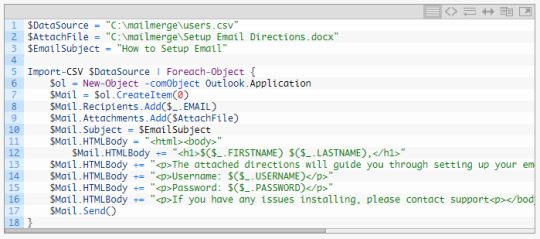
The other site: http://sigkillit.com/2015/02/18/mail-merge-with-attachment/ details the steps as well quite nicely.
Step 1 – Create Data Source
I will use a users.csv as the data source of users we want to email. The users.csv file will look as follows:
FIRSTNAMELASTNAMEEMAILUSERNAMEPASSWORD
Step 2 – Create Outlook Profile to Send Mail Merge From
Now that you have your data source, you’ll need to make sure you have an Outlook profile. This profile should be setup with the email address you wish to send the mail merge from.
Step 3 – Create Powershell Script
In the below powershell script, you’ll need to modify the following variables:
$DataSource – Path to the data source (users.csv) file created in step 1 $AttachFile – Path to the file to attach to the email $EmailSubject – Subject of the email
In addition to modifying the above variables, you’ll need to modify $Mail.Body, which is the body of the email. The below example is referencing data fields in users.csv for the mail merge, which you may want to modify. These correspond as follows:
$($_.FIRSTNAME) – FIRSTNAME field in users.csv
$($_.LASTNAME) – LASTNAME field in users.csv
$($_.USERNAME) – USERNAME field in users.csv
$($_.PASSWORD) – PASSWORD field in users.csv
Special Note: To add a new line in the body text use a backtick + n ( `n)

Extra Special Note: If you want to have the email body be HTML formatted instead of Plain Text, just modify $Mail.Body to $Mail.HTMLBody and add your HTML tags in the text. Using the example above:
Step 4 – Send the Mail Merge
Open Microsoft Outlook with the profile created in step 2 (It is required for Outlook to be open in order for the powershell script to work!) Then open Powershell, and run the powershell script in step 3. You can confirm the emails are sending by looking in the “Sent Items” in Outlook.
Note: – If you’re using User Account Control (UAC), Outlook and Powershell must be running at the same security level. This simply means, if you open powershell using “Run as administrator” you must open Outlook with “Run as administrator”. Alternatively, if you open powershell normally (not elevated) you must open Outlook normally (not elevated).
I found both of these sites to be most helpful out of all the searches I’d performed up to this point. Spiceworks, Technet, MS Docs, and Stack Overflow were relatively helpful in clearing up some oddities, but not enough to address the overall issue.
Using those two sites and the code therein, I was able to generate a .csv in excel and knock out the below PS script:
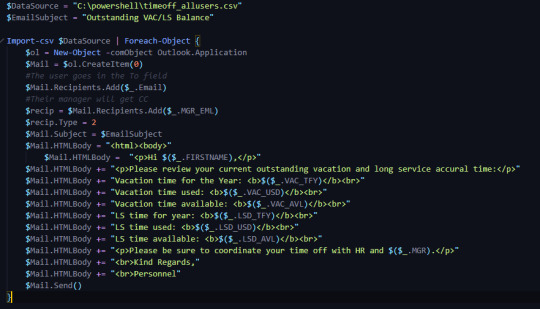
Actually, thinking about it, stack overflow did help me with one persisting issue and that was using the Cc field in addition to the To field to include the users manager. Particularly this thread, which helped me realize that the CreateItem(0) needed an additional numerical type to recognize the process.
After that, it worked as intended.
Overall work and investigating totals out to less than 3 hours once the initial bumps are overcome.
0 notes
Link
One Draycott Condo
One Draycott Condo
One Draycott is a High Anticipated Freehold Development in prime district 10 near to Draycott Park.
One Draycott popularly known as Draycott park, was entirely sold to Champs worth development, which has later sold its 50 % to Selangor Dredging at a price tag of 72 million in the mid of 2017.
One Draycott offers a price per plot ratio of S$1,787 each sq ft. One Draycott apartment consists of 36 residential which involves 2 -3 bedrooms, with dual key units which are also available but in rare vicinity.
There are some extraordinary properties which are prepared throughout the development with sky decks and swimming pools.
The new developmental project is expected to range from S$ 2,700 to S$ 2,800 per sq ft.
The residential area is specially made for personal use which generally shows the chances of redevelopment of the building at a 36 storeys height range.
One Draycott is a wonderful residence one can think of living into the place.
It is surrounded by Ardmore Ark and Claymore hill and has various entertainment and social hub like American club, Tanglin Club and, Goodwood Park.
With its closeness to Orchard Road, One Draycott is just few block away from the city’s main entertainment and shopping area, it is also bundled with lushly landscape gardens.
The residents can also enjoy the Orchard road city skyline along with Marina Bay as scenery, within the residential enclave of Singapore.
One Draycott comes with a doorman facility which booms its development as a lifestyle development.
All the sections of One Draycott come with quality fittings and furnishing, a well designed apartment waits for you and your family.
Details regarding development of One Draycott
Developed by- Selangor DregingBerhad (Champsworth Development Pte Ltd) Tenure: Freehold Location Address: District- 10, 1 Draycott Park, Singapore 259385 Apartment Details 2 Bedroom and a Private Lift Lobby Number of apartments: 36 Exclusive Apartments No. of Blocks: 1 Block Number of Levels: 36 Levels Car Parking Lots: 64 car lots | 2 handicap lots |12 bicycle lots|4Motorcycle lots AnticipatedTOP Date: 6 Sept, 2022 Area of Site: 17,442 sq ft Lan Bidding Price $2,490,000 Architect: CarverHaggard Ltd
Price list
Brochure
Floor Plans
One Draycott Brochure Download
[[[["field1","equal_to","Own Stay"],["field1","equal_to","Investment"]],[["show_fields","field6"],["hide_fields","field1"]],"or"],[[["field6","equal_to","1"],["field6","equal_to","2"],["field6","equal_to","3"],["field6","equal_to","4"],["field6","equal_to","5"],["field6","equal_to","Landed"]],[["show_fields","field3"],["hide_fields","field6"]],"or"],[[["field3","equal_to","1st"],["field3","equal_to","2nd"],["field3","equal_to","3rd"],["field3","equal_to","4th & Above"]],[["show_fields","field29"],["hide_fields","field3"]],"or"],[[["field29","equal_to","600k"],["field29","equal_to","700k"],["field29","equal_to","800k"],["field29","equal_to","900k"],["field29","equal_to","1M"],["field29","equal_to","1.25M"],["field29","not_equal_to","1.5M"],["field29","equal_to","2M"]],[["hide_fields","field29"],["show_fields","field30"]],"or"],[[["field30","contains","ready"],["field30","contains","browsing"],["field30","contains","exploring"]],[["hide_fields","field30"],["show_fields","field18,field31,field19,field35,field10,field28,field36"]],"or"],[[["field18","contains"]],[[]],"and"]]
1 Step 1
@media (max-width : 480px) { .fc_modal-dialog-2 .fc-pagination-cover .fc-pagination { background-color: url(https://ift.tt/2Irpdmj) !important; } } .formcraft-css .fc-form.fc-form-2 .form-element .submit-cover .submit-button, .formcraft-css .fc-form.fc-form-2 .form-element .fileupload-cover .button-file, .formcraft-css .fc-form.fc-form-2 .form-element .field-cover .button, .formcraft-datepicker .ui-datepicker-header, .formcraft-datepicker .ui-datepicker-title { background: #e85e30; color: #fff; } .formcraft-datepicker td .ui-state-active, .formcraft-datepicker td .ui-state-hover, .formcraft-css .fc-form.fc-form-2 .form-element .slider-cover .ui-slider-range { background: #e85e30; } #ui-datepicker-div.formcraft-datepicker .ui-datepicker-header, .formcraft-css .fc-form .field-cover>div.full hr { border-color: #cc522a; } #ui-datepicker-div.formcraft-datepicker .ui-datepicker-prev:hover, #ui-datepicker-div.formcraft-datepicker .ui-datepicker-next:hover, #ui-datepicker-div.formcraft-datepicker select.ui-datepicker-month:hover, #ui-datepicker-div.formcraft-datepicker select.ui-datepicker-year:hover { background-color: #cc522a; } .formcraft-css .fc-pagination>div.active .page-number, .formcraft-css .form-cover-builder .fc-pagination>div:first-child .page-number { background-color: #e9967a; color: #fff; } #ui-datepicker-div.formcraft-datepicker table.ui-datepicker-calendar th, #ui-datepicker-div.formcraft-datepicker table.ui-datepicker-calendar td.ui-datepicker-today a, .formcraft-css .fc-form.fc-form-2 .form-element .star-cover label, html .formcraft-css .fc-form.label-floating .form-element .field-cover.has-focus>span, .formcraft-css .fc-form.fc-form-2 .form-element .customText-cover a, .formcraft-css .prev-next>div span:hover { color: #e85e30; } .formcraft-css .fc-form.fc-form-2 .form-element .customText-cover a:hover { color: #cc522a; } html .formcraft-css .fc-form.fc-form-2.label-floating .form-element .field-cover > span { color: #000000; } html .formcraft-css .fc-form .final-success .final-success-check { border: 2px solid #000000; } .formcraft-css .fc-form.fc-form-2 .form-element .field-cover input[type="text"], .formcraft-css .fc-form.fc-form-2 .form-element .field-cover input[type="email"], .formcraft-css .fc-form.fc-form-2 .form-element .field-cover input[type="password"], .formcraft-css .fc-form.fc-form-2 .form-element .field-cover input[type="tel"], .formcraft-css .fc-form.fc-form-2 .form-element .field-cover textarea, .formcraft-css .fc-form.fc-form-2 .form-element .field-cover select, .formcraft-css .fc-form.fc-form-2 .form-element .field-cover .time-fields-cover, .formcraft-css .fc-form.fc-form-2 .form-element .field-cover .awesomplete ul { color: #000000; } .formcraft-css .fc-form.fc-form-2 .form-element .field-cover input[type="text"], .formcraft-css .fc-form.fc-form-2 .form-element .field-cover input[type="password"], .formcraft-css .fc-form.fc-form-2 .form-element .field-cover input[type="email"], .formcraft-css .fc-form.fc-form-2 .form-element .field-cover input[type="radio"], .formcraft-css .fc-form.fc-form-2 .form-element .field-cover input[type="checkbox"], .formcraft-css .fc-form.fc-form-2 .form-element .field-cover input[type="tel"], .formcraft-css .fc-form.fc-form-2 .form-element .field-cover select, .formcraft-css .fc-form.fc-form-2 .form-element .field-cover textarea { background-color: #fafafa; } .formcraft-css .fc-form.fc-form-2 .form-element .field-cover input[type="radio"]:checked, .formcraft-css .fc-form.fc-form-2 .form-element .field-cover input[type="checkbox"]:checked { border-color: #cc522a; background: #e85e30; } .formcraft-css .fc-form.fc-form-2 .form-element .star-cover label .star { text-shadow: 0px 1px 0px #cc522a; } .formcraft-css .fc-form.fc-form-2 .form-element .slider-cover .ui-slider-range { box-shadow: 0px 1px 1px #cc522a inset; } .formcraft-css .fc-form.fc-form-2 .form-element .fileupload-cover .button-file { border-color: #cc522a; } .formcraft-css .fc-form.fc-form-2 .form-element .form-element-html input[type="password"]:focus, .formcraft-css .fc-form.fc-form-2 .form-element .form-element-html input[type="email"]:focus, .formcraft-css .fc-form.fc-form-2 .form-element .form-element-html input[type="tel"]:focus, .formcraft-css .fc-form.fc-form-2 .form-element .form-element-html input[type="text"]:focus, .formcraft-css .fc-form.fc-form-2 .form-element .form-element-html textarea:focus, .formcraft-css .fc-form.fc-form-2 .form-element .form-element-html select:focus { border-color: #e85e30; } .formcraft-css .fc-form.fc-form-2 .form-element .form-element-html .field-cover .is-read-only:focus { border-color: #ccc; } .formcraft-css .fc-form.fc-form-2 { font-family: Lato; } @media (max-width : 480px) { html .dedicated-page, html .dedicated-page .formcraft-css .fc-pagination > div.active { background: url(https://ift.tt/2Irpdmj); } }
What is the main purpose for this property?
Own StayInvestment
How many bedroom(s) are you looking at?
12345Landed
This will be your __ property
1st2nd3rd4th & Above
How much are you setting aside for this investment?
600k700k800k900k1M1.25M1.5M2M
When are you looking to purchase?
I'm ready to put a deposit if I really like this projectI'm still browsing, please show me more projectsI'm exploring my options, no intention to purchase now
How Do We Address You?
Enter Your Name Hereyour full name
We will send The Florence Residencs brochure, floor plans & price list via WhatsApp.
Mobile (xxxx xxxx)
Get Property Details Now
keyboard_arrow_leftPrevious
Nextkeyboard_arrow_right
One Draycott Location
The One Draycott is 5-7 Mins of Driving distance away from the Nearest CTE via the Balmoral Rd.
One Draycott is one of the best ranking residential property which offers good living in the luxurious residence that is situated in the heart of Singapore with close proximity to Orchard road, with 3 MRT stations and all other amenities.
The One Draycott is located in the lush green field of the One Draycott Parks, in the prime District One0 of Singapore. It is located in the middle of the city and therefore, people who will be living in this property will not be faced any sort of problem regarding anything. The image from the google map shows the location of the One Draycott:
The above picture shows various building and blocks near the One Draycott, as it located in located pin the prominent part of the city.
One Draycott is located walkable distance away from the Newton MRT Station and requires only One0 mins to reach through bus journey.
One Draycott Google Map Location
The Florence Residences Google Street View
The One Draycott is 5-7 Mins of Driving distance away from the Nearest CTE via the Balmoral Rd.
The PIE is 4.5 Km away from One Draycott and can be reached after 6 Mins of Driving from the One Draycott via Thomson Rd.
One Draycott Developer
One Draycott is developed by Champsworth Development Pte Ltd, which is a trustworthy Selangor Dredging Berhad.
One Draycott is a new plot which is located in One Draycott Park.
The development consist of 64 residential units of 2 bedroom apartment along with a single tower, all of which are of them are designed to meet the need of large and small families.
The selected apartment will also have a dual key function which will also have a dual functioning key allowing the apartment homes to rent their space without having to worry about the loss of privacy.
The residences of One Draycott will never face any sort of lack as the development is filled with an assortment of facilities where one can easily entertain in that place.
There are children parks available near to One Draycott which act as an entertainment ground for the children living in the residence.
The residents will also be able to organize a family get-together to enjoy the beautiful evening of barbeque food with the outdoor barbeque pits at their service.
Fitness freaks will also be able to complete their daily workout at the indoor gym and Lap pool.
Moreover that residents will also be able to access the view of the Orchard Road City Skyline with the Marina Bay as a backdrop, from the luxury of their apartments.
One Draycott is just a minute drive away from Newton MRT station, Orchard MRT station.
It also provides the residents with an easy access to other parts of the island.
The development is also well connected to major expressway allowing the residents to get access to various parts of the island with great ease.
With such types of attractive connectivity One Draycott is the embodiment of conveniences.
Project related news
The developer of One Draycott is Selangor Dredging Berhad, which recently purchased a freehold site in 1 Draycott Park in collaboration with Champsworth Development Pte Ltd.
He owned the 50 percent share in the District 10 area and brought it for a price of $72 million.
For the couples who want to purchase a plot in Singapore can invest around $1800 (psf ppr) for leading an amazing life in the luxurious residential area of One Draycott.
The deal that was brokered by Savills Singapore approximated the breakeven price for the new development in between $2,700 and $ 2,800 psf determined by the quality of the last product.
A seven-storey building was there on the site which was built in the year 1990s.
The building has eight apartments varying from 860sq.ft to 6,200 sq ft.
The site was meant for residential area with a plot ratio of 2.8. The buildings in the site can again be re-build with a height of 36 storeys.
The site is located in the residential area of Ardmore Ark & Claymore that is near to Goodwood Park Hotel, American Club and Tanglin club.
Orchard Road is a walking distance from 1 Draycott. 70 percent of the property and its development will be funded by bank borrowing and internal funding.
In December last year, developer Selangor Dredging brought a freehold land of 31,705 sqft from National Aerated Water Company for $47 million.
One Draycott Amenities
One Draycott is going to give you the best facilities that you are searching for which includes all the stunning and luxurious pieces of real estate to live in.
The transportation facilities are easy to access as Newton MRT and Orchard MRT stations are within a range of 1 km.
More over many essential and luxurious medical facilities, shopping centers and clubs are also readily available.
Even if someone is looking to admit their young ones in a renowned educational centre, they don’t have to worry as Etonhouse International, International Singapore School, Saint Joseph Institute, AXA University and many more are nearby One Draycott.
Amenity Distance (If Travelling through Car) TRANSPORTATION Orchard MRT Station 4 Mins Newton MRT Station One0 Mins SHOPPING Far East Plaza 3 Mins Shaw Centre 4 Mins Tanglin Shopping Mall 6 Mins Tangs Plaza 3 Mins ION Orchard Mall 4 Mins Takashimaya 4 Mins The Paragon 5 Mins EDUCATION Raffles Girl’s School One Min Etonhouse InternationalSchool 7 Mins AXA University 4 Mins Singapore School (ISS) One6 Mins Anglo Chinese School (Junior) 7 Mins Saint Joseph’s Institution 5 Mins CLUBS/ASSOCIATION The Tanglin’s Club One Mins American Club One Mins Japan CreativeCentre 8 Mins Raffle’s Town Club 6 Mins HOSPITALS Mount Elizabeth Medical Centre 6 Mins Mount Elizabeth Hospital 5 Mins Gleneagles Hospital 8 Mins
Enjoy the popular view of NTUC FairPrice Supermarket at One Draycott
Cold Storage Serangoon Central is a fruit shop located near One Draycott
East Plaza is a shopping mall located in the heart of Orchard Road near One Draycott
Take the experience of Ion Orchard Mall near One Draycott
Another place located near the One Draycott is the Hualong Fish Head Steamboat, which is popular for its signature dish- Charcoal Fish Head Steamboat.
All the people who would live in the One Draycott will be walking distance away from the Newton MRT station.
Price list
Brochure
Floor Plans
One Draycott Floor Plan Download
[[[["field1","equal_to","Own Stay"],["field1","equal_to","Investment"]],[["show_fields","field6"],["hide_fields","field1"]],"or"],[[["field6","equal_to","1"],["field6","equal_to","2"],["field6","equal_to","3"],["field6","equal_to","4"],["field6","equal_to","5"],["field6","equal_to","Landed"]],[["show_fields","field3"],["hide_fields","field6"]],"or"],[[["field3","equal_to","1st"],["field3","equal_to","2nd"],["field3","equal_to","3rd"],["field3","equal_to","4th & Above"]],[["show_fields","field29"],["hide_fields","field3"]],"or"],[[["field29","equal_to","600k"],["field29","equal_to","700k"],["field29","equal_to","800k"],["field29","equal_to","900k"],["field29","equal_to","1M"],["field29","equal_to","1.25M"],["field29","not_equal_to","1.5M"],["field29","equal_to","2M"]],[["hide_fields","field29"],["show_fields","field30"]],"or"],[[["field30","contains","ready"],["field30","contains","browsing"],["field30","contains","exploring"]],[["hide_fields","field30"],["show_fields","field18,field31,field19,field35,field10,field28,field36"]],"or"],[[["field18","contains"]],[[]],"and"]]
1 Step 1
@media (max-width : 480px) { .fc_modal-dialog-2 .fc-pagination-cover .fc-pagination { background-color: url(https://ift.tt/2Irpdmj) !important; } } .formcraft-css .fc-form.fc-form-2 .form-element .submit-cover .submit-button, .formcraft-css .fc-form.fc-form-2 .form-element .fileupload-cover .button-file, .formcraft-css .fc-form.fc-form-2 .form-element .field-cover .button, .formcraft-datepicker .ui-datepicker-header, .formcraft-datepicker .ui-datepicker-title { background: #e85e30; color: #fff; } .formcraft-datepicker td .ui-state-active, .formcraft-datepicker td .ui-state-hover, .formcraft-css .fc-form.fc-form-2 .form-element .slider-cover .ui-slider-range { background: #e85e30; } #ui-datepicker-div.formcraft-datepicker .ui-datepicker-header, .formcraft-css .fc-form .field-cover>div.full hr { border-color: #cc522a; } #ui-datepicker-div.formcraft-datepicker .ui-datepicker-prev:hover, #ui-datepicker-div.formcraft-datepicker .ui-datepicker-next:hover, #ui-datepicker-div.formcraft-datepicker select.ui-datepicker-month:hover, #ui-datepicker-div.formcraft-datepicker select.ui-datepicker-year:hover { background-color: #cc522a; } .formcraft-css .fc-pagination>div.active .page-number, .formcraft-css .form-cover-builder .fc-pagination>div:first-child .page-number { background-color: #e9967a; color: #fff; } #ui-datepicker-div.formcraft-datepicker table.ui-datepicker-calendar th, #ui-datepicker-div.formcraft-datepicker table.ui-datepicker-calendar td.ui-datepicker-today a, .formcraft-css .fc-form.fc-form-2 .form-element .star-cover label, html .formcraft-css .fc-form.label-floating .form-element .field-cover.has-focus>span, .formcraft-css .fc-form.fc-form-2 .form-element .customText-cover a, .formcraft-css .prev-next>div span:hover { color: #e85e30; } .formcraft-css .fc-form.fc-form-2 .form-element .customText-cover a:hover { color: #cc522a; } html .formcraft-css .fc-form.fc-form-2.label-floating .form-element .field-cover > span { color: #000000; } html .formcraft-css .fc-form .final-success .final-success-check { border: 2px solid #000000; } .formcraft-css .fc-form.fc-form-2 .form-element .field-cover input[type="text"], .formcraft-css .fc-form.fc-form-2 .form-element .field-cover input[type="email"], .formcraft-css .fc-form.fc-form-2 .form-element .field-cover input[type="password"], .formcraft-css .fc-form.fc-form-2 .form-element .field-cover input[type="tel"], .formcraft-css .fc-form.fc-form-2 .form-element .field-cover textarea, .formcraft-css .fc-form.fc-form-2 .form-element .field-cover select, .formcraft-css .fc-form.fc-form-2 .form-element .field-cover .time-fields-cover, .formcraft-css .fc-form.fc-form-2 .form-element .field-cover .awesomplete ul { color: #000000; } .formcraft-css .fc-form.fc-form-2 .form-element .field-cover input[type="text"], .formcraft-css .fc-form.fc-form-2 .form-element .field-cover input[type="password"], .formcraft-css .fc-form.fc-form-2 .form-element .field-cover input[type="email"], .formcraft-css .fc-form.fc-form-2 .form-element .field-cover input[type="radio"], .formcraft-css .fc-form.fc-form-2 .form-element .field-cover input[type="checkbox"], .formcraft-css .fc-form.fc-form-2 .form-element .field-cover input[type="tel"], .formcraft-css .fc-form.fc-form-2 .form-element .field-cover select, .formcraft-css .fc-form.fc-form-2 .form-element .field-cover textarea { background-color: #fafafa; } .formcraft-css .fc-form.fc-form-2 .form-element .field-cover input[type="radio"]:checked, .formcraft-css .fc-form.fc-form-2 .form-element .field-cover input[type="checkbox"]:checked { border-color: #cc522a; background: #e85e30; } .formcraft-css .fc-form.fc-form-2 .form-element .star-cover label .star { text-shadow: 0px 1px 0px #cc522a; } .formcraft-css .fc-form.fc-form-2 .form-element .slider-cover .ui-slider-range { box-shadow: 0px 1px 1px #cc522a inset; } .formcraft-css .fc-form.fc-form-2 .form-element .fileupload-cover .button-file { border-color: #cc522a; } .formcraft-css .fc-form.fc-form-2 .form-element .form-element-html input[type="password"]:focus, .formcraft-css .fc-form.fc-form-2 .form-element .form-element-html input[type="email"]:focus, .formcraft-css .fc-form.fc-form-2 .form-element .form-element-html input[type="tel"]:focus, .formcraft-css .fc-form.fc-form-2 .form-element .form-element-html input[type="text"]:focus, .formcraft-css .fc-form.fc-form-2 .form-element .form-element-html textarea:focus, .formcraft-css .fc-form.fc-form-2 .form-element .form-element-html select:focus { border-color: #e85e30; } .formcraft-css .fc-form.fc-form-2 .form-element .form-element-html .field-cover .is-read-only:focus { border-color: #ccc; } .formcraft-css .fc-form.fc-form-2 { font-family: Lato; } @media (max-width : 480px) { html .dedicated-page, html .dedicated-page .formcraft-css .fc-pagination > div.active { background: url(https://ift.tt/2Irpdmj); } }
What is the main purpose for this property?
Own StayInvestment
How many bedroom(s) are you looking at?
12345Landed
This will be your __ property
1st2nd3rd4th & Above
How much are you setting aside for this investment?
600k700k800k900k1M1.25M1.5M2M
When are you looking to purchase?
I'm ready to put a deposit if I really like this projectI'm still browsing, please show me more projectsI'm exploring my options, no intention to purchase now
How Do We Address You?
Enter Your Name Hereyour full name
We will send The Florence Residencs brochure, floor plans & price list via WhatsApp.
Mobile (xxxx xxxx)
Get Property Details Now
keyboard_arrow_leftPrevious
Nextkeyboard_arrow_right
One Draycott Investment Opportunities
One Draycott is one of the top-ranking residential properties and is located at the heart of the Singapore. It is located near the Orchard Road and the MRT station, which is within the walking distance; and has all the required amenities near it. The main amenities near the property are well recognized schools & university like International Singapore School, Raffles Girls School,Etonhouse International School, Chatsworth International School and the AXA University; and Hospitals like- Mount Elizabeth,Paragon andGleneagles. The architecture of One Draycott is beautiful and the artwork in the property is done by the extraordinary artists Anna and David Hiscock, which is just beautiful. Due to all the luxury and the amenities, that are provided by the One Draycott, it is the anticipated to be one of the most sought-after property.
One Draycott Schools
World class medical centers and hospitals such as Paragon, Gleneagles, and the Mount Elizabeth are just few miles away, whereas top graded educational institutes such as International Singapore School, Raffles Girl School, Chatsworth International School, AXA University and Etonhouse International School are nearby.
If you have children and want to enroll them into a good school near yourhome, then One Draycott is the place for you, as it is located near various world class schools.
EDUCATION Raffles Girl’s School One Min Etonhouse InternationalSchool 7 Mins AXA University 4 Mins Singapore School (ISS) One6 Mins Anglo Chinese School (Junior) 7 Mins Saint Joseph’s Institution 5 Mins
The one Draycott is located near Anglo Chinese Primary school.
The One Draycott is walkable distance away from the River Valley Primary School.
Singapore Chinese Girls’ Primary School is an international school, which is located near the One Draycott residence.
St. Joseph’s International Schools is also located at the vicinity of the One Draycott.
One Draycott Facilities
The view of sky touching buildings from the apartment is simply fascinating.
The verandah at One Draycott has enough space and there’s greenery all around in order to soothe your eyes.
The swimming pool is built in the housing development is spacious and has state of the art facilities.
The one Draycott apartments have beautiful living room attached to a balcony.
The beautiful kitchen of the 1 Draycott, which has all the facilities that you would require while cooking food.
An entrance to a beautiful tall building apartment of One Draycott.
One Draycott Floor Plan
One Draycott Floor Plan A1 PH
One Draycott Floor Plan A1
One Draycott Floor Plan A2 PH One Draycott Floor Plan A2
One Draycott Floor Plan B1
One Draycott Floor Plan B1 PH
One Draycott Floor Plan B2 PH
One Draycott Floor Plan B2
Price list
Brochure
Floor Plans
One Draycott Price Download
[[[["field1","equal_to","Own Stay"],["field1","equal_to","Investment"]],[["show_fields","field6"],["hide_fields","field1"]],"or"],[[["field6","equal_to","1"],["field6","equal_to","2"],["field6","equal_to","3"],["field6","equal_to","4"],["field6","equal_to","5"],["field6","equal_to","Landed"]],[["show_fields","field3"],["hide_fields","field6"]],"or"],[[["field3","equal_to","1st"],["field3","equal_to","2nd"],["field3","equal_to","3rd"],["field3","equal_to","4th & Above"]],[["show_fields","field29"],["hide_fields","field3"]],"or"],[[["field29","equal_to","600k"],["field29","equal_to","700k"],["field29","equal_to","800k"],["field29","equal_to","900k"],["field29","equal_to","1M"],["field29","equal_to","1.25M"],["field29","not_equal_to","1.5M"],["field29","equal_to","2M"]],[["hide_fields","field29"],["show_fields","field30"]],"or"],[[["field30","contains","ready"],["field30","contains","browsing"],["field30","contains","exploring"]],[["hide_fields","field30"],["show_fields","field18,field31,field19,field35,field10,field28,field36"]],"or"],[[["field18","contains"]],[[]],"and"]]
1 Step 1
@media (max-width : 480px) { .fc_modal-dialog-2 .fc-pagination-cover .fc-pagination { background-color: url(https://ift.tt/2Irpdmj) !important; } } .formcraft-css .fc-form.fc-form-2 .form-element .submit-cover .submit-button, .formcraft-css .fc-form.fc-form-2 .form-element .fileupload-cover .button-file, .formcraft-css .fc-form.fc-form-2 .form-element .field-cover .button, .formcraft-datepicker .ui-datepicker-header, .formcraft-datepicker .ui-datepicker-title { background: #e85e30; color: #fff; } .formcraft-datepicker td .ui-state-active, .formcraft-datepicker td .ui-state-hover, .formcraft-css .fc-form.fc-form-2 .form-element .slider-cover .ui-slider-range { background: #e85e30; } #ui-datepicker-div.formcraft-datepicker .ui-datepicker-header, .formcraft-css .fc-form .field-cover>div.full hr { border-color: #cc522a; } #ui-datepicker-div.formcraft-datepicker .ui-datepicker-prev:hover, #ui-datepicker-div.formcraft-datepicker .ui-datepicker-next:hover, #ui-datepicker-div.formcraft-datepicker select.ui-datepicker-month:hover, #ui-datepicker-div.formcraft-datepicker select.ui-datepicker-year:hover { background-color: #cc522a; } .formcraft-css .fc-pagination>div.active .page-number, .formcraft-css .form-cover-builder .fc-pagination>div:first-child .page-number { background-color: #e9967a; color: #fff; } #ui-datepicker-div.formcraft-datepicker table.ui-datepicker-calendar th, #ui-datepicker-div.formcraft-datepicker table.ui-datepicker-calendar td.ui-datepicker-today a, .formcraft-css .fc-form.fc-form-2 .form-element .star-cover label, html .formcraft-css .fc-form.label-floating .form-element .field-cover.has-focus>span, .formcraft-css .fc-form.fc-form-2 .form-element .customText-cover a, .formcraft-css .prev-next>div span:hover { color: #e85e30; } .formcraft-css .fc-form.fc-form-2 .form-element .customText-cover a:hover { color: #cc522a; } html .formcraft-css .fc-form.fc-form-2.label-floating .form-element .field-cover > span { color: #000000; } html .formcraft-css .fc-form .final-success .final-success-check { border: 2px solid #000000; } .formcraft-css .fc-form.fc-form-2 .form-element .field-cover input[type="text"], .formcraft-css .fc-form.fc-form-2 .form-element .field-cover input[type="email"], .formcraft-css .fc-form.fc-form-2 .form-element .field-cover input[type="password"], .formcraft-css .fc-form.fc-form-2 .form-element .field-cover input[type="tel"], .formcraft-css .fc-form.fc-form-2 .form-element .field-cover textarea, .formcraft-css .fc-form.fc-form-2 .form-element .field-cover select, .formcraft-css .fc-form.fc-form-2 .form-element .field-cover .time-fields-cover, .formcraft-css .fc-form.fc-form-2 .form-element .field-cover .awesomplete ul { color: #000000; } .formcraft-css .fc-form.fc-form-2 .form-element .field-cover input[type="text"], .formcraft-css .fc-form.fc-form-2 .form-element .field-cover input[type="password"], .formcraft-css .fc-form.fc-form-2 .form-element .field-cover input[type="email"], .formcraft-css .fc-form.fc-form-2 .form-element .field-cover input[type="radio"], .formcraft-css .fc-form.fc-form-2 .form-element .field-cover input[type="checkbox"], .formcraft-css .fc-form.fc-form-2 .form-element .field-cover input[type="tel"], .formcraft-css .fc-form.fc-form-2 .form-element .field-cover select, .formcraft-css .fc-form.fc-form-2 .form-element .field-cover textarea { background-color: #fafafa; } .formcraft-css .fc-form.fc-form-2 .form-element .field-cover input[type="radio"]:checked, .formcraft-css .fc-form.fc-form-2 .form-element .field-cover input[type="checkbox"]:checked { border-color: #cc522a; background: #e85e30; } .formcraft-css .fc-form.fc-form-2 .form-element .star-cover label .star { text-shadow: 0px 1px 0px #cc522a; } .formcraft-css .fc-form.fc-form-2 .form-element .slider-cover .ui-slider-range { box-shadow: 0px 1px 1px #cc522a inset; } .formcraft-css .fc-form.fc-form-2 .form-element .fileupload-cover .button-file { border-color: #cc522a; } .formcraft-css .fc-form.fc-form-2 .form-element .form-element-html input[type="password"]:focus, .formcraft-css .fc-form.fc-form-2 .form-element .form-element-html input[type="email"]:focus, .formcraft-css .fc-form.fc-form-2 .form-element .form-element-html input[type="tel"]:focus, .formcraft-css .fc-form.fc-form-2 .form-element .form-element-html input[type="text"]:focus, .formcraft-css .fc-form.fc-form-2 .form-element .form-element-html textarea:focus, .formcraft-css .fc-form.fc-form-2 .form-element .form-element-html select:focus { border-color: #e85e30; } .formcraft-css .fc-form.fc-form-2 .form-element .form-element-html .field-cover .is-read-only:focus { border-color: #ccc; } .formcraft-css .fc-form.fc-form-2 { font-family: Lato; } @media (max-width : 480px) { html .dedicated-page, html .dedicated-page .formcraft-css .fc-pagination > div.active { background: url(https://ift.tt/2Irpdmj); } }
What is the main purpose for this property?
Own StayInvestment
How many bedroom(s) are you looking at?
12345Landed
This will be your __ property
1st2nd3rd4th & Above
How much are you setting aside for this investment?
600k700k800k900k1M1.25M1.5M2M
When are you looking to purchase?
I'm ready to put a deposit if I really like this projectI'm still browsing, please show me more projectsI'm exploring my options, no intention to purchase now
How Do We Address You?
Enter Your Name Hereyour full name
We will send The Florence Residencs brochure, floor plans & price list via WhatsApp.
Mobile (xxxx xxxx)
Get Property Details Now
keyboard_arrow_leftPrevious
Nextkeyboard_arrow_right
One Draycott Price
The One Draycott has 2 Bedroom apartments and the starting amount of the flats is $2.6 Million.
Land Bidding Price:
The Land Bidding Price of One Draycott is S$2,490,000.
He owned the 50 percent share in the District 10 area and brought it for a price of $72 million.
For the couples who want to purchase a plot in Singapore can invest around $1800 (psf ppr) for leading an amazing life in the luxurious residential area of One Draycott.
The deal that was brokered by Savills Singapore approximated the breakeven price for the new development in between $2,700 and $ 2,800 psf determined by the quality of the last product.
A seven-storey building was there on the site which was built in the year 1990s.
The building has eight apartments varying from 860sq.ft to 6,200 sq ft.
The site was meant for residential area with a plot ratio of 2.8. The buildings in the site can again be re-build with a height of 36 storeys.
The site is located in the residential area of Ardmore Ark & Claymore that is near to Goodwood Park Hotel, American Club and Tanglin club.
Orchard Road is a walking distance from 1 Draycott. 70 percent of the property and its development will be funded by bank borrowing and internal funding.
In December last year, developer Selangor Dredging brought a freehold land of 31,705 sqft from National Aerated Water Company for $47 million.
One Draycott Review
Rating for Location
In terms of location, One Draycott is located in the most beautiful place; one will ever want to live in. It is surrounded by beautiful vegetation. The one Draycott is also located in the middle of a happening city; therefore, all the residents will not face any kind of problem and can live according to their lifestyle. Though, the one Draycott is located within the city, it is not influenced by the crowdies and noise of the city and its residents can live a peaceful life in their apartment.Due to all these reasons we will be giving One Draycott “5 stars out of 5” for its location.
Rating for Pricing
In terms of price, the One Draycott is slightly expensive, BUT IN COMPARISON to the luxury and beauty that it offers to its residents, it’s worth it. Therefore, we will be giving One Draycott, “4.5 Stars out of 5” for its pricing.
Rating for Quality
The One Draycott has been developed by Selangor Dredging, designed by Carver Haggard and its artwork is done by Anna and David Hiscock. Due to the effort of all these people, the One Draycott looks beautiful and is well designed. In terms of Quality, we will be giving, One Draycott “4.5 stars out of 5”.
Guidelines For Visiting One Draycott Showflat
Register For One Draycott Showflat Visit
[[[["field15","contains","Yes"]],[["show_fields","field11"],["show_fields","field12"]],"and"],[[["field15","contains","No"]],[["show_fields","field1"],["show_fields","field2"],["show_fields","field16"]],"and"],[[["field12","contains","AM"],["field12","contains","PM"]],[["show_fields","field1,field2,field16"]],"or"]]
1 Step 1
@media (max-width : 480px) { .fc_modal-dialog-3 .fc-pagination-cover .fc-pagination { background-color: none !important; } } .formcraft-css .fc-form.fc-form-3 .form-element .submit-cover .submit-button, .formcraft-css .fc-form.fc-form-3 .form-element .fileupload-cover .button-file, .formcraft-css .fc-form.fc-form-3 .form-element .field-cover .button, .formcraft-datepicker .ui-datepicker-header, .formcraft-datepicker .ui-datepicker-title { background: #4488ee; color: #fff; } .formcraft-datepicker td .ui-state-active, .formcraft-datepicker td .ui-state-hover, .formcraft-css .fc-form.fc-form-3 .form-element .slider-cover .ui-slider-range { background: #4488ee; } #ui-datepicker-div.formcraft-datepicker .ui-datepicker-header, .formcraft-css .fc-form .field-cover>div.full hr { border-color: #3b77d1; } #ui-datepicker-div.formcraft-datepicker .ui-datepicker-prev:hover, #ui-datepicker-div.formcraft-datepicker .ui-datepicker-next:hover, #ui-datepicker-div.formcraft-datepicker select.ui-datepicker-month:hover, #ui-datepicker-div.formcraft-datepicker select.ui-datepicker-year:hover { background-color: #3b77d1; } .formcraft-css .fc-pagination>div.active .page-number, .formcraft-css .form-cover-builder .fc-pagination>div:first-child .page-number { background-color: #4488ee; color: #fff; } #ui-datepicker-div.formcraft-datepicker table.ui-datepicker-calendar th, #ui-datepicker-div.formcraft-datepicker table.ui-datepicker-calendar td.ui-datepicker-today a, .formcraft-css .fc-form.fc-form-3 .form-element .star-cover label, html .formcraft-css .fc-form.label-floating .form-element .field-cover.has-focus>span, .formcraft-css .fc-form.fc-form-3 .form-element .customText-cover a, .formcraft-css .prev-next>div span:hover { color: #4488ee; } .formcraft-css .fc-form.fc-form-3 .form-element .customText-cover a:hover { color: #3b77d1; } html .formcraft-css .fc-form.fc-form-3.label-floating .form-element .field-cover > span { color: #666666; } html .formcraft-css .fc-form .final-success .final-success-check { border: 2px solid #666666; } .formcraft-css .fc-form.fc-form-3 .form-element .field-cover input[type="text"], .formcraft-css .fc-form.fc-form-3 .form-element .field-cover input[type="email"], .formcraft-css .fc-form.fc-form-3 .form-element .field-cover input[type="password"], .formcraft-css .fc-form.fc-form-3 .form-element .field-cover input[type="tel"], .formcraft-css .fc-form.fc-form-3 .form-element .field-cover textarea, .formcraft-css .fc-form.fc-form-3 .form-element .field-cover select, .formcraft-css .fc-form.fc-form-3 .form-element .field-cover .time-fields-cover, .formcraft-css .fc-form.fc-form-3 .form-element .field-cover .awesomplete ul { color: #777; } .formcraft-css .fc-form.fc-form-3 .form-element .field-cover input[type="text"], .formcraft-css .fc-form.fc-form-3 .form-element .field-cover input[type="password"], .formcraft-css .fc-form.fc-form-3 .form-element .field-cover input[type="email"], .formcraft-css .fc-form.fc-form-3 .form-element .field-cover input[type="radio"], .formcraft-css .fc-form.fc-form-3 .form-element .field-cover input[type="checkbox"], .formcraft-css .fc-form.fc-form-3 .form-element .field-cover input[type="tel"], .formcraft-css .fc-form.fc-form-3 .form-element .field-cover select, .formcraft-css .fc-form.fc-form-3 .form-element .field-cover textarea { background-color: #fafafa; } .formcraft-css .fc-form.fc-form-3 .form-element .field-cover input[type="radio"]:checked, .formcraft-css .fc-form.fc-form-3 .form-element .field-cover input[type="checkbox"]:checked { border-color: #3b77d1; background: #4488ee; } .formcraft-css .fc-form.fc-form-3 .form-element .star-cover label .star { text-shadow: 0px 1px 0px #3b77d1; } .formcraft-css .fc-form.fc-form-3 .form-element .slider-cover .ui-slider-range { box-shadow: 0px 1px 1px #3b77d1 inset; } .formcraft-css .fc-form.fc-form-3 .form-element .fileupload-cover .button-file { border-color: #3b77d1; } .formcraft-css .fc-form.fc-form-3 .form-element .form-element-html input[type="password"]:focus, .formcraft-css .fc-form.fc-form-3 .form-element .form-element-html input[type="email"]:focus, .formcraft-css .fc-form.fc-form-3 .form-element .form-element-html input[type="tel"]:focus, .formcraft-css .fc-form.fc-form-3 .form-element .form-element-html input[type="text"]:focus, .formcraft-css .fc-form.fc-form-3 .form-element .form-element-html textarea:focus, .formcraft-css .fc-form.fc-form-3 .form-element .form-element-html select:focus { border-color: #4488ee; } .formcraft-css .fc-form.fc-form-3 .form-element .form-element-html .field-cover .is-read-only:focus { border-color: #ccc; } .formcraft-css .fc-form.fc-form-3 { font-family: Cabin; } @media (max-width : 480px) { html .dedicated-page, html .dedicated-page .formcraft-css .fc-pagination > div.active { background: none; } }
Bedroom Preferencepick one!
Bedroom Preference 1 Bedroom 2 Bedroom 3 Bedroom 4 Bedroom 5 Bedroom
Interest Levelpick one!
Interest Level Exploring options Ready to put a cheque if I like it
Comfirmpick one!
Confirm appointment date and time now? Yes No
Dateof appointment
date_range
Timepick one!
Time 10AM 11AM 12PM 1PM 2PM 3PM 4PM 5PM 6PM 7PM 8PM 9PM Time to be confirmed later
Name
Mobileyour full name
Register Showflat Visit
keyboard_arrow_leftPrevious
Nextkeyboard_arrow_right
The One Draycott e-Brochure Download
[[[["field1","equal_to","Own Stay"],["field1","equal_to","Investment"]],[["show_fields","field6"],["hide_fields","field1"]],"or"],[[["field6","equal_to","1"],["field6","equal_to","2"],["field6","equal_to","3"],["field6","equal_to","4"],["field6","equal_to","5"],["field6","equal_to","Landed"]],[["show_fields","field3"],["hide_fields","field6"]],"or"],[[["field3","equal_to","1st"],["field3","equal_to","2nd"],["field3","equal_to","3rd"],["field3","equal_to","4th & Above"]],[["show_fields","field29"],["hide_fields","field3"]],"or"],[[["field29","equal_to","600k"],["field29","equal_to","700k"],["field29","equal_to","800k"],["field29","equal_to","900k"],["field29","equal_to","1M"],["field29","equal_to","1.25M"],["field29","not_equal_to","1.5M"],["field29","equal_to","2M"]],[["hide_fields","field29"],["show_fields","field30"]],"or"],[[["field30","contains","ready"],["field30","contains","browsing"],["field30","contains","exploring"]],[["hide_fields","field30"],["show_fields","field18,field31,field19,field35,field10,field28,field36"]],"or"],[[["field18","contains"]],[[]],"and"]]
1 Step 1
@media (max-width : 480px) { .fc_modal-dialog-2 .fc-pagination-cover .fc-pagination { background-color: url(https://ift.tt/2Irpdmj) !important; } } .formcraft-css .fc-form.fc-form-2 .form-element .submit-cover .submit-button, .formcraft-css .fc-form.fc-form-2 .form-element .fileupload-cover .button-file, .formcraft-css .fc-form.fc-form-2 .form-element .field-cover .button, .formcraft-datepicker .ui-datepicker-header, .formcraft-datepicker .ui-datepicker-title { background: #e85e30; color: #fff; } .formcraft-datepicker td .ui-state-active, .formcraft-datepicker td .ui-state-hover, .formcraft-css .fc-form.fc-form-2 .form-element .slider-cover .ui-slider-range { background: #e85e30; } #ui-datepicker-div.formcraft-datepicker .ui-datepicker-header, .formcraft-css .fc-form .field-cover>div.full hr { border-color: #cc522a; } #ui-datepicker-div.formcraft-datepicker .ui-datepicker-prev:hover, #ui-datepicker-div.formcraft-datepicker .ui-datepicker-next:hover, #ui-datepicker-div.formcraft-datepicker select.ui-datepicker-month:hover, #ui-datepicker-div.formcraft-datepicker select.ui-datepicker-year:hover { background-color: #cc522a; } .formcraft-css .fc-pagination>div.active .page-number, .formcraft-css .form-cover-builder .fc-pagination>div:first-child .page-number { background-color: #e9967a; color: #fff; } #ui-datepicker-div.formcraft-datepicker table.ui-datepicker-calendar th, #ui-datepicker-div.formcraft-datepicker table.ui-datepicker-calendar td.ui-datepicker-today a, .formcraft-css .fc-form.fc-form-2 .form-element .star-cover label, html .formcraft-css .fc-form.label-floating .form-element .field-cover.has-focus>span, .formcraft-css .fc-form.fc-form-2 .form-element .customText-cover a, .formcraft-css .prev-next>div span:hover { color: #e85e30; } .formcraft-css .fc-form.fc-form-2 .form-element .customText-cover a:hover { color: #cc522a; } html .formcraft-css .fc-form.fc-form-2.label-floating .form-element .field-cover > span { color: #000000; } html .formcraft-css .fc-form .final-success .final-success-check { border: 2px solid #000000; } .formcraft-css .fc-form.fc-form-2 .form-element .field-cover input[type="text"], .formcraft-css .fc-form.fc-form-2 .form-element .field-cover input[type="email"], .formcraft-css .fc-form.fc-form-2 .form-element .field-cover input[type="password"], .formcraft-css .fc-form.fc-form-2 .form-element .field-cover input[type="tel"], .formcraft-css .fc-form.fc-form-2 .form-element .field-cover textarea, .formcraft-css .fc-form.fc-form-2 .form-element .field-cover select, .formcraft-css .fc-form.fc-form-2 .form-element .field-cover .time-fields-cover, .formcraft-css .fc-form.fc-form-2 .form-element .field-cover .awesomplete ul { color: #000000; } .formcraft-css .fc-form.fc-form-2 .form-element .field-cover input[type="text"], .formcraft-css .fc-form.fc-form-2 .form-element .field-cover input[type="password"], .formcraft-css .fc-form.fc-form-2 .form-element .field-cover input[type="email"], .formcraft-css .fc-form.fc-form-2 .form-element .field-cover input[type="radio"], .formcraft-css .fc-form.fc-form-2 .form-element .field-cover input[type="checkbox"], .formcraft-css .fc-form.fc-form-2 .form-element .field-cover input[type="tel"], .formcraft-css .fc-form.fc-form-2 .form-element .field-cover select, .formcraft-css .fc-form.fc-form-2 .form-element .field-cover textarea { background-color: #fafafa; } .formcraft-css .fc-form.fc-form-2 .form-element .field-cover input[type="radio"]:checked, .formcraft-css .fc-form.fc-form-2 .form-element .field-cover input[type="checkbox"]:checked { border-color: #cc522a; background: #e85e30; } .formcraft-css .fc-form.fc-form-2 .form-element .star-cover label .star { text-shadow: 0px 1px 0px #cc522a; } .formcraft-css .fc-form.fc-form-2 .form-element .slider-cover .ui-slider-range { box-shadow: 0px 1px 1px #cc522a inset; } .formcraft-css .fc-form.fc-form-2 .form-element .fileupload-cover .button-file { border-color: #cc522a; } .formcraft-css .fc-form.fc-form-2 .form-element .form-element-html input[type="password"]:focus, .formcraft-css .fc-form.fc-form-2 .form-element .form-element-html input[type="email"]:focus, .formcraft-css .fc-form.fc-form-2 .form-element .form-element-html input[type="tel"]:focus, .formcraft-css .fc-form.fc-form-2 .form-element .form-element-html input[type="text"]:focus, .formcraft-css .fc-form.fc-form-2 .form-element .form-element-html textarea:focus, .formcraft-css .fc-form.fc-form-2 .form-element .form-element-html select:focus { border-color: #e85e30; } .formcraft-css .fc-form.fc-form-2 .form-element .form-element-html .field-cover .is-read-only:focus { border-color: #ccc; } .formcraft-css .fc-form.fc-form-2 { font-family: Lato; } @media (max-width : 480px) { html .dedicated-page, html .dedicated-page .formcraft-css .fc-pagination > div.active { background: url(https://ift.tt/2Irpdmj); } }
What is the main purpose for this property?
Own StayInvestment
How many bedroom(s) are you looking at?
12345Landed
This will be your __ property
1st2nd3rd4th & Above
How much are you setting aside for this investment?
600k700k800k900k1M1.25M1.5M2M
When are you looking to purchase?
I'm ready to put a deposit if I really like this projectI'm still browsing, please show me more projectsI'm exploring my options, no intention to purchase now
How Do We Address You?
Enter Your Name Hereyour full name
We will send The Florence Residencs brochure, floor plans & price list via WhatsApp.
Mobile (xxxx xxxx)
Get Property Details Now
keyboard_arrow_leftPrevious
Nextkeyboard_arrow_right
Other Projects That You May Be Interested In
Boulevard 88
Boulevard 88 condo is a 154 units of 1-4 bedrooms freehold project, located at Orchard Boulevard, devevloped by CDL and expected to TOP in 2023.
Nyon Condo
Nyon Condo condo is a 92 units of 1-3 bedrooms freehold project, located at 12 Amber Road, devevloped by Aurum Land and expected to TOP in 2023.
8 st thomas
8 st thomas condo is a 250 units of 1-4 bedrooms freehold project, located at 8 & 10 St Thomas Walk, developed by Bukit Sembawang Estates Limited and expected to TOP in 2017.
Stay updated with the latest property news
Subscribe for the latest property news & new launches.
We have received your request. Thank you !
Email
Subscribe
Table Of Content
One Draycott Condo
One Draycott Brochure
One Draycott Location
One Draycott Developer
One Draycott Amenities
One Draycott Investment Opportunities
One Draycott Schools
One Draycott Facilities
One Draycott Floor Plan
One Draycott Price
One Draycott Review
One Draycott Showflat
Price list
Brochure
Floor Plans
The post One Draycott Reivew appeared first on Number One Property.
0 notes
Text
Generate Income Online: How I Make Rs 5000 Weekly Online?
The answer to How I Earn Rs 5000 weekly is here. Read this guide entirely.
The title itself will make you sit oddly to understand what is there in this article that assists you or recommends you earn Rs 5000 weekly by working online.
I can lots of people are always browsing the internet for authentic house based online part-time jobs to make an additional earnings of more than 20000 Rs monthly from their house.
Because in real 9-- 5 Day Jobs does not pay that much income to satisfy your month-to-month financial needs as since your working potential is restricted in there and you will not be made up for what you worked?
AD ⇒ Online information entry tasks available-- Zero Financial investment, ⇒ Earn Rs 300 to Rs 500 per task, ⇒ https://goo.gl/RcAYw4!.?.!⇒ Kind Filling Copy Pasting Work-- Free registration, ⇒ Earn upto Rs 20000 monthly, ⇒ https://goo.gl/RcAYw4
Requirements to begin making online:
Here you spend some time to read this research study report in this article that will provide you an idea to make Rs 5000 weekly online. To make such income you must need some requirements and those are:
✓ A personal computer system or laptop computer ✓ High-Speed Web connection ✓ Email Account (It's a good idea to utilize Gmail) ✓ Bank Account ✓ PayPal or Payza account to get your payments. If you are having all these requirements then you are set prepared
to earn money online. My friend, I desire you to sit for a long time patiently to read what is written in this article so that you never miss this golden opportunity of making money online from house without investment. This article covers some possible methods of online loan making without investing any money from your hand. Tag: How to earn 5000 Rs. in one day by working online anytime on your computer system.
Make Cash from house without financial investment from home based job available in Chennai, Mumbai, Calcutta, Bangalore, Pune and so on 1.)Start from Online Surveys in the house: By operating at Online studies at house you can easily make Rs.50-- Rs.250 per survey by working for about 30Minutes. You will be asked a series
of concerns in the survey and you will be paid if you effectively finished it. What are the studies? Surveys are a set of
questions asked to get a feedback from a group of individuals about a product or service. How do they work? Many international companies are continuously associated with remodeling their product and services to endure in this market and hence they need the real viewpoint from the individuals. So they utilize to conduct online studies on a regular period. How do we earn? No people are all set to invest their time to review or tell their viewpoint. So these business stepped forward to invest millions of dollars on this research study work. How do we participate? We need to register a complimentary account with online survey panels and then require to complete our profile studies. When these study panels get a study they will send us an email invitation to take part in the survey program. Attend the survey, address your opinions, and get paid. Keep in mind: Not all people who
participated the study panel will get a study invitation. Study panels have a state of art software that runs a series of the program to filter irrelevant individuals(individuals who never ever filled profile study, people from the various field, people from lower age etc). Find out how survey panel works? And how do we can get paid?
I suggest this approach securely to generate income online from home since it requires some standard knowledge
about the pattern in the market. 2. )Establish a Gig in Fiverr: What is Fiverr? Fiverr is the world's best market where anybody can hire a people for doing a service or jobs beginning at $5. How can you make? There are many methods to earn here.
One is by selling something begins with $5 or by offering your service(
or )a work beginning from$5. If you are looking for making some additional earnings of Rs.300/-day-to-day then my finest recommendations is to work on Fiverr.
Take at least one job daily for a month will earn you Rs. 300 x 30Days=Rs.9000< img src="https://www.onlinehomeincome.in/wp-content/uploads/2017/11/fiverr-gigs.png" alt
="Fiverr Gigs "width="400"height=" 250 "> How can you get involved? Open Fiverr and register a free account. Gain access to your account and produce a Gig.
Go to" Start Selling "and finish your profile. Submit it for Fiverr approval and when done your Gig will be shown Other comparable websites like Fiverr: Every organisation needs its online presence and every blog writer or web owner can refrain from doing all the tasks on their own. Either they select a staff to bring the job(or)sometimes may contract out something or whatever that depends
on their work. This post might provide some idea of working with Fiverr. There are other great deals of similar websites likes Fiverr
and those are< a href="https://www.upwork.com/"rel =" nofollow noopener"> UpWork,
freelancer, etc, but there the process include in Hiring and outsourcing is a bit riskier and thus it is best to work in Fiverr to make money online weekly from home. 3.) Compose posts for online blogs: If you are well at writing based upon a particular topic then there are greater possibilities to earn money from your skill. 80 out of 100 bloggers are searching for material authors to write contents for their blogs and there is constantly 80 possibilities out there when a brand-new 100 blog site released. Prior to writing articles you need to present a certain qualification to write for a blog or
website.< img src=" https://www.onlinehomeincome.in/wp-content/uploads/2017/11/article-writers-300x164.png"alt=" Short article authors "width= "300" height="164">
Write deep lengthy articles of more than 1500Words so that you can get more pay. Do not fret about who will purchase your articles? There are many websites out there whose prime service is offering posts for bloggers. Article authors like you must open a complimentary account there and finish
your profiles. Submit your short article in the ideal classification. They will display your short article
for sale and on the effective sale, you will be paid. You can easily earn Rs. 5000 weekly without putting much effort. Make a routine of writing a minimum of 1 short article each day. If you paid Rs.250 per short article daily you can get Rs.7500 per month. Spend a minimum of 1-- 2 hrs to write short articles will make you earn decent income every month.
4.)Join Paid to click websites: What are Paid to click websites? Paid to click websites, just called as PTC, a company model that uses instant genuine human traffic to a website or blog site or company and in turn they will pay a small cent of the total up to those visitors for go to these websites. How can you work? Register a totally free account with this list of real paying PTC websites
. Make a routine to log in everyday and view all readily available advertisements in their advertisement page. You will be paid simply for seeing ads like you are enjoying ads on TELEVISION. Pertain to see what are PTC websites and how to earn? Just how much can you make? You will be paid between$ 0.0001 to $ 0.01 depending upon the length of the advertisement you are watching.
All your payments will be made to your Bank account through the online processor such as PayPal or Payza. So you require to open an account with those processors to get your payment. Join many websites and work at the same time to get more income. This technique does not need any financial investment to begin but you can make money for sure. 5. )Start Blogging: Lastly, in this article, I wish to cover an approach that pays
you right off till you give up. This technique needs more perseverance and constant work. Blogging is a huge market where
it is having a big capacity to earn cash online and you can quickly make Rs 5000 weekly and more weekly.
No matter what is your interest are? You can blog about anything. What is blogging? A terrific place to share your ideas, ideas, information's through a web page
in a user legible format. To produce a blog you require to find out programs such as PHP, HTML, CSS or you can use the CMS (content management system)such as WordPress or Blog writer. Do not stress about the subject since there are big varieties of topics available and the internet gives the chance to everyone equally
. If you want to start a blog you need to learn about these4 things: ✓ Need for blogging ✓ Compose important contents ✓ Establish your blog ✓ Express your contents and develop your blog site Required for blogging: So the prime requirement for the blog is to Generating income blogging and for this reason it requires you to select a topic that is hot and trending. If you desire me to recommend, then
I would let you select, "make money online"as a topic since it is still having a heavy number of requests over search engines. Compose valuable contents: So
you have selected your subject now you need contents. Do not worry here too, you are having tools online to offer you the topic to write contents.
Use Google Keyword Research Study Planner, Word stream keyword suggestion tool and
primarily utilize Semrush for better keyword searches. Frame a sentence with that keyword will offer you subject. Research study over the internet
to compose a deep post of about 1500Words or more. Set up your blog: It is time to set up your blog. It includes selecting a finest dependable webhosting and
a suitable domain. You can get one best domain and the webhosting here. Get a reliable hosting strategy and set up WordPress or Blogger due to the fact that it's simple to begin for newbies. Express your contents and construct your blog site: Now begin posting your short articles on your blog daily. Strategy an advertising strategy and execute it to get traffic to your blog.
When you begin receiving traffic then you can start to make loan out of it. I am sure that you can truly make cash blogging if you effectively monetize if
for individuals. Summary: So finally I had revealed my thoughts to make cash online. If you comprehend and follow these strategies then you can quickly earn Rs 5000 weeklyfrom online. If you put your difficult work with devotion you can make more than what I suggested in this short article. I will still upgrade more info later on while in the meantime if you found something intriguing to make cash do share here. Do you wish to state something about this article? (or )do you have any
previous experience that you desire to share? Please comment below.
Source
https://www.onlinehomeincome.in/earn-money-online-how-i-earn-rs5000-weekly-from-online.php
0 notes
Text
Brower Electric - Commit #4 - Current Project Cards
This commit (or series of commits), I built the current project cards and the small footer on the bottom of the page, as well as some minor changes for typos and such.
On Desktop:

On Mobile:

(If you're viewing this post on desktop, sorry about the image quality here)
In Between:
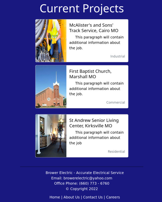
The HTML:
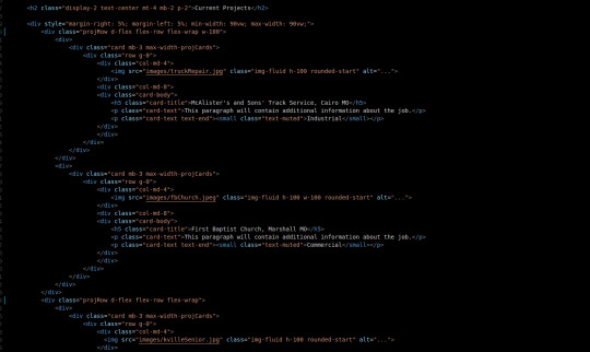
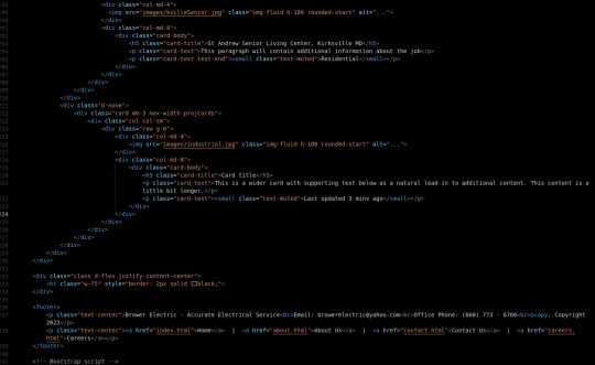
Our Current projects will be contained in a div that is always 90vw wide with 5% margins on either side.
Originally, I wanted to keep everything in a Bootstrap Grid, but they occupy the space between CSS Tables/Grids and Flexboxes. For this particular situation, Flexboxes will be the best utility because the justify-content-between tool sounds like it will be useful for the way I want the responsiveness to work.
There are currently 2 projRow divs with 2 unstyled "col" divs in each that contain one bootstrap card.
The rows are flexed with flex wrap enabled and they take up 100% the width of their parent section.
The cards are the basic Bootstrap 5 card components. They use a grid and have several pre-made breakpoints in the cards and pre-styled classes for card content.
The max-width-projCards helps me control the width of the cards.
We have a div that centers its content. It contains an <hr> (horizontal line) tag that is 75% the width of the page and has a 2px black border.
Then we have our footer. 2 centered <p> tags one has the footer paragraph with <br> tags separating the lines. One is a simple footer nav.
The CSS:

I did not write much custom CSS here. I changed the card-text to black since my default <p> color is white. The title also got some styling to match the page.
The .max-width-projCards sets the max width to 100% of the viewport. But by default it is 500px.
The projRow contains that space around justify content thing I was talking about earlier. It keeps all the divs organized equally apart.
Conclusion:
This commit, I learned more about the peculiarities of the Bootstrap Grid and a situation where a more traditional flex-box is appropriate. I think it is important that I learn more about these core code-design decisions as I improve in my skills as a developer.
You can visit the site's github repository here: https://github.com/Xacheri/BrowerElectric
6 notes
·
View notes
Text
How to Build a Custom Email with Foundation for Emails
Building email templates is down right hard. Building responsive emails is even harder.
Luckily, the kind folks over at Zurb have developed a fantastic framework that makes the process of building responsive emails easier than it has ever been before.
Foundation for Emails (formerly Ink) is a framework tailor fit for a modern designer/developer looking to use the tools and technologies of today to build responsive email templates for tomorrow.
The Numbers Don’t Lie
According to Zurb, 54% of emails are opened on a mobile device and this number is likely to rise. With that figure in place, the need for a responsive email template is a must. Zurb also states that 75% of Gmail users access their account from their mobile device.
No matter the type of email sent, Foundation for Emails has you covered. In fact, once you launch their handy project builder you are greeted with sample templates to either reference or customize to your heart’s content.
Getting Started
Throughout this article, I will be showing you how to get up and running with Foundation for Emails using a custom template I designed for my own small branding agency. As with any framework, it’s imperative for you to reference the documentation. I won’t be going over every detail as Zurb already has but this guide will be enough for you to hit the ground running.
Source Code
You can find the final source code to this project on GitHub.
Installation
To begin you can opt in to use traditional CSS or Sass. I’ll be making use of Sass.
There are many reasons I recommend going this route as opposed to traditional CSS. These reasons include:
More control over the framework’s visual styles
A full build process including Sass compilation and image compression
A custom HTML language known as inky which means you don’t have to write table based layouts by hand.
A built-in inliner for distributing your CSS as inline CSS
Live reloading
Handlebars templating
Note – The Sass version requires Node.js to run. Be sure to install it before going forward.
Install the Foundation CLI and Create a New Project
The installation process makes use of the Foundation CLI. To make use of it open your command line program of choice and type the following:
Bash $ npm install --global foundation-cli
If you run into any permission errors, try prefixing the same command with sudo. You’ll be prompted to enter your system password.
With the Foundation CLI installed, you can now create a blank Foundation for Emails project. Be sure to move to (cdinto) the folder you want to install the project in, and then run the following command:
Bash $ foundation new --framework emails
The CLI should ask you for a project name (I called mine newsletter). This name is what the folder the entire project will be labeled as. After that is set, a number of dependencies will install. (This could take a while to download.)
Once the download completes you should see the following:
Bash You’re all set! ✓ New project folder created. ✓ Node modules installed. ✓ Bower components installed. Now run foundation watch while inside the <projectname> folder.
cd into your project folder by typing cd newsletter. Your project name may vary compared to mine but if you are following along you should be set to go.
Running the Server and Compiling Assets
From within the terminal run the command:
bash $ npm start
This will fire off the build process I mentioned before. The build process will parse HTML, compile Sass, compress images, and launch a server. Your default browser should pop open a new tab point your index.html file from the address of localhost:3000. From this page, you can visit the sample templates Foundation for Emails bundled with the install.
Assessing the design
With Foundation for Emails installed and our project running on the server provided by the framework, we are ready to dive a bit deeper into handling the design shown below.
For the most part, the design is minimal with placeholder content for a newsletter style email. Going forward we will modify elements within the template to make any changes. It’s a bit more hands on than a WYSIWYG email builder like the default MailChimp templates for instance, but for the sake of custom branding, it’s well worth the time. I think most users would agree. You could certainly extend this to utilize the editor within Mailchimp but that’s a topic for another time.
Starting Fresh
Assuming you are using the Sass version, Foundation for Emails comes bundled with Inky HTML which is their own creation. This HTML is responsible for making writing tables and advanced table-layouts a breeze.
The documentation for Foundation fro Emails is the best place to learn all there is to know about the custom Inky HTML you can use in your own projects. Be sure to refer to it often.
We will be working inside the src folder within our project folder. These files are being watched via gulp.js and some included plugins. When changes are made to our template code and/or styles all the files in the dist folder are updated accordingly. I won’t go deep into how all of this works but I remember when I was new to it all it seemed like magic!
Index
The index page you see is found inside src/layouts/index-layout.html. Foundation for emails makes use of Handlebars which allows you do templating inside basic HTML pages. For example, you can create a partial HTML file that gets included into another file dynamically.
Note the tag. All the content essentially gets imported here, in the end, thanks to the HTML parsing available inside the framework.
Pages
Every page you see within src/pages/ is what initially gets displayed when you run $ npm start for the first time. Each page is a sample template provided by Zurb.
Copy the contents of newsletter.html and create a new file called branded-newsletter.html. Paste the contents inside. Within this file, we will build the branded template I shared before.
Inside the file, you should see a lot of foreign looking HTML tags. These are part of Inky HTML. Essentially by using them, you can get away with never having to physically code table layouts. (You can’t use divs inside of emails like you would web pages; the same is true for many CSS properties.)
Below is a brief overview of tags we will make the most use of:
<container> – A wrapping element which has a set width.
<row> – necessary for wrapping columns of content similar to a floated grid on websites.
<column> – where most of your content will live. These can be customized using a 12 column layout. They behave like a floated or flexed div but involve tables.
<menu> – create a menu inside an HTML email using tables.
<spacer> – vertical spacing for email templates. Many mail clients don’t respect margin or padding via CSS. This is a great solution for it. Set any size by adding the attribute like this so: <spacer size=”16″></spacer>.
<button> – create a button with tables.
On top of these tags are additional CSS classes you can add, customize, and extend via Sass.
Scaffolding the Newsletter Template
For the sake of brevity, I am summarizing the coding process and showing you all of the HTML before I style it. This allows me to build a skeleton of sorts for the template and worry about styles later. Below is the HTML I ended up with for the design. This template lives with the pages directory and gets included in the layouts/index-layout.html file where you see the tag.
html
<container> <spacer size="16"></spacer> <p class="text-center"> <small>Email not displaying correctly? <a href="#">Click here</a></small> </p> <spacer size="36"></spacer> <a href="http://ift.tt/2hJkqKT" class="logo"> <img src="http://ift.tt/2psSUp3" alt="Couple of Creatives Logo" width="135" height="68" class="text-center logo" /> </a> <spacer size="24"></spacer> <row class="main-nav"> <columns> <menu class="small-vertical"> <item href="http://ift.tt/2oX9TmT">RECENT WORK</item> <item href="http://ift.tt/2psXt2p">BLOG</item> <item href="http://bit.ly/2oOk3SW">YOUTUBE</item> <item href="http://ift.tt/2oXb5qz">WORK WITH US</item> </menu> </columns> </row> <spacer size="16"></spacer> <p class="issue-meta"> <span class="issue-number">ISSUE #100</span> <span class="issue-sep">•</span> <span class="issue-date">MARCH 29, 2017</span> <p> <spacer size="5"></spacer> <p class="intro"> Maecenas faucibus mollis interdum. Donec sed odio dui. Etiam porta sem malesuada magna mollis euismod. Maecenas sed diam eget risus varius blandit sit amet non magna.Maecenas faucibus mollis interdum. Donec sed odio dui. Etiam porta sem malesuada magna mollis euismod. Maecenas sed diam eget risus varius blandit sit amet non magna. </p> <spacer size="16"></spacer> <hr class="divider" /> <spacer size="16"></spacer> <h2>Recent case study</h2> <img src="http://ift.tt/2psTqD9" width="600" height="324" alt="Screen shot of a case study for Wildwood Family Dentistry from Couple of Creatives" /> <container class="case-study-description"> <columns class="content"> <h4>Wildwood Family Dentistry</h4> <p>Curabitur blandit tempus porttitor. Vestibulum id ligula porta felis euismod semper. Fusce dapibus, tellus ac cursus commodo, tortor mauris condimentum nibh, ut fermentum massa justo sit amet risus.</p> <spacer size="12"></spacer> <button href="http://ift.tt/2oX74CE" class="small-expanded">View Case Study</button> </columns> </container> <spacer size="48"></spacer> <container class="blog"> <h2>From the blog</h2> <a href="#">This is a headling to a external link</a> <p>Curabitur blandit tempus porttitor. Vestibulum id ligula porta felis euismod semper. Fusce dapibus, tellus ac cursus commodo, tortor mauris condimentum nibh, ut fermentum massa justo sit amet risus. Lorem ipsum dolor sit amet, consectetur adipiscing elit.</p> <spacer size="16"></spacer> <a href="#">Donec id elit non mi porta gravida at eget metus.</a> <p>Curabitur blandit tempus porttitor. Vestibulum id ligula porta felis euismod semper. Fusce dapibus, tellus ac cursus commodo, tortor mauris condimentum nibh, ut fermentum massa justo sit amet risus. Lorem ipsum dolor sit amet, consectetur adipiscing elit.</p> <spacer size="16"></spacer> <a href="#">This is a headling to a external link</a> <p>Curabitur blandit tempus porttitor. Vestibulum id ligula porta felis euismod semper. Fusce dapibus, tellus ac cursus commodo, tortor mauris condimentum nibh, ut fermentum massa justo sit amet risus. Lorem ipsum dolor sit amet, consectetur adipiscing elit.</p> </container> <spacer size="16"></spacer> <hr class="divider" /> <spacer size="16"></spacer> <h2>Watch our latest video</h2> <a href="#"> <img src="http://ift.tt/2pt33BS" width="600" height="337" alt="A still of a Couple of Creatives during a video shoot" /> </a> <spacer size="16"></spacer> <p>Curabitur blandit tempus porttitor. Vestibulum id ligula porta felis euismod semper. Fusce dapibus, tellus ac cursus commodo, tortor mauris condimentum nibh, ut fermentum massa justo sit amet risus. Lorem ipsum dolor sit amet, consectetur adipiscing elit.</p> <spacer size="16"></spacer> <button href="#" class="secondary small-expanded">Subscribe to our channel</button> <spacer size="32"></spacer> <hr class="divider" /> <spacer size="16"></spacer> <h2>Follow us on instagram</h2> <a href="http://ift.tt/1sXpp0l"> <img src="http://ift.tt/2pt0EHt" alt="Instragram photos of Couple of Creatives" width="600" height="294" /> </a> <spacer size="36"></spacer> <hr class="divider" /> <spacer size="16"></spacer> <container class="footer"> <a href="http://ift.tt/2hJkqKT" class="logo"> <img src="http://ift.tt/2psSUp3" alt="Couple of Creatives Logo" width="135" height="68" class="text-center logo" /> </a> <spacer size="32"></spacer> <row class="footer-social-links"> <columns> <table class="social-menu"> <tr> <td> <table> <tr> <th class="menu-item"> <a href="http://ift.tt/2oX31pI"> <img class="text-center" src="http://ift.tt/2psSE9f" alt="facebook" width="21" height="21" /> </a> </th> <th class="menu-item"> <a href="https://twitter.com/couplecreatives"> <img class="text-center" src="http://ift.tt/2oXfXMs" alt="twitter" width="21" height="21" /> </a> </th> <th class="menu-item"> <a href="http://ift.tt/1sXpp0l"> <img class="text-center" src="http://ift.tt/2pt2Cru" alt="instagram" width="21" height="21" /> </a> </th> <th class="menu-item"> <a href="https://www.youtube.com/channel/UCwLgeZi57pzy-Q4LgvBBXRA"> <img class="text-center" src="http://ift.tt/2oX51yg" alt="youtube" width="21" height="21" /> </a> </th> <th class="menu-item"> <a href="http://ift.tt/2psJ9am"> <img class="text-center" src="http://ift.tt/2oXfZE4" alt="linkedin" width="21" height="21" /> </a> </th> <th class="menu-item"> <a href="http://ift.tt/2pt1Sm4"> <img class="text-center" src="http://ift.tt/2oWYJ1I" alt="google plus" width="21" height="21" /> </a> </th> </tr> </table> </td> </tr> </table> </columns> </row> </container> <spacer size="12"></spacer> <p class="text-center"><a class="footer-cta" href="http://ift.tt/2oXb5qz">Need marketing? Hire this creative duo</a></p> <spacer size="12"></spacer> <p class="text-center"><small>You received this email because you’re signed up to get updates from us. <a href="#">Click here to unsubscribe.</a></small></p> </container>
Inside the HTML you will see a lot of the custom tags mentioned before. The spacer element, for example, I utilize a lot to create vertical spacing. I do this simply because not all email clients honor margin and padding. To save the fuss the spacer element helps tremendously.
Adding the Styles
Since I’m using the Sass version of Foundation for Emails I’m able to create partials and import those into the master app.scss file which in return gets compiled to the dist folder as app.css.
I’m making use of a font called Ideal Sans. Unfortunately, I can only use it on my specified domain which means you won’t be able to make use of it for the headings on your end. If you are following along the headings will have Arial as the fallback for the base font.
Most of the customizations you can make to the styles bundled inside the framework are found in the assets/scss/_settings.scss. This file has a variety of variables ready to be customized to match your own branding.
On top of customizing these settings, I created some partials of my own. I imported these files into the app.scss file.
Responsive Emails
Foundation for Emails has support for responsive emails out of the box. Using the bundled <container>, <row> and <columns> tags you can essentially do the same handy work as you would in the browser. Within columns you can specify specific classes to establish a 12 column grid. For example, If I wanted to have a two column grid I would write:
html <container> <row> <columns small="12" large="6"> Column 1 </columns> <columns small="12" large="6"> Column 2 </columns> </row> </container>
Based on the screensize of the user these columns will appear at 50% width on larger screens and 100% width on smaller screens. If you’re familiar with popular CSS frameworks like Bootstrap or Foundation this should be pretty easy to grasp.
Using Images in Emails
Images need to be loaded from a web server using absolute url paths and preferably from the same domain as the person’s email who is sending it. So if I were to send an email from [email protected] to my subscribers the images would need to live under the same webdesignerdepot.com domain name.
Doing this eliminates the probability of your email being misdirected to a spam folder and also appears as more professional.
Alt Tags Are a Must
If you don’t normally use alt tags (I don’t know why you wouldn’t) you need to in emails. Many mail clients don’t load images by default and it’s up to the user. Alt tags can help describe the image before the user even sees it. This is both great for accessibility and a graceful fallback for those not interested in loading images in the emails they receive.
Building Production Files and Testing
Production based emails need to have their CSS inlined. Inlining is the process of defining the styles on the element itself rather than linking from an external stylesheet. Foundation for Emails has a handy build feature that does this for you. The final files get compiled and minified inside the dist folder.
To build production files you’ll want to kill any servers already running by typing ctrl + c in your terminal program. From there type:
Bash $ npm run build
When the email opens in the browser you should see the same as you did before. But, If you look closely at the source of the page you will see a mess of code. This is the result of the build process and assuming everything looks good, is ready to use in the wild.
Testing
I can’t stress enough how important it is to test on as many email platforms as you can. Your design will likely look different on all of them but the goal is to create a solution that at least looks consistent and legible across most platforms.
You can use a tool called Litmus for this test. There’s a free version of the tool that allows you to copy and paste your code and send an email to yourself or colleague. Be sure to do this step. Emails that get sent obviously can’t be edited after the fact.
Useful Links
Source code for this project
Test your emails before you send them
Foundation for Emails
Foundation for Emails – Documentation
Mailchimp Email Design Guide
Lifetime Access to DesignBold’s Library of 6,000+ Templates – only $37!
Source from Webdesigner Depot http://ift.tt/2psTqTF from Blogger http://ift.tt/2pt1PXB
0 notes
Link
Reading Time: 14 minutes
Have you heard about CSS grid? This is currently a very popular topics on web design scene, probably one of the most popular. It is also one of the most searched CSS features on CanIUse website. It is not a surprise. It is safe to say that CSS grid has the potential to cause a revolution in web design. In this tutorial, you will learn how to use this promising CSS feature to build your own simple layout. The future of web design arrived today. Let’s take a look at it!
Table of Contents:
Briefing
HTML
CSS (Sass)
Sass workflow and resets
Enter the grid
Defining template areas
Creating second grid
Putting it all together
Closing thoughts on CSS grid
Demo on Codepen.
Briefing
Before we get any further, let’s talk about the environment for this tutorial. Or, what will you need to get the code running? This tutorial will not use any external framework or resources. Well, except one. This will be font awesome. I used this font in order to show the icons for browser support and the heart icon in the footer. There is no other use of this font. So, you don’t have to use this font unless you want to use these (or other) icons.
Also I didn’t use any CSS stylesheet for resetting / normalizing CSS styles. This means that the only styles used are the styles you can see. The next thing are vendor prefixes. As you will notice, the CSS code contain no vendor prefixes. The reason is simple. Codepen allows to choose one of two plugins that take care about this. Then, code is prefixed automatically on the background. These plugins are autoprefixer and prefixfree.
You can see this option if you click on “Settings” button, in the Codepen header, and navigate to CSS tab. You may need to switch to “Editor view” via “Change view” button. Okay, what if you want to see the CSS code with all prefixes? Then, in “Editor view”, click on the button with down arrow (or angle) and click on “View Compiled CSS”. This will show you the Sass code compiled into CSS with all prefixes.
Lastly, let’s quickly address current support for CSS grid. Or, what browser will you need to make the code work? CSS grid will work, more or less, on IE +11, Edge +14, Chrome +57, Firefox +52, Opera +44 and Safari +10.1. Opera 43 and Chrome 49-56 require enabling “experimental Web Platform features” flag in chrome://flags. In case of Firefox 51, use “layout.css.grid.enabled” flag.
HTML
The first part of this CSS grid tutorial is about setting up the HTML structure. This structure will contain a number of blocks – header, sidebar, main block and footer. These blocks will be wrapped inside div element with class “grid”. This will be the first element using CSS grid. Header will contain only h1 tag with simple text. Sidebar (aside) will contain h2 tag with list containing six links. The main block will contain eight cards (article). This will be the second element using CSS grid.
We will use CSS grid for main block to distribute the cards evenly on different screen resolutions. Footer will contain list with six items showing current browser support for CSS properties related to CSS grid. And, footer will contain a short note. We can call this note epitaph. Below is the whole HTML structure we will need for this tutorial.
HTML:
<!-- Grid container and main wrapper --> <div class="grid"> <!-- Header --> <header> <h1>Introduction to CSS grid</h1> </header><!-- .end Header --> <!-- Sidebar --> <aside> <h2>Navigation:</h2> <nav> <ul class="nav"> <li><a href="#">Nav Link 1</a></li> <hr /> <li><a href="#">Nav Link 2</a></li> <hr /> <li><a href="#">Nav Link 3</a></li> <hr /> <li><a href="#">Nav Link 4</a></li> <hr /> <li><a href="#">Nav Link 5</a></li> <hr /> <li><a href="#">Nav Link 6</a></li> </ul> </nav> </aside><!-- .end Sidebar --> <!-- Main content --> <main> <article class="card"> <h1 class="card__heading">Heading</h1> <p class="card__excerpt"> Lorem ipsum dolor sit amet, consectetur adipisicing elit. Ex quidem quis adipisci accusantium laboriosam quae voluptatem, nesciunt dolorum labore ipsa? </p> <a href="#"><strong><small>read more »</small></strong></a> </article> <article class="card"> <h1 class="card__heading">Heading</h1> <p class="card__excerpt"> Lorem ipsum dolor sit amet, consectetur adipisicing elit. Ex quidem quis adipisci accusantium laboriosam quae voluptatem, nesciunt dolorum labore ipsa? </p> <a href="#"><strong><small>read more »</small></strong></a> </article> <article class="card"> <h1 class="card__heading">Heading</h1> <p class="card__excerpt"> Lorem ipsum dolor sit amet, consectetur adipisicing elit. Ex quidem quis adipisci accusantium laboriosam quae voluptatem, nesciunt dolorum labore ipsa? </p> <a href="#"><strong><small>read more »</small></strong></a> </article> <article class="card"> <h1 class="card__heading">Heading</h1> <p class="card__excerpt"> Lorem ipsum dolor sit amet, consectetur adipisicing elit. Ex quidem quis adipisci accusantium laboriosam quae voluptatem, nesciunt dolorum labore ipsa? </p> <a href="#"><strong><small>read more »</small></strong></a> </article> <article class="card"> <h1 class="card__heading">Heading</h1> <p class="card__excerpt"> Lorem ipsum dolor sit amet, consectetur adipisicing elit. Ex quidem quis adipisci accusantium laboriosam quae voluptatem, nesciunt dolorum labore ipsa? </p> <a href="#"><strong><small>read more »</small></strong></a> </article> <article class="card"> <h1 class="card__heading">Heading</h1> <p class="card__excerpt"> Lorem ipsum dolor sit amet, consectetur adipisicing elit. Ex quidem quis adipisci accusantium laboriosam quae voluptatem, nesciunt dolorum labore ipsa? </p> <a href="#"><strong><small>read more »</small></strong></a> </article> <article class="card"> <h1 class="card__heading">Heading</h1> <p class="card__excerpt"> Lorem ipsum dolor sit amet, consectetur adipisicing elit. Ex quidem quis adipisci accusantium laboriosam quae voluptatem, nesciunt dolorum labore ipsa? </p> <a href="#"><strong><small>read more »</small></strong></a> </article> <article class="card"> <h1 class="card__heading">Heading</h1> <p class="card__excerpt"> Lorem ipsum dolor sit amet, consectetur adipisicing elit. Ex quidem quis adipisci accusantium laboriosam quae voluptatem, nesciunt dolorum labore ipsa? </p> <a href="#"><strong><small>read more »</small></strong></a> </article> </main><!-- .end Main content --> <!-- Footer --> <footer> <ul class="footer-support"> <li> <span> <i class="fa fa-chrome"></i> <span class="browser-version">57</span> </span> </li> <li> <span> <i class="fa fa-edge"></i> <span class="browser-version">14</span> </span> </li> <li> <span> <i class="fa fa-firefox"></i> <span class="browser-version">52</span> </span> </li> <li> <span> <i class="fa fa-internet-explorer"></i> <span class="browser-version">11</span> </span> </li> <li> <span> <i class="fa fa-opera"></i> <span class="browser-version">43</span> </span> </li> <li> <span> <i class="fa fa-safari"></i> <span class="browser-version">10.1</span> </span> </li> </ul> <small class="epitaph"> Built with <i class="fa fa-heart"></i> by <a href="www.alexdevero.com"><u>Alex Devero</u></a> </small> </footer><!-- .end Footer --> </div><!-- .end Grid container and main wrapper -->
CSS (Sass)
Like in case of flexbox, there are many ways to approach this subject. There is the hard and the easy way. You can use flexbox with just a few lines of code. If you want to master it, you have to learn about a lot of CSS properties. The same is true about CSS grid. Grid, too, comes with amount of new CSS properties and values. My goal is to show you the minimum effective dose, not to overwhelm you. I want to help you get started. So, I will do my best to keep this tutorial simple.
We will be using a small number of CSS grid-related properties. These properties are grid-template-areas, grid-template-columns, grid-template-rows, grid-row-gap, grid-column-gap and display with “grid” as value. You can find the rest of all properties and values in this Complete Guide to Grid published on CSS Tricks. This guide also explains important terminology. So, if you find yourself in doubt, check this guide. You will probably find a solution. Now, back to the tutorial.
Sass workflow and resets
The first thing we will do is creating a few variables and one function to make our work easier and faster. If you are not familiar with Sass preprocessor, I highly recommend reading The Beginner’s Guide to Learn Sass Part 1, Part 2 and Part 3. This mini series will take you from basic of Sass to the most advanced topics and some tips & tricks. You will learn all you need to start using Sass at full-speed. Next, we will reset and add custom styles for html, body, a and ul elements.
Sass:
// Sass function for converting pixels to rems @function remy($value) { @return ($value / 16px) * 1rem; } // Sass variables $spacing: remy(16px); $spacing-big: remy(32px); $spacing-small: remy(8px); //- Basic resets -// html { font-size: 100%; } body { margin: 0; font: 16px / 1.414 Verdana, Arial, sans-serif; background-color: #f4f5f7; } a { $color: #212121; text-decoration: none; color: $color; transition: color .25s; &:focus, &:hover { color: lighten($color, 25%); } } ul { padding: 0; margin: 0; display: flex; list-style-type: none; }
Enter the grid
That was easy intro. Now, let’s dive right into the CSS grid. We will use our grid class to apply grid styles to the div that wraps the whole page. First, we need to set display property to “grid”. Then, we will set grid-template-areas property to “’header’ ‘sidebar’ ‘main’ ‘footer’”. Each row contains element(s) inside the quotes. So, first row contains ‘header’, second ‘sidebar’, fourth ‘main’ and fifth ‘footer.’ This basically means that our grid will contain four rows stacked on top of each other.
Next, we will use grid-template-columns property to specify how much space of the grid will each area in the row (think element like ‘header’) take. We want to keep it full-width so we will use “1fr” which stands for 1 fraction. After that, we will use grid-template-rows with minmax() CSS function to make sure the footer will always stick to the bottom. This will let the center of the grid remain flexbile and expand as screen allows while keeping header and footer at the same height.
In order to make this work, we will also need to set height to “100vh” (viewport height). Next are some styles for reducing the max-width of the grid and centering it. After that, we will use media query to target screen with higher than 768 pixels. When this happens, we will restructure the grid. From that moment, first row will still contain only ‘header’, second will contain ‘sidebar main’ and third will contain ‘footer’. We will also set grid-template-columns will to 1fr 4fr.
This means that the first area (element) inside the quotes (grid-template-areas) will cover 1 fraction of the grid while the second will cover 4 fractions. In other words, we will split the grid into two columns (fractions). One will take 1/5 (1 fraction) of the space and the second 4/5 (4 fractions). Also, the duplicate header and footer areas (‘header header’ ‘sidebar main’ ‘footer footer’) in grid-template-areas is not a mistake.
We are saying that we want these areas to fill both columns of the specific row. Or, this row should contain only header / footer and it should be full-width. Otherwise, header and footer would cover only one fraction or column. What if you want to split the grid into three columns?
Then, you can set grid-template-columns to “1fr 3fr 1fr” (or any other fractions of the space). And, you will set grid-template-areas to “’header header header’ ‘sidebar-left main sidebar-right’ ‘footer footer footer’”. Again, header and footer will be full-width. Sidebar-left and sidebar-right will both take 1/4 of the space and main will take 3/4. If you want header or footer to fill only 2 columns you will use “’header header’ ‘sidebar-left main sidebar-right’ ‘footer footer’”.
I know that grid-template-areas and grid-template-columns can be a bit tricky to understand. The best way to understand it is by trying different numbers of fractions along with adding / removing areas to see what will happen. Remember that you are dividing the grid into fractions. One more example. Let’s say you want to divide it into two halves. Then, set the grid-template-columns to “1fr 1fr”. This means that first column with take 1/2 of the grid and second will take 1/2 as well.
Sass:
//- Set the grid layout -// .grid { display: grid; grid-template-areas: 'header' 'sidebar' 'main' 'footer'; grid-template-columns: 1fr; grid-template-rows: minmax(min-content, max-content) auto minmax(min-content, max-content); margin-right: auto; margin-left: auto; max-width: remy(1170px); min-height: 100vh; @media screen and (min-width: 768px) { grid-template-areas: 'header header' 'sidebar main' 'footer footer'; grid-template-columns: 1fr 4fr; } }
Defining template areas
By now, you may wonder, how the grid knows what area relates to which HTML element? Great question! The truth is that you have to specify it explicitly. If you want to use some element with grid-template-areas as an area, you need to target this element and use grid-area CSS property set to some name for that area. Don’t use spaces or quotes. You can use camelCase or dashes. For example, grid-area: header, grid-area: footer, grid-area: sidebar-left or grid-area: sidebarRight.
In our example, we used header, main, sidebar and footer as areas. This means that we need to use grid-area for header, main, aside and footer with proper values.
Sass:
//- Define template areas -// header { grid-area: header; } main { grid-area: main; } aside { grid-area: sidebar; } footer { grid-area: footer; }
Creating second grid
There are a lot of styles to make the example for this tutorial look good. However, these styles are not necessary for learning about CSS grid. And, going over all the styles would take a lot of time. I will skip this code and stick only to what is directly related to CSS grid. Don’t worry, I will include the whole Sass code in the end. Now, let’s move to the second and last appearance of CSS grid in this tutorial. We can use grid to take our eight cards in the main area and create simple grid layout.
First, we will need to select the main element and set its display property to “grid”. We will use mobile-first approach. This means that we will use grid-template-columns and set it to “100%”. Meaning, the grid should contain one full-width column. Next, we will use grid-row-gap and to create some spacing between rows. $spacing-big variable is equal to 32px. This will be enough. After that, we can move beyond mobile screens.
We will create first media query targeting screens with width of 480px and wider. Inside this media query we will change set grid-template-columns to “auto auto” (without quotes). This means that we want two columns with equal widths in each row. We will also use grid-column-gap property and set it to $spacing variable (16px). This will create 16px wide gap between columns. Another media query will target screens 992 and wider.
Inside this media query, we will set grid-template-columns to “auto auto auto”, again without quotes. This will create rows with three cards with equal widths in each. Finally, let’s create one more media query for screen widths of 1200px and wider. This media query will change the value of grid-template-columns to “auto auto auto auto”. Yes, you guessed it. We want to have four cards with the same width in each row.
Sass:
main { display: grid; grid-template-columns: 100%; grid-row-gap: $spacing-big; @media screen and (min-width: 480px) { grid-template-columns: auto auto;// 2 cards per line with equal widths grid-column-gap: $spacing; } @media screen and (min-width: 992px) { grid-template-columns: auto auto auto;// 3 cards per line with equal widths } @media screen and (min-width: 1200px) { grid-template-columns: auto auto auto auto;// 4 cards per line with equal widths } }
Putting it all together
As I promised, here is the whole code for this tutorial. Keep in mind that it contains a lot of CSS used only for additional styling. If you want to replicate the design in this tutorial completely, use the code below. If you only want to practice with grid you can use only the snippets we discussed on the lines above. Also, if you want to see compiled CSS with all prefixes, take a look at the demo on Codepen in “Editor view” and choose “View compiled CSS” on CSS editor tab.
Sass:
// Sass function for converting pixels to rems @function remy($value) { @return ($value / 16px) * 1rem; } // Sass variables $spacing: remy(16px); $spacing-big: remy(32px); $spacing-small: remy(8px); //- Basic resets -// html { font-size: 100%; } body { margin: 0; font: 16px / 1.414 Verdana, Arial, sans-serif; background-color: #f4f5f7; } a { $color: #212121; text-decoration: none; color: $color; transition: color .25s; &:focus, &:hover { color: lighten($color, 25%); } } ul { padding: 0; margin: 0; display: flex; list-style-type: none; } //- Set the grid layout -// .grid { display: grid; grid-template-areas: 'header' 'sidebar' 'main' 'footer'; grid-template-columns: 1fr; grid-template-rows: minmax(min-content, max-content) auto minmax(min-content, max-content); margin-right: auto; margin-left: auto; max-width: remy(1170px); min-height: 100vh; @media screen and (min-width: 768px) { grid-template-areas: 'header header' 'sidebar main' 'footer footer'; grid-template-columns: 1fr 4fr; } } //- Define template areas -// header { grid-area: header; } main { grid-area: main; } aside { grid-area: sidebar; } footer { grid-area: footer; } //- Header -// header { padding-top: $spacing; padding-bottom: $spacing; margin-bottom: $spacing; background-color: #fff; box-shadow: 0px 2px 40px 0px rgba(0, 0, 0, 0.08); h1 { margin-top: 0; margin-bottom: 0; font-size: 18px; font-weight: 700; text-align: center; text-transform: uppercase; } } //- Navigation -// aside { padding: $spacing; background-color: #fff; @media screen and (max-width: 767px) { padding-bottom: $spacing; margin-bottom: $spacing; } @media screen and (min-width: 768px) { margin-right: $spacing; } h2 { @media screen and (max-width: 767px) { display: none; } margin-bottom: $spacing-small; font-size: 14px; } } .nav { flex-direction: row; justify-content: center; a { font-size: remy(12px); } @media screen and (max-width: 767px) { hr { display: none; } li + li { margin-left: $spacing; } } @media screen and (min-width: 768px) { flex-direction: column; justify-content: flex-start; hr { margin-top: $spacing-small; margin-bottom: $spacing-small; margin-left: 0; width: remy(36px); height: 1px; background: #eee; border: 0; } li + li { margin-top: $spacing-small; } } } //- Main area -// main { display: grid; grid-template-columns: 100%; grid-row-gap: $spacing-big; @media screen and (min-width: 480px) { grid-template-columns: auto auto; // 2 cards per line with equal widths grid-column-gap: $spacing; } @media screen and (min-width: 992px) { grid-template-columns: auto auto auto; // 3 cards per line with equal widths } @media screen and (min-width: 1200px) { grid-template-columns: auto auto auto auto; // 4 cards per line with equal widths } } //- Cards -// .card { display: flex; flex-direction: column; padding: $spacing; background-color: #fff; box-shadow: 0 20px 20px rgba(0, 0, 0, .08); transition: all 250ms cubic-bezier(.02, .01, .47, 1); &:focus, &:hover { box-shadow: 0 30px 30px rgba(0, 0, 0, .16); transform: translate(0, -10px); } a { margin-top: auto;// Push link to the bottom of the card } } .card__heading { margin-top: 0; font-size: remy(18px); } .card__excerpt { font-size: remy(14px); } //- Footer -// footer { margin-top: remy(24px); background-color: #fff; } .footer-support { padding-top: $spacing-big; padding-bottom: $spacing; display: flex; justify-content: center; li + li { margin-left: $spacing; } .browser-version { font-size: remy(14px); } } .epitaph { padding-top: $spacing-small; padding-bottom: $spacing; display: block; text-align: center; } .fa-heart { color: #e74c3c; }
Closing thoughts on CSS grid
Congratulations! You’ve just made your first layout using CSS grid! I hope that it was easy for you to follow this tutorial and learn about this CSS feature. Are you still trying to wrap your head around some things we discussed? Use the code I wrote for this tutorial, or fork my pen on Codepen, and play with it. If you are not sure how some property works, play with it and try using different values. Also, take a look at that guide published on CSS tricks. Remember, it all comes to practice.
Thank you very much for your time.
Want more?
If you liked this article, please subscribe or follow me on Twitter.
The post Quick and Easy Introduction to CSS Grid for Beginners appeared first on Alex Devero Blog.
0 notes
Text
What is jQuery Used For
What is jQuery Used For
Feb 12, 2017, 7:00 PM - Published Date
jQuery is essentially the backbone of today’s internet, and for the past decade, it has been steadily extending its span and influence. Nearly two-thirds of the World Wide Web’s ten million most popular sites use it.
jQuery is essentially the backbone of today’s internet, and for the past decade, it has been steadily extending its span and influence. Nearly two-thirds of the World Wide Web’s ten million most popular sites use it.Originally developed in 2006, jQuery is free, open-source, and available to developers and coders all across the globe.
What Exactly is jQuery?
A Library: jQuery is a JavaScript library that can be efficiently used across a wide variety of platforms. But it’s not just any JavaScript library; it is the most widely used Javascript library in history, putting valuable pre-written Javascript at the fingertips of developers worldwide.
A Scripting Tool: jQuery makes client-side HTML scripting infinitely easier than it otherwise would be. It offers a fast, concise, and versatile way to apply JavaScript. So it is a powerful website-building tool with features to help create sleek, dynamic, and interactive sites on a multitude of different platforms.
A Search Tool: jQuery makes navigating and manipulating documents easy, saving time and resources. As an invaluable tool for streamlining the process of website development, jQuery supports all the most popular browsers, including: • Chrome • Firefox • Internet Explorer 9+ • Edge • Safari • Opera
Who Uses jQuery?
jQuery is used by web developers all over the world. It is used by weekend tinkerers, those who code for fun, professional freelance developers, and developers working for both small businesses and major corporations. Because it is fast, efficient, and free, the community of users is remarkably diverse.
How is jQuery Used in a Work Environment?
For those with a basic knowledge of HTML, CSS, and JavaScript, jQuery vastly simplifies the task of developing a website. jQuery is user-friendly and easy to learn. It allows those who are non-experts in programming or web design to make beautiful, dynamic, interactive websites—and for these reasons it is has become extremely useful in a wide range of professional settings. Because it is supported by so many different browsers, it is also ideal for situations in which people in the office are accessing online resources from a number of different devices. In fact, jQuery will even render on devices that have JavaScript disabled.
3 Benefits of Using jQuery
It Loads Faster: jQuery reduces the size of CSS and HTML code significantly, meaning the site has shorter load times. It also allows you to only load division elements as they are needed, so not all of them load when the user first arrives on the site.
Search Optimisation: Many search engines, Google included, rank sites based on an algorithm that factors in load time. Because sites using jQuery typically load faster, they earn higher ranks. But jQuery also streamlines sites by allowing you to use unordered list (or UL) tags and to label animations with SEO friendly keywords.
Low Barrier to Entry: Not only is jQuery free, but it is also easy to learn and a cinch to implement.
11 Core Features of jQuery
The core features of the library are as follows:
DOM Element Selection: Allows easy element selection within document object models.
DOM Manipulation: Facilitates efficient and minimally intrusive manipulation of code within document object models. Easy search functions also streamline the process.
Events: Allows developers to code interactive elements, like those that automatically change the size or colour of text when the user hovers over a particular element.
Effects and Animations: Lets developers quickly and easily incorporate animations and special effects.
Ajax: Standing for asynchronous JavaScript and XML, Ajax enables web applications to send and receive information from a server, without altering the display or functioning of the site.
Deferred and **Promise Objects*: Used to control asynchronous processing, these objects specify functions that will occur at a later time.
JSON Parsing: JavaScript Object Notation is a language-independent format for data that is used to facilitate the communication between browsers and servers during asynchronous processing.
Extensibility: jQuery is loaded with features for just about every function you could ever think to need.
Utilities: These are useful for quickly accomplishing many standard programming tasks, such as eliminating excess white space or detecting certain features.
Compatibility: Many of its compatibility tools are natively integrated for modern browsers.
Multi-Browser Support: jQuery supports countless popular browsers.
There is simply no question that **jQuery is the most powerful JavaScript library available today**, and as time goes by, it is only getting stronger. As an open-source, free, and massively popular collection, it represents some of the best that the web has to offer in terms of collaborative tools. So if you, like so many, are interested in learning the basics of jQuery and putting it to use in your own web development projects, coding courses are a great way to push your skills to the next level.
0 notes
Text
New Post has been published on Themesparadise
New Post has been published on http://themesparadise.com/flex-multi-purpose-joomla-template/
FLEX - Multi-Purpose Joomla Template
Flex is super flexible, multi-purpose Joomla template that can fit in any type of website you are building. It is clean, responsive, includes drag & drop Layout and Page Builder and comes packed with powerful options! With stunning animations and eye-catchy layouts, Flex will help you draw attention of visitors at first sight.
Flex is best selling Joomla template on ThemeForest in 2016, starting at the end of February 2016. The story continues in 2017! Here are the reasons why:
FEATURES:
Compatible with latest versions: Joomla 3.6.5 and VirtueMart 3.0.18.
Powerful Helix 3 Framework made with Bootstrap 3.3.7.
Drag & Drop Layout Builder and Page Builder Pro Integration (Save $39). Flex is coming with fantastic page builder very easy to use and to edit. Only with drag and drop you can create complex layouts. With lightning fast SP Page Builder you can easily customize your website just in few clicks. Fastest and the most powerful drag & drop builder available.
53+ Addons Included:
Carousels, Slider, Buttons, Gallery, Team, Tabs, Accordions, Countdown, Animated Number, Modals, Person, Pricing, Pie Progress, Google Maps and Ajax Contact forms, Call to Action, Buttons, Testimonials and more.
8 custom addons, carefully built specially for Flex:
Plyr – HTML5 Media Player
Slick Slider / Carousel
Lightbox Gallery
Bootstrap Modal
PrettyPhoto Modal
Icons
Testimonials Flex
Latest Posts
Introducing “Include Component Anywhere”, a revolutionary system plugin, coming with Flex, which enables you to place components in article, module or page (without iframe) anywhere on your site. This means that you can include Page Builder’s page, or Virtuemart page, or other component page right into the standard Joomla article or “Custom” module with a very simple shortcode. Check out the demo to see what is possible now with “Include Component Anywhere” plugin.
2 Quickstart Packages: with or without Virtuemart, both with demo data installer (Joomla 3.6.5, Template, used extensions, demo content). Install quickstart demo to get same website as our demo site without any difficulties.
Fully Responsive Design with 6 Unique Home Layouts. Onepage Layout included.
Newsletter Integration. We also added support for AcyMailing newsletter, because we know that email works a lot better than any other online marketing tool.
Multi-purpose AP Smart LayerSlider (Save $24) included.
Portfolio component – Advanced, custom built version of SP Simple Portfolio with additional 2 styles for filter (tags), lightbox gallery, and custom dimensions for videos in lightbox gallery. Perfect portfolio solution for designers, photographers, artists, professionals and all kinds of creative business.
VirtueMart 3.0.18 Integrated. VirtueMart turns your Joomla! site into a powerful and full-featured e-commerce system. Create online shops and online catalog with ease. Configure the extension to handle multiple products and categories and support a wide range of shipping and payment options.
Payments, shipments, coupons, calculation rules, …
Real multi currency with auto updating rates
Ajax Off-Canvas shopping cart module
Ajax navigation between products
Ajax one page checkout
SEF/SEO integrated
Multilingual
Multiple Headers. Flex comes with several header layouts to match your personal taste. Classic header with navigation, centered or inline, transparent, with video background, white, coloured or something more complex and place your ads and banners inside header.
Mega Menu Builder & Off-Canvas Menu.
8 Article Post Formats: standard, video, gallery, audio (Soundcloud and Mixcloud), link, quote, status and custom (new). Each can be customized in the Article Manager to individualize your feel for blogging.
Font Awesome 4.7 (675+ Icons) + 202 Thin Pixeden Icons (v1.2)
Multi-languages Support.
Fluid and Boxed Layout – Use wide (default) or boxed layout variant.
Optional Page Title Options.
Sticky Header with Mainmenu. Improve your website usability using Sticky Header feature. Main menu and logo will always be at the top of the screen, automatically following when user will scroll down. Easily turn the sticky header on or off in template options panel.
CSS & Javascript Compression. Simple to use options to compress almost all CSS and JS template and Joomla files, which as a result will improve speed up of your website.
Support for RTL languages. With carefully styled every part of template for RTL (right-to-left), Flex supports middle eastern languages such as Hebrew and Arabic which are written predominantly right-to-left.
Unlimited Colors. Six template styles allows you to choose your own colors. Beyond that using custom CSS allows you to override all used color presets.
Retina Perfect. Perfect pixels and vectors looking great on higher resolution devices like retina or 4k display.
Built With HTML5, CSS3 & Less. Flex was based on a fast less preprocessor with additional functionality like variables, mixins, and functions for compiling CSS.
700+ Google Fonts with update button – Typography based on Google Fonts, with unique update button, support for Subsets (like Latin Extended, Cyrillic Extended for example), choose font weight and font size for several HTML tags (H1..H6) and navigation.
Logo Options. From template settings you can choose logo type, logo position, logo image (also for retina screens) and upload logo used only for mobile devices.
Custom Code. Use your own custom code, for example: CSS, JS, metatags, links and verification code by using the custom code fields or input more lines of styles inside custom.css file.
Social Icons
Social Share
Integrated Social Comments
Custom Coming Soon, 404 Page and Offline pages.
Documentation included. You can find it online here.
Our Reviewers are Our Customers:
Sources and Credits:
Extensions:
jQuery – http://jquery.com/
Bootstrap 3.3.7 – http://getbootstrap.com/
Helix 3 framework – http://www.joomshaper.com/helix
VirtueMart 3.0.18 – http://virtuemart.net
Acymailing (Starter) – https://www.acyba.com/acymailing.html
SP Page Builder Pro (2.3.4) – https://www.joomshaper.com/page-builder
SP Simple Portfolio (1.3) – https://www.joomshaper.com/joomla-extensions/sp-simple-portfolio
AP Smart LayerSlider Module – https://aplikko.com/joomla-extensions/ap-smart-layerslider
Fonts / Icons:
Lato (free) – http://www.google.com/fonts/specimen/Lato
Open Sans (free) – https://www.google.com/fonts/specimen/Open+Sans
Font Awesome Icon Font – http://fortawesome.github.io/Font-Awesome
Pixeden Icons (Stroke 7 Icon Font Set v1.2.0) – http://www.pixeden.com/icon-fonts/stroke-7-icon-font-set
Images:
High quality photos from pixabay.com. Free for commercial use. No attribution required. – https://pixabay.com
Beautiful free stock photos from stocksnap.io. All photos are free from copyright restrictions – No attribution required. – https://stocksnap.io
Videos:
High quality videos from Mazwai.com. – http://mazwai.com
What is included in package:
Flex Template Only Package Use this package to install Flex template on your current Joomla site. This is “Template Only” package (flex_2.0_template_only.zip).
2 QuickStart Installation Demo Packages
Quickstart with Virtuemart (flex_2.0_quickstart_with_virtuemart.zip)
Quickstart without Virtuemart (flex_2.0_quickstart.zip)
Use this package(s) to install on your site demo as seen on Flex demo website. This includes Joomla 3.6.5 version, all the sample data, all the images and videos.
Extensions
SP Page Builder Pro (2.3.4)
AP Smart LayerSlider (3.4)
SP Simple Portfolio (1.3)
Virtuemart (3.0.18)
Acymailing 5.6.1 (Starter)
Documentation Detailed documentation on how to configure and use template.
Changelog:
January 9, 2017 – Version 2.0
- SP Page Builder (pro) updated to 2.3.4 version. - Update: 2 available Quickstart packages updated with latest Joomla 3.6.5 and all extensions. - New: "Boxed Layout" is now with custom width, but still responsive and with custom top and bottom "spacing". - New: 8 available CSS "Preloaders" (page preloader) with custom RGBA (semi-transparent) background. - New: Copyright notice with dynamic year to show current year. - New: Native "Offline Page", now with custom background image and countdown timer (similar to "Coming Soon" page). - New: 8 Preset Styles. Each of presets now has additional options for custom Header and "Sticky" Header height and background colours (RGBA semi-transparent) for header and dropdown menu. - New: Flexbox finally in Flex template styling. Flexbox Layout (display: flex;) introduced to many parts of template's layout, specially in Header. - New: "Search" toggle module introduced in Header. - Fixed: In template's admin > Layout manager > Main Body (Component), now can be "Fluid" or "Boxed" (container-fluid or container). - New: Added "dropdown" option for languages (with flags) in multi-lingual websites. - New: In template's admin > Menu (tab), 8 available dropdown animations and 5 "Off canvas" animations. - Updated: Mootools Fixes. In template's admin > Advanced (tab), two options: to enable/disable Mootools library and to enable/disable Mootools Fix (for various conflicts with jQuery). - Updated: Social Share on: Facebook, Twitter, Google and Linkedin, in native Joomla articles and Blog. - New: PrettyPhoto Modal and Countdown (timer) addons for SP Page Builder added. - Fixed: VM Category custom fields. - Fixed: VM Fancybox Popup image and buttons (mobile view). - Fixed: VM Cart module (fix for <hr /> tag in Firefox). - Fixed: VM Product page (review-rating-stock) enable-disable working now. - Fixed: VM mod_virtuemart_product (default style headings - titles to be same size). - Updated: RTL (rtl.less) Improved. - Fixed: Video Post fix for Youtube (URL fix). - Fixed all known issues. - Documentation improved.
September 25, 2016 – Version 1.9
- SP Page Builder (pro) updated to 1.4 version. - VirtueMart updated to 3.0.18 version. - Update: 2 available Quickstart packages updated with latest Joomla 3.6.2 and all extensions. - Fixed issue with LESS Compiler, showing 0 error page. - Improved: striped tags in "Latest Posts: addon for SP Page Builder. - Improved: AP Smart LayerSlider's admin. - Fixed: Front-end editing, image select and tabs. - Fix for VM Review tab. - Fixed pagination for mobile view (pagination.less). - Fixed all known issues. - Documentation improved.
July 19, 2016 – Version 1.8
- Update: 2 available Quickstart packages updated with latest Joomla 3.6. - New: Option to have “Accordion style” vertical “Off Canvas” menu, for mobile view. - Some fixes in Virtuemart’s PrettyPhoto styling for responsive layouts. - RTL styling fixes in rtl.less file. - Fixed all known issues. - Documentation improved.
July 4, 2016 – Version 1.7
- SP Page Builder (pro) updated to 1.3 version. - New: Plyr - HTML5 Media Player, addon for SP Page Builder added. - Fixed all known issues. - Documentation improved.
June 22, 2016 – Version 1.6
- New: 2 available Quickstart packages: with or without Virtuemart. - New: Custom Post Format introduced for blogging in Joomla’s articles. - SP Page Builder (pro) updated to 1.1.0 version. - SP Simple Portfolio updated to 1.0.3 version. Added button “Back to Category” in Item view. - Font Awesome icons updated to 4.6.3 (634+ Icons), both in template and SP Page Builder. - New: Custom icons for post formats in template’s admin. - New: Mootools Fixes. Now you have options in template’s admin to remove Mootools or fix conflict with Mootools library. - Virtuemart's shipment and payment method fixed. - Fixed all known issues. - Documentation improved.
April 28, 2016 – Version 1.5
- Quickstart package updated with Joomla 3.5.1. - New plugin: Include Component in Article. - Onepage version included in Quickstart. - New: Bootstrap modal Login. - New: SVG option for logo and "retina" logo. Fixed in logo.php. - Virtuemart's one page checkout fixed. - SP Page Builder (pro) updated to 1.0.9 version. - VirtueMart updated to 3.0.16 version. - Fixed all known issue. - Documentation improved.
March 30, 2016 – Version 1.4
- Quickstart package updated with Joomla 3.5. - AP Smart LayerSlider is updated to version 3.4. Now, it automatically starts playing video on the first slide. - Fixed: Articles Blog layout fix. - Improvements in RTL languages support in rtl.less file. - Added: Instagram icon added to “Social Icons” in template's settings. - VirtueMart Home Page Settings fix for all views. - Documentation improved.
March 18, 2016 – Version 1.3
- Major improvements in RTL languages support. - Improved: SP Simple Portfolio has additional, custom background color for columns and options to enable/disable “View”, “Zoom” and “Tags”. - Person addon for Page Builder with new “Flip” style.
March 4, 2016 – Version 1.2
- AP Smart LayerSlider and SP Simple Portfolio included in package, in required "Extensions" folder - Improved: Updated privileges for Quickstart folder (permissions 700 changed to 755). Note: install Quickstart with 755 permissions. 700 permission was causing problems on some servers. - Minor improvement in headers.less file. - comingsoon.php updated. Logo is centered on mobile devices.
February 29, 2016 – Version 1.1
- SP Page Builder Pro v.1.0.8 included in package, in required "Extensions" folder - Improved: RTL support in Slick Carousel (Addon for SP Page Builder) - Added option to enable/disable page loader in template's admin
February 26, 2016 – Version 1.0
- First release.
Purchase Now
0 notes