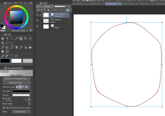
#i changed from ps to csp
Explore tagged Tumblr posts
Visit Tumblr Blog
Explore Tumblr blogs with no restrictions, modern design and the best experience.
Last Seen Tumblr Blogs


Fun Fact
In 2020, Tumblr had 29.4 million users in the US.
Text

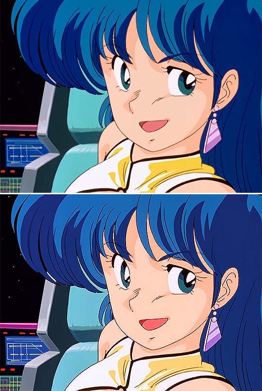
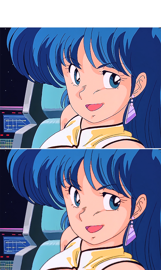
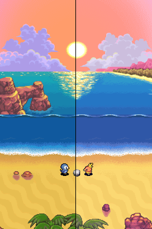
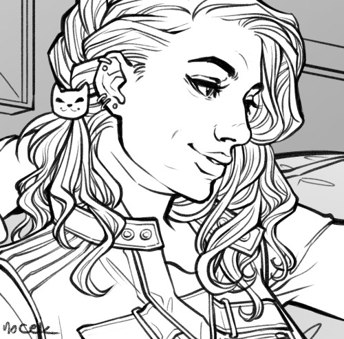
#sth#luzki's art#sonic the hedgehog#why is tumblr image quality so...#crunched#on holiday with friends rn#i miss sonic#sonic#i changed from ps to csp#idk how to use it properly but we ball
178 notes
·
View notes
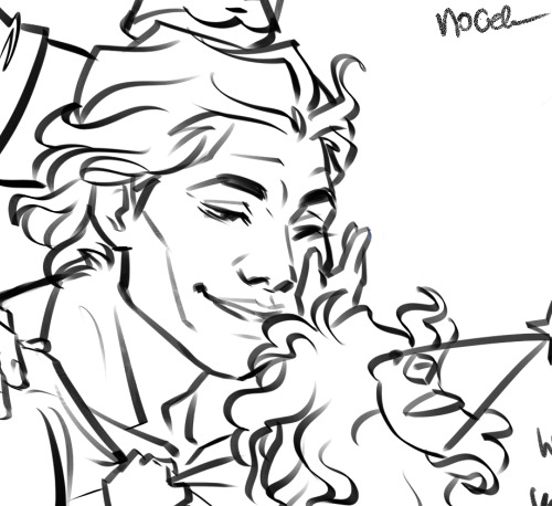
Text
youtube
Making of page 216 of my comic (from 2022!!) without any commentary or editing, just screen recording. This video was for patrons but it's been sitting around for a year so I thought maybe other people would like to see it. I've changed my steps some, mostly which programs I use for them, but it's still pretty accurate. For this page I used mostly SAI, CSP for bubbles, PS for backgrounds and effect layers.
Sorry it's so quick! You can slow it down to see better.
115 notes
·
View notes
Text
hi everyone!! my wrist is too sore to draw today, so instead i thought i'd share some of my favorite csp assets + how i like to use them! i also linked some procreate brushes at the end of the post!!
lineart brushes:
SU-Cream Pencil: i swear by this brush and i use it very often!! if you lower the pen density and use a gradient map over it when coloring your drawing, it has a nice effect. that's what i did in this drawing here! i also use this brush like i would draw on paper, so as a sketching tool. recently i've been enjoying blending it for shading. the pics below are drawn on one layer; left is more manga style while the one on the right is from a WIP of my singer sargent study, so it can be used for more realistic styles pretty well!


Found Pencil: another pencil brush that feels really nice to use, created by @/pigpenandpaper.
PS style brushes: a recreation of photoshop's (i believe) default brush. very versatile and also blends well!
analog wind variant pen: a nice pen that i like to use for lineart that is intended to have a bit of a sketch look.
zakutoro real g-pen: i used it for the lineart of this piece. although, it was drawn before i started using 600dpi in my works, so the lower resolution might make it look a bit unclear.
sets of rough pens: great for manga lineart with a rougher vibe; some of them have varying line weight.
coloring brushes:
zaku brushes: very nice and painterly mixing! i definitely recommend it for those who like to leave their colors a bit unblended.
softie marker: as the name implies, it's very soft! i like to use it for blush in chibi illustrations.
analog watercolor brushes: realistic-looking watercolor brushes. i recommend using it with csp's default paper textures, or those i linked below!
993 coloring pen: it's very soft and watery, though it can be made more solid by adjusting the paint density. i actually think it works very nicely for lineart too.
rock dog pen: another soft marker brush i like, that i once again also use for lineart and doodles.
thick coating brush set: recommended for paintings that show brush strokes.
cartoon cloud: don't let the name narrow your vision!! this has to be one of the BEST brushes for painting in my opinion, and of course it's great for clouds and explosions but so so much more!! and it's FREE try it try it!!
decoration/miscellaneous brushes:
neon pen
paper textures
symmetry move brush
close and fill without gaps
rope brush
sphere fisheye guide
flash balloon
speech bubble set: a lifesaving collection for comic artists!! dimensions and line weight can be adjusted by using the operation tool.
gradient map to use in color mode at 15% and another gradient map to use at 20%: the percentage refers to the opacity of the gradient map layer, but they are just the creator's recommendation and i tend to actually increase it. to use gradient map efficiently, i recommend putting all your colors (and lineart if you want) in a folder. then, right-click the folder, select "new correction layer" and then "gradient map". this allows you to modify the gradient map without worrying about affecting the original colors in case you decide not to use it in the end. to import a gradient map from your downloaded csp assets, click the wrench icon next to the name of the gradient set that's currently in use, then select "add gradient set".


you'll also notice that the creator recommends to use their gradients in "color mode". of course, this is also only a recommendation and i suggest trying as many layer modes as you like! to change a layer's mode, simply highlight the layer and click on "normal" (the default mode) and csp will display the available modes.

fruit ninja gradient map: fun to use if you want really drastic/vibrant colors! the names of the gradients are cute too, as you can see in the above screenshot!
BONUS: jeremy fenske's free photoshop brush pack: these aren't csp brushes per se, but they can be imported into the program! excellent for environments, i recommend watching fenske's video on how he uses the brushes to get a clearer picture since there are so many in this pack!!
BONUS 2: my good friend clem has a few brush packs for procreate that are ideal for painting,decorating drawings, and y2k-inspired illustrations, i definitely recommending checking out her shop!
in conclusion i hope this post can be helpful to you!! i tried to explain how to use the brushes as best as i could, but feel free to let me know if anything is unclear!! i hope you will enjoy using them! :D
#clip studio paint#clip studio paint brushes#csp#csp brushes#procreate#procreate brushes#brushes#tutorial#art tutorial#sort of hehe
187 notes
·
View notes
Note
hi i love your work! i wanted to know how you go from grey scale to color? i want to try it myself
yes yes ofc!! im a commercial illustrator so i have a very specific process for speed/efficiency and to also make it easier to revise if need be so the process isn't very "fun" (fun for me is like mixing paint and applying it slowly lmao) but it is how i do it lol. this is gonna get long so beware!
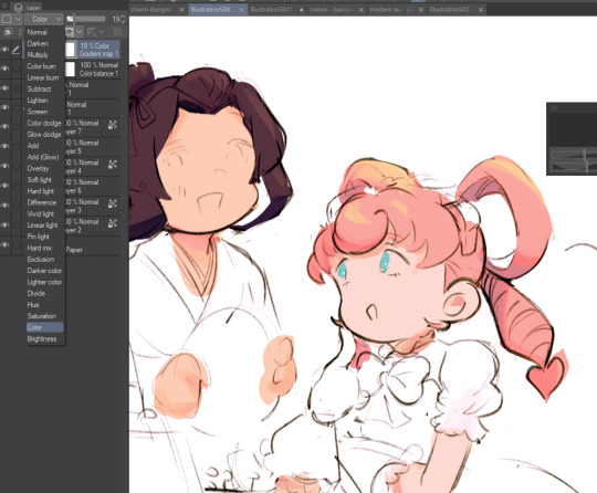
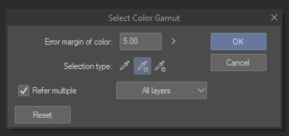
so my usual process for digital work is always b&w shapes > color > finalize. i use something called 'select color range' (photoshop)/'select color gamut' (clip studio paint) plus tons of layers w different blending modes to get the colors i want. this works in procreate/krita/any other program as well so long as there are layers/blending modes! also, even if there isnt select color range, this process can still work, just the clean up afterwards will take longer. how you use select color range/gamut is like this: you pull it up and it will give you a eyedropper tool with a little window. for CSP it looks like this. you can select a color on your canvas and the program will isolate/marquee all the colors that match/are close to the one you selected. you can change the "error margin of color" to include a higher range of colors/values or a lower range. 1 being very specific (it will only isolate the color you selected) and higher numbers being very broad (for example, if you put 20 and select a red, almost all reds and maybe even some oranges/yellows that are the same value will get selected)
so because of this, another thing is that i tend to only work with a round hard brush with no anti-aliasing which makes it incredibly easy to select entire chunks of value and paint bucket it without the horrible grey-halo. in PS i dont believe there is this option but can be mimicked via the dissolve brush (but PS tends to have better color tech so it's not a huge issue)
OKAY SO im using this crop of an old vash piece as an example. i did this in like 5 minutes (goes to show how quick it can be!!)
i tend to always make sure my piece in BW is somewhat developed and clean. usually all lighting/value/comp/drawing problems should be solved so that once u get to color u can just focus on making it look nice lol. the level of development/refinement is honestly up to you, but i find that w this method, the more refined the better

usually i start with a base color on overlay. i try to think abt the overall warmth/hue of the image and select a base color based on that. so like if i want a super warm yellow sunset ill prob choose a neutral yellow. if i want a crazy neon green night scene may go for a neutral green/blue tone.
i would kinda recommend that u have an idea of how the color scheme is gonna be or else u are gonna be in indecision hell and sliding the hue sliders around for hours... but also fuck it who cares we ball


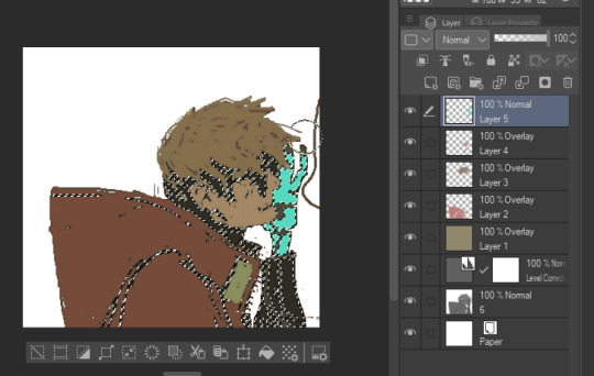
select color range - so here i start selecting entire groups of values and depositing color down. with simple images like this its pretty straight forward, but with more complicated images (like ones with bg, multiple light sources, etc) usually i start with the shadows en masse, and then the lights en masse, and then will start getting more into individual objects. if u dont have this function you can also just paint directly on with the pen or pencil brush
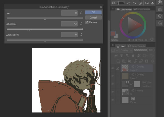
i also abuse the hue/saturation slider lol. this way i can kinda get the exact color i want depending on the blending mode (i use them all. literally. i use overlay the most but my fav is subtract and darken lmao) i literally just do this with all the values on the canvas or until im like. happy with it lol i tend to paint bucket everything but if i need like very specific areas and the marquee has selected areas i DONT want i just mouse/pen it in

after doing all that you can start to like tint/change color with like entire layers of overlay or anything! color balance or anything! (i used a dark purple subtract to tint everything a bit more green, and then put down a pure white on normal on the BG)
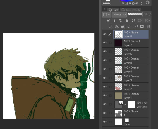
i will say tho that this process is not perfect, and sometimes i will have to go back in and repaint/recolor certain areas to make it look better, but i use this method really just to quickly apply color to the entire image, and then make the adjustments i need later. anyway i hope this was informative in some way LMAO hope it makes sense and that you can find a way to maybe use it for ur own work :D
22 notes
·
View notes
Text


I made this sometime in 2023/24, I believe? Initially it was just supposed to be a character study, but then one thing left to another, and then it turned into a design!xD I had far too much fun with this one, and I also learned a lot from it! I used CSP, PS and a tiny bit of Jasc Paint Shop Pro 9 (yes it's old as hell, but still fun to play with). I'm also still insanely proud of the typography here. It's something I've struggled with for years, but I think I'm slowly getting the hang of it.
He's a very difficult character to draw, imo. His hair is hard to get, but mainly, his expressions are the most difficult. The most subtle changes can mean everything. He's such a kind, yet heart wrenching character. He hides so much of his heart, yet displays it so openly.
#kaworu nagisa#nge#evangelion#neon genesis evangelion#graphic design#how the FUCK did i forget to upload this here lol??#gloomydraws#gloomydesigns
23 notes
·
View notes
Note
Would you be able to share some of your gif making process/programs you use to make them? They look great! 💕
Omg thank you,,, 🥺💕💖💕 And yes ofc! I'm going to write down everything I can think of about my gif making process but if I forget anything/you have questions about something specific let me know! ✨
(Long post ahead)
Emulators & Recording
I use different emulators and recording programs, depending on the game I want to play/record:
DesMuMe: This is the one I use for DS games, and it comes with a neat “Record AVI” feature under the “File” tab. Just click it, choose a location for the file and click OK (make sure the Compressor is set to “Full frames (No compression)”). Recordings have a limit of 2 minutes/2GB, but when it reaches it, the program will automatically create a new file and keep recording until it reaches 2 minutes, and the process will repeat (the next recordings will have “part_X” in the name file). When you’re done recording, just lick on File > Stop AVI. Also! The recordings will always have the original resolution. My DesMuMe is set to be 2x its size with a gap between the screens, but all recordings are 256x384 pixels with no gap.
VisualBoyAdvance: Like DesMuMe but for GBA games. Also has a recording feature in Tools > Record > Start AVI recording. The resolution of the video will be that of the original game but I think there’s no limit on how long the recording can be. I’d still recommend stopping and restarting the recording every 5 minutes or so.
Other games & OBS Studio: For 3DS games I use Citra, and Dolphin for Wii ones. They both have Recording features but I don’t use them because they create weird files. Instead, I record them with OBS Studio. Open the program, click on "Start Recording" and then on "Stop Recording" when you’re done. Pretty simple, just remember OBS records your screen so obviously if your emulator window is minimized it won’t record it. You can change your OBS settings to only record the emulator window but I’m too lazy to tinker with OBS so I just record the whole screen lol. There’s always a slight loss of quality with OBS. If you’re recording games with 3DS models then it won’t be too noticeable, but I do not recommend using OBS for pixel/pixelated games like Nintendo DS and Game Boy ones.
Misc: Before OBS, I used to use Camtasia Studio 8. Also does the trick, but instead of saving a .mp4 file it creates its own type of file and it requires you to manually export it as a .mp4 (it's a hassle). It has some editing features too, which OBS does not as far as I can tell. Also, besides DesMuMe I have MelonDS. Highly recommend it if you need to use the multiplayer option (to trade pokemons between games for example) and most importantly for the better mic feature (you WON’T get past the Nintendogs tutorial on DesMuMe). Also the 3D model graphics are of higher quality, but it doesn’t have a recording feature so you will have to rely on OBS and as I said it lowers the quality.
As for video file types, both .avi and .mp4 are allowed in Photoshop. However, .mkv (mostly used for TV shows and movie files) is not, so if you want to edit, say, an anime episode in that format you’ll need to convert it to .mp4. I use Format Factory for that, although I think here’s a slight quality loss.
Here's a comparison of a pixel game recorded with OBS vs with DesMuMe. It's tiny but it will have you shaking the screen violently when you notice it.
OBS recording vs. DesMuMe recording
Do not delete or move the video file until you’re done making gifs of it. Even if you save the file as a .psd, you will get an error message if the video file is gone from its original location and you'll have to start over again.
Editing (I)
I exclusively use Photoshop 2020. If you use CSP, GIMP or other editing program you’ll have to find the equivalent features or look at other tutorials, because I’m only familiar with Photoshop. Other PS versions should have either the same or similar features. Here are the steps I usually follow (names might be wrong because my PS is in Spanish “OTL):
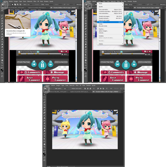
Importing: Drag and drop your file into PS. You should have your Timeline window on the bottom part. If you import a .mp4 or .avi file you should get the Video Timeline, which is what we will work with. If you export a .gif you will get the Frame Animation Timeline; in that case you need to convert it to a single timeline. Click on “Convert to Timeline Video”, then select all the layers (click on Layer 1 and then hold Shift+Click on the last layer) and then right-click on the last layer > “Convert to Intelligent Object”. This is what your PS window should look like for both cases:
avi/mp4 file (has a Video Timeline) vs. gif file (has a Frame Animation Timeline)
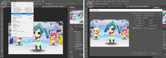
Cutting and resizing: Often your file will either be the wrong size or have unnecessary parts. To resize your video, go to Image > Image Size (NOT Canvas size) and change the resolution. For good gif quality, the image resolution should always be 540 pixels wide (Tumblr’s image size), height doesn’t really matter. PS will change the height proportionally if you change the width. So, for example, a 1440x1080 video will be 540x405 after the conversion. Similarly, you can crop out parts with the Selection tool + Image > Crop. Making pixel games bigger requires a different method (more on this later).
Cropping vs. Resizing
Cutting the timeline: Your gif will likely be too long, or you might need to stitch two parts together. In the Timeline window, move the vertical red line to the part where you want to make the cut. You can precisely move frame by frame with the arrows next to the play button. You can also zoom in and out the timeline with the slider at the bottom. Once you’ve placed the red line on the part where you want to make a cut, click on the scissors. You’ll get two layers – delete the one you don’t need and repeat until your gif is the right length. Similarly, you can click on either end of the timeline and drag it left and right to extend/reduce the length, but it’s less precise. I recommend moving the gif layer out of the video group in the Layer window, especially if you’re going to stitch parts together or add new layers that aren’t Color adjustment layers (like your watermark). If you do so, you’ll notice that each layer occupies a different line in the timeline, while if it’s in a group, it will all be in the same line (this means that all layers will be one after the other, you won’t be able to overlay them).
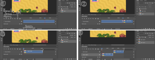
Cutting the timeline (1-3) + Moving the gif layer out of the video group (4)
Color adjustments: The fun part! You can get hella crazy with this one. If you want to go for really fancy stuff, I recommend checking out @/usergif, they have lots of tutorials and gifsets you can use as inspiration. I am however a simple man and will mostly use the same tools: Sharpen, Hue/Saturation, Gradient Map and Curves.
Soft sharpen in the Filters tab + Curves, Hue/Saturation and Gradient Map in the Layer window
Editing (II)
Can't make a bullet list of a bullet list so here's each adjustment layer explained. Note that this part is very personal so feel free to tinker with the settings for each tool until you get what you like:
Sharpen: Used only with non pixel media, aka for 3D models and series/movies. It makes the image look sharper. You'll notice that the video layer can have two icons: a movie film or a folded paper (in the "Import" section, the Pokémon gif has a movie film icon, while the converted Nintendogs gif has a folded paper icon). If your layer has the former, the sharpen tool will only be applied to one frame. To avoid that, right-click on the layer > Convert to intelligent object. Resizing the image will also do the trick. Filters are always applied to the layer, they don't create a new one (this is what the rest of the following adjustments will do). As for settings, this is what I usually have:
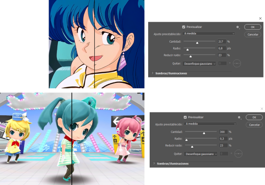
Two types of Sharpen settings (original on the left)
Hue/Saturation: Changes both the global colors and specific hues. To do the latter, open the menu right above all three sliders (by default it's set to "All") and then choose the color you want to change. Be careful! Sometimes you might accidentally edit the wrong hue, for ex a bluish green if you are editing blue hues. If you want to see what parts of the gif you're targeting, set the saturation to the max. Colors play a heavy role on gif size: the more diverse and brighter the color palette, the bigger the file. Gif size will be the ruin of your gif making process, so don't go too overboard with this. More on gif size later, but for now, I recommend "unifying" the color palette (aka making some hues similar).
Two examples of Hue/Saturation adjustments (Original above)
Gradient map: Adds a gradient overlay to the image. When you open the Gradient Map window, click on the gradient and you'll be able to edit it or create a new one. To do so, click on the tiny boxes with colors (only the lower ones, the upper ones won't work), then on the slightly bigger box to change the hue. To add a color, click anywhere below the gradient; to move the colors around, drag the tiny boxes and move them, and to edit the limit between each hue, drag the tiny diamond. The way gradient maps work is by editing the colors from lighter (right) to darker (left). So if you have blue on the right of the gradient, light hues will be blue, and if you have pink on the left of the gradient, dark hues will be pink, with mid tones being a mix of pink and blue (either purple, or bluish purple or pinkish purple). The image will look weird when you add a gradient map, but don't mind that for now. Just create the gradient you want and click OK. Now, select the new layer that has been created and play with the blending modes and the opacity of the layer until you get something you like. For blending modes, I usually go for the ones in the second and third sections. To edit either the Hue/Saturation layer or the Gradient Map one, click on the black and white icons (left to the mask, aka the white box) in the Layer window.
Video showing how Gradient map works

Two examples of Gradient maps, with a readjustment of the Hue/Saturation layer (Original above)
Curves: Edits the light, dark and mid tones. Click any point in the curve/line and then drag it around to see what it does. You can make more than one point in the curve. Afterwards, change the blending mode and the opacity.
An example of a Curve and the same example with the Curves layer at 40%
Gaussian blur: Sometimes I add a blurry/fuzzy effect to certain gifs. To do so, duplicate the gif layer (right-click > Duplicate layer), then, while selecting the new layer, go to Filters > Gaussian blur and pick a small numer (0,4-1). Click OK, set the blending mode of the new layer to Darken and lower the opacity.
Two examples of images with Gaussian blur applied (Original above)
Watermark: Add a watermark to your image. Click on the Text tool, create a text box, pick the font, the size, the color and the placement, and then click the ✔ button. Change the blending mode and opacity of the text layer. Personally, I have a .png image of my watermark that I just import to the gif and then edit, instead of creating a text box everytime. Regarding watermarks, I get that they are annoying but it's going to be far more annoying when someone reposts your gif without credit or crops the watermark out. Tumblr sucks when it comes to reporting this kind of stuff and you deserve to have your work respected (you've spent time and effort on this!!), so I highly recommend putting a watermark on your gifs. If you want to avoid having someone crop it, put it towards the middle of the image and not in a place that can be edited easily. Also, I usually save gifs without a watermark and add it afterwards.
Red: Danger zone, can get cropped easily. Blue: Also Danger zone, can be edited out. Green: Too obtrusive. Yellow: Perfect place, can't be edited out and it's not on the main focus of the image
Exporting
This is the "hell on earth" part. To export a gif, go to File > Export > Save for Web (Legacy), then once it loads (may take some time), play the gif a couple of times to make sure it looks good and save it. These are my settings:
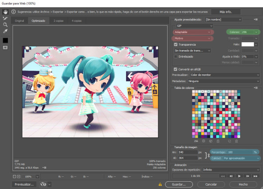
Settings for the Save for Web (Legacy). You'll only need to tinker with the settings on the right.
However, there's one thing to keep in mind: Tumblr has a size limit of 10MB per gif, meaning your gif won't be uploaded if it's larger than that, and you'll be surprised how easily you can surpass that limit. Also, gifs can't be longer than 500 frames, aka 8 seconds (to check the duration of your gif, zoom in in the Timeline Window, you can see the seconds at the top). Here are some pointers regarding gif size:
Pixel games and anime have a smaller size than life-action and 3D models: This is because the former have limited color palettes and the latter has way more colors. For example, Pokémon Mystery Dungeon or Sailor Moon will rarely pose problems, but Arcane, Breaking Bad, Nintendogs or Baldur's Gate 3 will.
The more complex the animation/motion, the bigger the size: This is because complex animations/motions, like a fight, have more unique frames than, say, someone moving their head up and down and nothing else, and that means there's more information to store.
The longer the gif/the bigger the resolution, the bigger the size: Kind of self-explanatory, longer gifs or gifs with big resolutions means more information stored in the file.
Bright and diverse color palettes increase the gif size: As explained in the first point, more colors means more information and thus a bigger file size.
The more it exceeds the limit, the bigger the changes you'll have to make: If it's 10.5MB you can get that number down easily. If it's like 20MB, you might need to cut the gif in half.
How do you solve this? There are a couple of methods:
Make the gif shorter: In the Timeline window, cut parts of your gif until it's short enough. If you don't want to delete certain parts, you can divide your gif in two separate ones.
Make the colors less bright/unify the color palette with an Hue/Saturation layer: If you haven't done this in the editing process and your gif exceeds 10MB, it's time to edit the gif colors.
Reduce the color palette: In the Save for Web (Legacy), you'll see that there's "Colors: 256" on the left (marked in green in the screenshot). 256 is the max amount of colors you can have, but you can reduce it. PS will automatically get rid of colors that have a smaller presence first (for example, in the anime gif above, if I reduced the colors it would get rid of the reds and magentas before the yellows or the blues).
Change the settings in the Save for Web (Legacy) window: Besides the color palette, there's a setting on the right side, marked in red in the screenshot above (the first one). I have it set to "Adaptable", which is the highest setting, but you can change it to "Perceptual", "Selective" or "Restrictive". This will lower the quality and thus the size, but sometimes it might mess up the gif. Similarly, you can change the setting below that one (set to "Motive" in the screenshot) to "Noise", "Difusion" or none at all to change the quality and size.
Optimize the gif: I use ezgif.com for this. Click on "Optimizer", upload your gif, make the Compression level smaller, click on "Optimize" and then save your gif. This will inevitably lower the quality, so I usually don't go lower than 35. Also, try to get your gif right below the 10MB limit, so if a compression level of 20 gets your gif to 9.5MB but a 15 gets it down to 9.9MB, choose 15. ezgif also has other cool features like one to slow down your gif's speed, so check it out!
Don't make gifs of media that causes problems: If you regularly find yourself being frustrated with gifs of X media exceeding the size limit, you might need to find something else. It sucks to think that you might not be able to make gifs of your favourite piece of media, but gif making should be fun, not ruin your day. Of course, it's up to you to decide how much effort you're willing to put on a gif, but don't overexert yourself either.
The Save for Web (Legacy) window is also where you can make your gif bigger in the case of pixel/pixelated games like Pokémon Mystery Dungeon or Nintendogs. In the "Image Size" section, set the quality to "Nearest Neighbor" and the percentage to 200% to double its size (it will be somewhat close to 540 pixels wide). You can make the gif three, four or even more times its size wih this method.
Closing thoughts and results
Managing a gif blog would require a whole new post with some advice so I'll leave that out for now. There are other things I've also left out like actions (highly recommend learning about them) but these are the basics methinks. Again, if you have any questions, my ask box is open ✨
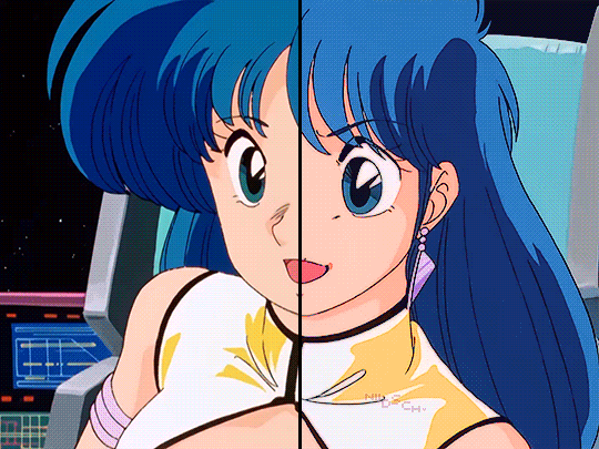
And here are the gifs with a comparison to the original 🎉
Sharpen, Hue/Saturation, Gradient map and Gaussian blur

Sharpen, Hue/Saturation, Gradient map, Curves and Gaussian blur
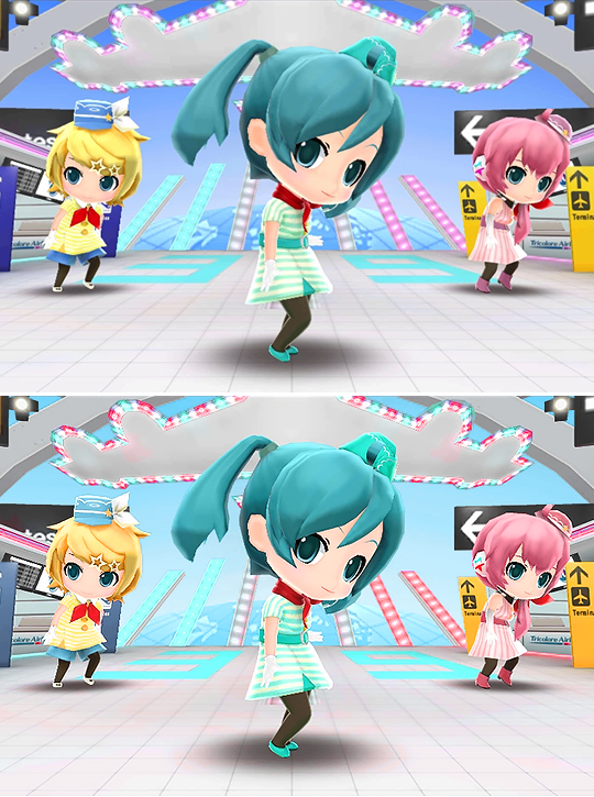
Hue/Saturation and Gradient Map
#ysiposting#whew this took a while#now if you'll excuse me I'm going back to studying for exams. regrettably
34 notes
·
View notes
Text
can anyone help me with clip studio paint??? I have colour sketches I need to work from, saved in PS with the colour settings I have to use. When I open my sketch PSD in csp it looks correct-ish, but when I eyedrop the colours from the sketch to the main document I'm working in, they change to completely different colours. CSP won't let me change the preview colours in my main document to the same profile as the sketch doc, and the colours change again on export since it won't let me save in CMYK. I'm literally only using CSP bc of its bucket tool, but this colour problem is almost doubling the time it takes me to do any work so I'd really appreciate some help...
If anyone could help me figure out how to set up my main documents, and how to export them without messing w the colours I'd be super grateful. I might need it explained to me as if I'm a child because I don't think I understand the basics of digital art programs lol

27 notes
·
View notes
Note
hey I really enjoy your style and brush packs! I've bought a couple of the packs, and I wanted to ask if you have any tips for using your brushes/getting the most out of them? Like what sort of brushes would you say work best for coloring/shading/lineart - some are obvious (ex liner for lineart) but I struggle with picking ones to use and what works!
Hello, thank you very much for the support! Let me know which program you got 'em for and I could try to highlight some particular ones from there.
I like to try to use the lineart brushes both for sketching, lining and coloring, especially the brushes that are like "Thick Tone Pencil"(or similar) or have coloring changing features to them!
Also, this is a more general answer:
🔶 I usually use brushes named around the word "Shale" for lineart and I usually sketch and color with those too. If you use Procreate the Personal Shale from this free set is my most frequently used:
I try to treat it like a very springy, multipurpose brush pen.
I've first tried to make something similar for Photoshop here(and later on re-made the brushes for CSP and Procreate):
From the sets above I like to use the Dried Up Ink/Dry Ink brushes both for lineart and for painting. I draw over loose paint strokes with it to define shapes or to re-make what I painted over! Those sets also contain painting brushes such as Flat Varnish Oil/Painty, Textury, Triangly/Oil Brick which could work well if you want to go for a thick, mushy oil pastel/oil paint texture. For thin, precise sketching, I like to use the Concept Art Lad!
🔶 I also like sketching/lining/coloring/painting with the coloring changing tone brushes such as the ones from these sets:
When painting with color changing brushes, I like to color pick from what the brush randomly generated for me and build up on that!
The brush sets above have a brush called Wispy Sketching Brush which I use for bold and loose brush strokes! It's like a sable brush but covered in graphite(that also changes colors with each stroke).
🔶 There are also a lot of flat, tone brushes for shading in those sets too and a few more in here:
That one above contains a series of Blocky Marker brushes that I like to use for fairly much everything.
🔶 There's also this free PS brush pack which imports decently in Procreate and CSP that has a brush called Soggy Pencil. It behaves like a regular sharp pencil tip, but if you make it bigger, you can create dusty, blurry or out-of-focus effects:
11 notes
·
View notes
Note
Hihi! I'm the anon from the MN talk sprite ask I'd love to hear about your sprite genius science haha :-D
Ps to say that I'm a huge fan of your work just in general
first of all THANK U SO MUCH WAAH....... im so glad you like our stuff TvT !!
second !! ill hop to the sprite explanation right here! i'll put it under the cut bc it might get long eheh
and a note: im using csp but this should work with any program! i previously used ibis for my talksprites before remaking them ^^
for my example subject, i'll be using ace! they'll be my best example since theyve gotten more use so far!

quick notes about the background; i always export my canvas as transparent to give the image that they're just a Part of the post/environment. the nametags and gradients are optional, but i feel the gradients help fill dead space and add a bit more to it- the nametags help in emulating the feel of video game dialog too (i dont tend to have the patience to actually make pokemon textboxes because i have to do it manually, so putting this over post text is my next best option.. makes it easier for chattier people, and gives screen reader accessibility as well!)
ANYWAYS, now for the actual Building of the Sprite!

where i usually start is with a base sketch of their neutral expression. i have two for All of the modern/updated talksprites, because i had initially wanted to put them at an angle to add a bit more flavor to them.. ultimately though, i stuck with the symmetrical style for my personal quality of life. i find it easier to work with and add to- i just have to be very meticulous about getting the proportions right is the main thing ^^'
now, from the sketch is the natural next step of Lining shit! and heres where the method of madness starts, because a big part of this entire thing is...

this . im so sorry about this image.
if you look at the layers, you'll see the general order of operations! basically i try to look at it as different Pieces, or Assets. its like a paper doll that you're assembling- the pieces that go behind need to go all the way in the back, then you build up. the back of someone's hair goes behind everything, then their body. then their clothes, then head, face, face accessories, bangs, and finally cartoony emotes on the very top if that's your style.
generally, i try to set my layers up for maximum customization- mixing and matching it the key for making my talksprites as versatile as possible. so stuff like having a base body that you can add changes of clothes too, using clipping layers to add shadows that would go over everything, that kinda thing.
but overall, having layer stacks worked out like this is the MOST important part, imo, for doing these talksprites. when it all comes together, the result is a clean basis for mixing and matching however you might need for both expressions and appearance. i keep everything in folders of Lineart, Shading, and Color as well, just in case i need to revisit or add to something premade later.
speaking of adding- this also allows for you to easily make any future assets for changing appearance and expression! i personally do it case-by-case, as i can't ever anticipate every expression or article of clothing i'd Ever Need. when something new is needed, i'll just make the new thing, and then it's just another piece to have in the mix! it's pretty nice! :D
tip: god remember to name your layers/folders. i used to Not and it made finding the pieces i need so hard. doing this method will result in a LOT of layers. be nice to yourself and name things accordingly!

now focusing in on the most important part of an expressive talksprite, heres the face, and the best way ive found to stack the layers so far. within all of these layers are the pieces of expressions that can make countless matches if you add enough to them. fun!


now the Eyes. the eyes . the eyebrows and mouth are pretty straightforward you just Draw and Color them and boom theyre done. but i want to draw special attention to the Eyes because figuring out how to do these were probably the thing i struggled with the MOST. its a system thats a bit more in depth than just. Doing it. here's what we got though.

the optimal stack for maximum eye expression that ive found? do lines and the coloring for those lines. SEPARATELY.
the idea is to make irises fully round so you can move them around or have wide eyed expressions without any weird cutoff in parts you failed to draw (looking at my old sprites. sighs). but to avoid having to delete or erase anything, the iris folder needs to clip onto the eye whites folder so you dont get stuff like

this . yeah.
and another thing i had to learn the hard way is that if your character has stuff like eyebags or makeup, and this is the reason my "lineart layer" has folders, if that if you put that stuff on the white layer, the irises will sit over THAT as well as the whites, resulting in some annoying little things.

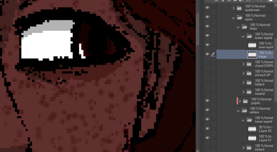
see: ace's eyebags in the whites layer, VS ace's eyebags in the lines layer.
ofc this is unnecessary if you dont add that kind of detail to your own characters- in that case, the lines layers can be as simple as just being lines!
with all that, the eyes more than anything are layers i recommend having properly named. you'll need to have the right whites with the right lines, so being able to find the two pieces with the same names is important! else you could get fun bits like this:

i dont think eyes are supposed to do that.
and generally, that's the most important parts of making these that i'd say! i have a few more tips, but theyre mostly little things that are moreso optional that i'll rattle off real quick-
for shading, i just use solid black shading with a lower opacity (i know, booooo). it's the quickest and easiest way to ensure they're both consistent, and covering everything in the same way. tbh i dont every see shading as necessary for these- but it adds just that bit more of depth and extra visual appeal to it imo
a general rule i use for characters with facial hair, which is Several in missing numbers; beards go with the head base, mustaches should be redrawn with every mouth. when someone with a mustache or stubble is talking, its usually gonna be moving and contorting with the shape of the mouth:


having it be static can range from a little off, to just Weird with more extreme expressions. but thats mostly because my style leans more realistic- if you've got a more toony style, i dont think having a mouth overlapping a mustache a little will be too bad!
this is just because i put a lot of detail into stuff and is SUPER optional, but one thing i do is have two different head bases for whether a mouth is open or closed. the jaw is opening is gonna result in the chin going a bit farther down, as opposed to it being closed! all i did to make it was take the original head base, grab the jaw area, and lower it a few pixels, then filled in the gaps. work smarter not harder
when moving the irises around, i prefer to duplicate the base layer. usually to get things to look right, you'll need to move the irises independently, so its good to just have the original stay as it is because getting it back EXACTLY how it was might be difficult. plus, you can keep the moved ones for reuse later! ^-^
if your art program allows for a universal symmetry ruler, awesome! make sure you know exactly where to put it later to add to your character! and if you use a program like clip studio (like me) where the ruler only applies to one layer; at least for csp, i can put it on a folder and it applies to everything inside that folder, so i just put all the assets in one Big folder and put the ruler there. i dont know every art program, but hopefully that still helps??
if your character has strands of hair that rests in front of their shoulders like ace's wisps or leafs big old strands, draw them as a part of the bangs or put them in the same folder so they properly sit atop everything else!
ace doesnt have any hands yet, but those would go at the very top of the layer stack. heres our lovely assistant for an example!

and for now, thats all i can really think of!
these talksprites aren't ideal for a lot of bodily motion, but for stuff like that, i figure thats where hand-drawn pieces come in. generally, i have these setup to make work on updates a bit easier, as it takes me a while to draw entire original pieces (and i struggle to focus. this is in fact why the blog suddenly went quiet again), but i still want my posts to have that visual flair to them! doing an entire visual of a character from the ground up is a fair bit more work than just. drawing a symmetrical mouth onto a guy, so i've found this whole mix-n-match type of talksprite thing a godsend ^^
anyways !! i hope i explained that well enough- good luck with ur endeavors, and i hope i get to see it!! :O
and please feel free to shoot any other questions my way if you need anything else!! im always happy to explain and help :D
and as a blog teaser for whoever gets all the way down here, a little something for your time... ive hired these three trainers to stare at you


#mn diary#hoping this is comprehensible TuT thank u again anon ur so sweeet auhjndkfdklssnkksldjn#i hope this helps anyone who sees it n wants to try!#hell did something similar for green but exported his assets into some picrew-adjacent site for his own ease of use#so thats also a thing but idk how that works.. i like my methodical madness lol
9 notes
·
View notes
Note
omg what brushes and program do you use?
Oh I'm not sure this answer will be very usefull from amount of brushes listed. I have very few faves actually and mostly like them because they help me circumvent my perfectionism.
So right now I'm using Clip Studio Paint but I've been using Photoshop for a looooong time. Till they pissed me off too much with adobe adobeness. That's why part of my brushes are originally photoshop ones I've ported to CSP.
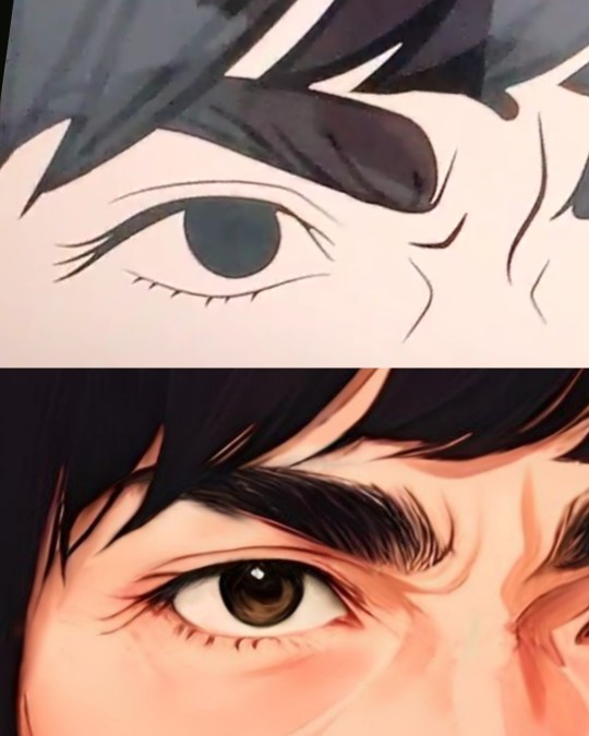
I mostly do linearts, like overly detailed ones, like this closeup:
Which I used DAUB FunnyGranny2 and back in PS times (and also now sometimes) I've used Kyle's Drawing Box - Animator Pencil 2016 from Kyle Webster (now available for free with PS as far as I know? still I had bought them ages ago and just ported it to CSP, works ok)
I like those two brushes because they are slightly grainy and aren't 100% smooth which helps me not to be as precious about smoothness. Otherwise I'd be smoothing it over and over again. Also they loose a bit of opacity with lighter touch which I like :)
I also like the Belgian Comics Smoother from Kyle's Inbox. It's very smooth but has a nice shape so I use it for touchups on color flats and lettering.
As for my more recent spiderverse comics of following close up:
I need to make them quick so everything is on 2000x2000 canvas and is linearted with DAUB - Fluid Ink Chisel 2 set permanently on size 30 so I won't be tempted :D It may not be grainy but I like how it changes it size and opacity with pressure and how it changes it's shape with direction of line.
Besides that I mostly use flat colors (I love the Lasso Fill tool in CSP) and regular soft airbrush too add some gradients.
I don;t use them that often but I also like Mirre's markers + blender if I do some actual shading but I also use Kyle's gouaches then.
And that's about it :)
58 notes
·
View notes
Text
People of Tumblr who use CSP (Clip Studio Paint)
PLEASE HELP ME 🙏
I’ve recently swapped over to this program from Photoshop and that program lets me use a slider to go through my brushes while on CSP they all just form a BLOCK- I have to extend the brushes tab all the way across my canvas to even see my brushes in each pack and they don’t show up as nice little drawn lines like they do on the videos I’ve seen or like they do in PS. Instead, they’re weird stamps? Also my options to change the opacity of my brushes is nowhere in sight and only available in my options after pressing 3 buttons in settings and then scrolling down a list to find the option and I don’t fancy doing that EVERY time I wish to change brush opacity.

Does ANYONE know how to fix this?? Or at least make it more bearable to work with because coming from photoshop this program is actual hell to use and I have no idea what I’m doing :[
#CSP#clip studio paint#csp help#digital artist#photoshop#digital art brushes#how do I fix this?#I BEG#I AM SO LOST AND SCARED I CAN’T MAKE GOOD ART ANYMORE AFTER SWAPPING PROGRAM#csp brushes#CSP will be the end of me I swear
5 notes
·
View notes
Note
Yo, can I ask what Clip Studio Paint is like? I wasn't in the market to change bc I'm happy with Krita, but it does look like a good program. And if it comes with models you can move around that would be great for me! Is it particularly hard to get into/use? Thanks :3
i like CSP a lot!
its not photoshop but as someone who only ever used a fraction of PS's features anyway, CSP is perfect for me
i came from Sai years ago and i remember being really frustrated that it couldnt do text and things like gaussian blurs, motion blurs, liquify, and other photoshop tools and effects, and that stuff is included in CSP, so now i basically have everything i want in one program thats not a bajillion dollars
u can get a subscription if you want it constantly up to date, but i just got the 1-time purchase of csp 2 or whatever it is now because I dont really care about updates. not until i see some new feature i just absolutely have to have, and then maybe ill buy one of those update passes or whatever. but that hasnt happened yet
and yeah! i really love the model feature, i find it super handy for quick and dirty reference (but you can get pretty in-depth with it and download other models.)
(in fact, i just googled JUST now, and i learned theres a 3.0 update with better 3d model customizing and posing, and i might cave and grab that update just bc i use that feature so often. also some more basic text editing stuff, finally LOL)
you can also 2d animate inside csp and some people really love that feature but i struggle with it, ill figure out how that works eventually
also ofc the library of user-made brushes and textures and models you can download for free or buy, like any other good art program
anyway i think if youve used any other modern art program it should be easy enough to adapt to! all the things are in logical places for the most part. and theres probably a ton of features ive yet to even discover. theres a ton of comic-building features i never touched, for example
also i think theres a free trial you can always play with first~
6 notes
·
View notes
Note
you mention adjusting pressure and tilt settings to suit your needs in a couple of your answers about the brushes you use - do you have any advice for figuring out what works (beyond, yknow, experimenting). i find the output of those settings kind of mystifying and view people who understand their controls as wizards
Yes I DO have advice— [reads “beyond experimenting] ah… I’m blowing away in the wind.
Well, aside from reading the manuals of your chosen program (which can be easy or frustrating depending), I would look up videos by people who know what they’re talking about. I like this one for CSP*, and I’m sure there’s a ton out there for customizing brushes in PS and Procreate and idk Ibis Paint or whatever else. YouTube tutorial people are saints… thankfully watching a video and taking notes is much easier than setting all the sliders to 0 and 100 and trying to figure out what does what.
Sometimes, I’ll find a brush that I like from the CSP assets library and screenshot the settings, then copy a brush I already have and adjust the settings until they match— then I can see what changes and how I like or dislike the changes.
Many settings I go and fiddle with automatically are as simple as the pen pressure graph, and the brush size jitters.
I of course will always recommend playing with some analog art tools and paying attention to how you hold them as you make marks, what position the tool makes to help you draw etc, and try to incorporate those things into the comfort of your brush settings.
That was a little scattered. Hope it helps anyway…!
#*I haven’t actually watched that whole video BUT it did have some info that helped me learn stuff a while ago…#I should revisit it… maybe tomorrow… z
25 notes
·
View notes
Text
Thank you for the clarification! I appreciate it!
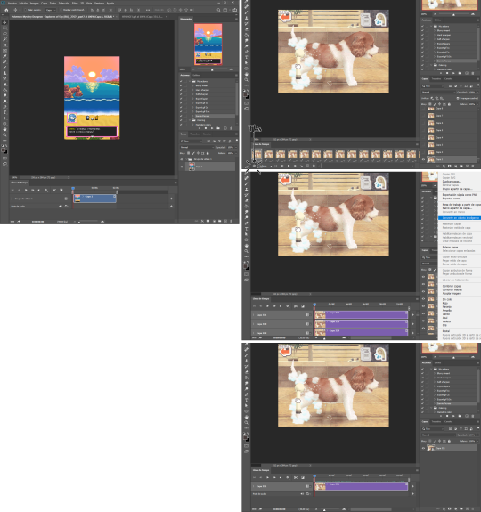
However, I cannot see how the things you talked about here (brush pressure sensitivity being poor and doing traditional art) is super relevant to how you achieved that rendering from the base colors!
Since you could not record a time lapse unfortunately, if possible, could you please show me the different layers that this art has? For example, like in the video here or here! In my experience (I've been making digital art on Procreate since 2018) an amazing art like yours would require a minimum of 8-10 layers with different elements such as lineart, base colors, shadows, detailing, highlights, finer rendering, light adjustments, etc.
I noticed one of your files had only 3 layers. I think the final csp file should have all the layers visible!

I also noticed that your lineart is significantly different from the finished art, so I assume there must be a separate layer where you modified the lineart further? (screenshot comparisons are from your vid)
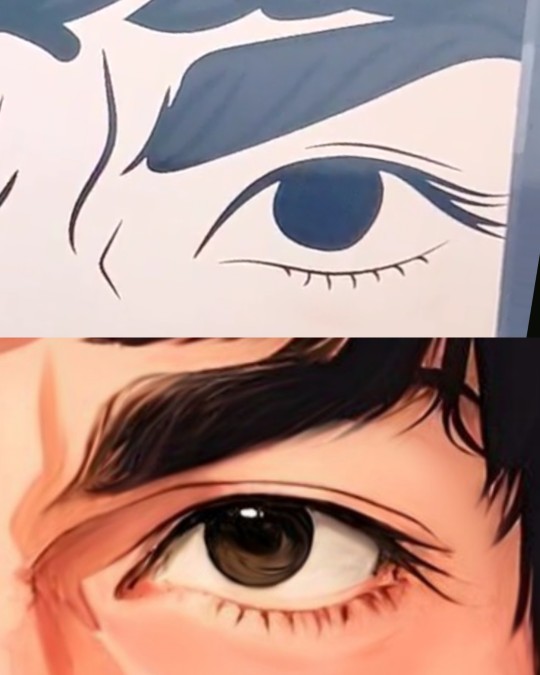
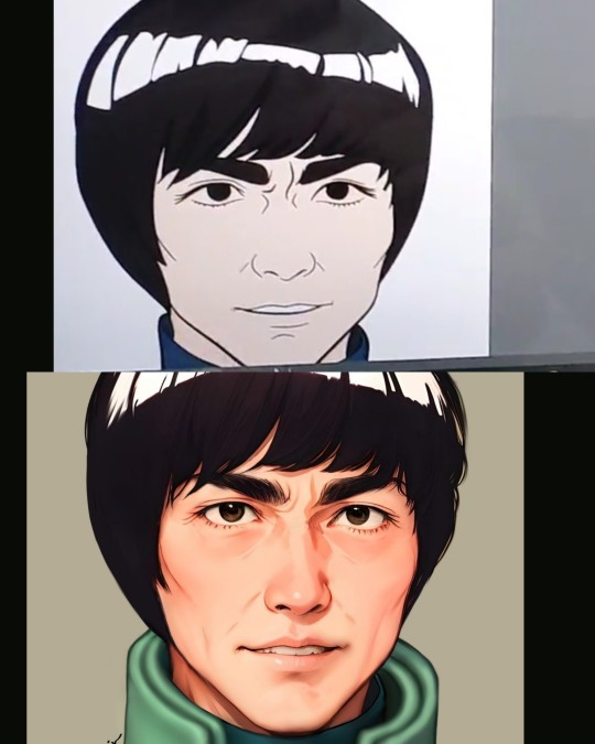
The brushes you used for adding such finer details and the flat color variations is very good!! May I know the names? I'm also curious since you added so many fine rendering despite the pressure sensitivity of your pen not working very well!
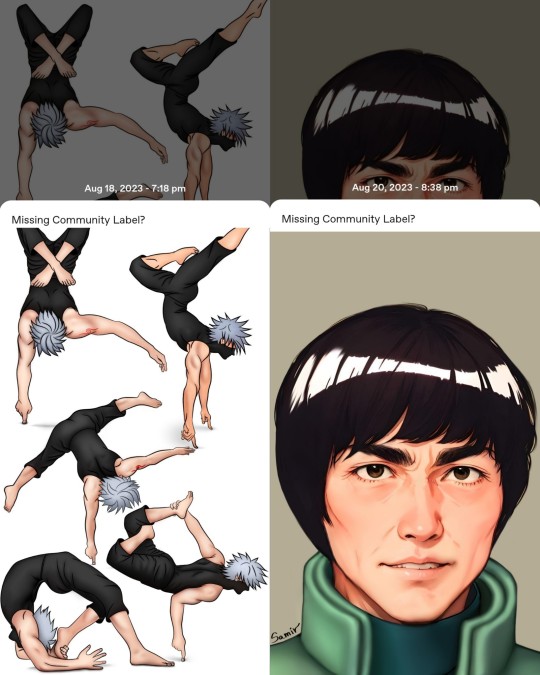
However, I'll have to commend your drawing style change over such a short period of time (presumably a week, since you mentioned you drew this over five days), kudos to you :')
PS - a small objection : "but if my existence here is going to upset some ppl then I can delete this blog and go back to my corner again"
Never once did I claim your existence was upsetting me, nor did I ask you to delete your blog. I'm simply asking for clarifications because I had a few questions
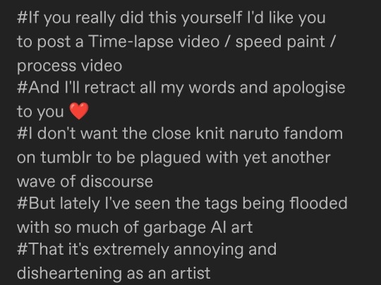
@narudoodles Not that I owe you any explanation
I don't need to prove anything to you anyway and if that's something that would make you feel better as an artist I can stop drawing and posting on Tumblr all together, this wasn't even a commission like you said on your previous post, @depressedhatakekakashi didn't ask me to draw anything, I did it on my own because I wanted to, because I'm here to have fun with my friends but if my existence here is going to upset some ppl then I can delete this blog and go back to my corner again, loving Kakashi on my own. I didn't spend 5 days working on this art just to get someone accusing me of something like this based on some speculations, it literally takes me more time to draw anything at all than anyone else because I have to work with such a shitty tablet that refuses to do the simplest things ever but I still do it anyway because I love drawing. I wasted my weekend crying and stressing over something like this and honestly, if that's what I'm going to get from this fandom then maybe it's time to leave it.
82 notes
·
View notes
Text
art block & depression is like if i buy these 500 brushes for 15 bucks will the sera toenin come back from war
#i want gud acrylic/oil brushes for csp. csp lacks the tasty texture brushes from photoshop and my pc too whack to change back to ps :'((((#macnchat
19 notes
·
View notes
Text
.
#wow how long have I gone hiatus#hi im back from college#havent update much up here#gonna update soon#so that I can have a site with proper art and not doodles of idulgence thingn#look how deserted this is#lasted post got like 50#that avatar I haven changed in you know how long#lots of things has happened include the lost of one year worth of art data of mine#likely gotta make another sample board because my art has changed#it would be nice to have money to buy CSP#i need to work on something other than Sai but not too different than Sai#not PS because my tablet hates PS for a reason
7 notes
·
View notes