#it’s my tracing/basic sketch layer color
Explore tagged Tumblr posts
Visit Tumblr Blog
Explore Tumblr blogs with no restrictions, modern design and the best experience.
Last Seen Tumblr Blogs


Fun Fact
Tumblr’s reach among the 26-to-35-year-olds in the US is 11%.
Text
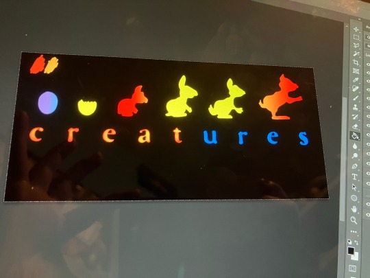
Things I should be using my art degree for: Job
Things I am actually using it for: Recreating the Creatures logo so I can have VistaPrint put it on a T-shirt
#just gotta finish up the last few letters and add a glow to everything#laughing to myself bc when i wear the shirt in public literally nobody will get the reference#someday i hope somebody does though#wouldn’t that be cool?#oh wait two other things#NO this has not be easy and NO i don’t want to know if someone else has done the same thing#i’m like 60% of the way done don’t burst my bubble#also the blue is intentional atm#it’s my tracing/basic sketch layer color#i make a clipping mask over the blue so the lines are perfect but i can dick around w the colors#anyone should feel free to use the image when it’s finished though just saying
6 notes
·
View notes
Text
My acrylic portrait painting process.
A vaguely step-by-step showing of how I painted my recent study of Astarion's golden ear mods from Afterlife by @cweepa and @dumptruck. Check out their amazing cyberpunk fic here, my original post of this art here, and available Inprnt prints here.

My supplies for this piece:
--Golden brand fluid acrylic paint
--Golden brand acrylic mediums (specifically GAC 100, high-flow medium, and dry-time retarder)
--variety of brushes. Mostly for acrylics I use Royal & Langnickel Zen brushes
--a wet palette. Mine is a Game Envy Exemplar one but they're all basically the same
--random 5x7 canvas I already had, literally no idea what brand lol
Step One: Sketch and Tone!
I start with a sketch on scrap paper because trying to draw on stretched canvas with a pencil sucks and this lets me erase as much as I want. Once I spend forever and a day messing with pencil lines I ink it so it's clear what my final lines are (you can see here though even as I was inking it I changed my mind a few times. Art is a process lol) and then I use tracing paper and the graphite transfer method to transfer it to my toned canvas.

I always tone my canvases first with a solid color, even in cases like this where the base colors were pretty opaque (due to all the titanium white). It ensures that no white dots of canvas are showing through in the final piece. Also, any of tone that does show through the final paint layers help bring cohesion to the overall piece. It helps to not be staring at a white surface when you start, I think. Less intimidating.
In this case I painted the whole thing with Alizarin Crimson. For warm skin tones I typically use Burnt Sienna, but Astarion is cooler-toned.
Also, side note, the vibe of this color is already good for vampire.

Step Two: Base Colors
I follow my sketch and lay down flat areas of color. When I mix these I use as few pigments as possible so the colors don't get muddy, especially since we're going to be doing lots of thin translucent layers on top. This is one of the main reasons I love Golden fluid acrylics--great color payout and pigment load with many options for single-pigment colors.
The hair is two different mixtures of titanium white and carbon black (normally I wouldn't use straight black in portraiture but I wanted a really neutral grey base layer here), skin is titanium white with more alizarin crimson and a tiny touch of phthalo green (blue shade) to tone down the pinkness. Still pretty pink but whatever. Ear cuff is straight raw sienna. Ear lines are more alizarin crimson--those are just so my sketch isn't totally lost among the flat colors.
The hair chunks here are very gestural and only meant to get an idea for how the hair will lay. Some sections change a bit later on.

Step Three: Create Form and Depth
Here I start to build things up to start to look 3D as well as hone in where I want bits of hair to fall. At this point I am still using limited pigments but we're bringing in more colors. Payne's Grey in the hair so it's isn't so black-paint-flat. Violet oxide and Van Dyke Brown in the skin.
Here is also where I start to use some mediums. I add a bit of dry-time retarder to my colors and I keep everything on a wet palette so my mixes don't dry out. I do both on-palette mixing and on-canvas mixing at this step. Some blends are already pretty smooth but some are a little choppier. The skin here is still a little too pink for my liking but that's fine! Things will be toned later.

Step Four: Details
Now we're building up the details that will be fully seen in the final piece.
For the skin, I'm now doing mostly on-canvas blending. I will add some GAC-100 (basically clear acrylic paint base) to thin the colors a bit so they blend more. I put down two colors and then use a clean fluffy brush to blend at the edges. Kind of like eye shadow?? Idk. I didn't go to art school, y'all, that's just how I do it.
Once I have a good blended base, I then start adding a TON of layers of thinned paint. I combine a little bit of a color with a mix of GAC-100 and high-flow medium. This basically creates toning washes of color, similar to how you create solvent-based washes in oil painting. Some washes go across the whole skin area (like a wash of burnt sienna to make the whole thing less pink) or selective washes in specific areas (phthalo blue in the shadows, for example).
For the hair I used a striping brush and created layer upon layer of increasing light lines. I had the same pool of mixed grey (titanium white+payne's grey) and kept adding more white to that same pool as I built layer on layer of little strands. That way it was all the same color family but just lighter tints.
Note that brown crease line wouldn't normally be that dark or harsh if this were a normal ear but I wanted to make sure it stood up to all the little details I was about to paint on top.

Now, I meant to take at least one progress picture of the ear cuff, the little attachment tabs, and the scarring but I totally forgot (got ADHD hyperfocused for too many hours straight, whoops). But I added the final art below so you can look at it while I explain, at least.
I shaded the whole cuff and the attachment tabs first before adding any details. That way I could ensure that the shadows and highlights made sense and I didn't have to worry about covering any details. Also at this point I added that second little arch. I put a base layer of raw sienna down to make sure the hair there was fully covered and then shaded it like the rest.
The details were all unplanned and spur of the moment. I poured out some pyrrole red, cobalt teal, and burnt umber and just went to town with a tiny brush.
The scaring was done by first creating the shape with a similar white+crimson mixture to that first flat base layer we did at the beginning, then building up translucent washes of color and adding tiny shadows around the edges with Van Dyke Brown.
I also tweaked the shading on the skin just a tiny bit more (again, using only thin translucent washes of color) and added a few more little hair swoops using basically pure white to make them pop.

Final Step: Tone and Seal
Last step is simple. I added a couple drops of a blue shade (I think I used Anthraquinone blue?) to a bunch of GAC-100 and did two layers across the entire canvas. This seals everything together, helps add a little UV-protection and anti-yellowing protection, and most importantly very slightly tones the entire thing so that the colors meld well together. Sort of like putting a filter on a picture but irl. You just have to make sure the blue is VERY lightly tinted.
Final, Final Step: Forget the Sign the Damn Thing Because You Were Too Excited to Post it
Et voila! It was ready to scan. Note the progress photos look way warmer than the final scan due to the overhead lighting. Looking at it in person it looks way more like the final scan.
Thank you for getting to the end if you are still here. If people are interested I can post more of these process insights in the future!
#bg3 fanart#astarion ancunin#afterlife#astarion#painting#acrylic painting#my art#fanart#art process#how do I even tag this??
25 notes
·
View notes
Note
HELLOO!!! I just stumbled upon your blog and I admit that I already love it. While looking at some fanart, a question (or curiosity, depending on how you put it) came to me: how do you draw dragons? Or, more precisely, do you have a method for figuring out the shapes and sketching the different species? AND do what program and brushes do you use (especially for sketching)?
I'm sorry that's a lot, but I'd like to get familiar with drawing dragons, I hope you can answer<33
-☄️
Hello, welcome to the blog!! :D
I can definitely answer your questions!
I recently bought a new tablet with a pen, which is part of the reason I haven't posted in a while. I'm a little overwhelmed and hesitant to start drawing dragons for the blog again, so I've been focusing on personal art to get comfortable with the new equipment. But I can absolutely tell you how I used to draw on my previous tablet!
It didn't have a pen or any sort of pen pressure, so I used IbisPaintX and its basic opaque brushes for both sketching and coloring. I used the same brushes for sketching, lining AND coloring, I just changed the opacity as needed. I never used any of my brushes on 100% opacity for the lineart, I just layered my lines to give them some texture. I did also make a custom fuzzy textured brush by messing with settings, but I didn't really use that for the dragon posts as far as I remember (except for the Liberated Duskcutter drawing)
As for drawing dragons specifically, I use a LOT and I mean a LOT of references for every drawing, especially for species I haven't drawn until that point. In my experience, tracing helps you get familiar with the dragon's shapes and helps to build muscle memory on the long term. Part of my process is to find good reference images, break them down into shapes by drawing on top of them, and then use those shapes sort of like building blocks to figure out a new pose that I can then refine.
The shape of the head is always the most difficult for me to get right, so I tend to focus on it even when the rest of the body might look a little wonky (don't look too closely at the toes and fingers)
I'm not very good at explaining my process, but I love answering questions, so feel free to ask for clarification as needed. I do hope this helped though! I wish you luck on your dragon drawing journey <3
#asks#httyd#how to train your dragon#dreamings#not dragon art#I do appreciate the curiosity#I did make a little tutorial/process thing at one point but didn't end up posting it#it went over 10 images and I don't use tumblr desktop so I kinda gave up on it#but I may just edit those images together to see if I can post them afterall
37 notes
·
View notes
Note
Do you have any recommendations for art references and or video's that might help me improve as an artist? Your art style is really inspiring to me and I'd love to get better at drawing because I haven't been on that grind recently of doing so!!!
Honestly your best bet is learning the RULES of art instead of the process, at least that's how I did it
I find it easier to NOT do the things that make it wrong than to learn ALL the things that make it good
There's like a million different ways to make art appealing but a lot of them typically avoid the same mistakes. It also makes the learning process customizable for you
To anyone else other than Gongus, I wanna say first that this post is heavily catered to cartoonier art styles but the links are for general art. I will also be laying down a lot of the things I learned from college (multimedia arts course)
Alright, first of all try to dabble up on some character design rules, here's a video that teaches it and a channel that has a series with critiquing people's portfolios
youtube
(she's not really insulting the portfolios btw, the thumbnails are just click baity)
Then also learn about the 12 animation principles because it can still be applied to non animation art like comics and stuff
youtube
Get yourself some line of action crammed in there. Regardless of art style, a lot of people struggle with stiffness, line of action is the counter attack to it
youtube
Optionally, if you're gonna learn line of action then you're gonna be doing gesture drawings to practice it. I suggest going to @adorkastock for reference images
Next up, color also have rules so here's the basics
youtube
I only linked that so you can smoothly transition here wjsndndm
But YEAH color fuckery is an underrated art cheat, you can get away with art that looks good without shading if you know how to toy with the colors right
youtube
Trouble making thumbnails?
Photography as an art form has got your back. Composition techniques can be applied to the drawing sort of art
youtube
Here are my personal tips now skskksks
1. Use your inspirations as reference. I got a sense of solidity when I saw the reference sheets for Wander Over Yonder and copying stylistic aspects from DST, TF2 comics, Clone High, and Pizza Tower.
SPEAKING OF TF2, I also wanna throw in this video about it's character design and other visual aspects (you'd only wanna watch the first half, the rest talks about the characters writingwise)
youtube
2. Another thing I do with references to make it easier is draw it at least two times. First time to trace it (directly or eyeballing it. You can also do with skeleton sketch or not but preferably give it a skeleton), then the second or third or fourth is to make it slowly morph into your style.
This will give you a sense of solidity, teaching your hand the traits that should be kept or exaggerated
3. If it looks like ass or you don't like it then that's okay. You DON'T have to post EVERYTHING you make. Sometimes you will feel like you draw a character you've always drawn wonky and that's because you just need to do warm up doodles.
I have SO MUCH sketches that I haven't posted and will never post because they're warm ups. Y'all think Pepperman is hard to draw? Y'all think I draw him good? I have good news for you, I fumble his face more often than not AND THATS OKAY
4. ANOTHER niche technique is to learn the keyboard shortcuts and other functions of your art program. Do not underestimate how much time that can spare you. It's gonna be tricky to find or get used to but it's gonna be so worth it
I learned you can alt+G on Krita one day and it makes a folder for your layers, total game changer. I can move layers at once instead of the old one by one with precision
5. Final note is to do the opposite of everything Vivsiepop does, it does not matter if you like her shows or not because time and time again critiques of her art and writing style breaks SO MANY RULES without UNDERSTANDING why they exist in the first place.
Art is like architecture, you need to know how to make a basic house before going straight for the fucking manor from Hello Neighbor 💥 or else you're never gonna figure out why the living room collapses everytime you flush the toilet
Anyway eeee, that's about everything I can teach, hope these help and if there's anything else to ask or add on, please do so!
23 notes
·
View notes
Text
Five Nights at Freddy's × Erma Comic
As Abby Schmidt walks through the arcade of Freddy Fazbear's Pizza, she passes by a game cabinet to which a spirit haunting the console emerges.
But shortly after, she introduces her new friend to her brother. And while Abby is excited about the new guest at the pizzeria, Mike, on the other hand, isn't so thrilled about having another ghost around.

I had this idea of doing another FNAF comic, but this time as a crossover with Erma by @brandontheoutcast and in the style of the FNAF comics by @chloesimaginationthings
I think that Abby meeting Erma and easily becoming friends with her makes a lot of sense, especially since in the movie as well as the comics by Chloeimaginationthings she befriends the ghosts of the children haunting the animatronics. The same ghost children who also tried to kill Mike in the movie, which is why I made him appear pretty uncomfortable about having Erma around. Don't worry, Mike, I'm pretty sure that Erma would be the least of your worries.
Below is a draft and clean sketch I made of the comic, which I would use to trace over. You might notice that there are some differences between the draft and the clean sketch. I also used Chloeimaginationthings' FNAF comics as reference to draw out Abby and Mike while Brandontheoutcast's posts for Erma.


After finishing the clean sketch, I had the drawing sit under some stacks of books so the sheet would flatten. Usually, I would go over the sketch with ink and markers to fill in some color after a while of flattening. However, I've decided to go over this comic digitally.
After taking a photo of the comic once it was flat enough, I used the Sketchbook app to work on the outlines and color. Once again, I used Chloeimaginationthings' FNAF comics while doing this.
Here's a bit of progress when I was working on the outlines. You might notice that on the sketch I wrote "meet" instead of "met". I didn't notice that error until I got to this point. So to fix that, I made two layers so that I can write "M" and "EET ERMA!" so that I would go over on the layer I was doing the outlines.


Once the outlines were made, I made another later to fill in color. We'll, maybe multiple layers, as I used them to color different parts on the comic, whether it be the characters, the background, speech bubbles, and other small details. I even used a layer to smudge to blend some color together, which might be noticeable on the hair and the close-up panel of Erma coming out of the screen.


I also wanted to add a couple of small details to reference the users mentioned earlier. So if you look closely at the drawings at the wall on the 3rd panel, you might see a couple of cameos among the drawings of Freddy Fazbear, Bonnie, Chica, Foxy, and Golden Freddy.

And while the comic is supposed to be one big reference to Chloeimaginationthings' FNAF comics, I wanted to leave one more nod to Brandontheoutcast. I'm not sure what kind of graphics an Erma arcade cabinet would have, but if you look closely at the panels with the cabinet, you'll see a logo for Outcast Studios as if being the company that developed the Erma game. Though it might be easier to see on the 2nd panel as it might be difficult to make out on the first panel.

And that's pretty much about all I got to share regarding my progress on this comic.
I'm thinking of doing a couple of follow-ups to this where Erma meets Freddy and the gang, which I already have drafts for. They're basically the same but with different outcomes. One is where the animatronics are frightened about meeting a ghost, only for Mike to point out that they are ghosts as well, and the other is where they instantly befriend Erma, to which Abby figured would happen. I'll probably work on those at some point if anyone is interested.
Anyway, I hope everyone enjoys this FNAF and Erma crossover fan comic I made. It was really fun to make and I would like to do more like this again soon.
Oh, and to Chloeimaginationthings and Brandontheoutcast, feel free to share your thoughts about this comic. I really want to know what you both think of it.
With that said, I hope that everyone is having a good Friday and soon a good weekend.
Based on the Five Nights at Freddy's fan comics by @chloesimaginationthings
Erma and Outcast Studios logo ©️ @brandontheoutcast
#crossover#five nights at freddy's#abby schmidt#mike schmidt#fnaf abby#fnaf mike#erma#ghost#ghost girl#horror#fanart#comic art#chloesimagination#brandontheoutcast
26 notes
·
View notes
Note
hel-lore (see what i did there)
just wanted to ask what brush you used for your casscass comic because. Goddamn that lineart and colours. Yummy.
How’d you. Do you. What brushes. What pallets. What program.
Did you get pose from somewhere… references…
basically this is me asking how you made your art style so i can osmosis it hope you don’t mind, if you do, you can absolutely tell me to not steal your art style
okay have a nice (insert timezone specific term here)! drink water
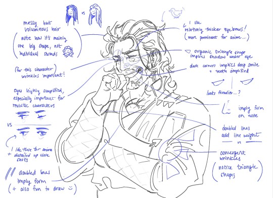
Hello and a drink water yourself! I draw in Photoshop currently and I have downloaded Kyle T. Webster's free brush megapack. For pencils and sketching I use the "Ultimate Charcoal Pencil", and for inking I've been using the "Ultimate Inking Thick 'n Thin" :


I often shade with the default hard round pressure opacity brush. I recommend you try out a few different brushes and see what feels good!
Some tips on color: 1. you can help your palette look cohesive if you cover the drawing with a solid low-opactity "color" or "hue" layer. 2. don't draw in black on white. I recommend not using black "ink" at all, but if nothing else change your bg color to a gray 3. atmospheric perspective For posing characters, learning anatomy will help. Also, you can find stock poses online. I like the adorkastock website.
I developed my style by copying elements of other art styles I liked, and over time making them my own. Tracing or imitating art that you like can help you feel how that style works.
When I draw my own version of a character, I use shapes to emphasize certain features and keep them recognizable:

(I was influenced by elekilokal's incredible charcter designs)
and all that being said, practice is gonna help more than any one brush or tip. Good luck!
#ask#art#art tips#2025#long post#character design#that cass drawing was my preliminary design for her and as i draw her more i settle into what works and what feels right#sometimes you just have to follow your heart#im not sure if i worded the bit about copying other art styles quite right but shrug#the trick there is to draw from a lot of sources and youll naturally synthesize them into your unique style
23 notes
·
View notes
Note
kind of a dumb question but how do you redraw a frame? im just wondering how you completely draw over the character and get the same screen effects as the show
It’s not a dumb question, dw!
I know you asked specifically about screen effects, but I’m just gonna go over my whole process just to clear all bases.
So first, I start out with the frame I want to redraw. I’ll be using this frame as an example.

So I go onto my desired drawing program and insert the photo onto my canvas. I usually scale it up quite a bit since these screenshots tend to be pretty small and I don’t want my brush strokes to be bigger than I like.

Next I trace over the character’s basic shapes, just so I can get a grasp on how they’re posed, their expression, and figure out how to translate that into my own style better

Then comes the actual redraw part. I sketch over this layout with my own design and style, altering details like proportions and a bit of posing as I see fit to capture the same energy while keeping true to my own style choices.
Then I do line art and color.

Then I carefully edit out the parts of the original character so they’re not peeking out behind the redraw. This mainly just comes down to color matching and blending in order to make it look natural and not obviously edited. My editing tend to be pretty crappy, but it’s good enough to not be noticeable at first glance I think lol
Then, to get the character to look like it actually belongs in the scene, I add several overlaying layers and shading.

And then it’s done!
I think the only screenshot redraw I’ve had to try a different tactic on was this Sir Pentious redraw, cuz the shot had a camera effect over it. For that I just added a purpley pink overlay and a bunch of horizontal lines that I later blurred a bit

Hope this helped!
#ashedwings post#ashedwings art#hazbin hotel#hazbin hotel redesign#hazbin alastor#hazbin pentious#hazbin sir pentious#hazbin hotel redraw#hazbin hotel fanart#art tutorial#i think?#ashedwings reply#ashedwings ramble
59 notes
·
View notes
Text


PART 1 of ART TRADE
I am doing a trade with my buddy @tepidti and I decided to do a little more for him than just a simple exchange of oc x canon digital drawing(s). I decided to make Shrinky Dink keychain charms for him as a little extra bc he is my oldest online buddy, and he deserves a lot of nice things uwu
Disclaimer: Plz do NOT request art trades with me. Trades are exclusive to my friends. If you would like art from me then plz check out my pinned post for commissions. That would be greatly appreciated :')
DETAILS / PROCESS
Sooo, I was there for the conception of Dragonsteel (OC featured above), thus he holds a very special place in my heart. I LOVE how beautifully disastrous MegaSteel is... I cannot get enough... They are just SO CUTE and HILARIOUS.
As for the process, I am gonna make posts about each one I do, that way everyone can see the WIP... this is also so my buddy knows my process without me text dumping on him in our DM LOL
Redesign - I tried not to change too much on him. All I really changed was the positioning of his horns slightly, as well as some details on the helm itself, but other than that, I wanted the silhouette to be roughly the same. Dragon's art is a pretty simplistic style already so he was really easy to adapt into another style.
Color - I leaned closer to a more purple primary on Dragonsteel. I added some blue in and blended it to give it a more cool undertone, as well as to better shade the piece (dunno bout you guys but shrinky dinks are really hard to shade with pencils on qwq). I also opted to make the glass on his chest pink like his optics to balance and diverse the colors a bit more. I think the touch of yellow in the pink optic really help balance the look too. (I actually hadn't noticed the yellow in his ref sheet until I started to REALLY analyze his design and colors. I worked so seamlessly o.o)
Technique! Technique! - So I basically just started on normal printer paper for the sketch, and then transferred it to tracing paper, and lined/traced that onto the Shrinky Dink sheet.
NOTE: You can technically line with permanent marker on the slick/glossy side of the shrinky dink sheet, and it gives you a really NEAT look of 3D when it comes out cleanly, but it's such a risky process bc even the perm. marker wipes off/smears too damn easy. Doing it on that side will likely ruin the design altogether, so I suggest lining on the rough side.
Colored pencils grip to the rough side excellently, but once you start adding layers of color, it proves to be quite challenging because of how smooth the surface gets. It's easy to erase the colored pencil on them though, so mistakes are easily remedied in that regard.
#transformers one#transformers#tf one#tf#transformers art#maccadams#maccadam#my art#art commisions#commissions#tf one 2024#dragonsteel#tf one oc#transformers oc#art for tepedti#tf1#my traditional art#traditional art#art trade#artists on tumblr#not my oc#shrinky dinks
21 notes
·
View notes
Text

First of all I need to thank my artist friends @meizze-art and @annarielmidori for leading me into this brilliant software... (it's so much better than Photoshop goddang)
Like I mentioned in my previous post, I was doing a "research" this morning...😂I took notes of artworks that I really love the style of, and then also took notes of the ones that I wasn't a fan of. I also wrote what feature I'd like to learn. My note looked like this... (please don't misunderstand, these artworks are all amazing in their own way, I'm only making notes on their artstyle to decide my personal preference)

And second of all sorry it's not a Hogwarts Legacy character😂When it comes to the process of learning, I'd prefer practicing on the faces I'm most familiar with, and...that's just Dan. I'm not sure if I should switch to my Dan Stevens content only account because if I tag my friends there it'll be a bit weird...so...
Anyways, because this is literally the first time I actually do a rather "serious" colored digital art (previously my experiences in drawing are only limited to traditional methods, and most of them are either b&w pencil sketch or copying manga panels/manga art with colored pencil/copic marker), and I just got this pen tablet a week ago, so umm...I'm still exploring. This one took me too embarrassingly long, idk exactly when did I start but probably 6 hours or something. I used this photo (my favorite screenshot from "The Guest"...) as reference:

I admit that I acturally traced some part of it (like the sihoutte of his hoodie, and hair shape overall), however during my drawing I realized I actually cannot directly follow his face's jawline's contour, because the proportion would look a bit weird...so I sort of redrew that. Also on the eyes, originally I wanted to do a full realistic size, however I noticed that if I used the actual eye size, there won't be enough space for me to emphasize his eyes, so I enlarged them a little bit. I guess I'm still...leaning towards modern anime style more?
I checked my "research notes" (🤣) for many times and in the end I basically just did a 4:6 mixture of Vinland Saga and Variable Barricade (???), I wasn't planning to reference Vinland Saga in the beginning but I really really want to add his unique "aegyo-sal" in my drawing but most of the works mentioned in my notes don't really have it, so I experimented a lot and...well, Vinland Saga's method sort of works...
Managing layers is a real pain in the ass. Like previously when I was only working on Photoshop I didn't really have to deal with so many layers that constantly requires modification, and now it's like...I need to remember which is which and the logic and order of putting different parts into different layers.

(This screenshot was taken before I changed the gaze direction. In the original screenshot he was not actually looking at viewer, but I feel like it's gonna be more "fetching" (???) if he's looking at viewer, so I basically just cropped out the eyes and paint the area white and masked the cropped out eyes and fixed some details )
Well, this is only my day 2 of using CSP and I haven't even watched any tutorials of what's the proper way of drawing this kind of anime...hopefully I could get the hang of it soon.
13 notes
·
View notes
Note
Whats your art process and what would you reccomend for someone who would like to achieve a style similar to yours? i love this mix of cartoonism and realism. your work is such an inspiration >.<
oh gosh! thank you?! 💞 i'll do my best to explain it, but even I have a difficult time trying to understand my own art process/style because of how inconsistent it is;; (i still have a lot to learn!) this is gonna be a long reply so i'll place it under the cut
process:

I start loose with a more gesture type rough sketch. I mainly just do lineart in the same layer as my sketch and erase away parts I don't like. Sometimes I'll lower the sketch's opacity and on a new layer do my lineart (which is what i did for the drawing above). But regardless doing that loose gesture sketch helps keep my drawing dynamic even as I refine over top of it!
- I duplicate layers A LOT for safekeeping my previous progress, especially if I'm thinking of making a big change (ex. changing limb position)
If I wanna put colors down underneath it I set my lineart to Multiply. For coloring I'm very inconsistent with the process, but recently I've been using a more subjective coloring style, where I pick my own shadows and highlights to try relying less on blending modes (which is gonna be too long to get into here;;) Finally if I feel like it, I make a layer on top of my lineart layer where I render everything
Oh this is something that helps me a lot for colors! I have 2 layers that are a mid-gray tone placed above all my other layers. One I set to the Color mode (to make the drawing black and white), and the other I set to the Luminosity blending mode (to make the drawing's brightness the same..?not sure)
The Color layer helps me check if I have enough contrast in values, and the Luminosity layer helps me check if I have enough contrast in color hue and saturation!
style:
This is really difficult to answer because style encompasses so many different aspects of art, but I'll try to focus my answer on the mix of cartoonism and realism that you mentioned!
I struggled trying to explain what my style is like so I just broke down one of my drawings that exemplifies a lot of my stylizations! Hopefully these can give you some pointers about what I tend to think about when I draw (click for higher quality)
(+to add to this i use a brush with no size pressure, only opacity pressure)
What I recommend for stylizing a realistic character: The way I learned to stylize a more realistic character like this one was to import a reference of his face, then trace over it very deliberately, making sure to stick to big shapes and characterizing details I thought were important to achieve his likeness! Then I'd turn the reference layer off and freehand it over and over, comparing and redrawing until I managed to get the mix of accuracy and stylization I liked!
What I recommend to find a style: I basically ended up with my style subconsciously as an intersection between the things I like to see in art + the things I like to draw! Most of my inspiration comes from anime (😔) and artists online. I'll see a very specific stylization I like in others' art, and try replicating it to see if I like how it fits with my style + if I enjoy drawing it in that way. I did this a lot over the years, accumulating into a big mosaic of inspiration from all the artists whose work I personally enjoy and learn from! I know this isn't exactly answering how to get a style like mine, but I think knowing this general process may help you out in the long run!
ahh i think that's it! i tried to be as comprehensive as i could without being too verbose (my bane). i hope this is the answer you were looking for and that it can help you! 💞 and thank u for the ask! it was a good exercise for myself to analyze my own art
#my asks#anonymous#tutorial#...? art info? not sure what to tag this#i spent a very intense day mulling over this ask#hopefully i answered this correctly...!#art resources
46 notes
·
View notes
Note
Your art is so pretty and clean and colorful!! I’m still thinking about happy Chert in their summer dress.
Do you think maybe you could talk about your process? Especially coloring and rendering? Im working on understanding my own style, so I’m asking some of my favorite artists how they learned and refined theirs. Practice, obviously, but what kind of practice? What were the hardest things to figure out?
Hi!!
First of all: AAAAA?????
Second of all: This genuinely made my day reading this <3 Thank you so much, like seriously :’}
A part of me doesn’t feel all that qualified to answer this, I’m still learning and refining my own style and it genuinely feels so crazy (in a good way) that people have been really enjoying the stuff i do, but in regards to what kind of things i do for practice/ things I’ve learned over the years-
1. Be insane about a character
Like 0 joke, there was a 6ish month period a few years ago where i got really obsessed with a couple of my ocs and used them for pose practice ALOT. Using references was a BIG help to learn anatomy. I’d usually find a pose i was looking for on google, paste it into my canvas and do a few tracing passes.
One where i map out the skeleton in one colour. Another where I map out the BIG shapes in a different colour. And then another where i map out little shapes or shapes that I’ll need to add (wings, horns, etc) in a third colour. I’d then hide the reference image and set the traced skeleton off to the side and try to recreate it step by step!
These were only a year apart!! Left- Pre obsession (2022) Right- Post obsession (2023)
I had another bout of it late 2023-early 2024 with some Baldur’s Gate ocxcanon shenanigans that also boosted my art in the same way. And now I’m in my Mylo/Startners era!
2. My basic art process
The sketch is done on a mid grey canvas with coloured lines (mostly for eye problems lmao). I learned from a post SOMEWHERE on tumblr that blurring the sketch and putting it on REALLY low opacity helps a lot with line confidence and it really does work.
Lines are done in a non-black colour depending on what the main colour scheme is. Most of my furry works and my oc works are done in brown because i use a lot of natural browns and beiges in them but almost all of my outer wilds stuff is done in navy blue or dark purple. There are some works even done in pinks and reds just because i thought it would look pretty! I also LOVE using textured brushes and use the same textured pencil on 7px width for like everything now.
Colours are done by half manual colouring and half fill bucket. It’s a pain in the ass but Krita is weird to work with sometimes. I throw down basic flats, 2 layers of blush, and things like eye shines etc. Almost every single thing has its own layer, usually grouped into things like ‘Skin, clothes, eyes, etc’ and then regrouped into specific characters if theres more than one.
Rendering is still something I’m working on. I have a really hard time understanding light and shadows but it REALLY helps to understand the 3d form in some way whether thats with references or with a 3d model!
I personally love my layer adjusters (cannot think of the right word rn) when it comes to shading. I mostly use Multiply, Colour burn, and Luminosity (Sai) for shading. Screen is used for glass and Overlay is used for things like eye shines and sparkles!!
Then to finish everything, if theres no background i love adding a light colour border around everything to make it look kinda like a sticker :3
3. Don’t be a perfectionist.
I know saying that to artists is like asking the world to stop turning but i swear to you that it doesn’t matter. It’s not very often that i sit and do proper line work, a lot of the time (if the sketch is clean enough) i just colour in the sketch or just post the sketch as is. And even when i do line work leaving in line gaps or shaky/sketchy lines isn’t the end of the world. If anything i find that textured lines and colours look NICER that perfect crisp works a lot of the time.
4. The hardest things I had to learn
Anatomy, colour theory, shading, perspective, and backgrounds were some of the hardest thing’s I’ve had to learn, and honestly sometimes i don’t feel like i understand them at all. I hardly ever do backgrounds or weird camera angles because it hurts my brain to try and figure out stuff like foreshortening, but sometimes you just have to try it out.
You gotta get weird with it sometimes. Go to a colour pallet generator online and colour in something using it. Draw the same character a million times. Try different brushes if you do digital or try different mediums if you do traditional. Get out of your comfort zone!
I know it’s very controversial these days but steal style things from artists you like. My art is a mishmash of so many different artists who have inspired me over the years that i no longer know where half the things I do come from. Sometimes you even just have to go ‘What if…?’ And try something!!! That’s how I started doing eyes and lips the way i do! Even if you don’t do it consciously, a lot of the time your art will be influenced by something you’ve seen like games or shows and that’s okay!!!
In short, i really hope this made like a lick of sense.
I’m not a professional in the slightest, I’m just a man who’s been drawing since elementary school (and almost dropped out of art college), and I’m i don’t really know how to give coherent advice, but I genuinely hope this was helpful!! I’d post like examples of my art process but the laptop I’ve been doing all my art of is kinda down for the count rn! If/when it’s back up and running i might add some stuff to this but for now!!!
Thank you so much again for coming in and asking!! <3
5 notes
·
View notes
Note
Do you have any advice on how to go about designing monsters and animals and the like? I like the idea of creating those kinds of things but I always blank on how to go about it, like I know little facts like Allen's Rule but I don't know how to find out about something like that intentionally or even think of it for my thing. (me when I have no idea how to explain that I have no idea how to research smth lol)
first I've heard of Allen's Rule, so that probably says a lot about the fact that I'm mostly self taught lol.
here's the wikipedia page about it for anyone else who didn't know.
to sum up, it is a rule stating that animals in cold climates tend to have shorter/thicker appendages while animals in hot climates tend to have longer/thinner ones. Arctic hare vs desert hare, as an example.
the first thing to do when you want to design anything is to do a lot of studies. just in general. look up images of any animal or insect and draw sketches studying how they're built. do it for people too! you'll always be better at making new designs if you have a basic understanding of how real things are shaped and how they function.
study from videos by sketching fast gesture poses as you watch the creatures in motion! I have also done this while attending sports and dance performances. studying bodies in motion by watching olympic athletes or videos of people trying and failing to do a sport. just study the heck out of everything you can! it's as simple as putting down some lines and shapes to show the main body forms. heavier detail studies are also useful! tracing images in order to study the details is not wrong. I do it all the time, as you can see in a lot of the advice posts I make! I frequently provide traced images of the creature references I've found in order to show my process of breaking down the simplified body shapes.
my actual sketch process often looks like this:
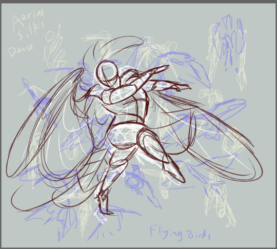
(image description: multiple layers of very loose scribbly sketches in different colors. visible notes on two layers of sketches read "aerial silks dance" and "flying birds". the clearest and topmost layer of sketch is a humanoid figure with wings, performing a dance.
as you might be able to see if you can even begin to parse the mess that is all my study sketching, the final pose sketch I made here for my bird dude Morianon doing a little dance does not even match the poses I sketched from reference videos! This is because gesture sketch studies like these are more based on vibes than accuracy! They're a good way to warm up and practice making really fast gestural doodles that just show the form and motion more than anything well proportioned. It also frees you of the pressure to draw anything perfect! this is messy on purpose! you gotta be messy, it's how learning works.
and then once you're more confident with speed studies, you can get more specific with detail studies. all of this is essential if you want to be able to design creatures. it's all about artistic confidence and developing the skills to notice details. and then you get better at applying those details.
I have two posts on how to study and use references! one over here focused on humans. and another one here about non humans.
this is getting longer than I expected lol. I have other posts on my to-do list that will also be helpful to you I think, and you can explore the links on my pinned post to find more advice on a lot of topics! I might have to make a post on the more general topic of "how do I even get started on designing a creature?" because it is kind of the whole premise of this blog, huh? I have a lot of advice for people who already have a solid idea and just need some advice to overcome a few obstacles along the way, but I don't think I've made a proper advice post for what to do when you don't even have a starting idea.
the tldr version of creature creation is this:
pick a niche (mountain people, flying predator, burrowing creature)
study real life creatures in similar niches
start throwing ideas at your page until something sticks and then take the things that stick and build on them until it feels good
refine your design
16 notes
·
View notes
Note
HIHI!! just wondering if you have any tips on like how you draw?? idk how to explain it but like your anatomy and style really speak to me!! (I'm also trying to use Krita so if you have any tips about that too that would be great) TYSM!! :D
Hi Starry!!
my bad this is going to be a long post ^_^;
This may seem like the most basic art tip you can get, but I definitely recommend searching for reference photos online or even your own personal photos! Websites I recommend for this are Pinterest, Line of Action, etc. Try replicating them! I used this all the time in a sketchbook but by using a pen, no erasing. It forces you to be much more purposeful and confident with your lines and makes you embrace the mistakes without raging :'). I would 100% recommend replicating difficult/uncommon poses at differing angles, so it ensures that you gain a stronger understanding of anatomy + proportions + perspective, and how each part of the body moves dynamically with what you want to convey. Thanks to these practices, I can freehand most of the poses I draw :) Occasionally, I do run into some struggles that involves the case of light tracing, but that is still part of the learning process (as long as it's not heavily tracing other people's work lol).
Another technique is drawing the silhouette of a pose before actually drawing it. For me, I just draw some blob (haha) that I can adjust using the brush and eraser tool until it resembles the pose I desire. Then, put it on low opacity so I can sketch the actual pose in the layer on top. Not only does it make it easier to form the pose, but it ensures the pose is easy to read and distinct. When I am drawing, *I draw what I see, not what I know/think + not everything has to be perfect or symmetrical.
Krita is an awesome program! i stopped using it months ago, but I can say that I'm very experienced with it (since 2018). there are so many features I can talk about that I cant possibly list here, but if there are any specific areas you want to ask about (ex. coloring, layering, brushes, tricks), please do!
of course, these are tips just from my experience and what I think has helped me improve
if there is anything specific you would like me to touch on, please let me know and I would be more than happy to make an in-depth tutorial :)
im so sorry it took so long for me to answer! i appreciate your comments a lot!!
5 notes
·
View notes
Text
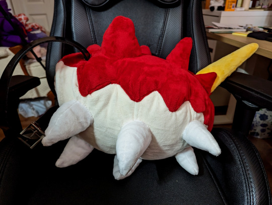
Wurmple Build Log
Guess who's back to drop another overly detailed post about a cosplay project. Another Pokémon one, unsurprisingly! My dumb ass made a Nargacuga fursuit head back in 2020 so I could learn how to work with upholstery foam. It looked... alright... but I know in my heart it was a horrible, horrible mess. Fast forward to 2023, I go to a 3-day convention, wear a bunch of different heavy wigs the whole time, get a rash on my forehead and think, fuck it, I am cringe and I am free, I'm gonna finally live the dream and make a Pokémon suit. It'll be great, and I won't have to wear a wig; I'll just have to worry about heat strokes instead. Fun! Of course, in true shitpost fashion, my perfect fursuit candidate has 10 legs and is shaped like a sausage.
Click on over to read the wondrous tale of building a Wurmple Partial Suit in like two weeks.
1. The Worm
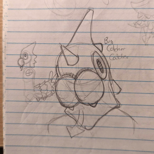
Wurmple started as a dumb little sketch in the corner of my notebook. I have a lot of cosplays and plushes under my belt but the last fursuit (head) kinda looked like it would belong in a bootleg Freddy Fazbear establishment, so I brainstormed over a bunch of Pokémon I like that would work as a partial and are simple enough in design to avoid accidentally creating Uncle Uncanny 2.0. The goal was something that would be relatively comfortable and easy to bring to events 'cause I'm just not mentally prepared to drag a suitcase in public transport and wear a full body sweat carpet yet. I ended up doodling a few ideas like Haunter or Koffing, but then I pictured a Bug Catcher trainer with a bug head and I thought it was funny as hell, so the choice was made. I picked up my copy of Alpha Sapphire to get a good look at the model and immediately ran into a problem; the eyes on Wurmple are literally on the side of the head. They sit so flush you literally cannot see them if you look at them from the front. Not a great start. I figured I could probably hide a small hole for vision right above the mandibles where the red and cream colors separate. I wasn't super confident it would work, but dammit, I was already commited to being a stupid Bug Bug Catcher. Similarly, I looked at the side profile and figured I could open a hole behind the mandibles at mouth height to breathe out of. With an disproportionate amount of confidence for the bullshit I'm about to summon into the world, I began the project by patterning out the tail.
2. Bug Ass
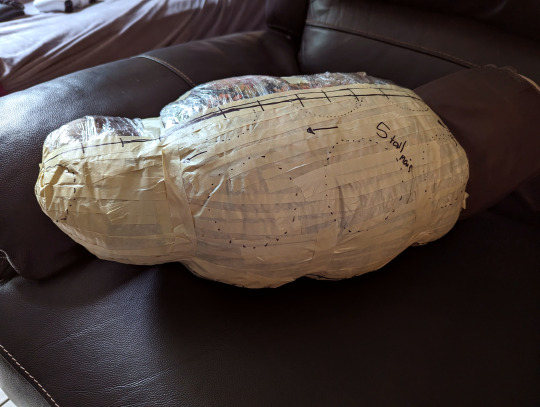
I'll be honest, I started on the tail so I wouldn't have a reason to back out of it if the head ended up being a hot mess. I've patterned out and sewn a few plush before, so making a big ol' headless grub sounded like a reasonable goal. I usually make plush patterns by building out the shape with newspaper and tape, but Wurmple's tail got pretty big when scaled to fit a human, so I searched for alternatives. I ended up building the base shape to draw a pattern out of by taping two pillows together. I tied down small sections to shape the belly and slapped a layer of masking tape over half of it to trace my pattern. Once everything looked good, I cut the pattern pieces out and laid them flat. The pillows were returned to the couch safely once they recovered from the barbaric treatment.
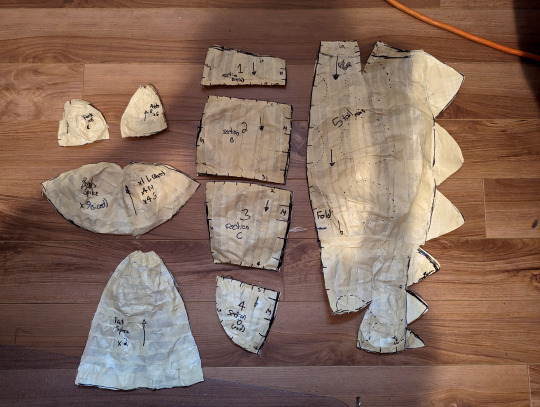
I dug through my materials storage (a sad lonely plastic bin) for some Trash Fabric ™ leftovers from other Trash Projects ™ and tested the pattern out to see how it looked. I made the pattern for the spikes and legs at that point based on the test build and adjusted some seams on the tape pattern to refine some shapes, but overall the first pattern was a great success!

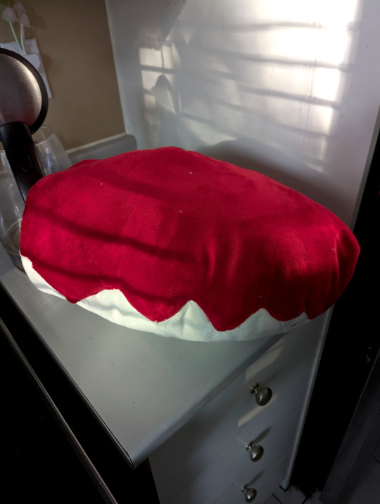
With the mockup done, I pulled out the minky fabric and got to sewing the tail together. I picked minky for the project 'cause it felt right for the cartoony 3d models to have that smooth short-pile look in real life (kinda like the official mascots, really). I was aware the margin for error when your fur pile is 3mm long is basically non-existent, but hey, at least I could work without a respirator on unlike fur! Sewing the body of the tail was pretty straightforward; I assembled the belly panels together, stitched the darts on the red parts to form the curve, and attached the backside of the zigzag spikes to it. I assembled the top and bottom halves together, tacked each zigzag down in place by hand, and filled the whole thing with polyester stuffing to see my beautiful bug sausage take shape.
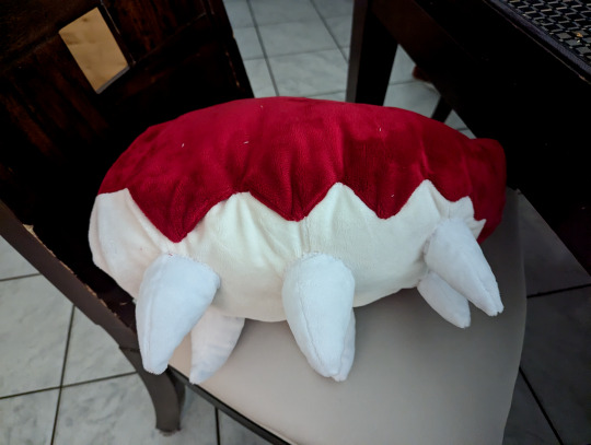
Once I was sure it everything looked good. I stitched six little white legs and attached them onto the belly by hand using the belly seams as a guide.
Before moving on to the top spikes, I took a break from handsewing to build the tail base. It's a little nub made out of sandwiched upholstery foam with a belt running through a channel carved into the foam. It's topped off with a layer of high density EVA Foam glued at the base to keep the anchor point sturdy. Huge thanks to Neffertity for her tail tutorials as this was the main inspiration behind the method I used for the tail attachment. The foam nub goes about a quarter of the way through the tail, with the rest of it being filled up with the polyester stuffing that was added earlier.
Once the tail attachment point was secured, I started sewing all the spikes for the top half of the tail, stuffed them, and then stitched each of them to the tail by hand. Once they were all stitched on securely, I sewed the back closed with one last minky piece and Wurmple's tail was complete!
(Looking back, I could probably have machine stitched the legs and spikes on... But I was watching some really good Resident Evil Randomizer streams while handsewing these, so I didn't wanna get off the couch to work on the pattern again)

I'm so glad I started with the tail. It was basically a big plush, and I was so proud of the results when I was done that I was energized to start working on the head. Oh right, the stupid worm head with no vision.
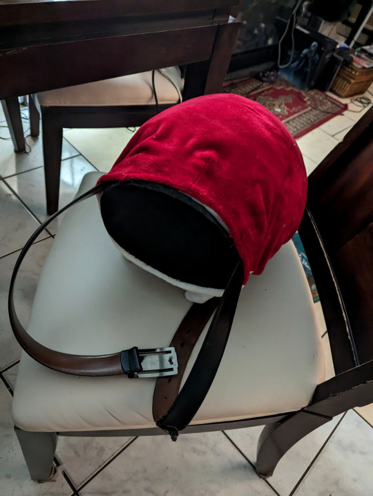
3. The Head
Building up the shape of Wurmple's head was simple enough. I began by building a bucket head base out of upholstery foam by following Skyehigh's Studios old tutorial (new one linked here) and slapped some paper on it to figure out the size of the main elements; the mandibles and the eyes. I immediately regret following the tutorial steps for the eye holes, since I Forgot We Weren't Gonna Be Doing That, and mark where my cyclops eyehole is generally going to be instead.

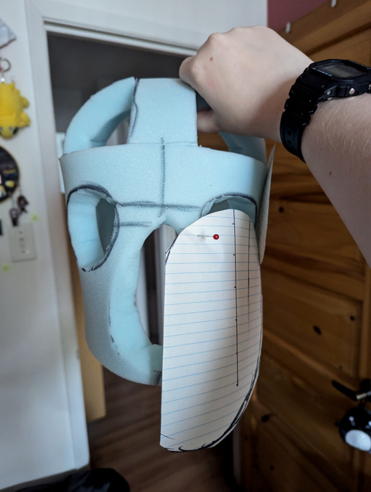
Once I was satisfied with my patterns, I cut some more upholstery foam slabs, carved them with scissors until I got down to the general shape of the mandibles and horns, and glued them onto the base. I immediately got another stress injury carving everything down and realized I did not learn from my wig ventilating mistakes. I took a break to add a turkey carver to my online shopping bookmarks, which I immediately forgot about until I sat down to write this post. Since I was using minky for this project, I needed to make sure my base was as smooth as possible. The fabric is so thin it would pick up every wrinkle ever and look sad if I didn't. I dug into the bin for some Trash Felt ™ and glued it over the mandibles to smooth things out and added some mesh to the holes of the bucket head base to keep the curved shape of the head going without sacrificing those sweet ventilation holes. I also added my vision hole and marveled at my horrifying Mando helmet abomination. At that point in time I'm having some big doubts about the vision hole, but I trudge on because I'm not just gonna wear a bug ass to these conventions.
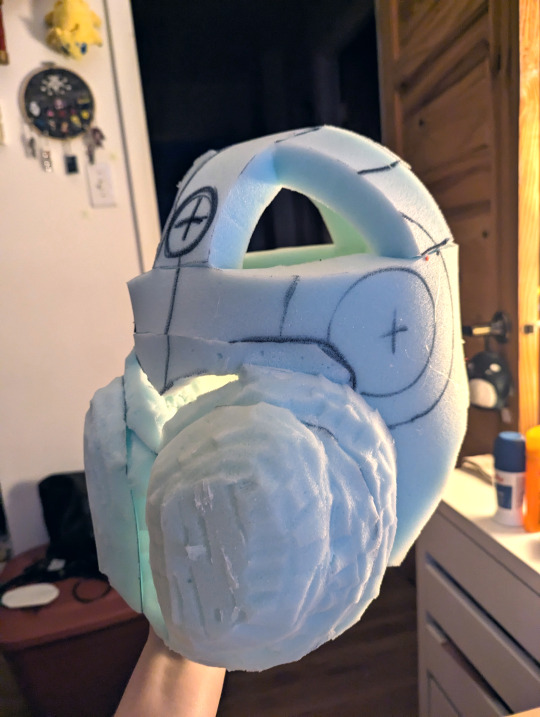

With the base complete, I covered the whole thing in tape and drew over it like I did with the tail to create a pattern, made sure to forget to take pictures of said pattern so that this step is lost to time, and started sewing the head fabric so I could slap some skin on this bad boy, starting with the horns. At the same time, I stitched the darts on the mandibles, pinned that to the head for later, and assembled the red halves of the head together on the back seam to test the fit.

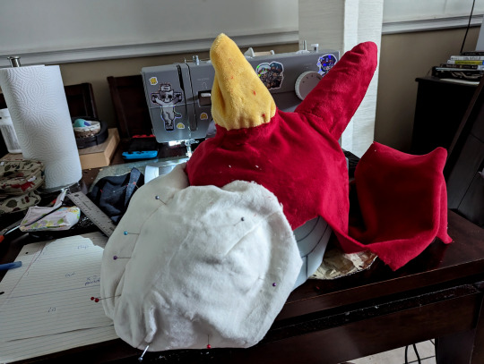
With the test fit successful, I pulled the red part off in order to machine stitch it to the front half of the head along the zigzag edge and slipped the whole thing over the head again. With everything in place, I painstakingly handstitched everything up, including the side of the mandibles and the horns.
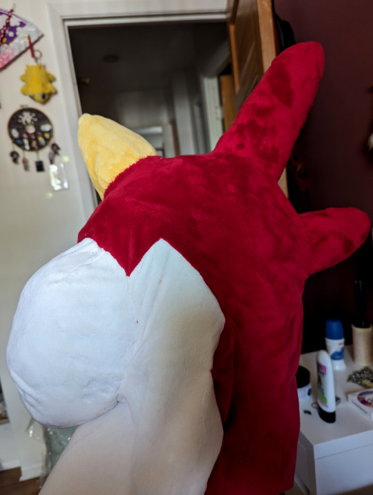
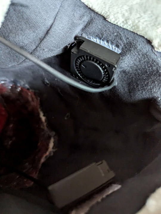
Somewhere in the magical stretch of time between midnight and 5 in the morning, I somehow summoned the inner lining of the head out of french terry knit, a tape pattern and a dream. I also painted a little piece of buckram for the eye mesh to match the red fabric and glued that to the inside of the head. I included a little velcro pocket on the back of the neck in the lining to insert a powerbank for the fans (which I then proceeded to procrastinate on installing for a whole 4 months afterwards). Since I'm an idiot and took no pictures signed an NDA with the Midnight Craft Wizard, here's a picture of the fan installation in the mandibles with velcro so they can be removed to wash it. (Fan kit by Henry's Helmet Fans)
Once the head was completed, I finally went to sleep. And then I woke up at noon and remembered I forgot the eyes WHOOPS I cut four circles out of high density EVA Foam (Two of them smaller for the pupils), heat shaped a slight curve to them, and covered them with minky. I glued the pupils to the irises and then I glued those suckers to the head and NOW THE HEAD WAS ACTUALLY DONE WOOHOO

Turns out hiding the vision hole right over the mandibles was... Actually a decent idea, in the end. It blends pretty well into the face at a short distance. The mouth opening also isn't visible in most angles so I can actually breathe pretty well, and I can even wear a portable necklace fan and have it blow hair into the head without making poor Wurmple eat the fan.
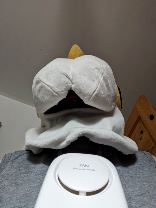
I took it for a test run and realized the eye vision in the suit was actually pretty damn bad overall because the minky covered half of the original hole up, especially on the sides. I took a heat gun and some scissors to the head so I could peel it back around the vision hole, cut some material out to open it up more, and glued everything back down with a new piece of mesh. Now I have like 40 more degrees in my cone of vision, which puts me on par with some of the guys in Metal Gear Solid.

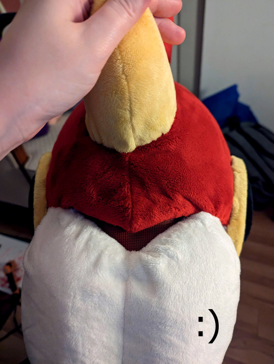
With those adjustments done, the head was finally complete!
4. Get Worm'd on

Turns out I like it a whole lot, whoops. It's definitively not perfect (what costume ever is?), but it looks leagues better than I expected it would, so it works out. Looking back, I don't think I'd really do anything else differently on the build. I still got to make the Bug Catcher outfit to go along with it, but with winter in full swing there's no rush to do so. Definitively looking forward to making a net, though!

If you're still reading, thank you for getting through my ramblings! I hope it was an interesting read, and maybe even provided some insights or inspirations for your own future projects.
❤️
#Wurmple#Cosplay#Pokemon#Pokemon Cosplay#Fursuit#Partial Fursuit#Fursuit Friday#Pokemon Fursuit#Fursuit Maker#Cosplay tutorial#Cosplay Build Log#Original Content#Oh yeah I'm totally making another dumb pokémon suit project after this it was real fun#I'm thinking maybe giving that Koffing or Haunter idea a try later. Or maybe something else equally stupid like Grimer. Something
32 notes
·
View notes
Text
Little behind the scenes post on this painting/drawing I did.

After taking several dozen screenshots from BIG to try to find one for a decent reference I eventually did and practiced drawing shitty outlines on my phone's photo app until I got the gist of how I might do a basic outline for it. Then I started with the outline sketch and made marks where the colors change. I wasn't sure exactly what I was going to do with this, whether I'd do a rainbow gradient over the whole thing or just the background. This paper is 3x3 inches and I can't lie I did try and trace a little of it on my phone screen to get the placement of the features (not well) but marginally better than freehanding it so call it cheating if you want but at least it has less wikihow man vibes this way.


I left the pencil because I was going to trace over it and did the watercolor outline first to see where I wanted to go with it. Then I liked the outline, so I went nowhere with it and kept it as it was. I started from yellow and used the tiny Sennelier brush that came with the palette and did the outline with 579 Sennelier Yellow, 645 Orange, 690 Rose Madder Lacquer, 913 Cobalt Violet Hue, 341 Phthalo Turquoise, and 805 Green Yellow.

Once I realized I wasn't going to paint the background I wanted to fill the space somehow so I decided on the "and the future is clear: it's pretty queer" quote because it was the first thing that came to mind and I thought I could carefully fit it. I divided each side into three segments of 1.5cm each and roughly sketched the letters to make sure they had any chance of fitting and then erased the marks and went over them in ultra fine sharpie. I lowkey hate sharpies, they're useful and easy to get and last longer than expensive pens but the ink doesn’t come out consistently at all which sucks for thin lettering but I don’t have much choice since it’s what I have in the greatest color variety. I tested several shades of each color to try and have the general brightness match up because the scanner I have can get weird with colors, especially light oranges and pinks not rendering. So the colors came out okay but the lettering is far from my best.


Then finally I inked the outline in black (off-brand) micron pen size 0.3 (Superior Needle Drawing Pen, whoever that is, but they work) to cover the pencil lines. I went slightly thicker on the hair because I hadn't erased the pencil as well and didn't want gaps between the outline and the paint, so then I traces all the outer lines in double to make it more consistent.

Then of course I took some photos and scanned and edited it. My scanner is weird with some colors, that day it decided to exact its vengeance on purple and turn it all the same shade of pink. Its only redeeming quality is that I can scan a stupidly small 3x3 inch paper in 1200 dpi and have it come out decently. I was technically trained in photoshop once upon a time but I don’t have adobe subscription type of money so I use GIMP and wing it.
First I cropped the excess edges and added a second almost-white layer underneath because the right edge was too close to just crop it and leave it, and I added the margins that way and smoothed out the edge line. Then I used the overlay brush on the purple section on 20ish percent opacity to color correct and have it look closer to the real color. I also edited out the mysterious mark on the paper that wouldn’t come out.
I assure you nothing else is edited otherwise I would’ve made my handwriting look less shitty. It’s worse than my usual letter work and I’m blaming the sharpies but if I’m being honest it’s just lack of practice because I used to freehand entire fucking maps that were better than this. It happens.
Anyway, here’s my makeshift painting station on the floor on the back of an old picture frame and the color correcting edits I did the next morning. It was hard to get the lighting but you can sort of see that the actual paper is more purple and the outline was very red and not blending with the blue on the scanned version.


Anyway, that's all for that one. Even if it's not perfect I had fun with it and it didn't take forever like the tour sets did, so that's a win for me.
2 notes
·
View notes
Text
@raccoytefox809 i got ur ask but tumblr was being difficult and i accidentally deleted my whole post including the ask ;; luckily i screenshotted all the stuff i wrote
mostly digital art tips bc traditional is not my strength lol
flip the canvas occasionally to check for mistakes, but not too much or it defeats the purpose
use references, the more the better!
if something is hard to draw, trace a picture of it to practice and then try it on ur own
learning basic color theory is easy but you can also cheat with blending modes lol. (pssst make a new layer on top, fill it with a nice color, change the blending mode (my favorite is Soft Light), and/or change the layers opacity)
do stuff with ur lines! varying line thickness is great for making important things stand out, separating things that overlap, etc... you can use darker colored lines for important stuff and lighter lines for details, or all light colors for a soft feel. i almost never have pure black lines
i also never use black for shadows; i use a color from the rainbow (usually blue) with the blending mode set to multiply. purple looks good almost everywhere, green gives a natural vibe, red is good for human skin tones
it might not affect the final art that much but i like drawing on a medium gray background, not white. it reduces eyestrain and kinda helps me color stuff better?
sketch a simple stick figure to plan out a pose before actually drawing it
do warmup sketches! i dont feel a huge difference from this personally but some people do, i usually just draw something simple like a snake
keep simple physics and gravity in mind. body parts squish when bearing weight on something. things like hair and loose clothes tend to hang down when still. if youre drawing a character in motion, those loose things should also reflect that
this is really specific, but eyeballs are not just spheres. the iris (colorful part of the eye) is kinda like a bowl and the pupil (black part) is at the bottom of the bowl. keeping that in mind with perspective is a nice touch of realism and depth
super lazy secret hack to make it look glowy when the drawing is done: save it as a png, have png as a new layer on top, blur until unrecognizable, set blending mode to overlay, lower layer opacity as you want, enjoy!!


finally heres the brushes i use in ibispaint for lineart and static :)
16 notes
·
View notes