#messed around with a gradient map :7
Explore tagged Tumblr posts
Visit Tumblr Blog
Explore Tumblr blogs with no restrictions, modern design and the best experience.
Last Seen Tumblr Blogs


Fun Fact
Tumblr posted its first advertisements in May 2012 and subsequently earned $13M in revenue.
Text

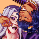
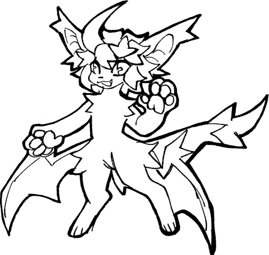
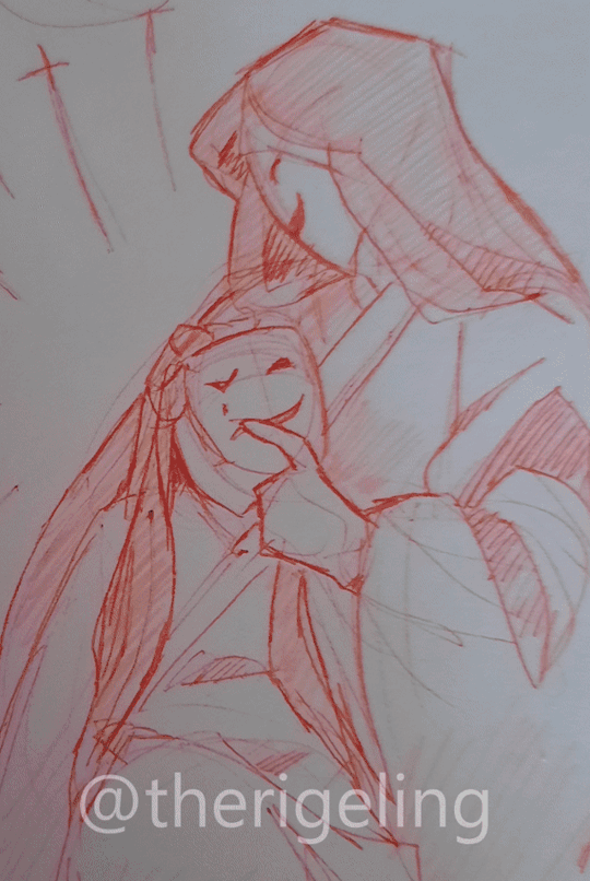
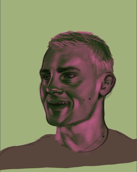
mindflayer...
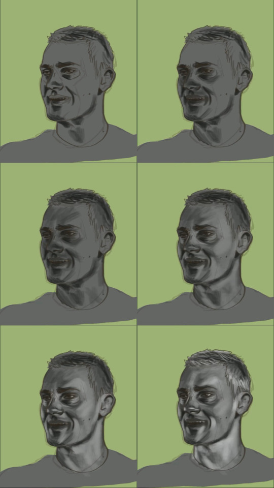
#mindflayer#ultrakill#mindflayer ultrakill#messed around with a gradient map :7#something something art tag
46 notes
·
View notes
Note
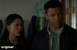
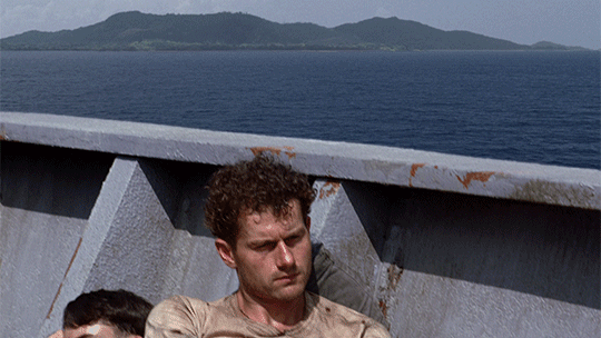
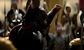
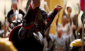
hey!! Those gifset for scrubs looks amazing!!
https://www.tumblr.com/billysjoel/776944203704975360/scrubs-jd-elliot-turk-pscentral-event-36?source=share
would you mind doing a tutorial on how you made the colouring and colour isolation and text effects on the second gif?
hi, thank you so much!! this is the post and i'd be more than happy to make a tutorial for you!

so, i'll start with the coloring:

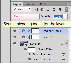
step 1: as with almost every single coloring/psd i make, i start with a blank brightness/contrast layer set to screen. this is especially helpful with really dark scenes! in this case, i left it at 100% opacity, but sometimes i'll decrease it if it blows out the scene.
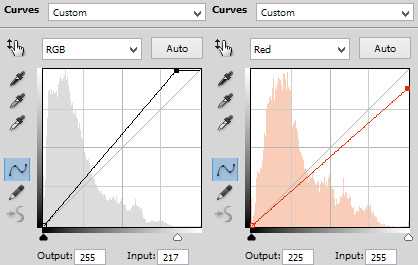
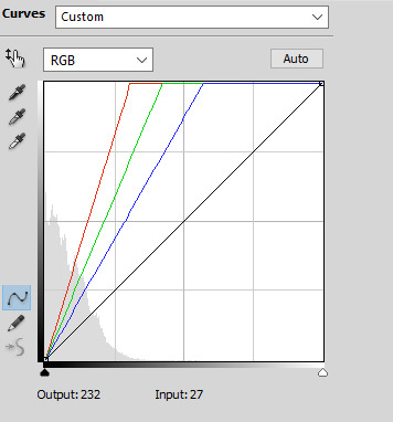
step 2: curves. i rarely, if ever, manually adjust this layer and instead use the eyedropper tools. click the black eyedropper (1) and then click on the blackest part of the scene and then use the white eyedropper (2) to select the whitest part. in this case, it didn't make a huge difference, but this is a big help with heavily tinted scenes.

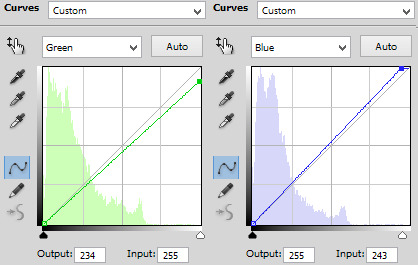
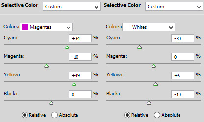
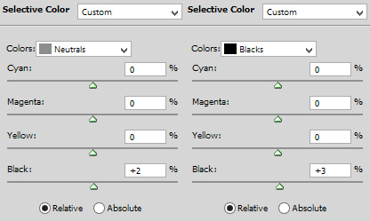
step 3: selective color. my next step is always adjusting the blacks and neutrals (and sometimes whites) in selective color. how much i adjust these totally depends on the scene and messing around with the neutrals can definitely affect the skin tone of people of color, so keep that in mind!


step 4: color balance. this step is usually optional for me, but i found the scene was leaning kind of yellow. again, this will vary dependent on the media you're coloring, so my best advice is to play around with the sliders and see what works!


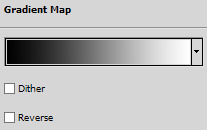
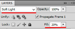
step 5: gradient map. after this, i added a black & white gradient map set to soft light and reduced the opacity to 25% just to add a bit more contrast and depth to the blacks.
step 6: brightness/contrast. another blank layer set to screen and set the opacity to 15% to brighten things up just a little.
step 7: vibrance +50.
step 8: selective color. adjusting the blacks and neutrals again.


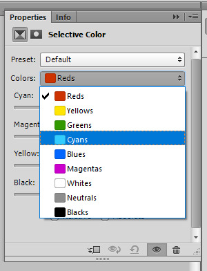
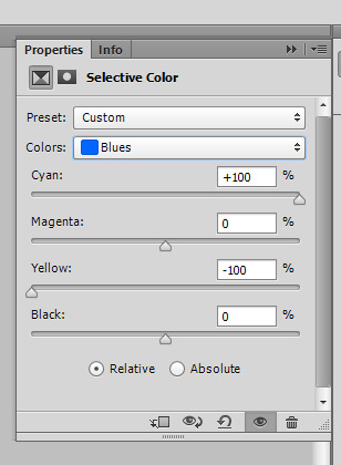
step 9: selective color. my favorite part is just cranking the blues and cyans the FUCK up lmao


step 10: selective color (again) on cyan and blue (again).


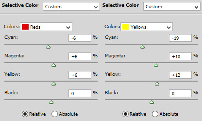
step 11: selective color under the reds because elliot's face was looking pretty red.

step 12: selective color under the yellows. again, i recommend just playing around to see what slider does what. a little can go a long way!

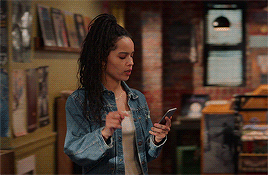
and that's it for the general coloring that i used for all the gifs in this set. for the next part, you'll either want to be proficient with keyframes or pick a scene where your main character doesn't move much (this will make life so much easier).
step 13: create a new layer (ctrl+shift+n or layer > new > layer). choose the color you want to use and either fill the layer using the paint bucket tool (g) or use a brush (b) to color it all in. you should have something like this now:

step 14: set the layer to color (or another blending mode of your choosing) and apply a layer mask (the 3rd icon across the very bottom).

step 15: with the layer mask selected (as you see above), not the color thumbnail, use a soft black brush and color over your character. this will remove the blue from from whatever areas you color. if you need to "undo" what you've colored, switch to white (x) and that will bring back whatever you color over.
step 16: typography. i've actually done a few tutorials showing how i do my text like this, so check out this one, this one, or this one!
if you have any other questions, please let me know! i'm happy to help however i can!
#answered#Anonymous#my tutorials#gif tutorial#gifmakerresource#completeresources#dailyresources#chaoticresources#coloring tutorial
48 notes
·
View notes
Text
how i make color palettes of my ocs before i pick one, an art tutorial?
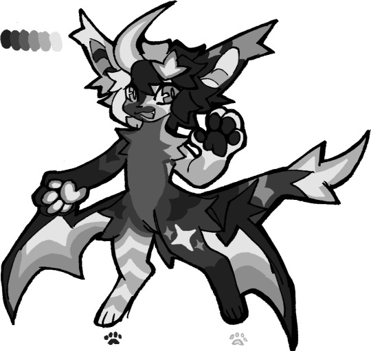
hello, whenever i made a new design for myself i found a way to make lots of color palettes and pick one! i see this method more in paintings and rendering but not much on character designs? here are some examples i used that on.
it helps me so much when i feel experimental with colors. here are what you need
a wip character design. sketchy or pixel art works better since the colors can have some anti aliasing issues
a program with gradient maps. i'm using clip studio paint but ik photoshop also has it. like i said this is used more on photos or paintings
and here's what you do!
draw your character. i'm making a new fursona for myself but anything should work.
2. decide on their markings/color placement in grayscale. i recommend doing grayscale so you can easily see the values. split your grays into however colors you want. i like doing 5-6 the most. i reccomend duplicating the color layer if you wanna try multiple palettes.
3. this part is program dependent but in csp's case go to edit > tonal correction > gradient map.
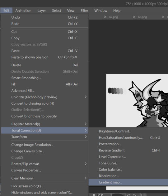
4. i made a few default 5 color gradient maps but if don't use gradients like me i reccomend making the graph like this so they become solid color. split the map into however many colors you used. i'll add a color to the red-orange one bc my character has 6 grays.
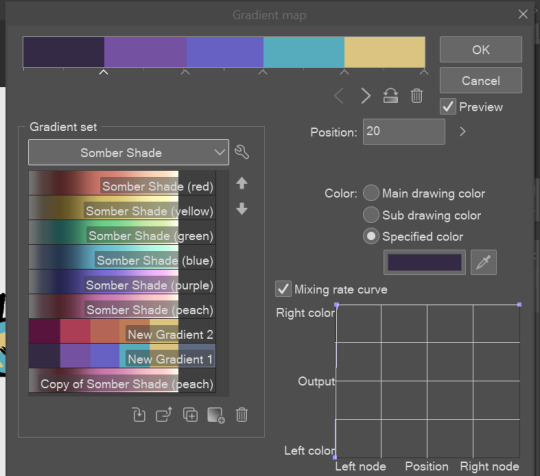
5. replace the colors by clicking below specified color. it all depends on your creativity and what you want. experiment til you like it.
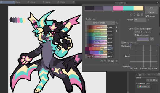
6. fuck around, try stuff, put them together to see if you like any of em. i made 9 to see if i can focus on one of them and i actually ended up loving the bottom right. it really makes them shiny
7. (optional) if you like a palette you can further and play with colors while keeping the palette. you can use color balance (in the same menu as gradient map in csp) or layers to mess around, have fun!
also a color tip because people seem to compliment that a lot in my art: digital art has millions of colors! don't be afraid of using wacky tones unless you're going pantone. if you want to get something physical i recommend being open to alternative colors as they tend to be more limited. i know whoever is doing it will try their best to keep the colors close.
color theory is something i don't...care much about mostly because this is something i'm doing for fun. i'll consider it in professional work.
#artists on tumblr#digital art#ika's showtime#ikarnival#art tutorial#art tips#drawing tips#art resources#clip studio paint
420 notes
·
View notes
Note
How. Do you paint. Please. I have tried. I have cried. Tell me ur secrets 😭
i see you, bestie, we’ve all been there.
the technique i use is a common one for painting - make a mess, work on top of it. you can see it for yourself here:


(btw, i’m entirely self-taught and still have a lot to learn, so my use of this technique is probably wildly unorthodox. but it works for me and may or may not work for you.)
so the process basically goes like: 1. get yourself a messy ass sketch, don’t even worry about details, nor anatomy really. you can fix everything as you go. 2. FIGURE OUT YOUR BACKGROUND COLOR. it’s important!!! all your colors are gonna depend on it. (but again, don’t worry too much since anything is salvageable through our lord and savior gradient maps.) 3. slap some base colors on. paint some basic shadows and lighting as well. BUT! BE MESSY ABOUT IT. NO DETAILS, NO DEFINITION. 4. play around with your colors a bit. color correction? gradient maps? overlay? yes. 5. got your colors down? alright, you can add SOME definition. just fix wonky shapes, nothing too fancy. 6. NOW we’re talking about details. fix the shadows, add some highlights. get the edges nice and crisp, or cute and smooth. go all out. 7.MORE COLOR CORRECTION! fix the little places that bother you.
and that’s all, basically. Make a mess, make mistakes, fix them, have fun!
Don’t like how your artwork turned out? it’s okay, try again! art is all about practice and making mistakes, it’s not that serious to cry over it.
if y’all are interested i can post some of my older, cringier paintings (from 2014 till now) to make y’all feel better about your own journey :)
83 notes
·
View notes
Note
congrats on the photoshop! if u dm talking abt, what’s ur gif-ing process :3
tyty! and you've activated my trap card, I love talking
It usually goes like
1. download the mp4 from youtube or some other place and trim the clip until I get the parts I want
2. import the mp4 into photopea, which automatically splits it into frames for me (haven't tried directly loading it into photoshop actually).
if this step gets messed up and the frames aren't generated properly/smoothly (this happened in one of the hu tao gifs and I didn't realize until about a week ago lmao) I have to use the mkv player method a lot of gif tutorials talk about (I followed this one).
3. crop it to either 960px or 540px (widths), settings below. everyone says use 540 but I've done 960 on several occasions by now just because I like clicking on images and having them actually zoom in. it's supposed to be worse for the normal preview though

4. add adjustment layers and fool around with them. for this I almost always add hue/saturation and selective color, and sometimes brightness/contrast and gradient map as well, and maybe others depending on how I feel. a ton of tutorials add curves layers but I haven't figured out how to not make them look ass lol
this step is super vibes and eyeballing based tbh I use different colors for every gif including ones in the same set. I know coloring psds/actions are a thing but I haven't looked into that
5. sometimes I will also add gradient fill (did this for the lyney gifs and some other non-genshin ones) for more strongly colored backgrounds
6. finally open the file in photoshop and do: make video timeline > convert to frame animation > make frames from layers > delete any blank frames (manually) > select all frames > set the frame delay to 0.05. exactly the same steps as this tutorial, without the reverse frames part
7. tweak the color details until it looks better / finished. I've had to mess around with layer masks for some of the gradient fill parts (to make sure the subject of the gif isn't colored over by the gradient), and that's kinda painful, but I've only done that for ~3 gifs so it's fine
8. add sharpening layers, I think I use the settings in this tutorial? I tend to make the gaussian blur stronger than 15% (usually 40-70% lol) because sometimes the 2 sharpens look too pixelated. idk if that's bc of differences between animation and live action or personal preference
9. squint at the gif a lot when exporting (I usually use adaptive color and pattern dithering, but sometimes I have to use perceptive color instead to lower file size...) and go through at least 3 different minor color or sharpen tweaks before being like yeah that's probably good enough
photopea doesn't have dithering settings which is the reason I switched to actual photoshop (sigh). it makes the gif colors look smoother
also there's a bug where the frame delay you set gets changed (usually increased) when exporting, but often times I'm too lazy to fix it back and export again. idk it doesn't make a difference to my eyes but fyi ig
10. save as draft on tumblr and add alt text. it's fun and my internet is shitty enough that my own gifs load very slowly too, so the description is helpful especially when all I can see is a gradiently colored square
there are a lot of photoshop actions that people recommend and I haven't looked at any of them, mostly I'm lazy and prefer to just wing it myself. also I feel like the main ""trick"" to gifs/giffing and making your """style""" or whatever is in choosing and adjusting colors, but besides making things brighter and more colorful, I don't really have rhyme or reason behind how I adjust things lol
also if you have any other questions feel free to ask! I can also send cracked photoshop and the gif tutorials I've used if you want lmao
#teyvat thoughts#asks#thank you for sending this it was fun to think about! maybe I'll look back on it in a year and see what's changed#gradient map is kind of weird and I haven't figured it out. idk curves or levels either although i theoretically know how they work
2 notes
·
View notes
Text
"I've seen your fears. Mine will eat you alive."
I don't have a proper PC to play Valorant lmao but the cinematics are so cool! I'm currently obsessing over Fade rn lol. She's and her powers are so cool! and I'm obsessed with her design and her art style.
I wanted to try and imitate the art style used in the cinematic, while also messing around with gradient maps again. It ended up a lot warmer in colour compared to the video and I'm not sure if I did justice to the character but I really like how it turned out.
Drawn with: Clip Studio Paint EX
Time taken: 7 hours
Music or Show while listening: Character themed playlist
I do not consent to having my work used as N.EF.T.'s, used in A.I., stolen/ traced, or used without credit.
Have a nice day/evening/night!!
27 notes
·
View notes
Text
my coloring process!! a couple people did say they want to see the process soo. also for reference i do use procreate, but i know all these functions are available on photoshop and (presumably) other programs as well.
far too many visuals + explanation below :3 + silly speed coloring
SO…. i’ll try to organize it step by step? i’m gonna use visuals from my roope piece so. basically early TLDR: grayscale -> flatten + duplicate layers so you have two layers of the gray scale -> put a gradient map on one -> make the other a luminosity layer -> ??? profit maybe
BUT FOR A MORE IN DEPTH EXPLANATION
1. after finishing ur sketch or lineart, fill in the figure a medium gray! just a solid fill .. straightforward
2. start applying shadows and highlights! i do these as clipping layers over top of the filled in shape we just did (i used reference photos, if you do that imo it’s easier to lower exposure on the photos and even up the contrast slightly to see the lighting differences better. but ymmv)
i use three shades of gray that are darker than the color i put down to fill the shape, i layer those so the darkest is on the top. i then use three shades of gray that are lighter than the filled color, i put these on top of the darker shades and layer them so the lightest is on the top. again, just personal preference, that’s how i layer shade/light usually so
3. this is when things get ugly . for me at least. you can also do this step before doing two… really it can go wherever but i do it here. i hide the above grayscale colored layers, i move my sketch layer above the filled in shape (FOR REFERENCE … don’t color on ur sketch layer. unless you want to i guess), i then apply the base colors on a new layer of the drawing . literally just simple skin/hair/clothes. it looks odd to not add any depth or lines but we have to move
4. youre gonna wanna flatten and duplicate the grayscale painting layers you did before. there should be two grayscale drawings in your layers that are so stunning and gray and beautiful.
5. hide the grayscale drawing highest in the layers for now. take the bottom one and then we use gradient maps!!! my best friend!!!! this is all gonna be very personal choice on what you want YOUR palette to be. i wanted green/pink so i adjusted the colors in the gradient map to be green/pink
6. i then take these pretty color layers and mess around with layer settings. for this particular piece, i set the layer to linear light at about 30% opacity. i usually keep my opacity around there, but i’ll jump around between linear light, vivid light, color burn, etc etc. literally just experiment and have fun!!! it should just be adding more color/whimsy to your base colors
7. i then unhide the other grayscale layer. it’s gonna make everything gray again, believe it or not. i turn that layer to LUMINOSITY….. i’ve played around with other layer types but because it’s a shade/light thing i really think luminosity looks best. but again, you play and have fun and figure out your own preferences!
your layers should look, more or less, like this
AND THATS REALLY TRULY IT …. it’s pretty simple and diverse and allows you to be more explorative with colors if you’re someone who tends to stick to basic ones or only palettes you’re familiar with.. i like it because it’s simple and intuitive for me (i started out doing mainly charcoal so grayscale is my friend) and just fun!! non stressful!! except when you’re fighting layer limits!!!
and for shits and gigs…. coloring speed drawing be upon ye
(song: baby i’m yours - cass elliot)
#basically … clipping masks + confidence in contrast with ur darks/lights + GRADIENT MAPS!! are ur best friends#also this was just to show my process but it did turn tutorial esque because . well#future teachers of america curse#enjoy!!#art stuff
3 notes
·
View notes
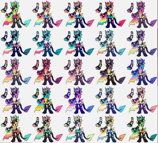
Text
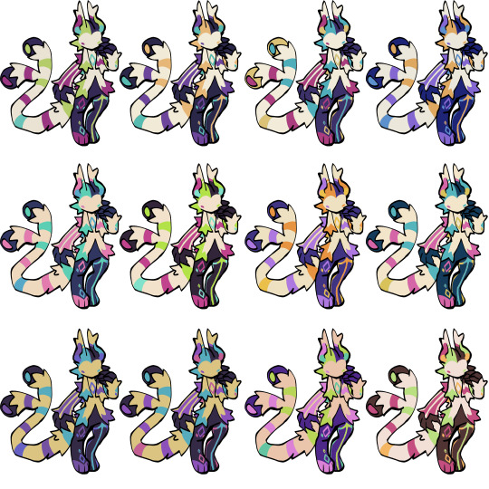
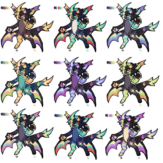
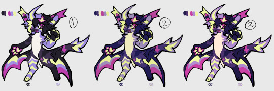
this was meant to be a rough sketch but whatever. I messed around with gradient maps and made a bunch of different colorways lol
just in case I touch these up and print these, which variant is your favourite? These aren’t final in any way I’m just interested what colors y’all prefer (I’m planning on using 3 of these variants)


Hehe
Do I know how to wait? Yes. Do I want to wait? Hell no! Anyways doodle of a skin idea for the upcoming horsies :)
#art#flight rising#fr art#flightrising#fr skins and accents#fr uma#fr cirrus#flight rising skins#flight rising uma#I have no patience AT ALL bear with me
305 notes
·
View notes
Note
wait like you said can you send screenshots for the settings?
ofc, under the cut!
ok so for the color fill option, if i wanted it to look like this:

(this is from my emails i can't send set but w an added mask)
the layers for the blues look like this:


ok from bottom to top, first is a gradient map set to soft light at 20% opacity. this just makes the gif more blue toned (or whatever color you'll be going with). the gradient should be black to a dark shade of whatever color you're going for! so mine looks like this:

next is group 4 which has 3 gradient fill layers. the bottom layer is set to color, and it's just the colors i want the overall vibe to be. then on top of that, two gradients set to soft light, just to add a bit of a highlight and... lowlight? sdfhskf idk it looks better. these are the angles i went with, but once again. it's just what looks best for your gif and what you want:


you can stop there but for some reason i added more gradients on this dksjfsk both of the gradients in group 7 are set to hard light, but gradient copy 3 is at 41% opacity. the angles are the same as above. all of this is just something you have to play around with though, it's whatever looks best for what you're trying to get!
without the masks, the gif is just fully blue and looks like what it is in the set i posted. so to make it a background thing, you just add a mask and color in their faces/whatever you want to not be blue!
and finally, for group 7, i changed the mask density bc i felt like ricky & gina looked too orange/red so i wanted to use some of the blues from that group to tone it down:

and that's how i got the blues for this set!
now for selective color, i don't have a set in mind where i changed the background so we're just gonna change ricky's shirt color here & it should be the same process:


so after my initial coloring, to go from the green shirt to blue, i used two selective color layers w the following settings:


and you can mess around with it to make it a different shade of blue!
you should also be able to go to purples if you add another selective color layer and do something like this:


so yeah, just mess around with it and see what happens!
lmk if any of this is confusing, i'm assuming you have some ps knowledge so i've skipped over some things but i can expand on anything that doesn't make sense! <3
2 notes
·
View notes
Text
I was getting some questions about my process in procreate, so I just put this together. More under the cut!
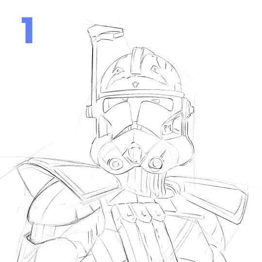
1. Start with a rough sketch! It just has to be clear enough, so that when I start painting, I know where things are supposed to go. I use references throughout the whole process, but especially now! If I get something wrong here, it'll be a pain to fix later after I start adding in values and color and all the fun details.
2. I make 2 layers, one for the body and one for the helmet, just painting in the basic shapes. Then, I make 2 clipping mask layers, one for each of those. I could have more, but for a painting like this, it's not really necessary.
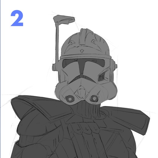
3. I start to lay in some values on the clipping mask layers with the flat brush. For this particular painting, I wasn't sure what colors I wanted yet, so I stuck to greyscale. Whenever you're making anything, whether it's with graphite or an apple pencil, the pressure you use is super important. Constantly pressing really hard gives you less control over your stroke. Another helpful thing to remember is painting big to small. At this point, I'm not thinking about the little scratches on his armor (at least I shouldn't be). Right now, I'm using a bigger size for my brush and later I can zoom in with a smaller one.
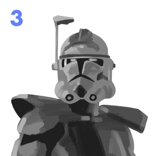
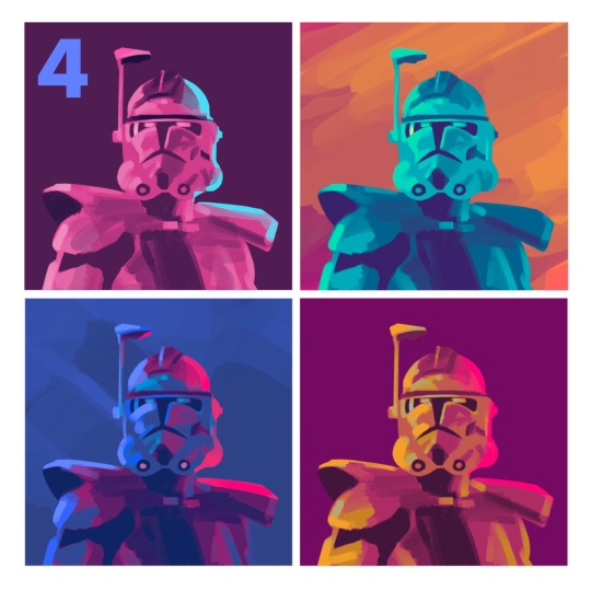
4. Then I made a copy of my work so far and duplicated it a couple times in a new canvas. I played around with the gradient map tool and color drop to try to quickly find something that stands out! Something I learned just recently is that you can adjust the reach a color drop has. Super helpful!
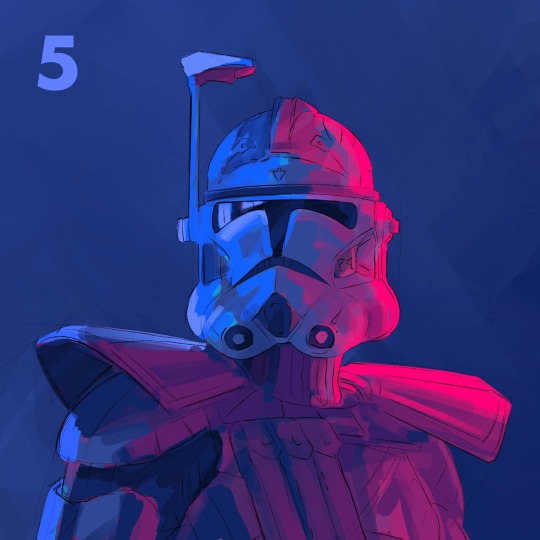
5. After finding a palette I liked, I go back to my first canvas and used the same method again to get those colors. This is a bit convoluted and only cause I don't like to work without having a clear direction in mind. If I know my colors right away, I'd probably skip the greyscale and color comps, and go straight to this step.
6. This is where the fun begins! Still looking at my references, I begin to render the form. I use a combination of the flat brush and smudge tool to build in the values. Once the basic values are there, I started to give the armor some texture. I used the dry brush and oil brush to add nicks and scratches. I also used some from the comics MaxPack set.
7. After finishing the helmet, I start to focus more on the body, using the same technique. I use the flat brush to define the large shadows on the pockets and bring it to a teeny size to add the stitches. I try to always keep the basic light logic principles in mind.
8. Last step is to take a break! I've been looking at this thing for too long, and if there's anything wrong I can't tell. I come back to look at it later and give itty bitty finishing touches. Maybe a highlight gets too bright, or an edge isn't as defined as I would like. Then I call it done!
Thanks for reading! I want to say I'm definitely still learning about painting digitally and I'm no professional! This isn't the best way to work, but it's my method. Hopefully this rambling mess was helpful to some of you!! If there's any questions I can do my best to answer :)
105 notes
·
View notes
Photo


maziekeen’s coloring tutorial (part 1, base)
part 2 for dark scenes here
before anything, here are some helpful resources for what i’m about to do cause i think you need to test everything to see what will work for you and will learn so damn much in the process:
how to use curves: curves tutorial by completeresources. and gif tutorial by barrysberkman. curves is the best and it’s what i use to “fix” the coloring before proceeding with the coloring
how to color yellow-ish/terrible scenes: coloring tutorial by jungshoseok. i’m always going back to this tutorial when i’m stuck with my coloring or need a reminder of a different way to color difficult scenes, and again, sami uses curves!
and there is more on my resources tag here
downloads/settings
download the psds
save for web settings
sharpen settings
text settings
crop sizes (new dimensions)
my ko-fi ♥
the tutorial, finally lol
tv show high fidelity. this gonna be simple scene before going to the annoying dark/yellow/green/blue scenes on the second part of the tutorial.
this is important: i don’t always get right the first time like i’m showing this tutorial. i do all this process and then go back to the layers and adjust a few to get what i want
before:
after:

1) curves. first i brighten the gif just a little with RGB so i can see how to color correct, and to do that i use the red, green, and blue there. instead of using them up, i decrease their values, trying to leave as natural/red/magenta as possible, sometimes i increase, like i did with blue, but it’s really just a bit
okay, what do i do? i decrease the color that’s bothering me. when you increase the RGB, the color that stand out is what you will use the others to fix. like this one, the gif got too yellow, so i decrease red. then it was too green, so that’s the next one to change. i get this “controlled” yellow, it’s good but i want more red-ish/magenta tone so i can work with the colors only later, so i increase the blue just a bit for that. then you get the result
i always try to "take off” the colors here so i have more control of them in the future and edit the way i want
result:

2) levels. i use for both darken and brighten, nothing too extreme
the white arrow to brighten, it depends on the gif, but since i'll use exposure to that later, i only use around 200 to 250
the gray one to darken, if you increase this one too much then you’ll be whitewashing the shit out of the gif, i only use this way or don’t use at all. exception if it’s a really dark gif
the dark one is to darken too, i use only around 0 to 10
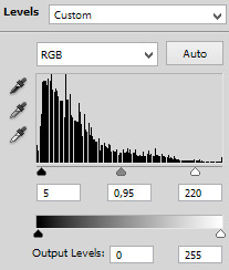
result:
3) exposure. this one is the one i use to brighten, here the different is minimal, but in a dark gif this works really well as you’ll see on part 2. also, i know it looks like the levels was for nothing here, but most of the time you go back to previous layers and edit a bit more. or even after use exposure and need to darken, levels is there for it
exposure. i never use more than 1,00. and sometimes only +50 is enough in a dark gif
offset. nope, never, no
gamma correction. also, never use more than 1,10. sometimes 1,05 is more than enough
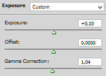
result:
4) gradient map. i wasn’t a fan, but now that i see the difference i’m always using it. i like that controls the dark parts of the gif, i could use more levels for that, but it would get weird
always soft light, and the fill i only use around 20%. sometimes my standard is 15%. i got this from sami’s tutorial and it’s amazing even tho it doesn’t look like much here
result:

5) color balance. i’m still in that thought of “taking off” the colors, because after this layer that i’ll edit them.but also here i fix the color if the gif is practically ready. i only used midtones, but sometimes i use highlights to make the gif as natural as possible. it doesn’t look like it changed much here, but you’ll probably get back here after finishing the psd to fix a thing or two

result:

6) selective color. the fun part! honestly, just mess around the colors. i can’t really say do this or that here because i change this a lot depending on the gif, so here are some tips:
reds and yellows. i use to fix whitewashing, make the person more vivid too, you know? usually i’ve been using magenta with yellow together, you have more control if the red will stay red or it will be pink-sh, and if the yellow will stay yellow or be around green
cyans and blues. if you come across a gif where the white is blue, you adjust this on cyans. decrease the cyan and mess around magenta and yellow
magentas and whites. sometimes the gif seems too red-ish, or something, so you decrease magenta and it will make a LOT of difference. the whites it’s helpful too when the white on the gif have another annoying color, you adjust here just like the cyans
neutrals and blacks. nothing hardcore, sometimes i don’t even use neutrals. and i used to use blacks on 10 and it’s just the worst on most of the gifs, so now i use top 5, depending on the gif

result:

7) vibrance. i don’t overdo because it will ruin everything i edited previously, like, if add more vibrance the yellow would go crazy along with the background and ugh, this way is so clean and exactly what i want. so, i never use more than 50, some scenes are really with no color, so i use more

final result:
other examples using the same process are in the post previews since tumblr won’t let me add more gifs here ;)
PART 2 OF THE TUTORIAL HERE
there i’ll color dark/yellow-ish/blue scenes <3
#dearindies#coloring tutorial#gif coloring#tumblr psds#high fidelity psd#zep psd#legacies psd#nancy drew psd#resources#my tutorial#psds#my coloring tutorial#base psd
973 notes
·
View notes
Text
basilone’s gif tutorial (part II)
Following yesterday’s first part of this gif tutorial, we’re now gonna move on to where the real magic happens! Today, we are going to go from the basic gif we created in part I to the type of gif that I typically publish.
In other words.. we start with this:
And we end with this:
Sounds good? Let’s rock it!
What you need for the second part:
Photoshop (again, I use CS6 but any version is fine)
Some patience
Step 1
If you’ve followed all the steps from part I of this tutorial, you’ll have a Smart Object on your hands that’s essentially all the layers/frames of your gif condensed into a single package.
The first step to making it look pretty is to use a sharpening action! (There is plenty of info on Google about how to add an action into PS – for the sake of length, I haven’t included it here. Feel free to drop me an ask about this or anything else in this tutorial if it’s too confusing, though!)
I use this sharpening action religiously, as it works with any gif. You could also do this manually through the use of Filter → Sharpen → Smart Sharpen but you’re gonna have to experiment with the settings of that one yourself because I’m notoriously lazy and never do it by hand, haha.
For the next step, we’re gonna brighten the gif. There are two ways to brighten a gif to the point where you can actually see things properly, lol. I sometimes use both methods at once, like in this gif we’re doing now, so I will explain them both.
Step 2
Go to Layer → New Adjustment Layer → Curves. (Alternately, just click on the Curves option in the Adjustments box.)
There are three things that matter in the box that appears on screen now. I’ve color-coded them in the screenshot below. You can play the gif and pause it at a particular frame if this will help you in this next part – sometimes, the parts you need are not in the frame the Smart Object landed on. ;)

Click on the eyedropper I marked with red. Now, use it to click on the brightest/whitest part in the image. You might need to experiment a bit here to see which part looks best! (In other words, use CTRL+Z to undo it so you can try again. I typically wind up clicking a few sections or zooming in on the image to see which part is white or close to white.) I went for a part of the clouds, but had to click a few times to get the result that brought out most of the cyan tones in the gif.
Click on the eyedropper I marked with green. This is a bit of a finicky one to be honest with you. Sometimes this one works like a charm and sometimes it hates me. Use it to click on the most neutral-toned/grey-ish part of the gif. In this case, I really want to bring out the blue parts of the gif and so I chose a part of the pillow-ish thing Leckie is leaning against.
Click on the eyedropper I marked with blue. Now, click on the darkest/blackest part of the gif. I went with the underside of the boat’s railing, but again had to retry a few times to wind up with something that didn’t add too many red tones.
Step 3
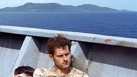
If you don’t want to use Curves, if Curves make it all look odd no matter how you click things, if you want to add some additional lightness, whatever else have you.. then try Gradient Maps. Find them in the Adjustments box or through Layer → New Adjustment Layer → Gradient Map.
For brightening purposes, I almost always use a gradient map with pink on the left and yellow on the right. (#ffcbe6 for the pink – #fffec3 for the yellow.) As you can probably tell from this screenshot, this is gonna do something wacky to your gif! We’re gonna fix that up real nice though.
Go to your old friend the Layers box and click on the part I marked in pink. Now, choose soft light and tadaa – the pink/yellow is gone, but your gif looks different!!
Now, I’m pretty pleased with the brightness but I hate that the Gradient Map took away some of the blues in the image. So, I chose to set the Opacity of the gradient map’s layer to 30% instead of 100%. That looks good, right?
Step 4
Now!! This next bit is where we’re gonna go from good-looking gif to color-porn gif, haha.
It’s time to meet the bestest friend you’re ever gonna get when you’re giffing: Selective Color. You can find this baby, again, in the Adjustments box or through the Layers → New Adjustment Layer → Selective Color bit.
Now, we’re not gonna touch all of the colors. You can select specific ones in the drop-down menu you see in the screenshot above. For this gif, we’re going to touch the following: green, cyan, blue, white, neutral, and black.
Here’s the theory behind Selective Color:
All images are built up out of different colors. Some of them you can see straight off, while others are more of a background building block. When I select Green in the drop-down menu, I am going to work with every green part in the image – both visible and invisible. When I select Neutral, I am going to work with every neutral part of the image. (And so on for the other colors as well..)
Selective Color works with sliders. You can be subtle with those, or you can be like me. =P When you have selected a color in the drop-down menu, you’ll see 4 sliders.
This is what you need to remember about those:
The first one is Red-Cyan. Sliding to the left means the image will turn redder, while sliding it to the right means that there’ll be more cyan.
The second is Green-Magenta. Sliding to the left makes it greener; sliding to the right turns it pink.
The third is Blue-Yellow. Sliding to the left makes it all blue and sliding to the right.. yup.. turns it yellower.
The last is White-Black. Left makes white, right makes black. Use this one sparingly!!
For this gif, we’re gonna do the following.
Select the Green color. Slide the second slider all the way to the left. (You’ll see a number that says -100%.)
Select the Cyan color. Slide the first slider all the way to the right. (+100%.) Slide the third slider all the way to the left. (-100%.)
Select the Blue color. Slide the first slider all the way to the right (+100%) and the third all the way to the left (-100%), just like you did with the cyan!
Select the White color. Set the fourth slider a little to the left. (In numbers, this is represented as something like -9%.)
Select the Neutral color. Set the first slider a little to the left (-9%) and the third a little to the right (+7%). Be very careful with this one! I typically never slide it further than -12% or +12% on these because it messes with skin tone like whoa. (It’s great for when the Curves/Gradient made skin tone look paler though, as this setting breathes life back into the skin tone really well. There’s nothing selective color can’t fix!!)
Select the Black color. Set the final slider a little to the right (between 3 and 7% should do it!).
For other gifs with different colors, you’re gonna need to try different things with the sliders. Just play around with it and see how the colors of the gif change depending on what you do with the sliders. Sometimes, a scene will be entirely too yellow and then it really helps to go to the Yellow and Neutral sections and slide the third slider more toward blue. Similarly, a scene that is very neutral-toned can benefit from adding small bursts of color alongside black to make the little color there is ‘pop’. Seriously, this tool is so multi-functional that it’s almost impossible to show you the whole nine yards of what you can accomplish with it! So please, experiment and have fun. =)
Step 5
Aaaaand.. we’re done! Save your gif using the exact same settings we used in part I of this tutorial!
#gif tutorial#ps tutorial#basilonetutorial#these are like.. 3/4 of my giffing secrets right here#I'm not fond of hoarding info and keeping it to myself#I prefer to share and teach and whatever else -- to inspire folks to create!!#I hope this is a clear instruction though lol
24 notes
·
View notes
Text
color blob effect in clip studio paint


hey! >this post< got a some attention and i saw a tag asking for the tutorial, so i decided to go through with it. here’s that tutorial!
tutorial below the cut!
step 1: open a new csp document. doesn’t need any particular settings, whatever size you want to work at is fine.
step 2: go to Filter > Draw > Perlin noise...
your drawing will fill with cloudy black and white blobs, and a window like this will pop up:

these are the settings i used, but let me explain what each slider does:
Scale: this changes the size of the blobs and will affect the look of your final drawing. adjust this however you think is best.
Amplitude: this changes the contrast between the lightest and darkest areas of the clouds. i prefer low contrast. high contrast also works, it just changes some variables in later steps. make sure it’s at least above zero.
Attenuation and Repeat: these have slightly different effects, but the effect of both of them on this particular design is smaller, more granular blobs. keep these low — we want very blobby blobs.
Offset: these will move the generated noise around the canvas. if you’d like to move a blob to a particular spot, fiddle with these. i set them to random numbers so that i don’t repeat settings too often (identical settings will lead to identical clouds).
hit “OK” when you’re satisfied and you’ll have a canvas something like this:

step 3: go to Layer > New Correction Layer > Binarization... and mess with that number until your image is a mix of black and white blobs like this:

there should be a few numbers that work. pick whatever you like.
step 4: duplicate your blob and threshold layers. make sure they’re in order like this:

step 5: invert the second blob layer (“Layer 1 Copy”). you can do this with Edit > Tonal Correction > Invert Gradient
step 6: set the second blob layer (“Layer 1 Copy”) to Multiply.
step 7: fiddle with the second threshold layer (“Threshold 1 Copy”) until none of the black spaces are touching. you might have to mess with the original threshold layer. there should be a few possible options — it’s up to you what looks best! i ended up with this:

step 8: flatten your layers. you can do this with Layer > Merge Layers.
step 9: add a shape effect. here are some options from Filter > Transform
> Convert polar coordinate...
> Whirlpool...
> Pinch...
just mess with these settings however you think looks good. i went with a whirlpool.
step 10: add a new layer and fill it with a black and white gradient. try to include both black and white on the canvas. i like doing this with the gradient tool on a raster layer, but you can also use Layer > New > Gradient and messing with the settings there. for my whirlpool, i made it a circular gradient.
step 11: put the gradient layer on top of your your pattern layer, and set the gradient layer to Lighten.
everything so far should look something like this:


step 12: duplicate the pattern layer. put this layer on top.
step 13: set the pattern layer as a Reference Layer. to do this, select the layer and click the lighthouse icon.
step 14: make a new layer on top. it helps to turn on layer color (Layer Property tab > Layer Color button) so it’s easier see your work in the following steps.

step 15: in the new layer, start filling in blobs.

this is to make each blob a single color. here’s where layer color comes in handy (the blue blobs above are the ones i’d filled in so far).
use the eye dropper to select the color of a blob. for my whirlpool, i picked close to the “front” of the blob, so it feels like the colors are spiraling out from the center. then use the bucket to dump that color in the blob on the new layer. make sure your bucket settings are like this:

unfortunately i haven’t found a better way to do this, so this will take a little while. put on some noise and take it easy.
when it’s all done, it’ll look like this:

turn off layer colors and it looks like this:

step 16: the fun part! go to Layer > New Correction Layer > Gradient map... and mess with gradients until you get something you like. make sure the gradient map is on top of all of the layers so far.
here’s what i made while writing this tutorial:

and one with a different original shape:

step 17: experiment! that’s as much as i can tell you to do. mess around with different colors, layer orderings, clipping layers to other layers, blending modes, shapes, opacities, etc. — you can find a ton of different effects just by fiddling around. if an idea strikes you, go for it!
thanks for reading, and i hope you have fun with this technique!
393 notes
·
View notes
Note
5, 25, 27
5. What’s your favorite thing to draw?
Surreal looking people/monsters. its what i default to when i have no ideas
25. Do you like to draw in silence, or with music?
w/ music but like. if my youtube mix stops i will not notice until im done drawing
27. For digital artists: how many layers does a typical piece require?
Like in total i probably end up using 7-15 layers, 12 when im really like messing around with how something looks with like gradient maps or layer settings or actually having a background
2 notes
·
View notes
Text
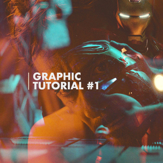
JULIE DOES GRAPHIC TUTORIALS – VOL.1
Last week I received an ask requesting a tutorial on this graphic so here she be! I’ve never done a tutorial on graphic-making before so forgive me if this isn’t the most in-depth tutorial/best example.
Tutorial below the cut.
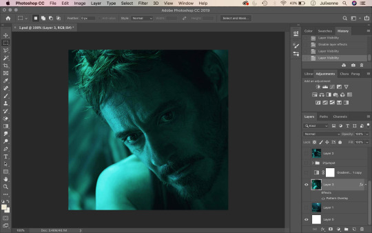
1. Start by opening your base image on Photoshop – crop to your liking. I usually size my square edits 1100 x 1100 pixels to maximise quality!
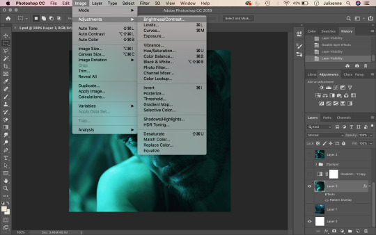
2. Up above where all your tabs are, click on Image and hover over the Adjustments section.
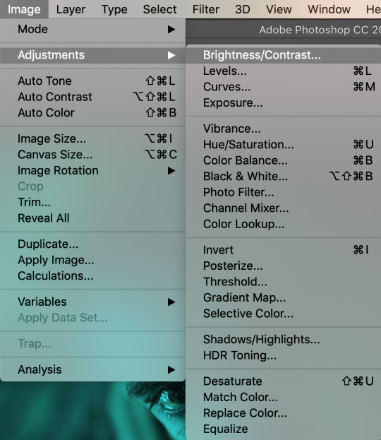
3. From here, you will find settings such as Brightness/Contrast, Vibrance, Hue/Saturation, and Shadows/Highlights. When making graphics, these are the settings I frequently mess around with. Using the aforementioned settings, adjust the sliders accordingly to fix the brightness and overall look of your base image to your liking.
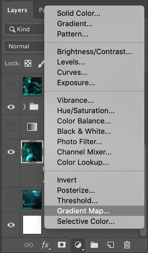
4. After adjusting your base image’s look, head over to the bottom right of your screen, where the layers panel is. At the very bottom, you will see a circle that is half empty and half filled. Click this, and find Gradient Map.
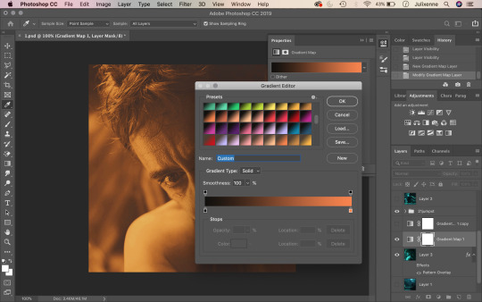
5. Click on the gradient bar and this window should open up. The gradients you see on my screenshot have been pre-installed. You can find these same gradients (and more) on DeviantArt and install them to your own computer! Pick a gradient duo you like (in this scenario, black and a warm, vibrant tone works best). I ended up using #151311 and #CD5517 as my two colours for the gradient.
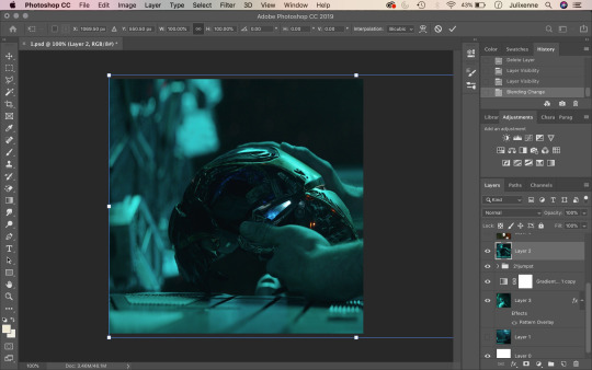
6. Press enter and minimise your gradient adjustment window. After this, find your second image which will be your “overlay image”. Paste it on top of your base image layer (drag upwards if it is underneath your base image layer) and adjust its position to your liking like so.
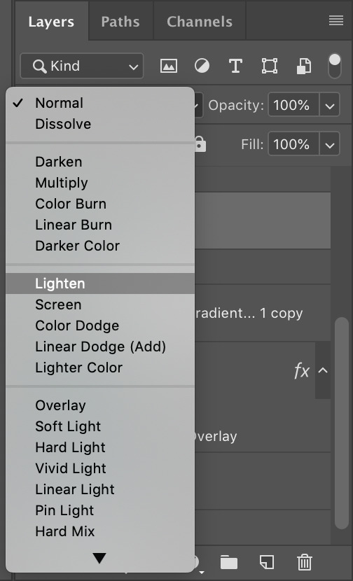
7. Make sure your “overlay image” layer is selected. Under your layers panel, there is a search bar that says “Kind” with a magnifying glass next to it. Click the drop-down button that says “Normal” on it. Here you will find different blending settings for your overlay image. Choose “Lighten”.
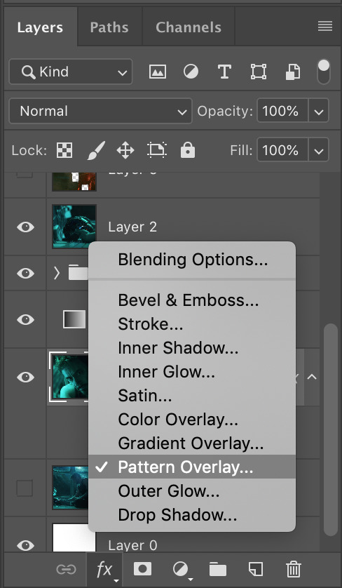
8. To add a little more styling to your edit, click back and make sure that your base image layer is selected. On the bottom-most selection of buttons (bottom right corner), click on the “FX” button and then “Pattern Overlay”.
9. You will see the Pattern Overlay adjustment window on your screen. Ensure the blend mode is set to multiply, opacity at 100%, and that your pattern is the polka-dot-looking option. Scale your pattern to 45% (or not – adjust to your liking!)
10. Your edit should start to look like this now! (Except I added a third image of Iron Man on the top right corner so disregard that – I was just trying to make things a little more fun hehe – you can add as many images you want on top of your base image. Making edits is all about trial and error and going nuts.)
11. Assuming that you are on the “Essentials” mode of Photoshop, the text tool should be on the left-hand side of your screen as it is on mine. Click the gigantic “T” and drag a text box on your image like so. Type whatever text you wish. (In this tutorial, I used the font Futura and centred my text to the image.)
12. Bonus! If anyone wants the full settings of my text for this edit, here they are! Follow if you wish.
13. In classic Julie graphic-making tradition, we have to add a layer of noise to top things off. From the bottom right corner of your screen, next to the folder, there is a page button. Click this while holding down option (mac, windows: alt) and a “new layer” window should open. Under mode, select overlay.
14. After selecting overlay as your blending mode, tick the box that says “Fill with Overlay-neutral colour (50% grey)”.
15. Above where all the main Photoshop tabs are, click on “Filter”. Hover your cursor all the way down to “Noise” and select “Add Noise”.
16. Change the amount to 10 (or something else that will suit your taste), set distribution to uniform and click OK!
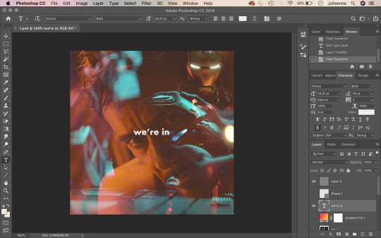
17. And there you have it, folks! Save as a JPEG and you’ve got yourself an edit. ✨
#julie does graphic tutorials#thespidermannet#petermaximoffnet#graphicsquad#metalarmsquad#shutupnet#graphic tutorial#edit tutorial#iron man#tony stark#iron man edit#tony stark edit
151 notes
·
View notes
Text
Gif Coloring Tutorial
Requested by anon. Sorry for taking so long to post this!
This tutorial goes over how I color gifs, including tips for coloring dark scenes and scenes that are heavily filtered with a certain color (i.e blue scenes, yellow scenes, etc.).
We’ll be going from this:
To this:

Warning: This post is gonna be really long! (if the read more breaks blacklist “long post” or “usermerlin gif tutorial”)
*I’m using Photoshop CS5
1. Gif Making Basics (Note this part won’t include images since the anon specified coloring and avoiding noise I’m gonna focus on that)
First I take screencaps using Potplayer.
In PS I import the frames by selecting File --> Scripts --> “Load Multiple DICOM Files”
Once the images have loaded I go to the drop down menu on the animation window and select “Make frames from layers”.
Then I crop my gif using the crop tool. I put all the layers into a group (select all the layers and press ctrl + g (cmd + g if you’re using a Mac)
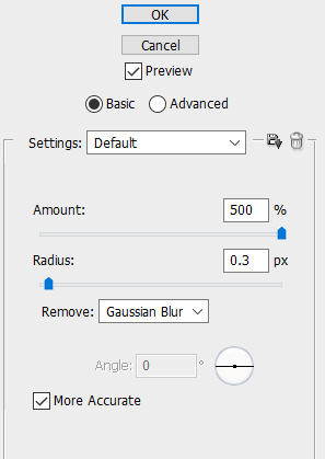
Now I sharpen my gif. I’ve created an action to speed up this process using user thepunisher’s action tutorial. I didn’t include the grouping of my layers in the action so that’s why I always group them before starting my action so that it works properly. My sharpening is pretty standard from what I’ve seen. I use smart sharpen:
Now I can start coloring!
2. Basic Coloring
In this section, I’ll be going over a basic, but vibrant, coloring. When making adjustments you have to be careful not to increase brightness or vibrance too much or your gif will become grainier. Same goes with making changes to the colors. It’s better to have more layers with slight adjustments
I always start by brightening up my gif. Sometimes I use curves to both brighten and adjust colors. For this particular gif I didn’t, but I use this adjustment often. User villainelle has a tutorial for using curves to color adjust here and so does user thepunisher here. They have slightly different approaches and I use either depending on the scene. I’ll also be explaining this adjustment more in the next section but I learned how to use it from them.
Step 1:
For this gif, I just started with an Exposure adjustment layer. Exposure allows you to change the tones of your document. Gamma adjusts midtones, offset adjusts shadows, and exposure adjusts highlights. It’s really helpful with brightening up dark scenes or heavily shadowed scenes. I usually only adjust the midtones/gamma. Here are my settings:

I increased the Gamma to 1.12
Step 2:
I then use a Brightness/Contrast layer to adjust the highlights (you could also do this with Exposure but I find Brightness more manageable). At this point, I’m only increasing the brightness. I won’t increase or decrease the contrast bar. Here are my settings:
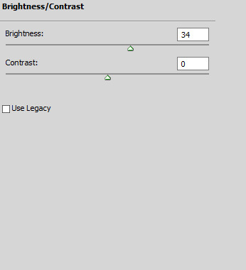
I increased the Brightness to 34
Step 3:
After adjusting the brightness, I want to bring back some depth (I’m probably using this word incorrectly tbh) to my gif by increasing the contrast before moving on to color correction and vibrancy.
To increase the contrast I use a black and white gradient map and set it to soft light. Then I lower the opacity between 10%-50%, depending on the scene.
You could also use Levels or Brightness/Contrast but I find the gradient map is easy to control while also making the gif more neutral. For this gif, I set the transparency to 10% but could go a little higher because the scene is naturally bright. All these adjustments are really about your personal preference.
Step 4:
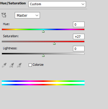
Now I can move on to the colors. For basic coloring I usually start by increasing the saturation. I use a Hue/Saturation layer because this way I can increase the saturation of everything. I feel like the Vibrance layer tends to just make the gif warmer rather than making the colors pop- and I have less control over individual colors. For this gif, I increased the saturation for all colors (”Master”) to 27:
Step 5:
After adjusting the vibrancy I move on to color adjustment. This can really vary based on preferences. I tend to prefer to make my gifs cooler in tone. I use Selective Color and Color Balance to manipulate the colors.
I started by adding a Color Balance layer to adjust the colors on Aziraphale’s face:

I increased the Cyan to 4, the Magenta to 3, and the Blue to 1 to make the skin tones more neutral. I’m moving the bars toward the colors I want to add. So if my gif is too yellow I’d move it toward blue and if it’s too red I’d move it toward cyan. Also note that I only made changes to the midtones. If I wanted to make changes to the darker or lighter parts of this gif I’d alter the shadows or highlights but I usually only do that for rainbow gifsets. Typically, I prefer Selective Color to make more drastic color alterations so I have more control over the specific color I’m changing.
*Be careful when making these types of changes. You don’t want to make drastic changes to the natural undertones of a person’s skin. Same goes when you’re brightening your gif. You can easily whitewash if you’re not careful. User amorverus has a great tutorial on avoiding whitewashing in coloring here .*
I also wanted to brighten up the gif more after this so I added a curves layer :
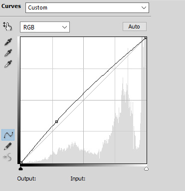
Then I used Selective Color to decrease the yellow tones in the White background:

I decreased it by 26. I almost always do this for scenes with white backgrounds or large blocks of white.
Step 6:
After I make some color adjustments I adjust the brightness and contrast again. I always add another Curves layer to increase the brightness of the shadows by slightly lifting the line on the bottom left:
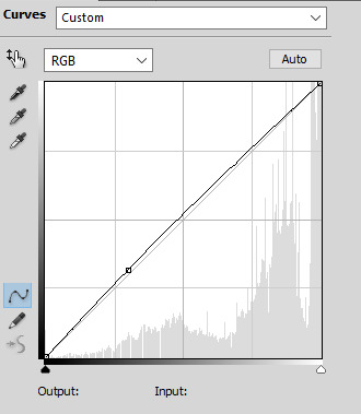
Then I use Levels to change the contrast of my tones. I usually increase the contrast by moving the left hand point slightly to the right:

After that I add another Curves layer, decreasing the shadow and increasing the highlights like this:

I feel like this adds some nice depth to my gif and brings out the colors more. The amount I decrease or increase the curve depends on the gif itself, so definitely play around with this.
Step 7:
Now I go back to make some last color changes. I added another Selective Color layer and increased the Black on Whites:

Finally, I added another Selective Color layer adjusting the Whites again. I decreased the Yellow again and also increased the Cyan and Magenta to make the blue in the sky pop a little more:
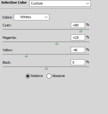
I used a layer mask to erase this layer on Aziraphale so the change is only apparent on the sky.
Now I’m done! Here’s the same method on two other scenes:


And I uploaded the .psds (dl here) so you can take a closer look at what I did in Photoshop. Keep in mind that I don’t always follow these steps in the exact same order. Psd #3 features the curves color adjustment method and has some more adjustments. It really depends on the scene itself and the mood I’m in. Practicing a lot will build your familiarity with the different adjustments and hopefully boost your confidence in making your own coloring!
3. Hard to Color Scenes
Blue/Yellow/Green/Red Scenes + Dark Scenes
These types of scenes can be hell to color but there are some techniques to help balance the colors so that you have something that’s easier to work with.
For general dark scenes, adjusting the Exposure can be really helpful. Unfortunately increasing the Gamma or Exposure too much can make the gif grainy so be careful when using it. Consider using it in combination with Brightness/Contrast and Curves to avoid making drastic changes.
Another helpful adjustment layer is the curves layer. As the tutorials linked above explain, using the midtone or highlight dropper tool can help adjust the presence of red, green, and blue in your gif. Photoshop will balance against the color you select.
Let’s take this scene for example:

This scene is really yellow. Using color balance or selective color to balance it out could help but given how yellow it is, you’d need to use a lot of these layers to gradually change the colors or you’d make your gif too grainy. Using Curves, we can adjust colors with less layers and hopefully introduce less grain (sometimes this type of adjustment can result in too drastic a change, so your gif becomes hella grainy so be careful). I used the midtone dropper around here:

And got this:
Here’s the Curves layer:

The shadows are a little more intense than they were to begin with but that’s easier to adjust. You could also keep messing around with the dropper so the scene doesn’t become darker. You could it make it slightly less yellow and then finish the rest with color balance and selective color. Either way, I’m satisfied with this so now I can continue coloring:
Here’s an example of a dark and blue scene:
Usually for darker scenes, I use the midtone dropper but that wasn’t resulting in a change I was happy with. I used the highlight dropper instead, clicking on the flecks of snow in the bottom right:

Here’s the Curves layer:
And here’s the final gif after coloring:
This method is great for making big changes to the lighting and colors of your gifs.
HQ GIF Tips:
Save Settings:
I save my gifs with Diffusion because I find that the dithering is usually less noticeable that way, so my gif looks smoother. Pattern can also look really nice though, depending on your coloring. Try out both and see which you prefer! Here are my settings:

Coloring:
Making drastic changes all at once can make your gifs grainier. Be careful not to change a color too much one one Selective Color or Color Balance layer. It’s better to make smaller changes over multiple layers. Same goes for increasing brightness and vibrance.
Source:
Use the highest quality video source you can. That’s an easy way to make HQ gifs. Blu Ray or DVD quality is better than Itunes for example and both of those will be better than clips from Youtube. If the file size is bigger that typically means there less compression so the quality will be better. If you can’t find larger sizes or you don’t have the space or time to save larger files, just make sure it’s at least 1080p. Keep in mind that now that gifs are converted to gifv, your gifs might look grainy or blurry when you post them even if they look fine when you save them. You can go back and mess with the coloring to see if this helps but otherwise there’s not much you can do about the conversion.
Those are all the tips I have for now! If anything doesn’t make sense or you have any questions please let me know.
#gif tutorial#coloring tutorial#photoshop help#long post#usermerlin gif tutorial#I hope this helps!!#sorry this got so long :(#please let me know if you still have any questions or if something doesn't make sense#I get all rambly#my current coloring is really a messy mix of all the tutorials I've ever seen#I'm gonna reblog this a couple of times to make sure it gets seen#I'm gonna go to sleep now lol
35 notes
·
View notes