#sprite analysis
Explore tagged Tumblr posts
Visit Tumblr Blog
Explore Tumblr blogs with no restrictions, modern design and the best experience.
Last Seen Tumblr Blogs


Fun Fact
BuzzFeed published a report claiming that Tumblr was utilized as a distribution channel for Russian agents to influence American voting habits during the 2016 presidential election in Feb 2018.
Text


Hey. Sprite analysis folks what the fuck does this mean
Somewhat inspired by this post
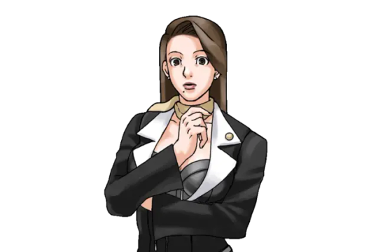
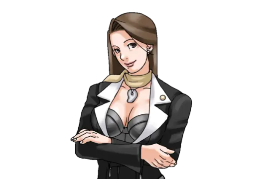
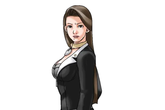
#ace attorney#pwaa#mia fey#iris hawthorne#iris fey#iris of hazakura temple#sprite analysis#mine#one of my biggest unanswered questions of aa is how much the twins interacted with mia before dl-6/leaving kurain with their father#like were they close. or was morgan's jealousy so strong that she stopped any of that dead in its tracks#i like to think they were and these sprite similarities allude to that#but then WHY. does mia not recognize dahlia in 3-4 it makes absolutely no sense#she absolutely would have been old enough to remember her. i get they probably didn't want to spoil dahlia being a fey but like#her recognizing mia first (made more obvious in the anime) already points to that. i feel like another vague line would have been sufficien#anyway i could go on about this for hours but. if anyone has more thoughts feel free to add#iris lovers PLEASE interact she is everything to me
73 notes
·
View notes
Text
On today's episode of "neat sprite details":
For as much as the game itself likes to poke fun at Akechi and Shido looking vaguely similar (before an NPC brushes it off), they share a surprising amount of facial expressions actually... 😳


(Oh god this boy's already being hit by the Shido genes at 18)
Joke aside, it really reminds you just how much a kid Akechi is, since you could arguably chalk this up as him emulating a figure in literal power in order to rise up it himself (And also cause he's his dad).
#persona 5#p5r#p5#persona 5 royal#persona#goro akechi#masayoshi shido#gaming#game sprites#character analysis#sorta#moni rambles
768 notes
·
View notes
Text
More thoughts on Infinity Nikki's themes that I'm still rotating in my head, but like.
In contrast to the Faewish Sprites who evoke children despite also living for hundreds of years, the Pieceys as a whole are old. There's this sense of...decay around them, coupled with the way the Abandoned District is designed as the literal ruins of human civilization. Pieceys cannot naturally heal, their fabric only grows more worn over time. They patch themselves with fabric, but do that too much and there's not enough of themselves and they die.
The Abandoned District itself is a sharp contrast to the Wishing Woods, and IMO it's a pretty carefully crafted difference. The Abandoned District's aesthetics and music carry this undercurrent of melancholy that permeates nearly every part of the experience in exploring it versus the way the Wishing Woods is whimsical.
The story of the Faewish Sprites revolves around the Coming of Age Ceremony—it's been delayed and it needs to happen. The Faewish Sprites are about the future. Meanwhile the Pieceys have multiple stories exploring death or remembering the past. I think it's not a coincidence their downtrodden are specifically those who cannot remember where they came from?
But there's another difference I think. The Faewish Sprites are a very collective kind of society. They all dress exactly the same with only minor variations—there are no Faewish Sprites with their hoods down, for example, but many wear makeup or accessories which provide only really inconsequential differentiations. Even their names follow a strict naming convention (-bo/-da).
Meanwhile the Pieceys are much more varied in appearances. If you look closely there are model recycles, but IMO that's more of a limitation of the medium than the way it's handled with Faewish Sprites. The Market of Mirth and the Handsome Lads Circus also stand out to me as celebrations of individuality and life, much more than any place in the Wishing Woods. Pieceys also have theatre and arts and tell each other stories, connecting them closely to the humans they succeeded.
The contrast brings with it a difference in mentality too. There's a letter to Giroda post-story from an anonymous Faewish Sprite that states that they never really hated him but Faewish Sprites had no reason to question Chigda as their authority, so they followed him in mistreating Giroda. It's arguable how sincere this letter was (I assume it is because of the way Faewish Sprites are in general), but compare that sentiment with how every Piecey we met all treated Raggy in different ways.
maybe it also goes back to the Wishing One. He created the Faewish Sprites in life, so they're perpetually his children. Because of this, we get the Ascetics who punish themselves and the Faewish villains who cannot accept this death. The Pieceys were created when he died and became the Silvergale, so they carry a perpetual grief within their bodies. So they try to celebrate life where they can.
I don't really know where I'm going with this! Despite focusing on Faewish Sprites more, I love both and I think they're both very well written and tie well together within the lore.
211 notes
·
View notes
Text


So did anyone notice that Kazuma and Gina share a bunch of similar mannerisms for some reason
#i love ace attorney sprite parallels#though i can't explain these ones#they don't even know each other lol#ace attorney#the great ace attorney#dgs#dai gyakuten saiban#gina lestrade#kazuma asogi#tgaa#ace attorney sprite analysis#i mean analysis is generous bc i just put them there. but anyway#my post#great ace attorney
75 notes
·
View notes
Text

Decided to make a little analysis on Chara's design, due to the common consensus on their appearance.
#undertale#undertale analysis#undertale speculation#chara#chara undertale#frisk undertale#sprites#theory#character design#deltarune
518 notes
·
View notes
Text
Okay, so
I finally got my bf into reading Homestuck. I was on a phone call with him as he read it at loud, voice-acting and stuff, while I was drawing. Today he reached the Dave first appearance and he discovered Sweet Bro and Hella Jeff.
You have to understand that I always thought that this comics was just a stupid joke that only Hussie understands and finds funny. Bc the moment I saw the page with the dog (you know which one) I left the comics and never looked at it again. Until today.
My boyfriend read every single page of Sweet Bro and Hella Jeff in complete silence. I asked him what's wrong, and he said "This is extremely sad". I was confused so he started explaining to me how this comics is a way little Dave was coping with trauma of living with his abusive brother. I didn't believe that, so I started reading the comics again and you know what?
Imagine adult Dirk, being completely under Lord English control, going shopping with little Dave and destroying supermarket in frustration of not finding anything that Calliborn would recognize as a food, being arrested by police in process and leaving little Dave alone hidden somewhere in the shop.
Imagine little Dave being pushed from the stairs so many times by his bro, he drew a caricature of himself pushing his bro off the stairs in revenge. Or being regularly beaten so hard and often, so he drew comics in which his brother got beaten up, shitted on and even brutally killed.
Imagine little Dave being so hungry (bc of course brother didnt give him proper food) he literally threw himself at a Subway sandwich machine during idk a walk with his bro (probably) and tried to steal some food or even just smell the actual normal food and while doing so got abandoned by his brother. Again.
Of course we can't interpret this way every single page of Sweet Bro and Hella Jeff, but come on, if you start seeing it, you cant stop sensing that every single page is either a way Dave coped with a traumatic experience or a way he kind of got revenge on his brother in a way his brother wouldn't understand and notice and beat him up for doing so.
I searched internet for so long and can't find a single person who would interpret it this way. Am I wrong though??
It gets better. As we know, Dave from universe B also drew this comic. And we even got a directly explained to us interpretation: he started drawing it as a simple comic (probably to cope with the loneliness). Then when Batterwitch became a real danger and he saw that but couldn't react directly, he started using his comics as a way to show what Betty Crocker was really like. So we also had this two characters, one represented Betty Crocker and the second one represented society, and they had this very abusive relationship that had references to situations in real life in Universe B.
So my theory (or more like my bfs theory) is that Dave from universe A was using his comics for the same exact thing. He drew situations from his life in a unreadable for others way (and also no one taught him how to draw or write, and maybe later he kept the shitty format so it's unreadable and too shitty for his brother to read) to cope with trauma. We see in this comics that Sweet Bro is shaving himself above Jeffs face while he sleeps, a thing that Dave's bro could definitely do. We see some pages of Dave trying to understand sport, economy and politics in his own way, bc his brother of course didn't teach him shit. And we even got a page that might suggest that Dave was sexually molested by his bro. There are many scenes of Bro being abusive to Jeff or Jeff getting his revenge. We also have Geromy, a possible interpretation of John, and on one page Jeff (Dave) tries to come to Geromy's (John's) place to visit him, but he can't and he drowns instead (which is so sad???).
I could go through every single page with this interpretation. I think some pages being a foreshadowings for what is happening later in Homestuck is just an additional joke, Hussie loves having layers of meta twists and many unrelated things relating or referencing each other for no reason. I don't think the comics is Dave's unconscious traveling through time and revealing the future, bc if so then we would see every single page of Sweet Bro and Hella Jeff being a foreshadowing, and they are not. I also think that the huge wink to the audience was the scene of Dave being pushed by his bro down the stairs and we see him falling with accompaniment of a little panel of Jeff saying "I warned you about the stairs, bro". For me this is a visible hint that this is what this page of the comics was about, it was a way of coping with trauma, it was Dave drawing his brother falling down the stairs and himself saying probably a line that his brother irl was saying to him a lot.
Dave drew his life. His own horror of a life and it was probably more terrifying than he revealed in act 6.
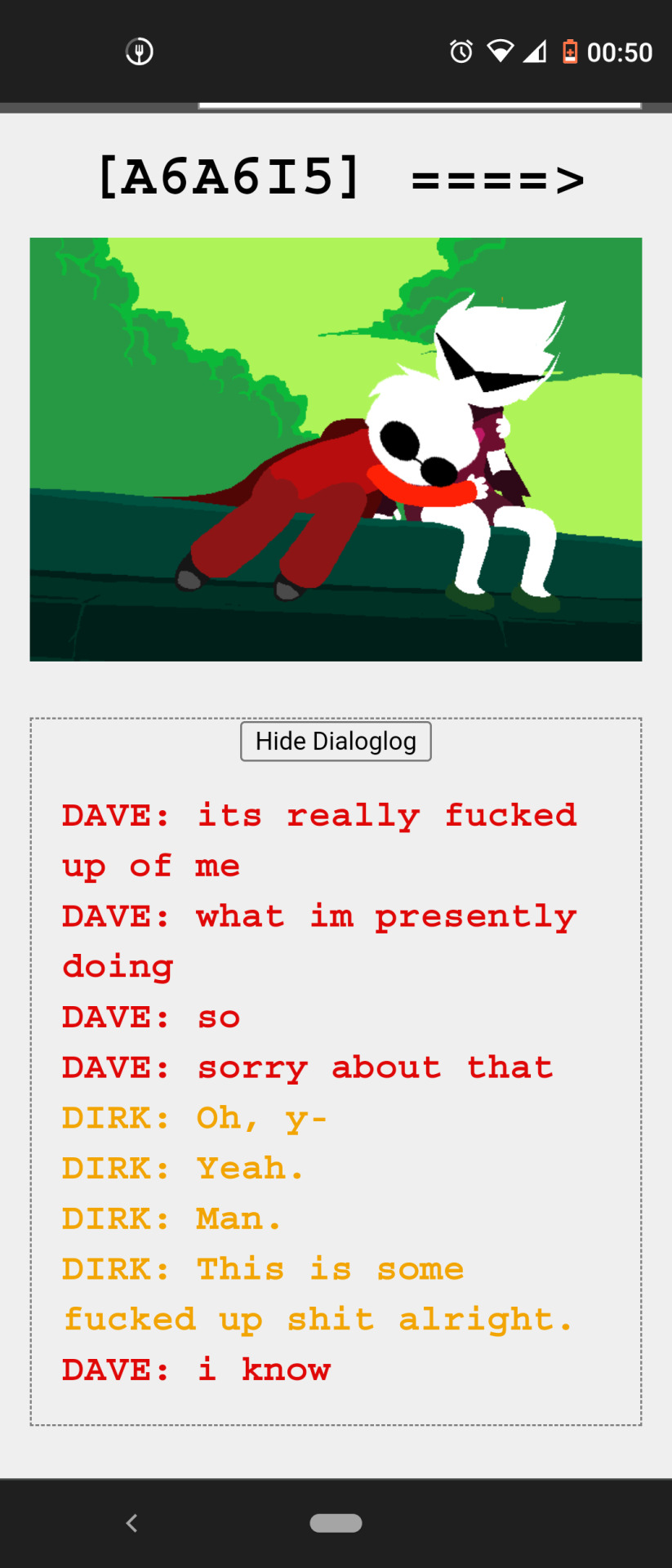
Do you remember the iconic "bro hug" from Sweet Bro and Hella Jeff? A hug from his bro, sth that Dave really needed and wanted, a simple hug that he was very nervous to asked for, he literally drew himself hugging his brother in his second comic, and then we have the very same scene of Davepeta and Arquius hugging (part of them was Dave hugging Dirk, even if artificial), and then we have the exactly opposite of the scene between actual Dave and Dirk, when instead of enthusiastic "we're doing it bro, its happening, were making it" it's Dave saying "fuck forgive me for what I'm doing, this is so messed up fuck" and it's not even full embrace like in his comic, it's awkwardly side by side hug when they didn't even sit on the same level (like in the comic or with sprites), no, Dave is lower, he's smaller, he's scared, he cant face his brother, he wants to but he can't and this is just aaaansnanbska dmnsksnsdkydykdky
Can someone talk about this comic more? This flashy shitty documentary of Dave's life drawn by idk maybe 8 years old Dave ? The more I read Sweet Bro and Hella Jeff, the more depressed I am, cause this is so sad if I'm right about it. I really wish it was just stupid colorful comic without any deeper meaning, just faking to have one or sth....
Also I think Geromy is black bc either Dave didn't know how John looks like so he imagined him being somewhat similar to his fav president Obama or maybe he was just trying to make John's character as unlike John as possible so no one would suspect a thing. Or maybe he just imagine himself being friends with young Obama, who knows.
After editing this chaotic rambling I have two more things as a prove for my theory. One is picture above, and second is what Hussie said about Sweet Bro and Hella Jeff:
“SBaHJ is absolutely inseparable from HS, and has been almost from the start. If you don't understand this, then you don't understand HS very well. SBaHJ is like the mentally handicapped step brother of MSPA, requiring special attention, but no less cherished as a part of the family. It was originally intended as the chief source of in-house memes for dialogue, but this is ultimately a superficial purpose. Though it only has 20+ strips, it contains a pretty dense and internally consistent language of recurring symbols and typo-driven grammars, applicable as a rich sub-cognitive lexicon for highlighting elusive elements woven into the mythology of the story which tend to be shrouded in the unconscious.”
#sweet bro and hella jeff analysis#homestuck#homestuck john#homestuck dave#homestuck dirk#dave strider#sweet bro and hella jeff#caliborn#homestuck caliborn#dirk strider#john egbert#homestuck sbnhj#homestuck sprites#sprites#davepetasprite#arquiusprite#homestuck analysis#this is so unlike and also unnecessarily long#i will probably make a video about it one day or sth bc omg i cant stop thinking about it#how could i not see this before?#shout out to my genius bf#hes so smart omg
347 notes
·
View notes
Text
flat affect in ct
idk if im misremembering, but one of the things that stuck out to me in clinical trial was the lack of smiling/happy sprites for angel + lee. its not to say that they dont have plenty, they do! (i tried counting the number of 'happy' sprites angel had, and i gave up after 30 smthn. (it's mainly the same 15-20ish expressions w/ clothing variants))
it just seemed like they mainly had neutral/pensive expressions throughout the game, with the occasional smile sprinkled in, rather than the typical 'happy-with-occasional-negative-sprite' approach.
i feel like this would tie in rly well with the 'lee having autism' hc. i imagine him being pretty high functioning/high masking, but he falls short of hiding his autism due to his often-neutral expressions. i think this could be due to the flat affect, (where an individual, typically nd/mentally ill, appears devoid of emotions due to limited facial expression) which can be a symptom of autism. i also think him killing brandon could be chalked up to a strong sense of justice, also commonly caused by autism, but thats a separate tangent for l8r ( ◠‿◠ )
the same goes for angel, but to a lesser degree. i think they're pretty good at expressions, but their character did feel 'flat' at times where there should've been more emotion. (that could also js be me projecting where i would 'mask') it wasn't in a poorly-written way, but rather in a not-reacting-100%-bc-i-wasn't-paying-full-attention-and-processing way, which is a trait that i feel like a lot of people with adhd exhibit. (could be wrong, just speaking from personal experience (( ◠‿◠ )) im still not sure how to interpret angel, so i dont rly have a lot to say here
anyway thats my take, if somethings off/if u have a diff opinion, id love to hear it! im not autistic myself, nor do i have diagnosed adhd, but its a big possibility, so i try to interpret nd behavior where i can


heres some cute angel + lee happy sprites ( ◠‿◠ )
#clinical trial game#clinical trial angel#clinical trial lee#lee smith#angel martinez#character analysis#headcanon#maybe im looking into it too much and homie just drew normal sprites that im analyzing way too deeply
24 notes
·
View notes
Text
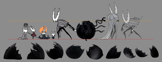
Friendly Reminder that the Vessel Eggs are Freaking Huge.
Also Obligatory Birthplace Egg is the only Egg Asset with Void Vines attached to it remark.
It was always strange to me how large Vessel eggs really are, especially because there really seems to be little need for it. Vessel hatchlings/nymphs are Tiny. Why are the eggs so big in comparison?
There seems to be waaaay too much unnecessary/excess space in each egg if there's only one Vessel per egg. Usually with eggs, by the end of the gestation period, the spawn is cramped in there with very little excess room. Extra unused space is wasteful, and biology hates being wasteful.
This is why I've personally always subscribed to the headcanon of Vessels eggs actually being more like Egg Sacs/Egg Cases than typical eggs. Both are when, for irl bugs, multiple larva/nymphs hatch from the same "egg"-like gestational container. Egg sacs are common for spiders (they make the actual sac itself with silk; here's a great video showing how one is made.) while cockroaches are know for egg cases (Here's a video of some hatching.)
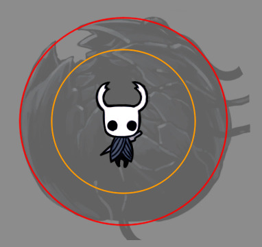
Ghost's egg clearly isn't that much bigger than the other egg assets, it's just less destroyed, so it's size is a good reference for how big all of them would have been. And it's big enough for at least a handful of Vessel nymphs to have fit inside at once.
^ Case in point.
(You could probably squeeze a few more in there if you treat it more like a the sphere it's supposed to be and also depending on the horns. The main limiter are the heads/shells, since those are the hard parts* of a Vessel; Vessel nymph bodies seem to be quite squishy and flexible.)
(*= This is assuming that Vessel shells were hard during their gestation period. There is a chance they might not have been, since newly hatched nymph insects tend to have flimsy bodies for a while. The Birthplace memory shows that Vessels had hard shells at that point, and that seems really close to the point of hatching, so it seems likely that they hatched with hard shells rather than needing to wait a bit for them to harden up. Also, Vessel biology is weirdly wonky, so irl stuff doesn't really matter.)
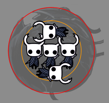
Also, curiously, it seems Vessel eggs have two layers:
There's the outer shell, but there's very clearly a second, inner thing that has been broken out of. The different in the breaking look from the outer shell suggests this inner layer is made of a different material. The Pale King's egg lacks this, to it's at the very least unlikely to be a Wyrm thing, or at least not a Wyrm thing on it's own. It might be something unique to the union of Wyrm and Root and thus unique to the Vessels.
It could be a Root Thing, but we know jack shit about the White Lady and exactly how much she contributed to the Vessels.
I mean, we know literally nothing about how the Vessels were made besides Pale Babies Get Thrown Into The Liquid Shadow Pit To Get Stuffed With Black Goop, but that's besides the point.
There's also two alternative theories for why the eggs are so big that I'd like to touch upon: Void Swelling, and Stunted Development.
Let's go with Void Swelling first.
In snake eggs, the eggs tend to get a bit bigger by the time they hatch. Normally, it's not too much. Sometimes, however, the eggs really seem to swell up. Most people I've heard/seen talking about this think that the eggs are absorbing and retaining water from the humid incubation environment. Sometimes it's indicative of a problem; sometimes those swollen eggs start to rot, making it clear that that gestation has failed. Other times, the snake just hatches with a lot of egg goop.
It's possible that the Vessel eggs are so large because they've just been swollen up from the Void infusing into them.
Two problems with this theory: Vessels eggs are clearly hard-shelled, and hard-shelled eggs don't swell. At least, I've never heard of them doing that, but I'll admit I'm not a bird person. Perhaps some eggs got stuffed with way too much void and popped open before it was ready to hatch.
The second issue is that the Abyss is not what I would call a humid place (or, at least, it doesn't LOOK humid), and we don't see any liquid Void anywhere near where the eggs are in the Abyss. All the liquid Void we see is to the left of Vessel Corpses, and we see no egg assets anywhere on the way to and around the Lighthouse.. This makes it rather ambiguous how the Void even infused into the eggs at all, let alone if liquid Void was involved. Given how deep the Birthplace goes, it's impossible to tell what was at the bottom of that shaft before all of the corpses stuffed it up.
Unless ambient smoky environmental Void could have stuffed into the eggs enough to engorge them, which is also a possibility. Void is weird and we know little about how it works/behaves. Still unlikely due to the hard shells, but it's a theory.
The second theory is less about too much Void in the eggs and more about not enough Vessel.
It's possible that, at the time of Void infusion (and thus, death for the gestating Pale Children nymphs) the influence/corruption of the Void caused the Vessels to just stop developing. Dead things don't grow or develop after all.
Perhaps the eggs are so large because the original offspring that was supposed to hatch from those eggs were really supposed to be that large. They were supposed to be the spawn of a Wyrm and a Root combined. Even if the White Lady hadn't of been so big at the time of the Vessel Plan, she's shown she was always capable of eventually growing large. And if the offspring took aspects from PK's original Wyrm form over his dinky bugsona, which I would assume to be possible bc DNA and Genetics, then a larger size would also potentially be expected.
Or maybe some Pale Children would have gotten the Wyrm gene while others got the Bugsona gene, which is what Hornet got, and is absolutely hilarious to think about. Imagine getting riffed on by a twelve foot high sibling bc you got dad's Short Gene.
There's one issue with this theory, and that is of course, Broken Fucking Vessel. Broken Vessel always throws wrenches into Vessel theories, it's like their favorite past time.
Broken Vessel has aged. And, Hollow, more obviously, but BV is the main confusing one. Broken Vessel proves that Vessel can age on their own, without the potential influence/assistance of the King. BV proves that Vessel development isn't permanently stunted.
The most logical solution to this issue I've seen is exposure to the Void. Vessels, on a fundamental level, are made up of Void. It is intrinsically entwined with their very physiology. They're not just walking corpses stuffed full of Void and a Shade, their very flesh IS Void and that Shade.
Case in point:
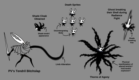
BV, out of any other Vessel outside of Hollow, is the one who could have potentially come into contact with Void after leaving the Abyss. They're found in the Ancient Basin, which at the time of the game is heavily Void tainted (likely due to the Lighthouse being off and PK fucking off to Buzzsaw Land. That light had likely been the only thing keeping the Void suppressed underneath the Basin.)
PK could have used Void to supplement Hollow's growth into adulthood because Vessels probably literally cannot grow or age without it. Hence why Ghost and all the other escapee Vessels are stuck as nymphs while BV grew a tiny bit.
Of course, the solution to the BV issue also ruins the stunted embryonic development theory too. It's a rather poor and weak theory that I've included only because I though it was a bit interesting. Thinking about what the original Pale Spawn would have been like is always interesting to me.
With that, I have just one more thing to point out.
Ma'am, how the FU--
#hollow knight#Vessels#Vessel theories#This started off just jokingly pointing out how big the eggs were and devolved into an Analysis somehow#No seriously WL how the FUCK did you lay those?!?!?!#Or did you fruit them? Do roots fruit?#Those eggs are big enough to fit Adult THK I s2g#I'm still Salty the Black Egg in BET wasn't a massive Vessel egg sac/case#It would have fit so fucking well and also been so much more thematically tragic for THK#Still endlessly amusing that Hornet and PK are the Exact Same Height without their horns#I like playing with HK sprites can you tell?
127 notes
·
View notes
Text
I know it’s been like 7 years since I’ve learned of Undertale’s existence but I still can’t get over how Flowey’s character design has like 4 fu@king layers to it despite his design literally being a flower with a face
First of all. His design is deceptive. A cute tiny flower hiding his true intentions. A perfect design for Flowey and who he is as a character, as well as serving as the perfect subversion for the trope of the “tutorial character “.
Second of all, his gold petals are reflective on how he is literally filled with determination, with the colour of determination being gold. Alluding to his connection with the substance, both in his creation and his ability to reset.
Third of all, He shares the same colours with Asriel (white, gold, green), which alludes to the fact that he and Asriel are in fact the same person.
And last but not least, he is LITERALLY the embodiment of his own trauma and his past. Golden flowers. Golden flowers being associated with Chara and the plan, the poisoning incident, his literal resting place, the Dreemurr family. He became his own trauma and he had carried it with him since the incident.
Man. Toby really cooked.
#also side note the design of his eyes are associated with the undead#one of his sprites have the blackened out eyes#like Sans and Undying#well played#undertale asriel#undertale analysis#undertale flowey#Undertale
22 notes
·
View notes
Text
Evolution of Homestuck’s Art Style, Pages 1-1550

[page 1, 1434]
Since Act 4 began, I’ve been blown away by the visual difference between this and the earlier comic – there’s been a big shift in style, and huge increase in the use of color. So, re-reading and just looking at the art style, here’s an overview of the changes so far.
[a short one – 2.8k words below the cut + some very beautiful panels. I was limited to 30 images in a post, so would recommend looking up page references for the ones tumblr wouldn't let me include <3]

[page 4, 16]
Act 1 mostly uses sprite art and clean, tidy images; the white background is the dominant color in most panels. Where John is drawn freehand, he’s drawn as close to his sprite as possible, with a thick black outline and blocky shapes. This is often done to give him a more complex pose or facial expression than a sprite would allow (for example, p.16). John’s house is relatively tidy, filled with discrete items that it’s easy to move around and manipulate to create new panels – these are mostly either imported photographs rendered in black and white, or line drawings similar to John’s sprite. Occasional items are drawn in color – some due to their importance (Sburb logos) but some due more to common sense (blood capsules).
John’s captchalogue and strife systems are colored overlays on panels that are still mostly black and white. Full color panels show up when John (or Rose) uses a computer, showing their desktop background, or when John looks or goes outside and observes his neighborhood. Here, his near monochrome, thick-lined sprite stands out against the lineless background (the car and mailbox help soften this for now).

[page 195, 246]
Over the next few acts, Homestuck will develop an art style typified by its lack of outlines and straights, abundance of curves and swirls, use of patterned blocks of solid color to create light and depth effects, and emphasis on motion. Act 1 has the earliest steps towards this – my favorite is page 195, where John looks through his telescope and sees the meteor heading towards him. These styles of sky, clouds, wind, and small animated elements that don’t dominate the panel are all still common techniques in Act 4. The final shot of the meteor cloud in the End of Act 1 flash animation (p.246) – which is almost entirely full color outdoors shots – is another great example.
Act 1 is definitely not dull or colorless, and there's a real charm to its style, but it is overall functional. Panels are designed to give information, show the results of commands, and communicate a change of state from the previous panel – it’s unlikely someone would look at them just for aesthetic value. Act 1 has the closest to an ‘adventure game’ look, as lots of John’s items look like they should be clicked on for more information, and rooms are often rendered in an isometric style. In a narrative comic, this also makes John feel boxed in and stifled by the imposing walls and lack of color. His world is stark, monotonous, and cut-and-paste, somewhere he has been placed instead of somewhere he naturally belongs.


[page 312, 363]
Act 2 stays primarily monochrome, but panels are busier on average. Dave’s room (p.312) has so much going on in comparison to John’s (p.4) that in a video game, it’d be hard to know what to click on first. John’s room has become much busier now that it’s been looted and smeared by imps, which makes it harder to keep the art consistent between different panels and angles. Like John and Rose, Dave’s computer, house exterior, and inventory systems are shown in color. Dave’s living room is monochrome but has a fair amount of color through his brothers’ puppets, while John’s now has imps in harlequin outfits, build grist, and Nannasprite.
Rose is unique among the kids for never being placed on a white background. When she’s first introduced, her room is shown in pale gray to indicate that it’s getting dark in her house. This color is unobtrusive, close to white, and doesn’t feel like it makes the panels more complex. As a wildfire creeps closer, the sky around Rose tints red – a slight burgundy on page 398, and a more dangerous wine red on page 985. The mausoleum is also gray, with a soft lineless background unlike other indoor spaces. Rose is the first beta kid to leave her house entirely and go to a secondary location, heading down to the Skaianet Laboratory on page 840 – a much more visually complex area in which she’s shown against a green background until she goes back to the fire. If there’s any examples of her in a white space, I missed them!

[page 444, 665]
The kids are still drawn close to their sprite style, with occasional variation. Dave’s sprite is shaded in red and yellow on page 444 to represent the ‘sick heat’ he’s trapped in, and he’s shown in red silhouette as he steps onto the roof on page 665. In ‘WV: Ascend’ (p.757), every frame is full color and more detailed than most previous panels, and the kids’ and guardians’ sprites stand out as the only cut and pasted element. The landscapes are changing faster than the characters, which creates a feeling of unfamiliarity and their struggle to keep up with their new circumstances.

[page 248, 558]
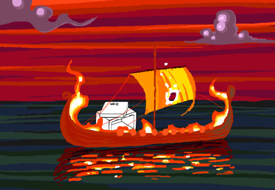
The Wayward Vagabond’s panels immediately look different from the kids’. Page 248 is easily the most complex still image up to that point, with the greatest color diversity (four shades in the sky, one in the city, and I think as many as eight in the sand). It’s very different from the blocky blue sky at John’s house. WV has a sprite too, but his is full color, meaning that when he’s drawn freehand he’s drawn without an outline. This makes him feel ‘part’ of the background instead of pasted on top of it, merged with his landscape while the kids are at odds with theirs. The 100-page Wayward Vagabond point of view section is the first extended sequence of full color panels, but by this point they’ve shown up enough that it doesn’t feel jarring.
Act 2 has the first panel where the art itself blows me away. Page 558, with its fiery boat sailing into the sunset, goes harder than any panel that’s come before it entirely in service of the Vaulthalla pun.


[page 760, 840]
Act 3 introduces Jade in the typical sprite style and monochrome interior, but she appears in her windowed garden atrium, so at least half of her first panel is in full color. The exterior of her house is more colorful and prominent than any kid before her, with various colors of clouds and plants; the same is true of her computer, which surrounds her in three-dimensional spinning colors instead of being a two-dimensional screen. Jade’s room is the biggest and messiest yet, as in just two acts the comic is already feeling limited by its ‘character stuck in a room’ format.
[page 225, 986]
This act shows the art style in transition, with even more color and complexity introduced into what are technically indoor panels of the kids, and more excuses found to draw in the softer, lineless style. On page 840, the tunnel Rose walks through is sketched like a sky, when an act earlier it might have been made of simpler, blockier shapes. Page 986 shows a very similar view to page 225, and the new version isn't necessarily more complex but it is more Homestuck, with increased texture and definition in the clouds and a fire moving through layered lines of color.
Just like in Act 2, ‘Years in the future…’ pages lead the charge with the changing art style. Pages 924, 1005 and 1035 provide lush post-apocalyptic landscapes with a beauty that isn’t seen on present-day Earth – even Jade’s island on page 1080, clearly designed to be visually interesting, doesn’t have quite the liveliness and definition of the post-apocalyptic pages (in my opinion).


[page 1051, 1147]
Act 3 also introduces the aesthetic vertical page. Previously, vertical pages are used occasionally for their aspect ratio, showing a book or the entirety of John’s house. Page 1051’s art isn’t giving information or showing a changed state, but stands out as an impressive visual and a pause for breath in between panels that do give information. Page 1147 is similar, and I believe it’s also the first time a beta kid is drawn in the lineless style (with detail to their form, not just a silhouette). This page comes right before the end of act flash, showing the final form the art has now achieved.

[page
Besides the monochrome sprite art associated with the kids’ houses and the lineless style associated with the outdoors, Act 3 introduces a couple more styles. One is the scribble style, first introduced with WV’s Can Town fantasies and murals, and then scattered throughout Jade and the exiles’ scenes in Act 3. Some panels in this style are explicitly intended to be drawn or imagined by an in-universe character, while other times they represent a strong emotion or sudden interruption.
The other new style is the color-adjusted jpeg, seen in Prospit (p.1029) and the dark kingdom (p.886), where the background is composed of externally-sourced images that have been manipulated and recolored. The over-saturation of a single color makes the location recognizable without need for its own distinctive art style – Prospit is entirely gold or yellow, the dark kingdom is entirely purple, and the Felt’s mansion is entirely green.

[page 1236, 1337]
The Intermission is made almost exclusively in this style, which adds a lot of detail to backgrounds while sacrificing some distinctiveness. While sprite art is used, the sprites themselves are entirely black or green, so they complement their environment the same way John complements his Act 1 house. By using images of a mansion’s interior as panel backgrounds, the Intermission is arguably more ‘realistic-looking’ than the representational art and medieval castles of the Acts, which ties into its grittier and more grounded tone.
With its goal of a fast production pace in advance of a more complex Act 4, there aren’t many artistic standout pages in the Intermission. A rare exception are the pre-city wasteland panels, such as page 1236, which blend the jpeg technique (for the stars and planets) with a lineless alien landscape of pleasantly rolling dunes. Pages 1188 and 1337 also blend these styles, but this is the extent of the lineless panels until Slick enters the safe.
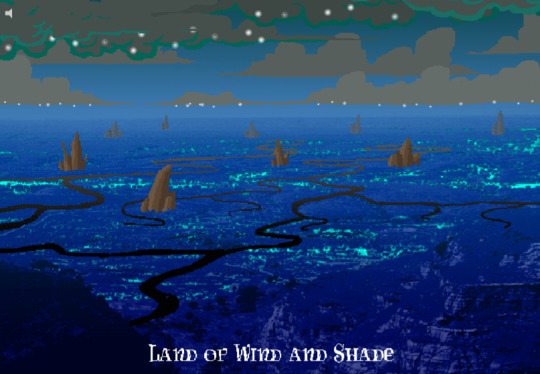
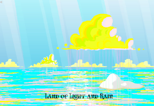
[page 1358, 1407]
Act 4 introduces the Land of Wind and Shade (LOWAS) and the Land of Light and Rain (LOLAR), two planets with distinct designs in the lineless style where John and Rose’s scenes now exclusively take place. Both are stunning – LOWAS is mostly dark blue with gray clouds, and a focus on bioluminescence through its mushrooms and fireflies, while LOLAR is mostly white landmasses amid a sea of pastel blue, pink and yellow. Since Act 1, Homestuck has taken care to set its animated pages primarily outside the kids’ houses, with the notable exception of page 253’s walkaround. This is likely because color makes flash pages more interesting to watch and easier to interpret – but character or plot developments have still been the focus. Page 1407, which introduces LOLAR, is the first flash with a primarily aesthetic function.

[page 1446, 1457]
In Act 4, panels that might have been standouts in previous acts are now commonplace, such as John answering messages on page 1391-2. Use of brown and yellow keeps the exiles’ pages visually distinct from John and Rose’s, but they’re no longer a clear upgrade. This helps the comic skip back and forth between John, Rose and the exiles without a narrative transition, as the art change is less jarring. Pages that take place in Dave’s monochrome room are now the outliers, while Rose and John’s sprites (and Dad’s car) really feel like relics of previous acts. Even with John’s new full-color suit and Rose’s land including a lot of white, their stark lines and lack of shading don’t merge well with their landscapes and always become the focal point when these sprites are used.
As such, there’s more examples of John and Rose in a lineless style, which feels long overdue and catches them up with changes that have already happened. Fully lineless panels tend to be very well composed with clear artistic intent; easy to interpret and pleasing to look at. They often represent movement even when not animated, so work well for transitioning to or away from a character. Sprite panels, on the other hand, have much lazier composition. Messes don’t get cleaned up, and panels show irrelevant objects often half-inside the panel and half-outside, so even when they’re communicating clearly they’re often less pleasant to look at – I find this true of AR’s introduction in Act 3 (p.1100-1111) and all the Dave and Jade scenes in Act 4. Page 1446, for example, features the first prototyping of Dave’s sprite, but it’s hard to focus on the crow-sword’s move through the room with so much else in the way (in contrast with page 185, where the harlequin doll is clearly in focus for its prototyping).


[page 39, 1523]
As a final comparison to illustrate this change, let’s look at page 39 side by side with page 1523. In both cases, a character is typing in Pesterchum. The reader has already seen the kid’s location and nearby possessions, so the images do nothing more than illustrate that the character is on their computer, while the meat of the page is in the Pesterlog.
On page 39, this is situated between two John panels where he takes different actions (assigns Hammerkind and captchalogues a book), so page 39’s image feels necessary to the sequence. On page 1523, this is immediately followed up by another image of Rose, still on her computer, and one that feels far more dynamic. Rose gets a facial expression and sitting position that give her some character, the close-up shot feels intimate for an important conversation, and the background is still present through the ocean behind Rose and the shading from her umbrella. So while there’s nothing wrong with page 1523 (which does successfully re-establish Rose after some pages away from her) or with the sprite style in general, the upgrades to other areas of the art do make the sprite pages feel weaker by comparison.
[page 1524]
Whether intended or otherwise, the kids’ houses being the only monochrome, heavily outlined spaces while all other locations are full color and mostly lineless, is really evocative of the comic’s title. The first full-color panel is John’s desktop on page 24 featuring the Slimer background he made himself, and later his computer becomes a gateway to the Medium where he can access a whole world of color designed just for him. In contrast to being ‘stuck’ in defined dimensions and copied images, the kids are entering a world of beauty, motion and art for its own sake. The exiles’ panels introducing the lineless style and the kids’ following reflects the exiles guiding the kids into the Medium and towards their eventual quests. LOWAS and LOLAR’s fantastical designs add a sense of magic to the story, bringing it away from games and technology and towards more esoteric, unknowable forces. Their unique designs compared to the kids’ similar-styled houses recalls Rose and gallowsCalibrator’s mentions of Sburb’s ‘flexible mythological framework’ (p.440) or ‘HYP3R FL3XIBL3 MYTHOLOGY’ (p.1524), which apparently extends to the level of art style.
Personally, I think the swirling, lineless art style Homestuck has developed is very pretty, but does take away the ‘point and click game’ feeling of Act 1. It’s interesting that the art style develops alongside the reader-command format – Act 1 is almost entirely reader commands, while Acts 2 and 3 mix reader commands with author-driven exile commands and ==> pages, and Act 4 has already seen the reader suggestion boxes close for good. I think the question of ‘is Homestuck a game?’ is still relevant, but needs a different answer in Act 4 compared to Act 1. The level design of LOWAS, LOLAR, Prospit and the dark kingdom is excellent, but they’re for running around and fighting, not standing still and clicking. The genre has changed, and the characters’ roles in the game are being reconfigured alongside the players’ and narrators’ roles.
So, how will Homestuck’s art develop from here? My guess is that there will be a decrease in GIFs and an increase in still images, as the new style is likely harder to animate and better at conveying motion without animation. Act 4 is setting up to bring Dave and Jade into the Medium as quickly as possible, at which point there will be five planets (including post-apocalyptic Earth) each with their own distinctive designs. Once this happens, there will be no need for scenes inside the kids’ houses, and the comic will be able to eliminate the kids’ sprites altogether (or at least re-design them with more color and fewer stark lines, more similar to the trolls’, exiles’ or Felt members’ sprites). Dave and Jade’s sprites being prototyped may further affect the Medium, perhaps affecting the light and dark kingdoms as planets as well as just their agents. Finally, I think there will be a focus on how the kids’ actions physically change the landscape of their planets, as this has already been the case with their modifications to their houses.
[page 1395]
#homestuck#analysis#i like to look at it! it's a beautiful comic there's a whole bunch of panels id get framed for my wall#if i had money or a house!#act 3 also doesn't have a super defined identity so thinking abt it as a transitional act for the art is cool to me#also wish id thought a lil more abt facial expressions and emotions and how they are represented in sprites#but im trying to keep posts short and simple and not let them get away from me. so. i will stop here <3#chrono
22 notes
·
View notes
Note
The way you drew Number One with long hair reminds me a bit of Kyoko Kirigiri from the Future arc. Especially the tied hair 🤔
Wait, really? Let me check.
Tw: spoilers alert ⚠️

Ohhh, they really do look alike here, I didn't mean to make him look like her, I just wanted to make his hair different. This looks interesting, Kyoko's look here is really pretty. Maybe I'd make content for both of them? I've never drawn the characters from Danganronpa 1 and 2, I've always been more focused on v3.
My interpretation of him may be a little different than yours, sorry for anything. Maybe he could act like Kyoko did in the beginning? I still think he would be friendly and kind of silly at times when he wasn't solving a case, although he was always busy, so it would be hard to see that silly side of him. Was the younger version of him more open than the older one?

He deserves to have more content, and it would be interesting to see more of him in a sequel, like, because not knowing his real name is a factor, post-game Yuma could be well explored, be it in a spin off, DLC or even an anime, I know it would be very dreamy of me to want to see him, Makoto and the old cast again, but it doesn't matter, right? Even in animes with episodes about the characters' pasts, novels, and official mangas, I really hope he has a good cameo in the next games, if Master Detective becomes a trilogy + an anime. And also, new products and collaborations, right? We will welcome new content from Master Detective Archives with open arms.
I wanted to make more content about this "Yuma", he solves mysteries, but he is a mystery to us, why is that? Not knowing his name or his past is the case to be solved, whether it is Kurumi as the protagonist or a new character connected to WDO.
#master detective archives: rain code#mdarc spoilers#raincode spoilers#rain code spoilers#rain code#danganronpa#danganronpa future arc#yuma kokohead#kyoko kirigiri#number one yuma#number one#rain code number one#fanart#sprite edit#art#my art#analysis post#pre game#anon ask#ask box#gacha
25 notes
·
View notes
Text
Something something the Faewish Sprites being so childlike in mentality not just being a joke but being an integral core of the narrative and characters. The role of Wish Master is not just spiritual leader but almost like a parent—Chigda nearly got away with everything because the Faewish Sprites don't have any reason to question the sole "adult" in their lives. Avicinda is like the "big kid" pushing everyone around because he says so but he still answers to Chigda.
And then Giroda being ostracized from the moment he awakened and then being pushed out of their home—because of this and then traveling with Nikki all over Wishfield, he gains more life experience than most of the other Faewish Sprites. He often comes across somewhat more mature than them in cutscenes with several of them. And the fact his lowest point is in the cave where he's regressed so hard he is crying for his parents?
The Coming of Age Ceremony being Giroda's first action as the new Wish Master is not a coincidence I think. This is his coming of age story too and that's the moment that cements him as the new "adult" in Faewish society...
Although. I think Eltinada went through his own "coming of age" in the Farewisher storyline in a very different way, it's just that we only came into it at the very end of his narrative.
#my analysis#infinity nikki#im still rotating this in my brain#i feel like i dont have the right words for it!!!!#theme that accidentally informed my fic writing lmao#altho giroda stays silly :3#faewish sprite
109 notes
·
View notes
Text
About Toriel
Ok, you know how the first child's items are in the ruins? What if Toriel had years with that child, years to love and protect and be a mom again? For whatever reason, the child does not want to leave. Then the child dies. Maybe they are killed by a monster, maybe there's some sort of accident, but Toriel is devastated because she's lost a child all over again.
So she lets the next child leave, and the child after that, because she is too scared to love and lose again. It's like she's cursed to lose what she dares to love. She continues on, years and years of waiting, wondering why on earth Asgore hasn't just gone through the barrier and collected the rest of the souls himself.
What makes it worse is that now she's heard that some of the human children have killed monsters, human children that she let leave the ruins with barely any resistance. It's her fault that both the humans and those monsters are dead now. It doesn’t feel like she can do anything right.
She can hardly stand the guilt, but speaking to her friend on the other side of the door helps. They share jokes, talk about nothing in particular, and Toriel feels herself opening up more and more. A part of her is healing due to this time where she can set her expectations and guilt aside and just listen to a friend.
Then the final human falls down. That terrible flower is attacking them, but she takes care of him swiftly. It's strange though. He usually does his best to avoid her, and she knows that he knows that she visits the flowers at this time.
What she doesn't know is that this flower is her son Asriel, but it's not like he never told her. But Toriel didn't give the reaction her son was expecting. It's like she refused to believe that this flower is her son. Flowey thinks that she forgot him, that she moved on. But in reality, she was scared. Scared that if this really is Asriel, if she really believes and loves and lets herself heal, she'll lose him again, like she's lost everyone else.
Of course, she doesn't know any of this. Flowey has reset so many times that he's a different person now, unwilling to feel, just like his mother. But unlike Flowey, Toriel has some hope. She protected this child from the flower after all. Maybe she can protect them from everything else. Maybe she can love again without fear.
Everything seems to be going great for a while... but then the human asks to leave. Toriel is terrified of losing another child, and she knows that this is the last human they need to break the barrier, but she can't be responsible for the death of another child. She won't be responsible, so she decides to destroy the entrance to the Ruins. She'll never speak to her friend again, but that won't matter if she saves this human, if she breaks the curse that makes her afraid to love like she wants to.
But the first human that fell never left the ruins, a tiny part of her mind protests. She remembers the feeling of a cold, dead body in her hands all too well, something she wants to never experience again. She is still scared to love, but she's even more scared to be the reason a child dies. So, she makes a deal. "Prove yourself... Prove to me you are strong enough to survive."
So they fight. Toriel does not want to kill the human, only scare them back upstairs. But in an instant, no time for her to react, the human gets hit and collapses to the floor. She stands there shocked for a few moments before rushing to their aid.
The body is so warm... they could just be asleep, they look so peaceful lying there. But deep down, she knows. She has too much experience with this sort of thing not to know.
And this time, it really is her fault. All the guilt she felt before is nothing compared to this. All of those other times there was something else to blame, something she could be angry at during the hard times. But this time, this time she has no one to blame but herself.
Toriel remembers crying when Asriel and Chara died. But the tears won't come as she cradles this human in her arms. "This human..." She didn't even know their name. She feels a pain in her soul like she's never felt before, both dull and aching and sharp and hot, worse than anything she's ever experienced. But the tears still won't come.
All Toriel can do is hope in vain that somehow, some miracle can bring her child back.
........
When that miracle comes, Toriel won't remember the pain. It's better that way.
#undertale#toriel#headcanon#grief and guilt are both complicated emotions#emotions the entirety of the dreemurr family is familiar with#i'll admit when i learned that Toriel could kill you#i just thought it was cool that she had a shocked sprite#it's easy not to acknowledge the very real emotions she's feeling in that moment#because those emotions will be erased when you load your game#that's probably why flowey isn't empathetic and why sans is so apathetic#because is something really real if it can't be remembered?#and when you're the only one who remembers you're the only one who feels real#or who feels that your feelings are real#and that distancing is why i am totally fine with doing the genocide route in undertale yellow#because i feel bad but at least i can erase the devastation i cause#also why i love the fact that you're not actually kris in deltarune#because now you have to face the fact that you are forcing someone who is not you to go through traumatic experiences#and they'll remember that traumatic experience#plus there's the theory that when you erase a file and start a new game#all you're doing is severing the connection with that particular world#so the consequences of your actions (especially snowgrave) are lasting and real in that world#i didn't realize i would ramble so much in the tags#i just think this stuff is cool to think about#text post#character analysis
14 notes
·
View notes
Text
i need to give love to my rp group for a bit but proton always shows off his ass and face in poses bc those are his only good qualities
#《 ooc. 》#i am nothing if not roasting him crispy#i love you rat boy and your poses#i could write a full analysis post on the rocket exec sprite/hgss art poses and how they translate into their personalities#and that's a threat
13 notes
·
View notes
Text
Analysis of Yuma's Design ②

The design of Yuma's head has several features that are related to "question" or "mystery".
Everyone has probably noticed that his ahoge design is based on a question mark. Also, anyone who has watched him closely has noticed that his pupil design (or perhaps I should say the area around the pupil) resembles a keyhole. Some might argue that it is an abstract shape and perhaps something else, but "key" is a symbol used frequently in RAIN CODE, so I think it is reasonable to interpret it as a keyhole.
The main consideration I want to talk about in this post is that the outline of his eyes is a closed ellipse. My guess is that this is because it is based on the letter Q of the alphabet. There are several characters designed by Rui Komatsuzaki in Danganronpa and RAIN CODE with closed eyelines, such as Gundham, Kazuichi, Gonta, Ryoma, K1-B0, Aphex, Zilch, Desuhiko, and Vivia. While there are exceptions like Ryoma, most of them have sharp or semicircular eyes. Characters like Yuma with rounded eyes and closed eyelines are rare, so I think there is an intention behind it. He has a single long eyelash at the corner of his eye, which to me looks like a diagonal line coming out of the circle of the letter Q in the alphabet.
Yuma's eye line is not a simple single line, but rather a line that branches out a bit, so this analysis may be a bit of a stretch. I just think it could mean something, and I think it's one of Yuma's most distinctive parts, so I personally always want to draw him with his eyeliner closed when I draw him. Please don't get me wrong, this is just my preference! I have no intention of criticizing any fanart that doesn't. In fact, in the art for the Danganronpa and RAIN CODE Collaboration Cafe, Yuma's eyeline is broken at the inner corner of his eyes. If Tookyo Games supervises this art properly, it may not be so important whether Yuma's eyeline is closed or broken.
#my analysis#rain code#yuma kokohead#I just wanted to summarize my analysis before the official art book is released.#As I wrote I have no intention of criticizing any fanart.#I think it is up to the person drawing the character to decide how they want to portray it.#I was just curious if I was the only one who thought so#because his eye lines are always closed in his sprites and Rui Komatsuzaki's art#but few people draw them that way.#Would love to hear if you think the same or have a different opinion :D
50 notes
·
View notes
Text
where is he going? to AAI REMAKES apparently. It's happening folks. I almost cannot believe it but it's happening.
I was a little worried the new mini overworld sprites would not live up to the OG sprites in my mind, but honestly I think they look great so far. I was able to obtain this one from the official site (after some trial and error) and wanted to share it since it's not really out there yet I don't think. It is a little crunchy since I had to convert it haha.

I really hope the Miles overworld sprite memes start back up again. this is my contribution lol.
also apparently the direct today was for me specifically because a new too kyo games project was also announced??? and it's legitimately the most DR coded game from them so far???
The way I went from, Oh hey another game like Raincode, maybe it's a sequel,
to
gee this music sure sounds like it belongs in a danganronpa ost...
wait the world is being overrun by cutesy but also horrifiying creatures who are murdering everyone?
"...a mysterious school mascot..."
"he's then forced to enroll at the Last Defense Academy...."
this cannot be happening. I'm back in the fucking building.
"...along with 15 other students"
"colored by extremes and despair..."

I am going to throw up (joking)
But really I was not prepared for this specific sequence of events when I woke up today okay. I guess this is the project Kodaka and Uchikoshi have been co-directing/writing? Too kyo games is really out here throwing me for a loop today... because this may not be danganronpa, but it sure walks, talks, and acts like danganronpa and I'm simultaneously excited and concerned haha.
Also Stray got a switch port and if you haven't played it yet, you should definitely give it a shot, esp if you love cats, it's a wonderful game! It does look a little muddier on Switch so far compared to other platforms, admittedly, but still. Glad to see more folks might get to experience that game.
#aa investigations#miles edgeworth#ace attorney#animated sprite#he's walking#IN HD#ace attorney investigations#took me a while to convert this from the official site but here you are#the hundred line#too kyo games#nintendo direct#also#stray#go play stray#enquire ???#gif#danganronpa#enquire analysis
24 notes
·
View notes