
Showcasing accessible user interfaces and tools. Submit your favorite website, application or UI pattern. Curated by Marcy Sutton.
Don't wanna be here? Send us removal request.
Statistics
We looked inside some of the posts by a11ywins and here's what we found interesting.
Average Info
Notes Per Post
76
Likes Per Post
71
Reblog Per Post
5
Reply Per Post
0
Time Between Posts
2 months
Number of Posts By Type
Text
17
Last Seen Tumblr Blogs


Fun Fact
Tumblr has been banned in Indonesia for providing people with access to pornographic content.
Text
A11y Project Redesign

Five years ago I wrote about The Accessibility Project (a.k.a. the A11y Project) on this blog as it has long been a useful resource for learning about accessibility. In July of this year, a new site redesign launched showcasing the talents of designer Tatiana Mac and the A11yProject community. It's a beautiful and highly functional site well-deserving of an Accessibility Win!
I love the bold colors, big readable fonts, and information architecture. It's got a skip link, innovative focus styles, and a meaningful banner supporting Black Disabled people and the Black Lives Matter movement. The site communicates what's most important and I really love that.
The A11y Project is looking for contributing writers and website maintainers, so if you're interested in getting involved be sure to reach out to them!
6 notes
·
View notes
Text
Gatsby.Design
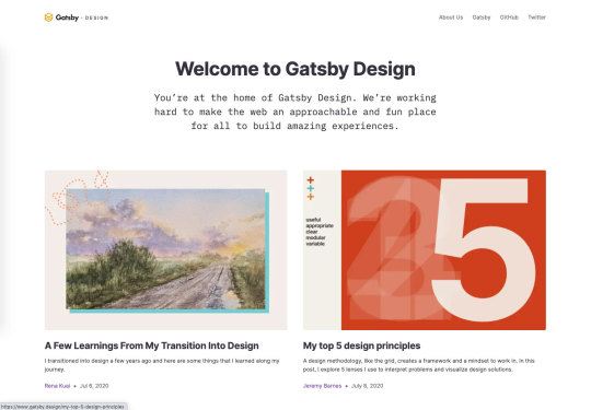
Gatsby Design, a website from my colleagues at Gatsby showcasing their design thinking, launched in the past couple of weeks and of course my first instinct was to give it a spin for accessibility. I was so pleased with what I found!
It's not often that I see a design site launch with no obvious accessibility issues (ahem, Dropbox Design). The Gatsby Design team kept their site simple, and let the content do the talking: articles with artwork telling their stories of working as designers. They kept visible keyboard focus outlines, included good color contrast, and there are no automated accessibility issues that I could find in Accessibility Insights.
Accessibility must be considered before the development phase to be successful, so to see a design team embrace it for their own site is fabulous. We've had great conversations internally about contrast and acessibility and I've been happy to see the curiosity applied to learn more and expand one's craft to be more inclusive. It's the way things should be, really.
3 notes
·
View notes
Text
Adobe Spectrum CSS
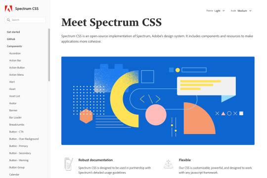
Recently, Adobe launched their Spectrum design system complete with an open-source implementation, Spectrum CSS. In addition to an extremely polished and well thought-out presentation, Spectrum’s focus on accessible CSS practices and quality markup is a breath of fresh air. Its use is likely to facilitate more accessible websites and applications, which is fantastic.
Spectrum the design system includes principles, pattern guidelines, content recommendations, tools and resources, and more; not dissimilar from Google’s Material Design. The Spectrum CSS project, in contrast to its design system, is a working collection of component styles that you can download from npm or explore on GitHub and apply to your own project. It’s an incredible resource to have available, particularly with its rigorous testing and attention paid to accessibility.
One outstanding question I do have is about the textarea component, which doesn’t illustrate usage with a label element and could lead developers to omit a critical piece of accessibility information. But that’s more of an issue with docs/education than a shortcoming of the library, itself. Many of the patterns I reviewed included SVG and ARIA best practices, a welcome contribution in a world of DIV soup component libraries.
According to Matt May, Head of Inclusive Design at Adobe (and my former manager for a brief moment point in time), the Spectrum project has been in the works for over 3 years. Adobe is a large company with many teams–and a robust legal department–so I imagine getting this thing ready to launch to the public with their name on it was no small task. Thanks for making this available to us, Adobe, and keep up the good work!
9 notes
·
View notes
Text
Accessibility Insights
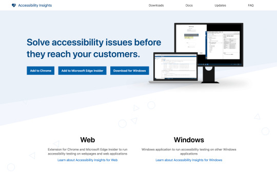
A project I've been recommending a lot lately is Accessibility Insights, a set of free testing tools from Microsoft. It uses axe-core under the hood (which I used to work on) and was years in the making. They're currently offering browser extensions for Chrome and Edge Insider, as well as a testing solution for Windows applications. Super cool!
There's a lot to love about Accessibility Insights for Chrome/Edge in particular, but I really love the tab order and headings tools. You can run automated scans for whole pages and dive deeper into ad-hoc tools, gaining knowledge about the health and quality of your pages (or the lack thereof). Microsoft did a lot of solid design and planning work along with their partnership with Deque, and it's been great to see this launch (even if I'm a few months late to write about it!).
Thanks for the free tools, Microsoft. And happy testing, everyone!
7 notes
·
View notes
Text
Matuzo.at

I just love the personal site of Manuel Matuzović, a front-end developer based in Vienna, Austria. I was reading through Manuel’s slides for a talk he did at React Finland yesterday on 12 Tips for More Accessible React Apps and was immediately impressed with the bold design on his site (it looked great on mobile, and works wonderfully on desktop as well). Knowing his typical attention to detail for accessibility, I was pretty sure the site would be wonderfully accessible. And it is!
I love the little touches with a skip link neatly nestled into the design, animated SVG logo on focus and various link interactions. Manuel used semantic markup in his pages, with a visually hidden h1 element with his name on the homepage. It’s a breath of fresh air getting to see a nicely designed site and know that it’s got accessibility handled! There’s a “beta” message on it, but I think it’s already in great shape.
Manuel: thank you for sharing your knowledge with us in your talks and content bits like the TIL (“Today I Learned”) section of the site. I especially love your Dark Side of the Grid stuff as I’m also using and speaking about accessible CSS Grid. Your contributions are fantastic and I hope they continue!

5 notes
·
View notes
Text
ARIA Authoring Practices on Accessible Date Pickers
Recently I wrote about Delta Airlines' date picker when booking a flight, as I found it really easy to use as compared to some other airline websites I'd tested in the past (VirginAmerica.com comes to mind). I wrote about the accessibility mechanics they'd used, including ARIA role=application and clever aria-label'ing to guide the experience. I even cautioned against that role as it often causes problems, which ironically in the case of Delta's date picker, was true. When I tested it again in JAWS and NVDA, I ran into the same issue reported by Bryan Garaventa: screen readers will frequently get stuck in the wrong interaction mode. Strangely it didn't occur every time I tested, but it was still bad enough that for the first time ever, I’ve removed a post from this blog.

Unfortunately, in pursuit of celebrating something working well, I used an incomplete testing methodology which showed a personal bias. Even by limiting the scope of a win to a single component, like a date picker: if it doesn't work in a major screen reader used by people with disabilities, highlighting it can spread bad practices. Delta did some things very well, undoubtedly. But not reliably working in NVDA and/or JAWS doesn't live up to the standard of an accessibility win. People who use those screen readers full-time should have a good travel booking experience, too! So instead, I want to highlight some true winners here: the group of people working together in the ARIA Authoring Practices group (APG) to establish a standard design pattern for accessible date pickers.

In a long-running post on GitHub, a discussion highlights some of the detailed interaction requirements for accessible date pickers. There are a few live examples in the thread, including a draft example in the Authoring Practices Guide and another one from Bryan Garaventa (who kindly sent this issue my way). I want to thank them for their dedication to getting this right, as standardizing accessible date picker mechanics is in everyone's best interest. I look forward to seeing a published solution for ARIA 1.1, so that developers know where to go for the most up to date and working examples.

Bryan's ARIA date picker could definitely be adapted for Delta.com. It would need to be refactored to include two months side-by-side (if possible) and use different styling, but it should definitely be possible to avoid role=application if followed very closely. Delta unfortunately used this role on the city picker as well, likely because they were having trouble with keystrokes in the autocomplete dropdown. Luckily, there are combobox examples in the ARIA Authoring Practices guide to reference, too.
Complex widgets like date pickers are really easy to get wrong; in fact, something working beautifully for some users may present barriers for others. Custom widgets require thorough testing to get right, especially on Windows and mobile screen readers due to their high usage by people with disabilities. You'll often hear accessibility professionals recommend using native HTML elements first. The unfortunate thing, however, is those browser defaults aren't always accessible, either...and our best bet is to come up with standard solutions that can be shared and implemented in various JavaScript projects. Accessible component libraries and guides are really helpful here.
So let my shame be an example to start with proven date pickers. Test in more assistive technologies and with more devices, and be honest with the limitations of your testing methodology so you can go back and test more before giving something the "ship it" stamp. (Listen to Leonie Watson user her screen reader with Bruce Lawson from Smashing Mag, while you're at it.)
It's okay to iterate and fix things for accessibility as you go along, as long as improvement work is actually happening. Focus on the browsers and technologies that people use the most, which can be gleaned from looking at your own browser analytics when paired with the WebAIM Screen Reader Survey. And don't be afraid to ask for a peer review....it just might open your perspective to who you're leaving out.
3 notes
·
View notes
Text
TV Für Alle

Baseline accessibility is possible in almost any kind of website or web application, and that’s certainly the case with this German TV website, TV For All. Regardless of how a website is rendered–whether with static HTMLm or in this case, Vue.js–putting effort into accessibility does a huge service for users with disabilities. Even the content focus of this site has accessibility in mind, by highlighting TV programs with audio descriptions and subtitles (even if it’s currently light on content).
I like that this site is straight-forward with a modern design. It has a skip link, visible focus outlines, focus management, and accessible names for all links and buttons. I did find that the pink and blue color contrast could be enhanced to meet WCAG requirements (4.5:1 ratio for regular non-bold text, and 3:1 for large text). There is also something preventing keyboard tabbing through lists of TV programs in Safari at desktop viewports, which is odd…but overall they did a great job! Any remaining issues could easily be tweaked thanks to the site's accessible foundation.
From Marcus Herrmann:
My contribution is www.tvfueralle.de (“TV for all”), a German-language electronic program guide for TV shows and formats that supply subtitles or audio descriptions (once there is more content available, a filter for GSL will be added). As a website with this inclusive concept it had to be made sure that it worked well with AT such as screen readers. It was built in VueJS and officially launched just two-ish weeks ago. I had the opportunity to advise the agency that built tvfueralle.de regarding common accessibility pitfalls in SPAs (routing, modals, toggle buttons,…), thanks to the knowledge base that is Deque University. Unfortunaltely my contribution was just a small workshop *before* they started building it, but in the end, I’m quite content with the result.
Thanks Marcus for the submission, keep up the good work!
2 notes
·
View notes
Text
Google Maps

What a pleasant change! The Google Maps team has done some fantastic work making their app functional with the keyboard. After lacking accessible maps functionality for years, this is a huge improvement! They’ve obviously done a lot of work for assistive technology users as well, with appropriate semantics and intentional, accessible user experience in this complex web application. I’d be willing to bet if you have feedback for them on how to improve it, they’d love to hear from you.
From Manuel Matuzović:
Recently I tried using Google Maps with the keyboard and it works pretty great.
Tab/Shift+Tab to show the blue square Arrow keys for moving around +/- for zooming in and out Numbers 1-7 for selecting places
Explanation and more shortcuts: https://support.google.com/maps/answer/6396990?co=GENIE.Platform%3DDesktop&hl=en

As someone who uses Google Maps all the time, this is very welcome. People need to get around! Thanks Manuel for the submission.
2 notes
·
View notes
Text
Tatiana Mac, Art Director

Have you ever heard someone say, "accessible websites are boring"? Hopefully you already know that is an incorrect sentiment, as accessible digital experiences can be beautiful, innovative, well designed and highly functional. With that said, I have a new example for you to hold up and shatter that assumption: the website of Tatiana Mac, an Art Director, Designer and Developer with a focus on inclusive design. She uses bold colors with a sophisticated aesthetic to express her personal brand, and she did a wonderful job making her website accessible.
Decent markup laid out with CSS Grid, little-to-no axe violations (short of one image missing alt text and a few best practices), great color contrast, and quite a bit of personality: those are the things I love about Tatiana's site. She could perhaps rearrange some headings and add a few more landmarks, but I think you'll find she paid a lot of respect towards accessibility in building her website. Her point of view and values shine through; in a world of endless inaccessible portfolio sites, this one explifies accessible web design done well. And it's so refreshing!
After a few month hiatus from this blog (important life events, y'know?), it's great to find an example that has me excited about the web...because let's be honest, it can be bleak out there sometimes. But I'm thrilled to be back sharing more tidbits of winning web accessibility. If you've seen or built something you feel is deserving of praise, send it my way. Otherwise, it's back to our regularly scheduled programming. 🤘
6 notes
·
View notes
Text
Wikipedia Link Preview

I saw a link to a Medium post on Twitter today that Wikipedia started enabling link previews on hover states, showing a little overlay with more information about the linked page. This is nice because users can decide whether they want to click a link before doing so. It reminds me of Steve Krug's "Don't Make Me Think" philosophy by providing users with more helpful information before choosing whether to leave the page.
However, seeing the hover feature made me ask out loud: "does it work on keyboard focus, too?" So I went over to a wiki page and started tabbing around. I was pleased to learn that they did in fact make link previews work on keyboard focus! It might be a little sad that I'm so excited about such a simple thing...but it's awesome.
One question I had was about a preview settings button inside the overlay; there doesn't seem to be a way to reach it with the keyboard. To fix it, they could potentially enable another key command to reach the overlay (like a down arrow), or maybe they could inject it into the tab order right after the link. Amazingly, the team already took note of my comment on Medium and reached out to say they'll address it!
Additionally, the overlay isn't announced in screen readers. I couldn't seem to trigger it with the devtools open to inspect the markup, but I suspect they could pair the link with the overlay by using aria-describedby. I've passed that idea along to the team as well.
In any case, this is a great start. Thanks for considering keyboard users for your basic functionality!
10 notes
·
View notes
Text
Accessible site for Austrian service abroad

From Michael Schober:
Hi Marcy,
I saw at your talk at the scriptConf yesterday and just had to think about your accessibility win blog when I encountered this website. Although there is only a German version, maybe it suits the Blog.
The website: https://www.internationalerfreiwilligeneinsatz.at
btw.: thanks for the awesome talk :)
Best wishes, Michael
This Austrian service site has a lot more accessibility built into it than many others I’ve seen! I like that it has skip links which complement the design, and lots of keyboard support with tooltips and subtle animations. It’s missing a few visible focus outlines and has a few extra tab stops, and some of the color contrast could definitely be bumped up. But it’s such a great start!
Running an accessibility checker like the aXe Chrome Extension would help identify a lot more low-hanging fruit that could be fixed. It’s also good to tab through the entire page to make sure the tab stops make sense and can be tracked visually. Here are some general keyboard tips from WebAIM.
I love seeing examples of accessibility efforts in the wild. It was great presenting on live accessibility debugging at Beyond Tellerrand and ScriptConf this year, and it makes me even happier seeing this example as a result. Thanks to Michael for the submission!
Got something you’re proud of? Submit an A11yWin!
1 note
·
View note
Text
Facebook AX Navbar

I've heard from colleagues and friends who rely on screen reading software that Facebook.com has historically presented challenges when consuming content. Something about the news feed having many sections and lots of dynamic content made it difficult to navigate. However, I was pleased to discover last week that Facebook has added an accessibility navbar, accessible with keyboard shortcuts (Alt + /) and as the first item in the tab order.
Having a global navigation bar for keyboard and screen reader users is fantastic. The entire navbar acts as one tab stop, with the arrow keys taking you through dropdown menus for sections, pages and accessibility help. When applicable, a visible outline shows the section or landmark targeted by a dropdown menu item. But the best part of this navbar? It extends landmark navigation to all keyboard users, not just those using assistive technologies.
This accessible navigation is big a step beyond skip links, with well coded, desktop-style dropdown menus instead of a basic list of links. I really like this pattern, but I'd love to hear what you think of it!
4 notes
·
View notes
Text
Expedia

In writing a new talk for Beyond Tellerrand and Script Conf, I went looking for examples of inaccessible travel booking sites, online bill pay and entertainment. It's a bummer that I was able to find so many with basic accessibility issues, including Kayak, Hulu and my own electricity provider's website (tsk tsk, Puget Sound Energy!). But there was an example that stood out as being designed and developed with accessibility in mind: Expedia.com.
People with disabilities need to book trips, too! Fortunately, Expedia has done a great job of making their site accessible. They have a skip link, labeled form controls and icon buttons, and intuitive navigation. They've made it easy to navigate with a keyboard and a screen reader. Even something as simple as visible focus outlines puts them ahead of many other sites, in my book.
I know their team works on accessibility all the time. So if you've got feedback they'd probably love to hear it. Way to go, Expedia!
2 notes
·
View notes
Text
Google Chrome’s Color Contrast Debugger

As a web developer and person working on accessibility tools full time, this win provides a lot of satisfaction: Chrome Canary’s developer tools have an experiment where you can debug color contrast right in the style inspector. For a given foreground color, clicking on it in the inspector now shows how it relates to WCAG AA contrast ratios. You can also expand it to show the AAA ratio from inside the color picker.
By meeting these ratios, users with low vision or difficulty seeing color will have a higher likelihood of being able to use your sites! Color contrast is also the #1 accessibility fail on the web. So this tool is very close to my heart!
I was a little thrown off by inherited background colors at first; especially for user-agent styles like the default link color, where no color style is shown (but I'm an edge case weirdo–most people would provide a CSS color). The color picker shows a gradient of the two colors with the background indiciated as a circle icon; a visible hexadecimal or RGB value probably would have helped me understand it quicker. But there's also an interactive color picker you can change on the fly to adjust the ratio, which is a killer feature.
We do a lot of work to test color contrast in the axe-core library and browser extensions, and I know that it isn’t easy to deal with all the edge cases. But hopefully in a privileged browser context they can utilize processes for painting the screen according to CSS in a performant way. Chrome's contrast devtool will be a great complement to the aXe extensions, or aXe in Lighthouse.
To enable the experiment, download the Chrome Canary browser, a bleeding-edge version of Google Chrome. Open the developer tools, go to the Settings, and click on Experiments. If you don’t see an option for a color contrast ratio line, press shift six times and the option will appear. Enable the checkbox and close the settings. Now you know the secret devtools experiment handshake, congratulations!
7 notes
·
View notes
Text
Dragon drop: accessible reordering library

There's a visually beautiful drag & drop solution making the rounds on the web, and it even touts itself as being "accessible". The problem is, you can't actually use it with the keyboard in its current iteration–a huge, blocking barrier to people who can't use the mouse. If you are looking to implement drag & drop on a website, I HIGHLY recommend checking out Dragon Drop by Harris Schneiderman.
Dragon Drop is available on Github and it's framework agnostic, so you could work it into a bigger project. To make it accessible, each movable object has a dragger button that can be moved with the keyboard once you enter edit mode with the space bar or enter key.
Here's an integral part of its accessibility: the button elements used for reordering are natively focusable, so keyboard and screen reader users can reach them. Disabled users can't magically start using the mouse to drag and drop, a strange expectation of many "accessible drag and drop" solutions (slapping ARIA attributes on it isn't enough!).
Harris did the work not only to make it keyboard operable, but also to pipe customizable screen reader messaging using ARIA Live Regions. He made sure it worked in major assistive technology/browser combos. Speaking from experience, it can be difficult to support Windows screen readers like JAWS when mouse interactions differ from the keyboard. This solution works around that with the edit mode and button accordances for manipulating items with the keyboard.
If you do find an issue with it, I'm sure he'd love to hear from you on Github!
Happy reordering!
5 notes
·
View notes
Text
Cupper: An inclusive documentation builder

Heydon Pickering and The Paciello Group recently launched a cool project called Cupper (previously named Infusion), an inclusive pattern library and documentation builder. As far as boilerplate projects go (ones that get you up and running quickly), being accessible and inclusive from the start is the best thing ever!
Infusion is a high performance generator of rich and accessible documentation sites in the form of progressive web applications (PWAs)... Infusion allows you to include [rich] content in your markdown via special shortcodes. Included are shortcodes for expandable sections, file tree diagrams, WCAG references, browser support tables, and even working code demos encapsulated with Shadow DOM.
-TPG blog post
Shadow DOM in code demos? I'm excited to try this thing out!
It makes sense to take advantage of a pre-built tool to spend less time developing a pattern library site and more time bringing your ideas, interactions and APIs to life. Why not make it as accessible as possible, including keyboard, screen reader, and offline support through a responsive, Progressive Web App (PWA)?
Enter Infusion, TPG's latest offering geared towards inclusive designers but useful to pretty much everyone in technology. It's open source, so you can contribute on Github if there's something you'd like to see implemented. All pattern library and UI framework authors can learn from this group, for sure!
And don't let me forget about Inclusive Components, from one of the same authors; Heydon Pickering contributes so much goodness to the accessibility community! Be sure to check out their other project, focused on accessible UI patterns: https://inclusive-components.design/
0 notes
Text
Nerdery - Video background with pause feature

Submission from Joe Watkins:
Attention to contrast and a handy-dandy pause button for folks who have difficulty with animation! Even a nice learning moment tooltip :)
https://www.nerdery.com/
I agree, this is a great feature! Providing a pause button is an important consideration for accessible user experiences, as autoplaying video can be extremely distracting to the point where users will leave the website if they can’t consume the text content. I wish it saved your preference for subsequent visits, which could be accomplished with JavaScript and localStorage or by storing a cookie. The interface does explain the purpose of the pause button when you focus on it, which is a nice touch.
4 notes
·
View notes