#a11yWin
Explore tagged Tumblr posts
Text
A11y Project Redesign

Five years ago I wrote about The Accessibility Project (a.k.a. the A11y Project) on this blog as it has long been a useful resource for learning about accessibility. In July of this year, a new site redesign launched showcasing the talents of designer Tatiana Mac and the A11yProject community. It's a beautiful and highly functional site well-deserving of an Accessibility Win!
I love the bold colors, big readable fonts, and information architecture. It's got a skip link, innovative focus styles, and a meaningful banner supporting Black Disabled people and the Black Lives Matter movement. The site communicates what's most important and I really love that.
The A11y Project is looking for contributing writers and website maintainers, so if you're interested in getting involved be sure to reach out to them!
6 notes
·
View notes
Link
via Twitter https://twitter.com/vajrakayat
1 note
·
View note
Text
Gatsby.Design

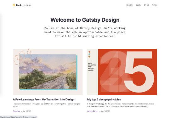
Gatsby Design, a website from my colleagues at Gatsby showcasing their design thinking, launched in the past couple of weeks and of course my first instinct was to give it a spin for accessibility. I was so pleased with what I found!
It's not often that I see a design site launch with no obvious accessibility issues (ahem, Dropbox Design). The Gatsby Design team kept their site simple, and let the content do the talking: articles with artwork telling their stories of working as designers. They kept visible keyboard focus outlines, included good color contrast, and there are no automated accessibility issues that I could find in Accessibility Insights.
Accessibility must be considered before the development phase to be successful, so to see a design team embrace it for their own site is fabulous. We've had great conversations internally about contrast and acessibility and I've been happy to see the curiosity applied to learn more and expand one's craft to be more inclusive. It's the way things should be, really.
3 notes
·
View notes
Text
Adobe Spectrum CSS

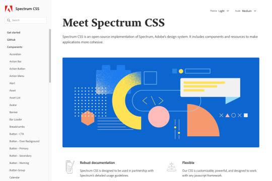
Recently, Adobe launched their Spectrum design system complete with an open-source implementation, Spectrum CSS. In addition to an extremely polished and well thought-out presentation, Spectrum’s focus on accessible CSS practices and quality markup is a breath of fresh air. Its use is likely to facilitate more accessible websites and applications, which is fantastic.
Spectrum the design system includes principles, pattern guidelines, content recommendations, tools and resources, and more; not dissimilar from Google’s Material Design. The Spectrum CSS project, in contrast to its design system, is a working collection of component styles that you can download from npm or explore on GitHub and apply to your own project. It’s an incredible resource to have available, particularly with its rigorous testing and attention paid to accessibility.
One outstanding question I do have is about the textarea component, which doesn’t illustrate usage with a label element and could lead developers to omit a critical piece of accessibility information. But that’s more of an issue with docs/education than a shortcoming of the library, itself. Many of the patterns I reviewed included SVG and ARIA best practices, a welcome contribution in a world of DIV soup component libraries.
According to Matt May, Head of Inclusive Design at Adobe (and my former manager for a brief moment point in time), the Spectrum project has been in the works for over 3 years. Adobe is a large company with many teams–and a robust legal department–so I imagine getting this thing ready to launch to the public with their name on it was no small task. Thanks for making this available to us, Adobe, and keep up the good work!
9 notes
·
View notes
Text
Accessibility Insights

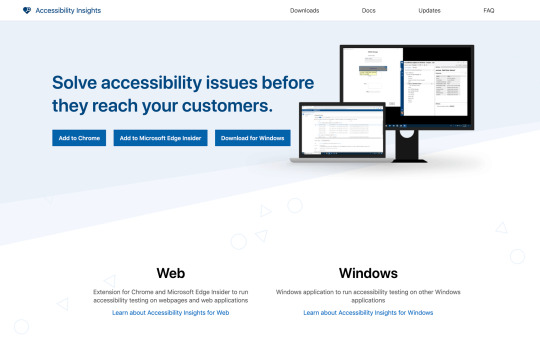
A project I've been recommending a lot lately is Accessibility Insights, a set of free testing tools from Microsoft. It uses axe-core under the hood (which I used to work on) and was years in the making. They're currently offering browser extensions for Chrome and Edge Insider, as well as a testing solution for Windows applications. Super cool!
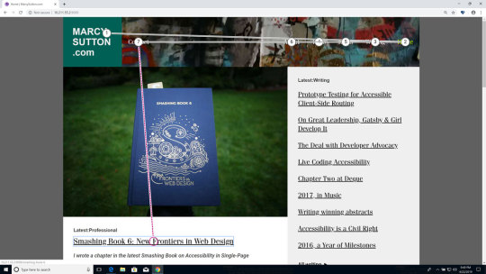
There's a lot to love about Accessibility Insights for Chrome/Edge in particular, but I really love the tab order and headings tools. You can run automated scans for whole pages and dive deeper into ad-hoc tools, gaining knowledge about the health and quality of your pages (or the lack thereof). Microsoft did a lot of solid design and planning work along with their partnership with Deque, and it's been great to see this launch (even if I'm a few months late to write about it!).

Thanks for the free tools, Microsoft. And happy testing, everyone!
7 notes
·
View notes
Text
Matuzo.at

I just love the personal site of Manuel Matuzović, a front-end developer based in Vienna, Austria. I was reading through Manuel’s slides for a talk he did at React Finland yesterday on 12 Tips for More Accessible React Apps and was immediately impressed with the bold design on his site (it looked great on mobile, and works wonderfully on desktop as well). Knowing his typical attention to detail for accessibility, I was pretty sure the site would be wonderfully accessible. And it is!
I love the little touches with a skip link neatly nestled into the design, animated SVG logo on focus and various link interactions. Manuel used semantic markup in his pages, with a visually hidden h1 element with his name on the homepage. It’s a breath of fresh air getting to see a nicely designed site and know that it’s got accessibility handled! There’s a “beta” message on it, but I think it’s already in great shape.
Manuel: thank you for sharing your knowledge with us in your talks and content bits like the TIL (“Today I Learned”) section of the site. I especially love your Dark Side of the Grid stuff as I’m also using and speaking about accessible CSS Grid. Your contributions are fantastic and I hope they continue!

5 notes
·
View notes
Text
Tatiana Mac, Art Director

Have you ever heard someone say, "accessible websites are boring"? Hopefully you already know that is an incorrect sentiment, as accessible digital experiences can be beautiful, innovative, well designed and highly functional. With that said, I have a new example for you to hold up and shatter that assumption: the website of Tatiana Mac, an Art Director, Designer and Developer with a focus on inclusive design. She uses bold colors with a sophisticated aesthetic to express her personal brand, and she did a wonderful job making her website accessible.
Decent markup laid out with CSS Grid, little-to-no axe violations (short of one image missing alt text and a few best practices), great color contrast, and quite a bit of personality: those are the things I love about Tatiana's site. She could perhaps rearrange some headings and add a few more landmarks, but I think you'll find she paid a lot of respect towards accessibility in building her website. Her point of view and values shine through; in a world of endless inaccessible portfolio sites, this one explifies accessible web design done well. And it's so refreshing!
After a few month hiatus from this blog (important life events, y'know?), it's great to find an example that has me excited about the web...because let's be honest, it can be bleak out there sometimes. But I'm thrilled to be back sharing more tidbits of winning web accessibility. If you've seen or built something you feel is deserving of praise, send it my way. Otherwise, it's back to our regularly scheduled programming. 🤘
6 notes
·
View notes
Text
Facebook AX Navbar

I've heard from colleagues and friends who rely on screen reading software that Facebook.com has historically presented challenges when consuming content. Something about the news feed having many sections and lots of dynamic content made it difficult to navigate. However, I was pleased to discover last week that Facebook has added an accessibility navbar, accessible with keyboard shortcuts (Alt + /) and as the first item in the tab order.
Having a global navigation bar for keyboard and screen reader users is fantastic. The entire navbar acts as one tab stop, with the arrow keys taking you through dropdown menus for sections, pages and accessibility help. When applicable, a visible outline shows the section or landmark targeted by a dropdown menu item. But the best part of this navbar? It extends landmark navigation to all keyboard users, not just those using assistive technologies.
This accessible navigation is big a step beyond skip links, with well coded, desktop-style dropdown menus instead of a basic list of links. I really like this pattern, but I'd love to hear what you think of it!
4 notes
·
View notes
Text
Expedia

In writing a new talk for Beyond Tellerrand and Script Conf, I went looking for examples of inaccessible travel booking sites, online bill pay and entertainment. It's a bummer that I was able to find so many with basic accessibility issues, including Kayak, Hulu and my own electricity provider's website (tsk tsk, Puget Sound Energy!). But there was an example that stood out as being designed and developed with accessibility in mind: Expedia.com.
People with disabilities need to book trips, too! Fortunately, Expedia has done a great job of making their site accessible. They have a skip link, labeled form controls and icon buttons, and intuitive navigation. They've made it easy to navigate with a keyboard and a screen reader. Even something as simple as visible focus outlines puts them ahead of many other sites, in my book.
I know their team works on accessibility all the time. So if you've got feedback they'd probably love to hear it. Way to go, Expedia!
2 notes
·
View notes
Text
Google Chrome’s Color Contrast Debugger

As a web developer and person working on accessibility tools full time, this win provides a lot of satisfaction: Chrome Canary’s developer tools have an experiment where you can debug color contrast right in the style inspector. For a given foreground color, clicking on it in the inspector now shows how it relates to WCAG AA contrast ratios. You can also expand it to show the AAA ratio from inside the color picker.
By meeting these ratios, users with low vision or difficulty seeing color will have a higher likelihood of being able to use your sites! Color contrast is also the #1 accessibility fail on the web. So this tool is very close to my heart!
I was a little thrown off by inherited background colors at first; especially for user-agent styles like the default link color, where no color style is shown (but I'm an edge case weirdo–most people would provide a CSS color). The color picker shows a gradient of the two colors with the background indiciated as a circle icon; a visible hexadecimal or RGB value probably would have helped me understand it quicker. But there's also an interactive color picker you can change on the fly to adjust the ratio, which is a killer feature.
We do a lot of work to test color contrast in the axe-core library and browser extensions, and I know that it isn’t easy to deal with all the edge cases. But hopefully in a privileged browser context they can utilize processes for painting the screen according to CSS in a performant way. Chrome's contrast devtool will be a great complement to the aXe extensions, or aXe in Lighthouse.
To enable the experiment, download the Chrome Canary browser, a bleeding-edge version of Google Chrome. Open the developer tools, go to the Settings, and click on Experiments. If you don’t see an option for a color contrast ratio line, press shift six times and the option will appear. Enable the checkbox and close the settings. Now you know the secret devtools experiment handshake, congratulations!
7 notes
·
View notes
Text
Dragon drop: accessible reordering library

There's a visually beautiful drag & drop solution making the rounds on the web, and it even touts itself as being "accessible". The problem is, you can't actually use it with the keyboard in its current iteration–a huge, blocking barrier to people who can't use the mouse. If you are looking to implement drag & drop on a website, I HIGHLY recommend checking out Dragon Drop by Harris Schneiderman.
Dragon Drop is available on Github and it's framework agnostic, so you could work it into a bigger project. To make it accessible, each movable object has a dragger button that can be moved with the keyboard once you enter edit mode with the space bar or enter key.
Here's an integral part of its accessibility: the button elements used for reordering are natively focusable, so keyboard and screen reader users can reach them. Disabled users can't magically start using the mouse to drag and drop, a strange expectation of many "accessible drag and drop" solutions (slapping ARIA attributes on it isn't enough!).
Harris did the work not only to make it keyboard operable, but also to pipe customizable screen reader messaging using ARIA Live Regions. He made sure it worked in major assistive technology/browser combos. Speaking from experience, it can be difficult to support Windows screen readers like JAWS when mouse interactions differ from the keyboard. This solution works around that with the edit mode and button accordances for manipulating items with the keyboard.
If you do find an issue with it, I'm sure he'd love to hear from you on Github!
Happy reordering!
5 notes
·
View notes
Text
Deque Pattern Library

In the web industry it’s common to see pattern libraries circulated as they do a good job of promoting design thinking in reusable code patterns. Less common, however, is to find a pattern library where accessibility is the primary objective. On the product team at Deque Systems, also known as Deque Labs (where I work, so full disclosure), accessibility is our top priority. We created the accessible Cauldron pattern library specifically for our products and open sourced it, making the patterns available to the public!
In addition to style basics like typography and colors, the library includes components like custom form controls, a select menu, badges, toasts, and more. There are also composite components like modals, navigation and alerts. It's important to mention that the design and interactions presented are intended to show how Deque wanted to solve these problems, and how we approach them in our products.
Think it should work differently? You can contribute to the Deque Pattern Library on Github by opening an issue or submitting a pull request: https://github.com/dequelabs/pattern-library. I'm sure the team would love to hear from you.
3 notes
·
View notes
Text
Blackboard Learn

Accessibility is crucial in education for people with disabilities: without it, students are prevented from consuming content and collaborating in class. Lack of access in school can negatively impact job prospects later in life, too. Blackboard understands this, and prioritizes accessibility in the web development process. (It's also very important to prioritize accessibility in design, as accessibility starts with UX.)
Accessibility in the Blackboard learning management system is well considered. Pages load in layers, and focus management is handled very well so keyboard users don't get lost. Interactive controls are customized for the content on a given page, giving screen reader users as rich of an experience as everyone else (i.e. an icon button with aria-label="Add new content above 'New Document'"). There are probably some things to improve on, sure, but this is leaps and bounds beyond most "single-page" interfaces I’ve seen out on the web.
This past week I did a keynote talk at Fluent Conf, where I encouraged attendees to think beyond the mouse when building for the web. I told stories about technology impacting people’s lives for the better, providing education and employment opportunities, along with independence and privacy. I wanted to show that accessibility can be cutting-edge, and it doesn’t have to be boring. After seeing Blackboard's JavaScript-heavy Learn education platform up close and personal last year, I knew it had many, many hours devoted to accessibility, and it would make for a fantastic video demo.
Showcasing focus management and screen reader support in a major web application was huge for folks who’d never seen something like this before! So, I want to highlight Blackboard for doing great work.
Thank you, Blackboard, for putting this emphasis on accessibility–and for providing an online demo of your Learn app! It makes a huge difference showing web developers how accessibility can be modern and done well.
1 note
·
View note
Text
Elm HTML A11y Helpers

This week I spoke at the GOTO Chicago conference and the speaker before me, Richard Feldman, talked about JavaScript interrop with the Elm programming language. If you're not familiar with Elm (I wasn't), it's a statically typed programming language that compiles to JavaScript, with a focus on performance and no runtime exceptions. When I spoke with Richard about accessibility on the speaker drink track later, he mentioned a colleague had been working on an accessibility library. Enter Elm-HTML-A11y, a set of helpers to encourage accessible HTML in Elm.
From developer Tessa Kelly:
“I've been working on a library in Elm that adds helpers for aria attributes and presents a nice API so that it's easier for developers to make the accessible-friendly decision. I've been working from the WAI-ARIA spec, and just trusting that assistive technologies support the attributes I'm adding.”
Elm-HTML-A11y currently covers form inputs, tabs, and images, enforcing accessible defaults with labels, roles and text alternatives. Tessa maintains the repository on Github, so if you have a feature request or issue be sure to let her know!
It's so awesome to see accessibility-focused tools for new programming languages, because they make writing accessible HTML easier for developers who often overlook it. Thanks, Tessa!
4 notes
·
View notes
Text
Shopify Polaris Design System

The last time I wrote about Shopify's homepage, I heard a soft grumble from someone who worked there that they wished more of Shopify's tools were accessible. So I was pleased to find a new design system from the e-commerce company, called Polaris, highlighting accessibility as one of its core fundamentals. Polaris provides documentation, tools and components for building with Shopify, including a UI Kit and React component library. The combination of resources helps people with different skillsets get involved, which is cool.
The React component library has nice looking, (mostly) accessible demos and they've encouraged participation on Github. So if you find something that could be improved, let them know! I found some color contrast issues with their demo site and a few issues with components which I plan to file on Github when I get a chance.
Overall, it's really awesome to see accessibility being advocated in design systems. They're great opportunities to bring awareness to accessibility and offer pre-built components that have it baked in, helping consumers get accessibility right from the start. More of this, please!

Got an accessible web design system you're proud of? Submit yours!
3 notes
·
View notes
Text
A11ySea Meetup

I want to award an Accessibility Win to my manager at Deque, Dylan Barrell, as well as Michael Schulz and Joe Welinske for rescuing the Seattle Area Inclusive Design and Accessibility Meetup in March 2017. Apparently, there was about a five-minute window where someone had to step up and save the Meetup page before its growing membership and backlog of past events went down with it.
Dylan volunteered me since I've orgnized events before and I'm originally from Seattle (even though I live 80~ miles away now). Michael and Joe were right there to rescue it if Dylan hadn't, so we got together and started brainstorming how to run A11ySea with sustainable leadership and regular events.
First-up is a free A11ySea meetup on May 18 for Global Accessibility Awareness Day (find an event near you). We'll have 3 speakers covering a range of topics from losing your vision to working on accessibility at scale. On September 23, there will also be an unconference-style accessibility camp at the Seattle Public Library downtown, a revival of the great Seattle accessibility camps held in the past. We've got lots of ideas and excitement for future events, so stay tuned for more.
Accessibility meetups and camps around the world are great places to learn about inclusive design and accessibility, and to network with like-minded colleagues. I highly recommend looking for events in your own community and other cities, as some of them live-stream events; I know A11y Chicago and A11y NYC do from time to time, and there may be others. A big thanks to all you organizers out there for making accessibility camps and meetups possible! Keep up the good work.
2 notes
·
View notes