
Statistics
We looked inside some of the posts by aleshamg and here's what we found interesting.
Average Info
Notes Per Post
0
Likes Per Post
0
Reblog Per Post
0
Reply Per Post
0
Time Between Posts
28 days
Number of Posts By Type
Photo
2
Text
15
Last Seen Tumblr Blogs


Fun Fact
Mobile US users spent an average of 115.8 minutes on Tumblr app monthly.

Photo

Massive magazine Illustration
Issue 05, 2017
0 notes
Text
concept rationale & final thoughts
Rationale:
The NZ Herald website was redesigned to engage users with the site more, almost like how they would interact with the physical newspaper. This approach developed my concept to not make a full connection between the physical newspaper and the online news site, but to acknowledge the timeless style in my design process. The information architecture of the original website is easy to follow once you understand but every page is overwhelmed by all sorts of information and although this correlates back to the physical newspaper IA, I wanted to simplify the navigation, the sub-headings and the articles published to be about genuine news and not everyday news plus unnecessary aspects like quizzes, star signs etc.
The timeless style is shown with the use of high-contrast black & white photographs of the articles, focusing on the actual image itself. This fixes a problem I faced on the original NZ Herald website; being overwhelmed with text, imagery and ads on the home page. Only showing the headlining articles gives the user a chance to understand the structure for the rest of the website but also giving them the freedom to choose an article and interact with the pages. An aspect of user interactivity includes the new feature ‘Saved’ where the user is able to save multiple articles to read at another time, this allows for a small personalisation that may encourage the user to come back to the website.
I used a serif typeface and a sans serif typeface to approach the timeless yet contemporary style; Georgia is a serif and used on all the body text, captions and descriptions, Tisa Sans Pro is a sans serif and used on all the headings, subheadings and titles of articles. The colour palette is very refined to a creamy-yellow background tint, black, white & dark grey. I decided against bringing in any more colours as previous iterations showed this to make the site look clumsy and unfinished.
Thoughts:
As I decided to focus on coding a few pages I didn’t attempt to make the site responsive as I believe I didn’t have enough time to make it worthwhile. In addition to a coded article page with a comment feature and the breadcrumb navigation, I tried to code the home page but this proved to be just as difficult because of the way I designed the page in blocks. I did however include my attempt at a home page in the submission just so you get the idea of where I was heading with it and if I had more time, it would’ve (hopefully) looked closer to the design. In saying that, I found learning code to be quite fun once you got the hang of the terms and will definitely have another go at creating a website.
0 notes
Text
studio 6b
Another class of troubleshooting

The coding of the home page is proving to be quite difficult. With Tims help I managed to set up the layout I wanted but as soon as I started to add css it went downhill from there. I think this might’ve been a combination of the multiple div tags and me being confused by these tags.
The div section on the left worked out and the div section on the right is in the correct position but the styling of the article title and ‘global’ are the same when theyre not supposed to be. I wanted it to look like the div section on the left. Also to add some margins or padding to the square to give it some gutter.

Working on it all afternoon with the help of another classmate we managed to tidy up my code and sort out the sections. However, we couldn’t get the ‘global’ & ‘national’ italic headings to be flush right. And then I would’ve added padding to make a gutter between the articles. But this was a job and a half to figure out & then apply
0 notes
Text
studio: homework

An example of what I wanted in terms of a 3 column grid using html - tring to do the home page of my website

I have sorted the 3 columns but finding it hard to create the article pages - will keep working on this in class

Updated my old code to match the slight changes in design. Also added in the breadcrumb feature
0 notes
Text
studio: homework

Started the wireframes for mobile based on what I had last class

Introduced a serif to relate to the essence of a newspaper

screenshot of artboards for the wireframes

Mobile incorporates style and easy to navigate
0 notes
Text
studio 6a
Today we had a round of user testing on laptops which was good in terms of getting feedback before the hand in on Friday. We each tested the prototypes and gave some written feedback to our peers.

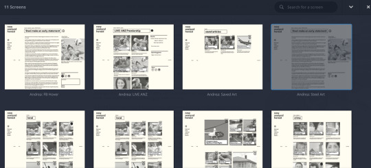
The task was to find the article ‘Steel make an early statement’ via the ‘saved’ option on the menu
Home > saved > ANZ Live article > Article
However, because of the way I worded the situation it took some people longer to find which is something I can easily fix in the user journey task
Feedback:
Easy to navigate
Easy to read & find article
What does the plus do? Add to saved?
Sports section may help
Refine by category
Saved feature useful
No sport category
Wireframes?
Challenging to find
Re-look at grid
Wanted to have sport as a sub-heading to national & global

The top half is where I’m heading and the bottom half is what I’m refining from. It came to my attention from the little feedback session that my aesthetic wasn’t showing the historic ‘newspaper’ vibes and almost felt like it was still in a wireframe format or the design was a bit lazy. To make it dynamic I then made the article photographs full opacity instead of 70%, made the headline title white to contrast nicely against the picture and add the + right next to the title so people are able to make that reference


The top image was to show me the purposefulness of the background colour and the effect it has on the webpage. The screenshot below has the 3 different shades I was working with before deciding on the top left one - pushing the cream colour more so that it doesn’t get washed out and it more noticeable to the eye
0 notes
Text
studio: homework
Below is the code for my comment section on the right sidebar, this also allows you to ‘type’ a comment but won’t actually send due to no Javascript in code, I wanted that part to be more than just a picture. The ‘comment’ section just above it is a filler image to show what would actually go there


Code in use
0 notes
Text
studio 5b
Today was another studio class with troubleshooting. Spent all day coding an article page and learning a lot along the way, also had a good read of HTML & CSS by Jon Duckett

Added in a pullquote to the article page to see what it would look like and this is the code (incase I lost it somehow)

Sorting out the sections

Adding in some aesthetic
Realised the browser was set to 75% not 100% so made some changes to fix that problem & the body of the article text was in a fixed position but with Tim’s help we managed to get the scroll back and then I had to go back and change the CSS to put it into the right position

Fix the body section (blue line was the body but that wasn’t where I wanted it to go)

Progress so far
Left sidebar is fixed and is the main header
The middle is where the article content goes with a fixed article title- want to try and make the space above the article title the background colour so the text disappears seamlessly when scrolled
Right sidebar is the added features section with author, date, image + caption, comment section
0 notes
Text
studio 5a
Today was more of a studio class and I spent it finessing my wireframes and doing user journeys to make sure that everything worked smoothly before I add aesthetic to it. After talking to some class peers and Tristam, I made a few more changes to the wireframes as some aspects were being confused - like words being confused as sub-headings when they weren’t
wireframe editing:


These are the changes I have made to the wireframes like including the ‘saved’ feature because that creates more interactivity between the users and the website - I will then look more into the ‘comment’ section in the wireframes for a user journey
0 notes
Text
studio: homework
Something I wanted to do was have my wireframes and information architecture sussed before Tuesday's class so that the layout and journeys would flow a lot more and people testing the journeys wouldn’t get confused

I kept the orientation landscape as that was my original idea but with these drawn wireframes I explored different ways to show the sidebar menu instead of a block to the side of the page - it made the website quite blocky and restrictive therefore making the rest of the design restrictive.

0 notes
Text
studio 4b: interim

Going over user journeys.
Idea is good, refinements need to be made and apply a situation and goal (ideal user journey) to the user journey to provide more insight.
From here I will go back to my wireframes (change dimensions as I’ve made them too big for InVision) and make some IA changes to make the design consistent as a whole
What I’m doing:
Overules and underlining - think of the ‘politics’/ ‘local’ headings and how they look similiar but need to be distinguished because they do different things
Go back and make some basic wireframes with article detail in it but no design or images
Sort out what is on my fixed header
Sort the layout of images/articles when on the main pages or introduce sections
Have a 4 column site but content is only 3 of those columns
Need to make sure article text is readable - stick to the normal one column text
0 notes
Text
studio: homework
mobile & web user journeys with a lot of detail
it is quite informative once you move from paper prototypes to invision and get to visualise (to some extent) the flow of the user journey
I’ll be showing the following user journeys in tomorrows interim and the basic wireframe of the mobile version


Figured out that my web dimensions were too big, so will need to change from 1280 to 1080 to fit my screen better
0 notes
Text
studio 4a
Studio class today
Did some user journeys with classmates and worked out small problems/when they hesitated

making iterations

I decided to change the font from a friendly geometric shape to something that portrayed the history of the NZ herald without it looking too 'fancy' or 'traditional'
Filson soft to Tisa Sans Pro
0 notes
Text
studio 3b
studio - putting more detail into the wireframes to see if it works there


We had another short recap on coding (on brackets) which was very helpful and instead of taking notes this time I screenshot the working files.
Click on the blog post to see the screenshots, although it is for my learning to keep a visual of the correct coding


0 notes
Text
studio 3a
interim presentation

Today we went over a user journey and wireframing/ia and had mini critiques on each, i recorded most of this in my workbook but the main points were to sort out flow of the site and create more user journeys and tasks to test the site out.
The digital version on the left was the first iteration and the small pieces of paper are the second iteration and to develop it further.
The user personaes are very important in determining certain functions and the aesthetics of the website
0 notes
Text
studio 2b
More studio time today, working on paper prototyping
Also think of in terms of wireframing - the layout of titles, subtitles, images, captions, pullquotes
Understand the user personaes more - will be helpful once we start designing our own design

Quick sketches from workbook, will turn these into digital wireframes for interim on tuesday!
0 notes