
Don't wanna be here? Send us removal request.
Statistics
We looked inside some of the posts by aubriannax-blog and here's what we found interesting.
Average Info
Notes Per Post
14
Likes Per Post
14
Reblog Per Post
0
Reply Per Post
0
Time Between Posts
25 days
Number of Posts By Type
Audio
1
Text
16
Last Seen Tumblr Blogs


Fun Fact
Tumblr posted its first advertisements in May 2012 and subsequently earned $13M in revenue.
Audio
0 notes
Text
Week 10, Own Choice, March 23

I took this photo when I was visiting family in Newfoundland the summer before last. Every time we visit, my nana makes a point of having a large seafood meal with all of our family there. My hometown is right on a bay in central Newfoundland, which means locals can get seafood for very cheap from the fish plant there. This is always a big treat for my parents and I because seafood is so expensive up here, and of much lesser quality than what’s available there.
I chose this photo because I think it represents a snapshot of East Coast culture. Particularly around where I’m from, time seems to move slower and life is always a party. This can be frustrating when trying to actually get anything done, but it seems to work for them - which makes me very envious.
I would like to paint this or have it painted, minus the feet and the chair in the background. I just think the colour scheme is so perfect.
1 note
·
View note
Text
Week 10, Postmodernism, March 23

This picture represents postmodernism because it combines a classic style of porcelain decoration with the very modern concept of a pop can. I feel that this image may be attempting to convey an idea regarding the simplicity of times gone by, and the destructive nature of modern norms.
One often sees discarded pop cans on the side of the road, but never porcelain. The contrast between the subject and material seems to work especially well on account of some of the cans being squished, which I think is meant to show the fragility of changing ideals and perceptions of attractiveness.
The only question I have about this work is why the background is left bare. I feel that the message of the art could be much more easily interpreted with some context in which to place the subject... but maybe that’s the point.
Image source: http://rebloggy.com/post/photography-art-sculpture-cool-photo-soda-picoftheday-artists-on-tumblr-postmode/62957317441
1 note
·
View note
Text
Week 9, Own Choice, March 19

For my ‘own choice’ post this week, I chose a photo my mom took of my dog’s recent work on her coasters. I found this to be funny and ironic as there is a German Shepherd on the coaster, and the coaster was chewed by a German Shepherd.
His bite marks also seem to form a sort of border around the picture, an interesting coincidence, as he usually completely destroys household items that he gets his paws on. My dog is a modern artist.
1 note
·
View note
Text
Week 9, Contemporary Propaganda, March 19

I think that this ad represents a rather disgusting example of modern propaganda. It makes a clear emotional appeal towards a biased opinion, and propaganda is usually intended to stir an emotional response in the viewer. For example, propaganda during war times is meant to create fear in its viewer.
This image attempts to convince those uneducated on the matter of a certain perspective by appealing to our baser natures.
Whether images such as the above should be allowed to be circulated is a complicated question. One could argue that banning such advertisements is restriction of freedom of speech, but it’s also important to consider that many people may take this at face value without doing research, which could be harmful to an issue that means life or death for many women.
0 notes
Text
Week 8, Other Photojournalist, March 10

For this post, I chose a work by environmental photojournalist, Peter Essick. I believe that this photo is not only aesthetically successful in terms of colour and size relativity, but in its deeper meaning.
I think that the height of the smoke stacks is meant to represent the enormity of the threat the humans possess to the environment, and how quickly global warming is escalating past the ‘point of no return.’
A photo like this demonstrates the power that the photojournalist can have when trying to bring attention to issues that most of us ignore.
1 note
·
View note
Text
Week 8, Nachtwey, March 9

Among all of the horrors captured in Nachtwey’s work, I chose to include this photo in my journal because it showcases how little consideration is taken for human life in some circumstances. This is a picture of Hutu cholera victims being taken to a mass grave, and it shares the grim nature of much of Nachtwey’s photos.
People in the West don’t see these things in daily life, and it’s important that all who seek truth should have access to the realities faced by their fellow humans. Work like Nachtwey’s is important in making a difference in the lives of those who usually seem far away to most of us.
0 notes
Text
Week 7, Own Choice, March 5

This is my front driveway in the summer, and I chose this picture because I needed to see some grass to remind me how summer feels. The winter really gets me down at times, especially during exams. The only thing that consistently keeps me going is the thought of eventually being able to sit in the grass and read, knowing that I have nowhere else to be.
This photo was taken when we first moved in, and I think that the arrangement of the picture almost makes our driveway look longer than in it is, which is an interesting effect.
1 note
·
View note
Text
Reading Week, Own Choice Post 2, February 23

This is a picture of my dog that I took last winter. This is my favourite picture of him because the snow contrasts his black fur, and he’s actually looking at the camera which is rare. I also like the way he fills out half of the image with the white wall on the other side to add additional pop to the snow on his fur.
There’s also something about the way he’s looking at the camera that seems to capture his innocence and ‘puppydom.’
What I love most about this photo is how unexpected it was. I didn’t think I got any nice pictures of him, as I usually just take a bunch and hope for the best, but I found this one hours after I had taken it and was very impressed with how it turned out.
1 note
·
View note
Text
Week 7, Photoshop Assignment, February 28
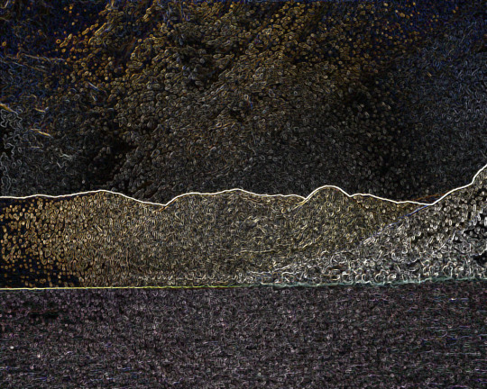
This picture was an experiment in photoshop and in failure. I began by deleting the subjects of the image, and then played with the color and applied several filters before getting the above result.
My original plan was to make it into a pretty watercolor-type landscape, but that failed when I started to use the clone stamp tool and the dock blended with the water. I settled on this because it reminded me of a lite-brite, which I played with often as a child.
All of the filter effects also seem to have contributed some cool details to the sky. It looks like another landscape up there, or like maybe the sky is on fire. It’s interesting what you can create when you just play around.
1 note
·
View note
Text
Reading Week, Own Choice, Post 1


These photos are of my cousin and I, taken about ten years apart. I chose these photos because it’s cute to see how much we’ve both changed, and yet these pictures seem to portray the same sort of relational dynamics.
I’ve gotten into the habit of going through old family photos for ‘own choice’ posts, and these just stood out to me because of their comparative similarity.
The bottom photo is not an edit, it really was taken on a polaroid camera. My cousin and I had fun playing with this camera on our vacation because it gives a kind of old-fashioned look to the photographs, and prints them out immediately. I’m sure there are more of these photos of us floating around, but I thought it was an interesting coincidence that both of these photos of us look quite similar and that they were the first ones I found.
1 note
·
View note
Text
Week 6, Effective Typography, February 17

First let me say, I LOVE THIS.
I’m a huge Nirvana fan, and the original image from which this typography is constructed is hanging in my room currently.
I’ve seen Cobain-inspired typography pieces that didn’t seem to make a lot of objective sense; but the usage of lyrics to fill his figure is so simple and beautiful. This kind of typography is infinitely more effective than just random words being used to fill an image. I feel that for typography to achieve aesthetic success, it must be relevant to whatever idea it is trying to convey.
This goes to show that, often, the simplest and best inspiration for art is right in front of you.
0 notes
Text
Week 6, Own Choice, February 17

This is a picture I took of my childhood dog, Max, on what I believe is his second or third birthday.
I was maybe eight when I took this photo, and I remember it distinctly because my family had just purchased a digital camera that we were all very excited to use. Being able to see the picture you had just taken on a screen on the back of the camera seemed to me, at the time, to be the heights of technology.
I went through a brief phase after we got this camera in which I would take photos and write stories about random things around my house, pretending to be a journalist. Funny, as I am now a journalism major.
This photo makes me feel deeply nostalgic for a time when things were simpler; and yet, terribly afraid of the fact that I will one day look back on the moments I’m experiencing now and feel the same longing.
On a lighter note, what a good boy.
2 notes
·
View notes
Text
Week 5, Own Choice, February 11

I chose this image because of the recent discussion in the media of Lady Gaga’s Super Bowl performance. Apparently people on social media were too busy critiquing the singer’s body, citing apparent weight gain, too appreciate her political message in her performance of Woody Guthrie’s “This Land is My Land.”
Gaga choice for the opening song contrasts Coldplay’s performance last year, which began with their hit “Yellow.”
To put it plainly, there are real problems in the world and people are concerned about a celebrity’s stomach. I’ve never understood the obsession that some people have with Hollywood and celebrities. There has always been some part of me that felt that the promotion of ‘celebrity news’ is meant to distract people from the issues going on in the world that really deserve their concern. This sort of misdirected attention is shared by millions on a daily basis, and will only become more problematic as the ailing world demands our attention.
And personally, I wish my stomach looked like this.
Sources:
http://www.bbc.com/news/in-pictures-38929490
http://www.menshealth.com/weight-loss/lady-gaga-body-shaming
1 note
·
View note
Text
Week 4, Own Choice, February 2


These photographs of abandoned houses in the Smoky Mountains are part of Johnny Joo’s “architectural afterlife” series. What makes these particular photos aesthetically satisfying is the focus on the central field of view. The intended focus of the photograph is the middle of the image; and while this often looks awkward outside of portrait work, it works well with Joo’s subject matter.
I chose these images because I’ve always had an interest in houses, especially older styles of architecture. I live in a very rural area about forty minutes outside the city, and whenever I drive out there, I see all kinds of abandoned barns and houses. I always wonder what their story is, what they’ve seen. I’m sure many of them are more than a hundred years old.
I’d love to explore an abandoned house, and these photos satisfy that desire without the risk.
1 note
·
View note
Text
Week 4, Own Choice, February 2

This is an image by Laura Buckman of Reuters, depicting a little girl waving an American flag before praying Muslims at a protest of Donald Trump’s immigration ban in Dallas.
I chose this image because the girl’s display of the American flag in front of praying Muslims, who are supposedly a danger to Americans, is a powerful representation of the damage that can be caused by identity politics. These people are equally as entitled to their pursuit of the ‘American Dream’ as anyone else. Alienating any one race or religion has historically only led to violence; and if Donald Trump thinks that he can ‘Make America Great Again’ by making vast numbers of Americans feel that they have no place in their country - many of these people have never known another place.
North Americans come from all over the world, and are no less Canadian or American because of their country of origin. If colonial-era Aboriginals had had the power to treat European migrants as modern migrants are being treated, the world would be a very different place today.
I believe that the world is in a time of crisis, and to turn away one’s fellow humans only increases the danger that we all face.
Image source:
https://www.theatlantic.com/photo/2017/01/a-weekend-of-protest-against-trumps-immigration-ban/514953/
1 note
·
View note
Text
Week 3, Ineffective Advertising, January 26

This is a harmless McDonald’s ad intended to promote civility among EURO 2016 fans. There are a variety of images in the campaign, featuring combinations of country names such as “iregium” and “polmany.” McDonald’s is known for their support of sporting events, which is funny, because I don’t know of any athletes who regularly consume their food.
While the other images successfully convey their sugary-sweet, family-friendly message, I feel that this one can be misinterpreted. The combined Sweden and Italy makes “swetaly” which sounds a lot like “sweatily” when said out loud.
Even a simple pronunciation mistake like this can detract from the central message of the ad, distract the viewer, and cause a different mental association to form than the one intended. I’m honestly quite surprised that this ad made it into circulation.
Source:
http://www.adweek.com/news/advertising-branding/ad-day-mcdonalds-brings-nations-together-outdoor-ads-euro-2016-171973
1 note
·
View note