
Don't wanna be here? Send us removal request.
Statistics
We looked inside some of the posts by chloeokeeffefmpwsc and here's what we found interesting.
Average Info
Notes Per Post
7
Likes Per Post
6
Reblog Per Post
1
Reply Per Post
0
Time Between Posts
6 days
Number of Posts By Type
Text
17
Last Seen Tumblr Blogs


Fun Fact
The most popular pages on Tumblr are about Minecraft, GIFs, and David J. Peterson.
Text
Final Postcards Part 2.
This postcard was produced near the end of the project when we used the darkroom for the first time. Using the darkroom and the different chemicals was probably my favourite skill and lesson overall. (THese are my final 20 postcards that i produced over the four weeks for the project)

These 5 postcards were created in illustrator and are amongst the best I created. The last two really contribute to the music I listen to, so being able to create edits towards something I’m passionate about was really cool for me. I also really like the colours on all of these, it was definitely a fun lesson.


This postcard below is one of my hand based work that I scanned in. I really like the orange felt tip pen behind the black and white magazine model. I decided to keep it as just a scanned image and not further it in Photoshop because I think it gives a more authentic vibe.

This is another edit I liked with some good edits and typography.

This is one of my textured couture garments, it’s fairly simply but I think it still shows my creativity and skill.

0 notes
Text
Final Postcards
As a first project on this course, I didn’t know what to expect but I was excited with this theme and what I could learn. These are my final 20 postcards that I produced over the four weeks of the project.
These are the first two edits I ever made that were inspired by Jesse Draxler. I was completely new to Photoshop and I think it shows my starting point which I like.


The 3 postcards below were all made in the same lesson. All of it is hand based work that I scanned in and continued to edit in Photoshop which was mainly layering. Layering all my work on top of each other and then (in the first edit) adding in some shapes and colour them to match the background. I like all these edits because they came out exactly how I envisioned them. The drawing was an offsite task that was inspired by the portraits Luke Dixon produces.


These below are my liquidfy edits that we learnt how to do in Photoshop, the liquify tool helps to distort images and type. Using the liquify tool in our work was inspired by a digital artist called MISHKO.co on Instagram. To test out/get myself familiar with the tool I used to theme ‘Identity’ meaning to distort, but once I got familiar with it I used movie quotes, song lyrics and inside jokes I have with friends to connect it with my identity. Halftone images, like the one in the second postcard, are something we’re were also taught. It was hard to make look good with certain images I had but it still came out really nice.


These are my Mavantri inspired postcards. Making these cards helped me explore Photoshop in more depth, with using the brushes tools and shapes. Out of the two, I much prefer the second one with the multiply filter that I used to create a slight distort.


0 notes
Text
Contact sheets.
These are all the photos taken from my most recent photoshoot. I created these contact sheets to clearly indicate which ones I’d use in my work and that came out the best.


0 notes
Text
AllFiftyTwo Research
In our very first lesson on this course, we took inspiration from an artist called All fifty two. We used his Instagram account to look at his art work. He used a pack of 52 playing cards to create little illustrations/collages that result in his own cool creations. We were given 15 playing card outlines and told to create playing cards based around our identity, to eventually submit as postcards.


These below are some I’ve created over the weeks using some photos from magazines, masking tape, some old photos of mine, and some food wrappers.


0 notes
Text
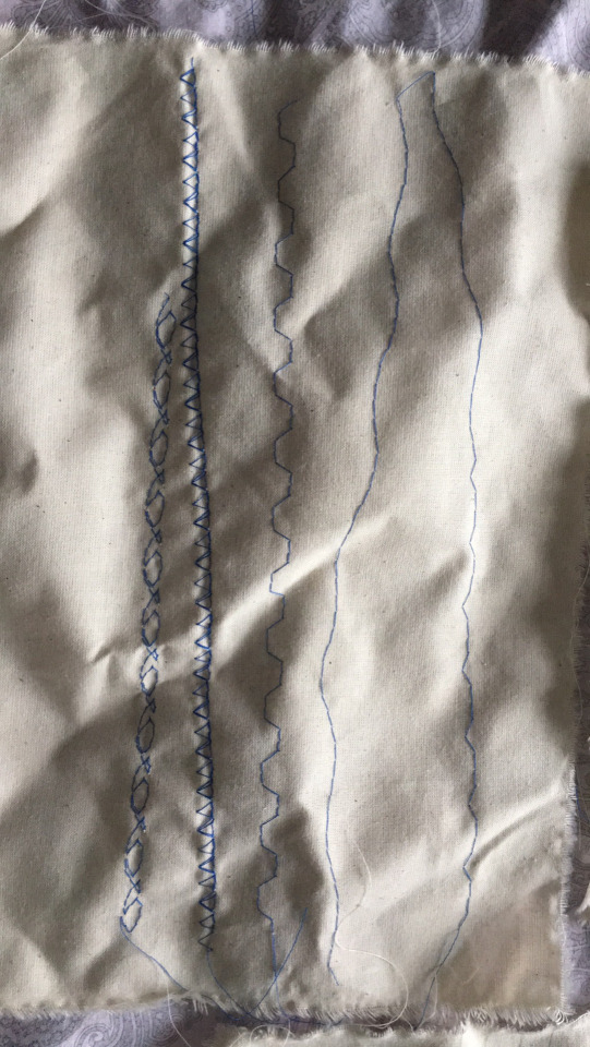
Hand and Machine embroidery
The aim of today’s lesson was to create a series of swatches that demonstrate our knowledge of stitching. We had to this by hand and using a embroidery machine. Luckily I’d been sewing and using an embroidery machine all summer, so I knew how to do everything such as attach the hoop around our fabric and how an embroidery machine works. We did all this to practice sewing then after break we were to sew into our photos, from our photo shoots from the previous day, to create postcards with texture, inspired by Diane Meyer, Hinke Schreuders and Maurizo Anzeri.

These are what I decided to do by hand. I didn’t want to over complicate the stitch otherwise the paper would rip, so I went for a simply running stitch and to make sure the paper wouldn’t rip I pierced holes with my needle where I was going to stitch. I thought the red thread would look nice against the purple light in the image.

This is what the finished stitch looked like on a light box.

I used the embroidery machine for this one. I actually layered two images on top of each other, so after it’d been stitched I’d be able to rip off the remainder of the top image to reveal the bottom one but it didn’t work. If I had moved the top image more to the left and then stitched and rip the remainder off I think it would’ve worked better. But I still like the green thread with the purple light from the image.

These are the stitches I did by hand, There’s not many as I spent most of my time on the machine. I managed to do a running and cross stitch. I really like cross stitches.

These two are the ones I did on the machine. I’m not too sure what the names of these stitches are but they were fun to make and play around with.

0 notes
Text
Diane Meyer
Santa Monica based artist Diane Meyer draws inspiration from ‘failures’ within photography in preserving experience and personal history through combing the image with embroidery. She makes good use of embroidery, which she explains “deteriorates the original photograph and forms a pixelated version of the image”. Her use of cross-stitching as a technique offers an uncommon sculptural effect that intensifies the dramatisation of the image and heightens the conceptual meaning. Diane very much pushes the distorted image and its history towards the viewer.
I really like her use of coloured thread. I think it really helps give the distorted effect.


0 notes
Text
Maurizio Anzeri
Maurizio Anzeri is a London Italian artist. He works with sewing, embroidery and drawing to explore the essence of signs in their physical manifestation. Maurizio takes inspiration from his own personal experience and observation of how, in other countries, bodies themselves are treated as living graphical symbols. He uses sewing and reshaping stones and history of these people.
Maurizio intricately embroiders directly onto found eerie photographs with coloured thread. The photographs are of a range of the faces of serious-looking children, sophisticated adults, and formal newlyweds are obscure by intricate thread work masks, while leaving exposed an eye, a mouth, or an ear. In his landscapes, diagrammatic rays emanate from both the natural and built environment, suggesting unseen and mysterious phenomena.
Anzeri’s handy work turns vintage portraits and landscapes onto surreal, psychological charged images, while upending the conventions of traditional photograph.


Do some sticching work to reference him
0 notes
Text
Hinke Schreuders
Hinke Schreuders lives and works in Amsterdam. Her work is regularly shown in the Wetering Galerie in Amsterdam and has been exhibited at such venues such as the Noordbrabands Museum in ‘Shertogenbosch and Avada Textielmuseum in Tilburg. Hinke Schreuders has been making small paintings and drawings on canvases with a need and three since 2002. She works on both borrowed images and personal photographic material for that embroiders in which she explores the the field of tension between feminine role models, sexuality and pornography. In parallel to this, the work is about vulnerability and identity confusion in general. Her technique of embroidery appears to be innocent, but her carefully constructed compositions evoke associations with more sinister undercurrents in a language that is prosaic and poetic. She draws her inspiration from both traditional Victorian and Mondern pornographic websites, as well as from the tale of little red riding hood and the novel Histoire d’O.


0 notes
Text
Mishko
Mishko is a graphic design artist we’ve were looking at today. We did some distorted typography editing in Photoshop using the liquify tool. His work consists of bright bold colours and statements. He used a range of objects in his work such as people, eyes, flowers and old TV sets. The kobra eye piece below is actually apart of his Disney villains 2019 collection, Kaa from the jungle book.


He occasionally will create work based on the things he likes or watches, in 2019 he created a pieces commissioned from season one of Euphoria on HBO. They were actually posted on the Euphoria official Instagram page before the release of each episode. I really love how he’s catered every piece to the personality of the character in the series.


He also bases some of his graphics on important things that are going on around the world -


This is an A5 canvas I did inspired by him. Using the liquify tool to distort the type.

0 notes
Text
Studio lesson
Today we experimented with white and black backdrops. The lights we used today were a Soft box, which is a rectangular box that controls the shape, direction of the light and prevents more light spill from occurring. A Small round light which gives off continuous lighting by pointing it to the background which gave me a crisp white background in my photos. And a Light box which, we used in front of our models to soften their faces and help with any shadows.
We also added colour gels on the continuous lighting and changed the colours around to get different contrasts by experimenting with the light adjustment dials on the various lights. I loved using the colour gels.
We also used manual camera settings to take our photos.

These below are the photos I took with the black backdrop. They came out a little bit darker than I thought they were, but still nice and clear.


These below are the photos either I took or were taken of me. We used blue colour gels but they came out looking a bit purple, but I still love the effect they have. They give me Euphoria vibes, which I love.


0 notes


Text
Liquify and Halftone lesson
In today’s lesson we explored the liquify tool in photoshop which were inspired by the artist @Mishko.co. We learn’t how to distort typography and how to apply halftone edits to our chosen photos. I used the liquify tool to distort quotes and song lyrics, I also used it to layer over some halftone images.
This is my best liquify creation. I enjoyed using the liquify tool.


Halftone
To create halftone images we had to go to change our images from colour to grayscale so it’s dark. We can chose to also change the colour levels of the grayscale image so it looks better. When the image is in Bitmap Mode, I selected the halftone screen option which then lets you set the halftone to what you want. So you chose the halftone to be in diamonds, eclipses, rectangles, lines or hexagons. For all my halftone images I picked either diamonds or eclipses. Here are some of the halftone images I created.


0 notes
Text
Animation play around
This was just an animation I created to get use to making them.

0 notes
Text
Liquify and Halftone Animation.
Within Monday’s lesson we were also taught how to make animations/GIFs. To start off I just made a regular digital collage, then saved every layer as frames for the animation. I dragged the first ‘frame’ into Photoshop and then placed all the other ‘frames’ on top of the first. All the ‘frames’ have to be in order in the layers panel. After doing that and making sure everything is in order, I then went to Window in the top left of the computer and clicked timeline then it moved all the ‘frames’ to the bottom of the screen in a line. I clicked the button in the top right corner of the area, where it was lined up and clicked create frame animation which literally made the layers of my collage into frames and then into an animation. I could preview the animation, but the time of when each frame appeared on the screen was too fast. I was able to adjust the delay of each frame slower. I then saved it, then exported it, saved it for the web and then posted it on here.
This is my Harry Potter themed collage. The distorted type is a joke me and my friends have. Avada Kedavra is a spell used various times in the movie franchise. I loved the little stamps of Harry and Ron in the corners. The blueish/green also goes really well with the black halftone images.


0 notes
Text
Guo Pei
Guo Pei is a Chinese fashion designer. She is best known for designing dresses for Chinese celebrities and in America for Rihanna’s trailing yellow gown at the 2015 Met Ball.

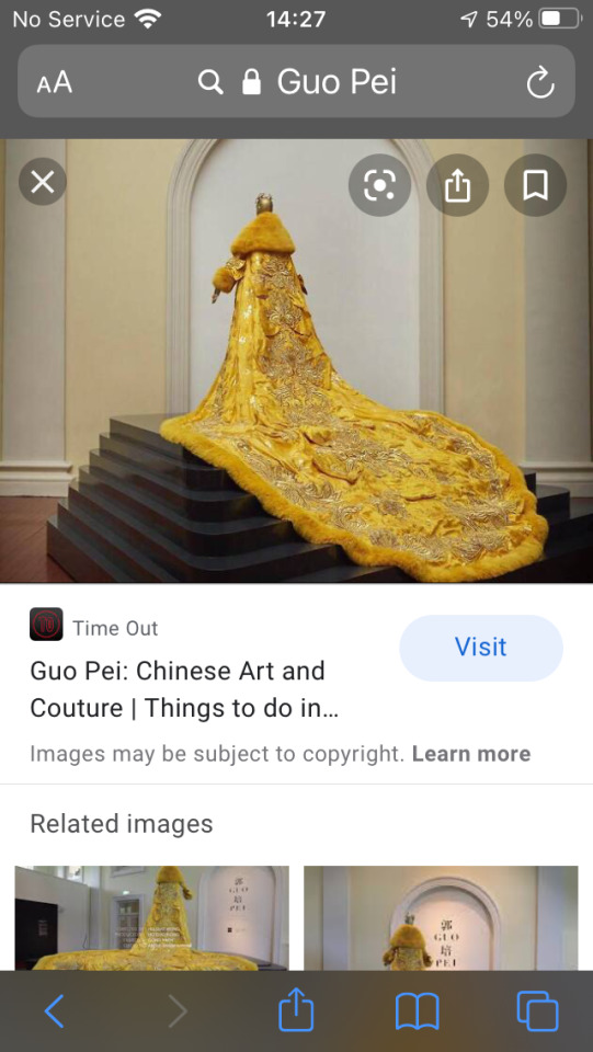
Guo Pei says that she strives for something more as the fashion demand grew in China. In the early 2000s, Guo’s reputation began to grow when she received commissions to create styles for the 2008 Summer Olympics as well as the annual Spring Festival Gala’s put on by China Central Television (CCTV). She is responsible for Song Zuying’s (a Chinese classical/folk singer) dress that she wore during her performance with Plácide Domingo at the 2008 Summer Olympics closing ceremony. The dress took two weeks overall to make and was covered with 200,000 Swarovski crystals.

She has distinctive Haute Couture fashion, her ‘Alternative Universe’ Autumn/Winter collection, certainly speaks volumes of uniqueness.
This collection caught my eye mostly because they’re are some weird garments within the collection. The colours on the dress of the left of the first picture below has such vibrant colours but is so weirdly shaped. And next to it, I’m pretty sure that’s two people in one dress? I’ve never seen that before on a catwalk. But the colours of the other dresses, the creme and black ones, are really nice and the train on the last one of the catwalk is nicely detailed.


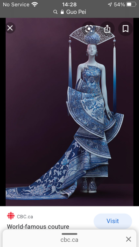
These below are three dresses I found of hers are some independent projects that caught my eye. This first one is certainly amazing. The accessories are certainly bold. The detail on the dress is amazing. This must of taken her ages to complete. This second one is so gorgeous, I’d definitely wear it. The blue and gold colours definitely work well together. I love the length of the dress and that the material is tight. The third one is lovely. I like how obvious is it that its something native to her.


7 notes
·
View notes