
Statistics
We looked inside some of the posts by coulro and here's what we found interesting.
Average Info
Notes Per Post
3
Likes Per Post
3
Reblog Per Post
0
Reply Per Post
0
Time Between Posts
17 days
Number of Posts By Type
Text
7
Last Seen Tumblr Blogs


Fun Fact
Tumblr has 16.74 million mobile monthly users in the US.
Text
skeleton arm swing
some class notes:


for animating the skeleton arm, i started off mapping it out the same way I would for the magic dot. I then connected the rest of the arm to the sketch and animated tracing over the sketch sheet.
After finishing the animation the final paper version looked like this.
I then also redid the animation digitally and fixed up the part when it flips over itself and added a bit more swing at the end.

This is the final digital version of it.
0 notes
Text
the take
notes from the class:


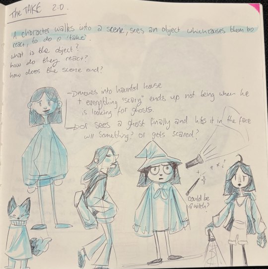

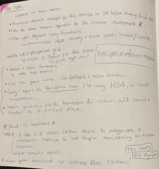
For the take the standard structure of it is the anticipation, the action, and the reaction.
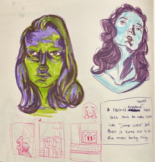
For my take, the animation is set in a haunted / abandoned house and the character will see various creepy things, before getting a big scare from a shadow that grows and then it ends up being just a little mouse with a top hat that comes through the door.
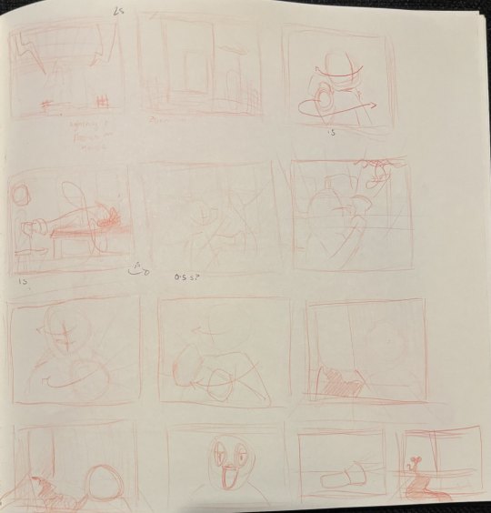

Here is the rough / thumbnails for the animation. I am completing this animation on toonboom harmony at 24 fps, I will be animating most of this on 2s and 4s, using 1s when necessary for quick actions.
In this animation, I want to try making use of some dramatic lighting and using the torch and the light from the doorway to create a nice effect with it.
After recieving some feedback on the various shots in the animation I have adjusted the timing and order of some of the shots for the take and am now happy with the thumbnails and will start sketching the animation out now.
I reduced the amount the camera zooms in the first shot of the house, and moved the spider so it was the reason he turns around and not just after he looks at the dripping tap. I also changed the camera angle a bit so you just see him holding the torch when looking at the door making the camera seem closer to him instead of having the over-the-shoulder shot.
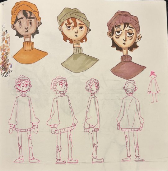
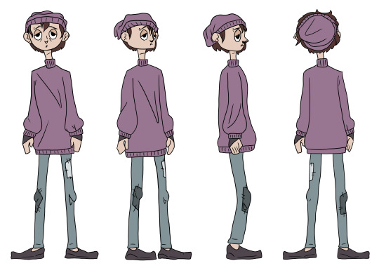
Once I got the thumbnails for the animation and my ideas sorted I then worked on the character's design and made a few little reference sheets to look back at while animating.
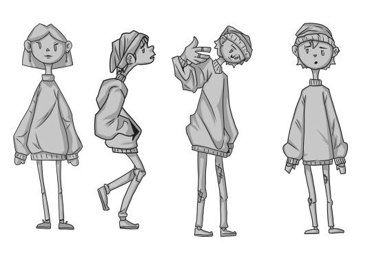
i went through a couple design ideas - testing if it should be either a boy or a girl. I ended up deciding to go with the boy. i did think these original designs reminded me of the characters in a game called papas cupcakeria, so I ended up changing them a bit further and ended up with this:
-----------
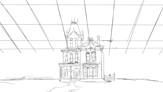
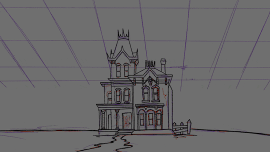
My toonboom files ended up corrupting and I had to start again working from the video I had with the thumbnails, I ended up importing the movie to a new Toonboom file and then tracing over the sketch to create the background.
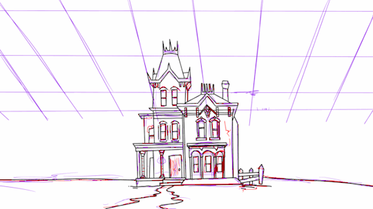
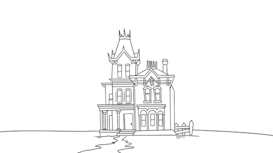
After drawing the line-art for the background it looked like this.
I then did the lineart for the face, starting with the key poses and then doing the in-betweens.

then after animating the head, I did the same process for the hat and the hair, putting in the keyframes and breakdowns first and then doing the in-betweens.
And then doing the same process for the body again.

I then did the lineart for the hands, and then filled with flat colours. i also used nodes to set one of the layers to an 'add' blend mode and then used a softer airbrush for the torch shine.
Using the nodes, I also set the shadow coming out the door to a multiply layer.
Then finally to finish it off i created new layers for shading each section that my animation was split into and adding shading using multiply nodes on the layers and using cutting noted so they only affected the colour of the animation.

then after finishing the shading i had one layer over the background set to multiply to darken the background and then one layer over the top of the whole animation set to overlay to give it all a cooler tone.
I also added lightning using the same method as the torch light and adding them as an add layer.
I animated the lightning as straight ahead.

This was my node setup once the animation was finished.
Then finally added the sound effects to the correct places. I got all my sound effects from pixelbay.com .
and this was my final animation:
0 notes
Text
walk cycle
For the walk cycle we needed to display a 'type' of walk, for example tired, excited, angry etc. I decided to attempt a drunk walk.
some notes from class:

For this i started off finding a reference on youtube - there was one very useful video of a man doing various walks on a treadmill and I ended up using that as my reference.
** youtube video link**
I also made a quick sketch of a character design I c ou ld use for this animation:

i took a few screenshots of important / kep poses from the walk, paying attention to the contacts and when his legs were the furthest in different directions.
I then used this to create a basic guide where I put different shapes to indicate where each of his joints would be in each pose.

I also made sure to put in a floor place so he wouldn't wander off on the screen while I animated. However, I tried to make him slide around so I could sell the effect that he was wobbling over and wasn't stable when walking.
after this, I started to sketch out the character on a new layer using these markings as my guides

after this, I resized everything to fit the screen better and removed the guidelines from being seen.

I then cleaned up the sketch and did linework on a layer above finishing off the animation.
This was the final animation I submitted and in particular, I liked the effect that the necklace had swinging around while he walked. I was also happy with the way the shoes came out, especially in the shots where the underside of them was moving towards the camera.
I am also happy with the solidity of the shapes I managed to achieve and how nothing really looks like it is floating around unlike with my first attempt at the head turn.
I do think to improve on this I need to fix my timing and spacing on the animation. I definitely want to redo this one as well if I have time after completing my take and redoing my head turn.
0 notes
Text
head turn animation
For this animation, I was tasked to create a head turn implementing all of the fundamentals we have covered up until this point. Some of which being: arcs, squash and stretch, timing, anticipation and drag and follow through, easing, overlapping action, and solid drawing.
I decided to use an original character I had created previously for the animation. Here is the reference sheet I have made for her.

Along with this for reference, I also took a video of myself following the motion that I wanted in the final animation and used that as a reference for the keyframes and breakdowns in this animation.
A lot of this project Was me learning my way around ToonBoom Harmony and figuring out how to animate within this software. I found a lot of it was similar to using Adobe animate which I have e a bit of experience animating in, and some other bits were different - mainly the shortcuts and the Nodes for finer editing things.
Some of the things I struggled with on this task were figuring out the paint bucket tool for colouring the animation, keeping the consistency on the face as it turns, and placing the spots on the mushroom so they move in a way that feels realistic and relative to the head turn. I feel I can definitely improve on these areas where it is less consistent and I will probably either re-attempt the head turn or work further on this one to fix the issues I have mentioned.
Here are some WIPS:


and some notes from class:

1 note
·
View note
Text
BOUNCING BALL EXERCISE
‧˚₊꒷꒦︶︶︶︶︶꒷꒦︶︶︶︶︶꒦꒷‧₊˚⊹
This is the bouncing ball task, in class we are completing this with paper animation just like the magic dot, using a lightbox and different sheets of paper for each frame. Similarly to the magic dot exercise I will be also completing more versions of this digitally to practice and experiment. This task makes use of the timing fundamentals from the magic dot exercise but also includes squashed and stretch to better show the material that the ball is made out of, without the squash and stretch it feels very stiff and unnatural.
notes from class:


‧˚₊꒷꒦︶︶︶︶︶꒷꒦︶︶︶︶︶꒦꒷‧₊˚⊹
Standard Bouncing Ball:

After completing the first bouncing ball animation (left), I noticed the ball moves off to the side a bit when it first bounces, and the secondary bounces feel a bit stiffer than the initial one. I decided to try again (right) and make it bounce a couple more times after the first impact on the floor. I do find the second one still moved to the side a bit after bouncing back up, so I will try again and make sure to carefully follow some guidelines to keep it straight up and down. I also decided to try colouring and adding a shadow onto the ball.
For the next few Balls, I tried to animate different materials being dropped change the squash, and stretch of the balls, to fit the material better. First, I did a Water Balloon, I tried to make it larger on the bottom and smaller on the top when falling to look like the weight of the water was falling to the bottom of the balloon, I then made it splash and break apart when it hits the floor instead of bouncing back up. In a similar style, I experimented with making one of a pumpkin falling and breaking when it hits the floor - I feel the way it broke and split apart comes across as very bouncy and cartoony but not particularly realistic. I also had these little spirits/ghosts emerge from the pumpkin afterward and float up (to try and incorporate the main ideas from the bouncing ball animation and the magic dot animation).


‧˚₊꒷꒦︶︶︶︶︶꒷꒦︶︶︶︶︶꒦꒷‧₊˚⊹
Paper Version:
This last one is a digital version traced from the plan I drew for my paper animation of the ball to test and see what it will look like before I finish drawing the frames on paper.

And finally, this is the paper-animated version of the bouncy ball, if I were to do this again, I would push the stretch/squash further on the initial couple of bounces and reduce it more significantly on the last couple when it loses power. I am happy with the consistency I kept in the size of the ball throughout and the contact frames when it hits the ground.

‧˚₊꒷꒦︶︶︶︶︶꒷꒦︶︶︶︶︶꒦꒷‧₊˚⊹
Updated version:

Here's my updated version I redid it to improve on my initial ball bounce animations. In this version, the size of the ball is more consistent and I made sure to make the ball squash and stretch less when it loses power after the initial hit onto the 'ground'. I also coloured the ball and added shading as if there was a light in the top middle of the screen. I am happy with the colouring on it and how smooth the animation looks.
WIP photos:
Any references:
https://m.youtube.com/watch?v=0Qzn7mjfdXE&pp=ygUmZHJvcHBpbmcgcHVtcGtpbiBvbiBmbG9vciBhbmQgc21hc2hpbmc%3D
https://www.youtube.com/shorts/aXiiMLqiq-c
https://www.youtube.com/shorts/TO5K9Nwj9x4
https://www.youtube.com/watch?v=udgkQBsvWS4
0 notes
Text
MAGIC DOT EXCERCISE
Paper Version (Final piece from task)
*input animation video* *input animation plan sheet* - mention abt changes made
This is the Magic Dot task, in class we are completing this with paper animation, using different sheets of paper and a lightbox to create each frame. Some of my notes from class:


Outside of the class, I am also experimenting with using various softwares and using this task to test out the way they work and the benefits or disadvantages of the different softwares. For all of my digital Animations, I did them in 12fps.
Experiment with procreate:

With Procreate I found that the app very quickly limits the amount of layers you can use which means you can only create a certain amount of frames before you run out, on this animation I was not able to finish it and only completed 62 frames.
For the animation itself, I also am experimenting with keeping the dot the same size the whole way through the animation and making it change size, changing size feels more dynamic and fluid as it looks like it's moving closer and further when the size changes, bigger being closer and smaller being further.
Experiments with FlipAClip:


I found that when using FlipAClip, I had a lot more ease using layers while animating and didn't get limited to the number of frames I was allowed to use in the animation. However, this app doesn't have as many options as Procreate does for the brushes you can use to draw with. Since I am able to use layers when animating I did a second one in FlipAClip using two different colour dots and having them chase each other around in the animation.
Final Version - ToonBoom

In this final version, I kept the arc the ball follows short and simple following a heart shape as it moves, also making use of changing the size of the dot to seem to get closer and further from the 'camera'.
I also coloured the ball and added shading as if there was lighting in the middle of the heart-shaped arc it goes around. I slowed down the dot's movement towards the top and bottom points of the heart to try and clearly show the shape of the arc.
1 note
·
View note
Text


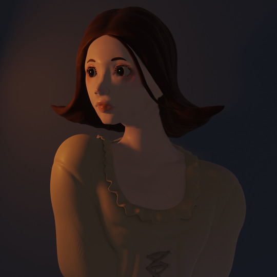
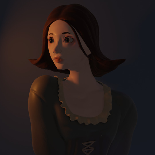
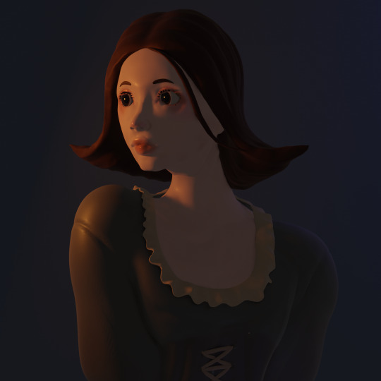
FRESHERS WEEK PROJECT
For my Freshers Week project, we were tasked to create a piece that displayed our aspirations within our art career and our interests. I am really interested in 3D modeling, and character design, so for this project, I decided to model a bust portrait. I used interest to reference the photo for basing the face off of. I referenced a corset I saw in the Bowes Museum loosely for the top. Modeling this was quite challenging when working on things such as the frill around the edge of the top and the lace on the front of it. After modeling in a blender I made use of texture nodes and painting on the sculpture until I got a final result I was happy with. If I were to improve on this piece I think I would redo the eyes, add another layer of frills to the top so it better matches the one I saw in the museum, and add some more background elements. One of the things I'm really happy about in this piece was the lighting I managed to achieve.

Here are some progress photos:


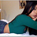
And here are some of the reference photos I used:


Also here is the link to my Pinterest board with a lot of my references on there: (this will be added to as i go through the first year and complete different tasks or projects)
૮(ˊ ᵔ ˋ)ა
1 note
·
View note