
Statistics
We looked inside some of the posts by dave-columbus and here's what we found interesting.
Average Info
Notes Per Post
37
Likes Per Post
27
Reblog Per Post
8
Reply Per Post
2
Time Between Posts
2 months
Number of Posts By Type
Text
11
Photo
6
Last Seen Tumblr Blogs


Fun Fact
In 2020, 27% of US Tumblr users had an annual household income of over $100,000.
Text
Death and Doctor Who-7.1
Spearhead from Space
Nothing like starting a set of posts seven seasons in. But the project was started at the beginning of the year and I’m just now experimenting with putting it up on Tumblr. I may go back and do a retrospective on a Hartnell or Troughton era story, but probably not the entire run. The writing sucks up all available time as it is.
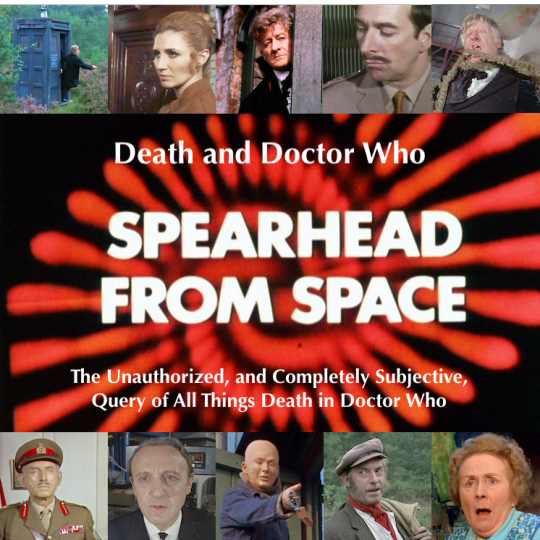
So the project is all about how death has been portrayed in Doctor Who and the ramifications of it on the various characters. Let’s take a look at a section that’s in every essay—the list of things you will see in a particular story.
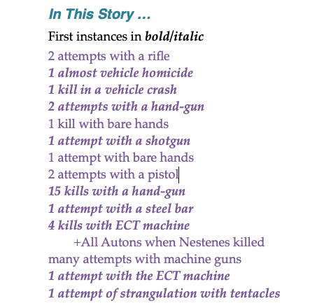
So, in Spearhead from Space, there’s some of the normal methods like using a pistol, a rifle, or a shotgun and maybe just trying to kill someone with your bare hands. But there are also some methods of lesser distinction. Like that last one, 1 attempt of strangulation with tentacles. The bold/italic means that this is the very first time in Doctor Who that method was ever used. Just like the hand-gun that is unique to the Autons.

There’s also information about the Production Crew and some interesting things regarding the story’s History. This is the very first story that Robert Holmes got a viewer complaint about the violence. What a foreshadowing.
I list all the Players who killed someone/thing or who themselves got kills. If a character did none of the above, then they aren’t included in the Player’s List.
I Discuss how Morals and Ethics come into play. But be warned. Since morals and ethics are totally subjective, these are my views on the subject. And as always, YMMV (You Mileage May Vary.)
I look for some interesting Quotes that deal with death or dying.

Brigadier: “At least he won’t get very far.” Liz: “You mean, before your men shoot him again.”
The main section is, of course, Death. And the main sub-section is called Murder by Death. Death also contains sub-sections for any particular items like sightings of Blood, Genocides, and in this one, Tentacles.

Each essay is rounded out with sections like Locations (place that are considered scary,) Things to Notice (self-explanatory,) and Final Thoughts.
Essays for Hartnell (Seasons 1-3) and Troughton (Season 4) are available for free download at LinkTree
https://linktr.ee/greenpear
This is my (current) passion project and I intend to make it to Jodi Whitaker’s third season—and beyond. So I figure it ain’t gonna be done by the Solstice.
Anyway, enjoy the reads—I enjoy the writing.
#doctor who#death#death on tv#jon pertwee#third doctor#caroline john#liz shaw#nicholas courtney#brigadier#spearhead from space#doctor who season 7
5 notes
·
View notes
Text
Book of Armaments - version 1
When I first decided to create the Monty Python Book of Armaments, it was just as a practice piece. No expectations for the final result.

The gold paint I used sucked and looks like brown mud. I did, however, like the humming birds and flowers.
Book of Armaments - version 2
In this version, I changed the calligraphy to a hand I did better. I replaced the pink flowers and insects with the Sandy Lion glittery stickers. I also changed to a sumi gold and put the rabbit in the versal. I also replaced the standard red and blue with my fluorescent gouaches.

This version improved the appearance, but I was still unsatisfied.
Book of Armaments - version 3
In this third version, I returned to the pink flower stickers and plain insects, brought back the hummingbird, and kept some of the glittery flowers as incidentals. I replaced the sumi gold paint with an image of real guilded gold.

This is the version I had seen in my mind those years ago. Now I am satisfied.
Contact me for information on purchasing a print this piece. size 11″ x 14″.
6 notes
·
View notes
Text
Not Practice, Finished
Did another Ben Day dot piece and put quotes on both of them. Much better than image with a large space for text that isn’t there. First is the one I posted yesterday with new wording. The screens are coming together and I have a few more in the making. All my screens are based on the original Ben Day patterns. Each takes a tong, long time to create, But it’s worth it in the end.

The next one I added a touch of gold leaf to the image. Maybe not exactly as would have been the case when this image showcased in the late 1900s but I’m updating many things here.
Generally my dots are bigger than ones that would have been used during the period of these pieces. But I’m also working at a time when the technology of I use for printing these is constrained to 300dpi. After trying to make the dots smaller than these screens caused a lot of blurring and in some places make the dots indiscernible. So like it or not, I’m stuck with the slightly larger than I’d like dot size.
These will end up on my con table starting in May.
3 notes
·
View notes
Text
Ben Day Dot Practice
Continuing to refine my dot screens and how I apply them to new pieces.This is one I did last night testing the varying-size dots. Working on how to use limited flat tones to complement the dots. Trying to hold it to a limited number of colors. Shading is starting to come together. I’m liking where this is going.

Just need to find the right saying to go with the picture.
1 note
·
View note
Text
Winnie the Pooh-John Mandeville style
I’ve been researching 17th century typography, typesetting, spelling, and grammar. And the one thing I take away from this, there weren’t any rules about spelling.
So one of the books I’ve been staring at is the English Hous-wife. A book telling women everything they need to know to run a proper house.
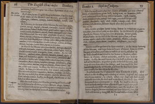
I like the layout and decided that adding a few woodcut-style images would make for a nice book spread. The annotations in the margins were inserted by the typesetter. They weren’t handwritten. More like place markers when you’re leafing through looking for something.
Next I had to decide on the woodcut style. After browsing my collection, I decided on a more simplistic style.

They may get more complex in upcoming projects but this style would do well for the first one.
Finally, they subject. I believe it came from viewing two things in quick succession in a rash of searches. First was some vintage maps and second the Shepard illustrations from Winnie the Pooh. It was then I decided this would become a two-fold project: A book spread with an accompanying map.
The map would be the easier of the two so that went first. I’ve dealt with maps for ages so this went quickly. The only addition I made was making it appear as if the map was folded up.

Next was the text I needed for the book spread. So I read a few chapters from The Travels of Sir John Mandeville to get the metre I needed. So I wrote enough text to will my two pages. The font was easy as I have an appropriate 17th century book font. It was the grammar and spelling I needed to work on. At first I was doing all the adjustments manually. That was until I found a web page to translate modern English into Shakespearean English. It had a few oddities but the base text was enough for my purposes. I added a few other respellings and grammar I liked. Tossed in a few annotations. Made it look similar to The English Hous-Wife and got this which I placed on a blank set of pages in a historical manuscript. The little bookholders on the left and right help it to appear as a real book on display.

I like the end results and plan on creating more typeset books in this fashion
#medievil manuscript#17th century#typesetting#woodcut#winnie the pooh#tigger#the travels of sir john mandeville
2 notes
·
View notes
Text
When Data Goes Bad
In the process of determining what data I would include in the Sonic Compendium, I ran quite a few test pivot tables. That made testing the data easier to find what would and wouldn’t work. Here is an example of a test that I definitely couldn’t include.

This looks like it would have been a good chart to include. It shows an interesting angle people might not have thought of. Liz Shaw, of all people, having the the best “per story” usage numbers was something I would not have thought was possible. But that’s where this data gets it wrong.
The number is 13 uses in one story, Inferno. But Liz was in four stories total. In none of the other stories did she use a sonic device. So in the spreadsheet I work with, it gave me an average use of 13. In reality, Liz’s average should be calculated as 13/4 which equals 3.25. That knowledge instantly invalidated all of the numbers on the chart.
It behooves people to be careful when running spreadsheet tests and getting some great looking numbers. They may not be what you think.
I will continue to check and recheck the numbers for the book to make sure I did not include any other erroneous tables as above. The target date is holding true and the book should be completed by May of this year.
0 notes
Text
The Book of Chess Problems
While browsing the digitized books online from libraries and universities, I ran across a Book with Chess Problems from 14th century France. And almost instantly, it made me think of the plot point in the Doctor Who story, The Curse of Fenric.
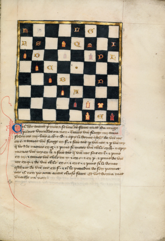
I though this might be a nice fusion. I decided to use the original chessboard as I might never get one I drew to look so pure and natural. I would, however, need to move some of the pieces to replicate the problem in the story. I found a reasonable shot in the video.

So I rearranged the pieces.

Then I noticed the board in the the book page was rotated 90˚. Current ideals for a chessboard state that the bottom right square should be white. MY thought is in the 14th century, there might not have been such a standard. So I left my board alone. I did clean up the rubrication on the versal as the red lines were not that sell defined.

I added my header (with the problem number being the story number), some appropriate text explaining the situation, and finally some annotations that would have appeared in book of this nature written by readers who agreed or disagreed with various things. The bottom patronis is from one celebrated owner in 1922.
And I placed it on a blank page from an actual manuscript which helps give it a proper aged look.
#doctor who#curse of fenric#illuminated manuscript#chessboard#14th century#french gothic#chess problem
7 notes
·
View notes
Text
I love the look of woodcuts. Without the tools, I do them as paper & ink.

0 notes
Text
Penguin Book Parodies
I’ve always been drawn to the classic Penguin Book covers. So simple in design but so timeless. I wanted to do a set of covers with a twist mainly the artwork points to a completely different aspect.

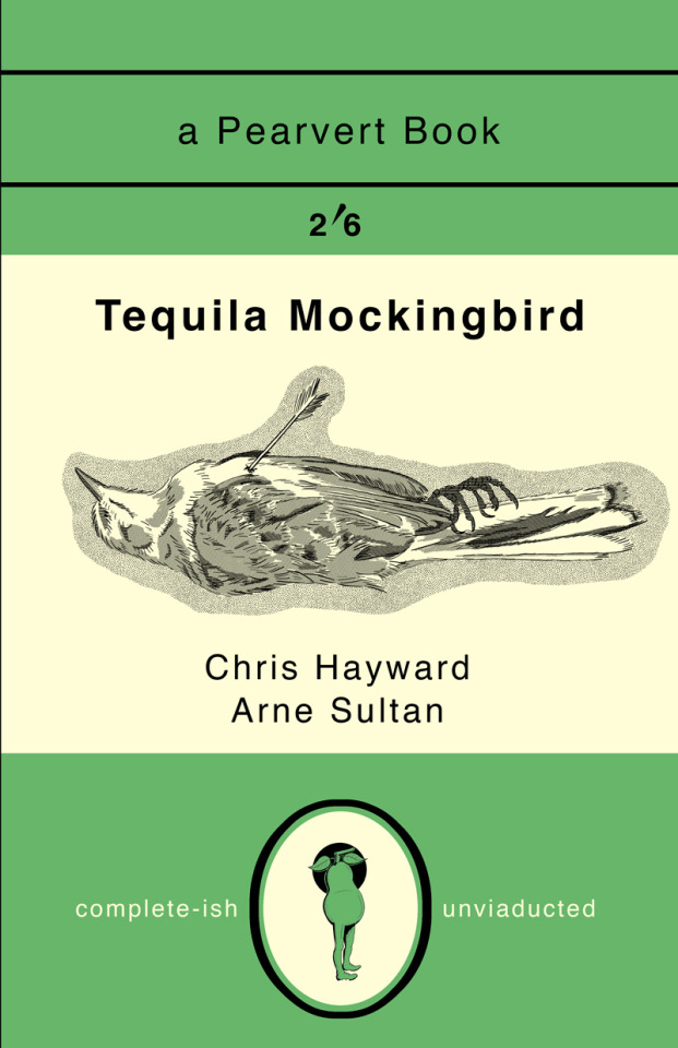

7 notes
·
View notes
Photo

I check recommendations for other accounts as I’ve found some good leads. I can’t, for the life of me, see the connection that “Black Girl Makeup” is like “Vintage Comics”.
1 note
·
View note
Text
Evil Dead-Ex Mortis
Most of the books I look into do not have any examples to work from. Then other books have some amazing official pages designed. The Ex Mortis from The Evil Dead is one of those books. So here’s what the professionals make when building a prop for a movie. And even better, they designed a script that looks completely foreign but is actually English. For me, that was even better.
There’s quite a few pages so I’ll only post a few here. For the rest of the book, go to: https://weylandyutani91.wordpress.com/2014/12/09/evil-dead-book-of-the-dead-limited-edition-dvd-secret-codes/
Pages 1-2

“Dedicated to those who bled for The Evil Dead and their friends, family and fans TS (Tom Sullivan).”
Dedicated is pretty clear but it’s obvious there are no spaces or punctuation in this script. That definitely makes reading it a little harder.
Pages 3-4

“Employees must wash hands before returning to work place thanks.”
“Bow down before me and beg. Hey, it’s Sam (Raimi).”
The creater has a real sense of humor with the text. Fully what I expect in those fictional books I find.
Necronomicon Page 5-6

“Raw, medium, well.”
“Getta load flying deadites, Tom must be psychic.”
I get the left page but I’m zoning on the right page.
Necronomicon Page 7-8

For you scholars out there this is the ancient language of bullskrit aka as font of the dead I hope you enjoy decoding this as much as I did. Your ad here (the one in the center). Read on.”
“I can draw skulls all day long”
The left page resembles some old, medieval books I’ve seen.
Necronomicon Page 9-1 0

“Visit lovely Kandar Castle.”
“Not scientifically accurate. Gross huh?”
So we have a travel ad on the left and a very hairy eyeball on the right. INteresting combination of images.
I’ve had a few customers ask me if I was going to create my own unique Necronomicon Ex Mortis pages soon. The book is on the list . But this onw will require a little more study before I attempt to create my own pages.
#evil dead#necronomicon#ash vs. evil dead#fictional book#books within books#foreign looking english script#calligraphy
0 notes
Text
The Book of Armaments
I’ve always been fascinated about Books Within Books. It started with the scene of the priests reading from the Book of Armaments in Monty Python and the Holy Grail.

Though Terry Gilliam did many paper cut animations, the movie never showed the pages from the actual book.
Years later, after I had learned some calligraphy and illumination, I decided to create a version of that page. But it wasn’t going to be a standard book page. It had to be a silly book page.

It was a nice representation of a 16th Squashed Bug style only I decided to use some Sandy Lion Glittery Stickers in place of the realistically painted birds and bugs. Fittingly silly, I thought.
But years later, I realized the mistake I had make. I made a 16th century book page for a movie set in 932 A.D. Although I loved my squashed bug version, I am a purist at heart. That meant I needed to create a period page from the 10th century. So I came up with this, a double page spread.

I’m happy with both versions.
4 notes
·
View notes
Photo

Ditko/Lee 5-page morality play. Second page inked and I decided to use my Dr. Martin’s Pen-White to block out some unwanted black lines instead of in Photoshop. Going old school. . This is the inks for the color version. After I scan this, I will draw additional rendering for the black & white version. I may white out additional borders before that though. . https://www.patreon.com/dave_columbus . #art #artofdrawing #blackwork #creativity #dailysketch #doodle #drawing #drawingoftheday #illustration #ink #inkdrawing #inkwork #inkfeature #inklouvre #inklovers #linework #penandink #penandinkart #penwork #9panelpage #pendrawing #sketch #sketchbook #stipple #kuratake #kuretakezig #platinumpen #zebrapen #ditko #steveditko . https://www.instagram.com/p/BukrcSChS78/?utm_source=ig_tumblr_share&igshid=1vphsc0n00rfb
#art#artofdrawing#blackwork#creativity#dailysketch#doodle#drawing#drawingoftheday#illustration#ink#inkdrawing#inkwork#inkfeature#inklouvre#inklovers#linework#penandink#penandinkart#penwork#9panelpage#pendrawing#sketch#sketchbook#stipple#kuratake#kuretakezig#platinumpen#zebrapen#ditko#steveditko
1 note
·
View note
Photo

Finished with the ink outlines on pages 2 & 3. Don’t want to do too much detail and through my study, so much of the shaping from Ditko’s work came through the way he did his black spotting. The rendering comes after black spotting but in this early 60s period, there was not a lot of feathering work. . Still calculating where any additional pattern work might go so there is still lots of white area. . Although the initial printing will be black and white, I’m looking toward giving this a Ben Day coloring treatment. That means before any hardcore ink rendering is done, I’ll need a cleaner scan for the color version. . https://www.patreon.com/dave_columbus . #art #artofdrawing #blackwork #creativity #dailysketch #doodle #drawing #drawingoftheday #illustration #ink #inkdrawing #inkwork #inkfeature #inklouvre #inklovers #linework #penandink #penandinkart #penwork #9panelpage #pendrawing #sketch #sketchbook #stipple #kuratake #kuretakezig #platinumpen #zebrapen #ditko #steveditko https://www.instagram.com/p/BujbA8EBRiN/?utm_source=ig_tumblr_share&igshid=xrdx45twd3fq
#art#artofdrawing#blackwork#creativity#dailysketch#doodle#drawing#drawingoftheday#illustration#ink#inkdrawing#inkwork#inkfeature#inklouvre#inklovers#linework#penandink#penandinkart#penwork#9panelpage#pendrawing#sketch#sketchbook#stipple#kuratake#kuretakezig#platinumpen#zebrapen#ditko#steveditko
0 notes
Photo

At Panera’s penciling my story, “I Found The 4D World”, my take on a Ditko/Lee five-page morality play. . Sometimes you need to get out of those same four walls or they’ll suck every bit of creativity out of you. Probably start inking some time next week. . I’ll be posting a more involved post on my Patreon page for those interested in a day or three. . https://www.patreon.com/dave_columbus . #art #artofdrawing #blackwork #creativity #dailysketch #doodle #drawing #drawingoftheday #illustration #ink #inkdrawing #inkwork #inkfeature #inklouvre #inklovers #linework #penandink #penandinkart #penwork #9panelpage #pendrawing #sketch #sketchbook #stipple #kuratake #kuretakezig #platinumpen #zebrapen #ditko #steveditko https://www.instagram.com/p/Bug0a1Ghr57/?utm_source=ig_tumblr_share&igshid=1tx1p8cb9431v
#art#artofdrawing#blackwork#creativity#dailysketch#doodle#drawing#drawingoftheday#illustration#ink#inkdrawing#inkwork#inkfeature#inklouvre#inklovers#linework#penandink#penandinkart#penwork#9panelpage#pendrawing#sketch#sketchbook#stipple#kuratake#kuretakezig#platinumpen#zebrapen#ditko#steveditko
0 notes
Photo

So the Ditko panels and the 9-panel pages have all led up to this. Here is the pencils for the splash page, “I Found The 4D World”, for a 5 or 6 page (haven’t finished the script yet) story done in the style of those 1960–1962 Marvel stories by Steve Ditko and Stan Lee. Ain’t saying I can draw a perfect Ditko artwork or write the perfect Stan Led story, but I will do my best to make it a worthy effort. If you’d like to support the project drop by my Patreon page. I’ll be doing manny public posts and supporters will get a more in-depth story of the how and why. https://www.patreon.com/dave_columbus . #art #artofdrawing #blackwork #creativity #dailysketch #doodle #drawing #drawingoftheday #illustration #ink #inkdrawing #inkwork #inkfeature #inklouvre #inklovers #linework #penandink #penandinkart #penwork #9panelpage #pendrawing #sketch #sketchbook #stipple #kuratake #kuretakezig #platinumpen #zebrapen #ditko #steveditko https://www.instagram.com/p/BuWy_a3BQWx/?utm_source=ig_tumblr_share&igshid=18emjq14ehv45
#art#artofdrawing#blackwork#creativity#dailysketch#doodle#drawing#drawingoftheday#illustration#ink#inkdrawing#inkwork#inkfeature#inklouvre#inklovers#linework#penandink#penandinkart#penwork#9panelpage#pendrawing#sketch#sketchbook#stipple#kuratake#kuretakezig#platinumpen#zebrapen#ditko#steveditko
0 notes
Photo

Asked why I have a fascination for Steve Ditko’s Art, this image and paragraph explains it all. . https://www.patreon.com/dave_columbus . #art #artofdrawing #blackwork #creativity #dailysketch #doodle #drawing #drawingoftheday #illustration #ink #inkdrawing #inkwork #inkfeature #inklouvre #inklovers #linework #penandink #penandinkart #penwork #9panelpage #pendrawing #sketch #sketchbook #stipple #kuratake #kuretakezig #platinumpen #zebrapen #ditko #steveditko https://www.instagram.com/p/BuVVViKha1o/?utm_source=ig_tumblr_share&igshid=1990yak3ydbpf
#art#artofdrawing#blackwork#creativity#dailysketch#doodle#drawing#drawingoftheday#illustration#ink#inkdrawing#inkwork#inkfeature#inklouvre#inklovers#linework#penandink#penandinkart#penwork#9panelpage#pendrawing#sketch#sketchbook#stipple#kuratake#kuretakezig#platinumpen#zebrapen#ditko#steveditko
0 notes