
daveclewlow-blog
David Clewlow
Graphic designer / Artist
50 posts
Don't wanna be here? Send us removal request.
Last Seen Blogs
triangular-dude
No pockets?
chicago-footage
Chicago-footage.net

supertfidan34-blog
KİTAP ODASI

funnythingshere0-blog
Funny Thing Here

Photo
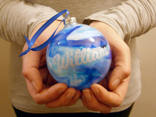

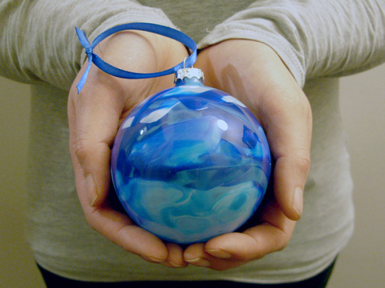
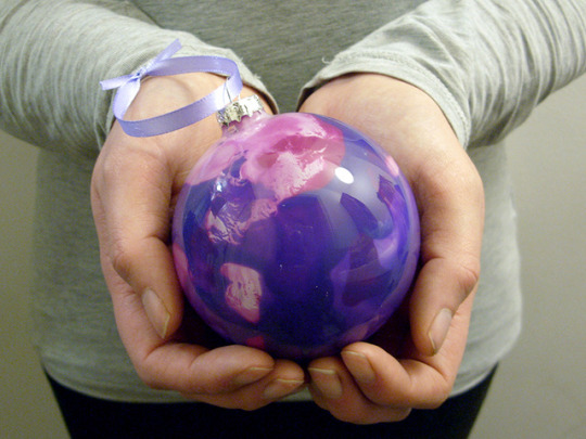
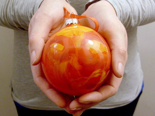


Beautiful bespoke Baubles with optional personalisation.
Our statement baubles are sure to complement any theme for your tree this season. Glass baubles have been adorned using wax to create a unique and ornate finish. Due to the nature of embellishment there will never be two identical pieces. Perfect as a gift or as a treat to add to your Christmas collection.
Personalisations are edited by the makers to ensure the best fit.
Text is etched permanently into the glass and sprayed lightly with a silver paint.
8cm Diameter
Coloured Satin Ribbon to match bauble!
All gifts will be packaged in a presentation box.
https://www.etsy.com/uk/listing/565360836/glass-personalised-colourful-bauble?ref=shop_home_active_1
#bauble#christmas#decoration#unique#colourful#wax#planet#special#personal#gift#psychedelic#beautiful#xmasgifts#present
5 notes
·
View notes
Photo
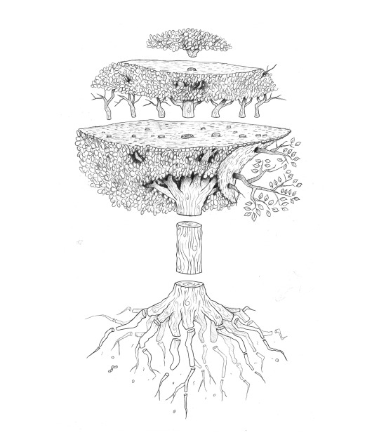
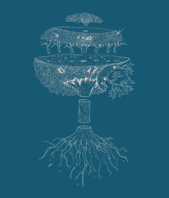
Exploded diagram of a tree
Illustration for a T-Shirt. Blue variation makes it feel like a blueprint.
8 notes
·
View notes
Photo

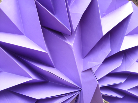

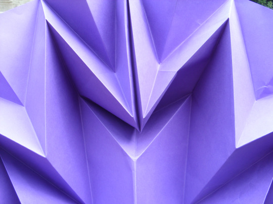
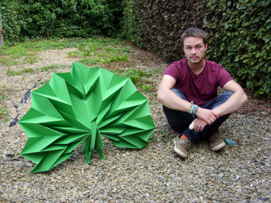
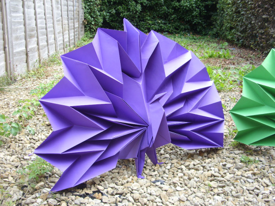
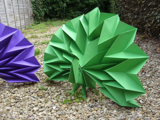
Commission to make 7 x (2ft & 3ft) Origami Peacocks
These are being used in window displays at Duo (Women's boot store in Bath, London & Edinburgh).
The paper was from 1.5x1.5m to 2.25x2.25m. Took up my whole living room! Around 3/4 hours to make each.
Peacock model invented by Jun Maekawa.
16 notes
·
View notes
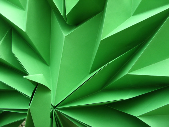
Photo
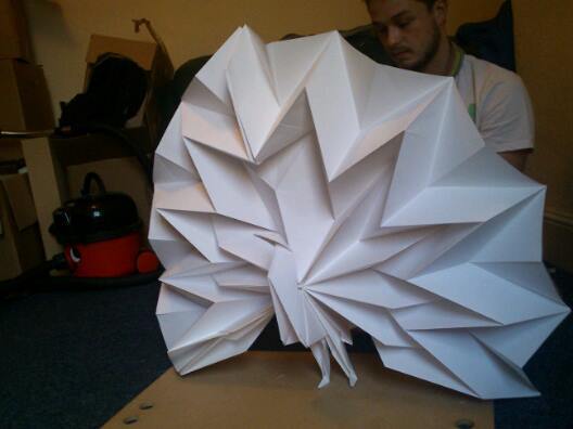
Working on a mock up origami Peacock for commission!
Its 2ft in height and the paper was 1.5 x 1.5m. Got to make 7 more in purple and green.
3 notes
·
View notes
Photo
The Typography Workshop
Identity created for a Typography Workshop, a place where new and experienced designers can come and practice type among a communal atmosphere.
The design uses 6 popular letter press type faces layered on top of each other letting the differences of letter shapes show through one another.
3 notes
·
View notes
Photo
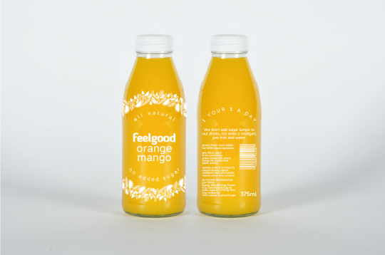


Feel Good Packaging Re-brand
Feel Good wanted to let their customers know that they are a 100% all natural fruit juice drink and had no added sugar. They liked their previous design but wanted to evolve.
The ring pattern has small illustrations which change for each flavour, these illustrations are based on the ingredients.
The concept was to use a clear label design so the beautiful colours of the juice could shine through. The juice fills up the empty circular space which the type sits in, to evoke a sense of being 100% full of natural juice. The use of a clear label design also reflects their honest attitude to the production of the product.
Here is the previous design:
22 notes
·
View notes
Photo
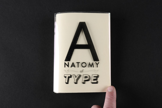
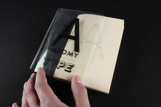
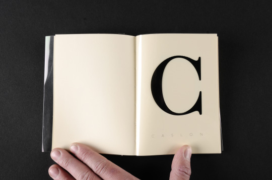
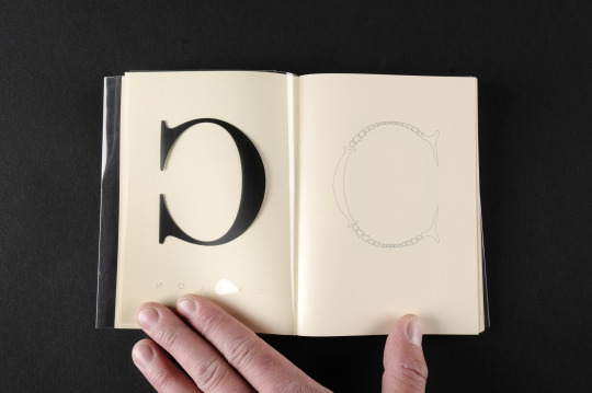
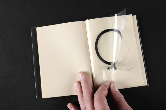
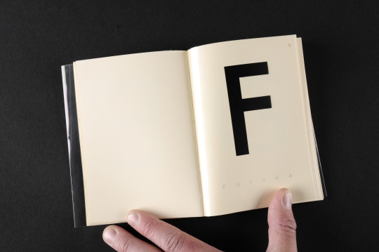
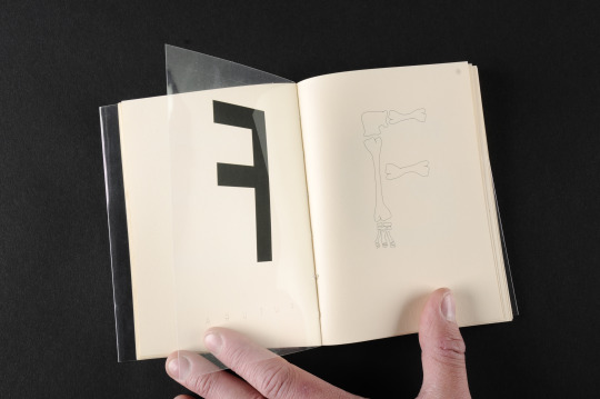

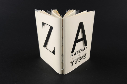
Anatomy of Type
I decided to illustrate what the bone structure of type may look like if it was alive.
This book is an A-Z of some popular type faces and their anatomy.
The bone structure was illustrated with thought on how that letter may move if it was alive, i also considered how it would shift into an italic position.
970 notes
·
View notes
Photo

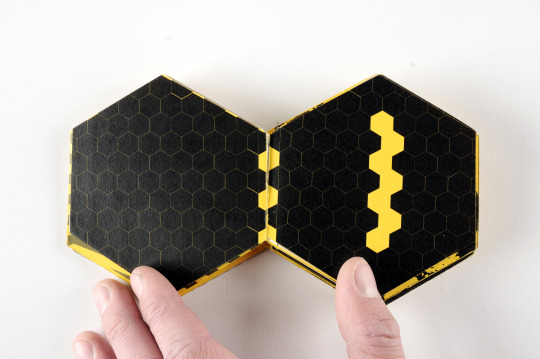


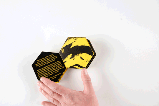

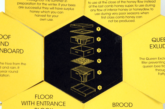

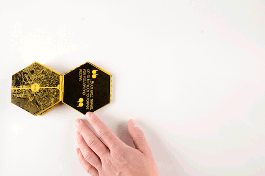
How to be an Urban Bee Keeper
A short overview on how to be an Urban Bee Keeper. Titled, "To Bee or not to Bee".
The cover is made from real bee's wax!
18 notes
·
View notes
Photo
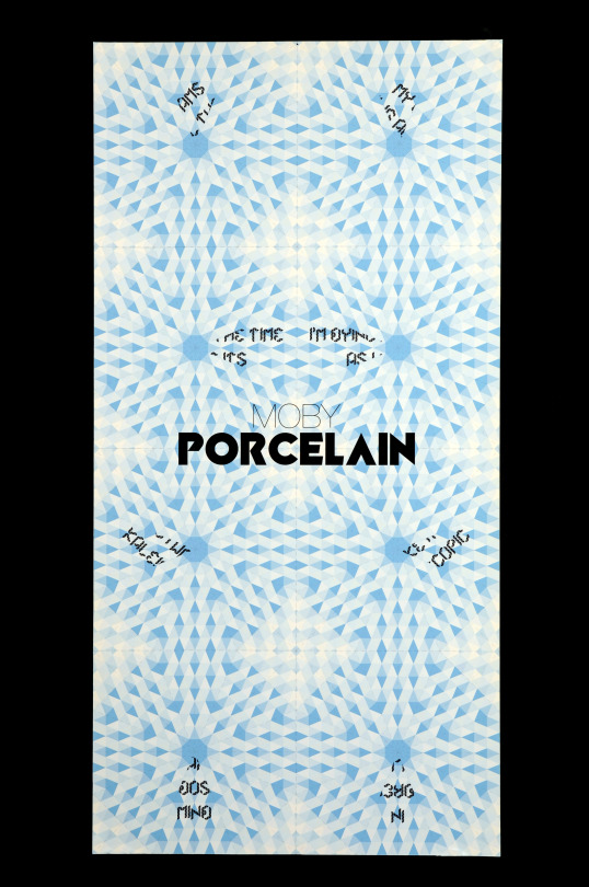

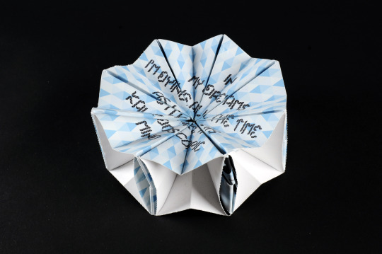

Promotional poster that folds down into an origami toy.
This is a promotional piece for Moby's song Porcelain, which would be included inside the CD package.
The 8 segments that create the poster are teared along the perforated edges and then fold down using the instructions to create the origami star toy.
The idea is that the poster mimics the concept of a kaleidoscope, which means "to constantly change and shift” as mentioned in the song lyrics here:
In my dreams I'm dying all the time
As I wake it's kaleidoscopic mind
The lyrics are printed onto the poster, and when the star toy is being used the lyrics visually come together.
3 notes
·
View notes
Photo
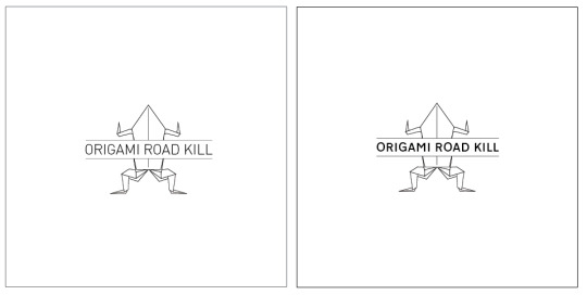
Origami Road Kill Book cover
Can't decide which font to use, left is DIN (used on german road signs), right is Transport (used on UK road signs). The book is about animals in the UK.. so i suppose Transport the most relivant, but DIN is looking pretty fine too.
1 note
·
View note
Photo

Sneaky peak of current project Origami Road Kill
4 notes
·
View notes
Photo
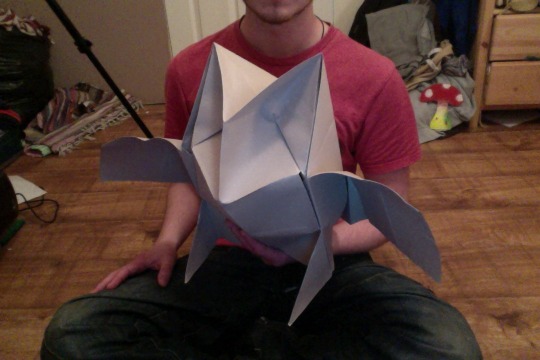
Origami Road Kill Owl
Folding time: 2h
2 notes
·
View notes
Photo
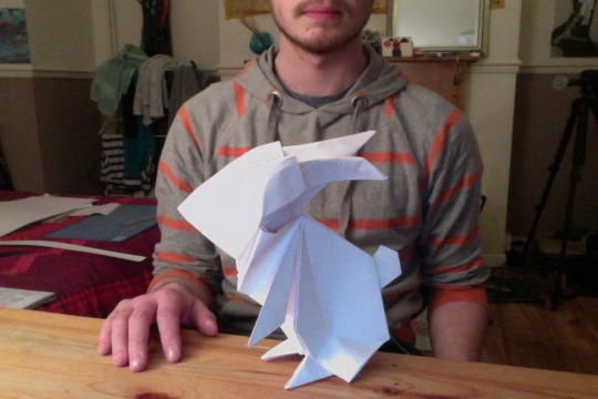
Origami Road Kill Rabbit
Folding time: 1h
Here is a life size Origami Rabbit! Going to be part of a series of life size animals for my book Origami Road Kill.
Heres what should be coming next:
Hedgehog, squirrel, fox (f**king hard to make), badger, deer, toad, owl, pigeon and adder (easy peasy to make).
6 notes
·
View notes
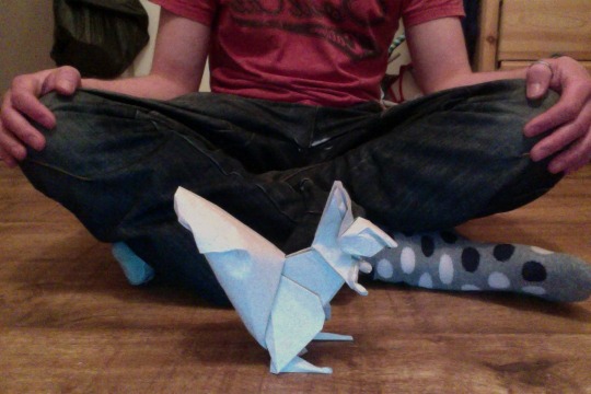
Photo
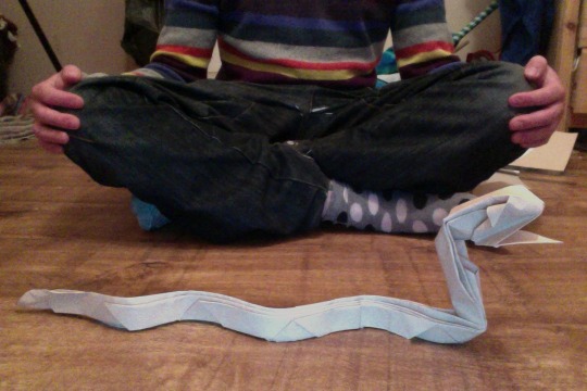
Origami Road Kill Adder
Folding time: 2h
2 notes
·
View notes
Photo
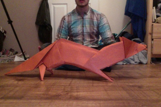
Origami Road Kill Fox
Folding time: 3h
My favorite animal.
18 notes
·
View notes
Photo
Origami Road Kill Squirell
5 notes
·
View notes
Photo
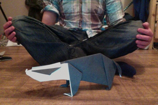
Origami Road Kill Badger
I think i should re-make this one, it keeps falling on its face, and its half the size.. oops.
1 note
·
View note