
Don't wanna be here? Send us removal request.
Statistics
We looked inside some of the posts by designerdood-blog and here's what we found interesting.
Average Info
Notes Per Post
0
Likes Per Post
0
Reblog Per Post
0
Reply Per Post
0
Time Between Posts
13 minutes
Number of Posts By Type
Photo
17
Last Seen Tumblr Blogs


Fun Fact
Tumblr.com rank in the US is 25.
Photo

First attempt at an ad for these Adidas shoes. In retrospect I see now that I should’ve done something to the most important aspects of the ad: the price and specifications of the shoe. But oh well, it wasn’t a first ad for nothing.
Made in Photoshop.
0 notes
Photo

The first wireframe I ever made for ‘my own site’. I wanted to try and think up a concept that looked and functioned a lot like Pewdiepie’s website. So this is an example of that.
Made in Illustrator, on a 12 bar grid.
#wireframe#web design#design for web#wireframing#Illustrator#wireframe Illustrator#12 bar grid#webdesign#DesignerDood
0 notes
Photo

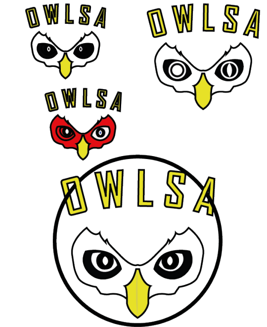
This became the final-final-FINALLL design, as it goes. This was (and as of now still is) my first animal logo and after seeing it again since I made it a year ago, I still think it’s pretty good. I usually end up disliking what I made when some time passes, but I guess this one holds up quite well.
So, that was the whole of the process of how I made this owl logo! Hope you liked it :) Made in Illustator.
#owl logo#graphic design#graphic art#web art#digital art#animal logo#logo process#illustrator#illustator art#illustrator logo design#illustrator logo#owl art#owl drawing#DesignerDood
0 notes
Photo
I started to experiment with the eyes and the colors for a bit.
What happened next happened sort of by accident, but I loved it. I placed a circle around it. And suddenly, it had become a ‘real’ owl. I absolutely loved it!
So this was the final-final design. And I still wasn’t done yet. Made in Illustrator.
#graphic design#logo design#logo#owl logo#logo process#illustrator#illustration#web art#graphic art#graphic#illustrator art#DesignerDood
0 notes
Photo

So here we are. I called this Illustrator file "Owl logo - final”. Little did I know, this was definitely not the final design xD But this is a common thing among designers, and this time was the first time I experienced it first hand.
The advice that a friend had given me was this: Think in layers, rather than in design. What that means is you should think about how you build your logo from the ground up, per layer and shape. And not so much in final design terms. If you think about in layers you will work in a logical order and you will be able to keep your designs much simpler than if you go in trying to design the whole thing from A-Z starting by F, so to say.
In the case of this logo, I began with the eyes, the most prominent feature of the owl and the logo. If I think about it, I probably should have begun with its head, but this was just the first time I tried to apply this advice. Then the curvature of its head, and then the beak. Made in Illustrator.
#how to make a logo#animal logo#illustrator logo#graphic design#owl logo#web art#design#graphic art#owl#owl drawing#drawing#Designerdood
0 notes
Photo

This is not a pretty picture, but I wanted to show some of the way I work to get to a logo; the process if you will. This was made in Illustrator. I first set my eyes on making the upper most left owl, the one with the cute big eyes into a logo. I began to digitalize it. I first scanned in the previous picture I posted, and then opened it in Illustrator.
Then I started to go over it with the pen tool. And when I was almost done with that, I started to realize that this was becoming more of an illustration than an actual logo. So I had to change course, and went on with the one in the down left corner. I also received some great advise I will share with you in the next post.
#design process#sketches#design sketches#owl logo#how to make an animal logo#animal logo#owl drawing#Illustrator#graphic design#design#logo design#art#illustrator logo
0 notes
Photo


Animalogo. I prepared for this logo my studying owls for a bit. I wasn’t sure yet if I wanted to design a flying owl or just its head, or even its eye.
#sketch#logo sketches#sketches#owl sketch#owl drawings#owl#art#drawing#graphic design#animal logo#owl logo#animal
0 notes
Photo

The last of the typography series, ‘Heavy & Light’ or ‘Zwaar & Licht’ in Dutch. The “leaves” are made with the word ‘licht’, and the cliff is made with the word ‘zwaar’ in a type of bold. Made in Photoshop.
#Heavy and light#typography#web art#photoshop#digital art#graphic design#graphic art#design#photoshop art
0 notes
Photo

‘Round & Square’ or ‘Vierkant & Rond’ in Dutch. Typography series continued. I like the idea of this one, but the ‘Square’ (Rond) execution not that much.
#typography#web art#photoshop art#photoshop#photoshop design#graphic design#design#digital design#DesignerDood
0 notes
Photo

‘Thick and Thin’, or ‘Dik en Dun’ in Dutch. A continuation of the project to fuse polarities.
#typography#graphic design#graphic art#web art#digital art#photoshop art#photoshop#photoshop design#dik en dun#thick and thin#DesignerDood
0 notes
Photo

“There is Order in Chaos”. I continued playing with typography. Made in Photoshop.
#Order#Chaos#beatiful chaos#order in chaos#web art#graphic design#graphic#photoshop#photoshop art#DesignerDood
0 notes
Photo

A typography assignment we had to do. I think this was made with either ‘O’’s or ‘0′s. It was an assignment that made us think what we do and do not show in an image. What happens when you add something? What happens to the image when you leave it out. That sorta thing. Made in Photoshop.
0 notes
Photo

I continued designing the logo I posted before and made it into a YouTube suitable banner. Made with #Photoshop
#youtube banner#graphic design#graphic art#gaming#Photoshop#youtube logo#photoshop logo#photoshop wallpaper#wallpaper#banner#DesignerDood
0 notes
Photo

I was really proud of this one, even though I used a tutorial to make it. I made this as a logo for my gaming YouTube channel, and tried to give it my own taste. It’s the name of my (then) alias ‘Arch Crition’. Made in Photoshop.
#graphic design#logo#logo design#gaming logo#youtube channel#youtube logo#graphic art#Photoshop art#photoshop design#photoshop#DesignerDood
0 notes
Photo


A Game Boy Color I recreated. Can you tell which is real and which isn’t? You probably can ;) But I think this one turned out pretty nice! Made in Photoshop.
0 notes
Photo

My first montage I dubbed ‘Battle of the Zodiacs’. You’re seeing (left) a minotaur representing the Taurus, the Scorpio (middle) and the Aquarius (right) astrological signs. Made with Photoshop.
#Photoshop#Photoshop montage#Battle#Zodiac#Astrology#Battle of the Zodiacs#Aquarius#Scorpio#Taurus#DesignerDood#space#wallpaper#graphic design#graphic art#graphic
0 notes
Photo
One of my first creations in Illustrator. Drawn over with the pen tool.
0 notes