
This is a tumblr page for my class, MPDC 500, Design Ethics. Please go to the page, "More About Me," to get to know me!
Don't wanna be here? Send us removal request.
Statistics
We looked inside some of the posts by diaryofadesignkid and here's what we found interesting.
Average Info
Notes Per Post
11
Likes Per Post
7
Reblog Per Post
1
Reply Per Post
3
Time Between Posts
4 days
Number of Posts By Type
Photo
16
Video
1
Last Seen Tumblr Blogs


Fun Fact
Tumblr was created by web developers David Karp and Marco Arment.
Photo

For visual diary 14, I immediately thought of the importance of human centeredness, and how I would want to carry forward with this sort of mindset in my career as a design leader. We actually spoke about this in both this course and the other course, Ethical Design, throughout this semester, and I know how we place the importance of understanding consumer needs, what really matters, and how we can best respond while considering all sorts of factors as designers.
#GUMPDC620#visual diary#humanCenteredDesign#design thinking#design leadership#designvernacular#vernaculardesign
0 notes
Photo

As a reminder, my wicked design problem is “How can we get people to still go out and exercise and work without being bothered by the rainy weather?”
For visual diary 14, I was thinking about how can I keep the users engaged continuously beyond the initial deployment of motivating people to go out and exercise even in rainy weather. We talked about parameters earlier this semester, and I realized that my project is beyond just the initial development of shoes that may be of help in motivating people to take initiative in working out and go to work without being bothered by rainy weather. However, I shouldn’t just stop there and “give up” on the consumers. As shared in our class, I wanted to anticipate the future and think about the societal impact this solution could have, and how my solution can “live” beyond its initial deployment. Therefore, I thought about maybe an app would be a good continuous motivator for the consumers to stay involve with the waterproof footwear company and also be motivated to actually exercise or go to work in these shoes during the rainy weather. I was inspired by Nike Run Club app, where they basically track runners and the amount of miles and the map of where they ran. I will go further in this in my presentation, but I’m thinking of having the app have the location setting on and be able to track the weather, so during the rainy days, it can remind the users that they don’t have an excuse now to not go out to run or go to work now that they have waterproof shoes! Additionally, to keep it light hearted and fun, I think having giveaways or providing some sort of social media aspect to it, such as allowing the consumers to share their progress with each other will create that relationship between business and consumers.
Therefore, I would like to carry forward that mindset as I go forward in my career as a design leader. I think it’s important to think with a human-centered mindset, which includes understanding the parameters we work with in the long run beyond initial deployment.
#GUMPDC620#wickeddesign#design problems#problemsolving#visual diary#design thinking#design tools#designvernacular#vernaculardesign#Parameters
0 notes
Photo

For visual diary #13, I would like to share how some people grow herbs in their kitchen as such. In regards to interior design, some have thought to create/design eco-friendly kitchens by adding more greenery and sunlight. It’s like having their own miniature garden indoors, and it’s accessible in the kitchen. Some choose herbs, as it’s easy to grow and can be always used in cooking. Many would say they would save money from constantly buying store-bought herbs, and it’s fresher to grow your own. I believe this is a great solution to people who may be interested in being eco-friendly and looking to save a bit of money when it comes to groceries.
1 note
·
View note
Photo

For my visual diary #13 (open topic), I would like to talk about cochlear implants. There’s a large controversy that surrounds this technology. Both of my parents are deaf, so I often hear this topic come up. I think the creators who came up with this technological design probably had the intention to help people around the world as it is supposed to allow people who cannot hear to be able to hear again. However, as we have spoke about this in these classes, I believe this design lacks the understanding of those who they think need this tool.
Just as Insider has stated, “Cochlear implants perpetuate the idea that deaf people need to be “fixed” — and a lot of deaf people take issue with that.” My mother has considered the idea of having this surgery, but my father and many friends, including myself, are not a fan this idea. There are various of factors that go into why this may not be a great idea. If it was a baby, it might be different, since babies are not yet fully developed. However, it is understandable why others may see this as a large issue. To break it down, here are some issues:
1) It’s like telling deaf people that they are not enough being deaf, and need to be cured. 2) "Presenting the technology as a simple ‘cure’ is misleading. Deaf people don’t understand speech perfectly as soon as the device is activated. They must spend months or even years working with speech therapists, learning how to process this unfamiliar sensory input. They’re trained to lipread, to pick up on vocal cues, and to speak.” (Insider) 3) Culture: for ANYONE to go from deaf to hearing is a huge culture shock and switch. 4) As shared in the article, even after some people receiving this implant, some found it painful and unbearable to live with. 5) It would also pose as a danger to older people, as we’re more developed, physically, mentally, and emotionally, and everything that we’ve been shaped growing up cannot change overnight along with this surgery.
In summary, this technically would not be a human centered design, as it did not consider the effects and thoughts of their audience and their culture. I am not sure if there was much design research throughout the process of this design, and how much engagement with the audience was there in order to develop an “appropriate” design response.
#gumpdc620#design tools#humanCenteredDesign#designresearch#design thinking#vernaculardesign#designvernacular#wickeddesign
0 notes
Photo
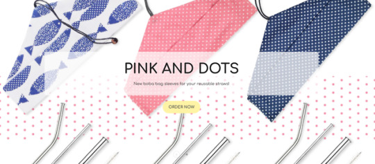
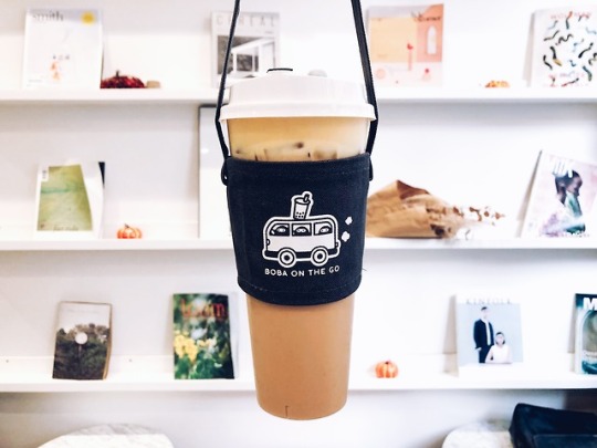
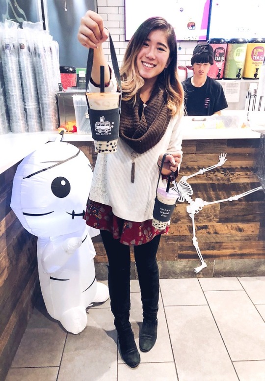
For Visual Diary #12, I also thought of BobaMade, which is a small online store that sells reusable bubble tea and smoothie straws, along with boba bags. The owner, Julia, decided to create this out of her love for bubble tea. I worked with her a few times on Instagram before in marketing her products, and I love how she values sustainability and wants to encourage other bubble tea loves to consider how we can help the environment more by using less cardboard/paper cartons that hold bubble teas and less plastic by using reusable straws. While there’s not much about what we can do about the bubble tea stores using plastic cups (small through large) that holds the very bubble tea itself, I think it’s encouraging to see how we can influence buyers and consumers to take part in sustainability through our own actions! BobaMade is located mainly in San Francisco and has this online store to reach consumers all around the U.S. BobaMade also has built some relationships with local bubble teas stores in SanFran, so they can also show support in sustainability. Fun Fact: This actually was already a thing in Taiwan, so she thought it would be a great idea to bring this to the United States and promote ways of how consumers can be sustainable as diverse businesses especially restaurants and tea shops grow here all over the states. It’s awesome to see such design leadership and how creators can consider low cost and environmentally friendly products, while also thinking of the consumers and what would attract them (aka the cute designs on the bags).
#gumpdc620#sustainability#bubbletea#boba#environmentallyconscious#design thinking#designresearch#designleadership#consumerfocused#artifact#vernaculardesign#designvernacular#visual diary
2 notes
·
View notes
Photo

For visual diary #12, I immediately thought of Reformation, the clothing store, as one of the companies in Los Angeles, CA that values sustainability and takes responsibility for the impact that may affect the environment and the community. While their clothes may not exactly be the cheapest around, they put their stake in the ground by showing that they care about the environment and the community. Their sustainable factory is housed in Los Angeles rather than overseas. They also share how often times people work under terrible conditions in factories, so they are pretty open about their work environment by providing public tours to their factory and to meet the people who are behind the scenes of making these clothes. Additionally, this provides more jobs for locals rather than relying on international cheaper factories. I think with this sort of initiative, it is awesome to see this design leadership where they show positive support to their employees while taking steps to be sustainable, which leaves a societal and environmental impact. This encourages me to think about the impact this leaves on the community, as it does not only positively impact their locals in Los Angeles, but also online globally on social media, as many also support their initiative.
#gumpdc620#clothingbrand#sustainability#designleadership#designthinking#designtools#vernaculardesign#designvernacular#socialresponsibility
1 note
·
View note
Photo

For Visual Diary 11, I also thought of how various grocery stores across the world just love shopping baskets like these for shoppers who may not need to buy many things during their trip so they may not need a large cart, which technically is their stake in the ground since majority of them only offer these one or two shopping options to use. I find this design of the shopping basket problematic and annoying, as the functionality of it is not user friendly nor convenient for any shopper. First, the placement of the basket is not proportional to how we would normally hold it, as shown in the photo above. Second, aside from holding it this way, it is hard to place items inside the basket because it requires us to balance the basket. If you put an item in the basket on one end without something else on the other end, it will tilt and fall out. Honestly, shopping baskets should have the handles extended across the longer width of the basket itself, not the shorter width. I do think it is possible that grocery stores do this so they can encourage users to use the larger carts instead, and tempt them into buying more items to fit inside their carts, but there are still users who just simply do not need to buy these many items in the store and will still not get tempted, so the baskets are not very user-friendly to pick up and use in the first place.
#gumpdc620#user experience#design problems#design thinking#designresearch#design vernacular#vernaculardesign#artifact#design tools#visual diary
0 notes
Photo

For visual diary 11, when thinking of problematic stake in the ground, I immediately thought of Moviepass. In 2017/2018, I was a moviepass user. Many of my friends and users across the United States can agree that there were many problems revolving around Moviepass, since they tend to run into app issues and they often change/redesign the service, which caused limited functionality. The reason why many of us signed up was because of how desirable it sounded to pay only $10 for unlimited amount of movies we can watch in a month. As long as we see at least one movie a month, it was worth it! However, throughout 2017 and 2018, they kept changing their policy and some factors in their app would not work out as well. For example, one of the things they later updated was requiring to take a photo of our receipt of the movie ticket. An example of an app issue is sometimes, they would take the photo of our ticket but it would not recognize it as well as it should, or if we ended up not seeing a movie and wanted to change it, it was very inconvenient and sometimes would not allow us to change it, even though it mentions we can change it. Additionally, the app did not factor in how some phone users may not have their own internet data, which can be inconvenient because the app requires you to be within 20 feet of the movie theater in order for us to buy a movie ticket with the app. (My friend often time would run into this issue, so he had no choice but to only go to one movie theater in the area and would have to go to a Starbucks nearby and use their WiFi.) In August 2018, they changed their policy (again), and only allowed users to watch up to three movies a month and increase their prices. The worst change was when they only allowed a select few movies per day to be watched. This made it inconvenient, because sometimes, users like myself are simply unable to watch movies in the middle of the week, but MoviePass only allowed a specific movie to be shown and bought with their card on a Tuesday, for instance. This caused many users (like myself) to cancel our subscription, as they failed to not only keep their stake in the ground, but every time they redesigned their service and attempted to throw their stake in the ground, it was a failure due to bad customer service and an inconvenient service overall.
#gumpdc620#moviepass#designfailure#stakeintheground#designvernacular#vernaculardesign#artifact#design thinking#designthinking#designresearch#design tools
0 notes
Photo

For Visual Diary 10, I immediately thought of TOMS and their “one for one” campaign. They put this stake in the ground to positively have the community be able to support and help those who are in need. Their campaign encourage buyers to buy their shoes, since each pair of shoes purchased allows a pair of new shoes to be given to a child in need. This campaign also grew and evolved, as they are starting to launch TOMS Roasting Co., where each bag of coffee purchased will allow TOMS to provide one week of clean water to a person in need! This “one for one” concept is what shaped TOMS as they threw this stake on the ground and it’s been a successful business model that encourages many to support those in need.
(Posted this a second time because my first post didn’t show up in the tags for some reason.)
#gumpdc620#design thinking#designresearch#design tools#charity#designvernacular#vernaculardesign#visual diary#designneed#designleadership
2 notes
·
View notes
Photo

For visual diary 10, I also thought of the AMC Stubs A-List subscription. They have competitors, but their stake in the ground that they threw is basically providing the best price for watching a movie with them up to three times every weeks, and the cost is only $20 a month. They’ve done a great job in keeping this consistent and staying on top of their app, while competitors like MoviePass and Sinema are known to be inconsistent with their apps and movie choices, and can be very complicated to use. While MoviePass and Sinema are cheaper per month, they do not provide the best service nor the convenience to access these movies. With AMC throwing such a stake in the ground with a low/reasonable price, many have decided to subscribe with them due to their trustworthy service and consistency.
#gumpdc620#designleadership#designvernacular#subscription#vernaculardesign#designthinking#design tools#artifact
0 notes
Photo


This visual diary #9 made me think about how we should consider cultural parameters in our design. I believe that a cultural parameter is a factor regarding people’s backgrounds, environments, and values that needs to be considered and should be respected when creating a design. It can also be dependent on the audience’s upbringing as well. Here, I share about McDonald’s because I believe they did a pretty good job matching this cultural parameter as they expanded their business and advertising across the world. In the first photo, they tailored their meats and menu options to what people in India may be more used to eating, and brought in the menu food item of curry. I’m not sure why McDonald’s did this in Hawaii, but they did bring the idea of “ramen” there, and there were rumors of how they brought some of this to Japan as well. Lastly, they created a new food item called McNoodles Chicken Curry to Austria. In China, they would also offer a rice bowl as an option. I honestly think it’s pretty cool how McDonald’s took into consideration the environments and cultural foods that people may have grown up with eating in their home countries, and expanded their business with that consideration in mind!
#gumpdc620#cultures#parameters#design thinking#designresearch#design tools#designvernacular#vernaculardesign#visual diary
0 notes
Photo

Visual Diary #9:
I believe a cultural parameter is a factor regarding people’s backgrounds and cultures that needs to be considered and should be respected when creating a design. This may also cause people to think of people’s values, as sometimes it may also be shaped by our cultures and upbringing. It also can be shaped by how people portray certain environments to be. For example, in the work culture, majority of the people immediately think of suit and tie, professional wear, and heels. Unfortunately, this can be quite a barrier for me. As a reminder, my wicked design problem is "How can we get people to still go out and exercise and work without being bothered by the rainy weather?" For me, I absolutely hate it when it’s raining and I’d still have to go to work in heels or flats or at least some nice look boots for a work event that needs us to dress up for. It’s inconvenient! However, when I commute, I do see people even carry their professional shoes while wearing sneakers comfortably to work. I think in a way, this can play well in my idea, as waterproof sneakers and alleviate the problem people may feel when it is rainy and may need to still go outside. I wouldn’t say the cultural parameter that may be set in professional work places need to be broken, but can be honored if people want to and if they are allowed to carry sneakers to work and be able to change into professional shoe wear later at work.
#gumpdc620#visual diary#design thinking#design tools#designvernacular#vernaculardesign#wickeddesign#parameter#Parameters
0 notes
Photo

For Visual Diary #8, I also thought about the design process that went into the U.S.’s first sign language Starbucks store (https://stories.starbucks.com/stories/2018/eight-things-to-know-about-the-new-starbucks-signing-store/). I decided to share a picture of me when I was visiting the store near Union Station/NoMa-Gallaudet.
This store is located in Washington, D.C., and is down the street from Gallaudet University, which is an institution for Deaf and hard of hearing students. My parents are deaf and hard of hearing, and they graduated from this university as well! I must admit, I don’t love Starbucks coffee, but they do a great job in creating close knit communities and having a relationship with their customers. I have friends who have worked in Starbucks and majority of them always expressed positive experiences there, and to hear how Starbucks are engaged with their audience to understand their needs show their care for their customers. What makes this sign language store different is their ability to meet the consumers where they are at.
For tangible parameters, they made use of the space/building near the deaf and hard of hearing campus and they value user experience to understand their needs. It was known that they created a sign language store in the past in Malaysia and Canada before as well, so they most likely have collected much data and experiences while also engaging with the audience here to get a better understanding how to design such a store here. For intangible parameters, it is clear that they are anticipating the future as this generation tends to share more awareness of various needs around the world. As the deaf community have continually and increasingly voiced their needs and opinions and feedback, it is interesting how Starbucks have included this parameter to work with concurrently and in the future. Additionally, another intangible parameter would be the societal impact the store would have on the deaf community.
2 notes
·
View notes
Photo

For Visual Diary #8, I would like to share about how Singapore is one of the fastest growing populated cities around the world. While they want to grow in business, they also want to grow in sustainability, and aim to be the greenest city in the world. Gardens by the Bay is an example of how they are moving their city forward, by making use of earth and the space they have while also bringing in tourist attractions and business, because they aim to raise their quality of life in the city.
To further their plans for the city, Cheong Koon Hean is the first woman who is an architect and urban planner to lead Singapore’s urban development agency. Her vision is to make use of the compact space they have on their island and to make use of the city buildings to build the idea of “skyrise greenery” for the purpose of “[filtering] out air pollutants, inhibit urban desertification, better insulate buildings which reduces the cost of cooling, retain rainwater which lowers the risk of flash flooding, and increase biodiversity by providing habitats for animals” ([2.]), which would all be extremely useful in cities. This really shows how she is making use (rather than seeing them as limits) of the parameters, which include both tangible and intangible ones, such as space and use and materials provided (tangible) and anticipating for the future and impact it may have on the city (intangible).
Sources: [1.] https://www.cnn.com/2012/06/08/world/asia/singapore-supertrees-gardens-bay/index.html
[2.] https://www.vagabondjourney.com/plants-on-buildings-skyrise-greenery-in-singapore/
[3.] https://www.nationalgeographic.com/environment/urban-expeditions/green-buildings/green-urban-landscape-cities-Singapore/
1 note
·
View note
Photo

For visual diary #7, I was browsing for some ideas on how I could further my research for my wicked design problem project on waterproof sneakers, and I came across this article called, “6 Creative Examples of Ethnographic Research in Action.” While reading this, it gave me the idea of having people that are part of my target audience be able to jot down when they wear sneakers on a day-to-day basis and why they may have worn sneakers that day. If I could do this research and have them jot it down for a month, it may give me a better idea why and when they wear sneakers and see if there was ever a time when they could have worn sneakers but couldn’t due to rain or any sort of water related reasons that prevented them from wearing sneakers.
#gumpdc620#daytoday#vernaculardesign#designvernacular#designleadership#designresearch#humanCenteredDesign#ethnographic research#ethnography
0 notes
Video
youtube
For Visual Diary #7, I want to share about how storytelling has really boosted products in a greater and more positive light. An example of a product that uses storytelling marketing is Warby Parker. I’ve always wondered how such a brand really boomed, especially since they only sell eyeglasses and sunglasses, but as they were around for nine years, they truly became an ecommerce success all due to their skilled storytelling. They explain in detail how they craft their glasses, while also sharing how they care about their employees, customers, community and environment, and how each purchase plays a part in that.
“Our customers, employees, community and environment are our stakeholders. We consider them in every decision that we make.” ~Warby Parker (https://sujanpatel.com/marketing/7-companies-killing-brand-driven-storytelling/)
They were open to sharing such behind-the-scenes information on the design itself, and the supplies they use, such as plant-based cellulose acetate, and each purchase made also allows Warby Parker to “give a pair to someone in need through charitable partners around the globe…To date, they’ve given away 4 million pairs.” (https://sujanpatel.com/marketing/7-companies-killing-brand-driven-storytelling/) It is no wonder why such a brand boomed with this reputation and growth and storytelling methods, as it is quite engaging with the consumers.
1 note
·
View note
Photo

For Visual Diary #6, there’s a design leadership tool literally called “Abstract.” It’s a collaboration tool that designers can use tangibly to put together a portfolio full of designs and files for work, which is quite useful for teams. I can see myself using this in the future when working as a part of a design team. You can edit and comment on each other’s designs with this platform and build designs together as well. This is also very human-centered, as it’s convenient for designers to use such tool and it meets designers’ needs throughout the process in executing designs in this online platform. Unlike Google Drive and other similar file-sharing platforms, this is build particularly for designers, as it allows us to draft designs, critique it, edit it, build on it, and collaborate altogether as a team.
#abstract#tangible#design tools#design thinking#gumpdc620#design leadership#vernaculardesign#designvernacular#humancentereddesign
1 note
·
View note