#typographic theory
Explore tagged Tumblr posts
Visit Tumblr Blog
Explore Tumblr blogs with no restrictions, modern design and the best experience.
Last Seen Tumblr Blogs


Fun Fact
1,644 Tumblr posts in 1 second.
Text

Space as Language: The Properties of Typographic Space
This publication, part of the Cambridge Elements: Publishing and Book Culture series, examines the function and significance of typographic space. Readers are invited to consider in turn the space within letters, the space between letters, the space between lines, and the margin space surrounding the text-block, to develop the hypothesis that viewed collectively these constitute a 'metalanguage' complementary to the text.
Drawing upon critical perspectives from printing, typeface design, typography, avant-garde artistic practice, and design history, Space as Language examines the connotative values and philosophies embodied in the form and disposition of space. These include the values attributed to symmetry and asymmetry, the role of "active" space in the development of modernist typography, the debated relationship between type and writing, the divergent ideologies of the printing industry and the letter arts, and the impact of successive technologies upon both the organization and the perception of typographic space.
Published by Cambridge University Press, 2023
Softcover, 75 pages, 5 × 7 inches
ISBN: 978-1-00-926543-0
#Space as Language#typography book#graphic design book#typographic theory#graphic design theory#Cambridge University Press#Will Hill#Draw Down Books
34 notes
·
View notes
Text


Typography Tuesday
This week we present a few random alphabet designs as reproduced in ABZ, edited by Julian Rothenstein and Mel Gooding, and published in San Francisco by Chronicle Books in 2003 (an earlier edition was published by Shambhala in 1993 as Alphabets & Other Signs). The alphabets from top to bottom are:
Alphabet by Slovak artist and educator Fridrich Moravcik (1916-1993) from his notable theory book Method of Creating and Arranging Lettering.
Typeface designed in 1965 by English typographer and graphic designer Edward Wright (1912-1988) to be use on buildings. Wright is perhaps most well known for the his design of the New Scotland Yard’s rotating sign (1968).
Typeface based on Standard Light Extended, a san-serif typeface in the Standard family developed in the early 20th century at the Berthold Type Foundry.
1940s German typeface by an unknown designer.
Preliminary drawing for Paul Renner's Futura typeface, 1925.
Gothic wood type by an unknown designer, ca 1837.
Edward Wright's preliminary drawing for a typeface, 1965.
French typeface, date unknown, designer unknown.
Hand-drawn typeface, designer unknown.
Alphabet from an early 20th-century, French signwriter's manual, Modeles de Lettres sur vingt ton de fonds differents.
View other posts from ABZ.
View our other Typography Tuesday posts.
#Typography Tuesday#typetuesday#alphabets#ABZ#Julian Rothenstein#Mel Gooding#Fridrich Moravcik#Edward Wright#Paul Renner#20th century type#19th century type
114 notes
·
View notes
Text
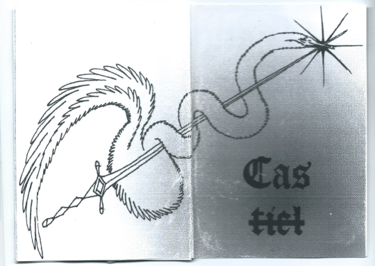
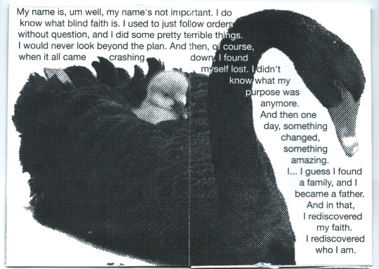
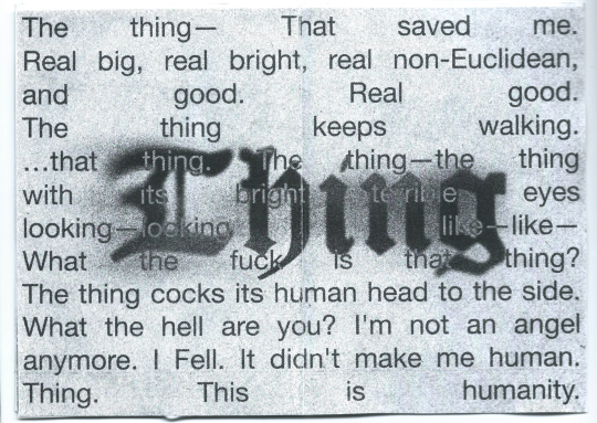
castiel trans zine. click for quality. bibliography under the cut
2street2car (2021). Romantic Theory. Archive of Our Own. Available at: https://archiveofourown.org/works/31427978
@bedlund (2021). There is a crack, a crack in everything / That’s how the light gets in. Tumblr. Available at: https://bedlund.tumblr.com/post/667421049623805952/there-is-a-crack-a-crack-in-everything-thats
@bedlund (2022). *lying on my stomach kicking my legs grinning and giggling* cas became something other than an angel because he has a body and the ability to consent to possession. he’s literally the first of his kind (also he’s trans). Tumblr. Available at: https://bedlund.tumblr.com/post/690873746717818880/lying-on-my-stomach-kicking-my-legs-grinning-and
@calamitysong (2020). cas is trans because he came into being without gender and then became a gay man. dean is trans too. Tumblr. Available at: https://calamitysong.tumblr.com/post/635674769551966208/cas-is-trans-because-he-came-into-being-without
Edlund, B. (2011). Supernatural 6x20 'The Man Who Would Be King' Promo. Youtube. Available at: https://youtu.be/TvJd7NCoKVw?si=cwUWr7UdHflZx2ko
Edlund, B. (2011). Supernatural Preview: 'Lies, Omissions and Secret Agendas' Play Into Castiel-Centric Hour by Gelman, V. TVLine. Available at: https://tvline.com/interviews/supernatural-preview-ben-edlund-castiel-213629/
Edlund, B. (2013). Angel Warrior - The Story of Castiel Featurette. Youtube. Available at: https://youtu.be/FqgJYoM_sc0?si=J7am-hrW6r92hTCD
Edlund, B. (2021). “O, Angel” #officeart, sharpie on paper, acetate, Supernatural, Season 8. Twitter. Available at: https://twitter.com/ben_edlund/status/1440730181237305350
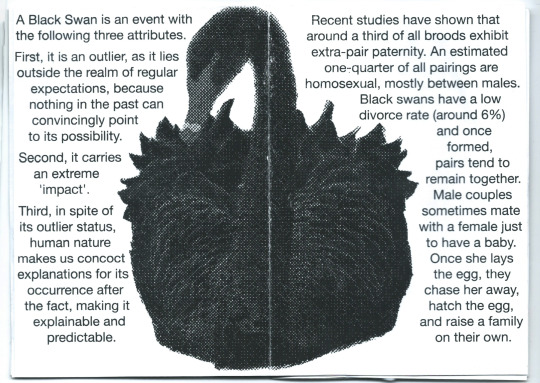
Kraaijeveld, K., Gregurke, J., Hall, C., Komdeur, J., Mulder, R. A. (2004). Mutual ornamentation, sexual selection, and social dominance in the black swan, Behavioral Ecology, Volume 15, Issue 3. Available at: https://doi.org/10.1093/beheco/arh023
@marxandangels (2021). If we talk about Cas himself, as a character that’s a result of interpretation, he is a trans man. A trans man who is, importantly, gay and a father. All three of those things are essential parts of Cas as a character. Tumblr. Available at: https://marxandangels.tumblr.com/post/648648117339734017
seperis (2014). Down to Agincourt. Archive of Our Own. Available at: https://archiveofourown.org/series/110651
@steveyockey (2022). #easiest refutation of my life. cas developed into something other than an angel because he literally has a body and the ability to give #other beings consent to possess it. Fin. Tumblr. Available at: https://steveyockey.tumblr.com/post/680206404343234560
Taleb, N. N. (2007). The Black Swan: The Impact of the Highly Improbable. Random House Publishing Group. Available at: https://dl.acm.org/doi/10.5555/1324807
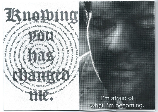
@themanwhowouldbefruit (2022). “knowing you has changed me” SHUT THE FUCK UP KNOWING ASS CHANGED ASS BITCH. Tumblr. Available at: https://themanwhowouldbefruit.tumblr.com/post/699695907897262080/knowing-you-has-changed-me-shut-the-fuck-up
Walton, R. (1997). Typographics 2: Cybertype : 'zines + Screens. Hearst Books International. Available at: https://books.google.com/books?id=QWpSKQAACAAJ
if anyone reads this far and is interested in a copy hit me up
737 notes
·
View notes
Text
296 notes
·
View notes
Text
The Dwarven Decker, a better Dwarf Archetype for Shadowrun (1st Edition)
Wiz art by @skullchicken
In case you haven’t heard, the current managers of the Shadowrun IP, Catalyst Game Labs, announced that they will be reprinting 1st Edition Shadowrun.
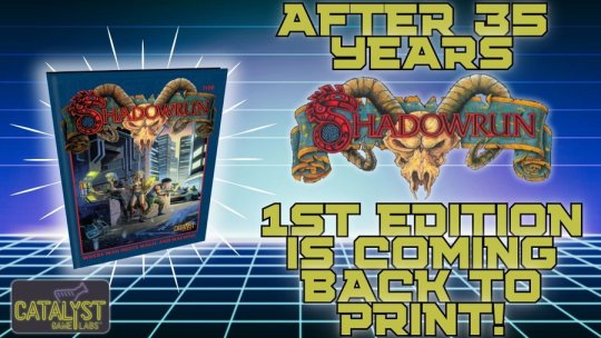
Told ya, chummer.
My feelings on this are surprisingly neutral – I already own a couple of hardcopies and so I don’t feel the need to buy it a third time. I’m mostly curious to see what kind of editing they do; after all, even the 1st edition book went through several printings. In addition to some lingering purely typographical errors...
Which made it into my print copy of 2nd edition.
...to editing errors...

The undescribed and elusive Program Enabler was subsequently copied and pasted in the Street Samurai Catalog.
These make sense to fix – they don’t substantively change the game at all. Some did – for instance the underpriced power focus that led to an Instant Death Spell loophole. This was fixed in the 1st edition magic sourcebook The Grimoire.
But then there were a myriad of things that saw changes from 1st to 2nd edition, some of the major ones being:
Damage codes moving to a standard staging of 2
Updated automatic fire rules (which came before 2nd Edition, in the Rigger Black Book)
Addition of Physical Adepts to the core magic rules
But the one I’m going to exploit in this build today is: in 1st edition, there was no cap on the amount of active or storage memory that an off-the-shelf cyberdeck could carry.
Admittedly, this doesn’t sound as exciting as smearing some Aztechnology corpcop across the side of their Pyramid with a Force 21 Mana Dart, but it does greatly increase the ability and versatility of a decker, and maybe shortening some of those Matrix runs which traditionally take as long as a papal election.

So sayeth Pope Elihu I
In the description of how a cyberdeck’s active memory (here called onboard memory, in perhaps another editing flub), there is the sentence:
In real life, there is a limit to how much RAM you can have for a particular computer build. This, like power foci and autofire, was fixed before 2nd Edition was published, as Virtual Realities set a maximum Active Memory of 50 Mp per point of MPCP, but for our purposes here…
What this means is that: our Dwarven Decker here will be able to buy a copy of every possible utility program (there are 13 of them) at Rating 6 and run them simultaneously without having to worry about swapping between Storage and Active Memory. Essentially rendering the Load property of the deck useless.
Attributes:
Body: 4 Quickness: 5 Strength: 3 Charisma: 2 Intelligence: 5 Willpower: 4 Essence: 5.3 Reaction: 5
Skills:
Computer: 6 Computer (B/R): 3 Computer Theory: 6 Etiquette (Street): 3 Firearms: 2
Cyberware:
Datajack Headware Telephone
Gear:
Armor Jacket Fuchi-Cyber 4 (Response Increase 2, Active Memory 550 Mp, Storage Memory 1000 Mp) Programs (All at Rating 6): Bod, Evasion, Masking, Sensors, Analyze, Attack, Browse, Deception, Decrypt, Evaluate, Medic, Mirrors, Relocate, Shield, Sleaze, Slow, Smoke Walther Palm Pistol (Concealable Holster, 20 rounds normal ammo)
Contacts:
Dwarf Technician Elven Decker Fixer Gang Boss

31 notes
·
View notes
Text
booksbooksbooks{2} - a convoluted excuse to drive the choo-choo train
I have the good fortune to live very near a library that reopened a few months ago, which means: more books!

The Black Locomotive by Rian Hughes was one such book that I saw on the shelves and decided to read like old times - no recs, no familiar authors, just rolling the dice on a book that looked kinda interesting. Paging through it, it looks kind of wildly ambitious, each chapter alternating with tables of materials that make up the built environment and architectural plans and varied, experimental typography. As a work of Design(tm), I certainly can't fault this book.

And indeed, as I got going reading this book, introduced to a beleagured Crossrail engineer who stumbles across what is blatantly a big old alien artefact and a buildingfucker artist whoo is constantly going on huge long meandering meditations on the nature of architecture infrastructure in his POV chapters, I was pretty intrigued. It seemed like it would be going somewhere really quite interesting.
However.
The actual story that all this is in service to is an elaborately contrived scenario in which a group of train-obsessed men who joined a train club as kids must coordinate a nation-wide conspiracy of message board users to drive an old steam train cross-country from the 'strategic steam reserve' of decommissioned steam trains under Box Hill into London... in order to open a locked door. Because the aliens created a field which disables all modern electronics you see, so they can't just blow it up or something.

You see: the artist, Rutherford, went into the alien spaceship that lies underneath London and formed the sort of psychic seed that the city grew around. And closed the door behind him. And they only found one key. And they need to get in and stop Rutherford before he does any unwise alien shit. Hence the whole train thing.
So crossrail engineer Austin teams up with his old schoolmates and users of the 'Smokebox Club' forums to crack the nut with a steam train, coordinated using a phone app, which tells everyone exactly where to go and how to move the points to direct the train to the right destination.
So far this is all a bit silly but like. It's a fun idea, and an interesting way to play with railway-fan conspiracy theories and so on. What really soured me on this book, if I'm honest, was the ending.
Once this is accomplished - of course it's accomplished, you don't set up a premise like that and have them fail - our co-protagonist Austin finally gets to confront Rutherford. And doesn't do anything. He just kind of backs down and goes along with it as Rutherford flies central London into space to get involved in a space war or something. Literally this whole entire plot, which gives the novel its title, which takes up the entire second half of the novel, goes absolutely nowhere.

At that point the house of cards kind of came down for me. Rather than fun and provocative, all the interstitial panels and schematics felt rather superfluous. For all its grounded descriptions of Crossrail engineering and typographic inventiveness in the presentation, the actual scifi premise was all pretty standard space opera stuff.
You might notice a lot of parallels in this description to Seth Dickinson's novel Exordia, which I loved. Both novels transition from their characters encountering the manifestation of a terrifying alien artefact to a mad dash supported by the efforts of people across the country/world to get the protagonists where they need to go in a last-ditch effort and, not to get too deep into the Exordia spoilers, both subvert that direction. Both books invoke a subject that can be quite dry and academic - moral philosophy, architecture - and make it the heart of a dramatic scifi story.
And while there are many differences that led to me liking Exordia more than The Black Locomotive (Exordia is a lot darker and richer in its imagery, it's a lot more international in its outlook, women actually do shit in it, etc.), the biggest one for me is that Exordia had actual structural and thematic payoff. What Anna does at the end of the Exordia, while it betrays the triumphant arc that seemed to be in motion, is still interesting - horribly so, it's the crux of it all. What Austin does at the end, by contrast, is nothing! He might as well not have done any of it.
The whole book drives (literally) towards a confrontation, yet Austin and Rutherford barely have enough time to set up any sort of adversarial dynamic (they both find the idea at worst mildly annoying). There are some parallels between them - both are deeply lonely men, we are reminded often, men who subsume their inability to participate in heterosexuality into their work and just kind of numb themselves to it. So Rutherford is sort of vaguely interested in people in the abstract, but mostly in terms of how they form part of the city, which is his real love. Austin is your classic engineer guy.
The other thing that left me cold with The Black Locomotive is the concept of the Smokebox Club. It felt something like a plot tumour - a cute idea that somehow grew to subsume the whole book. Hughes is clearly very proud of this: he's come up with a logo for it, a theme tune with multiple remixes, fake magazine covers, and a whole bunch of lore about its secretive workings. And like, listen, I've been in the Infrastructure Club slack, I've been on forums, I know how train nerds be.
Where this truly broke down for me is the series of brief POV chapters in which people get messages from a phone app they vaguely remember which tell them to go to a nearby rail and move the points, and somehow this all goes off without a hitch. Each POV character gets their own font - for example, an old man escapes from his nursing home, and one guy is a thief/gang leader called 'Ice Prophet' ('real name Yousef Evans') whose section is delivered in a handwritten font, but he finds a sudden spark of prosociality when he hears the Smokebox ringtone and recalls his dad (yes this chapter is kind of painfully written). i.e. people from all walks of life come out to help the train on its way, isn't that wonderful? Hurrah for steam trains, every boy wants to drive a train don'tchaknow.
I can definitely enjoy a 'people from across the land come out to support the big project' plotline. Sure, all of Japan's electricity must go into the rifle to blow up the angel! It's incredibly silly, and often softly nationalistic, yet it can be very emotionally compelling.
But.
The narration is pretty explicit here: the app shows detailed pictures and the MCs have a UI indicating which points on the line have been checked. And normally, in fiction, you might overlook questions like 'so who coded this app' and 'why does it have this functionality'. But this book is literally all about infrastructure. How and why things are built, the way architecture shapes our lives and grows like an organism, this is all stuff we've spent chapters and chapters meditating on. So it's a lot harder to ignore!
Over the course of the latter half of the book, the Smokebox Club grows from a train forum to an elaborate secret society which commands supranational loyalty from its members. Surprise: Austin's boss Georgia Ash is the Chief Engineer! One of her predecessors was probably Winston Churchill.
And like, OK, it's all a bit of fun. But it really undercuts the setup of the rest of the book, all the grounded effort to tie it to real places and engineering projects and British history and politics, to fold everything back up around an oddly culty train enthusiast forum.

Overall, then, The Black Locomotive disappointed. I looked up Rian Hughes after reading - it turns out he's a prolific typography designer, graphic designer and illustrator, as well as working frequently in comics, who's recently turned his hand to writing novels (his previous being XX). Which probably goes a long way to explaining this: all the stuff he's got decades of experience in is what's strong in this book. But the actual scifi novel aspect is fairly underbaked.
Science fiction and fantasy authors do, for some reason, really love London. There are so many books directly or indirectly about the nature of this city (and often its secret spiritual underworld) from authors like China Mieville or Neil Gaiman, as if London is the paradigmatic city, which all other cities somehow echo. I do feel like it's a bit played out at this point. Like in this book, if London's unique complexity is because it was seeded by a reality-warping alien spaceship that was cultivating the complex society it needs to replace its pilot and get back into space... what of like, literally every other big city, just as steeped in history?
I guess if I mostly read novels in French, I'd probably end up saying the same things about Paris...
#fiction#sff#rian hughes#the black locomotive#a rare negative review from canmom dot whatever#i can finally take this back to the library now i've reviewed it - it's obscenely overdue...
5 notes
·
View notes
Text
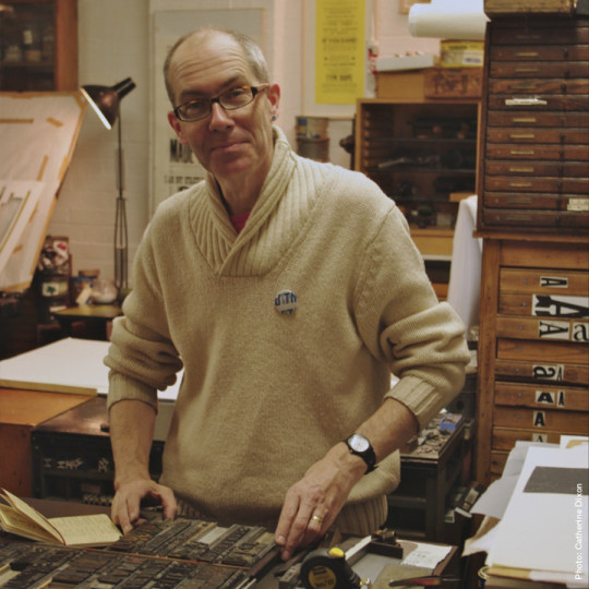
Phil Baines, who has died aged 65 of multiple system atrophy, was one of the most distinctive voices in contemporary British graphic design. His work included books, posters, art catalogues and lettering for three important London monuments – the memorial to the Indian Ocean tsunami in the grounds of the Natural History Museum and the 7 July memorials in Hyde Park and Tavistock Square, commemorating the victims of the 2005 London bombings. These projects point to Baines’s defining attributes: a scholarly appreciation of letterforms, a deep-rooted respect for materials and a love of collaboration.
Such attributes can also be seen in Baines’s cover designs for the Penguin Great Ideas series (2004-20), works by “great thinkers, pioneers, radicals and visionaries” that gave him a canvas on which to display his typographic philosophy. The Saint Augustine – Confessions of a Sinner cover, for instance, uses ancient ecclesiastical letterforms and yet looks superbly modern. For Chuang Tzu — The Tao of Nature, Baines arranged letters to suggest a butterfly in flight. David Pearson, one of two art directors for the series, described how his “often-oblique approach gave the series a crucial added dimension”.
Born in Kendal, Cumbria, Phil was one of the three children of Martin Baines, a construction contract manager, and Joan (nee Quarmby), a horticulturalist. Growing up in a Roman Catholic household, he began studies for the priesthood at Ushaw College, County Durham. During the holidays from Ushaw he worked at the Guild of Lakeland Craftsmen, Windermere, and from there his interest and confidence in art grew.
At the start of his fourth year, he quit Ushaw, and in 1980 began a year’s study on the foundation course at Cumbria College of Art and Design. In 1982 he moved to London and enrolled on the graphic design course at St Martin’s School of Art (now Central Saint Martins), where he met Jackie Warner, whom he married in 1989, and where he was among a talented cohort, many of whom went on to study, as he did, at the Royal College of Art.
Richard Doust, then leader of the first-year course at St Martins, recalled the portfolio Baines submitted for admission: “I was so excited … I was sure he was going to be someone very special. He quickly established his individuality. He made typography and particularly letterpress his own territory.”
Baines was fiercely individual – he did not join schools of thought or align himself with fashionable camps. Instead, he built a creative practice based on his belief in the “humanist” qualities of the English typographic tradition.
His contemporaries were using the computer to bring a new complexity to graphic communication. Smart software allowed for the overlapping and interweaving of text in ways that echoed the ecclesiastical manuscripts that Baines admired so much. He was no Luddite, and used the computer himself, yet his work invariably retained an element of the handmade.
Paradoxically, his work was greatly admired by the new generation of digital designers. Neville Brody, for instance, included Baines’s work in his experimental typography publication FUSE, produced to demonstrate the malleability of the new digital typography. Baines’s work does not look out of place among the other contributors, many of them American typography radicals whose multi-layered layouts were driven by modish theories of deconstruction and poststructuralism.
In 1988 he returned to Central Saint Martins (CSM), as part of the faculty. In staff meetings his willingness to say the unsayable was a frequent cause for consternation among colleagues. To his students he preached a doctrine of “object-based learning”, a typically contrarian notion in the age of screen-based and virtual graphic design. He was appointed a professor in 2006 and retired in 2020 as emeritus professor.
Despite his commitment to teaching, Baines did not give up his work for clients. As well as designing books for leading publishers, he worked for the Crafts Council and the Ditchling Museum of Art + Craft, and designed the signage for CSM’s King’s Cross campus. He designed exhibition catalogues for Matt’s Gallery, south-west London, relishing the creative three-way collaboration that existed between the gallery’s director, Robin Klassnik, exhibiting artists and himself.
He wrote books that contributed to the understanding of visual communication: Type & Typography (with Andrew Haslam, 2002), Signs: Lettering in the Environment (with Catherine Dixon, 2003) and Penguin by Design: A Cover Story 1935-2005 (2005), the last of which helped establish Penguin cover art as one of the most important bodies of graphic art in British design history.
With Dixon, he co-curated the Central Lettering Record, an archive of typographic history housed at CSM, and in November 2023 his work was celebrated in an exhibition, Extol: Phil Baines Celebrating Letters, at the Lethaby gallery, CSM. He was appointed as the Royal Mint advisory committee’s lettering expert in 2016, and reappointed in 2021 to advise on the integration of lettering on new coins and medals, with consideration given to special issues and the accession of King Charles to the throne. For this work, in 2023 he was awarded the Coronation medal.
Baines was an enthusiastic runner and cyclist, and loved music, especially the Manchester post-punk band the Fall. He was a collector of signs, lettering, and railwayana, and built his own studios at his home in Willesden Green, north-west London. A few years before his retirement he moved to Great Paxton, Cambridgeshire, where he took up bellringing.
He is survived by Jackie and their two daughters, Beth and Felicity, and by his father.
🔔 Philip Andrew Baines, graphic designer, born 8 December 1958; died 19 December 2023
Daily inspiration. Discover more photos at Just for Books…?
9 notes
·
View notes
Text
Portrait of a Communard (2): André Léo (1824-1900)
In my first post, I gave you a general overview of the memory of the Paris Commune, chronologically, without going into detail. However, don’t worry, I don’t forget the important role that women played in the insurrection! I attach great importance to the history of feminism and the role played by great heroines (more or less known) in the struggle for women’s emancipation.
But who are the women communards? A person more or less passionate about history, who is not a specialist in the Paris Commune but who has a vague idea of it, knows at least Louise Michel, The Red Virgin! She is also the first character of the Commune that I mentioned in my first post...
Let's get straight to the point. This post and the next one will be dedicated to a heroine in the history and memory of the Paris Commune, but also in the history of socialism and social struggles in general, and the fight for gender equality, is the aptly named Léodile Béra, otherwise known as André Léo…
Warning: In this post, I will only retrace the journey of André Léo (such a rich and honorable journey) before the Paris Commune. My next post will be dedicated to his fight throughout the Commune. I don't want to make posts too long (I'm just starting to master the principle of Tumblr posts ^^). And, to be honest, I love her, and I have so much to say about her…! :)
Léodile Béra comes from a bourgeois family. She is the granddaughter of a member of the Society of Friends of the Constitution.
A few days after Napoleon III's coup d'état in December 1851, she married Pierre-Grégoire Champseix, a socialist typographer and journalist (close to Pierre Leroux), who had taken refuge in Lausanne in 1850 because of his accusation of press offences.
In 1860, due to the amnesty, Léodile and Pierre-Grégoire returned to French soil. It was there that she gave herself the pseudonym "André Léo" (these are the firsts names of her two children). he published many novels, criticizing the place of women in society: Un Mariage Scandaleux (1862), La Vieille Fille (1864), Jacques Galéron and Les Deux Filles de Monsieur Plichon (1865), Un divorce (1866), L'Idéal au village (1867), Attendre - Espérer and Double Histoire (1868), Aline - Ali (1869).
In 1866, André Léo founded the Association for the Improvement of Women's Education. She was one of those "feminist" activists (the term did not yet exist, was limited to the medical field, and was used by truly misogynistic men!) who wanted to develop women's education and improve its content, methods, and purpose. In her letter to Victor Duruy, Minister of Public Instruction, she expressed her criticism of Catholic education. In 1868, alongside eighteen other women, including Maria Deraismes and Paule Minck (Don't worry, I'll have the opportunity to talk about them later), she published a Manifesto in favor of women's rights. She then founded the Women's Rights League. This league was dedicated to spreading a Demand for Civil Rights.
In 1869, alongside the schoolteacher Noémie Reclus and her cousins (the famous Elisée Reclus and his brother Elie), André Léo founded the Society for the Demand of Women's Rights, a mixed society. She participated in writing a manifesto demanding a reform of the Napoleonic civil code; this manifesto was published in the newspaper "Le Droit des Femmes", a newspaper founded by Maria Deraismes and Léon Richer. She dismantled Proudhon's pseudo-misogynistic theory in her report "Women and Morals. Liberty or Monarchy". André Léo was aware of the links between the oppression of women by men and that of the proletariat by the bourgeoisie. She highlighted the relationship between socialism and gender equality. Thus, she virulently criticized the sexist ideas of the republicans and socialists. According to her, regarding the issue of women's freedom and gender equality, the revolutionaries (with the exception of Eugène Varlin, Léo Frankel, or the Reclus brothers) became conservatives !
In January 1870, alongside Louise Michel, she went to the funeral of the journalist Victor Noir. After the coup de La Vilette in August 1870, still with Louise Michel, she sent a petition to General Trochu, defending the Blanquist activists sentenced to death at the Blois trial for an alleged plot (against order, oppressors and social injustice!).
In January 1871, André Léo worked for the newspaper La République des Travailleurs. In this newspaper, she vehemently criticized the government of Jules Dufaure, General Trochu, Jules Favre, Ernest Picard; she also called for a popular revolt to defend Paris, with these pretty words: "To the barricades, women! May the French Republic, the real one, freed from its shackles (the Trochus, the Favres, the Picards), raise the great cry that restores the strong to themselves, overexcites the weak, terrifies the traitors (...) The Republic and freedom cannot and must not perish!" André Léo attacks the bourgeois who enrich themselves at the cost of the misery of the proletarians, and she demands the fair redistribution of foodstuffs.
4 notes
·
View notes
Text
My Galaxy
My galaxy, one-shot by Eribin

A/N: hi! This is Eribin. I am not a real writer, doing this as my past time. English is not my first language so bear with my English. There’s a lot of grammatical and typographical errors. This is just a fiction from my delusions 😆 this was inspired by the song Hitomi no naka no Galaxy by Arashi. I suggest to listen to that song while reading.
CAST:
ICCHAN (ITSUKI FUJIWARA) DIANE (Y/N)

ITSUKI'S POV
We were sitting next to each other on the rooftop of the hospital, stargazing. Her head was on my left shoulder, and she was holding my hand. It's almost midnight, but we don't care. We’re here since sunset. We want to have this moment alone, and this might be our last moment together.
"The sky, the galaxy, is so peaceful," she murmurs. She was tired from crying earlier.
"They shine like your eyes, Diane," I said, tightening the hold of her hands. Her hands look small and delicate in my hands. If only i can hold it forever
"It looks like wishing on the shooting stars is a scam," she said and laughed. a sweet laugh that I will definitely miss. "I wish they spared me more time to be with you, Icchan. I feel guilty for hiding our relationship all these years," she added while playing with my hands. This made me teary-eyed, so I looked away so she wouldn't see my face. I am embarrassed to cry in front of her at this moment. I need to look strong in front of her.
"Diane, you should not feel guilty. I am genuinely happy in our relationship," I said as I wiped away the tears coming from my eyes with my other hands. She moved a little away from me and smiled at me. A sweet and big smile
"I was thinking, If we wished for the shooting star, was it just fleeting? Billions of wishes were fleeting in the galaxy. Shooting stars disappeared into endless space. So, probably our wishes were left behind and just fleeting. Hahahaha. That's why my only wish was never granted," she said, and you can hint at sadness in her voice.
Actually, I don't know what to say. Diane loves astronomy, and I didn't before. We talked about planets, comets, theories, and other stuff for hours. I am not complaining. She's fun to be with and to talk to. You can actually learn something interesting from being with her.

"Icchan, thank you for making me the happiest girl alive right now. Being with you is the best feeling I've experienced. Thank you for making me experience how to love and to be loved. I wish you real happiness and am sorry for breaking your heart. I am guilty for leaving you miserable. Allow your heart to heal and to love again. I am really sorry, Icchan. Days from now or even hours, I might not be here with--" I stopped her by sealing our lips. When our lips parted, I closed my eyes to prevent my tears from falling. Diane has congenital heart defects. And it's not curable. I knew from the start that she had this disease. Her parents prevented her from having a boyfriend because of her condition, but we fought it. We fight it for love. After almost 3 years of relationship, we learn to love each other unconditionally to the point that I want to spend the rest of my life with her, but destiny is not on our side.
"Don't say that, Diane, please. I'm begging you; don't make this so hard for me," I said while our foreheads touched. Just thinking of my life without her, it's sad and horrible.

"I love you, Icchan. You're absolutely wonderful. You deserve all the good things in this world," she said, cupping my face. I closed my eyes and felt her touch. "I'm sorry, Icchan, for leaving you. I really am," she added.
"don't be sorry. I never regret the time we fought for our love. I love you, Diane, always and forever," I replied. I kissed her once again with care and longing. I will miss the taste of her lips. The mint lip balm. Her strawberry-scented shampoo. I will miss this feeling every time I am with her. She being talkative. Her sweetest smile. Her galaxy-like eyes shone the brightest. I will miss you, Diane.

"I will surely become a star to watch over you, Icchan," she said when we parted and wiped each other's tears away. We smiled at each other, saying everything would be alright.
"When it's my time,I will search for you in the vast galaxy, Diane. I will search for you in the billion trillions of stars. I will also become a star next to you. I promise that to you," I said, another tear endlessly falling from our eyes. At that moment, we don't care about others. We care only about our hearts. She rested her head on my shoulder, and we watched the stars once again in the sky. It's beautiful, just like Diane. We talked about my future. She wants me to love again and have a family. A big family. I don't want to talk about it, but Diane insists. As we enjoyed gazing, we unexpectedly saw a shooting star.
"Did you see that, Diane? A shooting star," I said as I cried loudly. I know I am hopeless now, but I don't care. I felt that her head was getting heavier on my shoulder as her hand slowly fell to her side. I cried. "I wish that you will be safe on your next journey. Wait for me, Diane." At that moment, I wanted the time to stop for me to have more moments with her. I know that she's already tired and she don't want to be burden to us.

Out of nowhere, her parents came to us, crying heavily. Her mother kneeled down to be on her level, while her father was just looked at her, try and hide their face so they can’t see that he's crying. The ache spreads out in my chest, it hurts seeing them like that.
I looked at the sky. I saw one star that shined the brightest. I smiled while crying.
eh? That fast, Diane? Wait for me, Diane.
#itsuki fujiwara#love#my edit#exile tribe#boyfriend#fangirl#the rampage from exile tribe#the rampage#high and low#relationship#fanfic#fanfiction#short story#fiction#oneshot#exile#jpop#japanese#Spotify
13 notes
·
View notes
Text
The parallelism between Heulendorf and Wolphinel
So much for Strange Things-esque, the World Below, Upside Down theory, parallel universe is happening on Undead Girl Murder Farce but it is only a clandestine underground tunnel that separates between the two villages that are at war from each other. Only a few have known this secret, the one responsible for the killings and some children smart enough to plan about their daily survival.
Taking advantage of the difference of day and night in both villages.
It is a conundrum.
Interestingly, the idea of a hidden tunnel also ironically connects both villages: Heulendorf and Wolphinel.
These two villages harbours a countryside mentality where outsiders are deemed dangerous and not to be trusted, which greatly emphasised here.
Sir Arthur Conan Doyle once said through Sherlock Holmes why the countryside is more dangerous than the city:
John Watson: Good heavens! Who would associate crime with these dear old homesteads?
Sherlock Holmes: They always fill me with a certain horror. It is my belief, Watson, founded upon my experience, that the lowest and vilest alleys in London do not present a more dreadful record of sin than does the smiling and beautiful countryside.
John Watson: You horrify me!
From the “Adventure of the Copper Beeches”
One thing that stands out is their society. Both villages, on the surface, are matriarchal. In the human village, it is the Our Lady the focal point of their Christian religion.


But the male villagers are the ones who observe and practise law and order.

In Wolphinel, Grandma Regi governs, but the male werewolves, the Blutkralle (blood claws) holds the key to ensure that there is peace and order in the village.


The official UGMF TwitX just posted that they had a typographical error concerning the title of the episode.
【apology】
Regarding the subtitle of the 12th episode broadcast today, there was a typographical error in the main story and next preview.
<Incorrect>
Episode 12 “The place where the flow changes”
<Correct>
Episode 12 “The place where the flows intersect”
I humbly make the correction. I am terribly sorry. ( x )
The cliff, the waterfalls, the tunnel.
#undead girl murder farce#undead murder farce#episode 12#aya rindo#tsugaru shinuchi#shizuku hasei#dennis#gunther#the werewolves#ugmf spoilers#ugmf speculation#sherlock holmes#sir arthur conan doyle
15 notes
·
View notes
Text
diary142
2/3-4/2024
my weekend begins #now.
i started it with a damon packard movie, foxfur, a friend sent me it and i was like, entranced by it. really great movie, feels like it gets at the precarity/nightmarishness of the world atm and all ways people cope, especially w/ new age weirdo stuff. so oddly on with that, all the way back in 2012.
otherwise, my day was okay, my work note:
stuck there too long, one kid tried to scam me and it was so obvious and bad, insanely stupid attempt. the rides are scary, someone almost lost their phone, but mostly, dull. i didn't get to take a break.
i did work on music but i'm too exhausted/spaced out to get to the next song, i've just been fiddling with the last one, the issue w/ it is that in order to get it more disgusting sounding in the distortion/how it distorts, i need to figure something out, and the fiddling/ solutions i've come up with are a bit flabby sounding i guess, coming back to them. the flab is in the lack of sharpness. something weird needs to happen or whatever. might need to go back to the guitar fixing thing for the right channel sound, i've started messing with some octave effects, but there may be something else i need to try too, maybe a re-done effects chain in parts. idk. i'll see how this export comes out where i boost some of the highs in each separate track.
did something where i went and eq-ed out the ugliest signals solo, seems to have worked in a first pass but i forgot to turn some stuff back on. i also decided to change something in the master. it's impressive to me how much stuff regarding guitar sounds/tones online is so useless and how boring most people want to be.
having thoughts now, about ai, that's how you know i've been up too late. here's my new whacko theory about it, or i guess i can't present it from there, immediately, here's the source of the thought, seeing the cover art for zazen boys ii, and the illegibility of it, basically, its failure to say zazen boys ii in a way that's immediately readable. it's willfully against being read, it's a mess, it's beautiful, it's a typographic explosion, it looks like several different languages slammed together, congealed. i don't think it's important it was done by a human or whatever but i think what it is, is something that fails at what you'd expect, and what you'd want from what is basically an advertisement to get people to blindly buy something, or that's what cover art is when viewed from the perspective of not caring about the music. many times, they are related, but it's positive also with the selling/potential to get someone to loo, i think maybe this is is only worth thinking about because zazen boys are a japanese band and cd sales are still hugely important over there, because piracy is so scary for them. for anyone who steals the vast majority of music, it's more freely interrelated to the music/meaning of the music, it's something that is liked and connected with in that way. this is an aside. basically the other thing is it reminded me of what those neural nets or whatever they are now, do when they try to write something in an image. signs, anything. it bugs me when people act like ai is novel, is what i think i'm feeling lately. it's a lot of futurists basically taking up a fetishistic desire to point at something as new, a new method, a new field of potentiality, a new capability for people to adopt, maybe flatly, it increases our ability, for them, and so this novelty in technology revitalizes art, but these things only scrape and congeal, they do it at a scale that people cannot, because they can remember more, with their monologic weighting and construction of meanings as largely singular and not fluid. people may bring the nature of ai writing which does get rather figurative and strange, but so does any good writer, it rarely produces sentences i think nothing else could produce, it just feels like a lot of excitement over the fact that capital has now moved into the territory of the illegible, it creates nonsense information, it absorbs centuries of ways of writing and sequences them, somehow, this is enough to some people to seem better than all fiction currently produced. a strangely eugenic approach to art, we seem to have arrived at in recent times, where people are quick to say, this is the end of everything, this makes anyone doing the same thing unnecessary, there is not vitality in (x), there is no hope for anything new in (x). a sickness over novelty, it is so purely and psychotically spectacular, it should be seen as special i guess how even people who act outside/above this get very wrapped in it, or act like it is real. i can never see or feel how it's real. i don't know why. is that wrong of me?
i know people who find ai to be very exciting, but when i see what they think of it, all i feel is that really what they want is to be the manager of creative work, and ai is finally a worker they can have. it's not about freeing up who can make things, the novelty is the fantasy it sells, the fantasy of not having to communicate with others in the creation of something, and the feeling that you are communing with some vast well of meaning. in short, you are enabled to be a creative director, you direct an image making, text spewing machine, a machine which has absorbed meaning/constructs meaning in a way that snuffs out the negative, there is never lack, it is a system of pure success, it is eugenically improving itself always, at least this is my read on it, creating memories / facts / linkages that are essentially a kind of super-infrastructure for information. this is totally opposite to the waste-products created in our mind, which we trip over, and months of not considering them, surface, corpses in rivers, eggs which never spawned, and now gleaming and bobbing, they seem pearls you may fashion into something terrible, and carry it for the rest of your life, with a special sort of love. the value of failure, and waste, is in that, spoken more i guess, directly, it is that when you are shut up in yourself, mute, and when you cannot find the words, something else comes to you, and when you cannot explain yourself, you are something else, you are fallen between words. a.i cannot fall between, it cannot be anything but the sun, not as solar anus, not as the life-expelling force bataille describes, but the implement of measurement via shadows cast, a ruler set to earth, set to voice and thought to collect data and surveil, a system perfected, something that can encapsulate some of the world.
our next cybernetic apparatus of agitation and gentle discomforts. it will not think for us, it will make us think we think as it does, and thus we will chase the capability, ability to conclude, be read, and to read, falling for the novelty, and whatever.
this isn't to say though, it's utterly useless. ai should probably be used in pointless clerical data entry work, and i don't especially care if some people steal pokemon with it. the palworld thing is so weird because people should be wigged out that people are just getting super into something that seems like ark or whatever. that awful game with the dinosaurs. survival game slop, you do not need anything other than minecraft.
okay i think i got the problem song pretty good. right guitar needs something though... idk what. maybe it's missing some frequency from something i notched.
re-exporting now.
i think it sounds really good now, i hope i feel that way tomorrow. i also just made a new guitar sound thing. i am up too late but at least i'm having fun.
this has too much white noise in it but idk, it's kind of cool, also.
anyway i need to sleep now, or soon, at least, so
byebye!!!!!!!!!!!
4 notes
·
View notes
Text
Marvel’s Thunderbolts Twist: Bold Brand Play or Franchise Lifeline?
Subscribe to marvelphase5 for the latest insider insights on Marvel's boldest moves. In a twist that's redefining superhero cinema, Marvel Studios has pulled off an unprecedented stunt: rebranding Thunderbolts to The New Avengers just a week after its theatrical release. This guerrilla marketing masterstroke has ignited both applause and controversy. Is this a desperate franchise lifeline or a visionary marketing pivot aimed at reigniting fan enthusiasm amid superhero fatigue? This article unpacks Marvel's mid-campaign rebrand, exploring industry expert takes, strategic motivations, and what this means for the future of the Marvel Cinematic Universe (MCU).
Marvel’s Thunderbolts Twist: Bold Brand Play or Franchise Lifeline?
Marvel Studios has once again challenged the norms of cinematic branding, this time with a bait-and-switch that redefines its latest theatrical release. Just days after the Thunderbolts premiere, a covert marketing twist was unveiled: the film was rebranded mid-campaign as The New Avengers. This was first hinted at by a mysterious asterisk in the film's promotional materials and confirmed through a surprise reveal by cast members Florence Pugh, David Harbour, and Sebastian Stan at the Hollywood premiere. Stan even replaced local bus stop ads overnight, symbolizing the transformation. This was no haphazard move. Experts agree this twist was deeply strategic, designed to tap into shifting viewer behavior, social media's rapid narrative control, and the franchise's need for rejuvenation. With Phase 6 looming, Marvel needs to stay fresh, relevant, and ahead of the conversation. The unconventional rebrand signals a willingness to break from formula and embrace risk. What Was the Marketing Strategy Behind the Rebrand? Marvel's approach was stealthy but calculated. The asterisk in the Thunderbolts title wasn’t just a quirky typographic choice – it was a planted teaser. According to Alex Chan, head of brand at Geneco, the reveal was staged as a PR crescendo. The timing aligned perfectly with growing chatter around superhero fatigue, creating a newsworthy narrative that could dominate the entertainment conversation for weeks. Instead of announcing the twist through conventional press releases, Marvel leveraged the social presence of its stars, allowing the reveal to feel organic and fan-driven. This method emphasized fan engagement over studio authority, a crucial move in today's digital-first landscape. Is This a Sign of Franchise Fatigue or Marketing Genius? The MCU has been around for over 17 years, and signs of saturation are real. Box office trends show declining returns for superhero films, driven by content overload and changing viewer habits. For Chan, the rebrand is not a desperate grasp for relevance, but a sophisticated pivot. "The boldness of this move is the most un-Marvel strategy they’ve undertaken," he notes, emphasizing its break from tradition. Padmanabhan Manickam, a former GroupM marketing lead, calls it "thunder-BOLD." He sees the maneuver as both an in-universe twist and a strategic brand reset. It simultaneously drives ticket sales and repositions the movie in the cultural zeitgeist.

Marvel’s Thunderbolts Twist Bold Brand Play or Franchise Lifeline (2) Why Didn’t Marvel Change the Theatrical Title? Despite the rebranding, Thunderbolts remains the official title in theaters. Chan sees this duality as intentional. It preserves continuity while allowing the marketing team to double-dip on media cycles. "The reveal is not official; it's performative," Chan explains. This ambiguity keeps the buzz alive and encourages fan speculation. This tactic acknowledges how quickly spoilers and fan theories spread online. Instead of fighting that tide, Marvel embraced it. They let fans fuel the fire, crafting a reveal that felt like a community discovery rather than a corporate decree. How Did Social Media Influence the Campaign? Social media didn’t just amplify the twist – it was part of the strategy. Marvel leaned into the idea that if they didn’t reveal the rebrand, fans would spoil it anyway. By making the reveal feel collaborative, the campaign turned passive viewers into active participants. Sebastian Stan’s late-night poster swaps became instant viral content. Fans filmed, shared, and speculated, turning what could have been a quiet marketing update into a spectacle. This type of experiential marketing leverages Gen Z’s appetite for participation and meme culture. What Can Other Studios Learn From This Move? The lesson is clear: static campaigns are outdated. Studios must embrace fluidity, digital-first execution, and fan-led storytelling. Not every franchise can pull off a mid-release rebrand, but the principles of agility, audience insight, and surprise are universally applicable. Studios should also consider how marketing stunts tie back to plot elements. The asterisk, as Manickam highlights, was a storytelling device as much as a brand play. Done wrong, it’s bait-and-switch. Done right, it’s immersive marketing.

Marvel’s Thunderbolts Twist Bold Brand Play or Franchise Lifeline (1) Could This Strategy Backfire? Absolutely. Risks come with stakes. If the story doesn't justify the twist, fans may feel manipulated. There's also a danger of diluting the Avengers brand if such rebrands become commonplace. But early reactions suggest this campaign stuck the landing. Critics have lauded the execution, and fans are actively engaging with the new identity. That said, Marvel will need to follow through with content that validates this pivot. If The New Avengers is more than a title and signals a thematic shift, it could mark a new era for the MCU.
Summary
Marvel’s rebrand of Thunderbolts as The New Avengers is a calculated, high-stakes move that reflects a deeper industry pivot. It blends fan engagement, experiential marketing, and narrative control in a way few studios have attempted. The strategy hinges on social media virality, Gen Z engagement, and a strong payoff in the MCU's evolving storyline. Whether it becomes a blueprint or a cautionary tale depends on how Marvel capitalizes on this momentum in Phase 6. Either way, it has the internet talking — and that might be the biggest win of all. Read the full article
0 notes
Text
Research: Visual Hierarchy
Visual hierarchy refers to the arrangement or organization of elements within a design in a way that guides the viewer's eye through the content in a specific order of importance. It's about creating a clear and logical structure that helps users navigate and understand the information presented. You can use size and scale, color and contrast typography, white space.
History
Visual hierarchy is far from a new concept. Through the ages, humans have naturally arranged information into hierarchies, assigning more importance to items that appear bigger, bolder, brighter, or otherwise distinct. Consider this: Our ancestors intuitively arranged cave drawings to emphasize certain elements, depicting some animals larger than others or using bold lines and shading to highlight certain figures.
When we look back at the evolution of art over time, we can see many examples of artists using visual hierarchy to direct the viewer’s eye through their works and emphasize elements along the way. Notable visual artists like Leonardo da Vinci, Vincent van Gogh, and Claude Monet are famous for using textures, lines, and colors to manipulate perspective and visual weight, creating focal points and promoting an effortless visual flow in their work.
During the print era of the 15th century, these artistic design principles were adapted for use in text publications and graphic design. Newspaper designers applied visual hierarchy principles to headlines, images, and text blocks to guide the reader’s gaze across the page. Visual hierarchies also showed up in early billboards, film posters, magazines, catalogs, mail flyers, and other graphic print designs.
Eventually, this design principle was given a name. The term “visual hierarchy” is based on Gestalt psychology, a 20th-century theory of perception developed by German psychologists Wolfgang Kohler, Max Wertheimer, and Kurt Koffka. This school of thought states our brains automatically group and organize what we see into whole, structured objects rather than a collection of individual elements. Visual hierarchy draws upon many of the principles developed by Gestalt psychologists, called Gestalt principles, that describe how we organize visual elements into meaningful patterns.
Principles

Size – Users notice larger elements more easily.
Color – Bright colors typically attract more attention than muted ones.
Contrast – Dramatically contrasted colors are more eye-catching.
Alignment – Out-of-alignment elements stand out over aligned ones.
Repetition – Repeating styles can suggest content is related.
Proximity – Closely placed elements seem related.
Spacing - giving elements more space and room to breathe will make it easier for the viewer to identify all objects in your design and order them by importance.
Whitespace – More space around elements draws the eye towards them.
Texture and Style – Richer textures contrast to flat ones.
Typographic hierarchy - a system used to organize in a visual way using typography.
0 notes
Text

NEB FOGEL
One of the strangest characters I’ve ever met in The Wayside – and remember, that’s a tavern where a meteor standing stone which was worked into the architecture is one of the co-owners; there’s a bartender who looks like a pig and another who resembles a West Highland terrier; the manager is a tree spirit; and the bouncer is a “pixiederm”, a fairy elephant. Then there are the “Waysiders”, those who are regular patrons – like the retired demon of typographical errors and an Asgardian squirrel. And of course, there’s the other co-owner of The Wayside, my friend Timjimmy Auxberon. He can see and speak to ghosts, Canterville’s largest population demographic.
All worthy contenders for the title, but I still hold that the strangest character was just this guy, you know? (You are missed, DNA.) His name was Neb Fogel, or so he claimed when he was sober… which wasn’t a condition that lasted long once he was settled into a back table in the taproom.
According to the legend handed down by the descendants of the Fògarraich, those Scottish refugees who settled in the future Connecticut Notch region on lands offered by the local Wampaug tribe, Neb Fogel was already living there in the now-missing hills of what is now Southwick, Massachusetts. In fact, it’s claimed that Neb Fogel was there before the Wampaug migrated to the region. He was there even before Hyoond, that meteor which is now part of The Wayside, crashed to Earth, serving as the beacon which led the Wampaug to that territory. Neb Fogel supposedly was living in a small shack in the woods of Eukridge Knoll, which later became a haven for hermits and others who preferred to avoid the company of others more civilized, including the Wampaug. And Neb Fogel was already there before all others.
Even the Wonnix, those extra-dimensional humanoids who were best remembered in Irish mythology as the Firbolgs of Ireland, support the claim that Neb Fogel was already living in the lands of the Quinnetukut before they even arrived, driven out of Inisfail by the Tuatha de Danann. While they established the third of their underground realms in the region there in the future Notch (the other two were in the vicinity of Fairfield and of course, beneath Machimoodus, known today as the “land of bad noises” because of them), Neb Fogel was above them, minding his own in his simple shack.
Because he kept himself to himself, theories abound that the legends are glawackus scat. If there was somebody living on Eukridge Knoll all that time, since before the arrival of the Wonnix to the Great Vanishment of 1678[1], then it was a series of men who each assumed the name of “Neb Fogel.” Who could claim that they were lying? “Neb Fogel” kept his distance from everybody and could go many decades without another person espying him. Certainly nobody lived who could claim that they had seen him twice in a long stretch of time.
Along with all of the original terrain which once existed in the Connecticut Notch, Eukridge Knoll (as well as its inhabitants, those hermits who were dubbed “Eukers” by outsiders) was whisked away in the Great Vanishment. It still exists, just within the boundary of the Riftwood, on the border with Fortenbury, the hard-luck center of Pooticuck County. (Some might say that’s apt, but those who deal with the Eukers would disagree.)
If Neb Fogel still lives there on the knoll, none can say with some assurance where exactly his shack could be located. Some say he is now a cosmic hobo in the Flatlands, still giving Eukridge Knoll as his permanent address when pressed on the matter if confronted in one of those other foreign countries on that flat planet. And while he has never broken any laws (at least none which the authorities can confirm with any certainty), and never shown any inclination that he would do so, the Monitaur adepts who protect Pooticuck County are always on the alert for his presence in that country. (It’s surprising they have never been able to find him there, considering that Pooticuck County is less than ⅓ the size of the state of Connecticut.)
And yet…. Somehow he manages to slip past the Monitaurs and find his way to the back door of The Wayside to enjoy a few brews among the more regular Waysiders. Even knowing that over the last 70 years, Neb Fogel has only frequented The Wayside on the first Saturday of the month of May, sometimes on Beltane itself, somehow he evades their vigilance there in Notchboro. The Monitaur agents on the other side of the dimensional barrier, in the thin place of Canterville, only keep an eye out for him should there be reports of him in the community at large. (Not being magical adepts like their counterparts in Pooticuck County, the agents don’t bother going into The Wayside to confront him. Like most of the Notchfolk in Canterville, they have little regard for the Magickers, despite living in a pocket dimension still tethered to Earth by the energies imbued in the Connecticut Notch border with Massachusetts. Not that he has ever caused any trouble in there – apparently he’s only there to watch live broadcast from Earth of the Kentucky Derby. But as the tavern is often frequented by powerful Magickers, the agents have maintained a more prudent policy of letting them deal with it.
I don’t always go to The Wayside on Saturdays, but okay, I often do. The first Saturday of May is one that I never miss and the primary reason I have been going on those Saturdays is because the legendary Neb Fogel would be there to watch the Derby. Unfortunately, he doesn’t join in the conviviality of the more “permanent” Waysiders, taking his seat in the shadows to the back, at the table which is kept vacant for him on that day only.
Last year he was seated at his usual table, and he was deep into his cups before the race began. I sat as close as I dared (advised against it by Titivillus, that retired demon of typographical errors whom I mentioned earlier, and maybe I should have listened to him – if even a demon is wary of a situation….), and strained to hear what he mumbled.
He seemed preoccupied with a curious landmark to be found on Canterville’s village green. (As if any landmark on the green is not an object of curiosity, what with the statue of Orson Bean as his ‘Twilight Zone’ character, and the stone gazebo which may, or may not, have a body or two buried beneath it.) Neb Fogel’s focus was on the classic “signpost up ahead”, perhaps in tandem with the statue, but with arrows pointing to various points of interest back on Earth. One of them was in the direction of Wales, specifically to Cynefin, Wales, acknowledged as Canterville’s sister city, but one which the Notchfolk are advised to avoid.
“Cynefin…” he mumbled. “I used to live up the road a fair pace from Cynefin. Llyddwdd the place was. All I wanted was the peace and quiet to work on a few experiments, that’s all. But they treated me like I was some kind of a witch!”
Hoping that I might widen this opening for conversation further, I remarked, “’Neb Fogel’ doesn’t sound like a Welsh name….”
He derisively scoffed. “Didn’t use my real name!” With a shrug, he added, “I played around with it though. Called myself ‘Nebogipfel’ and -#”
Saying that name aloud, perhaps the first time in centuries, brought him up short; might have even sobered him up somewhat. Glaring at me, he pulled back the cuff of his jacket’s sleeve to reveal what looked to be a steampunk prop strapped to his wrist. But this was no cosplay accessory. With a few taps on the main band-plate, he suddenly vanished from sight.
As everyone else in The Wayside was fixated on the bar’s TV just as Mystik Dan crossed the finish line, nobody else noticed his disappearance. And as I feared being chastised by Timjimmy, I chose not to say anything. But I am sharing it now.
1] On February 13, 1678, under cover of a massive earthquake which rocked the Connecticut colonies, the original 2.5 square miles of the land mass were whisked away to the Flatlands, that flat planet which serves as a petulant toddler godling’s playset. From that seed, the micro-nation of Pooticuck County was born.
#canterville#connecticut#wayside#quirky#small town life#chronology#history#flatlands#literary characters#notchfolk
0 notes
Text
Mastering the Principles of Design: Insights from Shlomo Smith
When it comes to the foundation of great visual communication, few voices resonate as clearly as that of Shlomo Smith—renowned graphic designer, visual theorist, and mentor to emerging creatives. With roots in Lakewood, New Jersey, and a formal education from Rutgers University, Smith has emerged as a thought leader in modern design, celebrated for blending theory with aesthetic clarity.

When it comes to the foundation of great visual communication, few voices resonate as clearly as that of Shlomo Smith—renowned graphic designer, visual theorist, and mentor to emerging creatives. With roots in Lakewood, New Jersey, and a formal education from Rutgers University, Smith has emerged as a thought leader in modern design, celebrated for blending theory with aesthetic clarity.
His mastery of design fundamentals—balance, contrast, emphasis, rhythm, movement, proportion, and unity—can be seen across his expansive portfolio and scholarly work.
Balance and Visual Harmony
For Smith, balance is more than just symmetry; it's about visual equilibrium that allows the eye to flow seamlessly through a composition. Whether creating digital layouts or physical artwork, Smith ensures each element supports a stable visual experience.
His curated collections, available on SaatchiArt, demonstrate how spatial distribution, negative space, and weight contribute to an artwork's psychological impact.
Contrast and Emphasis
Smith uses contrast not merely for decoration but to create focal points and narrative layers. Through his lectures and published research—accessible via Google Scholar—he breaks down how contrast in color, shape, and scale can guide viewers and invoke emotion.
His design approach prioritizes intentional contrast to emphasize key messages and guide the viewer’s interaction with the content.
Rhythm, Movement, and Flow
Drawing inspiration from both music and architecture, Smith applies rhythm and movement to generate cohesion across his visual work. Whether it’s a flowing grid system or a dynamic typographic arrangement, the viewer is subtly led from one element to the next—an experience akin to storytelling through design.
This rhythmic sense is evident in his fine art pieces showcased on Pictorem, where structured repetition and flow amplify the viewer's experience.
Unity and Proportion
Smith believes unity is the ultimate goal of any design piece: everything must belong. His compositions exhibit carefully considered proportion and hierarchy, ensuring that no part of the design feels disconnected or overwhelming.
From minimalist branding systems to complex editorial spreads, Smith ensures unity through thoughtful alignment, color palettes, and typographic choices.
Conclusion: Designing with Purpose
For Shlomo Smith, the principles of design are not constraints—they're opportunities. Opportunities to create clarity, evoke emotion, and communicate meaning through every element on the canvas. By mastering these principles, designers can elevate their work from decoration to powerful visual communication.
0 notes
Text
The historical method aims to understand events that took place in the past through using written records or documents. It requires collecting information and determining facts. Facts should be differentiated from the assumptions and assertions of the historians, because this can enhance the veracity of historical methods and writings. The historical method is different from the scientific method, because of the difficulty in finding answers to historical questions, since subjects and their conditions are not controlled like in experimental studies. The 5’Ws of research are Who, What, Where, When, and Why. Some historians are also interested in asking how and so what. Various questions in history are hard to answer because: 1) sources do not fully describe what happened, or do not honestly explain why they did something; 2) sources sometimes use “couched” or “diplomatic” words to express themselves; 3) history is a complex combination of numerous factors, such as culture, morality, beliefs, et al., that affect language and ways of communicating and understanding each other; 4) definitions are not universally agreed upon; and 5) subjects change throughout time. Proper historical writing seeks out facts. In reality, however, facts can be presented with biases, because historians themselves have different viewpoints on what happened and why/how they happened. Proper historical writing should also differentiate facts from assertions. If historians want to talk about interpretations or arguments, they must be clear about this intention in their writings. History should not be about what they think happened, but what truly happened. In the absence of facts, historians offer conjectures and theories about history. Some fields of science accuse social science as a “phony science,” because it is open to researcher bias and methodological weaknesses. Social science research, however, can respond to these weaknesses and reduce writer bias and methodological flaws, thereby improving the validity of their methods, findings, and conclusions. The problems of social science research are: researcher bias, bad data set, logical fallacies, relativism and normative definitions, level of certainty and variations, credibility of sources, misleading statistics, misinterpretation of facts, conspiracy theories, and other research problems that concern language. Like other research, their analysis and conclusions can also be prone to fallacies in reasoning. Some of the common problems with writing are: 1) not knowing who your audience is, and so the language and writing style do not fit their level of knowledge and expectations, 2) using biased language that alienate or discriminate other groups, 3) not using the right punctuation marks, and 4) not proofreading. Proofreading is essential because it catches and corrects typographical, grammatical, spelling, and usage errors. Student should maximize existing writing centers. These centers can help them make their thesis, outline, and first draft. The advantages of primary source are that writers can interpret the primary sources for themselves, instead of relying on the interpretations of others, and primary sources gather data firsthand, thereby reducing bias from having someone interpret it. Secondary sources are helpful in gathering background or historical information about a topic, and in expanding understanding on events or subjects, by exposing the readers to different perspectives, interpretations, and conclusions. Secondary sources also already synthesize or combine studies and facts, thereby reducing time needed to read them all. What historians add or not add to “history” impact their narration of “facts.” It is interesting how world history books, for instance, include or do not include certain events, people, and conjectures Read the full article
0 notes