
Statistics
We looked inside some of the posts by dustin-kraus and here's what we found interesting.
Average Info
Notes Per Post
392K
Likes Per Post
191K
Reblog Per Post
201K
Reply Per Post
30
Time Between Posts
3 months
Number of Posts By Type
Text
7
Photo
8
Video
1
Link
1
Last Seen Tumblr Blogs


Fun Fact
Forty percent of Tumblr users are between the ages of 18 to 25.
Text

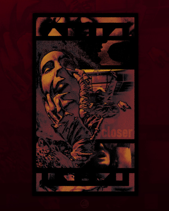


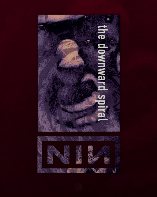

HALO 8 - 30th Anniversary
Another set of psuedo-90's-retro designs to acknowledge the thirtieth birthday of The Downward Spiral.
I wasn't old enough to experience this album new, but instead found it sometime in my early twenties. After listening to it so many times, you memorize an album front to back and it gets into your blood.
Then not listening to it for years, and reapproaching it again is like a reminder of where and what you were, but also gives you fresh ears to appreciate its inherent qualities.
It's an album that stands out amongst it's peers and reaches out into the future, if only because it didn't get trapped by anything "contemporary" by its decade. It's still caustic, dramatic, grating, but also meloncholy, grounded in an internal struggle, an existential war with God and Self. Maybe I'm projecting.
Anyways, the design goal was to keep with the era, and make some designs that could have feasibly been released in 1994, with some fun easter eggs. Here's to another 30, when I'll be approaching 64.
Grab them over on tsuchiman.redbubble.com
#nineinchnails#music#design#graphicdesign#90s#grunge#industrial#industrialmusic#nothingrecords#trentreznor#rivethead
19 notes
·
View notes
Text


THE FAT OF THE LAND
///
Trying out some design ideas for one of my favorite albums, which turned 25 years old (in 2022! I'm late to the party!) This album was engrained into me when it came out in 97, that's what you get for having X-gen parents.
These were fun to make and I plan on making some more designs exploring this aesthetic with a few other bands.
Grab it all here
#theprodigy#theprodigymerch#graphicdesign#appareldesign#music#electronicmusic#DJ#basshead#thefatoftheland#1997#firestarter
11 notes
·
View notes
Text
instagram
TFW Paul Pope reposts your (fan)art to his own insta 🤩
"Bespin/2018 Happy 4th #starwars a 3pg private commission I did via @felixcomicart focusing on the sword fight between Luke and Vader from #ESB #empirestrikesback //colors Dustin Kraus //I gave Vader thigh thigh boots as a nod to @iamphilippedruillet whose comics were an inspiration for the visuals of the franchise #maythe4thbewithyou #lisp @starwars"
4 notes
·
View notes
Text
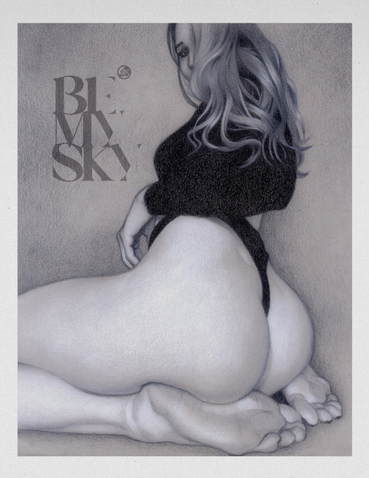
BEMYSKY // bemysky.tumblr.com
28 notes
·
View notes
Photo

HERO
8 notes
·
View notes

Photo

RUST
5 notes
·
View notes
Video
tumblr
AMURO process
3 notes
·
View notes
Photo

AMURO
A follow up DnD character: my warforged druid named Amuro.
4 notes
·
View notes
Photo

DRAGONBOI
11 notes
·
View notes
Photo

Celestial Peace
0 notes
Link
“Art must be protected. First, art is a counterforce against nihilism. It’s only through art that we can value something without a notion of utility. Corot’s landscapes can’t be strolled through, nor can we stand with Liberté in Delacroix’s famous scene, but we cherish these works nonetheless.
Placed in direct contact with beauty, uselessness becomes genius. In the increasingly soulless world of urban gentry and technology, the idea of genius provokes scorn. But even an atheist like myself requires spiritual sustenance. Caravaggio’s portraits and Raphael’s frescoes provide that sustenance.
It is also through art that we can realize human potential. As the late Roger Scruton eloquently explained, through art the “human need for form triumphs over the randomness of objects.” The inability to recognize this is a symptom of a larger ailment of our times: the inability to be reverent about anything.“
3 notes
·
View notes


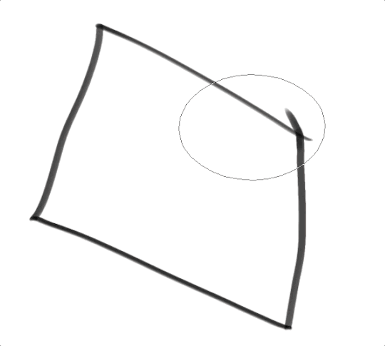
Text
Anti-Aliasing in Clip Studio Paint
Okay, so today I want to talk about anti-aliasing in CSP because it’s kind of a lifesaver?
But also I have a super hard time remembering how to do it or that it exists so here we go.
Basically, anti-aliasing helps you color line art without going outside the lines. Here’s a gif of me coloring with my mouse so you can kind of get an idea of what it is we’re talkin’ about here:
So how do we do that?
First, select your line-art or sketch layer in the layer panel of CSP. Click on the little lighthouse icon at the top of the panel. When you click off there should be a little lighthouse on the side of your line-art layer! This icon means that is now a reference layer!
Step2:
Go into your brush settings and click Anti-overflow! Click “Do not exceed reference layer” to make it work, tweak the other settings till you’re happy. These are the settings I used in the example below to get a cleaner coloring style
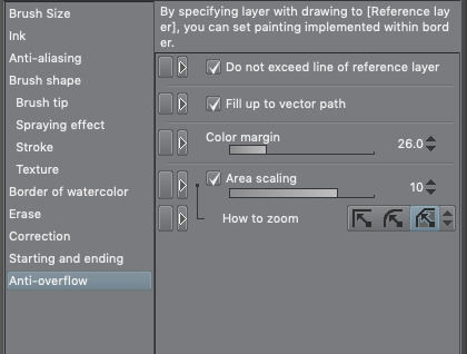
Step 3:
Add another normal layer below you line art! Make sure it’s selected and color away! Here’s what it looks like with the settings above:
15K notes
·
View notes
Photo

When you tell someone you’re an animator.. #Animation
135 notes
·
View notes
Text
me whenever a drawing doesnt go my way: that’s it. i lost all talent. i’m no longer able to make art. i peaked. this is it. this is the end of days
329K notes
·
View notes