#tableau dataviz
Explore tagged Tumblr posts
Visit Tumblr Blog
Explore Tumblr blogs with no restrictions, modern design and the best experience.
Last Seen Tumblr Blogs


Fun Fact
Tumblr was acquired by Yahoo for $1.1B in 2013.
Text
youtube
New to data visualization? 📊 This beginner-friendly Tableau YouTube tutorial guides you through connecting data sources, creating interactive charts, and uncovering insights. Ideal for students and aspiring analysts crafting compelling visual stories!
0 notes
Text

Tableau Developer Salary in India
0 notes
Text
Industry-Leading Visualization with Tableau Data Visualization

1. User-Friendly Interface: The intuitive design allows anyone to easily start visualizing data.
2. Seamless Integration: Connects easily with various data sources for efficient analysis.
3. Quick Insights: Generate actionable insights within minutes.
4. Integrated Collaboration Tools: Share dashboards and insights with your team effortlessly.
5. Regular Updates: Tableau continuously evolves with new features and improvements.
Want to take your skills to the next level? Join our 1-day Tableau Bootcamp on 2nd November (Online)!
#tableau#tableau software#data visualization#data visualisation#dataviz#software#technology#cavillion#cavillion learning#data analytics#data#tableau online training#tableaudesktop#tableau dashboard#big data#business analytics#data analysis#data science#tableau course#salesforce#Tableau Tutorial#Tableau Visualization#Tableau Training#learn tableau#tableau certification#Tableau Visualisation
1 note
·
View note
Text

Data visualization tools transform data into graphical representations, making complex information easier to understand and analyze. Popular tools include Tableau, Power BI, and D3.js.
1 note
·
View note
Text
Hey everyone! 🌟 Just dived into the world of Tableau Bridge, and it's a game-changer! It's like having a magic key to unlock all the data in the cloud, making decisions faster and smarter. Who else loves making life easier and more efficient? Let's chat about it! 💬✨
1 note
·
View note
Text

Tableau, a visual analytics platform, revolutionizes problem-solving with data by transforming how we analyze and interpret information.
Stay tuned for the next post!
know more: https://www.analyticsshiksha.com
#Tableau#TableauTips#VisualizeWithData#TableauMagic#DataViz#AnalyticsExcellence#TableauTrends#DataDrivenDecisions#super30#artofproblemsolving#analyticsshiksha#checkyoureligibilty#super30dataanalyticsprogram#datascience#dataanalytics#datasciencecourse#dataanalyticscourse#datasciencejobs#datanalyticsjobs#only30slots#InformationTechnology#TechInnovation#DataManagement#programming#DataProcessing#SuccessStories#ProblemSolving
0 notes
Text
Tableau: Display Top N & Bottom N Customers using FIRST() and LAST()
Discover the step-by-step process of displaying both the top n and bottom n customers on a single sheet. Utilize the power of FIRST and LAST functions to efficiently showcase your data and gain valuable insights.
#analyticspro#analytics#dataAnalytics#dataViz#scenario#interview#visualization#vizualization#dashboard#bi#businessintelligence#reporting#tableau#tableaudeveloper#Tableaudesktop#tableauinterview#tableautips#datavisualization#tableaudashboard#bar#chart#topn#top5#bottomn#bottom5#data#first#last#function
0 notes

Photo
This graphic is interesting, but some of the choices made for the visualization are... deceptive.
I want to say, first off, that I am an advocate for justice reform. I believe in restorative justice, and the way our prison system is set up right now encourages recidivism, not rehabilitation.
The issue I have is that the visualization is, on its face, flimsy. Its message might read to prison abolitionists as a stark picture that orange states prioritize prison more than education. It also paints an incomplete picture about the state of criminal justice in purple states. So, in my opinion, the visualization isn't making a clear statement, nor do I think the data is presented cleanly enough to make an actual argument.
Part of the reason that I bring this up is because there's a caveat to the graph that bothers me deeply. The graphic only counts institutions that offer bachelors degrees and there is no clear definition of what counts as a prison for the purpose of the visualization. In my state, there are are certain counties whose community colleges partner with local universities to offer bachelor's degrees on campus. Faculty from that university teach upper division courses, and students neither have to move nor worry about paying exorbitant private tuition elsewhere. That kind of accessibility in education isn't obvious here, despite the importance of those programs to low-income, first-generation students in their community. Furthermore, many of the states in purple have a large number of out of state and international students that travel for college, meaning that the college student population and subsequently, number of colleges, are going to be higher regardless of what the state does about prisons.
Of course, some of this is naturally incomplete because it's only going by one metric only, and that metric is only a count of institutions--not of student populations, not of prison populations, and certainly not of other important metrics like reentry statistics and recidivism.
I had to pull myself off of this soap box because I wanted to dig up data to help support other points I wanted to make. The long and short of it is that not all states publish all data about prisons and the justice system.
Also note: that purple and orange color scheme might be hard to read for those with colorblindness and other forms of visual impairment. This seems to have been made in Tableau, so if you ever use it for something like this, please make sure to switch to the inbuilt colorblind template they have instead.
That's your dataviz diatribe for the week? I guess? Maybe I should just start doing Tableau visualizations in makeover Monday...
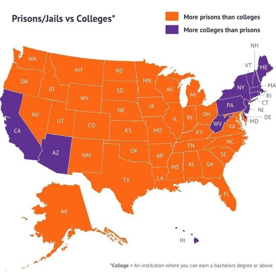
Prisons/Jails vs Colleges - More prisons or more colleges?
39K notes
·
View notes
Text

According to the U.S. Census Bureau, Hispanic Heritage Month encompasses 21 Latin American nations. Among these flags, the primary colors of red, white, and blue collectively account for 80% of the color composition.
Notably, 66% of Argentina, El Salvador, Guatemala, Honduras, and Nicaragua's flags are predominantly blue, while 66% of Peru's flag is characterized by the color red.
Treemap inspired by flagstories.co, a project by Ferdio.
#treemap #tableau #python #colors #color #hues #hue #hispanic #latin #latinamerican #hispanicheritagemonth #flag #flags #latino #latina #southamerica #centralamerica #carribean #datavisualization #dataviz #visualization #graphicdesign #datavizsociety #data #viz #dataanalytics #charts #graphs #infographic #datavisualisation #peru #bolivia #spain #mexico #puertorico #colombia #venezuela #elsalvador #chile #argentina #panama #guatemala #honduras #dominicanrepublic #cuba #costarica #ecuador #equatorialguinea #nicaragua #paraguay #uruguay #tableau #pandas #inforgraphics #analytics #pythonprogramming #pythoncode
0 notes
Photo
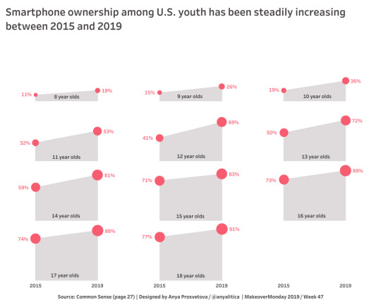
Smartphone ownership among U.S. youth has been steadily increasing between 2015 and 2019
Makeover Monday 2019, week 47
1 note
·
View note
Text
Why Learn Tableau? Here are 5 powerful reasons to get started with this industry-leading tool

1. Industry-Leading Visualization: Transform raw data into stunning visuals!
2. High Demand in Data Analytics: Tableau skills are highly valued in today’s job market.
3. Actionable Insights in Minutes: Make data-driven decisions faster.
4. User-Friendly Interface: Easy to learn, even for beginners.
5. Boost Your Career: Stand out in data roles and advance your career! Want to take your skills to the next level?
Join our 1-day Tableau Bootcamp on 2nd November (Online)!
#tableau#Learn tableau#Tableau Bootcamp#data analytics#data visualization#software#big data#dataviz#technology#cavillion#cavillion learning#data visualisation#tableau dashboard#tableau software#salesforce#data#tableau community#Tableau Developer#business analytics#businessintelligence
0 notes
Photo

Visual Vocabulary - Vega Edition
There are so many ways to visualise data - how do we know which one to pick?
2 notes
·
View notes
Text

Explore the forefront of data visualization with our curated list of the top tools for 2024. Elevate your analyses and presentations with innovative platforms designed for efficiency, clarity, and impact. From industry veterans to cutting-edge newcomers, discover the solutions that will keep you ahead in the data game.
#data visualization#dataviz#datadriven#storytelling#data analytics#data science#tableau#powerbi#looker#getondata
1 note
·
View note
Text
Tableau: Dynamically Switch / Swap Sheets using Parameter
Allow users to switch / swap displayed sheets, visuals or charts within a Tableau dashboard based on their selection using parameters.
#analyticspro#analytics#dataAnalytics#dataViz#visualization#vizualization#dashboard#bi#businessintelligence#reporting#tableaudashboard#tableau#tableaudeveloper#Tableaudesktop#tableauinterview#tableautips#datavisualization#dynamic#switch#swap#line#bar#map#sales#charts#chart#data#sql#parameter#sheets
0 notes
Text

Get your free copy of the checklist I use before I publish my work here: https://maven.com/p/63c8aa
0 notes