
Follow me on my Journey to become a graphic designer as I share content that inspires me, along with tips, tricks, thoughts and teachings from my Visual Communication class.
Don't wanna be here? Send us removal request.
Statistics
We looked inside some of the posts by emmasvisualdiary and here's what we found interesting.
Average Info
Notes Per Post
14
Likes Per Post
14
Reblog Per Post
0
Reply Per Post
0
Time Between Posts
3 days
Number of Posts By Type
Link
3
Photo
7
Video
2
Quote
1
Text
4
Last Seen Tumblr Blogs


Fun Fact
Mobile US users spent an average of 115.8 minutes on Tumblr app monthly.
Link
PORTFOLIOS
Our last lecture on portfolios was really helpful. It’s something I have been putting off because it feels really overwhelming to get started on.
The class helped me realise that I don’t need to be the worlds best designer to start - I should just do it and work with what I’ve got so far. Most successful people end up where they are by blagging their way at the start!
I’ve come across some amazing portfolios recently - the animated ones are really attention-grabbing. I have attached one that I love (her work is incredible), but I do think she went slightly overboard on the ripple effect animation throughout the site. However, I would love to be able to create and design content like this one day. The logo is very clever - I’d hire Julie in a heartbeat!
5 notes
·
View notes
Photo

MOVIE POSTER ANALYSIS
Alien is one of my favourite movies of all time, and the corresponding movie poster does not disappoint. The ‘Alien’ movie was one of the first crossovers between horror and science-fiction ever made, and I think the poster accurately embodies this hybrid.
The chilling caption “In space no one can hear you scream” is visually echoed by the mass of black ‘white space’ surrounding it. This poster uses minimalism to create a powerful impact. The title is simple, yet effective: the tracking is carefully planned to represent isolation and the sheer vastness of space. The sans-serif font employs contrast against the background, and does not distract from the main image. The use of the colour black adds a secondary element of mystery to the already ominous poster, the pressing and most obvious question being: ‘what is in the egg?’. The crack in the egg could represent either rebirth, or the destruction of the planet. I find this ambiguity compelling, and definitely would pay to see this movie in the cinema based on this poster alone.
0 notes
Photo


OPTICAL ILLUSIONS
We covered optical illusions in class - and touched upon how they can affect the shape and size we perceive an image or logo to be.
I noticed that it is also trending when it comes to illustration and typography. Immersive patterns and graphics appear ‘trippy’ and psychedelic, while maintaining a somewhat retro vibe. I am a big fan of the use of this style of typography in poster design, particularly then remaining design and layout of the poster is minimalist.
The first image, names ‘That 70s Flow’ is an optical illusion illustration by Matt W. Moore of MWM Graphics.
The second two experimental typography designs are by London-based graphic designer Andrew Footit.
3 notes
·
View notes
Video
youtube
ILLUSTRATION TYPES - WOODCUTTING
In class this week we also learned about illustration types, techniques and trends. I came across a kind of illustration recently called “woodcutting”, which involves quite a laborious process, but produces beautiful designs.
It actually stems from the Middle Ages, and can be admired in some of the worlds oldest manuscripts. Illustration was one of the main forms of communication then, and used as the type of choice. This video showcases the process which is now modernised and mass-produced, creating wood-carved illustrations from the same master cutting.
This technique embodies contrast, often using dark and bold colours with thick strokes against pale paper, giving an authentic, rougher feel and textured look. This is a technique employed by many contemporary artists today.
0 notes
Quote
"The public is more familiar with bad design than good design. It is, in effect, conditioned to prefer bad design, because that is what it lives with. The new becomes threatening, the old reassuring."
Paul Rand, graphic designer
0 notes
Video
youtube
MOTION GRAPHICS
I thoroughly enjoyed our recent lecture on design trends. Since then I have found myself immersed in motion graphics. With so many different styles and varieties, it’s easy to get lost down a YouTube rabbit hole!
The opening cinematic for Far Cry 6's title sequence is one of the most impressive and immersive experiences I have encountered to date. The use of nature’s elements throughout helps create an entrancing and almost hypnotic experience for the viewer. Although this clip is an action and adrenaline-fueled concept, the smooth transition between scenes and fluid motion of the elements work together and add to the cinematic effect of this trailer. The warm colour palette of fiery reds, oranges and yellows create a further sense of drama and adventure, insinuating danger, excitement, bloodshed, passion and anger.
0 notes
Photo
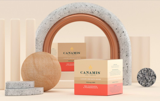
3D DESIGN IN BRANDING & STAGING
Brand Nu, a creative and branding studio at https://www.brandnu.co.uk/, often employ 3D design as part of their branding process.
Having recently learned about 3D design in class, there were a few negative opinions on it, all of which were valid. However, I have a huge soft spot for this trend. When used correctly, this style of design does not have appear playful or as some might say, ‘child-like’. It can be equally elegant and luxurious, it just needs the right balance.
I like the use of 3D design in Brand Nu’s work, because their mixture of mediums, sophisticated colour pallettes and abstract shape combine to create a stage for their client’s products that is laden with class. I would love to learn more about this type of design in branding and graphics, as it really is an impressive asset to add to ones portfolio, in my eyes.
I am using a 3D program called Blender in my Animation Class. It seems quite complicated so far. I think I will give Adobe Dimension a shot over the summer before I try this in Blender!
0 notes
Photo


ABSTRACT SHAPE IN DESIGN
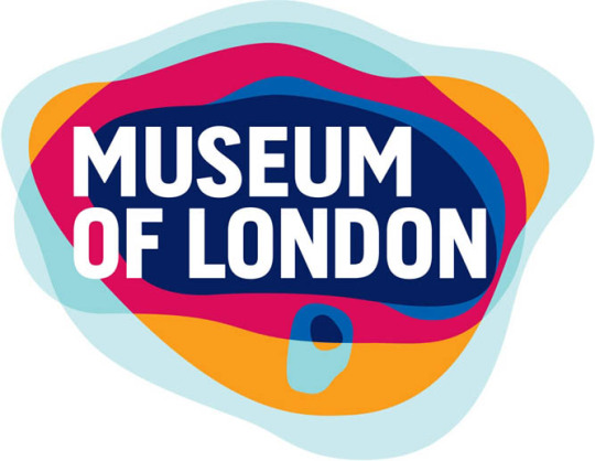
During our lecture on logo design, the “Museum of London” logo really stood out to me. I have since noticed a trend in using these organic shapes in design. When browsing through Wallpaper Magazine this week, I discovered this article dedicated to contemporary rug design.
https://www.wallpaper.com/design/best-colourful-rug-designs
The first rug was designed by creative duo Arati Rao and artist Adam Sipe, who wanted to give the concept “handmade in India” a contemporary twist. Inspired by Indian landscape on their travels, this rug exudes Indian desert, stone, sand and sun. I love the use of negative space in this design, and mixture of chic grey’s with warm tones of dusty sandstone and faded yellow.
The second design is by artist and architect Roula Salamoun, who’s creation was inspired by the Nepalese Landscape, as we can see from the pastel, cool-coloured, misshapen strata. Once learning where this inspiration originated, I was instantly transported back to junior cert geography class - this rug definitely has a ‘soil-creep’ vibe to it! I’m huge fan distorted and asymmetrical art, so this is my favourite piece from the collection.
1 note
·
View note
Link
IMAGE FILE FORMATS
Our discussion of image file formats in class was eye opening, so I decided to research the difference between the formats a little more, to reiterate what I learned in class. I found this article helpful alongside our lecture notes!
A few things I learned so far:
• I didn’t know PNG and JPEG had the capacity to produce similar image quality (thanks Dara!). I think from previously using Canva, it has been drilled into my head that PNG = higher quality image format. Good to know.
• All all layers of a JPEG file are flattened, compared to a PNG file.
• I haven’t used TIFF files before, so I couldn’t tell you much about them in the first place. It’s good to know what is permitted on the web, vs. what isn’t compatible though.
• It’s possible to convert RAW images to DNG, which compress the size by up to 20%, but don’t affect the quality of the image.
I’m sure there is plenty more to add - I may edit as learn!
0 notes
Text


KELLOGG’S REBRAND DESIGN
Unfortunately, this artwork was shared with no accreditation, but whoever designed these did an incredible job.
The simple use of slightly dull, organic colour and texture give an impression of wholesome food and sustainability. I like the slightly abstract use of line and design too. This collection of designs has an aura of class in comparison to Kellogg’s current designs, in my opinion.
Although I am fond of this design, would it appeal to their very young and playful target market? I guess this is the importance of good UX in every industry and design aspect - including cereal packaging.
8-year-old me might have disregarded these as boring and unadventurous!
0 notes
Text
I am no graphic designer (yet), but some of these memes are already relatable! I have agreed to design a few logos for friends' start-up companies recently. I took on these projects eagerly, not realising the problems I might encounter when dealing with close friends.
Here is what I learned:
1. Boundaries are harder to set with friends, than with strangers.
2. The term "scope creep" is very, very real.
3. Rejection or criticism is a lot more difficult to swallow, when coming from those near and dear.
4. A small or non-existent budget does not equal lower expectations.
Valuable lessons learned all round, I must admit!
Number 14, though.
2 notes
·
View notes


Photo
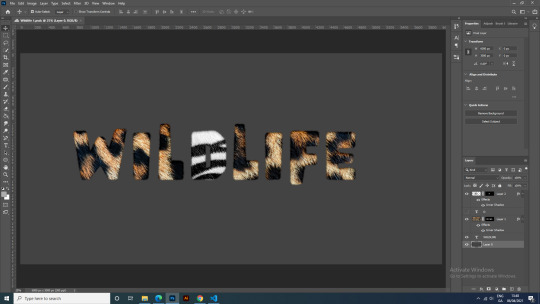

TYPOGRAPHY: CREATING REALISTIC FUR LETTERS
The above is a style I really wanted to incorporate into my recent assignment submission of a typography poster. I believe I have already mentioned my love of animal print! Although I didn’t end up using this design, I did learn a new skill following numerous YouTube tutorials.
My process in Photoshop was as follows:
1. Find an animal print - make it furry.
2. Choose a font (I found the bolder the better).
3. Highlight the text of choice underneath the animal print layer, and make a layer mask (instead of a clipping mask - they t look the same).
4. Either create your own brush, or use a custom brush to add in the hair (I used Crackle in DP brushes).
5. Customise the brush settings to add variation and spacing to the brush, in order to make the fur realistic looking. Name and save the brush.
6. Selecting the layer mask, brush along the path outlining text, after creating a workpath around said text.
7. Repeat as necessary, until you get that furry font!
Very basic steps, but a handy skill to have.
1 note
·
View note
Link
BRAND GUIDELINES
Following a very interesting lecture dedicated to branding and brand guidelines, I decided to do a little investigating, as this is a field I would be interested in perusing as part of my career.
I came across this stunning set of guidelines, that was produced by a branding studio (no surprise there!). The contrasting colours remind me of the palette I chose for my poster, so perhaps I am somewhat biased, but it the alluring illustrations that really captivated me. I would trust this company with my brand.
I like the use of info-graphics, and mix of mediums / platforms. It showcases the brands capabilities, and is in no way mundane, for a set of guidelines.
0 notes
Photo

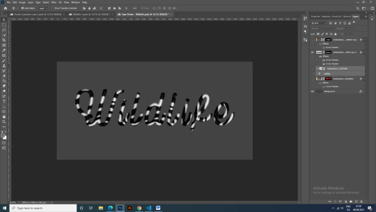
ASSIGNMENT REFLECTION
I had a typography poster assignment due recently - here is the final product. I wanted to reflect on a few key valuable lessons I learned from this project:
• The power of contrast. I had no idea so many elements of design require contrast. Only when I compared different versions of this poster on various artboards, did I appreciate the true power of contrast.
• Warping text can be effective - when used correctly, and with meaning. I like the look of warped text within an illustration - it relays a message and has purpose. Simply warping a heading for the sake of using the tool does not create the same impact.
• I learned a lot about alignment, and the various uses of it within poster production. It’s not as straight forward as it looks! I spent more time on alignment than any other feature of this poster.
• The importance of layers, and arranging them in an organised fashion. This helped immensely. My layers panel was a mess at the beginning of this project. Using folders and labels made my life so much easier for the remainding duration of the project.
• Colour use is not straight forward either. Plattes I had originally had in mind took the emphasis away from the heading. Similarly, I found an overly textured or detailed heading was illegible.
These were the main lessons I took away from creating a poster as a beginner on Adobe Photoshop.
1 note
·
View note
Text

PLAY ON WORDS
Resident Evil has always released a new logo with each edition. Today, There are 9 in total (is what I'm told - I'm no gamer!). The designs have always stood out to me as being clever and dystopian - the game does involve strategic survival against zombies.
The logos are mainly wordmark (some offering a combination), and full of volume and drama. The release of Resident Evil 7 and 8 are my favourites,as they do not use a seperate number to denote the edition. Instead they elude to the version through isolating Roman Numerals within the body of text.
The shattered, distorted effect through the text signifies unease, danger and adds a sense of mystery.
0 notes
Photo


“BOOK OF IDEAS” by Radim Malinic
I am strongly recommending this book, which is a journal about creativity and graphic design. It is an honest reflection on the trials and tribulations of the creative industry, and offers insight on improving your creative thought process.
What I love most about this book, are the beautiful colours and unique graphics throughout: there are 3D models and backdrops, stunning typography designs, logo designs and many branding ideas, to name but a few.
Some of the topics Mr. Malinic addresses are;
• Self-doubt in the creative world
• Rewiring your brain & brain fog
• Self-promotion and making ideas come to life
• Finding meaning in your work and making ideas come to life
• Discovering and developing a creative style
I highly recommend this book for anyone hoping to kick-start their creative career, or find some new inspiration.
1 note
·
View note