Text


Here is the finished copy of the page I’ve been obsessing over in the last few days! It’s page 11 from The Universal Penman, a letter from Joseph Champion to George Bickham, August 8, 1733. I just wrote the actual letter, not the excessively flourished header, date and signature. I tried to copy every detail, every ligature, letter form and flourish as accurate as possible (without penciling first – I just used a line grid). As mentioned in one of my previous posts on Insta, the size is a bit bigger than in the book – I scaled the x-height up from 2 mm (1/12 inches) to 3 mm (1/8 inches).
My lines tended to get a bit wider proportionally than in Champion’s original – so I had to cheat a little and invent some more flourishes for the line-fillers between the second and third paragraph ;).
There are of course some bloopers. I am not happy with the T that starts the second paragraph – the swashes aren’t as nicely balanced as in the original. The exit flourish of the capital N in the same line should be higher to balance the other flourishes in this area. There are some bigger words within the text that are written in Round Hand (‘New Copy Book’ and ‘Mr. Charles Snell‘) that I had difficulties with – switching from the narrower, lighter and shorter Running Hand style to the bolder Round Hand proved challenging.
There are some more – but overall I am quite happy with the outcome of this practice / study and look forward to write some texts without an original to copy!
#calligraphy#federflugcalligraphy#kalligrafie#flourishforum#caligrafía#bickham#universalpenman#englishroundhand#englishrunninghand#pointedpencalligraphy
15 notes
·
View notes
Photo

I had a wonderful time yesterday teaching Kurrent script in the style of the late 1700s, early 1800s to roughly 25 people in the Berlin State Library! Thanks so much for inviting me, @staatsbibliothek_zu_berlin, and thanks to everyone for coming ☺️! :: #calligraphy #handwriting #handschrift #kalligrafie #etahoffmann #etahoffmannexhibition #unheimlichfantastisch #kurrentscript #kurrentschrift #calligraphyworkshop #handwritingworkshop #staatsbibliothekzuberlin #flourishforum #federflugcalligraphy https://www.instagram.com/p/CjNLR4sD_mh/?igshid=NGJjMDIxMWI=
#calligraphy#handwriting#handschrift#kalligrafie#etahoffmann#etahoffmannexhibition#unheimlichfantastisch#kurrentscript#kurrentschrift#calligraphyworkshop#handwritingworkshop#staatsbibliothekzuberlin#flourishforum#federflugcalligraphy
19 notes
·
View notes
Photo
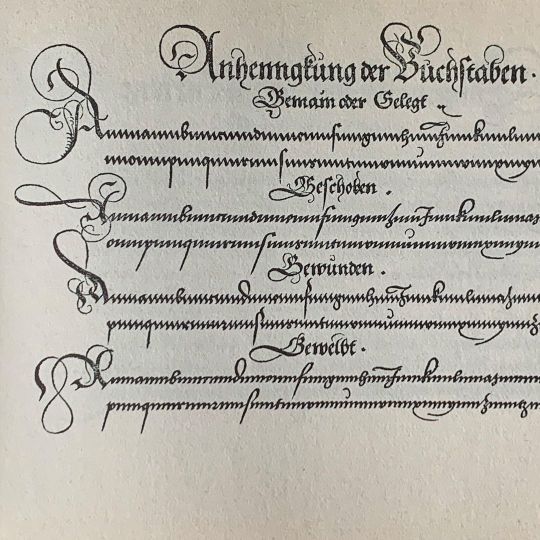
Update zu meinen Kurrent-Workshops: Es gibt wohl doch wieder ein paar freie Plätze, da die Teilnehmerzahl erhöht wurde. Weitere Infos unter https://blog.sbb.berlin/termin/hoffmann-workshop-1-10-22-1/ :: Historisches Beispiel im Bild aus Fuggers »Nutzlich und wohlgegrundt Formular …« von 1553 #kalligrafie #calligraphy #kurrent #kurrentscript #kurrentschrift #calligraphyworkshop #handwriting #handschrift #script #schreibschrift #flourishforum #federflugcalligraphy https://www.instagram.com/p/CjII2lnD2JB/?igshid=NGJjMDIxMWI=
#kalligrafie#calligraphy#kurrent#kurrentscript#kurrentschrift#calligraphyworkshop#handwriting#handschrift#script#schreibschrift#flourishforum#federflugcalligraphy
12 notes
·
View notes
Photo
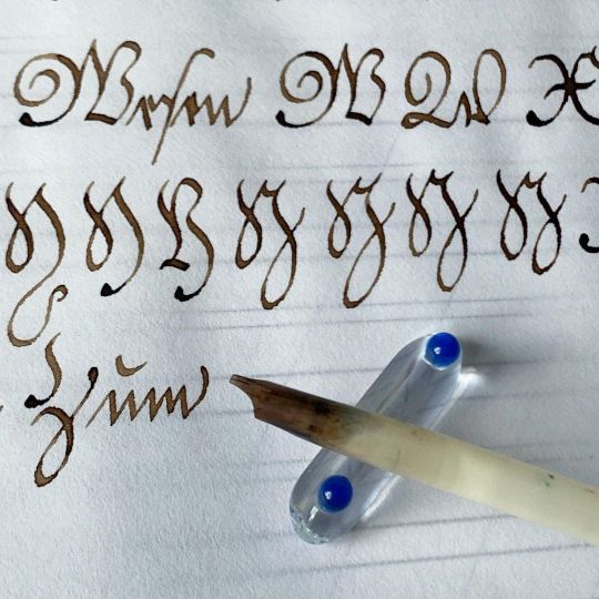
Neugierig auf Kurrentschrift? Am 1. Oktober gebe ich einen Schnupperkurs zum Thema, und zwar in der Staatsbibliothek zu Berlin im Rahmen der Ausstellung »Unheimlich Fantastisch – E.T.A. Hoffmann 2022«. Es gibt zwei Termine, einmal um 12:30 und einen um 15:30. Und es gibt noch freie Plätze – und der Kurs ist kostenlos :)! Anmeldung unter dem Link im Profil. :: Bei der Gelegenheit werde ich auch ein bisschen was zur komplizierten Geschichte der gebrochenen Schriften in Deutschland erzählen – aber hauptsächlich wird es ganz konkret um die Kurrentschrift, beruhend auf Beispielen aus dem 18. Jahrhundert, gehen – und es wird mit dem Gänsekiel geschrieben! :: Die Hausbeschriftungen mit verschiedenen gotischen Schrifttypen sind übrigens Fundstücke aus Basel und dem Berner Oberland. :: #calligraphy #kalligrafie #handschrift #handwriting #kurrent #kurrentschrift #kurrentscript #calligraphyworkshop #staatsbibliothekzuberlin #unheimlichfantastisch #etahoffmann #flourishforum #federflugcalligraphy https://www.instagram.com/p/CigGOkOjVrk/?igshid=NGJjMDIxMWI=
#calligraphy#kalligrafie#handschrift#handwriting#kurrent#kurrentschrift#kurrentscript#calligraphyworkshop#staatsbibliothekzuberlin#unheimlichfantastisch#etahoffmann#flourishforum#federflugcalligraphy
6 notes
·
View notes
Photo

Vielen Dank an Andreas und Matthias, die mich in schöner, spätsommerlicher Atmosphäre in einer Jurte im @nomadenland.offiziell ausführlich zum Thema Kalligrafie, wie ich dazu kam und so weiter interviewt haben! Den Link zum Podcast könnt Ihr unter @jurtegespraeche finden. :: #calligraphy #kalligraphie #kalligrafie #kalligrafieinterview #nomadenlandpotsdam #potsdam #federflugcalligraphy https://www.instagram.com/p/CiDq_HoDCqJ/?igshid=NGJjMDIxMWI=
#calligraphy#kalligraphie#kalligrafie#kalligrafieinterview#nomadenlandpotsdam#potsdam#federflugcalligraphy
3 notes
·
View notes
Photo

Finally invested in a pair of work glasses – money well spent! It’s so much more comfortable to write when I don’t have to hunch over the table for close-up stuff … I tried some years ago, but I guess they were just not very well adjusted to my specific needs. This time they work wonderfully! Btw I’m studying here some German Kurrent scripts from the 18th century – nothing beats a quill for broad pen writing if you ask me ☺️ … :: #calligraphy #kalligrafie #kurrentscript #kurrentschrift #quill #federkiel #handwriting #handschrift #flourishforum #federflugcalligraphy https://www.instagram.com/p/Cfjs-zUjmYk/?igshid=NGJjMDIxMWI=
#calligraphy#kalligrafie#kurrentscript#kurrentschrift#quill#federkiel#handwriting#handschrift#flourishforum#federflugcalligraphy
6 notes
·
View notes
Photo
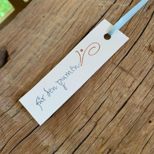
More Roman Cursive – that’s a throwback to last autumn, I made several of these as gift tags … and swipe if you want to get a look at our quince tree in bloom, I guess it’s the latest fruit tree here in the North …? So beautiful. Last year we only had three actual fruits to harvest, so hopefully, there seem to grow many more this year! #calligraphy #kalligrafie #kalligraphie #caligrafia #caligrafía #calligraphie #romanmonoline #lettering #romancursive #typographyrelated #watercolors #aquarellfarbe #aquarellfarben #schmincke #horadam #horadamaquarell #calligraphypractice #letterlove #handwriting #gifttag #handmade #handmadegifttag #geschenkanhänger #quince #quitte #handgemacht #madewithlove #handschrift #flourishforum #federflugcalligraphy https://www.instagram.com/p/CdwT2eYDX4z/?igshid=NGJjMDIxMWI=
#calligraphy#kalligrafie#kalligraphie#caligrafia#caligrafía#calligraphie#romanmonoline#lettering#romancursive#typographyrelated#watercolors#aquarellfarbe#aquarellfarben#schmincke#horadam#horadamaquarell#calligraphypractice#letterlove#handwriting#gifttag#handmade#handmadegifttag#geschenkanhänger#quince#quitte#handgemacht#madewithlove#handschrift#flourishforum#federflugcalligraphy
3 notes
·
View notes
Photo
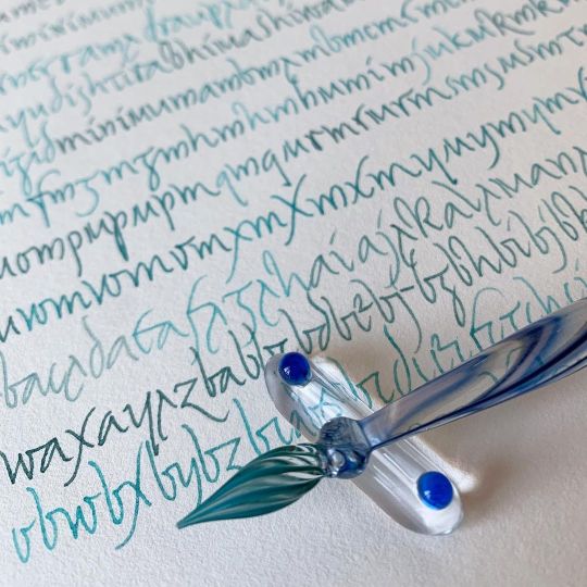
A personal interpretation of Roman minuscule cursive I’ve been working on – on and off – in the last few months. It’s inspired by versions from @julien_chazal and #gottfriedpott, as well as from contemporary examples. As these are pretty wild I feel there is no “historically accurate” version of this script – that was before writing manuals with a fixed version of an everyday script were created! It’s fun to try around with that and develop my own more formal version. Also writing with a glass pen is always relaxing, and I do have a soft spot for monoline writing … :: #calligraphy #kalligrafie #kalligraphie #monoline #romancursive #miniscule #glasspen #watercolors #schmincke #schminckewatercolor #glasfeder #aquarellfarben #flourishforum #federflugcalligraphy https://www.instagram.com/p/CdTPNUUDfmI/?igshid=NGJjMDIxMWI=
#gottfriedpott#calligraphy#kalligrafie#kalligraphie#monoline#romancursive#miniscule#glasspen#watercolors#schmincke#schminckewatercolor#glasfeder#aquarellfarben#flourishforum#federflugcalligraphy
10 notes
·
View notes
Photo

My portable studio – 100% hand stitched by me. I designed it to be fit to put some longer oblique pens in it, and it was also important to me to include a pocket for ink towels (I use old cotton or linen). I try to avoid plastic, but for carrying inks in small containers it feels safer to use a plastic bag … my walnut ink goes in a slightly bigger glass that contained some medicinal stuff before 😅. Still missing is something to keep the roll closed – I haven’t decided what kind of cord or string I’m going to use. Weird mistake: the embroidery would have been much better placed on the top part. Well, you never stop learning … have a relaxed Sunday everyone. We had a quiet family week as there was a school holiday. Lots of rain, fire building, reading, baking, games, calligraphy research, and, well, stitching … #calligraphy #kalligraphie #kalligrafie #caligrafia #calligraphytools #handstitched #handsewn #vonhandgenäht #penroll #calligraphytoolsofthetrade #calligraphystuff #calligraphybooks #kalligrafiematerialen #handschrift #handwriting #flourishforum #federflugcalligraphy https://www.instagram.com/p/CZpzjEjg62Q/?utm_medium=tumblr
#calligraphy#kalligraphie#kalligrafie#caligrafia#calligraphytools#handstitched#handsewn#vonhandgenäht#penroll#calligraphytoolsofthetrade#calligraphystuff#calligraphybooks#kalligrafiematerialen#handschrift#handwriting#flourishforum#federflugcalligraphy
5 notes
·
View notes
Photo

I haven’t been posting for a while (for a myriad of reasons) … the text above is from the appeal by Greta Thunberg and her fellow climate activists Vanessa Nakate, Dominika Lasota, and Mitzi Tan to ask world leaders to to face up to the climate emergency. You might check also @avaaz_org for more information and actions. You’ll find the link to the petition this week in my profile – maybe you’ll consider signing this too? :: Like my dear colleague @allthingsletters I’ve been thinking for a while about how to use my IG posts for more than showing you pretty writing. There are some things that are very dear to my heart besides calligraphy, and I will talk about or link to them here from time to time. — If that is something you’d like to see more often, let me know! :: Regarding the script: This is another round of practice with Archaic Latin Capitals – well, my personal interpretation. But they existed in many different forms anyhow, and I guess no old Romans will show up to complain they're not accurate … I wrote on scraps of beautiful @archespapers watercolor paper (hot pressed) – leftovers from a previous project, using a glass pen and four different hues of supergranulating colours by @schmincke_official. #calligraphy #avaaz #kalligraphie #kalligrafie #caligrafia #savetheclimate #unclimatechange #climatechange #climateaction #climatecrisis #climateemergency #archaiclatin #capitals #romancapitals https://www.instagram.com/p/CWL-8KMN4bI/?utm_medium=tumblr
#calligraphy#avaaz#kalligraphie#kalligrafie#caligrafia#savetheclimate#unclimatechange#climatechange#climateaction#climatecrisis#climateemergency#archaiclatin#capitals#romancapitals
3 notes
·
View notes
Photo

When your husband asks you to write a Thank You letter for a retiring colleague because he thinks your handwriting is prettier 😅 (that’s not my handwriting – and of course he knows that 😉. But it’s relatively quickly written with a fountain pen, much faster than with a pointed dip nib …). And I just saw that today is apparently #worldletterwritingday – so how fitting is that ☺️. :: #calligraphy #kalligraphie #kalligrafie #caligrafia #calligrafriends #capitals #majuscules #copperplate #anglaise #monoline #fountainpen #englischeschreibschrift #flourishedcapitals #flourishes #calligralove #historicalscripts #calligraphypractice #letterlove #18thcenturypenmanship #letterwriting #briefschreiben #tagdesbriefes #letterwritingday #tagdesbriefeschreibens #calligraphynote #dankesagen #sayingthanks #flourishforum #federflugcalligraphy https://www.instagram.com/p/CTReHYQDxiO/?utm_medium=tumblr
#worldletterwritingday#calligraphy#kalligraphie#kalligrafie#caligrafia#calligrafriends#capitals#majuscules#copperplate#anglaise#monoline#fountainpen#englischeschreibschrift#flourishedcapitals#flourishes#calligralove#historicalscripts#calligraphypractice#letterlove#18thcenturypenmanship#letterwriting#briefschreiben#tagdesbriefes#letterwritingday#tagdesbriefeschreibens#calligraphynote#dankesagen#sayingthanks#flourishforum#federflugcalligraphy
9 notes
·
View notes
Photo
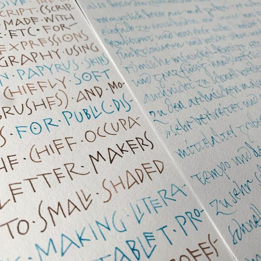
Recently, I’ve been down some fascinating research and experimenting rabbit holes with father Catich’s wonderful book »The Origin Of The Serif«, a must-read for understanding the Latin alphabet and its history a bit better and more in depth. The archaic monoline Roman Capitals that are still very close to its Graeco-Phoenician-Etruscan predecessors are such a joy to write with a glass pen and some watercolors! Tried my hand also on Roman Cursive Minuscules based on Gottfried Pott’s (#gottfriedpott) and @julien_chazal’s versions. #calligraphy #kalligrafie #kalligraphie #caligrafia #caligrafía #calligraphie #archaiclatin #romancapitals #romanmonoline #romancursive #fathercatich #originoftheserif #lettering #typographyrelated #watercolors #aquarellfarbe #aquarellfarben #schmincke #horadam #horadamaquarell #calligraphypractice #letterlove #handwriting #handschrift #flourishforum #federflugcalligraphy https://www.instagram.com/p/CTKv-pWDzjm/?utm_medium=tumblr
#gottfriedpott#calligraphy#kalligrafie#kalligraphie#caligrafia#caligrafía#calligraphie#archaiclatin#romancapitals#romanmonoline#romancursive#fathercatich#originoftheserif#lettering#typographyrelated#watercolors#aquarellfarbe#aquarellfarben#schmincke#horadam#horadamaquarell#calligraphypractice#letterlove#handwriting#handschrift#flourishforum#federflugcalligraphy
18 notes
·
View notes
Photo

Embroidered monogram I made some months ago on super fine cotton batiste … it was so flimsy I had trouble making smooth curves and nice dense lines! But a decent enough result for a little private project. And as it’s quite hot today here, maybe you also enjoy some pics of the glorious winter days back when I created this … And thanks to @_ch_is_art_o_ who’s fantastic work reminded me today of that little monogram! :: #calligraphy #kalligrafie #kalligraphie #caligrafia #caligrafía #calligraphie #embroidery #embroider #embroidered #monogram #embroideredmonogram #embroiderymonogram #cotton #batiste #batist #embroideryonbatiste #flourishforum #federflugcalligraphy https://www.instagram.com/p/CQELiIZgtTm/?utm_medium=tumblr
#calligraphy#kalligrafie#kalligraphie#caligrafia#caligrafía#calligraphie#embroidery#embroider#embroidered#monogram#embroideredmonogram#embroiderymonogram#cotton#batiste#batist#embroideryonbatiste#flourishforum#federflugcalligraphy
3 notes
·
View notes
Photo
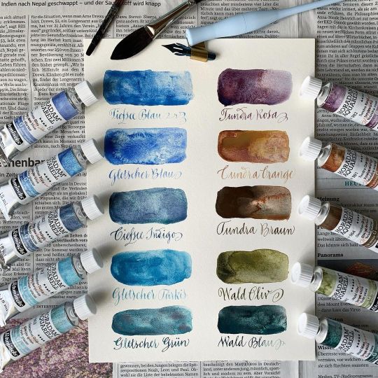
Something a bit different today – I used to do A LOT of watercolor painting in my youth (I learned most of the basics from my father, he was quite good at it and today I treasure his color sets and brushes). I also like watercolor for writing and I’m not sure why I don’t use them more often – the subtle variations in color hues can look so charming. Probably because I’m not the biggest fan of loading nibs with a brush, which is a must if I use watercolor pans (which are what I’ve been using, again, since my teens). :: When I recently saw the granulating watercolors by @schmincke_official, I was pretty hooked – so many interesting blues! They are only available in tubes – and I thought, so I can easily convert them in “dippable” inks like I do with gouache (simply mix an amount of your tube color with water in a small container and just dip away!). I chose a set of blues plus some warm shades to complement them and for mixing neutrals. Here are the first quick color swatches – and for reference, the »Tundra Braun« is actually the »Gletscher Braun« (Glacier Brown, sorry)! :: Regarding how the behave with a pointed pen: in this very quick first test I noticed that some colors worked much better regarding ink control, hair lines etc. – as I’ve seen this happen with gouache too, I guess it depends on the actual pigments how well a color is suited for writing. Pigments that are heavier or less fine are more difficult to work with in my (totally personal and unscientific) experience – the tones that worked better were generally the blues, while the brown was the one that gave the thickest hairlines and was more difficult to control blot-wise … more experimenting to come, I must try this also with other tools – I guess glass pens could do nicely here, or quills. :: And no, it’s not a sponsored post – just a review ☺️! #calligraphy #kalligraphie #kalligrafie #caligrafia #supergranulation #supergranulationwatercolors #colorswatches #watercolorswatches #aquarellfarbe #aquarellfarben #aquarellfarbentest #calligraphywithwatercolors #schmincke #horadam #horadamaquarell #calligraphypractice #letterlove #handwriting #handschrift #flourishforum #federflugcalligraphy https://www.instagram.com/p/CPwUoKRgOUX/?utm_medium=tumblr
#calligraphy#kalligraphie#kalligrafie#caligrafia#supergranulation#supergranulationwatercolors#colorswatches#watercolorswatches#aquarellfarbe#aquarellfarben#aquarellfarbentest#calligraphywithwatercolors#schmincke#horadam#horadamaquarell#calligraphypractice#letterlove#handwriting#handschrift#flourishforum#federflugcalligraphy
3 notes
·
View notes
Photo

More iterations of my pointed pen version of the French Ronde! I particularly like these majuscules with cadeaux-like details (cadels in English? Not sure). Swipe to see some more of them by French master scribe Charles Paillasson (I’m using his »L’art d’écrire« – from 1763 – a lot as a reference book). :: Combining shaded capitals with more or less monoline minuscules is something I borrowed from Spencerian though, it makes for quite quick writing and I like it a lot for personal letters and cards (3d pic). :: Btw while the Ronde was in the 18th century written with a (broad cut) quill, the more elaborate capitals and flourishes were indeed made with a pointed pen (but a quill, of course, as steel nibs were not yet invented – at least not in a quality that made them a valid replacement for bird quills). The little numbers in the 2d pic indicate the recommended penhold – swipe some more to see penhold number two, which is between the regular one (like for normal writing) and what we would call today the flourishing penhold (where the hand pulls away from the body). I’m cheating of course by using an oblique penholder which I prefer for all pointed pen work, and by turning the paper a bit if the direction gets too awkward … but I’ve put a straight penholder on the book in the last pic in hope this makes clear what the author intended to say. :: #calligraphy #kalligraphie #kalligrafie #caligrafia #calligrafriends #capitals #majuscules #flourishedcapitals #flourishes #frenchronde #rondeinspired #calligralove #historicalscripts #schminckegouache #drmartinsbleedproofwhite #calligraphypractice #letterlove #paillasson #masterscribes #lartdecrire #18thcentury #18thcenturycalligraphy #letterwriting #kartenschreiben #snailmail #calligraphysnailmail #sayingthanks #craneandcopaper #flourishforum #federfluegcalligraphy https://www.instagram.com/p/CPdcNOOgW-Y/?utm_medium=tumblr
#calligraphy#kalligraphie#kalligrafie#caligrafia#calligrafriends#capitals#majuscules#flourishedcapitals#flourishes#frenchronde#rondeinspired#calligralove#historicalscripts#schminckegouache#drmartinsbleedproofwhite#calligraphypractice#letterlove#paillasson#masterscribes#lartdecrire#18thcentury#18thcenturycalligraphy#letterwriting#kartenschreiben#snailmail#calligraphysnailmail#sayingthanks#craneandcopaper#flourishforum#federfluegcalligraphy
5 notes
·
View notes
Photo
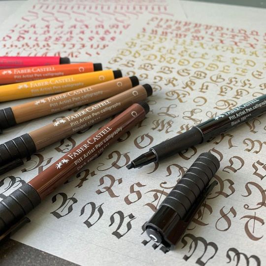
A while ago, @fabercastelldeutschland was so kind to send me their Calligraphy Studio Box in exchange for reviewing it. The box contains 12 lightfast and waterproof calligraphy felt pens with a broad tip (roughly 2 mm) in a range of rather natural shades, here the warmer hues (the colder ones include white, two greys, a blue and a green). I’m by no means an expert in broad pen calligraphy, which makes me maybe a good person to test these! The nice thing about calligraphy felt pens is that you don’t have to hassle with technical problems like ink flow, which nibs to use etc., so they’re very beginner friendly in general. What I find pleasently surprising with the Pitt Artist Pens specifically is that they are really firm and hold their shape quite well. Also you can get nice hairlines for serifs, flourishes etc. by tilting them a bit. So, thanks Faber Castell! I’d love a lighter grey-blue instead of the many brown tones, but that’ just me (if you look around my feed, I do like my light blues …), and maybe a red that is a tad less magenta / pink. But overall – lovely to write with! :: I was practicing Kurrent capitals using an exemplar by master scribe Wolfgang Fugger (1553). You can see that they look *very* similar to Fraktur capitals – as he puts it (roughly translated from German): »The versal or capital letters / are made and varied in different ways / as you can see on the opposite page / you can use them with all Kurrent / Chancery / and Fraktur scripts / but in the larger scripts / as in the Fraktur / you can add flourishes (as shown before) / but in moderation / and as much as the circumstances demand.« — Sometimes I think I like researching script at least as much as writing! :: I tested the pens also on white paper, but I really think they look great on grey – here I used the calligraphy pad by @pascribe! :: #calligraphy #madewithfabercastell #pittartistpencalligraphy #kalligraphie #kalligrafie #caligrafia #gothicscript #kurrentscript #kurrentschrift #gothiccaps #calligraphypen #calligraphypad #pascriberhodiapads #rhodianotebooks #calligraphypractice #kalligrafieüben #calligraphyreview https://www.instagram.com/p/CPYKpZ4An3F/?utm_medium=tumblr
#calligraphy#madewithfabercastell#pittartistpencalligraphy#kalligraphie#kalligrafie#caligrafia#gothicscript#kurrentscript#kurrentschrift#gothiccaps#calligraphypen#calligraphypad#pascriberhodiapads#rhodianotebooks#calligraphypractice#kalligrafieüben#calligraphyreview
4 notes
·
View notes
Photo

Saying »Thank you« with a personal written note is something I try to do every time I get non-digital mail – at the moment I’m catching up with snail mail that is even slower than usual … if you ever wrote to me, I haven’t forgotten. I can’t promise when I’ll answer, but eventually I will! Or send me an angry e-mail 😆, preferably with your current address 😉. — Btw I bought this peacock feather cards, they are not my own design (made by @craneandco) – they just fit perfectly to my studio name: »Federflug« means »flying with feathers« in German. Well, even if this is decidedly NOT a feather suitable for flying. I guess I just chose the cards because they’re soo pretty! :: #calligraphy #kalligraphie #kalligrafie #caligrafia #calligrafriends #smallcaps #frenchronde #calligralove #historicalscripts #calligraphypractice #letterlove #letterwriting #kartenschreiben #snailmail #calligraphysnailmail #sayingthanks #peacockfeather #pfauenfeder #flourishforum #federflugcalligraphy https://www.instagram.com/p/CPQRlX4ANJ4/?utm_medium=tumblr
#calligraphy#kalligraphie#kalligrafie#caligrafia#calligrafriends#smallcaps#frenchronde#calligralove#historicalscripts#calligraphypractice#letterlove#letterwriting#kartenschreiben#snailmail#calligraphysnailmail#sayingthanks#peacockfeather#pfauenfeder#flourishforum#federflugcalligraphy
8 notes
·
View notes