#kurrentscript
Explore tagged Tumblr posts
Visit Tumblr Blog
Explore Tumblr blogs with no restrictions, modern design and the best experience.
Last Seen Tumblr Blogs


Fun Fact
Tumblr has 16.74 million mobile monthly users in the US.
Photo
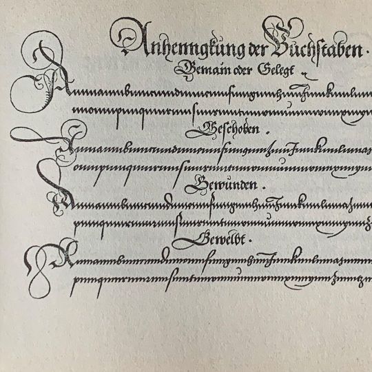
Update zu meinen Kurrent-Workshops: Es gibt wohl doch wieder ein paar freie Plätze, da die Teilnehmerzahl erhöht wurde. Weitere Infos unter https://blog.sbb.berlin/termin/hoffmann-workshop-1-10-22-1/ :: Historisches Beispiel im Bild aus Fuggers »Nutzlich und wohlgegrundt Formular …« von 1553 #kalligrafie #calligraphy #kurrent #kurrentscript #kurrentschrift #calligraphyworkshop #handwriting #handschrift #script #schreibschrift #flourishforum #federflugcalligraphy https://www.instagram.com/p/CjII2lnD2JB/?igshid=NGJjMDIxMWI=
#kalligrafie#calligraphy#kurrent#kurrentscript#kurrentschrift#calligraphyworkshop#handwriting#handschrift#script#schreibschrift#flourishforum#federflugcalligraphy
12 notes
·
View notes
Photo

I had a wonderful time yesterday teaching Kurrent script in the style of the late 1700s, early 1800s to roughly 25 people in the Berlin State Library! Thanks so much for inviting me, @staatsbibliothek_zu_berlin, and thanks to everyone for coming ☺️! :: #calligraphy #handwriting #handschrift #kalligrafie #etahoffmann #etahoffmannexhibition #unheimlichfantastisch #kurrentscript #kurrentschrift #calligraphyworkshop #handwritingworkshop #staatsbibliothekzuberlin #flourishforum #federflugcalligraphy https://www.instagram.com/p/CjNLR4sD_mh/?igshid=NGJjMDIxMWI=
#calligraphy#handwriting#handschrift#kalligrafie#etahoffmann#etahoffmannexhibition#unheimlichfantastisch#kurrentscript#kurrentschrift#calligraphyworkshop#handwritingworkshop#staatsbibliothekzuberlin#flourishforum#federflugcalligraphy
19 notes
·
View notes
Photo

Finally invested in a pair of work glasses – money well spent! It’s so much more comfortable to write when I don’t have to hunch over the table for close-up stuff … I tried some years ago, but I guess they were just not very well adjusted to my specific needs. This time they work wonderfully! Btw I’m studying here some German Kurrent scripts from the 18th century – nothing beats a quill for broad pen writing if you ask me ☺️ … :: #calligraphy #kalligrafie #kurrentscript #kurrentschrift #quill #federkiel #handwriting #handschrift #flourishforum #federflugcalligraphy https://www.instagram.com/p/Cfjs-zUjmYk/?igshid=NGJjMDIxMWI=
#calligraphy#kalligrafie#kurrentscript#kurrentschrift#quill#federkiel#handwriting#handschrift#flourishforum#federflugcalligraphy
6 notes
·
View notes
Photo
Neugierig auf Kurrentschrift? Am 1. Oktober gebe ich einen Schnupperkurs zum Thema, und zwar in der Staatsbibliothek zu Berlin im Rahmen der Ausstellung »Unheimlich Fantastisch – E.T.A. Hoffmann 2022«. Es gibt zwei Termine, einmal um 12:30 und einen um 15:30. Und es gibt noch freie Plätze – und der Kurs ist kostenlos :)! Anmeldung unter dem Link im Profil. :: Bei der Gelegenheit werde ich auch ein bisschen was zur komplizierten Geschichte der gebrochenen Schriften in Deutschland erzählen – aber hauptsächlich wird es ganz konkret um die Kurrentschrift, beruhend auf Beispielen aus dem 18. Jahrhundert, gehen – und es wird mit dem Gänsekiel geschrieben! :: Die Hausbeschriftungen mit verschiedenen gotischen Schrifttypen sind übrigens Fundstücke aus Basel und dem Berner Oberland. :: #calligraphy #kalligrafie #handschrift #handwriting #kurrent #kurrentschrift #kurrentscript #calligraphyworkshop #staatsbibliothekzuberlin #unheimlichfantastisch #etahoffmann #flourishforum #federflugcalligraphy https://www.instagram.com/p/CigGOkOjVrk/?igshid=NGJjMDIxMWI=
#calligraphy#kalligrafie#handschrift#handwriting#kurrent#kurrentschrift#kurrentscript#calligraphyworkshop#staatsbibliothekzuberlin#unheimlichfantastisch#etahoffmann#flourishforum#federflugcalligraphy
6 notes
·
View notes
Photo
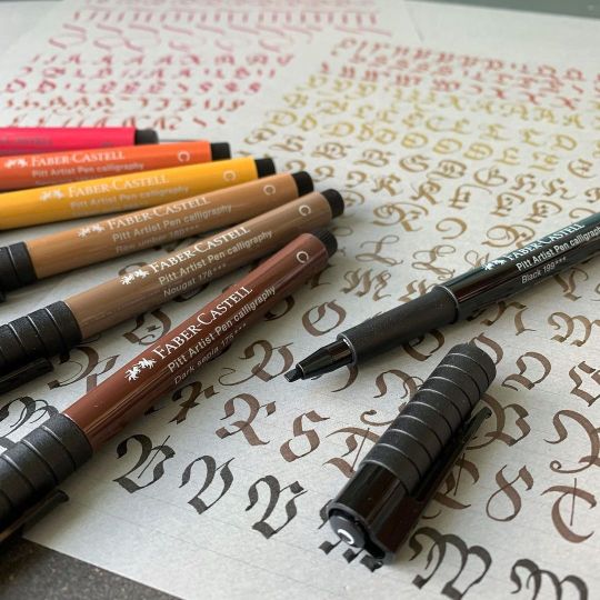
A while ago, @fabercastelldeutschland was so kind to send me their Calligraphy Studio Box in exchange for reviewing it. The box contains 12 lightfast and waterproof calligraphy felt pens with a broad tip (roughly 2 mm) in a range of rather natural shades, here the warmer hues (the colder ones include white, two greys, a blue and a green). I’m by no means an expert in broad pen calligraphy, which makes me maybe a good person to test these! The nice thing about calligraphy felt pens is that you don’t have to hassle with technical problems like ink flow, which nibs to use etc., so they’re very beginner friendly in general. What I find pleasently surprising with the Pitt Artist Pens specifically is that they are really firm and hold their shape quite well. Also you can get nice hairlines for serifs, flourishes etc. by tilting them a bit. So, thanks Faber Castell! I’d love a lighter grey-blue instead of the many brown tones, but that’ just me (if you look around my feed, I do like my light blues …), and maybe a red that is a tad less magenta / pink. But overall – lovely to write with! :: I was practicing Kurrent capitals using an exemplar by master scribe Wolfgang Fugger (1553). You can see that they look *very* similar to Fraktur capitals – as he puts it (roughly translated from German): »The versal or capital letters / are made and varied in different ways / as you can see on the opposite page / you can use them with all Kurrent / Chancery / and Fraktur scripts / but in the larger scripts / as in the Fraktur / you can add flourishes (as shown before) / but in moderation / and as much as the circumstances demand.« — Sometimes I think I like researching script at least as much as writing! :: I tested the pens also on white paper, but I really think they look great on grey – here I used the calligraphy pad by @pascribe! :: #calligraphy #madewithfabercastell #pittartistpencalligraphy #kalligraphie #kalligrafie #caligrafia #gothicscript #kurrentscript #kurrentschrift #gothiccaps #calligraphypen #calligraphypad #pascriberhodiapads #rhodianotebooks #calligraphypractice #kalligrafieüben #calligraphyreview https://www.instagram.com/p/CPYKpZ4An3F/?utm_medium=tumblr
#calligraphy#madewithfabercastell#pittartistpencalligraphy#kalligraphie#kalligrafie#caligrafia#gothicscript#kurrentscript#kurrentschrift#gothiccaps#calligraphypen#calligraphypad#pascriberhodiapads#rhodianotebooks#calligraphypractice#kalligrafieüben#calligraphyreview
4 notes
·
View notes
Photo

Learning something new can be soothing in these weird times! I actually tried my hands at embroidery together with my kids. For your inspiration, here are some more Modern Kurrent practice sheets (that I made actually before everything went in lockdown). You can see many of the minuscules are based on zigzag-like forms, so a »u« and an »n« can only be told apart by context and a sort of reversed lying comma over the u. The majuscules are related with Fraktur forms (I also invented some, or sort of combined them with Roundhand versions, as I did with some of the minuscules where the historical versions are very confusing for modern eyes). More on this in my book (sorry, only in German at the moment), or for a classical 19th century pointed pen Kurrent check the book »Ornamental Calligraphy« by George J. Becker, it has a beautiful exemplar. If you have experience with Copperplate, you should easily learn this! — Hoping you’re all safe and healthy! :: #calligraphy #kalligrafie #kalligraphie #kurrent #kurrentscript #kurrentschrift #modernkurrent #pointedpen #spitzfeder #calligralove #flourishforum #federflugcalligraphy https://www.instagram.com/p/B-ZijVfKxAY/?igshid=16hyxjlauafcg
#calligraphy#kalligrafie#kalligraphie#kurrent#kurrentscript#kurrentschrift#modernkurrent#pointedpen#spitzfeder#calligralove#flourishforum#federflugcalligraphy
15 notes
·
View notes
Video
instagram
Fun exercises in difficult times – a little finishing flourish under an alphabet practice sheet. As I explained in an earlier post about these pages, one of my goals here was writing spontaneously and without guidelines. Quite challenging, as I usually like my guidelines! But after a while I found a nice flow. – Wishing all of you a relaxing and healthy Sunday. #calligraphy #kalligrafie #kalligraphie #pointedpen #spitzfeder #kurrentscript #kurrent #kurrentschrift #flourish #verzierung #handwriting #handschrift #gouache #flourishforum #federflugcalligraphy https://www.instagram.com/p/B-ms7oAKyPF/?igshid=1p39g7vchzp6k
#calligraphy#kalligrafie#kalligraphie#pointedpen#spitzfeder#kurrentscript#kurrent#kurrentschrift#flourish#verzierung#handwriting#handschrift#gouache#flourishforum#federflugcalligraphy
11 notes
·
View notes
Photo

I finally picked up a pen last week after a longer break – I want to work a bit more on my “Modern Kurrent script”, which is an adaption of an historical gothic cursive (that was used over hundreds of years in the German speaking world). I have no intent on perfect historical accuracy – I just want it to look aesthetically pleasing and be more readable than the scripts from the 19th century and earlier. In the video, I start with some oval, loop and spiral drills (need those for the majuscules) and then continue with the basic strokes for the minuscules with the typical zigzag lines. Months ago, I posted some earlier examples too … My other goal here, as you can guess, is writing without guidelines. Kurrent was a true everyday cursive and often written pretty casually. Also, it’s much easier to write without guidelines with a non-slanting script, so I started with that one instead of Copperplate! You can see on the example that I have trouble keeping my lines horizontal – they keep going up on the right side. – Would you be interested in seeing more of this script? I personally find it rather interesting, but it’s hard to tell how you guys see it 😁... :: #calligraphy #kalligraphie #kalligrafie #caligrafia #calligraphie #pointedpen #spitzfeder #kurrent #kurrentscript #kurrentschrift #cursive #kursive #handwriting #handschrift #gothiccursive #gouache #schminckegouache #archesart #flourishforum #federflugcalligraphy https://www.instagram.com/p/B9wWun6qJv2/?igshid=1wvio4v3aucse
#calligraphy#kalligraphie#kalligrafie#caligrafia#calligraphie#pointedpen#spitzfeder#kurrent#kurrentscript#kurrentschrift#cursive#kursive#handwriting#handschrift#gothiccursive#gouache#schminckegouache#archesart#flourishforum#federflugcalligraphy
9 notes
·
View notes
Photo

Today on my desk – variations of upright Kurrent script capitals. That’s an old pet project of mine – trying to modernize a nearly forgotten style of handwriting, but not losing its particular characteristics. I will show and tell more about this in an upcoming project 😉! :: Kurrentschrift fand ich spannend, seit ich als Tenie zum ersten Mal in einem autobiografischen Comic der 2014 verstorbenen Zeichnerin Marie Marcks darauf stieß. Bald erfahrt Ihr mehr über meine modernisierte Spitzfeder-Kurrent, in der ich versuche, einen Kompromiss zwischen Lesbarkeit und historischer Anmutung zu erreichen ... :: #calligraphy #kalligrafie #kalligraphie #gothicscript #gothichandwriting #kurrent #kurrentschrift #kurrentscript #handwriting #handschrift #écriture #calligraphie #blackandwhite #schwarzweiß #flourishforum #federflugcalligraphy https://www.instagram.com/p/B2_jjryg_SU/?igshid=150i1r1xb7fna
#calligraphy#kalligrafie#kalligraphie#gothicscript#gothichandwriting#kurrent#kurrentschrift#kurrentscript#handwriting#handschrift#écriture#calligraphie#blackandwhite#schwarzweiß#flourishforum#federflugcalligraphy
18 notes
·
View notes
Photo

Nicht von mir! Dies ist ein historisches Beispiel für die Englische Schreibschrift von Herr Jäger aus dem Jahr 1856. Freue mich immer über solche Schätze: "Vorlagen deutscher und englischer Schrift". Toll, um Buchstabenvarianten zu studieren! Man beachte das ß in "heißt", das in der Englischen Schrift mit langem und kurzem s geschrieben wird 😯! Den Umschlag und ein Beispiel der deutschen Schrift findet ihr, wenn ihr nach links wischt. Es gibt übrigens noch je einen Platz in meinen Workshops am 10. und 17. März in Berlin! :: Look at this pretty version of English Roundhand by German "Schreiblehrer" (= writing teacher) from 1856! Love such finds to study letter variations … swipe to the left to have a look at the cover and an example of the German handwriting / Kurrent script! #calligraphy #kalligrafie #kalligraphie #handschrift #handwriting #historical #historisch #historicalhandwriting #englischeschreibschrift #englishroundhand #copperplate #anglaise #inglesa #kurrent #kurrentschrift #kurrentscript #flourishforum #federflugcalligraphy
#kalligrafie#kurrentschrift#anglaise#kurrent#federflugcalligraphy#englishroundhand#calligraphy#flourishforum#historicalhandwriting#historical#handschrift#inglesa#kalligraphie#historisch#kurrentscript#englischeschreibschrift#copperplate#handwriting
10 notes
·
View notes
Photo

Ah, and look – here's a glimpse at this letter Santa wrote to my kids 😉! :: Ein Brief vom Weihnachtsmann! #calligraphy #kalligrafie #kalligraphie #caligrafia #kurrentscript #kurrent #kurrentschrift #handwriting #handschrift #script #santaclaus #weihnachtsmann #letter #brief #flourishforum #federflugcalligraphy
#federflugcalligraphy#kurrentschrift#kalligraphie#kalligrafie#kurrent#script#santaclaus#kurrentscript#brief#caligrafia#handschrift#letter#flourishforum#handwriting#weihnachtsmann#calligraphy
8 notes
·
View notes
Photo

One of the most interesting and challenging jobs this year was creating calligraphic illustrations for an ongoing series of essays my husband is writing on Medium. The essays are about design, computers, science and their various interactions. The above was a discarded version for »Bringing Design to Science« – it reads »science design« in a rather weird monoline version of German Kurrent script. To read the essay and see the finished design check the link in my profile to Boris’ Medium site – just today and tomorrow! :: Ich habe dieses Jahr einige Essays meines Mannes mit kalligrafischen Intros versehen – es handelt sich um eine Reihe Artikel auf Medium, die sich mit Design, Computern, Wissenschaft und den vielfältigen Beziehungen und Wechselwirkungen dieser Felder befassen. Heute und morgen verlinke ich von meinem Profil aus direkt auf den Artikel »Bringing Design to Science« – oben seht ihr einen verworfenen Entwurf dafür! #calligraphy #kalligraphie #kalligrafie #science #design #graphicdesign #interfacedesign #kurrent #kurrentschrift #kurrentscript #flourishforum #federflugcalligraphy
#federflugcalligraphy#kurrentscript#flourishforum#design#interfacedesign#kalligraphie#kalligrafie#kurrentschrift#kurrent#graphicdesign#calligraphy#science
3 notes
·
View notes