
F E L I C I T Y Process Journal: Beverage brand concept design. Introduction to Visual Deisgn Principles - Bachelor of Visual Communication Design @ The University of Newcastle.
Don't wanna be here? Send us removal request.
Statistics
We looked inside some of the posts by felicity-desn1011 and here's what we found interesting.
Average Info
Notes Per Post
3
Likes Per Post
3
Reblog Per Post
0
Reply Per Post
0
Time Between Posts
6 days
Number of Posts By Type
Text
13
Photo
4
Last Seen Tumblr Blogs


Fun Fact
1,644 Tumblr posts in 1 second.


Text
W E E K 1 3
A 2 : L A B E L P R O G R E S S
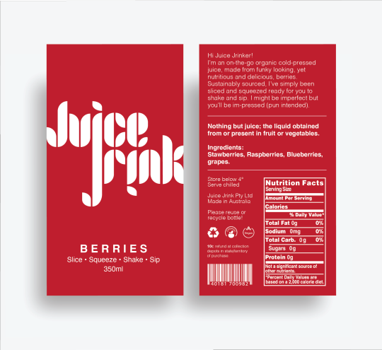
4 flavours: GREEN, ROOTS, FRUITS, BERRIES.
Slogan: SLICE. SQUEEZE. SHAKE. SIP.
Description on the back (greens):
“Hi Juice Jrinker! I'm an on-the-go organic cold-pressed juice, made from funky looking, yet nutritious and delicious, green vegetables. Sustainably sourced, I’ve simply been sliced and squeezed ready for you to shake and sip. I might be imperfect but you'll be im-pressed (pun intended).
Nothing but juice; the liquid obtained from or present in fruit or vegetables. Ingredients: Celery, Cucumber, Spinach, Mint.”
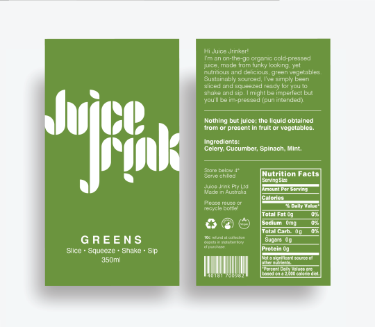


I sourced the free vectors (nutrition facts, barcode, 3 symbols) from www.freepik.com
0 notes
Text
W E E K 1 2
R E P E A T P A T T E R N
*to be uploaded
0 notes
Text
W E E K 1 1
A 2 : M O C K - U P H U N T I N G
Where and why? I found my mock-up juice bottle on ‘Creative Market’ - suggested by my Tutor, Crystian. It cost me $5 for personal use but this website had a larger variety and better quality of mock-ups than the ones I had previously found for free. This wasn’t the style of bottle I originally intended to go for. I chose to display my label on this one as I believe the design best represents my brand identity and the shape stands out more than the average juice bottle. These still need adjusting and I’m yet to finish the back of the label. I would also like to create a more visually appealing background.
https://creativemarket.com/pred_artem/2172823-Juice-Bottle-Mock-Up-7

Draft of applying design to mock-up:


0 notes
Text
W E E K 1 0
L A B E L A N A T O M Y D I A G R A M
I utilised this image of Pressé cold pressed juice to identify key elements of a beverage label.

To be included on my juice label:
Front:
- Brand name/logo
- Net and juice contents
- Flavour/name of drink
- Slogan
Back:
- Description of beverage/brand
- Health claims
- Ingredients list
- Nutritional information table
- Serving and storage instructions
- Country of origin
- Symbols: recycle, organic, vegan, Australian
- Barcode
Bottom:
- Use by date
0 notes
Text
W E E K 1 0
L A B E L I M A G I N G C A S E S T U D Y
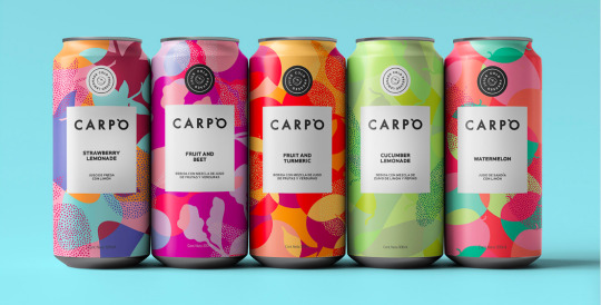


I was drawn to the aesthetically pleasing designs of the brand ‘Capro’. The beautiful, bright and unique patterns as well as it being canned unlike most cold pressed juices, is what caught my eye when scrolling through Behance. The designs for the different flavours are distinct from one another but still cohesive. It inspired me to look at pursuing pattern design for my packaging.
https://www.behance.net/gallery/90736553/CARPO-JUICE?tracking_source=search_projects_recommended%7Cmilk
0 notes
Text
W E E K 9
A 2 : I M A G I N G R E S E A R C H
Updated Pinterest inspiration board:
https://www.pinterest.com.au/felicitybronner/vd-2-typographic/
*The images below were sourced from Bēhance - ww.behance.net

0 notes
Text
W E E K 8
A 2 : LO G O & L A B E L - I D E A S , P L A C E M E N T , S K E T C H E S


I decided to change the name of my brand to ‘Juice Jrink’ to better suit my branding vision. I will also do the juice design in 4 different colours (green, purple, orange and red) and the flavours will be named ‘greens, roots, fruits and berries’.
I expanded my ideas further in Indesign, experimenting with ligatures in the brand name using the letters j and i. I based my logo design on the font ‘Joschmi’ (bottom right corner on ‘type outline’ screenshot below). I manipulated the letters to look somewhat like leaves and decided on the colour to green - these two elements are intended to symbolise natural and health. I did attempt to vectorise my hand-lettering but was not as happy with the result. I want all other text on the packaging to be a sans serif typeface to keep the overall design simple and cohesive. I will be using the famously legible and neutral ‘Helvetica’.
A 2 : L O G O P R O C E S S & V I S U A L D E V E L O P M E N T


0 notes
Text
A 1 : F I N A L R A T I O N A L E S & K E Y W O R D S
V D 1 .
The Juice Co. is a collection of colourful, cold pressed juices made up of organic fruit and vegetables. These drinks double as a health kick and a tasty treat, targeting health conscious consumers on the go. The eco-friendly juices will be bottled in typical clear packaging, utilising the colour of the juice to somewhat identify and differentiate the flavours as well as add vibrancy.
With the idea of ‘less is more’ in mind, visual direction 1 has been created with a modern, minimalistic mood and structured, simplistic style - this design approach translates to minimal ingredients and conveys a clean beverage. Designed to allude quality, I envision a white rectangle paper label, on a rounded and reusable, glass bottle.
With consideration that the fresh juices will be brightly coloured, a completely black and white palette will be utilised with simple, legible fonts for a timeless yet trendy appearance. This technique is not only visually appealing but also less straining on the eyes. It is common for healthy and sustainable beverage brands to opt for these design features to emulate how pure the contents are and the simplicity of the process.
• Minimal
• Modern
• Simple
• Black
• White
• Clear
• Clean
• Fresh
• Healthy
• Eco-friendly
V D 2 .
The Juice Co. is a collection of colourful, cold pressed juices made up of organic fruit and vegetables. These drinks double as a health kick and a tasty treat, targeting health conscious consumers on the go. The eco-friendly juices will be bottled in typical clear packaging, utilising the colour of the juice to somewhat identify and differentiate the flavours as well as add vibrancy.
Visual direction 2 has been created with a fun, fresh feel and soft, simplistic style. I intend to use large, white typography as the focal point of the packaging with a white lid to match. For maximum effect, the design will be printed directly onto the recyclable bottle or a label the same colour as the juice. This is a common theme with juice packaging designs as it stands out on the various colours and is aesthetically pleasing.
All white text was chosen as it is symbolic of cleanliness and purity whereas the transparency of the bottle displays the natural colour and consistency of the liquid. This design will contain minimal content to emulate the raw product with no additives but with a fun and fruity appearance.
◦ Typography
◦ White
◦ Simple
◦ Soft
◦ Fun
◦ Fresh
◦ Organic
◦ Transparent
◦ Eco-friendly
0 notes
Text
W E E K 6 + 7 :
A 1 : P I T C H P R E S E N T A T I O N
What did you try? What worked and what didn’t? What was the biggest challenge in creating your Narrated Pitch Presentation? What advice would you give someone else completing the same task?
To record my mp4, I opted to download Loom onto my MacBook’s desktop and displayed my slides using Indesign in presentation mode. I used my AirPods as the microphone in these captured it better. I knew I had a quiet voice but I felt like I had to almost yell to make sure it was clearly recorded. 😂 I intended to pause it to do in 2 or 4 parts but ended up recording it in one go - it took me a few times to do without messing it up. Although sounding a little less natural, I found the final product came together better when I went off a script. Loom is very user-friendly and I didn’t encounter any major issues, just a couple of little hiccups but overall it was a smooth process. I would advise having a play with the software you intend to use to familiarise yourself with it then do a test run and of-course ensure you're organised with your content.

0 notes
Text

W E E K 5 :
D E S I G N P R O C E S S A D V I C E
“Practice safe design: Use a concept.” – Petrula Vrontikis
There were two reasons I picked this quote.. One, I found it funny (childish, i know) and two, this piece of advice reminds me of how important it is to make up the DNA of your project. Conceptualising is essentially the formation of your ideas and how you intend to solve design ‘problems’ you are presented with as it provides a sense of direction, communicates purpose and aids decision making. Research, take photos, brainstorm, do mind maps, sketch, create mood boards - whatever it is that gets your creative thinking going. So far, I have learnt that the design process is smoother when you go back to basics and develop a concept, leading to a better final product. As they say - better to be safe than sorry!
0 notes
Text

V D 2 : T Y P O G R A P H I C
W E E K 4 + 5
A 1 : M O O D B O A R D S V . 2
To be honest, the majority of the first versions of my mood boards were completed the night before we had to print them out so I wasn’t 100% happy with them.
In the refinement stage, I opted to change most of the images in both boards and add more fonts but remove the labels. I altered Visual Direction 1 to emulate a more black and white, minimalistic mood, toning down the green yet keeping a fresh feel about it. I completely changed my idea for Visual Direction 2 to a fun typographic approach. I also didn’t list fonts in this one as some ideas are displayed in the images and on the beverage packaging.
I also decided on the brand name “The Juice Co.”
V D 1 : M I N I M A L I S T I C

Visual Direction 1: Minimalistic
#mood board#refinement#adobe#indesign#visual direction#beverage#brand#concept#minimalistic#typographic#juice
0 notes
Text

W E E K 3 + 4
A 1 : M O O D B O A R D S V . 1 & F E E D B A C K
This week we printed the first versions of our mood boards to be critiqued in class. I was questioned on the use of green for my first concept - to symbolise health and help create an aesthetically pleasing board (I do not think I would use this colour in my packaging). Labelling the images as well as my use of different fonts and tags to convey the message for the different directions was positively commented on. I also checked out MyFonts, Font Squirrell and Adobe Fonts that were suggested to the class as a good sources for free fonts. Although I received little feedback and it was generally good, I still think there’s plenty of room for improvement. Possible adjustments will include more images of labels/packaging and possibly fonts.

1 note
·
View note
Photo

A 1 : V I S U A L D I R E C T I O N 2
Screenshot of inspiration board created via Pinterest as a visual method.
https://www.pinterest.com.au/felicitybronner/natural/
Draft rationale + key words:
A cold pressed juice made up of purely fruit and vegetables that doubles as a health kick and a tasty treat, targeting health conscious consumers. This visual direction has been created with a natural notion, aiming for a soft, earthy design. I intend to use a more graphic approach with simple imagery or illustrations, using muted colours/earthy tones to convey an organic and eco-friendly beverage. I envision a rounded paper label stuck on the front and back of a reusable glass jar-like bottle.
◦ Natural
◦ Organic
◦ Healthy
◦ Eco-friendly
◦ Soft
◦ Simplistic
◦ Graphic
◦ Muted colours
◦ Earth tones
◦ Patterns
#juice#natural#fun#hippie#yoga#vegan#eco-friednly#colourful#healthy#fruit#sustainable#reusable#recyclable#graphic#graphic design#illustration#earth tones#muted colours
0 notes
Photo

A 1 : V I S U A L D I R E C T I O N 1
Screenshot of inspiration board created via Pinterest as a visual method.
https://www.pinterest.com.au/felicitybronner/vd-2-typographic/
Draft Rationale + Key words:
A cold pressed juice made up of purely fruit and vegetables that doubles as a health kick and a tasty treat, targeting health conscious consumers. This visual direction has been created with a fresh feel, aiming for a simple, sleek design. To convey a clean beverage, I intend to use a more typographic approach with minimal content which translates to minimal ingredients.Taking into consideration juice is often brightly coloured, a completely black and white palette will be utilised for a timeless, contrasting effect. This also makes for an easy read when paired with simple, legible text. To identify the different flavours, the colour of its juice will be written across the middle of the bottle in handwritten script e.g. green. I envision a rectangle paper label for a sharp appearance, stuck on a reusable glass jar-like bottle. As a premium quality juice, this trendy packaging would be stocked in whole-food stores and niche cafes.
• Minimalistic
• Fresh
• Clean
• Healthy
• Black & White
• Simplistic
• Sleek
• Sharp
• Trendy
• Eco-Friendly
#jucie#fresh#clean#minimalism#simplicity#lineart#health#fitness#vegetables#green#modern#eco-friendly#sustainable#typographic#sleek#sharp#black and white
0 notes
Photo
W E E K 3
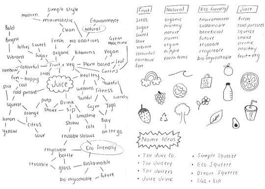
A 1 : B R A I N S T O R M I N G
In the tutorial we started brainstorming ideas for two visual directions for our beverage brand concept. This included mind mapping as well as word and image association which proved to be an effective tool to get the ball rolling for Assessment 1. My chosen beverage is juice, leaning towards a healthy option but I’m yet to decide on a name and visual directions...
I D E A S :
Brand Name: The Juice Company | The Juice Co. | The Juicery | The Juicers | Juice Jrink | SQZ + SIP | Simple Squeeze | Ocean Squeeze | Eco Squeeze
Visual direction: Minimalistic | Simplistic | Typographic | Graphic | Illustrative
Mood: Fresh Feel | Natural Notion | Modern Mood | Vintage Vibes | B&W
#brainstorm#mindmap#wordassociation#imageassociation#ideas#branding#brandconcept#visualdirection#tutorial#pentopaper#juice
1 note
·
View note
Photo

W E E K 2
S K E T C H N O T E B I B L E
During our lecture we were set a doodle challenge! We were instructed to refine our quick illustrations afterwards for our visual library and expand it to create a simple sketch-note bible. This activity was intended to improve our visual vocabulary.
#doodlechallenge#sketchnote#bible#fonts#containers#connectors#pentopaper#lecture#visuallibrary#visualvocabulary#visuallanguage#visualdesign
1 note
·
View note