#visualdirection
Photo
W E E K 3
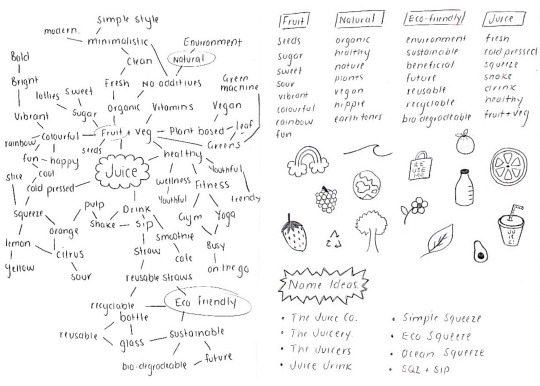
A 1 : B R A I N S T O R M I N G
In the tutorial we started brainstorming ideas for two visual directions for our beverage brand concept. This included mind mapping as well as word and image association which proved to be an effective tool to get the ball rolling for Assessment 1. My chosen beverage is juice, leaning towards a healthy option but I’m yet to decide on a name and visual directions...
I D E A S :
Brand Name: The Juice Company | The Juice Co. | The Juicery | The Juicers | Juice Jrink | SQZ + SIP | Simple Squeeze | Ocean Squeeze | Eco Squeeze
Visual direction: Minimalistic | Simplistic | Typographic | Graphic | Illustrative
Mood: Fresh Feel | Natural Notion | Modern Mood | Vintage Vibes | B&W
#brainstorm#mindmap#wordassociation#imageassociation#ideas#branding#brandconcept#visualdirection#tutorial#pentopaper#juice
1 note
·
View note
Video
instagram
Metropolis Rose Produced by @thearthausgroup Dance Models : @charliwheeler from @thestarfactory_ and @brooklynmetropolis from @jodymarshalldanceco Song : Girl by @jamie___xx #thearthausgroup #agency #australia #productionhouse #creativedirection #choreography #campaigns #brandcampaigns #commercialdance #perthdance #perthdancers #producer #perthcontentcreator #videoshoot #urbanlistperth #perthfashion #perthdesigners #visualdirection #fashion #kingstreetprecinct #perth #perthlabel #jamiexx #girl #ballerinas #beyoncedancers #heelschoreography #heelsdance #dancevideos (at Australia) https://www.instagram.com/p/ByB00r8D9rq/?igshid=1x6fzf3x6lz9b
#thearthausgroup#agency#australia#productionhouse#creativedirection#choreography#campaigns#brandcampaigns#commercialdance#perthdance#perthdancers#producer#perthcontentcreator#videoshoot#urbanlistperth#perthfashion#perthdesigners#visualdirection#fashion#kingstreetprecinct#perth#perthlabel#jamiexx#girl#ballerinas#beyoncedancers#heelschoreography#heelsdance#dancevideos
1 note
·
View note
Photo


PLUSOUPLE
2022
Digital
Art Direction : Munehiro Machida, NSSG Inc.
Design : Haruna Onakahara, NSSG Inc.
Photograph : Koji Honda
Styling : Mari Nagaksa
Web Develop : Masayuki Emi
Client : PLUSOUPLE
–
https://plusouple.jp/
–
“PLUSOUPLE” is a new open bread and soup store in Kamakura. NSSG was responsible for their new website and main visual.
https://nssg.jp/article/plusouple/
0 notes
Text


3rd year fashion marketing magazine project. ( message me to view full magazine)
Role: Visual director.
Magazine contains written pieces from the team.
#dailypaper#magazine#magazineproject#thirdyearuni#finalyearproject#styling#creativedirection#visual creatorz#visualdirection
0 notes
Photo

Photography by O SE AE🇰🇷 - - @ohseae #pixpills #픽스필즈 #visualartistplatform #visualart #artist #오세애 #oseae #photography #photo #photoart #portrait #conceptart #visualdirection #artwork #fashion #kunst #art #arte #비주얼아트 #아티스트 #포토그래퍼 #포토그래피 #사진 #인물 #패션 https://www.instagram.com/p/B3GK2_kHZqQ/?igshid=138ptq9ye0g9l
#pixpills#픽스필즈#visualartistplatform#visualart#artist#오세애#oseae#photography#photo#photoart#portrait#conceptart#visualdirection#artwork#fashion#kunst#art#arte#비주얼아트#아티스트#포토그래퍼#포토그래피#사진#인물#패션
0 notes
Text


W korea Sep. 2018 for Saint Laurent
0 notes
Photo
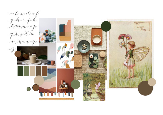
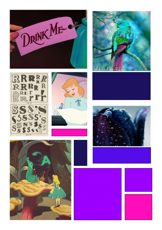
WEEK 05
Second Moodboards
After last week’s feedback I have redesigned my moodboards and tried to take into consideration all suggestions from tutors and students that I thought would help me create a more cohesive and succinct visual representation of my chosen directions and would benefit my ideas.
Feedback from last week:
“Nice work Yana! The two distinct styles are really shining through in your mood boards. I'd like to see you refine them by using only half the number of images you currently have. Challenge yourself to express the style in as few images as possible. I try to use 6-9 images + colour paletteSame goes for the colour palettes. See if you can just lock in just one distinct colour palette for each one.”
“This is really good! But the inclusion of different colour palettes makes it a little confusing.”
“These mood boards look great! you have really developed them since we saw them as just images in our last feedback class! Were you still doing Alcoholic Tea as your beverage? If so, I think perhaps the trippier Mad Hatter might be more appropriate - alternatively you could go a little more of the 'green fairy' absinthe style in your lovely nostalgic directions?”
“YESSSS! I think that would work – I think that idea of a twist and adding something a little naughty could transform the first one. If you can communicate that aspect in your presentation pitch, that would be great!”
SUMMARY OF FEEDBACK:
1. Use less images
2. Limit colour palette
3. Try to communicate the madness aspect better
This feedback has helped me generate moodboards that consist of more specific visual directions and create a limited palette for each. This allows me to pinpoint a more indepth understanding of my ideas and present it in an efficient and aesthetically pleasing manner.
#feedback#secondtry#moodboards#simple#limited colour palette#imagery#visualdirections#design#progress
0 notes
Photo

Exploring a visual direction for an upcoming project #visualdirection #progress #book #series #india #wip #indoorairpollution https://www.instagram.com/p/CPykMDaJzZo/?utm_medium=tumblr
1 note
·
View note
Photo

// Guineasss Sticker // It has arrived~~~ hand cut for each of them • • • #illustration #illustrator #stickers #design #nothingisordinary #thehappynow #thatsdarling #abeautifulmess #theeverydaygirl #persuepretty #prettylittlething #fancy #creativelifehappylife #hand #branding #illustrationdesign #visualdirection #prints #printing #smallbusiness #guineapig #cute #wip #stickerprint #mini
#cute#prints#thehappynow#mini#nothingisordinary#branding#fancy#design#wip#abeautifulmess#thatsdarling#stickers#visualdirection#persuepretty#illustrationdesign#guineapig#prettylittlething#smallbusiness#illustration#hand#theeverydaygirl#creativelifehappylife#illustrator#stickerprint#printing
0 notes
Video
instagram
Metropolis Rose By @thearthausgroup Dance Models : @charliwheeler from @thestarfactory_ and @brooklynmetropolis from @jodymarshalldanceco Song : Girl by @jamie___xx #thearthausgroup #agency #australia #productionhouse #creativedirection #choreography #campaigns #brandcampaigns #commercialdance #perthdance #perthdancers #productions #producer #dancecompany #videoshoot #urbanlistperth #perthfashion #perthdesigners #visualdirection #fashion #kingstreetprecinct #perth #perthlabel #jamiexx #girl #ballerinas #beyoncedancers #heelschoreography #heelsdance #dancevideos (at Australia) https://www.instagram.com/p/Bx0xJMTFkzR/?igshid=fg7omdyjwyak
#thearthausgroup#agency#australia#productionhouse#creativedirection#choreography#campaigns#brandcampaigns#commercialdance#perthdance#perthdancers#productions#producer#dancecompany#videoshoot#urbanlistperth#perthfashion#perthdesigners#visualdirection#fashion#kingstreetprecinct#perth#perthlabel#jamiexx#girl#ballerinas#beyoncedancers#heelschoreography#heelsdance#dancevideos
1 note
·
View note
Photo


BASE.CREATE.COLLAB. - CREATIVE BRANDING |
“Mutli disciplinary agency facilitating online creative”
#logodesign #branding #visualdirection #graphicidentity
0 notes
Video
undefined
tumblr
some #motiongraphics playing-around #animation #motiondesign #sounddesign #design #automotive #automobile #connectedcar #audiovisual #car #soundandvision #visualeffects #led #test #playing #adobecc #aftereffects #lightstrokes #artdirection #creativedirection #motiondirection #visualdirection #style
0 notes
Photo

#WIP#COLLAGE#artinstallation#ARTDIRECTION#VISUALDIRECTION#PHOTOGRAPHY
0 notes
Video
instagram
// Guineasss Sticker // Sent to printer for test printing. • • • // Sticker for packaging // Printed quite a number of my sub element logo stickers. Preparing for the packaging. • • • #illustration #illustrator #stickers #design #nothingisordinary #thehappynow #thatsdarling #abeautifulmess #theeverydaygirl #persuepretty #prettylittlething #fancy #creativelifehappylife #hand #branding #illustrationdesign #visualdirection #prints #printing #smallbusiness #guineapig #cute #wip #stickerprint
#cute#prints#thehappynow#nothingisordinary#branding#fancy#design#wip#abeautifulmess#thatsdarling#stickers#visualdirection#persuepretty#illustrationdesign#guineapig#prettylittlething#smallbusiness#illustration#hand#theeverydaygirl#creativelifehappylife#illustrator#stickerprint#printing
0 notes
Photo

art house/ˈɑːt haʊs ➕choreography ➕creative direction ➕campaigns ➕shows ➕talent ➕training By Janelle Vaccaro #thearthausgroup #agency #australia #creativedirection #production #perth #contentmarketing #visualdirection #artdirection #design #designers #artists #artdirector #creativedirector #productionhouse #janellevaccaro #boutiquecreativeagency #boutique #graphicdesign #danceagency #adagency #creativeagency #talentagency #artistsagency #perthbranding #vision #perthdesigners #thefutureisfemale (at Australia) https://www.instagram.com/p/By6iNmLDEao/?igshid=1wrmu1bheds5o
#thearthausgroup#agency#australia#creativedirection#production#perth#contentmarketing#visualdirection#artdirection#design#designers#artists#artdirector#creativedirector#productionhouse#janellevaccaro#boutiquecreativeagency#boutique#graphicdesign#danceagency#adagency#creativeagency#talentagency#artistsagency#perthbranding#vision#perthdesigners#thefutureisfemale
0 notes
Last Seen Blogs

rosyrosie-e
You're talking shit for the hell of it

ahealinginsight
A Healing Insight

bloglovetostyleuk
Love to Style

hyr653-blog
봉지야동
bloglovetostyleuk
Love to Style