Text


Image 1: Data Visualization - This data visualization shows the worlds top 50 websites. This can be manipulative because it only represents traffic and not actual experiences people are having. A company on this list can manipulate its audience to believe that high traffic equates to quality designed websites even if it may not be true.
Image 2: Target - Target’s house brand Up&Up plays a crucial role in creating consistent and recognizable visual language. One of the key visual relationships between the elements that construct Up&Up’s identity system is color. The brand uses a limited color palette of white, black, and shaded of red and blue. This color palette is used consistently across all of the brand’s products, creating a cohesive and recognizable visual identity.
Typography is another crucial element of Up&Up’s identity system. The brand uses a sans-serif typeface for all of its branding, with variations in weight and size used to create hierarchy and emphasis. Text alignment and positioning are also used consistently across all of the brand’s products, creating a sense of visual harmony.
Imagery is also an essential part of Up&Up’s identity system, with the brand using illustrative and photographic elements to communicate its messaging. The imagery is consistent in style and tone, creating a cohesive visual language that is recognizable across all of the brand’s products.
Overall, Up&Up achieves consistency in its branding through a careful and consistent use of color, typography, and imagery. By using these design elements consistently across all of its products, Up&Up creates a cohesive and recognizable visual identity that sets it apart from other brands.
0 notes
Text


Image 1: Weight - I chose a dumbbell with a simple font to describe how much it weighs. This has both denotative and connotative meanings. The denotative being that it’s just a number representation. In a connotative context, the number can symbolize progress, strength, self-confidence based on one’s experiences with it.
Image 2: Meta - This picture is the front cover of a VR Headset box for Meta. The logo on the box represents and iconic function. The logo is a literal depiction of what the shape of the headset looks like.
Image 3: TV Remote - The design of the tv remote represents iconic, index, and symbolic function. I’m going to focus on indexical and symbolic function with the mute and volume buttons. The plus and minus symbols are indexical because they are associated with basic math functions. The mute button has a microphone with an “x” on it. The “x” in this case is a symbol that can be associated with “don’t” or something to avoid so by putting it in front of the microphone it means an action causing no sound.
Image 4: PS4 Controller - The use of green camouflage to decorate the playstation controller references the past use of green camouflage in style. Camouflage was initially used for clothing on military personal to help them blend in environments. Over time the usage of camouflage began to work its way into other aspects of society such as fashion and decoration. The design of the controller serves as an ode to history.
0 notes
Text


Image 1: Rhythm - The consistent and constant use of the flowers in this picture creates a sense of rhythm for the audience.
Image 2: Hierarchy - The use of bolding, italicizing, size, and placement of the typography creates a hierarchy of importance for these different typographic elements.
Image 3: Ascender - This is the letter “b.” The ascender is the upward part of a letterform that extends above the x-height and usually above the cap height.
Image 4: Descender - On the other hand the descender goes the other way compared to the ascender. I chose the letter “p” in lowercase because it has a downward vertical stroke that extends below the baseline.
Image 5: Counter - All three of these letters have examples of counters. A counter is the area of a letter that is entirely or partially enclosed by a letter form or a symbol.
Image 6: Crossbar - The capital letter “A” has a crossbar in it. A crossbar are the strokes that connect two separate lines in capital letters, or the horizontal strokes in the lowercase “t.”
Image 7: Large X-height - This image has a large x-height. In other words, the distance between the baseline and the mean line of lowercase letters in a typeface is bigger than the distance between the median and cap height.
Image 8: Small X-height - This image does the opposite of image 7. Having a small x-height means that the distance between the baseline and the mean line of lowercase letters in a typeface is smaller than the distance between the median and cap height.
Image 9: Modernist - This piece of design follows a modernist approach. That is the typeface is simple and the colors are plain black and white to match the clean/minimalistic style of Modernism.
Image 10: Connotation - The blur effect on the word “placebo” is used purposefully to demonstrate mental fog that people have when dealing with mental health.
This module consisted of looking at specific typographic elements.
0 notes
Text


Image 1: Fanta - An orange soda can made by Fanta uses bright orange and a deep blue both of which are complementary to each other to create an eye catching product. There is emphasis on the name Fanta with the size of it being the biggest on the can.
Image 2: Water - PurAqua has used analogous colors with different hues of the color blue. The color blue is often associated with water which helps to market the bottle. By having these colors as waves in the background it enhances the contrast with the typography.
Image 3: Suave - This 3-1 cleanser utilizes the primarily cool color of dark blue as a design choice. The reason for this is to associate it with men. The word “men” is made the largest and is at eye-level for this reason as well.
Image 4: Pringles - The designers at Pringles used warm colors to market their classic chips. Since the color red was used from the beginning of Pringles, it become a staple color for the brand.
Image 5: Bread - Marketside’s signature brand of brioche buns uses the classic contrast of white text on a black background on their packaging. This contrast helps to create an elegant style that enhances the product.
Image 6: Cocoa - There is continuity in using the color white from this graphic. From the typography to the visuals the use of this color plays on the product itself since it’s unique that it has marshmallows in the cocoa powder mix.
Image 7: Clay Mask - Freeman’s designers use a 3D image to create an active figure-ground relationship with its clay mask. This creates an attention grabbing effect on the eyes.
Image 8: Pepsi - The iconic Pepsi brand colors came from the CEO wanting the brand to stand out from Coca Cola and show support for the United States during World War 2. (Red, white, and blue are the three colors of the US national flag). This is an example of graphic design relating to history and culture.
This module goes into different topics/principles of graphic design and is a way to see graphic design “in the wild.”
0 notes
Text


Image 1: Oatmeal - This oatmeal package my Millville uses contrast in weight to utilize typography to advertise the product. The design places this typography up and center (closest to eye level) to help the customer quickly see the product.
Image 2: Macaroni - Priano’s strategy is to use mainly typography to brand their macaroni. There are differences in size, weight, and style of this typography. They are placed very close together and in the center of the product.
Image 3: Protein Bar - The designers used weight and size of typography to convey the advertising on their protein bar. There is an emphasis on health conscious facts such as having high protein and not including any synthetic flavors, colors, etc.
Image 4: Ramen - Maruchan uses the placement of their typography and its repetition in font and size along with an image of their product to make it easy for users to spot and differentiate it from other brands.
Image 5: Tomato Soup - Campbell’s tomato soup can consists of mostly text. The typography is thick in weight and large in size. The content is divided into large sections but there is a repetition of font style.
For this module I was tasked with mainly looking at the contrast of typographic elements of graphic design.
0 notes
Text
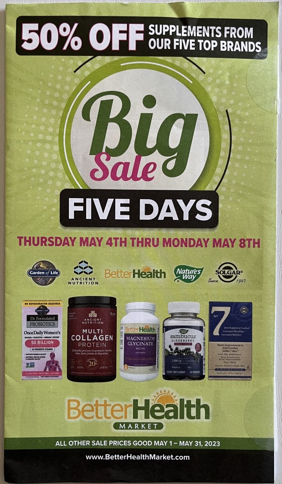
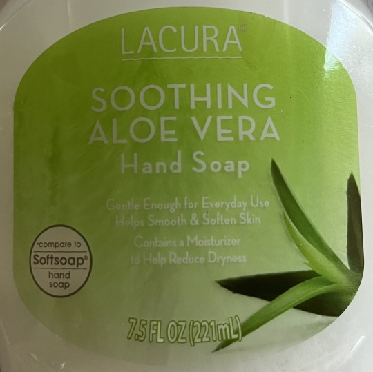
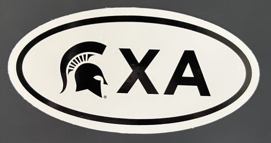
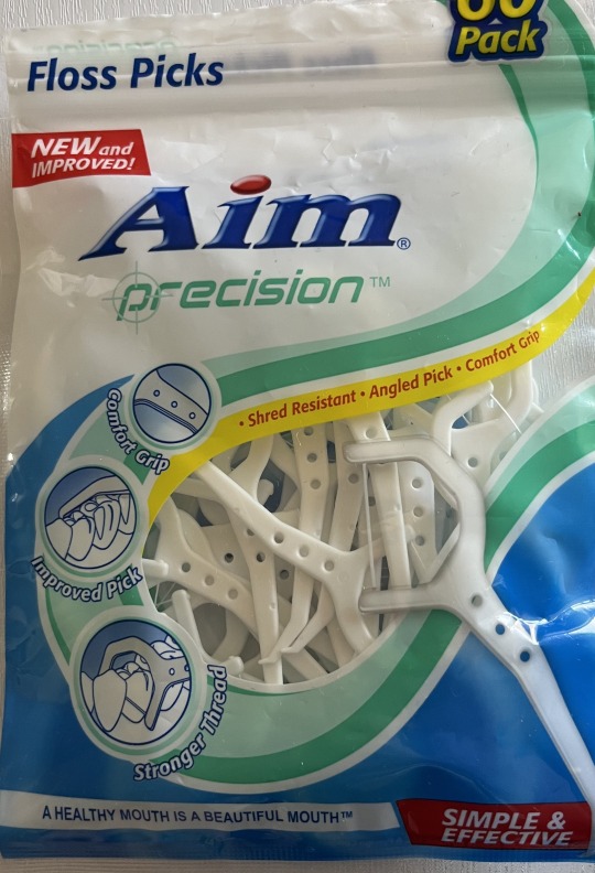
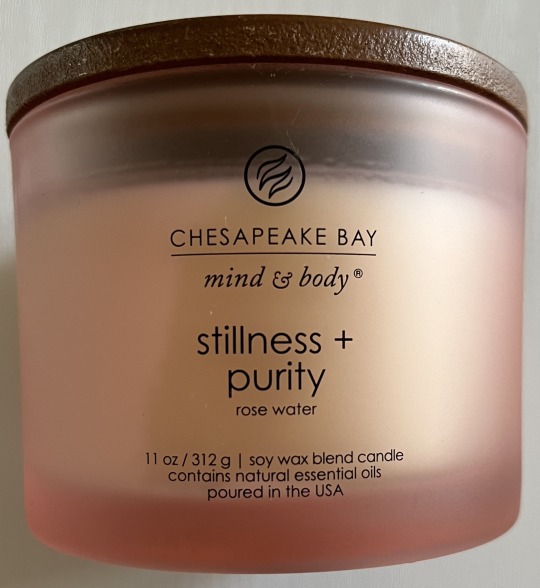
Image 1: BetterHealth - This pamphlet is a promotion for BetterHealth Market. The typography is emphasized more than visuals of the products. This is seen through the size and contrast of colors with the 5 day sale being the main marketing strategy to get people to go into the stores.
Image 2: Hand Soap - Lacura’s hand soap utilizes a green color background and white typography along with one image of an aloe plant to market their hand soap. There is adequate white space to not distract the user from the product.
Image 3: XA Sticker - The XA sticker consists of the MSU logo along with the letters XA to represent the Experience Architecture program. The minimal design is intended to intrigue the eye from further distances.
Image 4: Floss - This floss pack uses bright colors, large shapes, images, and typography to stand out from competitors.
Image 5: Candle - Chesapeake Bay’s candle utilizes a logo, minimal colors, and all typography to brand their candle. The small size of text coupled with the white space around the product represents the simplicity of the product itself.
The pictures above are what I think graphic design is. As discussed from the readings graphic design and culture are intertwined. We can see this with the endless need for graphic designers to create product branding and marketing for corporations.
1 note
·
View note