
Statistics
We looked inside some of the posts by ia4003-seminar-blog and here's what we found interesting.
Average Info
Notes Per Post
18
Likes Per Post
13
Reblog Per Post
5
Reply Per Post
0
Time Between Posts
5 days
Number of Posts By Type
Text
17
Last Seen Tumblr Blogs


Fun Fact
Tumblr’s website traffic is steadily declining.
Text
Hiding in plain view - Ted Bundy film and documentary

The Ted Bundy Tapes and, Extremely Wicked Shockingly Evil and Vile recall the police case on Ted Bundy’s crimes. The first is a documentary and the second is a film.
I watched the documentary first so it was interesting to compare two sides of the story. The documentary is more objective, facing the facts head on and takes the perspective of the victims. The film focuses on Subjectivity and the manipulation of those closest to Bundy. In the documentary, we very quickly feel horrified and certain of his crimes because we are bombarded with evidence but in the film, we see the opposite. Instead he see him through the eyes of his girlfriend who slowly comes to accept his terrible truth.
I admire the film makers choice because it reflected the perspective of people who knew Bundy. Everyone said he could never do such a thing but as we all know, he actually did. This film purposefully presents Bundy as the charming, and friendly young man he was to let the audience fall into this trap. For the first 2/3’s of the film, the crimes take a backseat and we spend most of our time focused on personal relationships and Ted Bundy’s family. The first time the crimes were descibed in any kind of graphic detail was in the last 33% of the film. It shocks us because we spent the first 66% under his charismatic spell. Throughout the film, there are more and more obvious clues which reveal his truth, which becomes harder and harder to justify as being innocent. It creates this interesting tension which is really engaging to experience where by the end, the truth hits us hard.
The structure of the film follows denial and acceptance
Zack Efron was chosen to play the role of Ted Bundy. I think this decision really engages with this concept of being blinded by charisma and alleged good looks because Zack Efron is a popular and charismatic person in real life. We want to like him and the character he plays. It exaggerates the disbelief of Ted Bundy’s Truth because our image of a charismatic actor becomes a character of pure evil, which we want to deny.
————————————————————————————————
Film structure
Actors identity
How much information and when
#film#animation#repotage#ted bundy#zac efron#manipulation#psychology#film structure#movie#extremely wicked#shockingly evil and vile#extremely wicked shockingly evil and vile
8 notes
·
View notes
Text
Company - Musical

Company is a musical about Bobbins attempt to find a man and settle down (triggered by her birthday).
I found the use of set design to separate characters interesting and the relationship between closeness and isolation between the couple and Bobbi.
The stage design uses the idea of a box throughout the production to enforce Bobby’s feeling of being alone. This was seen in the first act where Bobbi (in her dinning room) was isolated by all the black and open space outside her apartment. A few minutes into the show, the four other couple come dancing in from the outside. I enjoyed how they communicated abstract idea like this in the space the characters move in and how it was timed.
There’s a lot of rhythm and symmetry in the couples but not Bobbi. This emphasises my point.


^^^notes on-site
Just like the Rose Theatre in Kingston there was a lot of middle class looking people, but this time they were all old...except us
2 notes
·
View notes
Text
A zine a third year made. I liked the combination of colours in expressing heat, holiday and relaxation. The solid coloured paper links the images together and hold a similar feeling of warmth. The zine as a whole paints a picture of the experience
1 note
·
View note
Text
Portfolio show and tell
It was really interesting to see portfolios from current students and the type of work third years get up to. It was clear that it was important to vary scale of images and layout to show the work in its best, most exciting light.
I could see how the content, tone and purpose of each students work effected how their portfolio was presented and whether it was more process based or more final outcome. As a first year, I think my portfolio should lean more towards process since that’s what this year seemed to focus on.
In the example I saw, layout, font, colour and consistency was considered to create an image of themselves in their portfolio. Some where physical and some were digital. The book layout could be used to express enthusiasm and an identity too by changing the shape of pages, or the material they’re made from.
0 notes
Text
BluBlu - Vanessa Chang
youtube
Characters can be seen moving through a very familiar scene. Despite the strange ways they move, they are brought to life by their context as th moe around the 3D space (on the walls and the floor). It also feels like they are in our world because the location is so familiar to all of us, and similar places could be found anywhere.
We see these characters move more slowly than ourselves so it gives the impression of unseen happenings underneath our noses, which is engaging as the viewer. The traces of the animation is left on the wall which adds to this.
By puting artworks like this it comments on the space they’re in.

Unknown artist but they have a similar idea to Vanessa
0 notes
Text
Sam Toms


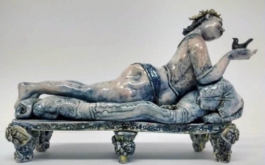
Sally Toms is a ceramic artist. She captures human moments of narrative in clay. I really enjoy the comparison between the hardness of the ceramic and the softness of the flesh it’s portraying. I think she uses materiality to say something about the character of each figure (perhaps a bit closed off).

I think Sam is touching upon sensory design and the associations we form from materiality of objects. The old lady characters feel quite old and as if they’ve seen a lot of things in their time. The ceramic feels dry and crusty which is associated with aging, similar to how a rubber band ages or a slice of bread (yeas I’m comparing old ladies to bread).
It contrasts the ‘school girl’ composition and facial expressions of the two ladies. The ceramic medium makes these characters feel more alive and real, not only because they have a physical presence but because there are themes of time, aging and weakening, just like us. Sam uses clay to depict human nature
5 notes
·
View notes
Text
National Theatre: Playing With Scale

The National theatre held a small exhibition about scale models. At the theatre, they use models to design the stage for performances. It reminded me a lot of stop motion animation, especially the image above. They aimed to bring the performance into the audiences space by reducing the traditional boundary between the performers and the audience. Finding interesting (but appropriate) ways of entering and exiting stage such us through a hatch in the floor for sailors in a submarine, or more elaborately, a revolving stage which can move up and down a shaft (to show the rooms of a building).
The spoke about using making as a 3D form of painting, a way of thing and experimenting with ideas.


Changing scale changes your relationship with objects
0 notes
Text
Everyday Connections Exhibition

When finding my way through the exhibition I found the composition of the set of images and their location particularly interesting in how they helped communicate, unify and add to the narrative of the photos by bringing them into a 3D space, here and now. For example, Ayumi’s photos were presented on the misted windows in the life room which created a peaceful and somber mood as the diffused light illuminated the images which presented themes of decay and the passage of time. It also created a feeling of isolation in the empty space it was presented in. The light brought out the colours and textures in the photos which would fade when the sun went down, which brought the idea of decay and time into a space where it can be experienced and shown.
Another example of this was the sequence of photos which went around a corner on the wall. The photos described a motion of turning and travelling so this simple idea really emphasised and brought the theme to life.
Continuity was another area of interest I found. One which comes to mind is a sequence of two photos, one of the yellow lines on the road, and the other was a photo of the skirting board of a room. The lines were joined up and described the movement and journey from outside to inside spaces.
This project (and particularly ideas such as continuity) suggest ideas for editing as cutting in films, and how to communicate a movement through a space without directly showing it.
It reminds me of a cut which links two story arcs in Riverdale. The first is about a family who are trying to cover up an accidental murder to a story arc about a girl who is going through gay conversion therapy. The two arcs are linked by this cut where Cheryl (the girl) is dragging sacks of sand as a punishment for her actions which links to the dragging of the dead body seen earlier in the first story arc. I thought it was clever how they linked these two very different themes through this visual connection. Continuity like we explored in the Everyday Connections project.
#film#everyday connections#ia4003#animation#photography#sequence#exhibition#friday#continuity#display#editing
0 notes
Text
Process And Portfolio
Broken Fingaz use video to present the work as well as the process of forming ideas and the making of the work. We see it as a journey and it communicates clearly how the artists like to work, and what kinds of ideas they are interested in. Again, we feel more engaged with the work as well as the artist because we can see where it’s come from.
https://vimeo.com/311140226
vimeo


They like to use everyday contexts in their work so it makes sense to document the environment with it.
I also enjoy the contrast between moving and static parts to the gifs, it focuses you attention to what’s important and it reminds you that it’s in a street setting, not s screen
#ia4003#animation#animator#friday#gif#illustration#artist#illustrator#scale#street art#portfolio#documenting
0 notes
Text
Process And Portfolio
The design and layout of a portfolio can be used to communicate the themes and ideas you (as an artist) like to work with. It can be presented in a range of forms, such as a traditional portfolio, showreels, feedback based formats (e.g Instagram) or on websites dedicated to your work. We looked at three categories of a portfolio, (although there are more than just three): content (the idea of the piece of work), process (sketches and techniques/materials used), and context (what was it made for). Choosing to present your work in these different ways helps communicate your interests and values to everyone who sees it.


Lola Durpe’s work is presented by showing the final image first and then an image which starts to reveal the process of how it was made (stretching,printing and cutting sections from the same image). The final images are captivating to look at and almost surreal. It makes you wonder how the artist made it so when she presents a photo of a close up (showing the layers of paper) it makes us feel more involved in her work and her process. This engagement with the audience makes the experience of viewing a portfolio more personal as it isn’t left at surface level. We see the process, so we feel part of it. I think it makes it more memorable.
Mark Todd uses video to document the context of his work in his exhibition. He uses it to present the playfulness and excitement he likes to use in his work as the exhibition wasn’t just the paintings on the walls, it was the shelves, the lighting and the layout of the walls which combine to form the identity of his work.
0 notes
Text
Everyday Connections (final photos)
I chose these five photographs for my final sequence. My Typology was ‘force and pressure’, it focused on the composition, and type of shape and line. I used the original photos I took to inspire and heavily influence what and how I photographed these final photos, however, I still experimented with composition and I used a better quality camera for these pictures.

Composition was very important for this idea to create the tension/pressure I was trying to communicate so I tried out different ideas. Some worked better than others. I enjoyed using photography to manipulate the found objects such as the ... photo where I used the contorted metal to create a directional movement which fights against the direction your eye wants to move in (left to right). It creates a feeling of power and tension. It’s also quite eye catching because it’s been abstracted.


I also thought the idea behind the crushed can was interesting. I took inspiration from the Assyrian stone fisherman in the British museum. It combines different perspectives to create a complex composition to communicate two ideas, one more literal (a guy fishing in the side of the bank), and one more expressive (the man trapping the fish, showing superiority). I tried to use this concept in my crushed can idea by photographing it from above, so the can could appear as if it’s standing up right. I thought it created a feeling of tension and motion as it suggests the can is being crushed rather than in the past tense.

The plane trail in the sky pierces through the empty sky as a diagonal through an undisputed and empty sky

I’m not convinced the rope composition is as strong as I wanted it to be. I wanted it to capture a motion/ tension. I tried to accomplish this by leaving empty space to the left whilst cramming in the rope and branch into the right side but there isn’t any kind of weight, the branch is too low to the ground (seen from its context, the house in the background) and the branch is too thin.

I tried to print my photographs on a think and matt paper but I couldn’t get this to work in the time I had, so I had to print them on normal printer paper. I really didn’t like how flimsy and weak the paper appeared as it reduced the force felt in each photo. The shininess had a similar effect. In my opinion, the paper has a great impact of the final result which suggests I should leave more time to figure out technical details like this.


I presented these photographs in the elevator. I got there early to make sure I could use it, as I felt the motion and force the elevator has was very relevant to the theme of my work. Being small and cramped when more than 4 people were in it, it further suggested this idea of force and tension.
#everyday connections#ia4003#repotage#observation#photography#sequence#exhibition#final outcome#friday#typology#force#pressure#composition
0 notes
Text
Using video games to comment on current issues, to get the message to spread
#ha4109#monday#film#animator#interaction design#v&a museum#v&a#video games#london#field trip#politics#current affairs#message
0 notes
Text
The video games exhibition was very very very good
It displayed the ideas and thought processes behind these games as well as the current issues it’s facing. I find it interesting how the video game format can be used to teach something through interactive story which can be unique to the player. By making it interacting it becomes more personal to the player and if the game is discussing a current issue in the world, it is more emotive and impactful as it isn’t distant.
0 notes
Text
Interaction design (video games)

Envirobear 2000 is a very good game. Moral of the game: bears like to eat fish and drive cars, do not like wasps, no one likes wasps


^^enjoying the handmade painterly textures working with the digital mediums. Back at it with the sensory design.

A game which uses a rope light. It works within its limitation to create something unique with a retro vibe due to its simplicity. Would be cool to make Christmas decorations with it, it would blow the neighbors minds
2 notes
·
View notes
Text
A video game which stars a grandma in a graveyard. The speed emphasises her age and encourages you to feel the surroundings as you’re forced to take your time.
The character is an archetype so everyone can see her as their grandmother therefore the game feels more personal and nostalgic and it resonates with the player more as the game relates to death. I really enjoy this focus on emotion in these types of video games
#ha4109#monday#animator#film#video games#interactive design#character#grandma#archetype#v&a museum#v&a#london#field trip
0 notes