
Don't wanna be here? Send us removal request.
Statistics
We looked inside some of the posts by jamchen and here's what we found interesting.
Average Info
Notes Per Post
96
Likes Per Post
54
Reblog Per Post
40
Reply Per Post
2
Time Between Posts
4 months
Number of Posts By Type
Text
9
Link
6
Photo
2
Last Seen Tumblr Blogs


Fun Fact
When “GIF” was named word of the year in 2012, Oxford Dictionaries U.S.A. credited Tumblr for pushing the word.
Text
移植Loopback到AWS Serverless架構 Part 2
日前嘗試移植Loopback App到AWS Serverless 架構,雖然目前結果不甚理想,但是覺得其中過程頗值得記錄下來,以備下次可以再派上用場(沒什麼記憶力了)同時也供他人參考。
Part 1在這邊
本系列文章不會帶到太多細節,主要想陳述在過程中遇到的問題與解決方法
反應
在Part 1幾乎解決���大多問題之後,首先測試了一下網頁的載入時間
首先用ab試了一頁由Loopback待搭配ejs產出的動態網頁,由於是SAP網頁,所以server side 大概只做了auth,跟一些環境設定(例如一些靜態檔路徑)也沒做什麼太複雜的事。
結果部署在ap-northeast-1輸給了部署在Heroku上,想說會不會是因為MongoDB(mLab)是在Virginia所以期間的round trip導致反應速度低落。 所以我在us-east-1也部署了一版。發現結果有好一點,但是還是輸給了Heroku
以下一些數據供各位看倌參考
herokuapp.com的結果
Total transferred: 11520 bytes HTML transferred: 7500 bytes Requests per second: 10.61 [#/sec] (mean) Time per request: 942.457 [ms] (mean) Time per request: 94.246 [ms] (mean, across all concurrent requests) Transfer rate: 11.94 [Kbytes/sec] received Connection Times (ms) min mean[+/-sd] median max Connect: 615 664 36.1 664 716 Processing: 210 217 8.5 213 229 Waiting: 209 216 8.1 213 228 Total: 826 881 43.9 875 942 Percentage of the requests served within a certain time (ms) 50% 875 66% 912 75% 927 80% 933 90% 942 95% 942 98% 942 99% 942 100% 942 (longest request)
ap-northeast-1的結果
Total transferred: 28300 bytes HTML transferred: 20380 bytes Requests per second: 7.85 [#/sec] (mean) Time per request: 1274.087 [ms] (mean) Time per request: 127.409 [ms] (mean, across all concurrent requests) Transfer rate: 21.69 [Kbytes/sec] received Connection Times (ms) min mean[+/-sd] median max Connect: 133 176 24.8 180 209 Processing: 706 880 128.9 911 1094 Waiting: 706 880 129.2 911 1094 Total: 839 1056 132.7 1099 1274 Percentage of the requests served within a certain time (ms) 50% 1099 66% 1121 75% 1164 80% 1179 90% 1274 95% 1274 98% 1274 99% 1274 100% 1274 (longest request)
us-east-1的結果
Total transferred: 26700 bytes HTML transferred: 18780 bytes Requests per second: 9.77 [#/sec] (mean) Time per request: 1023.069 [ms] (mean) Time per request: 102.307 [ms] (mean, across all concurrent requests) Transfer rate: 25.49 [Kbytes/sec] received Connection Times (ms) min mean[+/-sd] median max Connect: 109 162 29.4 169 197 Processing: 621 683 67.5 660 847 Waiting: 621 683 67.5 660 847 Total: 769 845 70.1 827 1022 Percentage of the requests served within a certain time (ms) 50% 827 66% 827 75% 869 80% 882 90% 1022 95% 1022 98% 1022 99% 1022 100% 1022 (longest request)
從數據可以發現API Gateway的processing time比Heroku來得長,這部分還有很多真相可以挖掘,今天就先到這裡。
體感
除了用ab單看網頁載入速度之外還需要用瀏覽器體驗一下真正網頁的載入速度,畢竟一個網頁的組成還有一些js、css、字型、圖片等靜態檔。
果不其然,在這樣的架構下表現很慘。
在us-east-1的數據
Finish: 7.78 s | DOMContentLoaded: 4.24 s | Load: 7.25 s
在heroku.com的數據
Finish: 3.03 s | DOMContentLoaded: 2.41 s | Load: 3.04 s
所以接下來我就乖乖將靜態檔都轉到S3去
SSS
靜態檔轉到S3之後也遇到了幾個問題。 第一個問題是啟用內建的"Static website hosting"才發現不支援https...(怎麼這麼廢)
再來就是S3也不支援"自動gzip encoding"(怎麼這麼廢,難道是為了流量費?)
結果這兩個問題都透過Amazon CloudFront來解決。
CloudFront
設定了一下CloudFront,不止cache了S3的靜態檔,連在API Gateway/Lambda的動態html也cache下來,不過不cache API。
在把靜態檔放上S3並掛上CloudFront之後的結果實在是太驚人了,載入網頁的表現變成
Finish: 2.07 s | DOMContentLoaded: 738 ms | Load: 788 ms
暫時結論
為什麼說暫時結論呢,因為還有很多東西可以再深入研究並最佳化的,例如database的部署是否可以也放到AWS上面就可以改善Loopback處理的效能。
Cold Start 與併發
在測試的過程中發現放在Lambda Function的程式啟動時間至關重要,因為Lambda Function在一段時間的Idle也是會進去冷凍期(Cold)。 而且一旦Lambda Function進入冷凍期時加上同時有多個request進來,然後在時間內又沒辦法啟動完畢並消化完request的話Lambda似乎會再啟動另外一個「實體」來幫忙,所以像Loopback這樣有點大又不會太大的程式(啟動時間相對久)似乎不太適合放進Lambda Function。但也有可能是Databse連線時間造成,瓶頸得再花時間實驗與調查。
不過,對比我另外一個單純Express也沒有搭Datastore的應用,"Cold Start Time"明顯差很多。
除了降低開啟時間或許還有其他方法可以改善或解決這個問題。有空再繼續研究。
收費
整體下來真的會比部署到Heroku便宜嗎?後續還要繼續觀察整個收費的狀況(應該也可以先試算出來,但是有點懶得思考/算)
結語
這系列文章算是將這次移植手術告一個段落,之後有空還是會繼續優化,將整體效率提升到至少可以接受的程度。小弟算是近幾年才接觸「後端」的開發,實務經驗稍嫌不足,文中若有值得討論的觀點,歡迎各位看倌給予指教。
6 notes
·
View notes
Text
移植Loopback到AWS Serverless架構 Part 1
日前嘗試移植Loopback App到AWS Serverless 架構,雖然目前結果不甚理想,但是覺得其中過程頗值得記錄下來,以備下次可以再派上用場(沒什麼記憶力了)同時也供他人參考。
移植過程比想像中長,估計有不少東西可以寫,所以大膽先將這次標題配上Part 1(其實是有點想睡了,寫多少算多少)
本系列文章不會帶到太多細節,主要想陳述在過程中遇到的問題與解決方法
原本
原本用Loopback開發的POC是部署在Heroku付費機器上,Datastore搭配的是由mLab提供的MongoDB。
後來
POC其實久久才用一次,但又不想每次用的時候又要等待「機器被喚醒」(免費方案的宿命),所以就升到付費等級,移掉休眠的封印。後來接觸到Serverless架構,想說POC的使用狀況剛好很適合用多少算多少這樣的計費模式,所以就來嘗試看看。
Adaptor
在AWS Serverless架構上要處理HTTP Request (API) 基本上就是用Amazon API Gateway搭配AWS Lambda。
API Gateway 在前線接受HTTP Request,然後再將Request傳遞到Lambda Function處理,然後再將Lambda Function的結果透過API Gateway回應給Client。
AWS有提供一個adaptor - aws-serverless-express 給Express-based的Node.js app用,讓開發者方便將API Gateway過來的event轉成HTTP Request再餵進Express-based的app處理並回傳結果,讓移植變得很方便(?)。剛好Loopback也是Express-based的,所以很快就成功地接上了。
Routing & Proxy
API Gateway需要設定規則才能將Request送到對應的Lambda Function。對這次移植而言,不管路徑為何,所有Request都要送進Loopback處理。換句話說真正的Routing還是在Loopback/Express中處理,API Gateway只是Proxy角色。所以我們得設定兩個Resource(API Gateway的說法):
/ /{proxy+}
一開始我以為/{proxy+} 就已經涵蓋了根目錄/,結果卻不然,導致我呼叫 API https://id.execute-api.region.amazonaws.com/stage/ 都會錯誤,最後補上的 / 這個resource才能正確處理根目錄的Request
Content-Encoding: gzip
我們的POC是有支援gzip encoding的,但是套進API Gateway與Lambda Function架構後就要額外處理,因為API Gateway接收的回應目前只支援文字,所以Lambda Function要回傳gzip這種二進制資料時得先把資料轉成Base64編碼的字串,並且標示為Base64 encoded。這點aws-serverless-express也有支援, 在初始化的時候要提供所有會經過gzip處理的mime-type
const binaryMimeTypes = [ 'application/javascript', 'application/json', 'application/octet-stream', 'application/xml', 'application/x-font-ttf', 'font/eot', 'font/opentype', 'font/otf', 'image/jpeg', 'image/png', 'image/svg+xml', 'text/comma-separated-values', 'text/css', 'text/html', 'text/javascript', 'text/plain', 'text/text', 'text/xml', ]; const server = awsServerlessExpress.createServer(app, null, binaryMimeTypes);
但由於HTTP content-type header可以同時帶進charset,所以官方對content-type的比對邏輯是有缺陷的,所以我fork了並自己改了一版
寫廢文也是會累的,今天就先到這。下次有機會再繼續。
未完待續
0 notes
Text
利用Postman/Newman+Jenkins來自動化測試API
昨晚第一次參加了線上讀書會,講的是網頁的自動化測試框架Nightwatch.js。收獲不少,也刺激了我思考怎麼自動化測試/監控RESTful API這個議題。
剛好最近也在開發RESTful API。所以花點時間研究一下這個議題,想說可以派上用場。問了同事、也上網找了一些討論,發現有不少開源工具與雲端服務在做這件事。其中有SoupUI、JMeter、WireMock等等,大多都是Java體系的解決方案。可能是中的node.js的毒太深。總覺得要安裝這些工具或系統很麻煩,太重了(不是介面都鳥鳥的就是用Windows的截圖,零分),所以大多只看了看簡介就放棄,連下載安裝都沒嘗試。
最後皇天不負苦心人,找到了一個心目中理想的解決方案:利用Postman/Newman+Jenkins。
先講一講我的需求。我的需求其實很簡單,只是想要週期性地確認服務是否正常,不正常的話可以透過Slack通知開發者。
所以這個輕量的解決方案完全滿足我的需求。
簡述一下整個工具架構與流程:
利用Postman GUI編寫API與測試項目
匯出測試項目成JSON檔(懂語法其實可以直接寫檔,不一定要用Postman)
用命令列 newman 驅動測試
利用Jenkins定期觸發測試。測試若失敗同時發佈通知到Slack(透過Jenkins Plugin)
詳細細節請參考Postman官方介紹文件
短心得:經過這次研究我才發現原來Postman的功能這麼多!
補充:實務上我用npm來安裝newman,用git來維護Postman Collection與Environment json檔案。另外,newman可以輸出JUnit的報告格式,因此可以再搭配Jenkins的Plugin呈現更結構化、更有用的資訊。

0 notes
Link
可以用來製造「測資」的工具 有網頁可以試用:http://marak.com/faker.js/
(網頁好像有問題,但至少console可以用)
1 note
·
View note
Link
用sails-auth可以省下不少工夫,但是目前還找不到可以擴充User Model的方法。或許這就是缺點/限制。 2016/4/24 更新:
找到擴充User Model的方法 https://github.com/langateam/sails-auth/issues/119
2 notes
·
View notes
Text
Side Project
好久沒開發自己的專案了。其實有一個想法一直在心中醞釀,只是惰性使然,遲遲都沒有動手。
年紀也有一點了,同時也覺得應該要花一點心力回饋社會。錢是沒有,但是技術能力應該還算有。所以打算開發一個非營利專案來投入我關心的議題,順便玩玩新東西。
計劃大綱:開發一個平台提供統一管理協尋寵物資訊的服務。
最理想的情況下這個系統應該也可以用在協尋人或物。
計劃自己先完成一個雛形,再上網尋找志同道合的夥伴一起經營。
註:寫下這篇文章算是有點宣示的意味,希望自己不要又虎頭蛇尾。(握拳)
1 note
·
View note
Text
大阪環球影城之旅 Last Day

時間來到最後一天了...QQ,這次故意選早去晚回的機票,回台灣是晚上9點的飛機,所以幾乎還有一整個白天可以玩。爽~
第四天
箕面

其實我們大部分行程都是在日本決定的,在台灣只是看了一些資訊,聽聽親朋好友的意見,真正要去哪裏、哪一天去都是隨興而至。
箕面也是在搭車過程中翻翻書後決定的,目的是想要體驗一下大阪近郊的風情。 從大阪地鐵、火車、公車輾轉到了箕面火車站。一出站問了問當地的旅遊資訊站,聽聽他的介紹並且拿到了當地休閒步道的地圖,最後決定走這單趟約40分鐘的步道,體驗一下日本的大自然。

車站附近跟沿路都可以看到書上有介紹的當地名產「炸楓葉」。當場買了一包吃吃看,還滿好吃的,不過不算便宜,一小包也要90左右。

說是步道,其實是沒有車的馬路(可能有更像步道的步道,只是貌似在整修),走起來還滿舒服的,尤其搭配著新鮮空氣。

沿路的建築也古色古香,很有味道

路上剛好看到一間小商店有販賣著一鍋很像滷味的東西,因為肚子餓了,加在上本次旅行定調「體驗」的精神,我們就進去踩雷了,魯的味道還不錯(好像在日本還是算「黑輪」),還有搭配黃芥末(日本人好像很喜歡黃芥末,常出現在餐廳裡)。店裡牆上掛了不少類似「美鳳有約」的照片,看來是個名店,老闆娘好像也是名人(牆上很多剪報),也很親切。推推。

沿路看到的外國觀光客很少,好像都是日本人居多,算是在地的景點(自以為)
箕面瀑布

箕面步道的終點就是箕面瀑布。可惜當天天氣太涼爽,被瀑布的水氣給濺到有一點冷,不過近看氣勢還是滿澎湃的。
大江戶溫泉物語

跟八里的「大唐溫泉物語」很像(沒去過,但是有看過網頁。猜測是學日本的),很大,裡面設施很多,一進去很像劉姥姥逛大觀園的感覺(難怪一進場他就發地圖給我),而且不便宜。進去泡之後有點後悔,還是前幾天的「浪速之湯」好!原因是大部分的湯池都是在室內,我還是比較喜歡戶外泡湯的感覺。
離開箕面後又回到心齋橋拿寄放在飯店的行李。在日本的最後一餐沒按照計劃地在心齋橋隨便找一間還有營業的餐廳解決了(因為回心齋橋已經3點多了),不過還不錯吃,lucky~。
關西機場

原本擔心超重沒想到也才比來日本時的行李多6公斤,太神奇了。

更幸運的是我們兩人只多花3000台幣就升等商務艙,實在是太爽了!(原本可以選擇用日幣只要10000,但是身上現金不夠,又不能刷卡,算了,人要知足)。其實照DM看來,升等每個人要3000的,在排隊時我們被詢問過一次,我們猶豫了一下,覺得太貴,所以拒絕了。沒想到輪到我們到櫃檯的時候,他又慢慢靠近,似乎刻意壓低音量地問我們如果兩個人只要3000要不要考慮。當然不用考慮阿,馬上掏錢(還好湊一湊台幣還夠)。事後回想,怎麼有點像是遇到黃牛的fu~ XDDD
漏網鏡頭

聽說最近Skechers很夯,聽說很好穿,聽說日本賣得很便宜(有圖為證),聽說最新一代的只要台幣1800。(給有需要的人參考一下)
0 notes
Text
大阪環球影城之旅 Day 3
在行前讓熱心人士請了一頓,也從他那獲取了重要情報,促成了第三天重點行程:百萬遍知恩寺手作市集。

第三天
百萬遍知恩寺手作市集 因為此行除了「哈利波特」之外,另外的主題就是體驗當地人生活,不想要走太觀光的路線(雖然有點難)。所以一得知京都有市集可以逛就稍微做得點功課,發現日本市集都有固定的時間,還可以上網查(http://www.garagesale.co.jp/index.html) 查到剛好第三天在百萬遍知恩寺剛好有擺攤,所以就排定第三天要前往京都逛逛。
其實到京都也差不多一個小時多一點的時間,沿路看看風景、日本妹,感覺一下子就到了。
從車站晃到知恩寺也差不多10來分鐘而已,還滿快的。

一到知恩寺就看到滿滿的攤位,還滿令人興奮的。邊晃變吃邊買一些紀念品,一下子就下午了。這個市集,對我來講算是滿新鮮的,因為在台北各大市集擺的東西都大同小異,所以有點逛膩了。雖說有新鮮感,但是真的令我感興趣會想買的東西卻不多。不過,我覺得女生應該會很喜歡,有很多飾品,包包等等可愛小物。

逛完市集也差不多該吃飯了,路上看到一間拉麵,被他的貌似碳烤過的叉燒給吸引,於是我們又吃了一次拉麵。不過這一次的更鹹。聽到隔壁的小朋友跟他媽說:「媽,我吃不下了,好鹹喔!」(講中文)

講到這兒突然想到一件不得不提的事,日本餐廳提供的飲用水都是冰水,跟漫畫畫的一樣!(想到愛好冰水的一位朋友一定很喜歡)

離開知恩寺特意經過日本的住宅區的小巷弄,想要看看他們的建築,感受一下那在地的氛圍。
大阪今昔館

不管是旅遊情報或是旅遊書都有介紹大阪今昔館,想說剛好下午有個空擋就去看看。 大阪今昔館的重點就是仿古的街道,燈光還會一直變,營造白天晚上的氣氛。其實我覺得普普,但是精緻度還是沒話說。如果你是喜歡穿和服(浴衣)拍照的人是可以考慮參觀一下。和服出租的生意好像不錯,我們去的時後已經預約完畢,當場還大排長龍,很多情侶,還好我們不愛。
すし政

每個景點中間彷彿都該安插一餐,逛完大阪今昔館就跑去附近吃壽司-すし政,看起來是老店(也忘記是誰介紹的)。剛到的時候有點猶豫,因為他的正對面也是一間壽司店,而且有不少人在排隊。但因為肚子餓,又是友人介紹的,所以就衝了,結果好吃又便宜。
再訪浪速之湯

吃完就照原定計畫再次造訪「浪速之湯」,因為剛好就在附近,一切都太完美的。 這次老馬識途,所以我們各自加點了韓式海鹽搓浴跟腳底按摩並且約兩個小時後碰面,因為第一次泡完覺得一個小時實在太短了。「海鹽搓浴」算是這次旅程中一個奇妙的體驗。加點的部分得先預約時間,時間到了我依約到了一間搓澡的浴室,原以為進來的會是一個大叔、或大哥之類的,至少是男生,沒想到進來的是一個大姐!(阿姨?)害我連忙故作鎮定地拿隨身小毛巾遮住我的重要部位。結果根本白遮,因為他要我把毛巾跟手上的置物櫃鑰匙給拿下放在旁邊...還好我見多識廣,坐懷不亂地享受完這難得的體驗。過程中聊天才發現她真的是韓國人,還會說一些「普通話」。離開時不忘說聲:「砍山哈密打」。
串炸-大眾酒場七福神

說好結束一個景點就是該輪到吃的時候了。泡湯前的路上早就相中一間看起來很local的串炸店,小小一間,到得時候已經坐滿了下班的上班族。為了美食等一下無所謂,果然客滿不是假象,東西又是好吃、便宜!
VIILAGE VANGUARD 吃完飯,回到飯店附近還不累所以繼續逛,試圖找些還營業的店家,但發現大多只剩餐廳、居酒屋。運氣不錯還有一間店還開著,更沒想到的是這間店賣的的東西還滿和我的口味的,買了不少東西。推推。
可能是對日本有點依依不捨,所以逛到這間店都打烊了才結帳離開,結束了最後一個夜晚。
To be continued...
0 notes
Text
大阪環球影城之旅 Day 1
距離上次去日本已經將近15年了。這次的旅遊算是玩得相當盡興(多虧許多親朋好友提供資訊與幫忙),當然也有遺憾,特此紀錄,下次去可以舊地重遊,也可以造訪遺珠。
第一天
關西空港

到了關西空港已經接近中午了。沒想到光入境就花了一個多小時!入境後就依照網路文章與朋友的建議,將需要的哈利波特門票、ICOCA給買好,路上遇到推銷免費Wi-Fi的攤位,索性就取消原本計畫要辦理的4G吃到飽。(雖說沒有4G依然可以在重要的點找到Hot-Spot,但是下次去可能還是會考慮辦4G吃到飽,移動中有網路還是比較方便)關西空港把該買的買一買之後就坐上南海鐵路前往心齋橋了。
難波/心齋橋

由於機上餐點難吃再加上等待入境花了不少時間,決定一到心齋橋就先去吃東西,吃飽再去飯店Check-in,反正順路。
一出難波車站走在街道上,一時還不太習慣日本的右駕,過馬路還東張西望。對沿途的商家感到新鮮,但由於肚子太餓,又對路線不太確定,只能專心在找路上面。
一到心齋橋附近就感受到鬧區的熱力,即便是平日還是人潮擁擠,當然大多都是觀光客。
第一餐就嘗試了鼎鼎有名的一蘭拉麵,果然打對了如意算盤,趁下午3點非尖峰時刻去,完全不用排隊。首次體驗一蘭的點餐方式還滿新鮮的,也加點了叉燒肉(發現日本物價還滿便宜的!在台北生活負擔真大...),不過即便是肚子餓,但是我還是沒辦法把拉麵吃光,實在有點鹹(第三天還有隨機嘗試另外一家拉麵,發現一蘭應該是算不鹹的了...)。
對了,在一蘭還發現廁所有免痔馬桶覺得很新奇,後來發現日本根本到處都是免治馬桶。日本人根本有痔瘡恐懼症吧!

吃完拉麵順路看到也是網路人氣,朋友有推的PALBO,也就買了帶到飯店吃。口感相當特別,味道也算濃郁。
心齋橋 Via-Inn 吃飽了,拉著行李一路到飯店。這次住的飯店真的沒話說,價格不貴,附早餐,還在鬧區,交通樞紐,下次去應該也會考慮住這一間。推推。
心齋橋 美國村 放置好行李,吃了甜點,飯店週邊這麼好逛,根本按耐不住,整裝出發。果然才轉個幾條巷子就有人拜了一件T恤。沿路有店員很酷(正)的唱片行、連三間隨便就打趴台北的樂器行(可惜不能拍照),由於我目標很明確,所以有沒花太多時間在樂器行。我在第一間樂器行用英文問他有沒有Micro Terror(台灣賣很貴,將近是我在日本買的兩倍),可能是我英文太破,他差一點把人家���的貨就給我,以為我是那位訂貨的人。我心中的惡魔懊悔怎麼不騙他我就是那位呢,哈哈哈。到下一間樂器行問了之後還是沒現貨,有人提醒我怎麼不問問看能不能訂貨,因此我獲得了我夢寐以求的Micro Terror!(在我離開日本當天到貨,下訂時店員怕我不來取貨,還一直叮嚀我不能取消喔)
天然溫泉浪速之湯

到日本怎能不泡湯,尤其離飯店路程也才半小時。日本消費真的便宜(一直強調),泡一次湯也才800日幣,而且置物櫃都會退錢(小鼻子小眼睛)。這個溫泉場所雖然不是接近大自然,但是有一半在戶外,泡起來相當舒服、療癒。個人覺得比箕面的「大江戶溫泉物語」好。對~我們第三天又再度造訪「浪速之湯」,第四天跑去箕面也有泡溫泉。全程下來完全沒有鐵腿的症狀,溫泉實在是太強大了。(日本人泡湯不知道為什麼很愛喝牛奶?泡湯的地方一定有賣。)
鳥貴族 泡完湯也該吃飯了,決定去朋友大推的居酒屋「鳥貴族」。 鳥貴族真的很便宜,不管是串燒、沙拉、小菜、飲料、各種酒類一律都是一樣280日幣。吃爽爽啊!美中不足的是日本餐廳可以抽煙,害我回飯店還要再洗一次澡,我明天還要早起捏!

未完待續...
1 note
·
View note

Text
效果器盤DIY

拖了好久一直都還沒有買效果器盒。(沒錢阿QQ)
有一天突然想到我有一個許久未用的筆電包好像大小差不多!

(2002年參加WWDC送的PowerBook 15"筆電包)
比一比還真的剛好,於是今天就來DIY省點錢好過年~
首先缺乏的是一個底盤。因為筆電包有點軟軟的,而且有底盤也比較方便整盤拿進拿出,還可以將效果器固定在上面。
到「特力屋」買個89塊的塑膠踏墊(第一張圖灰色一片的)。再到家庭五金塑膠綁繩130元,用來固定效果器,超貴的。(第一張圖疊在最上面黑色一包的)。還有家裡原本就有的鋸子。材料工具齊全了。
首先,塑膠墊子有點太大,所以得先用鋸子裁切一下。
再把效果器放上塑膠墊子擺擺看。耶~剛剛好。這樣也好啦,可以避免自己再亂買效果器。但是我缺一個調音器BOSS TU-3。

接下來就用黑色綁繩把效果器固定在墊子上。很少會把東西弄得這麼整齊。

再來就把整盤放進袋子裡。

耶!剛剛好!(廢話,都量好了)
接上電源火力全開,大功告成!

總花費:塑膠墊$89+塑膠綁繩$130=229。
省了至少有800塊!
廢物利用真爽!
0 notes
Text
“粉紅色”,我的最愛
“粉紅色”,我的最愛
你像小孩天真無邪的陪伴
你的眼神
你的期待
都是“粉紅色”,我的最愛
============================
“粉紅色”,我的最愛
我想我永遠都無法忘懷
你的甜美
你的塞ㄋㄞ
都是“粉紅色”,我的最愛
============================
無論如何都希望你有個美好的未來
你有美麗的花與玩具相伴
還有我們滿滿的思念與愛
雖然我的心永遠缺了一塊“粉紅色”,我的最愛
好想大聲吶喊!
============================
2 notes
·
View notes
Link
This is a guest post from an anonymous writer, who is a loyal user of Apple products and a veteran iOS developer.
I discovered the ICS Paper Cuts blog today and I was looking through some of the screenshots they had of Android Ice Cream Sandwich. As an iOS user since the first iPhone arrived, I don’t have much exposure to Android on a day to day basis. So it was an eye-opening experience for me to see just how bad the UI looks compared to iOS. I’m stunned that even after 4 major versions, the “the world’s most popular mobile platform” (according to Google) still looks like it was designed by first year CS students. It inspired me to do some side-by-side comparisons of Android vs. iOS to illustrate just how amateurish Google’s UI is. A previous post on Android Gripes showed how bad many third party apps look on Android compared to iOS, but here we’ll be looking only at UIs developed by Google and Apple themselves. Fandroids, you can’t blame this junk on lazy third party developers or inept carriers. This is 100% Google’s fault.
(Note: I don’t have an Android device of my own, so I’m comparing the Android screenshots from ICS Paper Cuts with similar ones I made myself in iOS. And before you Fandroids whine about how I can’t criticize ICS without having used it, keep in mind that your OS should be intuitive enough that a new user like me can understand immediately what’s going on just by looking at it. iOS lives up to that standard, so that’s the standard I’ll be holding Android to as well.)
First up is the standard alarm clock app:

Honestly, where to begin? On the left (iOS), you have a beautifully designed screen with the header “Alarm.” There are three alarms set, each clearly marked “ON” so you know they’re enabled. On the top you can see two controls that are subtly darkened and sunken into the title bar to make them appear like buttons to be pressed. One is marked “Edit” that will no doubt let you edit the alarms. The other is marked “+”. While it’s not as intuitive as “Edit”, it doesn’t take that much brainpower to realize that it will let you add a new alarm. Under the time for the first two alarms, you can see what days each is set for: Weekdays and Weekends. Nice. At the bottom of the screen is a shaded, labeled tabbed interface that clearly shows where you are in the context of the app. The whole UI is super clean and intuitive. The tasteful gradients, textures, and shadows make the interface appear polished and tangible, like something waiting to be touched. Quite impressive.
Now let’s look at the screen on the right (Android). First impression: a flat black square with a bunch of stark white lines. Ugh, it reminds me of a terminal screen. In the upper left you’ve got the header text “Alarms” with a clock icon. In the upper right you’ve got two icons: a check mark and some dots. One symbol is white and one is slightly grayish. Are they buttons? It’s not clear, since they look just like the title text. And if they are indeed buttons, who knows what they do. One might assume the check means “Save”, but if that’s the case, shouldn’t there be a corresponding “Cancel” or “X” button? Nowhere. So I can save, but I can’t cancel? And it’s anyone’s guess what those three dots are for. They look disabled anyway, so I’ll just ignore them.
Next, we have a big “Add alarm” text with a “+” next to it. This looks almost exactly like the header text. Am I supposed to tap that to make a new alarm? If so, why does it look like header text instead of a button that can be pressed? Ridiculous. Below that, we have the three alarms. Ok, a little bit better. I can see the times and the days they’re activated for. But the nice touch of showing “Weekdays” and “Weekends” is not there; instead it lists out all the days. A minor thing, sure, but reveals a lack of polish. Now, are these alarms activated or not? I would assume they are, since there’s no “OFF” or other text indicating otherwise. But then there are these faint gray boxes to the left of the alarms. They look like they could be checkboxes. What are they for? If an alarm is not checked, is it off? Or are the checkboxes just a convenience for selecting multiple alarms and performing an action on them (e.g., like checking a bunch of emails in Gmail and deleting them)? It’s not that clear. The checkboxes also look like they’re disabled controls, since they’re not bright white like the “Add alarm” button. And they’re not even horizontally centered. Laughable. Finally, at the bottom of the screen you’ve got three more symbols. They don’t look like buttons, just plain icons on a flat black background. And unlike the tab bar in iOS, there are no labels, so it’s anyone’s guess what they do. Are they related to the app? The arrow looks like a “back” icon, but the other two don’t look like anything. The pentagon in the middle looks like it could be an up arrow. Does it take you up a level in the app? And what about the two boxes on the right? Sorry, I’m stumped.
The entire Android alarm clock UI is flat, uninspired, and confusing. What can be tapped and what can’t? There’s no shading or texture to quickly let me know. What’s header text vs. a button vs. a list item? They all look exactly the same. If I was teaching an intro class on UI design and a student turned this into me, I’d give it a D. Come on Google, this is pathetic. It’s not that difficult to make a button look like a button!
Next we have the WiFi list:

In the iOS app we have a control that obviously looks like an on/off switch to toggle WiFi. We then have a list of networks, with the currently connected network in a different color and a checkmark next to it. It seems clear that if I tapped another item in the list, the checkmark would transfer to that item and that network would then be selected. Each item also has a signal strength indicator, and a lock if it requires a password. Finally, there’s a button with a right arrow symbol. It’s not immediately clear what this button does, though one could reasonably assume that tapping it takes you to more details about the network. Overall, this is a very intuitive UI.
Now let’s look at Android. Again, everything is flat; it’s not clear what’s a button and what isn’t. The on/off slider (I’m assuming it’s a slider?) doesn’t look like something that can be manipulated. It looks like a decorative element showing you that WiFi is on. As for the list, which network is currently active? There’s no checkmark or highlighting like iOS. Instead you have to read the text to see that one of them says “Connected”. Horrible. Also, I assume tapping a network will connect to it, right? If so, how do I view details of a network without also connecting to it?
Each item has an unnecessary amount of detail about the security protocols used for the network. Sure, it’s a noble effort to let people know how secure a network is. But honestly, how many regular users know or care what WPA2 is? When Average Joe wants to get on the Starbucks WiFi, he’s not going to say to himself, “oh, that’s only secured with WEP, I better not use it.” If you want to let people know that a network might not be secure, as a UI designer it’s your job to do the work for them. Don’t assume Joe knows the difference between WEP/WPA/WPA2. Instead, figure out how to translate that technical jargon into something a regular user can understand.
Finally, the scan/add network/more buttons on the bottom are a joke. The spacing is horrible; they don’t look anything like buttons; two of them are text-only and another is icon-only; and there’s absolutely no reason why “Advanced” has to be a single item in a popup menu. Ludicrous.
Moving on, let’s check out a screen in the settings app:

In iOS, related items are grouped together, and each section is clearly delineated thanks to the contrast between the white rows and the textured gray background. Item text is easily differentiated from header text. The former is bold and black, while the latter is bluish gray and etched into the background. Each setting has a clear on/off switch or else a gray arrow indicating that tapping it will lead to an adjustment of that setting. The entire UI is clean and obvious.
Android, on the other hand, is a jumbled mess. All of the text looks similar, so you can’t easily differentiate item text from header text from explanatory text. It’s not at all obvious which items are grouped together, since everything is just separated by white lines, and the spacing is horrendous. I don’t know which items can be tapped and which can’t, and why some have icons next to them and some don’t. Some text is indented and some isn’t. What a disaster.
I could go on with more examples, but I’ve had enough. I’m really amazed at how bad Google is at UI design, and even more amazed that people put up with it. Considering how practiced Google is at ripping off fundamental ideas from iOS (multi-touch, swiping, momentum scrolling, pinch to zoom, on-screen keyboard, etc.) you’d think they could do a better job of ripping off good UI practices also. But no; here they are 5 years after Apple first showed them the way, and they’re still failing miserably at it. Embarrassing.
42 notes
·
View notes
Link
android-gripes:
Zenobia from Digitizor:
Neil Daswani, who is also the CTO of security firm Dasient, says that they have studied around 10,000 Android apps and have found that 800 of them are leaking private information of the user to an unauthorized server. Neil Daswani is scheduled to present the full findings at the Black Hat Conference in Las Vegas which starts on July 30th. The Dasient researchers also found out that 11 of the apps they have examined are sending unwanted SMS messages.
Poor Android users, if you care about your privacy, do not trust apps out of the Android Market. Even if you install an app from the Android Market, be sure to read those requested permissions carefully.
22 notes
·
View notes
Photo
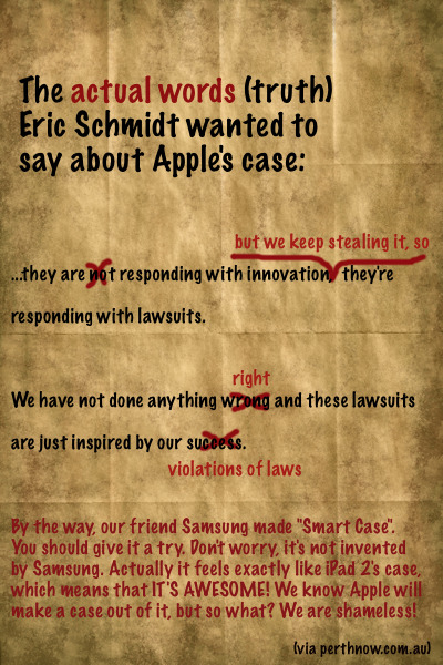
android-gripes:
In Google’s Mobile Revolution conference in Tokyo, Eric Schmidt talked about Apple’s case. His comments include:
… they are not responding with innovation, they’re responding with lawsuits.
and
We have not done anything wrong and these lawsuits are just inspired by our success.
Everybody knows that’s not true and above is what he should have said.
(via Perthnow and @philiped)
17 notes
·
View notes