
Don't wanna be here? Send us removal request.
Statistics
We looked inside some of the posts by katiecamplingstuff and here's what we found interesting.
Average Info
Notes Per Post
3
Likes Per Post
2
Reblog Per Post
1
Reply Per Post
0
Time Between Posts
1 month
Number of Posts By Type
Photo
12
Text
5
Last Seen Tumblr Blogs


Fun Fact
Tumblr was named as a finalist in Lead411’s New York City Hot 125 in Aug 2010.
Photo
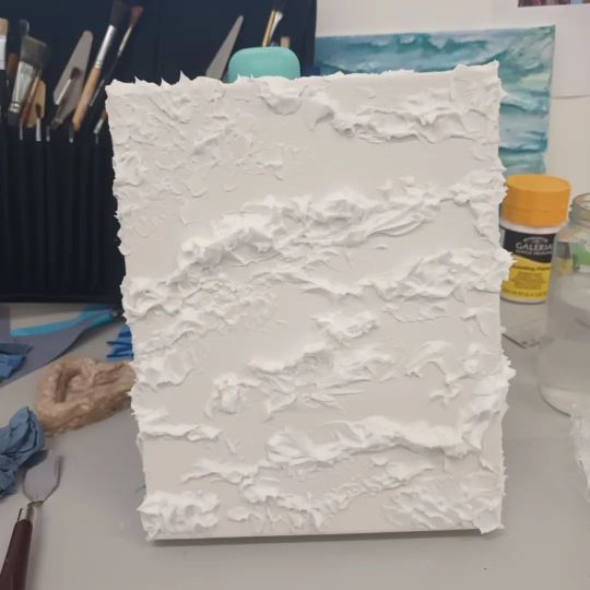
White waves Modeling paste on canvas #waves #modelingpaste #canvas #minimalism #texture https://www.instagram.com/p/ClAAFffjl6l/?igshid=NGJjMDIxMWI=
0 notes
Photo

Buddha drawing fine liner and pencil. #Buddha #pencil #fineliner #illustration #drawing #art #instagram (at Leicester, United Kingdom) https://www.instagram.com/p/CgT-ycIDBz7/?igshid=NGJjMDIxMWI=
0 notes
Photo

Watercolour sky #watercolour #sunset #painting #bright (at Leicester, United Kingdom) https://www.instagram.com/p/CfzNVx_DdD_/?igshid=NGJjMDIxMWI=
0 notes
Photo

A few pen and pencil drawings #pencildrawing #pendrawing #drawing #illustration (at Leicester, United Kingdom) https://www.instagram.com/p/Cfl8xy8jx-C/?igshid=NGJjMDIxMWI=
0 notes
Photo

My final project is of the 9 sets of angels and how they appear in different religions, their ranking and their appearance. These photos are of my whole project set up ready for a final show which was a couple of days ago. I'm so happy with how my work has turned out, I'm proud of how experimental I have become with my work. I'm ready for university now 😁 #finalshow #9angels #angels #mixedmedia #angels #sculpture #wings https://www.instagram.com/p/CfRWnSxDjKa/?igshid=NGJjMDIxMWI=
0 notes
Photo

Some more angel studie, Pen/pencil drawing, Metal embossing, Batik on paper, #batik #drawing #pencildrawing #pencildrawing #Metal #embossing #metalembossing #angel #seraphim #cherubim https://www.instagram.com/p/CbPm_GnDaBV/?utm_medium=tumblr
0 notes
Photo

Screen prints Once I had printed the white base I added to the prints by adding layers of colours. To develop the print I used bleach and textiles dyes. #angels #screenprint #colouredprints #bleach #textilesdye #patterndesign (at Leicester, United Kingdom) https://www.instagram.com/p/CbPnnvjjDat/?utm_medium=tumblr
0 notes
Photo

Cherubim👼 Fine liner #fineliner #angel #cherubim #drawing #angels #pen (at Leicester, United Kingdom) https://www.instagram.com/p/CavEkpOujWd/?utm_medium=tumblr
0 notes
Text

Medium acrylic and thread on canvas. I wannted to create a painting for my grandma as a christmas present this year. Her favourite flower are daffodils so I decided that is what I was going to paint. I first coloured the whole background yellow with a tint of orange running through it. I then drew my daffodils on, to begin with I was going to paint the daffodils in acrylics however, I remembered that she love mixed media pieces more than I do. To make the head of the daffodil i used multiple layers of different coloured thread to try and make it look as close to a daffodil as possible. I then painted the green stem of the flowers uses acrylics. I am pleased with how this turned out and think that it worked very well as a mixed media piece.
1 note
·
View note
Text
focal points
what is meant by focal point?
A focal point is the part of a painting or drawing that our eyes are drawn to first or the most. It is usually the lightest part of the art piece as this is what our eyes are drawn to or the most interesting part of the painting.
why is a focal point important?
A focal point is important as it draws the viewers eyes to the most important part and this becomes the resting place. it is important as it makes the viewer look more at the painting to look for more detail as this makes it more interesting.
0 notes
Text

still life
This is a still life that I have painted using acrylics and graphite. I made a still life in class using bottle, cutlery and a white box as the stand. I think that blue and brown bottle worked very well, I feel that I managed to make it look realistic with the lighter tints as the highlights. and a darker shade as a shadow. I think that i also managed to get the shape of the bottle to match the original bottle. I struggled with making the ellipses and the angles of the open tops of the jars, china bowls and mugs. I am very pleased with how the colours of all the objects have turned out, I think that I have managed to keep the colours natural which draws your eyes to the blue bottle making the focal point of the painting. The box and the table are originally white, I decided to make the stand a darker grey tone compared to the still life. I did this because I wanted there to be a clear difference between the box and the table. For the table I used a mixture of white and a light grey, I put the light gray in the darker areas where there is more shadow and gradually added more white. I wanted to make the background more interesting, I watered down a bit of green and brown acrylics, however I tried to keep the two colours separate so that they can be seen. I think that this worked very well, however if I was to do it again I would try to keep the colours more consistent. Once I had finished the painting I then used a graphite stick to add more shadow, I wanted to use graphite instead of acrylic because I feel that it gave it a softer shadow than acrylic would have. Overall I am very pleased with how it turned out, I think that if I was to do it again I would be more careful when it comes to the ellipses.
#ART#stilllife#acrylic#blue#bottles#paint#painting#graphite#shadow#ellipses#cups#plates#natural#green
2 notes
·
View notes
Text
what do we mean by context?
The historical context of an artwork is important because it help us to understand the painting itself, it also helps us to have an understanding of the artists life during the time of painting. Without context we can look at an artwork and assume that we know the circumstances of image, however what we think may be the complete opposite. Context is also important because it helps us to see the size, date and the artist to give us more understanding about the detail as well the historical time period. This is important because it gives us more background of the world at that time, not only the artists personal life.
why is is important to take a note of caption information in books and on the internet?
It is important to take note of this from both sources as it means you get a wider range of material research, as most artworks have been painted many years ago that it is possible that viewers/researches have found different or more information than another source.
0 notes
Photo

https://medium.com/thinksheet/how-to-read-paintings-paris-street-rainy-day-by-gustave-caillebotte-9deda220db98 (image source)
I like this painting by Gustave Caillebotte called ‘Paris street, rainy day’ painted using oil paint in 1877. I like this painting it looks very realistic, the artist Gustave Caillebotte has repeated a light purple tint throughout this painting this draws the viewers eyes around the whole painting. The painting ‘Paris street, rainy day’ makes me feel part of the painting. I thin this because the colours that have been used are very natural, the dark browns and greens tones mixed with the black shades contrast the yellow dusty tints of the buildings. The painting has been described as ‘photo-realistic’ this is mainly because the amount of detail that can be seen, for example the reflections on the stone grounds, made by using the lightest tints which shows that it has been raining. The slightly fogged background also make it look ‘photo-realistic’ as it shows the clouds and rain joining together to create a dull, gloomy sky. I would say that ‘Paris street, rainy day’ can be considered art because it is a very realistic painting. Caillebotte has also used his use of colour and the ‘photo-realistic’ technique to make the view feel as if they are there walking beside the people on the canvas.
#gustave#caillebotte#gustavecaillebotte#purple#paris#stereet#rainy#day#parisstreetrainyday#photo#realistic#phototrealisitic
0 notes
Photo

https://fineartamerica.com/featured/the-gleaners-jean-francois-millet.html?product=beach-towel (image source)
I like ‘Gleaners’ made by Jean-Francois millet painted in 1857 because it is really realistic, the way the people have been painted are very important. They are hunched over bellow the horizon line which indicate how hard there work is and how uncomfortable they are. The colours in the background look faded which makes the women stand out more, making them the focus of the painting. All the colours on the women are more defined with more shades and tints makes their movement more obvious. The painting makes me feel quite sad for the women in this painting because you can see how hard they are working from the hunched over work, also how isolated and abandoned the painting makes me feel they are, I think this because you can see a man on a horse in the background looking in the opposite direction like they don't matter. I do think that this can be considered art because it is a painting and it makes you feel sorry that they had to work like this, it is also educational on the events that happened in France in 1857.
0 notes
Photo


https://www.tate.org.uk/art/artworks/hirst-mother-and-child-divided-t12751
http://www.damienhirst.com/mother-and-child-divided-1 (image sources)
I don't like this art piece made “mother and child divided” made by Damien Hirst in 1993. I don’t like this art work because I think that it is cruel. The art work makes me feel uncomfortable and quite sad for the animals, before researching this art piece I didn’t think that the cows were real, I thought that maybe they were just plastic cows, this made me still feel uncomfortable however less disgusted. Although once I found out that they were real carcasses it made me feel even more uncomfortable. Although I wouldn’t call it art my self because I don’t think of it as traditional many people say it is because it makes you feel an emotion even if it is bad, but also because of the message it has, has made people think of it more of art and look passed the brutality of the art piece. Overall the piece has been branded as an “unforgettable” and I think this is true because of how cruel it is.
0 notes
Photo

https://contentdm.lib.byu.edu/digital/collection/Civilization/id/836/ (image source)
‘Madonna of the Meadow’ painted by Raphael in 1506, oil on wooded board (113*89cm). I like this painting because of the use of colours as well as the composition of the woman (Mary), she is placed in the middle of the canvas and her body is over threw the horizon line. I also like this painting because all colours are natural and realistic to the scenery, apart from the bright red of the woman's dress and the the blue that brings your eyes attention to her and the children she is with, the one in her hands is the child of Mary (Jesus) and to the side is Gabriel. It makes me feel that this scene in the painting is actually happened while the artist is painting, in my opinion this makes it art. I feel this because the painting looks like a classic painting with mainly primary which creates the realistic feeling.
0 notes
Text
what is art?
Art is an expression of emotion, whether it is an painting, drawing or a sculpture or auditory that is artistic. Art is made to make you as the viewer feel an emotion of some kind, whether is negative or positive. The way the art makes you feel something isn't just by it being a pretty picture but the story and the way it has been created, from the colours to the texture these are important factors. This is opposite to design because design is more of a product that can be used and can be considered a substantial product.
0 notes