
Don't wanna be here? Send us removal request.
Statistics
We looked inside some of the posts by nsaadm-blog and here's what we found interesting.
Average Info
Notes Per Post
40
Likes Per Post
30
Reblog Per Post
10
Reply Per Post
0
Time Between Posts
1 month
Number of Posts By Type
Text
17
Last Seen Tumblr Blogs


Fun Fact
The total number of visits Tumblr.com received during January 2021 is 327 million.
Text
Interactions Of Typography And Architecture
19th Amendment on the Grand Central Terminal by Stephen Doyle of Doyle Partners
http://www.doylepartners.com/
Vai Com Deus by R2 Design
http://weburbanist.com/
Berlinische Galerie by Jörg Fricke
www.duuplex.com
Seattle Central Library by Ann Hamilton
www.architecture-page.com
Dois Tempos by R2 Design
http://arkinetblog.wordpress.com/
Circus by Barbara Kruger
http://artobserved.com/
zavrtnica business centre by Brigada / Bruketa & Žinić Group
http://www.zummin.com/page/7/
Veenman Printer Building by Neutelings Riedijk Architecten
http://letterology.blogspot.com/
The Number House by Matsunami Mitsutomo
http://theawesomer.com/
POP Burger by Ali Tayar
http://nyclovesnyc.blogspot.com/
Tadao by Christopher Labrooy
www.highsnobiety.com
Evergreen by Vollaerszwart
www.creativebloq.com
Masjid Al Irsyad by Ridwan Kamil
http://nyatanyag.blogspot.com/
Lentos Museum of Modern Art by Weber & Hofer
www.oberoesterreich.at
Fougères Bibliothèque by Tetrarc
http://jetalu.fr/
Alphabet Building by MVRDV/h4>
http://letterology.blogspot.com/
Wales Millennium Centre by Jonathan Adams
www.arup.com
The South Korea Pavilion by Mass Studies
www.stuln.com
Public Library for Łódź by Maciek Grelewicz
www.dezeen.com
Christlicher Garten Marzahn by schlaich bergermann und partner
http://commons.wikimedia.org/
Comedy Carpet by Gordon Young and Why Not Associates
http://design.org/
Marion Cultural Centre by Ashton Raggat McDougall (ARM) and Phillips/Pilkington Architects (PP)
http://ginva.com/
0 notes
Text
Architectural Signage Designs
Signs aren't always an afterthought – sometimes they’re integral to the design of the building itself, carved in towering letters right into the facade or even serving as structural support. The marriage between typography and architecture is particularly eye-catching in these 13 examples, where the graphic beauty of type and, at times, moving lines of poetry add another layer of identity and emotional connection to built environments.
Wales Millennium Center, Cardiff, Wales
(images via: wikimedia commons)
‘In These Stones, Horizons Sing’. Written in both Welsh and English, this sentence makes a bold statement on the facade of the Wales Millennium Center in Cardiff, an arts center that holds performances of opera, ballet, dance, comedy and musicals. The inscription was written by Welsh poet Gwyneth Lewis, who wanted the words to reflect the architecture of the building. “The strata of the slate frontage of the Wales Millennium Centre reminded me of the horizons just beyond Penarth Head … The stones inside the theatre literally sing with opera, musicals and orchestral music, and I wanted to convey the sense of an international space created by the art of music.”
Minnaert Building, Utrecht University, Utrecht, Netherlands
(images via: architravel)
The Minnaert Building, designed by Neutelings Riedijk and added to Utrecht University in 1997, uses the letters in ‘Minnaert’ to form columns, making them essential structural supports for the section of the building that juts out over a bicycle parking area.
Fukutake House, Megijima Island, Japan
(images via: heartfish)
Fukutake House, a project started by seven of Japan’s leading art galleries, brings art to rural communities that tend to be isolated from it. Occupying a new location each year, Fukutake House reinvents itself annually, but its 2010 incarnation was more stunning than ever with a typographic installation covering the facade of the elementary school that the festival temporarily occupied.
University of Toronto Graduate Housing, Toronto, Canada
(images via: wikimedia commons, morphopedia)
Text is embedded into the design of the Graduate Housing building at the University of Toronto, with massive letters shielded by a glass and steel screen, the ‘O’ seeming to hang precariously from a ledge. The structure is one of the more important works designed by Pritzker-Prize-winning architect Thom Mayne.
Lentos Museum of Modern Art, Linz, Austria
(images via: houseofcassette.com, sendung)
With a transparent glass casing covered in words, not to mention the huge ‘LENTOS’ built right into the facade, the typographic elements of the Lentos Museum of Modern Art are integral, yet subtle: you don’t even notice the letters all over the exterior until you get close. It’s a fitting aesthetic element for an museum that displays, among many other works of art, typographic design.
House of Terror, Budapest, Hungary
(images via: milgrammer, david hand)
Though it may seem a bit sensationalistic, the word ‘TERROR’, which features prominently on the building’s overhanging roof, is a fitting name for a building with a horrifying history that is unfortunately all too real. Budapest’s House of Terror occupies 60 Andrassy Street, a building that was once leased by Hungarian Nazis and also housed two Communist organizations. All three used the basement as a torture chamber, and many people died there. When the sun hits it just right, the cutout in the metal overhang casts a sobering reminder of the building’s history upon its facade.
New Jersey Performing Arts Center, Newark, New Jersey
(images via: wallpaper magazine, walker art)
Designer Paula Scher of New York’s Pentagram started out creating bold typographic album covers in the 1970s, so it’s no wonder that, tasked with redesigning an architectural facade, she focused on “architecture as graphic design”. Scher dreamed up the transformation of this 1940s building for the New Jersey Performing Arts Center, painting words like ‘music’, ‘theater’, ‘dance’ and ‘poetry’ on everything from the brick itself to the air conditioning ducts.
Caltrans District 7 Headquarters, Los Angeles, California
(images via: the city review)
Architect Thom Mayne’s firm Morphosis, which designed the University of Toronto Graduate Student Housing building above, also tackled the Caltrans District 7 Headquarters building in Los Angeles. Says the firm, “The large cantilevered light-bar connects the structure to First Street, and the forty-foot, forward-canted super-graphic “100” marks the South Main Street entrance. This layered sign, with its nod to Chandleresque L.A.’s Hollywood sign, denotes the building as an urban landmark.”
Museum of Modern Art, Queens, New York
(images via: chi-athenaeum, cooperrobertson.com)
One could almost say they can tell this building is the Museum of Modern Art from a mile away. Architects Cooper, Robertson & Partners won a 2003 American Architecture Award after they expanded a former factory in Long Island City into a satellite facility for MoMA. The firm not only emblazoned the museum’s logo upon the facade, but put it in lights on the roof.
The Cooper Union, New York
(images via: pentagram)
The Morphosis-designed Cooper Union academic building in New York’s East Village is so visually engaging, it’s easy to overlook the details – but the details, in this case, are just as interesting as the building itself (especially for typography geeks). Designer Abbott Miller took inspiration from the font used for the sign on the original 1859 Cooper Union building to create a modern cutout sign on the new building. The font was also carried into the interior, descending down the underside of a stairway and even spotted on the vertical corner guards of the classroom doors.
Fairmont Pacific Rim Hotel, Vancouver, Canada
(images via: beyond robson, kennymatic)
Don’t be surprised if you see tourists gawking at the Fairmont Pacific RimHotel in Vancouver. There’s just trying to read the lowercase text that wraps around each level of the building. Designed by British artist Liam Gillick, the installation reads, “lying on top of a building, the clouds looked no nearer than when I was lying in the street.”
Seattle Art Museum, Seattle, Washington
(images via: nimbu, antonio ce)
Let’s hope that the Seattle Art Museum never leaves its current Robert Venturi-designed facility on First Avenue; its name is carved right into the facade.
Unidentified Building, San Francisco, California
(images via: typophile)
A typography-loving passerby captured these shots of an unnamed apartment building in San Francisco, where eye-catching text clings to the surface, seemingly sinking in at some points. The bits that can be read include “dreams we hold in our hearts” and “like rain enters earth.”
0 notes
Text
Architecture & Typography
The connection between the fields of architecture and typography is much more than the fact that typefaces are often featured on buildings, as illustrated by the Roman letters on the Pantheon. The connection is also more than the fact that Architects, such as Wright and Neutra, often crafted their own typefaces. Let's investigate this connection between architecture and typography a little further.
The Pantheon
Typefaces are much more than a series of random marks on a page. Like architecture, they are geometric constructs from the mind of educated man. Their form is carefully designed, they pack meaning, and they are reflections of their time. It should therefore come as no surprise that movements in typography parallel movements in architecture. History is full of such examples.
Helvetica in use
Perhaps the most ubiquitous typeface of the modern era is Helvetica, developed in 1957 by Max Miedinger. He desired to create a neutral letterset that would be easy to read and have universal appeal. The resulting Helvetica typeface consisted of a set of characters boiled down to their bare essence - no frills, no serifs. This stood in stark contrast to the blackletter typefaces common at Gutenberg's invention of the printing press and subsequent ornate serif typefaces. Helvetica was designed to be used anywhere and everywhere. And it has been. It was, and is, found in books, on signs, posters, and packaging. It is even the default font on the Mac notebook on which I am composing this post.
LeCorbusier's Unite d'Habitation
In the same year that Helvetica was launched, the famous Swiss born architect, LeCorbusier completed one of his masterworks, Unite d'Habitation. In the spirit of modernism, this apartment building stood in stark contrast to the heavy brooding buildings of the revival styles that preceded it. The bare concrete building was stripped down to its bare essence, devoid of decoration. This "international style" building could comfortably reside in almost any location as easily as its home in France. Post modern poster
Beginning in the 1970s the design world seemed to tire of modernism. The result was a return to historic styles, or at least to selected facets of historic styles. This new style was dubbed post-modernism, and it touched all design fields. Serifs, though less refined, returned to typestyles. Color and historic forms appeared on buildings, as evidenced by Michael Graves' 1982 Portland building.
Graves' Portland Building
Apercu Typestyle
Without the benefit of history, it is difficult to ascertain the current trends of typography or the direction of contemporary architecture. In this information age the world has become smaller. Typestyles are currently being designed to be legible and appropriate for as many languages as possible. Likewise architecture is becoming global (as opposed to "international"), but this time with a nod to local context. Top architects and designers continue to push the envelope. I think this is good. Our work should be a reflection of the time, and of the culture in which it was produced.
Holl's Nelson Atkins Museum of Art Addition
Typeface designer Adrian Frutiger spoke of advances in typography, a statement which could just as easily apply to architecture. Said Frutiger, "design needs to be taken to the extreme... I think it's a healthy process. You've got to be able to take everything to the limits in life. It does no harm to traditional typography. Good, classic typefaces are ageless."
0 notes
Text
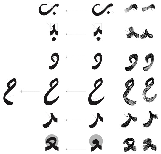
Arabic Typography
Arabic Calligraphy and Type Design
Arabic calligraphy is undoubtedly one of the highest achievements of Islamic art, and over the centuries an enormous number of calligraphic styles have emerged from different regions of the Islamic and Arab world. Arabic writing is an ethereal art set apart by its diversity of styles, the skill and passion required, and the message it was meant to carry.
The powerful influence of calligraphy long inhibited the progress of Arabic type design development. Religious and cultural attachments to the art played a role in this, as well as the complexity of styles, which far exceeded the capabilities of Latin-oriented typesetting systems. Consequently, Arabic type made several disjointed jumps into the digital age, all marked by severe limitations: in the case of hot metal type, faithful reproduction of the calligraphic styles necessitated the creation of an extremely large character set (a minimum of 900 characters, Bulaq Press, Cairo, Early 1800s). In the case of Linotype’s simplified Arabic, the limitations of the typesetting technology necessitated modifications to the core of the script itself. Recent technological developments have removed many of these limitations, and several new possibilities are emerging thanks to growing interest in Arabic type (as separate from Arabic calligraphy) and to resources available to skilled designers.

My fascination with Arabic calligraphy has always been my primary motivation for designing type, and since modern type design (not only for the Arabic script) has taken on a whole new level of complexity, I wanted to explore the relationship between these two areas.
My research focused on the intersection of calligraphy and type in a digital type environment, balancing the possibilities of both sides. For this purpose I chose the Diwani style, one whose complexity and unconventional rules have perhaps discouraged more extensive digital exploration.
The Diwani Style
The Ottoman dynasty held the Arabic script and its calligraphic traditions in high and sacred esteem. They assimilated them, developing them with both devotion and great imagination, mastering the already existing styles as well as developing new styles of their own. The Ottoman sultans patronised the most talented artists of the day, which led to the rise of a very large number of skilled calligraphers. One of the most important derivative styles of this period was the Diwani script, which was developed in the late fifteenth century by Ibrahim Munif, and later modified and refined by the celebrated Turkish calligrapher Shaykh Hamdullah. It is a cursive script based on the Ta‘liq style, ‘written on a less dramatically hanging baseline, though its letter connections are vertical and slanted’ ¹. It is characterised by dramatically curved undotted letters which are joined together in an unconventional fashion, and by ending swashes that often extend below the baseline of letters. Diwani is written without vocalisation marks. It was practiced primarily in the council chambers (Arabic: diwan) where it was used for all of the official correspondence of the Sultans. The Jali Diwani, an ornamental variant which is highly admired to this day, is characterised by large geometric shapes created by the small, delicate ornaments which fill all the gaps between the letters and words. It was used for long names and the titles of the Sultans.
Studying the Diwani Style
Because I respect and admire the art of writing, its calligraphic practices and styles, and because the attempt to capture a calligraphic spirit in a digital medium inevitably involves the risk of losing the beauty and sacredness of the script, I wanted to make every effort to study the Diwani style before drawing a single letter.
Therefore I contacted the renowned Lebanese calligrapher Ali Assi and had several lessons with him in which we tried to cover all the information essential for the start of my project. My aim was not to be able to write Diwani, but rather to understand it, always keeping in mind the forthcoming change of medium and how this new knowledge could be applied in a digital type environment.
Under Mr. Assi I learned about the rules of Diwani, the structure and proportions of the letters (measured by the rhombic dot) in their different positions and alternative shapes, the angle and movement of the pen, the connections, the ligatures, and the unique, unconventional features of the script. This culminated in the detailed analysis that was crucial to an authentic interpretation of the script as a typeface.
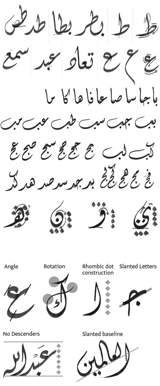
The angle of the pen is 60°, creating thin stems (verticals) and thick baselines (horizontals). Because of the angle of the pen and the excessively curled endings of the letters, the thinnest strokes involve a lot of rotation and usage of the pen tip.
The stem height is 6 rhombic dots, a relatively normal height, which maintains the horizontally compact texture of the style.
The connected letterforms all have slanted horizontals, and the general vertical axis of all the letters is inclined to the left.
A distinctive feature of Diwani is the no-descenders rule (except for the letter meem), contrary to other scripts where the letters are drawn between a maximum descenders line and a stem height line, with a baseline, several loop height lines and several descenders lines in between. This contributes even more to the general compact feeling of the script.
The most complex and distinctive characteristic of the script is the slanted baseline. This feature is responsible for the most unconventional connections and shapes.
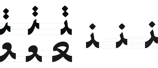
Levels
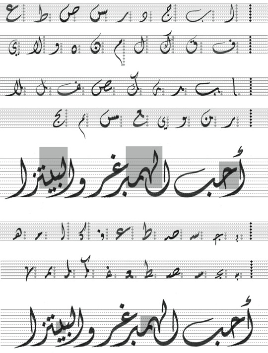
My approach to analysing the structure of the script (and beginning to understand the limitations imposed on the calligraphic features by the digital medium) was to divide the stem height into six levels (according to the number of rhombic dots) and six sub-levels. Each letter occupies a specified number of levels, and in the case of the isolated form of a given letter, this number affects only the letter itself. In the case of the terminal form of the letter, however, this number affects the height of the letter’s connection with the entire preceding combination. Similarly, in the case of the initial form of a letter, the number of levels occupied affects only the letter itself, but in the case of the medial form of a letter, it affects the position of the preceding letter.

The last letter in any combination has to sit on the baseline, so the position of the initial letter is determined by the connection level of the terminal letter, the number of letters in the combination and the number of levels each letter occupies.
The Process

The design process that led from Thuraya’s first sketches to the final digital version was full of ups and downs. Assuming that the slant would eventually work, I started two sets of quick sketches, one based strictly on calligraphy and one separate from it (without losing sight of the structure). After several rounds of drawing and much time devoted to designing slanted letters based on the calligraphic style, I came to an important realisation: forcing the typeface to follow the rules and proportions of the calligraphic script was not the right approach. Like every other feature of the script, this system had to be adapted to the capabilities of the digital typeface. I had been so fully focused on designing the glyphs according to the levels of the letters that I had not explored the shapes of the letterforms independently of the number of levels they occupied. The result was an outdated feel and unsatisfactory shapes. Thus a major decision had to be made: I would put aside the slanted baseline in favour of preserving the Diwani shapes and achieving smooth connections between the slanted letters, diverging from calligraphy while preserving its spirit.
From this straight-baseline typeface I would later devise a new system to incorporate the slant feature. There would be two versions of the typeface, each suited to a different purpose.
Drastic changes included minimising the inverted curves, creating clear cuts following the pen movement, making the teeth more pronounced, reducing the curled endings of some letters, changing the shapes of some letters to avoid confusion while reading, and opening all the closed counters.
On the other hand, keeping the clear horizontal slant and smooth curved connections of the letters, and playing with the levels of the isolated glyphs were ways to create a dynamic liveliness in the typeface. I was very pleased with the results. The effect was instantaneous. It looked like a nice start, and from here on the letters went through several cycles of changing and fixing and redrawing to meet the needs of the typeface.

Levels As a Typographic System
Having gotten the design process of Thuraya Regular on the right track, I returned once again to the idea of Thuraya Slanted. This time, however, the slant and level system was based not on the original calligraphic principles, but on a simpler concept derived from the straight-baseline version. To achieve a fluid, aesthetically pleasing result, every letter’s slant (i.e., the number of levels it occupies) would be proportional to its width. At this point the entire design was still largely theoretical with no real evidence that it would actually work. In spite of this fact, I continued to develop both versions in hopes that they would both be successful.

Thuraya Slanted Born
After a 3-day-workshop with Adobe’s Miguel Sousa, in a discussion with Erik van Blokland, Miguel suggested the cursive feature as a possible solution for the slanted baseline. The feature works as follows: Named anchors are placed at the connecting points of each glyph (‘exit’ anchors for the initial glyphs, ‘entry’ and ‘exit’ for the medial ones, and ‘entry’ for the terminals) and the cursive feature connects the ‘exit’ to the ‘entry’ anchors.
This approach required a preliminary script which would search through the typeface and locate all the anchors to be connected. After several attempts, Erik van Blokland developed a working script, so we could test the first working version of Thuraya Slanted.
I was extremely delighted and had a lot of fun typing my first slanted texts. And since it was now possible to test the slanted version properly with all the possible combinations, I was able to work out a lot of bugs, especially problems with rough connections.
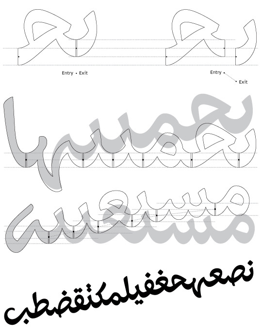
Curved Baseline
One of the main characteristics I wanted Thuraya to have was a completely curved baseline with high, tight curves. Creating one smooth curve out of two separate connecting curves requires coordinating the width and radius of the downstroke with those of the upstroke. Since both depend on the structures of the letters themselves, the key is to find a balance between all the possible downstrokes and upstrokes, shifting the optical connecting point slightly to the right, since the typeface has a vertical slant to the left. Dealing with the connections of the slanted version followed the same principle as the straight version, with the additional dimensions of the width and radius of the downstrokes and upstrokes adjusted for the slanted baseline.
Ligatures
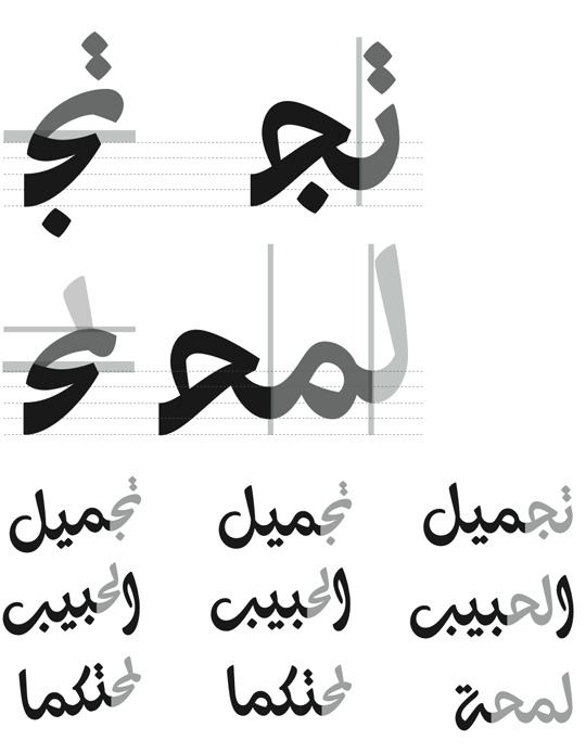
To keep a harmonious calligraphic flow and a rhythmically curved baseline, several letter combinations were designed as ligatures. This is because of some letters like reh, zayn, yeh, alef maksura and alef maksura hamza, which don’t connect on the baseline, and other letters like waw, waw hamza, feh and qaf which were difficult to connect smoothly while preserving the slanted vertical axis. The 660 ligatures (included in both styles) include every combination of the terminal forms of waw, waw hamza, feh, veh, qaf, yeh, alef maksura, alef maksura hamza, reh, zayn and jeh, with the initial and medial forms of all the other letters.
Other ligatures were designed either to achieve a smoother connection, as in the case of feh-alef or qaf-alef, or to solve the problem of overlapping diacritic dots, as in the case of yeh-yeh.

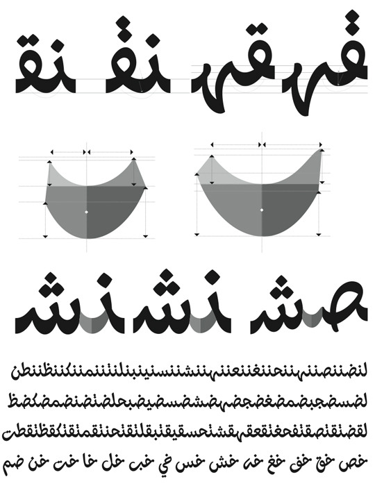
Titling Alternates
Some letters connect vertically. This is an important calligraphic feature which I also decided to implement in Thuraya. Therefore a set of alternates mainly intended for titles was designed for an even more authentic calligraphic expression.
Thuraya explores the intersection of the historic Diwani calligraphic style and a digital typeface. With its 2 styles, it is a contemporary yet faithful interpretation of the Diwani style with extensive calligraphic features.
1 Huda Smitshuijzen AbiFarès, Arabic Typography, A comprehensive sourcebook, Saqi Books 2001, London
16 notes
·
View notes
Text
R&E-SAT2: Contrast and Modernism
Following my practice 1 assignment (FAT1) feedback, I could link my artefact to the modernist movement. Functionality, clarity and purity were the aim of the movement; following the phrase ‘form follows function’. Modernist designers avoided unnecessary ornament applying one of its practitioners Mies Van Der "Less is more." Those designers didn’t just want a new way of expressing the message. They wanted to change culture and the way messages were perceived.

El Lissitzky, 1919, Beat the Whites with the Red wedge, lithograph.
Studying one of the most famous examples of El-Lissitzky work. The design of this poster utilizes contrast of form, direction, movement and hierarchy through the use of contrasting geometric shapes, colour, and size. Your eye is first drawn to the large red triangle, and then to the white circle and then the remaining black area surrounding the circle. After this you notice the text and all the secondary elements of the poster.

In my artefact, after removing unnecessary ornamentation and relating to the modernist rules, everything on the page is there to support the message and show its innate character. Following the principles of contrast researched and illustrated in my previous blog posts. I have used all elements in a way where each word gives way to the next. Contrast in the size of type, weight, colour, texture and language. The shapes it made and, especially, the white space it is guarded by, rather than filling it, I left it empty so that what mattered would be seen and nothing around it would distract from its meaning.
In relation, I feel there would have been some changes to my artefact; I feel I should have created something more advanced. It took me a long time to create my FAT1, this is because I thought I could create better ideas if I explored them enough but this wasn’t an easy task as most of the ideas were new to me and I became confused when coming up with my own ideas. However, it was very stimulating and inspiring to do all that visual and theoretical research and how one topic or keyword could have so many aspects in graphic design.
0 notes
Text
R&E-SAT2: Experimental Typography
As a designer, I always looked at typography in the way of how it will impact my design, considering aspects such as spacing, leading, weight and size. But as I am most of the time experimenting with how using two different languages in one design would result, thus I wanted to explore new horizons, new viewing perspectives and take a look at typography used as an experimental form of art.
As I started exploring in the field of graphic design and typography, the word experiment as a noun has been used to signify anything new, unconventional, defying easy categorization, or confounding expectations. As a verb, ‘to experiment’ is often synonymous with the design process itself, which may not exactly be helpful, considering that all design is a result of the design process.
In the recent book “The Typographic Experiment: Radical Innovation in Contemporary Type Design”, the author Teal Triggs asked thirty-seven internationally-recognized designers to define their understandings of the term experiment. The published definitions are marked by personal belief systems and biased by the experiences of the designers.
Among the designers’ various interpretations, the notion of experimentation by David Carson was ‘Experimental is something I haven’t tried before, something that hasn’t been seen and heard,’ (Triggs, Teal, 2003, The Typographic Experiment: Radical Innovation in Contemporary Type Design, Thames & Hudson, UK, p36.)
Figure01 & 02: David Carson works (http://www.davidcarsondesign.com/t/work/print/)
Carson’s statement suggests that the essence of experimentation is in going against the prevailing patterns, rather than being guided by conventions. This is directly opposed to the scientific usage of the word, where an experiment is designed to add to the accumulation of knowledge; in design, where results are measured subjectively; there is a tendency to go against the generally accepted base of knowledge.
The alphabet is by its very nature dependent on and defined by conventions. Type design that is not bound by convention is like a private language: both lack the ability to communicate. Yet it is precisely the constraints of the alphabet which inspire many designers.
An experimental technique which is frequently used is to bring together various working methods which are recognized separately but rarely combined. For example, language is studied systematically by linguists, who are chiefly interested in spoken languages. Linguists rarely venture into the visible representation of language, because they consider it secondary to spoken language. Typographers on the other hand are concerned with the appearance of type in print and other reproduction technologies; they often have substantial knowledge of composition, colour theories, proportions, paper, etc., yet often lack knowledge of the language which they represent.
I understand now that although there is no definitive explanation of what constitutes an experiment in typography. If experiments serve a practical need and utilizes something from the process that can be learned and applied to future projects, then experiments are very useful whether they have a realistic application or not. It was interesting to read what designers had to say about the term and research examples of it. I think without "experiments" in graphic design, no progress can be made. I hope one day I can create designs with typefaces in a way that had never been done before.
Bibliography
Biľak, Peter, 2005, Experimental Typography. Whatever that means, (http://www.typotheque.com/articles/experimental_typography_whatever_that_means)
Triggs, Teal, 2003, The Typographic Experiment: Radical Innovation in Contemporary Type Design, Thames & Hudson, UK
0 notes
Text
R&E-SAT2: Serious Play
I have been wanting to blog about this topic since we had an assignment that involved a video of Paula Scher talking about serious play at work. I became really intrigued with the importance of play related to the creative process, specially being subjected to a whole new experience of researching for my practice 1 assignment and how that to me represented serious play. Graphic design to me is not just the rules or theories of creating some artefacts but I would rather think of it as a way of life.
“Play becomes celebration; celebration becomes work; work becomes play. Our play should become work; our work, a celebration; and our celebration, play. I regard this as the supreme excellence of the human tasks.” Itten, Johannes, 1919, ‘Our play, our party, our work’ Lecture.
Going back through history, once established, the Bauhaus was held together as much by the social gatherings and festivities that masters and students. Such festivities gave free rein to the masters and students to demonstrate their creativity and design invention, providing innumerable opportunities to conceive invitations, posters, costumes and decorations. An additional aim of the festivities was the encouragement of play within teaching. Masters from Johannes Itten and Oskar Schlemmer to Paul Klee valued play as an essential ingredient of artistic creativity.
“My work is play. And I play when I design.” Scher, Paula, 2009, Great design is serious (not solemn), TED.com
In Paula Scher’s speech, she claims that play as defined in the dictionary equals what we usually think of, kids playing, but it also means gambling, and if you’re not gambling with your work, then you’re not in the game. But being ‘serious’ about something, says Scher, is very different from being solemn, when you’re solemn, that means you’re not playing anymore.
Generally, experiencing a new way of building up knowledge through research and self-directed work opposed to what I have experienced through my previous years of study, which barely had anything to do with analysing or reflecting on my own work. I can only describe that way of studying or working as being solemn, which meant that I have never experienced the sense of play at work.
Although it intimidated me at first but following the Bauhaus and Paula Scher examples, having this new experience through my MA studies, and how much I enjoyed the process, I am now becoming more drawn to the notion of play and how important it really is, not just to the artistic development but to life in general.
1 note
·
View note
Text
R&E-SAT2: CROSS CULTURES
The East and West similarities and differences is an issue that has always fascinated me, the opposition between Arabic calligraphy and Latin typography specifically. I have been researching the practical ways that Arabic and Latin typefaces can be used harmoniously together side by side. Designers have found ways to select typefaces, weights and styles so that the two languages appear compatible. They have configured layouts to allow the languages to operate individually while juxtaposed. Strides have been made toward improving the technical aspects of non-Latin typefaces and, in particular, the problems created by the calligraphic aspects of Arabic.

This is an example of combination of the two languages that are read in both directions simultaneously. It reads CNN in Arabic.
But instead, the purpose of my blog post is to explore the underlying ideas that contribute to the aesthetics and thinking behind these two languages in order to find new approaches to their application and use.
The obvious differences identified between different cultures (the East and West) resulted in the limitation of the human interaction between those cultures including their writing systems. In order to work effectively within these writing systems, it is necessary to understand and accept their differences.
Arabic has a sustained calligraphic tradition; its forms can be characterized as linear, musical, rhythmic, fluid, dynamic, decorative, individualistic, contemplative, mystical, and asymmetric. Arabic calligraphy expresses the significance of timelessness with a marked sense of rhythm, and with endless repetitions and decorative patterns. The primary purpose of the pattern is to transform matter so that it loses its solidity and heaviness. Complexity is created to hold the reader’s attention. The surface of a page can have a transcendent quality which achieves a desired spiritual essence.
Latin letters can be perceived as formal, impersonal, rigid, separate, symmetrical, static, grey, geometric, vertical and mechanical. Most of these characteristics complement technology and its more commercial applications. Latin reflects Western thinking, with an emphasis on the individual, and with rewards for innovation and diversification, as well as concerns about efficiency, progress, profit, and production. It is concerned with legibility and clear communication. It was not until the early twentieth-century that Latin typography began to be used as a means of expression in which letters served as images and forms, independent of their linguistics.
Arabic uses letters as forms of great beauty, but also to communicate meaning. The formal content takes precedence over the meaning of language in such a way that distortions of the letterforms rarely affect legibility. In Arabic, the reader understands first, and then reads.
Latin type made a clear separation from its calligraphic tradition that permitted typography to develop on its own, along with the technological advancements of each era. Arabic calligraphy however, did not evolve into typography. Due to continued resistance, the spirit of creative experimentation has been ignored. Technical and aesthetic developments have been minimal and slow, resulting in Arabic typography as a mechanized version of calligraphy.
As a conclusion, these contrary traditions could serve as obstacles that dictate that Arabic must follow the technical development used by the Latin or they might suggest freeing them from one another in order to allow them to work together in new ways to accommodate the needs of today’s society of mass consumption and commercialism.
Bibliography
Patai, Raphael, (1983), The Arab Mind, New York: Charles Scribner and Sons, 68–70.
AbiFars, Huda, (2003) Multicultural Trends in Typographic Design, Comma Quarter 1, 8–13.
Design Issues: Volume 19, 2003, Massachusetts Institute of Technology.
2 notes
·
View notes
Text
R&E-SAT2: Arabic Typography
As a part of my cultural contrast (language) research, I developed an interest in the typographic rules and as I have posted a previous blog about the typographic contrast in the Latin alphabet, I was obliged to know more about my own language type rules and the possibility of creating contrast between the Arabic letters.
The process of typesetting the Arabic script is more challenging and more complex than typesetting using the Latin script because of the requirement for special needs and strict rules. The contextual rules of the Arabic script are independent of the language, font and style and have no exception.
In terms of Arabic type design, the typographer must take into account a number of characteristics and rules of Arabic script. A good awareness of these characteristics leads to professional design of Arabic type.
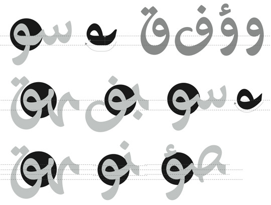
DIRECTION OF WRITING | Arabic is a unidirectional script in which the writing spreads out from right-to-left.

CURSIVITY | implies four different forms for the same letter according to its position in the word: initial, middle, final and isolated:
LIGATURES | Arabic script is extremely rich in ligatures due to the cursive nature of writing. Some ligatures are mandatory while others are optional and exist only for aesthetic reasons, legibility or justification.

Figure 01: The word "Mohamed" written with various degrees of ligatures.


DIACRITIC DOT | are a measurement unit marked by the feather of the used calligraphy pen. The semantic role of diacritic dots is that certain letters are characterized by the presence, number and positions of these dots. For example, the basic glyph gives several letters according to the number of diacritic dots which appear above or below: and
DIACRITIC SIGNS | (or short vowels) are markings added above or below the letters to aid in proper pronunciation of the purely consonantal text.
ALLOGRAPH | are the various shapes that a letter can take according to its neighbouring letters. For example, the initial form of Beh can take three allograph shapes according to its left neighbouring letter.

Kashida | is a connection between Arabic letters and it is not a separate character but a stretch of the previous letter; used for various purposes: Emphasis, Legibility, Aesthetic and Justification. Like ligatures, Kashida comes in various degrees:

Figure 02: The word "Glory" written with various degrees of ligatures.
JUSTIFICATION IN ARABIC LANGUAGE
In Arabic text justification, hyphenation is not allowed and so it is a more involved task than Latin script.

Figure 03: Justification favouring the use of Kashida (highlighted)
OPENTYPE JUSTIFICATION | many letters can be altered by a number of alternative shapes. This methodology was first used by Gutenberg who systematically applied ligatures and replaced some letter shapes with others to optimize justification on line level.

Figure 04: Figuring of ‘jalt’ table procedure
Relating this research to my own working experience, typography has become the responsibility of the graphic designer. Arabic type requires that additional care to be taken to leave its graphical structure intact in order to have an acceptable artefact from the Arabic calligraphic point of view. There are many attempts to break those rules. Designers experimented with the Arabic calligraphy in an attempt to modernize it. I am determined to explore those attempts but I had to review the rules before I started learning how to break them.
Bibliography:
- M.J.E. Benatia, M. Elyaakoubi, and A.Lazrek (2006) Arabic text justification, Proc. Annual Meeting, TUGboat.
- M. Eastman (2002) OpenType Fonts: The Next Level of Digital Typography in a True Cross-platform Font Format, Communication Arts Photography Annual.
8 notes
·
View notes
Text
R&E-SAT2: Borderlines Between Words and Images
How does visuality of written language interact with the artist’s concept, and with the context within which the artwork is shown? This is a question that came to my mind through the process of creating my practice 1 assignment artwork.
Searching through the history of written language as the sole or dominant component within an art practice, I traced it back to the late nineteenth century avant-garde. Art history tends to follow the trajectory from the figurative poetry of the French Symbolist Stephane Mallarmé at the turn of the last century to the word as material in Futurist poetry and the calligrammes of Guillaume Apollinaire, the word-image as an authority-challenging tool in the Dada and Surrealist movements, the appropriating advertising parlance of Pop, and finally, the word in Conceptual art, stripped down to the point that language itself became the artwork.
Figure 01: Apollinaire, Guillaume, 1918, Calligramme, dont la forme évoque la tour Eiffel.
Conceptual art is perhaps the most influential of these developments. Within most movements of the twentieth-century avant-garde, written language was reinvented as a medium, and along with it the visual potential of the word.
The Conceptual art movement of the 1960s used language as a medium differently. Joseph Kosuth challenged our perception of the object in its representation in language. Kosuth did not want the two confused. This can be seen in the 1967 piece Titled (Art as Idea as Idea), which he presented as a Photostat, with the subtitle undermining any importance placed upon the material manifestation.
Figure 02: Kosuth, Joseph, 1968, Art as Idea as Idea.
It is impossible to generalize as to why the Conceptual artists who turned to language did so. But one can argue that language in the 1960s became a medium of choice.
The creative act is not performed by the artist alone; the spectator brings the work in contact with the external world by deciphering and interpreting its inner qualifications and thus adds his contribution to the creative act.
Duchamp, Marcel, 1967, Session on the Creative Act, Published in Robert Lebel, Marcel Duchamp, London, 77–78.
Art historian Benjamin Buchloh argues that the question of “reading” or “seeing” text in Conceptual art was posed when artists presented a disorienting aesthetic proposition that left the audience with the tools to do either, but were forced by the work to choose a strategy.
The relationship between visual and textual components of art continues to shift. As I have previously discussed the “Asemic Writing movement,” typography is not always intended to be the most efficient way to communicate the message. At times, it places hurdles in the reading process, challenging the reader to question the information source and content in the process of perception. Type operates differently in the contexts in which it appears. To discuss the typography in the work is to bring the interaction of the visual elements of the work into dialogue with the communication of the idea.
But how is it that I do not speak that language of writing when I speak? I cannot write in the air with my voice. When I speak, no writing, only discourse. Answer: the text needs the paper. It is in contact with the sheet of paper that sentences emerge.
Hélène Cixous “Writing blind: conversation with the donkey,” Stigmata (London, 1998), 149.
Bilblography:
Dhillon, Kim, 2011, See It Now or Miss It Forever, Royal College of Art, London, (http://journals.uvic.ca/index.php/racar/article/view/7773)
Drucker, Johanna, 1994, The Visible Word: Experimental Typography and Modern Art 1909–1923, Chicago.
1 note
·
View note
Text
R&E-SAT2: DESIGNING ACROSS CULTURES - Ronnie Lipton
Human beings live in a world full of nuances and contrasts, our world is shared. Cultural diversity is reflected in the diversity of language, in art, in music and in the social structure. In a world of increasing print and broadcast media outlets, everyone everywhere is seeing print and broadcast content that spans across borders and cultures. In Ronnie Lipton’s “Designing across Cultures,” she lays the framework for making sound choices when representing ethnic groups. Lipton examines the pitfalls and stereotypes that can get designers in trouble.
“Visual design is important in reaching ethnic audiences, especially those for whom English is a second language,” Lipton says. “In the first seconds that a person views a message–before even reading a word, no matter what the language–it’s the images that hold the power to connect. It’s the images that make a viewer decide even whether to read a word.”
Lipton, Ronnie, (2002) Designing across cultures, HOW Design Books.
Lipton’s book makes the point that it’s nearly impossible to assign one meaning to all audiences or readers. I can see how this this is especially true in the Middle East markets where our cultural experiences can share a lot with western markets, but are yet very different.
Lipton states that research is Critical. She argues that a designer have to understand the symbolism and meanings he assigns to all visual elements. Visuals that translate to Mexicans, don’t necessarily work for Americans, or Europeans. She further asserts that the reason some designs doesn’t work is the lack of awareness of cultural differences.
Some of her advice that personally concerned me (as in the diverse Egyptian market Roman alphabet is usually used side to side to Arabic text) is what to avoid in the use of typography, for example; she advices to avoid typography that looks African or Asian, and for that matter, to avoid script type to represent a certain issue. She claims that sometimes these choices can be appropriate when it represents the tone of the content. Overuse of so-called ethnic colours and typography can dilute the impact of the story, and become cliché representations.
By reading “Designing across Cultures,” it provided me with the guidelines and examples I needed to start creating designs that speak to specific ethnic groups. I see my rule now is to think through how I can bring all this information together in one artwork that is seen by a variety of audiences without the risk of offending anyone.
Bilbliogarphy
Lipton, Ronnie, (2002) Designing across cultures, HOW Design Books.
0 notes
Text
R&E-SAT2: Types of Colour Contrasts - Johannes Itten
When I reached the point of considering surveying the characteristics of contrast and colour effects, as it was important for me to explore the specific definition of colour contrasts, it was not as important as knowing how to include appropriate contrast as part of my design process. My aim is to allow viewers, no matter how they interpret colours, to read and enjoy my design. I believe that choosing correct colour combinations when I design will allow my work to stand out in the world of graphic design. That is why I am determined to explore more about the use of colour.
That lead me to the seven kinds of contrast defined by Johaness Itten, each unique in character and artistic value, in visual, expressive, and symbolic effect; and together they constitute the fundamental resource of colour design.
Figure 01: Itten, Johannes, 1921, Farbenkugel (Colour Ball).
Johannes Itten was one of the first people to define and identify strategies for successful colour combinations. He devised seven methodologies for coordinating colours utilizing the hue’s contrasting properties.
1- The Pure Colour (Hue) Contrast
This results when pure colours are used in random combinations. White and black can further enhance the vivid effect.
2- The Light-Dark Contrast
This is based on the use of different brightness and tone values of the colours.
3- The Cold-Warm Contrast
The greatest effect is achieved with the colours orange-red and blue-green. All other colours appear cold or warm depending on their contrast with warmer or colder hues.
4- The Complementary Contrast
In the colour circle the complementary colours occupy opposite positions.
5- The Simultaneous Contrast
Its effect is derived from the law of complementary colours, according to which each pure colour physiologically demands its opposite colour – its complement.
6- The Contrast of Quality (Colour Saturation)
This is the contrast between luminous and dull colours. Colours can be subdued by the addition of black, white, grey, or complementary colours.
7- The Contrast of Quantity
This is based on the opposition of coloured areas of different sizes.
After thoroughly studying Johaness Itten’s contrasts, I found it an invaluable resource to my study, as he provided artists with a great deal of information on how colours work and how they work together. Itten was among the first people to look at colour not just from a scientific point of view, but from an artistic and emotional point of view. His interest in how colours made people feel made me consider and be cautious about my own coming choices.
Bibliography:
Itten, Johannes (1970) The Elements of Colour, John Wiley & Sons.
3 notes
·
View notes
Text
R&E-SAT2: WHAT IS ASEMIC WRITING?
During my investigation and experimentation of language contrast, a question arose to the importance of legibility within a design, which would naturally lead to the exploration of the current and historic debates amongst other designers regarding this issue but rather my tutor recommended that I would search the term “Asemic Writing” by Tim Gaze. This was one of the most interesting topics I researched so far as instead of studying how to make text legible, I studied the art of creating deliberate illegible text.
The subject of legibility is one which has been approached from alternative viewpoints by major graphic design movements. Should the communication be instantly visible, or would the idea be further implanted and hold greater meaning if the audience were required to search for it, which is the main concept of creating Asemic Writing.
What is Asemic Writing?
The word "Asemic" means having no semantic content. Asemic writing is anything that would look like writing, but in which the person viewing it can’t read any words.
“Asemic Writing sits on a continuum between abstract images & legible writing.”
Gaze, Tim, 2006, Asemic Movement Magazine 1.

Figure 01: Gaze, Tim, 2006, Asemic Movement Magazine1, P.11.
Asemic Writing is a whole class of visual phenomena, there are at least 3 different ways for Asemic Writing to occur:
Deliberately made as an illegible form of writing; many poets, calligraphers from different traditions, visual artists and graphic designers deliberately make Asemic Writing.
Writing intended to be legible, but for one reason or another, is not legible;
Something which accidentally looks like illegible writing.

Figure 02: Ionescu, Bernard, 2007, Asemic movement magazine 1, P.3.
Writing intended to be legible might be illegible because of:
Mental or physical distress or carelessness of the person writing
Faulty writing instrument or printer
Decay or other problems of the surface written upon (malfunctioning computer monitor);
The writing system is unknown to the person viewing it (Chinese characters, for a person who hasn't learned to read them);
Lighting or other conditions (person attempting to read is too close or too far away) render the writing temporarily illegible.

Figure 03: Li, Ezra, Asemic Movement Magazine 3, P.33.
Accidental Asemic Writing might be produced by:
Abstract art which uses fragments of the marks from which writing is formed;
Natural phenomena such as marks on trees, conglomerations of twigs, grass, stones & so on;
Traces of anything created by humans using "gestural" movements.

Figure 04: Gysin, Brion, 1986, Asemic Movement Magazine 3, P.31.
Whether something is Asemic Writing or not is subjective: if one person can't read a piece of writing, it is Asemic for that person. If another person can read the same piece of writing, it is not Asemic for the second person. So, the quality of being Asemic is not in the writing, but a consequence of whether a particular person can read it at a particular time.
Asemic writing tends to have no fixed meaning, their meaning is open. Every viewer can arrive at a personal, absolutely correct interpretation.
This would directly relate to my practice 1 assignment which will involve more than one language (English and Arabic) considering I will present this to an English speaking audience (UK).
8 notes
·
View notes
Text
R&E-SAT2: Typographic Quest No.5, Typographic Contrast, Carl Dair
After my wide-ranging investigations into the subject of contrast, I wanted to include a typographic research for the practical assignment. I therefore began to investigate the uses of contrast in typography both currently and throughout the history of typographic design.
I have found Carl Dair’s analysis of typographic contrast in his typographic quest No.5, an invaluable guide. In a seminal booklet that he both designed and wrote, Carl Dair showed how in typography, as in music, harmony and contrast are the keys to composition. He shows exactly how designers use different kinds of typographic contrast to make design work and meaning pop out, clearly and unambiguously.
CONTRAST OF SIZE
A simple but dramatic contrast of size provides a point to which the reader’s attention is drawn. The most common use of size is in making the title or heading noticeably bigger than the text — but that’s only a starting-point.

CONTRAST OF WEIGHT
Bold type stands out in the middle of lighter type of the same style for a powerful point of visual attraction or emphasis.

CONTRAST OF FORM
The distinction between a capital letter and its lowercase equivalent, or a roman letter and its italic variant, condensed and expanded versions and how some script types harmonize with standard types, such as the Bank Script and Bodoni on the opposite page. It can be used for dramatic change of form.

CONTRAST OF STRUCTURE

CONTRAST OF TEXTURE
Put all the above together, and apply them to a block of text on a page, and you come to the contrast of texture: the way the lines of type look as a mass, which depends partly on the letterforms themselves and partly on how they're arranged. "Like threads in cloth," says Dair, "types form the fabric of our daily communication."

CONTRAST OF COLOUR
A second colour is usually less emphatic than plain black on white (or white on black), so it’s important to give careful thought to which element needs to be emphasized.

CONTRAST OF DIRECTION
The opposition between vertical, horizontal type and the angles in between. Text blocks also have their vertical or horizontal aspects, and mixing wide blocks of long lines with tall columns of short lines can also produce a contrast.
OTHER TYPES OF CONTRAST (less clearly dependent on the type itself)
CONTRAST BY ISOLATION
Is putting a word or phrase in an isolated position, away from the other elements on the page in order to make it stand out.
TYPOGRAPHY RHYTHM
Consists of intervals of space and the power of “interrupted rhythm”.

In conclusion breaking Dair's types of contrasts down like this into simple oppositions made it easier for me to use them consciously. More than one kind of contrast should be used in order to make the differences between visual elements more obvious. It is important to make the contrast obvious, not just a slight change between the elements of the design, whether it is type, forms or shapes.
Bibliography:
Dair, Carl, 1967, "A Typographic Quest" No. 5: Typographic Contrast, Westvaco.
0 notes
Text
R&E-SAT2: Colour Contrasts
My next area for visual investigation was the artworks that illustrate the types of colour contrast formulated by Johannes Itten in 1961. In order to create my artwork, I had to fully understand the correct colour combinations. “Correct” often meant finding the right contrast between the background and the foreground so that my work would stand out. After studying Itten’s colour contrast, I started searching for visual results (shown here) representing different contrasts.
CONTRAST OF HUE
Some contrasting colour combinations are: yellow/red/blue, red/blue/green, blue/yellow/violet, yellow/green/violet/red/ and violet/green/blue/orange/black.
Figure 01: Gauguin, Paul, 1891, Tahitian Women on the Beach.
This painting presents undiluted colours in their most intense luminosity.
LIGHT–DARK CONTRAST
It is based on comparison of light and dark. Rembrandt paintings are often done with such contrast.
Figure 02: Rembrandt, circa 1652, Dr. Faustus in his study room.

Figure 03: Picasso, Pablo, 1915, Guitar and Clarinet on a Mantelpiece.
WARM–COLD CONTRAST
Colours or colour combinations such as: yellow, yellow-orange, orange, red-orange and red-violet are referred as warm. Colour combinations like yellow-green, green, blue-green, blue, blue-violet are referred as cold.
Figure 04: Renoir, Auguste, 1876, Le Moulin de la Galette.
Figure 05: Monet, Claude, 1904, The Houses of Parliament.
COMPLEMENTARY CONTRAST
Two colours are called complementary if their pigments mixed together yield neutral grey. Examples are: yellow-violet, blue-orange, red-green. This contrast gives the effect of a stability fixed image.

Figure 06: Francisco Goya – 1805, Dona Teresa Sureda.
SIMULTANEOUS CONTRAST
Simultaneous contrast is most intense when two complementary colours are juxtaposed directly next to each other. For example, red placed directly next to green, if you concentrate on the edge you will see a slight vibration.
Figure 07: El Greco, between 1577 and 1579, The Disrobing of Christ (El Espolio).

Figure 08: Van Gogh, Vincent, 1888, The Café Terrace.
CONTRAST OF SATURATION
Saturation relates to the degree of purity of the colour.

Figure 08: Degas, Edgar, 1862, The Gentlemen’s Race.
As a conclusion, the colour construction is connected with the juxtaposition of two or more colours in such way that they jointly produce a distinct and distinctive expression.

Figure 09: Itten, Johannes, Runge sphere.
Through this studying the previous examples I have learnt that contrast is the perceived difference in colours that are in close proximity to each other. Using contrast effectively not only differentiates the design from others, it is the essential ingredient that makes content accessible to every viewer.
1 note
·
View note
Text
R&E-SAT2: When Cultures Collide (Cultural contrast)
After my investigations into visual contrast and its use in art, I decided the next step was to begin building up my knowledge about cultural contrast and how it can be used in my artefacts; therefore I conducted a research based on my previous readings. I found the Computer Arts Magazine article - When Cultures Collide a very informative and useful resource that I can build up on.
Figure 01: Escher, M.C., 1938, "Sky and Water II." I think that this an inspiring visual example of environment (culture) Contrast. In this print we see the horizontal series of Sky and Water fitting into each other like the pieces of a jigsaw puzzle, connecting and separating them at the same time.
In this article posted in the Computer Arts Magazine - When Cultures Collide, the writer starts his argument by claiming that in the modern era of globally distributed media, our creative output can be viewed by a hugely diverse audience that reaches across each nationality, race and religion. As a result, creatives risk miscommunicating and, at worse, offending a portion of their audience with poorly targeted design.
I have to agree with his opinion that there are many examples of no-go areas unique to certain cultures, as an examples of the Middle Eastern countries that have more conservative attitudes towards nudity than the West.
He adds that design draws on a set of signs varying dependent on the culture, mentioning some examples of the use of colours in different cultures. He states that in the West, black is the colour most commonly associated with death, while in Asia it is white. Also, Green and yellow have particular associations in Islam and among Buddhist demographics, he asserts.
He goes on to argue, that the differences between European Roman languages that are read from left to right, and both Hebrew and Arabic that are written from right to left, as well as, the Asian languages that are written top to bottom could potentially present clear obstacles.
He clarifies that understanding particular cultural sensitivities will help the designer avoid the pitfalls. He concludes his article by assuming that creating a design that works universally is difficult, giving an example of websites that are often localised for separate languages.
The writer’s points in particular are relevant to my research for the reason that, as even when a design features no written elements, my intended audience’s way of scanning a page or screen will affect my design decisions.
CONNECTING WITH THE AUDIENCE
Quoting Ronnie Lipton from her book ‘Designing across Cultures’, she assumes that the best way to get around problems of this kind is to use a native speaker and professional translator of the destination language to translate, and use a native to ‘transliterate’. “This way you go beyond the language to ensure that appropriate tone, colours, symbols and type; are used for your target audience,” she says.
She adds, “Your job as a designer is to create designs that connect with your audience, whether global or domestic.”
Bibliography:
Computer Arts Magazine, “When Cultures Collide,” (http://www.computerarts.co.uk/features/when-cultures-collide).
Lipton, Ronnie, (2002) Designing across cultures, HOW Design Books.
0 notes
Text
R&E-SAT2: The Principle of Contrast in oil paintings
While researching into visual contrast, I became fascinated with the subject, and sought after further examples to support my practical assignment. Upon seeking further visual examples on the internet to both explain and expand my own knowledge of the subject, so that I can propose a well informed and researched final piece, I came across the use of contrast in oil paintings.
Contrast in art and design is explained as taking place when two related elements are different. The greater the difference, the greater the contrast. Contrast adds variety to the total design and creates unity. It is what draws the viewer’s eye into the painting and helps to guide the viewer around the art piece.
FIGURE 01: Sepo, 1926, Vintage Poster "Steaming Coffee Pot with Coffee Cups". The contrast in this illustration is quite obvious. The contrast of the light background (wall) with dark foreground (table cloth) and the contrast of the dark shadows on the tea pot and cup against the wall and with the lights of the same objects against a dark window. There is also a contrast of thin and thick lines in the napkin, straight and curved lines, and the dark steam as contrasted with the light clouds off in the distance.
Contrast in art also adds visual interest. Most designs require a certain amount of contrast. Too much similarity of the components in any design becomes monotonous.
In other words the use of too little contrast can cause a design to be bland and uninteresting. On the other hand too much contrast can be confusing. Just the right amount of contrast engages the viewer’s participation in comparing various components of the work. For instance, the viewer will compare light and dark areas of a painting, wide lines and thin lines, light-weight forms and heavy forms, filled spaces and unfilled spaces, etc.

Figure 02: CRANDELL, BRADSHAW, 1938 ART DECO "PIN-UP GIRL WITH PARROT." Above figure, contrast exists between the lights and darks. Also the contrast of the roundness of the objects in the foreground against the flatness of the background.
Figure 03: N.C. Wyeth, 1944, “The Spring House.” In the painting above is another example of contrast between light and dark.
The key to working with contrast is to make sure the differences are obvious. The most common ways of creating contrast are by creating differences in: size, value, colour, type, texture, shape, alignment, direction, movement.
Figure 04: Van Gogh, Vincent, 1888, "The Night Café, Arles." In this example Van Gogh has used complementary colours to create contrast and tension in his paintings.
Figure 04: J.M.W Turner, 1840, Slave ship. Contrast in this painting is a muted blue background to emphasis the bright orange sunset. Turner used the effects of simultaneous contrast to create the illusion of ‘glow’ of the horizon.
As a conclusion to this visual research, I figured how the use of contrast can be tricky, if focus is what I desire on a particular part of the painting, I must gain a knowledge of the ‘attraction to the eye’ which I can use to great effect in my artefacts.
0 notes